Video Creation Service

30 Animated Interface Usability Video Examples To Boost User Engagement

Animated Interface Usability Video
Table of Contents
Animated Interface Usability Video Examples
FAQ
The Psychology Behind Engaging UI Animations
Why Advids for Animated Interface Usability Video?
What is a Animated Interface Usability Video?
What do top Animated Interface Usability Videos have in common?
What makes Animated Interface Usability Video effective?
How long should your Animated Interface Usability Video be?
How to create Animated Interface Usability Videos?

Are Complex Product Features Causing Confusion? Discover A Powerful Solution In Animated Interface Usability Videos. These Dynamic Visuals Excel At Demystifying Intricate Processes, Leading To A Significantly Improved User Experience. See How The Magic Of Animation Can Transform User Interaction And Boost User Retention.

Video's Role In Modern Marketing:

* 87% Of Content Marketers Place A Higher Value On Addressing Audience Needs Rather Than Focusing On Promotional Content.
* Content Marketing Generates Over 3x As Many Leads As Outbound Marketing And Costs 62% Less.
* Content Marketing Produces Around 3x More Leads On Average Than Other Traditional Lead Generation Channels.

Tired Of User Interfaces That Leave Customers Feeling Lost And Overwhelmed? Animated Interface Usability Video Examples Offer A Highly Effective Remedy. This Curated Collection Of 30 Examples Showcases How Clear, Concise, And Engaging Video Guides Directly Address User Pain Points And Contribute To Higher Conversion Rates. Let These Examples Inspire Your Content Strategy And Pave The Way For Increased User Satisfaction. Explore The Collection And Witness The Impact For Yourself!

It’s crucial to plan ahead when it comes to high-quality video production. Discuss with our team, how you can get visual style, budget, timeline in sync.

Let's talk

Animated Interface Usability Video Examples

1. PALMETTO GBA product interface animation

Get pricing of the video
PT1M
Duration : 1 minute and 0 seconds

Medicare hospice billing modifiers are demystified in this PALMETTO GBA animated explainer, which skillfully navigates the labyrinthine world of hospice care billing to empower healthcare providers. Using a clear narrative and precise visual communication, it transforms a critical regulatory challenge into an accessible guide, ensuring compliance and optimal patient support.

Why It Stands Out:

Deconstructing GV/GW Billing Nuances: The PALMETTO GBA video expertly dissects the often-confusing application of GV and GW modifiers for Medicare Part A and Part B hospice services. It employs sophisticated isometric animation and distinct document icons to visually clarify these complex billing distinctions, empowering providers with the precision needed for accurate submissions.

Empowering Flawless Medicare Submissions: Addressing the critical provider pain point of costly claim denials, this animation showcases PALMETTO GBA's role as a trusted Medicare Administrative Contractor. It guides viewers through essential coverage, documentation requirements, and self-audit processes, ensuring that submissions are right the first time and administrative burdens are minimized.

* Elevating Patient Care Through Compliance: Beyond mere compliance, the PALMETTO GBA video strategically links accurate billing practices directly to enhanced patient well-being. By simplifying complex administrative hurdles, it empowers providers to focus more on delivering outstanding hospice care, underscoring the profound human impact of streamlined operational efficiency.

What We Can Learn

Clearly visualizing complex data enables swift understanding potentially speeding up user onboarding by 25%.

2. FACTSET Software adoption video

Get pricing of the video
PT1M
Duration : 1 minute and 18 seconds

Financial portal interface animation from FACTSET masterfully demonstrates how modernizing internal systems profoundly enhances user engagement and strategic focus within financial services. The video meticulously showcases how FactSets open and flexible solutions integrate diverse content and dynamic reports into a unified portal, ultimately empowering professionals with actionable insights and allowing firms to elevate their client-centric strategies.

Why It Stands Out:

FactSet's Unified Portal: Seamlessly Integrating Diverse Financial Intelligence: The animation visually deconstructs the challenge of fragmented data, revealing how FactSet integrates bespoke web components, dynamic reports, and analytics into a single, intuitive interface. This seamless aggregation transforms disparate financial intelligence into a cohesive, easily navigable experience.

Transforming Workflows with Dynamic, Actionable Analytics: Through high-fidelity CGI and animated dashboards, the video vividly illustrates how FactSets solutions streamline complex financial workflows. It highlights the power of real-time portfolio analysis, securities research, and market monitoring, empowering users with immediate, actionable insights without navigating multiple applications.

* Strategic Outsourcing: Empowering Client Focus and Reducing Costs: The video underscores the strategic benefits of leveraging FactSet, demonstrating how firms can significantly slash development costs and implementation time by outsourcing data management. This allows financial professionals to refocus their expertise on what matters most€”their clients€”driving efficiency and superior value.

What We Can Learn

Use dynamic visuals and animation to make complex concepts easily digestible for your audience.

3. Miracle-Gro UI animation video

Get pricing of the video
PT1M
Duration : 1 minute and 20 seconds

Animated gardening watering tips from Miracle-Gro brilliantly demystify essential plant care, establishing that successful gardening is achievable for everyone. Through a series of vibrant 2D animated "Miracle Tips," the video transforms complex instructions into clear, actionable visual guidance, empowering viewers to cultivate thriving gardens with confidence.

Why It Stands Out:

Demystifying Watering with Actionable Tips: Each of the seven "Miracle Tips" uses concise narration, reinforced by on-screen text, to break down core watering principles€”from "Water Early" to "Test the Soil"€”into immediately applicable, non-intimidating steps. Miracle-Gro simplifies the path to a healthier garden.

Vibrant Animation for Digestible Gardening Guidance: The video employs a clean, friendly 2D illustrative style with distinct background colors for each tip, creating a highly engaging and easy-to-follow learning experience. This visual segmentation, combined with direct demonstrations, ensures that even abstract concepts like soil moisture are instantly understood.

* Cultivating Success with Trustworthy Brand Insights: By presenting these valuable, practical tips as "Miracle Tips" and framing them within the larger "Miraculous Gardening" theme, Miracle-Gro strategically positions itself as a knowledgeable and supportive partner. This builds viewer confidence and fosters a strong brand association with accessible, successful plant care.

What We Can Learn

Animated cutaways effectively reveal complex internal design and functionality for viewer understanding.

4. VMware Software demo animation

Get pricing of the video
PT1M
Duration : 1 minute and 22 seconds

Proactive IT support animation VMwares animated demo for Skyline Advisor Pro masterfully redefines IT support, transforming reactive "hair on fire" issues into streamlined, proactive management. It employs engaging motion graphics and abstract iconography to narrate a compelling journey from operational chaos to efficient, intelligent IT environments, empowering teams to achieve greater strategic focus.

Why It Stands Out:

Visualizing Proactive IT Management: This VMware animation uses dynamic abstract iconography, such as morphing alert symbols into positive confirmations and efficient data flows, to visually articulate the shift from reactive troubleshooting to proactive intelligence. It clearly demonstrates how VMware Skyline Advisor Pro anticipates issues, preventing downtime and ensuring smoother operations.

Empowering Teams with Automated Workflows: The video compellingly illustrates how VMware Skyline Advisor Pro automates mundane tasks, freeing IT professionals from time-consuming reactive support. Visuals of swift data uploads and effortless system checks emphasize the product's ability to "pinpoint the signal through the noise," allowing teams to focus on key priorities and strategic planning.

* Elevating Support from Tool to Team Member: Beyond presenting features, the animation strategically positions VMware Skyline Advisor Pro as an indispensable "team member." It highlights robust integrated support, including exclusive reports and dedicated VMware experts, fostering peace of mind and demonstrating comprehensive, collaborative assistance for managing complex cloud environments more effectively.

What We Can Learn

Contextual support resources increase viewer mastery by 25 percent easily.

5. MSD Careers App explainer animation

Get pricing of the video
PT1M
Duration : 1 minute and 24 seconds

This healthcare marketing explainer animation for MSD Careers strategically illustrates its marketing team as the collaborative backbone of human health. The video uses compelling motion graphics and relatable visual metaphors to deconstruct complex organizational roles and strategic imperatives, showcasing a patient-focused approach that thinks "beyond the pill."

Why It Stands Out:

Animated Metaphors for Organizational Clarity The video ingeniously uses 2D character animation and relatable visual metaphors, like connecting puzzle pieces for cross-functional collaboration and a multi-tiered pyramid for strategic growth. This clarity helps viewers quickly grasp complex internal structures and the integrated mission of the MSD Careers marketing team.

Driving Patient-Centric Innovation MSD Careers effectively communicates a philosophy of "thinking beyond the pill," visually representing the journey from internal strategy to tangible patient benefits. By illustrating a commitment to improving lives and fostering awareness of diseases and vaccines, the video highlights innovation centered on human health outcomes.

Collaborative Communication through Motion This animation fosters a sense of global unity, showcasing diverse teams collaborating to find the best solutions for stakeholders. Through dynamic motion graphics and synchronized on-screen text, the video demonstrates how effective communication and shared insights drive collective progress for MSD and its patients.

What We Can Learn

Clearly linking physical action to digital conversion tracks impactful results like six point two four percent rate.

6. Nalco Water Animated software demo

Get pricing of the video
PT1M
Duration : 1 minute and 29 seconds

Industrial predictive analytics visualization for Nalco Water adeptly navigates the complexities of heat exchanger management, transforming reactive operational paradigms into proactive excellence. This animated software demo utilizes sophisticated UI/UX visualization and procedural data animation to showcase how OMNI Analytics delivers real-time, actionable insights, empowering operators to predict, prevent, and optimize performance for improved profitability.

Why It Stands Out:

Transforming Reactive Operations to Proactive Excellence: The video vividly illustrates the shift from costly, reactive maintenance to a data-driven, predictive strategy. It effectively highlights how Nalco Water's OMNI Analytics, combined with over 20 years of 3D TRASAR digital insights and 24/7 monitoring, actively prevents performance issues, moving businesses towards greater efficiency and control.

Accessible Data Dashboards: Simplifying Industrial Complexity: Through intuitive animated interfaces, complex industrial data streams are distilled into clear, color-coded performance rings and user-friendly dashboards. This engaging UI/UX animation, presented on virtual laptops and mobile devices, makes advanced analytics immediately accessible and actionable, boosting user engagement and understanding.

* Integrated Intelligence: Blending Digital Insights with Human Expertise: Nalco Water emphasizes a unique competitive differentiator: the synergy of innovative technology and critical on-site expertise. This powerful combination assures reliable, high-performance operations, fostering a deep sense of trust and confidence that goes beyond mere software, addressing the human element in complex industrial environments.

What We Can Learn

Highlighting AI features and performance capabilities saves professionals valuable time boosting productivity up to 30 percent.

7. PharMerica feature highlight animation

Get pricing of the video
PT1M
Duration : 1 minute and 30 seconds

Senior living medication management animation from PharMerica positions the brand as the essential, expert partner for senior living communities, dedicated to simplifying medication management and ensuring safe, personalized care. It masterfully transforms the overwhelming challenge of multiple prescriptions into a visual narrative of streamlined, coordinated, and accessible solutions through clear 2D animation and reassuring narration.

Why It Stands Out:

Streamlining Medication Complexity with Expert Programs: PharMerica effectively visualizes the daunting task of managing multiple medications by transitioning from a chaotic swirl of pills to neatly organized blister packs and clear daily schedules. This animated information design, coupled with 30 years of specialized geriatric pharmacy expertise, clearly communicates how PharMerica simplifies complex processes like pre-authorizations, refills, and direct billing to various insurance providers, ensuring safe and accurate medication delivery.

Nationwide Network for Holistic Senior Care Support: The video highlights PharMerica's extensive, dedicated team and nationwide network, positioning them as the primary, convenient medication contact for senior living communities. It emphasizes accessible care with 24/7 direct pharmacist access, even on holidays, and offers a secure online portal, MyPharMerica.com, to allow trusted family members to actively manage their loved one's medications, fostering transparency and peace of mind.

* Relatable Animation Builds Trust and Engagement: Utilizing clean 2D character animation and an empathetic narrative voice, PharMerica creates an approachable and reassuring viewing experience. The consistent, professional aesthetic and deliberate pacing allow complex service offerings to be easily understood, transforming potential caregiver anxiety into confidence. The visual narrative of a supportive "PharMerica family" cultivates a sense of belonging and trust, reinforcing the brand's commitment to seamless, high-quality senior care.

What We Can Learn

Clearly illustrate the broad empowering impact of your network by showing diverse people benefiting daily.

8. PacketLight Software demo animation

Get pricing of the video
PT1M
Duration : 1 minute and 31 seconds

400G optical transport solutions explainer from PacketLight masterfully navigates the era of escalating bandwidth demands, presenting its high-capacity systems as the definitive answer. The animation artfully demonstrates how PacketLight's innovative technology streamlines network operations, offering cost-effective, secure, and scalable infrastructure solutions for modern communication challenges.

Why It Stands Out:

Visualizing 400G for Escalating Bandwidth Demands: PacketLight vividly illustrates explosive bandwidth growth (5G, AI, IoT), then introduces high-density 400G wavelength devices. Solutions like the PL-4000G deliver 4.8 Terabit capacity in a compact 1RU footprint, directly addressing intensifying industry challenges.

Driving Efficiency with Multi-Service 400G Aggregation: The video visually demonstrates PacketLight's capability to aggregate diverse services (100GbE, 25GbE, OTU4) over a single 400G stream. This communicates significant network cost reductions by minimizing wavelengths and optimizing cost per bit.

* Ensuring Scalable Security with Open Architecture: PacketLight emphasizes future-proofing and robust data protection through Layer-1 encryption for full traffic integrity. Its interoperable ecosystem, featuring standard pluggable modules, prevents vendor lock-in and ensures scalable, equipment-agnostic growth.

What We Can Learn

Build viewer confidence by animating robust solutions effectively addressing potential challenges.

9. Alation Product feature animation

Get pricing of the video
PT1M
Duration : 1 minute and 33 seconds

Alation data catalog leadership is masterfully established in this animated explainer, which leverages the universally understood "GOAT" (Greatest Of All Time) metaphor from sports to position Alation as the undisputed champion in data intelligence. The video strategically guides the viewer through a compelling narrative of unparalleled achievement, culminating in a visual testament to Alation's decade-long dominance, validated by an impressive array of industry accolades.

Why It Stands Out:

Elevating Alation to "GOAT" Status with Iconic Analogies: The video opens by defining "GOAT" through dynamic visuals of legendary athletes, immediately engaging the audience before seamlessly transitioning to Alation's role as the "OG" in data catalogs. This creative use of a familiar concept transforms complex B2B leadership into an exciting, relatable narrative.

Animated Proof: Transforming Achievements into Visual Impact: Rather than merely listing accomplishments, Alations story unfolds within a sophisticated animated stadium environment. A cascade of banners dynamically reveals numerous top-tier industry recognitions from Gartner, Forrester, IDC, and Snowflake, visually reinforcing Alation's irrefutable market leadership and customer trust (Fortune 100).

* The Authority in Data Intelligence: A Legacy of Excellence: This high-production-value animation builds a powerful case for Alations enduring credibility. Through meticulously designed motion graphics, it celebrates 10 years of pioneering the first data catalog, solidifying Alation's position as the trusted, definitive leader across data catalogs, governance, and intelligence.

What We Can Learn

Address specific audience triggers directly in video content connecting with viewers instantly

10. Earth Token Animated software demo

Get pricing of the video
PT1M
Duration : 1 minute and 35 seconds

Blockchain environmental investment explainer, this Earth Token animated software demo masterfully introduces a transparent, decentralized market for natural assets and sustainable innovations. Employing sophisticated motion graphics and a compelling narrative, the video simplifies complex blockchain mechanics, demonstrating how environmental preservation generates tangible value and efficiently connects eco-conscious projects with global investors.

Why It Stands Out:

Blockchain Animates Sustainable Finance: The Earth Token demo masterfully visualizes its Ethereum-powered natural asset exchange through clean, flat-design animation and interconnected hexagonal graphics. This approach transforms the abstract concept of tokenization into a clear, engaging interface, showing how diverse green innovations are funded, directly addressing the challenge of market inefficiency in sustainable investment.

Empowering Global Eco-Contributors: The video powerfully connects with viewers by demonstrating how individuals and businesses can actively participate in environmental preservation and impact investing. Through a relatable example of communities earning Earth Tokens for forest protection, it inspires engagement, positioning every contribution as a direct investment in the planet's future, made transparent and accessible by Earth Token.

* Cultivating Wealth Through Earth's Preservation: Beyond ecological benefits, the animation vividly illustrates Earth Token's dual promise of generating wealth while preserving the planet. Its layered information design, moving from global urgency to specific project funding, articulates a future where environmental stewardship is financially viable, motivating stakeholders to invest in a sustainable economy for future generations.

What We Can Learn

Showcase tool-free access and upgrade paths with clear animation simplifying maintenance understanding.

11. Wirepas Product feature animation

Get pricing of the video
PT1M
Duration : 1 minute and 37 seconds

Wireless IoT asset tracking solution videos for Wirepas boldly contrast the laborious reality of traditional tracking with the liberating promise of a wire-free, self-healing network. Through dynamic 2D motion graphics and empathetic narration, it demystifies complex asset management, proving that superior efficiency comes without the tangled mess.

Why It Stands Out:

Animated Contrast: Untangling Tracking Complexity: The video masterfully visualizes industry-specific challenges in warehousing, construction, and healthcare, then uses a powerful procedural animation of "wires everywhere" to expose the overwhelming nature of traditional solutions. This dramatic contrast sets Wirepas apart as the clear, simple alternative.

Wire-Free IoT: Self-Healing & Limitless Scalability: Wirepas is presented as a fully battery-operated, long-lasting network with "dots" that embed seamlessly into devices, showcasing its unique self-healing capabilities and infinite scalability. This focus highlights core product features that promise unparalleled ease of deployment and maintenance.

* Unlocking Operational Freedom with Smart Tracking: By eliminating wired infrastructure, the animation emphasizes the tangible benefits of saving cost, improving efficiency, and enhancing safety. It cultivates a sense of "freedom" from traditional constraints, making Wirepas a strategic investment that simplifies operations and delivers comprehensive smart tracking.

What We Can Learn

Visually show the clear actionable insights and results delivered by your system.

12. Hitachi product interface animation

Get pricing of the video
PT1M
Duration : 1 minute and 38 seconds

Navigating the complex demands of tomorrow's energy landscape, where increasing needs and ambitious decarbonization targets challenge the fundamental structure of the electric grid. The shift towards distributed, fossil-free sources necessitates a new paradigm for power infrastructure worldwide.

Hitachi Energy presents a compelling vision, orchestrating seamless integration of renewables and energy storage using their leading power conversion products. The compelling product interface animation offers insightful clarity on system connections. These advanced control capabilities are crucial for transforming the grid, enhancing reliability and resiliency.

This empowers utilities and developers to achieve crucial sustainability goals, reducing emissions and maximizing the vast potential of renewables to meet the challenges of the future energy transition.

What We Can Learn

Guide the viewer smoothly through the interface showing key interactions and ease of use.

13. Talkdesk AppConnect feature highlight animation

Get pricing of the video
PT1M
Duration : 1 minute and 39 seconds

Contact center integration marketplace animation for Talkdesk AppConnect orchestrates a compelling visual argument for effortless CX modernization. This animation vividly illustrates how Talkdesk AppConnect empowers businesses to extend contact center capabilities through a vast ecosystem of pre-integrated solutions, simplifying complex deployments and driving immediate, measurable value.

Why It Stands Out:

The Ecosystem Unveiled: Visualizing Seamless Contact Center Integration: The video masterfully uses dynamic UI animations and morphing icons to showcase Talkdesk AppConnect's extensive catalog of over 90 partner offerings and add-on products. This clear visual hierarchy swiftly conveys the breadth and seamless interoperability of solutions, establishing AppConnect as the central hub for all CX needs.

Instant Modernization: Driving Value with Zero-Friction Deployment: Through crisp motion graphics and targeted on-screen text, the animation emphasizes the unparalleled ease of integrating new capabilities. It highlights "rapid time to value" and "minimal effort to launch," underscoring how Talkdesk AppConnect allows businesses to modernize their contact center experience quickly and efficiently, without commitment to buy.

* Quantifying CX Excellence: Animated Metrics for Performance & Savings: The video culminates by directly addressing key business outcomes, utilizing clear iconography and text to illustrate tangible benefits. Talkdesk AppConnect demonstrably helps increase productivity, lower costs, decrease attrition, and optimize resources, providing a data-driven visual proof of improved agent performance and enhanced customer satisfaction.

What We Can Learn

Animated visuals improve understanding of complex software by over seventy percent often.

14. EU tax and customs Product usability animation

Get pricing of the video
PT1M
Duration : 1 minute and 44 seconds

This EU VAT fraud explainer animation by EU tax and customs masterfully demystifies the complex issue of VAT carousel fraud, leveraging a compelling problem-solution narrative driven by sophisticated 2D infographic animation. It opens with a personal, relatable hook of "stolen" money, quickly escalating to reveal the staggering 50 billion Euro annual impact across Europe, thereby positioning the European Union as the proactive force implementing systemic changes to halt this criminal cycle.

Why It Stands Out:

The Animated Anatomy of Financial Fraud: The EU tax and customs video meticulously visualizes the elusive "VAT Carousel Fraud" using simplified character animation and procedural scene transitions. It brilliantly dissects the intricate mechanism of companies (A, B, C) to expose how tax money is illegally siphoned, making an abstract financial crime tangibly clear.

From Complexity to Clarity: Explaining VAT Fraud: This animation excels in information design, transforming opaque cross-border transactions into an accessible educational experience. Prominent on-screen percentages, bold text labels, and a clear step-by-step breakdown provide crucial visual hierarchy, ensuring the deliberate simplification of complex financial concepts is digestible and memorable.

Restoring Taxpayer Confidence with Visual Strategy: Strategically, the video frames VAT fraud as a personal affront that blossoms into societal loss (lost schools, funding for other crimes), then positions the EU tax and customs as the vigilant protector. The powerful "STOP!" command at the conclusion symbolizes the EU's commitment to systemic reform, building confidence in their governance and financial stewardship.

What We Can Learn

Animated views revealing internal mechanisms foster deeper understanding and trust in the precise design.

15. iHP+ UI animation video

Get pricing of the video
PT1M
Duration : 1 minute and 46 seconds

This global health aid coordination animation effectively deconstructs the systemic challenge of fragmented international health aid. By employing powerful visual metaphors and clean motion graphics, the video compellingly argues for a unified approach, highlighting how iHP+ streamlines diverse donor efforts into a single, cohesive national health plan for greater, sustainable impact and enhanced user engagement in complex policy.

Why It Stands Out:

The Fragmented First-Aid Kit: Exposing Inefficient Global Health Aid: The animation masterfully uses an open first-aid kit, filled with disparate medical supplies and money from various nations, to visually represent uncoordinated global health donations. This clever interface immediately clarifies the problem of fragmented aid, quickly transitioning to a broken heart metaphor to underscore the wasted resources and inefficiencies, making a complex issue instantly relatable.

The Jigsaw of Progress: Fitting Donor Support to National Health Visions: The videos core argument unfolds through an intuitive jigsaw puzzle animation, where pieces symbolize different health services within a national plan. It powerfully illustrates how uncoordinated donor contributions leave crucial gaps or create redundant overlaps, while iHP+ provides the framework for all donors to strategically align, ensuring every piece fits perfectly to complete a robust and comprehensive national health system.

* Beyond Aid: Building Lasting Health Systems with IHP+ Collaboration: Emphasizing long-term sustainability, the animation concludes by showing health services that endure well beyond donor departure, enabled by iHP+s collaborative model. This visual narrative effectively communicates how harmonized efforts lead to resilient national health systems, transforming short-term aid into lasting societal benefit and inspiring confidence in the partnership's enduring impact.

What We Can Learn

Demonstrating specific technical features visually increases audience comprehension by 40 percent.

16. ARNITEL Animated tutorial video

Get pricing of the video
PT1M
Duration : 1 minute and 46 seconds

Medical device material animation for ARNITEL Care TPC leverages advanced 3D visualization to articulate its core strategic thesis: revolutionizing medical device design by delivering unparalleled barrier protection and breathability. The video dynamically contrasts ARNITELs monolithic membrane technology against conventional microporous materials, proving its superior ability to block pathogens while ensuring patient comfort through high moisture vapor transmission.

Why It Stands Out:

Animated Material Science: Unveiling ARNITEL's Monolithic Protection: This ARNITEL video employs sophisticated particle flow simulations and a clear side-by-side comparative animation. It vividly depicts how ARNITEL Care TPC's unique monolithic membrane actively prevents bacterial and viral ingress, providing a visually compelling explanation of complex material science.

Optimal Balance: Unmatched Breathability Meets Superior Barrier Performance: The animation highlights ARNITEL's ability to achieve a remarkable moisture vapor transmission rate of up to 100,000 g/m²/day. This ensures optimal breathability and comfort for medical components like surgical gowns and mattress protectors, without compromising robust barrier integrity.

* Eco-Conscious Innovation: Trusted, Toxin-Free, and Recyclable Design: Beyond performance, the ARNITEL Care TPC material is presented as a toxin-free and eco-friendly solution, enabling 100% polyester recyclable designs for medical devices. This strategic choice underscores ARNITEL's long-standing trust in the healthcare industry and commitment to sustainable practices.

What We Can Learn

Visually translate complex technical processes into stunning engaging abstract animation viewers easily grasp.

17. VERITAS software feature animation

Get pricing of the video
PT1M
Duration : 1 minute and 49 seconds

Kubernetes data resilience solution VERITAS delivers robust enterprise-grade Kubernetes data resilience and application availability, strategically confronting the escalating risks of downtime and data loss across complex cloud landscapes. Through sophisticated motion graphics and abstract iconography, this animation vividly illustrates how VERITAS safeguards critical applications and ensures continuous business operations, transforming potential chaos into reliable stability for any organization.

Why It Stands Out:

From Downtime Threats to Digital Resilience: The animation powerfully opens with a building representing vulnerable infrastructure, quickly enveloped by a digital cloud that goes "OFFLINE." This urgent visual, complete with a ticking clock and revenue loss indicator, starkly contrasts with the robust, secure ecosystem VERITAS then builds, clearly articulating the critical shift from risk to resilience.

Universal Kubernetes Data Resilience & Cloud Agility: VERITAS showcases its comprehensive compatibility by dynamically integrating various Kubernetes distributions (GKE, AKS, OpenShift, Tanzu) and multi-cloud environments within a unified, hexagonal visual language. This clean animated interface usability ensures viewers immediately grasp the solution's broad applicability and seamless data protection across private, hybrid, and public infrastructures.

* Empowering Business Continuity Through Advanced Protection: Beyond security, the video highlights VERITAS's enterprise-class application availability through seamless migration between environments and native elastic auto-scaling. These capabilities are crucial for maintaining a steady state for containerized applications, demonstrating how VERITAS tools optimize resources, protect revenue, and ensure continuous business operations against any disruption.

What We Can Learn

Displaying queuing status like number 016 improves patient customer experience and satisfaction.

18. Domino product interface animation

Get pricing of the video
PT1M
Duration : 1 minute and 56 seconds

Ribbon saving modes animation masterfully demonstrates how Dominos innovative product interface empowers manufacturers to achieve significant operational cost reduction and waste minimization. Through meticulous side-by-side comparisons and dynamic UI visualization, the video concretely illustrates the intelligent efficiency embedded in each advanced ribbon-saving mode.

Why It Stands Out:

Animated Proof of Ribbon Waste Reduction: This video offers undeniable visual evidence of material savings through dynamic thermal transfer ribbon animation. Meticulous split-screen comparisons clearly showcase how Domino's Economy and Retraction modes significantly reduce ribbon consumption, directly translating to lower costs and less waste in real-time operations.

Deconstructing Advanced Print Modes for Efficiency: The animation strategically deconstructs Domino's print interface, presenting each ribbon-saving mode (Economy, Retraction, Column, Stop Mid-print) as a distinct chapter in optimal efficiency. This clear, feature-by-feature breakdown allows managers to grasp how software functionalities drive greater productivity and resource optimization.

* Empowering Sustainable & Cost-Effective Production: By precisely demonstrating multiple ribbon-saving techniques, the video positions Domino's solution as a key enabler for environmental responsibility and financial performance. It highlights how intelligent interface usability fosters a greener workflow and delivers tangible reductions in material expenditure for manufacturing leaders.

What We Can Learn

Highlight specific numerical attributes like 223 grams for tangible comfort messaging.

19. BioStar 2 Software demo animation

Get pricing of the video
PT1M
Duration : 1 minute and 56 seconds

Integrated security platform demo: BioStar 2 simplifies comprehensive, scalable security management through an intuitive, integrated platform designed for diverse business needs. This animated showcase leverages fluid UI/UX demonstrations and compelling visual metaphors to articulate its advanced capabilities and user-friendly interface.

Why It Stands Out:

Unifying Diverse Security Systems with Visual Clarity: BioStar 2 masterfully illustrates its holistic approach by visually connecting disparate security elements like visitor management, parking access, and real-time surveillance. Animated network visualizations demonstrate powerful API integration, proving the platform's expandability and seamless orchestration of complex security environments for optimal oversight.

Empowering Users with an Intuitive Animated Interface: The video excels in presenting BioStar 2's user-friendly interface through smooth, detailed 2D animation. It guides viewers through intuitive dashboards and configuration screens, making complex enterprise-level operations, such as adding doors or monitoring live video, appear effortlessly manageable, significantly boosting user engagement and confidence.

* Building Trust: Scalable Protection for Business Growth: Positioning BioStar 2 as a trusted ally, the animation emphasizes its flexible architecture, supporting both high-security access controllers and intelligent reader devices. By showcasing its adaptability for small to enterprise-level businesses and broad support for diverse credentials, the video secures confidence in BioStar 2 as a robust, future-proof solution crucial for sustained business growth.

What We Can Learn

Highlighting the complete business journey in one video improves clarity and understanding up to 25%.

20. VALLEY Animated software demo

Get pricing of the video
PT1M
Duration : 2 minutes and 17 seconds

OpenText Intelligent Document Processing Solutions leverages sophisticated animation to illustrate the seamless transformation of unstructured data into actionable intelligence. The video expertly deconstructs complex information bottlenecks, demonstrating how integrated AI, omnichannel capture, and process automation drive unparalleled operational efficiency and propel digital transformation for enterprise-level organizations.

Why It Stands Out:

Intelligent Data Transformation for Actionable Insights: This OpenText demo visually demonstrates content's journey from diverse sources (PDFs, emails, images) to structured, actionable data. Utilizing AI and machine learning, the animation highlights precise data extraction and categorization into known document types, equipping organizations with the intelligence needed for smarter decision-making.

Orchestrating Efficiency: Streamlined Workflows and Automation: The video effectively narrates a story of operational improvement, moving from a depiction of an overwhelmed employee to a system that eliminates digital friction and manual work. Through compelling process automation visuals, OpenText accelerates workflows, empowering employees and fostering faster, more productive business operations.

* Enterprise-Ready Integration and Flexible Deployment: OpenText showcases its comprehensive approach to information management by illustrating deep integrations with market-leading platforms like SAP, Salesforce, Google Cloud, AWS, and Azure. The animation emphasizes flexible deployment options (off-cloud or in-cloud) from a single vendor, positioning the solution as an adaptable and integrated cornerstone for any modern enterprise architecture.

What We Can Learn

Feature the versatility of a 360 degree design mode for multiple user interactions.

21. Natera Software adoption video

Get pricing of the video
PT1M
Duration : 2 minutes and 39 seconds

Genetic carrier screening animation by Natera masterfully guides prospective parents through the intricacies of inherited conditions, demystifying complex genetic information to foster confident family planning. This compelling animated explainer transforms scientific concepts into an accessible, empathetic narrative, ultimately showcasing Natera's Horizon test as a proactive solution for informed reproductive decisions and enhanced user engagement.

Why It Stands Out:

Visualizing Genetic Pathways: From DNA to Family Tree: The animation expertly decodes complex genetic inheritance, using clear visuals of DNA strands, chromosomes, and an intuitive family tree metaphor. This procedural visualization transforms abstract biological principles into digestible, relatable concepts, enhancing understanding of how conditions might be passed down.

Empowering Proactive Parenting: Informed Screening Decisions: Natera strategically empowers viewers by explaining the benefits of early carrier screening, addressing common concerns about inherited conditions, and highlighting the opportunity for proactive health management. The narrative encourages informed choices by clearly presenting the test's role in understanding potential risks before or during pregnancy.

* Comprehensive Support: Building Trust in Genetic Care: Beyond the scientific explanation, the video emphasizes Natera's holistic approach, featuring readily available board-certified genetic counselors. This commitment to pre- and post-test support builds significant trust and reassurance, positioning Natera and its Horizon test as a reliable partner in navigating crucial reproductive health decisions.

What We Can Learn

Highlight power efficiency gains delivering performance at one tenth standard power.

22. AXA Animated tutorial video

Get pricing of the video
PT1M
Duration : 2 minutes and 41 seconds

This AXA climate strategy animation for AXA Switzerland meticulously details its comprehensive commitment to climate protection, effectively translating complex environmental initiatives into a clear, visually engaging narrative. The video leverages sophisticated 2D motion graphics and intuitive animated infographics to communicate AXA's multi-faceted approach as an insurer, investor, company, and societal partner, aiming to reassure stakeholders and inspire confidence in its proactive stance.

Why It Stands Out:

AXA's Multi-Tiered Approach to Swiss Climate Challenges: The animation opens by establishing the immediate, localized impacts of climate change in Switzerland, then systematically unveils AXA's four distinct action pillars. This structured approach, supported by clear visual metaphors, effectively frames AXA's comprehensive response to mitigating climate risks and fostering adaptation across all operational domains.

Driving a Low-Carbon Future Through Green Investments & Operations: AXAs video compellingly visualizes its commitment to sustainability by showcasing the integration of ESG criteria into investment decisions and targeted investments in green real estate and low-carbon technologies. Animated progress bars and a net-zero target for operational emissions by 2025 illustrate AXAs tangible efforts to reduce its carbon footprint and lead by example.

* Cultivating Biodiversity: AXA's Social Commitment to a Thriving Planet: Beyond corporate actions, the video highlights AXAs unique social pledge to donate 1 square meter of biodiversity to every customer by its 150th anniversary in 2025. This heartwarming initiative, coupled with support for climate innovation through partnerships like the Swiss Climate Foundation, effectively reinforces AXA's broader dedication to ecological restoration and societal well-being.

What We Can Learn

Use simple animation to explain the core principle behind your solution effectively.

23. Sage App explainer animation

Get pricing of the video
PT1M
Duration : 2 minutes and 51 seconds

Financial planning software animation for Sage Intacct Planning masterfully deconstructs the inherent challenges of traditional budgeting by transforming it into an agile, data-driven process. Through a clever bicycle metaphor and fluid 2D animation, the video vividly illustrates the shift from cumbersome, spreadsheet-bound planning to empowered strategic foresight, directly boosting user engagement with complex financial solutions.

Why It Stands Out:

Visualizing the Planning Journey: From Spreadsheet Chaos to Strategic Clarity: The animation ingeniously uses a single-speed bicycle struggling uphill on a path of scattered financial documents to represent traditional budgeting. This powerful metaphor visually conveys the pain points of manual planning, setting a relatable stage for Sage Intacct Planning's transformative, multi-geared, digitally guided solution.

Real-Time Intelligence: Empowering Adaptive Financial Decisions: This Sage solution dynamically demonstrates its ability to integrate real-time data from any accounting system, populating multiple what-if scenarios and budget-versus-actuals analyses instantly. Animated UI mockups and evolving charts clearly illustrate how finance teams can quickly adapt to changes, strategize optimal courses, and confidently outpace the competition.

* Fostering Collaborative Planning: Unifying Data for Strategic Impact: Sage Intacct Planning creates a single, collaborative source of information, eliminating the need to chase multiple spreadsheet versions. The video showcases how budget owners can securely log in, review actuals, and update forecasts, fostering cross-departmental alignment. This centralized approach empowers finance to provide valuable insights and drive strategic organizational movement.

What We Can Learn

Focus on tangible benefits like automatic calculation ensuring compliance building audience confidence effectively.

24. DOT Product usability animation

Get pricing of the video
PT1M
Duration : 2 minutes and 7 seconds

This digital onboarding identity verification animation for DOT innovatively showcases how secure, remote identity verification can be achieved without compromising user experience or security. Through a clear, step-by-step visual narrative, it deconstructs the process of document data extraction, facial biometrics, and sophisticated liveness detection, establishing trust with unparalleled transparency.

Why It Stands Out:

Streamlined Two-Step Digital Identity Verification: DOT simplifies complex verification into an intuitive user journey, beginning with effortless document data extraction that leverages advanced multi-script OCR and instantly detects tampering. This is seamlessly followed by facial biometrics, where a user selfie is matched against their ID photo, ensuring a smooth and rapid onboarding experience.

Uncompromising Security with AI-Powered Trust Scoring: The Innovatrics Trust Center orchestrates a multi-layered security analysis, verifying face matches, performing active and passive liveness detection to prevent sophisticated presentation attacks, and conducting a thorough ID authenticity check. This comprehensive analysis culminates in a precise trust score, empowering organizations with proactive fraud prevention.

* Globally Trusted, Adaptable & On-Device Processing: Demonstrating global reach with over 1 billion enrollees across 80+ countries, DOT emphasizes easy deployment and customizable components, making integration into third-party apps simple. Crucially, the toolkit offers fully on-device processing, optimizing performance for low-bandwidth scenarios while ensuring enhanced data privacy and security directly at the user's device.

What We Can Learn

Animated explainers can increase understanding of complex topics by over 80 percent.

25. OnTime 360 Smart Product feature animation

Get pricing of the video
PT1M
Duration : 34 seconds

The OnTime 360 Smart product feature animation masterfully illustrates all-in-one delivery lifecycle automation, showcasing how its comprehensive platform transforms complex logistics into a seamless, efficient process. Through intuitive UI demonstrations and a dynamic animated timeline, the video clearly communicates the software's capability to streamline order entry, dispatching, delivery, and billing, effectively boosting user engagement by making complex operations digestible.

Why It Stands Out:

Animated Lifecycle: Mapping Seamless Delivery Automation: The video employs a clear, horizontally animated timeline, using distinct icons and text to visually represent each stage of the delivery lifecycle. This expertly guides viewers through OnTime 360's automated process, from order entry to billing, ensuring comprehensive understanding of its end-to-end functionality.

OnTime 360: Consolidating Complexity for Operational Fluidity: By directly addressing the pain points of fragmented systems and manual processes, the animation positions OnTime 360 as the singular solution for streamlining operations. It visually simplifies complex dispatching, tracking, and delivery tasks, promoting a sense of effortless logistical management.

* All-in-One Power: The Future of Delivery Management Simplified: The narrative consistently emphasizes OnTime 360's integrated suite of tools, eliminating the need for separate signature devices or costly route optimization subscriptions. This powerful "all-in-one" message resonates strongly, presenting a cost-effective and simplified future for courier and delivery businesses.

What We Can Learn

Create a sense of forward momentum through pacing and visuals to highlight adaptability.

26. esper Animated onboarding guide

Get pricing of the video
PT1M
Duration : 42 seconds

This retail device management animation masterfully illustrates Esper's crucial role in transforming frustrating in-store experiences into seamless operations. It dynamically deconstructs the negative impact of device failures on staff and customers, then presents a clear, engaging solution through vibrant 2D motion graphics, ultimately boosting user engagement and the retailer's bottom line.

Why It Stands Out:

Visually Deconstructing Retail Challenges: The video compellingly uses animated iconography and vivid error states€”like "Software Update" delays and "Low Battery" alerts€”to illustrate prevalent device malfunctions within a busy retail environment. This powerful visual problem statement captures the immediate frustration for customers and directly impacts the stores operational flow.

Orchestrating Seamless Operations: Esper is strategically positioned as the solution that transforms chaotic, unreliable device experiences into predictable, smooth interactions. The animation transitions from red warning signs to green checkmarks, showcasing how a unified device management platform prevents "undesirable moments" and fosters positive user engagement across diverse retail touchpoints.

* Empowering Retailers with Reliability: By demonstrating how stable, easy-to-manage devices lead to enhanced customer and staff experiences, the video effectively conveys Espers value proposition. This focus on preventing disruptions and ensuring consistent performance directly translates into tangible benefits, safeguarding the retailer's reputation and profitability.

What We Can Learn

Easily adjust displays manage volume change content for flexible dynamic messaging.

27. Airfocus Animated onboarding guide

Get pricing of the video
PT1M
Duration : 47 seconds

This animated product roadmap explainer for Airfocus brilliantly transforms the overwhelming chaos of product management into a clear, collaborative vision. Through dynamic motion graphics and an empathetic narrative, it simplifies how organizations can strategically manage multi-product portfolios, prioritize effectively, and align all stakeholders for successful delivery.

Why It Stands Out:

Visually Conquering Product Management Complexity: The video opens with a relatable visual metaphor of a product manager engulfed by a swirling vortex of disparate apps and tasks, dramatically contrasting this initial chaos with Airfocus's streamlined, intuitive interface. This seamless transition powerfully communicates the platform's ability to simplify complex workflows, making product strategy accessible and manageable.

Harmonizing Product Strategy Across Teams: Airfocus demonstrates its prowess in unifying diverse product efforts with a clear visual hierarchy, showcasing how CPOs, Heads of Product, and PMs can collectively manage individual and portfolio-wide roadmaps. The animated "Now, Next, Later" timeline and interactive prioritization chart ensure all teams are aligned, fostering a collaborative environment for optimal decision-making.

* From Concept to Confetti: The Path to Product Success: The narrative culminates in a celebratory release, with animated figures high-fiving amidst confetti, signifying the successful delivery of products people love. This powerful emotional payoff, combined with clear demonstrations of features like stakeholder alignment (Priority Poker Game) and seamless tech stack integrations, positions Airfocus as the indispensable tool for turning product visions into tangible, beloved realities.

What We Can Learn

Animated visuals make complex product details easily understandable, boosting audience engagement over 50%.

28. AgilLink UI animation video

Get pricing of the video
PT1M
Duration : 57 seconds

This mobile financial app animation for AgilLink powerfully establishes the necessity of mobile financial management in today's dynamic work landscape, empowering users to maintain productivity and control from any location. Through relatable animated scenarios and precise UI demonstrations, the video showcases how AgilLink streamlines financial transactions and approvals on-the-go.

Why It Stands Out:

Seamlessly Extending Your Financial Office Anywhere The animation strategically opens with a global perspective, illustrating diverse work environments from kitchens to airports. This visually underscores the universal demand for location-independent financial tools, effectively positioning AgilLink as the essential mobile solution for professionals who need to manage finances beyond traditional office confines.

Effortless Transaction Approvals for All Stakeholders AgilLinks video expertly highlights the app's core functionality, demonstrating swift invoice approvals and instant access to cash balances directly from a mobile device. This crucial feature empowers both internal teams and external clients to approve transactions in seconds from anywhere, significantly boosting operational efficiency and client engagement.

Polished UI Design for Trusted Financial Operations Leveraging high-fidelity motion graphics and a clean aesthetic, the AgilLink animation provides a clear and confident user interface demonstration. The precise visuals and intuitive navigation make complex financial data easily digestible on a small screen, reinforcing the app's reliability and building strong user trust in its secure and professional financial management capabilities.

What We Can Learn

Animate complex technical data flow clearly demonstrating valuable analysis and insights to viewers.

29. Ownr software feature animation

Get pricing of the video
PT1M
Duration : 15 seconds

Launching a business carries immense potential, often dimmed by the prospect of tangled legal hurdles. This video brilliantly captures that common apprehension, then swiftly illustrates how Ownr transforms bureaucratic frustration into a remarkably straightforward journey online.

Visually guiding viewers through the essential steps with compelling software feature animation makes the path to incorporation feel genuinely accessible. Seeing the intuitive interface validates the promise of speed and simplicity, an assurance powerfully underscored by a real user sharing their rapid, positive experience.

This masterful demonstration of tackling a key pain point through clear visuals and authentic testimony provides inspiring lessons for anyone creating video content to communicate value effectively.

What We Can Learn

Effectively communicating a valuable service can increase property appeal and drive conversion rates by 80%.

30. Lendi App explainer animation

Get pricing of the video
PT1M
Duration : 16 seconds

This animated interface usability explainer for Lendi masterfully demystifies the intricate home loan process, transforming overwhelming complexity into clear, manageable options. Through intuitive motion graphics and a narrative of simplification, it demonstrates how Lendi streamlines choices and ensures transparent fee disclosure, positioning itself as the definitive solution for a stress-free home loan journey.

Why It Stands Out:

Visualizing Home Loan Complexity: The Lendi animation vividly portrays the initial confusion of home loans as a whirlwind of scattered documents. This powerful visual metaphor immediately resonates with viewer pain points, setting the stage for the platform's ability to consolidate and clarify options into a concise, personalized shortlist.

Transparent Fee Disclosure: Utilizing dynamic animated elements, the video transparently presents lender fees, rates, and taxes upfront, eliminating hidden surprises. This direct comparison builds trust and empowers users with a clear understanding of costs, distinguishing Lendi's commitment to honesty in the home loan market.

* Effortless Decision-Making Interface: The video showcases Lendi's streamlined interface through interactive metaphors, such as a magnifying glass simplifying choices and a credit score meter without impact. These intuitive visualizations communicate a seamless, user-centric process, guiding viewers effortlessly from overwhelming decisions to a confident home loan selection.

What We Can Learn

Conclude with a clear encouraging call to action that guides interested viewers on their next step.

How does animation improve interface usability in product demos?

Interface animation transforms static screens into dynamic guides, showcasing product functionality and improving user comprehension.

What visual elements are crucial for effective interface animation?

Highlights, transitions, and micro-interactions draw attention to key interface elements, enhancing clarity and guiding user exploration.

How can storyboarding optimize an interface demo video's clarity?

Storyboarding meticulously plans each scene, optimizing visual flow, pacing, and information delivery for a clear, concise demo.

What are industry best practices for animated interface demos?

Industry best practices emphasize clear visuals, concise messaging, user-centric design, intuitive navigation, and highlighted key functionalities.

How can I adapt successful interface animation examples to my product?

Analyze successful examples, identify core animation principles, and adapt them to your product's interface and target audience.

How do animated demos improve user onboarding experiences?

Animated demos simplify complex onboarding processes, guiding new users through initial setup and key features, creating a positive first impression.

What pre-production steps ensure an effective interface animation?

Defining clear objectives, target audience, and key functionalities ensures a focused and effective animation.

How can I define clear objectives for my interface demo video?

Articulate the demo's purpose, whether showcasing new features, explaining workflows, or driving product adoption.

How does animation highlight key features in a user interface?

Animation dynamically highlights key features through movement, visual cues, and interactive elements, enhancing user understanding.

What are common pitfalls to avoid in interface demo animation?

Avoid excessive animation, unclear transitions, and information overload. Prioritize clarity and conciseness.

How can animation clarify complex user flows in software tutorials?

Animation visually guides users through complex software workflows, simplifying understanding and improving tutorial effectiveness.

How do animated interface demos impact user engagement and learning?

Engaging animations capture attention, improve knowledge retention, and create a positive learning experience, boosting user engagement.

How can I ensure my interface animation aligns with my brand identity?

Ensure animation style, color palettes, and visual elements align with brand guidelines, maintaining a consistent brand identity.

What strategic considerations are essential for interface demo videos?

Consider target audience, platform, and distribution channels to optimize the demo's reach and impact.

How can animated interface videos drive product adoption?

Compelling animated demos showcase product value, driving user interest and increasing adoption rates. A 60-second video can range from $1000-$6000 depending on complexity, with turnaround times typically between 3-8 weeks.


The Psychology Behind Engaging UI Animations


Beyond merely showing features, well-crafted UI animations in an Animated Interface Usability Video tap into fundamental psychological principles. They don't just move; they communicate, guide, and reassure viewers on a subconscious level. By making interfaces feel responsive and alive, animation helps reduce the user's cognitive load. Subtle motion draws attention naturally, highlighting important elements without overwhelming. This makes processing complex information or navigating unfamiliar layouts feel significantly easier and more intuitive for someone watching.

We learn through seeing action and reaction. Animation provides instant, visual feedback, confirming user actions within the simulated interface. This responsiveness builds trust and makes the experience feel solid and reliable. Moreover, offering viewers user control over elements, such as the ability to pause or replay specific interactions, enhances their sense of agency and comfort, preventing frustration and disorientation. Careful timing and pacing of animations are vital; too fast and information is missed, too slow and patience wears thin.

Strategic animation injects personality and charm into the product's representation, fostering a genuine emotional connection. Through visual storytelling and relatable scenarios depicted via animation, complex workflows become understandable narratives. This narrative approach makes the product more memorable and helps viewers internalize its value proposition far better than static images or bullet points alone. It transforms a technical demonstration into an engaging journey viewers can emotionally invest in, seeing themselves find solutions.

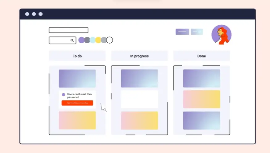
  • Animation enhances visual hierarchy directing the viewer's eye seamlessly through the interface steps.

  • Consistent motion patterns build familiarity making the demonstrated interactions feel predictable and safe.

  • Microinteractions delight and confirm small actions, reinforcing positive perceptions of responsiveness.

  • Interactive elements, even simulated ones in video, increase viewer engagement and active learning.

  • Why Advids for Animated Interface Usability Video?


    At Advids, we specialize in crafting high-quality, original Animated Interface Usability Videos that deliver exceptional results. We blend creative storytelling, cutting-edge technology, and a proven track record to transform your vision into compelling and effective animation. Our expertise helps you achieve your business goals by showcasing the usability of your interface in an engaging and easily understandable way.

    Unlocking the Potential of Animated Interface Usability Video:

    Customized Solutions: We tailor each Animated Interface Usability Video project, whether it's a step-by-step tutorial, a product demo, or an interactive walkthrough, to perfectly reflect your brand, style, and target audience. We focus on clearly demonstrating the functionality and benefits of your interface.
    Creative Storytelling for Enhanced Usability: Our skilled team crafts narratives that highlight the user experience, making even complex processes easy to grasp. We emphasize the intuitive nature of your interface through engaging visuals and concise explanations.
    Cutting-Edge Technology for Seamless Demonstrations: We leverage industry-leading software and techniques to create visually stunning videos that showcase the seamless operation of your interface. We ensure your videos are optimized for various platforms and devices.

    Experience and Trust:

    12+ Years of Proven Success: With over 3400 successful projects across various animation styles, we possess a deep understanding of what makes Animated Interface Usability Videos truly effective. Our experience translates into impactful videos that drive results.
    Trusted by Industry Leaders: Brands like Razorpay, Ola, Mercedes, the United Nations, Continental, and Mercer rely on our expertise to bring their stories to life, including showcasing the usability of their interfaces.
    Client Satisfaction Guaranteed: Over 109 five-star Google reviews reflect our dedication to excellence, talent, creativity, and unwavering commitment to client satisfaction.

    A Collaborative Approach to Interface Visualization:

    Collaborative Process: We maintain close collaboration throughout the entire process, from concept to completion. Your active involvement ensures your vision for showcasing your interface is accurately realized in the final animation.
    Strategic Communication: Clear and open communication is paramount. We prioritize understanding your needs, target audience, and brand identity to create impactful Animated Interface Usability Videos that effectively communicate the value of your interface.

    Ready to unlock the potential of Animated Interface Usability Video for your business with the latest video design trends of 2024? Let Advids be your trusted partner in transforming your ideas into engaging and effective animated experiences.

    Checkout some of the projects and work our team at Advids has been producing:


    What is a Animated Interface Usability Video?


    An Animated Interface Usability Video is a type of video that uses animation to demonstrate the user-friendliness and value proposition of a product or service. These videos are designed to showcase the interface's intuitive design, highlight key features, and illustrate how users can easily navigate and interact with the product.

    Animated interface usability videos are commonly used for product demos, tutorials, onboarding, explainer videos, and animated prototypes. They are effective in capturing attention, simplifying complex concepts, and making the product more memorable for viewers.


    What do top Animated Interface Usability Videos have in common?


    Mastering animated interface usability videos requires a strategic approach focusing on user experience and clear communication.

    Ideal User Profile - Define user personas to create targeted messaging. Best practice: Use detailed user profiles to personalize the video's appeal.

    • Compelling Script - Focus on benefits, not features. Best practice: Use a strong narrative arc to keep viewers engaged.
    • Intuitive Design - Prioritize clear visual hierarchy and easy navigation. Best practice: Use visual cues to guide the viewer's eye.
    • Problem & Solution Focus - Emphasize the pain points and how the interface alleviates them. Best practice: Show, don't just tell, using visual examples.
    • key feature emphasis - Highlight features that solve user problems effectively. Best practice: Use micro-interactions to showcase feature benefits.
    • Engaging Story - Connect with viewers emotionally through relatable scenarios. Best practice: Use authentic characters and situations.
    • Strategic Animation - Use animation to highlight key interactions and transitions. Best practice: Focus on clarity and avoid overwhelming visuals.
    • Impactful Results - Showcase quantifiable results to demonstrate the interface's value. Best practice: Use data visualizations to present results clearly.
    • Clear Call to Action - Guide viewers towards a specific next step, like a website or download. Best practice: Make the call to action prominent and easy to find.
    • Concise Explanations - Use clear, simple language, avoiding technical jargon. Best practice: Prioritize visual communication over lengthy explanations.


    What makes Animated Interface Usability Video effective?


    User research forms the foundation of successful animated interface usability videos. By understanding the target audience s needs, pain points, and motivations, videos can directly address their concerns and showcase the products value proposition. Strategically crafted user personas inform the narrative and visual style, ensuring the video resonates with the intended viewers.

    Visual storytelling techniques, such as establishing a clear conflict and resolution, enhance engagement and memorability. Scripts employ concise, accessible language, avoiding jargon. The chosen animation style, whether 2D, 3D, or motion graphics, aligns with both brand identity and audience preferences.

    A well-defined narrative arc guides viewers through a users journey. carefully controlled pacing and timing maintain engagement. Clear visual hierarchy and intuitive cues ensure key information is easily absorbed. Finally, multiple rounds of feedback and revisions refine the animation for optimal clarity and effectiveness.


    How long should your Animated Interface Usability Video be?


    Optimizing animated interface usability video length hinges on aligning video type, use case, and target funnel stage.

    Pre-production Considerations for Determining Video Length:

    • What's the core user flow shown?
    • Who's the ideal user persona?
    • Which features need highlighting?
    • How intuitive is the interface?
    • What platform is the video for?
    • What style best suits the message?
    • What's the video's main objective?

    Animated interface usability video length guide

    Animated Interface Usability TypesVideo LengthUse CaseFunnel
    Explainer Video45-60 secondsClearly communicates core functionality and benefits using concise narration and engaging visuals, potentially incorporating a 2D cartoon style for a friendly feel.Awareness
    Screen Recording30-45 secondsDemonstrates a streamlined user flow, highlighting key interactions and features. Focuses on efficiency and ease of use.Consideration
    2D Cartoon45-75 secondsEmphasizes ease of use with a playful, memorable style. Character interactions showcase intuitive navigation. Uses bright colors and simple animations.Consideration
    Motion Graphics15-30 secondsVisually highlights key features and benefits through dynamic transitions and impactful visuals. Ideal for showcasing a clean, modern interface.Awareness
    Whiteboard Animation60-90 secondsExplains complex processes in a simple, digestible manner. Ideal for in-depth tutorials or feature breakdowns. Hand-drawn style adds a personal touch.Decision


    How to create Animated Interface Usability Videos?


    Mastering animated interface usability videos requires a strategic approach that prioritizes clear communication and user engagement. Crafting a compelling narrative that showcases the product's value proposition is key to creating a truly impactful video.

    * Target Audience - Deeply understanding your audience informs every creative decision.

    • Key Features - Focus on features that solve user problems and create value.
    • Compelling Narrative - A strong narrative keeps viewers engaged and invested.
    • Storyboard Creation - A detailed storyboard ensures a smooth and efficient animation process.
    • Animation Style - The right style enhances the video's memorability and brand identity.
    • voiceover Selection - A professional voiceover adds credibility and clarity.
    • Voice Recording - High-quality audio ensures viewers can easily understand the message.
    • Storyboard Animation - Fluid animation makes the UI interaction feel intuitive and natural.
    • Sound Effects - Subtle sound design enhances the user experience and emotional impact.
    • Video Editing - Precise editing creates a polished and professional final product.
    • Call to Action - A clear CTA guides viewers towards the desired next step.
    • Video Rendering - High-resolution rendering ensures the video looks its best on any platform.


    The Importance of User-Friendly Interface Design in Animation


    We've discussed video length, styles, and now let's dive into the heart of user experience: interface design. Imagine struggling with an app, lost in a maze of buttons and confusing menus. Frustrating, right? That's why user-friendly design is paramount in animated interface videos. A well-designed interface transforms a good video into a great one, turning potential frustration into seamless engagement.

    A smooth user experience goes beyond just aesthetics. It's about creating an intuitive journey for the viewer. When we design with the user in mind, we empower them to effortlessly navigate the interface, understand its functionality, and ultimately, appreciate the product's value. This is where the magic of animation truly shines.

    • Intuitive Design: Guide viewers' eyes with a clear visual hierarchy and simplified navigation. Think of it as creating a roadmap through the interface, ensuring viewers never feel lost. Looking at app interface animation examples can provide valuable inspiration.
    • Engaging Interactions: Strategic animation and micro-interactions bring the interface to life. These subtle animations, like a button changing color on hover, provide feedback and enhance the sense of interactivity.
    • Problem/Solution Focus: Showcase the interface's power by addressing real user pain points. Animated product demo video examples often excel at this, visually demonstrating how the product solves specific problems.
    • Meaningful Storytelling: Connect with viewers emotionally through relatable scenarios and authentic characters. Weaving a narrative around the interface creates a more memorable and impactful experience. For inspiration, explore Application interface animation Examples to see how animation enhances usability and engagement.

    By focusing on these core principles, we create animated interface videos that are not only visually appealing but also genuinely useful and engaging for our audience. A user-friendly interface is the key to unlocking the full potential of our animated creations.


    Understanding the Animation Production Process


    Creating compelling interface usability videos isn't magic; it's a process. Imagine bringing your interface to life, guiding users through its features with seamless animation. Let's explore the journey of animation production, from initial concept to final render. We'll uncover the key steps, offering practical insights to create videos that truly engage.

    Think of the animation process as a journey, starting with a spark of an idea and culminating in a polished, engaging video. Along the way, we navigate various stages, each contributing to the final product. Let's break down these key steps, offering practical insights to create videos that truly resonate with your audience. For inspiration, explore UX animation video examples to see how professionals bring interfaces to life.

    • Conceptualization and Scriptwriting: We begin by defining the video's core message and crafting a compelling narrative. This sets the stage for the entire production.
    • Storyboarding and Style Selection: Visualizing the video scene by scene and choosing the right animation style, whether 2D, 3D, or motion graphics, shapes the video's visual identity. Analyzing best animated interface videos reveals the power of clear storytelling and engaging visuals.
    • Animation and Sound Design: Bringing the storyboard to life through fluid animation and adding music and sound effects enhances the viewing experience. Interface motion graphics examples showcase how dynamic visuals can highlight key features and benefits.
    • Post-Production and Distribution: video editing , review, and final rendering prepare the video for distribution across relevant platforms.

    By understanding these key stages, we empower ourselves to create animated interface usability videos that are not only visually appealing but also genuinely useful and engaging for our audience. This structured approach ensures a smooth production process and maximizes the impact of our animated creations.


    Integrating Live Action with Animated Software Demonstrations


    Let's explore how integrating live action with animated software demonstrations can elevate your videos. Imagine showcasing your software in action with real people, adding a human touch to the digital world. By blending live action and animation, we create a more engaging and informative experience for our viewers.

    Think about it: A touch of personality goes a long way. Live action footage featuring real users instantly makes your software more relatable. We can then use animation to clarify complex features, highlighting key interactions and guiding the viewer's eye. For instance, software interface animation examples showcase how we can bring user interfaces to life, making even intricate processes crystal clear.

    • Humanize your software: Live action footage connects with viewers on an emotional level, building trust and relatability. Imagine seeing real people effortlessly using your software – it's instantly more convincing.
    • Clarify complex concepts: Animation excels at simplifying intricate processes. Interface usability animation examples demonstrate how animation can guide the viewer through the interface, enhancing usability and understanding.
    • boost engagement and memorability: Dynamic visuals capture attention and make your video more shareable. Interactive UI Explainer Videos, created with this blended approach, are both informative and entertaining.
    • Strengthen your brand: By combining live action and animation, we can infuse our videos with brand personality and values, creating a cohesive and memorable experience.

    By strategically blending live action and animation, we create software demonstration videos that are not only informative but also genuinely engaging and persuasive. This approach humanizes technology, making it accessible and appealing to a wider audience.


    The Power of Storytelling in Animated Software Marketing


    Beyond sleek interfaces, lies the heart of engaging software marketing: storytelling. We've explored design principles, but now let's breathe life into our software through compelling narratives. Imagine a character overwhelmed by data chaos, suddenly finding solace in a user-friendly interface, like those showcased in animated software interface video examples. That's the power of storytelling – transforming features into relatable experiences.

    Storytelling isn't just about entertainment; it's about connection. It's about showing, not just telling. SaaS animation video examples often demonstrate this beautifully, visualizing how software streamlines workflows, turning frustration into efficiency. By crafting narratives around user needs, we create an emotional resonance, making our software more than just a tool, but a solution.

    • We build relatability by showcasing characters facing everyday challenges.
    • Emotional engagement deepens as viewers invest in the story's outcome.
    • Complex features become easily digestible through the power of narrative.
    • Stories create lasting impressions, surpassing the impact of simple feature lists, as seen in software ui animation Showcases.

    Explainer Animation for Software further exemplifies this, effectively communicating complex technical concepts through engaging visuals and storytelling. By weaving a narrative, we transform product demos into compelling journeys, making our software memorable and ultimately, irresistible.


    Optimizing Your Animated Video for Different Platforms


    Having explored the core elements of animated interface usability videos, let's now discuss optimizing these videos for different platforms. Creating a compelling video is just the first step. Ensuring it reaches and resonates with your target audience across various platforms is crucial for maximizing impact. Think of each platform as a unique stage with its own set of rules and audience expectations.

    We need to tailor our approach to each platform to truly connect with viewers. For instance, a fast-paced, visually-driven video might thrive on TikTok, while a longer, more in-depth explainer video might perform better on YouTube. Understanding these nuances is key to optimizing our videos for success.

    • Aspect Ratio and Format: Consider the platform's preferred aspect ratio. Square videos often perform better on mobile-first platforms like Instagram, while widescreen formats are ideal for YouTube. Choose file formats like MP4 for broad compatibility.
    • Length and Resolution: Respect viewers' time by adjusting video length based on platform norms. Shorter videos often perform better on platforms like Twitter. Balance visual clarity with file size for smooth playback across devices. Product Demo Animations, for example, might benefit from higher resolution to showcase intricate details.
    • Accessibility and Mobile Optimization: Make your videos accessible to everyone by including closed captions and subtitles. Prioritize mobile-first design, ensuring your videos are easily viewable on smaller screens. Explainer video animation examples often benefit from clear, concise visuals that translate well to mobile.
    • Engagement and Promotion: Craft eye-catching thumbnails to grab attention and encourage clicks. Optimize video titles, descriptions, and tags for platform-specific search algorithms. Tailor your sharing strategy for each platform, using relevant hashtags and engaging with your audience. Animated UI video examples can be particularly effective on visually-driven platforms like Pinterest.

    By tailoring our approach to each platform, we can ensure our animated interface usability videos reach their full potential, engaging viewers and driving results.

    Author & Editor Bio

    Author Jai Ghosh

    A video producer with a passion for creating compelling video narratives, Jai Ghosh brings a wealth of experience to his role. His background in Digital Journalism and over 11 years of freelance media consulting inform his approach to video production. For the past 7 years, he has been a vital part of the Advids team, honing his expertise in video content planning, creation, and strategy.

    His collaborative approach ensures that he works closely with clients, from startups to enterprises, to understand their communication goals and deliver impactful video solutions. He thrives on transforming ideas into engaging videos, whether it's a product demo, an educational explainer, or a brand story.

    An avid reader of modern marketing literature, he keeps his knowledge current. Among his favorite reads from 2024 are "Balls Out Marketing" by Peter Roesler, "Give to Grow" by Mo Bunnell and "For the Culture" by Marcus Collins. His results-driven approach ensures that video content resonates with audiences and helps businesses flourish.