
PHASE H: Final Case Study Generation (Consolidated Output)
Streamlining Enterprise Collaboration: A Motion-First Approach to Cloud Migration
Executive Summary
In the complex landscape of Enterprise Resource Planning and team collaboration tools, user adoption often hinges on clarity. Our client, a leader in the digital workspace sector, required a compelling video to facilitate the migration of their user base to the Cloud environment. The objective was to demystify the new interface and highlight efficiency gains without overwhelming viewers with technical density. Advids engaged our specialized 2D Motion Graphics division to deliver a sleek, vector-based explainer video that simplifies complex workflows into digestible visual narratives.
The Challenge: Navigating the Information Density Barrier
The primary hurdle was the inherent complexity of the software itself. The Cloud platform is a robust tool filled with dense menus, multi-layered dashboards, and intricate macro configurations.
- The Clarity Gap: Using raw screen recordings would result in a cluttered visual experience, especially on mobile devices. The text would be illegible, and the cursor movements would feel mechanical and slow.
- The Engagement Void: The client needed to move beyond a dry tutorial. They wanted a video that felt "alive" and reflected the fluidity of modern collaboration, enticing users to explore the new features rather than just learning them.
The Advids Solution: The Stylized Vector Abstraction
Advids implemented a "Stylized User Interface" strategy. Instead of filming the screen, we rebuilt the entire software interface as simplified vector graphics. This allowed us to control the viewer's focus with surgical precision—highlighting key features like the "Slash Command" or "Activity Feed" while abstracting non-essential data into clean geometric shapes.
- Dynamic Flow: We utilized morphing transitions (notably a recurring paper plane motif) to physically transport the viewer from one feature to the next, maintaining a continuous narrative thread.
- Brand Alignment: The aesthetic was strictly aligned with the client's "Open Teamwork" brand guidelines, utilizing flat character illustrations and a vibrant, high-contrast color palette.
Client Profile
- Industry: Enterprise Software & Collaboration Tools
- Focus: Cloud Computing, Project Management, and Knowledge Sharing
- Target Audience: Enterprise Teams, Project Managers, and IT Administrators
The Advids Clarity & Engagement Framework
To transform technical functionality into a compelling story, we deployed our proprietary 2D animation workflow:
- Strategic Scripting: Distilling technical documentation into a conversational narrative.
- Visual Strategy & Look Development: Defining the "Vector Abstraction" style.
- Storyboarding: Mapping the user journey frame-by-frame.
- Vector Illustration: Creating a scalable library of UI assets and characters.
- Animatics: Establishing timing and pacing.
- Motion Design: Executing fluid transitions and kinetic typography.
- Sound Design: Synchronizing SFX with UI interactions.
Project at a Glance
| Category | Details |
|---|---|
| Project Type | ERP Software Explainer Video |
| Video Style | 2D Motion Graphics / Vector Animation |
| Client Industry | Enterprise Software |
| Production Timeline | 8 Weeks |
| Primary Deliverable | 1080p Main Explainer, Social Cuts |
| Collaboration Stack | Slack (Real-time Communication), Google Drive (Asset Management), Vimeo Review (Video Feedback) |
Visual Proof Points
| Serial No. | Image Asset Placeholder | Timestamp | Rationale | Placement |
|---|---|---|---|---|
| 01 |  |
00:07 | Visual metaphor of collaboration in the cloud, establishing the conceptual tone. | Introduction |
| 02 | 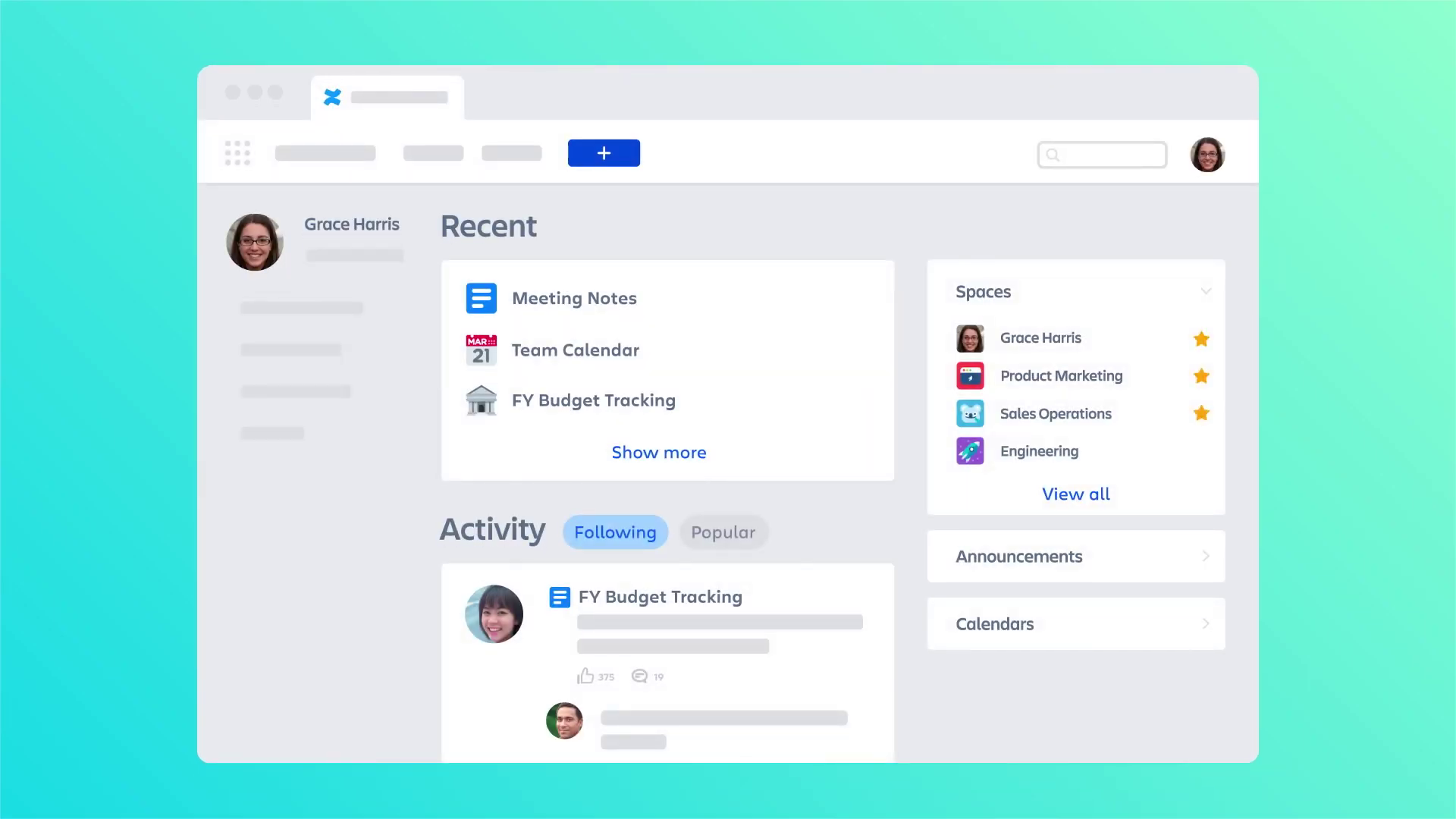 |
00:15 | The stylized "Home Dashboard" showcasing the vector abstraction technique. | Critical Juncture |
| 03 | 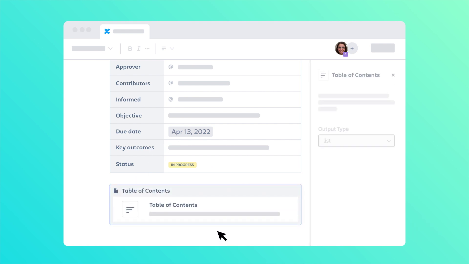 |
00:58 | Demonstration of the "Slash Command" macro, highlighting instructional clarity. | Production Deep Dive |
| 04 | [IMG ASSET 4] | 01:55 | Integration notifications (Teams/Slack) illustrating ecosystem connectivity. | Outcomes |
Project Timeline & Artifacts
-
Week 1: Discovery & Scripting
- Milestone: Script Approval.
- Artifacts:
Script_Draft_Tour_V3.docx. - Activity: Deconstructed the "Cloud Migration Guide" into a 2-minute voiceover script.
-
Week 2-3: Visual Style & Storyboard
- Milestone: Style Frame Sign-off.
- Artifacts:
Style_Frame_Dashboard_Dark_V2.ai,Storyboard_Sequence_Full_V4.pdf. - Quote (Client): "The simplified menu bars are great. They look like our product but are much easier to read at a glance."
-
Week 4-5: Illustration & Asset Creation
- Milestone: Asset Library Completion.
- Artifacts:
Vector_Asset_Lib_UI_V5.eps,Character_Set_Office_V3.ai. - Activity: Created over 50 unique vector assets representing buttons, avatars, and icons.
-
Week 6: Animation & Motion Design
- Milestone: First Cut (Animatic).
- Artifacts:
Animatic_Scene_04_Macros.mp4. - Quote (Advids): "We need to ease the transition between the desktop view and the mobile view to emphasize the cross-device compatibility."
-
Week 7: Refinement & Sound Design
- Milestone: Beta Release.
- Artifacts:
Video_Draft_V2_SoundMixed.mp4. - Activity: Integrating "click" and "pop" sound effects to give tactile feedback to the digital interactions.
-
Week 8: Final Polish & Delivery
- Milestone: Final Delivery.
- Artifacts:
Final_Master_Res_1080p.mov.
Production Deep Dive
Phase 1: The Abstraction Pivot (Critical Juncture)
Goal: To demonstrate the software's capability without the visual noise of a real screen recording.
Process: The team faced a "Information Density Challenge." A real screenshot of an Enterprise Resource Planning dashboard contains hundreds of data points. Showing this for 3 seconds in a video results in cognitive overload.
Action: Advids proposed a full reconstruction. We created a "Style_Frame_Master" that established rules for abstraction:
- Text blocks were replaced with grey rounded rectangles (greeking).
- Key headers were kept in legible, bold typography (e.g., "Recent," "Spaces").
- Avatars were simplified to colored circles.
This technique, applied to the Dashboard scene (Timestamp 00:15), allowed the viewer to instantly recognize the layout structure without trying to read irrelevant details.
Phase 2: Orchestrating the "Slash Command"
Goal: To explain a specific, high-speed feature (using the "/" key to open macros).
Process: The client needed to show that typing a single character triggers a menu. In real-time, this happens too fast for a video explanation.
Action: We manipulated time in the animation phase. We created a sequence where the character types "/", and the menu expands with an exaggerated "bounce" effect (Timestamp 00:58). We slowed down the selection process, allowing the viewer to read "Date," "Status," and "Table of Contents" before the cursor made a selection. This ensured instructional clarity over strict realism.
Feedback Loop: Refining the Ecosystem
Context: The video needed to show that the software doesn't exist in a vacuum.
Feedback (Client): "The notification from the external chat app needs to stand out more. It looks too similar to our native notifications."
Advids Action: We adjusted the color palette of the pop-up notification (Timestamp 01:55) to the distinct purple associated with the partner app (Microsoft Teams reference) and added a slight "shake" animation to draw the eye. This change was reviewed and approved via Vimeo Review.
Synergy Analysis: Technology Meets Design
This project exemplified the power of combining Vector Illustration Software with Motion Design.
- Human Expertise: The Advids creative team’s ability to "edit out" reality was crucial. Knowing what not to show was as important as what was shown. The decision to remove the browser chrome and OS taskbars focused the narrative entirely on the application.
- Technological Enabler: Using vector-based assets meant the project was resolution-independent. We could zoom in 500% on a specific button without any loss of quality, a feat impossible with rasterized screen captures.
Outcomes and Strategic Learnings
The final deliverable successfully bridged the gap between abstract features and concrete user benefits.
- Visual Retention: The use of the paper plane motif provided a strong visual anchor, reinforcing the concept of "sending" and "sharing" throughout the video.
- Scalability: By building a vector asset library, Advids provided the client with a toolkit for future videos. These assets can be reused for distinct feature updates without redesigning the entire interface from scratch.
- Conclusion: For complex Enterprise Resource Planning and collaboration tools, realism is often the enemy of clarity. A calculated, stylized abstraction is the most effective way to respect the viewer's time and attention.
Final Video
Author & Editor Bio

