
Executive Summary
In the complex world of auto financing, clarity is the ultimate currency. Capital One approached Advids to create an animated explainer video for their "Auto Navigator" tool—a digital solution designed to empower car buyers with real pricing and pre-qualification. The challenge was to translate dense financial data and a multi-step user journey into a seamless, engaging visual narrative. Leveraging The Advids Clarity & Engagement Framework, we delivered a high-fidelity motion graphics piece that perfectly balanced photorealistic product assets with a clean, branded User Interface (UI) aesthetic, resulting in a versatile asset for cross-platform user acquisition.
The Challenge: Transforming Financial Friction into Visual Flow
The traditional car-buying process is often perceived as opaque and stressful. Capital One needed to dismantle this perception visually. The core challenge lay in the duality of the visual requirements: the video needed to feature "real" cars to ground the offer in reality, yet it had to exist within a simplified, vector-based digital environment to represent the ease of the app.
The client provided high-resolution top-down imagery of vehicles, which needed to coexist with the flat, minimal design language of the Capital One mobile interface. A clumsy integration would risk making the video feel like a disjointed collage rather than a premium brand experience. Additionally, the narrative required explaining complex concepts—APR, term lengths, and pre-qualification—without bogging down the pacing.
!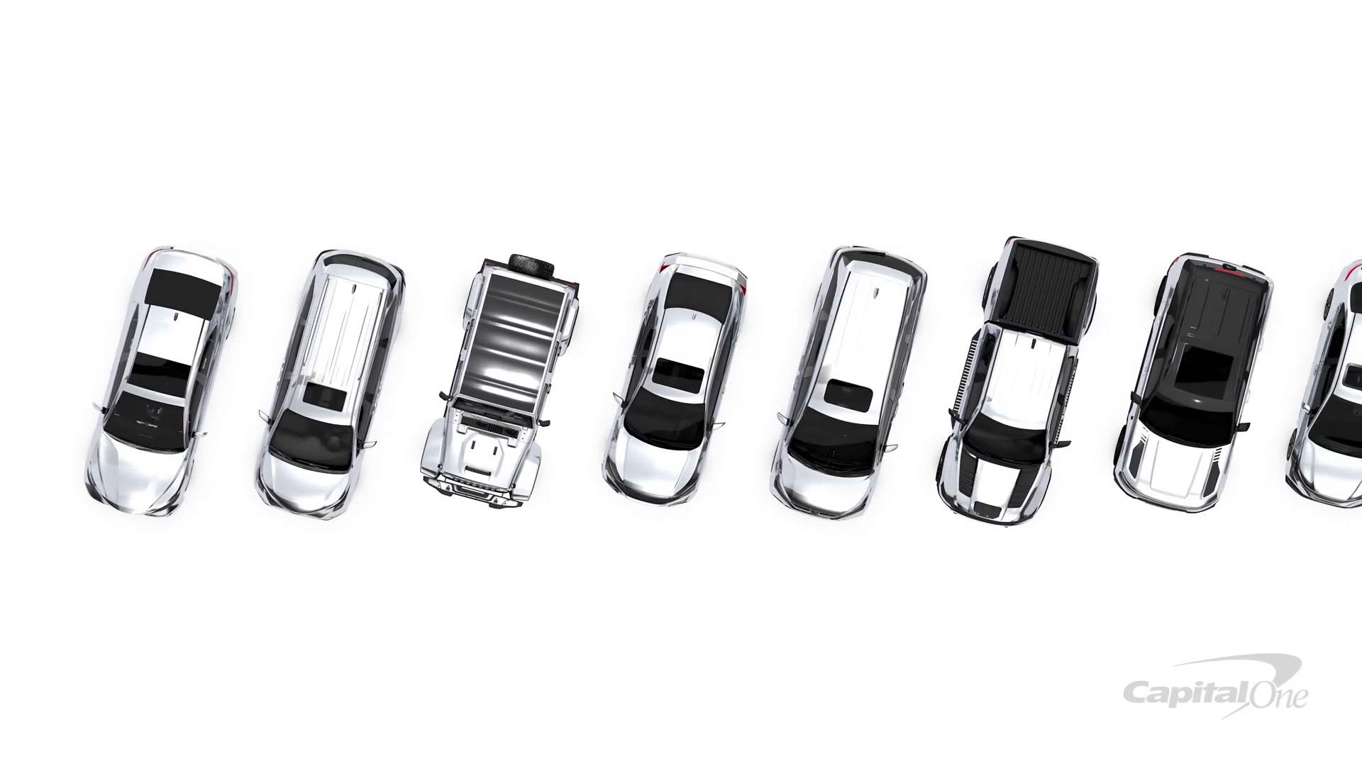
Timestamp: 00:01
Rationale: Visualizing the "Choice Paralysis" and market confusion using high-fidelity car assets arranged in a chaotic lineup.
The Solution: The Advids Clarity & Engagement Framework
To bridge the gap between financial utility and user engagement, we deployed The Advids Clarity & Engagement Framework. This specialized Module 2 workflow is engineered for explainer videos that demand high retention rates and crystal-clear communication.
Our approach focused on "Visual Economy"—using negative space and fluid motion to guide the viewer's eye through the app's features without cognitive overload. By treating the UI elements as characters in the story, we transformed a static app demo into a dynamic journey of empowerment.
Client Profile
- Industry: Financial Services / Fintech
- Focus: Consumer Banking and Auto Finance
- Scale: Fortune 500 Enterprise
Project Objective
- Primary: Increase adoption of the Auto Navigator app.
- Secondary: Educate users on the benefits of pre-qualification without credit score impact.
- Tone: Trustworthy, Modern, Empowering, and Transparent.
The Advids Clarity & Engagement Framework: Workflow Overview
| Project at a Glance | Details |
|---|---|
| Workflow Module | Module 2: 2D Motion Graphics/Explainer Videos |
| Core Strategy | UI Simulation & Kinetic Typography |
| Visual Style | Hybrid 2.5D (Photoreal assets + Vector UI) |
| Est. Duration | 7 Weeks |
| Collaboration Stack | Slack (Real-time Communication), Google Drive (Asset Management), Vimeo Review (Video Feedback) |
Project Timeline
- Week 1: Discovery & Scripting
- Milestone: Narrative alignment.
- Output:
Script_AutoNav_V3_Final.pdf
- Week 2: Visual Strategy & Style Frames
- Milestone: Defining the "White World" aesthetic.
- Output:
StyleFrame_Set_A_V2.png
- Week 3: Asset Creation & Optimization
- Milestone: Vectorizing the UI and prepping car assets.
- Output:
CapitalOne_UI_Kit_V4.ai,Car_TopDown_Cleaned.psd
- Week 4: Animatics
- Milestone: Establishing pacing and timing.
- Output:
Animatic_Flow_02_Rough.mp4 - Quote (Advids Lead): "We need to ensure the transition from the car lineup to the phone screen happens in under 2 seconds to maintain momentum."
- Week 5: Motion Design & Animation
- Milestone: Keyframe animation and easing.
- Output:
Motion_Draft_Scene3_V1.mp4
- Week 6: Sound Design & Mixing
- Milestone: Adding SFX and Voiceover sync.
- Output:
Audio_Mix_Master_V1.wav
- Week 7: Final Polish & Delivery
- Milestone: Final render and handoff.
- Output:
N1A277_Master_Del_ProRes.mov
Production Deep Dive
Phase 1: Architecting the Digital Environment
Goal: Create a visual language that feels native to the Capital One brand.
Process: The Advids design team began by deconstructing the client's mobile UI into editable vector layers. We created a master UI_Flow_V3.ai file, separating buttons, text fields, and car images to allow for independent animation.
Action: We established a high-key lighting setup within the animation software (After Effects) to ensure the white background remained pure RGB white (255, 255, 255), providing a clean canvas for the blue brand accents.
Phase 2: The Critical Juncture – The Visual Bridge
Challenge: Integrating the realistic car photos into the flat vector world. The raw photos looked too detailed and jarred against the clean lines of the app interface.
Solution: Advids implemented a "Hybrid Asset Integration" technique. We processed the Car_Asset_Sedan_Blue.png files by applying subtle color grading to cool down the warm tones of the photography, matching the cool blue of the UI. We then applied soft, diffuse drop shadows rather than realistic hard shadows. This "grounded" the realistic cars in the vector space, creating a cohesive 2.5D look that felt intentional rather than accidental.
!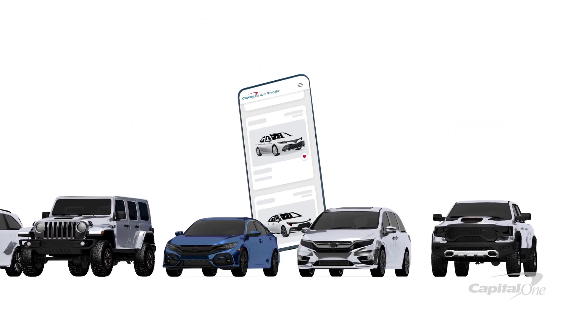
Timestamp: 00:08
Rationale: The "Solution Reveal" – demonstrating the seamless compositing of the realistic blue car onto the vector phone screen.
Feedback Loop: Refining the Aesthetic
Client: "The blue on the 'Save & View' button in
Style_Frame_V2.pnglooks a bit too teal compared to our app."Advids: "Good catch. We realized the color profile shifted during the export. We have corrected the hex code to Capital One's official Navy Blue in
Style_Frame_V3.pngand applied it across all UI assets."
Phase 3: Motion Design and Kinetic Typography
Goal: Visualize financial data without boring the audience.
Process: We utilized kinetic typography to highlight key benefits. Instead of static text, we animated the numbers for "Monthly Payment" and "APR" counting up/down to their final values. This subtle motion keeps the viewer's brain engaged.
Action: Using the "Graph Editor" in our animation software, we applied custom easing curves to the phone's scroll movements. This mimicked the physics of a real thumb swipe—fast at first, then slowing down—making the app simulation feel tactile and authentic.
!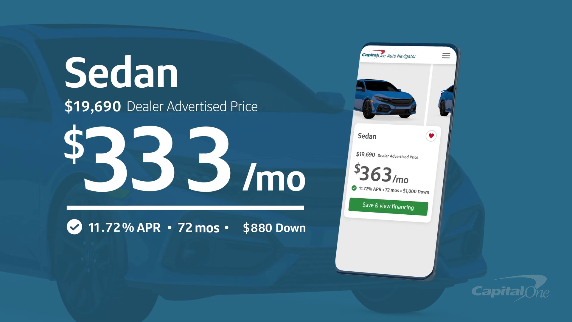
Timestamp: 00:25
Rationale: Kinetic Typography displaying financial data clearly, emphasizing the transparency of the tool.
Feedback Loop: Pacing the Narrative
Client: "In
Animatic_V2.mp4, the pause on the pre-qualification screen feels a beat too long. We want to get to the 'Test Drive' faster."Advids: "Understood. We have trimmed 1.5 seconds from that section in
Animatic_V3.mp4and overlapped the voiceover with the car transition to keep the energy high."
Synergy Analysis: Technology vs. Human Expertise
This project exemplified the synergy between advanced digital tools and human creative strategy.
- The Technology: We utilized advanced vector manipulation and compositing software to manage the hundreds of layers required for the UI simulation.
- The Human Touch: The software could animate the objects, but the feel of the animation—the "bounciness" of the car when selected, the "snap" of the text—was the result of experienced Advids animators manually tweaking velocity curves to evoke a sense of ease and reliability.
Outcomes & Strategic Learnings
The final deliverable successfully demystified the auto-financing process. By visualizing the app's utility through a high-end motion graphics lens, Advids provided Capital One with a versatile asset used across social media and web platforms.
![IMG ASSET 4]
Timestamp: 00:31
Rationale: The final "Call to Action" visual state, showing the car driving off, symbolizing the successful resolution of the user journey.
Key Learnings:
- Hybrid Assets Works: Blending realism (cars) with abstraction (UI) is a powerful way to show "real world" value in a "digital" context.
- Micro-interactions Matter: The small animations—button presses, scrolls, toggles—are what convince the viewer that the app is easy to use.
Would you like me to analyze another explainer video to determine the optimal balance between 2D and 3D assets for your next campaign?
Final Video
Author & Editor Bio

