
Executive Summary
In the complex world of personal finance, clarity is the ultimate currency. A leading Financial Technology provider approached Advids to create a corporate communication video that would demystify their platform. They needed to bridge the gap between the emotional reality of "growing up" (buying a home, retirement planning) and the technical utility of their software. Through The Advids Clarity & Engagement Framework, we delivered a seamless, motion-graphic narrative that utilizes a "continuous line" metaphor to guide viewers from life's milestones directly into the solution's dashboard.
The Challenge: Connecting Emotion to Logic
The client faced a dual challenge: their software is robust and data-heavy, but their target audience often feels overwhelmed by financial planning. A standard screen-recording walkthrough would be too dry and intimidating. They needed a visual language that acknowledged the stress of "adulting"—bills, family, responsibilities—while presenting their tool as the calming, organizing force. The communication barrier was translating the abstract concept of "financial future" into a tangible, watchable journey without resorting to clichéd stock footage.
The Advids Solution: The Continuous Journey Metaphor
We developed a concept centered on the "Financial Journey Line." This visual device starts as a simple, animated stroke that organically morphs into hills, roads, and timelines, physically connecting disparate life events. By utilizing a hybrid visual style—blending flat Two-Dimensional icons with Isometric structures—we created a world that felt both friendly and structurally sound.
Key Production Achievements:
- Hybrid Vector Style: Seamlessly integrating flat design with isometric projection to represent tangible assets like homes and cars.
- Stylized User Interface: Recreating the software dashboard as simplified vector art to ensure clarity on mobile devices.
- Kinetic Typography: synchronizing text animation with voiceover to reinforce key takeaways.
Client Profile
- Industry: Financial Technology (FinTech) & Wealth Management.
- Headquarters: North America.
- Target Audience: Families and individuals seeking long-term financial stability.
Core Objective
To increase user adoption by demonstrating how the platform simplifies complex financial tracking, transforming it from a chore into an empowering lifestyle habit.
Branded Workflow Overview: The Advids Clarity & Engagement Framework
For this project, we deployed our specialized 2D Motion Graphics/Explainer Videos module. This workflow prioritizes message retention and visual fluidity, ensuring that every frame advances the narrative.
Project at a Glance
| Component | Specification |
|---|---|
| Video Type | Isometric Corporate Communications Video |
| Visual Style | Vector Illustration, Isometric Projection, Kinetic Typography |
| Primary Tools | Adobe Illustrator, Adobe After Effects |
| Collaboration Stack | Slack (Real-time Communication), Google Drive (Asset Management), Vimeo Review (Video Feedback) |
| Project Duration | 7 Weeks |
| Deliverables | Main Explainer (1:45), Social Media Cut-downs (0:15, 0:30) |
Production Timeline
- Week 1: Discovery & Scripting
- Goal: define the emotional arc.
- Output:
Script_Financial_Journey_V4.docx.
- Week 2: Visual Strategy & Style Frames
- Goal: Establish the "Cyan World" color palette and isometric rules.
- Output:
Style_Frame_Iso_House_V2.ai.
- Week 3: Storyboarding & Animatics
- Goal: Map the "Continuous Line" flow.
- Artifact:
Animatic_Continuous_Line_Test.mp4.
- Week 4: Vector Illustration
- Goal: Create all custom assets and User Interface reconstructions.
- Action: Advids illustrators build the isometric city elements.
- Week 5: Motion Design & Animation
- Goal: Execute the trim paths and morphing transitions.
- Internal Quote: "The line speed needs to breathe with the narrator. It shouldn't feel like a race." — Advids Lead Animator.
- Week 6: Sound Design & Formatting
- Goal: Sync sound effects (SFX) with visual pops.
- Week 7: Final Mastering
- Output:
Final_Master_1080p_H264.mp4.
- Output:
The Production Deep Dive
Phase 1: Visualizing the Financial Landscape
The project began with establishing the visual language. The client's brand guidelines utilized a specific teal and cyan spectrum. The Advids design team created a "Vector Asset Library" (Vector_Library_Set_A.ai) containing flat icons for abstract concepts (like "time" or "responsibilities") and isometric structures for physical assets (houses, cars).
Communication Highlight: Defining the Blue
Early in the style frame phase, the client noted via Vimeo Review that the background blue felt too dark on mobile screens, potentially reducing text contrast. Advids adjusted the hex values to a lighter, more vibrant cyan and conducted a legibility test across devices, ensuring the white typography popped against the background.
!
Rationale: This frame at 0:02 captures the "Continuous Line" evolving into a road with a bicycle, establishing the central visual metaphor of the financial journey immediately.
Phase 2: The Isometric Evolution
A key challenge was balancing the "flat" nature of the timeline with the "depth" of real-life assets. We used Isometric Projection—a method of drawing Three-Dimensional objects in Two-Dimensional dimensions—to give weight to the "House" and "Car" elements.
!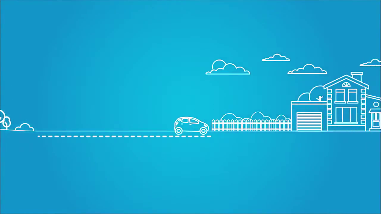
Rationale: At 0:06, the animation transitions from a flat line to an isometric landscape. This visual shift represents the transition from abstract planning to tangible asset acquisition.
Critical Juncture: The User Interface Reconstruction
The Challenge: The client's actual software interface contains dense tables, small fonts, and complex data grids. A direct screen recording would have been unreadable on smaller screens and would have clashed with the friendly, illustrative art style we had established.
The Constraints: We needed to show the functionality of the software without showing the clutter of the real interface. The visual fidelity had to be high enough to be recognizable but simplified enough to be aesthetically pleasing.
The Advids Solution:
Our team opted for a "Vector Reconstruction" approach. Instead of recording the screen, we redrew the entire software dashboard in Adobe Illustrator (UI_Reconstruction_V3.ai). We simplified the text into placeholder lines and turned complex data tables into clean, colorful bar graphs. This allowed us to animate the graphs growing and the numbers ticking up in Adobe After Effects, creating a dynamic representation of wealth accumulation that felt native to the video's world.
![IMG ASSET 4]
Rationale: The dashboard reveal at 1:04 showcases the reconstructed User Interface. It is clean, legible, and perfectly matches the video's color palette, proving the success of the vector reconstruction strategy.
Phase 3: Fluid Transitions and Kinetic Typography
To keep the viewer engaged, we utilized kinetic typography. Words like "Responsibilities" and "Bills" didn't just appear; they popped on screen synchronized with sound effects. The transitions were designed to be morphing rather than cutting. For instance, the "Continuous Line" transforms into the outline of a pie chart, reinforcing the connection between the user's life path and their investment portfolio.
Communication Highlight: Directional Flow
During the animation review on Vimeo Review, the client noticed that the compass needle at 0:35 was rotating counter-clockwise. They felt this subconsciously implied "going back in time." The Advids animation team corrected the keyframes to rotate clockwise, subtly reinforcing the theme of forward progress and future planning.
!
Rationale: The hourglass and compass icons at 0:58 demonstrate the clean iconography used to simplify abstract financial concepts, maintaining visual clarity.
Synergy Analysis: Technology Meets Expertise
This project exemplified the synergy between standard vector tools and high-level creative strategy.
- Technology: We leveraged Adobe Illustrator's grid tools for precise isometric drawing and Google Drive for seamless asset sharing between our illustrators and animators.
- Human Expertise: The true value lay in the Advids team's ability to interpret a complex financial product into a human story. The decision to "rebuild" the User Interface rather than record it was a strategic human choice that significantly improved the final video's quality.
Outcomes and Strategic Learnings
The final video successfully translated the anxiety of financial management into a visual narrative of control and ease.
- Clarity Achieved: The "Continuous Line" metaphor proved to be an effective device for explaining the "all-in-one" nature of the platform.
- Brand Consistency: By strictly adhering to the cyan/teal palette, the video acts as a seamless extension of the client's website.
- Asset Versatility: The vector assets created by Advids (houses, icons, UI elements) were provided to the client for use in their static marketing materials (PDFs and slide decks), providing value beyond the video itself.
Next Step for You:
Does your software platform have a complex interface that creates a barrier to entry for new users? Would you like Advids to conduct a Visual Simplification Audit to see how we can turn your dashboard into a compelling marketing story?
Final Video
Author & Editor Bio

