
Summary
This case study details the partnership between FedEx and Advids to produce a 2D motion graphics explainer video. The primary goal was to demystify the package shipping process for new customers. By implementing The Advids Clarity & Engagement Framework, our team navigated the challenge of adhering to FedEx's strict global brand guidelines while creating a warm and approachable narrative. The 6-week project involved a critical pivot in visual strategy to create a unique motion language that was undeniably "FedEx," resulting in a clear, effective, and brand-perfect customer education tool.
The Challenge
FedEx, a global leader in logistics, identified a key friction point for infrequent shippers: the perceived complexity of the shipping process. Steps involving packing, online label creation, and drop-off options were causing confusion and leading to increased customer support inquiries. FedEx needed a simple, scalable, and visually engaging tool that could walk any customer through the process in under 90 seconds, reinforcing ease-of-use and driving adoption of their online self-service tools.
The Solution
Advids developed a character-driven 2D animated explainer. We translated the multi-step, technical process into a simple, linear story. By focusing on a single character's journey, we built an approachable narrative. The core of the solution was our specialized 2D animation pipeline, which focused on translating FedEx's static brand identity into a fluid and professional motion language that guided the viewer seamlessly from one step to the next.
Client Profile
FedEx: A multinational conglomerate holding company focused on transportation, e-commerce, and business services. Its brand is synonymous with speed, reliability, and global reach.
Project Objective
To create a "How to Ship a Package" explainer video that simplifies the customer journey, reduces user anxiety, and remains 100% compliant with FedEx's comprehensive brand identity guidelines.
The Advids Clarity & Engagement Framework
For this project, we deployed our workflow for 2D motion graphics. This framework prioritizes clarity and narrative flow, ensuring that complex information is broken down into digestible, engaging visual steps. The key stages included brand-centric visual strategy, vector asset creation, and fluid keyframe animation to ensure the final product was both informative and visually polished.
Project at a Glance
| Feature | Detail |
|---|---|
| Client | FedEx |
| Agency Partner | Advids |
| Project | "How to Ship a Package" 2D Explainer Video |
| Video Type | 2D Motion Graphics/Explainer |
| Estimated Duration | 6 Weeks |
| Core Technologies | Vector Illustration Software (Adobe Illustrator), 2D Animation Suite (Adobe After Effects), Audio Editing Software |
| Collaboration Stack | Slack (Real-time Communication), Google Drive (Asset Management), Vimeo Review (Video Feedback) |
| Final Deliverables | 1:14 Minute Animated Video, Social Media Cutdowns |
Project Timeline
- Kickoff & Scripting (Week 1)
- Milestone: Strategic alignment and script finalization.
- Key Outputs: Script_V4_Approved.docx (voice-over and on-screen text locked).
- Quote: "The tone must be simple, direct, and encouraging. We're removing barriers, not adding more information."
- Visual Strategy & Initial Style Frames (Week 2)
- Milestone: Development of the initial visual concept.
- Key Outputs: Style_Frames_Set_A_V1.png (first-pass designs).
- The Brand Alignment Pivot (Week 3)
- Milestone: A critical strategy revision to align with the brand's "feel."
- Key Outputs: Brand_Alignment_V2_Style_Frames.png (approved character and world design).
- Quote: "This is it. It feels professional, clean, and unmistakably FedEx."
- Storyboarding & Animatic (Week 4)
- Milestone: Approval of the visual narrative flow.
- Key Outputs: Storyboard_V3.pdf, Animatic_V2.mp4 (a rough, timed-out version of the video with static images and scratch audio).
- Animation & Production (Week 5)
- Milestone: Full animation production, including character movement and transitions.
- Key Outputs: Final_Animation_V1_Review.mp4 (first full draft for review).
- Sound Design & Final Mastering (Week 6)
- Milestone: Integration of professional voice-over, music, and sound effects.
- Key Outputs: Final video files delivered.
The Production Deep Dive: From Brand Guidelines to Animated Clarity
Phase 1: Scripting and Visual Strategy
Goal: To establish a clear, simple narrative that guides the user from the decision to ship to the final drop-off.
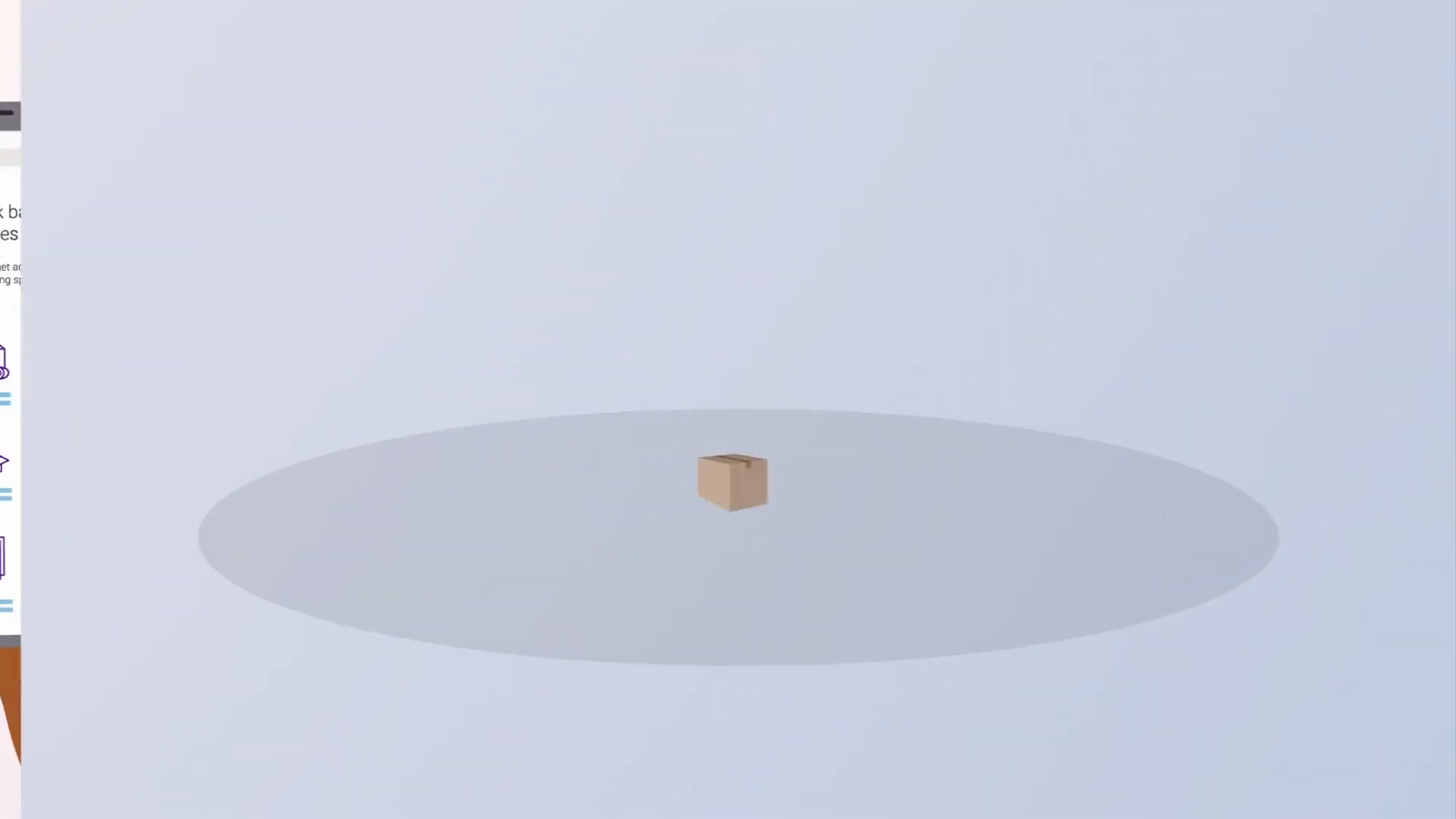
Process: The script was the foundation. The Advids team worked with FedEx to distill the process into four key acts: 1. Get Supplies, 2. Pack, 3. Create a Label, 4. Drop Off. The script was intentionally sparse, relying on the visuals to do the heavy lifting. The visual strategy was to use a single, relatable character to create a cohesive journey for the viewer.
(Timestamp: 102s) The final call-to-action reinforces the simplicity of the process with a brand-accurate drop box.
Workflow Action: Our team focused on "show, don't tell." Instead of listing requirements, we showed the character easily accessing packing tips on her phone and logging into the FedEx website. This visual-first approach set the stage for the entire production.
Phase 2: The Critical Juncture: The Brand Alignment Challenge
Goal: To create a visual style that was both approachable and 100% compliant with the strict FedEx brand identity.
Process: This was the project's most significant hurdle. Our first submission of style frames (Style_Frames_Set_A_V1.png) was functionally correct—it used the right Pantone colors and a clean 2D style. However, the feedback was that it felt "generic" and didn't capture the professional, reliable essence of the FedEx brand.
(IMG ASSET 1)
(Timestamp: 4s) The final, approved character design set in the brand-centric environment.
The Technical Breakthrough
The Challenge: How do you innovate within one of the world's most rigid brand books?
Constraint Management: We could not introduce new colors, fonts, or graphic elements. The solution had to be found within the existing brand language.
The Breakthrough: The Advids creative team held a dedicated workshop to define a "FedEx motion language." We moved away from using FedEx Purple as just an accent and made it a core background element, creating a deeply branded, professional "world." We redesigned the character to be professional but friendly (the blue cardigan). Most importantly, we defined a motion style based on clean, efficient, and fast-paced transitions, mirroring the brand's promise of speed and reliability. This new direction, presented in Brand_Alignment_V2_Style_Frames.png, was approved immediately.
Feedback Loop: Defining the FedEx Motion Language
Client: "We've reviewed Style_Frames_Set_A_V1.png. The elements are correct, but the overall feel is too generic. It doesn't feel like FedEx. It's missing our professional and efficient personality."
Advids: "We understand completely. We've gone back to the brand book, not just for colors, but for attributes. We're developing a new visual strategy that uses the core brand purple more prominently to create a professional environment and defines a motion language based on clean, efficient transitions. Please see Brand_Alignment_V2_Style_Frames.png."
Client: "This is a fantastic direction. This feels like us. Approved."
Phase 3: Vector Illustration and Keyframe Animation
Goal: To build all project assets and bring them to life with fluid, clear animation.
Process: With the visual style locked, our illustrators created the full library of vector assets—the character, the office, the laptop, the mobile phone, the FedEx box, and the drop box. Each asset was optimized for animation. The Advids animation team then began the Keyframe Animation process, focusing on smooth Easing and Interpolation to make the character's movements and the User Interface interactions feel natural and seamless.
(IMG ASSET 2)
(Timestamp: 16s) The vector illustration of the mobile User Interface, a key asset for the digital-first message.
(IMG ASSET 3)
(Timestamp: 45s) The desktop website animation was critical for showing the label creation step clearly.
Feedback Loop: Bridging the Digital-Physical Gap
Client: "We've reviewed the Animatic_V2.mp4 on Vimeo Review. The flow is good, but the transition from the website (0:48) to the labeled box (0:56) is too fast. It's a "magic" leap. We need to show the user that they print and attach the label."
Advids: "That's a critical point. We will add a new 2-second beat. We'll show the label printing and the character's hands clearly applying it to the box. This will bridge the digital and physical steps and make the process more tangible for the viewer."
This change was implemented, resulting in the clear, easy-to-follow sequence seen in the final video.
Synergy Analysis: Technology vs. Human Expertise
This project demonstrates the balance between efficient animation technology and the human expertise required for brand strategy.
- Technology-Powered Contributions:
- Vector Illustration Software: Allowed for the creation of scalable, lightweight, and brand-accurate assets that could be easily animated.
- 2D Animation Suite: Enabled our team to quickly produce high-quality Keyframe Animation, create seamless transitions, and integrate Kinetic Typography.
- Advids’ Visualization Craft (Human Expertise):
- Brand Psychology: The ability to look beyond a brand book's technical rules (Pantone colors) and understand its core personality (professionalism, reliability).
- Narrative Simplification: The skill to take a multi-step, technical process and distill it into a simple, character-driven story.
- Strategic Problem Solving: Identifying why the initial style frames felt "wrong" (The Critical Juncture) and developing a creative solution that strengthened brand alignment.
Outcomes & Strategic Learnings
A Scalable Tool for Customer Education
The final video is a clear, effective, and infinitely scalable tool that FedEx can deploy across its website, social media channels, and in-store displays. It directly addresses the most common customer questions, empowering users and reducing the load on support teams.
The "Brand as a World" Concept
The key learning from The Brand Alignment Challenge was the success of using the brand's core identity as the environment itself, not just as decoration. This created an immersive, professional, and trustworthy feel that resonated perfectly with the FedEx identity.
Clarity Bridges Digital and Physical
The project's success hinged on clearly connecting the digital actions (visiting the website, creating a label) with the physical actions (packing a box, finding a drop box). The 2D explainer format was the perfect medium to make this abstract connection simple and concrete. The final asset now serves as a high-performing component of the FedEx customer onboarding process.
Final Video
Author & Editor Bio

