
Case Study: FieldRoutes & Advids - Simplifying the Abstract with Motion Design
A case study on leveraging The Advids Clarity & Engagement Framework to translate a complex software-as-a-service (SaaS) platform into a clear, concise, and brand-aligned 2D motion graphics explainer video.
Summary
This case study examines the production of a 2D motion graphics explainer video for FieldRoutes, a leading software provider for field service industries. The objective was to simplify the abstract benefits of automation—such as automated payment reminders and scheduling—into a tangible visual narrative. Over a six-week production cycle, Advids developed a unique motion language aligned with the FieldRoutes brand, transforming a complex Business-to-Business service into an easy-to-understand story of "Simplify. Scale. Grow."
The Challenge
FieldRoutes' platform solves a problem that is invisible: the wasted hours and lost revenue from manual, repetitive administrative tasks. The client needed to move beyond feature lists and show how their software transforms a stressed, overworked office (the "problem") into a streamlined, automated, and scalable business (the "solution"). The challenge was to make these abstract benefits feel immediate, tangible, and visually compelling in under 90 seconds.
The Solution
Advids employed our Clarity & Engagement Framework, a specialized workflow for 2D motion graphics. Instead of focusing on technical complexity, this process prioritizes narrative clarity and brand alignment. Advids collaborated closely with FieldRoutes to develop a clean, character-driven visual style and a distinct "motion language." This allowed us to use simple visual metaphors (clocks, calendars, dollar icons) to clearly communicate the core value proposition: saving time and money through automation.
Client Profile
FieldRoutes: A leading cloud-based software provider for field service industries. Their platform is designed to automate and manage all aspects of a service business, from scheduling and routing to customer management and billing.
Project Objective
To create a high-impact 2D animated explainer video that clearly articulates the benefits of the FieldRoutes automation platform. The video needed to be visually engaging, strictly aligned with the brand's "Simplify" ethos, and effective at converting prospective customers by making the value proposition instantly clear.
The Advids Clarity & Engagement Framework
For this project, Advids utilized our proven framework designed for 2D motion graphics, which emphasizes a strategic approach to visual communication:
- Visual Strategy: Defining the "look and feel," including character design, iconography, and color theory, to ensure 100% brand alignment.
- Storyboarding: Translating the script into a sequential visual narrative, focusing on pacing and logical flow.
- Vector Illustration: Creating a library of high-quality, scalable, and on-brand visual assets.
- Motion Design: Developing a unique "motion language" (transitions, keyframe easing, and animations) that reinforces the brand's personality.
Project at a Glance
| Feature | Detail |
|---|---|
| Client | FieldRoutes |
| Agency Partner | Advids |
| Project | 2D Motion Graphics Explainer Video |
| Video Type | 2D Motion Graphics/Explainer |
| Estimated Duration | 6 Weeks |
| Core Technologies | Vector Illustration Software (Adobe Illustrator), 2D Animation Suite (Adobe After Effects), Audio Editing Software |
| Collaboration Stack | Slack (Real-time Communication), Google Drive (Asset Management), Vimeo Review (Video Feedback) |
| Final Deliverables | 1:07 High-Definition Animation, Social Media Clips |
Project Timeline
- Kickoff & Scripting (Week 1)
- Milestone: Strategic alignment on the core message and target audience.
- Key Outputs: Finalized script (Script_V4_Final_Approved.pdf).
- Quote: "We need to establish the 'problem' of manual work fast, then pivot to the solution. Our audience is busy."
- Visual Strategy & Storyboarding (Week 2)
- Milestone: Client approval of the visual direction and narrative flow.
- Key Outputs: Style_Frames_Set_C_V3.png (featuring the technician character and icon set), Storyboard draft.
- The "Motion Language" (Week 3)
- Milestone: Approval of the initial animatic.
- Key Outputs: Storyboard_Animatic_V2.mp4 (testing pacing and motion principles).
- Quote: "The key is the motion language. Let's use smooth, sliding keyframes to feel efficient."
- Full Asset Creation & Animation (Week 4-5)
- Milestone: All scenes animated with final vector assets.
- Key Outputs: Full-length animation draft (V1) for review.
- Audio & Final Polish (Week 6)
- Milestone: Integration of professional voice-over, music, and sound effects.
- Key Outputs: Final_Animation_V3_With_Audio.mp4.
- Final Delivery (Week 6)
- Milestone: Final project files delivered to the client.
The Production Deep Dive: Crafting a Narrative of Efficiency
Phase 1: Visual Strategy: From Script to a Cohesive Visual World
Goal: To establish a clear visual style that was unique to FieldRoutes and aligned with their "Simplify" motto.
Process: The project began with a deep dive into the FieldRoutes brand guide. The Advids creative team then developed a set of visual rules: characters would be professional but minimalist, icons would be bold and instantly recognizable, and the brand's blue-focused palette would be used for backgrounds and structure, with the pink/red as a key "action" color.
(IMG ASSET 1)
(Timestamp: 0s) The "Problem" Setup. This frame establishes the core conflict of manual work and time pressure.
Workflow Action: We presented Style_Frames_Set_C_V3.png to the client. This set defined the final look for the technician character, the manager character, and the core iconography for "Appointment Reminders" and "Payment Follow-ups."
(Timestamp: 27s) Iconography & Branding. This highlights a key feature ("Payment Follow-ups") using the clean vector illustration style.
Feedback Loop: Nailing the Brand's Visual DNA
Client: "We've reviewed the new style frames. We love the clean feel. One note: The pink/red on the technician's shirt. Is that an official brand accent? Let's ensure it matches our guide's secondary accent color precisely."
Advids: "Excellent point. We will color-pick the exact HEX code from your brand guide for that accent. We'll also use that same color to highlight key call-to-actions, like the checkmarks (00:56), to create visual consistency. Revised frames are on the way."
Phase 3: The Critical Juncture: Defining the FieldRoutes "Motion Language"
Goal: To move beyond static images and create a set of motion principles that felt efficient, modern, and aligned with the FieldRoutes brand.
Process: This was the critical challenge. A brand-aligned video isn't just about using the right colors; it's about how things move. The Advids motion design team held an internal workshop to define the "FieldRoutes Motion Language."
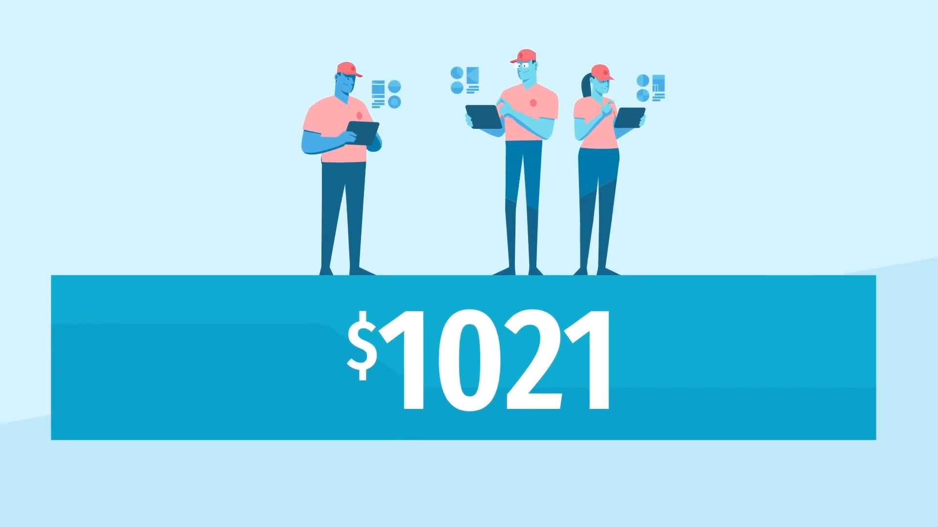
(IMG ASSET 2)
(Timestamp: 12s) The "Solution" Pivot. This frame represents the "Scale" concept, showing a manager overseeing a digitized, efficient team.
The Breakthrough: We decided against overly complex or "bouncy" animations, which would feel cartoony. Instead, the motion language was built on:
- Fluid Easing: Elements (like the calendar at 00:15) slide into place with smooth, fast keyframe easing, feeling purposeful and efficient.
- Minimalist Gestures: Characters use simple, clear gestures (like tapping a tablet at 00:09) rather than complex walking, keeping the focus on the technology.
- Icon Pops: Icons "pop" in with a slight, controlled overshoot to draw the eye without being distracting.
Workflow Action: These principles were first applied to the Storyboard_Animatic_V2.mp4. The client immediately saw the difference. The pacing felt faster, the transitions cleaner, and the entire video felt more professional and "tech-forward."
Feedback Loop: Optimizing the Narrative Pace
Client: "We've reviewed the first animatic (Storyboard_Animatic_V1.mp4). The overall story is correct, but the 'problem' setup with the worker at the desk feels a bit slow. Our customers feel this pain; we don't need to dwell on it."
Advids: "We agree. The pivot to the solution is the most important part. In Storyboard_Animatic_V2.mp4, we've cut the 'problem' shot (00:00-00:07) down by two seconds and created a faster, more dynamic transition into the 'solution' scene (00:09). This gets us to the product's benefits much faster."
Phase 4: Animation and Integration: Bringing Simplicity to Life
Goal: To execute the full animation, integrating all vector assets and the new motion language.
Process: With the visual style and motion principles locked, the Advids animation team scaled up production. This phase involved animating all the individual scenes—the weekly schedule filling up, the "Autopay" checkmarks, the customer renewal cycle.
(IMG ASSET 3)
(Timestamp: 20s) Information Design. This shot demonstrates the translation of "scheduling" into a clean, easy-to-read visual.
Workflow Action: The final step was integration. The professional voice-over was timed with the Kinetic Typography (on-screen text) to reinforce key messages. Subtle sound effects were added to give the icon animations and transitions a satisfying, tactile feel, completing the user experience.
Synergy Analysis: Technology vs. Human Expertise
This project demonstrates how the right tools and the right talent combine to create effective communication.
- Technology-Powered Contributions:
- Vector Illustration: Adobe Illustrator allowed for the creation of crisp, scalable assets that look perfect on any screen, from a mobile phone to a trade-show monitor.
- Keyframe Animation: Adobe After Effects provided the powerful tools needed to execute the smooth easing and complex interpolations defined in our "motion language."
- Digital Collaboration: Tools like Vimeo Review enabled the client to provide specific, time-stamped feedback (e.g., "at 00:10, can this icon pop faster?"), streamlining the revision process.
- Advids’ Visualization Craft (Human Expertise):
- Strategic Storytelling: The ability to distill a complex Business-to-Business service into a simple, 60-second problem-solution narrative.
- Brand Translation (The Critical Juncture): The creative expertise to invent a motion language that felt authentic to the client's brand, turning a static guide into a dynamic identity.
- Narrative Pacing: The editorial judgment to know when to speed up (the "problem") and when to slow down (the "benefits") to keep the audience engaged.
Outcomes & Strategic Learnings
- A Clear, Conversion-Focused Asset: FieldRoutes received a high-quality, evergreen marketing asset that explains their complex service in just over 60 seconds. The video effectively communicates the primary benefits of automation, serving as a powerful tool for their sales team and marketing funnels.
- The "Motion Language" as a Scalable Asset: The "motion language" developed by Advids for this video now serves as a blueprint for FieldRoutes' future visual marketing, ensuring brand consistency across all animated content.
- The Power of Simplicity: This project reinforced that in 2D explainers, clarity trumps complexity. The "Brand Alignment Challenge" was solved by committing to a minimalist, efficient aesthetic that mirrored the product's own value proposition.
Final Video
Author & Editor Bio

