
A case study on how Advids utilized The Clarity & Engagement Framework to translate a powerful, multi-featured digital signage platform into a clear, compelling, and scenario-driven 2D motion graphics video.
Summary
This case study details the 7-week production of a 2D explainer video for Link\&Link, a comprehensive cloud-based digital signage platform. The primary challenge was to communicate a high density of abstract features—from cloud-based publishing to Internet of Things integration—without overwhelming the audience. Advids implemented a critical narrative pivot, shifting from a feature-based list to a scenario-driven story. This strategic change, combined with a clean vector visual style and fluid user interface animation, successfully translated the complex Software as a Service product into a tangible, relatable, and valuable solution for multiple industry verticals.
The Challenge
Link\&Link’s platform is an all-in-one "brain" for digital marketing, allowing businesses to manage content across hundreds of screens. However, its greatest strength—its versatility—was also its biggest marketing hurdle. The client needed a video that could clearly explain its power to diverse audiences (retail, restaurants, healthcare, museums) while showcasing a long list of features like cloud publishing, content templates, multi-screen sync, and motion-detection integration. An initial "feature-list" approach proved to be informative but dry and failed to connect with the audience on a practical level.
The Solution
Advids employed its Clarity & Engagement Framework, a specialized workflow for 2D motion graphics. The solution was rooted in a strategic narrative redesign. Instead of just listing features, Advids' strategy team restructured the entire video around real-world user scenarios. This allowed the video to introduce each feature as a direct solution to a relatable problem—such as reducing customer anxiety in a restaurant or creating interactive exhibits in a museum. This scenario-based approach, supported by a clean and scalable vector visual language, made the platform's benefits immediately clear and compelling.
Client Profile
Link\&Link is a technology provider offering a next-generation, cloud-based media resource management and publishing system for digital signage. Their solution is designed to be highly secure, efficient, and adaptable to the needs of various industries, enabling remote content management from any device.
Project Objective
To create a comprehensive 2D explainer video that clearly demonstrates the power, flexibility, and ease of use of the Link\&Link platform. The primary goal was to generate qualified leads by showing potential customers how the platform could solve their specific marketing and operational challenges.
The Advids Clarity & Engagement Framework
For this project, Advids executed a specialized 2D motion graphics workflow designed for maximum clarity and audience retention.
- Narrative Strategy: Focusing on "why" a feature matters, not just "what" it is.
- Scalable Asset Creation: Developing a cohesive library of vector illustrations (icons, characters, scenes) that can be adapted for multiple use-cases while maintaining brand consistency.
- Fluid Motion Design: Using smooth keyframe animation, easing, and interpolation to make transitions seamless and user interface animations feel intuitive.
- Clarity-First Scripting: Translating complex technical jargon into simple, benefit-driven language.
Project at a Glance
| Feature | Detail |
|---|---|
| Client | Link\&Link |
| Agency Partner | Advids |
| Project | 2D Motion Graphics Explainer Video |
| Video Type | 2D Motion Graphics/Explainer |
| Estimated Duration | 7 Weeks |
| Core Technologies | Vector Illustration Software, 2D Animation Suite, Audio Editing Software |
| Collaboration Stack | Slack (Real-time Communication), Google Drive (Asset Management), Vimeo Review (Video Feedback) |
| Final Deliverables | 2:45 Full-Length Explainer Video, 3x 30-second Social Media Edits |
Project Timeline
- Kickoff & Scripting (Week 1)
- Milestone: Strategic alignment and script development.
- Key Outputs: Script_V3_Final.pdf.
- Quote: "People see our feature list and their eyes glaze over. We need to show them why it matters to their specific business."
- Visual Strategy & Storyboarding (Week 2)
- Milestone: Initial storyboard (feature-list) presented and revised.
- Key Outputs: Storyboard_V1_FeatureList.pdf (Rejected), Storyboard_V2_ScenarioFlow.pdf (Approved).
- The Critical Pivot (Week 3)
- Milestone: Client approval of the new scenario-based narrative flow.
- Key Outputs: Locked-in creative direction.
- Quote: "The new scenario flow in Storyboard_V2 is perfect. It connects the dots. This is what we were missing."
- Illustration & Asset Creation (Week 3-4)
- Milestone: Development and approval of the complete visual language.
- Key Outputs: Style_Frames_Set_A_V3.png (with final brand palette); Full library of vector assets (icons, characters, backgrounds).
- Animation & Motion Design (Week 5-6)
- Milestone: Full video animation, including all scenes and user interface elements.
- Key Outputs: Full_Animation_V1.mp4 (sent for review).
- Revisions & Sound Design (Week 7)
- Milestone: Feedback implemented; professional voiceover, music, and sound effects added.
- Key Outputs: Full_Animation_V2_Feedback.mp4.
- Final Delivery (Week 7)
- Milestone: Final, mastered video files delivered to the client.
The Production Deep Dive: From Abstract Cloud to Tangible Solution
Phase 1: The Critical Pivot: From Feature-List to User-Story
Goal: To establish a narrative structure that could explain a complex platform without overwhelming the audience.
Process: The project's most significant challenge was narrative. The initial storyboard, Storyboard_V1_FeatureList.pdf, was a logical tour of the platform's architecture. It was accurate but failed to build an emotional or practical connection.
The Critical Juncture: Recognizing this, the Advids' strategy team proposed a fundamental shift.
Feedback Loop: The Strategic Storytelling Pivot
- Client: "We've reviewed the first storyboard (Storyboard_V1) on Vimeo Review. All our features are there, but it feels... boring. It doesn't excite us. It's not selling the solution."
- Advids: "We agree. The feature-list approach is too abstract. We've drafted a new flow, Storyboard_V2_ScenarioFlow.pdf, that shifts to real-world scenarios. We'll show a restaurant owner using the queuing system to make customers happy, and show a clinic using it to manage patient flow. We introduce the features as solutions to their problems."
- Client: "This is it. This is exactly what we need. Let's proceed with this new flow."
Action: This pivot became the guiding principle for the entire production. The video was restructured to follow different user journeys, using each scenario to organically introduce the platform's features.
(Timestamp: 136s) The restaurant scenario, showing the "Unhappy" emoji changing to "Happy," was a direct result of the narrative pivot, linking a feature (queuing) to a clear customer benefit.
Phase 3: Building the Visual World: A Scalable Vector Language
Goal: To design a clean, modern, and friendly visual style that could be scaled across many different industries.
Process: With the narrative locked, the Advids' design team began building the visual world of Link\&Link. The style needed to be professional and tech-forward, yet simple and approachable. A flat, 2D vector style was chosen.
(IMG ASSET 1)
(Timestamp: 15s) An early challenge was visualizing the abstract "brain" of the platform. Advids' design team created this clean diagram to make the cloud architecture (Storage, Analysis, Approval, Publish) feel organized and accessible.
Action: A comprehensive visual library was created, including icons, device mockups, and character templates. This ensured that even though the video jumps between a retail store, a museum, and a clinic, the visual language remains 100% consistent and on-brand.
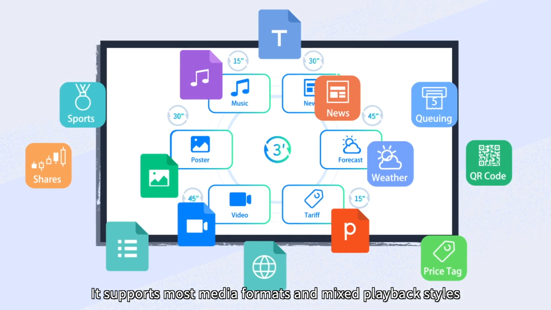
(IMG ASSET 2)
(Timestamp: 29s) A key graphic demonstrating the platform's versatility. The design team had to create a cohesive set of icons to represent diverse media formats (Music, News, Weather, Video) in a single, easy-to-understand layout.
Feedback Loop: Unifying the Brand Palette
- Client: "The first style frames (Style_Frames_Set_A_V2.png) look good, but the colors feel a bit generic. It could be for any tech company."
- Advids: "That's a fair point. We'll revise the palette to more intentionally use your core 'Link\&Link' blue as a primary accent color across all scenes. This will tie the different scenarios together and reinforce your brand identity."
Phase 4: Motion Design: Breathing Life into Interfaces and Ideas
Goal: To make the Link\&Link software platform look powerful, intuitive, and easy to use through fluid animation.
Process: This is where Advids' animation specialists brought the static vector assets to life. The focus was on two key areas:
- Seamless Transitions: Creating smooth, engaging segues between the abstract (the cloud) and the concrete (the user scenarios).
- User Interface Animation: Animating the software mockups to demonstrate functionality.
(IMG ASSET 3)
(Timestamp: 57s) The "Online Editing" sequence was critical. Advids' animators used subtle keyframe animation, easing, and reveals to make the software look responsive and user-friendly, as if the viewer were using it themselves.
Action: By applying principles of professional motion design, the team ensured the video felt dynamic and high-quality. Simple actions, like a character swiping a phone or a "Hot Sale" sign appearing on a screen, were animated with precision to feel satisfying and clear, reinforcing the platform's responsiveness.
Synergy Analysis: Technology vs. Human Expertise
This project's success depended on balancing 2D animation tools with strategic human oversight.
Technology-Powered Contributions:
- Vector Illustration Software: Allowed for the creation of a scalable and lightweight asset library, ensuring brand consistency across all scenes and characters.
- 2D Animation Suite: Enabled the team to execute complex keyframe animations, morphing transitions, and kinetic typography.
- Digital Audio Workstations: Used to mix the professional voiceover with background music and targeted sound effects (like notification chimes) to create an immersive audio landscape.
Advids’ Visualization Craft (Human Expertise):
- Narrative Strategy (The Pivot): The human-led decision to abandon the feature-list for a scenario-based story was the single most important factor in the project's success.
- Clarity-First Scripting: The expertise to take dense, technical concepts ("motion detected automation") and translate them into simple, compelling script lines.
- Visual Problem-Solving: The design skill to visualize abstract ideas, like "Cloud Analysis" or "mixed playback styles," in a way that is immediately understandable to a non-technical audience.
- Motion Theory: The artistic knowledge of easing, timing, and interpolation to make the animations feel fluid and professional, not robotic.
Outcomes & Strategic Learnings
A Clear, Compelling Sales Tool
The final video successfully transformed a complex, feature-dense platform into a clear, engaging, and solution-oriented story. The client received a powerful sales and marketing asset that could be used on their website, in email campaigns, and at trade shows to explain their product's value in under three minutes.
The Power of the "Conceptual Pivot"
This project was a classic reminder that for explainer videos, how you tell the story is more important than what features you list. By focusing on the user's problem and presenting the feature as the solution, the video built a much stronger connection with the target audience.
Scalable Creative Assets
The comprehensive library of vector illustrations (icons, characters, scenes) created for this video became a valuable asset for the client. Link\&Link could now use these assets, or have them easily repurposed by Advids, for future videos, web pages, or marketing collateral, ensuring long-term brand consistency.
Final Video
Author & Editor Bio

