
1. Summary
In the competitive landscape of financial services and insurance, speed and prioritization are paramount. Total Expert, a customer engagement platform, needed to communicate the value of their "Focused View" feature—a tool designed to help sales teams prioritize high-impact actions. Advids partnered with the client to produce a high-fidelity 2D Motion Graphics Explainer Video that transforms abstract algorithms into tangible, visual benefits. By utilizing a clean, isometric design language, we successfully simplified complex User Interface workflows into a compelling narrative that demonstrates a clear Return on Investment.
2. The Challenge: Visualizing the Invisible Algorithm
The core challenge lay in the intangible nature of the product. "Focused View" is an algorithmic sorting engine that organizes leads based on potential. Visually, this is merely a list of names on a screen—a concept that is difficult to make exciting or cinematic.
The client faced two primary hurdles:
- Complexity: Showing the actual, detailed User Interface would clutter the screen and distract from the core value proposition.
- Abstraction: They needed to visualize the feeling of efficiency and the concept of "impact" without relying on generic stock footage of people typing.
Advids needed to create a visual language that could represent "data prioritization" and "sales enablement" in a way that was both aesthetically pleasing and instantly understandable.
3. The Advids Solution: The Clarity & Engagement Framework
To address these challenges, Advids deployed The Advids Clarity & Engagement Framework, specifically tailored for software explainer videos. We selected a 2D Isometric Motion Graphics style. This approach allowed us to use three-dimensional geometry to represent weight, structure, and hierarchy within a two-dimensional space.
Our solution focused on:
- Isometric Metaphors: Using building blocks to represent data points, allowing us to visually "stack" and "sort" leads.
- User Interface Abstraction: Redesigning the software interface into simplified, "clean" vector assets that highlighted function over form.
- Kinetic Typography: synchronizing on-screen text with the voiceover to reinforce key metrics and terminology.
4. Client Profile
- Client: Total Expert
- Industry: Financial Services & Insurance Technology
- Focus: Customer Engagement and Marketing Automation Platform
5. Objective
To educate existing and prospective users (Marketing and Sales Directors) on the efficiency gains of the "Focused View" feature, specifically highlighting the proven "10% lift" in lead-to-application conversion rates.
6. The Advids Branded Workflow
We executed the project using The Advids Clarity & Engagement Framework, a precision-driven workflow designed to distill complex information into clear, engaging visual narratives.
Key Stages:
- Discovery & Visual Strategy: Defining the isometric grid and color palette.
- Scripting & Storyboarding: Translating technical features into visual scenes.
- Vector Illustration (Asset Creation): Designing the "Abstracted UI" elements.
- Animatics & Timing: Establishing the rhythm of the motion.
- Motion Design & Compositing: Bringing static vectors to life with physics-based movement.
- Sound Design & Mastering: Integrating voiceover and ambient sound effects.
7. Project at a Glance
| Category | Details |
|---|---|
| Project Type | Insurance Sales Enablement Video |
| Video Style | 2D Isometric Motion Graphics |
| Primary Tools | Adobe Illustrator, Adobe After Effects, Adobe Audition |
| Deliverables | 60-second Explainer Video (16:9), Social Media Cuts (1:1) |
| Collaboration Stack | Slack (Real-time Communication), Google Drive (Asset Management), Vimeo Review (Frame-by-Frame Feedback) |
| Est. Duration | 7 Weeks |
8. Production Timeline & Milestones
- Week 1: Kickoff & Script Lock (
Script_TotalExpert_Final_V4.docx). - Week 2: Visual Style Frame Approval. Defined the "Blue & White" corporate palette with "Signal Red" accents.
- Week 3: Storyboard delivery (
Storyboard_Iso_Flow_V2.pdf). - Week 4: Asset Creation. Completion of vector illustrations for UI mockups (
UI_Assets_Vector_Set.ai). - Week 5: Animatic Review. Rough timing check (
Animatic_Pacing_V03.mp4). - Week 6: First Cut Motion Design. Full animation with placeholder audio.
- Week 7: Final Polish. Sound design integration and final render (
Final_Master_N9A146.mp4).
9. The Production Deep Dive
Phase 1: Architecting the Isometric Universe
Goal: To create a consistent visual world where data looks physical.
Process: The Advids design team established a strict 30-degree isometric grid in Adobe Illustrator. This ensured that every cube, platform, and UI window shared the same perspective.
Action: We created a library of "building blocks"—cubes representing leads, cylinders representing database entries, and flat planes representing the software interface. This modular approach allowed us to rapidly construct complex scenes.
Phase 2: The Critical Juncture – The Conceptual Pivot
The Challenge: At the 00:20 mark, the script describes "marketers generating lists." A literal interpretation (a scrolling spreadsheet) would have disengaged the audience.
The Solution: We pivoted to a Constructivist Metaphor. We visualized the "list generation" as a machine-like process where red blocks (high-potential contacts) are sorted and elevated onto a pedestal.
Technical Execution: We utilized the "Cinema 4D Renderer" within After Effects to extrude 2D vector shapes into 3D objects, giving the red blocks (Block_Asset_Red.ai) genuine depth and shadow as they assembled. This transformed a boring administrative task into a dynamic, constructive animation.
Phase 3: Refining the User Interface Abstraction
Goal: To show the software without overwhelming the viewer.
Process: We employed a technique called "UI Reduction." We took actual screenshots of the Total Expert dashboard and traced them in Illustrator, removing 80% of the text and minor buttons.
Action: We kept only the "Hero Elements"—the contact name, the status bar, and the action button. This ensured that even on smaller mobile screens, the viewer understood exactly what the software was doing.
Communication Highlight: Feedback Loop - Aesthetic Refinement
Client: "The transition to the 'Daily Digest' pop-up at 00:26 feels a bit abrupt. Can we make the card entry smoother?"
Advids: "Agreed. We have adjusted the easing curve on
Popup_Animation_Comp_V2to have a softer 'overshoot' and settle, making it feel more like a tactile card being placed on a table. We also extended the hold time by 20 frames to improve readability."
Communication Highlight: Feedback Loop - Strategic Emphasis
Client: "The 10% lift statistic is our biggest selling point. It needs to pop more."
Advids: "We've updated the final scene. We are now using a large, green Kinetic Typography element for the '10%' that scales up from the center of the screen, separate from the rest of the text. We've also added a subtle sound effect to punctuate its arrival."
10. Visual Asset Analysis
The following visual moments demonstrate the effective application of the Advids Clarity & Engagement Framework:
| Serial No. | Image Placeholder | Timestamp | Rationale | Placement |
|---|---|---|---|---|
| 1 | 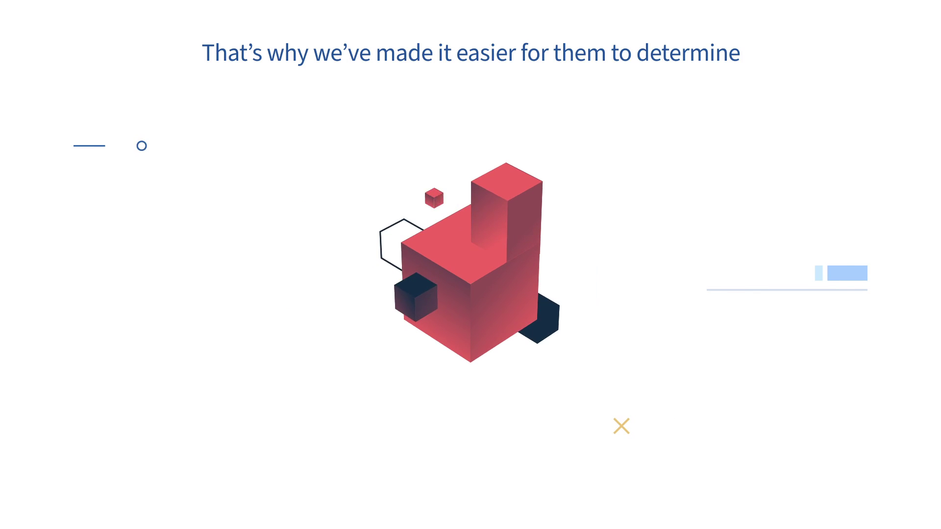 |
00:10 | The Isometric Assembly: Red blocks stacking up represent the accumulation of high-value opportunities. This validates our "Constructivist Metaphor" strategy. | Visual Strategy Section |
| 2 | 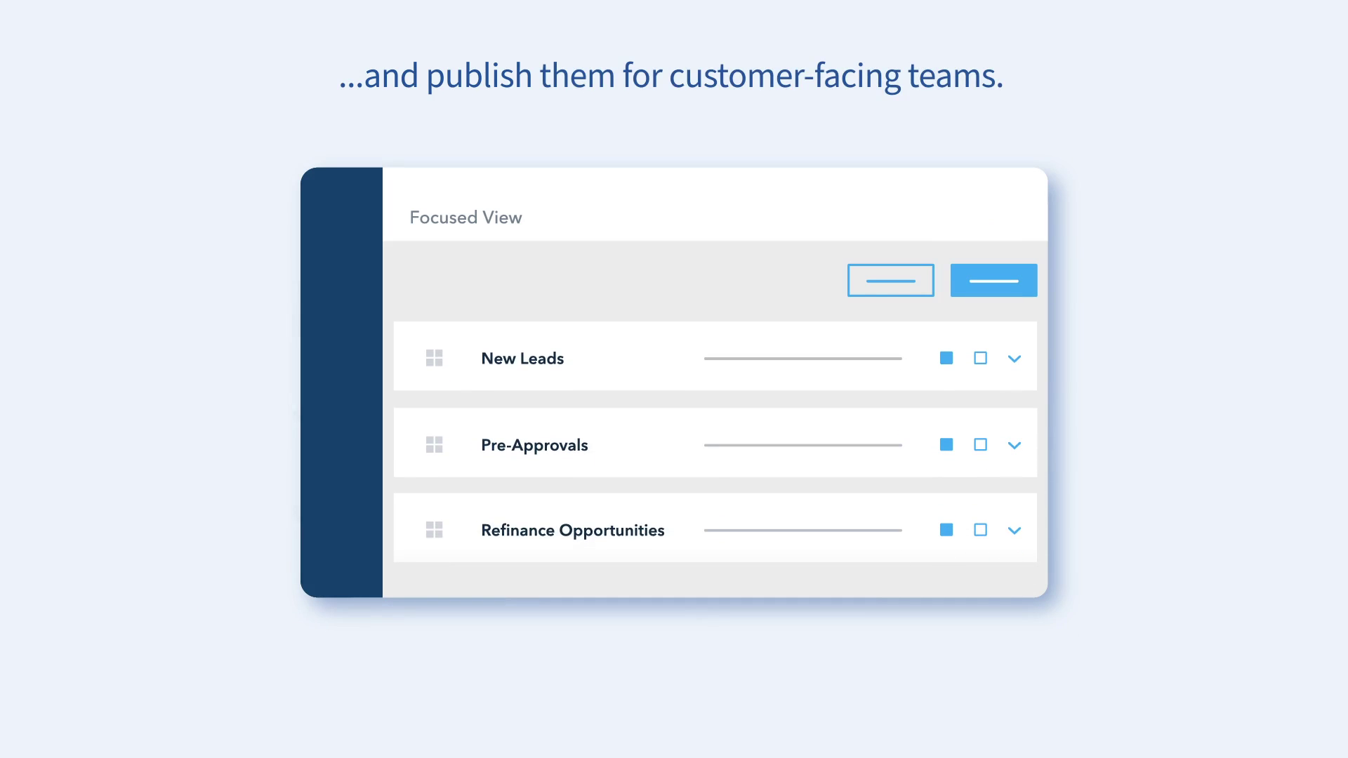 |
00:26 | The Simplified UI: A clean, legible "Daily Digest" card appears. This demonstrates our "UI Reduction" technique, keeping the focus on the message. | Production Deep Dive |
| 3 | 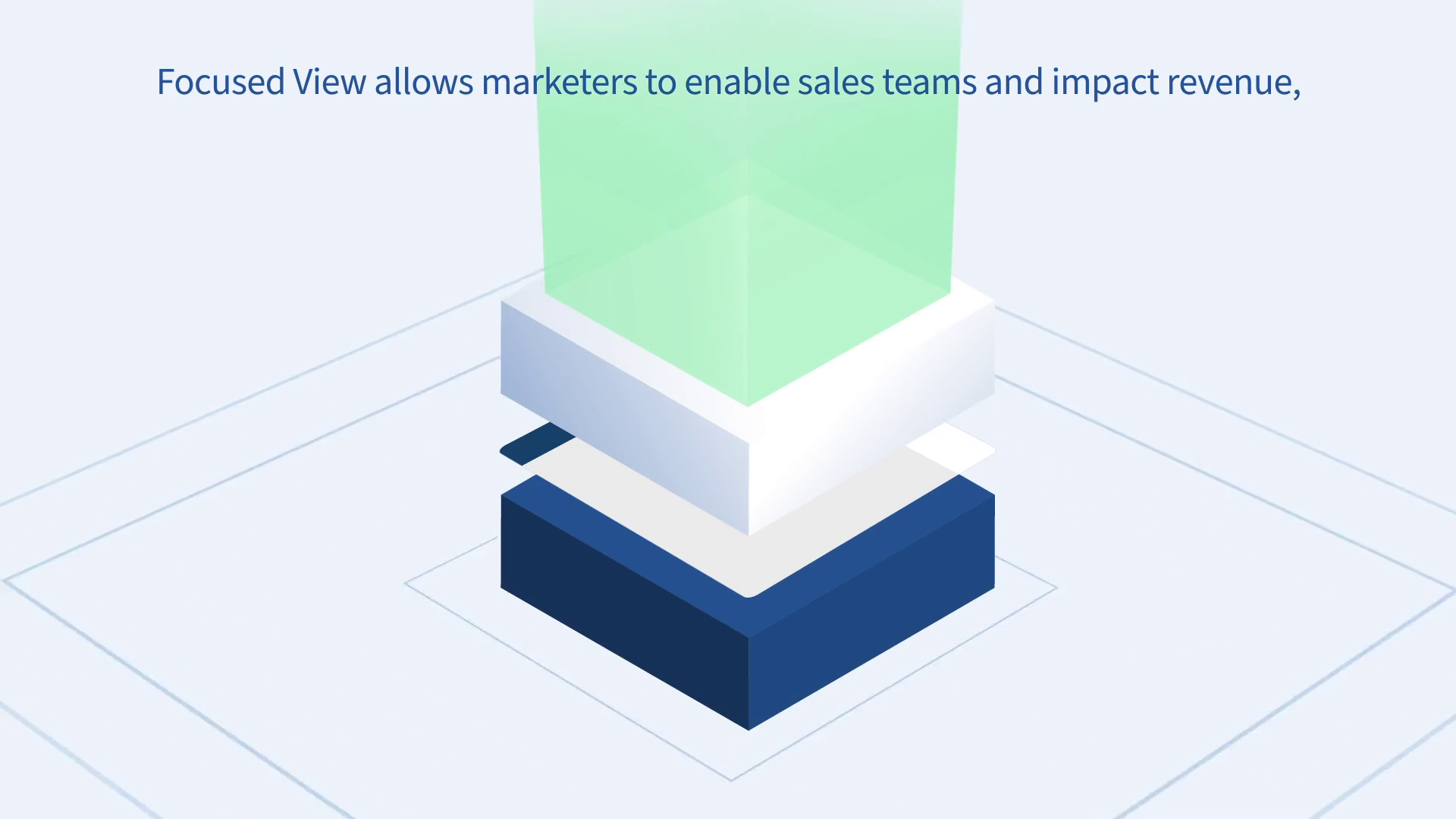 |
00:43 | The Synergistic Stack: Layers of marketing and sales data combine vertically. This visualizes the integration of different departments. | Critical Juncture Section |
| 4 | [IMG ASSET 4] | 00:48 | The Hero Metric: The "10%" figure is isolated and enlarged. This highlights the successful prioritization of Key Performance Indicators. | Outcomes Section |
11. Synergy Analysis: Technology meets Design
This project exemplifies the synergy between Human Design Expertise and Digital Animation Tools. While tools like Adobe After Effects provided the engine for the motion, the logic of the animation—how a list becomes a block, how a notification slides in—was derived from Advids' deep understanding of cognitive load and visual storytelling. The software allowed us to execute the vision, but the strategy of "Simplification" was a purely human-driven decision to ensure the complex Insurance/Fintech message resonated with the audience.
12. Outcomes and Strategic Learnings
The final video successfully translated a complex software feature into a clear, benefit-driven narrative.
- Metric Improvement: The clear visualization of the "10% Lift" in lead-to-application rates provided the sales team with a powerful tool for closing deals.
- Asset Versatility: The modular vector assets created for the video (
Vector_Kit_TotalExpert.ai) were subsequently repurposed by the client for static presentation decks and web graphics. - Strategic Learning: We learned that for technical B2B (Business to Business) products, Abstraction is often more accurate than Realism. By showing a simplified version of the interface, we communicated the function more accurately than a real screen recording ever could.
Would you like me to develop a specific script breakdown for a "Teaser" version of this case study for social media?
Final Video
Author & Editor Bio

