A case study on using 2D motion graphics to translate a complex software concept into a clear, engaging, and brand-aligned explainer video.
Summary
This case study details the production of a 2D animated explainer video for ProdPad, a leading product management Software as a Service platform. The primary challenge was to create a cohesive visual narrative that could explain the abstract problem of disorganized product ideas and then transition seamlessly to the concrete solution within the software's User Interface. Over a six-week period, Advids developed a unique visual language derived directly from the client's logo, creating a "concept-to-concrete" video that drove clarity and brand identity simultaneously.
The Challenge
ProdPad's platform is powerful, helping teams organize their idea backlog and answer the crucial "Who?" and "Why?" behind product decisions. The client needed a short, engaging video that could explain this value proposition without getting lost in technical jargon. The video had to appeal to busy product managers and feel both innovative and accessible, merging a conceptual story with a practical product demonstration.
The Solution
Advids employed The Advids Clarity & Engagement Framework, a specialized workflow for 2D motion graphics. The solution was a two-act narrative. Act One used custom-designed abstract characters to represent the "team" and their "ideas." Act Two transitioned from this abstract world directly into the ProdPad software, using precise User Interface animation to show how the platform solves the problems established in Act One.
Client Profile
ProdPad is a product management software company that provides tools for product managers to develop product strategy, build roadmaps, and manage idea backlogs. Their platform is designed to connect team discussions with the development pipeline, integrating with tools like Jira, Trello, and GitHub.
Project Objective
To create a 60-second 2D motion graphics explainer video that:
- Clearly explained the problem of a disorganized product strategy.
- Introduced the ProdPad platform as the clear, simple solution.
- Showcased key features and integrations.
- Established a unique and friendly visual style that was strongly aligned with the ProdPad brand.
The Advids Clarity & Engagement Framework
For this project, Advids utilized its dedicated 2D motion graphics workflow. This framework prioritizes narrative clarity and visual engagement. Key stages included developing a unique Visual Strategy, creating all custom Vector Illustration assets, storyboarding the "concept-to-concrete" flow, and executing precise Keyframe Animation for both the characters and the User Interface.
Project at a Glance
| Feature | Detail |
|---|---|
| Client | ProdPad |
| Agency Partner | Advids |
| Project | 2D Animated Explainer Video |
| Video Type | 2D Motion Graphics/Explainer |
| Estimated Duration | 6 Weeks |
| Core Technologies | Vector Illustration Software, 2D Animation Suite (Adobe After Effects), Audio Editing Software |
| Collaboration Stack | Slack (Real-time Communication), Google Drive (Asset Management), Vimeo Review (Video Feedback) |
| Final Deliverables | 1-minute Animated Explainer Video, Social Media Cutdowns |
Project Timeline
- Scripting & Strategy (Week 1)
- Milestone: Finalized "concept-to-concrete" script.
- Key Outputs: Script_Final_V2.docx.
- Quote: "The script needs to hook them with the problem first, then deliver the solution. 'Who?' and 'Why?' are the key themes."
- Visual Development & Storyboarding (Week 2-3)
- Milestone: Client approval of the custom character style and visual language.
- Key Outputs: Storyboard_Full_V3.pdf, Style_Frames_Character_Concept_C.png.
- Quote: "We need to avoid generic 'corporate' characters. Our brand is friendly and smart."
- Asset Creation & Animatic (Week 4)
- Milestone: All Vector Illustration assets (characters, icons, User Interface) created.
- Key Outputs: Animatic_V2.mp4 (a full-length, timed-out storyboard).
- Animation & Motion Design (Week 5)
- Milestone: Full animation completed, including character motion and User Interface sequences.
- Key Outputs: UI_Animation_Test_R1.mp4.
- Sound Design & Final Mastering (Week 6)
- Milestone: Sound effects and music mixed and finalized.
- Key Outputs: Final video delivered.
- Quote: "The animation is great. That's the clarity we were looking for."
The Production Deep Dive: A Tale of Two Styles
Phase 1: Crafting the "Concept-to-Concrete" Narrative
- Goal: To establish a clear script that connects the abstract problem (disorganization) with the concrete solution (ProdPad).
- Process: The Advids creative team worked with the client to refine a script that told a simple story. It starts by showing a team with scattered ideas (represented by various colorful icons at 0:05-0:14) and then introduces ProdPad as the central hub that provides clarity.
- Action: The script was built around the key questions "Who?" and "Why?" (0:40). This narrative structure gave the video a strong, memorable theme and a clear "before and after" format, which is central to Advids' expertise in storytelling for technology clients.
Phase 2: The Critical Juncture: Building a Visual Language from a Logo
- Goal: To design a unique visual style and set of characters that felt authentic to the ProdPad brand, avoiding generic "explainer video" tropes.
- Process: This was the project's critical juncture. The client's brand was clean and professional but lacked a defined illustration language.
- The Challenge: The client was rightly concerned that using "stock" character styles would dilute their brand.
- The Breakthrough: The Advids design team proposed a visual style derived directly from the client's own logo. The soft-edged, colorful, rounded-square shapes seen in the opening (0:01) and the logo itself (0:02) became the "DNA" for the entire video.
(IMG ASSET 1)
(Timestamp: 2s) The ProdPad logo and its colorful, soft-edged aesthetic.
- Action: From this "DNA," the simple, friendly, and universal ellipsoid characters were born. This solution, presented in Style_Frames_Character_Concept_C.png, was an immediate success. It gave ProdPad an ownable, relatable visual language that was 100% aligned with their existing brand identity.
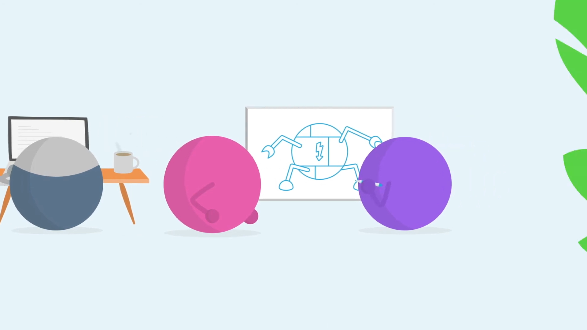
(IMG ASSET 2)
(Timestamp: 19s) The custom ellipsoid characters collaborating, an illustration style derived directly from the client's brand.
Feedback Loop: Defining a Unique Character Style
- Client: "We've seen Storyboard_Full_V3.pdf. We're still a bit worried that the characters might feel too generic. We want to stand out."
- Advids: "We understand completely. That's why we avoided a standard 'human' character. If you look at the style frames, you'll see the ellipsoid characters are built from the same soft, rounded shapes as your logo. This isn't a generic style; it's an extension of your own brand."
- Client: "That's a great insight. We love that connection. Approved."
Phase 3: Animating for Clarity: Organic Characters and a Precise Interface
- Goal: To animate two different styles—organic characters and a technical User Interface—in one cohesive video.
- Process: The Advids' animation team had to use two distinct Keyframe Animation techniques. The abstract characters were animated with smooth, organic easing and interpolation to make them feel friendly and alive (0:15-0:30). In contrast, the User Interface animation (0:34-0:56) had to be crisp, precise, and functional, mimicking an actual user's experience.
- Action: The key was the transition. At 0:33, the camera "zooms" into a shape that becomes the "Welcome back!" screen of the ProdPad software. This seamless transition connects the abstract "problem" world with the concrete "solution" world. The team then used Kinetic Typography to highlight the key questions ("Who?", "Why?") and animated clicks and menus to demonstrate the software's core functionality with absolute clarity.
(IMG ASSET 3)
(Timestamp: 35s) The clean, precise User Interface animation, marking the transition from "concept" to "concrete."
Feedback Loop: Perfecting the User Interface Flow
-
Client: (On Vimeo Review) "We're reviewing UI_Animation_Test_R1.mp4. The animation looks great, but the 'Push idea to development' menu at 0:53 appears and disappears too quickly. Our users need to see the Jira, Trello, and GitHub logos."
-
Advids: "Good catch. We'll adjust the keyframe timing on that sequence, adding a 1.5-second hold while the menu is open before it closes. This will ensure those integration logos are clearly legible."
-
Client: "Perfect."
(Timestamp: 53s) The User Interface animation was timed with precision to clearly show the software's key integrations.
Synergy Analysis: Technology vs. Human Expertise
This project demonstrates the balance between modern animation tools and the creative strategy that wields them.
- Technology-Powered Contributions:
- Vector Illustration Software: Allowed for the creation of crisp, scalable assets that look sharp at any resolution.
- 2D Animation Suite: Enabled complex Keyframe Animation, allowing animators to precisely control the timing and feel of every element, from character bounces to User Interface clicks.
- Advids’ Visualization Craft (Human Expertise):
- Strategic Storytelling: The "concept-to-concrete" narrative structure. This human-led decision is what makes the video effective, not just the software used.
- Brand Extension: The ability to see the "DNA" in a client's logo and expand it into a full-fledged, unique visual language. This is a creative, not a technical, act.
- Pacing and Timing: Knowing how long to hold a shot for a User Interface element to be readable. This expertise in information hierarchy and pacing is crucial for explainer videos.
Outcomes & Strategic Learnings
- A Unique, Ownable Visual Style: ProdPad emerged with more than just a video; they had a new, extendable visual language based on their own brand, setting them apart from competitors.
- Clarity Achieved: The final video successfully distilled a complex software product's value proposition into a simple, 60-second narrative that was easily understood by its target audience.
- The "Brand-First" Approach: The key learning was that even with minimal brand guidelines, a "brand-first" approach to visual development yields the most authentic results. By building the visual style from the logo, Advids ensured the final product felt like an inseparable part of the ProdPad identity.
Final Video
Author & Editor Bio