
Case Study: PwC & Advids - Animating the Abstract World of Intelligent Controls
Summary
This case study examines the production of a 2-minute hybrid-media explainer video for PwC's "Intelligent Controls" service. The primary challenge was to explain a complex, intangible business-to-business service using a combination of client-sourced live-action footage and bespoke 2D motion graphics. Advids successfully navigated the client's extremely strict brand guidelines to produce a premium video defined by its clean kinetic typography, clear data visualizations, and seamless integration of animated elements. The project highlights Advids' expertise in translating static corporate branding into dynamic, engaging motion design.
The Challenge
PwC, a global leader in professional services, needed to explain its sophisticated "Intelligent Controls" platform. The service is abstract, dealing with risk, compliance, and automation. The client's goal was to create a video that could quickly communicate the platform's value (e.g., "95% less costly to execute") to a high-level executive audience. The challenge was twofold:
- Clarity: How to make an invisible, complex service tangible and easy to understand.
- Compliance: How to create an engaging, modern video while adhering perfectly to one of the world's most recognized and strict corporate brand identities.
The Solution
Advids proposed a hybrid-media solution based on our Clarity & Engagement Framework. This approach leveraged the client-sourced, professional live-action footage as a human-centric backdrop. On top of this, Advids designed and animated a clean, "information layer" of 2D motion graphics. This layer included precise kinetic typography, clear icon-based process animations, and detailed software screen animations to communicate the core message, data points, and product functionality.
Client Profile
- Client: PwC (PricewaterhouseCoopers)
- Industry: Professional Services (Consulting, Assurance, Tax)
- Project: 2D Explainer Video for "Intelligent Controls" Service
Project Objective
To create a premium, brand-compliant explainer video that clearly articulates the process, benefits, and functionality of the Intelligent Controls platform, primarily through the use of kinetic typography and animated data visualization.
The Advids Clarity & Engagement Framework
For this project, Advids adapted its 2D explainer workflow to focus on seamless integration with live-action. The key stages included:
- Visual Strategy: Defining a visual language (icons, layouts) that aligned with the client's static brand guide.
- Asset Creation: Building a library of approved 2D vector graphic elements.
- Kinetic Typography: Designing and animating all on-screen text to be the primary storyteller.
- Software Animation: Re-creating the product's dashboard for a clear, animated demonstration.
- Compositing & Integration: Blending all animated elements with the client-sourced live-action plates, including color grading for a consistent look.
Project at a Glance
| Feature | Detail |
|---|---|
| Client | PwC |
| Agency Partner | Advids |
| Project | "Intelligent Controls" 2D Explainer Video |
| Video Type | 2D Motion Graphics / Explainer (Hybrid-Media) |
| Estimated Duration | 6 Weeks |
| Core Technologies | 2D Animation Suite, Vector Illustration Software, Compositing Suite |
| Collaboration Stack | Slack (Real-time Communication), Google Drive (Asset Management), Vimeo Review (Video Feedback) |
| Final Deliverables | 02:03 Minute 1080p Video, 16:9 Aspect Ratio |
Project Timeline
- Kickoff & Brand Immersion (Week 1)
- Milestone: Project kickoff, script finalization, and reception of all assets.
- Key Outputs: PwC_Brand_Guidelines_V4.pdf, Script_V3_Final.docx, Client-Sourced Footage Library.
- Quote: "The motion must feel as authoritative and established as our static brand. We cannot deviate from the approved color palette."
- Visual Strategy & Style Frames (Week 2)
- Milestone: Development and iteration of the visual look-and-feel.
- Key Outputs: Style_Frames_Set_A_V1.png (Rejected), Style_Frames_Set_B_V2.png (Approved).
- Animatic & Asset Production (Week 3)
- Milestone: Full storyboarding and creation of a video animatic (a rough draft).
- Key Outputs: Animatic_V2_Review.mp4, Full library of vector icons and graphic elements.
- Animation & Integration (Week 4-5)
- Milestone: Production of all 2D animations, kinetic typography, and software sequences.
- Key Outputs: Software_Anim_Test_V1.mp4, All scenes animated and composited onto live-action.
- Quote: "The key is seamless integration. The graphics can't look 'stuck on.' They need to feel part of the same world as the live-action plates."
- Post-Production & Final Delivery (Week 6)
- Milestone: Sound design, final color grade, and client approval.
- Key Outputs: Full_Video_V3_Final.mp4.
The Production Deep Dive: A Hybrid-Media Approach to Corporate Storytelling
Phase 1: Visual Strategy and the Brand Guideline Challenge
- Goal: To define a motion design language that felt modern and clear, yet 100% compliant with the client's rigid brand identity.
- Process: The project began with a deep dive into the PwC_Brand_Guidelines_V4.pdf. The Advids design team identified the core visual elements: specific fonts, a limited color palette (black, white, with yellow/red as accents), and a "clean" layout philosophy. We then created vector icons and graphic layouts to represent abstract concepts like "governance" (a gavel icon) and "automation" (gear icons).
- Action: We presented Style_Frames_Set_A_V1.png as an initial concept. This set the stage for the project's most important conversation.
(IMG ASSET 1 - Timestamp: 21s) - The clean, vector-icon style developed by Advids to visualize abstract processes in a brand-compliant way.
Phase 2: The Critical Juncture: Defining 'Corporate-Premium' Motion
- Goal: To pivot from the initial feedback and establish an approved motion language.
- Process: The client's feedback on our first set of style frames was clear: the motion felt "too playful" and "bouncy." This was our Critical Juncture. We had to redefine what "motion" meant for this brand.
- Action: The Advids animation team went back to basics. We developed a "minimalist motion" language. This meant abandoning flashy transitions. Instead, we focused on subtle, elegant animations:
- Kinetic Typography: Text appeared using soft, precise fades and gentle position moves, all controlled with smooth keyframe easing.
- Transitions: Scene changes were handled with simple, clean cuts or quick, directional wipes that matched the brand's solid-color-block aesthetic.
- Accents: The brand's accent colors (red, yellow) were used sparingly as underlines or in text boxes to draw the eye without overwhelming it.
- This new, more "authoritative" approach, presented in Style_Frames_Set_B_V2.png, was immediately approved.
Feedback Loop: Translating a Static Brand into Dynamic Motion
- Client: "We've reviewed Style_Frames_Set_A_V1.png on Vimeo Review. The core layouts are good, but the animation style feels too 'bouncy.' It doesn't match our authoritative brand voice. We need something more premium and subtle."
- Advids: "Thank you for the clear feedback. We understand completely. We'll pivot from 'playful' to 'premium.' Our revision will eliminate the 'bouncy' keyframes and focus on a more elegant, minimalist motion language using smooth fades and precise, gentle text reveals. We want it to feel sophisticated, not animated."
Phase 3: Hybrid Production: Integrating Vector Graphics with Live-Action
- Goal: To seamlessly blend the newly defined 2D graphics with the client-sourced live-action footage.
- Process: With the style approved, our production team began integrating the 2D elements. This involved compositing the vector graphics and kinetic typography over the live-action plates.
- Action: Every shot was treated individually. We applied a consistent color grade to all live-action clips to ensure a uniform, premium feel. The 2D animated text boxes, like "95% less costly to execute," were carefully placed and timed to support the voiceover and appear as an intentional part of the scene.
(IMG ASSET 2 - Timestamp: 7s) - The final, polished kinetic typography, designed by Advids to communicate the core value proposition with clarity and brand precision.
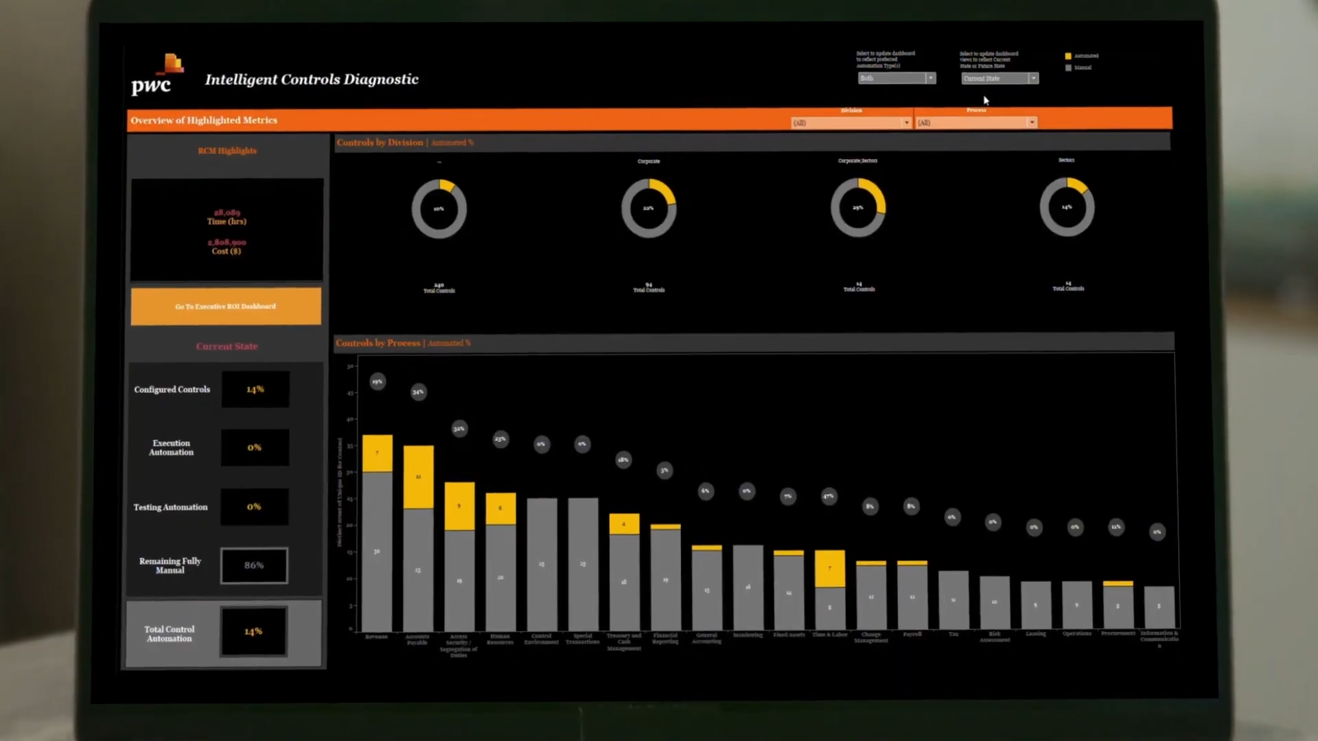
Phase 4: The Dashboard Deep Dive: Animating the Software Experience
- Goal: To clearly demonstrate the "Intelligent Controls" software interface, which was a key part of the video.
- Process: Simply recording the screen would be messy and hard to follow. Instead, Advids meticulously re-created the entire software dashboard as a 2D vector animation. This gave us complete control over the demonstration.
- Action: We animated simulated mouse clicks, page loads, and pop-up windows (like "Add Control Test"). This allowed us to slow down complex actions, use highlights to focus the viewer's eye, and ensure the "product" demo was crystal clear and perfectly timed to the script.
(IMG ASSET 3 - Timestamp: 44s) - The full "Intelligent Controls" dashboard, re-created by Advids as a 2D vector animation for maximum clarity and control.
Feedback Loop: Clarifying the 'Intelligent Controls' Dashboard
- Client: "We've reviewed the Animatic_V2_Review.mp4. The dashboard sequence starting at 01:17 is too fast. Our audience won't be able to follow the steps."
- Advids: "Noted. We'll slow down that entire sequence by 20%. We will also add a subtle 'zoom-in' to the 'Add Control Test' pop-up (at 01:19) and hold on it for an extra half-second to ensure it's readable. This will make the user journey much clearer."
(IMG ASSET 4 - Timestamp: 79s) - A detailed shot of the software pop-up, which Advids slowed down and highlighted based on client feedback to improve clarity.
Synergy Analysis: Technology vs. Human Expertise
This project was a perfect example of technology and human expertise working in harmony.
- Technology-Powered Contributions:
- 2D Animation Suite: Gave us the power to create and control the kinetic typography and vector graphics with precision.
- Compositing Software: Allowed us to seamlessly blend the 2D animated layer with the live-action video plates.
- Vector Illustration: Enabled the creation of crisp, scalable icons and interface elements that were pixel-perfect.
- Advids’ Visualization Craft (Human Expertise):
- Brand Interpretation: The human ability to interpret a static brand guide and translate its "feel" (authoritative, premium) into motion.
- Conceptual Storytelling: Taking an abstract idea ("intelligent controls") and designing a simple, clear visual narrative (icons, graphs) to explain it.
- Problem-Solving (The Pivot): Recognizing that the initial "bouncy" animation was a misstep and having the creative expertise to develop a new "minimalist motion" language that solved the client's core branding concern.
Outcomes & Strategic Learnings
- Final Deliverable: A 2-minute, 3-second hybrid-media video that successfully explained a complex B2B service, driving home key data points through powerful kinetic typography.
- Client Satisfaction: The client was extremely pleased with the final product, as it achieved their communication goals while perfectly adhering to their stringent brand identity.
- Strategic Learning (The "Less is More" Principle): The "Brand Alignment Challenge" was a crucial lesson. For premium corporate brands, motion design is often more effective when it's subtle, elegant, and "invisible." The quality is felt in the smoothness of the keyframes and the precision of the timing, not in the flashiness of the transition. This "less is more" approach became a key strategy for Advids when working with other high-compliance corporate clients.
Would you like me to generate a new case study for a different video?
Final Video
Author & Editor Bio

