

1. Executive Summary
Stukent, a leader in educational courseware, approached Advids to announce a significant platform update focused on inclusivity. The objective was to highlight new features compliant with the Americans with Disabilities Act and the Web Content Accessibility Guidelines. Advids leveraged the Advids Clarity & Engagement Framework to produce a high-fidelity Web application visualization video. By combining curated stock footage with precision-engineered 2D motion graphics, we transformed technical compliance standards into a visually compelling narrative, demonstrating Stukent's commitment to accessibility for every student.
2. The Client Challenge: Visualizing the Invisible
Stukent faced a unique communication hurdle. They needed to showcase "invisible" backend improvements—such as keyboard navigation protocols, screen reader compatibility, and contrast ratio adjustments—in a video format that is inherently visual. Standard screen recordings of these features felt static and failed to capture the user experience improvements. The client needed a solution that would make these technical specifications feel dynamic, modern, and crucial to the educational experience.
3. The Advids Solution
Advids proposed a "Simulated Reality" approach. Instead of relying on passive screen captures, our team decided to reconstruct the Stukent User Interface as active motion graphic elements. This allowed us to exaggerate subtle interactions (like the focus state of a button) and seamlessly integrate kinetic typography. The final deliverable was a mixed-media explainer that blended the human element of education with the technical precision of the software updates.
4. Client Profile
- Industry: Educational Technology (EdTech)
- Name: Stukent
- Focus: Digital courseware and simulations for higher education and high schools.
5. Core Objective
To drive awareness and adoption of Stukent's new accessibility features among educators and administrators by visually demonstrating compliance with the Web Content Accessibility Guidelines (Level AA).
6. Branded Workflow Overview
This project was executed using The Advids Clarity & Engagement Framework, a specialized module designed for 2D explainer videos where message retention and visual clarity are paramount. This workflow prioritizes the translation of complex information into digestible visual metaphors using vector illustration and advanced motion design.
7. Project at a Glance
| Category | Details |
|---|---|
| Project Type | Web Application Visualization Video |
| Primary Technique | 2D Motion Graphics & UI Simulation |
| Visual Style | Mixed Media (Curated Stock + Kinetic Typography) |
| Platform | Web / Marketing Campaigns |
| Duration | 7 Weeks |
| Collaboration Stack | Slack (Real-time Communication), Google Drive (Asset Management), Vimeo Review (Video Feedback) |
8. Project Timeline & Production Milestones
- Week 1: Discovery and Blueprinting
- Analysis of the Americans with Disabilities Act compliance documentation.
- Deliverable:
Creative_Brief_Stukent_V2.pdf.
- Week 2: Visual Strategy and Scripting
- Drafting the narrative to align with the "Help the World" brand message.
- Deliverable:
Voiceover_Script_ADA_Rev3.docx.
- Week 3: Look Development and Stock Curation
- Selection of diverse stock footage representing the student demographic.
- Quote: "The stock footage needs to feel candid, not staged, to match the authentic tone of the accessibility message." – Advids Creative Director.
- Week 4: The Vector Reconstruction (Asset Creation)
- Recreating User Interface screens in Adobe Illustrator for scalability.
- Deliverable:
Stukent_UI_Vector_Kit_V3.ai.
- Week 5: Animation and Motion Design
- Animating the "Keyboard Navigation" and "Zoom" sequences.
- Artifact:
Animatic_Sequence_02_NavFlow.mp4.
- Week 6: Audio Engineering and Compositing
- Syncing the voiceover with the text-to-speech visual highlights.
- Week 7: Final Polish and Mastering
- Final color grading and delivery.
- Deliverable:
Stukent_Accessibility_Promo_Master_V1.mp4.
9. The Production Deep Dive
Phase 1: Blueprinting the Accessibility Narrative
- Goal: To convert technical "Web Content Accessibility Guidelines" into a compelling script.
- Process: The Advids creative team analyzed the technical specifications provided by Stukent. We identified four key pillars to visualize: Keyboard Navigation, Text-to-Speech, Zoom Capabilities, and Contrast Ratios.
- Action: We developed a script that framed these features not just as compliance checkboxes, but as tools that "help students help the world." This emotional hook connected the dry technical features to the user's mission.
Phase 2: The Vector Reconstruction Initiative (The Critical Juncture)
- Goal: To demonstrate the "400% Browser Zoom" feature without losing visual fidelity.
- Challenge: Early tests using standard high-definition screen recordings revealed a significant quality drop. When the camera zoomed in 400% to simulate the browser feature, the text became pixelated and the interface elements blurred, undermining the message of "Improved Accessibility."
- Solution: Advids initiated a full Vector Asset Reconstruction. Our design team rebuilt the key interface screens—specifically the "Product Spec Document" and the "Introduction to Search Ads" dashboard—entirely as vector graphics within Adobe Illustrator. This allowed our motion designers to scale the assets infinitely in the animation software.
- Result: The final video showcases a flawless, crisp zoom sequence (visible at 00:36), proving the feature's utility effectively.
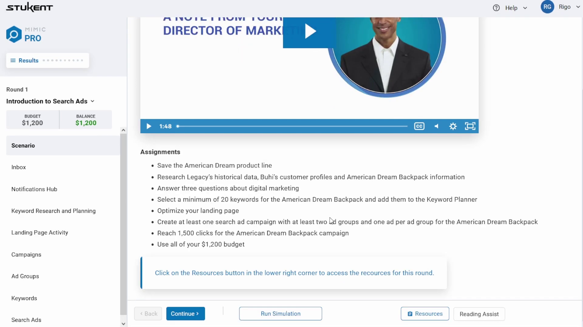
- Timestamp: 00:36
- Rationale: Visualizes the "400% Zoom" feature. This shot required the vector reconstruction technique to maintain crisp text clarity during the extreme magnification.
- Placement: Immediately following the description of the Vector Reconstruction Initiative.
Phase 3: Synchronizing Motion with User Experience
- Goal: To simulate the feeling of using the accessible tools.
- Process: For the "Keyboard Navigation" sequence, we needed to show how a user navigates without a mouse.
- Action: Advids animators meticulously timed the movement of the "Blue Focus Box" (the visual indicator of selected elements) to match a realistic tabbing rhythm. We avoided smooth ease-in/ease-out transitions for this specific element, opting for "hold" keyframes to mimic the instant snap of a digital keystroke, ensuring authenticity.
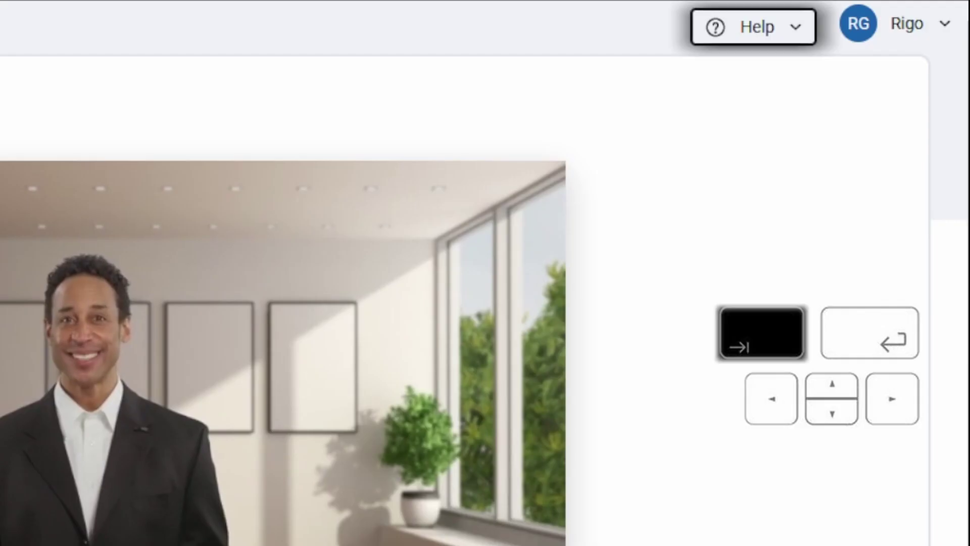
- Timestamp: 00:24
- Rationale: Demonstrates the Keyboard Navigation simulation. The blue outline moves sequentially, representing the tab order, a crucial detail for the target audience.
- Placement: In the Motion Design section.
Feedback Loop: Refining the Visual Hierarchy
- Context: Reviewing the "Contrast Ratio" split-screen sequence via Vimeo Review.
- Client (Stukent): "The distinction between the legacy view and the optimized view is a bit too subtle on the 'Marketing Strategy' text. Can we make the improvement more obvious?"
- Advids: "Understood. We will adjust the opacity of the non-compliant text in the 'Before' state to 60% and slightly sharpen the font weight in the 'After' state to visually exaggerate the clarity improvement."
- Outcome: The finalized shot (at 00:43) clearly delineates the improvement in readability, making the value proposition instant.
10. Synergy Analysis: Technology meets Human Expertise
This project exemplified the power of combining Adobe Creative Cloud technology with Human User Experience Expertise. While tools like After Effects handled the motion, it was the Advids team's understanding of User Interface Design principles that ensured the animations felt authentic. The decision to manually rebuild assets as vectors rather than relying on automated screen captures was a human strategic decision that elevated the final production quality.
11. Outcomes and Strategic Learnings
The Stukent Accessibility video successfully launched the new platform updates. The use of high-fidelity UI motion graphics allowed Stukent to present complex compliance features as sleek, modern, and desirable enhancements.
- Key Learning: When visualizing software features involving extreme scaling (like zooming), vector reconstruction is not optional—it is a mandatory step for professional results.
- Strategic Value: The video positioned Stukent not just as a courseware provider, but as an inclusive, forward-thinking technology partner for educational institutions.
Final Visual Asset Table
| Serial No. | Image Placeholder | Timestamp | Rationale | Placement |
|---|---|---|---|---|
| 1 | |
00:36 | Visualizes the "400% Zoom" feature, demonstrating the success of the vector reconstruction strategy. | Deep Dive Phase 2 |
| 2 | |
00:24 | Shows the Keyboard Navigation simulation, highlighting the accurate "tab order" animation. | Deep Dive Phase 3 |
| 3 |  |
00:09 | The "Improved Accessibility" kinetic text intro, establishing the modern, tech-forward tone. | Executive Summary |
| 4 | [IMG ASSET 4] | 00:43 | The Contrast Ratio comparison, showcasing the visual clarity improvements. | Communication Highlight |
Would you like me to develop a supplementary social media strategy to distribute this case study to EdTech professionals?
Final Video
Author & Editor Bio

