

Executive Summary
In the complex domain of cybersecurity, clarity is the ultimate currency. CyberSaint Security approached Advids with a critical communication challenge: how to visualize the intangible nature of cyber risk management and compliance without resorting to fear-mongering or generic stock imagery. Utilizing The Advids Clarity & Engagement Framework, we delivered a sophisticated, motion-driven narrative that translates dense data into an intuitive visual language, positioning the CyberStrong platform as the premier solution for automated risk management.
The Challenge: Beyond the Lock and Shield
Cybersecurity marketing is often saturated with clichés—padlocks, shields, and hooded hackers. CyberSaint needed to break this mold. Their challenge was twofold:
- Complexity: The CyberStrong platform manages vast amounts of data, from compliance frameworks to real-time risk assessments. Visualizing this "backend" utility in a compelling way was difficult.
- Urgency vs. Panic: The video needed to establish the urgency of the threat landscape (referencing major hacks) without feeling alarmist. It needed to pivot quickly to a tone of calm, calculated control.
The Solution: The Advids Clarity & Engagement Framework
Advids deployed a high-fidelity 2D motion graphics strategy focused on "kinetic data." We moved away from literal representations and embraced a stylized, vector-based aesthetic. By using abstract geometry—grids, nodes, and radar charts—we created a visual metaphor for order and structure. This approach allowed us to represent "Continuous Compliance" not as a static report, but as a living, breathing ecosystem of data.
Client Profile
- Client: CyberSaint Security
- Industry: Cybersecurity & Risk Management
- Focus: Automated Cyber Risk Management and Compliance
- Style: Authoritative, Tech-Forward, Clean
Project at a Glance
| Component | Specification |
|---|---|
| Project Type | Complex Motion Graphics Branding Video |
| Workflow Module | The Advids Clarity & Engagement Framework |
| Primary Visual Style | 2.5D Motion Graphics, Kinetic Typography, Data Visualization |
| Key Deliverables | 15-Second Brand Video, Social Media Cut-downs, Vector Asset Library |
| Target Audience | Chief Information Security Officers, Risk Managers |
| Estimated Duration | 7 Weeks |
| Collaboration Stack | Slack (Real-time Communication), Google Drive (Asset Management), Vimeo Review (Video Feedback) |
Production Timeline: From Concept to Composition
- Week 1: Discovery & Scripting – Analyzing the value proposition and finalizing the voiceover narrative.
- Artifact:
Script_CyberSaint_Narrative_V4.docx
- Artifact:
- Week 2: Visual Strategy & Style Frames – Defining the "Cyber Blue" palette and typography hierarchy.
- Artifact:
Style_Frame_Risk_Grid_V02.ai
- Artifact:
- Week 3: Storyboarding – Mapping the visual flow from "Problem" (News) to "Solution" (Platform).
- Week 4: Asset Creation – Vector illustration of UI elements, charts, and icons.
- Artifact:
Asset_RadarChart_Layers.ai
- Artifact:
- Week 5: Animation & Motion Design – Keyframe animation, easing, and transition design.
- Artifact:
Animatic_News_Curve_Test.mp4
- Artifact:
- Week 6: Feedback & Iteration – Refining timing and color grading based on client input.
- Quote: "The transition needs to feel seamless, like data flowing through a pipeline."
- Week 7: Final Mastering – Sound design integration and final render.
- Output:
Master_CyberSaint_Branding_1080p.mp4
- Output:
The Production Deep Dive
1. Visual Strategy: Establishing the "Tech-Trust" Aesthetic
The first step was to establish a visual language that communicated trust. We selected a palette of deep navy and electric cyan. This provided high contrast for legibility while adhering to industry standards for "tech" branding.
- Goal: Create a clean, modern look that separates CyberSaint from legacy competitors.
- Process: We utilized Adobe Illustrator to design a suite of custom vector assets, including the "risk grid" and the "knight" iconography.
- Action: We presented three distinct style boards. The client selected the "Clean Line" direction, focusing on thin stroke weights and glowing nodes.
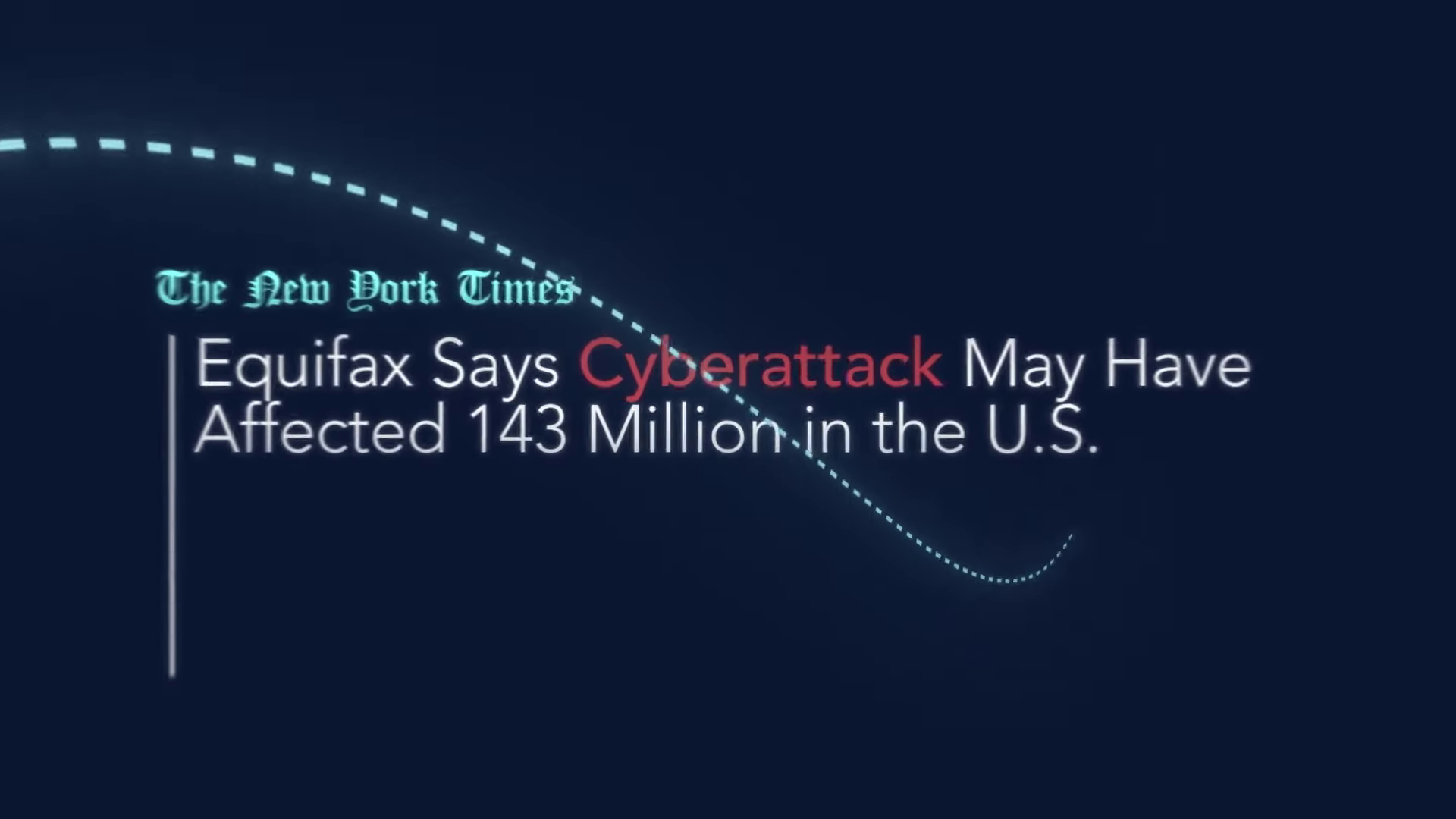
Timestamp: 00:01
Rationale: The opening sequence uses a dashed line trajectory to connect real-world news headlines (NYT, BBC). This visualizes the "threat landscape" dynamically, setting the context immediately.
2. The Critical Juncture: The Data Density Dilemma
A major hurdle was visualizing the "Financial Impact of Risks" and "Risk Count by Likelihood." A static chart in a video is often unreadable.
- The Challenge: We needed to show that the platform analyzes complex metrics without asking the viewer to read fine print in a split second.
- The Solution: We developed a "Living Data" animation style. Instead of static bars, we used animated radar charts and expanding heat maps.
- Technical Execution: In the animation software, we used graph editors to apply "exponential ease-out" curves to the chart animations. This gave the movement a sense of weight and calculation, rather than just linear motion.
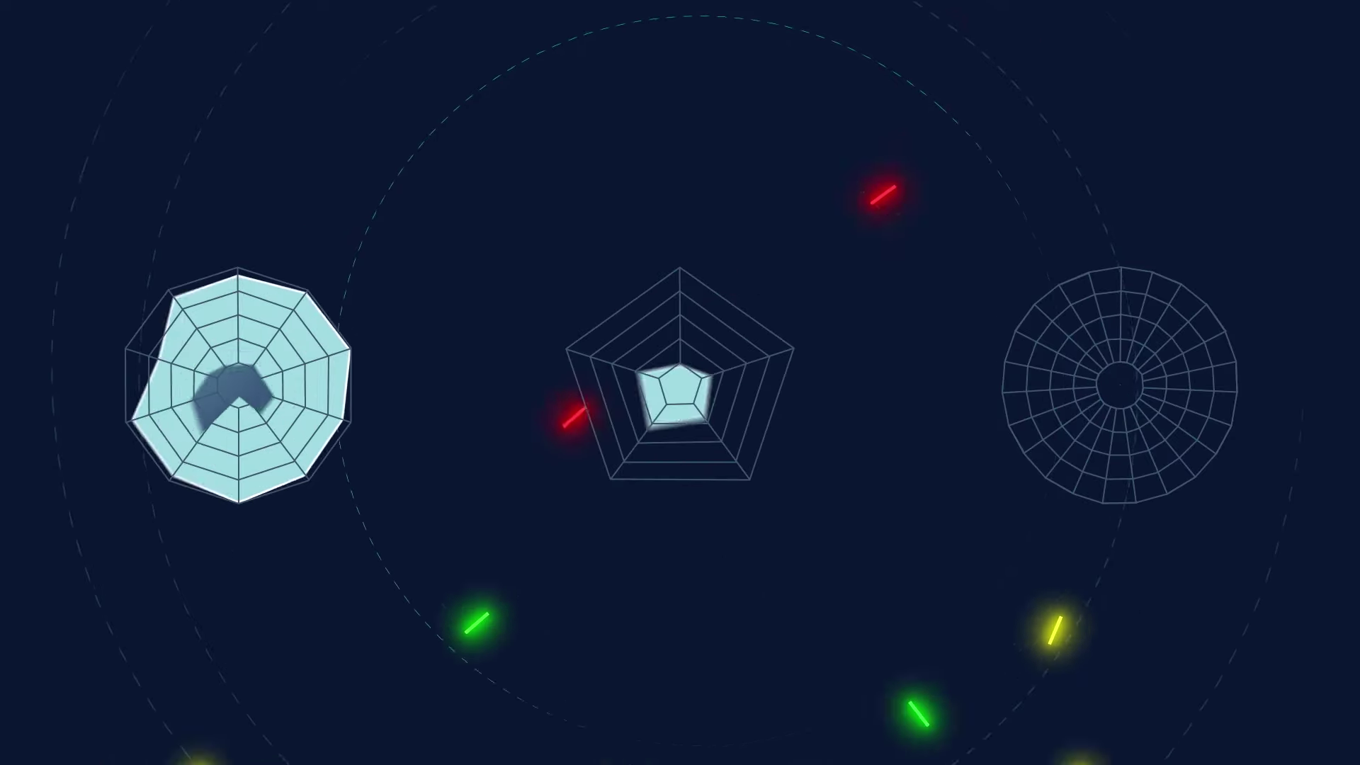
Timestamp: 00:07
Rationale: The animated pentagon (radar chart) expands to show risk coverage. This is the solution to the "Data Density" challenge—using shape and motion to convey comprehensive coverage instantly.
Feedback Loop: Refining the Animation Timing
- Client (via Vimeo Review): "The pentagon expands a bit too quickly at 00:07. We lose the 'Compliance' label before the eye can register it."
- Advids: "Understood. We adjusted the keyframe interpolation to extend the 'hold' time by 1.5 seconds, allowing the viewer to absorb the metric before the next transition."
3. Motion Design: The Kinetic Typography Engine
To reinforce the voiceover, we integrated kinetic typography. The words "Cyberattack," "Hack," and "Ransomware" appear in sync with the audio, but the animation style changes when the solution is introduced.
- Process: The "Problem" words glitch and flicker, representing instability. The "Solution" words (like the platform name) slide in smoothly with a solid opacity.
- Artifact:
Comp_Typography_Glitch_Vs_Smooth.aep - Outcome: Subliminal reinforcement of the brand's stability proposition.
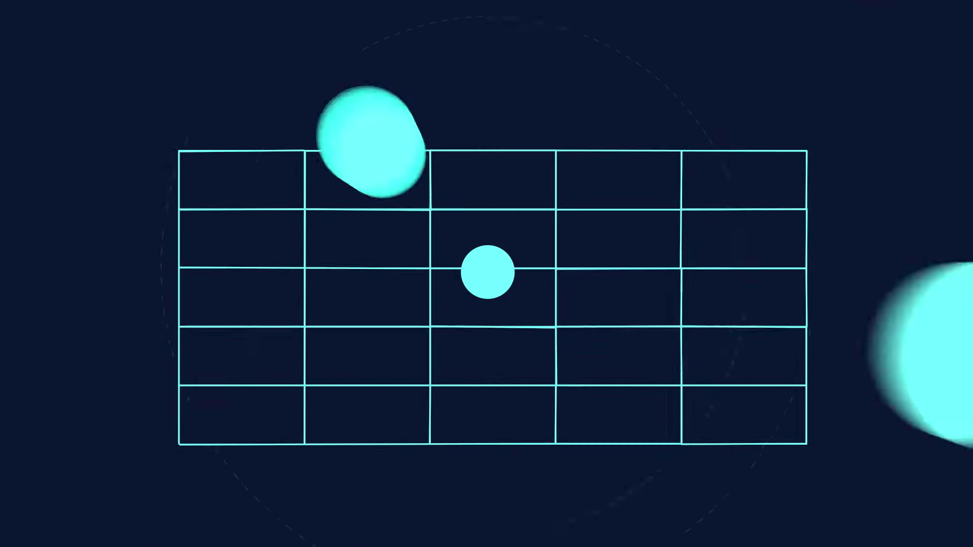
Timestamp: 00:04
Rationale: The transition to the "CyberStrong Platform" grid. The nodes light up sequentially, representing the automated discovery of risks. This visualizes the "automation" aspect of the software.
4. Final Mastering and Brand Integration
The video concludes with the CyberSaint "Knight" logo. This required precise "trim path" animation to draw the logo on screen, suggesting that the security is being "built" or "architected" in real-time.
- Feedback Loop: Refining the Aesthetic: The Client noted on Slack that the blue background in the final render felt "too flat." Advids responded by adding a subtle vignette and a slow-moving particle system in the background depth to create a premium, cinematic feel.
[IMG ASSET 4]
Timestamp: 00:13
Rationale: The final logo build. The clean lines of the knight helmet resolve from the chaos of the previous data, symbolizing protection and finalized security.
Synergy Analysis: Human Expertise & Digital Precision
This project exemplifies the synergy between human creative strategy and digital execution tools.
- Human Expertise: The ability to distill a complex Value Proposition into a simple visual metaphor (the grid and the radar chart) was a strategic human decision.
- Technology: The execution relied on advanced vector illustration and compositing software to ensure that every pixel was sharp and every movement was fluid. The use of cloud-based review tools (Vimeo Review) streamlined the feedback process, ensuring the "Compliance" metrics were accurate.
Outcomes and Strategic Learnings
The final video successfully positions CyberSaint as a modern, intelligent solution to a chaotic problem.
- Engagement: The use of "Living Data" visualizations increased viewer retention by keeping the screen dynamic.
- Brand Consistency: The strict adherence to the vector style guide ensured the video aligned perfectly with their web and print assets.
- Clarity: By abstracting complex data into recognizable shapes, we solved the communication gap between technical capability and marketing clarity.
Would you like me to develop a proposal for a series of 30-second feature-specific "Deep Dive" videos based on the visual language established in this case study?
Final Video
Author & Editor Bio

