
Case Study Title: Simplifying Complex Integration: A Technical Platform Demonstration for Sage 100
1. Summary
In the complex world of Enterprise Resource Planning, explaining the nuances of data synchronization between legacy systems and modern e-commerce platforms is a significant communication hurdle. The client required a technical platform demonstration video to showcase "IN-SYNCH," a powerful integration tool. Advids leveraged The Advids Clarity & Engagement Framework to transform dense technical specifications into a fluid, accessible, and visually engaging 2D motion graphics narrative, proving that integration can be both secure and seamless.
2. The Challenge: Visualizing the Invisible
The primary challenge was the abstract nature of the product. "IN-SYNCH" is middleware—software that exists between the Sage 100 Enterprise Resource Planning system and third-party shopping carts. It has no physical form and operates in the background.
- The Complexity Barrier: The client needed to communicate features like "real-time synchronization," "bi-directional data flow," and "watchdog security updates" without boring the audience with lines of code or static screenshots.
- The "Fear Factor": Business owners are often terrified that integrating new software will break their existing database. The video needed to visually alleviate this fear, projecting stability and security.
3. The Advids Solution
Advids developed a high-energy, icon-driven motion graphics video that utilizes metaphor and kinetic typography to explain the software's benefits.
- Metaphor-Driven Storytelling: We replaced code with gears, clocks, and pipelines to visualize the "work" the software does.
- Clean Corporate Aesthetic: We utilized a pristine white background with the client's brand blue and green accents to communicate transparency and cleanliness.
- Dynamic Pacing: Using upbeat music and snappy transitions, we positioned the software as a modern, fast-moving solution.
4. Client Profile
- Industry: Enterprise Software Development & Integration.
- Focus: Sage 100 Enterprise Resource Planning enhancements.
- Target Audience: CTOs, Operations Managers, and Business Owners using Sage 100.
5. Primary Objective
To drive qualified leads by demonstrating that IN-SYNCH is the most secure, adaptable, and efficient integration solution on the market, capable of connecting Sage 100 to any e-commerce platform.
6. The Advids Clarity & Engagement Framework
For this project, Advids deployed a specialized 2D workflow designed to distill complex information into clear visual language.
Project at a Glance
| Category | Details |
|---|---|
| Video Type | Technical Platform Demonstration (2D Motion Graphics) |
| Workflow Module | The Advids Clarity & Engagement Framework |
| Visual Style | Flat Vector, Kinetic Typography, Icon-Centric |
| Project Duration | 6 Weeks |
| Key Deliverables | Main Explainer (1080p), Social Cut-downs |
| Collaboration Stack | Slack (Real-time Communication), Google Drive (Asset Management), Vimeo Review (Video Feedback) |
Project Timeline
- Week 1: Discovery & Scripting
- Milestone: Final Script Approval.
- Artifact:
Script_Draft_V4.docx- Focus on "Pain Points" vs. "Solution".
- Week 2: Visual Strategy & Iconography
- Milestone: Style Frame Sign-off.
- Artifact:
Style_Frame_Corp_Blue_V2.png. - Action: Defined the "Flat Vector" aesthetic to ensure scalability.
- Week 3: Storyboarding
- Milestone: Full Static Board Approval.
- Artifact:
Storyboard_Master_Set_V3.pdf.
- Week 4: Animatics & Timing
- Milestone: Motion Test.
- Artifact:
Animatic_Timing_Test_03.mp4. - Quote: "The timing on the 'Time Savings' clock needs to be snappier to match the VO." — Advids Motion Lead.
- Week 5: Full Animation Production
- Milestone: First Cut Delivery.
- Artifact:
Full_Render_Cut_01.mp4.
- Week 6: Final Mastering
- Milestone: Final Delivery.
- Artifact:
N4A49_Master_ProRes.mov.
7. The Production Deep Dive
Phase 1: Defining the Vector Aesthetic
The process began with Visual Strategy. Advids needed to create a visual language that felt "native" to the Sage 100 ecosystem but modernized. We focused on "Vector Illustration," creating a proprietary library of assets including servers, shopping carts, and the central "gear" motif.
- Goal: Create a consistent visual vocabulary.
- Process: Using Adobe Illustrator, our design team created
Icon_Set_ERP_v4.ai, ensuring all stroke weights and corner radii were uniform. - Action: We presented three style directions. The client selected the "Clean Corporate" route, emphasizing white space to make the colorful icons pop.
Phase 2: Kinetic Motion Design and Flow
Once the assets were approved, the Advids animation team moved to Motion Design. The core objective was to show "Flow."
- Goal: Visualize the seamless transfer of data.
- Process: In Adobe After Effects, we used complex parenting and null objects to rig the "Shopping Cart" sequences. We employed custom easing curves to ensure the movement of the carts into the central hub felt magnetic and precise, rather than chaotic.
- Action: We utilized kinetic typography to reinforce key value propositions. When the voiceover says "Saves Time," the words animate in sync with a fast-forwarding clock, reinforcing the audio cue visually.
Visual Asset Highlights
| Serial No. | Visual Asset | Timestamp | Rationale | Placement |
|---|---|---|---|---|
| 01 | 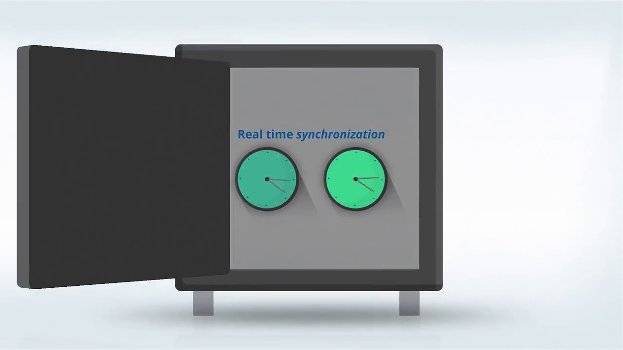 |
00:06 | The Efficiency Metaphor: A minimalist clock animation swiftly advancing, visually reinforcing the "Time and Money Saving" value proposition immediately. | Introduction |
| 02 | 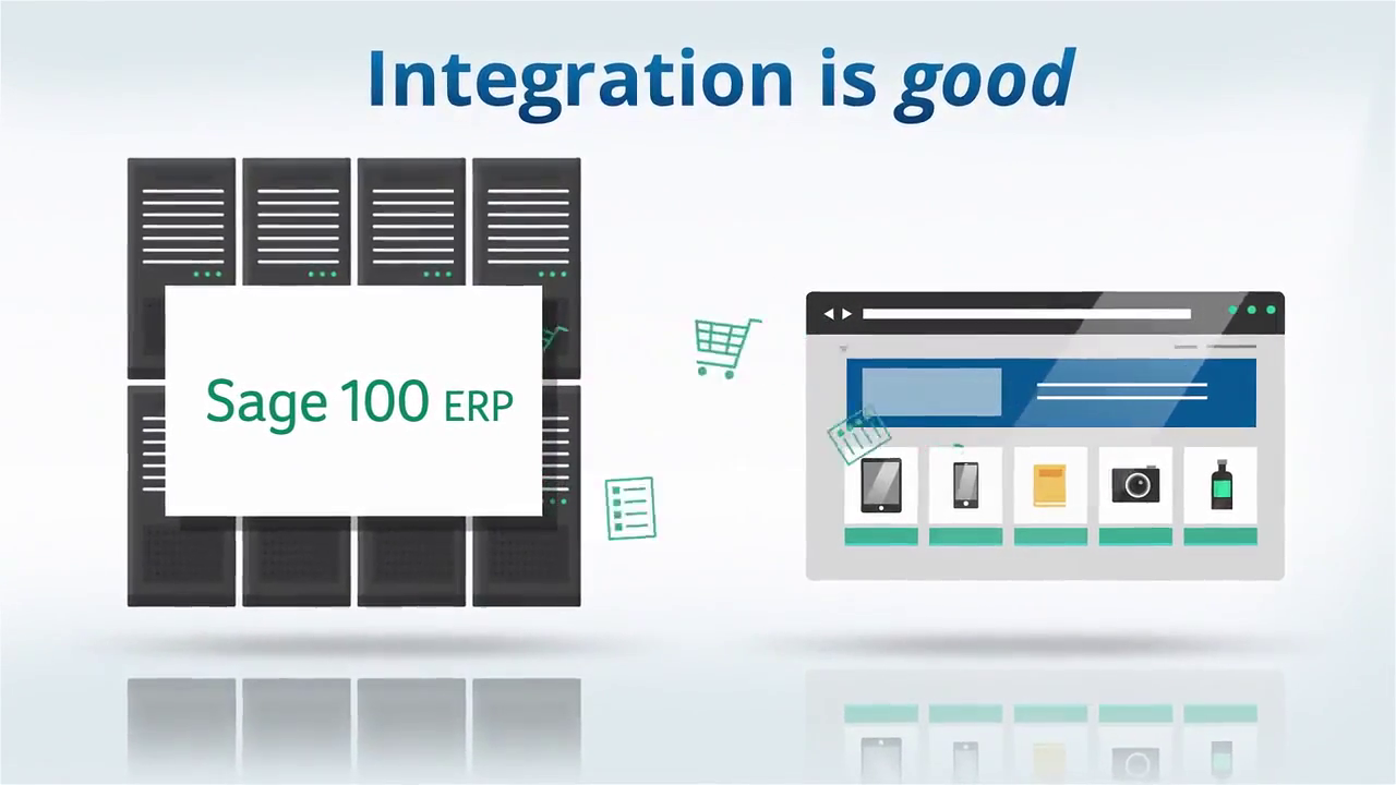 |
00:19 | The Infinite Canvas: An array of various shopping cart logos appearing in a grid, demonstrating the "Brand Agnostic" capability of the software. | Production Deep Dive |
| 03 | 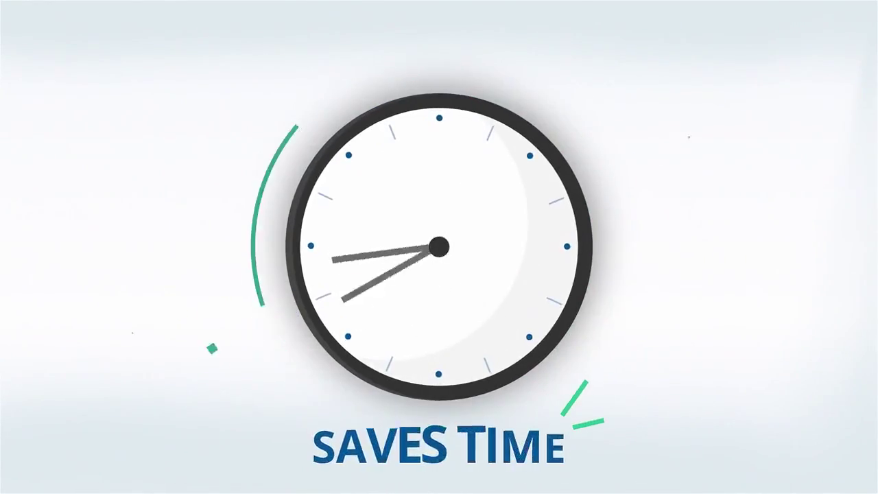 |
00:30 | The Integration Core: Two gears locking together perfectly, symbolizing the seamless connection between Sage 100 and external tools. | Critical Junctures |
| 04 | [IMG ASSET 4] | 00:50 | The Security Vault: A heavy, animated steel vault door closing, visualizing abstract "Data Security" in a tangible, reassuring way. | Conclusion |
Critical Juncture: The "Watchdog" Visualization
The Challenge: The client needed to highlight a specific technical feature called the "Watchdog Program," which monitors for updates. The initial concept of showing a blinking server light was deemed too passive and forgettable.
The Constraint: We needed a way to personify this automated process without breaking the strict corporate style guide or making it look like a cartoon.
The Advids Solution: We conceptualized a stylized, geometric silhouette of a dog sitting next to the data stream. We used limited animation—just a subtle head perk and a "signal" wave emitting from the dog—to suggest alertness. This Creative Pivot turned a dry background feature into a memorable visual hook that implied loyalty and protection.
Feedback Loop: Refining the Synchronization Metaphor
- Internal Review: The Advids creative director noted that in
Animatic_Test_02.mp4, the lines connecting the carts to the server were too thin and looked fragile. - Client Feedback (via Vimeo Review): "The connection needs to feel robust. These are million-dollar businesses; the 'pipe' needs to look unbreakable."
- Advids Action: We thickened the stroke weight of the connecting lines by 200% and added a "pulse" effect—a light moving along the path—to signify active, robust data transmission. This change was implemented in
Animation_Pass_03.aep.
8. Synergy Analysis: Strategic Creativity
This project exemplifies the synergy between Technical Understanding and Creative Abstraction.
- The Technical: Advids understood the intricacies of Enterprise Resource Planning data structures (Customer Relationship Management, Warehouse Management, etc.).
- The Creative: Instead of showing spreadsheets, we used distinct icons to represent these modules, arranging them around the central "In-Synch" hub. This spatial arrangement communicated the "centralized control" aspect of the software more effectively than any technical diagram could.
9. Outcomes and Strategic Learnings
The final video successfully demystified the IN-SYNCH platform.
- Clarity: The separation of "Web Store" and "Sage 100" elements, connected by the IN-SYNCH bridge, provided an instant "A-ha" moment for viewers.
- Brand Authority: The high-quality motion design elevated the perceived value of the software, positioning it as a premium enterprise solution.
- Engagement: The video successfully held viewer attention through the dense feature list by varying the visual metaphors (clocks, vaults, maps, gears).
Strategic Learning: In technical platform demonstrations, Visual Metaphor is King. By translating abstract code functions into tangible physical objects (locks, gears, pipes), Advids creates a cognitive bridge that allows non-technical decision-makers to grasp complex value propositions instantly.
Final Video
Author & Editor Bio

