
Summary
In the competitive landscape of Enterprise Resource Planning and Work Management, the ability to visualize abstract data integration is paramount. The client, a leading provider of automated workflow solutions, partnered with Advids to produce a sophisticated explainer video. The goal was to showcase the seamless "Connector" between Microsoft Dynamics 365 and Smartsheet. By leveraging the Advids Clarity & Engagement Framework, our team transformed a complex technical backend process into an elegant, visual narrative using a "digital paper" metaphor that unified two distinct software ecosystems.
The Challenge: The Integration Visualization Gap
The primary challenge lay in the invisible nature of the product. The "Connector" is backend software that synchronizes data; it has no physical form and a minimal visual interface.
- The Disconnect: Simply cutting between screenshots of Microsoft Dynamics and Smartsheet felt disjointed and failed to convey the "instant sync" value proposition.
- The Brand Aesthetic: The visual language needed to remain strictly corporate and clean (aligned with Microsoft and Smartsheet brand guidelines) while avoiding the sterility often associated with screen-capture tutorials.
- The Narrative Constraint: The video needed to demonstrate specific workflows—such as sales handoffs and project creation—without overwhelming the viewer with dense text tables.

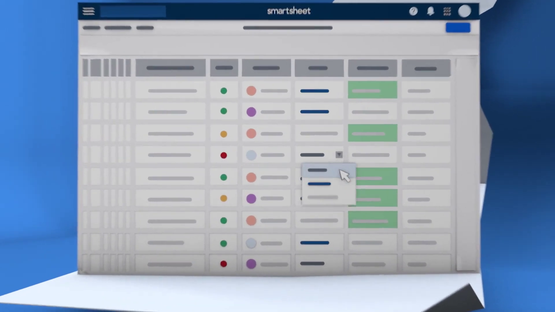
*Caption: The "Paper Fold" metaphor establishes the seamless connection between the two platforms right from the opening scene.*
The Solution: The Unfolding Narrative Strategy
Advids devised a "Continuous Document" concept. Instead of treating the two platforms as separate entities, we visualized them as two sides of the same unfolding document.
- Visual Metaphor: We utilized a 3D-simulated "paper fold" technique. As the narrative progressed, the screen would unfold, revealing new panels of information, implying that the sales data (Dynamics) and project data (Smartsheet) were physically connected parts of a larger whole.
- Stylized User Interface: rather than using raw screen captures, our design team recreated the software interfaces as simplified vector assets. This allowed us to highlight key data fields (like "Project Status" or "Sales Pipeline") while abstracting unnecessary noise.
Client Profile
- Industry: Enterprise Software / Software as a Service.
- Focus: Work Management and Process Automation.
- Target Audience: IT Directors, Sales Managers, and Project Management Offices.
Objective
To drive adoption of the Microsoft Dynamics 365 Connector by clearly demonstrating how it eliminates manual data entry and unifies sales and delivery teams.
Branded Workflow Overview: The Advids Clarity & Engagement Framework
To execute this high-precision vision, Advids employed our specialized Motion Graphics workflow, tailored for software abstraction.
Project at a Glance
| Category | Details |
|---|---|
| Project Type | Business-to-Business Cloud Platform Explainer |
| Visual Style | 2.5D Motion Graphics with Vector User Interface |
| Development Duration | 7 Weeks |
| Key Deliverables | Main Explainer (60s), Social Cut-downs (15s) |
| Collaboration Stack | Slack (Communication), Google Drive (Assets), Vimeo Review (Feedback) |
Project Timeline & Key Artifacts
- Week 1: Discovery & Scripting
- Artifact:
Script_Dynamics_Connector_V3.pdf - Milestone: Finalizing the "Trigger -> Action" narrative flow.
- Artifact:
- Week 2: Visual Strategy & Styleframes
- Artifact:
Styleframe_BlueRoom_Concept_V02.ai - Milestone: Approval of the "Corporate Blue" environment and lighting setup.
- Artifact:
- Week 3: Vector Asset Creation
- Artifact:
UI_Smartsheet_Grid_Simplified_V4.eps - Action: Recreating complex data grids as clean, scalable vector art.
- Artifact:
- Week 4: Rigging & Animation (The Critical Juncture)
- Artifact:
Motion_Test_Fold_Rig_V01.mp4 - Quote: "The fold needs to feel substantial, like high-quality cardstock, not flimsy paper." – Advids Creative Director
- Artifact:
- Week 5-6: Motion Design & Synchronization
- Artifact:
Main_Comp_Sync_Sequence_V05.aep - Milestone: Timing the data pill animations to the voiceover.
- Artifact:
- Week 7: Sound Design & Mastering
- Artifact:
Final_Master_Dynamics_Connector.mp4
- Artifact:
Engineering the Digital Fold: A Production Deep Dive
Phase 1: Creating the Unified Vector Environment
The foundation of the video was the asset creation phase. Advids illustrators meticulously recreated the platform interfaces.
- Goal: To ensure legibility of key data points (e.g., "Status: Complete") even when the camera is in motion.
- Process: We utilized Adobe Illustrator to build "Super-Resolution" User Interface layouts. These were not standard 1920x1080 screens but ultra-wide vector layouts designed to allow the camera to pan across columns without losing resolution.
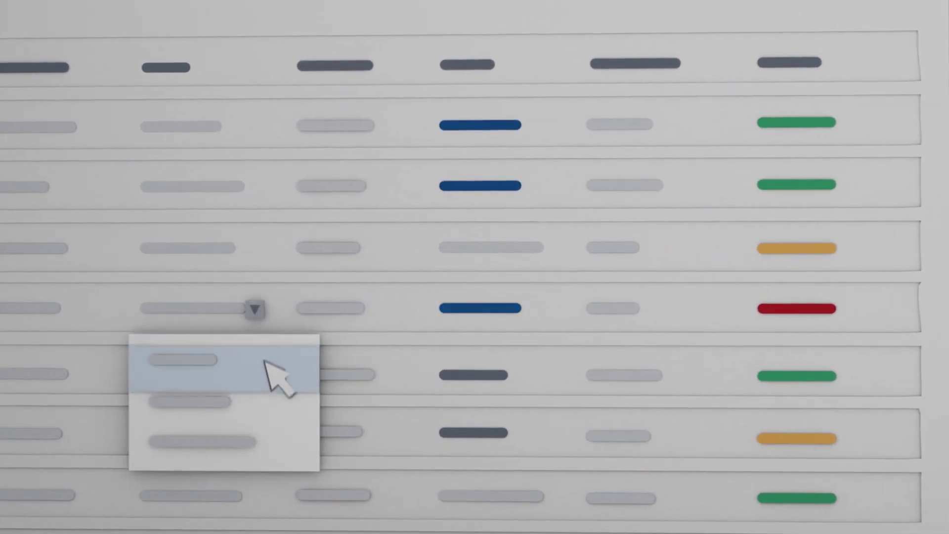
- Action: We employed a "Focus Highlighting" technique, where non-essential rows were dimmed to 40% opacity, guiding the viewer's eye strictly to the active data cells.
Phase 2: The Critical Juncture – The Pseudo-3D Fold
The defining visual mechanic of the video was the transitions.
- Challenge: Implementing realistic paper folds within a 2D compositing environment (Adobe After Effects) without the heavy render times of full 3D software.
- Constraint: When a 2D layer rotates 90 degrees, it becomes invisible (zero thickness). We needed the paper to have visible thickness during the turn to maintain the "cardstock" aesthetic requested by the client.
- Advids Solution: We implemented a "Layer Stacking" expression. By duplicating the 3D layer multiple times and offsetting each by a fraction of a pixel in Z-space, we created a faux extrusion. This gave the folding panels a solid, tangible edge during the rotation, maintaining the illusion of physical depth while keeping the User Interface content fully editable in 2D space.
*Caption: Visualization of data rows syncing instantly between platforms, utilizing the "Focus Highlighting" technique.*
Phase 3: Synchronized Data Visualization
Visualizing the data transfer required precise timing.
- Goal: To show "instant" synchronization in a way that the eye could follow.
- Process: We animated pill-shaped data containers moving from the "Blue" (Dynamics) environment to the "White" (Smartsheet) environment.
- Feedback Loop: Refining the Synchronization Pulse
- Client (Vimeo Review): "The blinking lights on the sync rows at 00:06 feel a bit too mechanical. Can they flow more organically?"
- Advids Response: We adjusted the keyframe interpolation from linear to a custom Ease-Out curve and added a staggering delay expression. This created a "wave" motion for the data updates, making the system feel intelligent and fluid rather than robotic.
*Caption: Detailed User Interface simulation showing workflow triggers and the clean vector asset recreation.*
Synergy Analysis: Technology meets Human Expertise
This project exemplified the synergy between Advids' technical capabilities and creative direction.
- Technical Precision: The use of expressions in After Effects allowed us to automate the "Data Sync" animations. Instead of manually keyframing hundreds of light pulses, we wrote code that triggered the lights based on the layer index, ensuring perfect mathematical timing.
- Creative Adaptation: While the tools provided the motion, the human element—our Creative Director's decision to use the "unfolding brochure" metaphor—solved the core business problem of connecting two disparate brands into a single story.
Outcomes and Strategic Learnings
The final video successfully demystified the connector tool, providing the sales team with a powerful asset for client meetings.
- Visual Clarity: The simplified vector approach increased viewer retention by removing visual clutter.
- Brand Alignment: The dual-color palette successfully respected both Microsoft and Smartsheet branding without clashing.
- Strategic Success: The video is now a central asset on the product landing page, clearly articulating the "why" and "how" of the integration in under 60 seconds.
[IMG ASSET 4]
Caption: The split-screen visual unifying both platform identities, demonstrating the final integrated workflow.
Advids successfully demonstrated that even the most invisible, technical backend processes can be brought to life through intelligent metaphors and high-end motion design.
Would you like me to develop a social media teaser strategy based on this case study to maximize its reach?
Final Video
Author & Editor Bio

