
PHASE H: FINAL CASE STUDY GENERATION
(Proceeding to generate the final output based on the above planning).
Case Study: Visualizing the Cloud-Native Defense for Uptycs
1. Summary
In the rapidly evolving landscape of cybersecurity, abstract concepts often struggle to find concrete visual form. Uptycs, a leader in cloud-native security, partnered with Advids to produce a high-impact Cloud Security Awareness video. The goal was to demystify their platform's ability to ingest, analyze, and act on massive amounts of security telemetry. Utilizing The Advids Clarity & Engagement Framework, we delivered a sophisticated 2D motion graphics piece that translates complex "attack surface" data into a cohesive, visually arresting narrative, driving brand awareness and product understanding.
2. The Challenge: Making the Invisible Visible
The primary challenge was the inherent abstraction of the subject matter. Concepts like "telemetry sources," "streaming analytics," and "cloud workloads" are invisible data processes. A standard screen-recording demo would be too granular, while generic stock footage would fail to capture the sophistication of the Uptycs engine. The client needed a visual language that was:
- Technically Accurate: Representing the flow of data from endpoints to the cloud.
- Aesthetically Modern: Moving away from fear-based red/black tropes to a modern, "Dark Mode" SaaS (Software as a Service) aesthetic.
- Narratively Fluid: Seamlessly connecting the problem (expanding attack surfaces) to the solution (unified defense).
3. The Advids Solution: Kinetic Abstraction
Advids engineered a solution rooted in kinetic abstraction. We developed a custom motion language where data is represented by glowing particle flows, and infrastructure is visualized through clean, neon-accented vector iconography. By placing these elements in a deep, atmospheric space, we created a "command center" feel that empowers the viewer. The result is a video that doesn't just explain the software; it simulates the feeling of control and visibility that the software provides.
4. Client Profile
- Client: Uptycs
- Industry: Cybersecurity / Cloud Infrastructure
- Headquarters: Waltham, Massachusetts
- Focus: The first unified, cloud-native security analytics platform.
5. Objective
To create a compelling "top-of-funnel" awareness asset that educates potential buyers on the changing nature of the attack surface and introduces Uptycs as the modern defender's tool of choice.
6. The Advids Clarity & Engagement Framework
For this project, we deployed our specialized 2D Motion Graphics Module, focusing on precision vector illustration and high-fluidity animation.
Project at a Glance
| Category | Details |
|---|---|
| Project Type | Cloud Security Awareness Video |
| Visual Style | High-Fidelity 2D Motion Graphics, Dark Mode Aesthetic, Neon Accents |
| Primary Workflow | Vector Illustration & Digital Compositing |
| Core Technology | Adobe Illustrator, Adobe After Effects, Cinema 4D (Lite) |
| Collaboration Stack | Slack (Real-time Communication), Google Drive (Asset Management), Vimeo Review (Video Feedback) |
| Deliverables | Main Explainer Video (1080p), Social Cut-downs, Clean Animation Assets |
Project Timeline
- Week 1: Discovery & Scripting - Deconstructing the Uptycs value proposition into a cohesive narrative script.
- Week 2: Visual Strategy & Style Frames - Developing the "Cyber-Dark" color palette and initial asset look.
- Week 3: Storyboarding - Mapping the visual metaphors for "Attack Surface" and "Telemetry."
- Week 4: Vector Illustration - Creating the
Icon_Set_Security_Pack_V2(Servers, Laptops, Shields). - Week 5: Motion Design (Phase 1) - Animating the core loops and data flows.
- Week 6: Motion Design (Phase 2) - Refining transitions and synchronizing with the Voice Over.
- Week 7: Sound Design & Final Mastering - Adding SFX (Sound Effects) and mixing the background score.
7. The Production Deep Dive
Phase 1: Decoding the Security Architecture
Goal: To translate technical jargon into visual metaphors.
Process: We conducted a deep-dive session with the Uptycs product team to understand the "SQL-powered" nature of their analytics. We determined that "connecting lines" and "converging nodes" were the strongest metaphors for their unified data model.
Action: We created a visual dictionary where "Red" signified distinct threats and "Purple/Cyan" represented the secure, analyzed state of the system.
Phase 2: Defining the Cyber-Aesthetic
Goal: To establish a premium look that aligns with modern developer tools.
Process: We avoided the cliché "hacker green" and opted for a sophisticated palette of deep void purples, accented by bright neon cyan and magenta.
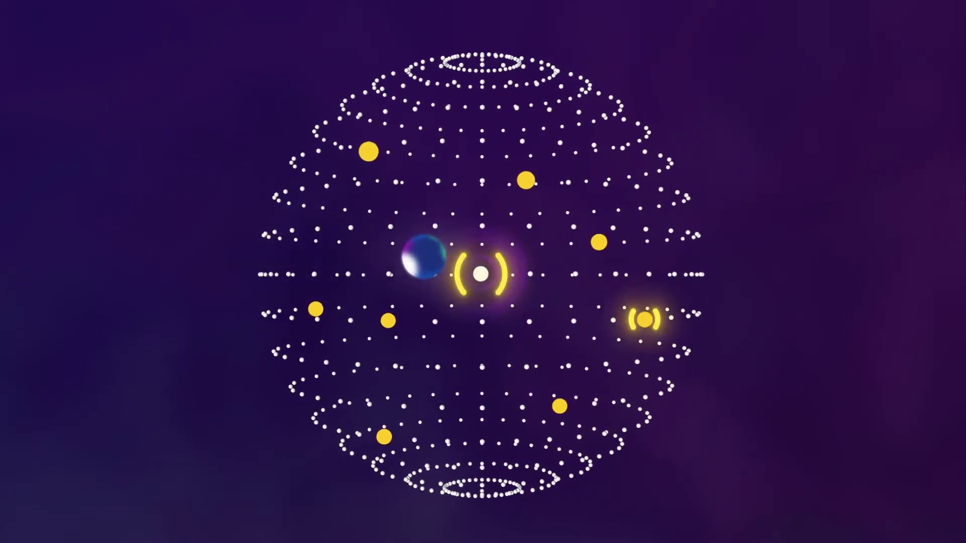
Action: We delivered Style_Frame_Cyber_V3.ai, featuring the "Attack Surface Sphere" (00:02).
Feedback Loop: Refining the Threat Visuals
Client: "The red dots on the attack surface sphere feel a bit static. They need to look like active vulnerabilities."
Advids: "We will update the asset to include a pulsing opacity expression and a subtle orbital rotation in
Animatic_V2.mp4to give the threats a sense of dangerous activity."
Phase 3: Orchestrating the Kinetic Data Flow (The Critical Juncture)
The Challenge: The script called for a visualization of the "Streaming Analytics Engine." Early tests using static lines felt lifeless and failed to convey the speed of the platform.
The Constraint: We needed to show massive data throughput without creating visual clutter that would distract from the Voice Over.
The Advids Solution: We implemented a particle-system approach within our compositing software. Instead of solid lines, we used dashed paths acting as emitters for glowing particles. This allowed us to control the velocity of the data flow. We synchronized the speed of these particles with the tempo of the background music, creating a rhythmic, hypnotic effect that implies high-speed processing (visible at 00:43).
Action: Synthesized Telemetry_Flow_Sim_V4.mp4 which successfully visualized the ingestion of data from endpoints into the cloud.
Phase 4: Integration and Typography
Goal: To reinforce the narrative with on-screen text that highlights key benefits.
Process: We utilized kinetic typography that "typed on" in sync with digital sound effects, reinforcing the code-based nature of the product.
Action: Finalizing the "Outcomes" sequence (00:51) where complex data simplifies into clear icons for "Insights" and "Metrics."
Visual Asset Highlights
| Serial No. | Image Placeholder | Timestamp | Rationale | Placement |
|---|---|---|---|---|
| 1 | IMG ASSET 1 | 00:02 | Illustrates the "Complex Attack Surface" using layered vector elements and orbital animation to show depth. | Introduction |
| 2 | IMG ASSET 2 | 00:30 | Shows the "Global Telemetry" concept with a 3D-simulated dotted globe effect, establishing scale. | Production Deep Dive |
| 3 | IMG ASSET 3 | 00:43 | Visualizes the "Streaming Analytics" critical juncture, showing data converging into the central hub. | Critical Juncture |
| 4 | IMG ASSET 4 | 00:51 | Displays the clean, flat-design aesthetic used for summarizing value propositions like "Measurable Metrics." | Outcomes |
8. Synergy Analysis: Technology vs. Expertise
This project exemplified the synergy between advanced Vector Illustration tools and human Strategic Insight.
- Technology: Enabled us to create complex particle simulations and intricate vector layering that would be impossible to draw by hand frame-by-frame.
- Human Expertise: Was crucial in restraint. The Advids creative team knew exactly when to simplify the visuals (using icons) and when to add complexity (using particles) to ensure the viewer's attention was guided correctly. It was our understanding of the cybersecurity audience that dictated the "dark mode" aesthetic, ensuring immediate resonance with the target demographic.
9. Outcomes & Strategic Learnings
The final video provides Uptycs with a versatile asset that serves multiple functions: a booth loop for trade shows, a website header background, and a sales enablement tool.
- Strategic Learning: For abstract SaaS products, "kinetic metaphor" is more powerful than literal interface walkthroughs. By visualizing the concept of data flow rather than the spreadsheet of data, we created an emotional connection to a technical product.
- Result: A polished, broadcast-quality explainer that successfully communicates the speed, scale, and intelligence of the Uptycs platform.
Next Step for You:
Would you like us to develop a similar "Dark Mode" visual strategy for your technical product to resonate better with developer and engineering audiences?
Final Video
Author & Editor Bio

