

PHASE H: Final Revised Case Study Generation (V2 Final)
(Proceeding to generate the final response using the MTP-V6 structure).
Case Study: Technical SaaS Walkthrough for Conductor
Case Study Summary
Conductor, a leader in Search Engine Optimization technology, required a video asset to unveil their new "Search Console Analytics" feature. The primary challenge was to demonstrate the depth and granularity of their new data integration without overwhelming the viewer with dense spreadsheets or static dashboard screenshots. Advids engaged the Clarity & Engagement Framework to produce a 2D motion graphics video. By abstracting the User Interface into clean vector assets and animating the data flow, we transformed a technical software walkthrough into a compelling narrative of insight and efficiency.
The Challenge: Visualizing Intangible Data
The core value proposition of Conductor's new feature is its ability to integrate and visualize massive datasets from Google Search Console, specifically highlighting historical trends over 16 months.
- The Density Problem: The actual software interface is data-dense. A simple screen recording would result in small, illegible text when viewed on mobile devices or social feeds.
- The Static Barrier: Historical data is exciting because of the trends it reveals, but a static image of a graph fails to convey the action of data retrieval and analysis.
- Brand Alignment: The video needed to balance the technical accuracy of the software with Conductor's modern, fluid brand aesthetic.
The Solution: The Advids Clarity & Engagement Framework
Advids implemented a High-Fidelity Vector Motion Strategy. Instead of using raw footage, we recreated the Conductor dashboard as a scalable vector environment. This allowed us to:
- Control the Focus: We could blur or remove non-essential menu items to direct the viewer's attention solely to the features being discussed (e.g., Keyword Groups).
- Animate the Data: We utilized kinetic motion design to make line graphs "draw" themselves on screen, visually reinforcing the concept of "accessing historical data."
- Humanize the Tech: We integrated stylized character illustrations to represent the marketing team, bridging the gap between the software and the human user.
Client Profile & Objective
- Client: Conductor
- Industry: Marketing Technology / Search Engine Optimization
- Objective: To educate existing and potential users on the specific capabilities of the Search Console Analytics integration, driving adoption and usage of the new feature set.
Branded Workflow Overview
Workflow: The Advids Clarity & Engagement Framework
This workflow is designed for complex technical explanations where clarity is paramount. It prioritizes the deconstruction of information into visual metaphors and simplified assets before reassembling them into a coherent motion narrative.
Project at a Glance
| Component | Detail |
|---|---|
| Video Type | Technical Software as a Service Walkthrough |
| Primary Technique | 2D Vector Motion Graphics & Data Visualization |
| Project Duration | 7 Weeks |
| Collaboration Stack | Slack (Real-time Communication), Google Drive (Asset Management), Vimeo Review (Video Feedback) |
| Deliverables | Main Explainer (16:9), Social Cut-downs (1:1), Vector Asset Kit |
Production Timeline
- Week 1: Discovery & Visual Strategy
- Milestone: Kickoff Workshop regarding feature prioritization.
- Artifact:
Conductor_Visual_Strategy_Deck_v2.pdf
- Week 2: Scripting & Storyboard
- Milestone: Script approval and static frame composition.
- Artifact:
Storyboard_Master_v3.pdf
- Week 3: Asset Creation (The Vectorization Phase)
- Milestone: Recreating the dashboard in vector format.
- Artifact:
UI_Vector_Kit_Main_Dashboard.ai
- Week 4: Animatics & Timing
- Milestone: Low-fidelity motion test to lock voiceover timing.
- Artifact:
Animatic_Sequence_01_v2.mp4 - Quote (Advids Internal): "The timing on the 'Keyword Group' dropdown needs to be snappier to match the upbeat tempo of the track."
- Week 5: High-Fidelity Animation
- Milestone: Main motion design and graph animation.
- Artifact:
Scene_04_DataGraph_Render_v1.mov
- Week 6: Sound Design & Polish
- Milestone: Adding sound effects (clicks, swooshes) and mixing background music.
- Artifact:
Audio_Mix_Stem_v2.wav
- Week 7: Final Delivery
- Milestone: Final render and format export.
- Artifact:
Conductor_SaaS_Walkthrough_Final_Master.mp4
The Production Deep Dive
Phase 1: Laying the Foundation – Visual Strategy and Asset Creation
Goal: To establish a visual language that merges Conductor's fluid brand identity with the rigid structure of a software dashboard.
Process: Advids creative directors analyzed the Conductor brand guidelines, which feature organic, liquid shapes. We decided to use these shapes as a dynamic background layer that "holds" the technical content.
Action: Our design team meticulously traced key screens of the software. We created a "Vector UI Kit" (UI_Vector_Kit_Main_Dashboard.ai) where every button, graph line, and text field was a separate editable layer. This preparation was crucial for the animation phase, as it allowed us to manipulate individual elements—like highlighting the "Apply" button—without pixelation.
Critical Juncture: The User Interface Abstraction Challenge
Challenge: The raw software interface contained dozens of metrics. Showing all of them would confuse the viewer. The client wanted to show the complexity of the data without the clutter.
Constraint: We could not alter the placement of elements so drastically that the software looked unrecognizable to current users.
Solution: Advids implemented a "Selective Focus" technique. We kept the structural layout identical to the real product but lowered the opacity of non-active elements (like the side navigation bar) while keeping the active elements (the "Engagement Trends" chart) at 100% opacity and vibrant color. We synthesized a specific artifact, Styleframe_Focus_Test_v4.png, to demonstrate this balance to the client before animation began. This approach ensured the viewer knew exactly where to look.
Feedback Loop: Refining the Motion Logic
Advids: "We have uploaded
Animatic_Sequence_01_v2.mp4to Vimeo Review. Please note the speed of the cursor movement during the 'Keyword Group' selection."Client: "The cursor moves a bit too mechanically in this version. It feels like a robot is using the tool. Can we add a slight curve to the path and a subtle ease-in before the click to make it feel more human?"
Advids: "Understood. We have adjusted the motion paths in the animation software to include natural easing and a slight overshoot. Please see
Animatic_Sequence_01_v3.mp4."
Phase 2: Bringing Data to Life – Motion Design and Animation
Goal: To visualize the passage of time and the accumulation of data.
Process: The script highlights "16 months of data." A static chart cannot convey this timeline.
Action: We utilized the Advids Clarity & Engagement Framework to animate the line graphs. Using "Trim Paths" functions in our animation software, we keyed the graph lines to draw from left to right, perfectly synchronized with the voiceover. We added a secondary animation of "popping" data points to emphasize specific peaks in the engagement metrics. This turned a standard chart into a dynamic storytelling element that visually grew alongside the narrative.
Visual Asset Impact Table
| Serial No. | Image Placeholder | Timestamp | Rationale | Placement |
|---|---|---|---|---|
| 1 |  |
00:09 | Shows the clean vector recreation of the calendar interface, demonstrating the User Interface Abstraction. | Phase 1: Visual Strategy |
| 2 | 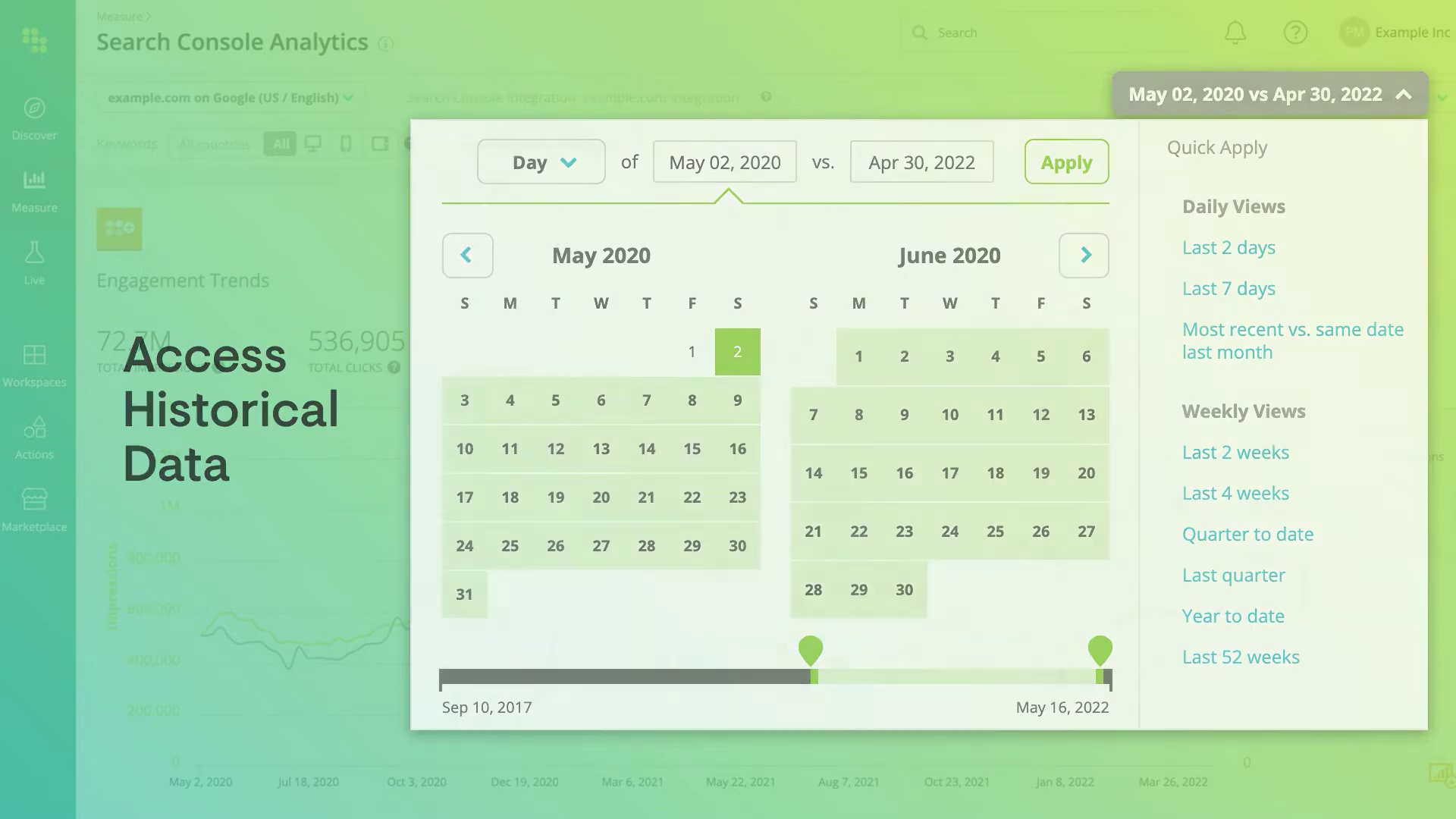 |
00:25 | Displays the animated "Engagement Trends" graph, illustrating the solution to the Critical Juncture regarding static data. | Phase 2: Motion Design |
| 3 | 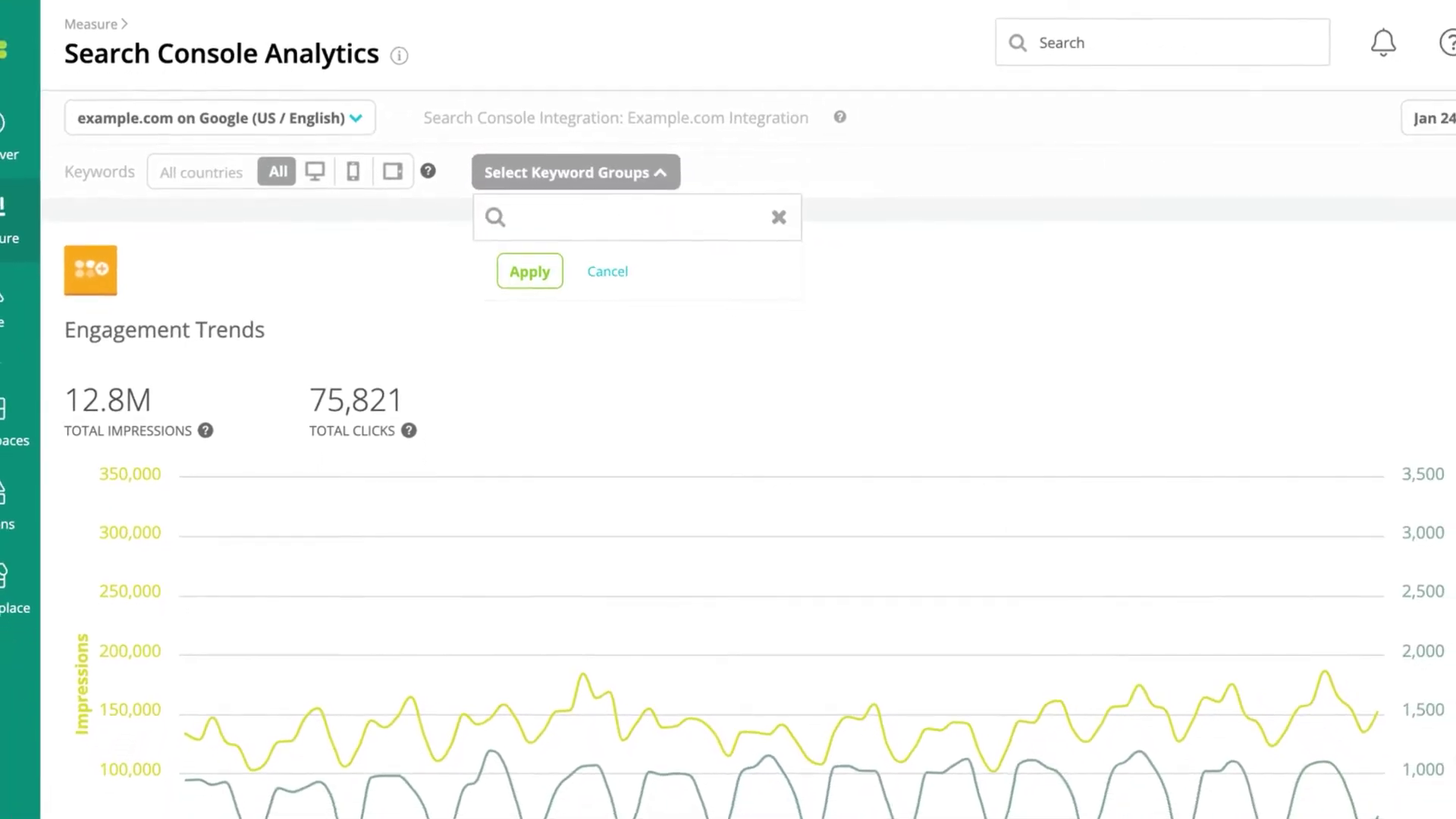 |
00:37 | Captures the "Keyword Groups" selection, showcasing the selective focus and cursor animation. | Feedback Loop Section |
| 4 | [IMG ASSET 4] | 00:58 | Highlights the detailed data table, proving the vector assets maintained legibility even for dense text. | Outcomes Section |
Synergy Analysis: Technology vs. Human Expertise
This project exemplifies the synergy between Vector Illustration Technology and Human Narrative Expertise.
- Technology: Enabled the precise, scalable recreation of the software interface (
.aiand.epsvector files) that remains crisp at any resolution. - Human Expertise: Advids animators understood that data needs a "pulse." The decision to animate the graph lines with specific easing curves—rather than a linear, mechanical reveal—added a layer of polish that made the software feel responsive and modern. The human ability to interpret "generic character" feedback and iterate into a persona that fit the "Analyst" role was crucial for audience connection.
Outcomes & Strategic Learnings
The final video successfully translated a complex set of analytical features into an accessible, 60-second narrative.
- Clarity Achieved: By abstracting the User Interface, we ensured that the viewer's cognitive load was managed effectively, allowing them to absorb the feature benefits without getting lost in the UI.
- Asset Reusability: The
UI_Vector_Kit_Main_Dashboard.aicreated during this production became a valuable asset for the client, allowing them to use high-resolution, editable dashboard elements in static print brochures and web headers. - Strategic Learning: For Software as a Service products, "High-Fidelity Vectorization" is often superior to screen recording. It offers complete control over timing, focus, and visual quality, which is essential when the product is the visual.
Final Video
Author & Editor Bio

