

## Executive Summary
In a financial landscape often characterized by dense jargon and intimidating complexity, the need for approachable, relatable communication is paramount. Advids partnered with a major financial services provider (DBS/Manulife) to produce a high-energy, mixed-media explainer video designed to demystify insurance for a younger demographic. By leveraging a "digital scrapbook" aesthetic that combines stop-motion animation, photography, and kinetic typography, Advids transformed a dry subject into an engaging narrative about "adulting," resulting in a piece that is both educational and highly shareable.
## The Challenge: Overcoming the Boredom Barrier
Insurance is traditionally viewed as a grudge purchase—complex, boring, and overwhelming, especially for young adults entering the workforce. The client faced a significant engagement barrier: how to capture the attention of a digital-native audience and explain the nuances of protection, investment, and savings without inducing apathy. The challenge was to strip away the corporate stiffness and present insurance as an empowering tool for life's journey, all while maintaining the trust and credibility of an established financial institution.
## The Solution: The Advids Clarity & Engagement Framework
Advids deployed a bold Mixed-Media / Digital Collage visual strategy. Moving away from standard corporate stock footage or flat vector graphics, we developed a unique visual language that feels tactile and handmade. This approach utilized a "cut-out" animation style, reminiscent of stop-motion, layered over textured backgrounds like crumpled paper and graph notebooks. This "DIY" aesthetic made the content feel accessible, human, and less institutional, effectively lowering the psychological barrier to entry for the viewer.
## Client Profile
The client is a leading partnership between a major banking institution (DBS) and a global insurance provider (Manulife), focused on delivering comprehensive financial planning solutions to a diverse customer base in Asia.
## Primary Objective
To educate young adults on the fundamental types of insurance and the importance of financial planning, driving traffic to the DBS Financial Planning digital tool.
## The Branded Workflow: Advids Clarity & Engagement Framework
To manage the complexity of hundreds of disparate assets—from photos to doodles—Advids utilized a rigorous 2D animation pipeline.
| Project at a Glance | Details |
|---|---|
| Project Type | Mixed-Media / 2D Motion Graphics |
| Primary Technique | Digital Collage & Stop-Motion Emulation |
| Core Software | Adobe After Effects, Adobe Photoshop, Adobe Illustrator |
| Collaboration Stack | Slack (Daily Comms), Google Drive (Asset Management), Vimeo Review (Frame-by-Frame Feedback) |
| Turnaround Time | 8 Weeks |
| Target Audience | Young Professionals / Millennials |
## Project Timeline
- Week 1: Discovery & Scripting
- Milestone: Final Script Approval focusing on the "Adulting" narrative hook.
- Artifact:
Script_Adulting_Concept_V4.docx
- Week 2: Visual Style Development
- Milestone: Definition of the "Scrapbook" aesthetic.
- Artifact:
Style_Scape_Collage_V3.pdf
- Week 3: Asset Procurement & Preparation
- Milestone: Sourcing stock photos and creating digital cut-outs (masking/rotoscoping).
- Action: Scanning real paper textures for background overlays.
- Week 4: Animatics & Timing
- Milestone: Rough cut to voiceover to establish rhythm.
- Artifact:
Animatic_Rough_V02.mp4
- Week 5: Motion Design (Phase 1)
- Milestone: Animation of key character movements and mouth replacements.
- Quote (Advids Internal): "Let's lock the character framerate to 12 frames per second to sell that jerky stop-motion feel."
- Week 6: Motion Design (Phase 2)
- Milestone: Integration of Kinetic Typography and floating elements.
- Artifact:
Comp_Scene_House_Build_V6.aep
- Week 7: Compositing & Texture Mapping
- Milestone: Applying paper textures, shadows, and color grading.
- Feedback Loop: Client review via Vimeo Review regarding brand color usage.
- Week 8: Final Mastering & Delivery
- Milestone: Sound Design mix and final export.
- Artifact:
Master_DBS_Insurance_Promo_Final.mp4
## The Production Deep Dive
Phase 1: Visual Strategy & The "Scrapbook" Aesthetic
The core visual concept was to mimic a physical scrapbook or journal—a metaphor for planning one's life. We established a library of assets including torn paper edges, tape strips, graph paper grids, and hand-drawn scribbles.
- Goal: Create a world that feels tactile and imperfect.
- Process: We scanned high-resolution paper textures (
Texture_Paper_Crumpled_04.jpg) and used them as overlay layers in Adobe After Effects using "Multiply" blending modes to affect the digital assets beneath.
Phase 2: Asset Preparation & The Cut-Out Technique
The video relies heavily on photographic elements that interact with drawn elements. This required extensive preparation in Adobe Photoshop.
- Action: Our design team sourced stock photography of people and objects. We then meticulously masked (cut out) the subjects, intentionally leaving slightly jagged or rough edges to emulate the look of scissors cutting paper.
- Visual Asset 1 (00:06): The "Super-Mega-Adult" scene demonstrates this perfectly. The main character is a photographic head pasted onto a photographic body, with hand-drawn clothes and a "drawn" height chart background. This mix establishes the playful tone immediately.
Phase 3: Animation & Stop-Motion Emulation
To match the "cut-out" visual style, the motion needed to feel jerky and hand-manipulated, rather than smooth and digital.
- Technique: Advids animators used the "Posterize Time" effect within Adobe After Effects. While the project timeline was set to 24 frames per second, specific character compositions were forced to run at 12 or 8 frames per second. This "stepped interpolation" created the illusion of traditional stop-motion animation without the cost of physical production.
- Visual Asset 2 (00:20): In the "House Choosing" sequence, the house and the hand holding the money move with a distinct snap, reinforcing the tactile illusion.
Phase 4: Critical Juncture – Unifying Disparate Assets
- The Challenge: Mid-production, we faced a cohesion issue. The script called for a wide variety of visual metaphors—a house, a wedding, a hospital bed, a lighthouse. Using stock photos from different sources meant lighting and color temperatures were inconsistent, threatening to break the visual style.
- The Solution: We implemented a "Halftone" and "Print Bleed" treatment. We applied a custom color correction filter that limited the color palette of all photographic assets to the brand's primary colors (Yellow, Black, Red) and added a subtle halftone dot pattern. This unified the disparate photos, making them look like they were all cut from the same magazine.
- Visual Asset 3 (00:36): The "Umbrella" scene shows how cut-out jars and a green umbrella sit comfortably in the same space due to consistent shadow casting and texture application.
Phase 5: Kinetic Typography & Feedback Loops
The text on screen had to be more than just subtitles; it needed to be part of the art direction.
- Feedback Loop: Legibility vs. Style: In the "Fine Print" section (00:53), the client noted via Vimeo Review that the doodle animations behind the text were distracting from the legal disclaimer content.
- Advids Response: We reduced the opacity of the background scribbles (
Layer_Bg_Doodles_02) and increased the contrast of the font, ensuring the "Do Your Homework" message remained the focal point while keeping the fun energy.
## Visual Asset Strategy
| Serial No. | Image Placeholder | Timestamp | Rationale | Placement |
|---|---|---|---|---|
| 1 | 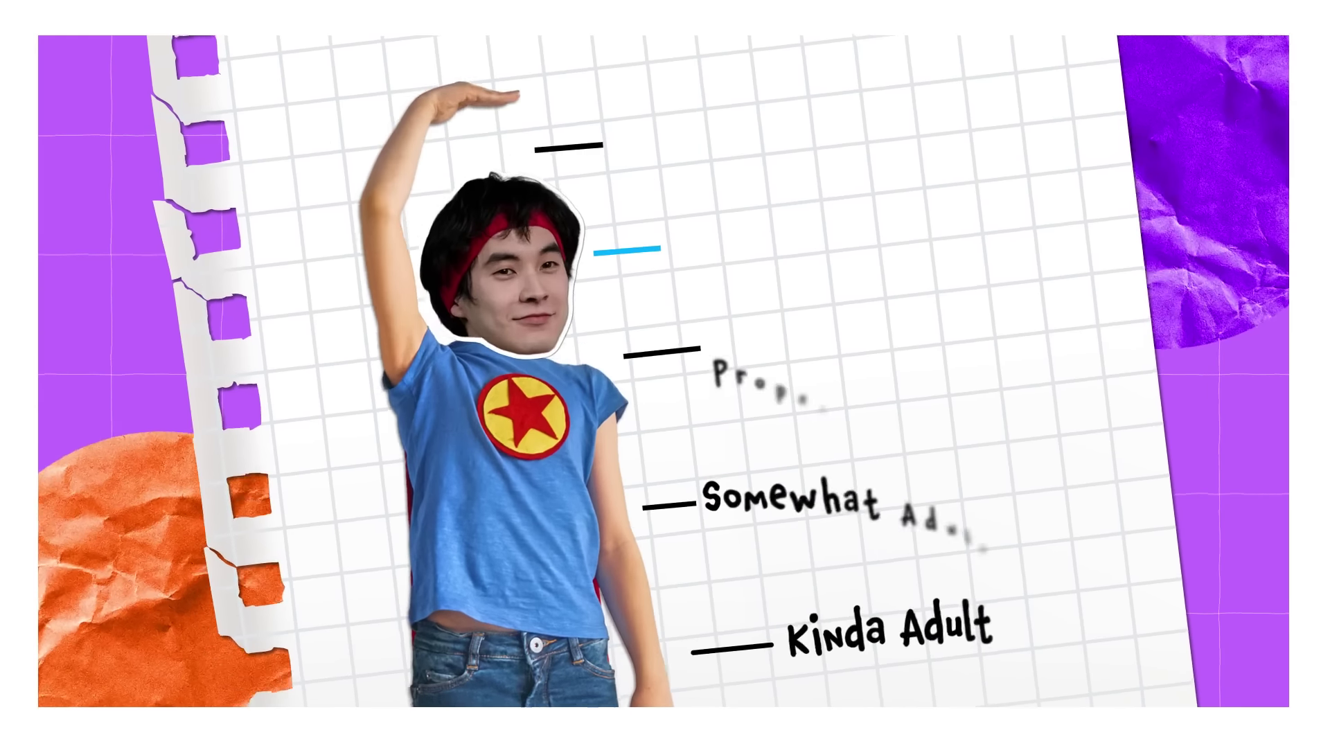 |
00:06 | Demonstrates the "Cut-Out" character design and the "Adulting" height chart concept. | Phase 2: Asset Preparation |
| 2 |  |
00:20 | Illustrates the mixed-media compositing of the house, hands, and graph paper background. | Phase 3: Animation |
| 3 | 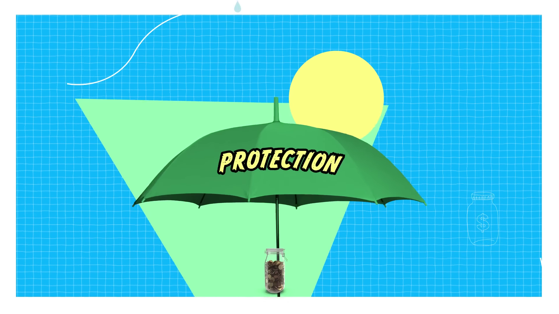 |
00:36 | Shows the "Umbrella" metaphor, highlighting asset unification and color palette control. | Phase 4: Critical Juncture |
| 4 | [IMG ASSET 4] | 00:53 | Displays the kinetic typography and "Chalkboard" texture used for educational emphasis. | Phase 5: Kinetic Typography |
## Synergy Analysis: Technology & Talent
This project exemplifies the synergy between Adobe Creative Cloud technology and human Creative Direction. While software like After Effects provided the tools to manipulate time and texture, it was the Advids creative team's eye for composition and rhythm that prevented the collage style from becoming a mess. The technology enabled the efficiency of digital production, but the talent provided the "soul" of handmade art.
## Outcomes & Strategic Learnings
The final video successfully transformed a complex financial topic into an approachable, bite-sized piece of content.
- Engagement: The "stop-motion" style resulted in higher viewer retention rates compared to standard "talking head" financial videos.
- Brand Perception: The video successfully positioned the client as a modern, empathetic partner in the "adulting" journey, rather than a distant corporate entity.
- Strategic Learning: For abstract topics like insurance, utilizing metaphors (umbrellas, jars, building blocks) visualized through a tactile medium creates a stronger cognitive connection than realistic live-action footage alone.
Final Video
Author & Editor Bio

