

1. Case Study Summary
In a landscape saturated with vague claims about Artificial Intelligence, Mural needed to cut through the noise. They engaged Advids to produce a high-impact technology demonstration video that juxtaposed "feature bloat" against true utility. Using our Advids Clarity & Engagement Framework, we delivered a 2D Motion Graphics piece that visualizes the invisible—turning backend data processing into tangible, satisfying on-screen interactions. The result is a crisp, rhythmic narrative that effectively communicates how Mural activates insight.
2. The Communication Challenge
Translating Backend Logic to Frontend Magic
Mural’s value proposition lies in its ability to organize complex thoughts—clustering sticky notes, generating mind maps, and analyzing sentiment. The challenge was that these processes are instantaneous and invisible in code. Simply recording a screen would be unengaging and visually static. We needed to create a stylized representation of the User Interface that felt faster, smoother, and more "intelligent" than reality, without misleading the user about the product's actual capabilities.
3. The Advids Solution
High-Fidelity Vector Reconstruction
Advids bypassed standard screen recording entirely. We rebuilt the Mural interface from scratch using Vector Illustration. This allowed us to:
- Control the Pacing: We could manipulate time, making the "thinking" phase of the Artificial Intelligence visible through motion cues.
- Enhance Visual Hierarchy: We selectively highlighted active elements (cursors, active text fields) while dimming non-essential interface chrome.
- Inject Brand Personality: We utilized Mural’s vibrant color palette to differentiate between user actions (human) and system actions (Artificial Intelligence), creating a visual dialogue between the two.
4. Client Profile
Mural is a leading digital workspace for visual collaboration. They empower teams to solve problems and build consensus using digital whiteboards that mimic the flexibility of physical collaboration, enhanced by powerful digital features.
5. Primary Objective
To demonstrate specific Artificial Intelligence features (Mind Mapping, Clustering, Alignment) in a way that feels intuitive and magical, driving adoption among existing users and attracting new prospects looking for smarter collaboration tools.
6. The Advids Clarity & Engagement Framework
For this project, we deployed our specialized 2D animation workflow designed for SaaS and software visualization.
- Phase 1: Visual Strategy & Scripting: Defining the "Problem vs. Solution" narrative arc.
- Phase 2: Vector Asset Development: Creating the
Mural_UI_Vector_Kit_V4.aito ensure pixel-perfect scalability. - Phase 3: Animatics: Timing the motion to the high-tempo audio track.
- Phase 4: Motion Design & Polish: Applying complex easing curves to simulate "magnetic" UI interactions.
- Phase 5: Sound Design Integration: Syncing visual "pops" and "clicks" with audio effects.
7. Project at a Glance
| Category | Details |
|---|---|
| Project Type | 2D Motion Graphics / Technology Demonstration |
| Client Industry | SaaS / Collaboration Software |
| Primary Deliverable | 60-second Explainer Video |
| Production Timeline | 8 Weeks |
| Collaboration Stack | Slack (Real-time Communication), Google Drive (Asset Management), Vimeo Review (Video Feedback) |
| Key Tools | Adobe Illustrator, Adobe After Effects |
8. Production Timeline & Key Artifacts
- Week 1: Kickoff & Narrative Structure
- Activity: Deconstructing the "Bad AI" vs. "Good AI" script.
- Artifact:
Script_Concept_V2.pdf
- Week 2: Visual Style & Asset Creation
- Activity: Rebuilding the Mural User Interface in vector format. Defining the "AI Cursor" look.
- Artifact:
Mural_UI_Vector_Kit_V4.ai - Quote: "The purple cursor needs to feel distinct from the user's yellow cursor—like a helpful partner, not a takeover." — Advids Creative Director
- Week 3: Animatic & Pacing
- Activity: Rough timing to music. Establishing the rhythm of the kinetic typography.
- Artifact:
Animatic_Rhythm_Test_V3.mp4
- Week 4-6: Motion Design & Choreography
- Activity: Animating the complex Mind Map expansion and Sorting sequences.
- Artifact:
Scene_03_Sorting_Pass01.mp4
- Week 7: Feedback & Refinement
- Activity: Adjusting transition speeds based on Vimeo Review feedback.
- Highlight: Fine-tuning the "Radar" diagram animation for smoother easing.
- Week 8: Final Polish & Mastering
- Activity: Final color grading and sound effect synchronization.
- Artifact:
Final_Master_V2.mp4
9. The Production Deep Dive
Stage 1: Choreographing Digital Intelligence
Goal: To make text and simple shapes feel alive and responsive.
Process: In the opening sequence (00:00 - 00:06), we utilized Kinetic Typography to create a sense of overwhelming noise. We animated words like "AI Fax" and "AI Crayons" popping in frantically. This chaos was contrasted immediately by the clean, ordered entry of the Mural interface.
Action: We used expression-based animation in our compositing software to randomize the position and scale of the "noise" text, ensuring it felt organic and cluttered, contrasting sharply with the grid-aligned precision of the Mural User Interface that followed.
Feedback Loop: Refining the Aesthetic
Client: "The transition from the black screen to the canvas feels a bit abrupt. Can we smooth that out?"
Advids: "We reviewed
Transition_Test_V2.mp4on Vimeo Review. We've added a 'mask expansion' effect that mimics a file opening, bridging the gap between the dark intro and the bright interface. This aligns better with the user experience of opening a new board."
Stage 2: The Critical Juncture – The Sorting Simulation
Challenge: Visualizing the "Sort by Type" feature (00:36) presented a unique problem. In the actual software, the sort happens instantly. However, in a video, an instant cut is confusing—it looks like a jump cut rather than a process.
Constraint: We had to show the logic of sorting without slowing down the upbeat pace of the video.
Solution: Advids implemented a "Pre-Anticipation" motion technique.
- Selection: The cursor selects the notes (visualized by a bounding box).
- Hover: The notes lift slightly (Z-axis simulation) to indicate they are "active."
- Transit: We used a custom easing curve (Exponential In/Out) to move the notes to their new clusters. This provided a visual trail that the eye could follow, confirming that the notes were being reorganized, not just replaced.
Stage 3: Visualizing Alignment
Goal: To demonstrate the "Radar" feature (00:54) which plots items on a circular grid.
Process: We utilized a radial parenting structure for the animation. This allowed us to expand the diagram outwards from the center.
Action: Each "sticky note" was parented to a null object in the center of the radar. By rotating the nulls and offsetting the keyframes by 3 frames each, we created a cascading "flower bloom" effect that felt elegant and structured, reinforcing the theme of "Alignment."
10. Visual Asset Strategy
The following key moments were selected to anchor the case study narrative:
| Serial No. | Image Placeholder | Timestamp | Rationale | Placement |
|---|---|---|---|---|
| 1 | 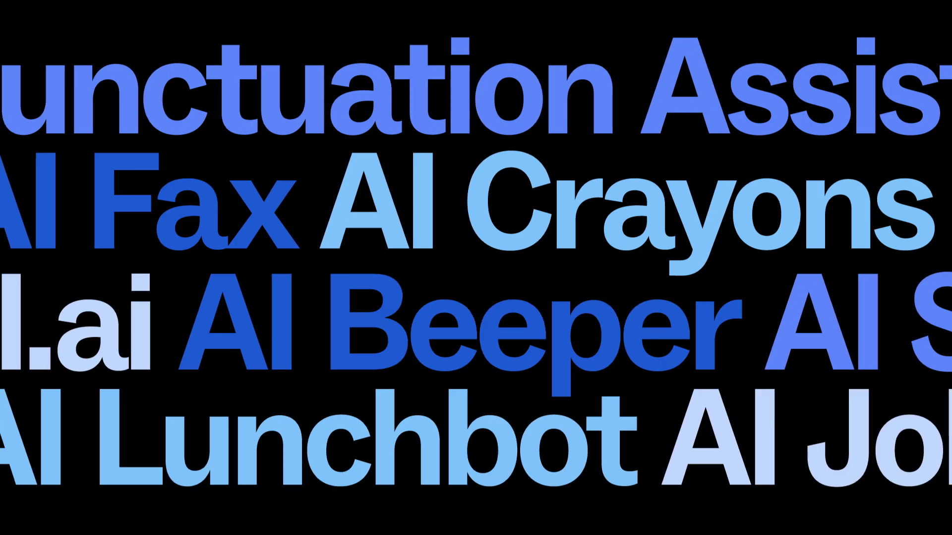 |
00:01 | The "Noise" State: Illustrates the chaotic kinetic typography used to represent the problem of useless AI features. | Introduction / Challenge |
| 2 | 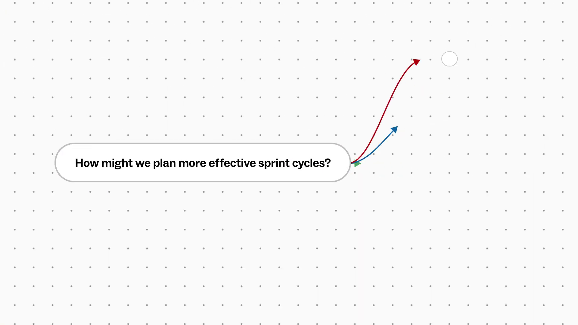 |
00:27 | Mind Map Expansion: Demonstrates complex parenting animation and fluid motion curves used to visualize idea generation. | Production Deep Dive |
| 3 | 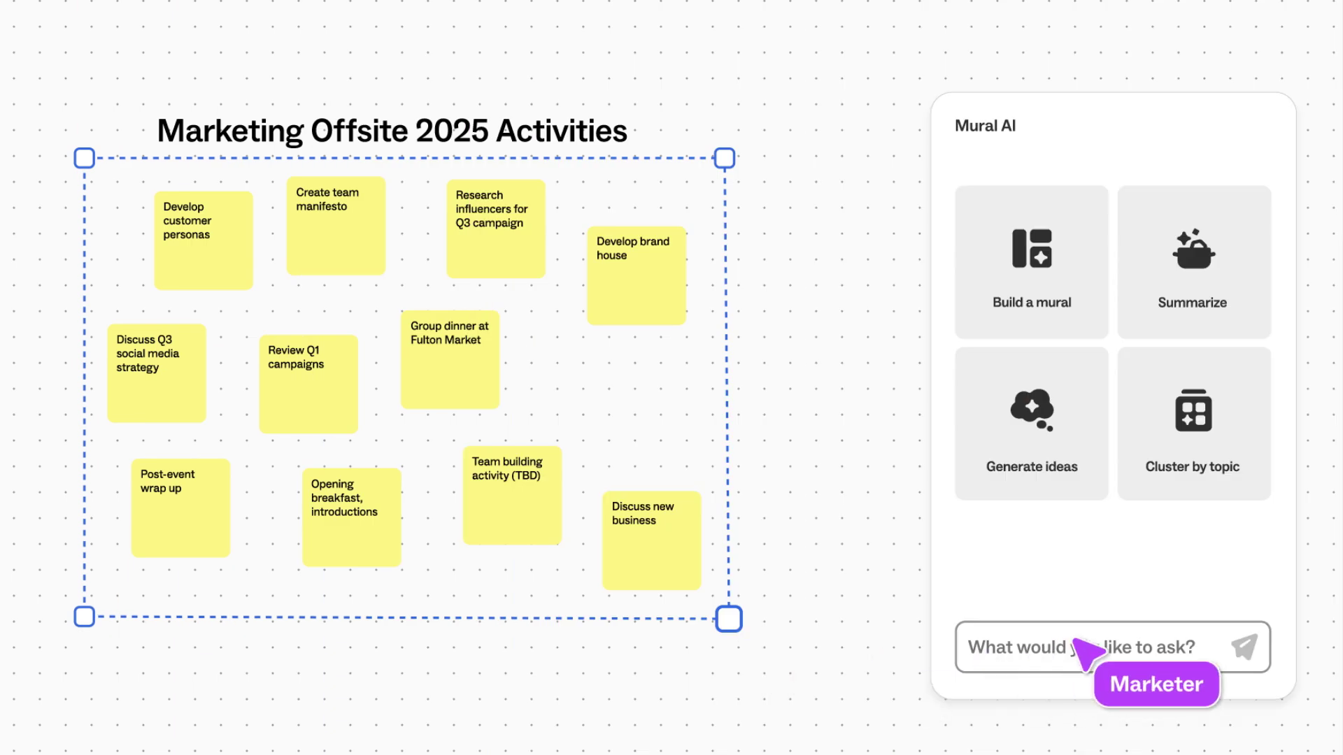 |
00:36 | The Sorting Sequence: The visual proof of the "Critical Juncture"—showing the motion path of sorting data. | Critical Juncture Section |
| 4 | [IMG ASSET 4] | 00:54 | The Radar Diagram: Highlights the clean vector asset management and radial animation techniques. | Conclusion / Solution |
11. Synergy Analysis: Technology vs. Expertise
This project highlights the symbiosis between advanced software tools and human creative direction.
- Technology (The Tools): We leveraged vector illustration software to create infinite-resolution assets and compositing software to handle complex particle systems and expression-based motion.
- Expertise (The Touch): The technology provided the capability, but Advids provided the timing. The difference between a robotic animation and one that feels "intelligent" lies in the animation curves—the subtle acceleration and deceleration that mimics human cognition. Our understanding of visual rhythm transformed a standard feature list into a compelling narrative flow.
12. Outcomes & Strategic Learnings
The Mural AI demonstration video stands as a benchmark for SaaS product marketing.
- Clarity Achieved: Complex abstract concepts (clustering, sentiment analysis) were successfully translated into universally understood visual metaphors.
- Brand Alignment: The motion language perfectly mirrored Mural's brand values—playful, efficient, and collaborative.
- Strategic Learning: For Artificial Intelligence product demos, "Hyper-Realism" in User Interface animation is more effective than literal screen recording. By abstracting the interface and accentuating the motion, we communicate the feeling of productivity more effectively than the raw pixels ever could.
Would you like me to develop a specific script breakdown for the "Mind Mapping" sequence to include in your technical blog?
Final Video
Author & Editor Bio