

Executive Summary
SafetyIQ, a leader in journey management software, partnered with Advids to produce a client onboarding video that would simplify the complex logistics of remote worker safety. Facing the challenge of explaining intricate tracking protocols and software interfaces to new users, Advids deployed the Advids Clarity & Engagement Framework. By utilizing high-fidelity 2D motion graphics and a strategic "UI Abstraction" technique, we transformed a technical software demonstration into a compelling, human-centric narrative.
The Challenge: Visualizing Remote Risks
SafetyIQ’s platform manages the safety of workers in remote, often hazardous locations. The primary challenge was to communicate the gravity of these risks—such as vehicle breakdowns in out-of-coverage areas—without resorting to fear-mongering. Additionally, the client needed to showcase their sophisticated User Interface and mobile application without overwhelming the viewer with dense data tables and complex menus typical of enterprise software. The goal was to reduce the "time-to-understanding" for new clients during the onboarding process.
The Solution: A Narrative-Led Vector Approach
Advids engineered a solution that balanced emotional storytelling with technical clarity. We developed a stylized vector world that aligned with SafetyIQ’s brand identity. Instead of using screen recordings, we rebuilt the software interface as simplified vector assets, allowing for fluid animation and clearer focus. The video seamlessly transitions from the "problem state" (a stranded worker) to the "solution state" (automated escalation via the SafetyIQ platform), ensuring the value proposition is instantly understood.
Client Profile
SafetyIQ is a technology provider specializing in Journey Management solutions. They empower organizations to protect their traveling workforce through automated check-ins, hazard alerts, and real-time location tracking, ensuring duty of care compliance for remote operations.
Project at a Glance
| Category | Details |
|---|---|
| Project Type | Client Onboarding & Product Explainer |
| Video Style | 2D Motion Graphics & Character Animation |
| Primary Audience | Health & Safety Managers, Operations Directors |
| Production Timeline | 7 Weeks |
| Collaboration Stack | Slack (Real-time Communication) Google Drive (Asset Management) Vimeo Review (Frame-accurate Feedback) |
Visual Asset Highlights
| Serial No. | Image Placeholder | Timestamp | Rationale | Placement |
|---|---|---|---|---|
| 1 | 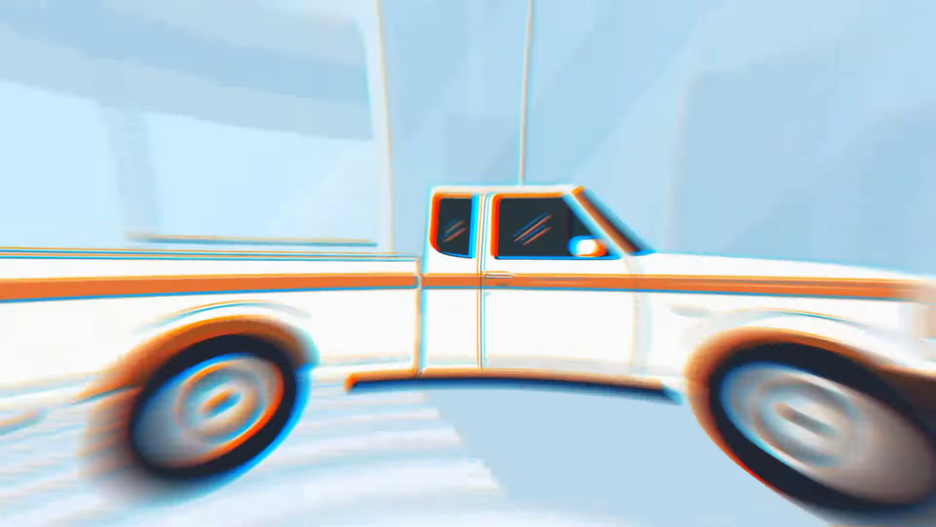 |
00:04 | Visualizing Scope: A stylized map animation utilizing trim paths to demonstrate route tracking across a complex city grid. | Introduction |
| 2 | 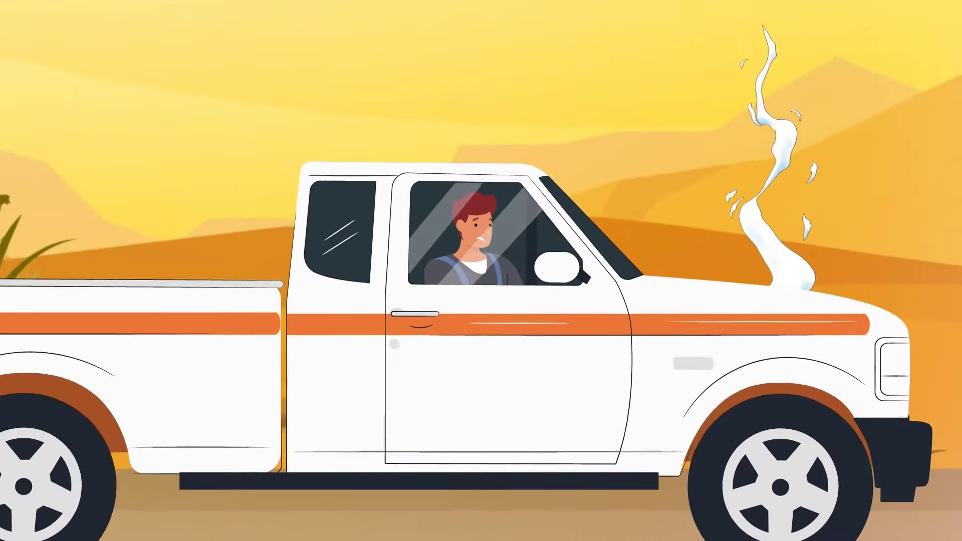 |
00:26 | The Risk Scenario: Character animation depicting a vehicle breakdown, establishing the emotional stakes and the need for the solution. | The Challenge |
| 3 | 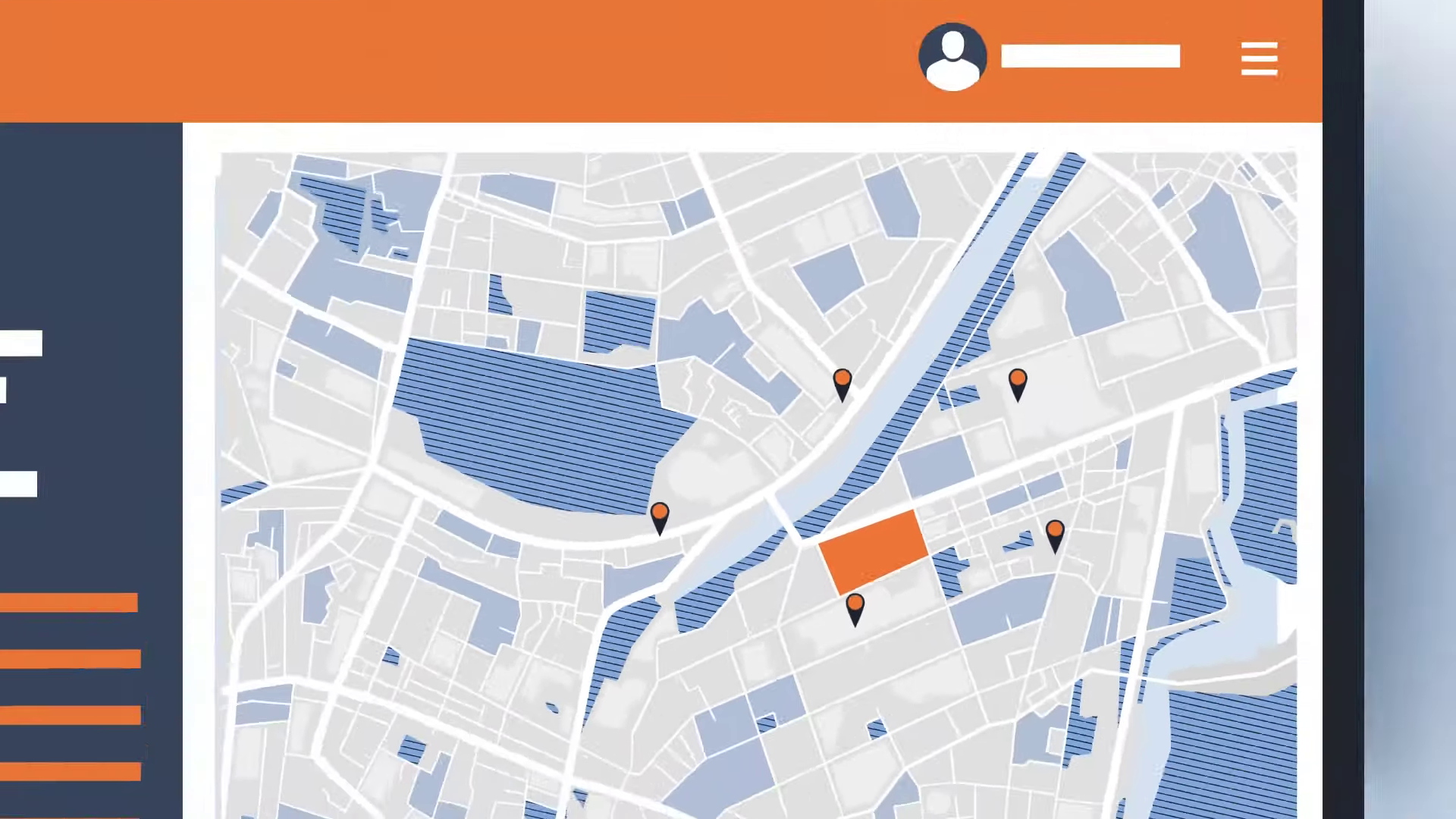 |
00:43 | UI Abstraction: The "Critical Juncture" showing the simplified, vector-based dashboard that mimics the software without visual clutter. | Production Deep Dive |
| 4 | [IMG ASSET 4] | 00:58 | Mobile Integration: A split-screen composition showing the synchronization between the driver's mobile app and the central dashboard. | The Solution |
The Production Deep Dive: The Advids Clarity & Engagement Framework
Our production process was meticulously structured to ensure brand fidelity while simplifying complex technical concepts.
Phase 1: Strategic Scripting and Visual Concepts
Goal: To translate technical documentation into a relatable narrative.
Process: The Advids creative team analyzed the SafetyIQ user manual to identify key "pain points." We drafted a script that focused on a single user journey—"Sam the Driver."
Action: We developed a "Style Frame" deck (Style_Frame_SafetyIQ_V3.ai) proposing a flat design aesthetic with a color palette dominated by "Safety Orange" for alerts and "Corporate Blue" for resolution.
Advids Expertise: Our Art Directors ensured the character designs were diverse and professional, avoiding the "cartoonish" look that can undermine B2B messaging.
Phase 2: The Critical Juncture – UI Abstraction and Mimicry
The Challenge: The client provided high-resolution screenshots of their dashboard (Dashboard_Raw_Screen_05.png). When placed into the storyboard, these images were illegible and disrupted the visual flow of the vector animation. The text was too small, and the data density was distracting.
The Solution: Advids proposed a "UI Abstraction" strategy. We rebuilt the SafetyIQ dashboard from scratch using vector shapes in Adobe Illustrator (UI_Dashboard_Abstract_V4.ai). We stripped away 60% of the peripheral data, keeping only the essential columns: Driver Name, Location, and Status.
The Outcome: This allowed us to animate the User Interface elements directly. We could make notification bells "ring" and status bars "slide" using easing functions in After Effects, creating a dynamic representation of the software that was easy to follow.
Phase 3: Animation and Motion Design
Goal: To create fluid transitions between the physical world (the truck) and the digital world (the software).
Process: We utilized keyframe animation with custom easing curves to ensure natural movement. For the map sequences, we used "Trim Paths" to draw routes in sync with the voiceover, visually guiding the viewer's eye from point A to point B.
Action: We integrated kinetic typography to highlight key terms like "Automated Pre-Trip Risk Assessment," ensuring these value-adds were memorable.
Artifact: Animatic_Rough_V1.mp4 was shared via Vimeo Review to establish the pacing before final rendering.
Phase 4: Feedback Loops and Refinement
Feedback Loop: Refining the Aesthetic
- Client Feedback: "The driver character in Scene 3 looks a bit too distressed. We want to show concern, but not panic."
- Advids Response: Our illustration team accessed the rigged character file (
Char_Rig_Driver_V3.aep) and adjusted the facial features, specifically the eyebrow rotation and mouth shape, to convey "focused concern" rather than fear. - Artifact:
Style_Update_Driver_Face_V2.png.
Feedback Loop: Technical Accuracy
- Client Feedback: "The SMS notification on the phone screen pops up too slowly. In reality, it's instant."
- Advids Response: We adjusted the timing of the scale-up animation on the notification bubble layer in After Effects, reducing the duration from 15 frames to 5 frames for a snappier, more realistic feel.
Synergy Analysis: Human Expertise meets Digital Precision
This project exemplified the synergy between artistic interpretation and technical accuracy. While the software tools (Adobe Illustrator, After Effects) provided the means to create the visuals, it was the Advids team's strategic decision to abstract the UI that made the video effective. A purely automated screen recording would have failed to communicate the core value proposition clearly. The ability to synthesize a "believable" software environment using vector graphics allowed us to control the viewer's focus completely.
Outcomes and Strategic Learnings
The final video served as a versatile asset, deployed across SafetyIQ’s website and used by sales teams during introductory calls.
- Clarified Value Proposition: The abstract UI approach successfully demonstrated the software's workflow without the need for a live demo.
- Enhanced Engagement: The narrative-driven character approach resulted in higher viewer retention rates compared to previous static slide presentations.
- Scalable Asset: The vector-based project files allow for easy updates to the UI or character uniforms as the SafetyIQ brand evolves.
Would you like me to develop a complementary "Social Media Teaser" strategy based on these visual assets to drive traffic to the full case study?
Final Video
Author & Editor Bio

