

CASE STUDY: Technical explainer video
Decoding Complexity: The Federated Search Initiative
Summary
In the landscape of big data, the ability to search across disparate storage systems without migrating massive datasets is a game-changer. Splunk, a Cisco company, introduced "Federated Search" to solve this exact problem. They partnered with Advids to create a Technical Explainer Video that would not only simplify this complex architecture for IT professionals but also visually demonstrate the speed and efficiency of the process. The result is a high-octane, neon-infused motion graphics piece that demystifies the technical backend while maintaining the sleek, developer-centric aesthetic of the Splunk brand.
The Challenge: Visualizing the Invisible
The primary challenge was communicating the concept of "Data Federation." Traditional cloud explanations often resort to overused tropes like clouds raining data or file folders flying across screens. However, accurate technical communication required us to show access without movement. We needed to demonstrate how a user can sit at a single console ("Single Pane of Glass") and query remote archives in Amazon S3 without those archives ever leaving their source. Visualizing this "query-only" connection required a sophisticated departure from standard data migration animations.
The Solution: The Advids Clarity & Engagement Framework
Advids employed a specialized Motion Graphics pipeline, leveraging high-fidelity vector assets and abstract particle systems. We developed a visual language based on "optic tethers"—glowing data streams that illuminate remote data sources upon query and return only the relevant insights. This was combined with precise UI (User Interface) simulations that walked the viewer through the actual setup screens, ensuring the video served both as a marketing tool and a high-level tutorial.
Client Profile
Splunk, a Cisco company, is a global leader in observability and security. They help organizations ensure digital resilience by unlocking innovation, security, and scalability through their unified data platform.
Objective
- Technical Education: Clearly explain the "Federated Search" architecture.
- Feature Adoption: Demonstrate the ease of setting up a Federated Provider and Index.
- Brand Alignment: Maintain the "Dark Mode" aesthetic appealing to developers and security analysts.
The Advids Clarity & Engagement Framework
Our production process focused on precision and visual metaphor, transforming lines of code into engaging visual narratives.
Project at a Glance
| Category | Details |
|---|---|
| Client Industry | Enterprise Software / Data Security |
| Video Type | Technical Explainer / 2D Motion Graphics |
| Target Audience | SecOps, DevOps, IT Administrators |
| Core Visual Style | Dark Mode, Neon Gradients, Kinetic Typography |
| Key Deliverable | 90-Second Product Explainer |
| Collaboration Stack | Slack (Real-time Communication), Google Drive (Asset Management), Vimeo Review (Video Feedback) |
Project Timeline
- Week 1: Discovery & Ingestion
- Kickoff meeting with Splunk product leads to understand the "Federated Provider" logic.
- Ingestion of Splunk brand guidelines (Color Palette: "Splunk Pink" and "Splunk Orange").
- Output:
Creative_Brief_Splunk_V1.pdf
- Week 2: Scripting & Conceptualization
- Drafting a script that balances marketing hooks with technical accuracy.
- Quote: "We need to ensure we don't promise 'instant' search on petabytes, but 'efficient' search. Let's tweak the wording in paragraph 3." — Advids Lead Copywriter
- Output:
Script_FederatedSearch_Rev2.docx
- Week 3: Visual Strategy & Style Frames
- Developing the "Dark Mode" aesthetic.
- Creation of key style frames showing the abstract data nodes.
- Output:
Styleframe_Neon_Network_Set_A.png
- Week 4: Asset Creation (UI Vectorization)
- Recreating the Splunk Cloud interface in vector format for limitless resolution.
- Output:
Splunk_UI_Vector_Kit_V2.ai
- Week 5: Animation Phase 1 (The Abstract Layer)
- Animating the particle flows and connecting splines.
- Output:
Animatic_Flow_Test_V3.mp4
- Week 6: Animation Phase 2 (The UI Simulation)
- animating the cursor movements and typing of the
sdselectcommand. - Output:
UI_Sequence_Composited_V1.mp4
- animating the cursor movements and typing of the
- Week 7: Sound Design & Final Mastering
- Adding digital "blips" and "swish" effects to match the kinetic motions.
- Output:
Final_Master_RAVHZ5ysEho.mp4
The Production Deep Dive
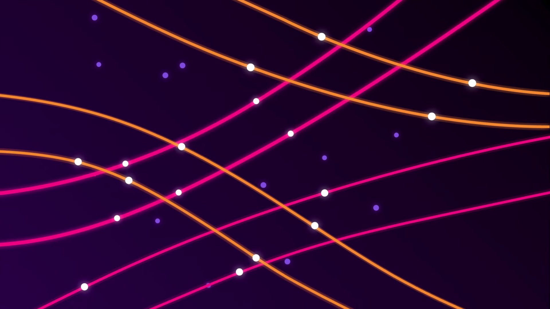
Visual Strategy: Defining the Data Aesthetic
We began by establishing a visual language that felt native to the Splunk environment. The user interface uses a dark theme, so our background canvas was set to a deep violet-black to allow the neon data streams to pop.
!
(Timestamp: 00:09 - Establishing the "Data Stream" aesthetic and flow dynamics.)
We utilized gradients of magenta and amber to represent different data types. The goal was to create a sense of speed and organized complexity. The lines seen here are not random; they represent the organized ingestion of logs and metrics into the Splunk ecosystem.
Critical Junctures: The Topology of Federation
One of the most complex concepts to illustrate was the relationship between the Splunk Cloud Platform, Splunk Enterprise, and Amazon S3. We needed a clean way to show that these three entities are distinct yet connected.
!
(Timestamp: 00:38 - Geometric simplification of the hybrid cloud topology.)
The Challenge: Early drafts of this diagram were too cluttered, attempting to show server racks and cloud icons.
The Solution: Advids simplified the topology into a clean, rotating triangle structure. This geometric abstraction allowed the viewer to understand the "triangular" relationship and data flow permissions without getting bogged down in hardware details.
Communication Highlight: Precision in UI Simulation
When demonstrating software, screen recordings often lack clarity and smoothness. For this project, Advids rebuilt the key screens as vector art.
!
(Timestamp: 00:42 - High-fidelity vector recreation of the "Add Provider" modal.)
Feedback Loop: Refining the UI Experience
Client (Splunk): "The text in the 'Add Federated Provider' modal is readable, but the cursor movement in
Animatic_V2.mp4feels robotic. It moves in a perfect straight line."Advids: "Understood. We will adjust the motion path in After Effects to have a slight natural curve and add an 'overshoot' ease to the stopping point to simulate natural human mouse interaction. We will also speed up the typing effect to match a power-user's speed."
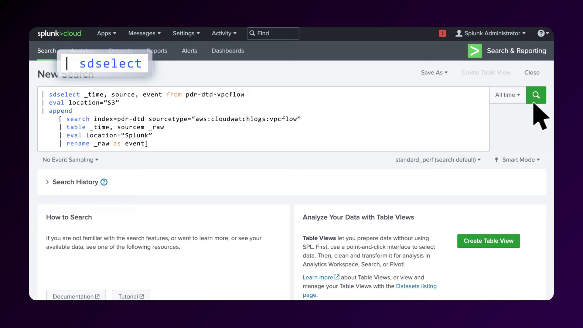
Technical Execution: The sdselect Command
The climax of the video is the execution of the search. It was crucial to highlight the specific syntax that makes this feature work.
![IMG ASSET 4]
(Timestamp: 01:06 - Highlighting the critical syntax sdselect for user education.)
We used a kinetic typography technique where the command sdselect pulses and glows as it is typed. This visual cue acts as a mnemonic device, helping the viewer remember the specific keyword required to invoke the federated search capability.
Synergy Analysis: Technology & Human Expertise
- Technology: We utilized Adobe After Effects for the core motion design and Adobe Illustrator for the precise UI vectorization. The particle effects were generated using Trapcode Particular to create organic, flowing data streams that felt alive rather than static.
- Human Expertise: The success of the video relied on the ability of Advids' creative directors to translate technical documentation into visual flow. Understanding the difference between "data migration" and "federated access" allowed us to design animations that were technically accurate, preventing potential confusion among the expert audience.
Outcomes and Strategic Learnings
The final video successfully translated a backend architectural feature into a compelling visual story.
- Enhanced Clarity: The abstract data visualizations provided a mental model for "Federated Search" that static diagrams could not achieve.
- Educational Value: By clearly highlighting the UI steps and the
sdselectcommand, the video reduced the perceived barrier to entry for new users. - Brand Consistency: The strict adherence to the Splunk color palette and "dark mode" aesthetic ensured the video felt like a seamless extension of the product itself.
Next Steps for You
Would you like to explore how we can adapt this "Vector UI Simulation" technique to create a tutorial series for your own software platform?
Final Video
Author & Editor Bio

