1. Freshdesk
Duration : 1 minute and 31 seconds
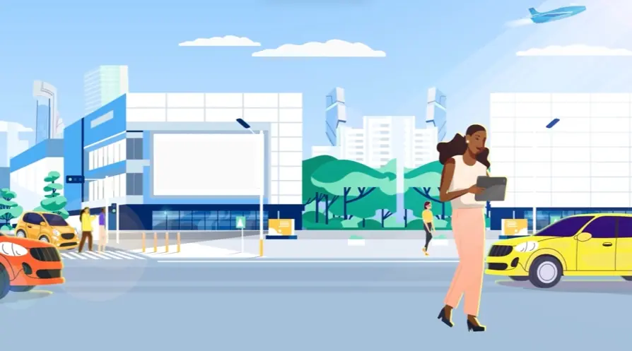
A relatable struggle of data overload is shown with abstract visuals and a symbolic hourglass in this Animated Demonstration Video. The Freshdesk Contact Center promo showcases professionals from different domains, like marketing and sales, grappling with data, leading to wasted time and missed opportunities. The video vividly illustrates the inefficiency of traditional methods for managing customer information with an overflowing cloud storage icon.
This visual journey then presents Freshdesk Contact Center as a solution, highlighting its interface with post-call transcripts. It shows how searchable transcripts enhance conversations by enabling quick query resolution. The video concludes by emphasizing how relevant insights can be gathered with ease, prompting a call to action to try it now for efficient solutions.
2. Codility
Duration : 1 minute and 15 seconds
This Codility animated process demonstration video masterfully transforms the chaotic, assumption-based world of tech hiring into a streamlined, data-driven narrative. Through sophisticated 3D motion graphics and detailed UI/UX simulations, Codility is presented as the essential solution for evidence-based skill assessment and efficient, global talent acquisition, ensuring optimal engineering team building.
Why It Stands Out:
Animated Metaphors Streamline Complex Hiring Narratives: The video opens with a vivid visual of swirling magnifying glasses, effectively personifying the frantic search for talent. It then transitions through abstract pipelines and culminates in a satisfying "Connect Four" game, illustrating Codility's ability to efficiently guide and place high-caliber candidates, simplifying the complex hiring journey into an intuitive visual story.
Decoding Engineer Skills with 360-Degree Evaluation: Codilitys platform functionality is showcased with a compelling UI/UX simulation of a candidate profile and a live coding interview. This segment meticulously demonstrates how Codility builds a comprehensive, evidence-based 360-degree evaluation of technical skills€”from specific programming languages like .NET and Django to application security€”moving beyond resumes to uncover real-world engineering capabilities.
* Accelerating Quality Hires Through an Intelligent Pipeline: By addressing the challenges of remote and global hiring, the video highlights Codilitys capacity to scale across time zones and geographies. It visually promises faster hiring cycles, significantly reduces unconscious bias in candidate assessment, and ultimately empowers engineering teams by giving them more time to focus on impactful problem-solving.
3. Atlassian
Duration : 1 minute and 54 seconds
Watch cluttered communication morph into streamlined efficiency in this dynamic explainer demonstration video from Atlassian. The visualization of chat bubbles converging into a centralized system brilliantly captures the pain points of disorganized requests, instantly resonating with viewers seeking a better way. The modern aesthetic and smooth transitions enhance the visual appeal.
Microsoft Teams emerges as the solution, showcasing its intuitive interface and key features for ticket management. By addressing the human element of customer issues and demonstrating a streamlined workflow within Teams, this video effectively targets IT professionals, helpdesk teams, and decision-makers, promising improved productivity and an enhanced service experience.
4. Intouch Insight
Duration : 1 minute and 44 seconds
This unified CX data platform demonstration video from Intouch Insight compellingly illustrates how disparate customer experience data can be transformed into actionable insights. Through vibrant 2D motion graphics and a clear problem-solution narrative, it showcases LiaCX's ability to anticipate customer needs and drive proactive, measurable improvements across the entire customer journey.
Why It Stands Out:
Bridging CX Data Silos for a Single View: The animation masterfully visualizes various data sources€”from call center data to surveys€”converging into LiaCX's intelligent dashboard. This clear integration provides a holistic, real-time understanding of the customer journey, empowering businesses to identify friction points and moments of delight that often remain siloed.
From Insight to Proactive, Targeted Campaigns: Intouch Insight's LiaCX moves beyond mere reporting by demonstrating how identified insights translate directly into actionable strategies. The video highlights the creation and deployment of targeted CX action campaigns via mobile checklists, directly addressing issues like staff knowledge or long lines, ensuring real-time organizational responsiveness.
* Measuring Real-World Impact on Key Business Metrics: Beyond showing actions, the video quantifies their success. It illustrates how machine learning prioritizes efforts, leading to visible uplifts in business metrics and CSAT scores. This powerful correlation demonstrates LiaCX's tangible ROI, turning customer detractors into promoters and securing lasting loyalty.
5. Milliken
Duration : 1 minute and 3 seconds
Modular carpet design flexibility is brilliantly showcased in this Milliken Ontera video, transforming abstract artistic vision into a compelling narrative of innovative, high-performance commercial flooring solutions. Through dynamic pattern animations and clear, practical demonstrations, the video efficiently communicates the comprehensive benefits of modular carpets, from rapid local customization to superior durability and sustainability, for diverse commercial environments.
Why It Stands Out:
Dynamic Design: Visualizing Modular Aesthetic Potential: The video opens with captivating, morphing abstract patterns, leveraging sophisticated dynamic animation to highlight the limitless aesthetic possibilities and inherent versatility of Milliken Ontera's modular carpet designs. This visual journey sets a tone of innovation and creative freedom.
Precision Production & Rapid Local Delivery: Addressing critical project timelines, the video proudly showcases Milliken's PrintWorks„¢ Technology, enabling local customization, 4-day sample creation, and swift 3-week delivery from its Sydney manufacturing facility, providing a clear competitive advantage.
* Engineered for Performance and Sustainability: Beyond aesthetics, the demonstration effectively highlights practical benefits such as an integrated cushion for improved acoustics and underfoot comfort, quick tile replacement for ease of maintenance, and strong sustainability credentials including PVC-free and Cradle to Cradle Silver certifications.
6. Uber
Duration : 2 minutes and 32 seconds
This animated explainer video from Uber and Australia Says No More strategically addresses sexual misconduct, clearly defining unacceptable behaviors and empowering users to report incidents and intervene as bystanders. The video leverages clear, concise visuals and a structured narrative to foster a safer, more respectful community, demonstrating Uber's proactive commitment to user welfare.
Why It Stands Out:
Clearly Defining Acceptable Behavior: Uber uses crisp 2D character animation and effective split-screen comparisons to visually demarcate appropriate from inappropriate conduct. Specific scenarios, from staring and asking personal questions to making offensive comments, are explicitly shown, transforming abstract guidelines into concrete, understandable examples of misconduct never tolerated on or off the platform.
Empowering Safe Action & Reporting: The video provides practical, actionable steps for individuals to contribute to a safer environment. It clearly demonstrates how to utilize the Uber app's 'Help' feature for reporting incidents and offers vital emergency helpline information, seamlessly integrating product functionality with critical safety protocols for users.
* Cultivating Collective Responsibility: By partnering with "Australia Says No More," Uber transcends a mere policy statement, championing community-wide bystander intervention. The narrative encourages viewers to disrupt inappropriate situations and offer support, framing safety as a shared endeavor and positioning Uber as a responsible platform actively invested in fostering a respectful culture for everyone.
7. ManageEngine
Duration : 2 minutes and 10 seconds
Efficiently addressing endpoint security concerns, this Product Demonstration Video Example immediately grabs attention. The sleek, modern animation style, coupled with a clear demonstration of the software's dashboard, makes the complex seem simple.
ManageEngine Endpoint Central's ability to manage and secure endpoints is visually compelling. The video's concise approach effectively communicates the software's value, making it a strong example of a successful software demonstration.
8. Alation
Duration : 1 minute and 19 seconds
This Alation process demonstration brilliantly illustrates how user-friendly metadata management revitalizes stagnant data into actionable, trusted insights. Through engaging 2D motion graphics and a powerful transformation narrative, it depicts the journey from isolated, cumbersome data systems to a dynamic, collaborative environment, empowering business users with self-service analytics.
Why It Stands Out:
Escaping the Data Museum: From Inertia to Insights: The video opens with a vivid "data museum" metaphor, immediately capturing the frustration of dealing with outdated, inaccessible metadata. It strategically presents Alation as the catalyst, transforming a static repository into a vibrant, active data community where information flows freely and is readily understood.
Collaborative Data Discovery: Empowering Every User: By using the intuitive "Yelp for data" analogy, the demonstration simplifies the complex process of data search and review. It highlights how Alation combines automated metadata gathering with human curation, enabling users to easily find, trust, and collaborate on data, propelling self-service analytics forward.
* Intelligent Curation: Building Trust in Every Dataset: The animation meticulously shows how Alation leverages machine learning and human expertise to ensure accurate and consistent data definitions. This focus on intelligent curation builds a foundation for robust data governance, reassuring users that their insights are reliable and fostering a culture of data-driven decision-making.
9. Hotjar
Duration : 1 minute and 18 seconds
For product teams struggling to prioritize, Hotjar offers a streamlined solution visualized in this compelling explainer video, a prime example of effective demonstration video ideas. The video uses vibrant 2D animation to showcase how Hotjar helps understand user behavior, identify bugs, and validate hypotheses, such as analyzing scroll depth and heatmaps.
These animated website interactions clearly demonstrate how Hotjar empowers data-driven decisions, leading to faster buy-in and ultimately, better business outcomes, symbolized by the impactful visual of a rocket soaring skyward. This concise approach effectively communicates the value proposition of Hotjar for product optimization.
10. GoCardless
Duration : 1 minute and 4 seconds
Anti-fraud solution video explanation, this GoCardless Protect+ demonstration powerfully illustrates its role as the definitive, end-to-end safeguard against payment fraud. Through sophisticated metaphorical CGI and a compelling visual narrative, it transforms abstract threats into tangible challenges, showcasing how GoCardless ensures both robust security and seamless conversion for online payments.
Why It Stands Out:
Metaphorical Storytelling for Payment Security: The video masterfully uses abstract CGI to represent the "dawn of a new era" shadowed by the "dark cloud" of payment fraud, visually demonstrating its impact as individual "drops" on businesses. This high-end production value elevates GoCardless Protect+ from a technical solution to a comprehensive shelter, making a complex problem relatable and its resolution clear.
Intelligent, End-to-End Fraud Protection: GoCardless Protect+ is presented as the first comprehensive anti-fraud solution built specifically for bank payments. It leverages payment intelligence to proactively identify fraudsters before they even sign up, allowing businesses to track the impact of fraud and set a precise risk tolerance, ensuring only genuine payers can complete transactions without hassle.
Balancing Security and Seamless Conversion: Addressing a critical industry challenge, the video emphasizes that GoCardless Protect+ eliminates the need to compromise between robust security measures and maintaining high conversion rates. It ensures businesses can have the benefits of both, keeping customers on the "sunny side of payments" with modern fraud protection.
11. Moogsoft
Duration : 2 minutes and 1 second
AIOps platform demonstration video: The Moogsoft Software Platform Demonstration video masterfully transforms the chaos of fragmented IT operations into a clear vision of automated efficiency. It meticulously guides viewers through the AIOps platform, visually proving how real-time data correlation and intelligent automation unify complex alerts into actionable insights, preventing outages before they impact service.
Why It Stands Out:
From Alert Chaos to Automated Incident Resolution: Moogsoft's demo vividly illustrates the core problem of "alert fatigue," then provides undeniable visual proof of its solution. The seamless UI elegantly consolidates disparate warnings into unified incidents, showcasing how the platform automates remediation to reduce MTTR and restore operational clarity.
Expert Narration Demystifies Advanced AIOps: An authoritative and confident narrative voice acts as an expert guide, translating intricate AIOps concepts and complex functionalities into easily digestible information. This strategic communication ensures viewers grasp Moogsoft's advanced capabilities, empowering IT leaders to understand its strategic value without getting lost in technical jargon.
* Seamless UI Demonstrates Operational Intelligence: The video leverages high-fidelity screen captures and fluid animations to present Moogsofts modern interface as a sophisticated hub for operational intelligence. This polished technical execution reinforces the product's reliability and advanced capabilities, visually building confidence in its ability to deliver proactive insights and optimize IT performance.
12. Conversica
Duration : 2 minutes and 15 seconds
Personalized communication is powerfully demonstrated in this Product Demonstration Video. The video uses vibrant 2D animation and smooth transitions to explain complex features, making them easily understood. Geometric shapes and visual metaphors, like the spring, effectively illustrate scalability.
Conversica's value proposition is clearly articulated, focusing on one-to-one communication. The video's concise explanations and seamless call to action leave a lasting impression, highlighting the ease of use and effectiveness of the solution.
13. Argus
Duration : 1 minute and 55 seconds
Crude oil market volatility insights are vividly brought to life in this Argus "Possibility Curves" demonstration video, masterfully addressing the inherent unpredictability of energy markets. It synthesizes vast proprietary data and expert intelligence into actionable, visual risk and opportunity insights, empowering traders with unparalleled foresight for critical hedging and trading decisions.
Why It Stands Out:
Translating Nature's Curves into Market Insight: The video ingeniously uses sweeping natural landscapes like rivers and canyons as a powerful metaphor for market dynamics. This visual storytelling transitions seamlessly into sophisticated data visualization animation, grounding complex volatility concepts in intuitive, recognizable forms.
Quantifying Volatility for Strategic Trading: Argus's core innovation, the "Possibility Curve," is elegantly animated to quantify price probabilities and delineate upside/downside risk. This clear visual hierarchy, reinforced by synchronized on-screen text, transforms abstract data into digestible, actionable intelligence, enabling faster, more informed trading and hedging decisions.
* Proprietary Data Fused with Expert Market Intelligence: Argus demonstrates the unparalleled depth of its insights by highlighting the fusion of extensive public data, its own proprietary historical prices and physical transaction data, and decades of market intelligence. This blend of machine learning and human expertise delivers a robust, credible, and comprehensive view of crude oil market possibilities.
14. Namecheap
Duration : 1 minute and 30 seconds
WordPress hosting made easy, this Namecheap EasyWP animated demonstration strategically simplifies the often-intimidating process of launching a WordPress site. It visually transforms the user's journey from navigating a complex digital maze to effortlessly bringing their ideas online, positioning EasyWP as the accessible solution to technical hurdles.
Why It Stands Out:
From Digital Maze to Clear Path: Simplifying WordPress Hosting: The video masterfully uses crisp isometric animation and abstract visual metaphors to represent the internet as a challenging obstacle course. This empathetic portrayal of technical frustration then shifts, showing Namecheaps EasyWP as the clear, streamlined platform that removes complexity, guiding users to effortless website creation.
Empowering Creators: Launching Ideas with Ease: By illustrating a character transitioning from struggle to confidently "surfing" a simplified digital landscape, the video builds a powerful narrative of user empowerment. This vivid animation highlights EasyWP's speed and user-friendliness, ensuring anyone can quickly get started and focus on content and business growth, rather than technical setup.
* Seamless WordPress Experience: Supported for Success: Namecheap effectively communicates EasyWP as a comprehensive, reliable, and scalable solution. With assurances of cutting-edge cloud technology, flexible pricing, and 24/7 support, the demonstration fosters immediate trust and confidence, positioning EasyWP as the dependable foundation for every aspiring online presence.
15. AvePoint
Duration : 1 minute and 27 seconds
Conquer collaboration challenges with AvePoint's inspiring animated video, employing a powerful mountain climbing metaphor. The struggle to the summit vividly portrays the complexities organizations face in achieving seamless teamwork, while a climber's fall underscores the devastating impact of data loss in the cloud. These pain points resonate deeply with IT professionals seeking robust solutions.
This compelling Product Tour Demonstration Video showcases AvePoint as the solution provider, guiding businesses to collaborative success. The video highlights core servicesmigration, operations management, and data protectionwith sleek 2D animation and concise text-based messaging. This unique approach effectively communicates the value proposition for Microsoft 365 users. A retail storefront subtly reinforces partner accessibility, leading to a clear AvePoint button, prompting viewers to learn more.
16. Speakfully Motion Demo Graphics
Duration : 58 seconds
This workplace misconduct reporting solution demonstration for Speakfully tackles the pervasive challenge of underreported workplace issues by visually translating employee apprehension into a clear, empowering path to resolution. It effectively showcases how Speakfully, powered by HR Acuity, transforms silence into actionable insights, building trust and fostering an ethical, equitable work environment.
Why It Stands Out:
Empowering Silent Voices: Unpacking Workplace Concerns: Speakfullys video expertly highlights the widespread issue of unreported misconduct, opening with compelling statistics and relatable line art animations that visualize employee fear of retaliation and perceived futility. This empathetic framing immediately resonates with the audience, underscoring the critical need for a trusted and accessible reporting mechanism like Speakfully.
Animating Trust: A Clear Path to Resolution: The video uses intuitive iconography and smooth motion graphics to demystify the reporting process, showcasing Speakfullys hotline and online submission options. By illustrating easy follow-up and issue tracking, it animates a transparent journey from initial concern to confident resolution, directly addressing employee skepticism about report efficacy.
* Elevating Workplace Culture: Strategic Benefits of Speakfully: Beyond simple compliance, the demonstration strategically positions Speakfully as a catalyst for cultural improvement. It visually links transparent reporting to an enhanced employee experience, building stronger trust and fostering a more ethical workplace. This broader impact appeals to leaders, reinforcing the product's role in protecting reputation and shaping a positive organizational future.
17. Rieter
Duration : 1 minute and 24 seconds
Digital spinning mill management comes to life in this Rieter animated demonstration, showcasing how the ESSENTIALbasic platform acts as a centralized digital ecosystem for short-staple spinning mills. The video narrates a user's journey from a traditional office to an empowered holographic control hub, using immersive CGI and modular feature demonstrations to simplify complex industrial processes, centralize expertise, and streamline operations.
Why It Stands Out:
Centralized Command: Unifying Spinning Mill Operations This video masterfully presents Rieters ESSENTIALbasic as a comprehensive central system. It vividly illustrates how fragmented data is unified into a single, intuitive interface, allowing managers to effortlessly monitor, control, and optimize their entire spinning mill operation from a single digital platform.
Digital Empowerment: Instant Access to Expertise & Resources The animation excels at demonstrating how ESSENTIALbasic empowers users. It shows seamless access to Rieter's deep technical expertise, personalized real-time parts ordering, and a wealth of digitized documents and optimized spinning recipes, transforming complex tasks into intuitive, one-click interactions for every mill professional.
* Visualizing Precision: Streamlining Complex Industrial Data Through sophisticated isometric 3D animation and crystal-clear holographic UI/UX, the video makes complex short-staple spinning technology and operational data remarkably digestible. This visual clarity, paired with intelligent information design, transforms overwhelming industrial details into actionable insights with unparalleled precision.
18. Benchling
Duration : 3 minutes and 6 seconds
This biotech R&D cloud platform demo masterfully illustrates how Benchling unifies complex scientific processes, data, and teams into a single, intelligent ecosystem. It transforms the overwhelming complexity of modern biotechnology into a streamlined, collaborative, and data-driven journey, accelerating discovery from initial concept to final development.
Why It Stands Out:
Intelligent Data Unification: Connecting the Scientific Dots: Benchling's scientifically-aware data model inherently understands and links intricate biological entities, from plasmids and protein chains to purification methods. The video visually proves its comprehensive lineage tracking and intuitive inventory management, pinpointing physical locations down to the box and plate, ensuring all data is discoverable and protected within a secure, integrated registry.
Streamlined Collaborative Execution: Beyond Fragmented Workflows: Directly addressing the industry's struggle with scattered spreadsheets and software, Benchling demonstrates seamless data entry and real-time team collaboration within its Electronic Lab Notebook. Its robust workflow management system allows for precise task design, tracking, and approval, unifying previously disparate ELN, LIMS, and inventory functions into a single, highly compliant workspace.
* Accelerated Scientific Insight: From Data to Discovery: Benchling empowers scientists with extensive data insights, showcasing dynamic visualizations like heat maps and scatter plots that convert raw experimental results into actionable patterns. This clear, data-driven approach, presented with a clean aesthetic and authoritative narration, accelerates decision-making by providing a full, integrated picture of R&D data, fostering rapid progress and identifying bottlenecks effectively.
19. EagleView
Duration : 1 minute and 12 seconds
Geospatial imagery analysis demonstration for EagleView's Connect Explorer expertly simplifies complex aerial data, transforming it into actionable insights for professionals. This 2D isometric animation masterfully illustrates how its web-based platform unifies diverse pictometry imagery with intuitive measurement and analysis tools, ultimately enhancing productivity and reducing costs from the convenience of an office.
Why It Stands Out:
Unified View of Diverse Aerial Intelligence: The video's seamless integration of oblique, ortho, and orthomosaic imagery into a single, navigable web application showcases EagleView's comprehensive data capabilities, allowing professionals to gain unparalleled multi-perspective insights without juggling multiple platforms.
Precision Measurement & Remote Analysis: EagleView Connect Explorer visually empowers users with precise on-screen measurement tools for length, height, area, and slope, alongside historical imagery comparisons and map data merging. This revolutionizes remote assessment, eliminating costly and time-consuming physical site visits.
* Streamlined Access for Enhanced Productivity: Highlighting "no software or installation required" and multi-device access, the demonstration shows how EagleView Connect Explorer delivers advanced geospatial intelligence from any browser or tablet. This frictionless access streamlines workflows, empowering professionals to expand their view of the world from their office.
20. Schneider Electric
Duration : 2 minutes and 13 seconds
Smart electrical infrastructure demo for Schneider Electric's EcoStruxure platform brilliantly showcases how integrating IoT, cloud, and AI transforms traditional electrical applications into powerful, efficient systems. This animated explainer demystifies complex digital intelligence, providing a clear vision of enhanced operational performance, proactive maintenance, and critical safety improvements for industrial and commercial users.
Why It Stands Out:
Demystifying Digital Transformation: Visualizing Smart Electrical Systems The video masterfully clarifies abstract concepts like IoT, cloud computing, and artificial intelligence through engaging 2D/3D hybrid animation. It illustrates data streams, sensor integration, and remote dashboards with remarkable precision, making Schneider Electric's vision for connected electrical infrastructure immediately comprehensible and compelling.
Intelligent Operations: Proactive Maintenance & Remote Control Schneider Electrics demonstration highlights the practical benefits of its digital ecosystem, such as predictive maintenance schedules, real-time condition monitoring, and secure remote operation. This strategic focus empowers viewers by showing how data-driven insights facilitate faster responses, optimize power availability, and significantly reduce operational downtime and costs.
* Seamless Integration: Connectivity as a Foundational Standard By emphasizing "native connectivity" through features like scannable QR codes for instant access to project information and a digital logbook for shared maintenance actions, the video establishes trust. It positions EcoStruxure as an end-to-end solution where devices, data, and expert knowledge converge to create a truly intelligent and secure electrical management ecosystem.
21. Sony
Duration : 1 minute and 13 seconds
Google TV interface demonstration: This Sony demonstration video masterfully crafts a compelling narrative around simplifying the modern home entertainment experience. Through vibrant 2D UI animations and insightful visual metaphors, it presents Sony TVs with Google TV as the definitive solution for seamless content aggregation and intuitive control, effortlessly transforming user interaction from fragmented to unified.
Why It Stands Out:
Seamless Content Convergence for Modern Viewing: The video brilliantly showcases how Sony's Google TV aggregates diverse streaming services into a single, personalized hub. Animated UI sequences demonstrate effortless access to apps like YouTube and Netflix, visually communicating a streamlined path to content discovery and eliminating the frustration of switching between multiple platforms.
Mastering Entertainment with Universal Control: Directly addressing remote clutter, the demonstration employs an iconic visual metaphor where scattered remotes converge into one central device. This powerful "procedural morphing" sequence vividly illustrates the universal control capability of Sony TVs, empowering users to command all their entertainment devices from a single, intuitive point.
* Animated Clarity for Effortless User Experience: Through clean 2D animation and a methodical pace, the video distills complex smart TV features into easily digestible segments. Each transition and on-screen text overlay is meticulously synchronized, creating an intuitive visual guide that highlights Google TV's responsive interface and enhances user understanding of its simplified, user-centric ecosystem.
22. Confiz
Duration : 1 minute and 35 seconds
Customer-driven marketing solution retail: This Confiz demonstration video unpacks the complexities of the fast-paced retail industry, presenting Confiz's Customer-Driven Marketing Solution (CDMS) as the key to overcoming evolving customer preferences. Through sophisticated 2D motion graphics, it illuminates how CDMS leverages data, personalization, and automation to streamline customer experiences and maximize ROI.
Why It Stands Out:
Transforming Retail with Data-Driven Engagement The video expertly visualizes the journey from chaotic retail challenges to strategic growth, showcasing how Confiz's CDMS unifies diverse customer data€”buying patterns, behavior, and channel preferences€”into actionable insights. This clear problem-solution narrative empowers retailers to navigate market demands effectively.
Orchestrating Personalized Customer Journeys Confiz's solution is meticulously demonstrated, highlighting its ability to build highly personalized content and implement marketing automation across multiple channels. The narrative focuses on addressing funnel drop-offs throughout the customer lifecycle, leading to enhanced engagement and higher conversion rates.
Proving ROI with Adaptive Analytics & Secure Deployment The video culminates by illustrating the tangible benefits of Confiz CDMS, including lower bounce rates, increased customer acquisition, and repeat purchases. It features a detailed analytics dashboard for ROI optimization, coupled with flexible on-premise, cloud, or hybrid deployment options, ensuring data compliance and robust support for diverse retail environments.
23. Process Street
Duration : 31 seconds
SaaS workflow automation demo for Process Street compellingly illustrates the transformation of organizational chaos into streamlined efficiency. It dynamically visualizes how the platform perfects complex processes, ensuring tasks are completed accurately and on time through seamless task routing and intuitive oversight, delivering quantifiable operational confidence.
Why It Stands Out:
From Simple Chores to Labyrinthine Audits: Visualizing End-to-End Processes: Process Streets video masterfully transitions from demonstrating a basic "Office Cleaning Checklist" to orchestrating a multi-departmental "Information Security Audit." This intricate, procedural animation of a connected workflow clearly showcases the platform's capacity to simplify and map even the most complex organizational operations with absolute clarity.
Global Task Orchestration: Connecting Distributed Teams with Precision: The demonstration brilliantly uses a world map overlay to visualize automated task routing and assignment across international teams. It effectively highlights how Process Street empowers seamless collaboration, ensuring every team member knows "what to do and when," fostering accountability and driving unified progress regardless of geographic spread.
* The Joy of Done: Celebrating Every Process Completed with Confidence: Beyond functionality, the video emphasizes the emotional payoff of flawless execution. Visual cues like satisfying checkmarks, progress bars, and a celebratory confetti burst underscore the inherent satisfaction of completing tasks with Process Street. This unique approach transforms process management from a chore into a consistently rewarding and confident operational experience.
24. Quuu
Duration : 1 minute and 30 seconds
This social media automation explainer video for Quuu masterfully demonstrates how the platform streamlines complex social media management into a single, efficient workflow. Through clear UI animations and dynamic content flow, it proves how curated suggestions, intelligent scheduling, and content recycling free users from the burden of daily posting, ensuring an engaging digital presence.
Why It Stands Out:
Intelligent Content Curation & Consolidation: Quuu visually transforms the scattered chaos of multi-app social management into a unified, organized dashboard. The demonstration highlights seamless UI animations and procedural content population, showcasing how hand-picked, relevant suggestions effortlessly fill a users schedule daily, consolidating diverse social streams into one powerful command center.
Automated Scheduling for Perpetual Engagement: The video clearly illustrates Quuus intuitive calendar-like interface, where curated content and personal posts are organized for automated, consistent delivery across platforms. This feature, combined with strategic evergreen content recycling, ensures timelines remain vibrant and engaging, allowing Quuu users to maintain an active presence without constant manual effort.
* Time-Saving Efficiency for Social Growth: By dramatically reducing the hours spent on content and scheduling, Quuu empowers users to achieve significant social media growth while reclaiming valuable time. The animation effectively visualizes this freedom, transitioning from a rapidly spinning clock to users enjoying real-life interactions, embodying the core benefit of genuine social connection facilitated by the platforms streamlined automation.
25. Diligent
Duration : 1 minute and 15 seconds
Board meeting software demo, this Diligent Boards explainer visually articulates how modern leadership can transform complex governance challenges into strategic advantage. Through sophisticated motion graphics and data visualization, it demonstrates how secure, collaborative access to critical information empowers boards to deliver impactful oversight, insight, and foresight in an "always-on" world.
Why It Stands Out:
Orchestrating Secure Board Intelligence for the Always-On World: Diligent employs dynamic iconography and a pristine aesthetic to illustrate the seamless, secure flow of sensitive information. The platform metaphorically locks down critical data, assuring boards of comprehensive protection and immediate access to intelligence, vital for navigating constant demands.
Transforming Board Oversight into Strategic Foresight: Diligents video showcases its ability to convert raw data into actionable insights via intuitive dashboards and evolving visual metaphors. From ESG performance to board effectiveness, the platform empowers leaders to ask better questions, moving beyond reactive decisions to truly up-level strategic impact.
* Seamless Collaboration for Proactive Leadership: This demonstration video emphasizes effortless, remote collaboration across various devices, ensuring board members are always connected and aligned. By streamlining meetings and fostering confident engagement, Diligent enables leadership to match the pace of business, becoming a strategic asset for the organization.
26. MCI
Duration : 1 minute and 46 seconds
AI-driven government modernization video, NCI's animated feature masterfully demonstrates how its commercially proven SHAI framework transforms outdated legacy code into modern applications. This video elegantly illustrates the secure and rapid conversion of systems like COBOL to Java, empowering government and military workforces to focus on innovative, high-value tasks, thereby accelerating modernization and reducing technical debt efficiently.
Why It Stands Out:
AI-Powered Code Refactoring: Transforming Legacy Systems: NCI's demonstration vividly showcases "intent-based" code refactoring, visually transitioning legacy COBOL into modern Java. This secure, efficient process drastically cuts the cost and time of manual application modernizations, affirming NCI's technical prowess.
Scaling Humans with AI for Government Innovation: NCI's SHAI (Scaling Humans with Artificial Intelligence) framework is clearly illustrated, showing AI handling repetitive tasks. This empowers government and military workforces to redirect their expertise toward innovative, strategic, and high-value projects.
* Clarity and Credibility in Government Modernization: Polished vector animation and iconic visuals simplify NCI's complex AI solutions. Authoritative narration clarifies technical processes and benefits, ensuring absolute understanding. This high production value builds trust in NCI's approach to government modernization.
27. PwC
Duration : 1 minute and 24 seconds
Asset management digital solutions demo for PwC unveils how firms can transform overwhelming market complexity into strategic advantage. The video orchestrates dynamic visual metaphors and clear narration to demonstrate streamlined operations, enhanced insights, and robust future-readiness for mutual funds, empowering them in an era of global change and increasing regulatory demands.
Why It Stands Out:
Navigating Global Change with Visual Clarity: PwC effectively uses sophisticated abstract motion graphics, like breaking circles and shifting landscapes, to depict unprecedented global change and complex market forces. This intuitive information visualization clarifies the challenges asset managers face, setting the stage for PwCs solutions as a guiding force through volatility.
Data Synthesis for Enhanced Strategic Insights: The video masterfully illustrates data transformation through dynamic iconography, showcasing a grid of raw information evolving into a cohesive, insightful pie chart. This seamless synchronization of visual metaphor and narration highlights how PwCs digital solutions synthesize and modernize data, enabling deeper analysis and more productive reporting for critical investment decision-making.
* Empowering Future-Ready Asset Management: PwC positions itself as an indispensable partner by demonstrating how its solutions directly address core pain points like regulatory compliance, risk management, and operational burden. The narrative culminates in empowering visuals of identifying trends and building strategies, giving viewers confidence that PwC helps them take control of the future through meaningful reinvention.
28. Engie
Duration : 1 minute and 42 seconds
Engie smart infrastructure demonstration: This advanced CGI explainer visually translates Engie's thesis€”optimizing critical infrastructure into a safer, more efficient, and interconnected energy ecosystem through precise monitoring and rapid response. The video leverages sophisticated data visualization, holographic user interfaces, and dynamic data streams to transform abstract concepts into tangible operational benefits.
Why It Stands Out:
Dynamic Data Streams & Holographic Interfaces Engie's solution comes to life through high-fidelity CGI and procedural data animation that illustrates data flowing from diverse sources into intuitive, responsive holographic UIs. This visually clarifies how complex information is processed, making intangible technological processes tangible and understandable.
Orchestrating Predictive Efficiency & Safety The demonstration meticulously showcases Engie's proactive capabilities, visualizing predictive analytics in action and illustrating rapid, automated responses to potential infrastructure crises. This directly addresses client pain points, building confidence in the platform's ability to enhance operational resilience and prevent downtime.
High-Tech Vision, Unwavering Brand Authority A minimalist, futuristic aesthetic, coupled with a deliberate, authoritative narration and consistent brand integration, elevates Engie as a visionary leader. This polished production value reinforces the company's credibility, positioning Engie as the definitive partner for advanced smart infrastructure solutions.
29. Alexa
Duration : 22 seconds
Exceptional visual storytelling defines this Alexa video. Its concise nature and strategic use of close-ups and wider shots create a compelling narrative, showcasing the product's features effectively. This Functionality Demonstration Video is a masterclass in efficient product communication.
The video's pacing is perfect, maintaining viewer engagement without feeling rushed. A clear narrative unfolds, leaving a lasting impression. This is a prime example of how to create a short, impactful product demonstration.
30. Carta
Duration : 1 minute and 45 seconds
Exceptional product demonstrations are key to success. Carta's video immediately captivates, focusing on practical applications rather than technical details. This clear, concise approach makes the information easily understood and relatable.
The Tour Demonstration Video is expertly crafted, showcasing key features and functionality. The video's visual storytelling creates an engaging experience, leaving viewers wanting to learn more. This is a fantastic example of effective communication.