CarClarity · Car loan comparison · 2D app demo video
App Demo Video for CarClarity: A Car Loan Match in 15 Seconds
CarClarity needed an app demo video that shows how a car loan match starts, inside 15 seconds. Advids put the phone form on screen first, ran the match on a laptop under "Smart matching technology", and gave "No impact on credit score" its own beat before the logo.
Last updated
CarClarity · Car loan comparison
- Client
- CarClarity
- Product
- CarClarity car loan comparison platform
- Made for
- Car buyers in Australia comparing loans
- Format
- 2D app demo video with on-screen text
- Style
- Line-drawn phone and laptop with flat icons in CarClarity purple
- Length
- 0:15
- Production timeline
- 3 to 4 weeks
- Budget
- $1,200 to $2,000
The problem: a loan comparison sounds like paperwork
CarClarity's YouTube description makes a big promise: "Get matched with over 30 of Australia's best lenders in just 60 seconds." Behind that promise sit 2 questions any loan applicant asks, and the video answers both on screen: effort, with "Stress free applications", and credit risk, with "No impact on credit score".
15 seconds leaves no room for a full product tour. The video had to show the first step of the app, the match and the credit promise, then leave the name on screen.
How 15 seconds cover the form, the match and the credit promise
Every claim is written on screen in 2-color headlines, so the video works with the sound off. Select a time to play that scene above.
| Time | On screen | What it does |
|---|---|---|
| A phone rises into view showing the CarClarity logo, an empty field and a "Next" button while "Australia's best car loans" and "100% Online" write in above it. | Opens on the offer and the first step of the form. | |
| From 0:01 the field is typed out until it reads "$7,500" next to the "Next" button. | Shows that applying starts with one number. | |
| "Smart matching technology" and "Stress free applications" over a laptop: a cursor on a car at 0:05, a document beside it that gets a check mark, then loose documents flying in at 0:07. | Shows the match happening on the larger screen. | |
| The laptop drops away and the car fills the frame at 0:09, then "No impact on credit score" appears above it as it drives. | Answers the worry that stops people applying. | |
| A wipe to white, the CarClarity mark draws itself, then the logo with "www.carclarity.com.au" below it. | Closes on the name to search. |
Storyboard: the frames that carry the CarClarity app demo video
Key frames from the finished video, in order. Select a time to play that moment above.
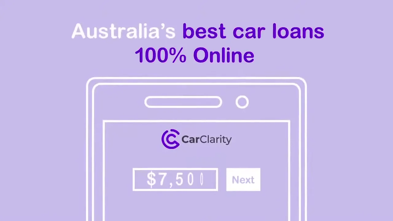
The offer and the first form field share the opening second. 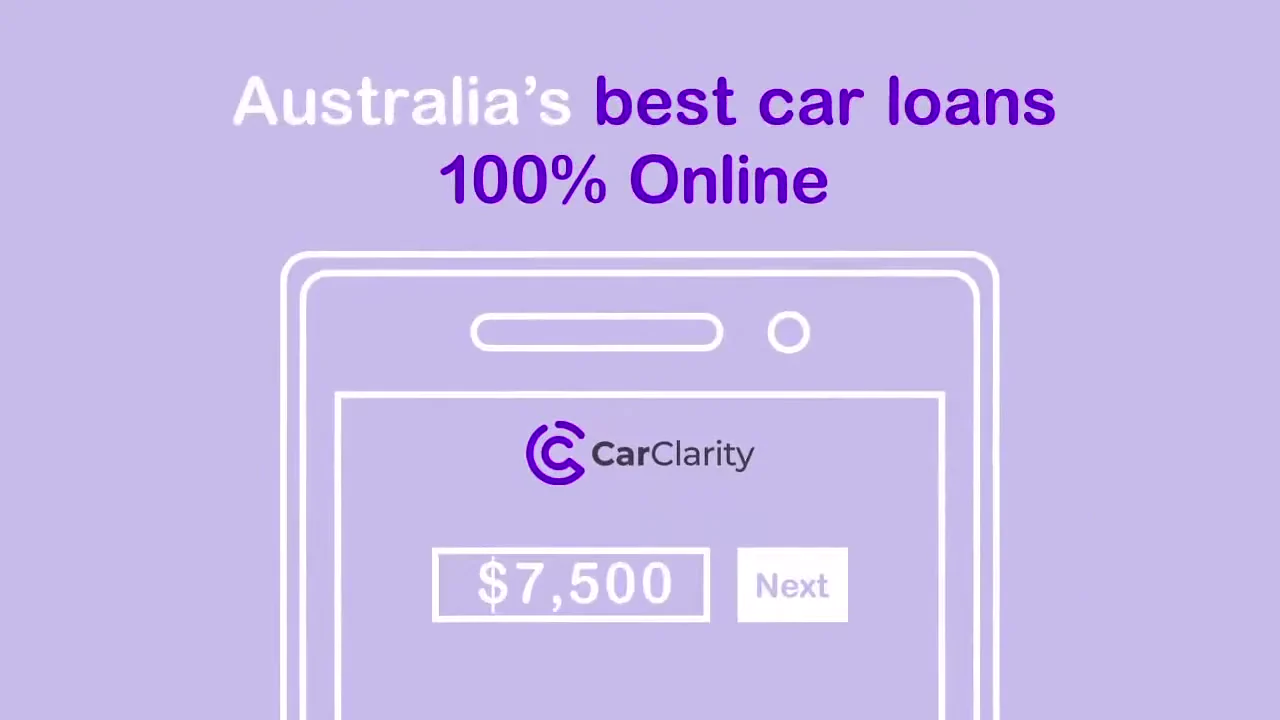
One typed number is the whole first step. 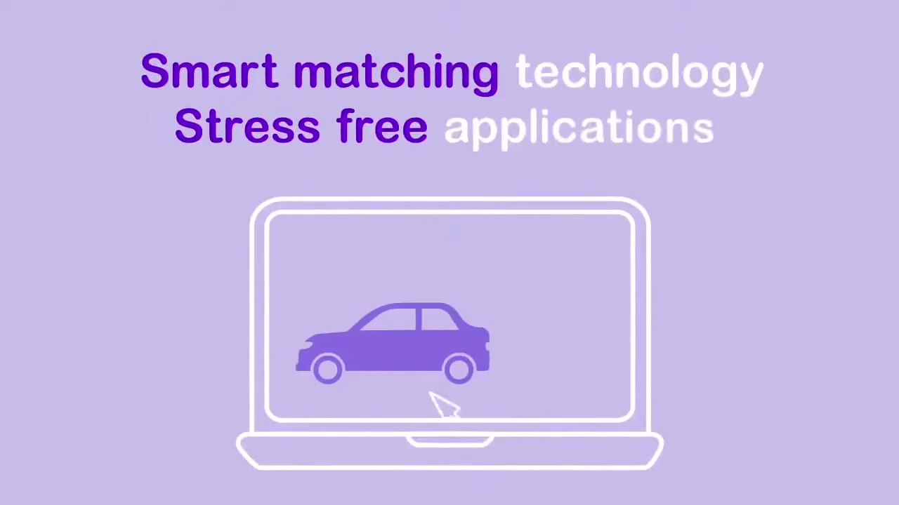
The match moves to a laptop under the 2 product claims. 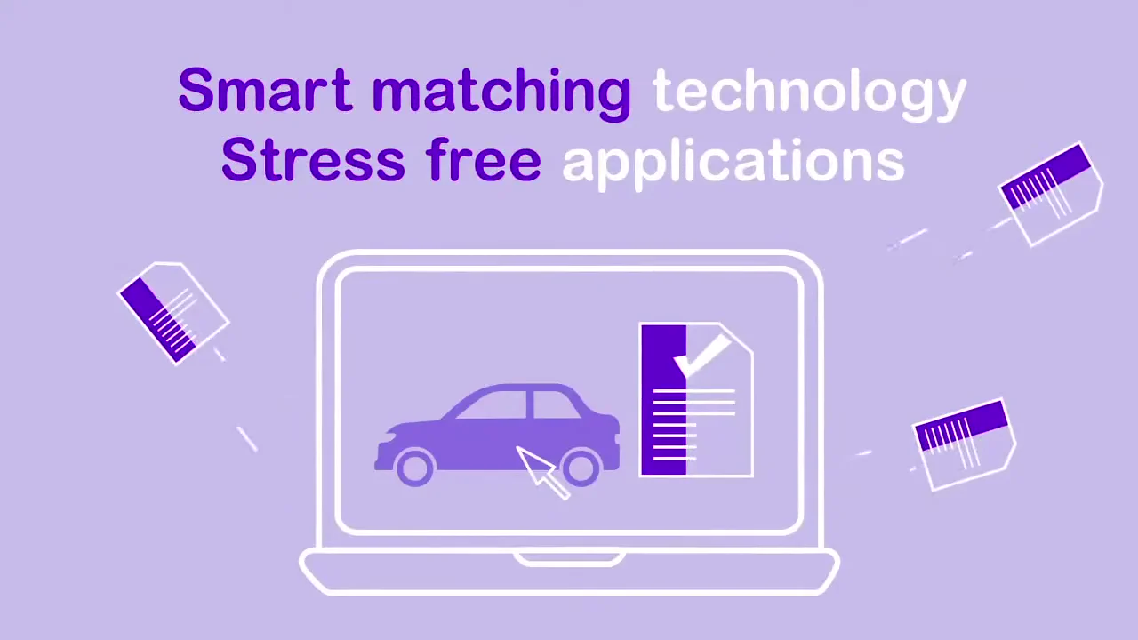
A checked document stands for an approved match. 
The car takes the full frame once the paperwork is gone. 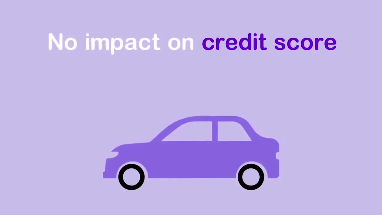
The credit worry gets a line to itself. 
The mark draws itself on white before the name appears. 
The close gives the name and the address to type.
4 decisions behind the CarClarity app demo video
Decision 1
Open on the form, not the logo
In the first second the phone already shows the CarClarity form, a field and a "Next" button, under "Australia's best car loans".
Copy it: Open your app demo on the first screen a new user sees, with the call to action visible.
Decision 2
Fill one field, skip the rest
By 0:02 the field reads "$7,500" and the scene moves straight to the match at 0:04. The rest of the form never appears.
Copy it: Show the single input that starts your flow, then jump to the result.
Decision 3
Give the main worry its own beat
At 0:10 "No impact on credit score" is the only line on screen, over the car alone.
Copy it: Find the objection that stops sign-ups and give it a scene of its own near the end.
Decision 4
Move from phone to laptop
The form sits on a phone from the first second and the match runs on a laptop from 0:04, so the platform reads as working on both.
Copy it: If your app runs on more than one device, put each step on a different screen.
How the CarClarity demo was cut to 3 claims in 15 seconds
- 3 claims. The script was cut to what fits 15 seconds: best car loans 100% online, smart matching with stress free applications, and no impact on credit score.
- Line-drawn devices. A phone and a laptop were drawn in white outline so the purple interface elements stand out.
- UI elements. The CarClarity form, its field and the "Next" button were rebuilt as flat illustrations.
- 2-color headlines. Each line splits into purple and white words so the key term reads first, as in "Smart matching technology".
- Animation. The field fill, the cursor on the car, the document check and the car drive were animated across the 2 devices.
- Sound and finish. Music, sound design, color grading and the final edit closed the video.
Scope of work:
Production took 3 to 4 weeks on a budget of $1,200 to $2,000. See the app demo video production service for how a project like this is scoped.
Questions about the CarClarity app demo video
What does the CarClarity app demo video show in 15 seconds?
3 steps: the form on a phone with "$7,500" typed in by 0:02, the match on a laptop at 0:04 and the credit promise at 0:10. The logo and "www.carclarity.com.au" take the last 3 seconds.
Why does the video open on a phone form with a "Next" button?
It puts the first step of the app on screen under "Australia's best car loans" and "100% Online", so the viewer sees how to start before the end card.
How does the video show smart matching?
From 0:05 a cursor points at a car on a laptop screen and a document with a check mark appears beside it, under "Smart matching technology" and "Stress free applications".
Why does "No impact on credit score" get its own scene?
It answers the risk of applying, so at 0:10 it appears alone over the car with nothing else on screen.
Why are the CarClarity headline words in 2 colors?
Purple marks the term to remember in each line: "best car loans", "Smart matching", "Stress free", "credit score". The white words fill in the rest.
How long did the CarClarity video take and what did it cost?
Production took 3 to 4 weeks on a budget of $1,200 to $2,000, covering UI illustration, interface animation, motion graphics, music and sound design.
What Advids clients say
"Transforming complex banking-as-a-service integrations was beautifully executed by Advids. They made it extremely easy for CTOs to grasp."Riju Choudhury, Brand Marketing Manager at Unit


Need to show your app's first step in under 15 seconds?
Talk to Advids