How can a short video effectively explain my complex SaaS product to potential customers?
Short, impactful videos focusing on key features, benefits, and customer pain points effectively explain complex SaaS products. Consider visuals and concise narratives.
What narrative structure best suits a SaaS explainer video for my target audience?
A problem-solution narrative structure effectively presents a SaaS product as the solution to user challenges, resonating with the target audience.
How long should my SaaS explainer video be to maximize engagement in my marketing funnel?
Optimal SaaS explainer video length is 60-90 seconds, balancing engagement and information delivery. Shorter videos suit social media; longer formats fit websites.
How can I choose the optimal video style for my SaaS product, considering its complexity and target audience?
Choosing the right video style depends on target audience and product complexity. Clean, modern styles suit tech-savvy audiences; illustrative styles suit broader markets.
What are the best practices for scripting a compelling SaaS product demo video that converts prospects?
Compelling SaaS demo video scripts focus on benefits, using clear language, a conversational tone, and highlighting the product's value proposition.
How can video simplify complex software concepts for a non-technical audience?
Simplify complex software concepts for non-technical audiences using analogies, metaphors, and visual aids, avoiding jargon and focusing on practical applications.
How do I seamlessly integrate my SaaS brand identity into my explainer video?
Seamless SaaS brand integration involves incorporating brand colors, logo, and typography, ensuring visual style aligns with overall brand identity and messaging.
How can a video effectively highlight my SaaS product's key features and benefits to drive conversions?
Highlight key SaaS product features and benefits using specific use cases, quantifiable benefits, data, and testimonials to build credibility and drive conversions.
How should I plan a video marketing strategy around my SaaS explainer video to maximize lead generation?
A successful video marketing strategy distributes the SaaS explainer video across multiple channels (website, social media, email) with targeted messaging.
How can I leverage video to generate qualified leads for my SaaS business within a specific stage of the marketing funnel?
Generate qualified SaaS leads using targeted ads, landing pages with embedded videos, and offering valuable content (free trials, demos) in exchange for contact information.
How can I repurpose existing SaaS marketing content, such as blog posts or website copy, for my explainer video script?
Repurpose existing SaaS marketing content by extracting key takeaways from blog posts or website copy and adapting the language for a visual medium.
How do successful SaaS companies strategically use explainer videos within their marketing funnels?
Successful SaaS companies strategically use explainer videos throughout the marketing funnel, tailoring content to each stage and addressing specific audience needs.
What are innovative ways to introduce my SaaS product in a video to capture audience attention?
Innovative SaaS product introductions use captivating hooks (surprising statistics, relatable problems), humor, animation, or storytelling to grab attention.
How can I clearly demonstrate my SaaS product's value proposition through a compelling video narrative?
Clearly demonstrate a SaaS product's value proposition by articulating the problem it solves, highlighting benefits, and using customer testimonials and case studies.
How can I create a SaaS onboarding video using screen recordings of the user interface to enhance user adoption?
Effective SaaS onboarding videos use screen recordings to demonstrate key features and workflows, emphasizing intuitive navigation and user-friendly design. Keep it concise.
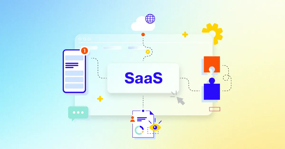
Mastering Your SaaS Explainer Video Strategy
Moving beyond creation fundamentals, mastering your overall SaaS Explainer Video strategy elevates impact and ensures these assets drive tangible business results. It shifts focus from simply having a video to strategically leveraging it throughout the customer journey. This approach significantly boosts customer comprehension of your product and enhances crucial brand awareness introducing the software in a captivating way that leaves a lasting impression.
A key component involves aligning the video message with a deep understanding of your target audience. Address their specific pain points directly showing how your SaaS offers a superior solution. Simplify complex software concepts demonstrating value without overwhelming viewers. Leveraging dynamic visuals and strategic style selection reinforces your brand while making the message highly accessible.
Execution requires more than just hitting publish. Ensure strategic timing aligning video launches with product lifecycle stages or market readiness. Place videos thoughtfully across key channels like your website product pages and social media for maximum visibility and impact ensuring visual consistency across all creative assets.
Measure success through granular engagement and conversion metrics tracking trial sign-ups or demo requests beyond simple views.
Utilize analytics insights like viewer retention graphs to refine content and strategy pinpointing where audiences connect or drop off.
Conduct iterative A/B testing on different video elements to optimize performance and audience resonance over time.
Integrate video into sales cycles and post-acquisition flows like onboarding enhancing lead nurturing accelerating deals and aiding user retention for continuous value.
By adopting this strategic mindset businesses transform SaaS Explainer Video assets into powerful engines for growth customer understanding and lasting relationships.
Why Advids for SaaS Explainer Video?
At Advids, we specialize in crafting high-quality, original SaaS explainer videos that drive exceptional results. We blend creative storytelling, cutting-edge technology, and a proven track record to transform your vision into compelling animation. From startups to Fortune 500 companies, brands trust Advids to bring their SaaS stories to life.
Why Choose Advids?
Experience & Expertise: 12+ years and over 3400 successful projects across various video types demonstrate our deep understanding of effective video production. We've earned the trust of industry leaders like Razorpay, Ola, Mercedes, the United Nations, Continental, and Mercer.
SaaS Explainer Video Specialists: We've crafted over 315 compelling SaaS explainer videos, helping businesses like yours clarify complex concepts, boost conversions, and enhance brand awareness.
Client-Focused Approach: Our dedication to excellence is reflected in over 109 five-star Google reviews. We prioritize clear communication and collaboration throughout the entire process, ensuring your vision is at the heart of every decision.
What We Offer:
Customized Solutions: We tailor each SaaS explainer video to your specific needs, brand, and target audience, whether you require explainer videos, character animations, or other animated content.
Compelling Storytelling: Our skilled animators and storytellers weave captivating narratives that engage viewers and drive action, simplifying your SaaS offering and highlighting its value.
Cutting-Edge Technology: We leverage the latest animation software and techniques to create visually stunning videos that make a lasting impact, ensuring your message resonates with your audience.
Partner with Advids:
Collaborative Process: We work closely with you from concept to completion, ensuring your vision is accurately realized in the final animation. Your input is invaluable to the success of your SaaS explainer video.
Strategic Communication: We prioritize understanding your needs, target audience, and brand identity to create truly impactful SaaS explainer videos that achieve your business objectives.
Ready to unlock the potential of SaaS explainer video for your business with the latest video design trends of 2024? Let Advids be your trusted partner in transforming your ideas into engaging and effective animated experiences.
Checkout some of the projects and work our team at Advids has been producing:
What is a SaaS Explainer Video?
Product demos: Showcase the features and functionalities of your SaaS.Feature highlights: Focus on specific aspects of your product, highlighting key features or addressing particular pain points.Onboarding tutorials: Guide new users through the initial setup and utilization of your SaaS.Case studies: Showcase real-world examples of how your SaaS has helped businesses achieve success.Testimonial videos: Feature satisfied customers sharing their positive experiences.Animated explainer videos: Use animation, motion graphics, and storytelling to simplify complex concepts and engage viewers on an emotional level.
What do top SaaS Explainer Videos have in common?
Mastering saas explainer videos requires focusing on these key elements to create impactful content that converts.
Ideal Customer Profile - Deeply understand your ideal customer's demographics, pain points, and aspirations. Tailor your video to resonate with their specific needs.
- Problem & Solution Fit - clearly articulate the problem your SaaS solves and how it provides a superior solution. Use concise language and visuals.
- Unique Value Proposition - Highlight the unique benefits that set your SaaS apart. Focus on what makes it better than alternatives.
- Compelling Narrative Structure - Structure your video with a clear beginning, middle, and end. Use a narrative arc to build suspense and engagement.
- Intuitive User Journey - Show a simplified user flow, focusing on key actions and avoiding unnecessary complexity. Prioritize ease of understanding.
- Emotional Connection - Use authentic storytelling to create an emotional connection with viewers. Show, don't just tell.
- Clear Call to Action - Make your call to action prominent and easy to understand. Use strong verbs and a sense of urgency.
- Concise Interface Demonstrations - Show only the most relevant features. Use smooth transitions and high-quality visuals.
- Strategic Visual Enhancements - Use animation to highlight key features and simplify complex concepts. Avoid overwhelming the viewer.
- Quantifiable Results - Use charts and graphs to present data in a clear and compelling way. Focus on key metrics that demonstrate value.
What makes SaaS Explainer Videos effective?
A captivating SaaS explainer video is a powerful tool for driving engagement and conversions. A key element is a design to effectively communicate your value proposition and resonate with your target audience.
The effectiveness of SaaS explainer videos is driven by their ability to simplify complex concepts and make them easily understandable. They break down technical jargon and showcase the benefits of your software in a clear and concise manner.
Methods for creating effective SaaS explainer videos include using engaging visuals, compelling storytelling, and clear calls to action. By incorporating these elements, you can create videos that capture attention, build trust, and ultimately, drive conversions.
How long should your SaaS Explainer Video be?
Optimize SaaS explainer video length for maximum impact by aligning video type, content, and target audience stage.
Pre-production Considerations for Determining Video Length:
- What's the core SaaS benefit?
- Who's the ideal customer profile?
- How many features to highlight?
- What's the UI complexity?
- Which platform will host it?
- What's the video's main goal?
- What animation style is best?
SaaS explainer video length guide
| SaaS Explainer Types | Video Length | Use Case | Funnel |
|---|
| Animated Explainer | 60-90 seconds | Clearly explains complex SaaS features using engaging visuals and concise narration, ideal for showcasing software functionality and benefits. Multiple styles like flat design or cartoon style can be used. | Awareness |
| Kinetic Typography | 30-60 seconds | Highlights key SaaS benefits and USPs with impactful text animations, perfect for short, attention-grabbing messages. Great for social media. | Consideration |
| Whiteboard Animation | 45-75 seconds | Illustrates the problem/solution approach, visually demonstrating how the SaaS solves user pain points. Ideal for showcasing a unique value proposition. | Consideration |
| Screen Recording | 45-90 seconds | Demonstrates the SaaS's user interface and workflow, guiding viewers through key features and functionalities. Focus on clear instructions and smooth transitions. | Decision |
| 2D Animation | 60-120 seconds | Provides a detailed overview of the SaaS, showcasing its features and benefits with visually appealing characters and environments. Style can vary from simple to more complex. | Awareness |
How to create SaaS Explainer Videos?
Crafting compelling SaaS explainer videos requires a strategic approach. To maximize impact, prioritize clear messaging, engaging visuals , and a strong call to action that directly aligns with your business goals.
* Define Objectives - Focus on quantifiable goals, aligning video metrics with overall marketing objectives.- Target Audience - Create user personas to inform design choices and messaging, ensuring relevance.
- Scriptwriting - Use concise language, focusing on benefits and avoiding technical jargon.
- Storyboarding - Use a storyboard to plan visual transitions and pacing for optimal engagement.
- Style Selection - Choose a style that reflects your brand and resonates with your target audience's preferences.
- Animation Style - Select a style that effectively showcases the software's features and user experience.
- UI/UX Design - Prioritize clarity and intuitive design to mirror the actual software's usability.
- Video Editing - Employ dynamic cuts and transitions to maintain viewer interest and convey information efficiently.
- Final Review - Conduct a thorough review to ensure accuracy, consistency, and overall quality.
- Call to Action - Use a strong, clear call to action that encourages immediate engagement and conversion.
How to Write a Compelling SaaS Video Script
Writing a compelling saas video script is key to engaging your audience and driving conversions. Let's explore how we can craft a script that truly resonates. Remember, we've already covered the basics, so now we're diving into the specifics of scriptwriting.
Think of your script as a conversation with your ideal customer. You want to address their pain points, showcase your solution's benefits, and ultimately, inspire them to take action. This requires a strategic approach, blending storytelling with clear, concise messaging.
- Grab attention immediately. Start with a hook that resonates with your target audience. Think about a compelling question, a surprising statistic, or a relatable scenario.
- Focus on benefits, not features. Instead of listing technical specifications, explain how your SaaS solves real-world problems. For example, instead of saying "our software has advanced analytics," say "our software helps you make data-driven decisions to boost your bottom line." Looking for inspiration? platform explainer videos offer valuable insights into showcasing software functionality.
- Craft a narrative. Weave a story that connects with your audience on an emotional level. Show, don't just tell. Use visuals to demonstrate your SaaS in action. Consider using SaaS explainer video examples with 2D animation to create visually engaging narratives. If your SaaS is sales-focused, explore SaaS explainer video examples for sales.
- Keep it concise. Respect your viewers' time. Get to the point quickly and avoid jargon. A clear call to action is essential. Tell your viewers what you want them to do next, whether it's signing up for a free trial, requesting a demo, or visiting your website. Digital product explainer videos can provide creative ideas for presenting your SaaS solution.
By following these tips, we can create a SaaS video script that not only informs but also persuades. A well-crafted script is the foundation of a successful explainer video, setting the stage for increased engagement and conversions.
The Importance of Storytelling in SaaS Videos
Let us discuss the art of storytelling. It transcends the mere assembly of words; it serves as a conduit for genuine connection. Within the SaaS landscape, where specifications and utility often dominate the conversation, a compelling narrative can be the catalyst for unlocking deep engagement. Consider this: would you prefer viewing an enthralling story or enduring an arid product demonstration?
Having previously addressed the technical mechanics, it is now time to infuse vitality into our SaaS explainer videos.
- Humanizing Technology: Demonstrate how your software resolves tangible issues for actual individuals. Visualize an entrepreneur overwhelmed by inventory logistics; your SaaS streamlines their operations, allowing them to concentrate on expansion. That constitutes a narrative worthy of dissemination.
- Evoking Emotion: Harness feelings of alleviation, the triumph of success, or the gratification of a resolved issue. Recall those app explainer videos that elicited a smile? We can replicate that identical emotional resonance within our SaaS productions.
- Building Trust: Credibility is forged through authenticity. Disseminate customer success testimonials or highlight the human element of your workforce. When reviewing SaaS explainer video examples animation, bear in mind that a riveting story can vitalize even the most abstract technical notions.
Are you seeking SaaS explainer video examples for marketing purposes? Prioritize stories that resonate with your intended demographic and catalyze conversions. Much like app explainer videos, SaaS productions thrive on a robust narrative framework. Impactful software-as-a-service videos utilize storytelling to establish a personal rapport with the audience. By interlacing captivating plots, we elevate our SaaS explainer videos from rudimentary product displays into potent instruments for engagement and conversion.
Measuring the ROI of Your SaaS Explainer Video
Let's talk about measuring the success of our SaaS explainer videos. We've discussed creating compelling content, but how do we know if it's truly effective? It's all about connecting video metrics to real business outcomes. Think of it like this: a captivating story is great, but it's even better when it translates into tangible results .
Measuring ROI isn't just about vanity metrics . It's about understanding how your video contributes to your bottom line. Are we seeing an increase in trial sign-ups? Are more leads converting into paying customers ? These are the questions we need to answer. Technology explainer videos, especially, need to demonstrate clear value.
- Track key website metrics . How many viewers are clicking through from your video to your website? This indicates genuine interest and engagement. Look to the best SaaS explainer video examples for inspiration.
- Analyze video engagement . Are viewers watching the entire video? High completion rates suggest compelling content. If not, consider what could be improved. Perhaps experimenting with SaaS explainer video examples 3D animation could boost engagement.
- Focus on conversions . How many viewers are taking the desired action , whether it's signing up for a free trial or requesting a demo? This is where the rubber meets the road.
- Monitor social media activity. Are people sharing your video? Social media engagement is a valuable indicator of brand awareness and reach. software explainer videos that resonate with audiences often go viral.
By analyzing these metrics, we gain valuable insights into our video's performance and can refine our strategy for even better results. This data-driven approach ensures we're not just creating videos, but creating videos that deliver real business value.
Choosing the Right SaaS Explainer Video Style
So, we've explored the essentials of SaaS explainer videos. Now, let's talk style. Choosing the right style is like picking the perfect outfit – it needs to fit your brand, your message, and your audience. A polished, professional style might be ideal for showcasing SaaS explainer video examples for enterprise, while a more playful approach could resonate with a younger demographic. Think about what feels authentic to your brand and what will capture your audience's attention.
Finding the right balance between information and engagement is key. We want to educate our viewers, but we also want to entertain them. A well-chosen style can do both. Take inspiration from SaaS explainer video examples high quality – they often blend informative content with visually appealing aesthetics.
Remember those subscription software explainer videos that made you want to click "learn more"? That's the power of a compelling style.
- Consider your audience. Who are you trying to reach? What kind of visuals will resonate with them?
- Think about your message. What's the key takeaway you want viewers to remember?
- Don't be afraid to experiment. Try different styles and see what works best for your brand.
- Look at SaaS product demo videos for inspiration. How do they showcase features in a clear and engaging way?
By carefully considering these factors, we can choose a style that not only looks great but also effectively communicates our message and drives conversions. A well-chosen style is the foundation of a successful SaaS explainer video, setting the stage for increased engagement and ultimately, business growth.
Building a Brand Through SaaS Explainer Videos
We've covered the technical nuts and bolts. Now, let's talk about how SaaS explainer videos can build your brand . Think of your video as a digital handshake , a first impression that can make or break a potential customer's perception. Looking for inspiration? Check out these top SaaS explainer video examples to see how successful brands leverage video for growth. Remember, even SaaS explainer video examples short can pack a powerful punch.
A strong brand isn't built overnight . It's a culmination of consistent messaging , engaging visuals, and a deep understanding of your audience. Your explainer video is a crucial piece of this puzzle.
- Craft a compelling narrative. Don't just list features; tell a story. Show how your SaaS solves real-world problems and makes life easier for your users.
- Highlight your unique value proposition. What sets you apart from the competition? Focus on the benefits that matter most to your target audience.
- Maintain visual consistency. Use a consistent color palette, typography, and animation style across all your videos to reinforce brand recognition.
- Include a clear call to action. Tell viewers what you want them to do next, whether it's signing up for a free trial, requesting a demo, or visiting your website.
By following these tips, you can transform your SaaS explainer video from a simple product demo into a powerful brand-building tool. For cloud software explainer videos, focus on showcasing the accessibility and scalability of your platform. Even business software explainer videos can benefit from a touch of creativity. Remember, a well-crafted explainer video can be the key to unlocking lasting brand loyalty and driving business growth .
Author & Editor Bio
A video producer with a passion for creating compelling video narratives, Jai Ghosh brings a wealth of experience to his role. His background in Digital Journalism and over 11 years of freelance media consulting inform his approach to video production. For the past 7 years, he has been a vital part of the Advids team, honing his expertise in video content planning, creation, and strategy.
His collaborative approach ensures that he works closely with clients, from startups to enterprises, to understand their communication goals and deliver impactful video solutions. He thrives on transforming ideas into engaging videos, whether it's a product demo, an educational explainer, or a brand story.
An avid reader of modern marketing literature, he keeps his knowledge current. Among his favorite reads from 2024 are "Balls Out Marketing" by Peter Roesler, "Give to Grow" by Mo Bunnell and "For the Culture" by Marcus Collins. His results-driven approach ensures that video content resonates with audiences and helps businesses flourish.