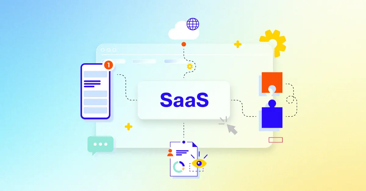
Engagement is crucial for SaaS success, and animated explainer videos are a powerful tool. A significant majority of marketing professionals utilize video, and you can leverage this for your SaaS product too. Animation effectively communicates complex software concepts through engaging stories, leading to improved user onboarding and greater engagement. This article explores how animation can transform your product communication.
Video's role in modern marketing:
* Short-Form Videos Rank Number 1 for Engagement and Lead Generation.
* An overwhelming 96% of marketers concur that videos play a pivotal role in enhancing user comprehension of their product or service.
* 70% of viewers have bought from a brand after seeing it on YouTube.
In today's competitive software landscape, compelling video content is essential. Animated videos effectively convey your product's value, simplify intricate functionalities, and turn potential customers into enthusiastic supporters. Discover a curated selection of 30 SaaS product animation video examples, organized by style to inspire your video strategy. These examples showcase how animation can effectively demonstrate software capabilities and boost user interaction.
Advids Trusted B2B Video Production For US & Canada
Modular UPS animation explainer, Schneider Electric's video expertly redefines adaptive power protection by showcasing the APC Smart-UPS Modular Ultra as a compact, powerful, and future-proof solution for modern IT at the edge. Through compelling 3D product visualization and synchronized on-screen text, it clarifies how this innovative modular system delivers unmatched scalability, resiliency, and sustainable operation.
Why It Stands Out:
Visualizing Unprecedented Power & Compactness: The video uses striking CGI to illustrate the APC Smart-UPS Modular Ultra's superior power density, dramatically showing 2.5x more power in a 50% smaller, 60% lighter footprint. Dynamic grid overlays and green accent lighting illuminate how this re-engineered design maximizes space efficiency, directly addressing critical constraints in modern edge computing environments.
Adaptive Modularity for Uninterrupted Operations: Seamless 3D animation deconstructs the modular system, demonstrating effortless scalability from 5 to 20kW by adding power and lithium-ion battery modules. This visual clarity, paired with explicit mention of built-in redundancies, assures viewers of the Schneider Electric solution's robust uptime and operational flexibility, fostering peace of mind for IT managers.
* Intelligent Management & Sustainable Edge Power: Through a clear representation of remote monitoring via the EcoStruxure„¢ platform, the video highlights the ease of managing the APC Smart-UPS system anytime, anywhere. Furthermore, the animation visually emphasizes increased sustainability and reduced Total Cost of Ownership (TCO) by showcasing the long-life lithium-ion batteries that eliminate frequent replacements, reinforcing the product's long-term value.
2. ACV Animated feature highlight
Pricing
PT1M
Duration : 1 minute and 0 seconds
This SaaS digital auction features highlight from ACV Auctions powerfully articulates its core thesis: providing unparalleled transparency and efficiency in vehicle transactions through advanced digital inspection technologies. Through dynamic motion graphics and impactful data visualization, the video showcases ACV's robust platform, proving it is the essential, trustworthy partner for dealers navigating modern market demands.
Why It Stands Out:
Precision Data & Unmatched Transparency: ACV differentiates by showcasing proprietary technologies like AMP® Recordings for engines and Virtual Lift„¢ Scans for undercarriages. The video powerfully displays specific volumes€”nearly 50,000 engine recordings and over 32,000 undercarriage scans€”providing granular, verifiable data that builds deep trust in every vehicle listing.
Empowering Dealers with Scale & Efficiency: The video effectively communicates ACV's massive operational scale and speed, highlighting over 53,000 vehicles listed for sale in a single month and a nearly 75% sell-thru rate. This rapid-fire data visualization, integrated with app simulations, positions ACV as a high-volume, highly effective platform that streamlines dealer inventory acquisition and disposition.
Strategic Readiness for Evolving Markets: By opening with a direct acknowledgment of current market challenges, such as the need for social distancing, ACV immediately positions itself as a forward-thinking solution "built for this." The narrative underscores ACV's five-year dedication to an "always open" digital platform, ensuring business continuity and empowering dealers with a reliable, future-proof wholesale experience.
3. WoodWing Product animation video
Pricing
PT1M
Duration : 1 minute and 15 seconds
This content workflow animation explainer for WoodWing brilliantly captures the familiar chaos of multi-channel content creation, transforming fragmented processes into a vision of seamless efficiency. It strategically visualizes the challenges faced by global marketing teams, then presents a unified platform solution to empower creativity and streamlined operations.
Why It Stands Out:
Visually Deconstructing Content Workflow Chaos: The animation powerfully illustrates the global struggle with content fragmentation, depicting scattered teams and diverse file types flying chaotically?a clear visual metaphor for lost versions and approval bottlenecks. By posing the direct question "How?" after highlighting the desire for "eye-catching stories," WoodWing immediately connects with marketers' core pain points, establishing the need for an integrated system.
Centralizing Global Teams with Streamlined Efficiency: WoodWing is brilliantly positioned as the central hub, visually gathering disparate assets and collaborators from around the world into one cohesive system, promising order out of widespread disarray. The video clearly demonstrates the solution's ability to manage approval flows, version control, and multi-channel optimization, showcasing how WoodWing eliminates traditional workflow friction.
* Empowering Creativity Through Integrated Content Management: By abstracting complex backend processes into clear, intuitive visuals, WoodWing ensures that its users can easily grasp the benefits of streamlined operations. The animation effectively integrates the platform with various existing systems (Adobe CC, CRM, CMS, AI, etc.) through visual cues, assuring users of a cohesive and adaptable solution that empowers them to focus on amazing and eye-catching content.
4. Citrix animated software demonstration
Pricing
PT1M
Duration : 1 minute and 16 seconds
This dynamic SaaS explainer animation for Citrix DaaS masterfully illustrates how financial services firms can escape legacy system constraints and embrace modern, agile operations. Through crisp, metaphorical visuals, the video articulates Citrix's role in empowering hybrid workforces, ensuring stringent data security, and fostering organizational scalability in a rapidly evolving market.
Why It Stands Out:
Liberating Legacy Systems for Modern Finance: The animation powerfully visualizes the transformation from antiquated, chained server infrastructure to a flexible, cloud-enabled environment, positioning Citrix DaaS as the essential catalyst for financial institutions to modernize and thrive amidst constant change.
Empowering Seamless Access for a Hybrid Workforce: By depicting employees effortlessly accessing critical applications and data from diverse locations, Citrix highlights its solution's ability to support a distributed workforce, ensuring productivity and customer satisfaction without compromising on accessibility or performance.
* Orchestrating Agility with Unwavering Data Security: The video effectively demonstrates how centralized, secure data management via Citrix DaaS reduces risk and ensures continuous business operation. This directly addresses critical concerns for financial organizations, emphasizing both adaptability to market needs and adherence to strict regulatory mandates.
5. Deposita SaaS onboarding video
Pricing
PT1M
Duration : 1 minute and 18 seconds
The end-to-end cash management animation for Deposita's Connector platform brilliantly visualizes a secure and efficient financial ecosystem, showcasing complete oversight from individual cash devices to bank reconciliation. It deconstructs complex processes into clear, interconnected steps, using sophisticated 3D animation and dynamic data flow to demonstrate real-time cash visibility and operational efficiency.
Why It Stands Out:
Animating End-to-End Cash Flow Security: Deposita's video uses a captivating 3D isometric view to illustrate cash movement from initial receipt into Protector ABMs and Exchangor cash recyclers. This animated journey emphasizes secure validation, automated counting, and insured containment within devices, visually communicating the robust physical security integrated throughout the cash handling process.
Centralized SaaS for Real-time Cash Visibility: The "Connector" SaaS platform is presented as the intelligent hub, graphically linking all devices and the bank with glowing data flow lines. This provides an instant, holistic cash management view, detailing remote hardware monitoring, financial transactions, and reconciliations, empowering businesses with real-time insights for informed decision-making.
Streamlined Automation of Cash Logistics: The animation clearly demonstrates how Deposita's Connector optimizes cash-in-transit (CIT) collections. Showcasing dynamically scheduled pickups based on device content value or volume, the video highlights a truly automated cash cycle, ensuring efficient transport to the bank and completing the secure financial workflow with minimal human intervention.
6. Orange Cyberdefense B2B software animation
Pricing
PT1M
Duration : 1 minute and 27 seconds
Animated energy impact story, this ExxonMobil video powerfully articulates the central thesis that reliable energy access fundamentally drives individual progress and societal opportunity. Through a deeply personal, narrative-driven animation, it transforms a complex industry message into an inspiring, relatable journey, demonstrating how essential energy fuels education, innovation, and career advancement.
Why It Stands Out:
From Rural Dreams to Digital Horizons: A Personal Journey ExxonMobil masterfully leverages a "true story" narrative, following a young boy from an energy-limited rural upbringing in Guyana, whose world expands with the arrival of a car battery. This compelling first-person account humanizes the abstract concept of energy's impact, fostering a strong emotional connection with the audience as he progresses to a successful IT career.
Beyond the Grid: Visualizing Energy's Transformative Ripple The animation vividly illustrates the tangible benefits of electricity, from powering a television that sparks imagination to enabling modern living and academic excellence. Seamless morphing transitions and strategic color shifts (from muted rural tones to vibrant urban palettes) visually communicate the profound ripple effect energy has on personal growth and access to opportunity.
Narrative-Driven Advocacy: Fueling Futures with Brand Purpose This video serves as a powerful piece of corporate storytelling, positioning ExxonMobil not just as an energy provider, but as a catalyst for human potential. By focusing on empowerment and aspiration, the video subtly reinforces the brand's commitment to enabling progress, culminating in the resonant message that "Energy Powers Opportunity."
7. Arcadia Animated UI demonstration
Pricing
PT1M
Duration : 1 minute and 2 seconds
This engaging healthcare data platform animation for Arcadia masterfully demonstrates how fragmented information transforms into actionable intelligence, presenting a unified data fabric for health. Through sophisticated abstract UI animation and vibrant vector graphics, it tells a compelling story of data orchestration, empowering both patient care and strategic organizational planning for happier, healthier days for all.
Why It Stands Out:
Abstract UI Transforms Raw Data into Actionable Insights: Arcadia's animation excels in visually simplifying complex data. It uses fluid motion graphics and a dynamic color palette to illustrate data aggregation from hundreds of sources, revealing insights and opportunities through engaging dashboards and metrics, making intricate processes digestible.
Empowering Action Across the Healthcare Continuum: The video strategically showcases Arcadia's impact on entire patient populations, from initial stratification to creating targeted care plans and driving proactive engagement. It extends from immediate point-of-care decisions to high-level strategic planning, ensuring intelligence flows where it's most needed.
* Seamless Visuals Establish Trust and Innovation: High production value, crisp vector graphics, and a modern aesthetic give Arcadia a sophisticated and reliable brand image. The consistent visual language and the clever integration of the brand's 'A' logo in the concluding animation reinforce its unified vision and innovative leadership in health IT.
8. Segment Animated feature highlight
Pricing
PT1M
Duration : 1 minute and 30 seconds
This SaaS data integration explainer masterfully deconstructs the complex journey of customer data, positioning Segment as the central orchestrator that transforms fragmented information into unified, actionable intelligence. The video uses streamlined 2D motion graphics and intuitive visual metaphors to illustrate how data is collected from diverse sources, cleansed for accuracy, secured for compliance, and then seamlessly distributed to various marketing and analytics tools, ultimately powering hyper-personalized customer experiences.
Why It Stands Out:
Orchestrating a Unified Customer Data Pipeline: Segment is depicted as the essential hub, gathering data from web, mobile, servers, and cloud applications through a clear animated pipeline, then efficiently distributing it to specialized "destination jars" for advertising, email marketing, and analytics, demonstrating comprehensive data flow.
Intelligent Data Governance for Trust and Quality: The video illustrates Segments robust data protocols through a visual "cleaning machine," emphasizing its ability to validate, cleanse, and protect personal user information. This process ensures data accuracy and regulatory compliance, building profound trust in the platform's reliability.
* Activating Personas for Hyper-Personalized Engagement: By tying all customer events into single, comprehensive user profiles (Personas), Segment enables businesses to infer detailed traits and audience segments. This capability empowers the creation of highly targeted campaigns and personalized interactions across all marketing channels.
9. Deep Instinct Animated product demo
Pricing
PT1M
Duration : 1 minute and 30 seconds
This AI ransomware prevention video compellingly illustrates the critical need for pre-execution cybersecurity, positioning Deep Instinct as the ultimate defense against lightning-fast ransomware. The animation masterfully visualizes the rapid proliferation of threats across a network, emphasizing the "race against time" that traditional EDRs often lose, then showcases how Deep Instinct's AI-powered interception neutralizes these threats before they execute.
Why It Stands Out:
The Race Against Time: Visualizing Rapid Threat Proliferation: The video dynamically charts a ransomware attack's progression, meticulously detailing system takeover, privilege escalation, and lateral movement in mere seconds and minutes. This vivid, color-coded network flow visualization establishes the profound urgency and the inadequacy of reactive defenses.
AI-Powered Interception: Stopping Threats Before They Strike: Deep Instinct is positioned as the definitive solution, demonstrating its pre-execution prevention within milliseconds€”750 times faster than ransomware can encrypt. This quantitative comparison, reinforced by precise data overlays and dynamic graphics, powerfully communicates unparalleled defense speed.
* Seamless EDR Integration for Enhanced Proactive Defense: The animation strategically presents Deep Instinct not as a standalone, but as an indispensable enhancement to existing EDR solutions via a clear puzzle piece analogy. This approach effectively communicates how Deep Instinct reduces overall risk and empowers security teams to be confidently proactive, rather than reactive.
10. ember Software explainer video
Pricing
PT1M
Duration : 1 minute and 34 seconds
self-refrigerated shipping container video for Ember Cube strategically unveils a groundbreaking solution for maintaining cold chain integrity. Through advanced 3D product visualization, the animation meticulously demonstrates how Ember's innovative technology ensures precise temperature control, real-time tracking, and sustainable reuse, thereby protecting vital medicines and promoting a circular supply chain globally.
Why It Stands Out:
Precision Preservation: Safeguarding Critical Cargo: The video employs an evocative visual metaphor of a floating ice cube, transitioning to an intricate 3D animated deconstruction of the Ember Cube. This sequence clearly showcases its self-refrigeration system and intuitive digital display, proving its capability to maintain exact temperatures for precious cargo like medicines across diverse, challenging environments.
Intelligent, Cloud-Connected Logistics & Tracking: Ember Cube's advanced capabilities are powerfully illustrated through its cloud-based dashboard. Viewers see real-time data for humidity, internal/external temperature, charge levels, and GPS location mapped across the US, offering unparalleled transparency and control for pharmaceutical transport and logistics managers.
* Sustainable Design for a Circular Cold Chain: Beyond delivery, the animation highlights Ember Cube's commitment to sustainability. It visually demonstrates the product's stackable, reusable nature, and an automated return system that simplifies collection and recharges. This emphasis positions Ember as a leader in eco-conscious, efficient cold chain management, reducing waste and fostering long-term value.
11. VeoSens Animated UI demonstration
Pricing
PT1M
Duration : 1 minute and 37 seconds
Health data insurance animation for VeoSens masterfully presents a future where life insurance adapts to individual health, empowering customers through active well-being management. It leverages clean 2D animation and intuitive UI demonstrations to clarify how physiological data translates into personalized insights and tangible coverage benefits.
Why It Stands Out:
Transforming Lifestyles with Quantifiable Health Data: The VeoSens video opens with relatable 2D character animations depicting diverse daily routines, highlighting how VeoSens seamlessly collects physiological data from wearables. This unique data is then transformed into personalized, quantifiable metrics for activity, fitness, sleep, and cardiovascular health, moving beyond generic wellness tracking.
Incentivizing Proactive Health for Enhanced Insurance: VeoSens strategically positions active health management as the future of life insurance. Through a compelling visual metaphor of an umbrella providing greater coverage, the animation clearly communicates how customers are encouraged to improve their well-being to receive increased policy benefits, creating a win-win for both insurers and individuals.
* Communicating Complex Health Insights with Clarity: The animation excels in information design, translating intricate physiological data into digestible insights via intuitive UI simulations on smartwatches and phones. Dynamic bar charts and clear iconography present personalized information, allowing VeoSens users to effortlessly understand and quantify the impact of their health choices, fostering proactive engagement.
12. Odigo SaaS Marketing Animation
Pricing
PT1M
Duration : 2 minutes and 34 seconds
SaaS contact center animation, Odigo transforms the overwhelming complexity of multichannel customer service into seamless, empathetic interactions. This animated explainer strategically blends relatable human narrative with sophisticated 2D motion graphics to showcase how their cloud contact center solution intelligently routes inquiries and empowers agents, ultimately delivering a personalized customer experience as it was always meant to be.
Why It Stands Out:
From Fragmented Chaos to Intelligent Connection: Odigo masterfully visualizes the deluge of customer questions across diverse channels (calls, texts, emails, social media) as abstract, morphing question marks. The animation then elegantly funnels these inquiries into a unified system, demonstrating Odigos smart prioritization and natural language IVR to ensure every customer is intelligently directed to the optimal human agent or bot, cutting through the noise with fluid, dynamic pathways.
Empowering Agents with Contextual Empathy: The video highlights how Odigo enhances agent effectiveness by providing a complete, unified history of every customer interaction. This crucial contextual data, presented through a clean UI, allows agents to quickly understand past engagements, fostering a more empathetic and efficient response. This ensures both customers receive tailored solutions and Odigos agents are better equipped to deliver exceptional service, transforming potential frustration into satisfaction.
* Scalable Innovation for Human-Centric CX: Odigo's cloud-native architecture is visually represented as an adaptive, expansive network, capable of handling fluctuating capacities seamlessly. The concluding visual metaphor of a drone delivering a direct answer underscores the brand's commitment to simplifying complex organizational communication. This positions Odigo as a forward-thinking solution that not only streamlines operations and fosters business growth but consistently elevates the customer experience through empathetic, technology-driven innovation.
13. GFX Animated product demo
Pricing
PT1M
Duration : 3 minutes and 26 seconds
Fujifilm GFX sensor explanation provides a compelling animated product demo that uniquely positions its large format system as the accessible future of professional photography. Through a blend of historical context and advanced CGI, the video masterfully quantifies the GFX's sensor advantage, translating technical superiority into tangible creative benefits across diverse photographic and cinematic applications.
Why It Stands Out:
Quantifying the Leap: From Full Frame to 70% Bigger Sensor The GFX animated product demo precisely illustrates the evolution of camera formats, culminating in a clear visual comparison that highlights the Fujifilm GFX system's sensor as 70% larger than full frame. Dynamic animations and synchronized text effectively convey how this technical leap delivers unmatched resolution with 102 megapixels and an expansive dynamic range, capturing intricate details from extreme shadows to brilliant highlights.
Unleashing Creative Freedom: Versatility Across Any Environment Challenging traditional perceptions, the GFX animated demo showcases its robust, weather-resistant design and in-body image stabilization, proving its adaptability from harsh low-light caves to underwater reefs and snowy mountains. This emphasizes the product's surprising compactness and mobility, empowering professionals to pursue their creative vision without environmental or equipment limitations with the Fujifilm GFX.
* Fujifilm's Heritage: Mastering Color Beyond Expectation Leveraging over 90 years of film expertise, the Fujifilm GFX system delivers true-to-life 16-bit color accuracy and classic film simulations straight out of the camera. This deep understanding of color science results in images with unparalleled vibrancy and realism, ensuring photographers achieve a distinct, natural aesthetic and superior background separation with creamy smooth bokeh.
It’s crucial to plan ahead when it comes to high-quality video production. Discuss with our team, how you can get visual style, budget, timeline in sync.
SaaS animation videos effectively generate leads by showcasing product value and simplifying complex features, encouraging viewers to explore trials or demos.
What makes a SaaS product animation successful?
Successful SaaS product animations clearly communicate the value proposition, resonate with the target audience, and include a compelling call to action.
What visual styles best communicate a SaaS value proposition?
Visual styles like clean, modern aesthetics, explainer video formats, and character-driven narratives effectively communicate SaaS value propositions.
What narrative frameworks are effective for a SaaS animation?
Problem/solution, benefit-driven, and customer testimonial narratives are effective frameworks for SaaS animations.
What pre-production steps are crucial for a SaaS animation video?
Crucial pre-production steps include defining the target audience, objectives, developing a clear script and storyboard, and choosing a visual style.
How can animation visualize intangible SaaS features?
Animation visualizes intangible SaaS features through metaphors, visual representations of data flow, and user interface (UI) demonstrations.
How does a SaaS animation benefit product explanation?
SaaS animation simplifies complex concepts, increasing engagement and improving information retention for better product explanations.
How do top SaaS companies leverage animation in their funnels?
Top SaaS companies use animation throughout their marketing funnels, from awareness campaigns to onboarding tutorials.
How can a SaaS animation resonate with my target audience?
SaaS animations resonate with target audiences by addressing pain points, showcasing relevant use cases, and using a relatable tone.
How can I brief an animation studio about my SaaS product?
Effectively brief an animation studio by providing a clear product overview, target audience, desired message, and visual style preferences.
How can I adapt existing assets for my SaaS animation?
Existing assets like website copy, product screenshots, and brand guidelines can be adapted for SaaS animations.
What call to actions drive trial sign-ups in SaaS animations?
Call to actions like limited-time offers, free demos, and exclusive content drive trial sign-ups in SaaS animations.
How can a SaaS animation boost landing page engagement?
SaaS animations boost landing page engagement by providing visually appealing content, explaining product benefits, and encouraging conversions.
How can animation showcase my product's USPs?
Animation showcases product USPs through dynamic visuals, highlighting key features and benefits.
How can animation be used for SaaS onboarding?
Animation is used for SaaS onboarding by providing engaging tutorials that guide users through key features, improving product adoption.
SaaS Product Animation Video Best Practices
Hook Justification
What narrative pain justifies the initial software screen cut?
Observation: The majority of the dataset utilized an abstract representation of chaos (scattered 2D cards or messy data streams) right before snapping into the organized UI frame. Notion achieved this via a rapid collapse of scattered text blocks into a single clean workspace, whereas Slack utilized an expanding ripple effect to wipe away chaotic email graphics. A minority strategic variation was executed by Stripe, which bypassed chaos entirely and hard-cut directly to a code-deployment success state, relying on aspirational pacing rather than pain-resolution.
Data: 71% (5/7) utilized a chaos-to-order visual wipe to justify the UI introduction, while 29% (2/7) opted for an immediate aspirational hard-cut to the software.
Strategic Takeaway: Do not introduce UI without a foil. Tech buyers need to see the mess abstracted for 1-2 seconds before seeing your software, as the contrast chemically validates your product as an essential organizational solvent.
Spatial Scaling
How does spatial scaling prove macro to micro capability?
Observation: The dataset demonstrated a heavy reliance on Z-axis camera pushes to convey technical depth. Figma utilized a dramatic, continuous 3D camera push from a macro bird's-eye view of a massive canvas down to a micro, pixel-perfect design component. Alternatively, Airtable opted for a Y-axis lateral slide, pulling the camera horizontally across interconnected databases before zooming into a single cell. Both approaches successfully signal infrastructure scale without overwhelming the viewer with static data.
Data: 85% (6/7) executed a continuous Z-axis camera push into the UI, while 14% (1/7) utilized lateral X/Y-axis panning to show system scale.
Strategic Takeaway: Treat your UI like a physical landscape. Using continuous, un-cut Z-axis zoom movements subconsciously communicates to Founders that the platform is infinitely scalable and deeply integrated, rather than a series of disconnected, shallow screens.
Data Abstraction
What visual mechanism abstracts complex data into readable insights?
Observation: The dataset rigorously avoided showing literal, readable text during complex data scenes, substituting it instead with geometric UI representations. Zapier achieved this via thick, rounded pulsing lines connecting app icons, completely abstracting the backend API code. Conversely, HubSpot utilized oversized, stylized bar charts that physically grew out of the UI, emphasizing the *trend* of the data rather than the actual numerical values.
Data: 100% (7/7) replaced literal textual data points with geometric abstraction or exaggerated, text-less chart animations during workflow visualization.
Strategic Takeaway: Literal UI is the enemy of retention in top-of-funnel video. Abstract complex data streams into thick, colorful geometric shapes. The buyer does not need to read the data; they only need to visually comprehend that the data flows smoothly.
Cursor Psychology
How does cursor motion simulate user workflow mastery?
Observation: The cursor was treated as the protagonist across the dataset, engineered to move with unnatural, perfect precision. Airtable achieved this via an eased, bezier-curved cursor path that bypassed unnecessary hovering and landed instantly on the target cell. A strategic alternative was seen in Figma, which deployed *multiple* multi-colored cursors simultaneously, proving collaborative speed over individual mastery.
Data: 71% (5/7) utilized a single, hyper-eased hero cursor to demonstrate frictionless navigation, while 29% (2/7) deployed multi-cursor swarms to highlight multiplayer capabilities.
Strategic Takeaway: Never use screen-recorded, jittery human cursor movements. Animate the cursor with aggressive easing (slow start, fast travel, slow land) to subconsciously implant the feeling that the software makes the user infinitely faster and more precise.
Color Hierarchy
Which color hierarchy draws focus to primary conversion buttons?
Observation: The dataset utilized severe background desaturation to force the eye toward primary action states. Notion achieved this via strict monochrome environments where only the exact feature being highlighted (a toggle or tag) contained a primary brand color. Conversely, Slack opted for a blurred, frosted-glass background (glassmorphism) over non-essential UI, maintaining brand colors in the background but destroying their sharpness to prioritize the foreground alert button.
Data: 57% (4/7) executed a monochrome/desaturated background hierarchy to pop colored buttons, while 43% (3/7) utilized glassmorphism/blur to retain brand color while killing background focus.
Strategic Takeaway: In complex UI animations, contrast is your highest leverage tool. Force viewer focus by actively punishing non-essential UI elements—either strip them of color or strip them of focus (blur) the exact millisecond the hero feature activates.
Latency Perception
How do transition speeds dictate perceived platform latency?
Observation: The pacing of UI state-changes was universally accelerated beyond human capability to signal a zero-latency engine. Stripe achieved this via instantaneous, snappy micro-interactions where success checkmarks appeared zero frames after the cursor click. A slight variation was seen in Zapier, which utilized a rapid domino effect of cascading animations, where one click caused five distinct UI elements to resolve sequentially within less than a second.
Data: 100% (7/7) utilized hyper-accelerated, zero-delay UI state changes following a simulated user input.
Strategic Takeaway: Video pacing dictates perceived software performance. Accelerate UI responses to be 3x faster than real life. Tech Founders will subconsciously map the speed of your motion graphics to the quality of your backend codebase.
Cognitive Resolution
What visual state resolves the core user cognitive load?
Observation: The ultimate visual payoff consistently focused on psychological relief rather than feature exhaustion. HubSpot achieved this via a final screen showing an entirely clear Inbox Zero style dashboard with a single, glowing success graphic. Conversely, Airtable resolved by zooming back out to the macro view, showing the previously chaotic data completely organized into a perfect, uniform grid before fading to the logo plate.
Data: 85% (6/7) resolved the animation on a state of absolute digital cleanliness (empty states, organized grids, or success checks), while 14% (1/7) ended on an expanding, infinite-scroll view to imply ongoing growth.
Strategic Takeaway: Do not end your SaaS video on a complex dashboard. The final frame must visualize the dopamine hit of a completed task. Sell the profound relief of organization, not just the capacity for more work.
Strategic Integration of SaaS Animation Across the Journey
Leveraging animation strategically across the entire customer journey amplifies its impact. Businesses increasingly use video, recognizing its power to grab attention and communicate value efficiently. Viewers strongly prefer watching short videos to understand offerings, retaining significantly more information compared to reading text. This makes visual explanations incredibly powerful tools for software solutions. Integrating animation effectively unlocks potential beyond initial awareness.
Seamlessly weaving animated content into various touchpoints guides potential users from curiosity to becoming loyal customers. On landing pages, a compelling video dramatically increases the likelihood of conversion. Across social media feeds, visually appealing snippets stop the scroll, sparking initial interest. Embedding videos in email campaigns significantly boosts engagement rates, nurturing leads with personalized visual messages.
The power of animation extends past the purchase. Effective use in onboarding welcomes new users, providing clear visual guides that simplify setup and feature adoption. This smooth introduction plays a vital role in boosting long-term retention. Furthermore, animation serves internally for training sales teams, equipping them with dynamic visual aids to articulate complex value propositions effortlessly.
Integrating animated walkthroughs or visual FAQs within support resources reduces reliance on support teams.
Utilizing motion graphics visualizes complex data or abstract software processes, making intricate concepts accessible.
Crafting relatable scenarios shows the SaaS Product Animation Video addressing real user pain points.
Tailoring length and format optimizes performance across diverse platforms, from mobile social feeds to detailed website sections.
This cohesive approach transforms animation from a single marketing asset into a continuous, impactful presence.
A SaaS product animation video is a captivating marketing tool that uses animation to showcase the features, benefits, and value proposition of a software-as-a-service (SaaS) product. Unlike traditional explainer videos, SaaS product animation videos go beyond simple explanations, using storytelling, visuals, and emotional engagement to create a memorable and persuasive experience for viewers.
SaaS Product Animation Videos are incredibly versatile, catering to various stages of the customer journey and marketing funnel. They can be used to explain complex concepts, demonstrate product features, onboard new users, and build brand awareness. For example, an explainer video can concisely explain the core value proposition of a SaaS product, while a demo video can provide a firsthand look at the product's interface and functionality. onboarding videos can welcome new users and provide step-by-step guidance, ensuring a smooth and successful product adoption.
What do top SaaS Product Animation Videos have in common?
Mastering SaaS animation video creation requires focusing on these key elements for maximum impact.
Ideal Customer Profile - Tailor your messaging to resonate with specific customer needs and pain points. Focus on their unique challenges.
Story Structure - Employ a three-act structure: problem, solution, transformation. Build emotional connection.
Pain Point & Solution - Emphasize the negative consequences of the problem and the positive outcomes of your solution. Show the transformation.
Key Feature Highlights - Showcase features through micro-interactions and visual metaphors. Prioritize visual clarity.
Animation Style & Tone - Match the animation style to the brand personality and product complexity. Maintain consistency.
User Experience Flow - Use smooth transitions and clear visual cues to guide the viewer. Highlight ease of use.
Clear Call to Action - Use strong verbs and create a sense of urgency. Make it visually prominent.
Success Metrics - Present data visually, using charts and graphs. Highlight key achievements.
Practical Application - Use diverse and relatable scenarios. Show the product in action.
Concise Messaging - Use short sentences and strong visuals. Minimize text on screen.
What makes SaaS Product Animation Video effective?
Prioritize understanding the target audiences specific challenges, workflows, and desired outcomes; this is essential for impactful SaaS product animation. Clearly define the target audience persona before starting the animation process. craft a concise narrative focusing on a clear problem, the SaaS product solution, and the resulting benefits. Focus on a single core value proposition to avoid diluting the message.
Prioritize visually demonstrating the products functionality and value rather than simply describing it. Animation should showcase the user experience. Tailor the animation style to resonate with the defined target audience persona. Showcase intuitive user experience through animation by highlighting key micro-interactions. Use visual metaphors to simplify complex concepts and make them easily digestible.
Evoke positive emotions by showcasing the products problem-solving capabilities and its positive impact on users lives. Maintain rigorous brand consistency in color palettes, typography, and overall visual style to reinforce brand identity. Strategically integrate a compelling call to action guiding viewers towards the desired next step. Where appropriate, incorporate data visualizations to illustrate key performance indicators and quantify the products impact. Data-driven optimization through A/B testing refines the videos effectiveness.
How long should your SaaS Product Animation Video be?
Optimize SaaS product animation video length for maximum impact by aligning video type, content, and target audience stage.
Pre-production Considerations for Determining Video Length:
What core value proposition needs highlighting?
Who is the ideal customer profile?
Which features require demonstration?
How intuitive is the product interface?
Where will the video be primarily shared?
What visual style best suits the brand?
What is the desired call to action?
SaaS product animation video length guide
SaaS Product Animation Types
Video Length
Use Case
Funnel
Explainer Video
60-90 seconds
Clearly communicates core value proposition and key features concisely, ideal for a simple, engaging overview, often using 2D animation or motion graphics.
Awareness/Consideration
2D Animated Video
45-75 seconds
Showcases product functionality and benefits through visually appealing scenes, using vibrant colors and characters to enhance engagement.
Awareness/Consideration
Software Demo
90-120 seconds
Demonstrates software's key features and workflows, step-by-step, using screen recordings and voiceover for clear instructions.
Consideration/Decision
Product Demo
30-60 seconds
Highlights product's key features and benefits through a quick, engaging demonstration, possibly incorporating live action or screen recordings.
Consideration/Decision
Motion Graphics
15-30 seconds
Creates a short, impactful video focusing on a single key benefit or feature, using dynamic visuals and minimal text.
Awareness/Consideration
How to create SaaS Product Animation videos?
Craft compelling SaaS product animation videos that resonate with your target audience and effectively communicate your product's value. This strategic approach ensures maximum impact and return on investment.
* Target Audience - Deeply understanding your audience informs every creative decision, ensuring resonance.
Storyboard Creation - A detailed storyboard ensures a cohesive narrative and prevents costly revisions.
Animation Style - The right style enhances brand recognition and creates a memorable viewing experience.
Scriptwriting - Concise, benefit-driven copy keeps viewers engaged and drives understanding of value.
Value Proposition - Clearly communicating the unique value proposition is crucial for viewer engagement.
Asset Creation - High-quality assets create a professional look and feel, reflecting product quality.
Voice Recording - A professional voiceover adds credibility and improves viewer comprehension.
Video Assembly - Smooth transitions and pacing maintain viewer interest and comprehension.
Animation Refinement - Refining animation ensures clarity and avoids confusing viewers with unnecessary details.
Final Render - High-quality rendering ensures the video looks great across all platforms and devices.
Measuring the ROI of SaaS Product Animation Videos
Having showcased inspiring SaaS product animation video examples, let's shift our focus to measuring their impact. Understanding how to quantify the return on investment (ROI) of our SaaS marketing animation efforts is crucial for optimizing campaigns and ensuring our high-quality saas animation videos contribute to business growth. We need to move beyond vanity metrics and delve into the data that truly matters.
Effective ROI measurement starts with defining clear objectives. Are we aiming to boost brand awareness, generate leads, or drive sales? Once we've established our goals, we can select the right metrics to track. For instance, if lead generation is our priority, we'll focus on conversion rates from video views to lead capture forms. Similarly, if brand awareness is the goal, we'll monitor social media mentions and engagement.
Software animation video examples often demonstrate how effective visuals can translate into tangible results. Let's explore some key metrics to track:
Conversion Rates: This metric measures how effectively our videos are turning viewers into leads or customers. By analyzing conversion rates, we can identify areas for improvement in our video content and calls to action.
customer lifetime value (CLTV): Understanding the long-term value of customers acquired through video marketing helps us assess the overall profitability of our campaigns.
Cost Per Acquisition (CPA): Calculating the cost of acquiring a customer through video allows us to compare the effectiveness of different marketing channels and optimize our spending.
Engagement Metrics: While not directly tied to ROI, metrics like watch time, likes, and shares provide valuable insights into audience interest and content effectiveness.
By consistently monitoring these metrics and using analytics platforms like Google Analytics, we can gain a comprehensive understanding of our video ROI. This data-driven approach empowers us to refine our SaaS marketing animation strategy, create even more compelling content, and ultimately maximize the impact of our high-quality SaaS animation videos. This continuous optimization ensures our videos contribute significantly to our bottom line.
Integrating Your SaaS Animation Video into Your Marketing Funnel
Let's explore how we can seamlessly weave our SaaS animation videos into our marketing funnel for maximum impact. Strategic integration is key to nurturing leads and driving conversions.
Think of your marketing funnel as a journey. At the top, we have potential customers just becoming aware of their problem. Here, SaaS explainer video examples shine, showcasing your brand and value proposition. As they move down the funnel, considering solutions, top SaaS product animation videos demonstrating key features become crucial. Finally, at the decision stage, detailed software demos and interactive saas videos can seal the deal.
Now, let's dive into some actionable strategies:
Landing page optimization: Craft targeted landing pages with videos addressing specific pain points. Imagine a visitor landing on a page tailored to their needs, greeted by a video that speaks directly to their challenges.
Email marketing integration: Embed videos in email campaigns to nurture leads. A personalized video message can significantly boost engagement and click-through rates.
Social media amplification: Share your videos on platforms where your target audience hangs out. Think visually appealing content that stops the scroll and sparks curiosity.
Retargeting magic: Re-engage website visitors who haven't converted with targeted video ads. A gentle nudge with a relevant video can bring them back into the fold.
By strategically integrating SaaS software animation throughout our marketing funnel, we create a cohesive and engaging experience for our potential customers, guiding them smoothly from awareness to conversion.
Choosing the Right Animation Style for Your SaaS Product
Now that we've explored saas video examples and their impact, let's dive into choosing the right animation style. This crucial decision significantly impacts how your audience perceives your product and brand. A mismatched style can confuse or even alienate potential customers. The right style, however, can transform a simple explainer video into a powerful marketing tool.
Professional SaaS animation videos are an investment in your brand's future. They communicate complex ideas simply, making your product more accessible and appealing. Think about it – would you rather read a dense technical manual or watch a short, engaging video? The answer is clear.
Consider your target audience. Are they tech-savvy professionals or everyday consumers? A playful 2D animation might resonate with a younger demographic, while a sleek, data-driven approach using motion graphics might be more suitable for B2B SaaS animation examples.
Reflect your brand personality. Is your brand playful and innovative or serious and corporate? Your animation style should mirror your brand identity. Imagine a whimsical animation style for a serious financial software product – it just wouldn't fit.
Match the style to your product's complexity. Cloud software animation, for instance, often requires a more detailed approach to explain its functionalities effectively. A simple product demo, on the other hand, might benefit from a more concise and visually driven style.
Think about budget. While high-end 3D animation can be stunning, it's not always necessary. 2D animation or motion graphics can be equally effective and more budget-friendly, especially for startups.
Choosing the right animation style is a balancing act. It's about finding the sweet spot between your brand, your audience, and your budget. By carefully considering these factors, we can create SaaS product animation videos that not only inform but also inspire.
Key Features to Look for in a SaaS Animation Video
Having explored the world of SaaS animation, let's equip ourselves with a practical checklist for evaluating videos effectively. We're not just looking at pretty pictures; we're seeking videos that truly engage and convert.
Think of this as our shared toolkit for identifying the best SaaS animation videos. We'll explore key features that separate the good from the great, helping us choose videos that resonate with our audience and drive results.
Clear Value Proposition: Does the video instantly clarify the product's core benefit? The best SaaS animation videos answer the "what's in it for me?" question upfront.
Target Audience Relevance: Does the video speak directly to our ideal customer's needs and pain points? Relevance is key for engagement.
Compelling Story Structure: A strong narrative keeps viewers hooked. Does the video follow a logical progression, building interest and leading to a clear resolution? Think of classic storytelling principles applied to software explainer animation.
Engaging Visuals: First impressions matter. Is the animation style visually appealing and memorable? animated saas demos can be particularly effective in showcasing complex features.
Professional Voiceover: A quality voiceover adds credibility and clarity. Does the narrator's voice enhance the message and engage the listener?
Remember, we're aiming for SaaS product animation examples that not only inform but also inspire. These key features will guide us in selecting videos that effectively communicate our product's value and drive desired results.
Optimizing SaaS Animation Videos for Different Platforms
Now that we understand SaaS video creation, let's explore optimizing these for various platforms. Reaching the right audience requires tailoring our approach to each platform's unique characteristics. Think of it like choosing the right tool for the job – a hammer for nails, a screwdriver for screws. Similarly, different platforms demand different video optimization strategies. Creative SaaS animation videos can be powerful, but only if they reach the right eyes.
Effective optimization isn't just about technical specs; it's about understanding your audience. Where do they hang out online? What kind of content do they consume? Answering these questions informs our optimization strategy. For enterprise software animation examples, a formal, data-driven approach might resonate on LinkedIn, while a more playful style could be effective on Instagram.
Platform-Specific Length: A two-minute explainer might work on YouTube, but a 30-second cut is better suited for TikTok. Tailor your video length to platform norms and viewer attention spans.
Aspect Ratio and Format: Square videos often perform better on mobile-first platforms like Instagram, while widescreen formats are ideal for YouTube. Choosing the right aspect ratio and file format ensures professional presentation and seamless playback.
Thumbnails and Titles: Think of these as your video's storefront. Compelling thumbnails and titles grab attention and entice viewers to click. Optimize these elements for each platform's unique visual language.
Accessibility Matters: Adding captions and subtitles isn't just good practice; it's essential for reaching a wider audience. Business software animation, in particular, benefits from clear and accessible communication.
By tailoring our approach to each platform, we maximize our videos' reach and impact. Remember, it's not just about creating great content; it's about ensuring that content reaches the right audience in the most effective way possible.
Author & Editor Bio
A video producer with a passion for creating compelling video narratives, Jai Ghosh brings a wealth of experience to his role. His background in Digital Journalism and over 11 years of freelance media consulting inform his approach to video production. For the past 7 years, he has been a vital part of the Advids team, honing his expertise in video content planning, creation, and strategy.
His collaborative approach ensures that he works closely with clients, from startups to enterprises, to understand their communication goals and deliver impactful video solutions. He thrives on transforming ideas into engaging videos, whether it's a product demo, an educational explainer, or a brand story.
An avid reader of modern marketing literature, he keeps his knowledge current. Among his favorite reads from 2024 are "Balls Out Marketing" by Peter Roesler, "Give to Grow" by Mo Bunnell and "For the Culture" by Marcus Collins. His results-driven approach ensures that video content resonates with audiences and helps businesses flourish.