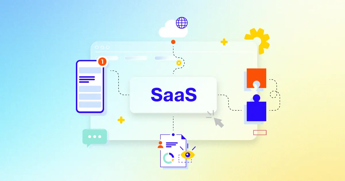
Elevate your business growth with a carefully chosen set of 30 exceptional explainer video examples! This piece explores how effective video marketing can significantly enhance audience interaction and drive expansion in today's fast-paced business world. We will delve into the essential elements of impactful videos and offer practical insights for your marketing approach, with a focus on improving customer retention and encouraging trial registrations.
Video's role in modern marketing:
* 68% of People will Happily Watch a Business Video if it's Under a Minute.
* 82% of them stated that video marketing is their key marketing strategy.
* 69% of B2B marketers plan to increase their investment in video marketing in 2024.
For businesses today, video marketing is a vital element for achieving success. Creating compelling videos demands a thoughtful and strategic approach. This curated collection of 30 SaaS explainer video examples showcases a variety of styles and successful techniques for boosting audience engagement and improving conversions.
This Multi-channel marketing attribution explainer for Mediahawk transforms the overwhelming complexity of diverse campaign data into crystal-clear insights. This animated explainer video masterfully uses dynamic motion graphics and compelling visual metaphors to articulate how Mediahawk empowers businesses to precisely track leads, optimize marketing spend, and confidently drive measurable business growth across all online and offline channels.
Why It Stands Out:
Navigating the Multi-Channel Maze with Clarity: The video brilliantly depicts the initial confusion of disparate marketing data as scattered points and a winding maze, then positions Mediahawk as the essential guide that clarifies complex customer journeys, leading to a direct, optimized path to conversion.
Pinpoint Attribution: Proving Every Marketing Dollar's Worth: Through intuitive data visualization, including animated attribution pathways and a branded dashboard, the video demonstrates Mediahawk's capability for 100% accurate call tracking analytics. This empowers marketers to see exactly which sources contribute to every lead and sale, validating ROI.
* Fueling Business Growth with Actionable Analytics: By translating raw data into clear performance charts and demonstrating efficient budget prioritization, the explainer ensures viewers understand how Mediahawk fosters intelligent decision-making. It visually illustrates how optimizing strategies leads to an undeniable upward trajectory in lead generation and overall business success.
2. Aircove Product explanation video
Get pricing of the video
PT1M10S
Duration : 1 minute and 10 seconds
Tired of installing VPNs on every single gadget? Aircove presents a groundbreaking solution, distinguishing itself as the industrys first router with a built-in VPN. This innovative hardware simplifies securing your entire home network effortlessly.
The intuitive interface for managing device groups truly impresses. This product explanation video demonstrates the ease of assigning different VPN locations to various devices or profiles a clever way to handle varied online activities like banking securely on one device while streaming geo-restricted content on another. It delivers flexible, hassle-free, whole-home protection.
3. AOX B2B software video
Get pricing of the video
PT1M10S
Duration : 1 minute and 25 seconds
This trademark management SaaS explainer masterfully positions AQX as the indispensable cloud-based platform for unifying, protecting, and optimizing global brand portfolios. The video employs dynamic motion graphics and precise text synchronization to articulate how AQX centralizes data, communication, and intelligence, transforming complex IP workflows into streamlined, secure, and cost-efficient operations for legal professionals.
Why It Stands Out:
Unifying Your Trademark Workflow for Peak Efficiency: AQX effectively streamlines operations by showcasing 10 distinct benefits, from gathering stakeholder search requests via a dedicated portal to automating data entry through seamless USPTO TSDR integration, all designed to improve collaboration and organizational efficiency within the platform.
Ensuring Global Brand Security and Data Integrity: The video leverages abstract data visualizations, like an interconnected global network, to visually demonstrate how AQX reduces risk and strengthens global brand protection by automatically verifying portfolio data against 180 jurisdictions worldwide and centralizing infringement actions.
* Empowering Strategic IP Management Through Insight: Through clear financial and hierarchical reporting capabilities, AQX empowers users to track KPIs, monitor budgets, and gain flexible insights into brand and mark applications. This enables informed decisions and cost reduction, including managing trademark renewals with fully integrated Anaqua Services.
4. SKOPE Onboarding video
Get pricing of the video
PT1M10S
Duration : 1 minute and 28 seconds
Commercial refrigeration food prep is revolutionized by SKOPE Reflex Preparation Fridges, establishing a new benchmark for food safety and operational efficiency in demanding kitchen environments. Through proprietary ChillGuard„¢ technology, robust 304 stainless steel construction, and the integrated SKOPE-connect„¢ smart app, this video brilliantly demonstrates how SKOPE transforms ingredient management and kitchen workflow.
Why It Stands Out:
ChillGuard„¢: Elevating Food Safety & Ingredient Freshness The video masterfully highlights SKOPE's ChillGuard„¢ Technology through seamless animated airflow visualizations, proving how cold, clean air precisely blankets uncovered ingredients in food wells. This eliminates the need for lids, enhancing both ingredient preservation and providing quicker, more efficient service while meeting stringent food safety standards.
Robust Construction & Modular Design for Seamless Operations Showcasing the SKOPE Reflex fridges bulletproof 304 stainless steel build, the video emphasizes long-term durability suitable for high-demand kitchens. Its innovative magnetic mounting system for internal parts allows for effortless, tool-free cleaning and maintenance, significantly streamlining kitchen hygiene and operational readiness.
SKOPE-connect„¢: Intelligent Control & Sustainable Efficiency SKOPE introduces intelligent management with the SKOPE-connect„¢ app, allowing users to remotely monitor temperature, track energy consumption, and simplify HACCP compliance. This smart integration, combined with the eco-friendly R290 natural refrigerant system, positions SKOPE Reflex Preparation Fridges as a highly efficient and sustainable choice, minimizing power bills and environmental impact.
5. Xfinity motion graphics video
Get pricing of the video
PT1M10S
Duration : 1 minute and 33 seconds
Breaking through the digital noise requires instant clarity to engage viewers. This video immediately grabs attention with its swift pace and direct on-screen text, showcasing a platform effortlessly. It powerfully emphasizes ease and speed, pulling the viewer into the user experience through dynamic visuals designed to pull the viewer in.
The compelling combination of screen demonstrations and concise messaging makes the value proposition crystal clear. Utilizing motion graphics video effectively highlights critical benefits like rapid profile creation, demonstrating how quickly results are achieved. This efficient approach offers a compelling lesson in modern digital communication, a style Xfinity might find inspirational.
6. Ocado Group Onboarding video
Get pricing of the video
PT1M10S
Duration : 1 minute and 33 seconds
This online grocery technology explainer by Ocado Group brilliantly visualizes its core thesis: simplifying the inherent complexities of online retail logistics through its cutting-edge, end-to-end software and robotics platform. It achieves this by transforming abstract technical challenges into an engaging narrative, utilizing dynamic 3D motion graphics and intuitive visual metaphors that guide strategic partners through the platform's advanced capabilities.
Why It Stands Out:
Abstract Animation Demystifies Advanced Logistics: The video employs sophisticated 3D motion graphics and geometric modeling to translate complex technological processes into easily digestible visual metaphors. This abstract approach, featuring a dynamic "O" navigating a vibrant maze, effectively derisks intricate builds and optimizes platform understanding for Ocado Group's partners without relying on literal depictions.
Strategic Clarity for Retail Partnerships: Ocado Group cultivates confidence through meticulously synchronized narration and on-screen text. This dual communication channel ensures key strategic messages about improving speed-to-go-live, embracing complexity, and achieving best-in-class solutions are absorbed, building trust with forward-thinking grocery retailers exploring global leadership opportunities.
Pioneering Sustainable Online Grocery Growth: The explainer video positions Ocado Group as a transformative force, daring to disrupt the online grocery landscape by solving complex problems. It highlights the power of unique simulations, modeling, and digital twins, underscoring the brand's commitment to providing sustainable, innovative solutions that drive growth and secure a future-ready retail ecosystem.
7. Deloitte Problem solution video
Get pricing of the video
PT1M10S
Duration : 1 minute and 33 seconds
Strategic business restructuring animation for Deloitte powerfully transforms the perception of organizational change. Leveraging abstract motion graphics and dynamic visual metaphors, it presents restructuring not merely as a response to challenges but as a proactive opportunity for growth in a post-pandemic world. This sophisticated explainer brilliantly articulates a holistic framework, empowering C-suite leaders to embrace transformation.
Why It Stands Out:
Unpacking Restructuring with Dynamic Visual Metaphors Deloitte brilliantly uses an evolving white capsule and vibrant geometric flows to represent an organization's journey through change. Complex concepts like supply chains and financial conditions are depicted as fluid systems and interlocking gears, providing clear, intuitive understanding of how strategic levers operate within a holistic restructuring process.
Activating Change: Embracing Growth Through Strategic Levers The video introduces a mnemonic "Re-" framework (Refresh, Rethink, Redesign, etc.), each verb visually embodied through distinct animations. This systematic approach clarifies specific actions an organization can take, positioning Deloitte as the expert guide for improving business performance, fostering competitive advantage, and strategically navigating disruption.
Deloitte's Authority: Precision in Explaining Complex Solutions High-quality 3D animation, coupled with authoritative narration, reinforces Deloitte's credibility and thought leadership. The polished production, from intricate mechanical systems to the evolving orb symbolizing future anticipation, instills confidence that Deloitte delivers precise, forward-thinking solutions for complex organizational transformations.
8. Unit4 motion graphics video
Get pricing of the video
PT1M10S
Duration : 1 minute and 39 seconds
This agile financial planning animation masterfully presents Unit4's FP&A solution as the vital tool for navigating a rapidly changing business world. It empathetically portrays a finance professional's transformation from being overwhelmed by disconnected data to confidently leading with intelligent insights, empowering mid-sized service organizations to achieve strategic agility and make smarter, data-driven decisions.
Why It Stands Out:
Visualizing the Shift from Complexity to Clarity: The video brilliantly opens with a distressed character surrounded by fragmented business icons, a relatable depiction of data silos. Unit4's solution then visually integrates these disparate elements, transforming the character to one of empowered confidence, making the journey from chaos to strategic clarity palpable and compelling for the viewer.
Empowering Rapid Strategic Adaptation: Through dynamic UI animations and intuitive iconography, the video clearly demonstrates Unit4's FP&A capabilities in areas like scenario planning and AI-powered forecasting. This visual storytelling highlights how the solution not only simplifies complex financial analysis but also provides the foresight necessary for organizations to quickly adapt and make informed decisions in a volatile market.
* Unifying Teams and Data for Smarter Decisions: By showcasing how Unit4 connects operational business budgets and facilitates workflow management, the video powerfully communicates the benefit of enterprise-wide collaboration and data consistency. This integrated approach ensures teams are aligned and empowered, enhancing planning speed and accuracy across the entire organization.
9. Sensormatic B2B explainer video
Get pricing of the video
PT1M10S
Duration : 1 minute and 3 seconds
Sensormatic's B2B explainer video champions RFID retail supply chain visibility, demonstrating how real-time inventory insights drive seamless shopping experiences. Through a sophisticated blend of isometric 3D animation and live-action footage, the video meticulously illustrates merchandise movement and data synchronization, providing clear information design for robust inventory accuracy and truly unified commerce.
Why It Stands Out:
Precision Tracking: Visualizing End-to-End RFID Supply Chain: Sensormatic visually demystifies the complex journey of RFID-tagged merchandise, from distribution centers to the retail floor. The dynamic 3D animation, complemented by subtle tracking waves and cloud integration graphics, precisely illustrates how every item's movement generates invaluable real-time inventory data, providing unparalleled supply chain clarity.
Operational Empowerment: Fueling Confident Retail Fulfillment: This explainer showcases how Sensormatic's system empowers retailers with the confidence to meet online order commitments and streamline in-store operations. By demonstrating immediate inventory status updates (received, in-stock, sold) via clear on-screen text, the video highlights how enhanced visibility directly translates into efficient fulfillment and reduced stockouts.
* Unified Commerce: Elevating the Shopper Experience: The video culminates by illustrating how Sensormatics solution ultimately improves how shoppers interact with the brand, enabling true unified commerce. With precise inventory control, retailers can offer a seamless experience, ensuring product availability whether in-store or online, which reinforces brand trust and drives customer satisfaction.
10. Tyro animated explainer video
Get pricing of the video
PT1M10S
Duration : 1 minute and 3 seconds
SaaS payment integration explainer videos strategically position products like Tyro by demonstrating their capacity to streamline operations, save costs, and elevate customer satisfaction. This animated explainer effectively distills the complexities of modern payment processing into a clear, benefit-driven narrative, showcasing how Tyro integrates seamlessly to foster efficiency and business growth.
Why It Stands Out:
Next-Level Integration for Unmatched Efficiency: The video vividly illustrates Tyro's seamless integration with over 330 point-of-sale and practice management systems. This animation quickly conveys how it eliminates double-keying, reduces costly errors, and significantly speeds up payment processing, presenting Tyro as an indispensable tool for operational fluidity and time-saving.
Faster Service, Happier Customers & More Sales: Tyro's super-fast tap-and-go processing, completing transactions in under 1.5 seconds, is brought to life through clear animated visual cues. This directly connects reduced queues and wait times to improved customer interaction and service, painting a compelling picture of a positive shopping experience that ultimately drives increased sales.
* Dynamic Cost Control & Diverse Payment Acceptance: Beyond speed, the explainer highlights Tyro's strategic financial advantages, including dynamic surcharging and least-cost routing. By showing a wide array of accepted payment types, from traditional cards to Alipay and UnionPay, the video assures businesses they can reduce transaction costs and cater to every customer, reinforcing Tyro's comprehensive value.
11. Brightpick tech product video
Get pricing of the video
PT1M10S
Duration : 1 minute and 49 seconds
Automated warehouse order fulfillment is redefined in this Brightpick video, which leverages advanced 3D industrial animation to showcase its end-to-end robotic solution. It strategically visualizes Brightpick AMRs seamlessly integrating with standard shelving, proving dramatic reductions in picking labor and exponential increases in storage density for modern logistics.
Why It Stands Out:
Robots in Motion: Precision Picking in High-Density Aisles This segment vividly demonstrates Brightpick's autonomous mobile robots navigating narrow warehouse aisles, executing complex goods-to-robot picking and multi-order consolidation with unmatched speed and accuracy. The dynamic 3D visuals precisely illustrate every robotic movement, making the intricate process of automated fulfillment clear and compelling.
The 95% Labor Reduction Breakthrough Brightpick compellingly communicates its core value proposition through strategic on-screen metrics, highlighting a remarkable 95% reduction in picking labor and a 50% cut in order fulfillment costs. These visually reinforced statistics provide powerful, tangible evidence of the operational efficiency and significant ROI Brightpick delivers.
* Seamless Integration: Standard Shelving to Multi-Level Automation The video masterfully illustrates Brightpick's system flexibility, showing how it leverages existing standard shelving and scales to multiple levels, boosting storage density by 250%. This demonstrates a pragmatic approach to automation, appealing to businesses seeking high-impact solutions without requiring extensive, proprietary infrastructure changes.
12. Cedar software explainer animation
Get pricing of the video
PT1M10S
Duration : 1 minute and 50 seconds
Cedar retirement income planning explainer from Cedar Brook Group expertly guides baby boomers through the complexities of optimizing their post-career finances and tax strategies. Using dynamic motion graphics, data visualization, and a reassuring narrative, the video transforms overwhelming financial concepts into clear, actionable steps, empowering viewers to plan for a secure and comfortable retirement.
Why It Stands Out:
Quantifying the Retirement Wave: The video powerfully opens by visualizing the daily influx of 10,000 baby boomers turning 65 across America. This immediate, data-driven hook establishes the critical urgency and widespread relevance of retirement planning, positioning Cedar Brook Group as a timely and essential solution for a generation facing this significant life transition.
Simplifying Complex Retirement Formulas: Rather than intimidating, complex financial equations are expertly demystified through clean, animated data visualization. The video breaks down the intricacies of income and tax strategies with accessible pie charts and spending bar graphs, ensuring that even the most abstract financial principles are presented as understandable and manageable for the Cedar Group's target audience.
* Guiding a Secure Legacy: The explainer extends beyond mere numbers, connecting financial strategies to profound personal impact. By emphasizing the ripple effect of sound planning on "Yourself," "Family," and "Legacy," the video offers an aspirational vision of comfortable golden years, motivating viewers to proactively engage with Cedar Brook Group to achieve their desired financial future.
13. Talkdesk Autopilot Problem solution video
Get pricing of the video
PT1M10S
Duration : 2 minutes and 55 seconds
AI contact center automation is expertly showcased in the Talkdesk Autopilot Problem-Solution video, revealing how AI revolutionizes customer support by transforming operational challenges into opportunities for superior engagement. Through intelligent automation, personalized interactions, and intuitive, no-code AI management, Talkdesk Autopilot streamlines customer service, enhancing efficiency and delivering real-time, precise answers across all hours.
Why It Stands Out:
Automating Precision with Contextual AI: The video uses dynamic 2D motion graphics to illustrate how Talkdesk Autopilot deftly deflects inbound calls, leveraging AI to understand practically any customer question. It generates real-time, laser-precise answers tailored to the right context, tone, and audience, ensuring consistent and accurate self-service without requiring a live agent.
Intuitive AI Building, No Code Required: Talkdesk Autopilot differentiates itself by demonstrating a powerful, no-code platform. It highlights pre-built integrations and templates for common industry use cases and shows how new, complex use cases can be effortlessly created using generative AI in just a few simple clicks, democratizing AI deployment for contact center teams.
Transforming Operational Costs into Customer Satisfaction: Through a relatable "Frank" use case, the video vividly illustrates Talkdesk Autopilot's seamless CRM integration, enabling personalized, proactive support. By autonomously handling order inquiries and delivery changes, it significantly reduces operational costs per contact while dramatically boosting the self-service resolution rate, ensuring consistently great customer experiences.
14. Logi Predict software explainer animation
Get pricing of the video
PT1M10S
Duration : 50 seconds
Embedded predictive analytics explainer for Logi Predict powerfully demystifies advanced AI and machine learning, presenting a clear thesis: applications should predict, not just react. Through compelling motion graphics, dynamic data visualization, and an intuitive problem-solution narrative, it showcases Logi Predict's ability to democratize data science, empowering developers to integrate sophisticated forecasting, churn reduction, and fraud detection capabilities five times faster without needing a data scientist.
Why It Stands Out:
Demystifying Predictive Analytics with Clear Visuals: Logi Predict leverages sophisticated motion graphics and meticulous information design to transform complex AI/ML concepts into digestible, animated sequences. Intuitive iconography and dynamic data visualizations, from evolving graphs to a world map illustrating flight delays, make advanced analytics accessible and understandable.
Empowering Applications with Proactive, Intelligent Insights: The video skillfully demonstrates how Logi Predict allows applications to provide forward-looking insights, rather than just historical data. It articulates specific, high-value use cases like reducing churn, forecasting sales, and detecting fraud, showcasing how Logi Predict enriches user experience and drives tangible business outcomes.
* Accelerating AI/ML Deployment for Non-Data Scientists: Strategically, Logi Predict is positioned as the solution that removes the barrier of specialized expertise. By emphasizing that applications can deploy predictive analytics five times faster and without requiring a data scientist, the video speaks directly to developer and product manager pain points, highlighting ease of integration and rapid value delivery.
15. monday.com B2B explainer video
Get pricing of the video
PT1M10S
Duration : 15 seconds
Painting a picture of streamlined team operations, this concise B2B explainer video opens with an inviting glimpse into a future state of work, voiced by a persona of future efficiency. It promises real productivity gains for teams facing complex workflows daily.
The narrative then shifts to a fluid visual tour, demonstrating how intuitive drag-and-drop actions transform complex project management into clear, actionable steps. Data dashboards aren't just charts; they provide a crystal-clear lens on progress, revealing insights instantly.
What truly resonates is the sense of control and clarity the platform seems to offer, making that initial promise feel entirely within reach. This visual storytelling provides a compelling blueprint for how monday.com makes complex solutions inspiringly accessible in video.
It’s crucial to plan ahead when it comes to high-quality video production. Discuss with our team, how you can get visual style, budget, timeline in sync.
What key elements make a SaaS explainer video truly compelling for potential customers?
Compelling SaaS explainer videos clearly communicate value, solve user pain points, and feature high-quality visuals and concise messaging.
How do we plan content for a SaaS explainer video that resonates with our target audience?
Effective content planning involves understanding the target audience, their needs, and how the SaaS product addresses them. Focus on benefits, not just features.
Which animation style best showcases our SaaS product's unique value proposition?
The optimal animation style depends on brand identity and target audience. Options range from minimalist and modern to dynamic and engaging.
What's the ideal length for a SaaS explainer video to maintain viewer engagement?
Ideal length is typically 60-90 seconds, balancing engagement and information delivery. Shorter videos suit social media; longer ones fit website landing pages.
How can a SaaS product overview video effectively drive leads and conversions?
SaaS product overview videos drive conversions by showcasing value, building trust, and featuring a clear call to action.
What's the optimal structure for a SaaS demo video showcasing key features and benefits?
An effective SaaS demo video structure follows a problem-solution-benefit format, highlighting key features and user impact.
How do we tailor the tone and style of our SaaS video to resonate with our ideal customer profile?
Tone and style should align with the ideal customer profile, considering their preferences and communication style.
How can storytelling enhance the engagement and memorability of our SaaS product video?
Storytelling creates emotional connections, making the SaaS product relatable and memorable.
How do we seamlessly integrate customer testimonials into our SaaS video for social proof?
Customer testimonials build credibility and social proof. Integrate them seamlessly through short clips or text overlays.
How can we ensure our SaaS video is mobile-friendly for optimal viewing experience?
Mobile-friendliness is crucial. Optimize video resolution and aspect ratio for various devices.
What compelling call to action should our SaaS video include to drive desired user behavior?
A compelling call to action directs viewers towards desired actions, such as visiting a website or starting a free trial.
How can our SaaS video stand out from competitors and capture attention in a crowded market?
Stand out by combining creative storytelling, high-quality animation, and a deep understanding of the target audience.
Where should a SaaS explainer video be placed in the sales funnel for maximum impact?
SaaS explainer videos are most effective at the top and middle of the sales funnel, generating interest and educating prospects.
What type of video best communicates the core value and benefits of our SaaS offering?
The best video type depends on specific goals. Explainer videos introduce the SaaS; demo videos showcase functionality.
How can we leverage existing marketing materials to streamline SaaS video production?
Leverage existing marketing materials for consistent messaging and streamlined production. Fixed-fee pricing for a 60-second video ranges from $1000-$6000, depending on complexity, with a typical turnaround time of 3-8 weeks.
Beyond the Basics: Advanced SaaS Explainer Video Strategies
Having explored the foundational elements, viewers now delve into layering sophisticated techniques to elevate a SaaS Explainer Video. Moving beyond simple explanations, teams leverage advanced strategies to forge deeper connections, maximize engagement, and drive more meaningful business outcomes. They understand that effectiveness comes from continuous refinement and a nuanced understanding of the modern viewer's habits and journey.
Success requires integrating insights from data and psychology, tailoring the content not just for understanding but for action and retention across various platforms. It involves treating the video as a dynamic asset that evolves with the product and audience.
They focus on optimizing every touchpoint and utilizing the video's power throughout the customer lifecycle. This approach transforms a good video into a powerful engine for growth.
Ensure mobile optimization includes visual cues and text overlays for viewers watching without sound, a common habit.
Employ A/B testing on video thumbnails, introductory hooks, and calls to action to continuously improve performance metrics.
Leverage explainer content specifically for user onboarding and ongoing feature education to boost retention and product adoption.
Explore incorporating subtle interactive elements allowing viewers to momentarily engage with simulated parts of the interface within the video itself.
These advanced applications move beyond initial lead generation, embedding the video's value throughout the user experience and refining its impact through measurable results.
Why Advids for SaaS Explainer Video?
At Advids, we create high-quality, original SaaS explainer videos designed to achieve exceptional results for your business. Our unique blend of creative storytelling, cutting-edge technology, and proven success helps transform your vision into compelling and effective animation.
Transforming Ideas into Engaging Animations:
Customized SaaS Explainer Video Solutions: We tailor each project, whether it's a concise explainer video, engaging character animation, or any other SaaS video format, to perfectly match your brand, style, and target audience. Creative Storytelling Through Animation: Our talented team of animators and storytellers craft captivating narratives that resonate with your viewers and inspire action. Cutting-Edge SaaS Explainer Video Technology: We utilize industry-leading software and techniques to deliver visually stunning videos that leave a lasting impression.
A Legacy of Success and Client Satisfaction:
12+ Years of Proven Success: With over 3400 successful projects completed, we possess a deep understanding of what makes a SaaS explainer video truly effective. Over 320 of these projects have been specifically focused on SaaS explainer videos. Trusted by Industry Leaders: From startups to Fortune 500 companies, brands like Razorpay, Ola, Mercedes, the United Nations, Continental, and Mercer rely on our expertise to bring their stories to life. Client Satisfaction Guaranteed: Our commitment to excellence is reflected in over 109 five-star Google reviews, showcasing our talent, creativity, and dedication to client satisfaction.
A Collaborative Approach to Video Production:
Collaborative Process: We work closely with you throughout the entire process, from initial concept to final delivery, ensuring your vision is accurately represented in the final animation. Strategic Communication: Open and clear communication is fundamental to our approach. We prioritize understanding your needs, target audience, and brand identity to create impactful SaaS explainer videos.
Ready to unlock the potential of SaaS Explainer Video for your business with the latest video design trends of 2024? Let Advids be your trusted partner in transforming your ideas into engaging and effective animated experiences.
Checkout some of the projects and work our team at Advids has been producing:
What is a SaaS Explainer Video?
A SaaS explainer video is a short, engaging video that explains the value proposition of a software-as-a-service (SaaS) product. It typically focuses on the problems the software solves, the benefits it provides, and how it works. These videos are designed to educate potential customer s, build trust, and drive conversions.
SaaS explainer videos are used in a variety of marketing and sales contexts. They can be used on landing pages, social media, email campaigns, and even as part of sales presentations. They are also effective for onboarding new users and providing customer support.
What do top SaaS Explainer Videos have in common?
Mastering SaaS explainer videos requires focusing on these key elements to create impactful content that converts viewers into customers.
Clearly Defined Target Audience - Tailor the message to resonate with specific customer segments. Focus on their pain points and aspirations.
Compelling Problem/Solution Fit - Showcase the SaaS as the solution to a critical problem. Use strong visuals and concise language.
Unique Value Proposition - Emphasize the key differentiators. Highlight features that solve problems better than competitors.
Engaging Narrative Structure - craft a story that keeps viewers engaged. Use a clear beginning, middle, and end.
Intuitive User Journey - Guide viewers through the SaaS effortlessly. Use clear visuals and simple language.
Emotional Connection - Evoke positive emotions. Show how the SaaS improves users' lives or businesses.
Strong Call to Action - Make it clear and easy to act. Use strong verbs and a sense of urgency.
High-Quality Screen Recordings - Use professional-grade recordings. Show the SaaS in action, highlighting key features.
Strategic Animated Graphics - Use animation to clarify complex concepts. Keep it simple and visually appealing.
Data-Backed Results - Use charts and graphs to show the impact. Quantify the benefits for viewers.
What makes SaaS Explainer Videos effective?
A captivating SaaS explainer video is a powerful tool for communicating the value of your software and driving conversions. A key element is a design to clearly articulate the benefits of your software and how it differentiates you from competitors.
A fundamental approach to creating effective SaaS explainer videos is to use a problem-solution-result structure. This structure provides a clear and logical flow that is easy for viewers to follow. It guides viewers through the challenges their business faces, presents your software as the solution, and showcases the positive outcomes they can expect.
The effectiveness of SaaS explainer videos is driven by the use of high-quality visuals, whether animated or live-action, to keep viewers engaged and make complex concepts easier to understand. They tell a story that resonates with your target audience and connects with their emotions.
How long should your SaaS Explainer Video be?
Optimize SaaS explainer video length for maximum impact by aligning video type, content, and target audience stage.
Pre-production Considerations for Determining Video Length:
What's the core SaaS value proposition?
Who is the ideal customer profile?
Which features need demonstration?
How intuitive is the software?
Where will the video be hosted?
What's the marketing objective?
What visual style best suits the brand?
SaaS explainer video length guide
SaaS Explainer Types
Video Length
Use Case
Funnel
Explainer Video
60-90 seconds
Concisely showcases core value proposition, ideal for complex SaaS solutions, often uses 2D animation or live action with screen recording elements.
Awareness/Consideration
Animated Screen Recording
45-60 seconds
Demonstrates software functionality, highlighting key features with engaging visuals, best for showcasing user flows.
Consideration/Conversion
Kinetic Typography
30-45 seconds
Emphasizes key messages and benefits, ideal for short, impactful communication, works well with minimalist style.
Awareness/Consideration
Whiteboard Animation
60-90 seconds
Explains complex concepts simply and engagingly, ideal for illustrating SaaS processes, can use illustrative style.
Consideration/Conversion
Product Demo
90-120 seconds
Detailed walkthrough of features and benefits, ideal for showcasing advanced functionalities, often incorporates screen recording.
Conversion/Decision
How to create SaaS Explainer Videos?
Crafting compelling SaaS explainer videos requires a strategic approach that prioritizes clarity, impact, and a deep understanding of your target audience. A well-executed video can significantly boost conversions and brand awareness.
* Target Audience - Deeply understanding your audience informs every creative decision.
Key Benefits - Focus on the "so what?"”how does the software improve their lives?
Scriptwriting - A concise, problem-solution-result script keeps viewers engaged.
Video Style - The style should reflect the brand's personality and target audience.
Visual Selection - Use high-quality visuals that showcase the software's features.
Storyboarding - A detailed storyboard ensures a consistent and engaging visual narrative.
Voice Recording - A professional voiceover adds polish and credibility to the video.
Animation/Filming - High-quality visuals are essential for conveying professionalism.
Video Editing - Precise editing creates a seamless and compelling viewing experience.
Final Review - A final review ensures the video effectively communicates the value proposition.
How to Target Your Audience with Your SaaS Explainer Video
Targeting your audience effectively is key to a successful SaaS explainer video. Let's dive into how we can tailor our videos to resonate with the right viewers. Imagine a potential customer struggling with a specific problem. Our video should immediately grab their attention by showcasing how our SaaS offers the perfect solution .
Think about those captivating software explainer videos you've seen. They work because they speak directly to the viewer's needs and aspirations. We can achieve the same by focusing on the following:
Understand your ideal customer . Who are they? What are their pain points? What are their goals? Creating SaaS explainer video examples short, tailored to specific segments , can significantly boost engagement .
Craft a compelling narrative. Use storytelling to connect with your audience emotionally. Show them how your SaaS can transform their lives or businesses. Consider using a problem-solution-result structure to keep them engaged.
showcase the value . Highlight the key benefits of your software and how it solves their problems better than the competition. Use clear visuals and simple language to demonstrate the user journey .
Include a strong call to action . Guide viewers towards the desired next step , such as visiting your website, signing up for a free trial, or requesting a demo.
By following these strategies, we can create SaaS explainer videos that not only inform but also inspire action, turning viewers into loyal customers.
The Importance of a Strong Call to Action in SaaS Explainer Videos
Let's talk about calls to action —that crucial moment in your SaaS explainer video where you guide viewers towards becoming customers. We've covered the importance of visuals, storytelling, and targeting, but without a compelling CTA , your efforts might fall flat. Think of it like this: you've baked a delicious cake (your video), but you haven't told anyone how to get a slice (your CTA).
Imagine watching a captivating SaaS explainer video examples animation, only to be left wondering what to do next. Frustrating, right? That's why a strong CTA is essential. It's the bridge between engagement and conversion, turning interested viewers into paying customers. application explainer videos , for example, often use clear CTAs like "Download Now" to drive app installs.
A powerful CTA starts with a clear objective. Are you aiming for free trial sign-ups, demo requests , or simply website visits? Tailor your CTA to match your goal.
Use action-oriented language . "Get Your Free Trial Today" is more compelling than "Click Here." create a sense of urgency with phrases like "Limited-Time Offer."
Make your CTA visually prominent . Use eye-catching buttons, animations, or text overlays to draw attention. Ensure it's easily clickable on all devices.
Remember the user journey. Your CTA should seamlessly integrate into the overall experience, guiding viewers towards the next logical step.
By focusing on these key elements, we can create CTAs that not only look good but also drive results , turning viewers into loyal customers.
Crafting a Compelling Narrative for Your SaaS Explainer Video
Crafting a compelling narrative is where we transform a simple explanation into a captivating story. We've covered the technicalities; now, let's breathe life into our SaaS explainer video. Think about those videos that truly grab your attention – they connect with you on an emotional level. That's the power of storytelling.
We want our viewers to feel understood, to see themselves in the story we present. This is how we build trust and turn viewers into customers. Let's explore how we can achieve this together.
Know your audience inside and out. What keeps them up at night? What are their aspirations? Understanding their needs is the foundation of a compelling narrative. For instance, 2D animation in SaaS explainer video examples can effectively simplify complex concepts while maintaining a lighthearted tone.
Define the problem clearly. What challenge does our SaaS solve? By highlighting the pain point, we set the stage for our software as the hero of the story.
Showcase our SaaS as the solution. How does our software alleviate the problem? Focus on the tangible benefits, not just the features. Drawing inspiration from successful digital product explainer videos, we can learn how to effectively showcase our software's key features and benefits.
Make it relatable. Develop a protagonist or scenario that resonates with our target audience. This could be a character facing a similar challenge or a situation they can easily identify with.
By focusing on these key elements, we can craft a narrative that not only informs but also inspires, turning viewers into loyal customers .
Key Considerations for SaaS Explainer Video Length
Let's face it, nobody wants to watch a rambling SaaS explainer video. Finding the sweet spot for video length is crucial for keeping viewers engaged and driving conversions. We've already covered the basics, so let's dive into some practical considerations for optimizing your video's runtime. Think of it like Goldilocks finding the perfect porridge – not too long, not too short, but just right. Take inspiration from effective SaaS explainer video examples to see how other companies have successfully tackled this challenge.
Remember, we're aiming for a video that effectively communicates our message without losing our audience's attention. This requires a strategic approach, considering factors beyond just the content itself.
Consider your audience. Are they busy executives who prefer short, impactful messages? Or are they technical users who appreciate a deeper dive? Tailor your video length accordingly.
Think about the platform. A short, snappy video might work well on social media, while a longer, more detailed video could be suitable for your website. platform explainer videos , for instance, often benefit from a concise format .
Don't forget your call to action. Ensure you have enough time to present a clear and compelling call to action without rushing it.
Analyze your competitors. See what works for them and consider how you can differentiate yourself.
By carefully considering these factors, we can create SaaS explainer videos that are both informative and engaging, maximizing their impact on our target audience . Remember, a well-crafted video can be a powerful tool for driving conversions and building brand awareness.
Integrating Live Action with Animation in SaaS Explainer Videos
Blending live action and animation in SaaS explainer videos offers a powerful way to connect with viewers on an emotional level while effectively showcasing software functionality . Think about those videos that truly grab your attention – they often combine the relatability of real people with the explanatory power of animation. Let's explore how we can achieve this captivating blend.
Imagine a web application explainer video where a live actor introduces a common problem, then transitions to an animated sequence demonstrating how the software provides a seamless solution. This approach not only clarifies complex functionalities but also adds a human touch , making the message more relatable. Similarly, SaaS explainer video examples showcasing motion graphics can effectively highlight key features while maintaining a lighthearted tone.
Humanize your message. Use live action to introduce real people facing relatable challenges, then seamlessly transition to animation to showcase your software as the solution.
Show, don't just tell. Demonstrate your software's key features with screen recordings enhanced by animated graphics, making the user experience clear and engaging.
Craft a compelling narrative. Combine live actors and animation to create memorable stories that resonate with your target audience, increasing engagement and recall.
drive conversions strategically. Guide viewers towards a clear call to action through a compelling mix of live action and animation, turning interest into action.
By strategically blending live action and animation, we can create SaaS explainer videos that are both informative and engaging, maximizing their impact and driving conversions.
Author & Editor Bio
A video producer with a passion for creating compelling video narratives, Jai Ghosh brings a wealth of experience to his role. His background in Digital Journalism and over 11 years of freelance media consulting inform his approach to video production. For the past 7 years, he has been a vital part of the Advids team, honing his expertise in video content planning, creation, and strategy.
His collaborative approach ensures that he works closely with clients, from startups to enterprises, to understand their communication goals and deliver impactful video solutions. He thrives on transforming ideas into engaging videos, whether it's a product demo, an educational explainer, or a brand story.
An avid reader of modern marketing literature, he keeps his knowledge current. Among his favorite reads from 2024 are "Balls Out Marketing" by Peter Roesler, "Give to Grow" by Mo Bunnell and "For the Culture" by Marcus Collins. His results-driven approach ensures that video content resonates with audiences and helps businesses flourish.