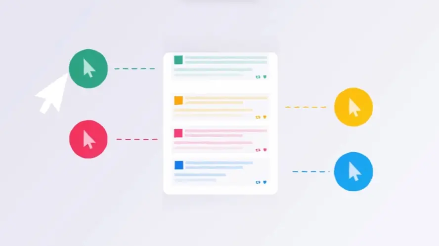
Confused users are a major cause of product abandonment, with over 90% giving up due to unclear onboarding processes. Discover how UI screencast videos can significantly improve user engagement and boost your conversion rates. These videos transform potentially complex user interactions into straightforward and visually appealing walkthroughs, which can lead to increased sales and decreased cart abandonment. Explore the vital role that visual demonstrations play in achieving successful product adoption and long-term growth. These videos can also be a powerful tool for reducing support inquiries by as much as 20%.
Video's role in modern marketing:
* Video streaming will make up 91% of global internet traffic by 2025.
* Live video currently dominates Facebook, garnering 3x the median interactions.
* 71% of B2B and 66% of B2C marketers incorporate video into their campaigns.
Unlock the full potential of your user experience with video. 30 UI screencast video examples are a leading method for enhancing user engagement and driving conversions. These videos provide a clear and efficient route to product understanding, encouraging users to actively participate and ultimately increasing conversion rates. Get ready to be inspired by examples showcasing innovative approaches to feature explanations, creative animation techniques, and effective calls to action. Learn how these visual guides can deliver substantial results and positively impact your business performance. Discover key strategies for creating high-performing UI screencasts, including the effective use of annotations. Watch the video to find out more.
1. ZURICH Software tutorial video
Get pricing of the video
PT1M10S
Duration : 1 minute and 10 seconds
Retirement fund income options are brilliantly clarified in this ZURICH animated explainer, which masterfully guides individuals through the pivotal transition of turning pension savings into a sustainable income. Utilizing a sophisticated blend of blueprint-style visuals and a comparative narrative, it demystifies complex financial choices, empowering viewers to navigate their future with confidence.
Why It Stands Out:
Blueprinting Retirement Income Options: ZURICH employs a clean, blueprint-inspired aesthetic and procedural animation to visually deconstruct two primary income paths: guaranteed annuities and dynamic investment funds. This approach translates abstract financial products into tangible, easy-to-understand concepts, enhancing comprehension without overwhelming the viewer.
Empowering Personalized Retirement Planning: Instead of prescribing a single solution, the video champions informed, personalized decision-making. Through compelling visual analogies€”like a scale balancing individual factors or different bicycles for risk tolerance€”it highlights how personal circumstances and preferences shape the ideal retirement strategy.
* Establishing Trust Through Clear Financial Guidance: The narrative adopts a reassuring, objective tone, positioning ZURICH as a trusted expert. By clearly outlining the nuances of each option and emphasizing the importance of professional advice, the video builds credibility, encouraging viewers to seek tailored support for their financial journey.
2. Quuu Software demo video
Get pricing of the video
PT1M10S
Duration : 1 minute and 11 seconds
This social media content automation demo for Quuu brilliantly addresses the challenge of consistent, quality content sharing by presenting a seamless solution for effortless curation and scheduling. It uses clean UI animations and compelling visual metaphors to articulate a clear problem-solution narrative, empowering users to dramatically boost their audience engagement and authority.
Why It Stands Out:
Streamlined Content Curation & Automated Scheduling: The video uses precise UI animations to depict Quuus intuitive process, from selecting relevant content categories to automatic scheduling via a central buffer. This visual flow demonstrates how Quuu transforms time-consuming manual effort into an efficient, hands-off operation, ensuring consistent, quality content distribution.
Quantifying Social Reach and Impact: Dynamic number counters and a vibrant particle system visually represent the surge in retweets, likes, and shares. This clear, animated feedback loop provides undeniable proof of the product's effectiveness, showcasing Quuu's ability to drive significant social interaction and cultivate an active, engaged following.
* Intuitive Design for Time-Saving Value: With a minimalist aesthetic and a clear visual hierarchy, the demo simplifies complex automation into an easily digestible user experience. It directly targets the user's pain point of time scarcity, positioning Quuu as a straightforward, high-value tool that frees up hours while enhancing digital presence and authority.
3. OWN.CANCER Feature explanation video
Get pricing of the video
PT1M10S
Duration : 1 minute and 11 seconds
Immunotherapy cancer treatment explained, this OWN.CANCER video illuminates how the body's own immune system can be precisely engineered to reverse aggressive cancers, particularly when conventional therapies fall short. Through sophisticated 2D motion graphics and an empowering narrative, it demystifies complex cellular mechanisms, positioning Alberta at the forefront of this life-changing medical innovation.
Why It Stands Out:
Visualizing Immunotherapy The Body's New Defense The animation masterfully demystifies advanced immunotherapy through abstract yet clear cellular visualizations. It first shows the natural immune response, then graphically illustrates how a patient's white blood cells are specifically transformed in a lab to recognize and eliminate cancer cells, presenting the core mechanism of OWN.CANCER's pioneering approach with compelling clarity.
Alberta's Breakthrough Leading the Immunotherapy Revolution Beyond scientific explanation, the video strategically positions Alberta as a global leader in cancer immunotherapy research. Visuals like the protective umbrella over a family and a celebratory globe reinforce the region's commitment to improving lives and accelerating access to these innovative treatments for adults and children facing hard-to-treat cancers.
Cultivating Hope Accelerating Access to Life-Saving Treatment** The narrative fosters a profound sense of hope by offering a viable alternative when traditional treatments are ineffective. OWN.CANCER effectively communicates the immediate impact and future promise of immunotherapy, driving a call to action to bring this transformative, body-empowering care to more Albertans sooner.
4. Diligent App walkthrough video
Get pricing of the video
PT1M10S
Duration : 1 minute and 15 seconds
This board management platform animation for Diligent Boards powerfully illustrates how the platform enables secure, insightful, and efficient governance for strategic impact. It leverages sophisticated motion graphics, dynamic data visualizations, and clear on-screen text to articulate how leaders can navigate complexity and enhance their organization's foresight in an always-on world.
Why It Stands Out:
Decoding Modern Governance with Dynamic Visuals The video masterfully simplifies complex governance challenges, such as cybersecurity threats and shareholder pressure, through animated icons and intuitive data visualizations. Diligent Boards' ability to transform abstract problems into clear, visually digestible solutions empowers leaders to grasp intricate concepts instantly.
Secure, Data-Driven Foresight for Leaders Highlighting features like secure access and responsive ESG performance dashboards, the animation demonstrates how Diligent provides crucial insights. It visually proves that board members can confidently collaborate and make informed decisions, ensuring their most sensitive information remains protected while driving proactive governance.
Transforming Boards into Strategic Assets Through a narrative of empowerment, the video positions the Diligent platform as essential for elevating a board's capabilities. It showcases how comprehensive tools facilitate better questions, remote collaboration, and seamless workflows, enabling the board to become a proactive strategic asset matching the pace of modern business.
5. EPAM Software demo video
Get pricing of the video
PT1M10S
Duration : 1 minute and 16 seconds
Composable digital experience explainer from EPAM powerfully navigates the evolving landscape of customer expectations, visually articulating its strategic approach to future-proof digital transformation. This dynamic video leverages sophisticated motion graphics and precise text overlays to demonstrate how EPAM orchestrates a powerful ecosystem of composable solutions, empowering businesses to deliver agile, personalized experiences and accelerate lasting growth.
Why It Stands Out:
Visualizing the Composable Ecosystem: EPAM brilliantly uses an abstract "data tunnel" visualization that seamlessly transitions into an expansive showcase of industry-leading technology partner logos. This signature technique elegantly communicates the breadth and interconnectedness of EPAM's integrated composable solutions, without complex technical jargon.
Strategic Clarity Through Dynamic Messaging: The video employs progressive, animated text overlays with strategically color-highlighted keywords to convey high-level business concepts with exceptional clarity. This direct, impactful communication ensures that the strategic benefits€”from rapid response to personalized experiences€”are instantly digestible for C-suite decision-makers.
* Architecting Future-Proof Digital Growth: By addressing pressing challenges like "sky-high" customer expectations and the need to "respond quickly," the video positions EPAM as the essential partner for digital agility. Its concluding visuals of upward-moving light lines powerfully symbolize accelerated growth and a robust foundation for lasting success, reinforcing a forward-thinking vision.
6. WalkMe App walkthrough video
Get pricing of the video
PT1M10S
Duration : 1 minute and 21 seconds
Enterprise AI workflow integration is masterfully demonstrated in WalkMe's app walkthrough, which unveils how WalkMe(x) democratizes generative AI, transforming every employee into an "AI Pro." By understanding user context and tasks, the platform seamlessly embeds proactive AI suggestions directly into existing workflows, eliminating the need for complex prompting and bridging the gap between overwhelming AI tools and effortless productivity.
Why It Stands Out:
Transforming Every Employee into an AI Pro: This WalkMe(x) video skillfully addresses the pervasive challenge of AI overwhelm, positioning Sam as the ideal user who effortlessly leverages GenAI. It illustrates how WalkMe(x) empowers all employees, regardless of technical proficiency, to adopt and benefit from AI in their daily tasks, boosting individual capability and confidence.
Seamless, Context-Aware Workflow Integration: The video brilliantly showcases WalkMe(x)'s technical prowess through dynamic UI overlays that interpret user intent and deliver context-specific, "no prompting needed" GenAI suggestions within native applications. This seamless integration ensures AI capabilities enhance rather than disrupt the flow of work, providing real-time, actionable intelligence.
* Boosting Enterprise-Wide AI Adoption: By making generative AI universally accessible, WalkMe(x) is strategically positioned as a catalyst for widespread organizational change. The video clearly communicates how the platform drives enterprise AI adoption across diverse departments, fostering a culture where every employee becomes an "AI Pro," directly translating to enhanced efficiency and accelerated digital transformation.
7. Seacomp App walkthrough video
Get pricing of the video
PT1M10S
Duration : 1 minute and 24 seconds
Hardware product development partner Seacomps animated explainer video masterfully simplifies the inherently complex and high-risk journey of bringing hardware innovations to market. Through a dynamic blend of 2D motion graphics and insightful narrative, it strategically positions Seacomp as the indispensable manufacturing partner, guiding ideas from concept to successful completion.
Why It Stands Out:
Mapping the Maze: Visually Deconstructing Product Development Challenges: Seacomp powerfully illustrates the daunting landscape of hardware product launches, highlighting the 90% failure rate and the hundreds of critical decisions involved. The videos signature "circuit board" animation, with its intricate, branching green lines, brilliantly visualizes the overwhelming complexity and interconnectedness of each development stage, from ideation to distribution.
Seacomp: Guiding Innovation from Concept to Completion: The animation establishes Seacomp as the expert navigator through this labyrinth, offering a clear, streamlined path where others might falter. By demonstrating how their partnership orchestrates every vital choice€”from engineering to supply chain setup€”Seacomp effectively de-risks the product journey, transforming potential pitfalls into planned successes for hardware innovators.
* Assured Success: Transforming Passion into Profitable Products: The narrative culminates in a compelling vision of market triumph, depicting multiple successful "circuit heart" products moving efficiently from production lines onto global distribution. This visual proof assures viewers that with Seacomp on their team, their innovative passion will not only come to life but will also achieve widespread adoption and sustained market impact, fostering deep trust and engagement.
8. Slack Product demonstration video
Get pricing of the video
PT1M10S
Duration : 1 minute and 27 seconds
Slack Canvas product demo masterfully introduces Slack's unified workspace, strategically addressing information fragmentation by transforming the platform into a centralized hub for all project-related content. This UI screencast video powerfully illustrates how teams can streamline workflows and enhance collaboration by seamlessly organizing diverse information, from action items and approvals to rich media and stakeholder details, all within their familiar Slack environment.
Why It Stands Out:
Transforming Scattered Information into a Unified Project Hub: This Slack demonstration vividly showcases how Canvas aggregates and structures previously dispersed information. It presents action items, technical resources, and key decisions within distinct, customizable blocks, establishing a single source of truth for projects directly inside Slack channels.
Dynamic Collaboration: Approvals, Resources, and Stakeholders in Context: The video highlights Canvass interactive capabilities, from one-click manager approval requests to sharing external files and spotlighting primary stakeholders. This integrated approach ensures all collaborators, including external partners via Slack Connect, can contribute and access vital project context instantly.
* Seamless Productivity: Intuitive Design Driving Workflow Acceleration: Through fluid UI screencast animation and clear information design, Slack Canvas empowers teams to push work forward faster. Every piece of content within a canvas is fully searchable, allowing for effortless navigation and rapid onboarding of new team members, all while maintaining an intuitive and engaging user experience.
9. ConnectiveRx App walkthrough video
Get pricing of the video
PT1M10S
Duration : 1 minute and 27 seconds
Patient financial assistance testimonials form the heart of this ConnectiveRx video, which powerfully communicates how the brand alleviates the overwhelming burden of medication costs. Through a poignant blend of kinetic typography and authentic multi-voice narratives, it transforms abstract support into deeply felt relief, building unwavering trust and brand loyalty.
Why It Stands Out:
The Empathetic Patient Journey: From Struggle to Support The video masterfully evokes empathy by sharing personal stories of financial hardship, with patients expressing the overwhelming cost of medication and the fear of "eating cold ramen." Dynamic background shifts from light to dark mirror the emotional transition from despair to the hope ConnectiveRx provides, making the struggle tangible and relatable.
ConnectiveRx: Transforming Lives Through Medication Access ConnectiveRx is positioned as a compassionate advocate, turning complex medical costs into accessible solutions. Through heartfelt voiceovers, patients detail how the company "rescued my health, my wallet and my life" and "made it possible" to afford vital medication, illustrating the brand's profound, life-changing impact beyond mere transactions.
Cultivating Trust Through Authentic Patient Gratitude The culmination of diverse voices collectively expressing "Thank you for putting the patient first" creates powerful social proof. This chorus of gratitude, bolstered by high production value and seamless kinetic typography, solidifies ConnectiveRx's image as a trustworthy and essential partner, fostering deep brand loyalty and emotional connection.
10. nmi Level III Advantage Software tutorial video
Get pricing of the video
PT1M10S
Duration : 1 minute and 32 seconds
Level III payment processing explainer, the NMI Level III Advantage video articulates a story of financial empowerment. It meticulously visualizes how automating complex transaction data optimization unlocks lower interchange rates, dramatically reduces fraud exposure, and opens lucrative new B2B and B2G market opportunities, boosting merchant profitability and partner residuals.
Why It Stands Out:
Automated Pathways to Lower Interchange Rates: The video distinctly uses motion graphics and iconography to clarify how NMI Level III Advantage automatically collects and submits detailed transaction data, ensuring merchants qualify for preferential Level II & III interchange rates and directly translating to significant cost savings.
Mitigating Fraud While Opening New Markets: Through intuitive visual metaphors, the explanation demonstrates how enhanced data collection hardens defenses against fraudulent activities, concurrently detailing how NMI Level III Advantages capabilities are essential for accessing the lucrative, high-value B2B and B2G payment sectors.
* Demystifying Complex Payment Data with Visual Clarity: This explainer excels in information design, using a minimalist aesthetic, synchronized on-screen text, and a confident narrative voice to transform intricate payment processing concepts into an easily digestible and understandable flow, empowering both merchants and partners.
11. DCS Product demonstration video
Get pricing of the video
PT1M10S
Duration : 1 minute and 7 seconds
To simplify plant control systems, this Siemens DCS product demonstration visually deconstructs the common challenges faced by industrial engineers and operators. Using a clean isometric animation style, it transitions from illustrating the frustration of custom PLC programming and overwhelming HMI alarms to showcasing the streamlined efficiency of pre-built, tested libraries, empowering users with intuitive, robust solutions.
Why It Stands Out:
From Custom Code Chaos to Streamlined Standardization This Siemens DCS video directly tackles the burden of custom PLC coding by visually presenting pre-built, tested libraries that accelerate configuration. The animated drag-and-drop interface dramatically illustrates how engineers can standardize processes and significantly reduce development time, transforming complex plant setups into manageable, efficient systems.
Intuitive Interfaces for Operator Empowerment The animation masterfully transforms chaotic, alarm-filled HMI screens into clear, color-coded, and actionable displays. This visual journey demonstrates how the DCS empowers operators to act quickly and decisively, minimizing nuisance alarms and fostering a user experience that reduces cognitive load and enhances operational control.
Seamless System Integration with Built-in Redundancy Beyond operational ease, the DCS showcases its comprehensive system redundancy and integrated functionalities (Asset, Batch, Safety, Route management) within a single software platform. This visual coherence communicates a robust and flexible infrastructure, ensuring high reliability and meeting diverse plant requirements.
12. Terraform Feature explanation video
Get pricing of the video
PT1M10S
Duration : 3 minutes and 2 seconds
Advanced grow tent climate control is meticulously showcased in AC Infinity's Terraform Series video, revealing a pioneering all-in-one solution that transcends traditional, inefficient methods. This 2D animated explainer strategically positions Terraform as the ultimate system for optimal plant growth, leveraging precision, automation, and comprehensive environmental management to tackle common grower challenges.
Why It Stands Out:
Mastering Grow Tent Climate with Unprecedented Precision: The Terraform Series introduces four distinct climate control functions€”cooling, heating, dehumidifying, and fanning€”powered by 10-level PWM controls. This unique integration ensures hyper-precise environmental adjustments, further enhanced by advanced VPD (Vapor Pressure Deficit) automation and a remote sensor probe for pinpoint accuracy within the grow space.
Dynamic Ducting: Engineered Airflow for a Pristine Grow Space: AC Infinity innovates with a sophisticated four-way duct system, visually demonstrating its capability to create positive, negative, or neutral pressure configurations. This strategic airflow management effectively controls odors and undesirable particles, ensuring a consistently clean and optimized atmosphere crucial for plant health.
* Smart Ecosystem: Orchestrating Seamless Automated Growth: Beyond individual functions, the Terraform integrates effortlessly with AC Infinity's smart controllers, offering a unified platform for comprehensive grow management. Growers can access remote control, real-time data, and alerts via a dedicated app, providing uninterrupted automation and proactive environmental adjustments for superior yields.
It’s crucial to plan ahead when it comes to high-quality video production. Discuss with our team, how you can get visual style, budget, timeline in sync.
How do tech companies use UI screencasts for onboarding?
Interactive tutorials within screencasts guide users through features, accelerating product adoption.
Adapting UI screencast examples for my business?
Tailor narrative, visuals, and call to action to your software and target audience.
Leveraging existing assets for UI screencast creation?
Repurpose existing marketing materials and documentation for efficient screencast creation.
Showcasing complex software features visually: Best approach?
Showcase complex features through visual demonstrations, animations, and clear explanations.
Effective call to action in a UI screencast?
A strong call to action clearly states the desired next step (e.g., website visit, demo request).
Role of audio in enhancing UI screencasts?
Professional audio, including clear narration and background music, enhances engagement.
Accessibility considerations for UI screencasts?
Ensure accessibility with captions, transcripts, and keyboard navigation. Pricing for a 60-second screencast ranges from $1000-$6000 depending on complexity, with turnaround times typically between 3-8 weeks.
Moving beyond simple viewership numbers, we look at how to truly measure the impact of a well-crafted Ui Screencast Video. Success is not just play counts it is about what viewers *do* after watching. We track crucial metrics like watch time completion rate to understand engagement depth analyze call-to-action click-through rates and most importantly monitor subsequent user behavior to see if they successfully complete tasks or achieve conversion goals tied to the demonstrated feature. We have found effective onboarding videos measured by feature adoption increases significantly speed up the aha moment for new users.
Crafting effective content requires precise execution and refinement. We ensure our voiceover scripts are concise anticipate user actions and perfectly synchronize with the on-screen movements using simple jargon-free language. Guiding viewer attention is paramount in busy interfaces we use subtle cursor highlighting temporary zooms on key elements and controlled screen panning to direct the eye. Minimizing cognitive load by showing only necessary UI elements and breaking down tasks into manageable steps helps viewers absorb information faster and improves comprehension.
Strategically deploying these videos across the user journey enhances their power. Mapping screencasts to specific stages ensures relevance providing quick overviews early on and detailed guides later. We advocate for embedding targeted videos directly within the application a powerful way to drive contextual feature adoption. Iteration is key we constantly A/B test different video elements from call-to-action placement to visual cue design to optimize performance and conversion rates. Localizing these assets goes beyond just translation adapting on-screen text and cultural references for global markets.
We employ strategic visual cues like highlight boxes arrows or glowing effects to draw attention precisely where needed enhancing user guidance within the interface.
Boosting engagement and learning involves interactive elements incorporating clickable hotspots or branching narratives allowing viewers personalized exploration.
We prioritize accessibility standards by providing accurate closed captions and transcripts ensuring our content reaches a wider and more inclusive audience.
Detailed pre-production storyboarding is crucial for complex workflows meticulously mapping out actions voiceovers and visual cues before recording even showcasing subtle micro-interactions with careful editing.
By focusing on these deeper metrics and refinements we ensure our videos do not just show the interface but actively contribute to user success and business objectives.
What is a Ui Screencast Video?
A UI screencast video is a digital recording that captures the user interface (UI) of a software application, website, or digital tool. It's like a guided tour of the software, visually demonstrating its features, functionalities, and how users interact with it. ui screencasts often include cursor movements, on-screen annotations, and voiceovers to provide context and explanation. This visual format makes it easier for viewers to understand complex processes and workflows compared to traditional text-based instructions.
UI screencasts are used for various purposes, including product demos, onboarding guides, training materials, and customer support resources. They can be used to showcase the features and benefits of a software application, guide new users through the initial setup process, provide step-by-step instructions for completing tasks, or answer frequently asked questions.
What do top Ui Screencast Videos have in common?
Craft compelling UI screencasts by focusing on user needs and showcasing tangible benefits.
Focused UI Elements: Showcase only crucial features, avoiding overwhelming detail. Prioritize clarity and conciseness.
Ideal User Profile: Tailor the video's language and style to resonate with the target audience. Use relatable scenarios.
Intuitive Navigation: Guide viewers smoothly through the UI, emphasizing ease of use. Use visual cues.
UI Pain Points Solved: clearly articulate the problem and how the UI solves it. Show before-and-after scenarios.
Key UI Benefits: Highlight the value proposition for users. Focus on tangible advantages.
Engaging Screencasts: Use high-quality recordings with smooth transitions. Maintain a consistent pace.
Cohesive Visual Design: Maintain a consistent visual style throughout. Use a clear and uncluttered layout.
Clear Next Steps: Provide a clear call to action, guiding viewers to the next step. Make it easy to follow.
Practical Use Cases: Demonstrate the UI in realistic scenarios. Show real-world applications.
Measurable Impact: Define clear metrics to track video effectiveness. Use analytics to measure success.
What makes Ui Screencast Video effective?
User-centered UI screencast videos prioritize the target audiences needs, providing a logical information architecture and visually distinct elements. Concise explanations and micro-interactions, motion graphics, and screen wipes ensure a smooth viewing experience, making it easy to grasp complex concepts and workflows by breaking down tasks into manageable steps, using metaphors and analogies, and providing relatable user scenarios and practical applications.
Narrative-driven UI screencasts guide viewers through the softwares features and functionalities with a compelling storyline with a clear objective, a well-defined beginning, middle, and end, and a consistent visual style. Animated annotations, pop-ups, and highlighted UI elements, progress indicators, and micro-interactions maintain viewer engagement.
Action-oriented UI screencasts are designed to be informative, engaging, and actionable. They equip viewers with the knowledge and skills needed for effective software use, leading to increased user proficiency and task completion rates. Iterative design based on user feedback and A/B testing different screen designs and instructional methods are crucial.
Brevity is key; respecting viewers time by prioritizing essential information and minimizing cognitive load is paramount. Using character-driven narratives and emotional resonance, creating relatable scenarios, and humanizing the software enhance the learning experience. Closed captions, transcripts, keyboard navigation, and screen reader compatibility ensure inclusivity.
How long should your Ui Screencast Video be?
Optimize Ui screencast video length for maximum impact by aligning video type, use case, and funnel stage.
Pre-production Considerations for Determining Video Length:
What UI features need showcasing?
Who is the intended user?
What user journey stage is targeted?
Which workflow is being demonstrated?
What is the video's core message?
What visual style best suits the app?
Does the video need a call to action?
Ui screencast video length guide
Ui Screencast Types
Video Length
Use Case
Funnel
Animated Walkthrough
45-60 seconds
Quickly showcases core UI features, emphasizing ease of use with smooth animations
Awareness
Screen Recording
1-2 minutes
Demonstrates a specific workflow or task within the UI, concise and efficient
Consideration
Tutorial Style
1-2 minutes
Step-by-step guide to a specific UI function, clear and instructional, potentially using screen recording and annotations
Consideration/Conversion
Product Demo
1.5-2 minutes
Highlights key features and benefits, showcasing UI aesthetics and functionality
Consideration
App Showcase
30-45 seconds
Presents the app's overall look and feel, focusing on visual appeal and key interactions, possibly using kinetic typography elements
Awareness
How to create Ui Screencast Videos?
Crafting compelling UI screencast videos requires a strategic approach, focusing on clear objectives and a well-defined target audience to maximize impact and viewer engagement. This ensures your video not only showcases the UI but also drives desired user actions.
* Target Audience - Deeply understanding your audience informs every creative decision.
Video Objectives - Clear objectives ensure the video stays focused and delivers results.
Storyline Development - A strong narrative keeps viewers engaged and invested in the content.
Format Selection - The right format maximizes impact and aligns with viewer expectations.
Platform Optimization - Optimization ensures maximum reach and a positive viewing experience.
Scriptwriting - A well-written script ensures clarity, consistency, and a professional tone.
Style Guide - A consistent style guide creates a professional and memorable brand experience.
Screen Recording - High-quality recording ensures a professional and polished final product.
Visual Cues - Strategic use of visual cues enhances understanding and improves retention.
Video Editing - Smooth transitions and precise cuts create a professional and engaging experience.
Motion Graphics - Subtle animations draw attention to key features and improve comprehension.
Final Review - A final review ensures the video is error-free, engaging, and achieves its objectives.
Integrating UI Screencasts into Marketing Campaigns
Let's talk about putting our polished UI screencasts to work. Think of them as mini-movie trailers for your product, each designed to grab attention and drive action . Strategic placement within your marketing campaigns is key. A well-placed screencast can transform a passive viewer into an engaged user.
Imagine a potential customer landing on your website, greeted by a concise screencast showcasing your app's intuitive interface. That's the power of targeted integration . We're not just telling them about our product; we're showing them.
Tailor screencasts to specific user personas . A screencast for a seasoned professional will differ from one designed for a first-time user. Speak their language, address their needs.
Map screencasts to the customer journey . An awareness-stage screencast might offer a high-level overview, while a conversion-stage screencast could delve into specific features. For instance, app walkthrough videos can be incredibly effective for onboarding new users.
boost engagement across various channels . embed screencasts on landing pages, incorporate them into email campaigns, and share them on social media. Think about creating top UI screencast video examples to inspire your team.
Repurpose content for maximum impact. Transform longer screencasts into bite-sized snippets for social media ads or create UI screencast video examples for explainer videos. Digital product showcases can also benefit from concise, impactful screencasts.
By strategically integrating UI screencasts into our marketing efforts, we can effectively engage our target audience, drive conversions, and ultimately achieve our business objectives.
Choosing the Right UI Screencast Style
So, we've covered the basics. Now, let's talk style. Choosing the right UI screencast style is like picking the perfect outfit – it needs to fit the occasion and impress the audience . Are we aiming for a quick, eye-catching glimpse or a deep dive into functionality? Let's explore some options.
Thinking about UI screencast video examples for software can spark some great ideas. Consider what resonates with your audience. Are they drawn to sleek animations or prefer a more practical, hands-on approach?
Show, Don't Just Tell: animated walkthroughs are fantastic for showcasing core features quickly and engagingly . Think of them as mini-movie trailers for your product, perfect for grabbing attention and generating excitement. The best UI screencast video examples often utilize this technique for initial awareness.
Dive into the Details: For complex web application demos or showcasing specific workflows, screen recordings are your go-to. They offer a clear, concise way to demonstrate functionality and guide users through key processes.
Guide the Way: Tutorial-style videos are perfect for onboarding new users or explaining specific features in detail. Think step-by-step instructions , clear annotations, and a helpful voiceover. This style is particularly effective for consideration and conversion stages.
Highlight the Value: product explainer videos are excellent for showcasing the benefits of your UI and addressing user pain points. Focus on the "why" – why should users choose your product ? What problems does it solve?
By carefully considering these styles and tailoring them to your specific needs, we can create UI screencasts that not only inform but also inspire . Remember, the goal is to engage our audience and drive action.
Animation Styles for UI Screencast Videos
Let's explore how animation can transform your UI screencasts from informative to truly captivating. The right animation style can significantly boost engagement and make your message stick. We're not just showing our product; we're creating an experience.
Think of animation as your storytelling toolkit. It's about guiding your viewers' eyes, emphasizing key features, and making complex information digestible. Imagine using kinetic typography in a UI screencast video example for SaaS, highlighting key features like seamless integration and scalability.
Kinetic Typography: Bring text to life, making key messages pop. Perfect for highlighting new features or emphasizing a call to action.
Icon Animation: Simplify complex processes by animating icons to guide user attention. Ideal for software tutorial videos, breaking down steps visually.
Transition Animations: Create a seamless flow between screens, enhancing the viewing experience. Essential for app walkthrough videos, ensuring a smooth user journey.
UI Element Spotlight: Draw attention to specific features by subtly animating them. Highly effective in software demo videos, showcasing functionality in action.
For UI screencast video examples for education, whiteboard animation can be incredibly effective, simplifying complex concepts with engaging visuals. Screen recording with annotations is a staple for software tutorial videos, providing clear, step-by-step instructions. By strategically choosing the right animation style, we can create UI screencasts that are not only informative but also visually appealing and memorable, leaving a lasting impression on our audience.
Optimizing UI Screencasts for Different Platforms
Let's talk platform optimization. We've crafted these amazing UI screencasts, but now we need to ensure they shine on every platform. Think of it like tailoring a presentation – what works in a boardroom might not resonate at a conference.
Imagine showcasing a new checkout feature with UI screencast video examples for e-commerce. On platforms like Instagram, a short, visually driven video highlighting the streamlined process would be ideal, while a more detailed tutorial would thrive on YouTube. High-quality UI screencast video examples are essential, especially on platforms like YouTube, where viewers expect professional production.
Mobile First: Design with mobile in mind. Clear visuals, large text, and concise messaging are key for smaller screens.
Right Size, Right Place: Square videos for Instagram, landscape for YouTube – tailor dimensions for each platform.
Accessibility Matters: Captions and transcripts make our content inclusive and broaden our reach.
Engage and Interact: Platforms like Facebook offer opportunities for interactive product demos, allowing viewers to engage directly with the UI, creating on-screen video tutorials for complex software features.
By tailoring our UI screencasts to each platform, we maximize their impact and reach a wider audience. Remember, it's not just about creating great content; it's about delivering it effectively.
UI Screencast Video Length and Engagement
We've covered the essentials of creating compelling UI screencasts. Now, let's refine our approach by focusing on the delicate balance between video length and viewer engagement. It's not just about showcasing features; it's about respecting our viewers' time and delivering information effectively. Think of it like crafting a mini-movie trailer for your product – concise, captivating, and leaving them wanting more.
For instance, professional UI screencast video examples often demonstrate how user interface animation can elevate even short videos, adding visual interest and highlighting key features without overwhelming the viewer. Imagine showcasing a new mobile banking app with UI screencast video examples for financial services. A short, dynamic video highlighting the streamlined interface and secure transactions would resonate far more effectively than a lengthy tutorial.
Concise storytelling is paramount. A well-paced narrative keeps viewers hooked, regardless of length. Think of each screencast as a mini-narrative with a clear beginning, middle, and end.
Visual clarity matters. Avoid overwhelming viewers with excessive detail. Focus on essential UI elements and guide their attention strategically.
Include a clear call to action within a reasonable timeframe. Guide viewers towards the next step, whether it's downloading the app, visiting your website, or exploring more features.
Use analytics to track video performance and identify optimal lengths for different content and platforms. Data-driven insights can significantly improve engagement and conversion rates.
By understanding our audience and their needs, we can create UI screencasts that are both informative and engaging, maximizing impact and driving desired actions.
Author & Editor Bio
A video producer with a passion for creating compelling video narratives, Jai Ghosh brings a wealth of experience to his role. His background in Digital Journalism and over 11 years of freelance media consulting inform his approach to video production. For the past 7 years, he has been a vital part of the Advids team, honing his expertise in video content planning, creation, and strategy.
His collaborative approach ensures that he works closely with clients, from startups to enterprises, to understand their communication goals and deliver impactful video solutions. He thrives on transforming ideas into engaging videos, whether it's a product demo, an educational explainer, or a brand story.
An avid reader of modern marketing literature, he keeps his knowledge current. Among his favorite reads from 2024 are "Balls Out Marketing" by Peter Roesler, "Give to Grow" by Mo Bunnell and "For the Culture" by Marcus Collins. His results-driven approach ensures that video content resonates with audiences and helps businesses flourish.