1. PARTSSOURCE
Duration : 1 minute and 13 seconds
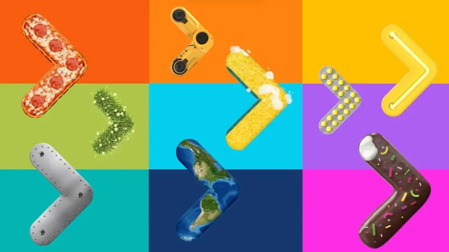
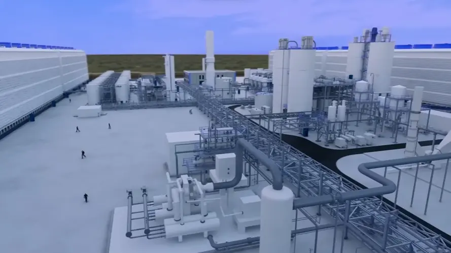
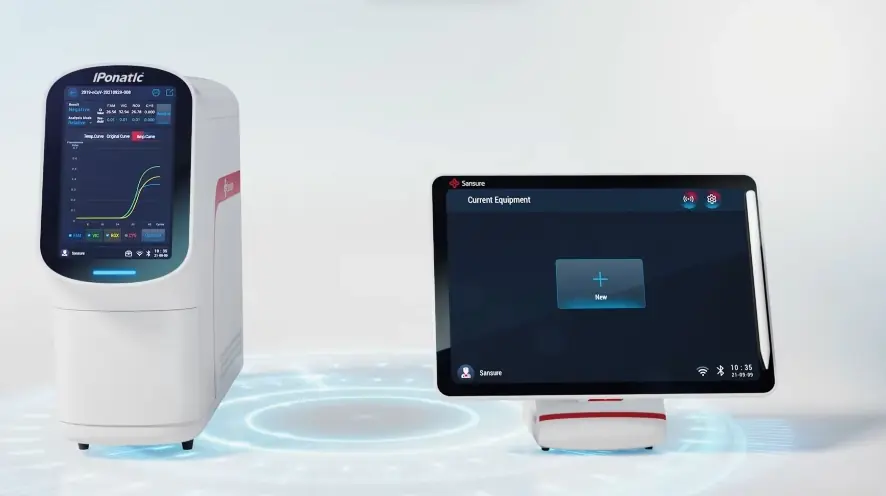
Streamlined medical equipment repair is the core challenge addressed by this PARTSSOURCE business animation, effectively illustrating how a fragmented, reactive approach to medical equipment maintenance transforms into a proactive, efficient system. The video uses compelling visual metaphors and intuitive UI/UX demonstrations to simplify a complex B2B service, guiding viewers from the chaos of urgent repairs to the clarity of optimized operations.
Why It Stands Out:
Transforming Chaotic Repairs into Streamlined Solutions The animation opens with a vivid "fire-fighting" metaphor for reactive maintenance, starkly contrasted by a dynamic split-screen that visually ushers in PARTSSOURCE's transformative platform. This compelling narrative arc demonstrates how a single, integrated solution replaces fragmented efforts, empowering hospital teams to move from crisis management to optimized, predictable workflows.
Empowering In-House Teams with External Expertise PARTSSOURCE simplifies the search for specialized medical equipment technicians by aggregating a network of pre-vetted service providers, akin to consumer-grade platforms like Uber or Amazon. The video visually explains how staff can filter by rating, distance, and price, efficiently connecting with experts who can diagnose and repair equipment onsite, significantly reducing downtime from days to hours.
* Transparent Tracking and Guaranteed Repair Quality The animation highlights PARTSSOURCE's commitment to transparency through clear visuals of repair status tracking and detailed cost breakdowns (parts and labor). Crucially, the platform offers a warranty on services, instilling confidence and mitigating risk. This holistic approach ensures not only efficient repairs but also superior quality and accountability, improving overall patient care.
2. Ema Business explainer animation
Duration : 1 minute and 58 seconds
AI document generation automation is dramatically reimagined in Ema's business animation, which presents its agentic AI suite as a transformative force in crafting high-quality documents. The video compellingly moves from illustrating the widespread pain of manual document creation to showcasing Ema's power to deliver accurate, customized, and visually rich outputs up to ten times faster, fueled by both proprietary and public data.
Why It Stands Out:
From Manual Drudgery to Agentic AI Automation: Emas animation uniquely addresses the drudgery of traditional document creation by introducing an "Agentic AI" suite. This innovative approach streamlines the entire document generation lifecycle, from data sourcing to final review, utilizing natural language instructions and real-time data integration to drastically reduce manual effort and accelerate workflows.
Elevating Documents Beyond Text with Dynamic Visuals: Ema transforms simple text into visually compelling content by seamlessly integrating complex sections, charts, images, and tables. The video effectively demonstrates how Emas AI can generate 200-page proposals, investor prospectuses, and detailed reports with sophisticated formatting and data visualization, all with remarkable speed and precision.
* Real-Time Intelligence for Smarter Business Outreach: Ema empowers sales and leadership teams with comprehensive, real-time insights derived from diverse sources like Salesforce and LinkedIn. By presenting AI functions as specialized "employees" (e.g., Sales Intelligence Analyst), the video illustrates how Ema fuels smarter, targeted outreach and sales conversations, significantly reducing research time from hours to minutes.
3. Snowfox Business short animation
Duration : 1 minute and 16 seconds
AI invoice processing automation is brilliantly showcased in this Snowfox animation, which strategically positions Snowfox AI as the intelligent solution to eliminate manual bottlenecks. The video masterfully visualizes how self-learning algorithms transform costly, error-prone workflows into streamlined, smarter, and highly cost-effective operations, directly addressing the modern business imperative for efficiency and financial optimization.
Why It Stands Out:
Accelerating Invoice Processing, Boosting Earnings: The animation powerfully quantifies Snowfox's impact, showing up to 90% manual work eliminated and a "Yearly Increase" in earnings dramatically rising to over 100%. Dynamic data visualizations and escalating counters vividly demonstrate how Snowfox converts processing time into productive working hours.
Intelligent Automation & Seamless System Integration: This video spotlights Snowfox AI's self-learning technology, which codes and routes invoices based on historical data, negating the need for complicated rules. Its ability to seamlessly integrate with major ERP systems like SAP, Oracle, and Microsoft Dynamics ensures a frictionless adoption and enhances existing financial workflows.
* Global Reach and Adaptive, Error-Free Processing: By showcasing its operations across "30+ Countries" and processing over 15 million invoices annually, Snowfox establishes its proven reliability and global scale. The animation emphasizes a continuous feedback loop where every processed invoice improves accuracy, ensuring Snowfox AI constantly adapts to new data for unwavering efficiency.
4. PREDATAR Animated typography video
Duration : 1 minute and 51 seconds
This data backup recovery animation for Predatar powerfully illustrates how the platform transforms overwhelming data ecosystem complexity into controlled clarity and actionable insights. Through dynamic abstract motion graphics and an authoritative narration, it meticulously deconstructs data challenges, visually proving Predatar's capability to deliver total visibility, powerful simplicity, and future-ready data management.
Why It Stands Out:
From Data Chaos to Controlled Clarity: The video brilliantly depicts complex, tangled data structures and repetitive tasks, then transforms them into organized, accessible systems. This visual narrative establishes Predatar as the essential solution for bringing order and control to extensive data ecosystems, particularly optimizing IBM Spectrum Protect investments.
Unlocking Total Visibility with Intelligent Analytics: Predatar leverages abstract motion graphics to make data protection transparent, presenting insights and analytics via a unified, intuitive dashboard. This allows users to instantly grasp data protection status and anticipate issues, providing invaluable intelligence through configurable reports for proactive management.
* Automating Efficiency for a Future-Ready Enterprise: Highlighting powerful AI and machine learning, the animation shows Predatar automating routine tasks and streamlining workflows. This focus on simplified, continuous monitoring and collaborative management positions Predatar as a forward-thinking platform, empowering teams to tackle complex data challenges with future-proof efficiency.
5. Crowdz Business animation overview video
Duration : 47 seconds
Small business invoice financing animation by Crowdz masterfully addresses the critical cash flow challenge faced by SMBs, presenting their invoice marketplace as a swift, empowering solution for immediate working capital. Through a compelling problem-solution narrative, streamlined process visualization, and dynamic demonstrations of accelerated payments, the video transforms the concept of invoice factoring into an accessible pathway to sustained business growth.
Why It Stands Out:
Accelerating Cash Flow with Visual Clarity: The animation expertly visualizes the pain of prolonged invoice waits by quantifying days and then dramatically shifts to show Crowdz's invoice marketplace delivering immediate funds. This clear contrast, driven by smooth 2D motion graphics and a dynamic bidding sequence, highlights the speed and efficiency of the Crowdz solution.
Demystifying Invoice Factoring for SMBs: Crowdz simplifies the complex process of selling invoices into an intuitive, step-by-step journey, from connecting accounting software to receiving bids and instant payment. This precise information design makes a sophisticated financial tool approachable and trustworthy for small business owners, removing traditional barriers to liquidity.
* Activating Growth through Immediate Liquidity: The video powerfully connects Crowdz's service directly to tangible business benefits, showcasing how newfound cash flow can fund payroll, secure inventory, and empower overall expansion. This strategic focus ensures that Crowdz is understood not just as a financial service, but as a vital partner for unlocking and sustaining small business potential.
6. Jooby Business animated teaser video
Duration : 1 minute and 31 seconds
This smart city lighting explainer video for Jooby intelligently dissects the colossal energy waste of traditional urban illumination. Through vibrant 2D motion graphics and clear data visualization, it vividly portrays Jooby's LoRa-powered adaptive lighting solution, showcasing networked streetlights that promise significant cost savings, enhanced safety, and reduced environmental impact.
Why It Stands Out:
Unmasking Hidden Urban Waste: The Cost of Traditional Lighting: The animation powerfully opens with a stark visual of streetlights blaring at full power over empty night streets, quantifying Europe's daily ‚¬27 million loss. This immediate, data-backed problem statement sets a compelling stage for Jooby's innovative solution.
Adaptive Lighting: Jooby's Responsive Network for Safer Streets: Jooby demonstrates its core innovation by showing streetlights intelligently dimming in low-traffic areas and instantly brightening with detected movement. This responsive, networked approach, powered by LoRa sensors, not only saves energy but also enhances public safety by ensuring optimal illumination when and where it's needed most.
* Beyond Illumination: Quantifiable Savings and a Greener Urban Future: The video expertly translates Jooby's technological advancements into tangible benefits. It highlights up to 50% more economical maintenance and an 80% lower power consumption, alongside a clear three-year payback period and reduced CO2 emissions, positioning Jooby as a smart, sustainable investment for modern cities.
7. iCare Intelligence Business animation brand video
Duration : 1 minute and 43 seconds
Unified healthcare provider engagement is streamlined by iCare Intelligence, transforming health plan operations through empathetic storytelling and vivid 2D motion graphics. This animation powerfully illustrates how the platform harmonizes disparate quality, risk adjustment, and pharmacy data streams, simplifying complex workflows and empowering providers for improved member outcomes.
Why It Stands Out:
Visualizing the Shift from Healthcare Overwhelm to Order: The animation expertly contrasts the chaotic reality of fragmented data and manual processes (depicted by towering paper stacks and burning spreadsheets) with the streamlined efficiency of the iCare Intelligence platform. This "before and after" visual narrative effectively communicates the pain points and the transformative relief of a unified solution.
Unifying Disparate Data for Proactive Provider Engagement: By visually demonstrating the integration of quality, risk adjustment, and pharmacy data into a single, cohesive platform, iCare Intelligence showcases its ability to break down departmental silos. This strategic portrayal emphasizes proactive communication with providers, fostering cooperative relationships and driving year-round compliance and documentation.
* Empowering Teams to Elevate Member Health: Through clear UI/UX simulations and character animation, the video highlights how iCare Intelligence extends the reach of health plan staff, accelerating results and enabling tailored provider education and incentives. It culminates in a powerful visual of empowered teams and providers collaboratively working to connect members to the right care at the right time.
8. VeoSens Business animation process video
Duration : 1 minute and 37 seconds
Animated health data management: The VeoSens business animation articulates a powerful vision for transforming life insurance, positioning VeoSens as the vital solution for companies to understand diverse customer lifestyles and empower proactive health management. Through dynamic 2D animation, it visualizes seamless data collection from wearables, translating physiological states into quantifiable insights for both customers and providers.
Why It Stands Out:
Animated Lifestyles to Actionable Data: This video brilliantly opens by showcasing a grid of varied customer lifestyles, from active runners to busy workers and those struggling with sleep. This immediately establishes the diverse challenges VeoSens addresses, illustrating how complex daily routines are transformed into initial, foundational health data points.
Visualizing Wellness Data for Informed Choices: Leveraging intuitive UI/UX animation, the video demonstrates how VeoSens collects and interprets physiological metrics like activity, fitness, sleep, and heart health. Customers gain clear, quantified insights into their well-being, empowering them to make informed choices and better understand the impact of their daily habits.
* Redefining Life Insurance with Proactive Health: By presenting VeoSens as a tool for active health management, the animation redefines the value proposition of life insurance. The compelling "umbrella of care" visual metaphor reinforces how healthier lifestyles, encouraged by VeoSens' insights, lead directly to enhanced coverage benefits for policyholders, fostering a mutually beneficial future.
9. ctrlX Animated website video
Duration : 3 minutes and 2 seconds
Open industrial automation platform, this ctrlX Automation video expertly articulates the paradigm shift from hardware to software-defined industrial control. It uses dynamic motion graphics and compelling metaphors to showcase a comprehensive, app-based ecosystem, addressing vendor lock-in and empowering users with unparalleled flexibility and future-proof innovation.
Why It Stands Out:
Visualizing the Shift: Modernizing Industrial Control Systems: The animation dynamically presents the rapid evolution of computing, communication, and IoT, then graphically redefines industrial automation as "software development." A striking sequence visualizes the rise of Python in programming, effectively illustrating the industry's pivot and positioning ctrlX as the catalyst for this modern transformation.
The ctrlX CORE: An App-Based Automation "Smartphone" for Industry: Using the intuitive "Smartphone of Automation" analogy, ctrlX CORE is showcased as a modular, Linux OS-based control platform. This communicates its open microservice architecture, allowing free choice of programming languages and easy integration via 60+ apps (50% from third-party developers), fundamentally simplifying complex engineering workflows.
* Cultivating a Collaborative and Future-Proof Automation Ecosystem: ctrlX directly tackles "supplier lock-in" by emphasizing openness, IP security, and co-creation through its developR Community and a network of 90+ partners. The video highlights cloud-based device administration, robust IoT integration, and readiness for 5G, TSN, and AI, assuring users of long-term investment protection and continuous innovation.
10. ESTECO Product business animation video
Duration : 1 minute and 31 seconds
Engineering design optimization software, ESTECO's product business animation for modeFRONTIER masterfully articulates how its solution tackles modern engineering complexities. This 2D motion graphics explainer demonstrates simulation process automation and intelligent design optimization, enabling engineers to streamline workflows, accelerate product development, and make data-driven decisions amidst increasing demands for efficiency and innovation.
Why It Stands Out:
Automating Engineering Workflows for Precision & Speed This modeFRONTIER video uses dynamic infographic animation to visualize the seamless integration of disparate CAD/CAE and third-party solvers into a single, automated workflow. It illustrates how complex, multi-tool processes are unified, allowing engineers to cut development times and move from manual chaos to automated clarity, directly enhancing operational efficiency.
Intelligent Design Optimization & Data-Driven Discovery The animation clearly showcases modeFRONTIER's application of smart algorithms, including RSM, Machine Learning, and Genetic Algorithms, to balance conflicting objectives and evaluate thousands of design alternatives automatically. This systematic approach reveals optimized solutions that might evade traditional methods, empowering engineers with deeper insights for making informed decisions and fostering superior product performance.
* Two Decades of Pioneering Advanced Numerical Methods ESTECO leverages its 20 years of experience in advanced numerical methods to build trust and authority. The video underscores how global leaders across automotive, aerospace, and manufacturing industries rely on modeFRONTIER's proven expertise, reinforcing the brand's position as a robust, credible, and forward-thinking partner in simulation-driven design.
11. Howmet Fastening Systems, Recoil 3D business animation video
Duration : 2 minutes and 37 seconds
Tangless thread insert installation animation. This Howmet Fastening Systems, Recoil, 3D business animation video expertly demystifies the intricate process of thread reinforcement, showcasing an innovative tangless design for superior mechanical performance. It uses precise CGI to transform complex engineering steps into a clear, compelling narrative, making the advanced benefits immediately understandable for a technical audience.
Why It Stands Out:
Demystifying Tangless Insert Installation: The animation acts as a detailed, step-by-step guide, meticulously illustrating the drilling, countersinking, and tapping processes with precise 3D mechanical animation. It highlights Recoil's bi-directional tangless design, eliminating installation orientation requirements and the risk of lost tangs, streamlining the entire workflow.
Visualizing Superior Load Distribution for Peak Performance: A compelling animated cutaway reveals the Recoil insert's "spring-like design" in action, dynamically distributing shear loads radially across the threads. This visual proof, complete with comparative load percentages, clearly demonstrates superior fatigue failure prevention, a critical differentiator for Howmet Fastening Systems.
* Engineering Clarity: The Animated Technical Guide: Without narration, the video leverages a minimalist aesthetic and synchronized on-screen text to deliver concise instructions and key product benefits. This sophisticated information design, including animated Go/No-Go gauging, provides a high-fidelity, authoritative technical guide that builds unwavering confidence in the Recoil product.
12. AUTORIV Animated fintech video
Duration : 1 minute and 30 seconds
Automated fastening solution animation meets meticulous engineering visualization in this AUTORIV video, designed to elevate brand story by showcasing the precision, functional versatility, and seamless integration of its full-hex blind rivet nuts. The animation artfully deconstructs complex mechanics and expands to feature compatible assembly systems, asserting AUTORIV's role as a comprehensive industrial partner.
Why It Stands Out:
Engineering Precision: The Full-Hex Advantage: This video meticulously presents the AUTORIV full-hex blind rivet nut, utilizing exquisite 3D rendering to highlight its superior "Vollhex-Geometrie." The precise M4-M8 thread sizes and robust design are showcased through dynamic rotations, communicating the component's inherent high torque resistance and engineered excellence, instilling confidence in its reliability for demanding applications.
Visualizing Secure Fastening Mechanics: A pivotal animated cross-section dynamically illustrates the internal "Nietwulst" (rivet bulge) formation as the AUTORIV fastener is installed into sheet metal. This clear visual proof, complemented by synchronized on-screen text explaining the transfer of expulsion forces, simplifies complex mechanics and unequivocally demonstrates the secure, unyielding hold achieved, distinguishing its functional superiority.
* Seamless Automation Integration: Beyond a single component, the video expands to present AUTORIV's extensive ecosystem of standard and specialized fasteners, along with compatible automated assembly systems like the A230, A240, A250, and A260. This strategic showcase positions AUTORIV as a comprehensive industrial solution provider, emphasizing efficient integration into modern production lines and elevating its brand narrative as a full-service partner.
13. NordVPN Animated tech video
Duration : 3 minutes and 11 seconds
This animated VPN proxy comparison masterfully clarifies the often-confused distinctions between proxies and VPNs, strategically positioning NordVPN as the superior choice for comprehensive online security and privacy. Through crisp 2D motion graphics and a systematic query-based structure, the video visually unpacks how each technology operates, empowering viewers to make informed decisions for enhanced digital safety.
Why It Stands Out:
Animated Clarity: Demystifying Online Traffic Routing: The video uses precise 2D motion graphics to visually differentiate application-level proxy routing from NordVPN's operating system-level encryption. Dynamic data scrambling effects and clear visual metaphors, like the "security dome," make complex technical processes easily understandable.
The VPN's Unrivaled Security and Privacy Advantage: By highlighting NordVPN's robust encryption, audited no-logs policy, and advanced Threat Protection features (like blocking malicious websites and infected downloads), the animation strongly emphasizes the comprehensive security and privacy benefits inherent in premium VPN solutions over typical proxies.
* Empowering Informed Choices for Digital Protection: Addressing common user confusion directly, the video uses a query-based narrative and consistent color-coding (red for proxy, blue for VPN) to guide the audience. It underscores that while proxies offer speed for specific tasks, NordVPN delivers unmatched protection, fostering educated decisions about personal online safety.
14. Sigga Business animation videos
Duration : 1 minute and 12 seconds
Mobile EAM software results video for Sigga Technologies masterfully addresses common industry skepticism, positioning Sigga as the reliable choice for tangible improvements in complex enterprise environments. This video proves its central thesis of superior productivity and measurable ROI by directly contrasting unfulfilled promises with concrete, data-driven outcomes, setting a new standard for trust and performance in mobile EAM solutions.
Why It Stands Out:
Beyond Generic Promises: Sigga's Integrity in Action: This animation boldly challenges industry rhetoric, directly addressing the common disappointment of unfulfilled promises. By explicitly stating "Not us. Not at Sigga," the video immediately establishes Sigga's commitment to integrity and expertise, building trust through a candid and confident brand persona.
Quantifiable Impact: Hard Data Drives Confidence: Moving beyond vague assurances, Sigga delivers a compelling, data-driven narrative of success. Dynamic motion graphics and integrated live-action showcase significant achievements, including $10.5M in annual savings, 79% reduction in MTTR, and 25% increased wrench time, providing irrefutable proof of the mobile EAM implementation's powerful, measurable ROI.
* Vision for Tomorrow: Empowering the Future of Work: The video culminates in a forward-looking vision, demonstrating how Sigga's solutions simplify planning, optimize mobile warehouse and inventory management, and mobilize asset management. Through a sophisticated blend of visuals, it prepares customers for "The Future of Work," solidifying Sigga as a strategic partner ready for evolving industrial demands.
15. ClickUp Business demo animation
Duration : 3 minutes and 42 seconds
Captivating Business Demo Animation immediately grabs attention, showcasing ClickUp's prowess in transforming chaotic workflows into Streamlined operations . Imagine a workspace where AI anticipates needs, schedules perfectly, and summarizes discussions, as brilliantly presented. Forget overwhelming to-do lists; this is about reclaiming focus and unlocking potential.
The video insightfully highlights how ClickUp integrates AI, enhancing writing and conducting smart research, freeing time for strategy. It inspires envisioning a workday liberated by intelligent tools elevating productivity. ClickUp presents itself as an intelligent partner achieving business goals, not just software.
16. Databricks Animated business video
Duration : 2 minutes and 6 seconds
This Databricks animation, an Open Data Sharing Platform explainer, vividly illustrates how its Delta Sharing protocol simplifies and democratizes secure data sharing. Through elegant motion graphics and compelling visual metaphors, it deconstructs the inefficiencies of traditional methods, positioning its Lakehouse platform as the open, cross-platform solution for real-time insights.
Why It Stands Out:
Exposing the Pitfalls of Traditional Data Exchange: The video masterfully uses visual metaphors like tangled pipelines, data blockages, and duplicated data containers to highlight the complexity, delays, and replication costs associated with conventional SFTP, API, and file-sharing methods, creating a clear problem-solution narrative.
Seamlessly Delivering Live Data to Any Platform: Databricks Delta Sharing is presented as an open protocol, enabling live data from the Lakehouse Platform to flow directly to any computing environment. This animation elegantly demonstrates secure, real-time access for diverse consumers, eliminating vendor lock-in and the need for data replication.
* Centralizing Data Governance for Unified Control: Beyond mere sharing, Databricks showcases robust features for data providers to centrally manage, govern, audit, and track shared data assets€”including ML models and dashboards€”all from a single platform, ensuring data integrity and simplifying operations for all parties.
17. Super WiFi Animated character video
Duration : 1 minute and 6 seconds
Home WiFi dead zone solution, this animated character video for Vodafone's Super WiFi masterfully addresses the pervasive issue of inconsistent home connectivity. It leverages empathetic character vignettes and dynamic architectural cutaways to first illustrate common household WiFi frustrations, then transitions to a clear, visually sophisticated explanation of how Super WiFi intelligently optimizes network coverage for a truly seamless user experience.
Why It Stands Out:
Solving Everyday WiFi Struggles with Empathy: The animation skillfully introduces the "Joneses" family, personifying the universal pain points of unreliable WiFi across multiple users and devices. This problem-centric narrative immediately builds viewer empathy, positioning Vodafone's Super WiFi as a relatable and essential solution to daily digital frustrations.
Visualizing a Seamless, Optimized Home Network: Utilizing clear 2D vector animation, the video employs dynamic house cutaways that transition from frustrating red "dead zones" to expansive green signal coverage. This visually demonstrates how Super WiFi access points establish a powerful, continuously optimized network, ensuring reliable connectivity in every corner of the home.
* Empowering the Modern Connected Household: Beyond just signal strength, the video highlights Vodafone's Super WiFi's ability to create a "personal smart network" that adapts to increasing device usage. This strategic messaging reassures viewers that their entire household can enjoy fast, reliable service, fostering confidence in a future-ready solution designed for today's hyper-connected lifestyle.
18. Fundbox Animated explainer series
Duration : 48 seconds
Business credit animated explainer videos like Fundbox's masterfully demystify complex financial services, presenting fast, reliable, and transparent access to capital as a catalyst for business growth. This 2D motion graphics explainer orchestrates bold typography and clear visuals to streamline the lending process, empowering businesses to confidently seize new opportunities.
Why It Stands Out:
Accelerating Business Capital Access: Fundbox simplifies traditional lending into a rapid, efficient process. Dynamic typography and clear, step-by-step visuals showcase a 2-step application, instant decisions, and next-business-day funding. This streamlined access empowers businesses to quickly secure capital, removing friction.
Financial Clarity, No Surprises: Addressing financial anxieties, the video emphasizes transparency and control. Dashboard-style UI elements visually confirm upfront payment totals and a credit limit that replenishes as you pay. This clear communication builds trust, ensuring businesses manage their capital with confidence and no surprises.
* Animated Storytelling for Growth: Beyond explaining a product, the animation uses vivid storytelling to position Fundbox as a catalyst for continuous business growth. Abstract visual metaphors like rising stairs and a growing building, coupled with a confident narrative, effectively convey forward momentum. This animated vision inspires businesses to see their potential.
19. GEICO Animated infographic video
Duration : 1 minute and 9 seconds
A comprehensive car insurance explained animation, this GEICO video masterfully demystifies "comprehensive other than collision" coverage. Through charming vector animation and relatable visual metaphors, it simplifies complex policy details, guiding viewers to make informed decisions about their vehicle's protection. The engaging presentation transforms a typically dry subject into an accessible educational experience, enhancing GEICO's brand trust.
Why It Stands Out:
Demystifying Comprehensive Coverage Through Playful Animation: GEICO effectively captures attention by presenting complex non-collision scenarios (vandalism, fire, animal encounters) with a whimsical narrative, featuring an anthropomorphic car as the protagonist. This creative storytelling approach, coupled with vibrant vector animation, transforms intricate insurance concepts into easily digestible and memorable visual lessons, making a once-confusing topic approachable.
Empowering Policyholders: Navigating Deductibles and Vehicle Value: The video provides practical, actionable advice, employing intuitive visual metaphors like adjusting a volume knob for deductible settings and a diamond car for "actual cash value." This smart information design helps viewers understand how their choices impact premiums and payouts, guiding them to optimize their GEICO coverage based on their car's worth and personal financial comfort.
* Building Confidence: GEICO's Transparent Approach to Auto Insurance: By proactively educating on nuances such as the strategic value of coverage for older vehicles versus mandatory requirements for leased or financed cars, the animation fosters a sense of trust. GEICO positions itself as a knowledgeable, transparent guide, empowering policyholders with clarity and confidence in their insurance decisions through a professionally produced and engaging format.
20. CLEAR Animated mobile app video
Duration : 1 minute and 49 seconds
Mobile health pass animation: This engaging explainer video for CLEAR Health Pass masterfully demystifies secure identity and health verification, showcasing how its innovative platform restores confidence for individuals and streamlines operations for businesses. Through a relatable user journey, it illustrates the app's seamless enrollment and touchless access, enabling a safe return to everyday experiences.
Why It Stands Out:
Unlocking Confident Access to Everyday Life: The video compellingly narrates Jane's journey, transforming the abstract concept of health verification into a tangible path to enjoying stadiums, restaurants, and offices. CLEAR Health Pass empowers users with the confidence to move freely, demonstrating its direct impact on personal freedom and quality of life.
Seamless Digital Identity & Health Verification: CLEAR's animation meticulously details the intuitive process of linking personal ID, health providers, and access credentials within the app. It highlights biometric verification and real-time health insights, illustrating how CLEAR securely consolidates essential data for effortless and reliable entry into participating venues.
* Pioneering Scalable, Privacy-First Access Technology: This explainer emphasizes CLEAR Health Pass's platform-agnostic, scalable design, making it an ideal solution for businesses seeking secure access management. It reassures viewers of robust privacy protection and data security, positioning CLEAR as a trusted leader in biometric identity solutions.
21. Lifesize Animated software video
Duration : 2 minutes and 9 seconds
This omnichannel contact center animation for Lifesize CXengage compellingly illustrates the paradigm shift required in modern customer experience, offering a unified cloud solution to transcend fragmented legacy systems. The video masterfully visualizes how CXengage transforms complex customer interactions into streamlined, data-driven engagements, ensuring reliability and empowering proactive agent coaching for exceptional service delivery.
Why It Stands Out:
Unifying the Omni-Channel Customer Journey: Lifesize CXengage visually deconstructs the inefficiencies of disparate on-premise solutions, demonstrating deep integrations that consolidate all customer touchpoints?from chat to video?into a single, intuitive view, enabling effortless agent pivoting and comprehensive interaction understanding.
Dynamic Scalability Meets Data-Driven Performance: Through vibrant animated data visualizations and UI simulations, the video showcases Lifesize CXengage's flexible architecture, allowing businesses to dynamically scale concurrent agents up or down. This agile adaptability, combined with a single source of truth for valuable insights, optimizes operational efficiency and ensures continuous service.
* Empowering Proactive & Personalized Support: The animation highlights how Lifesize CXengage equips contact centers with tools for proactive agent coaching and quality management. By providing detailed analytics and the ability to adapt swiftly to changing customer behaviors, the solution ensures every interaction is personalized, leading to consistently high customer satisfaction and a competitive edge.
22. Infosilum Animated startup video
Duration : 1 minute and 46 seconds
Cloud DVR platform animation for Ateme presents a compelling case for its future-proof Cloud DVR platform, ingeniously using 2D motion graphics to articulate how it addresses critical industry challenges around scalability, user experience, and content monetization. The video meticulously unveils a solution that offers limitless storage, sustainable infrastructure, and seamless multi-device content delivery, demonstrating Ateme's comprehensive and forward-thinking approach.
Why It Stands Out:
Future-Proofing Cloud DVR for Tomorrow's Demands: Atemes video directly confronts industry anxieties about aging DVR infrastructure, presenting its platform as an innovative answer. Through animated iconography and a problem/solution narrative, it reassures viewers that their content delivery is ready for evolving market demands, from flexible networks to seamless content migration.
Unlocking Limitless Scalability & Monetization: The animation vividly illustrates Ateme's capacity for limitless storage that scales over time, depicting growing servers and cloud connections. It highlights revenue opportunities through targeted ads and storage upsells, positioning the Ateme Cloud DVR platform not just as a service, but as a strategic tool for business growth.
* Greener Infrastructure for Global Reach: Beyond performance, Ateme integrates environmental responsibility into its core message. The video uses impactful visual metaphors, like shared resource connections forming a green leaf, to underscore its commitment to reducing carbon footprints while simultaneously expanding market reach across affiliates and countries.
23. RightCoach Business animation ad video
Duration : 3 minutes and 25 seconds
Next-generation industrial measurement technology is redefined by the RightCoach solution, leveraging the smart, modular Vaisala Indigo ecosystem. This animation expertly deconstructs complex instrumentation, showcasing its flexible design and integrated software to empower users with precise data and simplified operations across diverse applications.
Why It Stands Out:
Seamless Sensor Integration for Next-Gen Industrial Control: The RightCoach system masterfully demonstrates its modularity, enabling users to effortlessly interchange smart probes for various parameters like humidity, temperature, CO2, and dew point. This adaptability ensures future-proof measurement, aligning with evolving industrial and lab needs without requiring entirely new infrastructure.
Real-time Insights: Streamlined Data Visualization and Control: RightCoach enhances operational efficiency by providing clear, intuitive data visualization directly on Indigo 200/500 series transmitters and through the Vaisala Insight PC software. This allows for quick diagnostics, remote monitoring via mobile devices, and seamless integration with existing automation systems, minimizing maintenance downtime.
* Future-Proofing Industrial Measurement with Vaisala Indigo: From robust IP66/NEMA 4 enclosures for harsh conditions to single-cable Power over Ethernet installation, Vaisala Indigo is engineered for durability and longevity. This design philosophy, coupled with low total cost of ownership and flexible measurement capabilities, positions the RightCoach solution as a smart, reliable investment for sustained high-quality production.
24. SurveyMonkey Business animation feature video
Duration : 1 minute and 31 seconds
This dynamic brand tracking insights animation for SurveyMonkey Brand Tracker brilliantly addresses the challenge of understanding complex brand perception, arguing that real-time, AI-powered data is crucial for strategic brand management. It masterfully uses crisp motion graphics and interactive data visualizations to illustrate the shift from static, reactive analysis to proactive, agile brand evolution.
Why It Stands Out:
Unlocking Real-Time Brand Dynamics: Moving Beyond Static Reports. The animation powerfully contrasts outdated, static agency presentations with SurveyMonkey Brand Tracker's dynamic, interactive data visualization. It features evolving graphs and a user-controlled timeline slider, demonstrating how real-time market shifts and brand perception changes are instantly visible, empowering agile decision-making over relying on stale data.
Holistic Brand Health: Metrics, Competitors, and Global Markets. Visually, the video breaks down intricate brand health metrics€”such as awareness, favorability, consideration, and choice€”into digestible, color-coded bar charts and trend lines. It extends this comprehensive view to global markets and competitive landscapes, showing how SurveyMonkey Brand Tracker aggregates diverse data points from a trusted audience panel worldwide for unparalleled market intelligence.
* Actionable Clarity: AI-Powered Shifts for Strategic Empowerment. Highlighting its "AI-Powered Insights," the video illustrates how complex data is instantly processed to reveal meaningful shifts and their underlying drivers. This revolutionary feature saves countless hours of manual analysis, providing brand managers with immediate, actionable clarity and the strategic foresight needed to confidently grow and evolve their brand.
25. US Bank Business animation onboarding video
Duration : 58 seconds
US Bank instant card onboarding animation masterfully simplifies the complexities of corporate expense management, demonstrating a streamlined, digital solution. Through clear 2D motion graphics and intuitive UI animation, it illustrates the rapid provisioning process, from an administrator assigning roles to provisioners creating individual or bulk cards via a user-friendly web portal. The video effectively transforms the narrative of corporate spending, highlighting instant cardholder access and empowered, controlled usage.
Why It Stands Out:
Instantly Provisioning Digital Cards for Business Needs: The video uses compelling digital interface simulations and animated form fields to showcase the US Bank Instant Card's swift creation process, enabling businesses to deploy single or bulk cards with unprecedented speed and efficiency.
Clearly Defined Roles for Seamless Card Management: By segmenting the narrative around distinct user roles€”Administrator, Approver, Provisioner, and Cardholder€”the animation clearly communicates the hierarchical control and distribution system, ensuring transparent and efficient management of corporate spending.
* Immediate Cardholder Access via Mobile Wallet: The animation vividly portrays the instant delivery of US Bank Instant Card details to cardholders via email notification, followed by effortless mobile wallet integration, empowering employees with immediate, secure access to funds for controlled purchases.
Duration : 1 minute and 10 seconds
Education HR software animation for Frontline Central masterfully transforms the daunting landscape of school district HR paperwork into a seamless digital employee lifecycle system. This 2D motion graphics video elegantly illustrates how the platform streamlines everything from new hire onboarding to offboarding, positioning Frontline Central as the essential tool for administrative efficiency and enabling a focus on supporting people, not processing forms.
Why It Stands Out:
From First Day to Farewell: A Unified Employee Lifecycle: Frontline Central's animation tells a compelling story, following a new teacher from their initial electronic paperwork through ongoing credential management and contract renewals. This narrative approach vividly demonstrates the platform's comprehensive oversight across the entire employee journey.
Animated Workflows for Unmatched Operational Clarity: Complex HR processes are distilled into clear, digestible animated workflows. The video leverages an evolving circular diagram and intuitive character interactions to visually demystify each stage, from new hire packets with digital signatures to tracking important due dates, ensuring Frontline Centrals benefits are immediately comprehensible.
* Empowering School Districts with Comprehensive Digital HR: This animation strategically positions Frontline Central as a complete digital solution, freeing school district HR professionals from burdensome administrative tasks. By highlighting seamless data integration and efficient management of all forms, the video underscores its capacity to empower teams to prioritize strategic people support.
27. Cisco Business intro animation
Duration : 1 minute and 46 seconds
An animated business network security explainer, this Cisco business animation masterfully visualizes how integrated technology empowers businesses to connect, protect, and thrive in a complex, data-driven world. Through sophisticated abstract motion graphics and dynamic data flow representation, it transforms the unseen intricacies of digital infrastructure into a clear, compelling narrative of orchestrated security and seamless connectivity, cementing Cisco's role as a foundational digital partner.
Why It Stands Out:
The Digital Fabric Unveiled Simplifying Network Complexity The animation utilizes cutting-edge procedural network generation and dynamic light trails to metaphorically represent data flows, effectively demystifying the vast, intricate digital fabric. This technical precision allows Cisco to communicate the systematic management of complexity, making intangible processes comprehensible.
Orchestrating Connectivity Cisco's Secure Digital Blueprint Beginning with abstract chaos, the narrative smoothly progresses through seamless morphing animations that guide viewers from potential vulnerability to a state of robust, integrated security. This visual journey positions Cisco as the essential orchestrator, providing a clear blueprint for reliable and resilient digital transformation.
High-Tech Aesthetics Building Brand Trust and Innovation** With its polished production, high-fidelity rendering, and futuristic UI aesthetic, the video projects a powerful sense of innovation and authority. This deliberate choice in production value elevates the Cisco brand, inspiring confidence and reinforcing its leadership in pioneering secure, intelligent networking solutions.
28. mParticle Motion graphics business animation video
Duration : 1 minute and 36 seconds
This unified customer data platform animation by mParticle masterfully addresses the complex challenge of fragmented customer data across a multi-device, multi-platform world. Utilizing clean motion graphics and intuitive visual metaphors, the video effectively showcases mParticle's core capability: eliminating data silos to empower sophisticated, data-driven customer experiences for personalized marketing and analytics.
Why It Stands Out:
Orchestrating Fragmented Customer Data: The videos compelling opening visually establishes the chaos of scattered data across various devices and platforms. mParticle is then introduced as the central, unifying solution, employing a "greasing the wheels" metaphor and a clear hub-and-spoke animation to illustrate its seamless data integration.
Seamless Cross-Platform Data Flow: Demonstrating broad technical prowess, the animation highlights mParticles ability to collect and manage data from diverse sources, including iOS, Android, Unity, Roku, Xbox, Apple TV, and web platforms via a single JavaScript SDK, complete with native cookie syncing for comprehensive user profiles.
* Powering Personalized Customer Journeys: The animation culminates by showing how mParticle's unified data directly translates into actionable insights. It visually depicts granular control over data forwarding to platforms like Braze, ultimately enabling businesses to create highly personalized user experiences, drive informed experimentation, and optimize engagement.
29. Green Bonds Whiteboard animation video
Duration : 1 minute and 41 seconds
Green Bonds explainer animation provides a concise and optimistic overview of sustainable finance, clarifying the mechanics and dramatic growth of Green Bonds. Through vibrant 2D motion graphics and a structured narrative, the video educates viewers on how these instruments fund crucial environmental and climate-positive projects, seamlessly connecting financial investment with global ecological benefits for both issuers and investors.
Why It Stands Out:
Demystifying Green Bonds: From Concept to Capital: The video simplifies a complex financial product by illustrating the bond mechanism as a clear loan between issuers and investors, enhanced by a 'green feature' via animated iconography. This foundational clarity ensures that the core function of Green Bonds is immediately understandable, making sustainable finance accessible to a broader audience.
Visualizing Sustainable Impact & Market Growth: Concrete examples, such as improvements in transport infrastructure, agricultural production, and renewable energy generation, are visually integrated into stylized cityscapes. This is powerfully complemented by an animated data visualization that charts the dramatic growth of the Green Bonds market, reaching over $258 billion in issuance in 2019 alone, demonstrating tangible global impact.
* Building Trust Through Transparent Green Finance: An authoritative narration, combined with clean 2D animation and a consistent blue-green palette, fosters a sense of credibility. The powerful "brown to green" transformation of the earth icon underscores the beneficial transition these Green Bonds facilitate, building investor and issuer confidence in a global shift towards a more sustainable economy.
30. Amazfit Business animation
Duration : 43 seconds
Amazfit Virtual Pacer how-to animation offers an exceptional user interface demonstration, guiding fitness enthusiasts through activating a core feature with remarkable clarity and precision. This engaging animated explainer meticulously deconstructs the smartwatch's functionality, simplifying complex technical steps into an intuitive, step-by-step visual narrative that builds immediate user confidence.
Why It Stands Out:
Animated UI Guides Feature Activation: The precise animated UI walkthrough for the Amazfit GTR 3 & GTS 3 series showcases every crown twist and tap, transforming complex feature activation into a simple, followable sequence. This direct visual guidance ensures users can effortlessly set up their Virtual Pacer, building immediate confidence.
Dynamic Visual Pace Feedback: Dynamic 2D characters provide instant, real-time pace visualization, pitting the user's progress against their virtual AI guide. This compelling visual metaphor for the Amazfit Virtual Pacer allows runners to intuitively understand their performance, fostering motivation and aiding effective pace management.
* Precision Animation Elevates User Confidence: High-fidelity rendering and seamless transitions elevate the production value, positioning the Amazfit smartwatch as both sophisticated and user-friendly. This precision animation, combined with clear information design, inherently builds brand credibility and user confidence in Amazfit's innovative fitness technology.