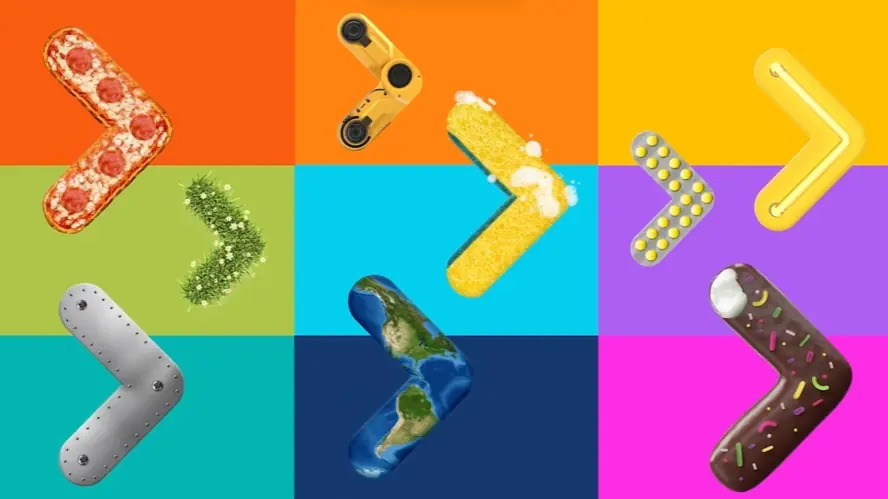
Paragraph 1: Visualize instantly captivating your audience, purely through visuals. What if your brand could truly leave a mark? In today's digital arena, crafting memorable experiences is paramount. Motion design video examples offer a compelling strategy.
Paragraph 2: For platforms seeking enhanced user engagement, these dynamic visuals are transformative. They clarify intricate features, boost brand perception, and ultimately drive conversions. Let's examine 30 motion design video examples to elevate brand experiences.
It’s crucial to plan ahead when it comes to high-quality video production. Discuss with our team, how you can get visual style, budget, timeline in sync.
Jai Ghosh
Video Producer at Advids
Let's talk

How are motion design video examples used for brand growth?
Motion design video examples propel brand growth by crafting visually arresting narratives. They swiftly capture audience attention and articulate brand essence with impact. Animated logos and graphics forge stronger brand memory. Consistent deployment across digital channels solidifies brand identity and recognition in competitive markets.
What design elements enhance motion design video examples?
Design elements elevating motion design video examples encompass fluid typography and seamless transitions. Brand aligned color palettes are paramount for visual harmony. Strategic utilization of negative space and visual metaphors enhances message clarity. Sound design and music composition heighten emotional resonance and viewer immersion.
What production stages are involved in these video examples?
Production stages commence with strategic concept development and detailed storyboarding. Compelling scriptwriting and distinctive visual style definition are foundational. Animation and motion graphics creation bring visuals to life. Sound design and music composition layer in auditory depth. Final rendering and meticulous post production refine the video for optimal impact.
Where are motion design video examples most impactful?
Motion design video examples exert maximum impact across social media ecosystems and brand websites. They excel as concise explainer videos and engaging product demonstrations. Digital advertising campaigns and impactful presentations are amplified. Internal communications and training modules become more captivating and effective.
How do these video examples improve audience engagement?
These video examples amplify audience engagement through dynamic visual storytelling techniques. Motion inherently attracts and sustains attention more effectively than static imagery. Dynamic visuals distill intricate information into easily digestible segments. Emotional connection cultivated through animation deepens audience involvement and fosters lasting impressions.
What marketing goals can motion design video examples achieve?
Marketing goals attainable through motion design video examples span amplified brand awareness and elevated website traffic. Effective lead generation and improved conversion metrics are primary targets. Enhanced social media interaction and strengthened brand recall are crucial objectives for sustained growth.
How can motion design video examples showcase product features?
Motion design video examples effectively showcase product features via animated visual demonstrations. They intuitively explain intricate functionalities with clarity and simplicity. Highlighting core product benefits using dynamic motion graphics proves highly persuasive. Animated tutorials and interactive walkthroughs significantly improve user comprehension and product adoption.
What makes a motion design video example effective overall?
Effective motion design video examples are characterized by visual allure and message conciseness. They articulate the intended message with precision and impact. Strategic brand alignment and acute target audience relevance are indispensable. Compelling storytelling and potent emotional resonance are key ingredients for overall effectiveness and viewer connection.
How do video examples communicate complex information simply?
Video examples simplify complex information by employing relatable visual metaphors and analogies. Animation systematically breaks down abstract concepts into readily understandable visuals. Motion graphics adeptly illustrate intricate processes and data sets with clarity. Strategic voiceover narration seamlessly complements visual explanations for enhanced comprehension.
What are key considerations when planning video examples?
Key considerations when strategizing video examples include precise target audience definition and clear marketing objective articulation. Realistic budget allocation and project timeline management are paramount. Consistent brand messaging and cohesive visual style are essential for brand integrity. Optimal platform suitability and strategic distribution planning are critical for maximizing reach and impact.
What core design principles underpin effective motion in video
Effective motion design in video is more than just movement it is about carefully considered principles working in harmony. We often see visually appealing motion, but truly impactful video hinges on a deeper understanding of design fundamentals. These principles guide our viewers eyes, evoke emotions, and ultimately ensure our message resonates.
To create motion that truly connects, consider these core elements.
- Timing and Pacing dictate the rhythm of your video. Just as music needs tempo, motion design uses timing to control viewer engagement. A well-paced Animated Explainer Video keeps attention, while rushed pacing can overwhelm.
- Easing adds naturalism to transitions. Think of how real-world objects move they rarely start and stop abruptly. Easing creates smooth, believable motion, crucial for an Animated Product Video showcasing features elegantly.
- Visual Hierarchy directs focus intentionally. Our eyes are naturally drawn to movement, but effective motion design uses this to guide viewers through key information. In an Animated Demo Video, hierarchy ensures users see the most important steps first.
- Color and Sound amplify emotional impact. Color palettes evoke feelings, and sound design enhances the overall experience. An Animated Brand Video leverages these principles to build a strong brand identity and emotional connection.
Mastering these core design principles allows us to craft motion design video examples that are not only visually stunning but also strategically effective, ensuring our message is both seen and felt.
Exploring advanced video storytelling techniques using motion design
Stepping beyond basic motion design, we begin exploring advanced techniques that truly elevate video storytelling. It's about moving past simple product showcases and delving into methods that captivate and resonate deeply with viewers. Let's consider how we can push creative boundaries.
- Layering animation styles adds incredible visual depth. Imagine combining 2D and 3D elements within a single scene to create a richer, more immersive experience. This is particularly effective when crafting a compelling 3D Motion Design Video that needs to feel both sophisticated and engaging.
- Character animation offers a powerful tool for emotional connection. By developing nuanced characters with relatable expressions and movements, we can forge stronger bonds with our audience. Think about how a well-crafted Motion Design Brand Video can use character to embody brand values and personality.
- Abstract motion graphics excel at visualizing complex ideas. When dealing with intricate concepts or data, abstract visuals can simplify understanding and create memorable representations. A Motion Graphics Demo Video can transform dense information into digestible and visually appealing segments.
- Seamless transitions are essential for narrative flow. Skillfully executed transitions guide the viewer smoothly from scene to scene, maintaining engagement and creating a cohesive viewing experience. This kinetic approach, often seen in Kinetic Motion Design Video, ensures the story unfolds naturally and rhythmically.
These techniques, when thoughtfully combined, unlock new dimensions in motion design storytelling, allowing us to create videos that are not just informative but truly unforgettable.
How to develop a consistent animation style guide for video content
Creating a consistent animation style guide is not just about aesthetics; it is about building a recognizable visual voice for your brand across all video content. Think of it as the visual DNA that ensures every motion graphics brand video, motion design explainer video, and even motion graphics product video feels distinctly yours. Let us explore how we can craft a style guide that truly works.
To begin, consider your brand's personality. Is it playful and energetic, or sophisticated and informative? This core identity should permeate every visual decision, from your color palette to your animation style. Speaking of colors, selecting a limited and consistent palette is crucial. Think about how these colors will be used across backgrounds, elements, and text to maintain visual harmony in every animated motion design example you create.
Next, let us delve into the specifics.
- Typography Styles: Choose a maximum of two fonts – one for headings and one for body text – ensuring they are legible and reflect your brand's tone.
- Animation Style: Decide on your primary animation approach. Will you embrace the clean lines of 2D, the depth of 3D, or perhaps a unique mixed-media style?
- Sound Design Guidelines: Establish rules for music and sound effects. Will your videos be upbeat and energetic, or calm and soothing? Consistency in audio is as vital as visuals.
- Iconographic Language: Develop a library of icons with a unified style. These visual shortcuts can greatly enhance clarity, especially in explainer videos.
Remember, a style guide is a living document. Include animated motion design example within it to illustrate each point clearly. Regularly review and update it to ensure it evolves with your brand. By investing time in a robust style guide, we ensure every video we create is not just visually appealing, but also undeniably and consistently *you*.
Mastering typography motion design for impactful video communication
Typography in motion design is more than just words moving on screen it is about giving voice to your message visually. We understand the power of emotional resonance and clarity in video communication from our earlier discussions. Now let us explore how mastering typography motion design can amplify these aspects. Effective typography ensures our message is not only seen but also deeply felt and understood.
To truly master this, we should actively seek resources like motion graphics tutorial video content online. These tutorials offer practical insights into techniques and software. Choosing the right font is paramount. It is the visual tone of voice for our brand. Consider how a font reflects the video's mood and brand personality. Animation then breathes life into these carefully chosen words. Exploring different kinetic typography video example styles is crucial. Kinetic typography is all about bringing text to life, enhancing viewer engagement and making key phrases memorable. We can use animation to emphasize crucial words and amplify the emotional impact of our message.
Consistency is key. Maintaining a consistent typography style throughout the video builds visual harmony and strengthens brand recognition. Readability across devices is non-negotiable. Our typography must be clear and legible whether viewed on a large desktop or a small mobile screen. Typography also guides the viewer's eye. It directs attention and controls the narrative flow, ensuring viewers focus on what is most important. Analyzing motion graphics explainer video examples can be incredibly insightful. Pay close attention to how these videos utilize typography to simplify complex information and maintain viewer interest.
Sound design is our ally. Incorporating sound that complements the rhythm of text animation enhances the kinetic feel and emotional depth. For adding depth and visual sophistication, consider exploring 3D motion design video example techniques. 3D typography can create a truly immersive experience. However, remember conciseness. Purposeful animation is more impactful than over animation. Keep typography animations focused to avoid distracting from the core message. Always test our typography motion design with our target audience. Feedback is invaluable for optimization and ensuring our message resonates as intended.
- Understand typography hierarchy for clear messaging.
- Animate text to highlight key emotions.
- Ensure readability across all screen sizes.
- Integrate typography seamlessly with other visuals.
Mastering typography motion design is about transforming simple text into a powerful communication tool. It elevates our videos from visually appealing to truly impactful, driving deeper viewer connection and message retention.
Strategic color palette selection in motion design video projects
Building upon motion design video examples effectiveness strategic color palette selection emerges as crucial element. Color transcends mere aesthetics becoming powerful communication tool. Thoughtful color choices significantly amplify video impact resonating deeply viewers.
Consider psychological impact colors. Motion design ad video example often leverage bold vibrant palettes for immediate attention. Conversely motion design brand video example might employ muted sophisticated tones reflecting brand personality. Target audience preferences also guide color decisions ensuring resonance specific demographics. Accessibility is paramount. Sufficient contrast guarantees readability viewers including those visually impaired.
- Emotional associations colors are profound. Warm colors like red orange evoke energy excitement. Cool colors blue green suggest calmness trust.
- Brand alignment dictates color palette. Colors should consistently reflect brand identity across all motion design videos.
- Cultural nuances color meanings exist. Understanding these prevents unintended misinterpretations global audiences.
- Testing color palettes is vital. A/B testing different palettes reveals which resonates best target viewers.
Strategic color palette selection elevates motion design videos from visually appealing engaging experiences driving desired outcomes. It is not just about looking good it is about communicating effectively connecting emotionally inspiring action.
Leveraging visual hierarchy through motion in video narratives
Visual hierarchy in motion design narratives is crucial for guiding your audience’s focus. Think of it as a visual roadmap, ensuring viewers absorb information in the intended order. By strategically using motion, we can emphasize key elements and create a compelling viewing experience. This isn't just about making things look pretty; it's about purposeful design that enhances understanding and engagement.
Effective visual hierarchy in motion design video example relies on several key principles. These techniques work together to create a dynamic and informative visual experience.
- Scale and Size Larger elements naturally draw the eye first. Use size variations to highlight the most important information, making key messages instantly noticeable.
- Color and Contrast Bold colors and strong contrasts can make elements pop. Strategic use of color can guide viewers through different sections of your animated demo video idea, creating visual cues for navigation.
- Movement Speed and Timing Faster motion attracts attention, while slower motion allows for focus. Varying the speed of elements in your motion design character animation video can emphasize crucial points and control the pace of information delivery.
- Directional Cues Lines, arrows, and even character gaze can direct the viewer's eye. These subtle cues are powerful tools for leading the audience through complex visuals in a motion design character animation video example.
By mastering visual hierarchy, we ensure our motion design not only looks appealing but also effectively communicates our message. It’s about creating a visual flow that feels intuitive and keeps viewers engaged from start to finish.
Defining the core purpose of motion graphics in video marketing
Motion graphics have truly transformed the video marketing landscape. Moving beyond simple visuals, they offer a dynamic way to communicate, engage, and ultimately, connect with your audience on a deeper level. We've seen how impactful video can be, and now let's explore why motion graphics are such a powerful tool within that realm. It's about more than just moving images; it's about crafting experiences.
Consider how motion graphics excel at simplifying complex information. They can break down intricate processes or abstract concepts into easily digestible visuals. This clarity is invaluable when you're trying to quickly convey the value of your product or service. Think about different approaches, for instance when brainstorming your next animated brand video idea, consider how motion graphics can bring your brand personality to life in ways static visuals simply cannot.
- Visually compelling storytelling becomes effortless with motion graphics.
- Capturing and holding attention in today's fast-paced digital world is significantly enhanced.
- Emotional resonance is amplified through dynamic movement and visual cues.
- Versatility across various platforms ensures your message reaches a wider audience effectively.
Looking at an animated demo video sample, you can immediately see how effectively key features and benefits can be highlighted. For animated demo video ideas, think about visually walking users through a product interface or showcasing a service in action. Expanding on animated brand video ideas, storytelling becomes even more powerful when infused with motion, creating narratives that truly stick with viewers. Ultimately, motion graphics are not just about aesthetics; they are about strategically enhancing your video marketing to achieve tangible results.
Crafting compelling motion for 2D animated explainer videos
Crafting compelling motion for 2D animated explainer videos is about more than just moving shapes; it’s about orchestrating visual narratives that captivate and clarify. We aim to transform complex ideas into easily digestible and engaging experiences. Thinking about an Animated Product Video Idea? Let's explore how motion becomes our key tool.
- Visual Storytelling First: Motion should serve the story. Every movement, transition, and effect must contribute to the narrative, guiding the viewer seamlessly.
- Character Animation Matters: Even simple characters inject personality and relatability. Effective character animation in an Animated Brand Video Sample can forge emotional connections.
- Dynamic Typography: Words in motion are powerful. Use kinetic typography to emphasize key messages and maintain viewer attention.
- Sound and Motion Harmony: Sound design isn't secondary; it's integral. Synchronize sound effects and music with motion to amplify impact and immersion.
To truly showcase functionality, consider an Animated Demo Video Example that walks viewers through step-by-step. Before diving in, explore Animated Demo Video Samples to gather inspiration and understand best practices. By focusing on these elements, we can ensure our motion design not only looks good but also effectively communicates and converts.
Showcasing product demo animation with motion design excellence
Showcasing product demo animation with motion design excellence truly unlocks product potential. Instead of static feature lists, we can use dynamic visuals to captivate and inform. Let us explore how different motion design approaches elevate product demonstrations.
- Diverse Animation Styles Think beyond typical explainer videos. Consider the impact of stop motion for tactile products or whiteboard animation for complex processes. Exploring variety in animation styles, from 2D to 3D, allows us to tailor the visual language to the product itself, creating a more resonant animated brand video example.
- Visual Storytelling Product demos should not just showcase features, they should tell a story. By crafting narratives around user journeys and problem-solving scenarios, we engage viewers emotionally. This approach transforms a simple demo into an animated demo video example that viewers connect with on a deeper level.
- Character Animation Introducing characters can humanize the product experience. A well-designed character can guide viewers through features, answer questions, and even inject humor. This personal touch, often seen in successful animated brand video samples, makes the demo more approachable and memorable.
- 3D Animation for Feature Focus For products with intricate designs or functionalities, 3D animation is invaluable. It allows us to zoom in, rotate, and explode views, showcasing details impossible to capture in live action. When brainstorming animated product video ideas, consider how 3D can highlight key selling points with stunning clarity.
These approaches ensure product demos are not just informative but also deeply engaging, transforming passive viewers into active prospects eager to learn more.
Enhancing brand messaging through strategic video motion design
Enhancing brand messaging through strategic video motion design goes beyond simply listing product features. It's about creating a genuine connection with your audience, making them feel something. We believe that motion design offers a powerful way to communicate not just *what* your brand offers, but *why* it matters to them on a deeper level.
- Emotional Storytelling through Animated Brand Video Examples. When we aim for emotional resonance, think about Animated Brand Video Examples. These aren't just ads; they are stories that tap into feelings, making your brand message truly unforgettable and impactful.
- Clarity with Animated Explainer Video Idea. For those complex products or services, the Animated Explainer Video Idea is invaluable. It's how we transform intricate details into easily digestible visuals, ensuring your core message shines through without confusion.
- Showcasing Benefits via Animated Product Video Sample. To really highlight what makes your product special, an Animated Product Video Sample can be incredibly persuasive. It’s about visually demonstrating the key advantages and how they solve real needs for your audience.
- Engagement through Animated Product Video Example. Consider how an Animated Product Video Example can weave a narrative that truly captivates viewers. It's about crafting compelling stories around your product, making them want to learn more and become part of your brand story.
Ultimately, strategic motion design is our tool to amplify your brand's voice. It's how we build stronger relationships, foster genuine loyalty, and drive results that truly resonate.
Author & Editor Bio
A video producer with a passion for creating compelling video narratives, Jai Ghosh brings a wealth of experience to his role. His background in Digital Journalism and over 11 years of freelance media consulting inform his approach to video production. For the past 7 years, he has been a vital part of the Advids team, honing his expertise in video content planning, creation, and strategy.
His collaborative approach ensures that he works closely with clients, from startups to enterprises, to understand their communication goals and deliver impactful video solutions. He thrives on transforming ideas into engaging videos, whether it's a product demo, an educational explainer, or a brand story.
An avid reader of modern marketing literature, he keeps his knowledge current. Among his favorite reads from 2024 are "Balls Out Marketing" by Peter Roesler, "Give to Grow" by Mo Bunnell and "For the Culture" by Marcus Collins. His results-driven approach ensures that video content resonates with audiences and helps businesses flourish.