Amplify your SaaS onboarding process with the strategic implementation of interface tour videos. This article showcases 30 compelling examples that illustrate how these videos refine the user onboarding experience and demonstrably increase product adoption. Discover how software walkthroughs simplify intricate features, resulting in a more intuitive user journey and significantly improved adoption metrics. Observe the data indicating a 15% increase in user engagement for organizations adopting this methodology, alongside a 10% reduction in customer support inquiries.
1. Luminoso UI tour video
Pricing
PT1M10S
Duration : 1 minute and 10 seconds
AI feedback analysis speed is the core promise of Luminoso's UI tour video, which strategically addresses the complexities of traditional feedback systems. The video brilliantly illustrates how Luminoso rapidly transforms chaotic, disparate customer and employee data into actionable intelligence within minutes, positioning the platform as an unparalleled solution for streamlining CX strategies and driving quick user adoption.
Why It Stands Out:
From Months to Minutes: Unlocking Rapid Insights: The video powerfully contrasts traditional AI tool implementations of "6 months" with Luminoso's 2-hour setup and real-time insights. This dramatic visual and narrative comparison, underscored by a money-falling animation, effectively communicates Luminoso's superior speed and immediate ROI, directly addressing the market's need for rapid value.
Transforming Disparate Data into Actionable Intelligence: Luminoso demonstrates its ability to aggregate diverse feedback sources€”from Voice of Customer (VOC) and Voice of Employee (VOE) to product reviews€”into digestible, bias-free insights. Through dynamic animated data visualization, the video simplifies complex data transformation, showing how raw feedback is quickly processed into clear, strategic intelligence.
* Seamless Integration for End-to-End Feedback Management: By showcasing effortless integration with popular BI tools like Tableau and Power BI, the video emphasizes Luminoso's "works out of the box" functionality. This strategic choice highlights the platform's user-friendly nature, reassuring potential adopters that Luminoso enhances existing workflows without requiring extensive retooling or constant attention.
2. Cvent Software user guide video
Pricing
PT1M10S
Duration : 1 minute and 10 seconds
Cvent badge designer demo powerfully articulates how its advanced platform simplifies complex event badge creation, driving user adoption by showcasing unparalleled efficiency and customization. This SaaS interface tour meticulously animates key features, demonstrating an intuitive workflow that empowers event professionals to design, personalize, and print on-brand badges with ease.
Why It Stands Out:
Dynamic Customization for Every Event Need: The video masterfully illustrates Cvent's flexible design capabilities, showing how users can effortlessly integrate attendee photos, QR codes, and custom graphics, adapting badges for diverse event types and roles€”from large conferences to intimate gatherings€”all while maintaining full brand control.
Accelerating Badge Creation with Intuitive Design: Through pristine UI animations and synchronized text overlays, the demo clearly communicates how the drag-and-drop interface and streamlined data integration significantly reduce manual effort. This visual journey from input to print underscores how Cvent transforms a time-consuming task into a rapid, error-free process, freeing up valuable event planner time.
* Elevating Event Branding and Attendee Experience: Beyond efficiency, the Cvent Badge Designer ensures brand consistency across all print collateral. The video showcases how flexible design options, precise print conditions, and sustainable choices culminate in professional, on-brand badges that not only reflect event identity but also enhance the overall attendee experience from the moment of check-in.
3. EagleView software demo video
Pricing
PT1M10S
Duration : 1 minute and 12 seconds
Aerial imagery analysis SaaS demo. This EagleView ConnectExplorer video strategically positions its web-based application as an indispensable tool for professionals by transforming complex geospatial data into accessible, actionable insights. It showcases how comprehensive oblique, ortho, and orthomosaic imagery, combined with powerful analytical features, revolutionizes remote site assessment, fostering efficiency and confidence.
Why It Stands Out:
Comprehensive Aerial Insights: Beyond the Obvious View EagleView ConnectExplorer unifies diverse pictorial data€”oblique, ortho, and orthomosaic€”on a single platform. This empowers users to gain unparalleled visual context and detailed perspectives, fostering a complete understanding of any location from multiple angles.
Precision Measurement & Data Overlay: Remote Site Mastery The video highlights advanced measurement tools, enabling precise quantification of length, height, area, elevation, and slope directly from imagery. The ability to merge map data layers provides rich, contextual analysis, transforming virtual views into actionable property insights.
Your Office, Your World: Expanding Reach from Your Desk This web-based solution champions operational efficiency and cost reduction by eliminating software installation. The video visually demonstrates how professionals can significantly reduce expensive onsite visits, analyzing comprehensive data remotely and empowering informed decisions from the convenience of their office.
4. Salesloft Software demonstration video
Pricing
PT1M10S
Duration : 1 minute and 13 seconds
SaaS revenue orchestration explainer, this Salesloft video powerfully illustrates how its Revenue Orchestration Platform transforms fragmented tech ecosystems into a cohesive, high-performing revenue engine. Through a compelling musical analogy, it showcases the unification of data and intelligent actions, ensuring go-to-market teams and buyers operate in perfect harmony.
Why It Stands Out:
Orchestrating Go-to-Market Harmony Salesloft masterfully uses an extended musical metaphor to visualize the transition from disorganized "chaos" to a perfectly synchronized "symphony" of revenue generation. This 2D motion graphics explainer positions Salesloft as the "maestro," unifying disparate go-to-market teams and buyer journeys for a frictionless, collaborative process.
Unifying Data for AI-Driven Action The video dynamically demonstrates how Salesloft integrates previously disconnected tech (CRM, marketplace, custom signals) into a "Holistic Data Model." This intelligent unification feeds AI-powered insights, transforming millions of interactions into prioritized, actionable steps for sellers, directly enhancing efficiency within their workflows.
Delivering Predictable Revenue Outcomes Salesloft reveals its platform's ability to create a continuous "flywheel effect," where insights lead to actions, which in turn drive predictable and durable revenue. By optimizing prioritization, productivity, and personalized experiences, it clearly shows how the platform increases deal size, reduces cycle time, and significantly improves win rates.
5. IONOS Key feature walkthrough
Pricing
PT1M10S
Duration : 1 minute and 13 seconds
Finding a truly European cloud alternative offering deep protection and flexibility is compelling, and this video presents IONOS Cloud effectively. It immediately conveys peace of mind with 100% GDPR compliance and highlights the strategic advantage of blending public and private cloud capabilities.
A key feature walkthrough reveals a powerful suite from Kubernetes to object storage, all designed for intuitive configuration and backed by constant expert support, directly benefiting the user. Witnessing this clarity inspires thinking about how best to showcase complex tech solutions powerfully.
6. Housing Europe feature highlight video
Pricing
PT1M10S
Duration : 1 minute and 16 seconds
EU social housing impact is powerfully illuminated in this Housing Europe feature highlight video, which orchestrates a personal narrative to champion affordable housing as a catalyst for individual empowerment and a cornerstone for Europe's future. The animation showcases the profound, multi-faceted benefits of social housing through Christine's journey, strategically transitioning from a relatable success story to an urgent call for enhanced EU support.
Why It Stands Out:
Christine's Journey: Empowering Individual Futures: The video masterfully uses 2D character animation and dynamic data visualization, like the procedural animation of Christine's accumulating savings, to make complex financial and social benefits tangible. This personal story demonstrates how affordable housing from Housing Europe enables financial stability, education, and accessible childcare.
Housing as a Catalyst for Social and Green Progress: Beyond individual well-being, the animation extends to broader societal impact, showcasing how energy-efficient buildings reduce carbon footprints and foster diverse, supportive communities. This highlights social housing as a holistic solution for sustainable urban development and community cohesion.
* EU Action: Securing a Cohesive and Fair Housing Landscape: The narrative culminates in a compelling advocacy message, illustrating Europe's pressing housing challenge. It effectively positions public, cooperative, and social housing providers as essential for securing a cohesive and fair future, emphasizing the critical need for EU support to scale these transformative models.
7. Capital One visual product explanation
Pricing
PT1M10S
Duration : 1 minute and 18 seconds
Capital One mobile app tour: This Capital One visual product explanation masterfully blends live-action engagement with dynamic 2D/3D hybrid animation to articulate its core thesis: banking reimagined for ultimate convenience and security. It strategically dismantles the traditional branch model by vividly demonstrating comprehensive app functionalities, from instant check deposits to personalized account management, actively driving user adoption.
Why It Stands Out:
Mobile Banking Beyond the Branch: Your Wallet on Your Phone. Capital One transforms the banking experience by showcasing the app as a complete financial hub, leveraging a compelling "banking without the building, teller, or safe" visual metaphor. This effortlessly communicates the breadth of features, from balance checks to bill payments, making financial management instantly accessible from anywhere.
Seamless Onboarding: From App Store to Account Access. The video provides clear, step-by-step animated instructions for downloading the Capital One mobile app and setting up online access. This direct, user-centric approach eliminates potential friction points, ensuring a smooth transition for new and existing users to easily embrace digital banking.
* Reimagining Banking: Secure, Convenient, Personalized. Through a fluid, engaging narrative and a friendly, reassuring tone, Capital One positions its mobile app as a secure and personalized solution for modern financial needs. The high production quality and crisp UI/UX simulations build confidence, demonstrating that comprehensive account management is not just efficient, but also inherently trustworthy.
8. RingCX Product adoption video
Pricing
PT1M10S
Duration : 1 minute and 21 seconds
AI contact center interface tour: The RingCX product adoption video masterfully presents RingCX as the AI-first contact center solution designed to simplify and elevate customer experiences and agent efficiency. Through a dynamic showcase of its intuitive interface and powerful RingSense AI features, the video clearly articulates value for businesses seeking rapid adoption and smarter customer service.
Why It Stands Out:
AI-Powered Agent Insights Made Simple: RingCX's intuitive RingSense AI dashboard is prominently featured, showcasing intelligent call scoring, sentiment analysis, and targeted coaching. This visual proof of advanced analytics empowers agents and managers with actionable data, transforming raw interactions into clear opportunities for performance improvement and efficiency gains, directly enhancing the RingCX platform's value.
Unified Omnichannel Customer Journeys: The video dynamically illustrates how RingCX seamlessly integrates voice, chat, and messaging into a single, cohesive customer experience. By highlighting easy-to-use interfaces for both customers and agents, it communicates that RingCX connects across all crucial channels, ensuring consistent, high-quality interactions that foster customer satisfaction and streamlined communication flows.
Accelerated Value and Adoption: Through rapid pacing, clear on-screen messaging, and a minimalist aesthetic, the video emphasizes RingCX's quick setup, ease of use, and predictable costs. This strategic focus on simplicity and transparency directly addresses common business concerns, positioning RingCX as an accessible, high-ROI solution that drives user adoption and offers immediate benefits for businesses of any size.
9. IRIS Product demo video
Pricing
PT1M10S
Duration : 1 minute and 2 seconds
Corporate brand evolution animation, this IRIS video masterfully articulates its journey from a singular idea to a sophisticated, future-ready entity. Utilizing high-quality 3D motion graphics and a confident narrative, it transforms abstract concepts of growth, innovation, and partnership with Canon into a compelling vision designed to build foundational stakeholder confidence for user adoption.
Why It Stands Out:
Kinetic Storytelling of Brand Evolution: The animation employs sophisticated 3D motion graphics and kinetic typography to visually narrate IRIS's journey. Starting from a glowing idea, it seamlessly morphs through stages of growth and innovation, reflecting the brand's dynamic development and its expansion into a comprehensive Canon Company.
Transforming Challenges into Opportunities: IRIS strategically leverages its narrative to position itself as a visionary partner, explicitly stating how "tomorrow's challenges become today's opportunities." This future-focused messaging instills confidence and highlights the brand's proactive approach to collaboration, preparing the ground for broader user adoption.
* A Premium Visual Statement of Partnership: The high production value, from polished rendering to the assured voiceover, creates a premium aesthetic that elevates IRIS's identity. The explicit integration "with Canon" and the final "IRIS. A CANON COMPANY" reinforces credibility and scale, showcasing a strong, trustworthy alliance for its partners and customers.
10. Azure Boost User interface demonstration video
Pricing
PT1M10S
Duration : 1 minute and 52 seconds
Azure cloud infrastructure innovation is dramatically reimagined in this Azure Boost video, showcasing how Microsoft's latest advancement offloads server virtualization processes to dedicated hardware. The video vividly illustrates this architectural shift, promising superior performance, fortified security, and significantly streamlined infrastructure updates for demanding cloud workloads.
Why It Stands Out:
Accelerating Workloads with Offloaded Virtualization: This video visually explains how Azure Boost leverages purpose-built hardware to offload virtualization processes from the host infrastructure. This direct mechanism is depicted as a "rocket boost," translating to significantly accelerated networking and storage performance critical for high-demand cloud applications.
Fortifying Cloud Security Through Logical Isolation: Through compelling motion graphics, the video demonstrates how Azure Boost introduces an additional layer of logical isolation between customer workloads. This architectural enhancement creates a stronger barrier, reinforcing protection against both internal and external threats to sensitive data within the cloud environment.
Seamless Infrastructure Updates with Reduced Downtime: The animation highlights Azure Boost*'s ability to receive infrastructure updates directly to its dedicated hardware, rather than requiring traditional host infrastructure updates. This dramatically reduces the amount of downtime needed for essential servicing, ensuring greater reliability and continuous operational efficiency for Azure's cloud platform.
Driver drowsiness detection system Guardian Generation 3 elevates safety standards in high-risk industries. This 3D product visualization unveils how this automotive-grade system proactively prevents fatigue-related accidents through continuous, real-time driver monitoring and intelligent intervention, empowering both drivers and fleet operators with critical data.
Why It Stands Out:
Decoding Driver Fatigue: Predictive Safety in Real-Time: Guardian Generation 3 leverages advanced AI to continuously evaluate driver drowsiness based on the KSS scale. The sophisticated biometric tracking UI dynamically visualizes fatigue levels, enabling precise, real-time intervention to prevent critical micro-sleep incidents before they occur.
Empowering Fleets with Proactive Safety Intelligence: Beyond in-cabin alerts, the system provides fleet operations with crucial real-time data on drivers experiencing elevated drowsiness. This actionable intelligence allows for swift, informed responses, fundamentally enhancing fleet risk management and ensuring every commercial vehicle journey concludes safely.
* High-Tech Visuals That Drive Trust and Clarity: Employing premium CGI, the video's sleek wireframe truck and animated driver model with integrated UI elements convey the system's cutting-edge nature. These high-fidelity visuals and intuitive information design build undeniable confidence in Guardian Generation 3's capability as a paramount commercial vehicle safety solution.
12. Logiclister Software capability showcase
Pricing
PT1M10S
Duration : 53 seconds
AI SaaS feature showcase, the Logiclister video presents its comprehensive platform as an indispensable tool for enhancing productivity and boosting sales. Through a dynamic UI tour, it seamlessly illustrates how Logiclister harnesses artificial intelligence to simplify content creation, automate asset generation, and empower users to effortlessly scale their digital marketing efforts.
Why It Stands Out:
Unleashing AI Across Every Creative & Technical Need: Logiclister adeptly showcases its broad AI capabilities, from generating compelling product titles and articles to producing high-quality images and even code. The rapid-fire demonstrations of diverse AI outputs within the intuitive interface powerfully communicate its comprehensive, all-in-one value proposition for modern businesses.
Instant Creation, Intuitive Interface: The video's quick transitions and clear on-screen text effectively highlight Logiclister's user-friendly design and speed. By fluidly navigating through various tools like AI Writer, AI Image, AI Code, and AI PDF chat, it emphasizes how quickly users can generate sophisticated content, driving adoption through sheer efficiency and ease of use.
* Boosting Sales & Igniting Creative Potential: Logiclister positions itself as a catalyst for business growth, addressing common pain points like content ideation and production bottlenecks. The video consistently reinforces the message of "never run out of ideas," promising to ignite creativity while directly contributing to improved sales and optimized e-commerce listings for its users.
13. AI Washing Machine Onboarding video
Pricing
PT1M10S
Duration : 16 seconds
This AI washing machine technology explainer meticulously deconstructs the LG AI DD„¢ to reveal how its foundational durability, efficiency, and precision are elevated through seamless AI integration. The video masterfully translates complex engineering and smart functionality into a compelling visual narrative, effectively onboarding users to the future of intelligent laundry.
Why It Stands Out:
Engineering Precision Meets AI Innovation: The video begins with a reverent showcase of core mechanical components€”from copper wiring for durability to intricate gear systems for efficiency€”before dynamically transitioning to the abstract, glowing circuits of "AI Core-Tech." This sequence powerfully illustrates how LG's established engineering excellence forms the bedrock for its intelligent AI Washing Machine.
Visualizing AI's Impact: Optimized Cycles for Every Wash: Through sophisticated animation, the concept of "AI Wash" is brought to life, demonstrating how the LG AI DD„¢ intelligently optimizes cycles based on laundry contents. This clear visualization of AI's practical application demystifies advanced technology, directly communicating tangible benefits and accelerating user adoption through clarity.
* High-Fidelity Production Builds Trust in Premium Tech: The high-end, photorealistic CGI and dynamic data flow visualizations create a premium aesthetic that mirrors the sophisticated technology within the LG AI Washing Machine. This polished production value instills confidence, positioning the AI Washing Machine as a trustworthy, cutting-edge appliance worthy of its "AI to the Core" promise.
It’s crucial to plan ahead when it comes to high-quality video production. Discuss with our team, how you can get visual style, budget, timeline in sync.
Moving beyond standard walkthroughs, consider how tailoring transforms a simple SaaS Interface Tour Video into a dynamic experience. They move beyond generic introductions, creating custom content reflecting specific user needs or business contexts. This approach resonates deeper, showing prospects and users exactly how the software solves their unique challenges, rather than presenting a one-size-fits-all overview. Focusing on relevant features and workflows for different roles or industries significantly increases immediate perceived value, unlocking deeper connections with viewers.
Using data insights drives this tailoring power. Analyzing how users interact with the product or identifying common pain points from support requests provides fertile ground for creating targeted video content. This allows businesses to proactively address potential confusion points or highlight underutilized features most relevant to a user's specific journey. The result is a far more effective communication that guides viewers directly to experiencing product value, accelerating their understanding and trust.
Tailored videos extend beyond initial demos, enhancing onboarding, reducing support dependency, and fostering deeper user adoption. They provide a path for users to realize value quickly and intuitively. Interactive videos, allowing viewers to choose their path or focus, offer an even greater level of personalization, creating an engaging, self-directed learning experience. Automating personalized video delivery based on user actions or characteristics maximizes reach and impact throughout the customer lifecycle.
Showcasing specific workflows based on a user's role or industry dramatically shortens their path to value realization.
Creating short, targeted self-help videos based on common support issues empowers users and reduces ticket volume.
Leveraging product usage data to trigger personalized video messages helps guide users towards key features they haven't discovered yet.
Interactive videos allow viewers to explore areas most relevant to them, boosting engagement and knowledge retention.
Ultimately, personalizing video tours makes the software feel designed specifically for the viewer, fostering trust and accelerating the path from prospect to satisfied, active user.
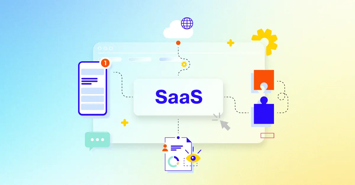
What is a SaaS Interface Tour Video?
A SaaS interface tour video is a guided walkthrough of a software application's user interface , designed to familiarize viewers with its features and functionality. These videos are typically short and concise, focusing on showcasing the key features and benefits of the software in a visually engaging way. They are often used as part of a marketing or sales strategy to attract potential customers and demonstrate the value proposition of the product.
SaaS interface tour videos can be used in a variety of ways, including:
generating leads : Use short, engaging videos on your landing pages and social media to capture the attention of potential customers and drive them to sign up for a free trial or demo.
promoting new features : Showcase the latest updates and enhancements to your product through videos, highlighting the value they bring to existing and potential users.
Explaining complex concepts : Simplify difficult-to-understand features or technical aspects of your product through animated explainer videos, making them accessible to a wider audience.
What do top SaaS Interface Tour Videos have in common?
mastering SaaS interface tour videos requires focusing on user needs and showcasing tangible value.
Ideal Customer Profile - Tailor messaging to resonate with specific user needs and pain points. Best practice: Use detailed buyer personas.
Compelling Narrative - Craft a clear, concise story arc that showcases value proposition. Best practice: Use a problem-solution-benefit structure.
Problem/Solution Focus - Emphasize how the SaaS directly addresses user challenges. Best practice: Prioritize user needs over features.
Key Feature Highlights - Showcase features that deliver the most significant benefits. Best practice: Focus on 3-5 key features.
Intuitive User Journey - Guide viewers through realistic workflows, highlighting ease of use. Best practice: Use on-screen annotations.
Engaging Screencasts - Use clear, concise recordings with smooth transitions. Best practice: Show, don't tell, with minimal narration.
Visual Storytelling - Use visuals to evoke emotion and build a connection with viewers. Best practice: Use authentic visuals and relatable characters.
Real-World Applications - Show the SaaS solving real problems for real users. Best practice: Use case studies and customer examples.
Quantifiable Results - Use data to demonstrate the SaaS's effectiveness. Best practice: Use charts and graphs to visualize data.
Social Proof - Include short, impactful testimonials from satisfied customers. Best practice: Focus on specific results and benefits.
What makes SaaS Interface Tour Video effective?
A well-designed SaaS interface tour video captivates audiences and drives conversions by clearly showcasing key features and benefits, emphasizing their value proposition for ideal customer profiles . The video should tailor its tone and style to resonate with specific ICP characteristics . A Compelling Narrative arc showcasing a clear problem, solution, and desired outcome is crucial. It must demonstrate a deep understanding of customer challenges and showcase how the SaaS directly addresses them with tangible results.
Purposeful animation, highlighting key features and guiding the viewers eye through the interface, is essential. Demonstrate intuitive usability through visually appealing micro-interactions, such as smooth transitions, subtle animations, and responsive feedback. Use data visualization strategically to illustrate ROI, efficiency gains, or other key metrics relevant to the ICPs priorities.
Integrate a clear, compelling call to action such as a free trial or demo signup seamlessly within the videos narrative, ideally at multiple points. A professional voiceover that matches the brands tone and style, creating an engaging and trustworthy experience, is vital. Incorporate clear visual cues and on-screen prompts that seamlessly guide users through the initial onboarding process , minimizing friction and maximizing user engagement.
Finally, brevity is key. Keep the video concise and focused, ideally under 2 minutes for optimal engagement. A shorter video maintains viewer attention and delivers a clear message effectively.
How long should your SaaS Interface Tour Video be?
Optimize SaaS interface tour video length for maximum impact by aligning video type, content, and target audience stage.
Pre-production Considerations for Determining Video Length:
What's the video's core message?
Who is the ideal viewer?
Which features need highlighting?
How intuitive is the interface?
Where will the video reside?
What's the video's objective?
What style best suits the brand?
SaaS interface tour video length guide
SaaS Interface Tour Types
Video Length
Use Case
Funnel
Animated Screen Recording
45-60 seconds
Showcases key features with engaging visuals and smooth transitions Ideal for complex interfaces
Awareness/Consideration
Live Action Demo
1-2 minutes
Presents a real person interacting with the software, building trust and relatability
Consideration/Conversion
Product Walkthrough
1-1.5 minutes
Guides viewers through the interface step-by-step, highlighting key functionalities
Consideration/Conversion
Explainer Video
30-45 seconds
Concisely explains the software's value proposition and benefits using a clear narrative, potentially with kinetic typography style
Awareness/Consideration
Tutorial Style
1.5-2 minutes
Provides step-by-step instructions on how to use specific features, using a screen recording overlay style
Conversion/Retention
How to create SaaS Interface Tour videos?
Crafting compelling SaaS interface tour videos requires a strategic approach that prioritizes clarity, engagement, and a deep understanding of your target audience. This ensures your video effectively communicates your product's value and drives conversions.
* Target Audience Definition - Deeply understanding your audience allows you to craft a message that resonates and addresses their specific needs.
Feature Selection - Focusing on key features that solve problems or improve efficiency maximizes impact and avoids overwhelming viewers.
Storyboard Creation - A well-structured storyboard ensures a logical flow, preventing confusion and maximizing viewer comprehension.
Scriptwriting - Concise, benefit-driven language keeps viewers engaged and clearly communicates the value proposition.
Style Selection - A consistent visual style reinforces brand identity and creates a professional, memorable experience.
Video Length Planning - Optimizing length for maximum impact ensures viewers stay engaged and retain key information.
Video Recording - High-quality recordings create a professional impression and ensure clarity, enhancing viewer trust.
Walkthrough Animation - Strategic animation highlights key features and simplifies complex processes, improving understanding.
On-screen Graphics - Effective use of graphics guides viewers' eyes, emphasizing important information and improving comprehension.
Narration Recording - A professional voiceover adds personality and guides viewers, enhancing engagement and memorability.
Video Editing - Smooth transitions and a well-paced edit maintain viewer interest and create a polished, professional final product.
CTA & Platform Optimization - A compelling call to action drives conversions, and platform optimization ensures maximum reach and visibility.
Using Data to Improve SaaS Video Effectiveness
Let's talk about data. We've covered the basics of creating compelling SaaS interface tour videos, but how do we know what truly works? Data-driven insights are key to optimizing our video strategy for maximum impact. Imagine launching a new SaaS interface explainer video. Are people watching it? Are they engaging with it? Data helps us answer these questions and refine our approach.
Data empowers us to move beyond guesswork and make informed decisions. For example, A/B testing different calls to action in our SaaS application demo video examples could reveal that "Start Your Free Trial" performs significantly better than "Learn More." Investing in high-quality SaaS demo videos pays off when we see a direct correlation between video views and conversions.
Track video completion rates. Are viewers dropping off early? This data pinpoints areas for improvement.
Analyze engagement metrics . Likes, shares, and comments reveal what content truly connects.
Leverage YouTube Analytics. Track audience retention and identify drop-off points in your videos.
Segment your audience. Create targeted videos for specific user groups and analyze their performance.
Remember the importance of video length we discussed earlier? Data can help determine the optimal length for your target audience. By analyzing metrics and gathering feedback, we can continuously improve our videos and drive better results. This iterative process is crucial for creating truly effective SaaS video tours.
Measuring the ROI of SaaS Demo Videos
We've covered the basics of creating compelling SaaS interface tour videos, but how do we know what truly resonates with our audience and drives results? Let's explore how to measure the ROI of our SaaS demo videos, ensuring our efforts translate into tangible business outcomes. We'll move beyond vanity metrics and delve into actionable strategies to assess the true impact of our videos.
Imagine launching a new feature and creating engaging SaaS demo video examples to showcase its functionality. How do we know if it's effective? By tracking click-through rates on the call to action within the video, we can measure how effectively the demo drives users to explore the new feature. This data-driven approach empowers us to make informed decisions and optimize our video strategy.
Another powerful example is developing a SaaS onboarding video series. By tracking completion rates for each video, we can pinpoint areas where users might be getting stuck, allowing us to refine the onboarding process and improve user experience. This not only enhances customer satisfaction but also contributes to higher retention rates.
Consider using SaaS platform demo video examples to showcase a complex integration. Analyzing metrics like watch time and social shares can reveal which content truly connects with viewers, helping us tailor future videos for maximum impact. This iterative process is crucial for creating truly effective SaaS video tours.
Track video completion rates . Low completion rates may indicate areas for improvement in content or pacing.
Analyze engagement metrics. Likes, shares, and comments reveal what content truly connects with viewers.
Leverage YouTube Analytics . Track audience retention and identify drop-off points in your videos.
Segment your audience. Create targeted videos for specific user groups and analyze their performance.
By consistently analyzing these metrics and gathering feedback, we can continuously improve our videos and drive better results. This iterative process is crucial for creating truly effective SaaS video tours that not only engage viewers but also contribute to our bottom line .
Integrating SaaS Videos into Marketing Funnels
Let's dive into how we can strategically weave SaaS interface tour videos into our marketing funnels to boost conversions. Remember, it's not just about creating great videos; it's about placing them where they'll make the biggest impact. Think of your marketing funnel as a journey, and your videos are the engaging tour guides.
We want to capture attention at the awareness stage with short, compelling explainers. Imagine a potential customer stumbling upon your SaaS platform overview video on social media. It's concise, visually appealing, and instantly communicates your value proposition. As they move into the consideration phase, we can showcase top SaaS demo videos highlighting key features and addressing their specific pain points. This is where SaaS product demo video examples become invaluable, demonstrating real-world applications and building trust.
Finally, at the conversion stage, we guide users through the interface with seamless product walkthroughs, prompting action with clear calls to action. For long-term engagement and customer retention, tutorial-style videos become essential, offering in-depth guidance on specific features and use cases.
landing pages : An engaging SaaS platform overview video can significantly increase conversion rates .
Email marketing: Personalized emails with embedded video links nurture leads and drive engagement.
Social media: Short, shareable video clips generate buzz and expand your reach.
Website integration: Strategic placement of SaaS product demo video examples showcases your product's capabilities and builds credibility.
By strategically integrating videos throughout the customer journey, we create a compelling and informative experience that drives conversions and fosters long-term customer loyalty.
Animation Styles for SaaS Interface Videos
Having explored the power of data, let's dive into the creative side: animation styles for your SaaS interface tour videos. Remember, the right style can transform a simple product demo into a captivating story. Think about your target audience and their preferred learning styles. Are they visual learners who would appreciate a vibrant 2D character animation in your SaaS software demo video examples? Or perhaps they prefer a clean, minimalist approach with subtle UI/UX animations showcasing your intuitive interface?
From whiteboard animation for simplifying complex concepts to 3D animation for showcasing realistic product features, the possibilities are vast. Consider using kinetic typography in your best saas interface videos to highlight key benefits or guide users through a seamless SaaS application walkthrough using screen recording with motion graphics. The key is to choose a style that aligns with your brand, message, and target audience.
Whiteboard animation breaks down complex processes into digestible visuals, perfect for explainer videos targeting a non-technical audience.
2D character animation injects personality and humor, making your demos more relatable and engaging.
Kinetic typography adds dynamism to key messages, ideal for short, attention-grabbing social media clips.
Screen recording with motion graphics provides a clear, concise way to showcase your interface and highlight key features.
By carefully considering these animation styles and aligning them with your overall video strategy, you can create compelling saas interface tours that not only inform but also captivate your audience, ultimately driving conversions and boosting your bottom line.
Creating Engaging SaaS Video Thumbnails
Creating compelling saas videos is only half the battle. What about those all-important thumbnails? They're the first impression, the gateway to your content. Let's explore how to make them truly captivating. Think about scrolling through a sea of videos – what makes you click? It's the thumbnail. A well-crafted thumbnail can significantly boost your video's performance.
Imagine clicking on a SaaS interface demo video example and seeing a cluttered, confusing thumbnail. You'd likely scroll past, right? That's why we need to grab attention instantly. Your SaaS product showcase video deserves a thumbnail that reflects its quality.
showcase your saas product's core functionality. A glimpse of a user-friendly interface in SaaS product tour video thumbnails can pique interest.
Use crisp, clear visuals. Blurry thumbnails deter clicks.
Maintain a cohesive visual identity across all platforms. Think about the best SaaS explainer video examples you've seen. What made their thumbnails stand out?
Concisely communicate value. "Boost Productivity" is more effective than "New Feature."
By following these tips, we can transform our thumbnails from overlooked afterthoughts into powerful click magnets. A compelling thumbnail for your SaaS product tour video can entice viewers to explore your platform, ultimately driving conversions and boosting your bottom line.
Author & Editor Bio
A video producer with a passion for creating compelling video narratives, Jai Ghosh brings a wealth of experience to his role. His background in Digital Journalism and over 11 years of freelance media consulting inform his approach to video production. For the past 7 years, he has been a vital part of the Advids team, honing his expertise in video content planning, creation, and strategy.
His collaborative approach ensures that he works closely with clients, from startups to enterprises, to understand their communication goals and deliver impactful video solutions. He thrives on transforming ideas into engaging videos, whether it's a product demo, an educational explainer, or a brand story.
An avid reader of modern marketing literature, he keeps his knowledge current. Among his favorite reads from 2024 are "Balls Out Marketing" by Peter Roesler, "Give to Grow" by Mo Bunnell and "For the Culture" by Marcus Collins. His results-driven approach ensures that video content resonates with audiences and helps businesses flourish.