
 /home/wwwroot/advids.co/design/index.php on line 425
Bridging the Physical-Digital Divide: A Strategic Visualization Framework
The architectural, engineering, and construction (AEC) industry stands at a pivotal threshold. We are moving beyond the era of static blueprints into a dynamic age where the "Digital Twin" is as vital as the physical foundation. For the "Constructive Visionary"—the architect, the BIM manager, the project lead—the challenge is no longer just about designing structures; it is about communicating complex spatial data with absolute clarity and persuasive impact.
As a comprehensive 3D Architectural Modeling Suite and SaaS Platform, our visual communication strategy must mirror the sophistication of the tools we provide. We are not merely selling software; we are offering a bridge between conceptual intent and built reality. The opportunity cost of staying static is immense. With the global 3D rendering software market projected to reach USD 28.76 billion by 2035, the demand for high-fidelity visualization is not a trend—it is the new operational standard.
However, adoption is often hindered by the "fear of complexity." Stakeholders worry that advanced modeling tools will introduce friction rather than efficiency. This guide is your strategic framework to dismantle that skepticism. By deploying targeted video styles that demonstrate operational velocity, we can shift the narrative. In fact, projects utilizing comprehensive visualization packages have been shown to average 47 days shorter approval timelines than those relying on standard documentation.
The following visual styles are curated to address specific cognitive needs across the buyer's journey, from the initial spark of awareness to the granular validation of technical features. Each style serves a distinct psychological function, designed to lower cognitive load and elevate brand trust.
1. Photorealistic 3D Renders
TOFU | Brand Awareness

The Visual & Narrative Approach
The video opens with a dramatic, low-angle worm's eye view of a twisting, helix-shaped skyscraper. The structure employs complex parametric design principles, yet the focus is on the aesthetic majesty. The scene is bathed in the crisp, golden light of an early morning sunrise, creating high-contrast reflections on the high-gloss curtain wall panels. As the camera tracks vertically up the towering facade against a clear azure sky, delicate clouds reflect in the glass, and birds appear as tiny silhouettes, emphasizing the immense scale. The rendering quality focuses heavily on ray-tracing and transparency to create a sense of tangible reality.
Psychological & Operational Impact
This style leverages "Visual Fidelity" to establish immediate authority. By presenting a hyper-realistic image, you trigger a "suspension of disbelief" in the viewer. Psychologically, high-quality rendering is often used as a proxy for the quality of the firm's engineering capabilities. It signals that your platform can handle complex geometry and lighting physics without compromise.
Strategic Implementation
- Best For: Website Hero sections, Instagram Reels, and introductory Brand Anthem videos.
- Duration: 5-10 seconds (Looping).
- Strategic Trade-off: While visually stunning, this style is resource-intensive to produce. It is less effective for explaining how the building works (functionality) and more effective for selling what the building is (vision).
Companies using similar video content -
Lumion Pro – Lumion – Creates stunning architectural visualizations rapidly.
Chaos Group – V-Ray – Delivers high-end photorealistic rendering for design.
3. Low-Poly 3D Modeling
TOFU | Market Education
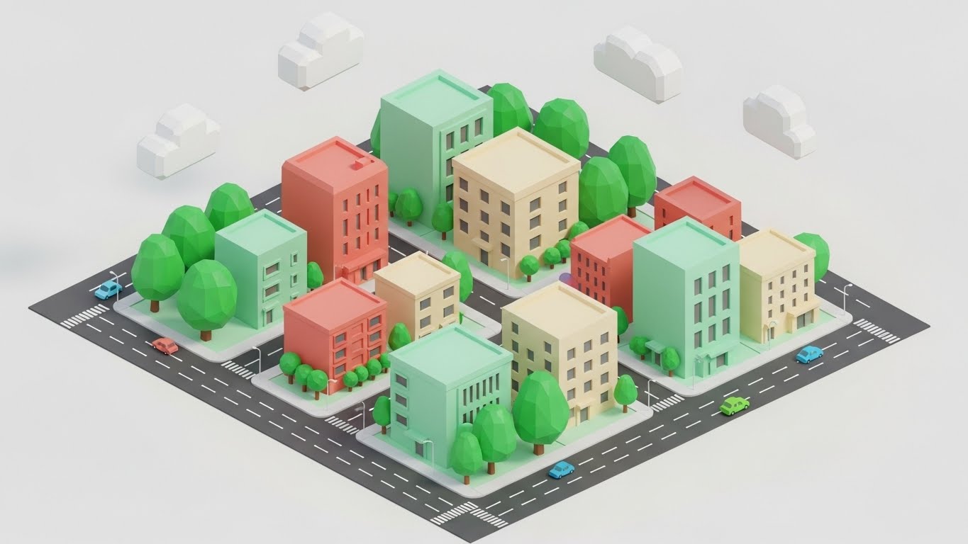
The Visual & Narrative Approach
A matte, low-poly 3D illustration of a dense city block appears in an isometric projection. The aesthetic strips away realistic textures, replacing them with a pleasing palette of pastel coral, mint green, and cream flat colors. The focus is on the massing model and zoning envelopes rather than architectural detail. The scene features distinct geometric facets, stylized miniature trees, and blocky tiny cars moving along the streets. Soft, shadowless global illumination gives the scene a friendly, approachable look, making the concept of "urban density" feel organized and manageable rather than chaotic.
Psychological & Operational Impact
This style reduces "Cognitive Load." By removing the noise of realistic textures (dirt, reflections, weathering), the viewer's brain can focus entirely on the spatial relationships and volumetric data. It is excellent for "Market Education," specifically when explaining complex zoning laws, massing studies, or urban planning concepts to municipal boards or non-technical clients who might be overwhelmed by a photorealistic city map.
Strategic Implementation
- Best For: YouTube educational tutorials, Blog post headers, and explainer videos about urban planning features.
- Duration: 30-60 seconds.
- Strategic Trade-off: This style feels "playful" and "approachable." It should be used carefully for high-stakes investor presentations where a more serious, gritty tone might be expected.
Companies using similar video content -
N/A – No specific style 2 provided in the input.
4. Futuristic Neon/Dark Mode
TOFU | Shaping Brand Perception

The Visual & Narrative Approach
The screen plunges into a "Dark Mode" aesthetic, featuring a wireframe building structure illuminated by glowing neon electric blue edges. Magenta data points float at key vertices, representing structural loads or sensor nodes. The background is a deep, infinite black with a digital grid floor that extends to the horizon. The camera performs a smooth orbital rotation around the central mesh topology, revealing the underlying polygon lines. Holographic UI elements and floating data particles surround the structure, conveying a sense of high-tech innovation and computational power.
Psychological & Operational Impact
This aesthetic appeals to the "Innovator" segment of your audience. It visually encodes the concepts of "Precision," "Data-Driven Design," and "Future-Readiness." The dark background with neon accents mimics the interface of advanced coding or engineering software, subtly positioning your SaaS platform as a tool for serious, cutting-edge computational design. It shifts the perception from "drawing tool" to "computational engine."
Strategic Implementation
- Best For: Feature announcement trailers, SaaS landing pages, and background visuals for tech conferences.
- Duration: 15-30 seconds.
- Strategic Trade-off: Highly effective for tech-savvy architects (BIM Managers), but can feel "cold" or "alienating" to residential clients looking for warmth and comfort.
Companies using similar video content -
Esri – ArcGIS Urban – Visualizes urban planning and zoning scenarios.
SketchUp – SketchUp – Simplifies 3D modeling for massing studies.
5. Hyper-lapse Stock Footage with Data
TOFU | YouTube
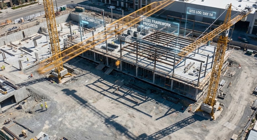
The Visual & Narrative Approach
A hyper-lapse video captures the frenetic energy of a busy construction site during the day. The camera is locked in a static wide shot, allowing the viewer to watch cranes swing rapidly and shadows sweep across the concrete ground. The color palette is dominated by natural concrete greys and safety yellows. Overlaid on this footage are 3D abstract digital progress percentages and "construction documentation" tags that float in 3D space, tracking the erection of the steel framework in real-time.
Psychological & Operational Impact
This style bridges the "Physical/Digital Divide" directly. By superimposing digital data onto physical footage, you visually demonstrate the value of your platform: "Control." It reassures stakeholders that the digital plan is actively governing the physical chaos. The hyper-lapse format emphasizes "Speed" and "Progress," which are key psychological triggers for developers anxious about timelines.
Strategic Implementation
- Best For: Case study videos, "About Us" operational overviews, and YouTube content targeting construction managers.
- Duration: 30-45 seconds.
- Strategic Trade-off: Requires high-quality site footage. If the base footage is shaky or poor quality, the 3D overlays will fail to track correctly, breaking the illusion of precision.
Companies using similar video content -
Bentley Systems – iTwin – Visualizes infrastructure digital twin data.
Siemens – Simcenter 3D Software – Performs advanced CAE simulations and analysis.
6. Abstract 2D flat vector organic modern
TOFU | LinkedIn Organic
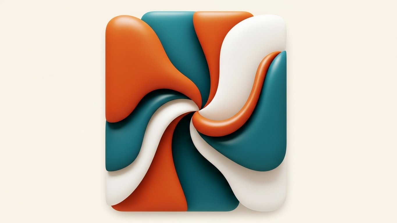
The Visual & Narrative Approach
Departing from rigid architectural lines, this style uses an abstract 2D flat vector illustration. Organic blobs and smooth curves in a sophisticated palette of burnt orange, deep teal, and off-white interact in a centered flat lay composition. The shapes possess glossy textures and fluidly intersect and merge, forming a unified, abstract representation.
Psychological & Operational Impact
This is a "Metaphorical" style. It is not about the building; it is about the team. The fluid merging of shapes represents "Collaboration," "Integration," and the "Soft Skills" of project management. On professional networks like LinkedIn, this artistic, clean style stands out against the noise of technical CAD screenshots. It appeals to the desire for harmony and smooth workflow in a typically fragmented industry.
Strategic Implementation
- Best For: LinkedIn thought leadership posts, articles about team culture, and "Integration" feature announcements.
- Duration: 10-15 seconds (Loop).
- Strategic Trade-off: Abstract nature means it cannot demonstrate specific product features. It builds "Brand Affinity" rather than "Product Understanding."
Companies using similar video content -
Procore – Procore Platform – Tracks construction progress with real-time data.
Cupix – CupixWorks – Transforms 360 video into 4D site models.
8. Rapid UI Feature Montage
TOFU | Non-Skippable Ads
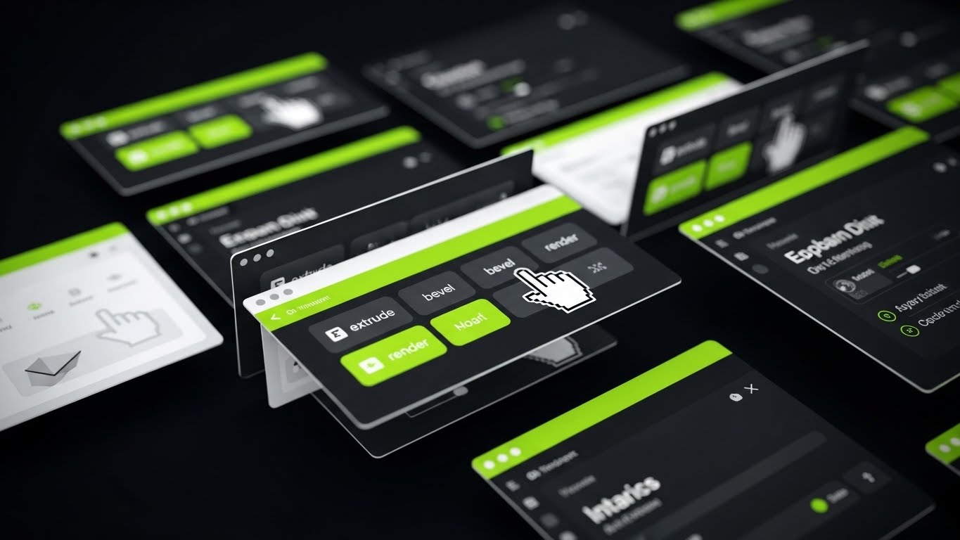
The Visual & Narrative Approach
A high-energy, rapid montage of the software's UI screens. The palette is high-contrast: vivid lime green accents against a charcoal and bright white interface. The design is flat with sharp, vector edges. The camera aggressively zooms in and out of specific screen elements, tracking a mouse cursor as it rapidly clicks on icons for 'extrude,' 'bevel,' and 'render.' Windows expand, menus collapse, and tools activate rhythmically to a beat.
Psychological & Operational Impact
This style targets the "Efficiency" pain point. Architects are often paid by the project, not the hour; speed equals profit. By showing the interface responding instantly to commands, you psychologically validate the platform's performance. The "Rapid Fire" editing retains attention in low-patience environments (like pre-roll ads) and conveys a sense of power and mastery.
Strategic Implementation
- Best For: 6-second or 15-second social media ads (Instagram Stories, YouTube Bumpers).
- Duration: 6-15 seconds.
- Strategic Trade-off: The pace is too fast for actual learning. It creates an impression of ease of use, but doesn't teach the user how to use the tool.
Companies using similar video content -
Catenda – Catenda Hub – Facilitates collaborative BIM model management.
ClickUp – ClickUp – Streamlines project management and team collaboration.
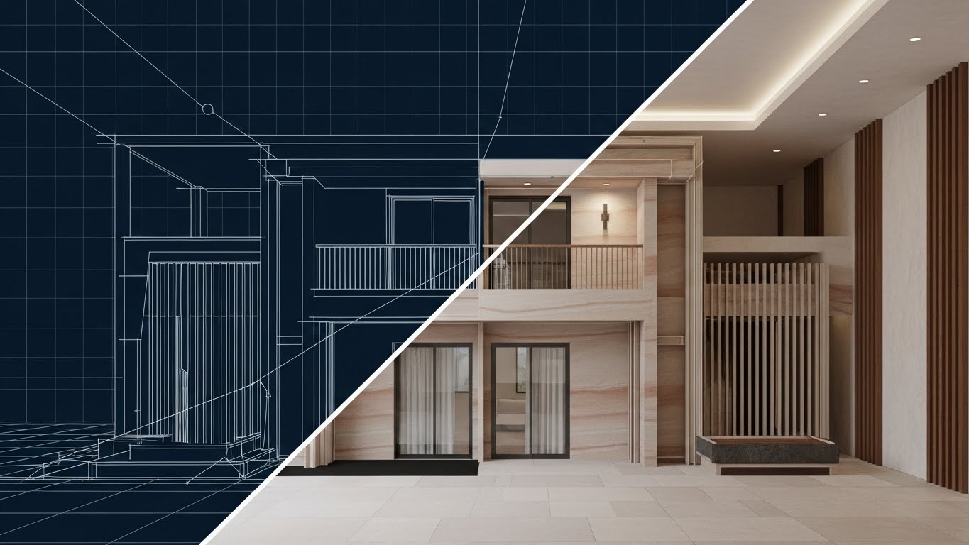
9. Wireframe to Reality Transition
MOFU | Product Differentiation
The Visual & Narrative Approach
A perfectly symmetrical split-screen composition displays the exact same architectural structure in two states. The left side reveals the technical skeleton: a white line wireframe on a blueprint blue background. The right side displays the "Promise": a 4K photorealistic render with realistic sandstone textures and warm lighting. A vertical divider line slides slowly from left to right, "revealing" the render and covering the wireframe.
Psychological & Operational Impact
This is the ultimate "Proof of Concept." It satisfies the "Skeptic" in your audience who worries that pretty renders might hide bad engineering. By showing the wireframe and the render in perfect registration (alignment), you prove that the visual beauty is backed by rigorous technical geometry. It validates the software's ability to translate data into art without loss of fidelity.
Strategic Implementation
- Best For: Website "Features" pages, Product comparison decks, and Email newsletters.
- Duration: 10-20 seconds (Interactive slider on web).
- Strategic Trade-off: Requires a model that looks good in both states. A messy wireframe will ruin the effect, so the underlying topology must be clean.
Companies using similar video content -
N/A – No specific style 7 provided in the input.
10. 3D Parallax UI Presentation
MOFU | Feature Education
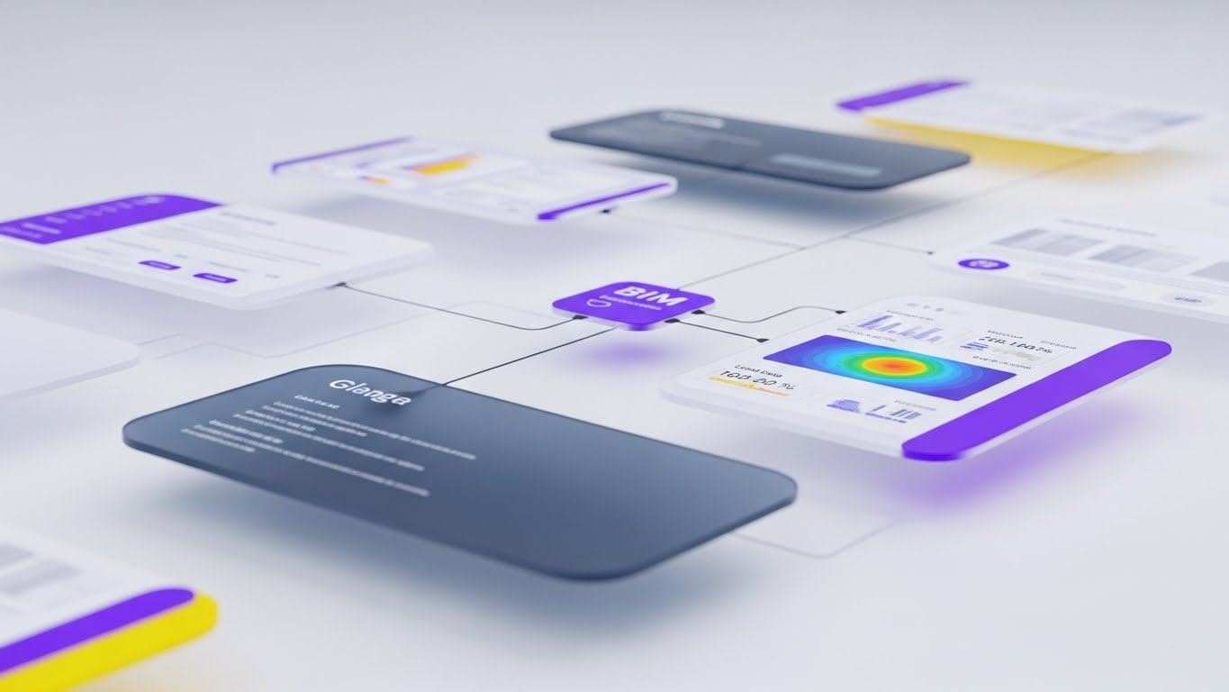
The Visual & Narrative Approach
A 3D parallax presentation arranges floating UI interface screens in deep space. The palette is soft and clinical: lavender, slate blue, and clean white. The camera is positioned at an angled side view, using a shallow depth of field to blur the background screens while keeping the foreground sharp. Delicate data lines connect the UI panels to a central node, displaying complex BIM data visualizations like thermal mapping and structural load analysis. The lighting is soft and diffuse.
Psychological & Operational Impact
This style manages "Cognitive Load" for complex features. By exploding the UI into 3D space, you allow the viewer to focus on one "layer" of information at a time (e.g., thermal data) without being distracted by the rest of the interface. The "Ethereal" look suggests that the software handles heavy data processing effortlessly, making complex BIM tasks feel light and manageable.
Strategic Implementation
- Best For: Product deep-dive pages, Webinar backdrops, and advanced tutorial intros.
- Duration: 30-60 seconds.
- Strategic Trade-off: This is an stylized abstraction of the UI. It is excellent for explaining concepts (like data interconnectedness) but should be followed by actual screen recordings to show the literal workflow.
Companies using similar video content -
Graphisoft – ArchiCAD – Showcases intuitive BIM design workflows.
Bricsys – BricsCAD BIM – Demonstrates efficient CAD to BIM transition.
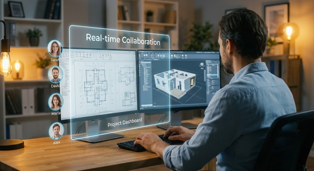
11. Lifestyle Stock with UI Overlay
MOFU | Building Trust & Credibility
The Visual & Narrative Approach
This style grounds the software in the human reality of the architectural profession. We see a high-quality, over-the-shoulder shot of a professional architect working at a dual-monitor setup in a warm, tungsten-lit home office. The depth of field is shallow, blurring the domestic background to focus on the work. Floating in the air between the viewer and the screens is a sleek, semi-transparent UI overlay explicitly labeled "Real-time Collaboration." To the left of the overlay, a vertical stack of user avatars (Sarah, David, Maria) indicates active team presence. The architect is typing, actively engaging with the "Project Dashboard" visible through the holographic layer.
Psychological & Operational Impact
This approach leverages "Social Proof" and "Relatability." In an era of remote work and decentralized design teams, the "human element" is often lost in cold, digital screenshots. By showing a real person using the tool in a comfortable environment, you subconsciously signal that the software enables flexible, modern work-life balance. The avatars visually reinforce that design is a communal act, reassuring firm principals that your platform facilitates connection rather than isolation.
Strategic Implementation
- Best For: Case study videos, "Day in the Life" user testimonials, and Careers pages.
- Duration: 15-30 seconds.
- Strategic Trade-off: The use of stock footage can feel generic if not customized with high-quality UI motion tracking. The key is ensuring the UI looks "anchored" in the physical space, not just pasted on top.
Companies using similar video content -
Autodesk – Revit – Validates precise BIM model geometry.
Vectorworks – Vectorworks Architect – Transforms designs from wireframe to render.
12. Split Screen: Optimized Reality and UI
MOFU | Competitive Displacement
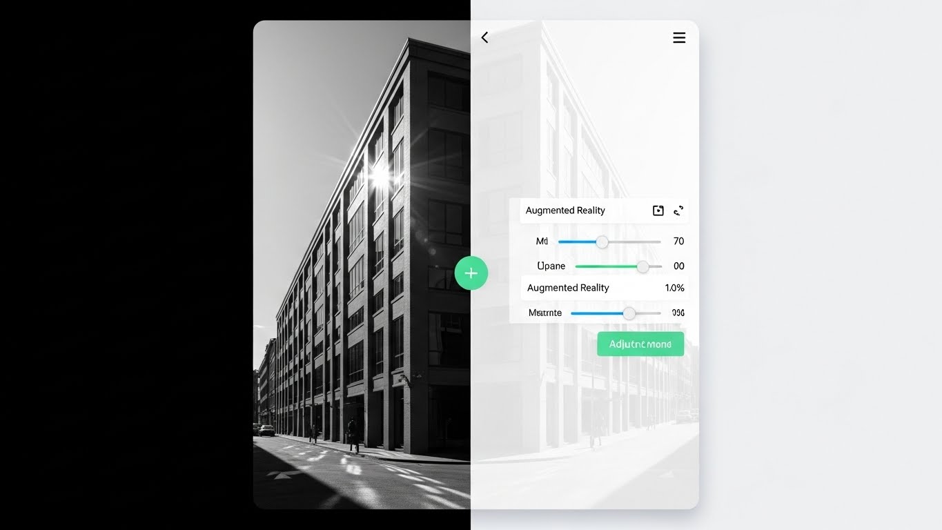
The Visual & Narrative Approach
A vertical split-screen creates a stark, compelling contrast. The left side displays a gritty, greyscale photograph of an existing physical building facade, representing the "As-Built" reality. The right side mirrors this perspective exactly but renders it as a pristine, white interface overlay. A green "+" button sits on the divider, suggesting interactivity. The UI on the right features precise sliders for "Augmented Reality" opacity and "Measurement" tools. As the video plays, the sliders move, and the digital overlay on the right updates instantly to reflect proposed renovations, while the physical reality on the left remains the anchor.
Psychological & Operational Impact
This style targets the "Retrofit & Renovation" market segment. It visually validates the concept of "Accuracy." By locking the perspective, you demonstrate that your digital model is not a fantasy—it is a calibrated overlay on the real world. This is crucial for displacing competitors who may offer pretty renders but lack the precision required for AR implementation or site verification. It tells the viewer: "Our software respects the reality of the site."
Strategic Implementation
- Best For: Product comparison pages, "Renovation" feature highlights, and AR mobile app promo videos.
- Duration: 10-20 seconds.
- Strategic Trade-off: Requires perfect alignment (match-moving) between the footage and the UI. If the perspective drifts, the illusion of accuracy is broken.
Companies using similar video content -
Autodesk – Tandem for AEC – Organizes complex digital twin data.
Plannerly – Plannerly – Visualizes BIM execution planning and data.
13. Bold Kinetic Typography (Visual)
MOFU | Driving Demo Requests
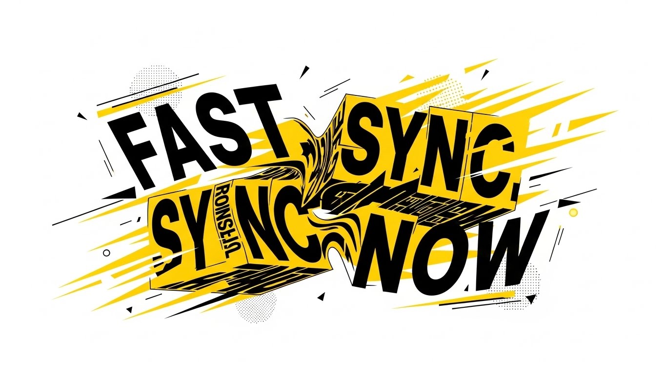
The Visual & Narrative Approach
This style abandons architectural realism for pure, raw energy. Using a high-contrast palette of safety yellow, black, and white, the screen explodes with kinetic typography. Massive, heavy-weight fonts spell out "FAST," "SYNC," and "NOW." The text blocks don't just sit; they morph, collide, and shatter into abstract building shards that reform into the words. Speed lines and geometric debris convey forward momentum. The motion is aggressive and rhythmic, synchronized to a fast-paced audio track, symbolizing low-latency cloud performance.
Psychological & Operational Impact
This addresses the "Need for Speed." Architects hate loading bars and rendering lag. This style is a visceral promise of performance. It doesn't explain how the sync works; it makes you feel the speed. It creates a sense of urgency (FOMO) and positions the platform as a high-performance engine for modern firms that cannot afford to wait. It effectively disrupts the scroll on social media platforms where attention spans are measured in milliseconds.
Strategic Implementation
- Best For: LinkedIn Video Ads, Instagram Stories, and Retargeting campaigns.
- Duration: 6-12 seconds (Looping).
- Strategic Trade-off: It is purely emotional/impressionistic. It conveys "speed" but explains nothing about the software's actual features. It is a hook, not a lesson.
Companies using similar video content -
Autodesk – Construction Cloud – Visualizes real-time collaboration in action.
CoConstruct – CoConstruct – Integrates client communication and project management.
14. Isometric 3D Workflow
MOFU | ABM Awareness

The Visual & Narrative Approach
We observe a cutaway isometric view of a stylized architectural studio. The color palette is warm and earthy—ochre, olive, and sage—evoking a sense of calm productivity. Inside, miniature animated figures (architects) sit at desks with computers. In the center of the room, a large table holds a white, low-poly massing model of a terrain. The figures move between their desks and the central model, symbolizing the flow of data from individual workstations to the central project file. The lighting is soft and ambient, creating a "dollhouse" effect that makes the complex firm management process look organized and delightful.
Psychological & Operational Impact
This style reduces the anxiety of "Change Management." Implementing new software across a firm is daunting. This visual metaphor makes the process look manageable, orderly, and even charming. It appeals to BIM Managers and Firm Principals who are responsible for team cohesion. It visually argues that the software is not a disruption, but a "Central Hub" that brings the studio together around a shared vision.
Strategic Implementation
- Best For: Email marketing headers, "Team Collaboration" feature pages, and Account-Based Marketing (ABM) campaigns targeting large firms.
- Duration: 20-40 seconds.
- Strategic Trade-off: The stylized look is not "technical." It sells the concept of workflow management, not the specific UI tools used to achieve it.
Companies using similar video content -
GAMMA AR – GAMMA AR – Overlays BIM models onto physical construction sites.
Desapex – AR/VR Solutions – Bridges physical site with digital design.
15. Generative AI Realistic Character video
MOFU | LinkedIn Video Ads

The Visual & Narrative Approach
A medium shot introduces a confident, professional female architect. She wears a sharp navy blazer and maintains direct eye contact with the camera. The background is a blurred, high-end design studio filled with 3D printed models and rolled blueprints, establishing instant context. The lighting is cinematic studio quality—soft key light with a subtle rim light. She speaks directly to the viewer, articulating a specific pain point (e.g., "Stop losing hours to rendering wait times") and offering the SaaS platform as the expert solution.
Psychological & Operational Impact
This leverages "Authority Bias." People buy from people they trust/respect. By presenting a persona that mirrors the viewer's aspiration (a successful, composed industry leader), you create a subconscious connection. This style humanizes the brand voice, moving it from a faceless tech company to a "Consultative Partner." It is particularly effective on LinkedIn, where professional peer-to-peer advice is the primary currency.
Strategic Implementation
- Best For: LinkedIn thought leadership ads, "Founder's Message" videos, and Webinar invitations.
- Duration: 30-60 seconds.
- Strategic Trade-off: The script is critical. If the dialogue sounds too "salesy" or robotic, the trust is broken immediately. It must feel like genuine advice from a peer.
Companies using similar video content -
Procore – Procore Helix – Highlights AI-powered insights and automation speed.
TwinMaster – TwinMaster – Visualizes rapid AI-driven design acceleration.
16. Dynamic Data Visualization
BOFU | The Economic Buyer
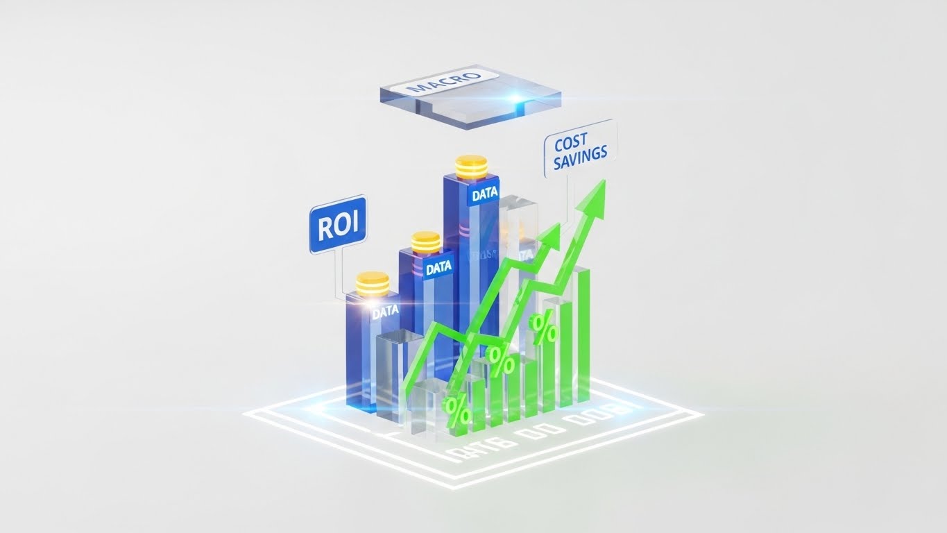
The Visual & Narrative Approach
This style speaks the language of the CFO. Floating in a clean, white void, translucent glass bars rise from a glowing digital floor plan. The bars are colored in "Data Blue" and "Profit Green." Floating labels clearly mark "ROI," "DATA," and "COST SAVINGS." Arrows surge upwards, indicating growth. A "MACRO" processor chip hovers above, symbolizing the computational intelligence driving these savings. The aesthetic is pristine, expensive, and analytical, utilizing 3D depth to make the abstract numbers feel substantial and tangible.
Psychological & Operational Impact
This targets the "Economic Buyer"—the partner or finance lead who signs the check. They care less about "pretty renders" and more about "profitability." This visualization translates intangible benefits (better design) into concrete metrics (growth, savings). By giving data a physical weight and high-end gloss, you visually equate your software with "Asset Value" rather than "Expense."
Strategic Implementation
- Best For: Investor pitch decks, Pricing pages, and "Enterprise" solution overviews.
- Duration: 10-15 seconds.
- Strategic Trade-off: It is dry and analytical. It will bore a creative designer but will delight the person responsible for the budget.
Companies using similar video content -
Autodesk – Construction Cloud – Orchestrates team dynamics and data flow.
Wrike – Wrike – Manages complex project workflows across teams.
17. Clean UI Workflow (Light Mode)
BOFU | The Functional Buyer
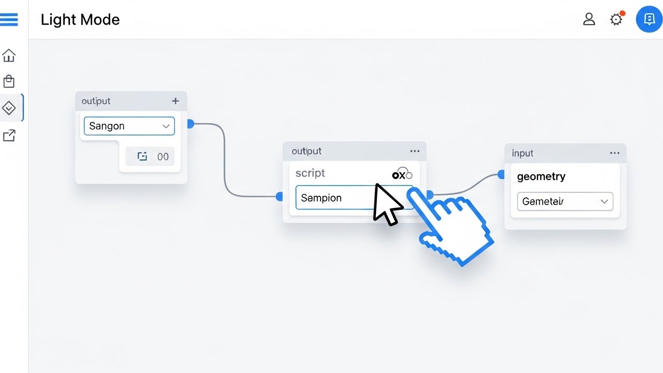
The Visual & Narrative Approach
A direct, top-down view of the software's "Canvas" interface in a crisp Light Mode. The background is clinical white. The focus is on a "Visual Scripting" workflow. We see a large, stylized cursor hand click and drag a connection wire from a "Script" node to a "Geometry" node. The nodes have clean, rounded corners and clear typography. The movement is smooth and deliberate, showing how easily complex parametric logic can be connected without writing code.
Psychological & Operational Impact
This appeals to the "Functional Buyer"—the daily user who fears a steep learning curve. "Visual Scripting" (like Grasshopper or Dynamo) can look intimidating. This style strips away the clutter, focusing on the logic of the connection. It visually promises "Ease of Use" and "Low-Code Power." It reassures the user that they can harness complex computational design without needing to be a computer scientist.
Strategic Implementation
- Best For: Feature documentation, "How-to" clips, and website "Product" sections.
- Duration: 30-60 seconds.
- Strategic Trade-off: It shows the "how" perfectly but lacks the "wow" of a final render. It creates confidence in usability.
Companies using similar video content -
Autodesk – Autodesk – Presents expert insights on industry challenges.
Bentley Systems – Bentley Systems – Builds authority as a consultative partner.
18. 3D X-Ray Visualization
BOFU | The Technical Buyer
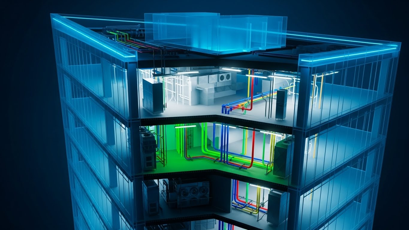
The Visual & Narrative Approach
The camera rotates around a multi-story office building rendered in a semi-transparent "Phantom Blue" material. As we peer inside, the internal skeleton is revealed. Brightly colored pipes—green for plumbing, blue for cooling, red for fire suppression, and yellow for gas—weave through the structure. This "X-Ray" view highlights the Mechanical, Electrical, and Plumbing (MEP) systems. The clarity is absolute; there are no walls to hide clashes. The visualization demonstrates the software's ability to handle complex internal systems and collision detection.
Psychological & Operational Impact
This style targets the "Technical Buyer" (Structural Engineers and MEP Consultants). Their nightmare is "Clashes"—pipes hitting beams during construction. This visual style validates "Risk Mitigation." It proves that your platform offers deep visibility into the building's guts, preventing expensive on-site errors. It signals "Engineering Precision" and "Holistic BIM Integration."
Strategic Implementation
- Best For: Technical whitepapers, Engineering-focused landing pages, and "Clash Detection" feature spots.
- Duration: 15-25 seconds.
- Strategic Trade-off: It is highly technical. A residential client looking for a beautiful home will find this "industrial" and unappealing, but an engineer will find it beautiful.
Companies using similar video content -
IBM – Maximo Application Suite – Justifies investment with clear ROI metrics.
SmartViz Ltd. – SmartViz – Visualizes building performance and financial impact.
19. Isometric 2D Motion Design
BOFU | ROI Justification Hook
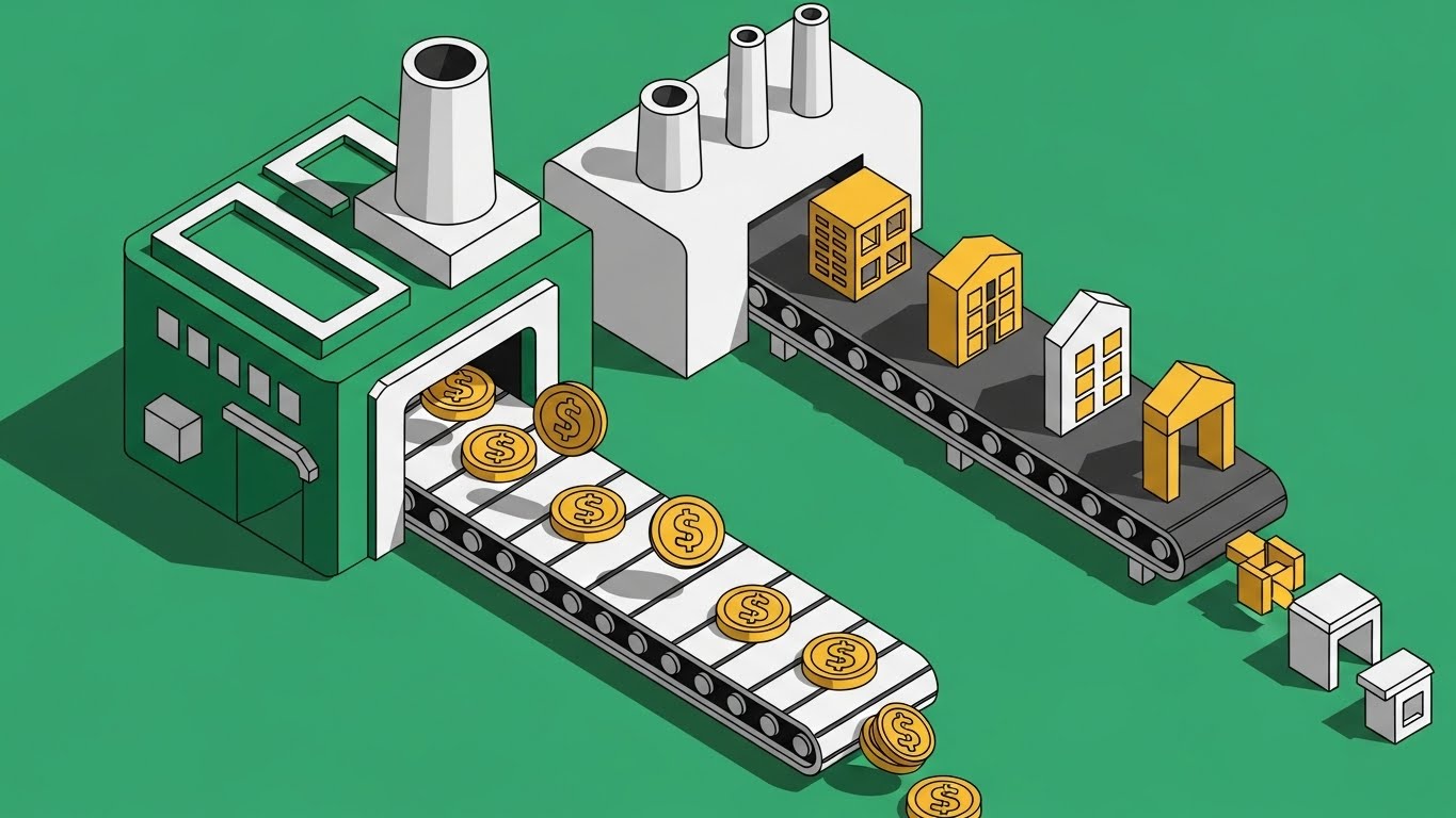
The Visual & Narrative Approach
A playful, isometric 2D vector animation depicts the architectural process as a literal factory. On the left, gold coins (investment) flow into a green machine on a conveyor belt. The machine processes them and outputs finished, yellow and white houses on the right. The style uses hard shadows and a limited "money-focused" palette of emerald green and gold. The loop is rhythmic and satisfying, turning the complex service of architecture into a scalable product line.
Psychological & Operational Impact
This style abstracts the architectural process into a "Business Model." It appeals to firm owners looking to scale. It visualizes the concept of "Design for Manufacture and Assembly" (DfMA) or simply the "Productization" of architectural services. It subconsciously reinforces the idea that the software turns the chaotic creative process into a predictable, money-making machine. It is a pure "ROI" visualization, associating the software with profit generation.
Strategic Implementation
- Best For: Remarketing display ads, Google Ads, and Pricing page "Enterprise" tier graphics.
- Duration: 5-10 seconds (Loop).
- Strategic Trade-off: It is highly abstract. It tells you nothing about how the software works, only why you should buy it (to make money). It creates desire but not understanding.
Companies using similar video content -
Autodesk – Dynamo for Revit – Simplifies complex parametric design logic.
FreeCAD – FreeCAD – Demonstrates intuitive 3D parametric modeling.
20. Dark Mode UI Showcase
BOFU | Risk Mitigation Hook
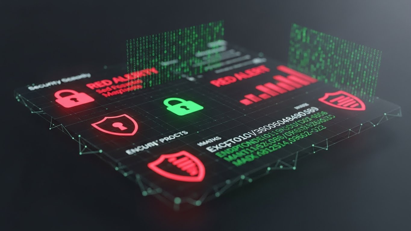
The Visual & Narrative Approach
The aesthetic shifts to a serious, "Dark Mode" environment, illuminated by the glow of security indicators. We see an angled close-up of a security dashboard. Vibrant red shields with "RED ALERT" warnings contrast with steady green lock icons. Matrix-style numbers and encryption codes scroll in the background. The text "ENCRYPTED" and "SECURITY PROTOCOLS" is prominent. The gloss and depth of the UI elements give them a weight that feels impenetrable.
Psychological & Operational Impact
This addresses the "Fear of Data Loss" and "IP Theft," which are major concerns for enterprise firms working on sensitive government or high-profile commercial projects. The dark, "Cyber-Security" aesthetic borrows visual language from military or fintech interfaces. It subconsciously reassures the IT Director or CTO that your cloud platform is a fortress, not a vulnerability. It shifts the conversation from "Creative Tool" to "Secure Enterprise Asset."
Strategic Implementation
- Best For: "Security & Compliance" pages, IT procurement decks, and BOFU objection handling.
- Duration: 10-15 seconds.
- Strategic Trade-off: This is purely functional. It has zero appeal to the designer who wants creative freedom, but it is the "key" that unlocks the door to enterprise adoption by satisfying IT gatekeepers.
Companies using similar video content -
Autodesk – Navisworks Manage – Reveals hidden MEP systems and clashes.
Solibri – Solibri Model Checker – Ensures model quality and clash detection.
21. Holographic UI over 3D Render
BOFU | Sales Cycle Acceleration
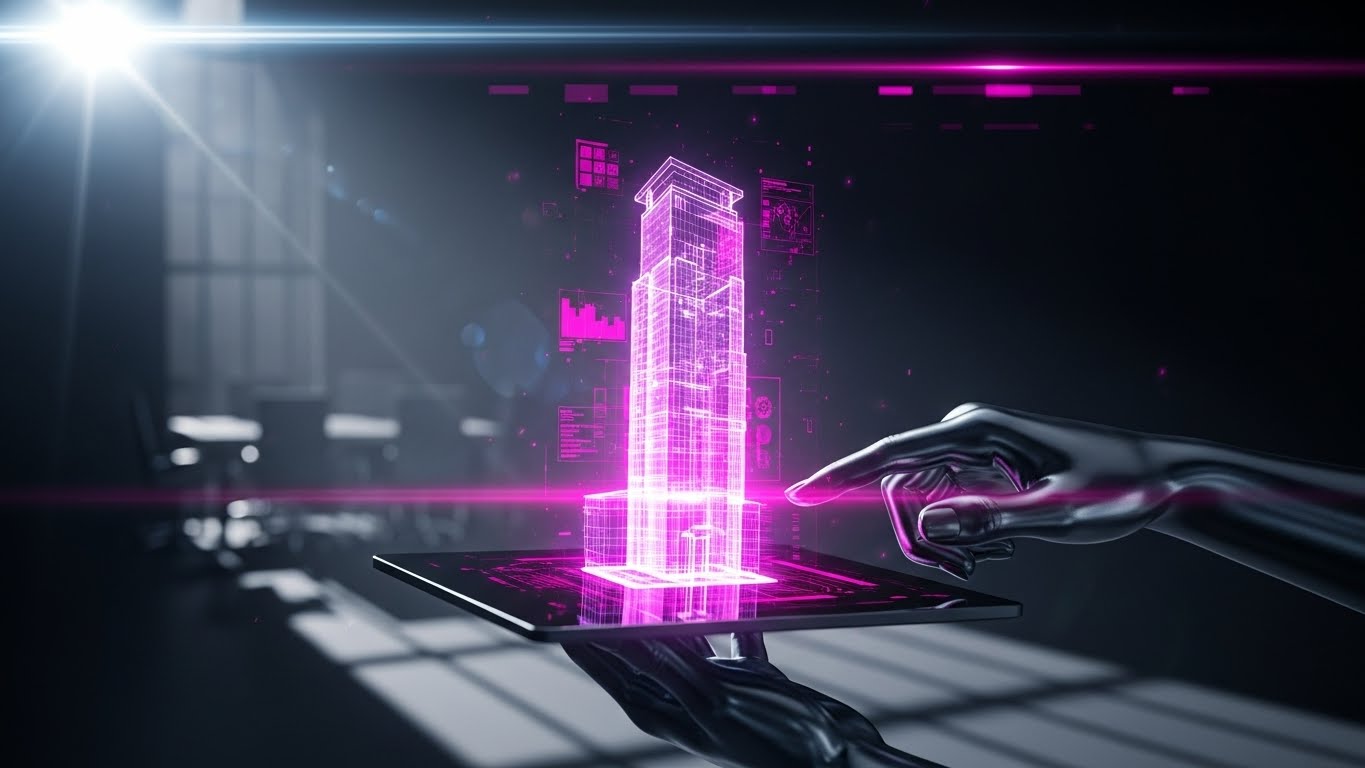
The Visual & Narrative Approach
This style embraces a high-tech, "Sci-Fi" aesthetic to demonstrate portability. We see a close-up, cinematic shot of a hand holding a high-end tablet device in a bright, sunlit boardroom. Projecting upwards from the screen is a volumetric, semi-transparent hologram of a building's "Digital Twin," rendered in laser red and electric blue structural lines. The hologram rotates smoothly, displaying a slight interference grain to emphasize its digital nature. The brightness of the hologram cuts through the ambient sunlight, symbolizing the software’s power to present complex models anywhere, anytime.
Psychological & Operational Impact
This visual targets the "Sales Velocity" pain point. Firm principals often struggle to communicate 3D spatial concepts to clients using 2D drawings or static renders on a laptop. This holographic visualization triggers a sense of "Future-Readiness." It suggests that by using your platform, the architect becomes a visionary consultant, able to conjure the building into the room instantly. It validates the software as a powerful sales enablement tool that impresses clients and speeds up decision-making.
Strategic Implementation
- Best For: Sales enablement emails, Mobile App feature highlights, and Investor Pitch Decks.
- Duration: 10-15 seconds (Looping).
- Strategic Trade-off: The holographic effect is stylized. It prioritizes the feeling of innovation over the literal representation of the screen (which would be flat). It sells the "wow" factor of the presentation mode.
Companies using similar video content -
CrewCost – CrewCost – Visualizes scalable construction accounting and profit.
Cohesion – Cohesion Platform – Depicts smart real estate asset monetization.
22. 2D Graphics Over Live Action
BOFU | Objection Handling

The Visual & Narrative Approach
A composite visual blending high-quality photography with crisp vector graphics. We see a diverse group of professionals in a conference room, engaged in a lively discussion. Floating above their heads are primary-colored vector speech bubbles (Blue, Yellow, Red) containing icons like lightbulbs and gears. As they nod in agreement, large green "Checkmark" vectors and "Approved" stamps animate into the air with a satisfying pop. Charts on the wall dynamically update with upward-trending arrows.
Psychological & Operational Impact
This style addresses "Stakeholder Alignment." In B2B architecture, the biggest bottleneck is often obtaining consensus from multiple parties (developers, engineers, city planners). This visual metaphorically represents the "Soft ROI" of your software: Frictionless Communication. It moves the focus from the building to the decision. It reassures the buyer that your platform facilitates the human connections and shared understandings required to get a project greenlit.
Strategic Implementation
- Best For: Retargeting ads for users who abandoned cart, "Collaboration" feature pages, and Case Study summaries.
- Duration: 15-20 seconds.
- Strategic Trade-off: The live-action photography must look premium and diverse. If the stock photo looks staged or "cheesy," the overlay graphics will feel amateurish.
Companies using similar video content -
Microsoft – Azure Digital Twins – Highlights secure cloud enterprise solutions.
IBM – Maximo Application Suite – Showcases robust data security protocols.
23. Abstract 2D Motion Graphics
Onboarding | Reducing Implementation Friction

The Visual & Narrative Approach
A soothing, fluid animation designed to lower anxiety. Soft, liquid shapes in pastel pink, slate blue, and warm yellow flow across a pristine white background. They morph and merge effortlessly, eventually funneling into the shape of a keyhole or an open door. The camera movement is gentle and floating. The motion is perfectly eased, with no sharp cuts or jarring transitions. The visual metaphor suggests that integrating this new software into an existing workflow is not a "hard stop" but a fluid evolution.
Psychological & Operational Impact
Onboarding is the highest friction point in the SaaS lifecycle. New users are often overwhelmed by the "Learning Curve." This style utilizes "Cognitive Ease." The abstract, flowing imagery subconsciously signals that the setup process is smooth, adaptable, and stress-free. It counters the expectation of clunky installation wizards and complex configuration menus, positioning the onboarding experience as a welcoming "Flow State."
Strategic Implementation
- Best For: "Welcome" emails, Password Reset screens, and the initial loading screen of the application.
- Duration: 5-10 seconds (Loop).
- Strategic Trade-off: This is purely mood-setting. It does not teach the user how to set up the software, but it puts them in the right emotional state to learn.
Companies using similar video content -
Bentley Systems – iTwin – Visualizes digital twins with instant portability.
Twinzo – Twinzo – Projects volumetric building models for presentations.
24. 2D Animation & UI Composition
Onboarding | Self-Serve Onboarding

The Visual & Narrative Approach
A friendly, flat 2D vector animation features a stylized character (a user) sitting at a desktop. The palette is energetic teal and orange. Floating question marks appear around the user's head, representing confusion. Suddenly, a glowing cursor appears, clicks a "Help" icon on a floating UI window, and the question marks transform into bright lightbulbs. The character smiles and points to the screen. The style employs clean lines and solid color fields, making the information hierarchy instantly readable.
Psychological & Operational Impact
This style promotes "Self-Efficacy." Architects are problem solvers who prefer to find their own answers rather than waiting for support tickets. This visual validates the "Self-Serve" model. It promises that the answers are intuitive and accessible directly within the UI. It reduces the "Fear of Getting Stuck" that often causes new users to abandon a trial.
Strategic Implementation
- Best For: In-app "Tour" introductions, Knowledge Base headers, and "Help Center" promo clips.
- Duration: 15-30 seconds.
- Strategic Trade-off: The character design must align with your brand persona. If it's too "cartoony," it may feel childish to serious professionals; it needs a "Corporate Memphis" or refined vector polish.
Companies using similar video content -
Procore – Procore Platform – Streamlines stakeholder consensus in meetings.
Aconex – Aconex – Facilitates communication and document approval.
25. Macro UI Micro-Interactions
Onboarding | Trial/Freemium User Activation
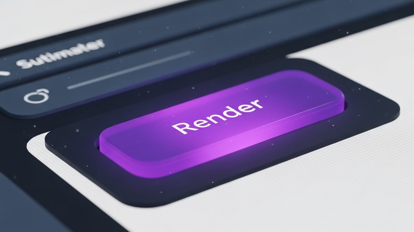
The Visual & Narrative Approach
An extreme macro, close-up simulation of a single UI interaction. The camera focuses tightly on a "Render" button, rendered in vivid, gummy purple against a textured matte white background. We see the sub-pixel texture of the screen and floating dust motes, grounding it in reality. A cursor enters and clicks the button. The button depresses with a satisfying, weighty physics animation, glows intensely, and a ripple effect expands outward. The movement is synchronized with a crisp, high-fidelity audio click.
Psychological & Operational Impact
This leverages the "Dopamine Loop." By hyper-focusing on the tactile satisfaction of a single click, you visually communicate "Responsiveness" and "Quality." It creates a sensory craving to interact with the software. For a freemium user, the barrier to entry is often inertia; this style makes the act of starting a render look so satisfying that the user wants to experience it themselves.
Strategic Implementation
- Best For: In-app empty states (e.g., "Start your first render"), Feature update notifications, and Instagram Stories.
- Duration: 3-5 seconds.
- Strategic Trade-off: It is hyper-specific. It works brilliantly for "Call to Action" moments but cannot explain complex workflows.
Companies using similar video content -
Autodesk – Autodesk Platform – Symbolizes frictionless software integration.
Graphisoft – Graphisoft Learn – Represents smooth onboarding and learning.
26. Aspirational Stock Montage
Retention | Accelerating Time-to-Value

The Visual & Narrative Approach
A cinematic, slow-motion montage bathed in the warm, golden light of sunset (Golden Hour). We see a diverse team of architects on a city rooftop, high-fiving, smiling, and pointing toward a finished skyline in the distance. Lens flares and natural lighting create an optimistic, triumphant atmosphere. The editing is rhythmic and uplifting. It captures the emotional release of a project completion—the "Victory Moment" that every architect strives for.
Psychological & Operational Impact
This style reinforces "Customer Success." In the grind of drafting and revising, users often lose sight of the end goal. This visual reminds them of the why. It associates your platform not just with the work (the UI), but with the result (professional triumph, team cohesion, and a built legacy). It builds emotional resilience and brand loyalty by aligning with the user's highest professional aspirations.
Strategic Implementation
- Best For: "Congratulations" emails after project export, Milestone celebration newsletters, and Case Study intros.
- Duration: 15-30 seconds.
- Strategic Trade-off: It relies on "Feeling" over "Fact." It must be used sparingly to reward the user, rather than to sell to them.
Companies using similar video content -
Plannerly – Plannerly – Empowers self-serve BIM planning guidance.
Fieldwire – Fieldwire – Guides users through jobsite management features.
27. 2D Character-Driven Story
Retention | Reducing Churn

The Visual & Narrative Approach
A flat 2D vector illustration set in a stylized, open-plan office. The palette uses calming corporate blues, greys, and warm yellow accents. We see a character (the User) looking stressed at a computer. A second character (Support Agent) appears in a pop-up window or at the desk, wearing a headset and waving friendly. The user's expression shifts from stressed to relieved. The scene includes humanizing details like office plants and a coffee machine, creating a warm, supportive atmosphere that feels like a partnership rather than a transaction.
Psychological & Operational Impact
Churn often happens when users feel isolated in their frustration. This style utilizes "Empathy." It humanizes the support process, visually promising that "We are here for you." It combats the fear of being abandoned with complex software. By depicting the support team as friendly colleagues rather than faceless bots, you build the trust required to retain customers during technical difficulties.
Strategic Implementation
- Best For: Support Hub headers, "We Miss You" re-engagement emails, and Chatbot avatars.
- Duration: 10-20 seconds.
- Strategic Trade-off: The tone must be "Helpful," not "Patronizing." The user should look like a professional hitting a snag, not an incompetent person needing rescue.
Companies using similar video content -
Enscape – Enscape – Visualizes instant rendering gratification and responsiveness.
Lumion Pro – Lumion – Highlights satisfying, quick rendering actions.
28. 2D Line Art Animation
Retention | Knowledge Base & FAQ Videos

The Visual & Narrative Approach
A clean, technical animation style that mimics a modern architectural blueprint. The background is a crisp paper white or faint grid. Lines draw themselves with precision in technical cyan or navy blue. We see a top-down schematic view where walls, doors, and arcs form in real-time. Measurement annotations and radius dimensions pop up dynamically as the lines extend. The motion is precise, linear, and devoid of unnecessary flourishes, focusing entirely on the geometry.
Psychological & Operational Impact
This style satisfies the "Technical Mindset." When an architect is searching the Knowledge Base, they want clarity, not marketing fluff. This style respects their intelligence by using the visual language they speak daily (CAD). It strips away distraction, allowing the user to absorb the "How-To" information rapidly. It frames the software as a precision instrument.
Strategic Implementation
- Best For: "How-to" tutorials, Feature documentation, and Tooltip video pop-ups.
- Duration: 30-90 seconds (Variable based on topic).
- Strategic Trade-off: It is dry and purely functional. It has zero emotional hook, which is exactly why it works for technical learning but fails for marketing.
Companies using similar video content -
Procore – Procore Platform – Celebrates project success and team triumph.
Autodesk – Autodesk Platform – Reinforces customer success and built legacy.
29. Abstract 3D AI Visualization
Expansion | Driving Deep Feature Adoption

The Visual & Narrative Approach
An abstract 3D visualization set in a bright, clean digital void. We fly through a tunnel of streaming data, visualized as glowing fiber-optic lines in neon pink and cyan. These lines converge on a central network of nodes that pulse with light, forming a stylized cloud icon or a brain-like structure. The movement is fast, fluid, and interconnected. The visual represents the invisible power of Cloud-Native infrastructure, Generative AI processing, and deep API connectivity.
Psychological & Operational Impact
This targets the "Innovator" desire for power. It visualizes the "Invisible Value" of the Enterprise tier—speed, connectivity, and AI processing. Since you cannot "see" a cloud server, this metaphor makes the computing power feel tangible and immense. It justifies the upgrade cost by associating the higher tier with cutting-edge technological superiority and "Future-Proofing."
Strategic Implementation
- Best For: "Enterprise" upgrade pages, API documentation headers, and "New Feature" announcements regarding AI.
- Duration: 10-15 seconds.
- Strategic Trade-off: It is abstract conceptual art. It requires accompanying text to explain what the AI actually does (e.g., "Automated collision detection").
Companies using similar video content -
Graphisoft – Graphisoft Support – Humanizes technical support and problem-solving.
Vectorworks – Vectorworks Service Select – Depicts supportive studio collaboration.
30. Minimalist Flat 2D Vector
Expansion | Driving Upsell/Cross-sell

The Visual & Narrative Approach
A bold, stark minimalist graphic using a strict palette of flat red, black, and white. The composition utilizes significant negative space to draw the eye to the center. A simple, iconic animation plays: a cloud symbol expands in size, or a bar chart arrow shoots decisively upward. The design is devoid of texture or shading. It is direct, confident, and universally understood. The motion is punchy and elastic.
Psychological & Operational Impact
This style leverages "Simplicity" to communicate "Scalability." When pitching an Enterprise upsell, complex visuals can suggest complex implementation. This minimalist style suggests the opposite: Growth is simple. Upgrading is just a button press. It removes the "mental weight" of the decision, framing the upsell not as a new burden, but as a straightforward expansion of capacity.
Strategic Implementation
- Best For: In-app upgrade prompts, Pricing table comparisons, and Sidebar banners.
- Duration: 3-5 seconds (Loop).
- Strategic Trade-off: It risks looking generic if the iconography isn't custom-designed. It must look like your brand's icon set, not free clip art.
Strategic Knowledge Base: The Visual Operations Doctrine
This section synthesizes the 30 visual styles into a cohesive business framework. It moves beyond "content creation" to establish a "Visual Operating System" for the AEC (Architecture, Engineering, Construction) SaaS enterprise.
STRATEGIC ALIGNMENT & VISUAL ARCHITECTURE
The "Pre-Production" Strategy. Defining Why and Who before production.
- The Cognitive Load Audit: Before commissioning any video (Styles 1-30), conduct an audit of the target feature's complexity. If the feature is complex (e.g., Parametric Scripting), use "Low-Poly" (Style 3) or "Clean UI" (Style 17) to strip away noise. If the feature is aesthetic (e.g., Ray Tracing), use "Photorealism" (Style 1). Match the visual fidelity to the user's cognitive bandwidth.
- Role-Based Visual Mapping: Differentiate your visual output based on the viewer's role. Use Mobile-First, "Bold Kinetic Typography" (Style 13) for Principals viewing ads on LinkedIn. Use Desktop-Native, "3D X-Ray" (Style 18) for BIM Managers analyzing specs on large monitors. Do not use the same asset for the cheque-writer and the daily user.
- The "Glanceability" Standard: In the high-stress environment of a construction site or a deadline-driven studio, information must be instant. Adopt a "Glanceability" standard for all Help/Support content (Style 28), ensuring the solution is visible within the first 3 seconds of the video, without audio.
- Brand Voice Consistency: Ensure a unified visual language across disparate modules. Your "Rendering" tool marketing (Style 1) and your "Billing" portal documentation (Style 30) must feel like they belong to the same ecosystem. Use a consistent color palette (e.g., Neon Blue for Data, Warm Yellow for Human Elements) to tie them together.
- The Advids Strategic Audit: Leverage Advids to define this "Visual Operating System" before production begins. A fragmented library of 30 styles creates brand confusion; a strategic audit ensures that every style serves a specific node in the user journey, maximizing asset utility.
- Standardization vs. Customization: Use standardized "Abstract Motion" (Style 23) for universal concepts like "Loading" or "Syncing" to reduce production costs. Reserve bespoke, high-budget "Photorealistic Renders" (Style 1) for your core value proposition. Don't waste budget rendering a login screen in 4K.
- The Cross-Departmental Bridge: Use visuals to unify terminology. If Sales calls it "The Digital Twin" (Style 21) and Support calls it "The 3D Viewer" (Style 24), friction occurs. Create a "Visual Dictionary" where specific styles are permanently paired with specific terms to enforce consistency across Sales, Ops, and Support.
- Legacy System Integration: Use "Wireframe to Reality" (Style 9) or "Split Screen" (Style 12) to visually bridge the gap between the client's old workflow (2D CAD/Blueprints) and your new platform. Visually validate their past experience while guiding them to the future.
- Accessibility in Design: Design motion graphics (Styles 13, 22) with accessibility in mind. Use high-contrast text and avoid flashing lights that trigger photosensitivity. Ensure that "Voiceover" content is always supported by "Kinetic Typography" for accessibility in sound-off environments (open-plan offices).
- The Mobile-First Mandate: Even for desktop-heavy BIM software, the buying decision often happens on mobile (Style 8, 15). Ensure all TOFU and MOFU assets are legible on a vertical 9:16 screen, prioritizing close-ups and bold text over wide, detailed screenshots.
OPERATIONAL ADOPTION & IMPLEMENTATION
The "Deployment" Phase. Embedding visuals into the workflow to drive usage.
- Overcoming "Black Box" Anxiety: Use "Clean UI Workflow" (Style 17) and "Glass/Transparency" effects (Style 18) to demystify AI automation. Architects fear losing control to algorithms. Visuals that show the "logic nodes" or "underlying data" build trust that the AI is a tool, not a replacement.
- The Micro-Learning Shift: Replace 50-page PDF manuals with a library of 30-second "UI Micro-Interaction" clips (Style 25) and "Line Art" tutorials (Style 28). Embed these directly into the software's tooltips. Learning should happen in the flow of work, not in a separate classroom.
- Just-in-Time Support: Embed specific visual styles into the context where they are needed. A "Render" error message should trigger a "Troubleshooting" video (Style 24), not a generic link to the homepage. Context-aware video delivery reduces frustration.
- Gamification of Training: Use "Aspirational Montage" (Style 26) and "Dynamic Data" (Style 16) to visualize progress in training modules. Show a "Level Up" animation when a user masters a new feature set, using video to reward competency.
- Reducing Support Ticket Volume: There is a direct correlation between proactive visual guides and reduced call center load. Analyze ticket trends—if "Export Settings" is a top query, deploy a "Style 25" macro video on that specific button. Use video to preemptively answer the most expensive questions.
- Remote Onboarding: Leverage "Holographic UI" (Style 21) and "Screen Recordings" to train distributed design teams. Since physical seminars are rare, your video assets must replicate the energy and clarity of an in-person trainer (Style 15).
- Standard Operating Procedures (SOPs): Transform text-based Firm Standards (SOPs) into "Isometric Workflow" animations (Style 14). Show the data flow from "Junior Drafter" to "Principal Architect" visually, ensuring compliance with firm protocols is easy to understand.
- Feedback Loops: Use interactive video elements (Style 12 - Split Screen sliders) in beta testing to gather user feedback. Let users "slide" between two potential UI options and vote, using video as a research tool.
- Scalable Localization: Architecture is global. Design your "Abstract Motion" (Style 23) and "UI Composition" (Style 24) assets without embedded English text layers where possible. Use icons and universal symbols so the same video asset can serve Tokyo, New York, and Berlin with only a voiceover swap.
- Leadership Communication: Use high-end "Photorealistic" (Style 1) and "Data Visualization" (Style 16) videos for Quarterly Business Reviews (QBRs) with Enterprise clients. Help your champions (BIM Managers) sell the value of your software to their own bosses (CFOs) by providing them with executive-grade visual assets.
MEASURING IMPACT & FUTURE-PROOFING
The "ROI" Phase. Quantifying value and preparing for the next evolution.
- Beyond "Views": Stop measuring video success by "Views." Define actionable KPIs: "Time-to-Competency" (how fast a user learns via Style 28), "Feature Adoption Rate" (did Style 29 drive upgrades?), and "Demo Request Conversion" (did Style 13 work?).
- The "Idle Time" Metric: Correlate better visualization with reduced software "Idle Time." If users spend less time searching for buttons because of effective "Micro-Interaction" videos (Style 25), that efficiency is a calculable ROI for the firm.
- Compliance Velocity: Measure how fast new building codes or software standards are understood via video. If a new zoning feature is released, track how quickly "Style 3" (Low Poly/Zoning) explainer videos lead to usage of that feature.
- Retention and Churn: High-quality UX visualization (Style 27) directly impacts Customer Lifetime Value (CLV). Users who feel supported by "warm" video content are less likely to churn. Track the retention rate of users who engage with your Video Academy versus those who don't.
- The AI Visual Frontier: Prepare for the next wave: Generative Video. Soon, "Photorealistic Renders" (Style 1) will be generated in real-time by AI. Build a style guide now that is flexible enough to incorporate dynamic, AI-generated footage without breaking brand consistency.
- Scalability of Assets: Build a library that grows with the feature set. Create "Master Templates" for your "UI Feature Montages" (Style 8). When the UI updates (Dark Mode V2), you should be able to update the video asset in hours, not weeks.
- The Advids Partnership: Partner with Advids not just for creation, but for "Asset Lifecycle Management." As your platform evolves from V1 to V2, Advids ensures your visual library scales, updates, and evolves, preventing your marketing materials from becoming "Legacy Debt."
- Benchmarking Success: In a visual industry like architecture, "good enough" visuals are a competitive risk. Regularly benchmark your "Render Quality" (Style 1) and "Motion Design" (Style 13) against the top 3 competitors. If your visuals look dated, your software looks dated.
- The ROI of Safety: For the construction management side (Style 5), quantify the reduction in on-site errors or safety incidents. If "X-Ray" visualizations (Style 18) prevent one major MEP clash on site, the software pays for itself for a decade. Visualize this saving.
- Final Call to Innovation: Treat video as Infrastructure, not Content. In the era of the Digital Twin, your video strategy is the interface through which the market perceives your reality. Invest in it with the same rigor you invest in your code. By mastering these 30 styles, you do not just sell software; you define the standard for the built environment of tomorrow.
Companies using similar video content -
LibreCAD – LibreCAD – Clarifies technical foundations with precision drawings.
Autodesk – AutoCAD MEP – Illustrates MEP system layouts and details.
Author & Editor Bio


