
Introduction: Visualizing the Invisible Nervous System
In the modern enterprise, the Application Programming Interface (API) has evolved from a technical connector into the central nervous system of digital business. We have entered an era where connectivity is the primary driver of value. The data confirms this shift: 65% of organizations now [generate revenue from their APIs](https://www.postman.com/state-of-api/2025/), transforming what was once "backend plumbing" into a frontline business product.
However, for technology leaders and product marketers, this "API Economy" presents a unique challenge: Invisibility.
How do you demonstrate the value of infrastructure that is designed to be unseen? How do you visualize concepts like "microservices orchestration" or "low latency" to stakeholders who only speak the language of growth and risk? The complexity is compounding; reports indicate a 73% increase in AI-driven API traffic in just the last year. This explosion of machine-to-machine communication requires a new visual language—one that can translate abstract code into tangible, persuasive narratives.
This guide serves as your strategic blueprint. We have curated 30 distinct video styles, mapped to specific stages of the B2B funnel. From the reassuring solidity of industrial kinetic typography to the precise clarity of architectural line art, these examples are designed to bridge the gap between the digital and the physical. They turn your "black box" infrastructure into a visible, competitive advantage.
1. Abstract Organic Motion
TOFU | Brand Awareness
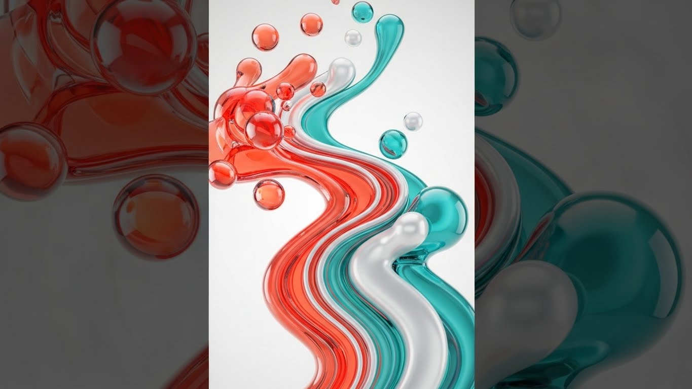
The Visual & Narrative Approach
This style abandons the rigid grids of traditional tech marketing for the elegance of fluid dynamics. The video depicts data not as binary code, but as glossy, liquid-like shapes made of iridescent glass. We watch as chaotic, scattered droplets—representing fragmented data sources—morph and merge into a unified, powerful river of Vivid Coral and Soft Teal. The motion is upward and effortless, set against a clean abstract void, symbolizing the seamless organization of complex API traffic.
Psychological Impact & KPI Focus
- Niche Psychology: This appeals to "Processing Fluency." By visualizing data integration as a natural, fluid process, you subconsciously signal that your platform eliminates friction. It counters the anxiety of "spaghetti code" with a visual metaphor of harmony and ease.
- Operational Impact: Visualizes Integration Efficiency. It transforms the abstract concept of "High Throughput" into a tangible, visual experience of smooth, uninterrupted flow.
Strategic Implementation & Trade-offs
- Best Use Case: Vertical Social (TikTok/Reels) brand campaigns.
- Duration: 9-16 seconds (Looping).
- Trade-off: This style creates an emotional connection but conveys zero technical detail. It sells the feeling of the solution, not the function.
Companies using similar video content -
MuleSoft – Anypoint Platform – Orchestrates complex integrations and fluid data flows.
Boomi – Integration Platform – Connects disparate systems with AI-driven automation.
Gravitee – API Management Platform – Manages event-driven and asynchronous APIs seamlessly.
2. Bold Kinetic Typography
TOFU | Market Education
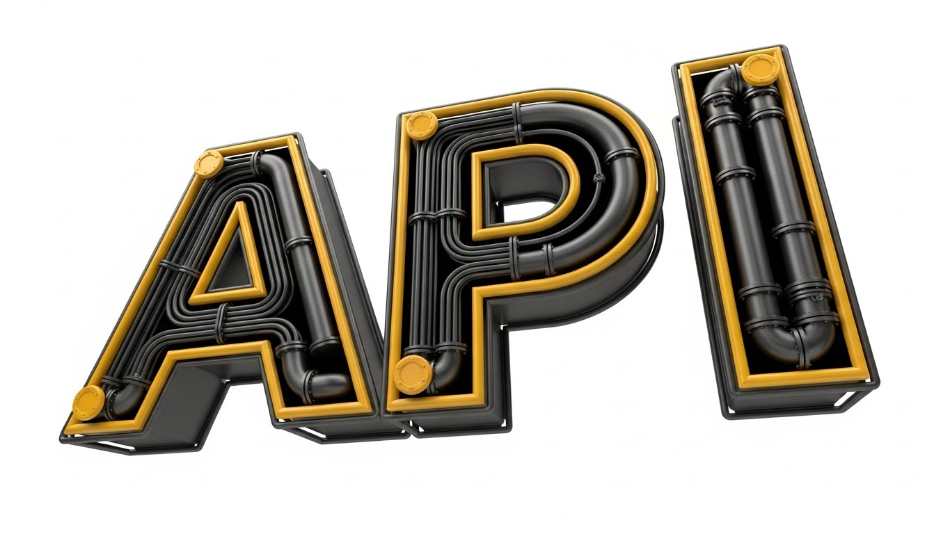
The Visual & Narrative Approach
Here, the abstract concept of "digital infrastructure" is given physical weight. The letters "API" are constructed from heavy, matte industrial pipes and conduits. The camera angle is low, looking up at the towering text as if it were a skyscraper. We see the pipes locking together with mechanical precision. Sharp, dramatic shadows on a stark white background emphasize the depth and solidity of the Bold Yellow and Jet Black structures.
Psychological Impact & KPI Focus
- Niche Psychology: This leverages the "Semiotics of Weight." In B2B infrastructure, "heavy" implies reliable, secure, and permanent. It combats the fear of "fragile" software by visually equating the API platform with heavy industry and engineering.
- Operational Impact: Visualizes System Reliability. It reinforces the message of "Enterprise-Grade" stability, increasing trust perception among conservative buyers.
Strategic Implementation & Trade-offs
- Best Use Case: Instagram Stories or LinkedIn Teasers announcing core stability updates.
- Duration: 6-10 seconds.
- Trade-off: The industrial aesthetic is powerful but can feel "cold" or "legacy" if not animated with modern, snappy energy.
Companies using similar video content -
Kong – Gateway – Builds robust, extensible API infrastructure for microservices.
IBM – API Connect – Provides enterprise-grade API management with strong governance.
WSO2 – API Manager – Offers open-source, customizable API management for enterprises.
3. Abstract 3D AI Visualization
TOFU | Shaping Brand Perception

The Visual & Narrative Approach
This visualization zooms out to reveal the "Big Picture." It depicts a high-tech digital horizon populated by crystalline node structures that glow in Electric Indigo and Metallic Silver. Thin, pulsing filaments connect these nodes across an infinite expanse. The wide-angle lens captures the sheer scale of the network, representing the "Invisible Nervous System" of a global, AI-driven enterprise.
Psychological Impact & KPI Focus
- Niche Psychology: This targets "Visionary Aspiration." It validates the CTO's reality of managing a massive, complex ecosystem. It frames that complexity not as a mess, but as a beautiful, intelligent network, reinforcing their role as the architect of this future.
- Operational Impact: Visualizes Scalability. It reassures the viewer that the platform can handle exponential growth without breaking.
Strategic Implementation & Trade-offs
- Best Use Case: Website Homepages and Event Backgrounds.
- Duration: 30-60 seconds (Slow Loop).
- Trade-off: It is highly abstract. It sets a tone of sophistication but risks looking like generic "tech stock" if specific brand colors and unique node geometries aren't used.
Companies using similar video content -
Google Cloud – Apigee – Scales enterprise API management for global ecosystems.
AWS – API Gateway – Manages serverless APIs for scalable cloud architectures.
Microsoft Azure – API Management – Delivers fully managed API gateway for cloud solutions.
4. Isometric 3D Workflow
TOFU | Product Differentiation
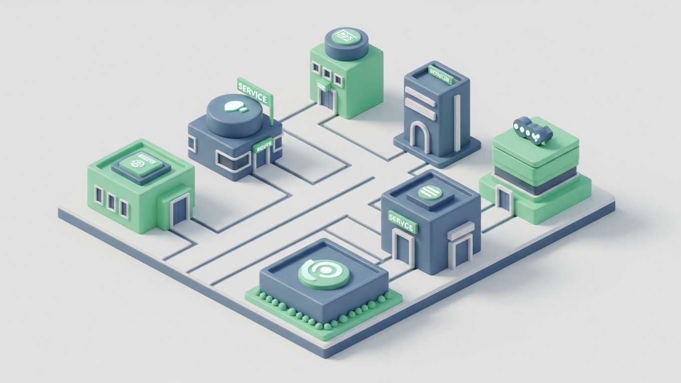
The Visual & Narrative Approach
To explain the complexity of microservices, this style uses a friendly, "claymorphism" aesthetic. The scene depicts a miniature, modular city where each building represents a specific service (e.g., Auth, Billing), connected by clean white pathways. The isometric view provides a "God-mode" perspective of the entire architecture. The soft Mint Green and Slate Blue palette makes the technical layout feel organized and approachable.
Psychological Impact & KPI Focus
- Niche Psychology: This reduces "Cognitive Load." Microservices architecture can be intimidating to visualize; this style breaks it down into "toy-like" building blocks. It transforms the anxiety of fragmentation into the joy of modular construction.
- Operational Impact: Visualizes Decoupling and Modularity. It effectively communicates "Ease of Management" and "Composability."
Strategic Implementation & Trade-offs
- Best Use Case: Blog Headers and Explainer Video intros.
- Duration: 15-30 seconds.
- Trade-off: The playful aesthetic might be perceived as "too casual" for highly regulated industries (Banking/Defense) if not balanced with serious, technical narration.
Companies using similar video content -
HashiCorp – Nomad – Orchestrates containerized and non-containerized applications efficiently.
Atlassian – Compass – Manages microservices architecture for enhanced developer experience.
Solo.io – Gloo Gateway – Provides Envoy-based cloud-native gateway for microservices.
5. Dynamic Data Visualization
TOFU | Product Differentiation

The Visual & Narrative Approach
Speed is the hero here. This flat vector illustration uses abstract speed lines and motion blur effects streaking from left to right to visualize "Low Latency." These lines intersect with a stylized, simplified graph showing a dramatic downward trend in "Response Time." The Bright Orange and Cool Grey palette creates a high-contrast, energetic look that visually screams "fast."
Psychological Impact & KPI Focus
- Niche Psychology: This utilizes "Kinetic Empathy." The left-to-right motion and blur effects physically induce a sense of speed and progress in the viewer. It appeals to the technical buyer's desire for optimization and efficiency.
- Operational Impact: Visualizes Latency Reduction. It provides a visual shorthand for "Performance" and "Speed" in social feeds.
Strategic Implementation & Trade-offs
- Best Use Case: LinkedIn Organic posts highlighting performance benchmarks.
- Duration: 5-10 seconds.
- Trade-off: It is very literal. It works best for a single data point (e.g., "50% faster") but lacks the nuance to explain complex features.
Companies using similar video content -
Zuplo – API Gateway – Delivers edge performance and rapid API monetization.
KrakenD – API Gateway – Ensures high-performance, stateless API gateway operations.
Apache APISIX – API Gateway – Provides cloud-native, ultimate performance for microservices.
6. Lifestyle Stock with UI Overlay
TOFU | ABM Awareness
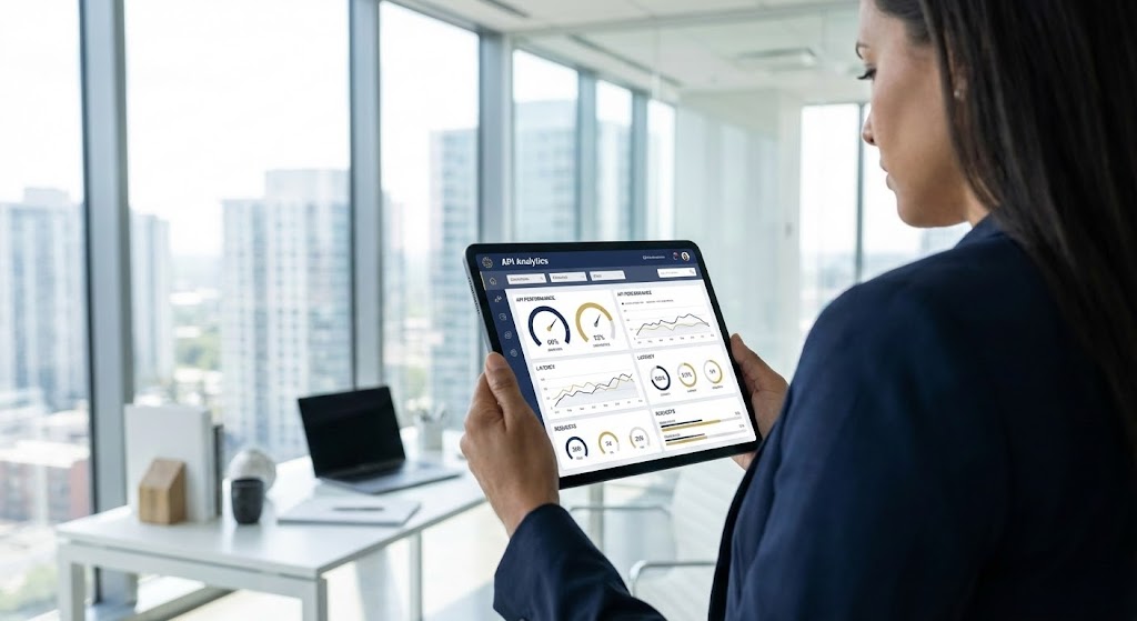
The Visual & Narrative Approach
This style grounds the software in the real world. It features a high-resolution, over-the-shoulder shot of a CIO in a modern, glass-walled office, looking at a tablet. The critical element is the high-fidelity UI overlay on the screen—crisp, readable analytics with circular gauges and trend lines (Navy Blue/Gold). It shifts the focus from "code" to "executive control."
Psychological Impact & KPI Focus
- Niche Psychology: This leverages "Social Proof" and "Role Visualization." It allows the decision-maker to see themselves in the video, successfully wielding the tool to gain oversight. It validates the software as a business asset, not just a developer tool.
- Operational Impact: Visualizes Governance and Oversight. It increases click-through rates from C-Level targets on LinkedIn.
Strategic Implementation & Trade-offs
- Best Use Case: LinkedIn Sponsored Content and Case Studies.
- Duration: Static image or subtle motion.
- Trade-off: Success depends entirely on the quality of the "track and composite." If the UI looks like a sticker, credibility is lost.
Companies using similar video content -
DigitalAPI – Platform – Unifies API management and governance for executives.
Flexera One – Cloud Management – Offers unified control plane for multi-cloud operations.
CloudHealth – by VMware Tanzu – Optimizes cloud management and cost for enterprises.
7. Wireframe to Reality Transition
TOFU | Market Education
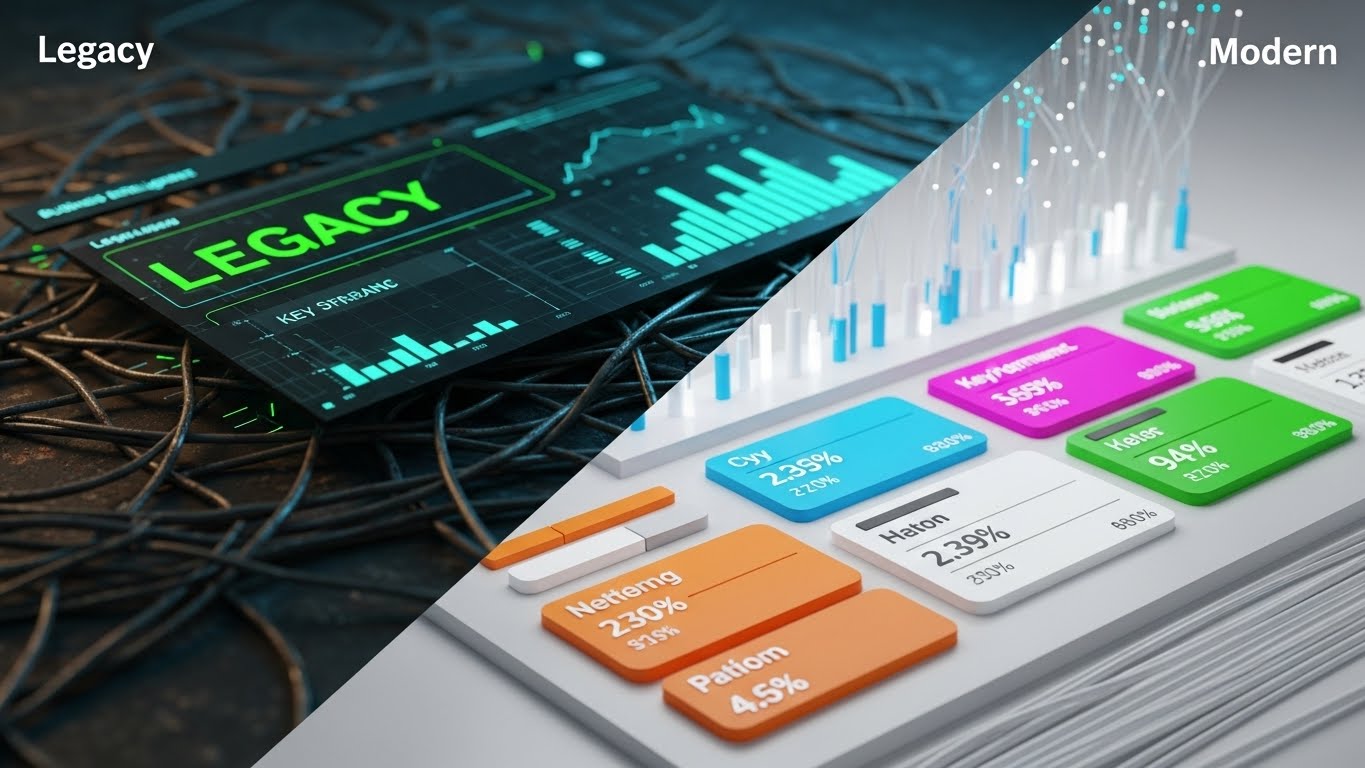
The Visual & Narrative Approach
A classic "Before & After" technique. The screen is split vertically. The left side shows "Legacy": a chaotic tangle of rusted metal wires in a dusty environment. The right side shows "Modern": sleek, glowing fiber optic cables in a pristine white lab. A sharp vertical line wipes across, transforming the old into the new. The Cyan and Magenta palette on the right emphasizes clarity.
Psychological Impact & KPI Focus
- Niche Psychology: This plays on "Loss Aversion" (fear of the old mess) and "Aspiration" (desire for the new order). It visually dramatizes the value of "Technical Debt Reduction" without using words.
- Operational Impact: Visualizes Modernization. It clarifies the value proposition of migration services.
Strategic Implementation & Trade-offs
- Best Use Case: YouTube Pre-roll ads and Webinar Intros.
- Duration: 10-15 seconds.
- Trade-off: It creates a binary "Bad/Good" comparison. It is effective for "Rip and Replace" strategies but less so for "Hybrid Integration" narratives.
Companies using similar video content -
MuleSoft – Anypoint Platform – Modernizes legacy systems with seamless API integration.
SAP – Integration Suite – Bridges SAP and non-SAP applications for digital transformation.
Axway – Amplify API Management – Facilitates hybrid and multi-cloud API modernization.
8. 2D Line Art Animation
MOFU | Feature Education
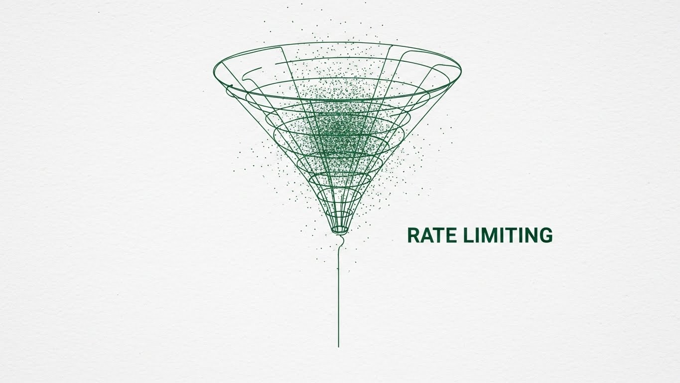
The Visual & Narrative Approach
To explain "Rate Limiting," this style adopts the precise aesthetic of a technical blueprint. Thin Emerald Green lines draw a funnel shape on a textured paper background. A chaotic cloud of dots (requests) enters the top and is filtered into a single, orderly line at the bottom. The animation is smooth, logical, and architectural.
Psychological Impact & KPI Focus
- Niche Psychology: This appeals to the "Engineer's Mindset." It signals precision, logic, and a "no-fluff" approach to technical problem solving. It visually explains the mechanism of the feature, building trust through competence.
- Operational Impact: Visualizes Traffic Management. It increases time-on-page for technical feature descriptions.
Strategic Implementation & Trade-offs
- Best Use Case: Website Feature Pages and Documentation.
- Duration: 30-45 seconds.
- Trade-off: It is dry and unemotional. It informs the logic center of the brain but doesn't inspire the emotional center.
Companies using similar video content -
Tyk – API Management Platform – Provides precise rate limiting and traffic control.
Kong – Gateway – Offers traffic control plugins for API management.
Apache APISIX – API Gateway – Enables dynamic routing and traffic management.
9. Clean UI Workflow (Light Mode)
MOFU | Feature Education

The Visual & Narrative Approach
This render focuses on the actual UI, elevated by "Glassmorphism." Semi-transparent, frosted glass panels float in 3D space against a soft office bokeh. We see specific widgets for "Traffic Analytics" and "Error Rates" in Royal Blue and Light Grey. The transparency metaphorically and literally suggests "Observability"—seeing through the noise to the data.
Psychological Impact & KPI Focus
- Niche Psychology: This triggers the "Illusion of Control." A clean, beautiful interface suggests that the underlying system is also clean and manageable. It promises a superior "Developer Experience" (DX).
- Operational Impact: Visualizes Usability. It builds desire for the product demo.
Strategic Implementation & Trade-offs
- Best Use Case: Product Tour videos and Feature pages.
- Duration: 15-20 seconds.
- Trade-off: Light mode is generally more "marketing friendly," but ensure you also have Dark Mode assets if targeting hardcore developers.
Companies using similar video content -
Postman – API Platform – Offers clean UI for collaborative API development.
Moesif – API Analytics – Provides clear observability and monitoring for APIs.
SwaggerHub – API Design & Documentation – Streamlines API design with intuitive interface.
10. Minimalist Flat 2D Vector
MOFU | Building Trust
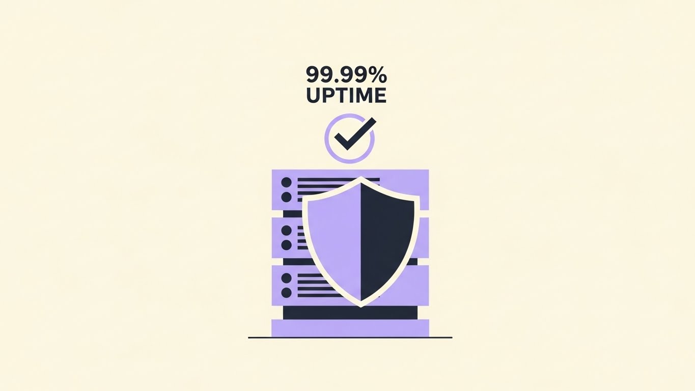
The Visual & Narrative Approach
Simplicity is the ultimate sophistication. This style uses simple geometric shapes to create a vector illustration of a server rack protected by a shield and checkmark. The "99.99% Uptime" text is prominent. The Soft Cream background and negative space focus all attention on the trust signals (Pastel Purple/Charcoal).
Psychological Impact & KPI Focus
- Niche Psychology: This leverages "Cognitive Ease." The simple, symmetrical shapes are instantly processed by the brain as "truth" and "stability." It acts as a visual badge of honor.
- Operational Impact: Visualizes SLA Compliance. It reinforces reliability claims in consideration-phase content.
Strategic Implementation & Trade-offs
- Best Use Case: Social Carousels and "Trust Bar" icons on the website.
- Duration: Static.
- Trade-off: It can feel generic. It relies on strong brand colors to own the otherwise common "shield" imagery.
Companies using similar video content -
Salt Security – API Protection Platform – Ensures AI-based API security and trust.
Imperva – API Security – Safeguards applications, APIs, and data with reliability.
Qualysec – API Security – Delivers penetration testing and vulnerability assessment.
11. Split Screen: Optimized Reality and UI
MOFU | Competitive Displacement
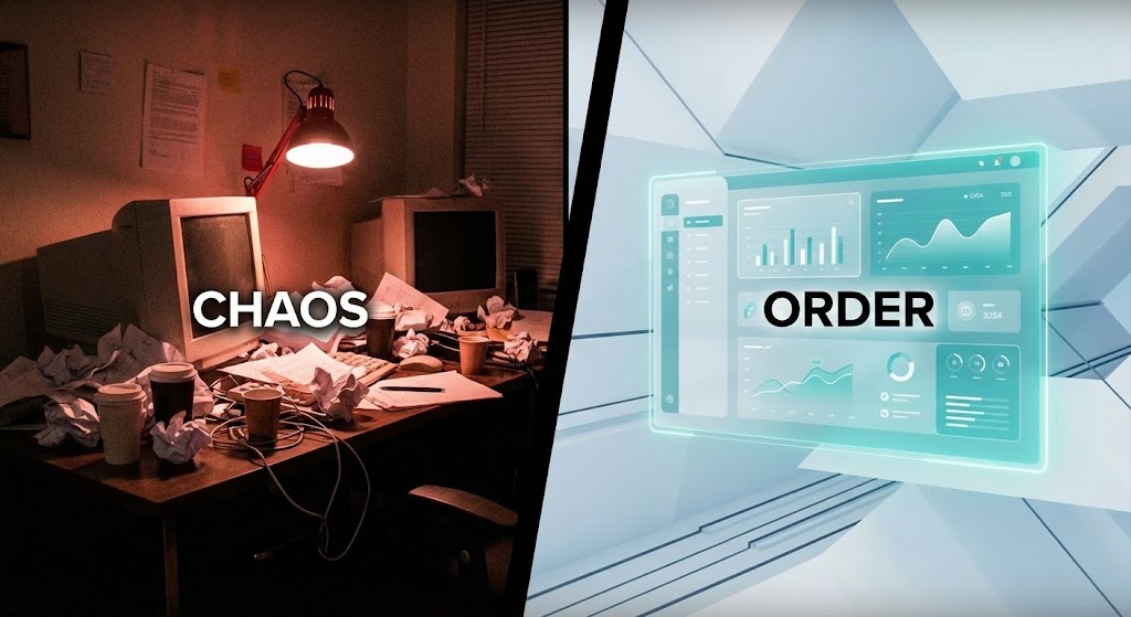
The Visual & Narrative Approach
This style utilizes a powerful "Cognitive Contrast" to compel a choice. The screen is split vertically. The left side ("Current State") depicts the visceral reality of IT stress: a dimly lit, red-tinted desk environment cluttered with paper, cables, and messy hardware—symbolizing "Chaos." The right side ("Future State") reveals a pristine, abstract digital workspace with a floating, organized UI glowing in calm Teal and White—symbolizing "Order." The narrative action focuses on the dividing line sweeping across, erasing the mess and replacing it with clarity.
Psychological Impact & KPI Focus
- Niche Psychology: This triggers "Cognitive Dissonance" followed by resolution. By visually juxtaposing the stressful problem with the clean solution, you physically agitate the viewer's pain point (alert fatigue, spaghetti code) and then immediately soothe it. It validates their struggle while offering an escape.
- Operational Impact: Visualizes Workflow Optimization. It moves the conversation from "features" to "Quality of Life" for the engineering team, demonstrating the shift from reactive firefighting to proactive governance.
Strategic Implementation & Trade-offs
- Best Use Case: YouTube TrueView ads targeting competitors' keywords (e.g., "Legacy Migration").
- Duration: 15-20 seconds.
- Trade-off: It is aggressive. It relies on the assumption that the prospect is currently experiencing chaos. If their current setup is "fine," this drama may miss the mark.
Companies using similar video content -
DigitalAPI – Platform – Transforms chaotic API sprawl into unified order.
Workato – iPaaS – Automates workflows, replacing manual stress with clarity.
Cloudify – Cloud Orchestration – Streamlines cloud infrastructure management, reducing chaos.
12. 3D X-Ray Visualization
MOFU | Risk Mitigation
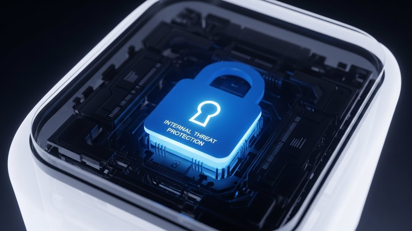
The Visual & Narrative Approach
Security is often invisible until it fails. This style uses an "X-Ray" aesthetic to make protection tangible. We see a pristine, translucent white server unit. The camera zooms in, and the outer shell dissolves to reveal a solid, glowing "Core" shaped like a padlock in Deep Azure. The macro lens highlights the intricate locking mechanisms inside, symbolizing that security is not just a perimeter wrapper, but a core architectural component embedded in the hardware.
Psychological Impact & KPI Focus
- Niche Psychology: This appeals to the "Need for Structural Assurance." Cybersecurity buyers are risk-averse; they need to see that security is "baked in." The "solid core" metaphor visually proves inherent stability and resilience against internal threats.
- Operational Impact: Visualizes Deep Packet Inspection and Zero Trust Architecture. It transforms "Compliance" from a checkbox into a robust, physical asset.
Strategic Implementation & Trade-offs
- Best Use Case: "Security" or "Compliance" pages on the website.
- Duration: 10-15 seconds (Looping).
- Trade-off: It requires high-fidelity rendering. A low-quality "plastic" look will have the opposite effect, suggesting cheap or fragile security.
Companies using similar video content -
Traceable AI – API Security Platform – Reveals internal threats with AI/ML detection.
Noname Security – API Security Platform – Provides comprehensive, baked-in API security.
Wallarm – API Security Platform – Discovers, tests, and blocks attacks on APIs.
13. Futuristic Neon/Dark Mode
MOFU | Risk Mitigation

The Visual & Narrative Approach
While Style 12 shows internal strength, this style visualizes perimeter defense. It adopts a "Dark Mode" aesthetic—the preferred environment for developers. Against a deep black void, Neon Green and Electric Cyan wireframe grids construct a formidable, impenetrable cube around a central data cluster. A "Dutch Angle" (tilted camera) adds dynamic tension, suggesting an active, high-stakes environment where the data remains untouched and secure behind the grid.
Psychological Impact & KPI Focus
- Niche Psychology: This leverages the "Semiotics of Containment." The visual of a glowing cage in the dark instinctively signals protection and demarcation. It reassures the viewer that "nothing gets in, and nothing leaks out."
- Operational Impact: Visualizes Data Sovereignty and Ring-Fencing. The rigid grid lines effectively communicate "Boundaries," "Firewalls," and "Strict Governance."
Strategic Implementation & Trade-offs
- Best Use Case: Background visuals for "Enterprise Readiness" sections or SOC 2 compliance announcements.
- Duration: 15-30 seconds.
- Trade-off: The "Hacker/Cyberpunk" aesthetic is popular but can feel "too edgy" for conservative banking clients. Elevate it with clean lines to maintain professionalism.
Companies using similar video content -
Lacework – Cloud Security Platform – Establishes strong data-driven security boundaries.
Zerto – Disaster Recovery – Ensures IT resilience and data protection.
Imperva – API Security – Offers compliance and robust attack protection.
14. Macro UI Micro-Interactions
MOFU | Demand Gen
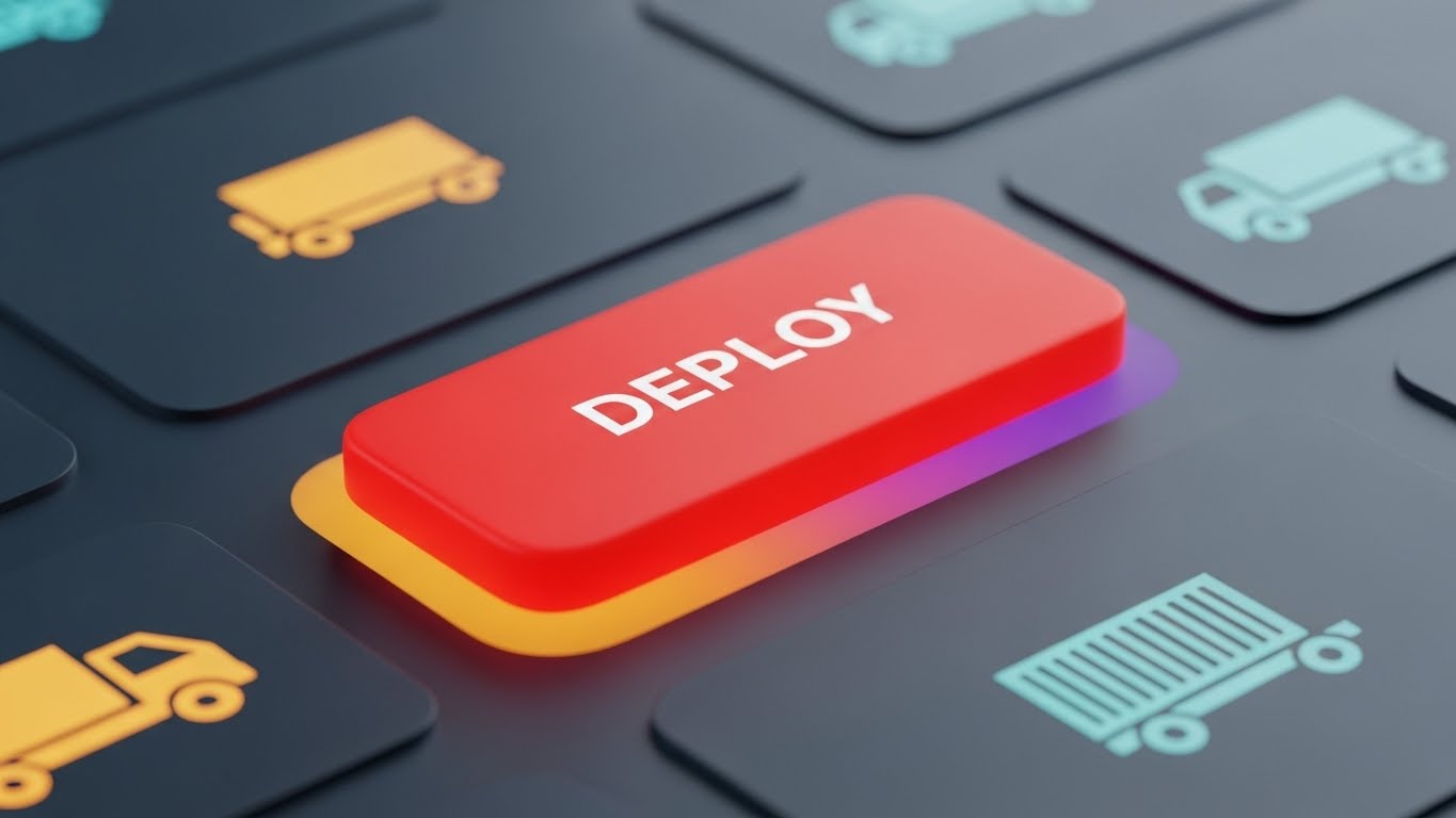
The Visual & Narrative Approach
This style creates a sensory experience out of a digital action. The camera focuses exclusively on a single "DEPLOY" button in an extreme macro shot. We see the subtle grain of the Matte Red finish. As the button is pressed, it depresses with weight, and a soft, warm Sunset Gradient (Orange to Purple) glows from beneath it, signaling a successful launch. The background remains blurred, forcing total focus on this moment of completion.
Psychological Impact & KPI Focus
- Niche Psychology: This triggers "Tactile Imaginability." It simulates the dopamine hit of finishing a project. For developers, the "deploy" moment is the climax of their work; visually glorifying it creates an emotional desire to use the tool.
- Operational Impact: Visualizes Ease of Use and One-Click Deployment. It implies that the hard work is done, and the platform makes the final step effortless.
Strategic Implementation & Trade-offs
- Best Use Case: Instagram Stories or short pre-roll ads targeting developers.
- Duration: 3-6 seconds.
- Trade-off: It conveys zero information about how the deployment works. It is purely a mood/sensation play to drive brand affinity.
Companies using similar video content -
Insomnia – API Development Platform – Glorifies the tactile satisfaction of API deployment.
GitLab – DevOps Platform – Streamlines one-click deployment with tangible results.
CircleCI – CI/CD Platform – Automates builds and deployments with satisfying feedback.
15. Low-Poly 3D Modeling
MOFU | ROI Justification
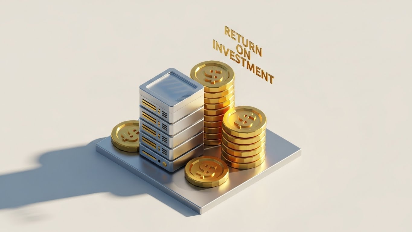
The Visual & Narrative Approach
How do you visualize "Return on Investment"? This style makes it literal. Using a clean, "Low-Poly" aesthetic, we see a stylized silver server block. Next to it, stacks of gold tokens (labeled with currency symbols) are rising rhythmically. The isometric perspective on a stark white floor makes the data easy to read. The materials are metallic but simplified, stripping away noise to focus purely on the relationship between "Tech" (Server) and "Value" (Gold).
Psychological Impact & KPI Focus
- Niche Psychology: This reduces "Financial Abstraction." CFOs and budget holders deal in numbers; this visual translates "API Efficiency" directly into "Currency." It creates a subconscious link between your server infrastructure and profit generation.
- Operational Impact: Visualizes Cost Savings and Monetization. It is the perfect visual anchor for articles discussing TCO (Total Cost of Ownership).
Strategic Implementation & Trade-offs
- Best Use Case: Blog headers for "Business Value" articles or slides in a pitch deck for finance teams.
- Duration: Static or simple loop.
- Trade-off: The "cartoonish" style may lack the gravitas required for ultra-high-enterprise clients unless executed with premium lighting and textures.
Companies using similar video content -
Apigee – API Management – Visualizes API monetization and financial returns.
CloudZero – Cloud Cost Management – Translates cloud spend into tangible ROI.
Densify – Cloud Cost Optimization – Optimizes cloud resources for financial justification.
16. 3D Parallax UI Presentation
MOFU | Driving Demo Requests

The Visual & Narrative Approach
To showcase the depth of the platform without overwhelming the viewer, this style uses "Parallax." Multiple UI screens—showing API metrics, traffic graphs, and logs—float in a 3D void. They are arranged in layers. The camera drifts slowly, and the layers move at different speeds, creating a rich sense of depth. The Violet and Light Blue palette glows against the dark background, creating a modern, "Cyber-SaaS" atmosphere.
Psychological Impact & KPI Focus
- Niche Psychology: This triggers "Perceived Sophistication." The multi-layered view suggests a "Full Stack" solution that covers every angle. It combats the perception of being a "point solution" or a simple tool.
- Operational Impact: Visualizes Deep Observability and Comprehensive Monitoring. It shows that the platform provides visibility into every layer of the API lifecycle.
Strategic Implementation & Trade-offs
- Best Use Case: Re-targeting display ads (HTML5) to users who visited the pricing page.
- Duration: 10-15 seconds.
- Trade-off: Ensure the UI text on the front-most layer is legible. If everything is moving and blurry, the specific feature message is lost.
Companies using similar video content -
Prometheus – Monitoring System – Showcases deep observability with layered metrics.
Grafana – Observability Platform – Visualizes metrics, logs, and traces comprehensively.
Datadog – Monitoring & Security Platform – Provides comprehensive observability for cloud applications.
17. 2D Graphics Over Live Action
BOFU | Sales Cycle Acceleration

The Visual & Narrative Approach
As we approach the sale, the human element becomes critical. This style features a high-quality photo of a confident female developer in a real workspace. What makes it "tech" is the layer of animated 2D vector icons ("Idea" bulb, "Code" brackets, "Launch" rocket) orbiting her head. The graphics are flat and vibrant (Teal/Amber), contrasting with the realistic photography. It bridges the gap between the user and the tool.
Psychological Impact & KPI Focus
- Niche Psychology: This leverages "Mirror Neurons" and "Empowerment." The viewer (a lead dev or manager) sees a version of themselves—not stressed, but creative and supported. It reframes the software as a partner in their creativity, not just a utility.
- Operational Impact: Visualizes Developer Experience (DX). It communicates that the platform removes barriers, allowing the human to focus on innovation.
Strategic Implementation & Trade-offs
- Best Use Case: LinkedIn "Culture" ads and "Why Work With Us" content.
- Duration: 15-30 seconds.
- Trade-off: The casting is crucial. It must look like a real developer, not a generic "stock photo model in a suit." Authenticity is key.
Companies using similar video content -
Postman – API Platform – Empowers developers with creative workflow tools.
Atlassian – Jira Software – Humanizes project management for development teams.
Red Hat – Ansible Automation Platform – Automates IT processes, empowering engineers.
18. Generative AI Realistic Character video
BOFU | The Champion

The Visual & Narrative Approach
This style focuses entirely on the emotional payoff. Using advanced Generative AI, we create a hyper-realistic video portrait of a lead developer (The "Champion"). He is in a server room, but the lighting is warm and cinematic, not harsh. He holds a tablet, looking at the screen with a genuine smile of relief and pride. The "cool blue" server background contrasts with the "warm" light on his face, symbolizing that he has tamed the machine.
Psychological Impact & KPI Focus
- Niche Psychology: This targets "Status and Relief." The buyer wants to be this person—the one who solved the infrastructure crisis and is now relaxed. It sells the emotional outcome of the purchase: peace of mind and professional success.
- Operational Impact: Visualizes Stability and Control. It implies the system is running so smoothly that the human operator can finally breathe.
Strategic Implementation & Trade-offs
- Best Use Case: Customer Success Stories and Case Study intros.
- Duration: 5-10 seconds.
- Trade-off: AI video generation must be flawless. Any "uncanny valley" glitches (weird hands, shifting eyes) will destroy trust immediately.
Companies using similar video content -
Clarifai – AI Platform – Validates success for AI pipeline architects.
SotaTek – AI/IoT Solutions – Showcases relieved developers with AI expertise.
Sensedia – API Platform – Highlights champion success in AI-driven API management.
19. Isometric 2D Motion Design
BOFU | Reducing Implementation Friction
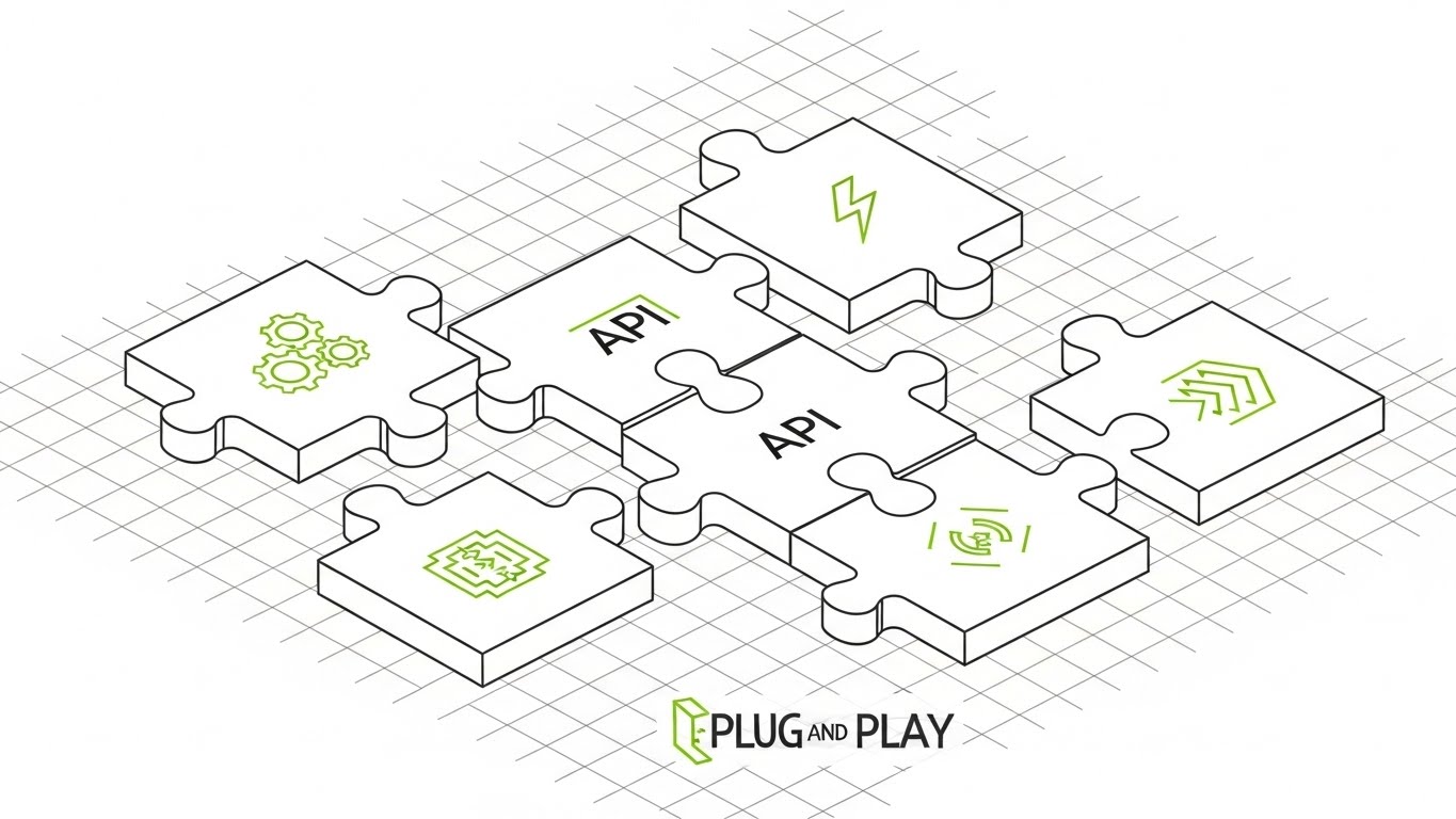
The Visual & Narrative Approach
The biggest barrier at the Bottom of Funnel is "Implementation Fear." How hard will this be to install? This style answers with a soothing visual metaphor. On a technical blueprint grid, we see flat, isometric puzzle pieces labeled with API icons. They slide and snap together with satisfying precision. The "Plug and Play" text is reinforced by the clean Lime Green and Charcoal palette. It looks like a manual, but one that is easy to follow.
Psychological Impact & KPI Focus
- Niche Psychology: This leverages "Cognitive Fluency." The puzzle metaphor is universally understood as "solving a problem by fitting things together." It signals compatibility and modularity, lowering the perceived effort of migration.
- Operational Impact: Visualizes Seamless Integration and Interoperability. It reassures the buyer that your tool plays nicely with their existing stack.
Strategic Implementation & Trade-offs
- Best Use Case: "Welcome" emails during onboarding or "Implementation Guide" documentation headers.
- Duration: Loop (GIF).
- Trade-off: It simplifies the reality. Integration is rarely this easy, so use it to sell the architecture (it's designed to fit), not the literal timeline.
Companies using similar video content -
Boomi – Integration Platform – Visualizes seamless integration with puzzle-like precision.
Tyk – API Management Platform – Reinforces easy setup and modular architecture.
Gravitee – API Management Platform – Communicates interoperability through interlocking components.
20. Photorealistic 3D Renders
BOFU | Overcoming Objections

The Visual & Narrative Approach
The final objection is often: Can this scale? This visual provides the definitive "Yes." It uses photorealistic 3D rendering to depict an infinite server hall. The polished concrete floors reflect rows of sleek, silver racks extending endlessly into the horizon. The lighting is cool, clinical, and expensive-looking. It conveys a sense of limitless capacity and industrial-grade power.
Psychological Impact & KPI Focus
- Niche Psychology: This appeals to "Awe" and "Certainty." The scale of the image suggests a provider that is massive, established, and capable of handling global workloads. It removes the fear of "outgrowing" the solution.
- Operational Impact: Visualizes Unlimited Scalability and High Availability. It is the visual equivalent of a "99.999% SLA" guarantee.
Strategic Implementation & Trade-offs
- Best Use Case: "Enterprise" landing pages and background visuals for Case Studies of Fortune 500 clients.
- Duration: Static or slow camera push.
- Trade-off: It can feel cold/impersonal. It works best when paired with a text overlay about a specific, massive number (e.g., "Supported 10 Billion Requests/Day").
Companies using similar video content -
AWS – Cloud Infrastructure – Proves enterprise scalability with infinite server halls.
Google Cloud – Cloud Platform – Conveys limitless capacity for global workloads.
Microsoft Azure – Cloud Platform – Demonstrates industrial-grade power and scale.
21. Rapid UI Feature Montage
BOFU | Driving Freemium/Trials
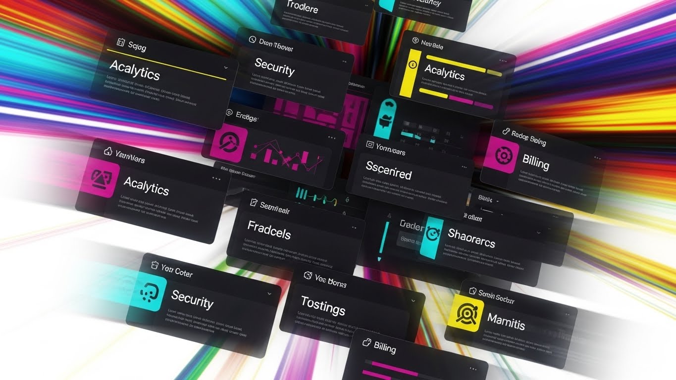
The Visual & Narrative Approach
This style is designed for the "scrolling economy," abandoning slow linear narratives for a vertical, high-energy composition. We see a cascade of UI cards—representing core pillars like "Analytics," "Security," "Billing," and "Sandbox"—dropping down the screen in rapid succession. The motion is snappy, with a slight motion blur to convey velocity. The background is a vibrant, abstract blur of multicolors against white, keeping the energy high without distracting from the crisp, readable UI elements.
Psychological Impact & KPI Focus
- Niche Psychology: This triggers the "Heuristic of Abundance." By showing a rapid-fire sequence of high-fidelity features, you visually overwhelm the viewer's skepticism, leading them to conclude, "This platform is complete." It appeals to the developer's "Fear of Missing Out" (FOMO) on a robust toolset.
- Operational Impact: Visualizes Feature Density. It quickly answers the "Does it do X?" question for multiple features simultaneously, driving users from "Awareness" to "Sign-up."
Strategic Implementation & Trade-offs
- Best Use Case: Instagram Reels or TikTok ads targeting developer hashtags (e.g., #DevOps, #APIFirst).
- Duration: 15-20 seconds (Fast-paced).
- Trade-off: It sacrifices depth for breadth. Viewers won't learn how a feature works, only that it exists. It functions as a menu, not a recipe.
Companies using similar video content -
Postman – API Platform – Showcases comprehensive feature breadth rapidly.
Apidog – API Development Platform – Highlights full API lifecycle features quickly.
SwaggerHub – API Design & Documentation – Presents streamlined API definition tools.
22. 2D Character-Driven Story
Onboarding | Self-Serve Onboarding

The Visual & Narrative Approach
Onboarding is where churn happens. This style counters "setup anxiety" with a friendly, narrative approach. We see a stylized 2D vector illustration of a female developer character. She is walking along a winding, "yellow brick road" style path that leads to a glowing door. Along the path, floating signposts display green checkmarks as she passes them. The aesthetic is flat, clean, and uses a soft Pastel Blue and Pink palette. It reframes the complex setup process as a simple, guided walk.
Psychological Impact & KPI Focus
- Niche Psychology: This leverages "Narrative Transportation." By placing a character in a journey, you help the user visualize their own progress. It creates a sense of "Guided Competence"—assuring them they won't be left alone to figure things out.
- Operational Impact: Visualizes Guided Onboarding. It directly combats the "Empty State" problem, encouraging users to take the first step in the configuration wizard.
Strategic Implementation & Trade-offs
- Best Use Case: The first "Welcome" email after signup or the "Getting Started" screen in the dashboard.
- Duration: Static image or short loop.
- Trade-off: It can feel "childish" if the character design is too cartoony. Keep the lines clean and the attire professional (e.g., modern casual) to maintain B2B relevance.
Companies using similar video content -
Atlassian – Confluence – Guides users through documentation with friendly characters.
GitLab – DevOps Platform – Reduces onboarding anxiety with guided journeys.
DigitalOcean – Cloud Platform – Simplifies complex cloud concepts for new users.
23. Hyper-lapse Stock Footage with Data
Onboarding | Accelerating TTV

The Visual & Narrative Approach
This style connects your software to the pulse of the real world. It uses cinematic hyper-lapse footage of a city at twilight. The long-exposure light trails from cars are digitally enhanced to look like glowing streams of ones and zeros (Deep City Blue, White, Red). A clean, white overlay graphic appears in the foreground: a progress bar that rapidly fills to hit "100% COMPLETE" followed by a checkmark. It visually equates the flow of city traffic with the flow of data.
Psychological Impact & KPI Focus
- Niche Psychology: This appeals to the "Need for Speed." In the API economy, latency is the enemy—not just in data transfer, but in implementation. This visual proves that your platform moves as fast as the market does.
- Operational Impact: Visualizes Rapid Deployment and Time-to-Value (TTV). It promises that the user will go from "Zero to Live" in record time.
Strategic Implementation & Trade-offs
- Best Use Case: Pre-roll ads on YouTube tech channels or background video for the "Integrations" page.
- Duration: 6-10 seconds.
- Trade-off: Stock footage can be generic. The custom data overlay is critical to branding it as your solution, not just a generic "tech city" video.
Companies using similar video content -
Bitbucket – Pipelines – Accelerates time-to-value with rapid CI/CD.
CircleCI – CI/CD Platform – Visualizes fast deployment and data velocity.
Apache Airflow – Data Orchestration – Shows rapid data workflow execution.
24. Holographic UI over 3D Render
Retention | Driving Deep Feature Adoption
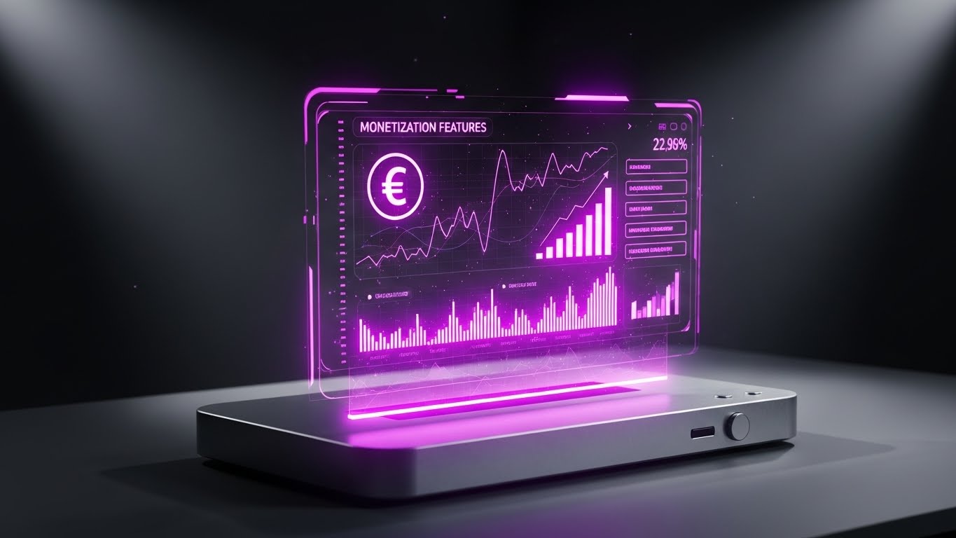
The Visual & Narrative Approach
To sell "Monetization" features to existing users, this style uses a futuristic, high-value aesthetic. A realistic 3D rendering of a sleek metallic device sits on a desk in a dimly lit room. It projects a floating, translucent Electric Blue holographic menu into the air. The hologram displays a currency symbol (€ or $) and dynamic growth charts. The glow illuminates the desk, making the data feel tangible and precious—literally "highlighting" the value generation capabilities of the platform.
Psychological Impact & KPI Focus
- Niche Psychology: This triggers "Perceived Value." By presenting the monetization dashboard as a high-tech hologram, you elevate it from a "boring billing tab" to a "command center for revenue." It appeals to the user's desire for profitability and high-tech command.
- Operational Impact: Visualizes API Monetization and Revenue Tracking. It encourages users to activate paid features by making the outcome look sophisticated and desirable.
Strategic Implementation & Trade-offs
- Best Use Case: Product pages dedicated to "API Monetization" or "Business Plans."
- Duration: 10-15 seconds (Looping).
- Trade-off: High production cost. The lighting interactions between the hologram and the physical object must be realistic, or it will look fake.
Companies using similar video content -
Apigee – API Management – Projects API monetization as a high-tech command center.
Zuplo – API Gateway – Highlights value generation with futuristic UI.
Moesif – API Analytics – Elevates billing data into a sophisticated revenue dashboard.
26. 2D Animation & UI Composition
Retention | Reducing Support Overhead

The Visual & Narrative Approach
When a user is stuck, they are frustrated. This style disarms that frustration with charm. A friendly, 2D animated robot character (Soft Purple/Cyan) stands next to a floating, simplified UI window. The robot points to a "Help" bubble or a specific setting, acting as a guide. The background is a calming, solid Soft Green. The animation is smooth and approachable, designed to say, "Don't panic, the answer is right here."
Psychological Impact & KPI Focus
- Niche Psychology: This utilizes "Affective Design." Positive emotions improve problem-solving abilities. By using a cute, helpful character, you lower the user's stress cortisol levels, making them more patient and willing to use self-service tools.
- Operational Impact: Visualizes Support Automation and Ease of Troubleshooting. It subtly trains users to look for the "bot" or the "docs" before logging a ticket.
Strategic Implementation & Trade-offs
- Best Use Case: The header of the "Knowledge Base" or "Help Center" portal.
- Duration: Loop.
- Trade-off: Avoid using this for "Critical Error" pages. If a server is down, a cute robot is annoying. Use it for educational/guide content only.
Companies using similar video content -
Atlassian – Jira Service Management – Automates self-service with helpful animated bots.
Atlassian – Confluence – Guides users through troubleshooting with clear visuals.
Postman – API Platform – Simplifies support with animated self-help guides.
27. Dark Mode UI Showcase
Retention | Competitive Comparison
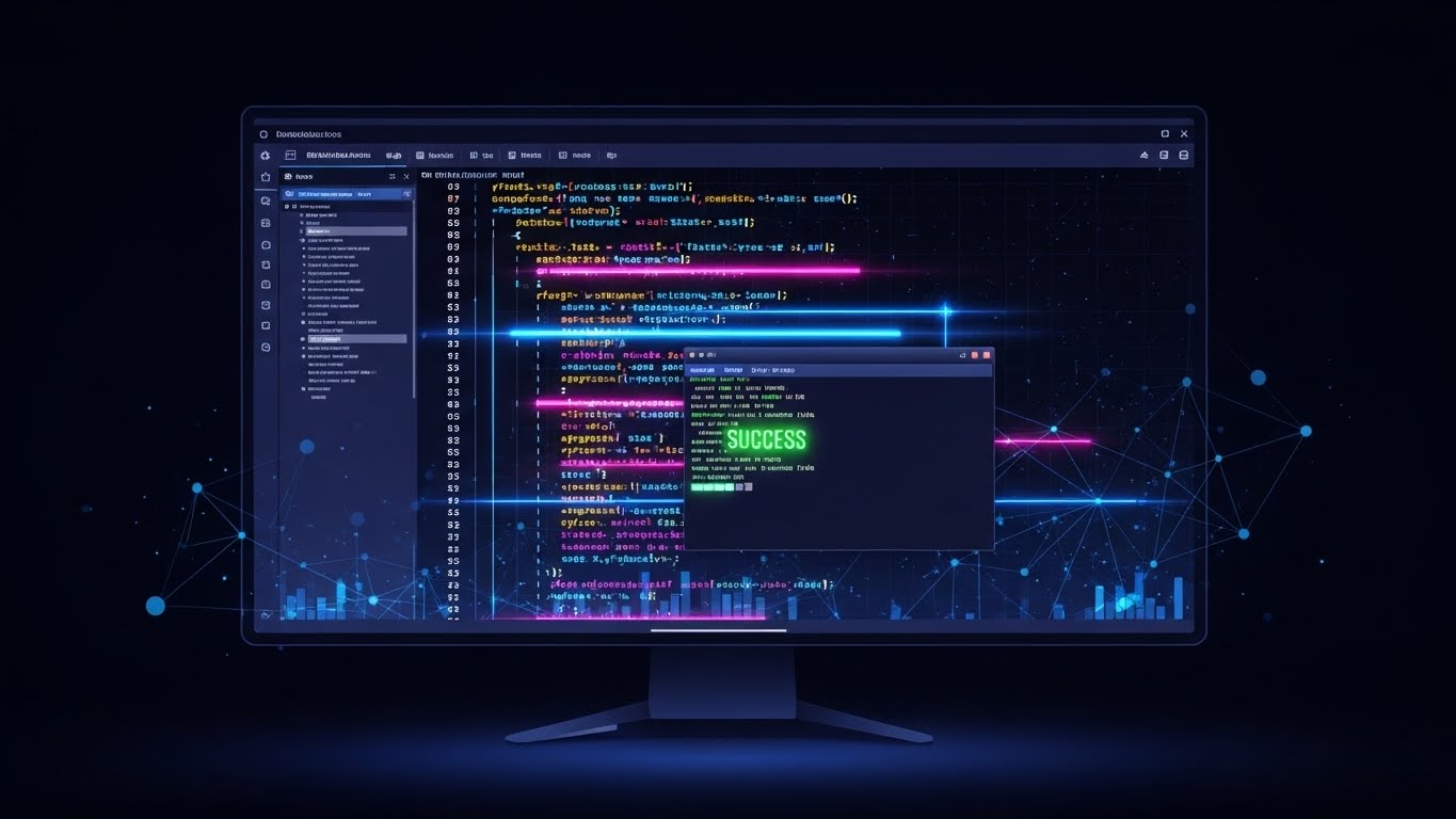
The Visual & Narrative Approach
This is a love letter to the developer. It features a straight-on, distraction-free view of the code editor interface in "Dark Mode"—the industry standard for serious engineering. The background is a deep Midnight Blue. The code syntax pops in neon Pink, Blue, and Yellow. The monitor bezel is barely visible, fading into the shadows. A "SUCCESS" message glows green in the terminal. It creates an atmosphere of focus and professional flow.
Psychological Impact & KPI Focus
- Niche Psychology: This validates "Tribe Identity." Developers identify strongly with their tools. Dark mode isn't just a setting; it's a culture. Showing your UI in dark mode signals, "We are one of you. We understand how you work."
- Operational Impact: Visualizes Developer Experience (DX). It acts as a powerful retention tool by confirming that the environment is comfortable for long-term use.
Strategic Implementation & Trade-offs
- Best Use Case: "Pro Tips" email newsletters or "Feature Release" notes targeting the engineering user base.
- Duration: Static or subtle typing animation.
- Trade-off: Non-technical buyers (CEOs) might find it "gloomy" or hard to read. Segment your audience: show Light Mode to Execs, Dark Mode to Devs.
Companies using similar video content -
Insomnia – API Development Platform – Validates developer identity with neon syntax.
Visual Studio Code – Code Editor – Offers developer-first ergonomics with dark mode.
Postman – API Platform – Provides comfortable environment for long-term API development.
29. Aspirational Stock Montage
Expansion | Driving Referrals

The Visual & Narrative Approach
Referrals come from happy teams. This style captures the energy of success. It uses a high-key, bright photograph of a diverse team of developers and business leaders high-fiving in a sunlit, open-plan office. The image is candid, not stiff. Lens flare adds a sense of optimism. The palette is dominated by Natural Sunlight, White, and warm Office Tones. It sells the result of good API management: a cohesive, celebrating team.
Psychological Impact & KPI Focus
- Niche Psychology: This targets "Social Belonging" and "Professional Pride." It suggests that using your platform fosters better collaboration and leads to wins that the whole team can celebrate. It associates your brand with a "winning culture."
- Operational Impact: Visualizes Team Collaboration and Workflow Success. It subtly encourages users to invite their colleagues to the platform.
Strategic Implementation & Trade-offs
- Best Use Case: "Milestone" posts (e.g., "We just hit 1M calls!") or "Refer a Friend" campaign imagery on LinkedIn.
- Duration: Static.
- Trade-off: Stock photography is the most risky style for clichés. Ensure the models look like actual tech workers (casual dress, laptops, stickers), not generic models in suits.
Companies using similar video content -
Atlassian – Jira Software – Cultivates team advocacy through shared success.
GitLab – DevOps Platform – Fosters team collaboration and workflow victories.
Monday.com – Work OS – Celebrates team achievements and project success.
30. Hybrid: Abstract AI + Neon
Expansion | Proactive Support
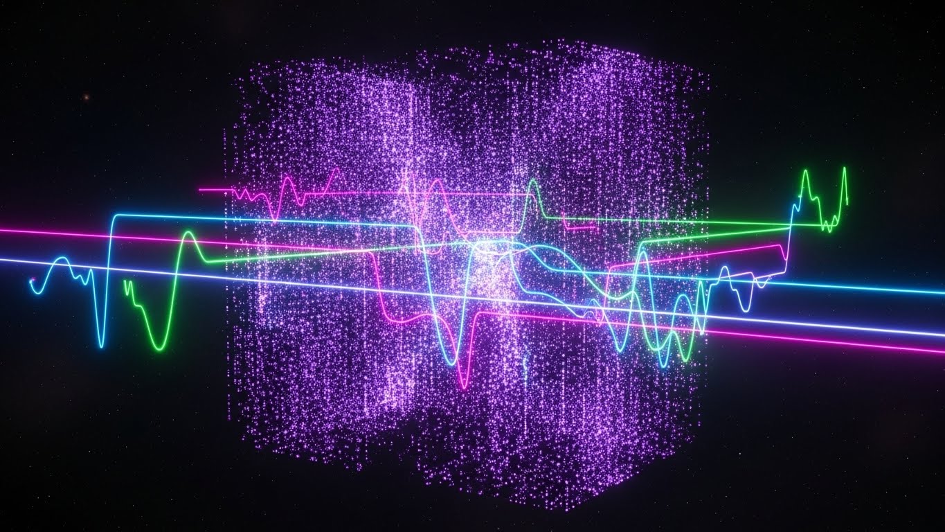
The Visual & Narrative Approach
To close the loop and promise a future of innovation, this style combines the organic with the digital. A galaxy of Ultraviolet and Deep Purple code particles is swirling in a deep space void. From this chaos, neon glowing lines (Green, Blue, Pink) emerge to form a solid, stable cubic structure. This represents "AI-Driven Evolution"—the system organizing itself. The aesthetic is ethereal, high-tech, and suggestive of next-generation intelligence.
Psychological Impact & KPI Focus
- Niche Psychology: This appeals to "Future Orientation." It reassures the client that the platform is not static; it is an evolving, living intelligence that will adapt to future needs. It validates long-term investment.
- Operational Impact: Visualizes AI Governance and Self-Healing Architecture. It leaves the viewer with a sense of awe and confidence in the platform's longevity.
Strategic Implementation & Trade-offs
- Best Use Case: Background loop for keynote presentations or the "Vision" section of the roadmap page.
- Duration: 30-60 seconds (Slow Loop).
- Trade-off: It is purely conceptual. It builds brand equity and "hype" but explains nothing specific. Use it to set the mood, not to teach.
The Visual Operations Doctrine: Strategic Synthesis
We have dissected 30 distinct visual styles, ranging from the molecular precision of line art to the emotive power of cinematic storytelling. However, a style guide is only as effective as its strategic application. To transform these assets from "marketing content" into "business infrastructure," we must organize them into a cohesive operational framework.
This section synthesizes the insights from all 30 examples into three core knowledge segments. These are not summaries; they are your Visual Operations Doctrine—the blueprint for deploying visual assets to drive adoption, efficiency, and revenue in the API economy.
Strategic Alignment & Visual Architecture
The "Pre-Production" Strategy: Defining the Visual Operating System
Before a single pixel is rendered, the visual language must be aligned with the technical reality of your API infrastructure. Inconsistency creates friction; clarity creates trust.
- The Cognitive Load Audit: Technical buyers are overwhelmed. Before approving a visual, perform a "Cognitive Load Audit." Does the style match the user's mental state? Use high-energy visuals (Style 21) for discovery (TOFU) but switch to calm, low-poly, or line-art styles (Style 4, 8) for complex technical education to prevent cognitive burnout.
- Role-Based Visual Mapping: Differentiate your visual output based on the viewer's role. A CTO (The Fleet Manager) needs the "God Mode" perspective (Style 3, 20) showing scale and ROI. The Developer (The Driver) needs specific, tactical visuals like Dark Mode UI (Style 27) or Command Line interactions. One style does not fit all personas.
- The "Glanceability" Standard: In a DevOps environment, time is scarce. Visuals must pass the "Glanceability" test. A user scrolling LinkedIn or documentation should grasp the concept (e.g., "Rate Limiting" - Style 8) in under 1.5 seconds. If they have to decode the image, the visual has failed.
- Brand Voice Consistency: Your visual language is your product voice. If your marketing uses playful 3D Claymorphism (Style 4) but your product UI is stark, industrial data grids, you create a "Brand Gap." Ensure your marketing visuals share DNA (color palette, corner radius, font weight) with your actual software interface.
- The Advids Strategic Audit: This is where a partner like Advids becomes critical. Defining a "Visual Operating System" that scales across 30+ styles requires an external audit. We help map your feature set to specific visual archetypes, ensuring that "Security" always looks like Security (Shields, Grids - Style 13) and "Speed" always looks like Speed (Motion Blur, Lines - Style 5) across every asset.
- Standardization vs. Customization: Know when to use "Stock-plus-Overlay" (Style 6, 23) versus bespoke 3D (Style 12). Use standardized assets for common concepts (Teamwork, Speed) to save budget, but invest in bespoke, high-end 3D for your core differentiators (e.g., a unique AI engine or proprietary architecture) to own that visual space.
- The Cross-Departmental Bridge: Visuals are the Rosetta Stone between Sales, Ops, and Support. A "Workflow Diagram" created for a whitepaper (Style 19) should be reused by Sales to explain implementation and by Support to troubleshoot issues. Unify your terminology visual assets to prevent silos.
- Legacy System Integration: Visualizing the invisible link between "Legacy On-Prem" and "Modern Cloud" is the hardest challenge. Use "Transition" styles (Style 7, 11) to visually demonstrate the bridge. Don't just show the new; show the path from the old to the new to validate the migration journey.
- Accessibility in Design: The API world is global. Ensure your motion graphics (Style 8, 22) rely on visual metaphors (shapes, motion) rather than heavy text. A "funnel" (Style 8) is understood as "filtering" in every language. This reduces localization costs and increases global comprehension.
- The Mobile-First Mandate: Even developers browse on mobile. Ensure all 30 styles—especially complex diagrams—are legible on a vertical screen (Style 21). If a topology map is unreadable on an iPhone, it is useless for 60% of your top-of-funnel traffic.
Operational Adoption & Implementation
The "Deployment" Phase: Embedding Visuals into the Workflow
The goal is not just to attract leads, but to ensure they successfully adopt and use the platform. Visuals are the grease in the gears of implementation.
- Overcoming "Black Box" Anxiety: Developers fear what they can't see. Use "X-Ray" visuals (Style 12) and "Glassmorphism" (Style 9) to psychologically prove that your system is transparent. "Seeing inside" the machine reduces the anxiety of losing control to an automated system.
- The Micro-Learning Shift: No one reads the manual. Replace 50-page PDFs with a library of 30-second "Micro-Interaction" videos (Style 14, 21). Embed these clips directly into the API documentation to provide "Just-in-Time" learning exactly when the developer needs it.
- Just-in-Time Support: Embed specific visual styles into the dashboard itself. If a user hovers over a "Deploy" button, a small tooltip GIF (Style 14) showing the successful action can reduce hesitation. This "Visual Hand-Holding" reduces friction at critical decision points.
- Gamification of Training: Use "Progress Bar" visuals (Style 23) and "Achievement" aesthetics (Style 22) in your onboarding flow. Visualizing the setup process as a "Level Up" journey rather than a checklist increases completion rates and reduces drop-off.
- Reducing Support Ticket Volume: There is a direct correlation between the quality of your "Self-Serve" visuals (Style 26) and your support costs. A clear, animated diagram explaining "How Tokens Work" can prevent hundreds of "Level 1" support tickets, freeing your engineers for complex issues.
- Remote Onboarding: In a distributed world, you cannot rely on in-person seminars. Use "Immersive 3D" (Style 4, 16) and "Screencasts" to simulate the "over-the-shoulder" mentorship experience. Visuals must bridge the physical distance between your product team and the client's implementation team.
- Standard Operating Procedures (SOPs): Transform text-based SOPs into "Visual Process Flows" (Style 19). An interlocking puzzle animation is far more effective at enforcing standard integration protocols than a bulleted list. Visuals drive compliance.
- Feedback Loops: Use interactive video elements. A "Choose Your Own Adventure" style video (branching based on user role) allows you to gather data on what users are actually interested in. Use this data to refine the product UI.
- Scalable Localization: When expanding to new regions (APAC, EMEA), replace on-screen text with universal icons (Style 10) and character actions (Style 22). This allows you to deploy the same visual asset across 20 languages with only a voiceover change.
- Leadership Communication: Technical teams often struggle to explain value to the C-Suite. Provide your champions with "Executive Summary" visuals—high-polish, "Abstract 3D" (Style 3) and "ROI Visualization" (Style 15) assets that they can paste into their internal slide decks to justify the budget.
Measuring Impact & Future-Proofing
The "ROI" Phase: Measuring Success and Looking Ahead
Visual assets are investments. You must measure their return and ensure they are built to last in an AI-driven future.
- Beyond "Views" – Actionable KPIs: Do not measure success by "video views." Measure it by "Time-to-Competency" and "Feature Adoption Rate." Did the "Monetization" video (Style 24) on the product page lead to a 15% increase in users activating billing? Connect pixels to product usage.
- The "Idle Time" Metric: Monitor how long users spend "stuck" on a screen. If idle time is high on the "Configuration" page, deploy a "Guided Walkthrough" visual (Style 22) and measure the reduction in idle time. This is the ROI of Usability.
- Compliance Velocity: How fast does your user base adapt to new regulations (e.g., SOC 2, GDPR)? Tracking the click-through on "Compliance" visuals (Style 13) gives you a metric for "Compliance Velocity"—a key indicator of enterprise health.
- Retention and Churn (LTV): High-quality UX visualization (Style 9, 27) acts as a subtle retention tool. It signals "Quality" and "Care." Track the churn rate of users who engage with your visual help center versus those who don't. The difference is the LTV of your video content.
- The AI Visual Frontier: Prepare for Generative UI. In the future, your API documentation might generate a custom "How-To" video on the fly for a specific user's unique stack. Your visual assets must be modular (Style 19) to support this real-time assembly.
- Scalability of Assets: Build a library, not a pile. Organize your Source Files (After Effects, 3D Projects) so that when the UI changes, you can re-render all 30 styles with the new hex codes in minutes, not weeks.
- The Advids Partnership: Scalability is where Advids shines. As your platform evolves, you need a partner who maintains your "Visual Source Code." We ensure that as you add features, your visual library grows without fracturing, maintaining the "Visual Operating System" defined in Segment 1.
- Benchmarking Success: "Good enough" is a competitive risk. If your competitor uses "Photorealistic 3D" (Style 20) to show scale, and you use flat 2D, you look like the "SMB" option. Constantly benchmark your visual fidelity against the Tier-1 leaders, not just your direct rivals.
- The ROI of Safety: Quantify the value of trust. A strong "Security Visualization" (Style 12) can be the deciding factor for a Bank CISO. Attribution modeling should credit these specific assets for "Enterprise Deals Closed."
- Final Call to Innovation: Treat video as infrastructure. In the API economy, the product is code, but the experience is visual. By investing in a diverse, strategic, and high-quality visual language, you turn the invisible nervous system of the enterprise into a visible, irresistible competitive advantage.
Companies using similar video content -
Clarifai – AI Platform – Visualizes future-proof architecture with AI-driven evolution.
SotaTek – AI/IoT Solutions – Represents next-generation intelligence and longevity.
Sensedia – API Platform – Showcases AI governance and self-healing architecture.
Author & Editor Bio


