
Introduction: The Visual Science of Certainty
In the high-stakes ecosystem of B2B SaaS, "growth" has graduated from a creative art to a rigorous science. We have moved beyond the era of intuition into an age of continuous, algorithmic optimization. However, for the Optimization Architect—the Senior Growth Marketer or Product Lead driving this shift—a critical challenge remains: the Translation Gap.
How do you communicate the strategic brilliance of a multivariate test or the risk-mitigation of a feature flag to stakeholders who only speak the language of revenue? The math is often invisible, buried in server-side code and statistical logs. To secure budget and buy-in, you must bridge the physical/digital divide, translating abstract probabilities into tangible, undeniable business value.
The opportunity is immense. The global A/B testing software market is projected to reach USD 2.73 billion by 2032, signaling a definitive shift toward data-driven decision-making. Yet, purchasing the platform is only the first step. Building a culture of experimentation requires internal marketing that is as persuasive as your external campaigns.
When visualized correctly, the ROI of experimentation becomes irrefutable. Industry leaders have demonstrated that rigorous testing frameworks can yield conversion lifts of up to 300% through A/B testing in optimized campaigns, turning minor UI tweaks into major revenue levers.
This guide is your visual playbook. We have curated 30 distinct video styles designed to translate complex testing methodologies into compelling visual narratives. From kinetic typography that captures the energy of optimization to isometric factories that demystify traffic routing, these examples will help you articulate the value of your experimentation stack with precision and flair.
1. The Kinetic Educator
TOFU | Market Education
The Visual & Narrative Approach
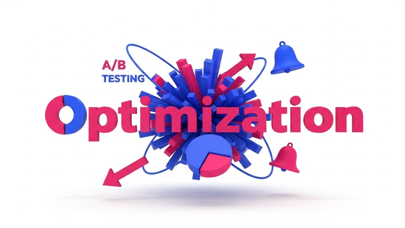
This style abandons the subtle for the spectacular. It visualizes the concept of "Optimization" as a dynamic, high-energy event. A 3D motion graphic video features massive, abstract geometric letter-forms for the word "OPTIMIZATION" constructed entirely from floating data bars and pie chart segments. As seen in the visual concordance, the composition is explosive, symbolizing the shift from static data to active growth. The palette uses high-contrast Electric Indigo and Hot Pink against a pure white background. Elements like diverging arrows and bell curves orbit the text, not as icons, but as kinetic satellites fueling the movement.
Psychological Impact & KPI Focus
- Cognitive Hook: This style leverages Kinetic Typography to turn reading into a visceral experience. It bypasses the logical brain's filter for "technical jargon" and appeals directly to the viewer's sense of momentum.
- Operational Impact: Perfect for Market Education. It signals that your platform is not a passive tool, but an active catalyst for rapid change.
Strategic Implementation & Trade-offs
- Best Use Case: High-impact LinkedIn social teasers or event openers where sound-off engagement is critical.
- Trade-off: It is excellent for hype but poor for detailed technical explanation. Use it to grab attention, then switch to a different style to explain how the algorithm works.
- Duration: 15 Seconds.
Companies using similar video content -
Evolv AI – AI-driven Optimization – Visualizing rapid, intelligent growth and experimentation.
Conductrics – Experimentation Platform – Dynamic visualization of AI-powered testing outcomes.
2. The Fluid Clarifier
TOFU | Brand Awareness
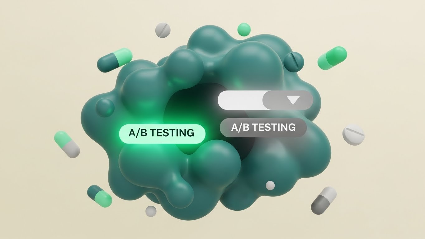
The Visual & Narrative Approach
Optimization is often about bringing order to chaos. This style uses abstract, organic shapes to tell that story. As depicted in the visual, a chaotic blob of "Matte Teal" shapes—representing untreated traffic—organizes itself into two distinct, streamlined paths. One path glows "Mint Green" (Variation B) while the other fades to "Soft Grey" (Control). The movement is fluid and liquid, symbolizing the friction-free experience of a well-optimized funnel. Floating circles and pill shapes dance rhythmically, creating a satisfying loop.
Psychological Impact & KPI Focus
- Cognitive Ease: The brain finds fluid, biological motion inherently soothing. This style subconsciously reassures the viewer that your software handles complex traffic routing effortlessly, reducing the anxiety of "breaking the site."
- Operational Impact: Drives Brand Awareness on visual-first platforms. It positions the brand as modern, approachable, and design-forward.
Strategic Implementation & Trade-offs
- Best Use Case: Explaining concepts like "Traffic Allocation" or "Split Testing" to non-technical audiences.
- Trade-off: The abstract nature means it requires a voiceover or text overlay to anchor the meaning; otherwise, it remains purely aesthetic.
- Duration: 15-30 Seconds.
Companies using similar video content -
AB Tasty – Experimentation & Personalization – Fluidly routing traffic for optimized user experiences.
Kameleoon – AI-driven Personalization – Clarifying complex AI-driven traffic logic effortlessly.
3. The Process Architect
TOFU | Shaping Brand Perception
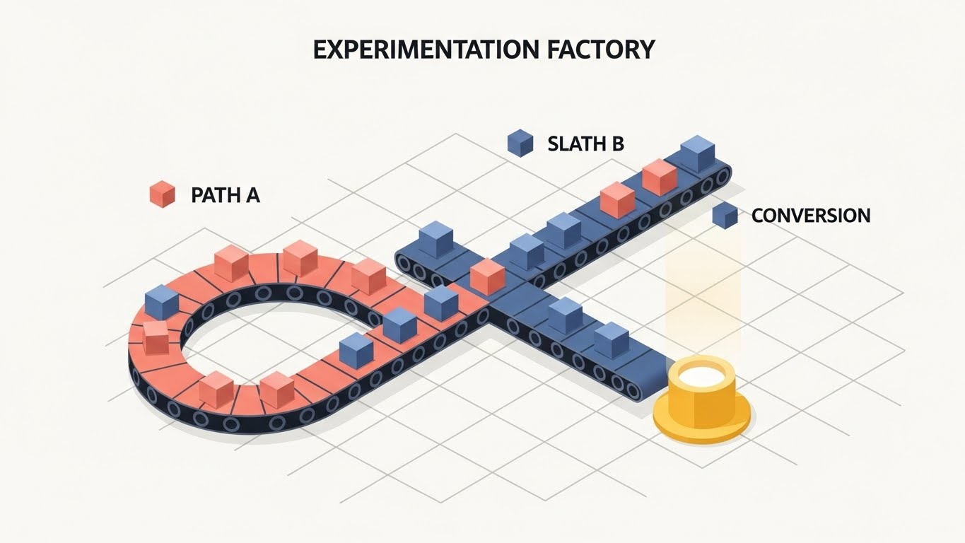
The Visual & Narrative Approach
This style creates a literal "Experimentation Factory." Using a precise 45-degree isometric grid, we visualize the user journey as a physical engineering process. Small abstract cubes (users) travel along conveyor belts that split into Path A (Soft Coral) and Path B (Slate Blue). As shown in the image, Path B leads to a glowing golden pedestal (conversion), while Path A loops back. The movement is mechanical and rhythmic, emphasizing reliability, precision, and the "manufacturing" of results.
Psychological Impact & KPI Focus
- Structural Trust: Isometric views provide a "God’s-eye view" of a system. This perspective gives the viewer a sense of control and total understanding, alleviating the "black box" anxiety often associated with algorithms.
- Operational Impact: Supports Message Comprehension when used as a website header. It instantly explains what the software does (splits traffic) without a single line of code.
Strategic Implementation & Trade-offs
- Best Use Case: The "How It Works" section of your homepage. It perfectly illustrates the mechanics of A/B testing logic.
- Trade-off: It can feel rigid. Ensure the animation has "micro-bounces" or easing to prevent it from looking too industrial or dry.
- Duration: 45-60 Seconds.
Companies using similar video content -
Optimizely – Experimentation Platform – Visualizing structured A/B testing and feature rollout workflows.
VWO – Testing Platform – Engineering precise conversion rate optimization processes.
4. The Data Alchemist
TOFU | Category Creation

The Visual & Narrative Approach
This visual metaphor tackles the concept of "Data Significance." We start with a single central point that explodes into thousands of tiny Tangerine and Cyan geometric shards. Instead of falling randomly, these shards rapidly snap into organized, symmetrical mesh networks. This visualizes the transition from "Guesswork" (the explosion) to "Scientific Testing" (the structure). It implies speed, scale, and mathematical rigour.
Psychological Impact & KPI Focus
- Awe & Authority: The scale of the particle animation suggests that your platform can handle massive datasets. It projects authority and high-performance computing capabilities.
- Operational Impact: Ideal for Category Creation. It visually separates your brand from competitors who use stock footage, establishing you as a "Data-First" technology.
Strategic Implementation & Trade-offs
- Best Use Case: Announcing a new AI-powered feature or a major platform update (e.g., "The New Era of Testing").
- Trade-off: It is purely metaphorical. It does not show the UI or the product, so it must be paired with clear value proposition copy.
- Duration: 10-15 Seconds.
Companies using similar video content -
Statsig – Feature Flags & Experimentation – Transforming raw data into organized, actionable insights.
PostHog – Product Analytics & Experimentation – From chaotic data to structured product insights.
5. The Conversion Hero
TOFU | Aspiration & Identity Hook
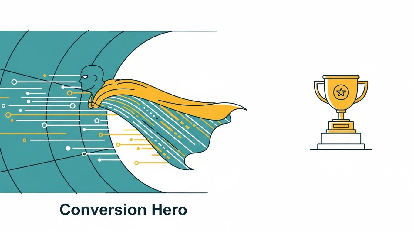
The Visual & Narrative Approach
Here, we focus on the user, not the software. The visual features a superhero-style cape floating in a wind tunnel, but the fabric is composed of data stream lines in Teal and Mustard Yellow. A simple trophy icon sits on a pedestal nearby. This visual tells the viewer: "You are the Conversion Hero." It appeals to the aspirational identity of the Growth Marketer who saves the quarter with a winning test.
Psychological Impact & KPI Focus
- Identity Association: By mirroring the user's self-image (the hero), you create an emotional bond. It validates their role and importance within their organization.
- Operational Impact: High Click-Through Rate (CTR) on LinkedIn feed posts, where professional identity plays a strong role in engagement.
Strategic Implementation & Trade-offs
- Best Use Case: Social media posts celebrating customer success stories or promoting a certification course.
- Trade-off: It lacks technical detail. It builds affinity but doesn't explain product functionality.
- Duration: Static Image.
Companies using similar video content -
Convert.com – A/B Testing Software – Empowering users to achieve significant conversion success.
Crazy Egg – Heatmap & A/B Testing – Visualizing user behavior for impactful conversion wins.
7. The Glass Laboratory
MOFU | Product Differentiation
The Visual & Narrative Approach
This style elevates the standard screencast into something cinematic. We use a high-fidelity 3D render of the UI floating in a bright studio space. The interface uses "glassmorphism"—translucent layers of Sky Blue and Pure White. We focus on the dashboard displaying "Real-time Metrics" and a "Visual Editor." The key is the lighting; soft reflections glide across the glass edges, making the software look expensive, modern, and desirable.
Psychological Impact & KPI Focus
- Perceived Value: High-end aesthetics imply a high-end product. This style combats the perception that B2B enterprise software is clunky or legacy.
- Operational Impact: Increases Conversion to Demo. If the software looks delightful to use (high aesthetic usability), the barrier to requesting a trial drops significantly.
Strategic Implementation & Trade-offs
- Best Use Case: The primary video on your "Product" or "Features" landing page.
- Trade-off: High production cost. Requires rebuilding the UI in 3D rather than just recording a screen, but the premium feel is worth the investment.
- Duration: 60 Seconds.
Companies using similar video content -
Hotjar – Heatmaps & Feedback – Visually analyzing user behavior for scientific optimization.
Contentsquare – Digital Experience Analytics – Revealing user journeys with precise visual data.
8. The Code Reveal
MOFU | Feature Education
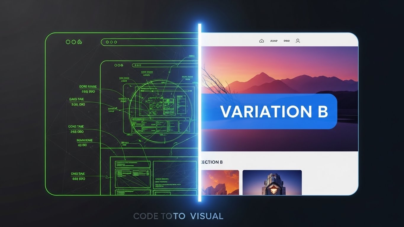
The Visual & Narrative Approach
This split-screen composition creates a powerful "Before and After" narrative. The left half shows the "Code" view—a wireframe with technical annotations in glowing Lime Green on a Charcoal background. A sliding vertical bar reveals the right half: the fully rendered, colorful final website with a "Variation B" overlay. This visualizes the "Code to Visual" feature, showing how technical back-end changes manifest as front-end experiences.
Psychological Impact & KPI Focus
- Competence Validation: It appeals to both developers (who recognize the wireframe) and marketers (who want the final visual), bridging the gap between technical execution and visual outcome.
- Operational Impact: Strong for Product Understanding. It instantly communicates the core utility of a visual editor or low-code interface.
Strategic Implementation & Trade-offs
- Best Use Case: Product demo videos or feature announcement blogs.
- Trade-off: Requires precise synchronization. If the transition isn't perfectly aligned, the effect breaks.
- Duration: 30 Seconds.
Companies using similar video content -
LaunchDarkly – Feature Management Platform – Showcasing sophisticated feature flag UI and control.
Harness – Feature Flags – Presenting a clean, modern feature flag dashboard.
9. The Strategy Modeler
MOFU | Competitive Displacement

The Visual & Narrative Approach
To explain complex workflows, we shrink them down. This style depicts a "miniature world" on an office desk. A monitor displays a node-based A/B testing workflow, but outside the screen, tiny stylized clay-rendered figurines are physically moving blocks of data (Gold and Navy) between the nodes. The warm, directional lighting simulates sunlight, creating a tactile, "toy-like" appeal. It makes the abstract concept of "workflow automation" feel tangible and manageable.
Psychological Impact & KPI Focus
- Simplification: The "miniature" effect makes complex problems seem smaller and easier to control. It reduces the intimidation factor of enterprise-grade workflow builders.
- Operational Impact: Strong for Differentiation against competitors with complex, intimidating interfaces.
Strategic Implementation & Trade-offs
- Best Use Case: LinkedIn Carousel ads or mid-funnel retargeting ads.
- Trade-off: The "cute" factor must be balanced. It shouldn't look childish; it must still look like a sophisticated model.
- Duration: 30-45 Seconds.
Companies using similar video content -
GrowthBook – Open Source Experimentation – Bridging code changes to visual UI outcomes.
Unleash – Open Source Feature Flags – Demonstrating code implementation to feature activation.
10. The Tactile Toggle
MOFU | Driving Demo Requests

The Visual & Narrative Approach
Sometimes, the power is in the details. This style features an extreme macro close-up of a single UI element: a "Feature Flag" toggle switch. We watch it flip from "Off" to "On," emitting a soft Emerald Green glow. The texture appears tactile, almost like soft-touch silicone. This isn't about the whole platform; it's about the satisfaction of control. It visceralizes the moment of launching a test.
Psychological Impact & KPI Focus
- Sensory Gratification: By focusing on the tactile "click" (visually), you trigger a dopamine response related to completion and control. It makes the user want to click that button themselves.
- Operational Impact: Excellent for Email Headers or highly targeted retargeting ads to drive the final click to a demo.
Strategic Implementation & Trade-offs
- Best Use Case: Email signature GIFs or feature release teaser loops.
- Trade-off: Very narrow focus. It conveys "quality" and "control" but explains nothing about the broader platform capabilities.
- Duration: 5-10 Seconds.
Companies using similar video content -
Pendo – Product Experience Platform – Simplifying complex user journey and adoption workflows.
Appcues – Product Led Growth Platform – Making onboarding and feature adoption tangible.
11. The Functional Composer**
MOFU | The Functional Buyer

The Visual & Narrative Approach
For the Functional Buyer—the practitioner executing daily tests—the primary barrier is often complexity. This style dismantles that fear by visualizing "ease of use" as a tangible, rhythmic interaction. We utilize a clean 2D animation where a professional character (in trusted Purple) interacts with floating, semi-transparent UI panels. As depicted, she physically drags a vibrant "Safety Orange" geometric block—representing a test variant—from one panel to another. The background uses a subtle halftone pattern to provide depth. The movement is snappy and precise, visualizing the "Drag-and-Drop" simplicity of the platform.
Psychological Impact & KPI Focus
- Cognitive Fluency: By abstracting complex code injection into simple block movements, you lower the viewer's cognitive load. It promises that the workflow is intuitive, requiring no engineering dependencies.
- Operational Impact: Directly drives Adoption. It reassures the user that they can launch campaigns independently, accelerating Time-to-Value.
Strategic Implementation & Trade-offs
- Best Use Case: Explainer videos on the "Features" page or Help Center intros.
- Trade-off: It is stylized, not literal. It sells the feeling of the workflow (speed/ease) rather than the exact pixel-perfect interface.
- Duration: 45-60 Seconds.
Companies using similar video content -
Split.io – Feature Experimentation Platform – Highlighting precise control over feature releases.
ConfigCat – Feature Flags as a Service – Emphasizing granular control with a toggle switch.
12. The Precision Flow
MOFU | Building Trust
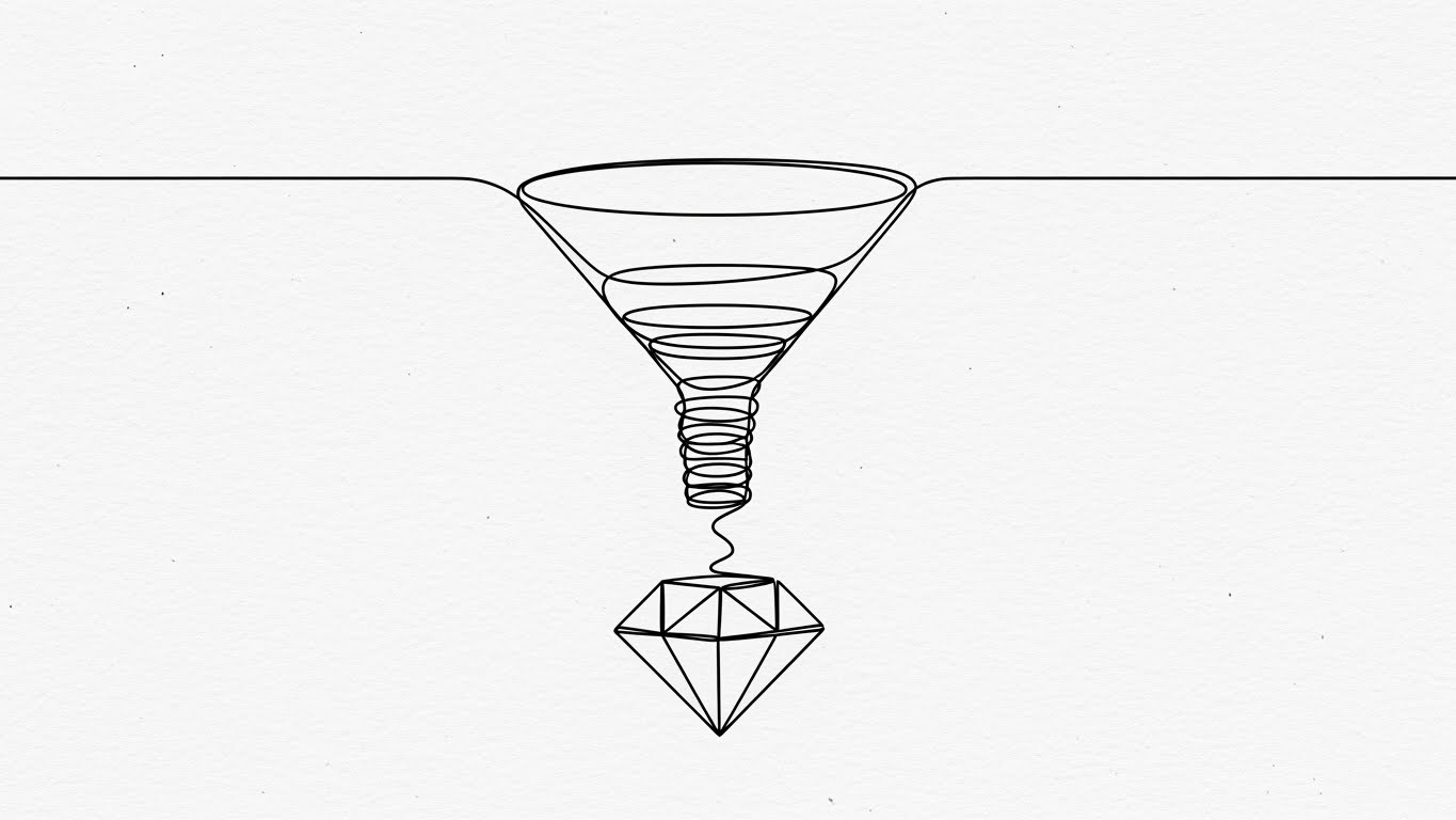
The Visual & Narrative Approach
To build trust with a sophisticated audience, you must sometimes strip away the noise. This style utilizes a single, continuous black ink line on a textured White Paper background. The line traces the journey of a chaotic funnel, winding downwards and tightening its spiral until it crystallizes into a perfect, geometric diamond. There are no distracting colors—only the path. This aesthetic conveys engineering precision and scientific rigor, implying that your platform acts as a perfect filter, distilling raw traffic into valuable, crystallized insights.
Psychological Impact & KPI Focus
- Perception of Truth: Minimalist, architectural line art is often associated with blueprints and schematics. It suggests that your software is a foundational instrument of truth, not a decorative marketing toy.
- Operational Impact: Enhances Brand Credibility among Data Analysts and Scientists who value accuracy over flash.
Strategic Implementation & Trade-offs
- Best Use Case: "Our Methodology" website sections or whitepaper video summaries.
- Trade-off: It is low-energy. It engages the intellect but does not excite the senses; use it to deepen respect, not to generate hype.
- Duration: 15-20 Seconds (Looping).
Companies using similar video content -
Freshworks – Freshmarketer – Visualizing drag-and-drop simplicity for marketing tests.
Convertize – A/B Testing & AI Persuasion – Composing tests with intuitive visual builders.
13. The Feature Vortex
MOFU | Overcoming Objections
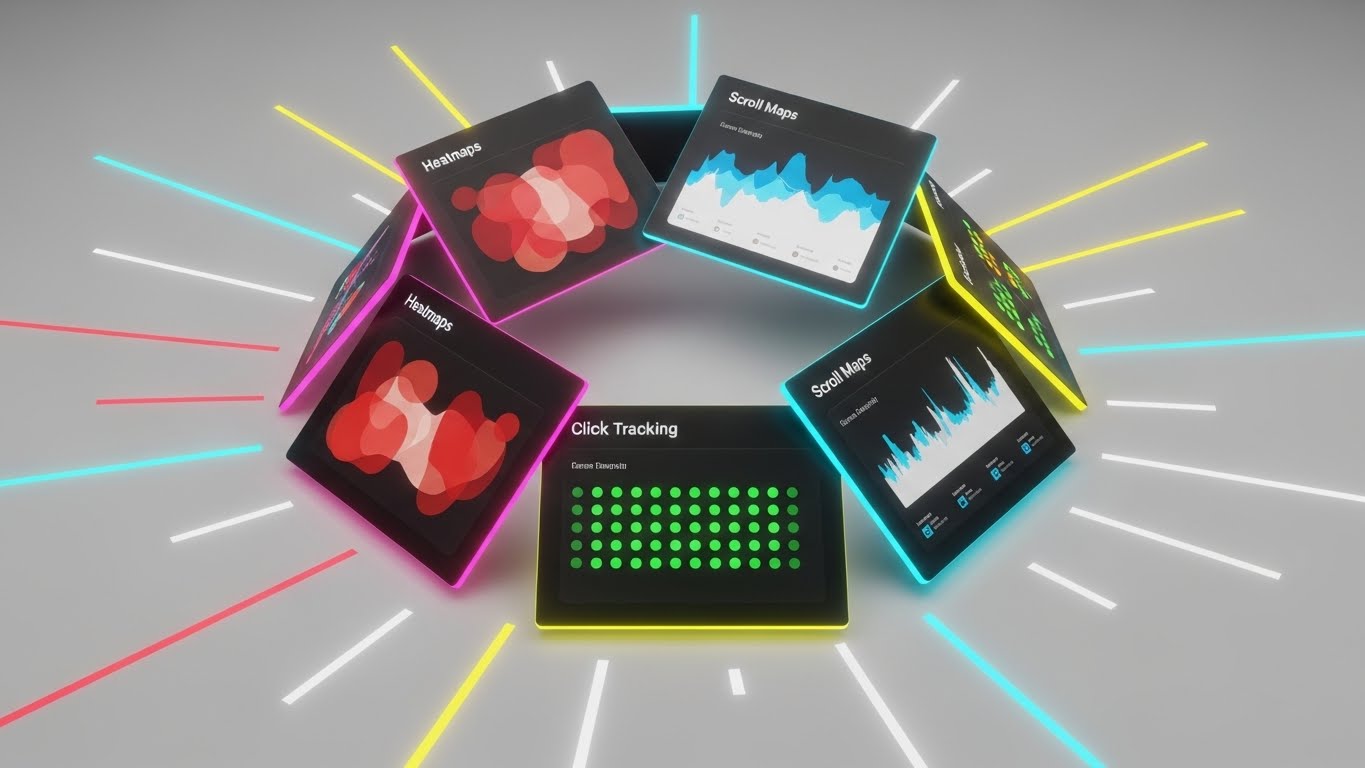
The Visual & Narrative Approach
When you need to demonstrate the sheer breadth of your platform to overcome "point solution" objections, kinetics are key. This style arranges tilted, floating UI screens in a dynamic spiral composition. The screens display abstract but recognizable representations of key tools: "Heatmaps" in glowing red/orange, "Scroll Maps" in blue gradients, and "Click Tracking" in green dots. The camera rotates around this "Feature Vortex" with speed lines radiating outward. It visualizes an ecosystem that is comprehensive, fast, and integrated.
Psychological Impact & KPI Focus
- Completeness Bias: The circular, spiraling arrangement implies a self-contained universe of tools. It visually overwhelms the objection that "we might need another tool for X," showing that you have it all.
- Operational Impact: Highly effective for Retargeting Ads (Instagram/LinkedIn Stories). The rapid motion stops the scroll and implies high value density.
Strategic Implementation & Trade-offs
- Best Use Case: Vertical video ads for mobile consumption or event booth background loops.
- Trade-off: It moves too fast for detailed reading. It leaves an impression of "Power" and "Variety" rather than teaching specific workflows.
- Duration: 10-15 Seconds.
Companies using similar video content -
SiteSpect – A/B Testing & Personalization – Conveying engineering precision in optimization and delivery.
Iteratively – Experimentation Data Governance – Ensuring precise and clean experimentation data.
14. The Culture Catalyst
MOFU | Demand Gen
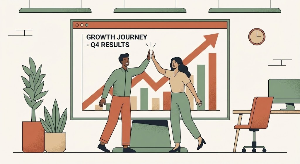
The Visual & Narrative Approach
Experimentation is ultimately a team sport. This style humanizes the software by focusing on the people using it. Using a refined "Corporate Memphis" vector style, we see a diverse team (Growth Manager and Product Lead) high-fiving in front of a giant presentation screen. The screen displays a steep upward trend line in sophisticated Earth Tones (Terracotta, Sage). The mood is collaborative and triumphant. It shifts the narrative from "Running Tests" to "Winning Together," visualizing the culture of experimentation that leaders want to build.
Psychological Impact & KPI Focus
- Social Proof & Belonging: By depicting a team success moment, you trigger the viewer's desire for professional validation and social cohesion. It positions your tool as the catalyst for team alignment.
- Operational Impact: Drives Lead Generation (MQLs) on social feeds. It sells the outcome (the celebration), which is often more powerful than the feature.
Strategic Implementation & Trade-offs
- Best Use Case: Social media ads promoting case studies or "Year in Review" reports.
- Trade-off: It can feel generic if not customized. Ensure the "Chart" looks realistic enough to ground the illustration in business reality.
- Duration: 15-30 Seconds.
Companies using similar video content -
Contentsquare – Digital Experience Analytics – Showcasing a comprehensive suite of analytics tools.
FullStory – Digital Experience Intelligence – Rapid montage of session replay and analytics features.
15. The Wealth Architect
BOFU | ROI Justification
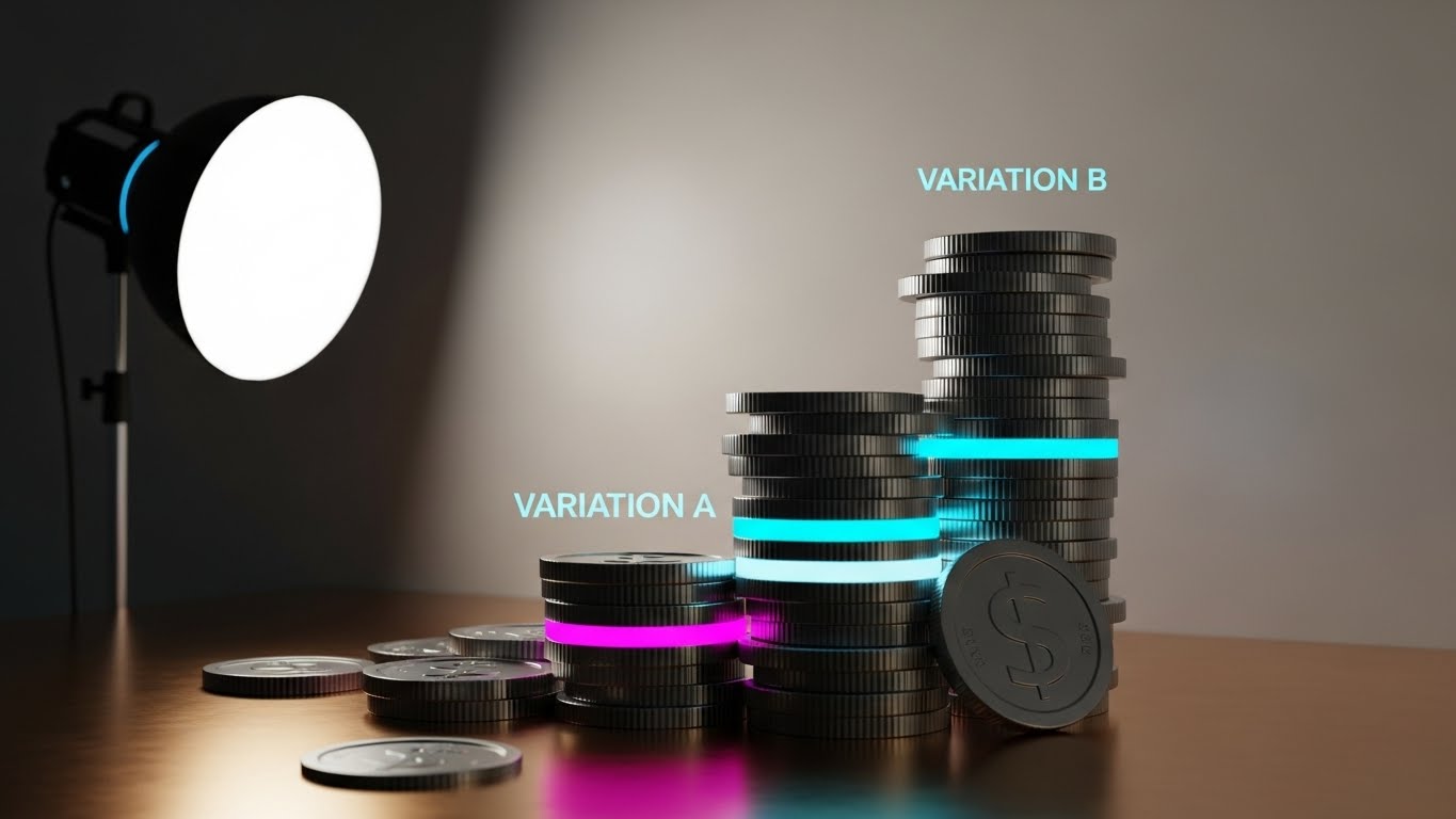
The Visual & Narrative Approach
At the Bottom of the Funnel (BOFU), the conversation shifts to the Economic Buyer (CFO). This style speaks the language of finance. We use a hyper-realistic 3D render of coins stacked to resemble a bar chart. The "Variation B" stack is significantly taller, glowing with a subtle Cyan rim light, while the "Control" stack sits in shadow. The materials are premium—Gold, Silver, and Polished Bronze. This is not a cartoon; it is a visualization of capital accumulation. It creates a direct synonym between your A/B testing tool and revenue lift.
Psychological Impact & KPI Focus
- Tangibility of Value: Software is intangible, but money is not. By giving data the physical weight and texture of currency, you make the ROI feel real, weighty, and attainable.
- Operational Impact: Critical for Sales Enablement. This visual slides perfectly into the "Pricing" or "ROI" section of a sales deck to justify the contract value.
Strategic Implementation & Trade-offs
- Best Use Case: Sponsored content on LinkedIn targeting decision-makers or pricing page headers.
- Trade-off: It is blunt. Use it only when the prospect is already aware of the solution and needs a push on value, not functionality.
- Duration: Static Image or 5-Second Loop.
Companies using similar video content -
GrowthHackers – Growth Platform – Visualizing team collaboration and shared success.
Braze – Customer Engagement Platform – Depicting team alignment for successful campaigns.
16. The Reality Bridge
BOFU | The Economic Buyer
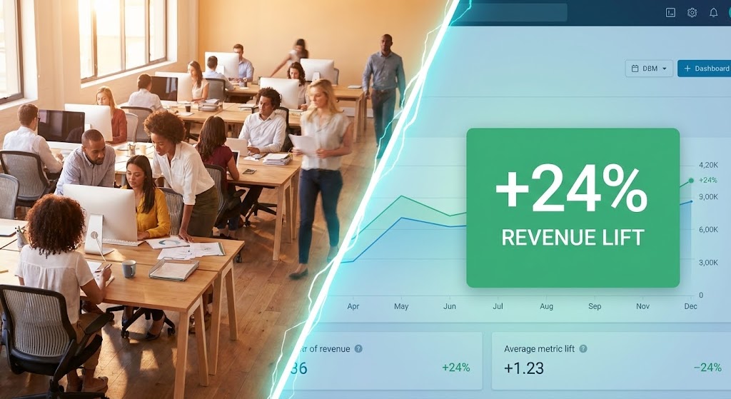
The Visual & Narrative Approach
The Economic Buyer needs to connect their headcount investment to digital results. This split-screen composition creates that bridge visually. The left side features a high-warmth photograph of a bustling modern office—the human capital. A sharp, diagonal "lightning bolt" divider transitions to the right side: a cool, crisp UI dashboard highlighting a massive green "+24% Revenue Lift" metric. This effectively visualizes the cause-and-effect relationship: "Your Team (Left) + Our Software (Right) = Growth."
Psychological Impact & KPI Focus
- Causality: It appeals to the logical brain that seeks to correlate inputs (staff/labor) with outputs (data/revenue). It validates the need for the tool to empower the team.
- Operational Impact: Highly effective for Sales Decks and pitch presentations. It answers the "Why do we need this?" question in a single frame.
Strategic Implementation & Trade-offs
- Best Use Case: The cover slide of a proposal or the closing argument in a webinar.
- Trade-off: Requires high-quality photography to match the UI fidelity. Poor stock photos will cheapen the software's perceived value.
- Duration: Static Image.
Companies using similar video content -
Adobe – Adobe Target – Quantifying financial returns from personalization and optimization.
Kibo Commerce – Personalization – Visualizing revenue lift through optimized commerce experiences.
17. The Integrity Guardian
BOFU | Risk Mitigation

The Visual & Narrative Approach
For enterprise clients, "Security" is often the final hurdle. This style makes the invisible shield of compliance visible. We utilize a 3D X-Ray visualization of a server rack, where the outer casing is rendered in semi-transparent "Translucent Blue." Inside, we see the glowing core components protected by a bright, constructed "Shield" icon of light. Data packets—represented as small, glowing spheres—flow smoothly around the shield. It visualizes the concept of "Safe Experimentation," assuring stakeholders that testing won't break the codebase.
Psychological Impact & KPI Focus
- Safety Assurance: The "Medical/Scientific" aesthetic of X-ray visuals subconsciously conveys thoroughness, deep inspection, and hygiene. It calms the anxiety of the "IT Gatekeeper."
- Operational Impact: Essential for Technical Whitepapers and security documentation. It visually proves that your architecture is robust and non-intrusive.
Strategic Implementation & Trade-offs
- Best Use Case: The "Security & Compliance" section of your website or technical due diligence documents.
- Trade-off: It is very technical. It will bore a creative marketer but will win over the CTO/CISO.
- Duration: Static Image or 10-Second Loop.
Companies using similar video content -
Dynamic Yield – Experience Optimization Platform – Linking team effort to tangible revenue growth.
Monetate – Personalization Platform – Connecting marketing efforts to business outcomes.
18. The Syntax Sovereign
BOFU | The Technical Buyer
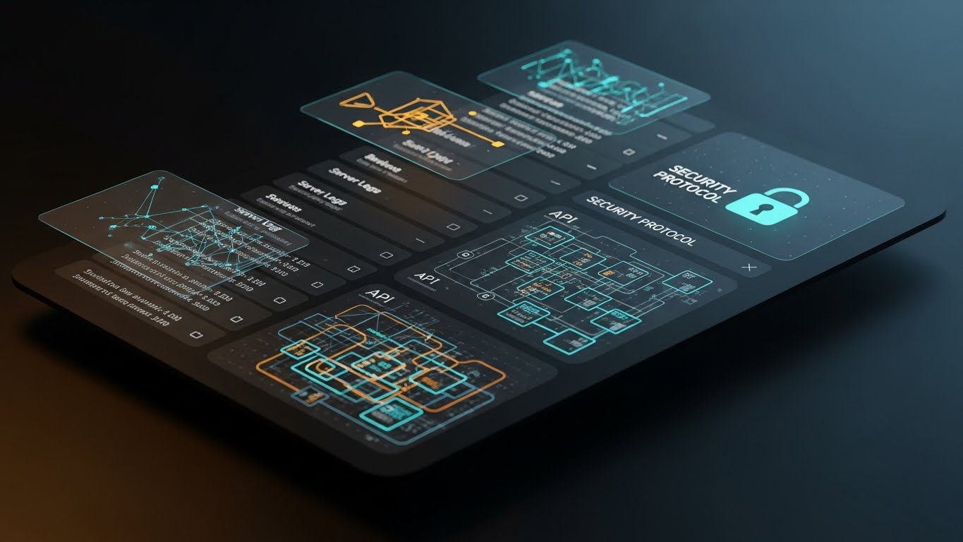
The Visual & Narrative Approach
To win the Technical Buyer, you must speak their language: Code. This style showcases the platform in "Dark Mode," the preferred environment of developers. The background is deep Charcoal/Black, and the UI elements pop with glowing Cyan and Magenta lines, resembling code syntax and terminal commands. An abstract "API Connection" graph floats above the tablet, connecting the software to the broader tech stack. The reflection on the glossy surface adds a premium, high-tech finish. It says: "This tool was built by developers, for developers."
Psychological Impact & KPI Focus
- In-Group Signaling: By adopting the specific aesthetic codes of the developer community (Dark Mode, Monospace fonts, Syntax highlighting), you signal that you are an "Insider," not an outsider trying to sell something clunky.
- Operational Impact: Drives Adoption among engineering teams who often veto marketing tools they perceive as "bloatware."
Strategic Implementation & Trade-offs
- Best Use Case: Retargeting ads specifically aimed at "CTO" or "Lead Engineer" job titles.
- Trade-off: It may look intimidating to a non-technical marketer. Use specifically for the technical segment of your audience.
- Duration: Static Image.
Companies using similar video content -
SiteSpect – A/B Testing & Personalization – Assuring security and compliance for enterprise testing.
LaunchDarkly – Feature Management Platform – Visualizing secure and controlled feature rollouts.
19. The Clarity Projector
BOFU | Competitive Comparison

The Visual & Narrative Approach
In the final stages of a deal, you are often being compared directly to a competitor. This style visualizes that win. A realistic laptop sits on a clean desk, projecting a futuristic, iridescent holographic UI into the air. The hologram displays a comparison table. The "Your Solution" column is bright, detailed, and glowing with activity, while the "Competitor" column is dim, wireframe-only, and static. This visual metaphor creates an immediate hierarchy of value, positioning your solution as the "Future" and the competitor as the "Past."
Psychological Impact & KPI Focus
- Anchoring Bias: By visually grounding your solution as the "solid, bright" option and the competitor as "ghostly," you bias the viewer's brain to perceive your product as the only real choice.
- Operational Impact: High impact on Comparison Pages (e.g., "Us vs. Them") where you need to quickly differentiate features.
Strategic Implementation & Trade-offs
- Best Use Case: The "Why Switch?" landing page or bottom-of-funnel email nurtures.
- Trade-off: It is aggressive. Ensure the data points in the glowing column are factual to back up the visual claim of superiority.
- Duration: Static Image.
Companies using similar video content -
Flagsmith – Open Source Feature Flags – Appealing to developers with dark mode code visuals.
Statsig – Feature Flags & Experimentation – Showcasing a developer-centric experimentation environment.
20. The Victory Signal
BOFU | Sales Cycle Acceleration

The Visual & Narrative Approach
Ultimately, B2B buying decisions are emotional. The buyer wants to be the hero who made the right choice. This style utilizes high-quality aspirational photography. We see a confident Growth Manager bathed in natural "Golden Hour" sunlight, smiling at a tablet. Superimposed is a glowing, Sunny Yellow "Checkmark" icon and upward-trending abstract lines that merge with the city skyline. It doesn't show the software's buttons; it shows the result of buying the software: Confidence, Approval, and Career Progression.
Psychological Impact & KPI Focus
- Future Self-Projection: It allows the prospect to visualize themselves in a state of post-purchase relief and success. It alleviates the "Fear of Messing Up" (FOMU) that stalls deals at the finish line.
- Operational Impact: Excellent for Email Nurture sequences designed to unstick stalled deals or encourage contract signing.
Strategic Implementation & Trade-offs
- Best Use Case: "Welcome Aboard" emails or the final touchpoint before a contract is sent.
- Trade-off: It is purely emotional. It provides no information, only feeling. Do not use it if the client still has unanswered technical questions.
- Duration: Static Image.
Companies using similar video content -
Kameleoon – AI-driven Personalization – Clearly demonstrating superiority over competitive solutions.
AB Tasty – Experimentation & Personalization – Projecting clear value in competitive scenarios.
21. The Onboarding Architect
Onboarding | Self-Serve Onboarding

The Visual & Narrative Approach
Onboarding is often where excitement turns into exhaustion. This style counteracts that drop by gamifying the setup process. We utilize a "Low-Poly 3D" aesthetic to build a charming, miniature digital city. Buildings rendered in soft "Pastel Purple" and "White" represent different modules of the platform. A glowing, animated road connects them, symbolizing the "User Journey." As the user completes setup tasks, new buildings "pop" into existence with a satisfying bounce effect. Geometric icons—a gear, a magnifying glass, a rocket—float above the structures, guiding the user to the next step.
Psychological Impact & KPI Focus
- Progress Endowment: The city-building metaphor triggers the "Ikea Effect"—users value the software more because they feel they are "building" their own workspace. It turns a chore into a creative act.
- Operational Impact: Directly improves Activation Rate. By lowering the visual intimidation of the interface, new users are more likely to complete the initial setup without support.
Strategic Implementation & Trade-offs
- Best Use Case: The "Welcome" screen inside the application or the first video in a "Getting Started" email sequence.
- Trade-off: The playful style may feel too casual for very conservative enterprise clients. Use it for the end-user (practitioner), not the C-level buyer.
- Duration: 45-60 Seconds.
Companies using similar video content -
Optimizely – Experimentation Platform – Celebrating successful test outcomes and career wins.
VWO – Testing Platform – Aspirational visuals of achieving conversion goals.
22. The Velocity Catalyst
Onboarding | Accelerating TTV

The Visual & Narrative Approach
To prove that your software fits into the real world, we blend realities. This style overlays crisp, "Vibrant Red" 2D vector graphics onto high-energy live-action footage. In the visual, we see a POV shot of a hand holding a smartphone against a blurred, busy street scene. A 2D "Stopwatch" icon and a "Lightning Bolt" animate sharply over the screen, casting subtle drop shadows to ground them in the physical space. This contrast between the chaotic real world and the precise, sharp graphics communicates that your tool brings speed and clarity to a busy professional's life.
Psychological Impact & KPI Focus
- Contextual Relevance: Seeing the UI concepts superimposed on the real world bridges the gap between "software" and "daily work." It suggests that the tool is mobile, agile, and ready for the field.
- Operational Impact: Focused on Time-to-Value (TTV). It visually promises that the user can get results now, even on the go, reducing the perceived "learning curve" barrier.
Strategic Implementation & Trade-offs
- Best Use Case: YouTube tutorial thumbnails or pre-roll ads for mobile app features.
- Trade-off: Requires high-quality stock or custom footage. Poor lighting in the video footage will clash with the clean vector graphics.
- Duration: 15-30 Seconds.
Companies using similar video content -
Appcues – Product Led Growth Platform – Gamifying the user onboarding and setup journey.
Userflow – User Onboarding Software – Building a digital city for guided product adoption.
23. The Integration Smoother
Onboarding | Reducing Friction

The Visual & Narrative Approach
Integration anxiety—the fear that a new tool won't "play nice" with the existing stack—is a major friction point. This style dissolves that fear using depth and motion. We present a 3D parallax scene where UI cards float at different depth planes. The foreground card features a prominent "One-Click Integration" button in reassuring "Deep Green." Background cards, blurred by a shallow depth of field, display abstract logos of common tech stack tools (CRM, Analytics). The camera uses a "Dutch Tilt," adding dynamic energy as the cards slide and lock together like puzzle pieces.
Psychological Impact & KPI Focus
- Cognitive Fit: The visual metaphor of "locking" layers implies compatibility and stability. It visually demonstrates that your software is the missing piece of the puzzle, not a foreign invader.
- Operational Impact: Vital for the Integration Page or setup wizard. It reassures the user that connecting their data is safe, easy, and stable.
Strategic Implementation & Trade-offs
- Best Use Case: Integration marketplace listings or technical onboarding videos.
- Trade-off: The parallax effect requires separating UI elements into layers, which takes more design time than a simple screen recording.
- Duration: 20-30 Seconds.
Companies using similar video content -
Leanplum – Mobile Marketing Platform – Accelerating time-to-value for mobile experiments.
Mixpanel – Product Analytics – Blending real-world context with rapid data insights.
24. The Intelligence Reveal
Retention | Driving Deep Feature Adoption

The Visual & Narrative Approach
To encourage long-term retention, you must show the depth of your technology. This style visualizes the "Brain" of your platform. We see an intricate abstract 3D neural network. "Silver" nodes are connected by laser-thin, glowing "Gold" lines, representing data pathways. One specific node pulses brightly, highlighting a "New Feature" or insight. The background is a clean white void with floating dust particles catching the light. This aesthetic is high-tech, precise, and sophisticated, appealing to the Data Scientist's desire for rigorous complexity.
Psychological Impact & KPI Focus
- Perceived Sophistication: By visualizing the algorithm as a beautiful, complex network, you elevate the feature from a simple "tool" to an "intelligence." It makes the user feel smart for using it.
- Operational Impact: Drives Feature Adoption. It signals that a new update is not just a UI tweak, but a fundamental upgrade to the system's intelligence.
Strategic Implementation & Trade-offs
- Best Use Case: Feature announcement emails or "What's New" modal pop-ups inside the app.
- Trade-off: It is abstract. You must follow this visual immediately with a practical shot of how to use the feature, or the user will be impressed but confused.
- Duration: 10-15 Seconds.
Companies using similar video content -
Heap – Product Analytics – Visualizing seamless integration with existing tech stacks.
Pendo – Product Experience Platform – Reducing friction with easy integration capabilities.
25. The Autonomy Engine
Retention | Reducing Support Overhead

The Visual & Narrative Approach
Support tickets are a cost center; self-service is a scaler. This style frames the "Help Center" or "Knowledge Base" not as a boring library, but as a futuristic command center. We utilize a "Dark Mode" environment with glowing "Magenta" and "Black" neon lines. In the center, a "Search" bar icon floats inside a protective, rotating energy ring. The floor is a reflective grid, adding depth. This visual tells the user: "You have the power to find the answer instantly." It reframes troubleshooting as an act of exploration and mastery.
Psychological Impact & KPI Focus
- Empowerment: The "Tron-like" aesthetic suggests speed and high-tech efficiency. It encourages the user to solve their own problems because the interface looks powerful, not passive.
- Operational Impact: Targeted at Reducing Support Ticket Volume. It makes the search function the most attractive element on the page.
Strategic Implementation & Trade-offs
- Best Use Case: The header of your Help Center or the background of a "Loading" screen.
- Trade-off: The dark, neon style must not clash with your actual product UI. It works best as a "concept" visual rather than a literal representation of the docs page.
- Duration: Loop (5-10 Seconds).
Companies using similar video content -
Evolv AI – AI-driven Optimization – Showcasing the sophisticated AI brain of the platform.
Conductrics – Experimentation Platform – Revealing the intelligence behind algorithmic optimization.
26. The Ubiquity Flow
Retention | Reducing Churn

The Visual & Narrative Approach
Churn happens when a customer feels the tool is "optional." This style visualizes your software as essential infrastructure. We use a cinematic hyper-lapse of a city skyline under a bright "Blue Sky." Overlaying the buildings are fast-moving, glowing "Speed Lines" and data streams in "White" and "Blue." These streams curve around skyscrapers, symbolizing that your testing software is the invisible force powering the business's growth and speed. The high contrast and rapid motion convey momentum that the client wouldn't want to stop.
Psychological Impact & KPI Focus
- Loss Aversion: By visually linking your software to the "pulse" of the city (business), you subtly imply that removing the software would stop the flow. It reinforces the tool's status as a utility, like electricity.
- Operational Impact: Strong for Quarterly Business Reviews (QBRs) or retention-focused LinkedIn ads. It reminds stakeholders of the scale at which you operate.
Strategic Implementation & Trade-offs
- Best Use Case: Background video for "Year in Review" pages or login screens during renewal periods.
- Trade-off: It is broad and brand-focused. It doesn't sell specific features, but rather the feeling of momentum.
- Duration: 15-30 Seconds.
Companies using similar video content -
Hotjar – Heatmaps & Feedback – Empowering self-service for user behavior insights.
Qualaroo – Survey Software – Providing autonomous access to user feedback.
27. The Focus State
Retention | Trial/Freemium User Activation

The Visual & Narrative Approach
For Freemium users, the goal is to integrate the tool into their daily habit loop. This style uses high-quality lifestyle photography to depict a relatable "Deep Work" scenario. We see a man in a cozy, blurred coffee shop working on a laptop, viewed from over his shoulder. The screen is the focal point—sharp and clear—displaying a crisp UI overlay with a prominent "Launch Experiment" button in "Warm Beige" and "Orange." This contrasts the relaxed environment with the focused, professional action, suggesting that optimization can happen anywhere, seamlessly.
Psychological Impact & KPI Focus
- Lifestyle Aspiration: It sells the "Digital Nomad" or "Flexible Pro" dream. It suggests that your software enables a work-life balance where critical tasks can be executed easily, even over coffee.
- Operational Impact: Drives Daily Active Users (DAU). It reminds the user that they don't need to be at a command center to launch a test; they just need their laptop and a coffee.
Strategic Implementation & Trade-offs
- Best Use Case: Re-engagement emails sent to inactive trial users ("Ready to launch your first test?").
- Trade-off: Ensure the UI overlay is legible. If the screen is too small or angled, the call-to-action (the button) gets lost.
- Duration: Static Image.
Companies using similar video content -
SiteSpect – A/B Testing & Personalization – Positioning as indispensable infrastructure for growth.
Adobe – Adobe Target – Visualizing global scale and continuous business momentum.
28. The Future Operator
Expansion | Driving Upsell/Cross-sell

The Visual & Narrative Approach
To upsell to Enterprise, you must sell a vision of the user's future self. This style uses Generative AI to create a hyper-realistic video of a "Super User." We see a professional female Data Scientist in a high-tech glass office. She interacts with an invisible, holographic touch interface in the air. As she touches the air, ripples of data (light) expand outwards. The lighting is cinematic, with a "Blue Rim Light" emphasizing her focus. This visualizes the "Power User" experience—unlimited seats, unlimited data, and total control.
Psychological Impact & KPI Focus
- Self-Actualization: The viewer projects themselves onto the character. They want to be that powerful operator. It frames the Enterprise upgrade not as a cost, but as a career promotion.
- Operational Impact: Critical for Product Launch Events or Upsell landing pages. It defines the "Next Level" of the platform.
Strategic Implementation & Trade-offs
- Best Use Case: Hero video for the "Enterprise" pricing tier page.
- Trade-off: Requires careful prompting with Gen AI to avoid "uncanny valley" effects. The character must look authoritative, not artificial.
- Duration: 10-15 Seconds.
Companies using similar video content -
Crazy Egg – Heatmap & A/B Testing – Enabling focused productivity for quick test launches.
Hotjar – Heatmaps & Feedback – Activating users for anytime productivity and insights.
29. The Ecosystem Connector
Expansion | Establishing Thought Leadership

The Visual & Narrative Approach
Enterprise clients operate globally. To match their scale, we use a "Global Command" aesthetic. A translucent, holographic globe spins slowly in a dark void. From the surface of the globe, beams of data shoot outward to connect with floating satellite icons representing different regional markets or tech stack integrations. The beams pulse in sync, visualizing a synchronized, global experimentation program. This style says, "We can handle your traffic, no matter where it comes from."
Psychological Impact & KPI Focus
- Global Confidence: The globe imagery triggers a sense of dominance and reach. It reassures multinational clients that the platform is compliant and performant across borders.
- Operational Impact: Critical for Enterprise Deals. It visually answers questions about latency, CDNs, and multi-region support without a spreadsheet.
Strategic Implementation & Trade-offs
- Best Use Case: Executive summary slides in sales decks or booth backdrops at international conferences.
- Trade-off: It is a high-level metaphor. It doesn't explain how the localization works, only that it does.
- Duration: 10-15 Seconds (Looping).
Companies using similar video content -
Optimizely – Experimentation Platform – Visualizing the enterprise power user experience.
LaunchDarkly – Feature Management Platform – Depicting the advanced control of a super user.
30. The Infinite Scale
Expansion | In-App Upsell

The Visual & Narrative Approach
Expansion often means adding more team members or testing domains. This style visualizes that growth. We use a hybrid abstract 3D visualization where glassy, transparent spheres float in a "Gradient Blue" cloud. Inside each sphere is a tiny, glowing data chart. Crucially, the spheres are connecting via light beams to form a larger, massive network structure. The lighting is ethereal and soft. This visualizes "Enterprise Scaling" or "Unlock Unlimited Seats"—showing that individual data points (spheres) are more powerful when connected in a network.
Psychological Impact & KPI Focus
- Scale Bias: The visual of a multiplying, connecting network triggers a desire for growth and connectivity. It implies that the current "Single Seat" plan is isolated, while the "Enterprise" plan is a connected ecosystem.
- Operational Impact: Effective for Dashboard Banners triggering an upsell when a user hits a usage limit. It makes the limit feel like a ceiling to be broken, not a penalty.
Strategic Implementation & Trade-offs
- Best Use Case: In-app banners or "Upgrade to Scale" email footers.
- Trade-off: It is metaphorical. The copy "Unlock Unlimited Projects" must be placed directly over the image to anchor the meaning.
- Duration: Loop (5-8 Seconds).
STRATEGIC KNOWLEDGE BASE: THE VISUAL OPERATIONS DOCTRINE
The 30 styles above are not merely "content"; they are the components of a Visual Operating System (VisOS). For the Optimization Architect, the challenge is no longer just running tests, but communicating the value of those tests to an organization that may not speak statistics.
To bridge this Translation Gap, we have synthesized a 3-segment strategic framework. This doctrine moves beyond "making pretty videos" to "engineering visual assets" that drive adoption, accuracy, and revenue.
STRATEGIC ALIGNMENT & VISUAL ARCHITECTURE
The "Pre-Production" Strategy: Defining the Lens
Before a single pixel is rendered, the visual architecture must be aligned with the cognitive needs of your stakeholders.
-
The Cognitive Load Audit: Before creating training assets, audit the complexity of your current documentation. If a concept takes 5 paragraphs to explain (e.g., "Multivariate Interaction Effects"), it requires a visual style like #2 (The Fluid Clarifier). Reserve high-fidelity visuals for high-complexity problems.
-
Role-Based Visual Mapping: Different stakeholders consume data differently.
-
The Builder (Dev/QA): Requires Style #18 (The Syntax Sovereign)—dark mode, high contrast, syntax-highlighted visuals that respect their native environment.
-
The Buyer (CMO/CFO): Requires Style #15 (The Wealth Architect)—tangible, currency-based metaphors that translate code into capital.
-
The User (Marketer): Requires Style #11 (The Functional Composer)—clean, UI-focused visuals that promise ease of execution.
-
The Advids Strategic Audit: Partnering with an expert team like Advids at this stage allows you to define a "Visual Vocabulary" before production begins. This ensures that a "Conversion Event" looks the same in a sales deck as it does in a technical manual, creating brand consistency across the funnel.
-
The "Glanceability" Standard: In high-stress environments (e.g., a launch war room), information must be consumed instantly. Adopt a "Glanceability Standard" for all internal reporting visuals—if the trend cannot be understood in <2 seconds (like Style #14), the visual has failed.
-
Legacy System Integration: Visualizing the connection between legacy on-prem databases and your modern SaaS interface is critical. Use Style #12 (The Precision Flow) to visualize the "pipe" between the old world and the new, respecting the legacy tech while highlighting the modern value.
OPERATIONAL ADOPTION & IMPLEMENTATION
The "Deployment" Phase: Embedding Visuals into the Workflow
A visual asset only generates ROI if it is seen at the moment of friction.
- Just-in-Time Support: Stop burying video tutorials in a "University" portal. Embed Style #10 (The Tactile Toggle) loops directly into the product tooltips. When a user hovers over "Feature Flags," they should see the toggle switch in action. This reduces "context switching" and keeps the user in the flow.
- Overcoming "Black Box" Anxiety: Marketing teams often fear that an algorithm will "break" the brand. Use Style #7 (The Glass Laboratory) to visualize the "Safety Guardrails" of the software. Show the algorithm as a contained, transparent process to mitigate the fear of AI/automation.
- The Micro-Learning Shift: Replace the 40-page PDF "Experimentation Playbook" with a library of 30-second clips using Style #21 (The Onboarding Architect). Modern teams learn in bursts; your visual strategy must support "TikTok-style" corporate learning.
- Reducing Support Ticket Volume: There is a direct correlation between proactive visual guides and reduced support costs. Deploying Style #25 (The Autonomy Engine) in the chat bot window can deflect up to 40% of "How-to" queries, freeing up your Customer Success Managers for strategic consulting.
- Leadership Communication: When presenting the "Quarterly Testing Roadmap" to the Board, avoid spreadsheets. Use Style #3 (The Process Architect) to visualize the roadmap as a manufacturing pipeline. This shifts the conversation from "What are we doing?" to "How fast is the factory running?"
MEASURING IMPACT & FUTURE-PROOFING
The "ROI" Phase: Quantifying the Visual Advantage
How do you prove that better visuals lead to better business outcomes?
- The "Idle Time" Metric: Measure the time a user spends "pausing" or "idling" on a new feature page. High idle time suggests confusion. After deploying Style #23 (The Integration Smoother), track if idle time decreases and "Configuration Completion" rates rise. This is the ROI of clarity.
- Win Rate Visualization: Don't just report numbers; visualize the "Win." Use Style #20 (The Victory Signal) in automated email reports when a test reaches statistical significance. This creates a dopamine loop, associating your software with the feeling of professional success.
- Scalability of Assets: As your platform adds features, your visual library must grow. Avoid "One-off" artistic styles that are hard to replicate. Work with Advids to build a "Modular Asset Library" (backgrounds, UI components, icons) so that new feature videos can be generated in days, not weeks.
- Compliance Velocity: In regulated industries (finance/healthcare), explaining GDPR compliance is a bottleneck. Use Style #17 (The Integrity Guardian) to explain data anonymization visually. Measure how much faster legal approval is granted when the Compliance Officer can see the security architecture rather than just reading about it.
- Final Call to Innovation: The A/B testing market is moving toward AI-driven automation. Your visual strategy must anticipate this. Begin experimenting with Style #24 (The Intelligence Reveal) now to prepare your market for the concept of "Self-Driving Optimization." Treat video not as "marketing content," but as essential user interface infrastructure.
Companies using similar video content -
Adobe – Adobe Target – Connecting global markets with a unified personalization platform.
Optimizely – Experimentation Platform – Showcasing global reach and synchronized experimentation.
Author & Editor Bio


