
INTRODUCTION: VISUALIZING THE HIGH-VELOCITY RECRUITMENT ENGINE
The days of the "Resume Black Hole" are officially behind us. In the modern talent landscape, Applicant Tracking Software (ATS) is no longer just a database; it is a high-velocity digital ecosystem that bridges the physical gap between global talent and organizational growth. For SaaS platforms in this space, the challenge is not just delivering efficiency—it is visualizing it. How do you show the "intelligence" of an algorithm? How do you depict the "warmth" of a human hire through a screen?
The stakes are incredibly high. Recent data from the 2025 AI in Hiring Report reveals that 98% of hiring managers have seen significant improvements in hiring efficiency by adopting advanced tools. This isn't just about saving time; it is about business survival. Firms that successfully leverage automation are twice as likely to grow revenue compared to their manual counterparts.
However, promising "AI-driven matching" creates a psychological hurdle: the "Black Box" problem. Buyers are skeptical of invisible magic. They need to see the logic, the flow, and the integration. This guide presents 30 definitive visual styles designed to demystify your technology. From the fluid, organic motion of talent pools to the crystalline clarity of glassmorphic UIs, these examples are engineered to reduce cognitive load and prove, visually, that your platform is the engine of their future success.
1. Abstract 2D flat vector organic modern motion graphics
TOFU | Brand Awareness

The Visual & Narrative Approach
This style moves beyond rigid corporate grids to embrace the fluidity of human talent. The visual features vertical, liquid-like waves in shades of Lavender, Soft Pink, and White, flowing smoothly against a clean background. The motion is continuous and organic, suggesting that the "Talent Pool" is living, breathing, and constantly replenishing. Unlike static charts, these forms merge and separate, visualizing how candidates move through different stages of the hiring pipeline without friction.
Psychological Impact & KPI Focus
Psychologically, the organic curves counteract the anxiety of "rigid" or "impersonal" software. It signals to the Head of Talent that your platform adapts to people, not the other way around. By removing hard edges, you visually promise a reduction in "candidate drop-off" (a key KPI). The soothing palette specifically targets the "overwhelmed recruiter," offering a subconscious promise of a smoother, less stressful workflow.
Strategic Implementation & Trade-offs
- Best Use: Social Media feeds (Instagram/LinkedIn) where you need to stop the scroll with satisfying, hypnotic motion.
- Duration: 6-10 seconds (Looping).
- Trade-off: While excellent for brand sentiment and "modern" vibes, it is too abstract to explain specific features (like parsing or scheduling). Use it to build feeling, not to teach function.
Companies using similar video content -
Lever – Talent Acquisition Suite – Manages fluid candidate journeys and talent pools.
Beamery – Talent Lifecycle Management – Nurtures talent pools with organic engagement.
2. Abstract 3D AI Visualization
TOFU | Category Creation

The Visual & Narrative Approach
To sell AI, you must make the invisible visible. This visualization features a complex, spherical network of polished Silver and Chrome nodes connected by glowing Cyan threads, set in a pristine, laboratory-white environment. It represents the "AI Brain" of the ATS. The camera rotates slowly around the structure, allowing the viewer to inspect the connections. This high-key aesthetic communicates cleanliness and precision, moving away from the "dark and mysterious" AI tropes that breed suspicion.
Psychological Impact & KPI Focus
This style directly addresses the "Black Box" anxiety. By showing a structured, interconnected sphere, you are visually proving that your AI is organized, logical, and robust. It appeals to the CIO and CTO stakeholders who need to validate the "tech stack" credibility. The complexity of the sphere implies deep data processing capabilities (parsing accuracy), while the bright lighting suggests transparency and ethical data handling.
Strategic Implementation & Trade-offs
- Best Use: Website Hero Backgrounds or "Our Technology" pages.
- Duration: 15-30 seconds.
- Trade-off: High render quality is non-negotiable here. A low-resolution render will look like a "screensaver" and damage credibility. It requires premium 3D assets to establish the "Category Leader" status.
Companies using similar video content -
Eightfold.ai – Talent Intelligence Platform – Visualizes AI-driven talent matching logic.
Phenom – Talent Experience Platform – Depicts AI-powered candidate and employee experiences.
3. 2D Line Art Animation
TOFU | Market Education
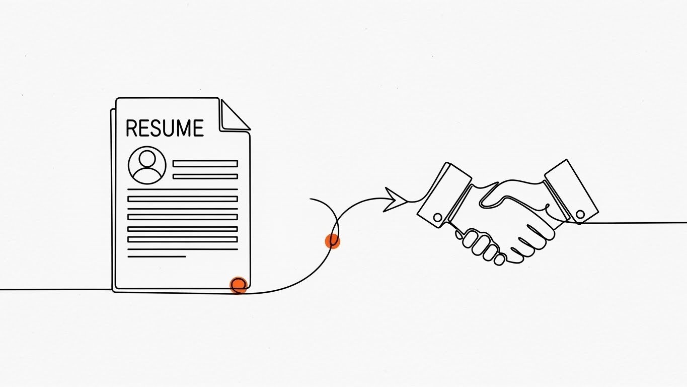
The Visual & Narrative Approach
Simplicity is the ultimate sophistication in complex process mapping. This style utilizes a continuous, stark Black ink line on a textured White paper background. We watch a "Resume" document icon physically morph and travel along the line to transform into a "Handshake" icon. Small accents of Safety Orange highlight the interaction points. The unbroken line is the hero; it never lifts off the page, visually reinforcing the concept of an "end-to-end" solution where data is never lost.
Psychological Impact & KPI Focus
The unbroken line is a powerful visual metaphor for "Data Integrity" and "Seamless Integration." For an Operations Manager, this visualizes the elimination of manual data entry errors. The minimalist approach significantly reduces cognitive load, making the complex hiring workflow appear manageable and linear. It effectively communicates "Time-to-Hire" reduction by showing the shortest path between application and offer.
Strategic Implementation & Trade-offs
- Best Use: Blog headers or explainer videos simplifying complex integrations.
- Duration: 30-60 seconds.
- Trade-off: It can feel "low-tech" if not paired with sophisticated audio or high-quality voiceover. It excels at explaining process but fails to convey the excitement or scale of the platform.
Companies using similar video content -
JazzHR – Recruitment Software – Illustrates streamlined, end-to-end hiring workflows.
Workable – ATS – Simplifies complex HR processes with continuous lines.
4. Generative AI cinematic video
TOFU | Shaping Brand Perception

The Visual & Narrative Approach
This is the "Hollywood" shot of the B2B world. We see a photorealistic, wide establishing shot of a futuristic, glass-walled corporate headquarters bathed in the warm Amber glow of the "Golden Hour." The Teal glass structure reflects a lush green landscape. A digital billboard on the building subtly reads "GLOBAL HIRING." The camera pans slowly, revealing the sheer scale of the operation. This is not about the software interface; it is about the result of using the software: a thriving, massive, world-class organization.
Psychological Impact & KPI Focus
This appeals directly to the "Aspiration" of the target persona. Every Recruitment Director wants to believe they are building a world-class team. This visual validates that ambition. It connects the software purchase to the "Employer Value Proposition" (EVP) and organizational growth. It creates a "Big Tech" halo effect around your brand, suggesting stability and global capability.
Strategic Implementation & Trade-offs
- Best Use: YouTube Brand Film intro or Event Keynote opener.
- Duration: 5-10 seconds (Establishing shot).
- Trade-off: This style sets a very high expectation. If the actual product UI looks dated, the disconnect will be jarring. It is a mood-setter, not a product demo.
Companies using similar video content -
Workday – Human Capital Management – Projects global corporate scale and organizational growth.
SAP SuccessFactors – HCM Suite – Visualizes thriving global talent management.
5. Bold Kinetic Typography (Visual)
TOFU | YouTube Organic

The Visual & Narrative Approach
In a crowded feed, you don't read; you scan. This style uses massive, heavy geometric blocks in Vivid Red and Charcoal Grey. The blocks are arranged to abstractly suggest the word "FAST" without spelling it out. They are set against a solid White background. Sharp, diagonal shadows cast by the blocks add depth. Motion blur on the edges suggests high-velocity movement.
Psychological Impact & KPI Focus
This visual screams "Efficiency" and "Velocity." It targets the pain point of "Slow Time-to-Fill." It assures the viewer that your platform is built for speed and high-volume processing. The bold, heavy typography implies a robust infrastructure—this isn't a lightweight tool; it's a heavy-duty engine for recruitment. It builds immediate authority through visual weight.
Strategic Implementation & Trade-offs
- Best Use: Video Thumbnails, Pre-roll ad hooks (first 3 seconds).
- Duration: 1-3 seconds.
- Trade-off: Use sparingly. If used for too long, it becomes aggressive and tiring. It is a "shout," not a "conversation."
Companies using similar video content -
SmartRecruiters – Hiring Operating System – Emphasizes speed and efficiency in hiring.
Bullhorn – Recruitment CRM – Communicates accelerated recruitment operations.
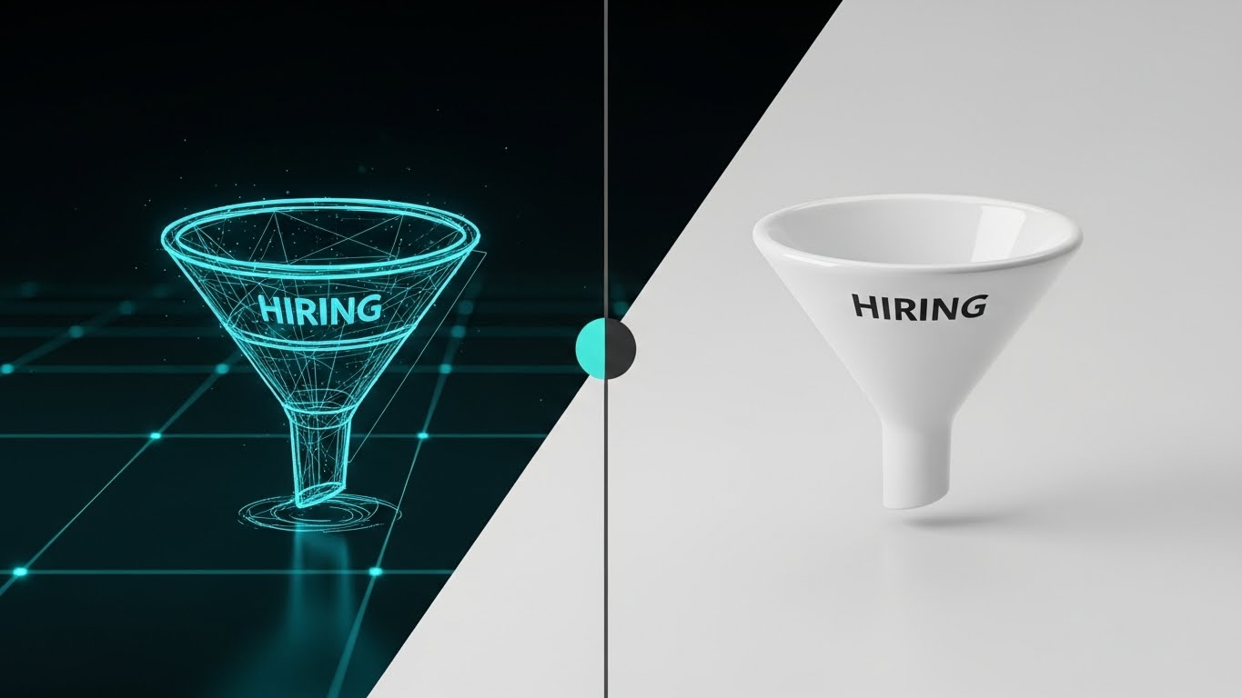
7. Abstract 2D Motion Graphics
TOFU | Skippable Pre-Roll Ad

The Visual & Narrative Approach
This style visualizes the "Sourcing" algorithm. We see a central diamond shape (the Job Req) emitting concentric ripples. Geometric shapes (triangles and circles) in Blue and Yellow are magnetically drawn from the edges of the frame toward the center. The background features a subtle grid/segmentation, implying organization. The movement is snappy and rhythmic—snap, snap, slide—syncing with an upbeat audio track.
Psychological Impact & KPI Focus
The "magnetic" visual metaphor is incredibly powerful for explaining "Inbound Recruiting" and "AI Sourcing." It relieves the anxiety of the "empty pipeline" by showing a system that proactively pulls talent in. The grid background reinforces "Sorting" and "Classification," reassuring the user that the influx of candidates will be organized, not chaotic.
Strategic Implementation & Trade-offs
- Best Use: YouTube Ads (Skippable), where you need to communicate the value proposition visually with the sound off.
- Duration: 15-20 seconds.
- Trade-off: It is abstract. You must overlay simple text (e.g., "Automated Sourcing") to ensure the viewer understands what is being attracted.
Companies using similar video content -
hireEZ – AI Sourcing Platform – Visualizes magnetic attraction of candidates.
SeekOut – Talent Search Engine – Shows organized sourcing and candidate discovery.
8. Aspirational Stock Montage
TOFU | CTV / OTT

The Visual & Narrative Approach
Sometimes, the best way to sell software is to show the people it serves. This is a cinematic, low-angle hero shot of a diverse group of professionals standing on a modern rooftop terrace. The sun is flaring behind them (Lens Flare), creating a warm, hopeful atmosphere. They look toward the horizon with confidence. The color grading emphasizes Warm Sunlight and Beige tones, evoking a sense of premium professionalism and success.
Psychological Impact & KPI Focus
This connects the software to the ultimate goal: "Quality of Hire" and "Retention." It humanizes the B2B transaction. It reminds the buyer that they aren't just buying code; they are building a culture. The diversity in the shot visually cues "DEI Compliance" and "Inclusive Hiring" without saying a word. It builds emotional resonance and trust.
Strategic Implementation & Trade-offs
- Best Use: TV Spots, "About Us" videos, High-level brand awareness campaigns.
- Duration: 5-10 seconds per clip.
- Trade-off: Avoid "Cheesy Stock" at all costs. The lighting and wardrobe must look premium and natural, or it will feel like a generic placeholder and damage brand authenticity.
Companies using similar video content -
BambooHR – HR Platform – Elevates company culture and employee experience.
HiBob – HRIS – Fosters aspirational team collaboration and engagement.
9. Minimalist Flat 2D Vector
MOFU | Demand Gen
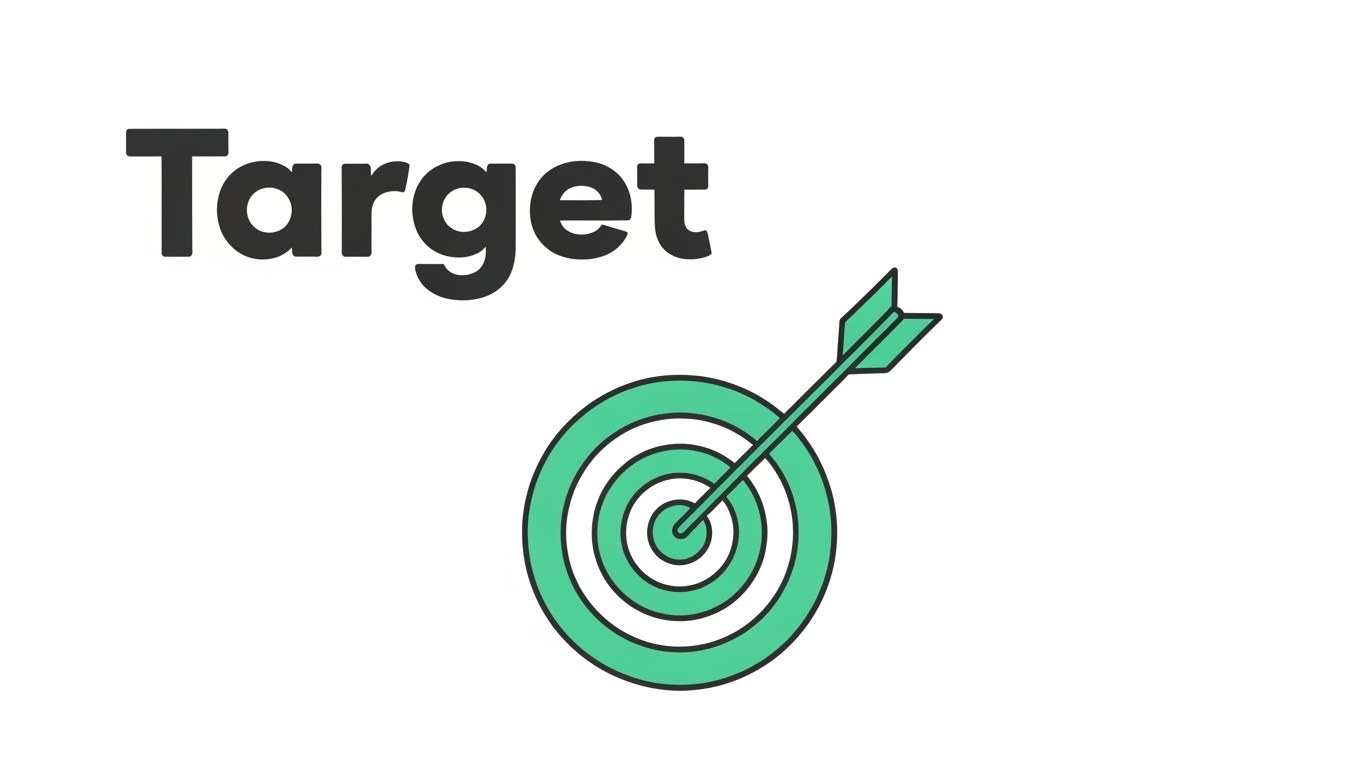
The Visual & Narrative Approach
In the middle of the funnel, buyers want clarity. This style uses a Mint Green and White palette to create a hyper-clean vector illustration. A simple "Target" icon sits in the center of a vast negative space. An arrow strikes the bullseye perfectly. There are no distracting gradients, shadows, or textures. It is pure, surgical precision.
Psychological Impact & KPI Focus
This visual communicates "Accuracy" and "Focus." It directly addresses the fear of "Bad Hires" or "False Positives" in the screening process. The extensive negative space allows the viewer's eye to rest, suggesting that the software creates room for decision-making rather than cluttering it. It reinforces the KPI of "Matching Accuracy."
Strategic Implementation & Trade-offs
- Best Use: LinkedIn Carousel slides, Sidebar ads, Feature lists.
- Duration: Static or Micro-animation (arrow hitting).
- Trade-off: It is not "exciting." It is "reassuring." Do not use this for hype; use it for validation of specific features like "Smart Matching."
Companies using similar video content -
Manatal – AI Recruitment Software – Focuses on precision candidate matching.
JobAdder – AI Recruiting Tool – Illustrates accurate skill-based candidate filtering.
10. Clean UI Workflow (Light Mode)
MOFU | Product Differentiation

The Visual & Narrative Approach
This is the "Proof" shot. It features a high-fidelity mockup of a "Candidate Profile" card using a Glassmorphism aesthetic. The card floats like a frosted glass pane over a blurred office background. The UI elements (Sky Blue and Soft Grey) are spaced generously. A "Match Score" circle (85%) is the focal point. The view is straight-on, celebrating the clean layout and readability of the light-mode interface.
Psychological Impact & KPI Focus
Recruiters stare at screens for 8 hours a day. Visual ergonomics are a major selling point. This style promises "Low Cognitive Load" and "User Experience (UX) Delight." The frosted glass implies a layer of sophistication—a modern tool for a modern recruiter. It differentiates your product from legacy, clunky "grey-box" enterprise software.
Strategic Implementation & Trade-offs
- Best Use: Website "Features" page, Product Demo videos.
- Duration: 30-90 seconds (for full walkthroughs).
- Trade-off: The UI shown must match the actual product closely enough to be truthful, even if polished. Over-promising here leads to disappointment during the actual demo.
Companies using similar video content -
Greenhouse – ATS – Showcases user-friendly interface and structured hiring.
Pinpoint – Applicant Tracking Software – Highlights clean, intuitive in-house recruiting UI.
11. Macro UI Micro-Interactions**
MOFU | Feature Education

The Visual & Narrative Approach
This style abandons the wide shot to focus intensely on a single, critical moment of conversion. The visual is an extreme macro close-up of a "Quick Apply" button, rendered in Soft Lavender. The texture of the screen pixels is faintly visible, grounding the digital action in physical reality. A stylized white cursor depresses the pill-shaped button, creating a subtle, satisfying liquid ripple effect. The background is a clean, out-of-focus white, forcing the eye to concentrate entirely on the interaction.
Psychological Impact & KPI Focus
This visualization targets the "Application Friction" pain point. By magnifying the ease of the interaction, you provide a sensory "tactile" feedback that digital products often lack. It subconsciously communicates to the Recruitment Marketing Manager that the candidate experience is effortless and responsive. The ripple effect serves as a visual dopamine hit, reinforcing the KPI of "Improved Application Conversion Rates."
Strategic Implementation & Trade-offs
- Best Use: Email marketing headers (GIF format) or feature highlight sections on landing pages.
- Duration: 3-5 seconds (Looping).
- Trade-off: This is a micro-view. It tells the viewer how it feels but not what the platform does globally. It must be used as a punctuation mark within a broader narrative, not the headline story.
Companies using similar video content -
Paradox – Conversational AI – Magnifies frictionless candidate application and scheduling.
GoodTime – Interview Scheduling Platform – Emphasizes seamless scheduling interactions.
12. Wireframe to Reality Transition
MOFU | Competitive Displacement
The Visual & Narrative Approach
To displace a competitor or a legacy process, you must show the evolution. This split-screen composition contrasts the "Old Way" with the "New Way." The left side reveals a rough, Blueprint Blue wireframe sketch of a hiring funnel—representing planning and theory. A vertical slider line moves across the frame, revealing the right side: the same funnel rendered in photorealistic, glossy White ceramic. This visualizes the transformation from a messy plan to a polished, automated reality.
Psychological Impact & KPI Focus
This style appeals to the "Builder" persona—the Head of Talent Operations who wants to construct a better machine. It validates their desire for structure and sophistication. The transition from sketch to solid 3D object implies that your software turns their abstract hiring strategies into tangible results. It directly addresses "Process Maturity," showing them what their organization could look like.
Strategic Implementation & Trade-offs
- Best Use: Display Ads (Retargeting) or "Why Us" comparison pages.
- Duration: Static image with slider interaction, or 6-10 second animation.
- Trade-off: It requires a clear "Before/After" narrative. If the "Wireframe" looks too good, the contrast is lost. The "Before" state must look unfinished to make the "After" state feel like a solution.
Companies using similar video content -
ClearCompany – Talent Management Suite – Shows evolution from planning to integrated reality.
iCIMS – Talent Cloud – Transforms legacy hiring processes into modern solutions.
13. Low-Poly 3D Modeling
MOFU | ABM Awareness

The Visual & Narrative Approach
Account-Based Marketing (ABM) requires visualizing specific targets and ecosystems. This style uses a "Low-Poly" aesthetic—simplified, geometric 3D shapes—to build a miniature world. We see a stylized operational hub with buildings in Pastel tones, connected by roads and active transport units. The lighting is bright and shadowless, giving it a playful, architectural model look. This simplifies the complexity of a large enterprise client or logistics network into a manageable, "winnable" target, visualizing the concept of "Target Account Mapping."
Psychological Impact & KPI Focus
The "Toy-Effect" (Tilt-Shift or Low Poly) makes large, intimidating challenges (like penetrating a Fortune 500 account or managing multi-site hiring) seem manageable and organized. It reduces the anxiety of scale. For a Sales Director using the ATS for CRM, this visualizes the territory as an organized board game where strategy leads to victory. It reinforces "Pipeline Visibility."
Strategic Implementation & Trade-offs
- Best Use: LinkedIn Sponsored Content or specialized ABM landing pages.
- Duration: 10-15 seconds.
- Trade-off: The "cartoonish" look can be perceived as childish if not rendered with premium lighting. It works best for explaining concepts and strategies, not for showing the actual UI or serious data compliance.
Companies using similar video content -
OrgVue – Workforce Planning – Simplifies complex organizational design into models.
Agentnoon – Org Design & Headcount Forecasting – Visualizes strategic workforce planning.
14. Isometric 2D Motion Design
MOFU | Visitor Re-engagement
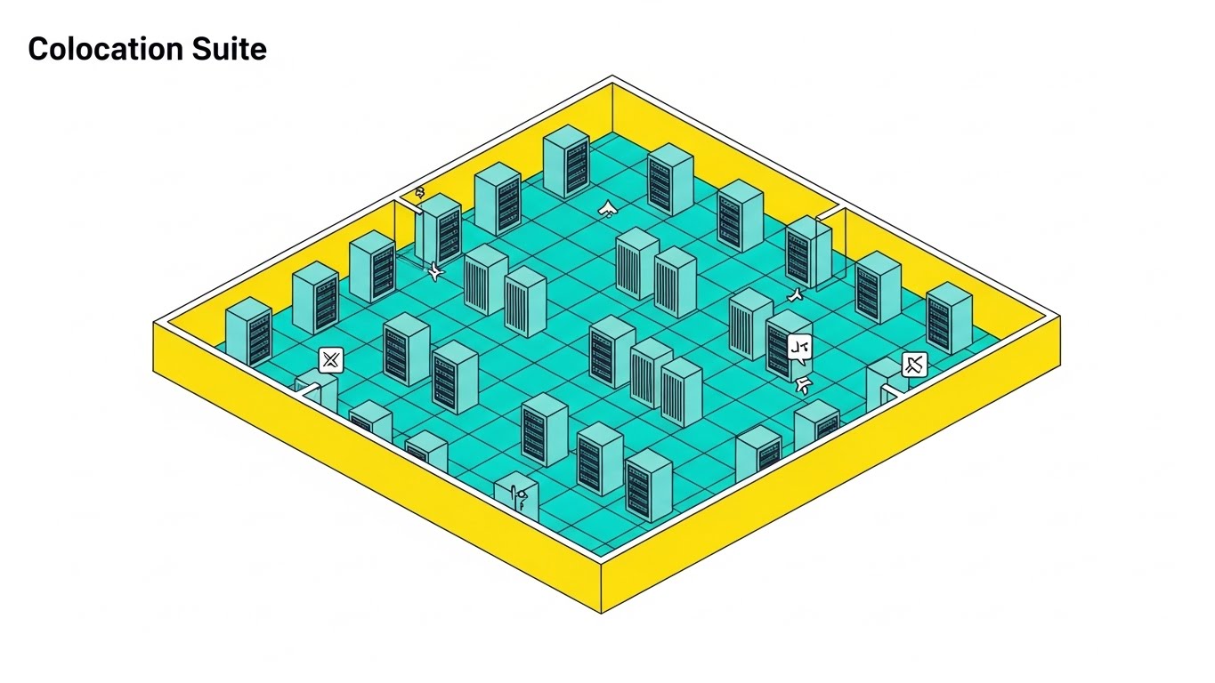
The Visual & Narrative Approach
Recruitment requires a robust backend to keep candidates engaged. This style utilizes an isometric perspective to visualize a "Colocation Suite"—a server room with racks arranged on a Yellow technical grid. Small icons indicate active data processing and "Always-On" status. Unlike a static chart, this environment feels alive. It represents the "Infrastructure of Engagement"—the automated backend that nurtures the "Infinite Loop" of talent rediscovery, ensuring no candidate data goes dormant.
Psychological Impact & KPI Focus
This addresses the "Database Rot" anxiety—the fear that candidate data becomes useless over time. By visualizing a humming, active server environment, you reassure the buyer that your platform maximizes the lifetime value of every data point. It visually proves the reliability of the system's "Talent Rediscovery" features, supporting the KPI of "Database Utilization."
Strategic Implementation & Trade-offs
- Best Use: Retargeting Ads (Web & Social) to remind visitors of the system's efficiency.
- Duration: 6-12 seconds (Looping).
- Trade-off: Isometric views can feel technical and detached. Ensure the visual cues (like activity icons) are clear so the viewer understands this represents active processing, not just cold storage.
Companies using similar video content -
Workforce.com – Workforce Management – Depicts active backend infrastructure for operations.
Runn – Resource Planning Tool – Visualizes real-time project and resource allocation.
15. Rapid UI Feature Montage
MOFU | The Functional Buyer
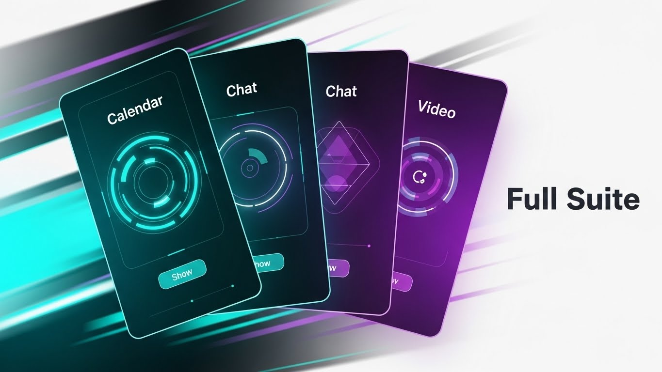
The Visual & Narrative Approach
When targeting the functional buyer, you need to show volume and integration. This visual features a dynamic composition of multiple UI screens—Calendar, Chat, and Video—fanned out like a deck of playing cards. The cards are rendered in dark mode with Turquoise and Violet accents. Motion blur lines indicate they are shuffling or snapping into place. This communicates that the platform is a comprehensive "Full Suite," not just a standalone tool.
Psychological Impact & KPI Focus
This targets "Tool Fatigue." HR tech stacks are notoriously fragmented. This visual promises consolidation. It tells the IT Director and HR Ops Leader: "Stop buying five tools; buy this one." The fanning motion suggests speed and accessibility—everything you need is right at your fingertips. It reinforces the value of "Unified Data" and "Platform Consolidation."
Strategic Implementation & Trade-offs
- Best Use: YouTube "Features" videos or mid-roll ad spots.
- Duration: 5-10 seconds.
- Trade-off: It is fast-paced. Viewers won't be able to read the text on the screens. The goal is to convey breadth of features, not specific functionality. Do not use this for tutorials.
Companies using similar video content -
Rippling – HR, IT, Finance Platform – Showcases comprehensive, integrated suite of features.
Zoho Recruit – Recruitment Software – Presents a dynamic view of advanced automation tools.
16. Photorealistic 3D Renders
BOFU | Building Trust

The Visual & Narrative Approach
At the bottom of the funnel, trust is the currency. This style uses a hyper-realistic 3D render of a solid Gold padlock resting on a crystal pedestal. The object is lit by museum-quality studio lighting against a clean white background. The reflection of the room is visible in the gold. This is not a cartoon; it is a serious, substantial object. It creates a visual metaphor for "Enterprise-Grade Security" and the high value of the data being protected.
Psychological Impact & KPI Focus
Security is often abstract and boring until it fails. This visual elevates "Compliance" and "Data Privacy" (GDPR/SOC2) to a premium feature. It assures the CISO and Risk/Compliance officers that the platform is robust, valuable, and impenetrable. The use of gold subconsciously links "Security" with "Value," framing data protection as an asset rather than just a requirement.
Strategic Implementation & Trade-offs
- Best Use: Landing Pages (Pricing/Security sections) or Trust Center documents.
- Duration: Static High-Res Image.
- Trade-off: It is metaphorical. It doesn't explain how the encryption works. It acts as a "Badge of Trust." It must be accompanied by technical specifications in the text to be effective for technical buyers.
Companies using similar video content -
Diligent – GRC Platform – Symbolizes enterprise-grade security and data protection.
ComplianceHR – HR Compliance Solutions – Represents robust legal and data compliance.
17. Dynamic Data Visualization
BOFU | ROI Justification

The Visual & Narrative Approach
The CFO needs to see the numbers. This style transforms a standard bar chart into an aspirational object. We see translucent Emerald Green glass bars rising upwards from a reflective white floor. The bars are crystal clear, refracting light, symbolizing transparency in reporting. A metallic Silver trend line weaves through them, pointing resolutely upward. The composition is clean, bright, and expensive-looking.
Psychological Impact & KPI Focus
This visualizes "Growth" and "Return on Investment." The choice of glass and transparency directly counters the fear of "Hidden Costs" or "Fudged Numbers." It suggests that the financial gains are solid, clear, and undeniable. It is designed to arm the internal champion with the visual evidence needed to get budget approval, focusing on "Time-to-Productivity" and "Cost Savings."
Strategic Implementation & Trade-offs
- Best Use: Pitch Decks, Annual Reports, and "Results" case study pages.
- Duration: Static or slow-growth animation (5 seconds).
- Trade-off: It is stylized data. Do not use it for actual dashboard reporting where precision reading of axes is required. This is for selling the result, not monitoring the daily metric.
Companies using similar video content -
Visier – Workforce Analytics – Transforms data into transparent ROI and growth visuals.
Tableau – Data Visualization Software – Creates dynamic, clear HR reporting dashboards.
18. 2D Character-Driven Story
BOFU | Overcoming Objections

The Visual & Narrative Approach
The biggest barrier to purchase is often internal adoption. This style uses a textured, hand-drawn 2D vector illustration style. We see two characters in a cozy office setting: a "Manager" showing a tablet to a "Skeptic" (perhaps an older hiring manager), who is now smiling and giving a thumbs up. The palette uses Earth Tones and Warm White, avoiding the cold blue of tech. It visualizes the "Ease of Adoption."
Psychological Impact & KPI Focus
This creates empathy. It acknowledges that software is used by humans who might be resistant to change. By showing a positive human interaction, you lower the emotional barrier to entry. It promises "User Adoption" and "Team Collaboration." It tells the buyer, "Your team will actually like using this," which is a critical factor for long-term retention.
Strategic Implementation & Trade-offs
- Best Use: Blog posts about change management, "Culture" pages, or customer success stories.
- Duration: Static Illustration or simple narrative animation.
- Trade-off: It can feel "soft." It is not appropriate for technical documentation or high-stakes security pages. Use it where emotion and culture are the decision drivers.
Companies using similar video content -
PeopleGoal – Performance Management – Illustrates positive stakeholder buy-in and collaboration.
Engagedly – Performance & Engagement – Depicts human-centric adoption and team success.
19. 3D X-Ray Visualization
BOFU | Risk Mitigation

The Visual & Narrative Approach
To prove your system is safe, you must show what's inside. This visual uses a high-key "X-Ray" aesthetic. We see a Transparent Briefcase (symbolizing the Candidate Portfolio) made of clear, high-tech plastic. Inside, we clearly see organized, glowing structures—representing the secure data and logic within. The background is a bright, clinical white. This visualizes "Internal Compliance" and "Audit Readiness" without being dark or ominous.
Psychological Impact & KPI Focus
The transparency creates immediate trust. It says, "We have nothing to hide." For a buyer concerned about "Data Portability" or "Leaks," this visual metaphor of a secure, transparent container offers reassurance. It suggests that the system is both secure (contained) and ethical (visible). It supports KPIs related to "Compliance Rate" and "Risk Reduction."
Strategic Implementation & Trade-offs
- Best Use: Whitepapers, Security Architecture pages, and Compliance FAQs.
- Duration: Static or slow rotation (10 seconds).
- Trade-off: It is abstract. You must clearly label what the internal elements represent (e.g., "Encrypted Data," "Audit Log") to ensure the metaphor lands effectively.
Companies using similar video content -
WorkBright – Onboarding & I-9 Compliance – Reveals transparent internal compliance processes.
Omnipresent – Global Employment Platform – Visualizes compliant global mobility and data.
20. Hyper-lapse Stock Footage
BOFU | Sales Cycle Acceleration

The Visual & Narrative Approach
The final push requires a focus on results. This style contrasts the chaotic speed of the market with the stability of your solution. We see a hyper-lapse video of a busy city street at twilight, with streaks of blue car lights indicating frantic movement. In the dead center, a static, sharp, semi-transparent white card simply reads "Hired!" with a checkmark. The background moves fast; the result is instant and clear.
Psychological Impact & KPI Focus
This creates a powerful "Anchor." It acknowledges the chaos of the recruitment world (the background) but positions your software as the stabilizing force that delivers the ultimate result: a hire. It triggers the "Relief" emotion—the feeling of closing a req. It reinforces the ultimate KPI: "Time to Hire." It is the visual equivalent of the signature on the contract.
Strategic Implementation & Trade-offs
- Best Use: Social Ad Retargeting (final push), Closing slide of a sales deck.
- Duration: 5-10 seconds.
- Trade-off: It relies on the quality of the stock footage. If the footage looks generic, the ad feels generic. The overlay graphics must be custom and high-fidelity to brand the content.
Companies using similar video content -
MokaHR – AI-Powered Recruiting – Contrasts market speed with rapid hiring results.
HireVue – Interview Automation – Highlights accelerated hiring and stable outcomes.
21. Lifestyle Stock with UI Overlay**
BOFU | Driving Demo Requests

The Visual & Narrative Approach
At the bottom of the funnel, the barrier to conversion is often the anticipation of friction. This style bridges the gap between the physical workspace and digital convenience. We see a high-quality, over-the-shoulder shot of a professional at a sunlit desk. As they pause over their laptop, a Holographic Blue calendar interface floats elegantly in the air above the keyboard. It glows softly, showing open "Demo Slots." The user’s hand moves naturally, and the hologram responds.
Psychological Impact & KPI Focus
This visualization reduces "Scheduling Fatigue." By showing the calendar as an accessible, holographic layer rather than a clunky form, you subconsciously signal that doing business with you is easy and modern. It creates a sense of "Immediacy." For the busy Talent Acquisition leader, it promises that help is just a click away, directly impacting the KPI of "Demo Conversion Rate."
Strategic Implementation & Trade-offs
- Best Use: "Book a Demo" landing pages, email signature banners, or high-intent Retargeting Ads.
- Duration: Static Image or 6-second Loop (Cinemagraph).
- Trade-off: The tracking of the hologram must be perfect. If the UI "slides" or jitters against the live footage, it breaks the immersion and looks amateur. High-quality motion compositing is essential.
Companies using similar video content -
GoodTime – Interview Scheduling Platform – Presents holographic scheduling for frictionless access.
22. Isometric 3D Workflow
BOFU | The Economic Buyer

The Visual & Narrative Approach
The Economic Buyer (CFO/Finance Director) cares about the bottom line. This style utilizes a trendy "Claymorphism" aesthetic—soft, matte, tactile 3D shapes—to visualize budget. We see a clean white floor where stacks of Rose Gold coins are organizing themselves into neat, rising columns. Small, friendly 3D arrows in Teal point upwards, indicating savings or ROI. The lighting is soft and global, removing harsh shadows. It transforms the cold concept of "Cost Savings" into something warm, organized, and tangible.
Psychological Impact & KPI Focus
Money discussions can be stressful. This soft, toy-like aesthetic disarms that anxiety. It frames "Budget" not as a constraint, but as a building block. It visualizes "Cost Efficiency" and "Resource Optimization" in a way that feels constructive rather than restrictive. It reinforces the financial logic of the purchase without needing complex spreadsheets.
Strategic Implementation & Trade-offs
- Best Use: ROI Calculator pages, Proposal decks, or "Pricing" explainer videos.
- Duration: 10-15 seconds.
- Trade-off: It is highly stylized. It works best for general concepts of savings (e.g., "Reduce Agency Spend by 20%") rather than precise financial reporting.
Companies using similar video content -
Vena – Financial Planning Software – Visualizes tangible cost efficiency and budget organization.
Anaplan – Enterprise Planning Platform – Shows organized financial and workforce planning.
23. Futuristic Neon/Dark Mode
BOFU | The Technical Buyer

The Visual & Narrative Approach
To the IT Director or CTO, "Dark Mode" and server racks signify a serious coding environment. This style embraces a "Cyberpunk" or high-tech aesthetic. We travel down a dark, infinite corridor of black server racks. Neon Green data cables pulse with light, connecting the racks. The perspective leads to a bright white light at the end—the "Solution." This is a visual language that speaks native "Tech Stack" to technical stakeholders.
Psychological Impact & KPI Focus
This builds "Technical Credibility." It visually answers questions about "Uptime," "API Stability," and "Server Integrity." It assures the technical buyer that under the hood, your platform is powerful, modern, and capable of handling high-volume data traffic. It moves the conversation from "HR Tool" to "Enterprise Infrastructure."
Strategic Implementation & Trade-offs
- Best Use: Technical Documentation portals, API integration pages, or IT-focused sell sheets.
- Duration: 10-20 seconds.
- Trade-off: It is distinctively "Tech." It may feel alienating to a non-technical HR buyer who prefers "warm and human" visuals. Use this strictly for the IT persona or security segments.
Companies using similar video content -
UKG Pro – HCM & Payroll – Highlights infrastructure robustness and technical depth.
Cornerstone OnDemand – Talent Management – Represents advanced enterprise solution architecture.
24. 2D Animation & UI Composition
Onboard | Self-Serve Onboarding
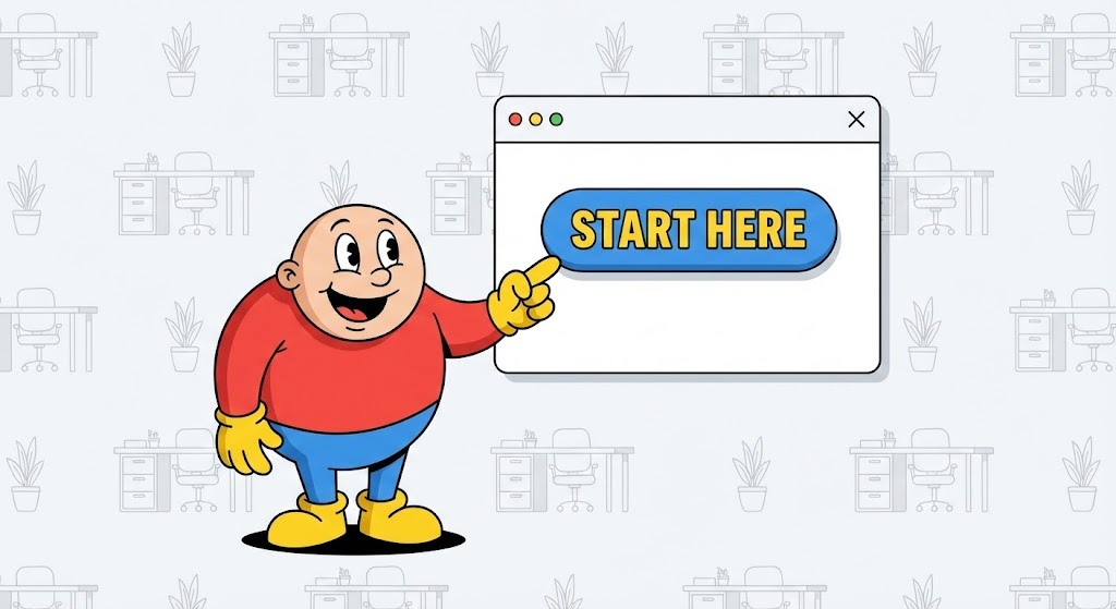
The Visual & Narrative Approach
Onboarding is where churn often begins. To combat this, this style uses a "Cel-Shaded" 2D animation approach. A friendly, rounded character—let's call him "Guide"—rendered in Primary Colors (Red, Blue, Yellow) stands next to a floating, simplified white UI window. The Guide points enthusiastically to a "Start Here" button, which pulses invitingly. The background is a subtle, non-distracting vector pattern.
Psychological Impact & KPI Focus
This lowers the "Intimidation Factor" of learning new software. The cartoon style signals, "This is easy. This is safe. You can't break this." It encourages "Self-Serve Adoption," reducing the burden on your Customer Success team. It directly targets the "Time-to-First-Action" KPI, getting the user to click that first button with confidence.
Strategic Implementation & Trade-offs
- Best Use: In-App welcome modals, "Getting Started" email sequences.
- Duration: 30-60 seconds (Instructional).
- Trade-off: It can feel juvenile if not executed with sharp, modern lines. Ensure the character design aligns with a professional SaaS brand, avoiding a "clip-art" look.
Companies using similar video content -
Zoho People – HRIS – Guides users through simplified activation and onboarding.
Recooty – Recruitment Platform – Uses friendly guides for easy self-serve adoption.
25. Holographic UI over 3D Render
Onboard | Accelerating TTV

The Visual & Narrative Approach
To show how fast a user can get up and running, we use a First-Person POV (Point of View) shot. We see a pair of hands typing on a modern keyboard on a wooden desk. Projecting from the monitor is a futuristic Augmented Reality (AR) display in Luminous Blue. It shows a "Setup Complete" checklist with checkmarks appearing rapidly in sync with the typing. The contrast between the warm wood (reality) and the cool hologram (speed) highlights the efficiency of the software.
Psychological Impact & KPI Focus
This visualizes "Velocity." It tells the new user that setup is not a slog; it's a sprint. The POV shot puts the viewer in the driver's seat, mentally rehearsing the success of the setup process. It reinforces "Time-to-Value (TTV)," promising that they will be productive almost immediately.
Strategic Implementation & Trade-offs
- Best Use: Onboarding video intros, Feature announcement trailers.
- Duration: 5-10 seconds.
- Trade-off: It sets a high bar for UI speed. If the actual software is laggy, this visual will feel deceptive. It represents the ideal flow state.
Companies using similar video content -
Lindy – AI ATS & Workflow Automation – Projects instant competency and rapid setup.
Workday Adaptive Planning – Workforce Planning – Visualizes accelerated plan implementation.
26. 2D Graphics Over Live Action
Onboard | Trial Activation

The Visual & Narrative Approach
Software should feel rewarding. This style combines candid live-action photography with hand-drawn 2D animation. We see a young professional in a coffee shop, smiling at her laptop. Exploding from the screen are neon doodles—Pink sparkles, Green arrows, and Yellow stars—that emphasize her excitement. The doodles are animated on "twos" (a slightly lower frame rate) to give them a handcrafted, energetic feel.
Psychological Impact & KPI Focus
This visualizes "User Delight." It reinforces the emotional payoff of using the software—the feeling of "Getting it right" or "Making a Hire." It is particularly effective for trial users who need positive reinforcement to convert to paid plans. It targets "Trial-to-Paid Conversion" by associating the product with joy and success.
Strategic Implementation & Trade-offs
- Best Use: Social Media (Instagram Stories/TikTok) for employer branding, "Congratulations" screens inside the app.
- Duration: 3-6 seconds (Looping).
- Trade-off: It is informal. It works best for "Celebration" moments (like a hire made), not for serious data analysis or compliance sections.
Companies using similar video content -
Peoplebox.ai – Performance Management – Celebrates user wins with delightful visual feedback.
Lattice – People Management Platform – Reinforces positive engagement with animated graphics.
27. Generative AI Realistic Character Video
Retention | Reducing Support

The Visual & Narrative Approach
When users have problems, they want humans, not bots. This style uses high-end Generative AI to create a hyper-realistic "Customer Success Agent." The shot is a portrait close-up with an 85mm lens, blurring the office background. The agent has natural skin texture, micro-expressions, and perfect lip-sync. They are smiling warmly, wearing a headset, and looking directly at the camera. The lighting is soft, neutral, and calming.
Psychological Impact & KPI Focus
This builds "Empathy" and "Trust" at scale. It humanizes the Help Center. Even if the video is AI-generated, the appearance of a human face reduces the frustration of troubleshooting. It signals, "We are here for you." This approach is critical for reducing "Support Ticket Escalation" by delivering clear, friendly video answers to common questions.
Strategic Implementation & Trade-offs
- Best Use: Help Center articles, FAQ video responses, Chatbot video bubbles.
- Duration: 30-90 seconds (Explainer).
- Trade-off: The "Uncanny Valley." The AI generation must be top-tier. If the lip-sync is off or the eyes look dead, it becomes creepy. Quality control is paramount.
Companies using similar video content -
Humanly – Conversational AI – Provides humanized support through realistic AI agents.
Paradox – AI Assistant Olivia – Offers empathetic candidate interaction.
28. Split Screen: Optimized Reality
Retention | Reducing Churn
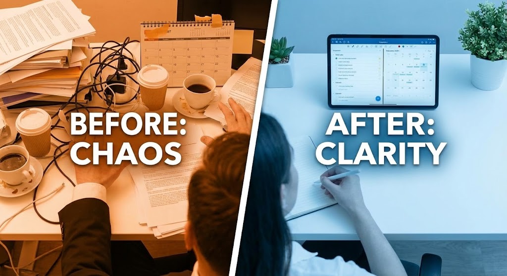
The Visual & Narrative Approach
To prevent churn, you must remind the client of life without you. This style uses a split-screen. The left side is tinted Warm Orange/Red, showing a messy desk, sticky notes everywhere, and a stressed posture ("Before"). The right side is tinted Cool Blue, showing a clean desk, a tablet with your ATS, and a calm posture ("After"). A white line divides them, sliding slowly to reveal more of the "After" state.
Psychological Impact & KPI Focus
This reinforces "Value Realization." It is a visual anchor for the Quarterly Business Review (QBR). It reminds the stakeholder why they bought the software in the first place—to escape the chaos. It serves as a potent reminder against cancelling, directly supporting "Retention Rate" and "churn reduction."
Strategic Implementation & Trade-offs
- Best Use: QBR Presentations, Renewal email campaigns, Re-engagement ads.
- Duration: Static Image or 5-second sliding animation.
- Trade-off: It is binary. Real life is rarely this black and white. Ensure the "Chaos" side depicts relatable struggles (e.g., lost resumes), not exaggerated disasters.
Companies using similar video content -
Workday – Human Capital Management – Contrasts chaos with order in HR processes.
ADP Vantage HCM – HCM Suite – Shows transformation from manual to optimized analytics.
29. Dark Mode UI Showcase
Expansion | Deep Feature Adoption
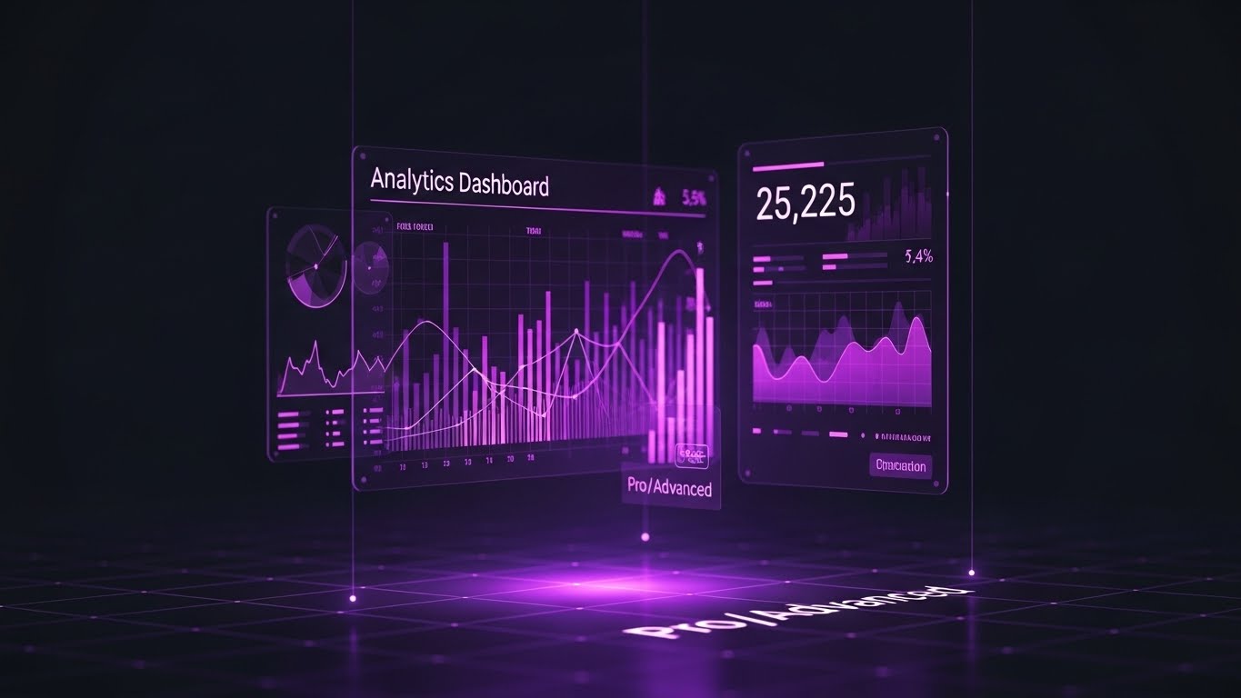
The Visual & Narrative Approach
For the "Power User," you need to sell depth. This visual features a sleek, tilted view of a complex "Analytics Dashboard" in Dark Mode. The background is Deep Charcoal. Data lines are vibrant gradients of Purple to Pink. The numbers are crisp white. A soft purple glow reflects off the virtual floor. It looks like the cockpit of a spaceship, not a spreadsheet.
Psychological Impact & KPI Focus
Dark mode and complex data visualization signal "Pro Features." This appeals to the heavy user who wants to feel like a master of the platform. It differentiates the "Basic" plan from the "Enterprise" plan. It visually motivates the user to upgrade to unlock these "Advanced Insights," driving "Expansion Revenue" and "Upsell."
Strategic Implementation & Trade-offs
- Best Use: "New Feature" release notes, Upsell landing pages, Admin console prompts.
- Duration: 10-20 seconds (Pan and scan).
- Trade-off: It looks complex. Do not use this for the general "Recruiter" persona who wants simplicity. This is for the "Admin" or "Ops Leader" who craves data.
Companies using similar video content -
Visier – Workforce Analytics – Presents pro-level analytics and deep data insights.
Crunchr – People Analytics – Showcases real-time, advanced people analytics.
30. 3D Parallax UI Presentation
Expansion | Driving Referrals

The Visual & Narrative Approach
Referrals come from happy, successful customers. This style uses a 3D parallax effect where UI cards float in layers against a Sunset Gradient (Orange to Blue). The front card highlights a "Referral Bonus" or "Network Connection," while back layers imply a growing ecosystem. The warm lighting is aspirational, suggesting that sharing the software helps others achieve the same "Golden Hour" success.
Psychological Impact & KPI Focus
This leverages "Social Capital." It frames the act of referring not as a sales pitch, but as extending a helping hand to peers. The depth and warmth of the visual suggest growth, community, and horizon-expansion. It aligns the brand with the user's own professional success story. It supports "Viral Coefficient" and "Referral Conversion."
Strategic Implementation & Trade-offs
- Best Use: "Invite a Friend" pages, LinkedIn Social Share cards, or Partner Program landing pages.
- Duration: 6-12 seconds (Looping).
- Trade-off: It is aspirational. It works best when the referral reward is significant. The visual promises value; the program must deliver it.
THE VISUAL OPERATIONS DOCTRINE: A 3-Segment Strategic Knowledge Base
This section synthesizes the 30 visual styles into a cohesive business framework. It moves beyond "aesthetics" to define how visual strategy drives Adoption, Efficiency, and ROI in the Applicant Tracking Software (ATS) domain.
STRATEGIC ALIGNMENT & VISUAL ARCHITECTURE
Designing the "Recruiter-First" Visual Ecosystem (The Why and Who)
- The Cognitive Load Audit: Before commissioning any video assets, conduct an audit of your user's current mental load. A recruiter toggling between LinkedIn, email, and your ATS is cognitively exhausted. Your visual strategy must be reductive, not additive. Use Style 9 (Minimalist Flat Vector) and Style 10 (Clean UI) to create "visual rest stops" that simplify, rather than decorate, the workflow.
- Role-Based Visual Mapping: Differentiate your visual language. A "Recruiter" persona needs high-volume, rapid-fire visuals (Style 11 - Macro UI) to improve speed. A "VP of Talent" persona needs slow, aggregated data visualization (Style 17 - Dynamic Data) to assess strategy. One style does not fit all.
- The "Glanceability" Standard: In high-velocity hiring, information must be understood in milliseconds. Adopt a "Glanceability" standard for all educational content. If a feature update video takes more than 1.5 seconds to convey the core value, it is too complex for a mobile recruiter.
- Brand Voice Consistency: Your marketing visuals (Style 4 - Cinematic) and your product visuals (Style 10 - Clean UI) must speak the same language. A disconnect here creates "Buyer's Remorse." Establish a "Visual Operating System" with a unified palette and motion language across all 30 styles.
- The Advids Strategic Audit: Engage a strategic partner like Advids early to define this visual architecture. A disjointed library of mismatched video styles signals a disjointed product. A cohesive visual strategy builds trust before the sales team even makes a call.
- Standardization vs. Customization: For core features (e.g., "Posting a Job"), use high-fidelity, standardized assets (Style 15). For complex, bespoke integrations (e.g., "Custom API Mapping"), use abstract, conceptual styles (Style 3) that allow for explanation without needing a custom screen recording for every client.
- The Cross-Departmental Bridge: Use visuals to unify terminology. If Sales says "Talent Pipeline" and Ops says "Candidate Pool," confusion ensues. A single, shared visual metaphor (Style 1 - Fluid Waves) cements a common language across the organization.
- Legacy System Integration: Many clients are migrating from spreadsheets or on-premise servers. Use transition styles (Style 12 - Wireframe to Reality) to visually validate their past efforts while exciting them about the cloud future. Respect the legacy; don't mock it.
- Accessibility in Global Hiring: Your visual strategy must be inclusive. Use high-contrast modes and rely on visual cues (shapes/motion) rather than just color to convey status, ensuring that colorblind users or non-native speakers can understand the workflow instantly.
- The Mobile-First Mandate: Hiring Managers approve offers from their phones. Ensure all 30 styles—especially text-heavy dashboards like Style 29—are legible on a vertical 9:16 screen. If your "Approval Workflow" video is unreadable on mobile, you are ignoring 50% of the decision-making process.
OPERATIONAL ADOPTION & IMPLEMENTATION
The "Zero-Friction" Deployment Strategy (The How)
- Overcoming "AI Anxiety": Users fear that AI will replace them. Use empathetic, human-centric styles (Style 18 - Character Story) to frame AI as a "Co-pilot," not a "Replacement." Show the human using the tool to succeed, not the tool working alone.
- The Micro-Learning Shift: Replace the hour-long "Onboarding Webinar" with a library of 30-second "Micro-Visuals" (Style 11). Users learn best when the answer is bite-sized and available exactly when they encounter the problem (Just-in-Time Learning).
- Just-in-Time Support: Embed these micro-visuals directly into the UI. When a user hovers over "Boolean Search," a tooltip showing Style 9 (Flat Vector) should appear. This reduces context switching and keeps the user in the "flow state."
- Gamification of Training: Visualizing progress is powerful. Use "Level Up" animations (Style 26) within your training academy to reward recruiters for mastering new features. A little visual dopamine goes a long way in driving certification completion.
- Reducing Support Ticket Volume: There is a direct correlation between the quality of your visual library and the load on your support team. Proactively sending a "How-to" video (Style 24) before a user encounters a known friction point can deflect the ticket entirely.
- Remote Onboarding: In a distributed world, you can't fly trainers to every office. Leverage high-fidelity screencasts and 3D walkthroughs (Style 25) to deliver a consistent, "Headquarters-quality" onboarding experience to remote recruiters in any time zone.
- Visualizing Standard Operating Procedures (SOPs): Text-based SOPs are rarely read. Transform your "Hiring Policy" documents into linear, 2D motion graphics (Style 3) that make the rules impossible to misunderstand and easy to follow.
- Feedback Loops: Use interactive video elements. At the end of a "New Feature" video, add a simple "Thumbs Up/Down" visual interaction. This provides immediate, quantitative data on whether your user base understands and likes the update.
- Scalable Localization: When expanding globally, separate on-screen text from the background animation (Style 13). This allows you to swap out languages (English to Spanish to Japanese) without re-rendering the entire complex 3D asset, saving massive production costs.
- Leadership Communication: When rolling out a new ATS to a global enterprise, the message must come from the top. Use high-end, cinematic video (Style 4) for the CHRO's launch message to signal that this is a strategic initiative, not just an IT software swap.
MEASURING IMPACT & FUTURE-PROOFING
Quantifying the Visual ROI (The Result)
- Beyond "Views": Stop measuring video success by "views." Measure it by "Feature Adoption." If 500 people watched the "Advanced Search" video (Style 29), did usage of that feature increase by 20%? That is the only metric that matters.
- The "Time-to-Hire" Metric: Correlate your visualization strategy with the ultimate business KPI. A well-trained recruiting team (via effective visual onboarding) works faster. Draw the line between your training library and the reduction in "Time-to-Fill."
- Compliance Velocity: New regulations (GDPR, Pay Transparency) appear constantly. Measure how quickly you can educate your user base using rapid-response explainer videos (Style 19 - X-Ray) compared to text memos. Speed of compliance is a competitive advantage.
- Retention and Churn: Customers who understand a product don't churn. Use visual analytics to identify users who haven't watched onboarding content and target them with re-engagement visuals (Style 28 - Split Screen). High-quality UX visualization significantly increases Lifetime Value (LTV).
- The AI Visual Frontier: Prepare for the future where video is generated in real-time. Soon, your ATS might generate a personalized "Candidate Summary" video for the Hiring Manager automatically. Your current visual style guide must be robust enough to support this automation (Style 27).
- Scalability of Assets: Build a visual component library, not just finished videos. By maintaining a library of "Buttons," "Characters," and "Icons," you can assemble new videos in hours, not weeks, keeping pace with your agile development cycle.
- The Advids Partnership: As your platform evolves, so must your visuals. Partnering with a dedicated agency like Advids ensures your visual language evolves cohesively, preventing the "Frankenstein" effect of mixing old and new styles over years of updates.
- Benchmarking Success: "Good enough" visuals are a competitive risk. If your competitor's onboarding is cinematic and yours is a blurry screen recording, you will lose on "Ease of Use" perception every time. Regularly benchmark your visual standard against the top 10 SaaS players.
- The ROI of Safety (Data Compliance): In HR Tech, "Safety" is data privacy. Quantify the legal cost reduction achieved by using Style 16 (Security Lock) visuals to train recruiters on proper data handling. Visualizing the invisible risks of non-compliance makes the "Risk Mitigation" ROI tangible for the C-Suite.
- Final Call to Innovation: Treat video as infrastructure, not content. It is as vital to your software as the code itself. Invest in it, maintain it, and optimize it. The winners in the next decade of HR Tech will be the platforms that don't just work the best, but those that are the easiest to see, understand, and trust.
Companies using similar video content -
Gem – Recruiting Platform – Visualizes network expansion and referral growth.
Boon – AI-Driven Referrals – Depicts floating cards for community and sharing.
Author & Editor Bio


