
 /home/wwwroot/advids.co/design/index.php on line 425
Introduction: The Visualization Advantage in Modern Logistics
The logistics landscape is undergoing a tectonic shift, moving from manual legacy frameworks to integrated, intelligent digital ecosystems. With the global 3PL market projected to reach USD 1.48 trillion by 2030, the opportunity for growth is immense, but the operational complexity is equally daunting. In this high-stakes environment, the ability to communicate value instantly is not just a marketing luxury—it is a strategic necessity.
For 3PL providers and SaaS platforms, the core challenge lies in the "Physical/Digital Divide." Your software orchestrates complex physical realities—thousands of trucks, shifting inventory, and unpredictable weather—into a clean, manageable digital interface. However, explaining this sophistication through text alone often fails to capture the speed and intelligence of your solution.
This is where strategic visualization becomes the bridge. It translates abstract algorithms into tangible operational benefits. The impact of this translation is measurable: companies utilizing advanced real-time visibility tools have reported reducing decision-making times by up to 25%. By visualizing the invisible data flows that power your network, you reduce cognitive load for your buyers, helping them "see" the efficiency you deliver before they even sign the contract.
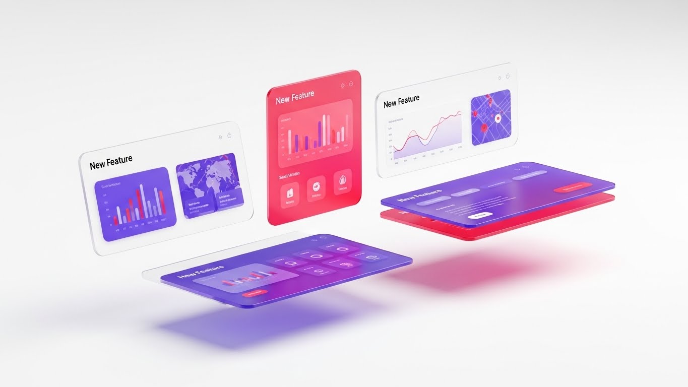
This guide explores 30 distinctive visual styles designed to articulate the value of 3PL and Delivery Management Systems. From high-level brand abstractions to detailed technical demonstrations, these examples serve as a blueprint for elevating your market presence and building trust through design.
1. Abstract 2D flat vector organic modern motion graphics with glossy textures
TOFU | Brand Awareness

(Abstract 2D Motion): Organic Network Flow - Visualizing Seamless Connectivity
The Visual & Narrative Approach
This style abandons rigid grid lines in favor of fluid, organic connectivity. It visualizes a global logistics network not as a mechanical structure, but as a living ecosystem. Interconnecting shapes resembling continents and shipping routes morph and flow into one another, driven by a palette of Glossy Turquoise and warm Amber. Nodes within the network pulsate gently, signifying active hubs and real-time data transfer. The glass-morphism effects add a layer of modern sophistication, suggesting transparency and high-tech fluidity.
Psychological Impact & KPI Focus
- Cognitive Ease: The absence of hard angles and text reduces the viewer's cognitive load, allowing them to absorb the feeling of the brand—seamless, adaptable, and global.
- Operational Impact: This aesthetic subconsciously reinforces Network Agility. It suggests that your system is not rigid; it adapts organically to supply chain disruptions, much like the fluid shapes on screen.
Strategic Implementation & Trade-offs
- Best Use Case: High-level brand anthems on website homepages or event backdrops where the goal is to establish a modern, forward-thinking identity.
- Trade-off: This style is excellent for mood and brand positioning but suboptimal for explaining specific feature sets or UI mechanics. Use it to open the conversation, not to close the deal.
Companies using similar video content -
Fleetbase – Logistics OS – Visualizing modular, open-source logistics workflows.
o9 Solutions – Digital Brain – Abstracting integrated business planning and supply chain.
2. Bold Kinetic Typography (Visual)
TOFU | Market Education

(Kinetic Typography): Heavy Impact Logistics - Communicating Scale and Velocity
The Visual & Narrative Approach
This style utilizes the raw visual power of typography without necessarily relying on readable words. Large, heavy blocky shapes—representing the "heavy lifting" of the logistics sector—collide and interlock with dynamic energy. The composition is diagonal and aggressive, utilizing speed lines and motion blur to emphasize velocity. The color palette of Bold Signal Orange and Deep Charcoal conveys industrial strength and urgency, mirroring the 24/7 nature of freight movement.
Psychological Impact & KPI Focus
- Urgency and Scale: The visual weight of the elements triggers a sense of importance and scale. It taps into the viewer's understanding of logistics as a massive, powerful industry.
- Operational Impact: This style aligns with Throughput and Speed. The kinetic energy implies a system that moves cargo fast and handles high volumes without breaking.
Strategic Implementation & Trade-offs
- Best Use Case: YouTube bumper ads or social media teasers designed to stop the scroll. It creates immediate energy and excitement.
- Trade-off: The lack of specific imagery (trucks, UI) means it relies entirely on rhythm and motion to hold attention. It requires a punchy, rhythmic sound design to be effective.
Companies using similar video content -
FourKites – Real-Time Visibility – Emphasizing speed and scale of freight movement.
SuperProcure – Transportation Management – Communicating heavy impact and velocity in logistics.
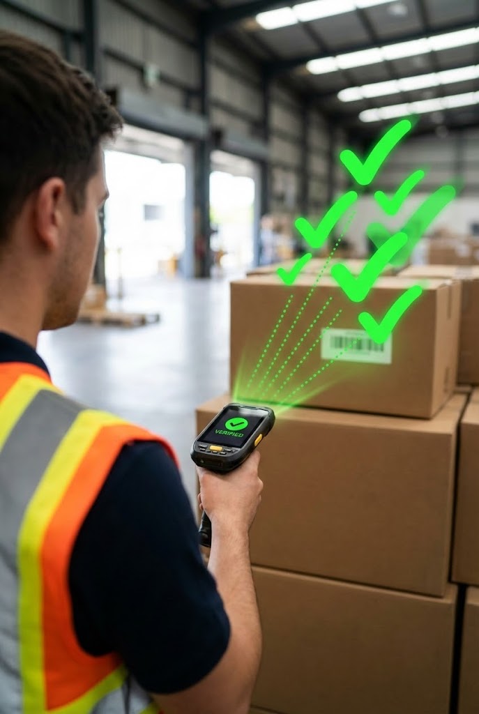
4. 2D Graphics Over Live Action
TOFU | YouTube

(AR Overlay): Instant Digital Verification - Bridging The Physical Gap
The Visual & Narrative Approach
This vertical format perfectly targets the mobile-first audience on platforms like TikTok or Reels. It features high-quality live-action footage of a warehouse worker using a scanner. Overlaid on this reality are Vibrant Neon Green 2D vector graphics—checkmarks popping up upon scanning, and dotted trajectory lines indicating the package's next destination. This technique visualizes the "Digital Twin" concept: the physical action immediately triggering a digital confirmation.
Psychological Impact & KPI Focus
- Tangible Proof: It grounds the software in reality. The viewer sees the actual work environment (warehouse) but improved by technology.
- Operational Impact: Highlights Accuracy and Worker Productivity. The instant "green check" triggers a dopamine response associated with successful task completion.
Strategic Implementation & Trade-offs
- Best Use Case: Social media shorts demonstrating "Day in the Life" ease of use for drivers or warehouse staff. Excellent for recruitment or showing user-friendliness.
- Trade-off: Requires high-quality original footage. Poor lighting or messy warehouse backgrounds can detract from the "clean tech" message.
Companies using similar video content -
Tookan – Delivery Management – Overlaying digital confirmations on live delivery actions.
Fieldpoint – Mobile Field Service – Showing mobile app overlays on technician's real-world tasks.
5. Generative AI cinematic video
TOFU | Vertical Social Organic
(Cinematic AI): Fleet Reliability Scale - Building Enterprise Trust
The Visual & Narrative Approach
This style leverages Generative AI to create high-budget commercial aesthetics without the Hollywood price tag. It features a breathtaking aerial drone shot of a fleet of pristine white semi-trucks driving in perfect formation on a coastal highway. The "Golden Hour" lighting casts warm, dramatic shadows, emphasizing the romance and reliability of the open road. The aesthetic is polished, epic, and inspiring, positioning the logistics provider as a major global player.
Psychological Impact & KPI Focus
- Aspiration and Trust: It appeals to the emotional side of the buyer—the pride in a fleet that runs smoothly and looks professional. It signals stability and financial health.
- Operational Impact: Subtle reinforcement of Fleet Reliability and On-Time Performance. The formation driving implies coordination and discipline.
Strategic Implementation & Trade-offs
- Best Use Case: Pre-roll ads where you have 5 seconds to capture imagination before the "Skip" button appears.
- Trade-off: It is aspirational rather than informational. It sets the mood but doesn't explain how the software works.
Companies using similar video content -
project44 – High-Velocity Supply Chain Platform – Cinematic views of global logistics, AI-powered.
Körber – Supply Chain Solutions – Epic visuals of integrated supply chains, building trust.
6. Isometric 2D Motion Design
TOFU | Skippable Pre-Roll Ad
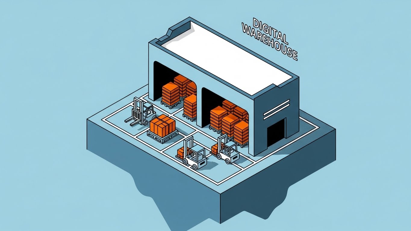
(Isometric 2D): Digital Warehouse Twin - Optimizing Floor Operations
The Visual & Narrative Approach
The "Digital Warehouse" concept is brought to life through clean Isometric 2D design. A stylized distribution center sits on a floating island, offering a "God-view" perspective of operations. Inside, pallets are abstracted into neat orange data cubes, and miniature forklifts zip along defined grid lines. The Slate Blue and Crisp White palette creates a sterile, controlled environment. There are no gradients, only clean lines that define the structure, emphasizing organization and architectural logic.
Psychological Impact & KPI Focus
- Operational Omniscience: The isometric angle gives the viewer a sense of total control. It satisfies the desire to see the "whole picture" at once, relieving the anxiety of hidden bottlenecks.
- Operational Impact: Visualizes Inventory Visibility and Space Utilization. It demonstrates how the software optimizes every square foot of the facility.
Strategic Implementation & Trade-offs
- Best Use Case: LinkedIn organic posts or whitepaper headers. It appeals to the logical, structural mindset of supply chain architects.
- Trade-off: Can feel detached or "game-like." It simplifies complexity, which is good for explaining concepts but may lack the grit of real-world operations.
Companies using similar video content -
Logiwa – Cloud WMS – Visualizing optimized warehouse layouts and inventory flow.
OpenWMS.org – Warehouse Management System – Showing a "God-view" of automated and manual warehouses.
7. Wireframe to Reality Transition
MOFU | Category Creation
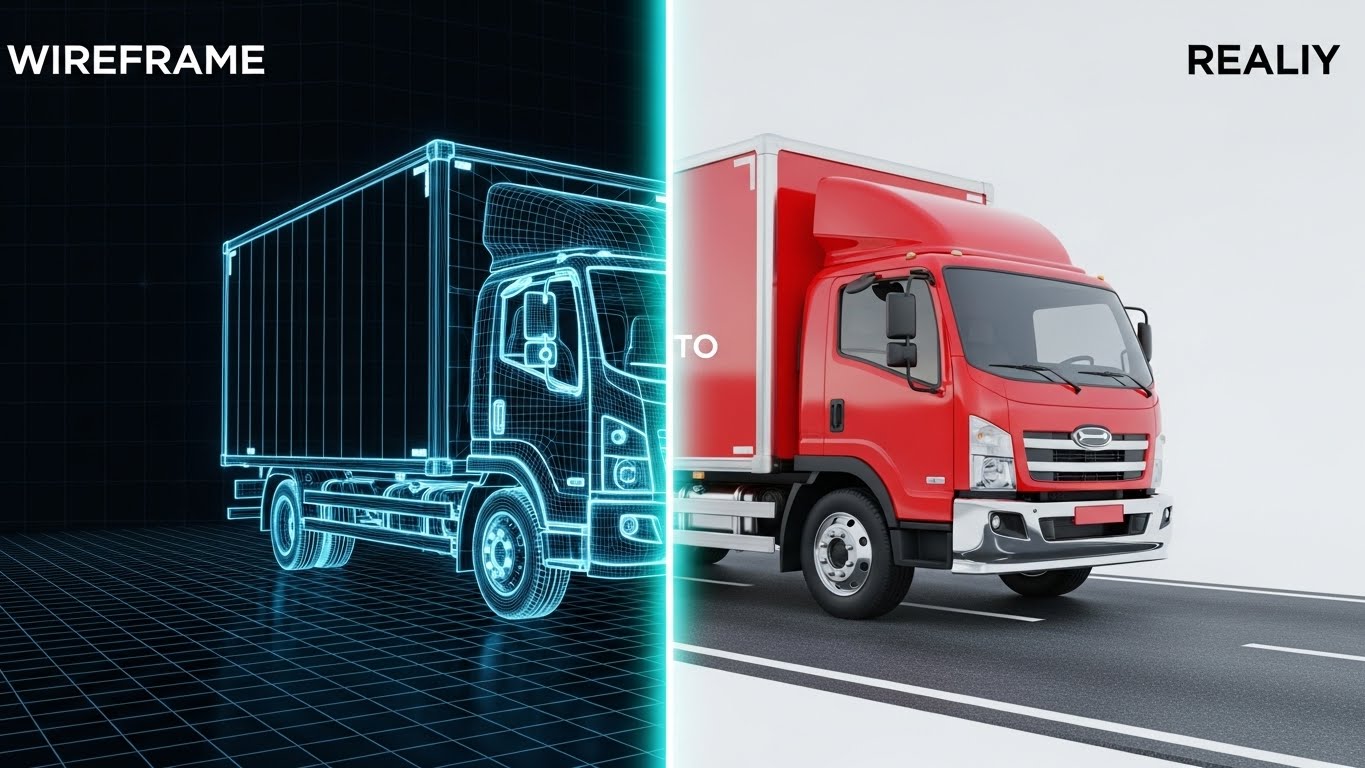
(Wireframe Transition): Concept to Execution - Proving Data Precision
The Visual & Narrative Approach
This split-screen composition powerfully illustrates the connection between planning and execution. The left half reveals the "blueprint" stage: a delivery truck rendered in technical Blueprint Blue wireframes. A glowing vertical scan line moves across the screen, transforming the wireframe into a fully rendered, Glossy Red photorealistic truck on a realistic asphalt road (right half). This visual metaphor perfectly captures the software's role in turning digital plans into physical delivery.
Psychological Impact & KPI Focus
- Competence and Precision: The technical wireframe suggests deep engineering and precision, while the realistic render promises a tangible result. It builds confidence in the software's planning capabilities.
- Operational Impact: Represents Planning Accuracy and SLA Compliance. It visualizes the promise (plan) being kept (delivery).
Strategic Implementation & Trade-offs
- Best Use Case: Website landing pages or feature breakdown videos. It is ideal for showing "Planned vs. Actual" features in your software.
- Trade-off: Requires seamless animation to look professional. If the transition is jerky, the metaphor of smooth operations is lost.
Companies using similar video content -
SAP Logistics Business Network – LBN – Transitioning from planned logistics networks to real-world execution.
Descartes Aljex – Logistics Software – Illustrating the transformation of freight plans into actual shipments.
8. Lifestyle Stock with UI Overlay
MOFU | Product Differentiation
(Lifestyle UI): Empowered Dispatcher Workflow - Humanizing The Interface
The Visual & Narrative Approach
Technology is ultimately about empowering people. This style features high-key lifestyle photography of a professional female dispatcher in a modern office. She looks confidently and in control—a stark contrast to the stressed stereotype of logistics personnel. Overlaid on the scene is a sophisticated, abstract UI representation of a logistics dashboard in Soft Blue. The shallow depth of field keeps the focus on her expression and the interface, humanizing the software experience.
Psychological Impact & KPI Focus
- Empowerment: It sells the result of the software: a stress-free, confident workforce. It addresses the fear of burnout and high staff turnover.
- Operational Impact: Subtle link to Dispatcher Efficiency and Employee Satisfaction. It suggests the software makes the job easier, not harder.
Strategic Implementation & Trade-offs
- Best Use Case: "About Us" pages or case study videos. It builds emotional resonance and trust with decision-makers who care about their teams.
- Trade-off: Can look like generic stock photography if the UI overlay isn't custom and high-quality. The UI must look like your software.
Companies using similar video content -
FieldInsight – Job Management Platform – Highlighting confident field service managers with UI insights.
Shippeo – Supply Chain Visibility – Showing empowered logistics personnel interacting with real-time data.
9. Isometric 3D Workflow
MOFU | Building Trust

(Isometric 3D): Automated Workflow Loop - Simplifying Complex Chains
The Visual & Narrative Approach
Taking the isometric concept to a tactile level, this style uses "Claymorphism"—soft, matte 3D textures with gentle lighting. A complex distribution center is simplified into a charming, organized machine. Tiny 3D trucks enter one side, packages flow smoothly on conveyors, and vans exit, all in a mesmerizing loop. The palette of Clay White, Soft Terracotta, and Steel Blue makes the supply chain look approachable and manageable, removing the intimidation factor of complex logistics networks.
Psychological Impact & KPI Focus
- Approachability: By making the supply chain look like a well-oiled toy system, it reduces the intimidation of switching to a new platform. It suggests that managing a complex network can be simple and even delightful.
- Operational Impact: Visualizes Process Flow and End-to-End Integration. It shows the entire lifecycle of an order in one smooth, continuous animation.
Strategic Implementation & Trade-offs
- Best Use Case: Blog posts comparing "Old vs. New" ways of working, or competitive comparison pages. It positions your solution as the "modern, friendly" alternative to clunky legacy systems.
- Trade-off: The "cute" aesthetic might not land with ultra-conservative enterprise buyers who equate seriousness with complexity. Use selectively.
Companies using similar video content -
Manhattan Associates – Warehouse Management – Simplifying complex distribution center operations into an approachable 3D model.
SSI SCHAEFER – Material Handling Equipment – Visualizing automated intralogistics as a charming, organized system.
11. Dynamic Data Visualization
MOFU | ABM Awareness
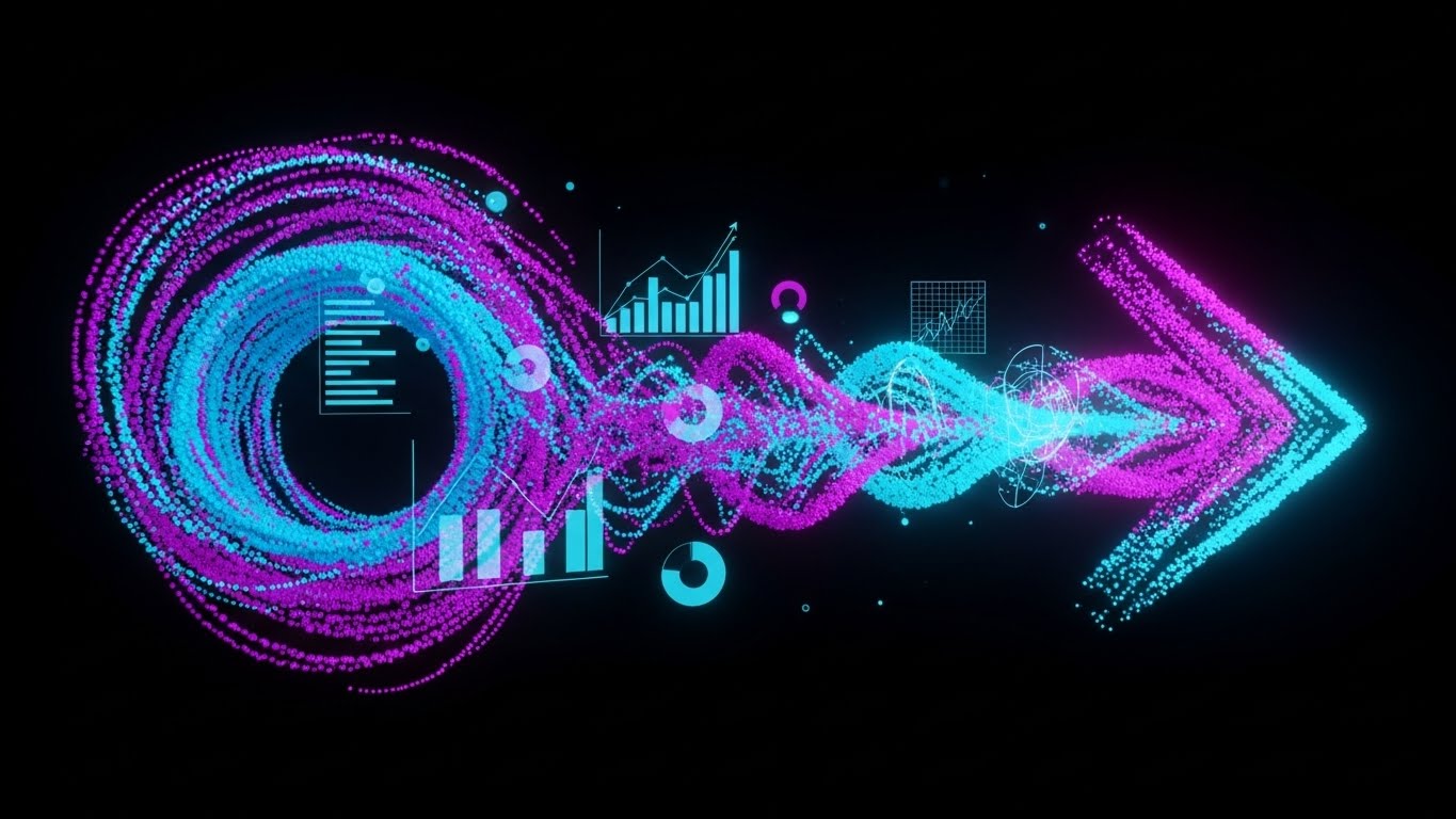
(Dynamic Data Art): Chaos to Order - Visualizing Algorithmic Efficiency
The Visual & Narrative Approach
This style transforms raw, overwhelming data into a work of art. Against a deep black background, thousands of chaotic particles—representing the fragmented nature of unmanaged logistics data—swirl into a vortex. As they move right, they are "processed" by the software, organizing into a streamlined, glowing arrow of Neon Cyan and Magenta. Floating charts and graphs emerge organically from this stream, utilizing the movement to symbolize insights born from chaos. It visualizes the core promise of your platform: turning the noise of the supply chain into a clear, directional signal.
Psychological Impact & KPI Focus
- Pattern Recognition: The brain naturally seeks order. By showing chaos transforming into a straight line, you trigger a sense of relief and resolution in the viewer, alleviating "data anxiety."
- Operational Impact: Visually articulates Data Consolidation and Predictive Modeling. It demonstrates that your software doesn't just store data; it refines it into actionable strategic direction.
Strategic Implementation & Trade-offs
- Best Use Case: Account-Based Marketing (ABM) campaigns targeting large enterprises drowning in data. It creates a "premium" feel suitable for high-value prospects.
- Trade-off: It is abstract. While beautiful, it does not show the actual UI, so it must be paired with clear copy explaining what data is being visualized.
Companies using similar video content -
Linnworks – Order Management – Showcasing a clean, mobile-friendly interface for multi-channel fulfillment.
GoComet – Supply Chain Visibility – Presenting a user-friendly mobile interface for tracking shipments.
12. 2D Line Art Animation
MOFU | LinkedIn Organic
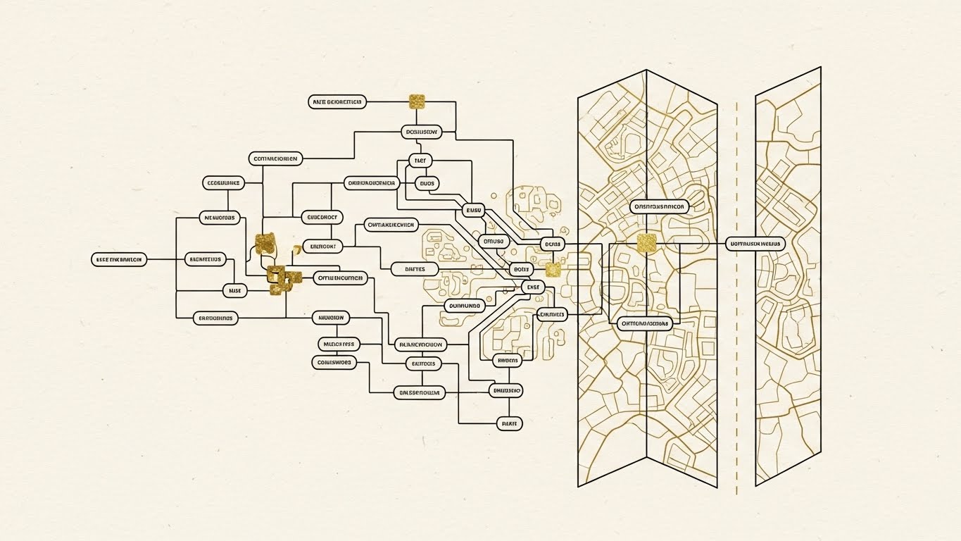
(Sophisticated Line Art): The Logic Tree - Mapping Intelligent Decisions
The Visual & Narrative Approach
Elegance meets engineering in this refined aesthetic. Using thin, continuous Black lines on a textured Cream paper background with Gold foil accents, this style visualizes the "thinking" behind the software. It depicts a complex route optimization logic tree that resembles a complex circuit board, slowly morphing into a geographic road map. The style is architectural and precise, stripping away the noise of trucks and warehouses to focus purely on the intellectual property—the algorithm itself.
Psychological Impact & KPI Focus
- Intellectual Authority: The "blueprint" aesthetic signals deep expertise and planning. It appeals to the logistical architect who values structure and logic over flashiness.
- Operational Impact: Highlights Algorithmic Logic and Network Planning. It suggests that every route is the result of calculated, golden-standard decision-making, differentiating from "black box" competitors.
Strategic Implementation & Trade-offs
- Best Use Case: LinkedIn organic posts or "How It Works" sections on your website. It positions your brand as the "smartest" solution in the room.
- Trade-off: It can feel academic. It lacks the urgency of kinetic styles, making it better for education than for immediate lead generation.
Companies using similar video content -
Ceres Technology – Nostradamus AI Platform – Transforming chaotic supply chain data into clear, actionable insights.
Qlik Sense – Data Analytics – Organizing raw supply chain data into interactive, insightful visualizations.
13. Futuristic Neon/Dark Mode
MOFU | LinkedIn Video Ads
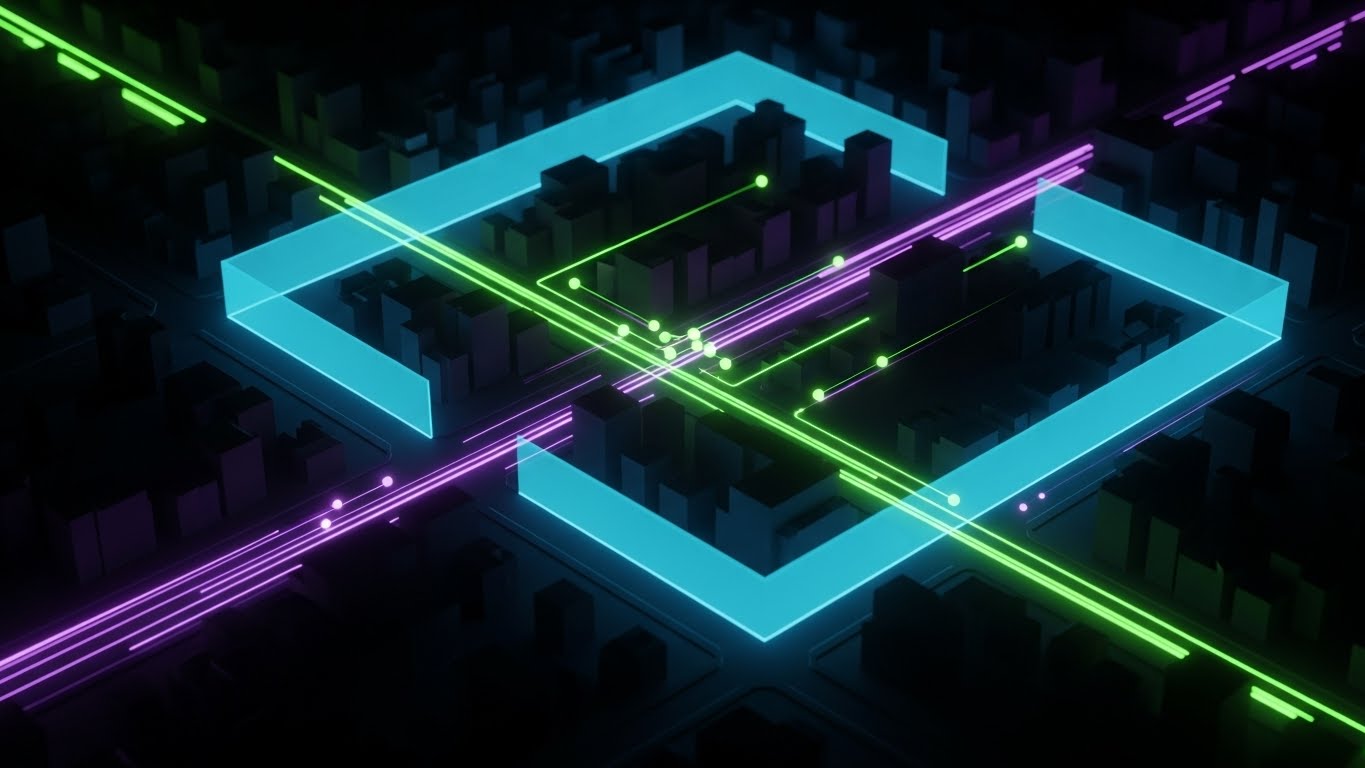
(Cyberpunk Logistics): Geofenced Control - Illustrating Real-Time Tracking
The Visual & Narrative Approach
This style embraces the "Dark Mode" aesthetic popular in modern SaaS interfaces to convey high-tech capability. From a high-angle "God mode" perspective, we see a stylized city at night (Midnight Blue). While the city sleeps, the logistics network is alive; delivery routes glow in Neon Green and Violet lines, and geofenced perimeters rise like holographic walls around key zones. It visualizes the concept of "Cyberpunk Logistics"—a world where physical assets are continuously monitored and guided by a digital nervous system.
Psychological Impact & KPI Focus
- Technological Superiority: The neon-on-dark contrast screams "cutting edge" and "24/7 visibility." It taps into the fear of losing track of assets in the dark.
- Operational Impact: Directly visualizes Geofencing Compliance and Real-Time Visibility. It shows the boundaries and tracks that are invisible to the naked eye.
Strategic Implementation & Trade-offs
- Best Use Case: LinkedIn Video Ads targeting IT directors and tech-savvy fleet managers. It stops the scroll by looking like a high-tech video game or movie interface.
- Trade-off: If overused, it can look "sci-fi" and detached from the gritty reality of trucking. Ensure the map geometry looks realistic.
Companies using similar video content -
Blue Yonder – Luminate Planning – Illustrating complex route optimization and supply chain planning algorithms.
Open Door Logistic Studio – ODL Studio – Mapping territory design and vehicle route planning with elegant line art.
14. Abstract 2D Motion Graphics
MOFU | Programmatic & ABM Display

(Geometric Motion): Self-Organizing Systems - Simplifying Integration
The Visual & Narrative Approach
Sometimes, you need to communicate "integration" without showing complex wires or code. This style uses a "Material Design" inspired approach with geometric shapes (squares, circles) in Vivid Purple, Teal, and Orange. The shapes float and automatically snap into a perfect grid structure, accompanied by soft, long shadows. The visual metaphor is "Self-Organizing Logistics"—the idea that disparate parts of the supply chain (inventory, fleet, billing) naturally fit together when using your platform.
Psychological Impact & KPI Focus
- Cognitive Ease: The satisfying "snap" of shapes fitting together reduces anxiety about complex integrations. It promises a frictionless experience.
- Operational Impact: Visualizes API Integration and Modular Scalability. It implies that the system is plug-and-play, not a custom coding nightmare.
Strategic Implementation & Trade-offs
- Best Use Case: Programmatic display ads and retargeting banners. The clean geometry remains legible even at small sizes on mobile screens.
- Trade-off: It is highly metaphorical. It communicates "ease" effectively but fails to communicate specific logistics features unless accompanied by strong text overlays.
Companies using similar video content -
Sensefinity – Supply Chain Visibility – Visualizing global tracking and real-time location with neon elements.
fleetx – Intelligent Fleet Management – Displaying geofenced control and real-time tracking in a dark mode UI.
15. 3D X-Ray Visualization
MOFU | Demand Gen
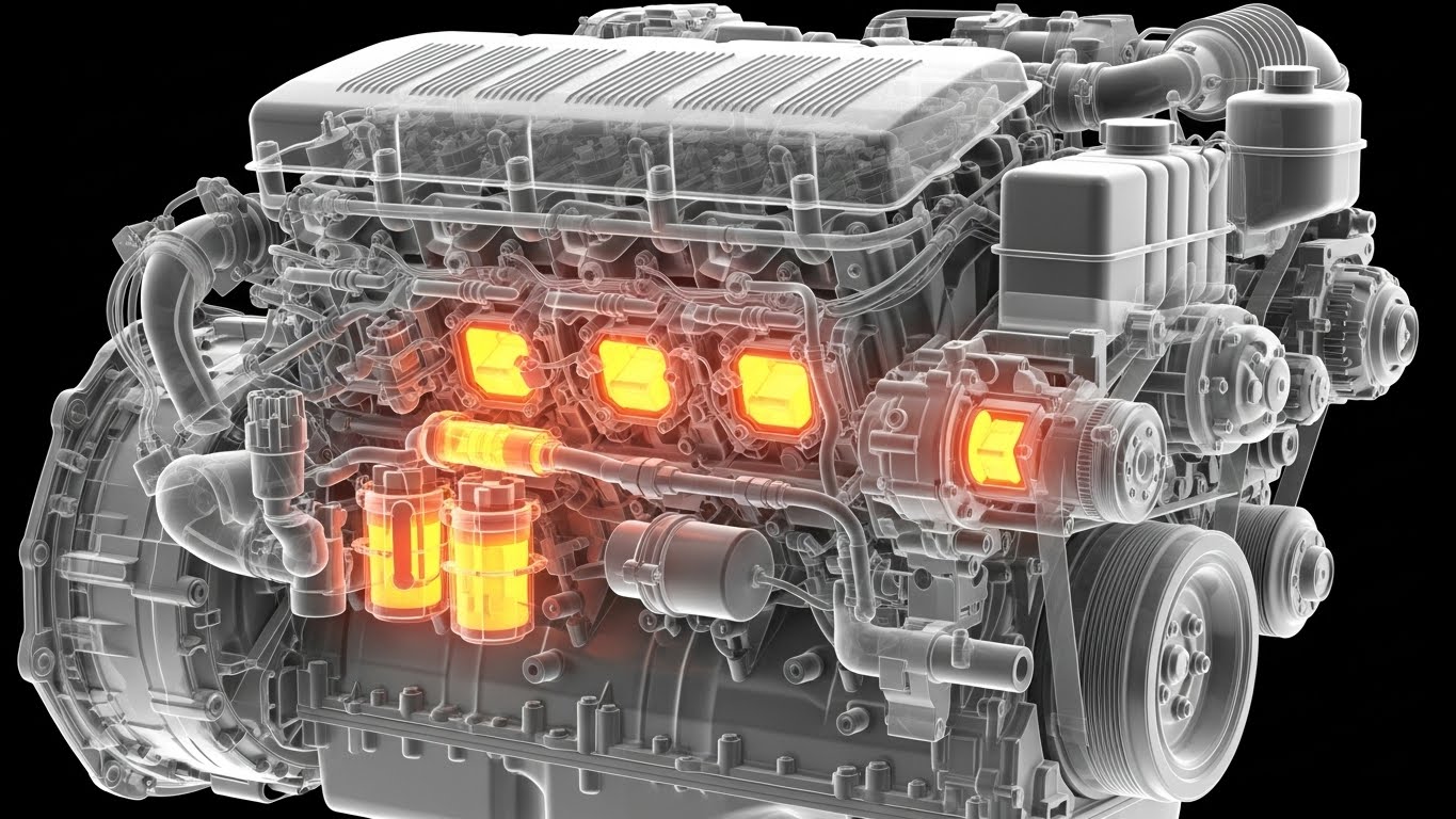
(Technical X-Ray): Inner Vision - Revealing Hidden Asset Health
The Visual & Narrative Approach
To claim "End-to-End Visibility," you must sometimes look inside the asset. This style utilizes a sophisticated 3D X-Ray effect. Applied here to a heavy-duty truck engine, the effect reveals the internal mechanics—pistons, valves, and filters—glowing with Vivid Orange and Yellow heat signatures against a semi-transparent "Ghost White" shell. It creates a clinical, high-tech look that promises deep insight beyond the surface level, visualizing the "heartbeat" of the fleet.
Psychological Impact & KPI Focus
- Depth and Diligence: This style appeals to the technical buyer who worries about what they can't see—engine wear or imminent failure. It signals that your software goes deeper than surface-level GPS dots.
- Operational Impact: Visualizes Predictive Maintenance and Asset Health Monitoring. It suggests the software identifies internal issues before they cause costly, unexpected downtime.
Strategic Implementation & Trade-offs
- Best Use Case: E-book covers, whitepapers on maintenance/security, or feature pages about telematics integration.
- Trade-off: It is technically demanding to produce. It requires high-fidelity 3D models. If the model is generic, the impact is lost.
Companies using similar video content -
Budibase – Low-Code Platform – Showing how custom logistics apps integrate and self-organize.
IBM Sterling – Order Management – Abstractly representing seamless integration across supply chain partners.
16. Dark Mode UI Showcase
MOFU | ROI Justification

(ROI Dashboard): Financial Clarity - Justifying the Investment
The Visual & Narrative Approach
When speaking to the CFO or the Economic Buyer, aesthetics must give way to analytics. This style presents the software's "Dark Mode" financial dashboard with absolute clarity. The background is Deep Charcoal to reduce eye strain, allowing the high-contrast data visualizations—Matrix Green for growth and Alert Red for exceptions—to pop. Floating holographic graphs extend off the screen, emphasizing positive trends in "Cost-Per-Mile" and "Efficiency." It is not just a UI; it is a financial argument visualized.
Psychological Impact & KPI Focus
- Financial Confidence: The "Bloomberg Terminal" aesthetic suggests serious financial control. It frames the software as an asset management tool, not just an operational expense.
- Operational Impact: Directly links operations to Cost Reduction and Margin Improvement. It creates a visual correlation between using the dashboard and seeing green trend lines.
Strategic Implementation & Trade-offs
- Best Use Case: Sales decks, pricing pages, and ROI calculator videos. It is the "closer" visual that proves the math works.
- Trade-off: It can be dry. It lacks the emotional hook of the cinematic styles, so use it only when the prospect is already interested in the numbers.
Companies using similar video content -
Fiix CMMS – Heavy Equipment Maintenance – X-ray views of machinery to show internal health and predictive maintenance.
FieldEquip – FSM for Equipment – Revealing internal equipment status and maintenance needs through 3D X-ray.
17. Photorealistic 3D Renders
BOFU | Risk Mitigation

(Enterprise Security): Fortified Data - Visualizing Compliance
The Visual & Narrative Approach
Security is intangible until you visualize it. This style uses hyper-realistic 3D rendering to create a metaphor for data protection. A secure server room is blended with a warehouse aesthetic; in the center, a gleaming Golden digital padlock floats protectively over a stack of pallets. The lighting is moody, with cool "Security Blue" rim lighting and a spotlight on the lock. Textures of brushed metal and concrete convey weight, permanence, and impenetrability.
Psychological Impact & KPI Focus
- Safety and Stability: The visual weight of the lock and the organized server room alleviates fears of data breaches or cyber threats. It communicates "Enterprise-Grade."
- Operational Impact: Visualizes Data Security and Compliance (SOC2/GDPR). It reassures the buyer that their proprietary route data and customer lists are under lock and key.
Strategic Implementation & Trade-offs
- Best Use Case: Trust Centers, Security compliance pages, and bottom-of-funnel landing pages where "Risk" is the primary blocker to signing.
- Trade-off: It is a static metaphor. It doesn't show how the security works, only that it exists. It creates a feeling of safety rather than a technical explanation.
Companies using similar video content -
Oracle SCM Cloud – Logistics – Presenting a dark mode financial dashboard for cost and efficiency.
NorthStar WMS – Billing & Invoicing Module – Showcasing clear financial dashboards for 3PL billing.
18. Aspirational Stock Montage
BOFU | Driving Demo Requests

(Human Hero): The Perfect Delivery - Selling the Outcome
The Visual & Narrative Approach
At the bottom of the funnel, the buyer wants to envision the success of their team. This style uses premium, high-key stock footage or photography. It features a "Hero Shot" of a delivery driver or fleet manager looking genuinely happy and successful—standing next to a clean van, bathed in sunlight and Sky Blue tones. It’s not about the software interface anymore; it’s about the result of the software: a happy driver, a punctual delivery, and a stress-free operation.
Psychological Impact & KPI Focus
- Emotional Validation: It validates the buyer's desire to be a good leader. Seeing a happy driver alleviates the guilt/fear of imposing difficult new tools on staff.
- Operational Impact: Visualizes Driver Retention and Service Excellence. It links the software to the human element of the supply chain.
Strategic Implementation & Trade-offs
- Best Use Case: Email marketing signatures, "Book a Demo" confirmation pages, and case study headers. It provides the "human touch" necessary to encourage a personal meeting.
- Trade-off: It can look generic if not curated carefully. Avoid "cheesy" stock smiles; look for authentic, gritty, but positive imagery.
Companies using similar video content -
E2open – Connected Supply Chain Platform – Hyper-realistic renders of secure data centers and compliance.
SAP – Extended Warehouse Management – Visualizing fortified data security within a warehouse context.
19. Split Screen: Optimized Reality & UI
BOFU | Objection Handling

(Before/After Contrast): Order from Chaos - Handling The "Complexity" Objection
The Visual & Narrative Approach
This powerful visual tactic directly addresses the "It's too hard to switch" objection. The composition is a sharp split-screen. The left side ("Before") depicts the pain: a chaotic, dimly lit messy desk or a frustrated driver with a clipboard, graded in tired Sepia tones. The right side ("After") depicts the solution: a bright, crisp render of your mobile app, glowing in Cool White and Blue. The contrast is stark and immediate, forcing the brain to choose the "clean" side.
Psychological Impact & KPI Focus
- Loss Aversion & Resolution: It agitates the pain of the status quo and immediately offers a dopamine-inducing resolution. It makes the "Old Way" look unbearable.
- Operational Impact: Visualizes Digitization and Paperless Operations. It shows the tangible shift from manual error to digital precision.
Strategic Implementation & Trade-offs
- Best Use Case: Retargeting ads for users who visited the pricing page but didn't convert. It reminds them why they need to switch.
- Trade-off: It is aggressive. It highlights the negative "Before" state, so ensure the "After" state is significantly more attractive to balance the sentiment.
Companies using similar video content -
FarEye – Last-Mile Delivery – Featuring happy delivery drivers and successful outcomes.
Wello Solutions – Field Service Software – Showcasing satisfied field technicians and seamless service delivery.
20. Generative AI Realistic Character
BOFU | The Economic Buyer
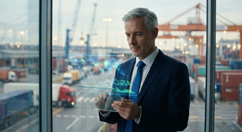
(The Visionary Leader): Executive Control - Mirroring The Buyer
The Visual & Narrative Approach
To sell to the C-Suite, you must mirror the C-Suite. This style uses high-end Generative AI or premium cinematography to depict the "Ideal Buyer Persona." We see a distinguished executive standing in a modern, glass-walled office overlooking a bustling logistics hub. They hold a transparent tablet displaying high-level holographic metrics. The lighting is cinematic and premium. The character looks serious but satisfied—in total control of their empire.
Psychological Impact & KPI Focus
- Aspiration and Mirroring: The buyer sees themselves in the image—or who they want to be. It associates your software with executive presence, control, and foresight.
- Operational Impact: Visualizes Strategic Oversight and Market Leadership. It suggests that using this platform is what top-tier leaders do.
Strategic Implementation & Trade-offs
- Best Use Case: Website homepages, Annual Report visualizations, or personalized video thumbnails for executive outreach.
- Trade-off: It feels staged. It is not "authentic" to the day-to-day grind, but it is highly effective for setting a premium brand tone for high-level decision-makers.
Companies using similar video content -
Extensiv (3PL Central) – Warehouse Manager – Contrasting chaotic manual processes with streamlined digital workflows.
Despatch Cloud – Order Fulfillment – Showing the transformation from messy order processing to clean digital fulfillment.
21. Low-Poly 3D Modeling
BOFU | ROI Justification Hook

(Low-Poly 3D): Gamified Efficiency - Translating Operations to Profit
The Visual & Narrative Approach
Money is often an abstract concept in logistics, hidden behind fuel costs and maintenance logs. This style simplifies the complex equation of "efficiency equals profit" using a playful Low-Poly 3D aesthetic. A stylized, grey factory conveyor belt processes raw, abstract cubes, pressing them into gleaming, Metallic Gold coins. The geometry is faceted and sharp, yet the soft Pastel Blue background keeps the mood light and optimistic. It serves as a visual metaphor for the software’s core function: turning raw operational input into tangible financial output.
Psychological Impact & KPI Focus
- Financial Tangibility: The direct visual transformation of "work" (cubes) into "wealth" (coins) triggers a satisfying confirmation of value. It simplifies the ROI argument for the financial buyer.
- Operational Impact: Visualizes Margin Improvement and Process Efficiency. It reinforces the idea that every streamlined process directly contributes to the bottom line.
Strategic Implementation & Trade-offs
- Best Use Case: Social media retargeting ads or pricing page headers. It effectively hooks the viewer with a clear "money-making" proposition.
- Trade-off: The "toy-like" aesthetic may feel too casual for severe crisis management topics. Use it strictly for positive financial messaging.
Companies using similar video content -
Anaplan – Supply Chain Planning – Depicting a confident executive overseeing strategic supply chain decisions.
Oracle – Fusion Cloud SCM – Aspirational executive in a modern office, controlling global logistics.
22. 2D Animation & UI Composition
Onboarding | Reducing Implementation Friction

(Vector Support): Collaborative Onboarding - Humanizing Technical Support
The Visual & Narrative Approach
The transition from sales to implementation is often where anxiety peaks. This style addresses that fear by visualizing "partnership." Using clean 2D vector animation, we see a stylized support agent actively collaborating with a user on a floating UI panel. The palette of Vibrant Lime Green and Electric Blue conveys energy and helpfulness. Floating positive icons—plus signs and checkmarks—surround the interaction, visualizing the "setup success" moment. It reassures the new customer that they are not alone in the deployment process.
Psychological Impact & KPI Focus
- Reassurance and Partnership: The presence of a helpful human character mitigates the "abandonment anxiety" often felt after signing a contract. It signals distinct, hands-on support.
- Operational Impact: Visualizes Implementation Speed and Support Accessibility. It promises a frictionless setup phase guided by experts.
Strategic Implementation & Trade-offs
- Best Use Case: Welcome emails, support portal headers, or the "Onboarding" section of a proposal deck.
- Trade-off: If the characters look too generic or "clip-art" style, it can cheapen the brand. Custom character design that matches your brand guidelines is essential.
Companies using similar video content -
Deposco – Bright Warehouse – Visualizing operational efficiency turning into metallic gold coins.
Leanafy – Cloud WMS – Simplifying complex 3PL operations into a clear profit-generating system.
23. Clean UI Workflow (Light Mode)
Onboarding | Self-Serve Onboarding
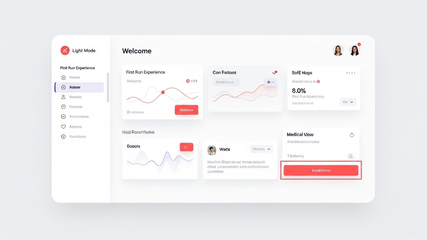
(Light Mode UI): Frictionless First Run - Inviting User Interaction
The Visual & Narrative Approach
For the first-time user, the interface must look inviting, not intimidating. This style showcases a pristine "Light Mode" UI workflow. The dashboard is designed with generous whitespace, using a palette of Medical White and Soft Grey to create a sense of breathing room. Vivid Coral accents draw the eye specifically to the primary "Action" buttons, guiding the user intuitively. Soft drop shadows give the cards a slight lift, adding depth without clutter. It visualizes a "First Run Experience" that is clean, organized, and easy to navigate.
Psychological Impact & KPI Focus
- Cognitive Ease: The high-key brightness and lack of clutter lower the barrier to entry. It tells the user, "This is easy to learn."
- Operational Impact: Visualizes User Adoption and Time-to-Competency. A clean UI implies a short learning curve for dispatchers and managers.
Strategic Implementation & Trade-offs
- Best Use Case: In-app "empty states" (screens with no data yet), Getting Started guides, or "Welcome" screens.
- Trade-off: Light mode can be glaring in low-light dispatch environments. It is best used for initial training contexts rather than representing night-shift operations.
Companies using similar video content -
SafetyCulture – Supply Chain Visibility – Animated support agent guiding users through supply chain monitoring.
OpenLMIS – LMIS – Visualizing collaborative support for health commodity supply chain management.
24. Rapid UI Feature Montage
Onboarding | Trial/Freemium User Activation
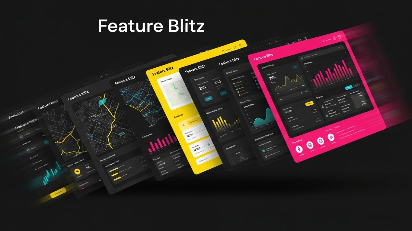
(Kinetic UI Stack): The Feature Blitz - Showcasing Platform Depth
The Visual & Narrative Approach
To activate a new user, you must quickly demonstrate the breadth of value available. This style uses a dynamic "card fan" animation where multiple UI screens—maps, manifests, analytics—fly into the frame, staggering like a deck of cards. The motion is rapid and energetic, accented by motion blur. The color palette is high-energy: Bright Yellow, Cyan, and Magenta. This "Feature Blitz" creates a visual feast that overwhelms the viewer (in a positive way) with the sheer volume of tools at their disposal.
Psychological Impact & KPI Focus
- Perceived Value: The quantity and speed of the screens trigger a sense of abundance. The user feels they are getting a robust suite of tools.
- Operational Impact: Visualizes Platform Scalability and Feature Density. It suggests that the software can handle any operational requirement that arises.
Strategic Implementation & Trade-offs
- Best Use Case: In-app modals announcing new updates, or "What's Included" videos for trial users.
- Trade-off: It is too fast for detailed learning. Use it to impress and excite, not to teach specific workflows.
Companies using similar video content -
ShipHero – WMS – Showcasing a pristine, easy-to-navigate light mode UI for warehouse operations.
Infoplus WMS – Multi-Client Handling – Presenting a clean, intuitive UI for managing multiple 3PL clients.
25. Hyper-lapse Stock Footage with Data
Onboarding | Accelerating Time-to-Value
(Hyper-Lapse Overlay): Velocity Control - Mastering The Pace of Logistics
The Visual & Narrative Approach
Logistics never sleeps, and neither does your software. This style combines the frenetic energy of hyper-lapse footage (fast-forwarded video) with the stability of digital overlays. We see a warehouse moving at breakneck speed—blurred forklifts and people—while the data overlays remain crisp, static, and legible in White wireframes. This powerful contrast visualizes the concept of "Calm within the Chaos." It shows that no matter how fast the physical operation moves, the digital control layer remains steady and accurate.
Psychological Impact & KPI Focus
- Stability in Chaos: It reassures the operations manager that the system won't crack under pressure. It provides a sense of digital anchoring.
- Operational Impact: Visualizes High-Volume Throughput and Real-Time Latency. It proves the system processes data as fast as the real world moves.
Strategic Implementation & Trade-offs
- Best Use Case: Welcome emails or waiting room screens in logistics centers. It builds confidence in high-speed environments.
- Trade-off: Hyper-lapse can be dizzying if sustained too long. Use it in short bursts (3-5 seconds) to establish energy.
Companies using similar video content -
Microsoft Dynamics 365 – Supply Chain Management – Rapidly showcasing a breadth of SCM features.
Infor Nexus – Supply Chain Platform – Dynamic montage of various supply chain visibility and analytics features.
26. 2D Character-Driven Story
Retention | Reducing Churn

(Team Vector): The Victory Lap - Celebrating Shared Success
The Visual & Narrative Approach
Retention is built on relationships and shared success. This style moves away from the interface to focus on the people using it. A diverse team—driver, dispatcher, and manager—is depicted in a modern, flat vector style, celebrating a milestone (high-fiving) in front of a global backdrop. The Warm Earth Tones and Sky Blue palette create a feeling of organic, human connection. It visualizes the software not as a tool, but as a unifying force that helps the entire team win.
Psychological Impact & KPI Focus
- Community and Belonging: It reminds the client that they are part of a successful community. It shifts the relationship from transactional (vendor-client) to relational (partner-partner).
- Operational Impact: Visualizes Team Alignment and Employee Satisfaction. It reinforces the soft benefits of the platform, such as reduced stress and better teamwork.
Strategic Implementation & Trade-offs
- Best Use Case: Monthly newsletters, "Year in Review" personalized videos, or milestone celebration emails.
- Trade-off: It is purely emotional. It does not communicate technical updates, so pair it with data-heavy content for a balanced review.
Companies using similar video content -
Katomaran Technologies – IoT in Warehousing – Combining fast-paced warehouse footage with stable data overlays.
Hopstack – WMS – Visualizing rapid warehouse operations with real-time IoT data.
27. Macro UI Micro-Interactions
Retention | Driving Deep Feature Adoption

(Macro UI Focus): The Power Button - Focusing on Precision Control
The Visual & Narrative Approach
Sometimes, to appreciate the sophistication of a tool, you need to look closer. This style uses an extreme macro close-up of a single UI interaction. We focus on an "Optimize" button with a Brushed Metal texture, glowing with an Emerald Green light as it is pressed. The shallow depth of field blurs out the surrounding interface, forcing the viewer to concentrate entirely on this single, powerful moment of decision. It creates a tactile sense of quality and responsiveness.
Psychological Impact & KPI Focus
- Tactile Quality: The high-fidelity texture makes the software feel "premium" and well-engineered. It mimics the satisfaction of pressing a high-end physical button.
- Operational Impact: Visualizes One-Click Automation and Ease of Use. It highlights that complex background calculations are triggered by a simple, decisive action.
Strategic Implementation & Trade-offs
- Best Use Case: Tooltips, "Feature Spotlight" emails, or changelog update videos. It is excellent for drawing attention to specific new buttons or features.
- Trade-off: It lacks context. You cannot see the full workflow, only the trigger. Use it to highlight the action, not the process.
Companies using similar video content -
Zetes – Supply Chain Optimization – Character-driven stories of teams achieving supply chain success.
FieldInsight – Job Management Platform – Depicting a diverse team celebrating successful job completions.
28. Abstract 3D AI Visualization
Expansion | Driving Upsell/Cross-sell

(Neural Network): Intelligent Evolution - Visualizing The AI Upgrade
The Visual & Narrative Approach
When upselling premium "AI" or "Intelligence" modules, you are selling the invisible. This style visualizes that intelligence as a complex, glowing neural network. Against a Deep Black background, nodes of Neon Cyan and Magenta connect via fiber-optic-like strands to form the shape of a delivery truck. This represents the "brain" of the fleet—the invisible algorithms that learn and adapt. The aesthetic is unapologetically futuristic and high-tech, justifying a premium investment.
Psychological Impact & KPI Focus
- Future-Readiness: It triggers the fear of missing out (FOMO) on the next generation of tech. It positions the upgrade as a leap into the future.
- Operational Impact: Visualizes Machine Learning and Autonomous Logic. It suggests the system is evolving and getting smarter over time.
Strategic Implementation & Trade-offs
- Best Use Case: Upgrade landing pages, "Pro vs. Standard" comparison videos, or launch announcements for AI features.
- Trade-off: It is abstract. It must be accompanied by concrete examples of what the AI actually improves (e.g., "Predicts delays 2 hours in advance").
Companies using similar video content -
MyCarrierTMS – Shipping Automation – Highlighting the precision and ease of a single "optimize" or "ship" button.
Ramco WMS – Warehouse Management System – Focusing on key UI interactions for precise warehouse control.
29. Holographic UI over 3D Render
Expansion | Driving Referrals & Advocacy
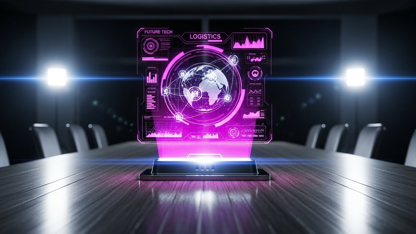
(Holographic Command): Global Command Center - Projecting Leadership
The Visual & Narrative Approach
To encourage advocacy, you must make your client feel like an industry leader. This style places a futuristic Holographic UI inside a realistic executive boardroom. A spinning 3D globe with connecting logistics arcs in Transparent Blue and Pink projects upwards from a conference table. The juxtaposition of the wood grain (traditional business) with the hologram (future tech) positions the user as a visionary leader orchestrating a global empire.
Psychological Impact & KPI Focus
- Status and Authority: It appeals to the client's ego and ambition. It visualizes the level of control and insight they want to be seen having.
- Operational Impact: Visualizes Global Visibility and Strategic Governance. It shows the software is capable of managing complex, multi-national supply chains.
Strategic Implementation & Trade-offs
- Best Use Case: Case study headers, "Ambassador Program" invitations, or social sharing assets for clients to post on their own LinkedIn.
- Trade-off: It feels "movie-like." Ensure the data on the hologram looks plausible, not just decorative sci-fi gibberish.
Companies using similar video content -
Ceres Technology – Nostradamus AI Platform – Visualizing AI-driven predictive analytics as a glowing neural network.
LEAFIO AI Retail Platform – Supply Chain Automation – Abstract 3D representation of AI optimizing retail supply chains.
30. 3D Parallax UI Presentation
Expansion | Proactive Support/Announcements
(Parallax Layers): Deep Dive Data - Unfolding New Capabilities
The Visual & Narrative Approach
Announcing major platform updates requires a visual style that says "Evolution." This style uses 3D Parallax, where semi-transparent glass UI panels float in a void, tilted at dynamic angles. As the camera moves, the layers separate, revealing depth and new feature widgets (graphs, maps) in Vivid Pink and Violet. The elements on the screens appear to float slightly off the glass surface. This depth effect visualizes the concept of "going deeper" into the data and unveiling new layers of functionality.
Psychological Impact & KPI Focus
- Sophistication and Depth: The parallax effect suggests a multi-layered, rich experience. It implies that there is always more value to be discovered in the platform.
- Operational Impact: Visualizes Analytics Depth and Multi-Dimensional Reporting. It shows that the software offers more than just surface-level insights.
Strategic Implementation & Trade-offs
- Best Use Case: "What's New" webinar intros, blog headers for major version releases (e.g., "Version 4.0"), or product roadmap presentations.
- Trade-off: Requires high-end animation. If the parallax is jerky, it looks broken. It is a "hero" style, not for everyday utilitarian use.
Strategic Knowledge Base: The Visual Operations Doctrine
To transition from "viewing" these styles to "operationalizing" them, we must adopt a strategic framework. This is not just about making things look good; it is about using visualization as a tool for efficiency, adoption, and growth. The following three segments outline the Advids Visual Operations Doctrine for 3PL and SaaS leaders.
Strategic Alignment & Visual Architecture
Before a single pixel is rendered, the visual strategy must be aligned with your operational reality. This segment defines the "Pre-Production" phase: structuring your visual language to match your business goals.
- The Cognitive Load Audit: Before creating training videos, conduct an audit of your current training density. If a manual takes 10 minutes to read, the visual equivalent should convey the core logic in under 90 seconds (Style 3). Visuals should reduce mental effort, not add to it.
- Role-Based Visual Mapping: Do not use the same visual style for everyone. Drivers need high-contrast, large-element visuals (Style 4, Style 23) viewable on mobile devices in sunlight. Fleet Managers need data-dense, dark-mode dashboards (Style 16) for desktop command centers.
- The "Glanceability" Standard: In logistics, seconds matter. Design your visual assets (thumbnails, in-app tooltips) to be "glanceable." A user should understand the status (Green/Red, Up/Down) in under 0.5 seconds without reading text.
- Brand Voice Consistency: Your marketing visuals (Style 1) and your in-app tutorials (Style 23) must speak the same language. A disconnect between a "Futuristic AI" ad and a "Clunky Windows 95" tutorial creates a trust gap. Unify the palette and font hierarchy.
- The Advids Strategic Audit: Partnering with experts like Advids early allows you to define a "Visual Operating System." We help you decide which styles belong in the boardroom and which belong in the breakroom, ensuring your budget is spent on the right impact.
- Standardization vs. Customization: For general features (login, settings), use standardized, clean styles (Style 14). For unique competitive advantages (proprietary routing algorithms), invest in bespoke, high-end motion graphics (Style 12) to protect your IP.
- The Cross-Departmental Bridge: Use visuals to unify terminology. If Sales calls it "AI Dispatch" and Ops calls it "Auto-Assign," confusion ensues. Create a definitive "Visual Dictionary" video (Style 20) that establishes the shared vocabulary for the entire company.
- Legacy System Integration: Visualizing the invisible bridge between old hardware and new software is critical. Use "Wireframe to Reality" styles (Style 7) to show how your modern SaaS layer draws data from legacy on-premise ERPs without friction.
- Accessibility in Trucking: Your workforce is diverse. Visuals must transcend language barriers. Use iconography and motion (Style 22) rather than voiceovers or heavy text to explain concepts to a multi-lingual driver fleet.
- The Mobile-First Mandate: 80% of your users (drivers) are on mobile. Every visual style—from Style 21 to 30—must be legible on a 6-inch screen. Avoid tiny text; rely on bold shapes, color coding, and clear motion.
Operational Adoption & Implementation
The best software fails if no one uses it. This segment focuses on the "Deployment" phase: using visuals to grease the gears of adoption and overcome resistance.
- Overcoming "Big Brother" Anxiety: Drivers often fear tracking software. Use empathy-driven visuals (Style 8, Style 26) to frame the technology as a "Co-Pilot" for safety, rather than a "Spy" for discipline. Show the driver benefiting, not just the company.
- The Micro-Learning Shift: No one reads the PDF manual. Replace it with a library of 30-second "Micro-Learning" clips (Style 27). Embedding these short, looped videos directly into the app's "Help" section reduces friction and encourages self-correction.
- Just-in-Time Support: Context is king. When a driver triggers an error, pop up a specific visual guide (Style 4) related to that exact error. Do not force them to search a library. Visual help should arrive before the support ticket is filed.
- Gamification of Training: Turn learning into a leaderboard. Visualize driver scores and safety bonuses using "Low Poly" or "Gold Coin" metaphors (Style 21). Visualizing progress motivates engagement far better than text-based checklists.
- Reducing Support Ticket Volume: There is a direct correlation between the quality of your visual library and the volume of Level 1 support tickets. Proactive "How-To" animations (Style 23) answer common questions instantly, freeing your support team for complex issues.
- Remote Onboarding: You cannot fly trainers to every hub. Leverage 3D visualization and screencasts (Style 6, Style 9) to conduct "virtual walk-throughs" of the software. This allows you to scale onboarding globally without travel costs.
- Standard Operating Procedures (SOPs): Text-based SOPs are ignored. Transform critical safety and compliance SOPs into "Kinetic Typography" videos (Style 2). The rhythm and motion ensure the message is watched and remembered.
- Feedback Loops: Use interactive video elements. At the end of a training clip, ask "Was this helpful?" with a simple visual thumbs up/down. This data helps you refine your visual assets over time.
- Scalable Localization: Global fleets need global assets. By separating text layers from the animation in your source files (a standard Advids practice), you can swap languages in Style 22 or Style 24 cheaply and quickly for different regions.
- Leadership Communication: When shifting strategy, the CEO should not send a long email. Use "High-End Production" (Style 20) to broadcast the vision. A polished video signals importance and commands attention from regional managers.
Measuring Impact & Future-Proofing
Investment in visual assets must yield a return. This segment focuses on the "ROI" phase: measuring success and preparing for the next wave of innovation.
- Beyond "Views": Do not measure video success by views alone. Define actionable KPIs: Did the "Route Optimization" video reduce the "Time-to-First-Route" for new dispatchers? Did the "Safety" video reduce accident claims? Measure behavior change.
- The "Idle Time" Metric: In software, confusion equals idle time. Measure the correlation between better visualization (Style 23) and reduced time spent navigating menus. Good design buys back time for the user.
- Compliance Velocity: When a new regulation (like ELD mandates) hits, how fast can you get the fleet compliant? Video is the fastest vector for mass information. Measure the speed of compliance adoption post-video release versus text release.
- Retention and Churn: High-quality UX visualization (Style 27) acts as a "quality anchor." Customers are less likely to churn from a platform that feels premium and easy to use. Visual polish contributes directly to Lifetime Value (LTV).
- The AI Visual Frontier: Generative AI is changing how we create. Prepare to integrate "Generative" styles (Style 5, Style 11) that can personalize content—showing a truck with the client's logo in the demo video automatically.
- Scalability of Assets: Build a visual library, not just one-off videos. Create a "Kit of Parts"—standardized icons, characters, and UI devices—that can be reassembled into new videos rapidly. This lowers the cost per asset over time.
- The Advids Partnership: Visual strategy is not a one-time project; it is an ongoing optimization. Advids serves as your long-term partner, managing your asset library and ensuring your visual language evolves alongside your software features.
- Benchmarking Success: Do not just look at your own metrics; look at the market. If your competitor's demo looks like a Marvel movie (Style 13) and yours looks like a spreadsheet, you are losing the "Attention Economy" war. Visual quality is a competitive moat.
- The ROI of Safety: Safety is the highest-ROI area for visualization. A clear, memorable video about "Braking Distance" (Style 7) can prevent an accident that costs millions. The ROI of a $5,000 video can be 100x if it prevents one crash.
- Final Call to Innovation: Treat video and design not as "Marketing Content" but as "Digital Infrastructure." Just as you invest in servers and code, invest in the visual layer that translates that code for the human brain. It is the interface of understanding.
End of Part 3. This concludes the Video Style Guide for 3PL Delivery Management Systems & SaaS Platforms.
Companies using similar video content -
Trimble – Visibility Solution – Holographic maps showing real-time fleet and delivery tracking.
Descartes MacroPoint – Supply Chain Visibility – Holographic display of global shipments and real-time visibility.
Author & Editor Bio


