
 /home/wwwroot/advids.co/design/index.php on line 425
Introduction: The Visualization of Logistics Intelligence
The logistics sector is undergoing a profound renaissance. We are moving beyond the era of purely physical movement into an age of digital orchestration, where the "digital twin" of a warehouse is just as critical as the forklift on the floor. For 3PL providers and SaaS platforms, this shift represents a massive opportunity to redefine value. It is no longer just about moving boxes; it is about visualizing the data that moves them.
The challenge, however, has always been the Physical-Digital Divide. How do you communicate the sophistication of an API integration or the efficiency of a wave picking algorithm to a stakeholder who is used to spreadsheets? The answer lies in strategic visualization. By translating complex, invisible logic into intuitive visual narratives, we bridge the gap between code and concrete results.
The market trajectory validates this urgency. With the global WMS market size projected to reach $10.04 billion by 2030, the race for technological dominance is on. Yet, adoption is often slowed by complexity. Visuals that simplify this complexity are not just marketing assets; they are sales accelerators.
Consider the impact of speed. Industry benchmarks show that 3PLs fulfilling orders in under 30 minutes are 1.67x more likely to be highly profitable. Your visual marketing must reflect this velocity.
This guide explores a curated spectrum of visual styles—from abstract vector art to high-fidelity 3D rendering—specifically engineered to reduce cognitive load and accelerate buy-in. We are not just making videos; we are shaping the perception of seamless, error-free logistics.
1. Abstract 2D Flat Vector Organic Motion
TOFU | Brand Awareness
1. The Visual & Narrative Approach
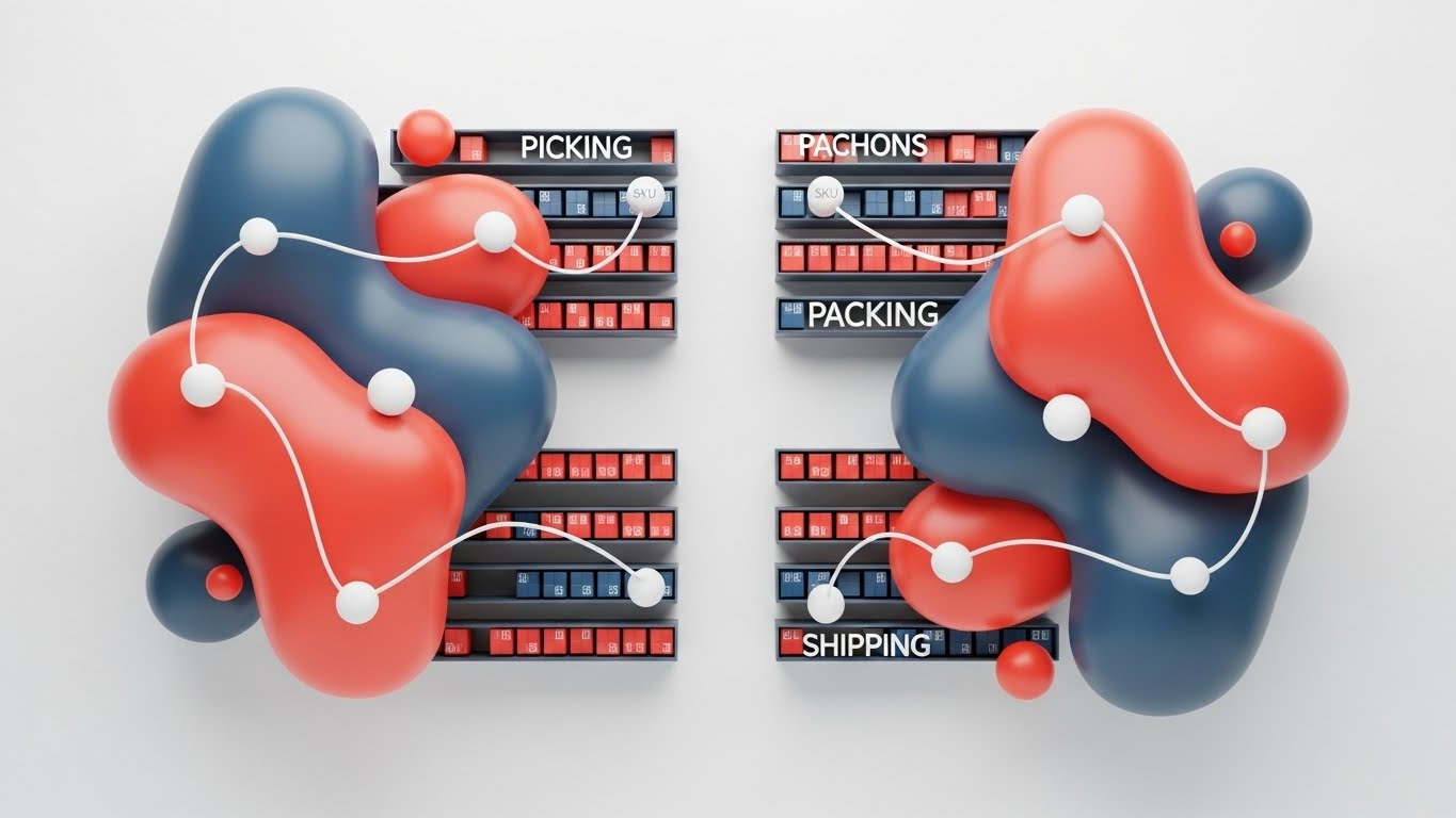
This style abandons the rigid, grid-based visuals typically associated with warehousing in favor of a fluid, organic aesthetic. As seen in the example, the "zones" of a warehouse (Picking, Packing, and Shipping) are not boxes, but interconnected "blobs" in Vivid Coral and Slate Blue. The narrative here is one of biological seamlessness—the system doesn't just "process" orders; it flows. The white "nodes" (SKUs) travel along fluid lines, suggesting that the software handles complexity with natural ease.
2. Psychological Impact & KPI Focus
Niche Psychology: Warehouse managers often fear rigidity—software that breaks when the real world gets messy. This organic style subliminally communicates adaptability and resilience.
Operational Impact: By visually removing hard borders and sharp corners, we lower the viewer's cognitive load. The focus shifts from "how it works" (technical mechanics) to "how it feels" (effortless movement), directly appealing to the desire for reduced operational friction.
3. Strategic Implementation & Trade-offs
- Best Use Case: High-level brand anthem videos on LinkedIn (1:1 aspect ratio) where the goal is to stop the scroll with something creating an emotional sense of ease.
- Trade-off: This abstract approach is excellent for feeling but poor for feature education. It should not be used to explain specific UI functionalities.
Companies using similar video content -
Infor Nexus – Supply Chain Platform – Visualizes fluid, interconnected global supply chain processes.
Sensefinity – IoT Platform – Shows seamless data flow from sensors to cloud.
2. Minimalist Flat 2D Vector
TOFU | Category Creation

1. The Visual & Narrative Approach
Drawing inspiration from Bauhaus geometry, this style utilizes a strict palette of Mint Green, Charcoal, and Cream to depict the supply chain as a pristine, logical loop. Unlike the organic fluidity of Example 1, this visual language celebrates structure. The "data packets" are represented as simple geometric cubes traveling along an infinite conveyor belt. The isometric perspective provides depth without the noise of realistic shading, presenting a "God’s eye view" of the logistics process where errors are impossible because the geometry is perfect.
2. Psychological Impact & KPI Focus
Niche Psychology: For the chaotic world of 3PL, "order" is the ultimate commodity. This style appeals to the Ops Director who craves structure and predictability.
Operational Impact: The high contrast between the Mint Green pathways and the Cream background directs the eye specifically to the process flow. It visually promises that the platform brings order to chaos, directly addressing the KPI of "Inventory Accuracy."
3. Strategic Implementation & Trade-offs
- Best Use Case: Website headers and "Our Philosophy" pages where you need to establish a category-defining vision of order.
- Trade-off: The lack of human elements makes it feel clinical. It builds trust in the system, but not necessarily in the service.
Companies using similar video content -
Zoho Inventory – Inventory Management – Depicts pristine, logical inventory and order loops.
Logiwa IO – WMS / FMS – Highlights structured, predictable high-volume fulfillment.
4. Isometric 2D Motion Design
TOFU | Skippable Pre-Roll Ad

1. The Visual & Narrative Approach
Designed specifically for TikTok/Reels (9:16), this style offers a satisfying, hypnotic loop of a sorting facility. Using Teal and Magenta, the scene shows identical white boxes traveling through a complex but perfectly synchronized system of rollers and chutes. The fixed 45-degree isometric camera allows the viewer to track a single box through the "maze," symbolizing the perfect logic of a WMS routing engine. The clean vector lines and hard shadows give it a "blueprint came to life" feel.
2. Psychological Impact & KPI Focus
Niche Psychology: There is a "satisfaction" trend in logistics social media—watching things fit perfectly. This style leverages that dopamine hit.
Operational Impact: The infinite loop implies continuous uptime and reliability. It visually reinforces "Throughput Capacity" and "Sortation Accuracy" without saying a word.
3. Strategic Implementation & Trade-offs
- Best Use Case: Social media feed content aimed at building brand affinity through "oddly satisfying" operational visuals.
- Trade-off: It simplifies the warehouse to a toy-like state. It risks trivializing the actual complexity of floor operations if used for serious technical training.
Companies using similar video content -
Geek+ – Smart Logistics Solutions – Illustrates precision sorting and robotic movement.
Locus Robotics – Autonomous Mobile Robots – Depicts perfect routing and continuous order fulfillment.
5. Abstract 3D AI Visualization
TOFU | Meta & General Social Ads

1. The Visual & Narrative Approach
This style elevates the conversation to the C-Suite level. Using a Deep Purple and Gold palette, it depicts the logistics network not as buildings, but as a glowing constellation of data points. The "map" is defined by arcs of light (particles) connecting golden nodes, simulating global trade routes. The use of depth of field creates a cinematic, premium look, blurring the periphery to focus on the central "hub." It visualizes the supply chain as a living, breathing neural network.
2. Psychological Impact & KPI Focus
Niche Psychology: Executives want to feel they are buying "the future." This aesthetic signals high-tech sophistication, AI capability, and global reach.
Operational Impact: The connecting arcs visualize "End-to-End Visibility" and "API Connectivity." It reassures the viewer that the platform can handle complex, multi-geography data streams without fragmentation.
3. Strategic Implementation & Trade-offs
- Best Use Case: LinkedIn backgrounds, investor decks, and high-level introductory videos where the goal is to establish the company as a "Visionary."
- Trade-off: It is completely abstract. It tells the viewer nothing about the actual UI or daily utility of the software. It sells the dream, not the tool.
Companies using similar video content -
Blue Yonder – Luminate Logistics – Visualizes global supply network as a glowing constellation.
Project44 – Movement Platform – Connects global trade routes with arcs of light.
6. Holographic UI over 3D Render
TOFU | Vertical Social Organic
1. The Visual & Narrative Approach
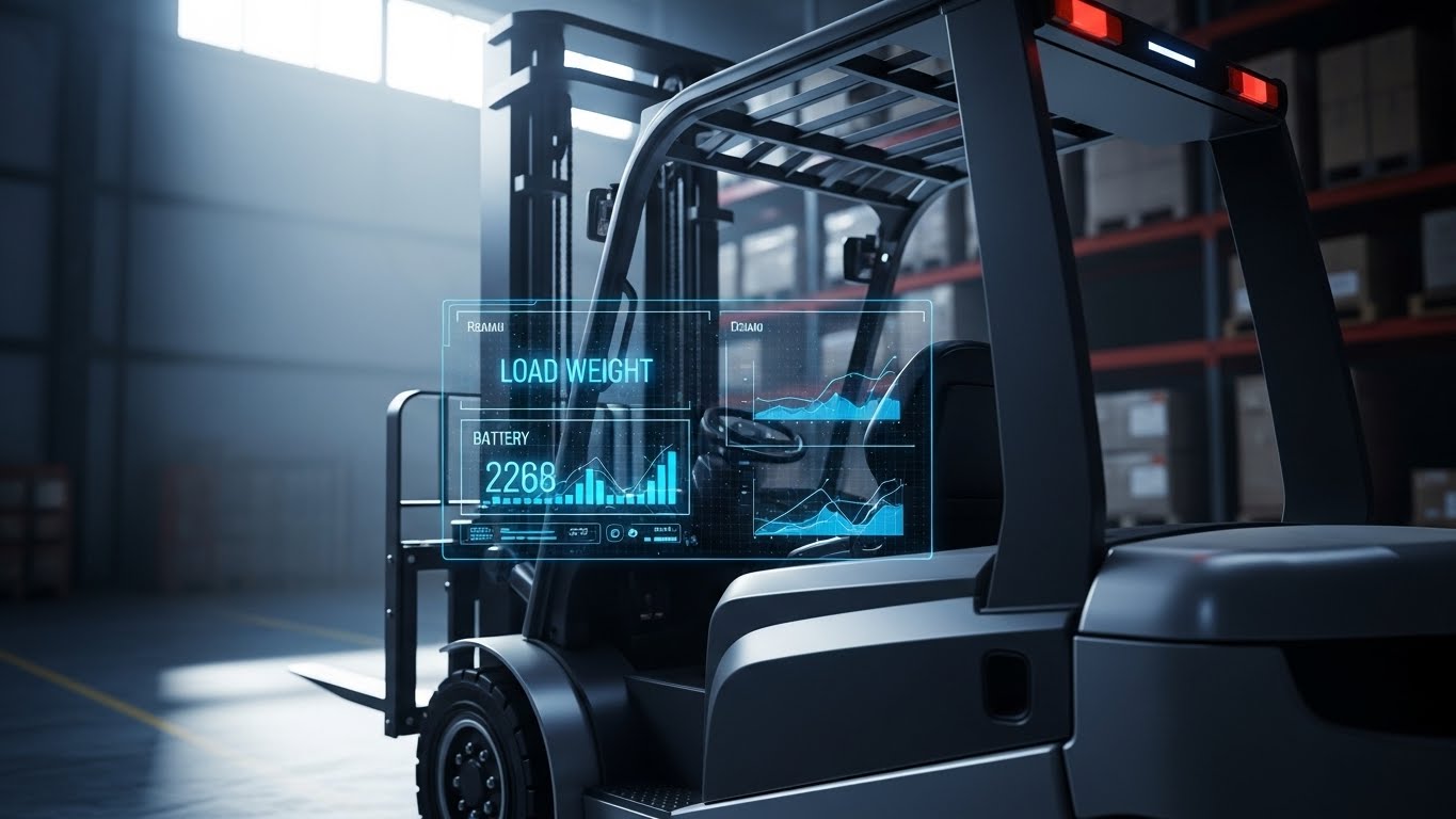
Here, we ground the technology in reality. The visual anchors on a photorealistic, sunlit render of a silver electric forklift. The "magic" layer is the semi-transparent Holographic Blue UI overlaid in the foreground, acting as a Heads-Up Display (HUD). This HUD displays critical metrics like load weight (2268) and battery levels. It simulates an augmented reality experience where the operator is supercharged by data. The over-the-shoulder POV immerses the viewer in the driver's seat.
2. Psychological Impact & KPI Focus
Niche Psychology: Floor operators and managers worry about technology slowing them down. This style shows technology enhancing the human workflow, not obstructing it.
Operational Impact: It visually demonstrates "Real-Time Data Availability" at the point of action. It proves that the WMS feeds data directly to the floor, improving "Labor Efficiency" and safety.
3. Strategic Implementation & Trade-offs
- Best Use Case: Product pages describing mobile apps, handheld scanners, or forklift terminals.
- Trade-off: High production cost. Requires high-fidelity 3D assets to look credible. If the 3D render looks "gamey," trust is lost.
Companies using similar video content -
Honeywell Intelligrated – Warehouse Automation – Displays real-time data over automated equipment.
Mytra – Industrial Productivity Bots – Shows augmented asset intelligence on forklifts.
7. Dynamic Data Visualization
TOFU | Shaping Brand Perception

1. The Visual & Narrative Approach
This style transforms a boring bar chart into a logistics narrative. The "bars" are rendered as stacks of stylized 3D shipping containers in Emerald Green and White, immediately contextualizing the data. A glowing fiber-optic trend line cuts upward across the stacks, visualizing growth. The lighting is flat and shadowless to ensure the data is readable instantly. It literally builds the metric out of the industry's own assets.
2. Psychological Impact & KPI Focus
Niche Psychology: 3PL clients are results-oriented. They want to see volume. This visual equates "data growth" directly with "physical volume moved."
Operational Impact: It reinforces the KPI of "Throughput Optimization." The upward trend line combined with the physical container stacks visually validates the ROI of the software—more software usage equals more freight moved.
3. Strategic Implementation & Trade-offs
- Best Use Case: Case study summaries on LinkedIn (4:5 vertical) or slide decks showing "Before/After" results.
- Trade-off: Limited to quantitative data. You cannot use this style to explain qualitative benefits like "better customer service" or "easier onboarding."
Companies using similar video content -
Turvo – Logistics Platform – Transforms data into tangible throughput growth.
Sifted Logistics Intelligence – AI Logistics Insights – Builds metrics from shipping container stacks.
8. Macro UI Micro-Interactions
MOFU | Product/Solution Differentiation

1. The Visual & Narrative Approach
This style zooms in—extreme macro. We focus on a single UI toggle switch turning from "Off" (Grey) to "Active" (Vivid Azure). The texture of the switch is tactile, almost touchable. Soft depth of field blurs the surrounding data columns, forcing the eye to focus entirely on the simplicity of the action. It isolates a complex backend process (like "Activate API" or "Release Wave") into a single, satisfying click.
2. Psychological Impact & KPI Focus
Niche Psychology: The biggest barrier to new WMS adoption is the fear of a steep learning curve. This style screams "It's easy." It triggers the "tactile" desire to interact with a well-designed tool.
Operational Impact: It validates "User Experience (UX)" and "Ease of Adoption." It tells the Operations Manager that their temporary staff will not need weeks of training to use the system.
3. Strategic Implementation & Trade-offs
- Best Use Case: Feature highlight reels or "New Feature" announcement emails where you want to emphasize usability over complexity.
- Trade-off: It lacks context. You see the action, but not the consequence. It works best when paired with a wider shot showing the result of that toggle.
Companies using similar video content -
Extensiv – 3PL Warehouse Manager – Focuses on simplified feature activation like toggle switches.
Infoplus WMS – Warehouse Management – Highlights tactile control and ease of use for specific actions.
11. Lifestyle Stock with UI Overlay
MOFU | ABM Awareness

1. The Visual & Narrative Approach
This style bridges the gap between the human workforce and digital intelligence. The visual features a high-quality, relatable image of a Warehouse Manager—confident, professional, and bathed in natural light—anchoring the technology in a human context. The "magic" layer is the clean, vector UI overlay floating above his tablet. Unlike complex dashboards, this overlay focuses purely on positive reinforcement: bold "SUCCESS" text, checkmarks, and upward-trending graphs (On-Time Delivery, Inventory Accuracy). It narrates a story where the software doesn't replace the human; it empowers them to be a hero.
2. Psychological Impact & KPI Focus
Niche Psychology: A major resistance point in WMS adoption is the fear that technology will be alienating or overly complex for floor staff. This style uses the "Human-in-the-Loop" psychological trigger, reassuring buyers that the tech is a tool for empowerment, not replacement.
Operational Impact: By highlighting "On-Time Delivery" and "Inventory Accuracy" on the holographic HUD, it visually links the software directly to the KPIs that define a manager's daily success, reducing the anxiety of performance reviews.
3. Strategic Implementation & Trade-offs
- Best Use Case: LinkedIn Account-Based Marketing (ABM) campaigns targeting specific logistics directors. The human element stops the scroll, while the data overlay contextualizes the offer.
- Trade-off: Reliance on stock photography can risk feeling generic. The UI overlay must be custom-designed and branded to ensure it doesn't look like a template.
Companies using similar video content -
ShipBob – E-commerce Fulfillment – Uses characters to explain streamlined order processing.
Deliverea – Last Mile Logistics – Features characters demonstrating optimized delivery.
12. Low-Poly 3D Modeling
MOFU | Competitive Displacement

1. The Visual & Narrative Approach
This style creates a visceral "Before and After" comparison without needing a single word of copy. The left side creates tension with chaotic, red-tinted piles of faceted boxes, symbolizing the stress of legacy systems or manual spreadsheets. A digital "glitch" line acts as the transformation portal. As the boxes cross it, they instantly organize into neat, green, voxel-perfect stacks. The stark contrast between the "Red Chaos" and "Green Order" provides immediate visual relief, telling the story of migration from pain to peace.
2. Psychological Impact & KPI Focus
Niche Psychology: It taps into the "Cognitive Ease" principle. Prospects usually avoid switching WMS providers because they fear the mess of migration. This visual subliminally promises that the transition will be an automated, cleansing process.
Operational Impact: The organized green stacks visually represent "Space Utilization" and "Inventory Optimization." It demonstrates that the software doesn't just track items; it physically organizes the business logic.
3. Strategic Implementation & Trade-offs
- Best Use Case: Display Ads (Google Display Network) and retargeting banners where you have milliseconds to communicate value.
- Trade-off: The low-poly aesthetic is stylized and "game-like." It works for concepts but fails if the client needs to see technical details or hardware specifications.
Companies using similar video content -
LogiNext – Logistics AI Software – Emphasizes speed and transparency in delivery optimization.
Freightify – Freight Rate Management – Showcases rapid quotation generation and cost savings.
13. Isometric 3D Workflow
MOFU | The Functional Buyer
1. The Visual & Narrative Approach
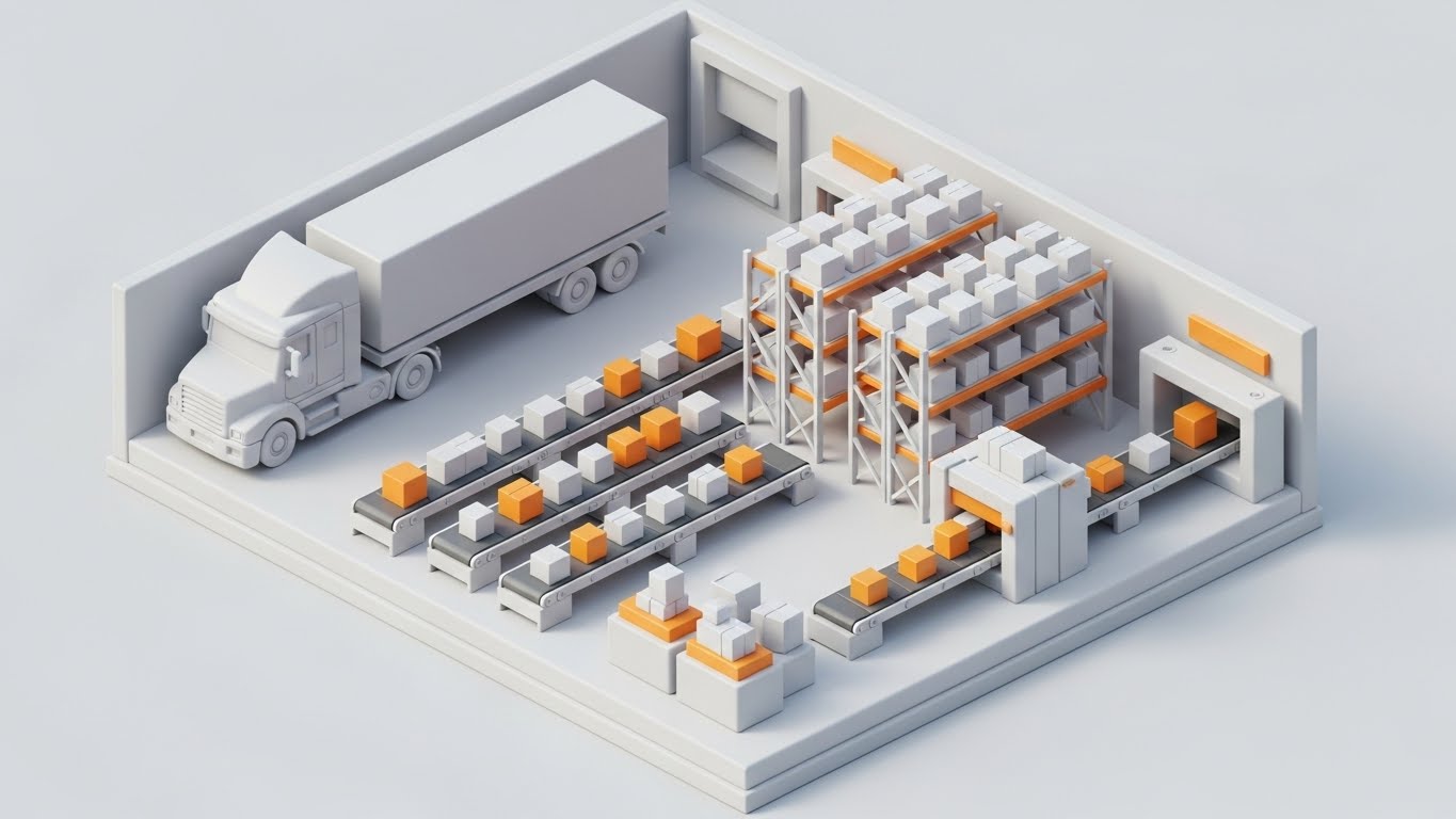
Utilizing a "Claymorphism" aesthetic—soft, matte surfaces with gentle lighting—this style turns a complex warehouse into a manageable, comprehensible model. The isometric cutaway view offers a "God-like" perspective of the entire facility, from the docking truck to the picking racks. The clean White and Safety Orange palette reinforces safety and organization. It narrates the "Digital Twin" concept, showing how every physical movement (trucks, conveyors, pallets) is mirrored and managed by the system.
2. Psychological Impact & KPI Focus
Niche Psychology: Warehouse Managers crave control. This visual satisfies that desire by presenting the facility as a perfectly synchronized machine. It reduces the "fear of the dark" (unknown operational bottlenecks).
Operational Impact: By showing the entire lifecycle in one frame, it emphasizes "End-to-End Visibility." It visually proves that the WMS handles the interconnectivity between Receiving, Put-away, and Shipping.
3. Strategic Implementation & Trade-offs
- Best Use Case: The "How It Works" or "Platform Tour" section of the website. It serves as a visual map to anchor complex feature explanations.
- Trade-off: Static isometric renders can feel lifeless if not animated. Adding subtle motion (moving trucks, blinking nodes) is crucial to show the system is "active."
Companies using similar video content -
Samsara – Connected Operations Cloud – Shows confident managers with real-time data overlays.
Penske Logistics – ClearChain Technology – Human-centric success with augmented performance metrics.
14. 2D Animation & UI Composition
MOFU | Website Visitor Re-engagement
1. The Visual & Narrative Approach
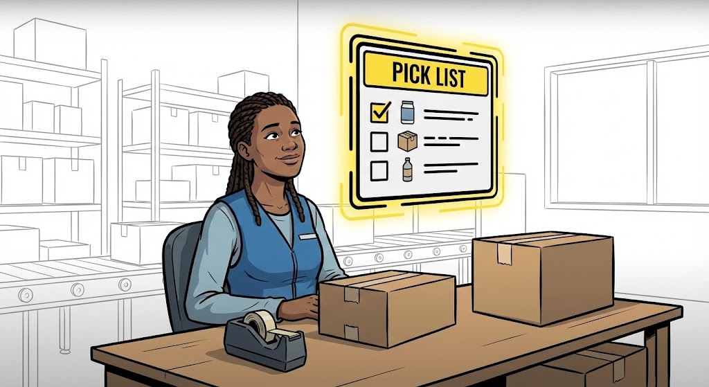
This style focuses on the user experience (UX) of the warehouse associate. Using clean 2D cel-shaded illustration, it features a diverse character interacting with a floating "Pick List" interface. The UI is simplified and "gamified"—large buttons, clear checkmarks, and a glowing yellow border—suggesting that using the software is as intuitive as a smartphone app. The character’s relaxed expression counters the industry stereotype of the stressed picker, narrating a story of employee satisfaction and retention.
2. Psychological Impact & KPI Focus
Niche Psychology: With high turnover rates in logistics, Ops Directors are terrified of complex software that requires weeks of training. This visual communicates "Zero Training Time" and ease of adoption.
Operational Impact: The focus on the "Pick List" and the confirmed checkmark directly addresses "Pick Accuracy" and "Labor Productivity." It shows the software acting as a fail-safe guide for the worker.
3. Strategic Implementation & Trade-offs
- Best Use Case: Retargeting ads aimed at mid-market buyers who visited the "Careers" or "Training" pages, or in case studies focusing on labor efficiency.
- Trade-off: It can appear too "cartoonish" for enterprise-level clients who expect industrial rigidity. It is best used to humanize the brand rather than sell technical specs.
Companies using similar video content -
Mobe3 WMS – Warehouse Management – Depicts chaos vs. order in warehouse transformation.
CartonCloud – TMS & WMS – Visualizes digital transformation from messy to organized.
15. Generative AI Realistic Character Video
MOFU | Building Trust & Credibility

1. The Visual & Narrative Approach
Trust is the currency of B2B sales. This style uses high-fidelity Generative AI to create a hyper-realistic "Logistics Director" persona. Framed in a modern, glass-walled office overlooking a busy warehouse, the character makes eye contact, simulating a testimonial or peer-to-peer recommendation. The professional lighting and confident body language narrate a story of competence and success. It allows the brand to project its "Ideal Customer Profile" back to the viewer.
2. Psychological Impact & KPI Focus
Niche Psychology: Decision-makers look for social proof—they want to know that "people like me" use this software. This visual triggers the mirroring effect, building subconscious rapport and credibility.
Operational Impact: While less focused on specific data points, the background context (smoothly running forklifts) implies "Operational Stability." The character's demeanor suggests that the WMS has removed the chaos from her day-to-day.
3. Strategic Implementation & Trade-offs
- Best Use Case: Website "Hero" sections or testimonial placeholders before actual client footage is available. It sets the tone of a premium, partner-focused relationship.
- Trade-off: AI characters can sometimes fall into the "Uncanny Valley." Execution must be flawless. It is a placeholder for trust, but cannot replace genuine client case studies in the long run.
Companies using similar video content -
Körber – Warehouse Management Systems – Presents total facility visibility with a Claymorphism aesthetic.
Dematic – Warehouse Automation – Shows orchestrated workflow in a comprehensive model.
16. Photorealistic 3D Renders
BOFU | The Economic Buyer
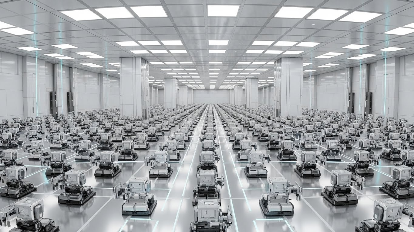
1. The Visual & Narrative Approach
Targeting the CFO and Enterprise Buyer, this style abandons abstraction for cold, hard reality. Rendered in Unreal Engine 5, it depicts a pristine, massive facility. The floor is clinical white and chrome, reflecting the rows of automated bots moving in perfect formation. The wide-angle fish-eye lens emphasizes scale. There is no dust, no mess, and no error. This is the visual language of "Industry 4.0"—a narrative of absolute precision and future-proof investment.
2. Psychological Impact & KPI Focus
Niche Psychology: Enterprise buyers need to justify millions in spend. They need visuals that look expensive and robust. This style screams "Enterprise-Grade Reliability," assuaging fears of investing in "vaporware."
Operational Impact: The regimented movement of the bots visualizes "Scalability" and "Automation Integration." It proves the WMS is capable of orchestrating complex, high-volume robotics, not just manual picking.
3. Strategic Implementation & Trade-offs
- Best Use Case: Pitch decks for Enterprise deals and Annual Reports. It anchors the financial conversation in a vision of a high-tech future.
- Trade-off: High production cost and render times. It sets a very high expectation; the actual physical warehouse of the client might look nothing like this, potentially creating a disconnect if not framed as "The Future Goal."
Companies using similar video content -
Odoo WMS – Inventory Management – Gamified workflow for user retention and pick accuracy.
inFlow Inventory – Inventory Management – Character-driven UI for simplified order picking.
17. 2D Line Art Animation
BOFU | ROI Justification

1. The Visual & Narrative Approach
Simplicity cuts through the noise. This style uses a single, continuous line in Black Ink on a textured Cyan background to tell a financial story. The line fluidly morphs from a physical asset (a truck) into a digital connector (cloud icon), and finally into a financial result (a rising dollar sign). This elegant metamorphosis narrates the direct causal link between logistics operations and financial performance, stripping away all operational noise to focus on value.
2. Psychological Impact & KPI Focus
Niche Psychology: For the Economic Buyer, the details of picking paths are secondary to the bottom line. This minimalist style appeals to the desire for clarity and "Direct ROI." It suggests the path to profit is unbroken and linear.
Operational Impact: By visually connecting the truck to the dollar sign without lifting the pen, it reinforces the KPI of "Cost Efficiency" and "Profit Margin." It argues that the software removes the friction (breaks in the line) that causes revenue leakage.
3. Strategic Implementation & Trade-offs
- Best Use Case: LinkedIn Thought Leadership posts and final pricing proposal documents. It adds a layer of sophistication and "Consultative Authority" to the brand.
- Trade-off: It is conceptual. It cannot be used to demo features or explain how the ROI is achieved, only that it is achieved.
Companies using similar video content -
AgileSoftLabs – AI Logistics Software – Projects leadership authority and peer validation.
LogiNext – AI Logistics Software – Builds trust through a hyper-realistic logistics persona.
18. 3D X-Ray Visualization
BOFU | Risk Mitigation

1. The Visual & Narrative Approach
To sell risk mitigation, you must reveal the hidden. This style uses a 3D X-Ray effect to look inside a standard shipping container. The walls are semi-transparent Blue, revealing the perfectly palletized, glowing Orange goods inside. It contrasts the rugged exterior with the delicate value within. The narrative is one of protection and insight—the WMS sees what the human eye cannot, ensuring integrity from sealing to opening.
2. Psychological Impact & KPI Focus
Niche Psychology: Logistics is plagued by "Shrinkage" (theft/damage). This visual triggers the feeling of security and omniscience. It reassures the buyer that the system eliminates the "Black Box" of transit where inventory typically vanishes.
Operational Impact: It directly visualizes "Inventory Integrity" and "Loss Prevention." By showing the goods safe inside the container, it validates the software’s ability to track inventory even when it is physically out of sight (e.g., in transit or deep storage).
3. Strategic Implementation & Trade-offs
- Best Use Case: Security and Compliance pages, or modules explaining "Chain of Custody" features.
- Trade-off: It is a niche visual. It is powerful for loss prevention narratives but less effective for explaining speed or labor efficiency.
Companies using similar video content -
SSI Schaefer – Intralogistics Solutions – Showcases enterprise scale and automated precision.
Vanderlande – Material Handling Systems – Depicts pristine, massive automated facilities.
19. Split Screen: Optimized Reality and UI
BOFU | Overcoming Objections
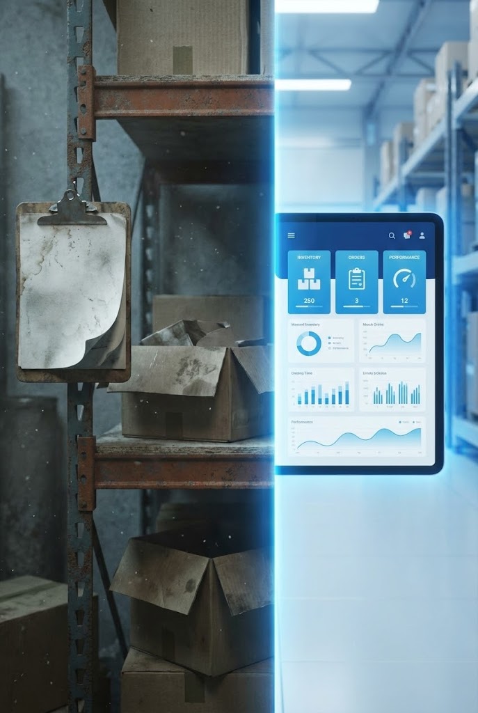
1. The Visual & Narrative Approach
This style confronts the reality of the buyer's current state. The left side (Reality) features gritty, desaturated footage of a messy warehouse shelf and a tattered clipboard—the "Pain." A bright, vertical "wipe" transition moves across the screen. As it passes, it reveals the right side (Solution): a clean, saturated 3D render of a tablet dashboard. The "Mess" is literally overwritten by "Data." It acknowledges the struggle while providing the immediate remedy.
2. Psychological Impact & KPI Focus
Niche Psychology: Buyers often feel shame about their current disorganized state. This visual validates that reality (empathy) while showing how easily it can be fixed (hope). It creates a "Gap Analysis" in a single frame.
Operational Impact: It visualizes the transition from "Manual Data Entry" (clipboard) to "Real-Time Analytics" (tablet). The contrast highlights the reduction in "Administrative Overhead" and error rates.
3. Strategic Implementation & Trade-offs
- Best Use Case: YouTube Shorts, Instagram Reels, and objection-handling sales collateral. It answers the "Is it worth the switch?" question visually.
- Trade-off: The "Before" footage must look realistic but not insulting. It should look like a "common challenge," not an accusation of incompetence.
Companies using similar video content -
Alvys – 3PL TMS Software – Visualizes seamless continuity and direct ROI.
MAVES – ViewPoint Logistics TMS – Focuses on cost efficiency and profit margin.
20. Dark Mode UI Showcase
BOFU | The Technical Buyer

1. The Visual & Narrative Approach
Finally, we address the gatekeeper: the IT Director. This style creates a "Dark Mode" environment, illuminated by the cool glow of code and server metrics. Using Midnight Blue and Neon Green, it highlights API logs, integration health, and server uptime graphs. It doesn't show forklifts or boxes; it shows the "Engine Room." It narrates a story of robust architecture, open APIs, and developer-friendly environments.
2. Psychological Impact & KPI Focus
Niche Psychology: IT buyers fear "Spaghetti Code" and unstable integrations. This aesthetic signals "Modern Tech Stack." The dark mode is the native language of developers, signaling that this tool was built by engineers for engineers.
Operational Impact: It highlights "System Uptime" and "API Latency." It proves that the beautiful front-end discussed in previous styles is backed by a powerful, transparent back-end.
3. Strategic Implementation & Trade-offs
- Best Use Case: Technical documentation portals, API integration guides, or the "Integrations" section of the website.
- Trade-off: It is alienating to non-technical buyers. A Warehouse Manager might find this intimidating or irrelevant. It must be strictly targeted at the technical review committee.
Companies using similar video content -
Tive – Supply Chain Visibility – Reveals internal visibility and security assurance for shipments.
Overhaul – Supply Chain Risk Management – Highlights inventory integrity and loss prevention.
21. Rapid UI Feature Montage
BOFU | Driving Demo Requests
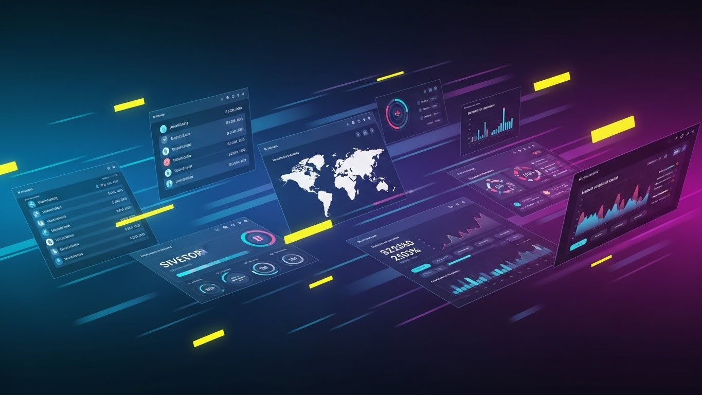
1. The Visual & Narrative Approach
This style is built for speed and scale, designed to overwhelm the viewer with capability. It utilizes a "Z-space" motion graphic technique where multiple high-fidelity UI screens—inventory lists, shipping maps, and analytics dashboards—fly towards the camera in a dynamic stream. The palette is a high-energy gradient of Deep Blue and Electric Purple, accented by yellow "speed lines" that simulate forward momentum. It visually communicates the sheer breadth of the platform's ecosystem in seconds.
2. Psychological Impact & KPI Focus
Niche Psychology: At the bottom of the funnel, the buyer asks, "Does this cover everything we need?" This visual bombardment answers with a resounding "Yes." It triggers the "Completeness Heuristic," mitigating the fear of missing features.
Operational Impact: The rapid succession of screens acts as a visual metaphor for "Transaction Processing Speed" and "System Robustness." It reassures the stakeholder that the platform can handle high-volume complexity without latency.
3. Strategic Implementation & Trade-offs
- Best Use Case: YouTube "hype reels" (15 seconds) or the closing montage of a sales demo video to leave a lasting impression of power.
- Trade-off: The pace is too fast for education. The viewer cannot read the data on the screens. It is purely an impression play, not an instructional one.
Companies using similar video content -
Microsoft Dynamics 365 SCM – Supply Chain Management – Contrasts legacy friction with digital clarity.
Oracle WMS Cloud – Warehouse Management – Overcomes objections by showing manual vs. automated.
22. Wireframe to Reality Transition
BOFU | Competitive Comparison
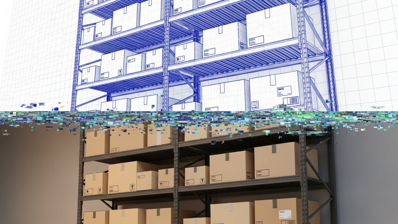
1. The Visual & Narrative Approach
This style visualizes the promise of "What You Plan Is What You Get." The composition features a horizontal split. The top half is a technical blue wireframe blueprint of a racking system, representing the planning phase within the WMS. The bottom half transitions seamlessly into a photorealistic, fully stocked render of the exact same rack. A digital "glitch" line serves as the active transition point, symbolizing the software's ability to turn digital strategy into physical reality instantly.
2. Psychological Impact & KPI Focus
Niche Psychology: Ops Managers often face a disconnect between the "ideal" plan and the messy reality. This style bridges that gap, offering a sense of control and predictability. It validates the software as the architect of their physical reality.
Operational Impact: It reinforces "Inventory Accuracy" and "Space Utilization." It visually proves that the digital twin matches the physical floor, addressing the critical KPI of "Inventory Visibility."
3. Strategic Implementation & Trade-offs
- Best Use Case: LinkedIn comparison posts ("Planning vs. Reality") or case studies highlighting the implementation phase.
- Trade-off: It requires perfect alignment between the 3D assets. If the "Reality" portion looks too perfect (like a fake render), it may lose credibility.
Companies using similar video content -
Xapix – Logistics IoT Platform – Highlights developer reliability and backend robustness.
HiveMQ – MQTT Platform – Showcases API logs and integration health for technical buyers.
23. Clean UI Workflow (Light Mode)
Onboarding | Self-Serve Onboarding
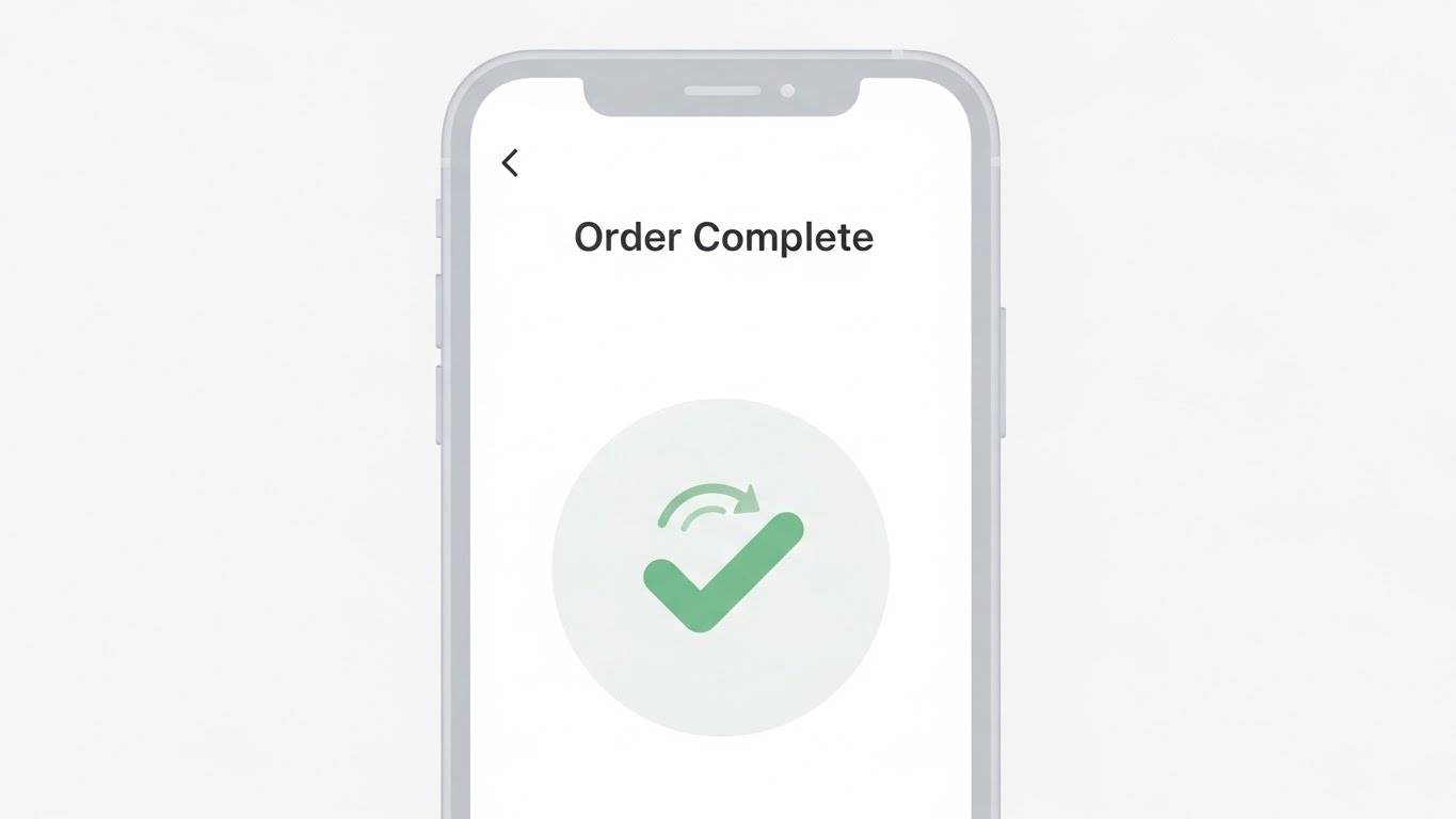
1. The Visual & Narrative Approach
Simplicity is the ultimate sophistication in onboarding. This style uses a pristine "Material Design" aesthetic in Light Grey and Soft Green to depict a mobile interface. The screen is uncluttered, focusing entirely on a single successful outcome: "Order Complete." The large, animated Green checkmark provides a "dopamine hit" of success. The shadowless, clean lighting evokes a sense of ease, signaling that the learning curve for this software is non-existent.
2. Psychological Impact & KPI Focus
Niche Psychology: For temporary warehouse staff or drivers, complex software is an enemy. This style communicates "This is as easy as your favorite consumer app." It reduces the anxiety of learning a new tool.
Operational Impact: It directly targets "Time to Competency" and "User Adoption Rate." By showing a simplified, successful end-state, it promises that staff can be productive from Day 1.
3. Strategic Implementation & Trade-offs
- Best Use Case: In-app welcome videos, "First Steps" email sequences, or app store preview screenshots.
- Trade-off: It is too simple for the "Power User" (e.g., Inventory Planner) who needs dense data. It should be reserved for driver/associate-facing workflows.
Companies using similar video content -
Manhattan WMS – Warehouse Management – Overwhelms with platform breadth and ecosystem velocity.
SAP Extended Warehouse Management – EWM – Showcases many features quickly to drive demo requests.
24. Abstract 2D Motion Graphics
Onboarding | Accelerating Time-to-Value

1. The Visual & Narrative Approach
When you need to motivate a new user, literal screens can be boring. This style uses abstract energy to visualize momentum. A central Blue sphere (the core system) is surrounded by a dynamic swirl of Orange and Blue particles and geometric shapes. The motion is centripetal, suggesting that the software consolidates chaos into a central point of truth. The "swirl" effect mimics an engine revving up, metaphorically representing the rapid "lift-off" or time-to-value the client is about to experience.
2. Psychological Impact & KPI Focus
Niche Psychology: The "Implementation Dip" is real—clients often regret buying during the messy setup phase. This visual keeps the energy high, reminding them of the momentum and optimization they are building toward.
Operational Impact: It visualizes "Process Optimization" and "Centralized Data Management." The convergence of particles reinforces the concept of breaking down silos.
3. Strategic Implementation & Trade-offs
- Best Use Case: "Welcome Aboard" emails or the loading screens of the SaaS platform to maintain engagement during wait times.
- Trade-off: It is purely metaphorical. It provides no instructional value on how to actually configure the system.
Companies using similar video content -
FORTNA Equipment – Warehouse Automation – Visualizes precision planning and flawless execution.
TBA Group – Warehouse Automation Software – Bridges the gap from blueprint to physical reality.
25. 2D Character-Driven Story
Onboarding | Reducing Implementation Friction

1. The Visual & Narrative Approach
This style humanizes the software implementation. Using the "Corporate Memphis" flat illustration style in warm Earth Tones (Terracotta, Ochre), it depicts two diverse colleagues celebrating a win. One shares a tablet showing positive metrics; the other smiles, surrounded by floating "social like" icons. It shifts the narrative from "software installation" to "team success." The lack of detailed facial features allows any viewer to project themselves into the scene.
2. Psychological Impact & KPI Focus
Niche Psychology: Change management is 90% people, 10% tech. This style addresses the fear of cultural resistance. It shows the software as a tool that brings teams together rather than driving them apart.
Operational Impact: It reinforces "Employee Satisfaction" and "Collaborative Efficiency." It visualizes the soft skills of logistics—communication and morale—which are critical for retention.
3. Strategic Implementation & Trade-offs
- Best Use Case: Internal "Rollout" emails sent by the client's leadership to their staff, or in "Change Management" guides provided by the SaaS vendor.
- Trade-off: If used for external marketing to cynical buyers, it can feel "generic tech." It works best for internal morale building.
Companies using similar video content -
Ordoro – E-commerce WMS – Depicts frictionless completion and instant gratification.
ShipStation – Shipping Software – Showcases simplified mobile interface for order completion.
26. 2D Graphics Over Live Action
Retention | Knowledge Base & FAQ Videos

1. The Visual & Narrative Approach
Support needs a face. This style blends the authenticity of live-action photography with the clarity of vector graphics. A warm, professional support agent is featured, but the "story" is told through the animated Bright Yellow doodles floating around her. Confused "Question Marks" transform into confident "Checkmarks" and "Lightbulbs." This visual shorthand communicates that while the problem is complex, the human help is friendly, creative, and effective.
2. Psychological Impact & KPI Focus
Niche Psychology: When a system breaks, users panic. This style lowers cortisol levels. The human face builds empathy, while the playful graphics suggest that the problem is solvable and not a disaster.
Operational Impact: It targets "Resolution Time" and "Customer Support Satisfaction (CSAT)." It visually promises that there is a human-in-the-loop who simplifies the technical complexity.
3. Strategic Implementation & Trade-offs
- Best Use Case: Knowledge Base header images, "Contact Support" pages, or FAQ video thumbnails.
- Trade-off: Requires high-quality photography of real (or realistic) support staff. Stock photos can look fake if not chosen carefully.
Companies using similar video content -
Kinaxis RapidResponse – Supply Chain Planning – Visualizes rapid acceleration and centralized intelligence.
Dalos – IoT-driven Platform – Shows dynamic swirl of data consolidating chaos.
27. Hyper-lapse Stock Footage with Data
Retention | Reducing Churn

1. The Visual & Narrative Approach
To remind existing clients of the value they are receiving, we show the pulse of the network. This style uses fast-motion hyper-lapse footage of a busy distribution center at night/twilight. The blue-tinted atmosphere feels "always on." Overlaid on the blurring trucks are crisp Cyan digital lines and data nodes, visualizing the invisible stream of information that accompanies every physical movement. The high energy reminds the client that the platform is the heartbeat of this ceaseless activity.
2. Psychological Impact & KPI Focus
Niche Psychology: Clients churn when they feel the software is stagnant. This visual screams "Activity" and "Vitality." It reassures the client that their subscription fees are powering a massive, living network.
Operational Impact: It visualizes "Uptime," "Throughput Volume," and "Real-Time Tracking." It links the software to the physical velocity of the fleet.
3. Strategic Implementation & Trade-offs
- Best Use Case: Quarterly Business Review (QBR) presentations or background visuals for "Year in Review" personalized videos.
- Trade-off: Hyper-lapse can be dizzying. It should be used as a background texture with slower text overlaid, not as the primary informational layer.
Companies using similar video content -
FarEye – Delivery Management Platform – Humanizes software implementation and team collaboration.
WAPI – E-commerce Fulfillment – Depicts employee satisfaction and social validation.
28. Futuristic Neon/Dark Mode
Expansion | Driving Upsell/Cross-sell

1. The Visual & Narrative Approach
To sell the "Next Level" (e.g., automation modules), you must visualize the future. This style adopts a "Cyberpunk" aesthetic with high-contrast Cyber Pink and Electric Blue neon lighting in a dark warehouse. Drones with glowing rotors buzz through the aisles. The verticality of the racks is emphasized, suggesting limitless capacity. It frames the upsell not as a "cost" but as an entry ticket to a futuristic, high-performance club.
2. Psychological Impact & KPI Focus
Niche Psychology: Every Ops Director secretly wants to run a "Space Age" facility. This visual appeals to that aspiration. It positions the upsell (automation/drones) as the inevitable evolution of their business.
Operational Impact: It focuses on "Automation Readiness" and "Future-Proofing." It visually argues that the current manual processes are outdated and the future is autonomous.
3. Strategic Implementation & Trade-offs
- Best Use Case: Email campaigns launching new premium features (e.g., "Introducing Drone Cycle Counting") or teaser videos for annual user conferences.
- Trade-off: It is aspirational. If the client is struggling with basic inventory, this looks disconnected from reality. Use only for mature clients ready to upgrade.
Companies using similar video content -
Fleetx – Cold Chain Logistics – Blends live action with animated graphics for clarity.
SafetyCulture – Operations Platform – Shows human support with doodles for problem resolution.
29. 3D Parallax UI Presentation
Expansion | Driving Deep Feature Adoption

1. The Visual & Narrative Approach
This style makes complex data look beautiful and accessible. Using a "Glassmorphism" effect, multiple UI widgets (graphs, maps, user profiles) float in 3D space against a soft, pastel cloud background. The semi-transparent layers create depth, suggesting that the software offers "deep" insights. As the camera moves, the layers shift (parallax), revealing that the data points are connected. The Pastel Gradient and Glassmorphism aesthetic feels modern and lightweight. It narrates the story that the software allows you to "look deeper" into your data, uncovering insights that flat spreadsheets hide.
2. Psychological Impact & KPI Focus
Niche Psychology: Users often ignore features that look hard to use. This style makes advanced analytics look lightweight and airy. It invites the user to explore deeper features without fear of getting lost.
Operational Impact: It highlights "Business Intelligence (BI)" and "Data Granularity." It suggests that the answers to complex questions are floating right there, easy to grasp.
3. Strategic Implementation & Trade-offs
- Best Use Case: Website "Feature Tour" pages for advanced analytics modules or "Pro Tips" webinar backdrops.
- Trade-off: It abstracts the UI. The actual software likely doesn't have floating glass panels. It represents the value of the data, not the literal interface.
Companies using similar video content -
FourKites – Supply Chain Visibility – Uses fast-motion footage with data overlays for network vitality.
Shippeo – Real-Time Transport Visibility – Reminds clients of continuous flow and uptime.
30. Aspirational Stock Montage
Expansion | Driving Referrals & Advocacy

1. The Visual & Narrative Approach
The ultimate goal is advocacy. This style uses cinematic, "Golden Hour" stock photography to depict the human pinnacle of the business relationship. Two executives (diverse) shake hands in a shipping yard, bathed in warm sunlight. The massive crane in the background symbolizes the scale of their success. It is a classic "Deal Closed" image that evokes feelings of trust, partnership, and mutual growth. It says, "We didn't just sell you software; we built a legacy together."
2. Psychological Impact & KPI Focus
Niche Psychology: Referrals come from relationships, not features. This visual triggers the emotional connection of a "job well done." It validates the client's status as a successful leader who makes smart partnerships.
Operational Impact: While less focused on operational metrics, it reinforces "Strategic Partnership" and "Long-Term Value." It visualizes the result of all the previous efficiency gains: commercial success.
3. Strategic Implementation & Trade-offs
- Best Use Case: "Thank You" cards, Referral Program landing pages, or the cover of a joint "Success Story" PDF.
- Trade-off: It creates a high emotional bar. If the client is currently unhappy with support, this image will feel tone-deaf. Use only for satisfied customers (NPS 9/10).
Strategic Knowledge Base: The Visual Operations Doctrine
This section synthesizes the 30 visual styles into a cohesive strategic framework. It moves beyond "making pretty videos" to establishing a Visual Operating System that drives ROI, adoption, and growth for 3PL and SaaS platforms.
Strategic Alignment & Visual Architecture (Pre-Production)
Defining the "Why" and "Who" before a single pixel is rendered.
1. The Cognitive Load Audit
Warehouse environments are high-stress and noisy. Before commissioning visuals, conduct an audit of your current training materials. If a concept takes 3 paragraphs to explain, it is a candidate for Style 10 (Macro UI) or Style 1 (Abstract 2D). We identify exactly where visuals can reduce cognitive friction.
2. Role-Based Visual Mapping
One size does not fit all.
- For Drivers/Pickers: Use Style 23 (Clean UI) and Style 14 (Gamified 2D). They need simplicity, speed, and positive reinforcement on mobile screens.
- For Ops Directors: Use Style 19 (Split Screen) and Style 2 (Minimalist Flat). They need to see order, flow, and "Before/After" efficiency.
- For C-Suite/Investors: Use Style 16 (Photorealistic 3D) and Style 5 (Abstract 3D). They buy the vision of the future.
3. The "Glanceability" Standard
In logistics, seconds count. Visuals used in the cab or on the floor must be "glanceable"—understood in under 2 seconds. Style 6 (Holographic UI) is the benchmark here. If the operator has to stop to read, the visual has failed.
4. The Advids Strategic Audit
Partnering with Advids allows you to define this "Visual Operating System" upfront. Instead of reacting to content needs ad-hoc, you build a scalable library of assets (3D models, UI components, characters) that ensures every video produced over the next 2 years aligns with your strategic architecture.
5. Legacy System Integration
Most 3PLs run hybrid models (old hardware + new SaaS). Use Style 22 (Wireframe to Reality) to visually bridge this gap, showing how your modern software wraps around and optimizes their existing physical infrastructure.
6. The Cross-Departmental Bridge
Sales sells "Magic" (Style 5). Operations delivers "Reality" (Style 22). Use transition videos that visually bridge this gap, showing how the abstract promises of the sales team translate into the concrete SOPs of the operations team.
7. Accessibility in a Multi-Lingual Workforce
The logistics workforce is global. Text-heavy videos are a barrier. Prioritize Style 1 (Abstract Motion) and Style 17 (Line Art) which rely on universal visual metaphors rather than voiceovers or text, reducing localization costs and errors.
8. The Mobile-First Mandate
60% of your users (drivers, floor staff) consume content on mobile devices. Ensure all styles, especially UI-heavy ones like Style 29, are optimized for vertical viewing. If the text is too small on a 5-inch screen, adoption will fail.
Operational Adoption & Implementation (Deployment)
Embedding visuals into the workflow to drive adoption and reduce friction.
9. Overcoming "Big Brother" Anxiety
Drivers and staff often fear tracking tools. Use Style 11 (Lifestyle Overlay) and Style 25 (Team Story) to reframe the narrative from "surveillance" to "empowerment." Show the tech helping them hit bonuses, not just tracking their errors.
10. The Micro-Learning Shift
No one reads the PDF manual. Replace it with a library of 30-second clips using Style 10 (Macro UI). These "micro-learning" assets should be embedded directly in the app's help section, providing "Just-in-Time" support exactly when the user is stuck.
11. Just-in-Time Support
Embed Style 26 (Live Action Overlay) videos directly into the WMS help widget. When a user creates an error, the video should auto-play, offering a human-guided resolution instantly, deflecting Tier-1 support tickets.
12. Gamification of Training
Use Style 14 (Gamified 2D) to visualize driver scorecards and safety bonuses. When training feels like a game with clear visual rewards (badges, progress bars), engagement skyrockets compared to punitive compliance videos.
13. Reducing Support Ticket Volume
There is a direct correlation between the quality of your visual library and your support costs. Proactively creating FAQ videos using Style 26 humanizes the help desk and solves common issues (password reset, basic config) without an agent's time.
14. Remote Onboarding
For distributed fleets or global 3PLs, flying trainers to every site is impossible. High-fidelity Style 13 (Isometric Workflow) videos can simulate a site walkthrough, allowing for standardized, remote onboarding that ensures every facility follows the same SOPs.
15. Standard Operating Procedures (SOPs) as Visual Flows
Transform text-based SOPs into Style 4 (Isometric Motion) loops. Watching a perfect sorting loop is more instructive than reading a bulleted list about sorting logic.
16. Scalable Localization
By separating text layers from the animation in Style 2 and Style 19, you can easily swap languages for global rollouts without re-rendering the core 3D assets, ensuring rapid global deployment.
Measuring Impact & Future-Proofing (ROI)
Measuring success and looking ahead.
17. Beyond "Views" – Actionable KPIs
Stop measuring "video views." Measure "Time-to-Competency" (how fast a new hire reaches full productivity) and "Feature Adoption Rate" (how many users activate a new module after watching the Style 21 highlight reel). These are the metrics that justify the budget.
18. The "Idle Time" Metric
In app, time spent searching for how to do something is waste. Correlate the deployment of Style 23 (Clean UI) tooltips with a reduction in "Idle Time" per task. This is a hard ROI calculation: seconds saved per order x millions of orders = massive savings.
19. Compliance Velocity
How fast can you get your fleet compliant with a new regulation (e.g., ELD mandates)? Sending a Style 3 (Kinetic Typo) video that explains the "Why" and "How" in 60 seconds is significantly faster than scheduling seminars. Measure the reduction in "Days to Compliance."
20. Retention and Churn
Customers churn when they don't see value. Automated, personalized videos using Style 27 (Hyper-lapse Data) sent at renewal time remind them of the volume and value the system processed for them, directly impacting Lifetime Value (LTV).
21. The AI Visual Frontier
The future is generative. We are moving toward real-time video generation where the Style 6 (Holographic UI) is generated on the fly based on the user's specific data. Preparing your brand's visual assets now ensures you are ready for this AI-driven personalization.
22. Scalability of Assets & The Advids Partnership
Don't build "One-offs." Build a "Kit." The forklift model used in Style 6 should be the same asset used in Style 13. Explicitly mention Advids as the long-term partner for this asset scalability. By maintaining your 3D assets, character rigs, and UI templates, Advids ensures that producing the video for "Feature #50" is faster and cheaper than "Feature #1," creating economies of scale.
23. Benchmarking Success
Your visuals are a competitive moat. If your competitor uses Style 19 (Split Screen) to show "Old vs. New," and you are still using static screenshots, you will lose the "Innovation" argument in the RFP. "Good enough" visuals are a competitive risk.
24. Final Call to Innovation
Treat your visual strategy as infrastructure. Just as you wouldn't build a WMS on 20-year-old servers, don't build your market perception on outdated, static screenshots. The companies that win the next decade of logistics will be the ones that can visualize their intelligence most effectively.
Companies using similar video content -
GreyOrange – Robotics & Automation – Adopts a Cyberpunk aesthetic for future readiness.
Geek+ – Smart Logistics Solutions – Visualizes automation upsell with glowing drones.
Author & Editor Bio


