
 /home/wwwroot/advids.co/design/index.php on line 425
Introduction: The Visual Architecture of the Modern Firm
The accounting profession is currently navigating its most significant transformation in decades. We are witnessing a definitive shift from the retrospective "compliance factory" model—defined by reactive deadlines and manual data entry—to the "advisory powerhouse," where real-time insights drive client growth. For practice managers and firm owners, this isn't just a technological upgrade; it is a fundamental reimagining of value. However, communicating this shift to skeptical clients or overwhelmed staff requires more than bullet points. It requires a visual language that makes the intangible benefits of automation and cloud integration instantly tangible.
The core challenge in marketing Accounting CRM and SaaS platforms effectively is bridging the "Physical/Digital Divide." Your audience feels the physical weight of paper piles, late nights, and scattered spreadsheets. Your solution offers a digital liberation that can be hard to visualize. Video content bridges this gap. It translates complex backend workflows into seamless visual narratives, proving that the chaos of tax season can be transformed into a structured, manageable process.
The opportunity for firms that embrace this visual communication is immense. Recent industry data reveals that firms at the highest levels of technology maturity report 39% more revenue per employee than their less digital counterparts. This statistic validates the strategic imperative: technology is no longer just a utility; it is a multiplier of firm value. Furthermore, the efficiency gains are measurable and dramatic; AI-driven reconciliation tools can reduce month-end closing time by up to 58%, freeing up vast amounts of capacity for high-value advisory work.
This guide is designed as a strategic framework for Practice Leaders and SaaS Marketers. We will explore distinct video visualization styles, each selected to solve a specific communication problem—from explaining automated audit trails to showcasing the relief of a balanced workload. By adopting these visual strategies, you are not just selling software; you are clarifying the future of the accounting profession.
1. Abstract 2D flat vector organic modern motion graphics with glossy textures
TOFU | Brand Awareness

The Visual & Narrative Approach
This style utilizes a sophisticated "Abstract 2D" aesthetic to visualize the most abstract benefit of accounting software: peace of mind. The visual narrative begins with scattered, disparate elements—representing receipts, bank feeds, and invoices—drifting in a disorganized void. Using "glossy textures" and a calming palette of Sapphire Blue and Mint Green (as seen in the visual example), these organic shapes magnetically snap into a precise, grid-like structure. The motion is fluid and satisfying, symbolizing the software’s ability to automatically categorize and reconcile financial data without human intervention.
Psychological Impact & KPI Focus
For an accountant, "chaos" is the enemy. This visualization directly addresses the cognitive load associated with messy ledgers and unclassified transactions. By watching chaotic shapes resolve into a beautiful, ordered system, the viewer experiences a vicarious sense of relief (Cognitive Ease). This style is highly effective for Top-of-Funnel (TOFU) awareness campaigns where the goal is to associate the brand with a feeling of control and organization.
Strategic Implementation & Trade-offs
- Best Use Case: Social Media teaser videos (Instagram/LinkedIn) or the opening seconds of a "Why Us" homepage video.
- Recommended Duration: 6-10 seconds (Looping).
- Trade-off: This style focuses purely on feeling and brand perception. It does not demonstrate specific UI features or buttons. Use it to set the mood, not to train the user.
Companies using similar video content -
Karbon – Practice Management – Streamlines accounting firm workflows.
Canopy – Practice Management – Organizes client data and tasks.
Silverfin – Connected Accounting – Harmonizes financial data from various sources.
2. Bold Kinetic Typography (Visual)
TOFU | Market Education

The Visual & Narrative Approach
This "Bold Kinetic Typography" style abandons traditional voiceover in favor of high-energy visual rhythm. Large, geometric 3D blocks emblazoned with core industry terms like "TAX" and "AUDIT" race across the screen, propelled by speed lines and motion blur. The palette is aggressive and energetic, utilizing Vibrant Orange and Deep Charcoal to command attention. The camera follows these data blocks as they slot perfectly into place, visualizing the speed at which a modern CRM processes complex compliance tasks.
Psychological Impact & KPI Focus
This style targets the "Need for Speed" and efficiency. In a profession often criticized for being slow or backward-looking, this aesthetic projects innovation and agility. It signals to the market that your platform is a high-performance engine, not just a digital filing cabinet. It is particularly effective for Market Education, helping to reposition a legacy firm or a new tool as a disruptor in the space.
Strategic Implementation & Trade-offs
- Best Use Case: YouTube Bumper ads or Event background loops.
- Recommended Duration: 15-30 seconds.
- Trade-off: The rapid pace can be overwhelming if the viewer is looking for detailed information. It is designed to create excitement, not to explain complex tax code nuances.
Companies using similar video content -
TaxDome – Client Portal & Practice Management – Accelerates client communication and task completion.
Ignition – Proposals & Payments – Speeds up client engagement and billing.
Dext – Receipt & Expense Management – Rapidly processes financial documents.
3. Split Screen: Optimized Reality and UI
TOFU | Vertical Social Organic

The Visual & Narrative Approach
This "Split Screen" composition offers the most direct visual argument for ROI. On the left, we see the "Current State": a stressed accountant buried in piles of paper, utilizing cool, desaturated grey tones. On the right, the "Future State" features the same professional, calm and in control, interacting with a sleek, abstract holographic UI floating above a clean desk. The warm Navy Blue and Gold tones on the right side create an inviting contrast. The narrative creates a direct link between the software and the improved quality of life.
Psychological Impact & KPI Focus
This style leverages the "Contrast Principle." By placing the pain and the solution side-by-side, the value proposition becomes undeniable. It deeply resonates with the target persona's burnout and desire for work-life balance. It is a powerful tool for Shaping Brand Perception on LinkedIn, where professionals are often venting about workload.
Strategic Implementation & Trade-offs
- Best Use Case: LinkedIn Feed ads or "Problem/Solution" landing pages.
- Recommended Duration: 15-20 seconds.
- Trade-off: It relies on a binary "Bad vs. Good" simplification. Care must be taken to ensure the "stressed" side doesn't feel like a caricature that mocks the potential client's current reality.
Companies using similar video content -
Jetpack Workflow – Workflow Management – Transforms chaotic tasks into organized processes.
Financial Cents – Practice Management – Reduces stress by centralizing client work.
Liscio – Client Communication Platform – Simplifies client interactions, reducing overwhelm.
4. Aspirational Stock Montage
TOFU | Shaping Brand Perception

The Visual & Narrative Approach
While software is digital, the business of accounting is human. This "Aspirational Stock Montage" features high-end commercial photography of a diverse team collaborating in a modern, sunlit office. They are gathered around a table, smiling and looking at a laptop screen where the contents are represented by an abstract glowing light. The lighting is natural and airy with a shallow depth of field. Colors are Warm Amber, Teal, and Crisp White.
Psychological Impact & KPI Focus
This style builds "Social Trust." For firm owners, the fear of new software is often the fear of staff resistance. This visual reassurance suggests that the software facilitates better teamwork and a happier culture. It effectively serves as a Skippable Pre-Roll Ad, as the positive human emotion captures attention within the first 5 seconds, associating the brand with success.
Strategic Implementation & Trade-offs
- Best Use Case: YouTube Pre-roll or "About Us" company culture videos.
- Recommended Duration: 15-30 seconds.
- Trade-off: Using stock footage can risk looking generic. It is crucial to overlay specific brand UI elements or distinct brand colors to ensure the video doesn't look like an ad for a generic consulting firm.
Companies using similar video content -
Sage Intacct – Cloud Financial Management – Fosters collaborative financial operations.
Workday – Financial Management – Promotes unified team performance.
Intuit – QuickBooks Accountant – Supports collaborative client management.
5. Isometric 3D Workflow
TOFU | Skippable Pre-Roll Ad

The Visual & Narrative Approach
Accounting workflows are complex ecosystems of data. This "Isometric 3D Workflow" style visualizes that ecosystem as a tidy, functioning city. We see a stylized office layout where tiny minimalist workstations are connected by glowing Emerald Green pipes representing workflow automation. Data packets (small cubes) travel along the pipes into a central server hub colored in Cyan. The rendering style is "clay" with soft shadows, making the technology feel approachable.
Psychological Impact & KPI Focus
This style appeals to the "Systemizer" mindset common in accountants. It validates the software’s ability to handle complexity without creating clutter. It is ideal for the Middle-of-Funnel (MOFU) stage, specifically for Product Differentiation, as it allows you to visually explain your unique "data architecture" or integration capabilities in a way that text cannot.
Strategic Implementation & Trade-offs
- Best Use Case: Website "How it Works" pages or Product Feature deep-drives.
- Recommended Duration: 30-60 seconds.
- Trade-off: This is a high-effort production style. It requires precise storyboarding to ensure the "pipes" and "connections" accurately reflect the actual software logic.
Companies using similar video content -
FloQast – Financial Close Management – Visualizes the entire close process.
BlackLine – Financial Close Automation – Connects and automates accounting processes.
AuditBoard – Audit, Risk, Compliance – Maps interconnected GRC workflows.
6. Clean UI Workflow (Light Mode)
MOFU | Product/Solution Differentiation
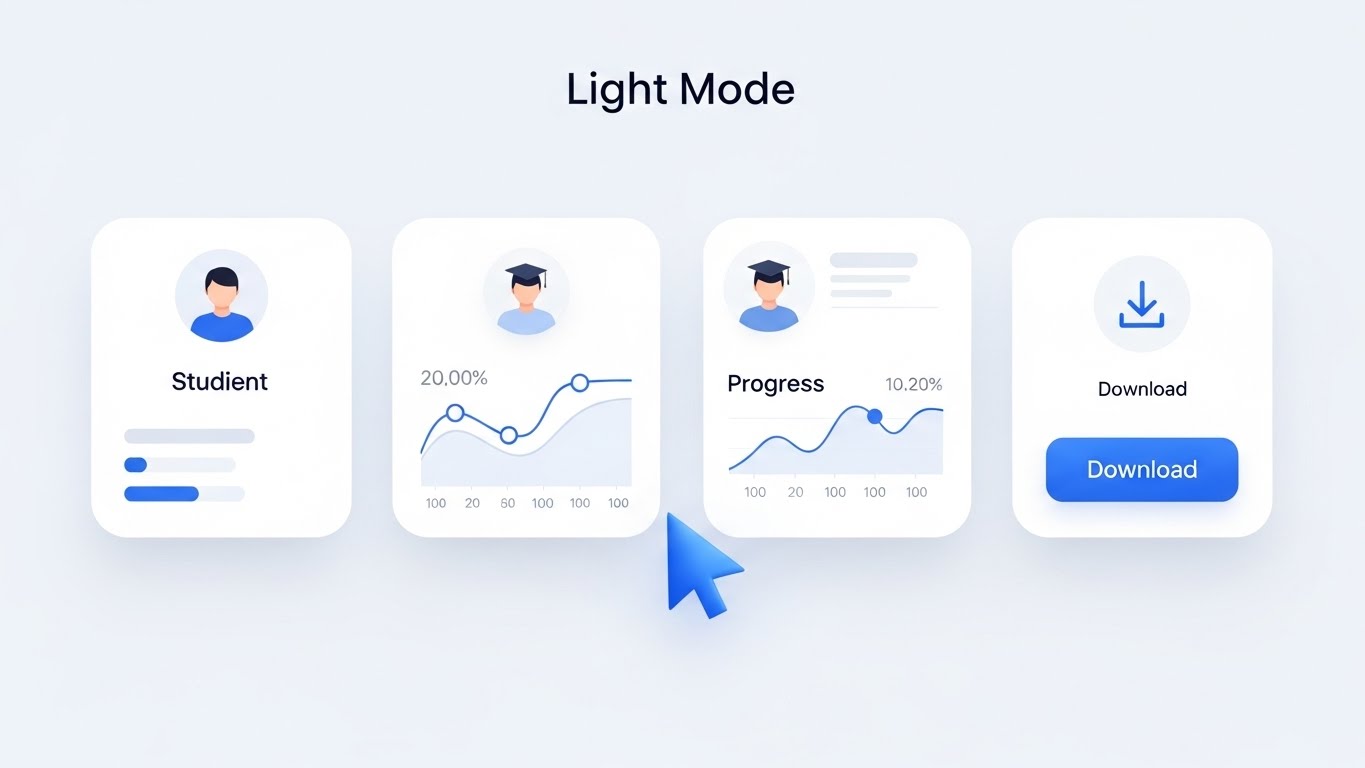
The Visual & Narrative Approach
Ultimately, the buyer wants to know: "What does it look like to use it?" This "Clean UI Workflow" style strips away all distractions to focus on the interface itself. We see a crisp, high-fidelity UI mockup of a task management dashboard. The interface is predominantly White and Light Gray with Royal Blue accents. Abstracted "cards" are arranged in columns, with one card being lifted and moved, casting a soft drop shadow.
Psychological Impact & KPI Focus
This visual demonstrates "Usability" and "Low Friction." It directly counters the fear that new software will be clunky or hard to learn. By zooming in on a specific interaction (like moving a task from 'In Progress' to 'Review'), it proves the intuitive nature of the platform. This is a critical asset for Feature Education in email nurturing campaigns.
Strategic Implementation & Trade-offs
- Best Use Case: Email newsletters announcing new features or Support Center tutorials.
- Recommended Duration: 10-20 seconds per feature.
- Trade-off: It is literal. It lacks the emotional punch of the lifestyle shots. It works best when the viewer is already interested and wants to see the "nuts and bolts."
Companies using similar video content -
Xero – Practice Manager – Demonstrates clear task management.
Canopy – Client Management – Showcases intuitive client portal.
Aero Workflow – Workflow Management – Highlights simple task assignment.
7. Rapid UI Feature Montage
MOFU | Feature Education & Demonstration
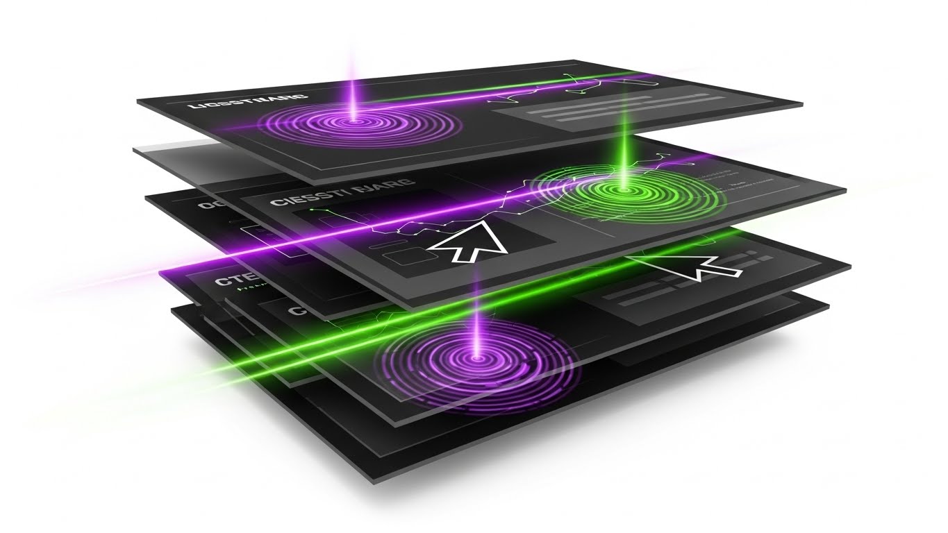
The Visual & Narrative Approach
To convey the sheer breadth of a platform’s capabilities without boring the viewer, this "Rapid UI Feature Montage" utilizes a high-energy composition. Multiple abstract UI screens are layered in a cascade, with bright Electric Purple and Lime Green cursor trails zipping across them. Ripple effects occur where the cursors "click." The background is a pure White void. The visual metaphor implies speed and immediate utility.
Psychological Impact & KPI Focus
This style is designed to accelerate Time-to-Value (TTV). It overwhelms the viewer (in a positive way) with the richness of the feature set, implying that the software is robust and comprehensive. It is perfect for Social Ads where you have limited attention spans to convey "We do it all—Payroll, Tax, CRM, and Reporting."
Strategic Implementation & Trade-offs
- Best Use Case: Retargeting ads for users who visited the pricing page but didn't convert.
- Recommended Duration: 10-15 seconds.
- Trade-off: The speed means no single feature is explained in depth. It creates an impression of capability rather than understanding.
Companies using similar video content -
Wolters Kluwer – CCH Axcess – Showcases multiple modules quickly.
Thomson Reuters – CS Professional Suite – Highlights diverse features.
Zoho – Books – Presents a wide range of accounting functions.
8. 2D Character-Driven Story
MOFU | Accelerating Time-to-Value

The Visual & Narrative Approach
Accounting is fundamentally a relationship business. This "2D Character-Driven Story" humanizes the digital transaction. A stylized vector illustration shows two professional characters: a practice manager handing a glowing digital token (representing a completed tax return) to a client character. The style uses grainy textures and flat colors in Muted Teal and Mustard Yellow. The background includes abstract office plants and a whiteboard.
Psychological Impact & KPI Focus
This style is highly effective for Driving Demo Requests because it focuses on the result of the service: a happy client receiving their deliverable. It moves the conversation away from "how the software works" to "how the software improves client relationships." It reduces the intimidation factor of technology, making the digital transition feel friendly.
Strategic Implementation & Trade-offs
- Best Use Case: LinkedIn Case Study videos or Testimonial visual accompaniments.
- Recommended Duration: 30-45 seconds.
- Trade-off: Character animation can sometimes feel "juvenile" if not executed with a sophisticated art direction. The textures and color palette are critical to maintaining a B2B professional tone.
Companies using similar video content -
Client Hub – Client Collaboration – Illustrates seamless client deliverables.
Ignition – GoProposal – Shows client acceptance and satisfaction.
Pixie – Practice Management – Depicts simplified client interactions.
11. Dynamic Data Visualization
MOFU | Establishing Thought Leadership

The Visual & Narrative Approach
To position your platform not just as a tool, but as a growth engine, this "Dynamic Data Visualization" style moves beyond static spreadsheets. The visual narrative centers on 3D bar charts and line graphs made of translucent Gold and Deep Indigo glass, rising triumphantly from a clean digital floor. Particle effects dance around the rising peaks, symbolizing active data transactions. The camera angle is low, looking up, imparting a sense of scale and dominance. This metaphor elevates "reporting" from a mundane task to a majestic display of financial health and firm scalability.
Psychological Impact & KPI Focus
This style appeals to the "Advisor" archetype within the accountant. It validates their aspiration to provide high-value insights rather than just data entry. By beautifying the data, you subconsciously tell the viewer that your software treats their work with the respect it deserves. It is highly effective for Establishing Thought Leadership in blog posts or whitepapers, helping to associate your brand with financial prosperity and "Advisory Intelligence."
Strategic Implementation & Trade-offs
- Best Use Case: Background visuals for webinars on "The Future of Advisory" or hero sections of "Reporting Features" pages.
- Recommended Duration: 10-20 seconds (Looping).
- Trade-off: It is abstract. While it builds authority, it does not show how the data is input. It assumes the data is already clean and available.
Companies using similar video content -
Fathom – Reporting & Advisory – Visualizes financial performance and insights.
Spotlight Reporting – Performance Reporting – Creates dynamic business dashboards.
Syft Analytics – Financial Reporting – Transforms data into actionable visuals.
12. Photorealistic 3D Renders
BOFU | ROI Justification

The Visual & Narrative Approach
When closing the deal, the conversation shifts to the bottom line. This "Photorealistic 3D Render" style grounds the digital software in physical value. We see a hyper-realistic scene: a sleek, metallic laptop displaying your dashboard, sitting on a polished mahogany desk next to neat stacks of Bronze and Steel Grey coins. The lighting is dramatic and warm, highlighting the texture of the metal against the White highlights. The narrative is simple but potent: "This software turns time into money." It visually translates saved billable hours into tangible profit.
Psychological Impact & KPI Focus
For the firm owner (the Economic Buyer), software is an investment that must yield a return. This visual triggers the "Accumulation" instinct. It mitigates the pain of the subscription cost by juxtaposing it directly with symbols of wealth and stability. It is precision-engineered for ROI Justification at the Bottom-of-Funnel (BOFU), reassuring the buyer that the platform is a revenue generator, not a cost center.
Strategic Implementation & Trade-offs
- Best Use Case: Pricing pages, Proposal PDFs, or "ROI Calculator" landing pages.
- Recommended Duration: Static Image or 5-second subtle motion (glint on coins).
- Trade-off: It can appear materialistic if overused. The messaging must remain professional—focusing on profitability and efficiency, not just "greed."
Companies using similar video content -
Bill.com – AP/AR Automation – Connects efficiency to cost savings.
Tipalti – AP Automation – Visualizes financial gains from streamlined payments.
Melio – Payments Platform – Highlights tangible savings in payment processing.
13. Holographic UI over 3D Render
BOFU | Building Trust & Credibility

The Visual & Narrative Approach
Security is the single biggest anxiety for accounting professionals. This style addresses that fear head-on with a "Holographic UI" aesthetic. The visual depicts a clean, sterile server environment or a secure tablet device. Hovering above it is a large, translucent Neon Cyan shield with a lock-shaped geometric icon. The shield rotates slowly, casting a protective glow over the data below. The atmosphere is clinical and high-tech, utilizing White and Cyan tones to convey "bank-grade" encryption and transparency.
Psychological Impact & KPI Focus
This visual leverages the "Security Bias." Accountants are custodians of sensitive financial data; they need to feel that your platform is a fortress. The holographic shield acts as a powerful visual metaphor for an invisible digital barrier (SOC 2 Compliance, 256-bit encryption). It is essential for Building Trust & Credibility during the final evaluation phase, specifically addressing the objections of IT directors or risk-averse partners.
Strategic Implementation & Trade-offs
- Best Use Case: "Security" page on the website or LinkedIn ads targeting CTOs of accounting firms.
- Recommended Duration: 10-15 seconds.
- Trade-off: It creates a "cold" technical feel. It should be balanced with human-centric content elsewhere to avoid making the brand feel robotic.
Companies using similar video content -
Drata – Compliance Automation – Visualizes security and compliance posture.
Vanta – Security & Compliance – Projects robust data protection.
Secureframe – Compliance Automation – Showcases secure infrastructure.
14. 3D X-Ray Visualization
BOFU | Risk Mitigation

The Visual & Narrative Approach
The "mess" of legacy systems is often hidden in filing cabinets—real or digital. This "3D X-Ray Visualization" reveals the hidden order your software provides. We see a traditional metal filing cabinet or briefcase rendered in semi-transparent Translucent White. Inside, instead of chaotic paper piles, we see glowing, organized rows of Blue data blocks. The "X-Ray" view implies that your software provides total visibility into the firm's operations, ensuring nothing is lost or hidden during an audit.
Psychological Impact & KPI Focus
This style targets the fear of the unknown—specifically, the fear of a failed audit or lost documentation. By visualizing the "insides" of the system as organized and glowing, you provide Risk Mitigation. It tells the viewer, "We have nothing to hide, and neither will you." It is particularly effective for whitepapers or technical deep-dives explaining audit trail features.
Strategic Implementation & Trade-offs
- Best Use Case: Technical whitepapers, "Compliance" feature pages, or sales decks.
- Recommended Duration: 15-20 seconds.
- Trade-off: It is a metaphorical style. It explains the concept of organization but doesn't show the actual interface for retrieving a document.
Companies using similar video content -
MindBridge – AI Audit Analytics – Reveals hidden anomalies in data.
CaseWare – Audit & Financial Reporting – Provides deep insight into audit files.
AuditFile – Audit Automation – Offers transparency into audit processes.
15. Wireframe to Reality Transition
BOFU | Competitive Displacement
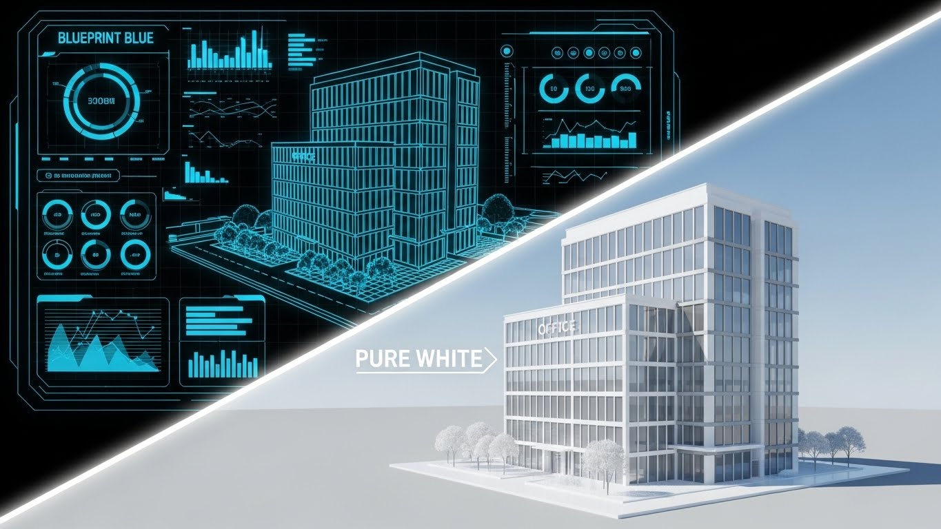
The Visual & Narrative Approach
Switching software is daunting; firms fear the "implementation gap." This "Wireframe to Reality" style visualizes the successful transition. The image uses a diagonal split: the top left shows a "Blueprint Blue" wireframe of a structured office building (representing the implementation plan/data migration). The bottom right shows the fully rendered, photorealistic version of that same building in Pristine White and glass (representing the live, functioning firm). A glowing white beam sweeps across, turning the plan into reality.
Psychological Impact & KPI Focus
This visual demonstrates Competitive Displacement by lowering the perceived barrier to entry. It assures the buyer that you have a structured plan to take them from "concept" to "live operations" without the chaos. It appeals to the "Architect" mindset—practice managers who want to build a better firm but fear the construction phase. It visualizes the stability and solidity of the final result.
Strategic Implementation & Trade-offs
- Best Use Case: Onboarding guides, "Switch to Us" landing pages, or implementation roadmaps.
- Recommended Duration: 10-15 seconds (Sweeping transition).
- Trade-off: It focuses on the process of change, not the day-to-day use. It is a specific tool for overcoming "switching costs" inertia.
Companies using similar video content -
OneStream Software – Corporate Performance Management – Visualizes successful platform migration.
Anaplan – Planning & Performance Management – Shows transition from legacy systems.
Workiva – Reporting & Compliance – Illustrates smooth data integration.
16. Dark Mode UI Showcase
BOFU | The Economic Buyer

The Visual & Narrative Approach
Senior partners and CFOs often prefer high-density data presented elegantly. This "Dark Mode UI Showcase" features a sleek, Deep Charcoal background where interface elements pop in Neon Green and Magenta. Complex data visualizations—donut charts, trend lines, and realization rates—glow faintly, reflecting off a glass-like surface. The isometric angle reveals layers of data depth, suggesting a platform that can handle complex, multi-entity consolidations.
Psychological Impact & KPI Focus
Dark mode signifies "Pro" level tools. It appeals to the Economic Buyer (CFO/CEO) who views the firm through the lens of metrics and analytics. This aesthetic screams "Modern," "Advanced," and "Premium." It differentiates your platform from "mom-and-pop" bookkeeping tools, positioning it as an enterprise-grade solution for serious firms.
Strategic Implementation & Trade-offs
- Best Use Case: "Enterprise" pricing tier page, Investor Relations, or high-level sales demos.
- Recommended Duration: 20-30 seconds.
- Trade-off: Dark mode can sometimes feel less "friendly" or approachable than light mode. It is best reserved for audiences who value power and analytics over simplicity.
Companies using similar video content -
DataRails – FP&A Software – Presents executive-level financial dashboards.
Vena Solutions – FP&A & CPM – Displays complex financial models.
Planful – FP&A & Consolidation – Showcases advanced analytics for decision-makers.
17. Lifestyle Stock with UI Overlay
BOFU | Overcoming Objections

The Visual & Narrative Approach
One of the modern accountant's main desires is untethering from the desk. This style combines "Lifestyle Stock" with a crisp "UI Overlay." We see a close-up of a professional's hand holding a tablet in a warm, domestic setting (home office or coffee shop). Overlaid on the screen is a sharp, abstract UI graphic in Focus Blue and White, displaying a prominent geometric green "check" icon indicating success. The background is soft bokeh. The narrative: "Approve the tax return from anywhere. The work doesn't stop, but you can move."
Psychological Impact & KPI Focus
This style creates "Situational Relatability." It directly addresses the objection: "Will I be stuck in the office until midnight?" By showing the software working seamlessly on a tablet in a relaxed environment, you sell the benefit of Work-Life Balance and mobility. It humanizes the technology, proving it fits into the user's life, not the other way around.
Strategic Implementation & Trade-offs
- Best Use Case: Retargeting ads on Facebook/Instagram or "Mobile App" feature pages.
- Recommended Duration: 10-15 seconds.
- Trade-off: Ensure the UI overlay looks realistic (tracked properly) and not just pasted on, otherwise it breaks the immersion.
Companies using similar video content -
Expensify – Expense Management – Shows mobile receipt capture and approval.
Rydoo – Expense Management – Highlights on-the-go expense reporting.
SAP Concur – Travel & Expense – Demonstrates mobile approval workflows.
18. 2D Graphics Over Live Action
BOFU | Reducing Implementation Friction

The Visual & Narrative Approach
Accounting is a team sport involving partners, juniors, and clients. This style uses "2D Graphics Over Live Action" to visualize this invisible collaboration. A high-quality photo shows a diverse team meeting around a conference table. Superimposed over them are floating vector icons: green checkmarks, speech bubbles, and connection lines in Bright Primary Colors (Red, Yellow, Blue). These graphics map the flow of conversation and task assignment, showing how the software captures and organizes the meeting's output.
Psychological Impact & KPI Focus
This visual reduces Implementation Friction by showing that the software supports, rather than replaces, human interaction. It appeals to the "Social" aspect of firm management. It reassures the buyer that the platform will enhance team communication and ensure that tasks assigned in meetings don't fall through the cracks.
Strategic Implementation & Trade-offs
- Best Use Case: LinkedIn ads focused on "Team Productivity" or "Workflow Management."
- Recommended Duration: 15-20 seconds.
- Trade-off: The tone must remain professional. If the graphics are too cartoony, it can trivialize the serious work being discussed.
Companies using similar video content -
Client Hub – Client Collaboration – Visualizes communication flow in meetings.
Liscio – Client Communication – Shows how digital tools enhance team and client interaction.
DocuWare – Document Management – Illustrates document flow and approvals.
19. 2D Line Art Animation
Onboarding | Self-Serve Onboarding

The Visual & Narrative Approach
When a user first logs in, they are overwhelmed. This "2D Line Art Animation" style offers a calming, clarifying visual guide. A continuous single Black line navigates across a White background, elegantly forming a winding path that navigates through simple obstacles to arrive triumphantly at a flag icon. The line varies in width, feeling organic and guided. It implies that the onboarding process is a continuous, unbroken journey with a clear destination.
Psychological Impact & KPI Focus
This style utilizes "Cognitive Fluency." It simplifies the complex mental model of setting up a new CRM into a single, followable line. It is critical for Product-Led Growth (PLG) strategies, where users must self-onboard. It reduces the "Time-to-Value" by visually promising a guided, hassle-free path to the first win.
Strategic Implementation & Trade-offs
- Best Use Case: In-app welcome screens, "Getting Started" email sequences, or support loading screens.
- Recommended Duration: 5-10 seconds (Looping).
- Trade-off: It is highly abstract. It sets a mood of simplicity but doesn't teach the user where to click. It is a mood-setter, not a tutorial.
Companies using similar video content -
FreshBooks – Invoicing & Accounting – Guides new users through setup.
Zoho – Books – Simplifies initial onboarding steps.
Capium – Practice Management – Provides a clear path for new firm users.
20. Macro UI Micro-Interactions
Onboarding | Trial/Freemium User Activation

The Visual & Narrative Approach
The ultimate goal of any task is completion. This "Macro UI Micro-Interaction" style zooms in to extreme close-up on that moment of gratification. We see a stylized, rounded UI button in Vivid Magenta. A finger (or cursor) presses it down, compressing the soft plastic texture. A soft glow of Light Blue emanates from beneath, signaling activation. This visual captures the tactile satisfaction of clicking "Submit Return" or "Reconcile All."
Psychological Impact & KPI Focus
This leverages "Gamification" and the dopamine hit of task completion. It is designed for User Activation. By focusing on the satisfying end state of an action, you encourage the user to perform that action. It makes the software feel responsive, tactile, and rewarding to use.
Strategic Implementation & Trade-offs
- Best Use Case: "Nudge" emails for inactive users ("You're one click away...") or feature highlight reels.
- Recommended Duration: 3-5 seconds (Quick loop).
- Trade-off: It is hyper-specific. It works best as punctuation in a larger narrative or as a quick visual cue, rather than a standalone story.
Companies using similar video content -
Dext – Prepare – Highlights the satisfying "submit" action.
Sage – AutoEntry – Focuses on successful data extraction.
Bill.com – Payment Approval – Emphasizes the final "approve payment" click.
21. Low-Poly 3D Modeling
Onboarding | Reducing Support Overhead

The Visual & Narrative Approach
Technical support documentation in accounting is often dry, text-heavy, and intimidating. This "Low-Poly 3D Modeling" style transforms the "Help Center" into an inviting, stress-free environment. We see a cute, low-poly robot character rendered in soft Pastel Pink and Blue facets. The robot holds a magnifying glass and stands next to a floating book (the knowledge base). The background is a clean, diffuse Soft White landscape. The aesthetic is intentionally "toy-like" and simplified, stripping away the visual complexity of the software to focus on helpful, friendly guidance.
Psychological Impact & KPI Focus
This style leverages "Affective Design." By using a character with "cute" proportions (Baby Schema), you lower the user's cortisol levels—which are likely high if they are seeking support for a tax error. It reframes a frustrating problem into a manageable learning moment. It is strategically deployed to Reduce Support Overhead; users are more likely to engage with a friendly, self-serve video guide than to immediately submit a ticket, deflecting volume from your support team.
Strategic Implementation & Trade-offs
- Best Use Case: "No Results Found" search pages, Help Center hero sections, or "Getting Started" wizard steps.
- Recommended Duration: Static imagery or short 3-5 second loops (waving or searching).
- Trade-off: The "cute" factor must be calibrated. It works excellently for support and basic learning but may feel too juvenile for critical "Audit Defense" or "Data Security" pages where gravitas is required.
Companies using similar video content -
Keeper Security – Password Management – Offers friendly guidance for secure practices.
Egnyte – Content Collaboration – Provides approachable help for file sharing.
Box – Cloud Content Management – Simplifies complex features with friendly visuals.
22. Hyper-lapse Stock Footage with Data
Retention | Reducing Churn

The Visual & Narrative Approach
Accounting firms are high-velocity environments, especially during tax season. This "Hyper-lapse Stock" style captures that energy while positioning the software as the anchor. We see a long-exposure time-lapse of a busy office; staff members are blurred streaks of motion, rushing to meet deadlines. Overlaying this chaotic scene are sharp, static digital data streams and UI widgets in Orange and Blue, floating calmly in the air. The contrast is stark: the human world is frantic, but the data remains rock-solid.
Psychological Impact & KPI Focus
This visual reinforces "Reliability" and "Stability." It subtly addresses the anxiety of system crashes or data loss during peak times. For the practice manager, it visualizes the software as the "Eye of the Storm." It is highly effective for Reducing Churn by reminding existing clients that your platform is the dependable foundation that keeps their operation running smoothly, no matter how busy it gets.
Strategic Implementation & Trade-offs
- Best Use Case: "Year-In-Review" customer emails, renewal reminder pages, or system status updates.
- Recommended Duration: 10-15 seconds.
- Trade-off: It requires high-quality stock footage. If the office environment looks dated or unlike a modern firm, the metaphor falls flat.
Companies using similar video content -
Oracle – NetSuite – Positions as a stable platform amidst business growth.
Sage Intacct – Cloud Financial Management – Reinforces system dependability during busy periods.
Workday – Financial Management – Highlights consistent performance.
23. Abstract 2D Motion Graphics
Retention | Website Visitor Re-engagement

The Visual & Narrative Approach
Sometimes, you need to bring a user back to the platform without overwhelming them with details. This "Abstract 2D Motion Graphics" style uses fluid, organic shapes in a Liquid Gradient of Teal and Purple. The narrative is purely visual: disjointed blobs swirl from the edges of the screen, moving towards the center to merge into a perfect, cohesive circle or the brand logo. The motion is smooth, hypnotic, and satisfying. The background is a clean, distraction-free White.
Psychological Impact & KPI Focus
This style utilizes the "Gestalt Principle of Closure." The brain naturally wants to see the shapes come together. It symbolizes the reintegration of data, processes, and the user themselves back into the ecosystem. It is designed for Website Visitor Re-engagement via display ads. It catches the eye with motion and color, creating a sense of "harmony" that invites the user to click and return to their workflow.
Strategic Implementation & Trade-offs
- Best Use Case: Google Display Network (GDN) retargeting ads or loading screens.
- Recommended Duration: 6-10 seconds (Looping).
- Trade-off: It is non-specific. It builds brand recall but doesn't communicate a specific value proposition. It is a "reminder" ad, not a "sales" ad.
Companies using similar video content -
Alteryx – Data Analytics – Visualizes seamless data blending.
Tableau – Data Visualization – Represents harmonious data integration.
Microsoft – Power BI – Shows fluid data connections.
24. 2D Animation & UI Composition
Retention | Proactive Support/Announcements

The Visual & Narrative Approach
When a new tax regulation or software update drops, clarity is king. This "2D Animation & UI Composition" pairs a stylized, flat vector character (rendered in professional Grey tones) with a large, floating UI window. The character gestures toward the window, which displays a prominent megaphone icon and key text in Primary Red. The background is a subtle geometric pattern. The visual hierarchy is strict: the character directs the eye immediately to the message.
Psychological Impact & KPI Focus
This style leverages "Social Cues"—we look where others look. By having a character point to the update, you increase the "Noticeability" of the message. It is crucial for Proactive Support and announcements, ensuring that critical information (like a server maintenance window or a new compliance feature) is seen and understood, preventing confusion and support tickets.
Strategic Implementation & Trade-offs
- Best Use Case: In-app pop-ups (modals) or "What's New" social media posts.
- Recommended Duration: 10-15 seconds.
- Trade-off: It can feel "instructional." Use it for important news, not for general brand building. The text in the UI window must be legible on small screens.
Companies using similar video content -
Karbon – Practice Management – Announces new features or updates clearly.
Canopy – Client Management – Communicates important system changes.
TaxDome – Client Portal – Notifies users of new client features.
25. Abstract 3D AI Visualization
Expansion | Driving Deep Feature Adoption

The Visual & Narrative Approach
To sell the value of AI features (like predictive cash flow), you must visualize the invisible intelligence. This "Abstract 3D AI Visualization" depicts a neural network. Glowing nodes in Silver and Blue are suspended in an infinite White studio space. They are connected by thin, pulsing lines that form a complex web around a central "document" icon. The camera drifts through the web, showing the density of connections. It represents the software "thinking" and finding patterns across thousands of data points.
Psychological Impact & KPI Focus
This style appeals to the desire for "Insight." It moves the perception of the software from a "calculator" to a "consultant." It visualizes the complexity that the AI handles for the user. It is highly effective for Driving Deep Feature Adoption (Expansion), encouraging existing users to try advanced, higher-tier features that rely on machine learning and big data.
Strategic Implementation & Trade-offs
- Best Use Case: Email campaigns introducing new AI modules or "Intelligence" feature pages.
- Recommended Duration: 15-20 seconds.
- Trade-off: It is conceptual. You must follow this abstract visual with a concrete shot of the actual output (e.g., the cash flow graph) so the user understands the practical application.
Companies using similar video content -
Vic.ai – AI for AP Automation – Visualizes intelligent invoice processing.
Auditoria.ai – AI for Finance – Depicts AI-driven financial operations.
Botkeeper – AI Bookkeeping – Shows the underlying AI intelligence.
26. Futuristic Neon/Dark Mode
Expansion | Driving Upsell/Cross-sell

The Visual & Narrative Approach
When upselling to the "Enterprise" tier, you need to show scale. This "Futuristic Neon" style visualizes your software suite as a sprawling, interconnected metropolis. Buildings formed of Cyan and Magenta neon lines represent different modules (Audit, Tax, Payroll, CRM) against a Black background (Dark Mode). "Data highways"—streaks of light—connect them, showing the seamless flow of information. It looks like the nervous system of a massive organization.
Psychological Impact & KPI Focus
This triggers the "Empire Building" instinct of a Managing Partner. It visualizes the scale of their firm powered by your software. It is a potent tool for Upselling and Cross-selling, as it visually reveals the "missing buildings" in their current subscription. It positions the full platform as the infrastructure for their growth.
Strategic Implementation & Trade-offs
- Best Use Case: Landing pages for "Enterprise Solutions" or background visuals for keynote speeches.
- Recommended Duration: 20-30 seconds (Looping).
- Trade-off: It creates a "Cyberpunk" vibe which may alienate highly traditional, conservative firms. Use selectively for the "Forward-Thinking" segment.
Companies using similar video content -
Wolters Kluwer – CCH Axcess – Positions as a comprehensive enterprise solution.
Thomson Reuters – CS Professional Suite – Visualizes interconnected modules for large firms.
Oracle – NetSuite – Showcases a vast, integrated business ecosystem.
27. 3D Parallax UI Presentation
Expansion | In-App Upsell
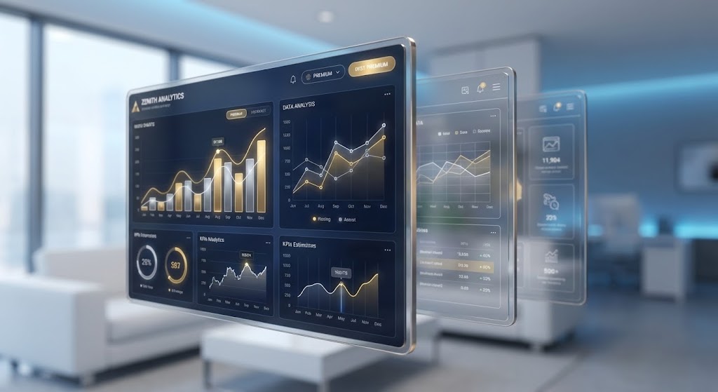
The Visual & Narrative Approach
To make a specific premium feature feel "special," this style uses "3D Parallax." We see a composition of multiple UI screens floating at different depths. The foreground screen is razor-sharp, displaying premium analytics widgets (heatmaps, advanced ratios). The background screens are slightly blurred and translucent. As the camera pans gently, the parallax effect creates a strong sense of three-dimensional depth. The background is a soft, out-of-focus office environment in Soft White and Blue.
Psychological Impact & KPI Focus
This style uses "Depth" as a proxy for "Value." By physically separating the premium interface from the background, it feels elevated and distinct. It captures attention and focuses it entirely on the data visualization. It is designed for In-App Upsell (Product-Led Growth), appearing when a user tries to access a locked feature, visually promising that the upgrade offers a "deeper" look into their data.
Strategic Implementation & Trade-offs
- Best Use Case: "Paywall" screens or Feature Unlock modals within the SaaS application.
- Recommended Duration: 5-10 seconds (Subtle motion).
- Trade-off: The UI shown must be the actual premium interface. Any discrepancy between this "glamor shot" and the real feature will cause disappointment.
Companies using similar video content -
Jirav – FP&A Software – Highlights advanced forecasting features.
DataRails – FP&A Software – Showcases premium reporting dashboards.
Fathom – Reporting & Advisory – Presents deeper analytical views.
28. Generative AI Cinematic Video
Expansion | Driving Referrals & Advocacy

The Visual & Narrative Approach
Referrals are driven by status. This "Generative AI Cinematic" video creates a blockbuster movie feel. We see a wide anamorphic shot of a high-end boardroom. Diverse professionals are laughing, shaking hands, and pointing at a screen (implied success). The lighting is dramatic, with Teal shadows and Orange highlights. Reflections of a city skyline are visible in the glass walls. The atmosphere is triumphant, elite, and successful.
Psychological Impact & KPI Focus
This appeals to "Social Status" and "Achievement." It associates your software not with "doing taxes," but with "winning business." It is used to drive Referrals and Advocacy. When you ask a client for a testimonial or a referral, you want them to feel like a successful leader who is sharing their secret weapon.
Strategic Implementation & Trade-offs
- Best Use Case: "Partner Program" recruitment pages or YouTube brand anthems.
- Recommended Duration: 15-30 seconds.
- Trade-off: As with all Gen-AI video, watch for artifacts (hands/fingers). The goal is "mood," not documentary realism.
Companies using similar video content -
Workiva – Reporting & Compliance – Celebrates successful financial reporting.
Diligent – Governance, Risk, Compliance – Portrays executive success and leadership.
BlackLine – Financial Close Automation – Depicts triumphant financial close outcomes.
29. Minimalist Flat 2D Vector
Expansion | Category Creation

The Visual & Narrative Approach
When you are defining a new category (e.g., "Client Advisory Services 2.0"), you need a stark visual metaphor. This "Minimalist Flat 2D" style shows a textured piece of paper in Ink Black tearing open in the center. Beneath the tear, a glowing, pristine digital screen in White and Blue is revealed. The edges of the tear are sharp. The contrast between the rough, dark paper (the past) and the clean, bright light (the future) is absolute.
Psychological Impact & KPI Focus
This visual utilizes "Binary Contrast." It forces the viewer to choose between the old way (dark, paper-based) and the new way (bright, digital). It creates a "Schism" in the market, positioning your brand as the leader of the new world. It is essential for Category Creation, helping to explain why a firm needs to stop doing things the old way entirely.
Strategic Implementation & Trade-offs
- Best Use Case: LinkedIn Thought Leadership posts or the cover of a "State of the Industry" report.
- Recommended Duration: 5-10 seconds.
- Trade-off: It is aggressive. It frames the "old way" as negative. Ensure your audience isn't offended by the implication that their current methods are obsolete.
Companies using similar video content -
Ledgible – Crypto Accounting – Positions as the new standard for digital asset accounting.
TaxBit – Crypto Tax Software – Defines a new category for crypto tax compliance.
LeaseQuery – Lease Accounting – Highlights the shift to new lease accounting standards.
30. Generative AI Realistic Character Video
Expansion | Sales Cycle Acceleration
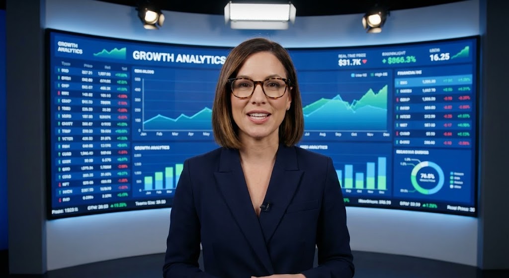
The Visual & Narrative Approach
The strongest sales accelerator is a peer recommendation. This "Generative AI Realistic Character" style creates a virtual "Champion." We see a professional woman in a sharp blazer, standing confidently in a modern studio. She breaks the fourth wall, speaking directly to the viewer. Behind her, a screen displays complex financial data in sharp focus. She exudes competence and confidence, acting as a proxy for a satisfied Managing Partner.
Psychological Impact & KPI Focus
This utilizes "Social Proof" and "Authority." Even though it is an AI avatar, the realistic eye contact and professional demeanor build trust. It is used for Sales Cycle Acceleration (SQLs), delivering a perfect pitch or case study summary to prospects who are on the fence. It simulates a peer-to-peer conversation at scale.
Strategic Implementation & Trade-offs
- Best Use Case: Personalized video messages in LinkedIn InMail or post-demo follow-up emails.
- Recommended Duration: 30-60 seconds.
- Trade-off: Transparency is key. While the avatar is realistic, it is best to use it to deliver information rather than pretending to be a real human being for emotional connection.
Strategic Knowledge Base: The Visual Operations Doctrine
To transform this collection of 30 visual styles into a cohesive business strategy, we must move beyond "video production" and discuss "Visual Operations." For an Accounting SaaS platform, the image is not just marketing; it is the interface of trust. The following three segments provide the strategic framework for Practice Leaders and SaaS Marketers to implement these visuals to drive Adoption, Efficiency, and ROI.
Strategic Alignment & Visual Architecture (Pre-Production)
Designing for the Accountant's Mind
- The Cognitive Load Audit: Accounting is a high-load profession. Before creating training videos, audit the complexity of the task. For complex tax workflows (ASC 606), use Style 19 (Line Art) to simplify the mental model before showing the UI. Never start with a dense screenshot.
- Role-Based Visual Mapping: Differentiate your visual delivery. Managing Partners need Style 16 (Dark Mode UI) to see high-level KPIs and firm realization rates. Staff Accountants need Style 6 (Clean UI) to see exactly where to click for reconciliation. Don't send "Strategy" videos to staff who need "Utility."
- The "Glanceability" Standard: During tax season, speed is currency. Design "Micro-Interactions" (Style 20) for your Help Center that solve problems in under 10 seconds. If a video takes 3 minutes to explain a 5-second task, it is an operational failure.
- Brand Voice Consistency: Your SaaS platform likely integrates with other tools (QuickBooks, Xero). Use Style 23 (Abstract Motion) to visually represent these integrations as smooth and native, reinforcing the "Single Source of Truth" narrative.
- The Advids Strategic Audit: Partnering with a specialized agency like Advids allows you to define this "Visual Operating System" upfront. We audit your user journey to ensure that the visual cues used in Marketing (TOFU) are consistent with the UI cues used in Onboarding (MOFU), reducing friction.
- Standardization vs. Customization: For core features (Tax, Audit), use standardized, high-polish assets (Style 5 Isometric). For niche, firm-specific workflows, empower your Customer Success team to create quick, personalized screencasts (Style 24) that feel bespoke.
- The Cross-Departmental Bridge: Use visuals to unify terminology. Sales calls a feature "Advisory Intelligence," while Support calls it "Reporting Widget." Use Style 2 (Kinetic Typography) to enforce a common visual vocabulary across the company.
- Legacy System Integration: Many firms are hybrid. Use Style 15 (Wireframe to Reality) to visually acknowledge their legacy data and show how it transforms into your modern cloud platform, respecting their history while selling the future.
- Accessibility in Accounting: Accounting is global. Ensure text-heavy styles like Style 2 are designed for easy localization. Visuals should rely on universal icons (calculators, shields, checks) rather than English-heavy metaphors.
- The Mobile-First Mandate: Partners are often at client sites. Ensure that "Approval Workflow" videos (Style 17) are optimized for vertical screens, reinforcing the reality that they can approve WIP from their phone.
Operational Adoption & Implementation (Deployment)
Embedding Visuals into the Workflow
- Overcoming "Big Brother" Anxiety: Productivity tracking features can feel invasive. Use Style 8 (Character Story) to frame these features as "Workload Balancing" tools that prevent burnout, rather than "Surveillance" tools. Empathy is the key to adoption.
- The Micro-Learning Shift: Replace the 50-page PDF manual with a library of Style 6 (Clean UI) clips. Index them by specific tax codes or error messages. Staff will watch a 30-second clip; they will not read a manual during April.
- Just-in-Time Support: Embed Style 21 (Low Poly Robot) videos directly into the error messages of the software. When a user gets a "Reconciliation Error," show them the fix immediately. This reduces context switching and frustration.
- Gamification of Training: Use Style 20 (Macro UI) to celebrate "Training Completed" milestones. Visual rewards for learning the software (badges, progress bars) tap into the accountant's desire for completion and order.
- Reducing Support Ticket Volume: There is a direct correlation between the quality of your Style 19 (Line Art) onboarding videos and the volume of "How-to" tickets. Invest heavily in "Pre-emptive Visualization"—answering the question before it's asked.
- Remote Onboarding: For distributed firms, you cannot do in-person seminars. Use Style 4 (Aspirational Stock) combined with Style 18 (2D over Live Action) to simulate the culture and connection of a live training session remotely.
- Standard Operating Procedures (SOPs): Transform text-based SOPs into visual process flows (Style 5 Isometric). A visual map of the "Audit Lifecycle" is instantly memorable; a checklist is easily forgotten.
- Feedback Loops: Use interactive video elements. After a Style 7 (Rapid UI) feature announcement, add a one-click poll: "Will this help you?" This data is gold for your Product Team.
- Scalable Localization: For multi-national SaaS, separate the text layers in your source files (Style 2). This allows for rapid translation of "VAT" to "GST" or "Sales Tax" without re-rendering the complex background animations.
- Leadership Communication: When announcing a price increase or a strategic pivot, do not send an email. Use Style 30 (Realistic Avatar) or a real video of the CEO (Style 28 style) to convey the nuance, gravity, and value behind the decision.
Measuring Impact & Future-Proofing (ROI)
Validating the Investment
- Beyond "Views": Do not measure video success by "View Count." Measure it by "Feature Adoption Rate." If you release a Style 25 (AI) video, does usage of that AI module spike in the next 48 hours? That is the only metric that matters.
- The "Idle Time" Metric: Track how long a user pauses on a screen. If "Idle Time" decreases after you deploy a Style 21 (Help) video, you have successfully improved their efficiency.
- Compliance Velocity: How fast can your client base adapt to a new tax law? Measure the time from "Video Release" (Style 24) to "Compliant Action." Video is the fastest way to propagate regulatory changes across a user base.
- Retention and Churn: Correlate user consumption of Style 22 (Stability) and Style 23 (Integration) content with renewal rates. Educated users who understand the "hidden value" of the platform are less likely to churn.
- The AI Visual Frontier: Prepare your assets for real-time personalization. In the future, Style 12 (Photorealistic) videos could dynamically render the client's actual name and logo onto the laptop screen, increasing conversion through hyper-relevance.
- Scalability of Assets: Build a "Visual Component Library." If you change your UI color from Blue to Green, you shouldn't have to re-shoot. Vector-based styles (Style 1, 19, 29) allow for global color updates in minutes.
- The Advids Partnership: Scalability requires a partner who manages the asset lifecycle. Advids ensures that as your software evolves from Version 2.0 to 3.0, your video library evolves with it, preventing the "Legacy Look" that damages trust.
- Benchmarking Success: Compare your visual maturity against the industry. If your competitors are using Style 26 (Neon) to sell Enterprise value and you are using static screenshots, you are losing the "Perception War" before the demo even starts.
- The ROI of Safety: In accounting, "Safety" means data security. Quantify how many "Security Questionnaires" were avoided because the prospect watched your Style 13 (Holographic Shield) video and was convinced of your SOC 2 compliance instantly.
- Final Call to Innovation: Treat video as infrastructure. It is not "content" to be filled; it is the "visual interface" of your business strategy. By adopting these 30 styles, you are building a firm that is visible, understandable, and undeniably valuable.
Companies using similar video content -
Auditoria.ai – AI for Finance – Presents a virtual expert explaining AI benefits.
Vic.ai – AI for AP Automation – Features an AI avatar championing automation.
MindBridge – AI Audit Analytics – Uses a realistic character to validate AI audit insights.
Author & Editor Bio


