
Introduction: Visualizing the Shift from Ledger to Leader
The modern financial landscape is no longer defined by the ability to record transactions, but by the velocity at which those transactions can be translated into strategic foresight. For the Chief Financial Officer (CFO) and their team, the mandate has shifted from "scorekeeper" to "strategic architect." Yet, a profound gap exists between this aspiration and the operational reality.
In a recent industry survey, ensuring on-time financial reporting ranked as the number-one challenge for CFOs, highlighting a persistent struggle with latency and manual friction. The physical world of paper receipts and the digital world of ERPs are often bridged by fragile spreadsheets, creating a "Reporting Lag" that paralyzes decision-making. In fact, a staggering 49% of finance departments still operate with zero automation, relying on manual processes that bleed time and accuracy.
For SaaS platforms in the Accounting and Reporting space, the marketing challenge is unique. You are not just selling software; you are selling trust, accuracy, and sleep. You must prove that your digital solution is robust enough to handle the weight of their compliance needs while being intuitive enough to reduce their cognitive load.
This guide provides a comprehensive visual vocabulary for your video content strategy. We move beyond generic screen recordings to explore 30 distinct visual styles—from "Bold Kinetic Typography" that visceralizes the relief of clarity, to "Wireframe Transitions" that validate technical integrity. Each style is mapped to a specific funnel stage and psychological trigger, designed to bridge the physical/digital divide and position your platform as the engine of financial truth.
1. Bold Kinetic Typography
TOFU | Brand Awareness

(Bold Kinetic Typography): Shattering Chaos into Clarity
The Visual & Narrative Approach
This style abandons traditional imagery to focus purely on the visceral feeling of data transformation. Massive, blocky letters representing "CHAOS" in a disjointed, vibrating deep slate blue physically shatter into fragments. These shards are instantly magnetically pulled together, reassembling into the word "CLARITY" in a solid, stable vivid coral hue. The background remains an abstract void of soft charcoal, ensuring the viewer’s eye is locked exclusively on the transformation. The animation is energetic and punchy, visualizing the immediate relief of moving from disorganized financial data to structured reporting.
Psychological Impact & KPI Focus
- Niche Psychology: Finance professionals constantly battle the anxiety of "messy data." This visual directly addresses that pain point (Chaos) and offers an immediate, dopamine-inducing resolution (Clarity). It leverages Cognitive Ease, reducing the mental effort required to understand the core value proposition.
- Operational Impact: By abstracting the complex process of reconciliation, it communicates the feeling of the solution rather than the mechanics. This is crucial for Top of Funnel (TOFU) awareness, where the goal is to stop the scroll.
Strategic Implementation & Trade-offs
- Best Use Case: 6-10 second bumper ads on YouTube or hero sections on landing pages.
- Strategic Trade-off: While highly effective for emotional engagement, this style lacks informational density. It cannot explain how the software works, only what the outcome feels like.
Companies using similar video content -
BlackLine – Financial Close Automation – Shattering chaos into clarity for financial processes.
FloQast – Month-End Close Software – Breaking down manual close barriers with speed.
Tipalti – AP Automation – Visually accelerating payment processing and efficiency.
2. Abstract 2D flat vector organic
TOFU | Category Creation

(Organic Abstract): Consolidating Silos into Structure
The Visual & Narrative Approach
This aesthetic uses fluid, organic shapes to represent the messy nature of unstructured financial data. Fluid amorphous blobs in mint green and soft charcoal—representing disparate data sources like bank feeds, receipts, and invoices—merge in the center of a clean white canvas. They seamlessly morph into a perfect, rigid square. The lighting is soft and top-down, creating gentle highlights on the glossy surfaces, symbolizing the consolidation of scattered data into a "Single Source of Truth."
Psychological Impact & KPI Focus
- Niche Psychology: The transition from "blob" to "square" is a powerful visual metaphor for Reconciliation. It subconsciously reassures the viewer that the platform can handle messy, unpredictable inputs and standardize them into compliant, rigid formats necessary for the General Ledger.
- Operational Impact: It effectively visualizes "Category Creation" or the concept of a Unified Ledger without needing complex technical diagrams, making it accessible to non-technical stakeholders.
Strategic Implementation & Trade-offs
- Best Use Case: Social media carousels (Instagram/LinkedIn) or introductory website graphics.
- Strategic Trade-off: The abstraction is high. If the audience is looking for specific feature validation (e.g., "Does it handle multi-currency?"), this style may feel too generic.
Companies using similar video content -
OneStream Software – Corporate Performance Management – Merging financial data silos into unified view.
CCH Tagetik – Financial Performance Platform – Consolidating diverse financial data sources seamlessly.
Boomi – Integration Platform – Organic data flow for seamless financial connectivity.
3. Abstract 2D Motion Graphics
TOFU | Market Education

(Motion Graphics): Visualizing Cash Flow Velocity
The Visual & Narrative Approach
This style embraces a digital-first, tech-heavy aesthetic. Streams of electric violet and cyan lines flow diagonally across a deep digital indigo background. These lines pulse rhythmically, representing the continuous flow of cash and data pipelines, eventually converging into a central glowing node. The neon glow effects and sharp vectors visualize the concept of Financial Velocity and connectivity.
Psychological Impact & KPI Focus
- Niche Psychology: CFOs are obsessed with "Cash Flow Velocity." The forward motion of the lines subconsciously signals progress and speed. The "pulsing" lines address the anxiety of Latency. It visually argues that this platform operates in real-time, not in static monthly batches.
- Operational Impact: This style builds credibility with IT-focused stakeholders (CIOs/CTOs), assuring them of robust API connectivity and modern architecture.
Strategic Implementation & Trade-offs
- Best Use Case: Background video assets for "Features" pages or within a longer "Product Tour" video to illustrate data integration.
- Strategic Trade-off: It can feel "generic tech" if not branded carefully. Ensure the voiceover anchors it specifically to financial data pipelines to avoid looking like a cybersecurity ad.
Companies using similar video content -
Kyriba – Treasury Management System – Visualizing real-time cash flow and liquidity velocity.
HighRadius – Autonomous Finance Platform – Dynamic flow of AR/AP data pipelines.
SnapLogic – Integration Platform – Streams of data visualizing financial connectivity and speed.
4. 2D Line Art Animation
TOFU | YouTube
(Technical Line Art): Blueprinting Financial Balance
The Visual & Narrative Approach
Stripping away color and distraction, this style mimics a technical blueprint. A continuous, elegant thin line in deep indigo on a textured white "blueprint" background. The line draws a complex structure representing a balance sheet that balances perfectly on a fulcrum. The absence of shading and the precision of the strokes convey architectural integrity, treating accounting not as a creative art, but as an exact science.
Psychological Impact & KPI Focus
- Niche Psychology: This appeals directly to the Audit and Compliance mindset. The "blueprint" aesthetic signals that the software is foundational, accurate, and structurally sound. It reduces skepticism by avoiding "marketing fluff."
- Operational Impact: Excellent for explaining complex concepts like "Double-Entry Accounting" or "Intercompany Consolidation" simply. It visually reinforces Data Integrity.
Strategic Implementation & Trade-offs
- Best Use Case: Educational "How-to" videos or compliance explainer videos.
- Strategic Trade-off: It is low-stimulation. It requires a compelling script and strong audio design to maintain engagement, as the visuals alone are subtle and intellectual.
Companies using similar video content -
Workiva – Financial Reporting & Compliance – Blueprinting accurate, compliant financial statements.
AuditBoard – Audit & Risk Management – Drawing clear lines for internal audit processes.
CaseWare IDEA – Audit Data Analytics – Precision line art for forensic accounting and analysis.
6. Minimalist Flat 2D Vector
TOFU | Meta & General Social Ads

(Minimalist Vector): Breaking Through Profit Barriers
The Visual & Narrative Approach
Simplicity is power in this style. A sharp, ascending arrow in bright magenta cuts decisively through a series of horizontal barriers in pure white against a soft grey background. The composition is perfectly symmetrical, focusing the eye immediately on the upward momentum. There are no gradients—just solid fields of color representing the breaking of financial ceilings or operational bottlenecks.
Psychological Impact & KPI Focus
- Niche Psychology: This is a direct visual metaphor for Growth and Profitability. It targets the CFO's aspiration to be a growth driver. The "breaking of barriers" resonates with the desire to overcome manual limitations to achieve scalability.
- Operational Impact: Ideally suited for "Meta & General Social Ads," this style communicates a direct benefit: "Growth." It visualizes the removal of friction.
Strategic Implementation & Trade-offs
- Best Use Case: High-frequency retargeting ads or high-level benefit slides in a sales deck.
- Strategic Trade-off: It is metaphorical. It does not show the UI or the "how." It must be used as a hook to drive traffic to a more detailed landing page.
Companies using similar video content -
Stampli – AP Automation – Streamlining invoice processing with clear, guided steps.
Yooz – AP Automation – Visualizing automated invoice processing steps iconographically.
7. Wireframe to Reality Transition
MOFU | Product/Solution Differentiation

(Wireframe Transition): The Structure Behind the Interface
The Visual & Narrative Approach
This split-screen technique bridges the gap between the technical backend and the user-facing frontend. The left half displays a technical 3D wireframe blueprint of a financial dashboard in cyan lines on a grid. The right half reveals the final, polished UI render in glossy glass and white plastic textures. A sharp center line demarcates the transition, sliding to reveal the "reality" born from the "wireframe."
Psychological Impact & KPI Focus
- Niche Psychology: This style builds Deep Trust. It tells the sophisticated buyer that the pretty interface is backed by robust engineering. It addresses the fear that a SaaS platform is "vaporware."
- Operational Impact: Visualizes Data Integrity—showing that the structure (wireframe) dictates the presentation (UI), ensuring accuracy in reporting.
Strategic Implementation & Trade-offs
- Best Use Case: "Our Technology" or "Platform Architecture" web pages.
- Strategic Trade-off: It appeals more to the technical buyer (CTO/CIO) than the CEO. It focuses on the "build" quality rather than the business outcome.
Companies using similar video content -
Sage Intacct – Cloud Financial Management – Breaking through financial growth limitations.
Anaplan – Connected Planning Platform – Visualizing accelerated business performance and growth.
Prophix – FP&A Software – Ascending arrows for clear financial performance improvement.
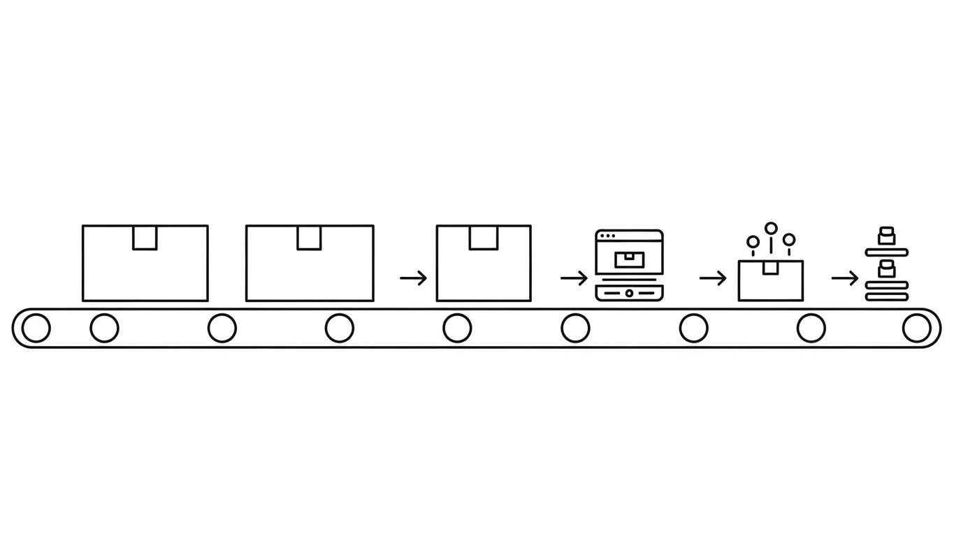
8. Rapid UI Feature Montage
MOFU | Feature Education & Demonstration
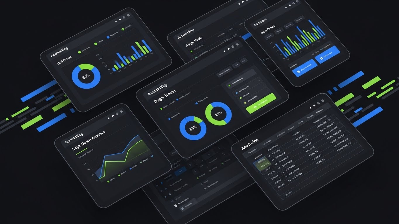
(UI Montage): The Full-Stack Ecosystem
The Visual & Narrative Approach
This composition is designed to show breadth and depth simultaneously. Multiple angled, semi-transparent screens overlap in a dynamic array, showcasing different modules: drill-down charts, pie graphs, and ledger grids. The cobalt blue and lime green palette creates a modern feel. Speed lines and motion blur on the edges direct the focus to the sharp, high-fidelity central data panel.
Psychological Impact & KPI Focus
- Niche Psychology: This addresses the "All-in-One" versus "Point Solution" debate. It visually demonstrates the Completeness of Vision of the platform. For a controller managing multiple disjointed tools, this montage promises a unified ecosystem.
- Operational Impact: Reduces the anxiety of Integration by showing all these modules living within the same visual and functional environment.
Strategic Implementation & Trade-offs
- Best Use Case: Main website hero video or product overview trailer.
- Strategic Trade-off: Can be overwhelming if the motion is too fast. The viewer needs enough time to recognize the specific modules (e.g., AP, AR, Reporting).
Companies using similar video content -
Workday Financial Management – Enterprise Financials – Revealing robust architecture behind the user interface.
Oracle NetSuite – Cloud ERP – Showing the structural integrity of the financial platform.
Acumatica – Cloud ERP – Transitioning from blueprint to polished financial management UI.
9. Lifestyle Stock with UI Overlay
MOFU | Building Trust & Credibility

(Augmented Reality): Empowering the Strategic CFO
The Visual & Narrative Approach
Humanizing the software is crucial for trust. This style features a high-quality photo of a professional financial controller—a woman with a confident expression—standing in a modern office. She interacts with an abstract, floating UI overlay displaying "Real-time Analytics" bubbles in translucent white and gold. The focus is sharp on her expression of relief and control.
Psychological Impact & KPI Focus
- Niche Psychology: This style targets the Ego and Identity of the persona. It positions the software as an tool that augments their capabilities rather than replacing their job. It addresses the fear of obsolescence by showing the human element as central.
- Operational Impact: Highly effective for LinkedIn, where professional identity is paramount. It bridges the gap between the human user and the digital tool.
Strategic Implementation & Trade-offs
- Best Use Case: Case study headers, testimonials, or LinkedIn thought leadership posts.
- Strategic Trade-off: Relies heavily on the quality of the stock footage. Generic "corporate smiling" stock will be ignored; the expression must convey genuine competence.
Companies using similar video content -
Microsoft Dynamics 365 Finance – ERP Financials – Dynamic showcase of integrated financial modules.
SAP S/4HANA Finance – Intelligent ERP – Montage of comprehensive financial management features.
Unit4 – ERP for Services – Overlapping screens demonstrating full financial suite.
10. Split Screen: Optimized Reality and UI
MOFU | Competitive Displacement

(Split Contrast): Visualizing the Automation ROI
The Visual & Narrative Approach
A classic "Before and After" comparison is elevated here. The left side is a desaturated, sepia-toned photograph of a messy desk with piles of paper and a calculator—the "Old World." The right side is a vivid azure and white digital environment showing a sleek, clean SaaS interface on a monitor, emanating a cool glow—the "New World." The contrast visualizes "Manual Chaos" versus "Automated Clarity."
Psychological Impact & KPI Focus
- Niche Psychology: This triggers the Pain of Inefficiency. It reminds the viewer of the stress of manual entry and offers the dopamine hit of the clean, organized solution.
- Operational Impact: It is a direct visualization of ROI (Return on Investment) in terms of time and sanity. It is particularly effective for "Competitive Displacement" campaigns targeting users of legacy on-premise software.
Strategic Implementation & Trade-offs
- Best Use Case: Direct response ads or "Why Switch?" landing pages.
- Strategic Trade-off: Avoid making the "before" state look too comical or ancient, or you risk alienating the user who is currently living in that reality. Frame it as "The Standard of Yesterday."
Companies using similar video content -
Vena Solutions – FP&A Software – Empowering finance professionals with strategic insights.
Planful – Financial Performance Management – Augmenting CFO capabilities with real-time analytics.
Certinia – ERP on Salesforce – Humanizing finance with intuitive UI overlays.
11. Abstract 3D AI Visualization
MOFU | ABM Awareness

(Abstract 3D AI): The Neural Network of Consolidation
The Visual & Narrative Approach
This style visualizes the "brain" behind the books. It utilizes a macro lens perspective with a shallow depth of field to focus on a complex neural network of silver and neon pink spherical nodes. Set against a deep digital void, these nodes pulse and magnetically merge via glowing filaments. This visually narrates "Intercompany Consolidation" not as a manual struggle with spreadsheets, but as an elegant, automated biological event where disparate data sources fuse into a unified core.
Psychological Impact & KPI Focus
- Niche Psychology: For Controllers managing multi-entity groups, consolidation is often a source of significant anxiety and error. This visual leverages Algorithmic Authority, reassuring the viewer that the platform handles complexity with the precision of a neural network. It reframes the "messy middle" of the month-end close as a sophisticated, automated synthesis.
- Operational Impact: It visually metaphors the Single Source of Truth. By showing the nodes connecting physically, it addresses the KPI of Data Accuracy, implying that no data is lost or altered in transit between subsidiaries.
Strategic Implementation & Trade-offs
- Best Use Case: Account-Based Marketing (ABM) ads targeting CFOs of holding companies or multi-national corporations.
- Strategic Trade-off: The high level of abstraction builds a "high-tech" perception but explains little about the actual workflow. It functions best as a hook to a technical whitepaper on "Automated Eliminating Entries."
Transitioning from the mechanics of consolidation to the presentation of results, the next style focuses on how data is consumed by the strategic leader.
Companies using similar video content -
Trintech – Financial Close Solutions – Contrasting manual chaos with automated clarity.
Auditoria.AI – AI-driven Finance Automation – Visualizing the shift from manual to intelligent processes.
Medius – AP Automation – Before/after of messy invoices versus streamlined digital.
12. Dynamic Data Visualization
MOFU | LinkedIn Organic

(Dynamic Data Viz): Elevating Metrics to Assets
The Visual & Narrative Approach
Data is brought out of the spreadsheet and into the spotlight. Stylized 3D bar charts rise confidently from a sleek dark surface, gradient-filled with sunset orange and deep purple to pop against the matte black background. Floating green arrows and percentage symbols orbit the structure in an isometric perspective. The animation focuses on the growth and motion of the bars, visualizing "KPI Performance" as a living, breathing financial ecosystem rather than a static historical record.
Psychological Impact & KPI Focus
- Niche Psychology: This appeals to the Strategic Architect persona—the CFO who wants to drive future performance. The upward, glowing trends trigger a desire for Growth and Visibility. It elevates the mundane task of reporting into an act of strategic storytelling.
- Operational Impact: It reinforces the concept of Real-Time Dashboards. By treating data as a 3D object with depth, it visually differentiates the user experience (UX) from the flat, grey interfaces of legacy ERP systems.
Strategic Implementation & Trade-offs
- Best Use Case: LinkedIn organic posts sharing "FP&A Best Practices" or quarterly benchmark reports.
- Strategic Trade-off: It is stylized "eye candy." It is excellent for engagement but should be paired with actual screenshots in the carousel to prove that the real UI is equally insightful.
While data is critical, the software is only as good as the people using it. The next style addresses the human side of the equation.
Companies using similar video content -
MindBridge – AI-Powered Audit & Analytics – Visualizing AI's neural network for audit insights.
Vic.ai – AI Autonomous AP – Abstract representation of AI-driven invoice processing.
DataRails – FP&A Software – Neural network for intelligent financial data analysis.
14. 2D Character-Driven Story
MOFU | Website Visitor Re-engagement

(Flat Character 2D): The Ease of User Adoption
The Visual & Narrative Approach
To counter the intimidation of complex enterprise software, this style adopts a radically approachable aesthetic. A stylized 2D character with pastel blue skin and simple geometric features sits at a floating desk, offering a casual "thumbs up." He is enveloped by smooth, flowing abstract shapes in soft yellow and white. The art style is flat, modern, and corporate vector-based, visualizing a Seamless Workflow where the user is supported, not overwhelmed.
Psychological Impact & KPI Focus
- Niche Psychology: This targets Implementation Anxiety. Buyers often worry, "Will my team revolt if I change the system?" This visual offers Cognitive Ease, promising a frictionless experience. The "thumbs up" is a universal signifier of satisfaction, directly addressing the retention of accounting talent.
- Operational Impact: Ideal for visualizing User Adoption and Collaboration. It shifts the focus from "features" to the "quality of life" for the finance team.
Strategic Implementation & Trade-offs
- Best Use Case: Retargeting (Display/Social) ads aimed at mid-level managers who will be the daily users.
- Strategic Trade-off: It risks looking "too SMB" (Small/Medium Business) if used in isolation. It works best as a retargeting layer to re-engage users who have already seen the high-tech branding.
As we move to the Bottom of Funnel (BOFU), we must shift from "ease of use" to "hard value." The next style materializes the financial argument.
Companies using similar video content -
Board International – Planning & Analytics Platform – Elevating financial metrics into dynamic assets.
Jedox – Enterprise Planning Software – Visualizing real-time data for strategic decision-making.
Tableau – Business Intelligence – Stylized 3D charts for interactive financial reporting.
15. Photorealistic 3D Renders
BOFU | ROI Justification

(Photorealistic 3D): Materializing Return on Investment
The Visual & Narrative Approach
When justifying the budget to the Board, abstract concepts must become solid assets. This style uses photorealistic rendering to turn "ROI" into physical wealth. Geometric polyhedrons made of brushed gold and polished black marble accumulate in a rising stair-step pattern on a reflective surface. Ray-traced lighting creates realistic reflections, grounding the graph in reality. It visualizes financial success not as a number on a screen, but as tangible, heavy, accumulated value.
Psychological Impact & KPI Focus
- Niche Psychology: The Economic Buyer (CEO/Board) operates on the logic of asset appreciation. This visual speaks their language by treating the software subscription not as an expense, but as capital accumulation. The premium materials subconsciously signal Solidity and Longevity.
- Operational Impact: Visualizes Profitability. It effectively anchors the "Business Case" slide in a pitch deck, subliminally reinforcing that the output of the software is "gold" (value) and "marble" (structure).
Strategic Implementation & Trade-offs
- Best Use Case: The "ROI" or "Pricing" section of a sales proposal or investor deck.
- Strategic Trade-off: It is purely metaphorical. It relies on the speaker or the accompanying text to connect the "gold blocks" to specific savings (e.g., FTE reduction, error avoidance).
Value is paramount, but in finance, security is non-negotiable. The next style visualizes the defense of that value.
Companies using similar video content -
Workato – Integration Platform – Explaining complex integrations with clear infographics.
Alteryx – Data Analytics – Storytelling through data transformation and insights.
16. 3D X-Ray Visualization
BOFU | Risk Mitigation

(3D X-Ray): Transparency in Security Architecture
The Visual & Narrative Approach
Security is often invisible, which makes it hard to sell. This style makes protection visible using a cutaway "X-Ray" technique. A digital server rack or vault is rendered with semi-transparent dark grey glass outer layers. As we look inside, we see a glowing internal core of intense translucent green light, representing Secured Data. The visual implies deep layers of impenetrable defense while simultaneously offering transparency—a paradox that is highly attractive in risk management.
Psychological Impact & KPI Focus
- Niche Psychology: The CFO's nightmare is a data breach. This visual addresses the Fear of Risk. By showing the "core" protected by engineered layers, it validates the security architecture without needing a technical diagram. It communicates, "We have nothing to hide, but your data is hidden from threats."
- Operational Impact: Critical for visualising Compliance (SOC2/GDPR). It shows that security is built into the core structure, not bolted on as an afterthought.
Strategic Implementation & Trade-offs
- Best Use Case: The "Security" or "Trust Center" page of the website.
- Strategic Trade-off: It is clinical and cold. It appeals strongly to the rational, risk-averse side of the buying committee (CIO/CISO), offering little emotional hook for the non-technical user.
Security provides peace of mind; stability provides operational control. The next style contrasts the chaotic market with your stable platform.
Companies using similar video content -
Acumatica – Cloud ERP – Illustrating seamless user adoption and workflow ease.
Sage Intacct – Cloud Financial Management – Character-driven stories for user-friendly finance.
Yooz – AP Automation – Playful characters guiding through automated invoice processing.
17. Hyper-lapse Stock Footage with Data
BOFU | Driving Demo Requests

(Hyper-lapse Overlay): Stability Amidst Market Velocity
The Visual & Narrative Approach
This style juxtaposes the chaos of the external environment with the control of the internal platform. The background is real-world hyper-lapse footage of a city street at night, with traffic turning into frantic streaks of light (bokeh), symbolizing the speed and unpredictability of modern business. Floating in the foreground, unaffected by this motion, are perfectly sharp, static white UI elements—checkmarks, "STABILITY" tags, and graphs. The message is clear: The world rushes; we provide the Anchor.
Psychological Impact & KPI Focus
- Niche Psychology: Finance leaders often feel like they are constantly "catching up." This visual offers them a sense of Control. It promises that the platform is a steadying force that allows them to observe the chaos without being swept away by it.
- Operational Impact: High-performing for Bottom-of-Funnel (BOFU) Ads aimed at driving demo requests. It visually argues that the software is the prerequisite for handling the "Velocity" of modern commerce.
Strategic Implementation & Trade-offs
- Best Use Case: Instagram Reels, LinkedIn Stories, or YouTube Shorts (vertical format).
- Strategic Trade-off: The UI elements must be simplified for the small screen. Complex dashboards will get lost against the busy background; stick to simple status indicators (e.g., "Reconciled").
Stability attracts interest, but the promise of seamless integration closes the deal. The next style dismantles the "rip and replace" fear.
Companies using similar video content -
OneStream Software – Corporate Performance Management – Materializing financial ROI as tangible assets.
CCH Tagetik – Financial Performance Platform – Photorealistic rendering of accumulated business value.
Coupa – Spend Management – Tangible visualization of cost savings and financial gains.
18. Isometric 2D Motion Design
BOFU | Objection Handling & Friction Reduction
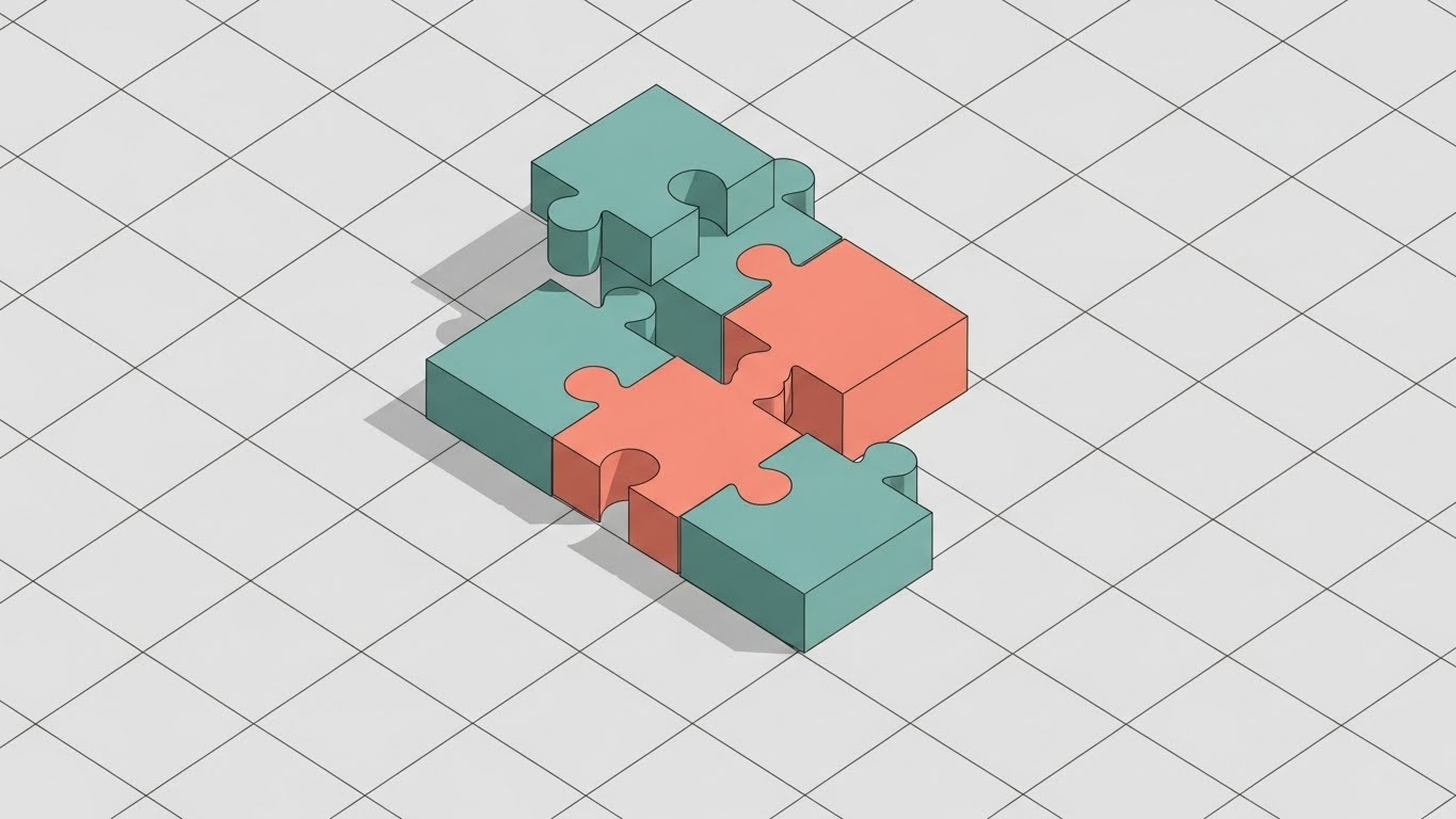
(Isometric Motion): The Frictionless Integration
The Visual & Narrative Approach
One of the biggest barriers to sale is the fear of a difficult implementation. This style uses clean, satisfying geometry to dismantle that objection. Muted teal and salmon-colored puzzle pieces snap together with a satisfying, magnetic precision on a light grey grid floor. There are no jagged edges, no forcing—just a perfect fit. The isometric angle gives a "god's eye view" of the process, visualizing Seamless Integration and easy setup.
Psychological Impact & KPI Focus
- Niche Psychology: This triggers the satisfaction of Order and Completion. It directly addresses Integration Anxiety ("Will this break my ERP?"). The visual metaphor assures the prospect that the software is a "missing piece" that fits existing workflows, not a disruption.
- Operational Impact: Perfect for visualizing API Connectors. It simplifies the complex reality of data mapping into a binary "it fits" visual, reducing the perceived friction of onboarding.
Strategic Implementation & Trade-offs
- Best Use Case: "Implementation Guide" emails or "How it Works" sections sent during the contract negotiation phase.
- Strategic Trade-off: It is a metaphor. Technical buyers will eventually want to see the actual API documentation, but this visual opens the door for that conversation by lowering defenses.
With technical fears assuaged, the buyer needs to see their future self in the solution. The next style targets their identity.
Companies using similar video content -
Workiva – Financial Reporting & Compliance – X-ray transparency into robust security architecture.
Diligent – GRC & Board Management – Visualizing layered data protection and compliance.
MetricStream – GRC Platform – Cutaway views of robust financial risk management.
19. Generative AI Realistic Character video
BOFU | The Economic Buyer

(Gen AI Realistic): Mirroring the Strategic Leader
The Visual & Narrative Approach
To close the deal, the buyer needs to see themselves in the success story. This style uses high-fidelity Generative AI to create a hyper-specific persona: a distinguished CFO in his 50s, silver hair, sharp navy suit, standing in a high-rise boardroom. He holds a tablet, smiling confidently as the screen emits a soft blue glow on his face. The city skyline is blurred behind him. This is not just a stock photo; it is a constructed image of Executive Confidence and strategic foresight.
Psychological Impact & KPI Focus
- Niche Psychology: This leverages Social Proof and Identity. It appeals to the CFO's ego and self-image as a modern, tech-enabled leader. It validates their status and suggests that the ultimate output of the software is not just a report, but the feeling of control depicted in the image.
- Operational Impact: Highly effective for LinkedIn Thought Leadership headers. It humanizes the BOFU stage, reminding the buyer that this purchase is a career-enhancing move.
Strategic Implementation & Trade-offs
- Best Use Case: Thumbnails for "CFO Success Series" videos or Case Study PDFs.
- Strategic Trade-off: Authenticity is key. If the AI generation has artifacts (e.g., unnatural hands), it damages trust instantly. It functions as a mood setter, not a product demo.
Finally, we must satisfy the gatekeeper of the infrastructure. The last style speaks the language of the IT department.
Companies using similar video content -
Kyriba – Treasury Management System – Providing stability amidst market velocity with real-time data.
Trovata – Cash Management Platform – Anchoring financial operations in a fast-paced world.
HighRadius – Autonomous Finance Platform – Static UI elements over dynamic market footage.
20. Futuristic Neon/Dark Mode
BOFU | The Technical Buyer

(Futuristic Neon): The Architecture of Data Purity
The Visual & Narrative Approach
The final hurdle often lies with the IT department. This style speaks their language. We view a perspective down an infinite corridor of abstract server racks in a pitch-black environment. The only illumination comes from cascading streams of matrix-green binary code and the glowing neon outlines of the servers. It visualizes Cloud Infrastructure and Data Purity. It looks like the inside of a machine that never sleeps and never errors.
Psychological Impact & KPI Focus
- Niche Psychology: For the CIO/CTO, "beauty" is code quality, uptime, and security. This aesthetic validates the Technical Robustness of the platform. It signals that the backend is modern, scalable, and powerful—distancing the solution from legacy, on-premise "dinosaurs."
- Operational Impact: Essential for the "Technical Specs" or "Platform" pages. It serves as a visual guarantee of uptime and data integrity, helping the champion (CFO) win over the gatekeeper (CIO).
Strategic Implementation & Trade-offs
- Best Use Case: Backgrounds for technical webinars or headers for API documentation.
- Strategic Trade-off: It can feel cold and alienating to the finance user if used in the wrong context. It must be reserved for technical validation moments in the funnel.
Companies using similar video content -
Fivetran – Data Integration Platform – Visualizing frictionless integration of financial data.
Celigo – Integration Platform as a Service – Seamlessly connecting disparate financial systems.
SnapLogic – Integration Platform – Puzzle pieces snapping for perfect data flow.
21. 2D Animation & UI Composition
Onboarding | Accelerating Time-to-Value

(2D Celebration): Visualizing the Launch of Efficiency
The Visual & Narrative Approach
The moment a client signs, the clock starts on "Time-to-Value." This style captures that excitement. A stylized 2D character in professional turquoise attire interacts with a prominent, floating yellow "Start" button. The moment of contact triggers a dynamic rocket trajectory leaving a trail of light that sweeps upward through abstract color fields. The composition blends character animation with UI symbolism, creating a celebratory, energetic atmosphere that marks the beginning of the partnership.
Psychological Impact & KPI Focus
- Niche Psychology: Implementation is often viewed with dread—a long, painful slog of data migration. This visual reframes the "Kickoff" as a launch event, triggering Anticipation and Optimism. It validates the buyer's decision to modernize.
- Operational Impact: Directly addresses Time-to-Value (TTV). By visualizing speed and upward momentum, it sets the expectation for a swift, successful onboarding process, combating buyer's remorse.
Strategic Implementation & Trade-offs
- Best Use Case: The "Welcome Aboard" email sequence or the first screen of the onboarding wizard.
- Strategic Trade-off: The "rocket" metaphor is common. To maintain premium authority, ensure the art style aligns strictly with your brand palette and doesn't veer into "casual gaming" aesthetics.
Companies using similar video content -
Workday Financial Management – Enterprise Financials – Mirroring the confident, strategic CFO persona.
SAP S/4HANA Finance – Intelligent ERP – Portraying executive confidence through AI-generated leaders.
BlackLine – Financial Close Automation – AI-generated executive endorsing automated processes.
22. Isometric 3D Workflow
Onboarding | Reducing Implementation Friction

(Isometric Clay): Constructing the Bridge to Automation
The Visual & Narrative Approach
This style softens the technical complexity of integration. Rendered in a soft, matte "clay" 3D aesthetic, miniature figures in lavender and grey collaborate to assemble a bridge connecting two data islands. They pass blocks representing data packets with precision. The environment is a clean, white digital landscape with soft, diffuse lighting. It visualizes "Team Implementation" not as a chaotic construction site, but as an organized, satisfying assembly of parts.
Psychological Impact & KPI Focus
- Niche Psychology: This addresses Change Management Anxiety. It reassures the finance team that the transition from their legacy system (Island A) to the new platform (Island B) is a bridged, supported process. The "toy-like" texture evokes Cognitive Ease and manageability.
- Operational Impact: Ideal for visualizing Data Migration workflows. It simplifies the concept of API mapping and historical data import, reducing the perceived friction of the "switch."
Strategic Implementation & Trade-offs
- Best Use Case: Implementation documentation, "Getting Started" guides, or kickoff presentation decks.
- Strategic Trade-off: The "cute" factor lowers defenses but can undermine authority if used for serious compliance topics. Use it for process explanation, not regulatory explanation.
Companies using similar video content -
Oracle EPM Cloud – Enterprise Performance Management – Showcasing robust, futuristic cloud architecture.
Microsoft Dynamics 365 Finance – ERP Financials – Visualizing data purity within a dark mode interface.
SAP BPC – Business Planning and Consolidation – Neon-lit architecture for advanced financial planning.
23. Clean UI Workflow (Light Mode)
Onboarding | Self-Serve Onboarding
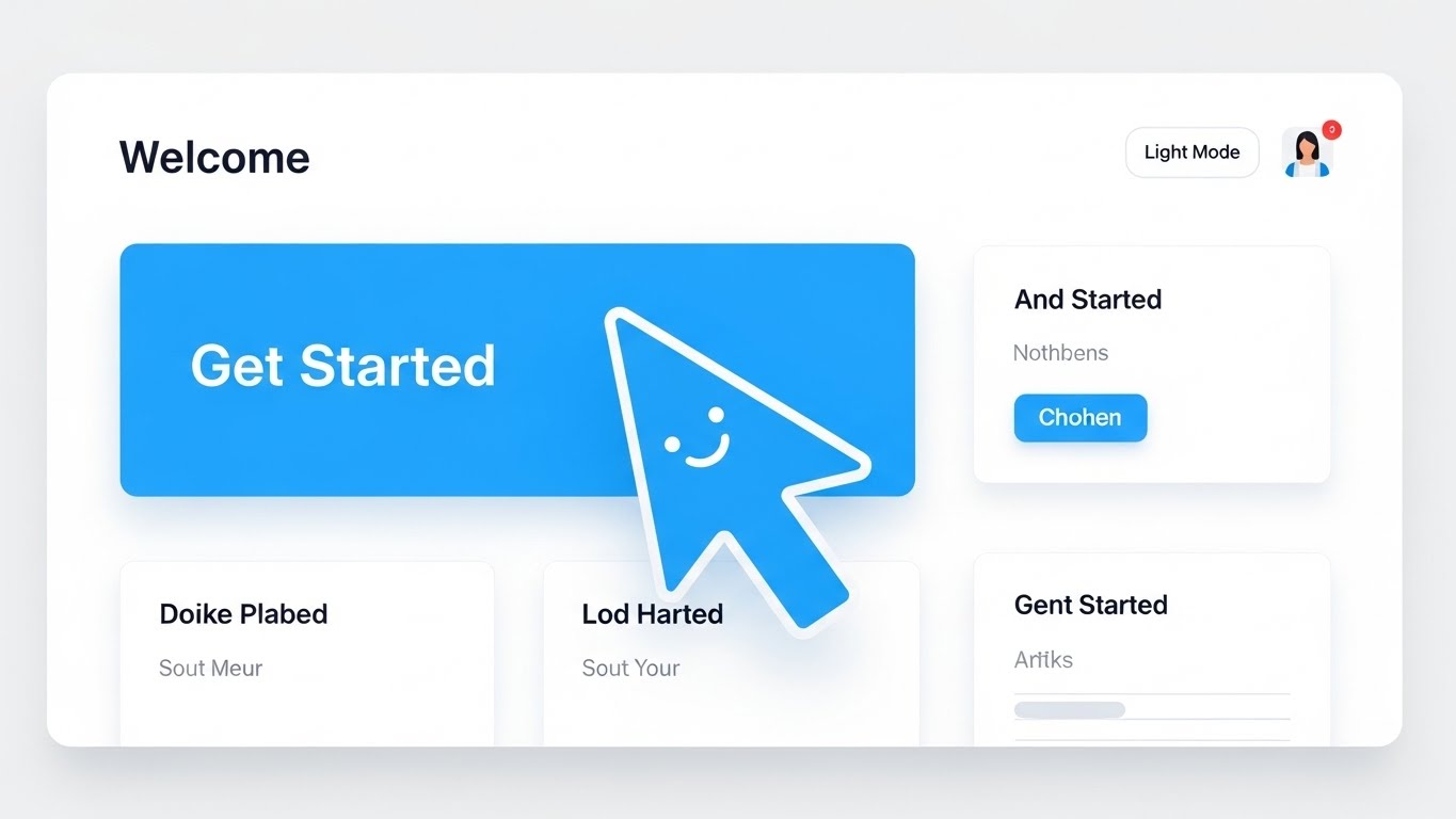
(Minimalist UI): The Simplicity of Self-Service
The Visual & Narrative Approach
For Product-Led Growth (PLG), clarity is king. This style features a high-fidelity, ultra-clean mock-up of a "Welcome" dashboard in Light Mode. The palette is airy—sky blue and pure white—stripping away all non-essential navigational noise. A large, oversized cursor with a friendly "smile" icon hovers over a primary "Get Started" action. It is a direct invitation to click, emphasizing the intuitive nature of the platform.
Psychological Impact & KPI Focus
- Niche Psychology: Finance users are traumatized by clunky, grey ERP interfaces. This "consumer-grade" aesthetic signals Usability and Modernity. It promises that the software is as easy to use as their favorite personal apps.
- Operational Impact: Drives Product Adoption. By highlighting the clear "happy path" (the Get Started button), it reduces the "Time to First Action," a critical metric in self-serve onboarding.
Strategic Implementation & Trade-offs
- Best Use Case: In-app tooltips, welcome modals, or "Quick Start" video overlays.
- Strategic Trade-off: It shows the UI in its simplest state. Be careful not to over-promise simplicity if the actual deep-dive workflow requires complex configuration.
Companies using similar video content -
FloQast – Month-End Close Software – Celebrating the launch of efficient financial operations.
Sage Intacct – Cloud Financial Management – Dynamic animation for accelerating time-to-value.
24. Macro UI Micro-Interactions
Onboarding | Knowledge Base & FAQ Videos

(Macro Interaction): The Power of a Single Click
The Visual & Narrative Approach
Sometimes, the devil is in the details. This style uses a macro lens to focus intensely on a single UI micro-interaction: a toggle switch flipping from dormant grey to active emerald green. A subtle lens flare triggers at the moment of activation, and the pixel texture of the screen creates a sense of tactile reality. It dramatizes the moment of "Configuration," making a simple setting change feel impactful and precise.
Psychological Impact & KPI Focus
- Niche Psychology: This triggers the Satisfaction of Completion. It reinforces the idea that powerful financial controls (e.g., "Enable Auto-Reconciliation") are just a toggle away. It builds confidence in the user's ability to control the system.
- Operational Impact: Highly effective for Knowledge Base content. It focuses the user's attention on the exact location and action required to solve a problem, reducing support ticket resolution time.
Strategic Implementation & Trade-offs
- Best Use Case: 10-second GIF loops for FAQ articles or "New Feature" release notes.
- Strategic Trade-off: It is hyper-specific. It provides zero context about where this toggle is located in the menu. It must be paired with a wider shot to establish location.
Companies using similar video content -
BlackLine – Financial Close Automation – Constructing a smooth bridge for data migration.
Trintech – Financial Close Solutions – Visualizing organized, collaborative implementation workflows.
25. 2D Graphics Over Live Action
Retention | Reducing Support Overhead

(Augmented Support): Humanizing the Helpdesk
The Visual & Narrative Approach
Software is only as good as the support behind it. This style blends the human element with digital assurance. A photo of a friendly support agent is overlaid with floating 2D vector icons—speech bubbles, life-buoys, and chat symbols—in trusted corporate blue. The icons orbit the agent, visually communicating that help is always active, accessible, and human-centric.
Psychological Impact & KPI Focus
- Niche Psychology: Finance professionals work under high pressure during close periods. The fear of being "stuck" is real. This visual provides Emotional Security. It says, "You are not alone; a real person is here to help."
- Operational Impact: Reduces Churn. Customers often leave not because of the software, but because of poor support experiences. This visual reinforces the value of the "Success Team" as part of the subscription.
Strategic Implementation & Trade-offs
- Best Use Case: "Contact Support" pages, email signatures of CSMs, or while a live chat is loading.
- Strategic Trade-off: The agent must look genuine. Avoid "model" looks; aim for "competent colleague."
Companies using similar video content -
DataRails – FP&A Software – Showcasing the simplicity of self-service financial planning.
Cube Software – FP&A Platform – Minimalist UI for intuitive, quick product adoption.
26. Aspirational Stock Montage
Retention | Reducing Churn

(Team Success): Celebrating the Month-End Close
The Visual & Narrative Approach
This style moves away from the screen to show the result of the software. A high-quality stock montage captures a diverse finance team in a sunlit, modern office. They are high-fiving and smiling around a laptop, celebrating a win. The lighting is warm and natural, contrasting with the cool tones of the software UI. It visualizes "Team Alignment" and the relief of a stress-free close.
Psychological Impact & KPI Focus
- Niche Psychology: It appeals to the VP of Finance's Aspiration for a happy, retained team. Burnout is a major issue in accounting. This image sells the "culture" that efficient software creates—one where people leave work on time.
- Operational Impact: Reinforces Net Revenue Retention (NRR). Happy teams don't churn software. This style reminds the decision-maker that the tool is a morale booster, not just a calculator.
Strategic Implementation & Trade-offs
- Best Use Case: Quarterly Business Review (QBR) presentations, renewal emails, or "Year in Review" campaigns.
- Strategic Trade-off: It can feel generic if the "celebration" feels forced. Ensure the laptop on the table clearly displays your dashboard to ground the stock footage in your product reality.
Companies using similar video content -
Workiva – Financial Reporting & Compliance – Dramatizing the power of a single configuration click.
Auditoria.AI – AI-driven Finance Automation – Highlighting precise micro-interactions for task completion.
27. Low-Poly 3D Modeling
Retention | Trial/Freemium User Activation

(Playful Poly): Gamifying the Workflow
The Visual & Narrative Approach
To combat user fatigue, this style introduces a touch of "Gamification." A simple, faceted low-poly rocket ship in bold primary colors (Red, Blue, Yellow) launches from a digital pad. The aesthetic is clean, geometric, and inherently playful. It breaks the monotony of spreadsheets, offering a visual "reward" for completing a task or launching a new project within the platform.
Psychological Impact & KPI Focus
- Niche Psychology: Accounting is repetitive. This visual leverages Dopamine Loops. By associating task completion (e.g., "Reconciliation Done") with a fun, rising visual, it creates a micro-moment of joy.
- Operational Impact: Drives Daily Active Users (DAU). It encourages users to log in and complete tasks to trigger the positive visual feedback loop.
Strategic Implementation & Trade-offs
- Best Use Case: "Empty State" screens (e.g., "Start your first project!") or success modals after a major task is completed.
- Strategic Trade-off: It is not "serious." Do not use this for critical error messages or compliance alerts. It is reserved for celebration and activation.
Companies using similar video content -
Vena Solutions – FP&A Software – Humanizing support with overlaid digital assistance.
Planful – Financial Performance Management – Blending human expertise with digital support tools.
28. Dark Mode UI Showcase
Expansion | Driving Deep Feature Adoption

(Neon Dark Mode): The Controller's Cockpit
The Visual & Narrative Approach
For the power user, "Dark Mode" signifies serious, focused work. This style showcases the platform's advanced analytics capabilities on a monitor angled in a dark void. The dashboard glows with neon blue and red data points—heatmaps, scatter plots, and complex grids. The reflection on the dark surface adds depth. It visualizes the platform as a high-performance instrument for deep financial analysis.
Psychological Impact & KPI Focus
- Niche Psychology: This appeals to the Data Scientist/Analyst persona within the finance team. It signals "Pro Features." It differentiates the "Basic" view from the "Advanced" view, triggering a desire to upgrade for deeper insights.
- Operational Impact: Drives Upsell/Cross-sell. It visually justifies the cost of the "Enterprise" tier by showing the sophistication of the analytics available.
Strategic Implementation & Trade-offs
- Best Use Case: "New Feature" announcements for advanced reporting modules or "Upgrade to Pro" landing pages.
- Strategic Trade-off: Dark mode can sometimes obscure readability in a video. Ensure the data highlights are high-contrast so the complexity is visible even on small screens.
Companies using similar video content -
FloQast – Month-End Close Software – Celebrating team success and stress-free month-end closes.
Sage Intacct – Cloud Financial Management – Aspirational montage of a thriving finance team.
29. 3D Parallax UI Presentation
Expansion | Driving Upsell/Cross-sell

(Layered Glass): Visualizing Multi-Entity Depth
The Visual & Narrative Approach
As companies grow, they acquire subsidiaries. This style visualizes that complexity with elegance. Three semi-transparent glass screens float in depth, one behind the other, creating a parallax effect. Each screen represents a different entity, displaying "Multi-Entity Management" features in iridescent gold and purple. The layered composition visually explains the concept of "Consolidated Views"—seeing through the layers to the bottom line.
Psychological Impact & KPI Focus
- Niche Psychology: This targets the CFO of Holding Companies. It addresses the pain of disjointed data across subsidiaries. The "transparency" of the glass metaphorically represents Operational Visibility across the entire organization.
- Operational Impact: Supports Expansion Revenue. It specifically markets the "Multi-Entity" module, a high-value add-on for growing customers.
Strategic Implementation & Trade-offs
- Best Use Case: LinkedIn ads targeting companies with >500 employees or "Growth" webinar backgrounds.
- Strategic Trade-off: The text on the back layers will be blurry. Use the front layer for the clear value proposition (e.g., "One Click Consolidation") and the back layers for texture.
Companies using similar video content -
Pigment – Business Planning Platform – Gamifying financial workflows with playful visuals.
Jedox – Enterprise Planning Software – Low-poly elements for engaging user activation.
30. Holographic UI over 3D Render
Expansion | Driving Referrals & Advocacy

(Holographic Reward): The Premium Standard
The Visual & Narrative Approach
The final stage of the funnel is advocacy. This style treats the referral reward as a precious object. A realistic 3D pedestal holds a glowing, rotating holographic gem or token in cyan and transparent white. It represents the value of the "Referral Reward" or the "Certified Partner" status. The lighting is ethereal and premium, combining the tactile realism of the pedestal with the futuristic projection of the hologram.
Psychological Impact & KPI Focus
- Niche Psychology: This appeals to Status and Exclusivity. It frames the act of referring a peer not as a transactional favor, but as joining an elite circle of partners. It elevates the brand to a "Premium Standard."
- Operational Impact: Drives Net Promoter Score (NPS) and Referral traffic. It makes the reward feel tangible and valuable.
Strategic Implementation & Trade-offs
- Best Use Case: "Refer a Friend" program emails or social posts celebrating "Partner of the Month."
- Strategic Trade-off: It is purely symbolic. Ensure the actual reward details (e.g., "$500 credit") are clearly stated in the accompanying text, as the visual focuses on the feeling of value.
The Visual Operations Doctrine: A Strategic Knowledge Base
We have explored 30 distinct visual styles, ranging from the visceral relief of shattering chaos to the precision of holographic data. However, a library of styles is not a strategy. To truly transform your Accounting SaaS from a "tool" into a "market leader," you must operationalize these visuals.
This concluding section synthesizes the insights from all 30 styles into a cohesive business framework. This is your "Visual Operations Doctrine"—a guide to aligning your visual assets with your financial goals, ensuring that every pixel drives a KPI.
The Visual Ledger – Strategic Alignment & Architecture
Pre-Production Strategy | Goal: Defining the "Why" and "Who"
Before a single frame is rendered, the visual strategy must be aligned with the financial reality of the user. This segment defines the foundational "Visual Operating System" for your brand.
- The Cognitive Load Audit: Financial professionals are drowning in data. Before creating content, audit your user's current mental state. If the topic is complex (e.g., "Intercompany Eliminating Entries"), use High-Abstraction Styles (Style 11, 2) to simplify. If the topic is tactical (e.g., "Approving an Invoice"), use High-Fidelity Styles (Style 23, 24) to clarify. Advids specializes in this audit, ensuring you don't use "loud" visuals for "quiet" tasks.
- Role-Based Visual Mapping: The CFO and the AP Clerk need different visual languages.
- The Strategic Leader (CFO): Responds to Styles 15, 12, 19. They want to see outcomes (Gold, Growth, Stability).
- The Operator (Controller/Clerk): Responds to Styles 8, 24, 28. They want to see interfaces (Toggles, Dark Mode, Grids).
- The "Glanceability" Standard: During month-end close, users don't have time to watch 2-minute videos. Adopt a "Glanceability" standard for support content. Use Style 24 (Macro Interaction) to create 5-second loops that solve specific problems instantly. If the user cannot understand the solution in <5 seconds, the visual has failed.
- Brand Voice Consistency: Your marketing visuals (TOFU) and your product visuals (BOFU) often look like they come from different companies. Use Style 8 (UI Montage) to bridge this gap, ensuring that the "marketing promise" visually matches the "product reality."
- The Advids Strategic Audit: Defining this "Visual Operating System" requires an external eye. Advids specializes in auditing your existing asset library to identify gaps between your "Sales Pitch" visuals and your "Customer Success" visuals, ensuring a unified narrative arc from click to close.
- Standardization vs. Customization: For core features (GL, AP/AR), use standardized, scalable styles like Style 23 (Clean UI). Reserve bespoke, high-budget styles like Style 19 (Gen AI Character) for "Category Creation" campaigns where emotional resonance is required to break market inertia.
- The Cross-Departmental Bridge: Sales sells "Magic" (Style 1), but Support supports "Mechanics" (Style 4). Use your visual style guide to align these departments. A shared visual vocabulary ensures that the feature Sales promised is the same feature Support explains.
- Legacy System Integration: The biggest competitor is "the old way." Use Style 10 (Split Contrast) not just in ads, but in onboarding to visually validate the upgrade. Continually remind the user why they switched by visually contrasting the old friction with the new flow.
- Accessibility in Finance: Financial teams are diverse. Ensure your Style 14 (Character Stories) and motion graphics adhere to WCAG accessibility standards (contrast, subtitles). A visual strategy that excludes users with visual impairments is a liability.
- The Mobile-First Mandate: CFOs approve invoices on their phones. Ensure all styles, especially Style 12 (Dynamic Data Viz), are legible on mobile screens. If the data is unreadable on a 9:16 vertical screen, it is useless to the executive on the move.
Asset Allocation – Operational Adoption & Implementation
Deployment Strategy | Goal: Embedding Visuals into Workflow
A video that sits on YouTube is marketing; a video embedded in the workflow is infrastructure. This segment focuses on deploying your visual assets to drive adoption and reduce friction.
- Overcoming "Big Brother" Anxiety: AI and automation can feel threatening. Use Style 9 (Lifestyle with Overlay) to frame automation as "Augmentation," not "Replacement." Visual empathy is critical to getting buy-in from the mid-level accounting staff who fear obsolescence.
- The Micro-Learning Shift: Replace the 50-page PDF manual with a library of 30-second clips using Style 24 (Macro Interaction). Map these clips to specific error messages. If a user gets an "Unbalanced Entry" error, show them the 10-second clip on how to fix it, right there in the UI.
- Just-in-Time Support: Embed Style 22 (Isometric Workflow) videos directly into the software's "Help" widgets. Context-aware video support reduces context switching, keeping the user in the flow of work rather than forcing them to search an external knowledge base.
- Gamification of Training: Use Style 27 (Low Poly) to visually reward training completion. Create a "Certification" track where users unlock new visual badges for mastering modules. This taps into the psychological need for completion and mastery.
- Reducing Support Ticket Volume: There is a direct correlation between proactive visual guides and reduced call center load. Deploy Style 18 (Isometric Motion) in your "Known Issues" or "Common Setup" emails to preemptively answer questions before a ticket is raised.
- Remote Onboarding: In a distributed work environment, you cannot rely on in-person seminars. Use Style 7 (Wireframe to Reality) to conduct "virtual walkthroughs" that simulate the architectural understanding of a whiteboard session, scaling your onboarding globally.
- Standard Operating Procedures (SOPs): Text-based SOPs are ignored. Transform your critical SOPs (e.g., "Month-End Closing Checklist") into Style 4 (Line Art) animations. This ensures the "Source of Truth" is engaging and unambiguous, reducing compliance errors.
- Feedback Loops: Use interactive video elements (end cards on Style 25) to ask, "Did this help?" This data loop allows you to refine your visual assets based on actual user utility, not just creative intuition.
- Scalable Localization: Your platform is global; your visuals must be too. Style 2 (Abstract Organic) and Style 6 (Minimalist Vector) are language-agnostic. Prioritize these styles for core concepts to minimize the cost of localizing text-heavy assets for different regions.
- Leadership Communication: When the CFO presents to the Board, give them the tools to shine. Provide them with Style 15 (Photorealistic ROI) slides/clips they can insert into their own decks. You become a partner in their success by making them look good.
Compounding Value – Measuring Impact & Future-Proofing
ROI & Evolution | Goal: Measuring Success and Looking Ahead
The visual strategy must prove its worth. This segment defines how to measure their return and prepare for the next wave of technology.
- Beyond "Views": Vanity metrics (views/likes) are irrelevant to a CFO. Define actionable KPIs: "Reduction in Onboarding Time," "Feature Adoption Rate" for Style 28, or "Decrease in Ticket-to-Resolution Time" for Style 24. Tie every pixel to a percentage point.
- The "Idle Time" Metric: High idle time in software often means confusion. Correlate reduced idle time with the deployment of Style 23 (Clean UI) tooltips.
- Compliance Velocity: How fast can your user base adapt to a new regulation (e.g., a tax code change)? Measure the speed of compliance adoption when introduced via Style 5 (Kinetic Typography - implied) versus text emails. Speed is a competitive advantage.
- Retention and Churn: Track the churn rate of cohorts exposed to the "Welcome Series" (Style 21) versus those who were not. High-quality visual onboarding is often the strongest predictor of long-term retention (LTV).
- The AI Visual Frontier: The future is generative. Prepare for real-time video generation where Style 12 (Dynamic Data Viz) is not a pre-rendered video, but a live, personalized video report generated instantly for each user based on their specific financial data.
- Scalability of Assets: Build a library, not a landfill. Construct your After Effects projects and 3D scenes (like Style 22) modularly. This allows you to update the UI within the video without re-animating the entire scene when the software updates.
- The Advids Partnership: Scale requires a partner. Advids acts as your "Visual Scale Engine," maintaining the integrity of these 30 styles while producing the volume of assets required for a growing feature set. We ensure that as your platform evolves, your visual language evolves with it, preventing "Asset Rot."
- Benchmarking Success: "Good enough" is a risk. Regularly benchmark your visual standard against B2C apps, not just B2B competitors. Your users compare your experience to their banking app, not their old ERP.
- The ROI of Safety: In finance, "Safety" is accuracy. Quantify the reduction in data entry errors or reconciliation mismatches attributed to better visual training (Style 4). This is a direct "Cost Savings" argument you can present to your buyers.
- Final Call to Innovation: Treat video as infrastructure. It is not "content" to be consumed and forgotten; it is the interface through which your users understand your value. By implementing this Visual Operations Doctrine, you stop selling software and start selling the vision of financial mastery.
This concludes the "Video Style Guide for Accounting Reporting Software & SaaS Platform."
Companies using similar video content -
Anaplan – Connected Planning Platform – Showcasing advanced analytics in a dark mode cockpit.
OneStream Software – Corporate Performance Management – High-performance dark mode for deep financial analysis.
Author & Editor Bio


