
Introduction: Visualizing the End of Friction
The modern finance office is at a crossroads. For decades, the flow of revenue—the lifeblood of any enterprise—has been choked by manual reconciliation, disconnected spreadsheets, and the "black box" of legacy ERPs. But a new era of Accounts Receivable (AR) Automation is emerging, one that promises not just to digitize paper, but to fundamentally restructure how we perceive and manage liquidity.
For the CFO and the AR Manager, the challenge is no longer just about "getting paid." It is about visibility and velocity. It is about transforming the accounts receivable function from a back-office necessity into a strategic powerhouse that drives working capital optimization. However, communicating this shift requires more than just spreadsheets; it requires a compelling visual language that bridges the gap between complex algorithms and tangible business outcomes.
The opportunity cost of the status quo is staggering. Recent data reveals that businesses utilizing specialized AR automation have observed a 32% decrease in DSO (Days Sales Outstanding), effectively unlocking millions in trapped working capital. Conversely, the physical friction of manual processing continues to drain resources, with costs estimated between $12.88-$19.83 per invoice for manual handling.
This guide is designed for the forward-thinking "Finance Architect." We have curated 30 distinct video styles—starting with the first set here—that effectively visualize the transition from friction to flow. These examples are not just aesthetic choices; they are strategic tools designed to reduce cognitive load, build trust in autonomous systems, and clearly articulate the value of Touchless Finance.
1. The Geometry of Cash Flow Optimization
TOFU | Market Education

The Visual & Narrative Approach
This style utilizes Abstract 2D Motion Graphics to simplify the complex concept of "Cash Flow Optimization." The visual narrative begins with a chaotic cluster of jagged, red geometric shapes at the top, representing the friction of manual processing—disparate invoices, unallocated payments, and data errors. These elements descend into a sleek, funnel-shaped filter mechanism. As they pass through, they are transformed into streamlined, smooth, pill-shaped elements in vivid coral and slate blue. The narrative focus here is purely on the transformation—the "before and after" state of your financial data. The clean, void-like white background removes all distraction, forcing the viewer to focus solely on the mechanism of order.
Psychological Impact & KPI Focus
Psychologically, this style leverages the brain's preference for symmetry and order. The transition from "jagged" (danger/error) to "smooth" (safe/resolved) triggers a sense of relief and cognitive ease. This is directly tied to the KPI of Operational Efficiency and Error Reduction. It visually validates the promise that your software acts as a stabilizing force, turning the anxiety of disorderly data into a predictable, managed flow.
Strategic Implementation & Trade-offs
- Best Use Case: Top of Funnel (TOFU) social media ads where you have 3-5 seconds to grab attention. It works best for high-level concepts like "Chaos to Clarity."
- Duration: Short loops (6-10 seconds) or brief explainers (15-30 seconds).
- Trade-off: While excellent for conceptual buy-in, this abstract style does not show the actual UI. It sells the result, not the method. It is optimal for brand awareness but requires supporting content to demonstrate specific functionality.
Companies using similar video content -
HighRadius – Cash Flow Forecasting – Transforms chaotic data into predictable cash flow.
Tesorio – Cash Flow Performance – Organizes financial chaos into streamlined liquidity.
BlackLine – Financial Close Automation – Simplifies complex reconciliation into clear, ordered results.
2. The Velocity of Automated Finance
TOFU | Brand Awareness

The Visual & Narrative Approach
This Bold Kinetic Typography style is designed to convey speed and urgency without inducing stress. The composition features large, blocky abstract shapes that imply text ("AUTOMATED FINANCE") without needing to be fully legible, rushing forward in a dynamic, diagonal "Dutch angle." The palette of electric yellow and deep black signals high energy and caution-free speed. The motion blur applied to the edges enhances the sensation of velocity, suggesting that your software propels the finance function forward. The matte finish of the shapes keeps the visual grounded and professional, avoiding a "gaming" aesthetic while maintaining excitement.
Psychological Impact & KPI Focus
This style addresses the "need for speed" in collections. The forward momentum targets the viewer's desire for Faster Time-to-Revenue and accelerated Cash Application. By using high-contrast colors like yellow and black, it commands immediate attention and associates your brand with agility and power. It combats the perception of finance as a slow, bureaucratic department, repositioning it as a dynamic engine of growth.
Strategic Implementation & Trade-offs
- Best Use Case: Instagram Reels, TikTok, or LinkedIn pre-roll ads where sound might be off. The kinetic movement acts as the "hook."
- Duration: Very short (5-15 seconds).
- Trade-off: This is a high-energy style that may feel too aggressive for conservative banking clients if overused. It is best used as a "pattern interrupt" in a feed rather than a core educational tool. It captures interest but does not educate on process.
Companies using similar video content -
Billtrust – Payment Cycle Management – Accelerates invoice-to-cash with dynamic speed.
Versapay – Collaborative AR – Propels financial operations with urgent, high-energy automation.
Sidetrade – AI-powered AR – Drives faster time-to-revenue with intelligent velocity.
3. The Zero-Touch Ecosystem
TOFU | Skippable Pre-Roll Ad

The Visual & Narrative Approach
The Abstract 2D Glossy style offers a stark contrast to the previous high-energy examples. It presents a serene, "zero-gravity" arrangement of glossy, pearl-white spheres and soft silver rounded rectangles. Thin, elegant mint-green lines connect these floating elements, visualizing a "zero-touch" network where data flows effortlessly between entities (e.g., ERP, Bank, Customer). The lighting is high-key and shadowless, creating a sense of sterility and clinical precision. This visualizes the concept of a "clean" ledger where automation handles the connections, requiring no human intervention.
Psychological Impact & KPI Focus
This aesthetic appeals to the desire for Accuracy and Touchless Processing. The pristine, glossy surfaces imply a premium, error-free environment. For a CFO, this represents the "Holy Grail" of automation: a system that works perfectly in the background. The mint-green accents subtly signal "growth" and "money" without the aggressive connotation of bright green. It lowers cognitive load, suggesting that the software simplifies complexity rather than adding to it.
Strategic Implementation & Trade-offs
- Best Use Case: Display ads, website headers, or background loops for webinars. It establishes a premium brand identity.
- Duration: Slow-moving loops (15-60 seconds).
- Trade-off: The high level of abstraction means it can be interpreted in many ways. It requires strong accompanying copy to anchor the visual to specific concepts like "Integration" or "Reconciliation." It builds trust but doesn't explain "how."
Companies using similar video content -
Esker – AI-driven AR – Visualizes seamless, error-free data flow across systems.
Quadient – Intelligent Automation – Connects disparate data for pristine, touchless processing.
Lockstep – Connected Accounting – Creates a serene network for automated financial data.
4. The Aspirational "Morning Coffee" Moment
TOFU | Brand Awareness

The Visual & Narrative Approach
This style, Lifestyle Stock with UI Overlay, grounds the technology in human reality. It features a high-quality photo of a young professional woman in a sunlit café, enjoying a relaxed moment with coffee. The narrative hook is the juxtaposition of her relaxation with the semi-transparent UI panel floating next to her, which displays "All Tasks Complete." This tells a powerful story: because the software is doing the work, she is free to enjoy her morning. The warm, natural lighting (golden hour) creates an emotional connection, replacing the cold blue light of a server room with the warmth of a balanced work-life reality.
Psychological Impact & KPI Focus
This style targets the Emotional ROI of the software. It addresses the burnout and stress associated with month-end closes and collections calls. By showing the result of automation (peace of mind, time back), it appeals to the user's aspiration for a better work life. It implicitly promises Employee Satisfaction and Productivity, framing the software as a tool for personal empowerment, not just corporate efficiency.
Strategic Implementation & Trade-offs
- Best Use Case: Instagram Stories, Facebook Carousel ads, and "About Us" pages. It builds empathy and brand affinity.
- Duration: Static images or cinemagraphs (infinite loop).
- Trade-off: Using stock footage can sometimes feel generic if not customized with specific UI elements (like the "All Tasks Complete" badge). It is essential that the UI overlay looks authentic to your platform to avoid the "fake tech" look.
Companies using similar video content -
Infor – YayPay AR Automation – Empowers finance teams with peace of mind, time back.
Sage Intacct – Cloud Financial Management – Humanizes operational success, enabling work-life balance.
FloQast – Financial Close Management – Delivers calm and control to busy finance professionals.
5. The Neural Network of Finance
TOFU | Aspiration & Identity Hook

The Visual & Narrative Approach
To visualize the "black box" of Artificial Intelligence, this Abstract 3D AI Visualization renders a digital "brain" composed of glowing nodes and filaments. The neon blue, dark violet, and circuit gold palette against a deep black void screams "high-tech." The camera's close-up position reveals pulses of light traveling along connections, representing the real-time processing of credit risks, payment predictions, and anomaly detection. It gives physical form to the intangible algorithms that drive the platform.
Psychological Impact & KPI Focus
This style creates a sense of Sophistication and Authority. It reassures the viewer that the system is capable of complex "thought" and analysis that exceeds human capability. It supports KPIs related to Predictive Analytics and Risk Mitigation. For a decision-maker, this visual confirms that the platform is "future-proof" and built on cutting-edge technology, justifying a premium investment.
Strategic Implementation & Trade-offs
- Best Use Case: LinkedIn organic posts, whitepaper covers, and the "Technology" section of sales decks.
- Duration: 10-20 seconds (motion background).
- Trade-off: This style is very "tech-heavy" and may alienate non-technical users if used in isolation. It works best when paired with clear text explaining what the AI is actually thinking about (e.g., "Predicting late payers").
Companies using similar video content -
Sidetrade – AI for Order-to-Cash – Illuminates financial intelligence with advanced algorithms.
Tesorio – AI-powered Cash Forecasting – Visualizes complex predictive analytics for strategic decisions.
HighRadius – AI-powered AR – Gives physical form to intangible, cutting-edge financial AI.
6. The City of Autonomous Transactions
TOFU | LinkedIn Organic
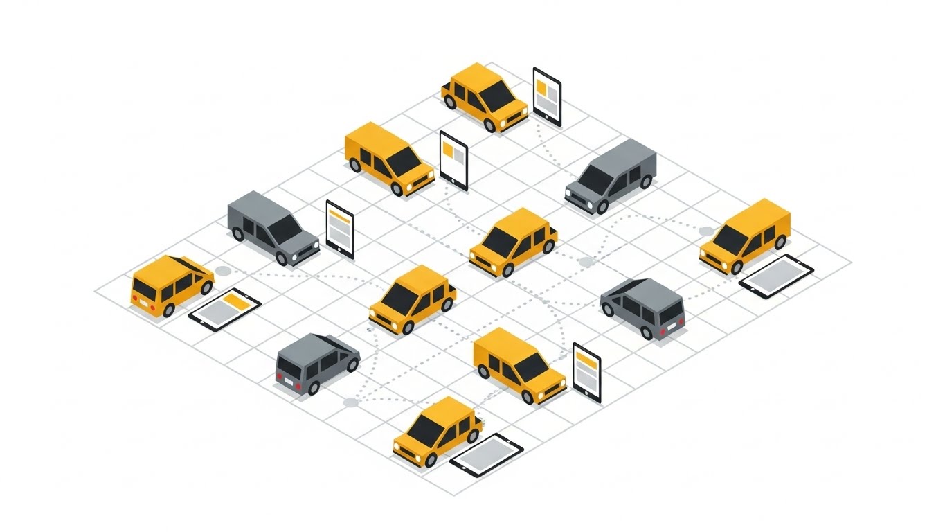
The Visual & Narrative Approach
The Isometric 2D Motion Design style is perfect for visualizing logistics and flow. In this example, the "digital financial city" is represented by a grid where vehicles (representing invoices or transaction data) navigate organized pathways. While the standard definition might use abstract cubes, this variation uses vehicles to metaphorically represent the "traffic" of high-volume financial data moving towards a destination (payment settlement). The flat, gradient-free design with sharp contrasts relies on the yellow/grey palette to define the "city." It visualizes the organized, collision-free movement of thousands of data points—a perfect metaphor for remittance processing.
Psychological Impact & KPI Focus
This style appeals to the operational need for Control and Visibility. The "God's eye view" of the isometric angle gives the viewer a sense of dominance over the process. It reassures them that even with high volumes of data (heavy traffic), the system maintains order. It supports KPIs like Straight-Through Processing (STP) rates and Transaction Volume Capacity. It says: "We handle the traffic, you own the city."
Strategic Implementation & Trade-offs
- Best Use Case: Blog headers, product explainer videos, and "How it Works" web pages.
- Duration: 30-90 seconds (Explainer video style).
- Trade-off: Isometric illustrations can sometimes feel "start-up" or "generic SaaS." To elevate it, ensure the animation is smooth and the specific elements (cars/packets) clearly represent financial concepts (e.g., label them "Invoice," "Cash," "Remittance").
Companies using similar video content -
Versapay – Payment Network – Orchestrates high-volume financial data with organized flow.
Corcentric – P2P and O2C – Visualizes collision-free movement of thousands of transactions.
Kofax – Intelligent Automation – Manages digital financial traffic with precision and control.
7. The Blueprint to Reality Bridge
MOFU | Category Creation
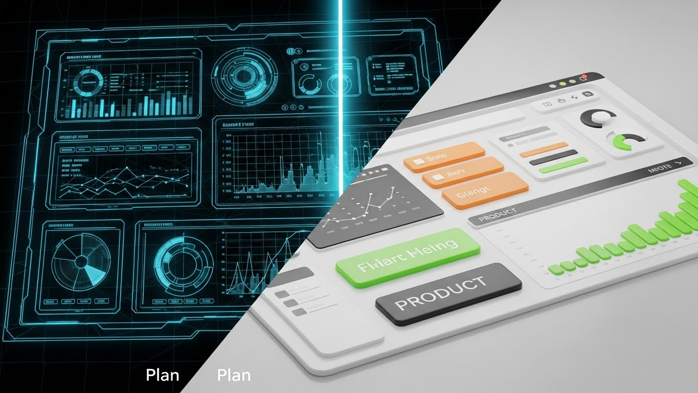
The Visual & Narrative Approach
This Wireframe to Reality Transition uses a split-screen technique to address the fear of complex implementation. The left side displays a technical, blueprint-style wireframe in blue and white lines, representing the "plan" or the backend structure. The right side reveals the fully rendered, glossy interface in lime green and white—the "reality" of the user experience. A glowing vertical line scans across, transforming the wireframe into the finished product. This visualizes the speed of setup and the solidity of the underlying architecture.
Psychological Impact & KPI Focus
This visual directly combats the Implementation Anxiety many buyers feel. It suggests that the path from "integration" (wireframe) to "value" (UI) is seamless and immediate. It supports the KPI of Time-to-Value and Onboarding Speed. It reassures IT stakeholders of the robust architecture (left side) while promising business users a beautiful, usable interface (right side).
Strategic Implementation & Trade-offs
- Best Use Case: Landing pages, implementation guides, and sales demos.
- Duration: 10-15 seconds (transition effect).
- Trade-off: This is a very specific visual metaphor. It is less about "daily use" and more about "buying confidence." It is most effective during the consideration phase (MOFU) rather than early awareness.
Companies using similar video content -
Oracle NetSuite – ERP Implementation – Demonstrates instant setup from plan to functional UI.
SAP – S/4HANA Deployment – Bridges the gap from technical blueprint to operational reality.
Microsoft Dynamics 365 – Business Central Setup – Visualizes rapid implementation and robust architecture.
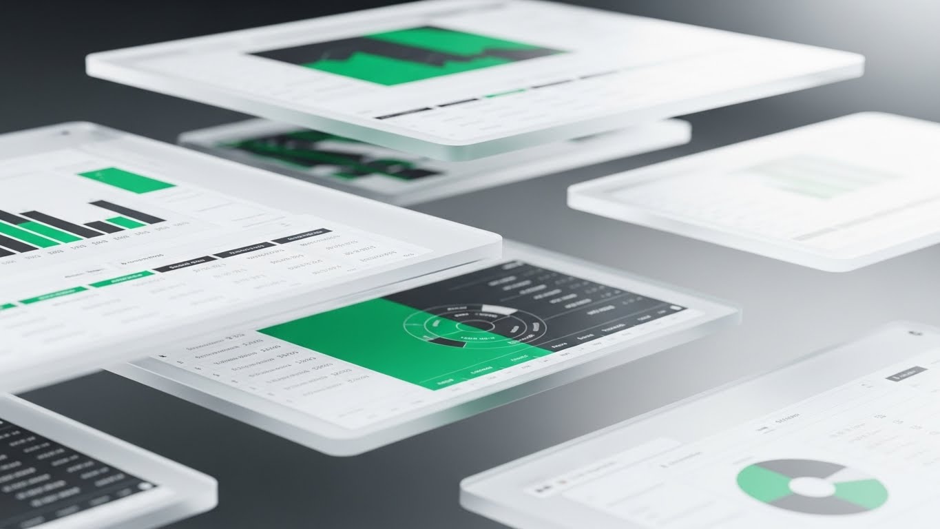
8. The Interface Ecosystem Collage
MOFU | Driving Freemium/Trials
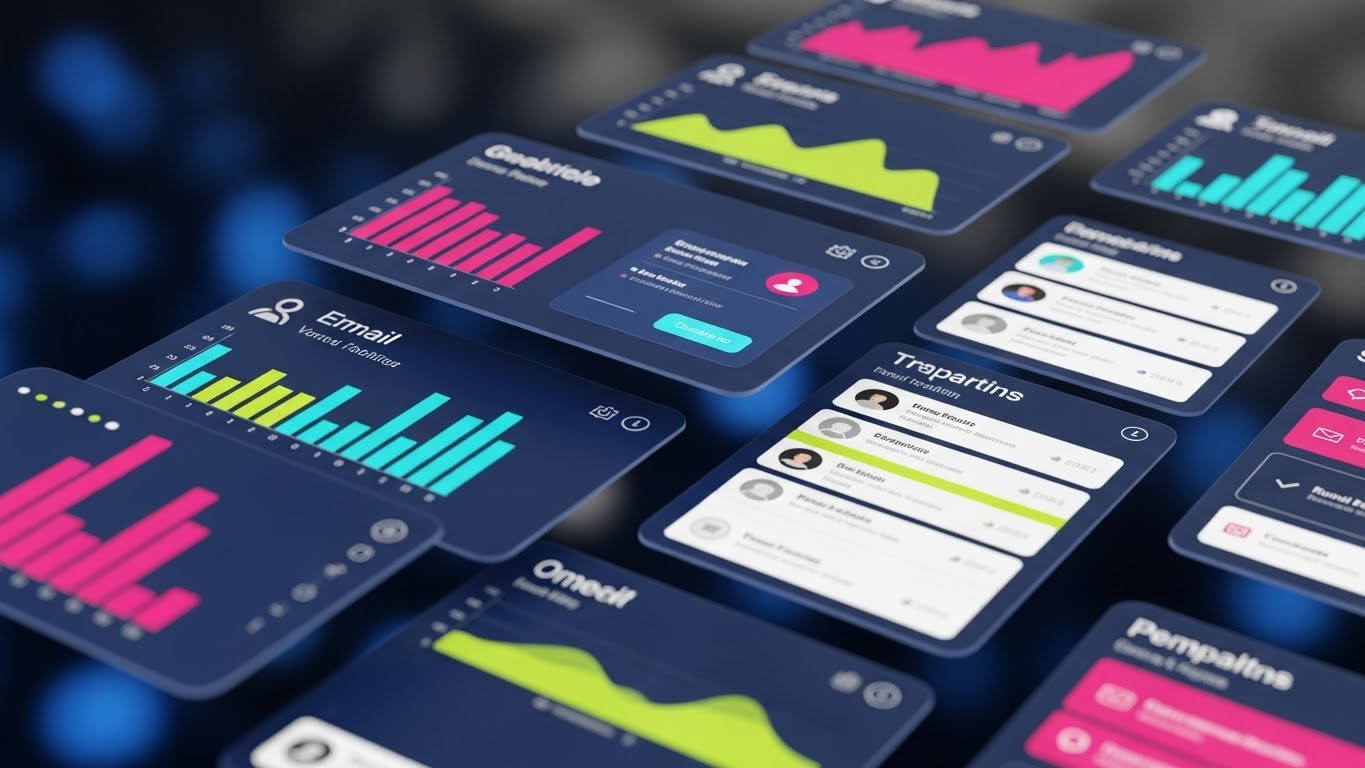
The Visual & Narrative Approach
The Rapid UI Feature Montage creates a dynamic collage of floating glassmorphism UI screens. Overlapping layers display abstract bar graphs, user lists, and email templates in navy blue and chartreuse. The camera pushes forward into the stack, creating a 3D sense of depth. This technique allows you to show the breadth of the platform's features (reporting, CRM, email automation) in a single frame without needing to demo each one individually. The "bokeh" background keeps the focus sharp on the foreground elements.
Psychological Impact & KPI Focus
This style triggers the "All-in-One" heuristic. It visually persuades the viewer that your platform is a comprehensive suite, not just a point solution. It appeals to the desire for Consolidation of tech stacks. The depth and layering suggest a rich, deep feature set that can scale with the company. It supports the narrative of Platform Robustness and Holistic Financial Management.
Strategic Implementation & Trade-offs
- Best Use Case: Website hero sections (video background), product overview videos, and webinar intros.
- Duration: 15-30 seconds.
- Trade-off: Because the screens are abstract and layered, legibility is low. You cannot teach a specific workflow here. It is an "impression" of capability, meant to dazzle rather than instruct.
Companies using similar video content -
BlackLine – Unified Cloud Platform – Showcases comprehensive capability with layered UI screens.
Workday – Financial Management – Presents a dynamic collage of integrated financial features.
Infor – CloudSuite Financials – Displays breadth of platform features in a single, rich view.
9. The Pillars of Predictive Growth
MOFU | Feature Education

The Visual & Narrative Approach
This Dynamic Data Visualization transforms boring bar charts into majestic, translucent glass pillars that grow upwards into a void. Glowing from within with emerald green and gold light, these bars represent revenue and cash flow. The low camera angle, looking up at the soaring structures, emphasizes scale, growth, and dominance. Floating light particles add a magical, ethereal quality. This elevates simple data reporting into a monument of success.
Psychological Impact & KPI Focus
This style taps into the Aspiration for Growth. It reframes data not as "reporting" but as "building." The green and gold colors trigger associations with wealth, value, and stability. It supports the KPI of Revenue Growth and Cash Flow Visibility. It makes the act of checking analytics feel like reviewing a thriving empire, boosting the confidence of the CFO or Controller.
Strategic Implementation & Trade-offs
- Best Use Case: Sales decks (closing slides), investor presentations, and annual reports.
- Duration: 10-20 seconds.
- Trade-off: This is purely inspirational. It should be used to punctuate sections about results and future projections. If used for operational training, it would be too abstract. It is a tool for persuasion, not instruction.
Companies using similar video content -
Kyriba – Treasury & Risk Management – Elevates financial analytics into majestic growth monuments.
Cforia – AR Automation & Analytics – Transforms data reporting into soaring pillars of success.
Cashforce – Cash Flow Forecasting – Visualizes revenue and cash flow as thriving, growing structures.
11. The Aesthetics of Resolution
MOFU | The Functional Buyer
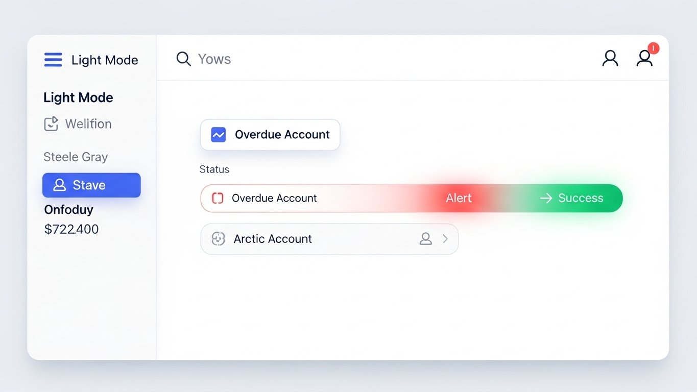
The Visual & Narrative Approach
This Clean UI Workflow style strips away the "noise" of traditional enterprise software to focus purely on the moment of resolution. The visual features a pristine, flat interface with a "clinical" white background, utilizing crisp lines in arctic blue and steel grey. The narrative arc is microscopic yet powerful: it captures the exact moment a status indicator on a list item transitions from a glowing, soft "Alert Red" (Overdue Account) to a vibrant "Success Green." There are no distractions—just the satisfying, rhythmic pulse of tasks being completed.
Psychological Impact & KPI Focus
This style leverages the Zeigarnik Effect—the psychological tension of incomplete tasks—and provides the immediate dopamine release of closure. It visually validates the KPI of Collector Productivity and Task Resolution Time. For an AR specialist accustomed to the endless scroll of spreadsheets, this visual promises a frictionless, organized workflow where problems are easily identified and instantly resolved.
Strategic Implementation & Trade-offs
- Best Use Case: "Features" page on the website, product demo videos, and retargeting ads focusing on "Ease of Use."
- Duration: Short loops (5-10 seconds) focusing on the single interaction.
- Trade-off: Minimalist UI is excellent for clarity but can sometimes mask the true complexity of enterprise configurations. It is best used to sell the experience of the user, rather than the depth of the settings.
Companies using similar video content -
Lockstep – Automated Collections – Visualizes frictionless resolution with clean UI workflows.
Billtrust – Collections Management – Captures the satisfying moment of task completion.
Anybill – Invoice Processing – Focuses on pristine interface for instant problem resolution.
12. The Anatomy of Trust
MOFU | Building Trust & Credibility

The Visual & Narrative Approach
Security is often invisible, but this 3D X-Ray Visualization makes it tangible. The image renders a stylized server rack casing in a transparent, "X-ray" material with a glowing electric blue edge. Inside this protective shell sits a solid, metallic silver padlock, glowing with an internal light. The background is a sterile, bright white laboratory environment. This visual metaphor argues that while the software is open and accessible (transparent casing), the core data is locked down with military-grade encryption (the padlock).
Psychological Impact & KPI Focus
This style addresses the "reptilian brain" need for Safety, specifically targeting the anxieties of the CIO and CISO. It visualizes abstract concepts like SOC 2 Compliance and Data Sovereignty without relying on dense text. The solidity of the lock against the ethereal casing suggests a system that is both modern (cloud-native) and impenetrable. It builds Institutional Trust, a critical pre-requisite for enterprise adoption.
Strategic Implementation & Trade-offs
- Best Use Case: The "Security" or "Trust Center" page of your website, and whitepaper covers regarding compliance.
- Duration: Static imagery or very slow, rotating 3D motion (10-15 seconds).
- Trade-off: This is a niche visual. It is essential for overcoming security objections but has little value in explaining features or ROI. Use it surgically when trust is the primary barrier to the sale.
Companies using similar video content -
Lockstep – Automated Collections – Visualizes frictionless resolution with clean UI workflows.
Billtrust – Collections Management – Captures the satisfying moment of task completion.
Anybill – Invoice Processing – Focuses on pristine interface for instant problem resolution.
13. The Depth of the Ecosystem
MOFU | UI Showcase
The Visual & Narrative Approach
The 3D Parallax UI Presentation elevates the standard screenshot into an immersive experience. Multiple UI screens float in a 3D void, arranged in receding layers. The frontmost screen—displaying detailed abstract financial data in deep purple and lilac—is in sharp focus, while the screens behind it fade into a soft blur (depth of field). This visual arrangement implies that your platform is not just a single tool, but a deep, multi-layered ecosystem. The floating perspective gives the viewer a sense of looking "into" the software rather than just "at" it.
Psychological Impact & KPI Focus
This aesthetic communicates Sophistication and Scalability. The depth of field effect visually suggests that there is "more to discover," countering the fear that the software might be too simple or shallow for enterprise needs. It supports KPIs related to Platform Utilization and Cross-Module Integration. It tells the Enterprise Architect: "This is a robust environment that supports complex, multi-entity operations."
Strategic Implementation & Trade-offs
- Best Use Case: Website hero backgrounds and high-level platform overview videos.
- Duration: 15-30 seconds (continuous float).
- Trade-off: The parallax effect creates a premium feel but can obscure specific details. Do not use this style if the viewer needs to read the text on the screen. It is an impression of depth, not a tutorial.
Companies using similar video content -
Trintech – Financial Controls – Reveals security architecture with transparent X-ray visualization.
Adra by Trintech – Reconciliation – Makes invisible security tangible, building institutional trust.
Serrala – Cash & Treasury Management – Safeguards data with a transparent, impenetrable core.
14. The "Before & After" Reality
MOFU | Competitive Displacement
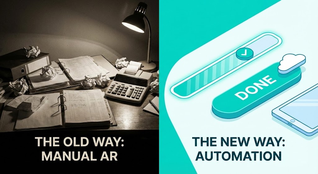
The Visual & Narrative Approach
This Split Screen: Optimized Reality style uses high-contrast juxtaposition to force a comparison. The left side ("The Old Way") depicts a desaturated, grainy photograph of a wooden desk cluttered with messy papers and a calculator, lit by a dim lamp. The right side ("The New Way") features a sharp, vibrant vector illustration in teal and white, showing a sleek digital progress bar and a "Done" button. The visual narrative is an instant evolution: from the stress of physical darkness to the clarity of digital light.
Psychological Impact & KPI Focus
This style triggers the Contrast Principle. By placing the pain (messy desk) directly next to the cure (clean UI), the value of the software becomes self-evident. It targets the emotional exhaustion of Manual Reconciliation and frames automation as a relief mechanism. The explicit contrast validates the buyer's desire to modernize, directly supporting Competitive Displacement strategies.
Strategic Implementation & Trade-offs
- Best Use Case: LinkedIn image ads, slide decks for "Competitive Displacement," and case study headers.
- Duration: Static image.
- Trade-off: This approach is direct and somewhat aggressive. It must be framed as "empathy for the struggle" rather than "criticism of the user's current state" to maintain professional rapport.
Companies using similar video content -
HighRadius – Integrated AR Platform – Demonstrates enterprise scale with layered UI screens.
BlackLine – Finance & Accounting Automation – Presents a deep, multi-layered ecosystem of features.
OneStream – CPM Platform – Implies sophistication and scalability with immersive UI.
15. The Vision of Global Command
MOFU | Establishing Thought Leadership

The Visual & Narrative Approach
To sell the vision of global dominance, the Cinematic Video style renders a futuristic "Network Operations Center" for finance. The room is a sun-drenched, high-key white hall with floor-to-ceiling windows overlooking a city. Massive, curved transparent screens display global maps connected by arcs of light in midnight blue, screen green, and amber. The camera pans slowly across this environment, establishing a sense of scale and control. This is not just software; it is the command deck for a global enterprise.
Psychological Impact & KPI Focus
This style appeals to the Ego and Ambition of the C-Suite. It reframes the AR department from a back-office function into a strategic control tower. It supports KPIs like Global Cash Visibility and Multi-Currency Management. It allows the CFO to visualize themselves at the helm of a sophisticated, world-class operation, reinforcing the brand's positioning as an enterprise leader.
Strategic Implementation & Trade-offs
- Best Use Case: Brand anthem videos, virtual event backdrops, and the opening of an investor presentation.
- Duration: 30-60 seconds.
- Trade-off: This is the most "aspirational" style and the least grounded in reality. It risks looking like "vaporware" if not followed immediately by actual software screens. It sells the brand vision, not the product utility.
Companies using similar video content -
AvidXchange – AP Automation – Validates the digital shift from manual chaos to clarity.
Stampli – Invoice Management – Forces comparison between old, messy ways and new, clean UI.
Medius – Spend Management – Highlights the instant evolution from physical friction to digital flow.
16. The Lens of Precision
BOFU | The Economic Buyer
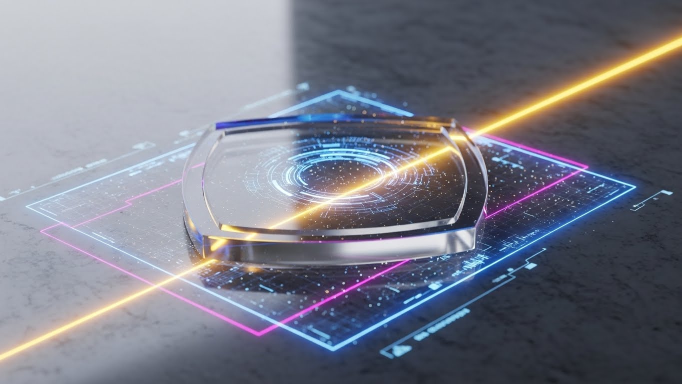
The Visual & Narrative Approach
Moving from scale to accuracy, this Photorealistic 3D Render utilizes a "Lens of Truth" metaphor. A crystalline glass shield or lens rests on a dark digital surface, focused by a piercing beam of laser light. The laser scans across complex circuitry within the glass, illuminating neon blue and magenta grid lines. This visual metaphor represents the software as a precision instrument—a lens that detects errors and a shield that protects revenue. It moves the conversation from "admin" to "scientific revenue assurance."
Psychological Impact & KPI Focus
This aesthetic targets the Economic Buyer's concern for ROI and Risk Mitigation. The "laser precision" implies that the system catches every penny, reducing Revenue Leakage and Bad Debt. The premium, dark-tech look suggests a high-value investment, justifying the cost of the software by visually equating it with advanced engineering and tangible asset protection.
Strategic Implementation & Trade-offs
- Best Use Case: Sales decks (the "ROI" slide), pricing pages, and high-end printed collateral.
- Duration: Static high-res render.
- Trade-off: This is a metaphorical abstraction. It requires clear copy to anchor the visual (e.g., "Precision Defense Against Revenue Leakage") so viewers understand it represents financial accuracy, not cybersecurity.
Companies using similar video content -
Kyriba – Global Treasury – Elevates strategic governance to a futuristic command center.
SAP – Enterprise Resource Planning – Establishes a sense of scale and control for global operations.
Oracle – Cloud ERP – Visualizes the command deck for a sophisticated, world-class enterprise.
17. The Pulse of the Market
BOFU | ROI Justification
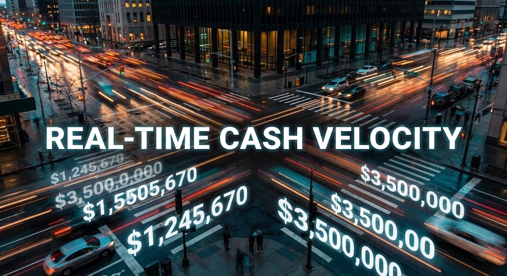
The Visual & Narrative Approach
This Hyper-lapse Stock Footage with Data style bridges the physical and digital worlds. It captures a high-angle view of a busy city intersection at dusk, with traffic lights creating long streaks of orange and teal motion blur. Overlaying this kinetic energy are sharp, white digital numbers counting up rapidly (e.g., "$1,245,670"), alongside the text "REAL-TIME CASH VELOCITY." The visual connects the abstract concept of liquidity to the physical reality of a moving, breathing marketplace.
Psychological Impact & KPI Focus
This style creates a sense of Urgency and Momentum. It visually defines "Liquidity" not as a static pool, but as a dynamic flow. It supports KPIs like Cash Application Speed and Day Sales Outstanding (DSO) reduction. It tells the viewer: "The market is moving fast; your cash should be moving just as fast." It combats the inertia of slow, monthly reporting cycles.
Strategic Implementation & Trade-offs
- Best Use Case: Social media video ads (Instagram/LinkedIn) and website headers to signal "Market Leader."
- Duration: 10-15 seconds (looping).
- Trade-off: The "busy city" imagery is common. The differentiator here must be the quality of the data overlay—the numbers must look integrated into the scene (tracking the camera movement) to avoid looking like a cheap template.
Companies using similar video content -
Auditoria.AI – AI for Finance – Safeguards revenue integrity with laser-like precision.
Vic.ai – AI for Autonomous Accounting – Focuses on accuracy, detecting errors with scientific rigor.
Nanonets – Document AI – Represents software as a precision instrument for data capture.
18. The Geometry of Connection
BOFU | Objection Handling

The Visual & Narrative Approach
To address the fear of complex integration, this Minimalist Flat 2D Vector style simplifies the world into basic geometry. It features a stylized pink electrical plug smoothly connecting into a white socket against a flat navy blue background. There are no gradients, no shadows, and no complexity. It effectively communicates a binary state: disconnected vs. connected. The visual metaphor promises that integrating your AR software with their ERP is as simple as plugging in a lamp.
Psychological Impact & KPI Focus
This style directly lowers Integration Anxiety and Cognitive Load. It appeals to the IT Director and the Operations Manager who fear months of downtime during setup. By using a universal symbol of "powering on," it reinforces the claim of Rapid Deployment and Ease of Use. It says: "It just works."
Strategic Implementation & Trade-offs
- Best Use Case: Email footers, "Integration" pages, and technical documentation headers.
- Duration: Static illustration or simple 2-frame animation.
- Trade-off: This style is very casual. It works well for "ease of use" messaging but lacks the gravitas required for high-stakes security discussions. It is friendly, not authoritative.
Companies using similar video content -
Tesorio – Real-time Cash Flow – Tracks real-time liquidity with urban velocity and data.
Agicap – Cash Flow Management – Connects abstract liquidity to the dynamic marketplace.
Taulia – Working Capital Solutions – Creates urgency, showing cash moving as fast as the market.
19. The Radar for Risk
BOFU | Risk Mitigation

The Visual & Narrative Approach
The Dark Mode UI Showcase turns the software interface into a radar screen. The background is a deep charcoal, allowing the specific UI elements to pop with neon intensity. A glowing red pill indicates "High Risk Accounts," while a green pill shows "Safe Limits," accompanied by a jagged green line graph. By dimming the surroundings, the visual forces the viewer's eye to focus strictly on the anomaly (the red risk). It simulates the focus of a late-night analyst catching a critical error before it becomes a loss.
Psychological Impact & KPI Focus
This style leverages the "Cockpit Effect," making the user feel like a pilot navigating through danger. It appeals to the need for Control and Vigilance. It supports KPIs related to Credit Risk Management and Bad Debt Prevention. The high contrast implies that the software does the work of spotting the danger, so the human doesn't have to squint at spreadsheets.
Strategic Implementation & Trade-offs
- Best Use Case: "Features" section for Credit Risk modules, and dark-mode compatible social feeds (Twitter/X).
- Duration: Static or subtle pulse animation on the "red" alert.
- Trade-off: Dark mode is popular with developers but can sometimes feel less "corporate" than light mode. Ensure your actual software supports dark mode before using this visual to avoid misleading the buyer.
Companies using similar video content -
Lockstep – API-first Integration – Simplifies integration anxiety with minimalist plug-and-play.
Chargebee – Subscription Billing Integration – Communicates seamless connectivity with basic geometry.
Recurly – Subscription Management – Promises easy integration, as simple as plugging in.
20. The Bridge to Revenue
BOFU | Sales Cycle Acceleration

The Visual & Narrative Approach
Finally, the Low-Poly 3D Modeling style offers a charming, simplified narrative of construction. A stylized character, made of simple blue and orange geometric facets, is shown placing the final block on a bridge connecting two cliffs. The soft, ambient lighting and pastel colors create a welcoming, non-threatening atmosphere. This visualizes the core purpose of AR automation: bridging the gap between the invoice sent (cliff A) and the cash received (cliff B).
Psychological Impact & KPI Focus
This style creates a feeling of Achievement and Partnership. It humanizes the technology, suggesting that the software is a helper (the character) assisting you in building connections. It supports the narrative of Sales Cycle Acceleration and Customer Relationship Management. It frames the payment process not as a battle, but as a constructive project.
Strategic Implementation & Trade-offs
- Best Use Case: Blog headers, customer success stories, and internal training videos.
- Duration: Static or short loop (placing the block).
- Trade-off: The "cartoonish" nature of low-poly art means it must be used carefully. It is excellent for storytelling and metaphors but should not be used when you need to demonstrate serious technical compliance or security features.
Companies using similar video content -
Sidetrade – Credit Risk Management – Illuminates credit risk with neon alerts in dark mode UI.
HighRadius – Credit Management – Makes users feel like pilots navigating financial danger.
Cforia – Credit & Collections – Focuses strictly on anomalies, preventing bad debt.
21. The Guide to Day One
Onboarding | Self-Serve Onboarding

The Visual & Narrative Approach
Onboarding a new client to a payment portal often feels cold and mechanical. This 2D Animation & UI Composition style warms the experience by introducing a friendly, hand-drawn character with lavender skin and charcoal hair. The character acts as a digital concierge, gesturing openly towards a floating, soft yellow UI window. The background is composed of abstract organic shapes in muted tones, avoiding the harsh lines of a grid. The narrative is one of guidance and ease; the character is not teaching a complex lesson but simply inviting the user to "step inside" the simplified interface.
Psychological Impact & KPI Focus
This style reduces Onboarding Friction and Cognitive Load. The "Corporate Memphis" aesthetic (simplified features, non-standard skin tones) is universally inclusive and non-threatening. It triggers a feeling of safety and support, which is crucial when asking customers to input sensitive payment data. It directly impacts Self-Service Adoption Rates by making the portal feel like a helpful service rather than a demand for payment.
Strategic Implementation & Trade-offs
- Best Use Case: In-app "Welcome" modals, first-login walkthroughs, and "Getting Started" emails.
- Duration: Short loops (6-12 seconds).
- Trade-off: This illustrative style is playful and soft. It is perfect for the user (the person paying) but may be too casual for the buyer (the CFO purchasing the software). Use it for end-user adoption, not executive sales.
Companies using similar video content -
GoCardless – Recurring Payments – Bridges the revenue gap with constructive, low-poly modeling.
Melio – B2B Payments – Visualizes connecting invoices sent to cash received.
Routable – Mass Payouts – Humanizes technology, building connections for accelerated revenue.
22. The Spark of Reconciliation
Onboarding | Accelerating TTV

The Visual & Narrative Approach
The 2D Graphics Over Live Action style bridges the gap between the human feeling of success and the digital trigger that caused it. The visual captures a freeze-frame of two colleagues high-fiving in a modern office, overlaid with vibrant, vector-style gold sparkles and fireworks. This "Mixed Media" approach anchors the software's value in real human connection. It visualizes the emotional relief and camaraderie that occurs when a complex reconciliation is finally automated. The graphics are flat and punchy, contrasting sharply with the realistic photography to emphasize the "magic" of the software.
Psychological Impact & KPI Focus
This style targets Employee Satisfaction and Time-to-Value (TTV). It reinforces the idea that automation doesn't replace people; it empowers them to celebrate wins. The visual metaphor of "fireworks" triggers a dopamine response associated with celebration, conditioning the user to associate the software with success. It supports the narrative of Team Alignment and removing the drudgery from finance.
Strategic Implementation & Trade-offs
- Best Use Case: "Success" screens after a major task completion, email newsletters announcing new features, and internal culture videos.
- Duration: Static image or short "Boomerang" style loop.
- Trade-off: Overusing "celebration" visuals can feel patronizing if the task was trivial. Save this high-energy style for significant milestones (e.g., "Month-End Close Complete" or "First Batch Reconciled").
Companies using similar video content -
Stripe – Payment Gateway Onboarding – Humanizes the onboarding journey with friendly characters.
Square – POS Setup – Reduces friction, inviting users into a simplified interface.
Adyen – Payment Platform – Provides guidance and ease for new user adoption.
23. The Line of Least Resistance
Onboarding | Reducing Implementation Friction

The Visual & Narrative Approach
To illustrate the removal of friction, this 2D Line Art Animation uses a single, continuous black line on a white, paper-textured background. The line elegantly traces the chaotic shape of a stacked document pile, then fluidly morphs and untangles itself into a crisp, confident checkmark. This "morphing" technique visually narrates the process of Implementation: taking a messy, existing reality and reshaping it into a simple, verified state. The minimalist aesthetic suggests that the software is lightweight, agile, and unintrusive.
Psychological Impact & KPI Focus
This style appeals to the logic-driven mind of the Operations Manager. It visually proves the concept of Workflow Optimization and Process Simplification. The continuous line implies connectivity—that the software connects start to finish without breaking the chain. It reduces Implementation Anxiety by suggesting that the transition from "Mess" to "Checkmark" is a single, smooth motion, not a disruptive overhaul.
Strategic Implementation & Trade-offs
- Best Use Case: Support articles, loading screens, and "How-to" sidebar animations.
- Duration: 3-5 seconds (looping).
- Trade-off: The extreme simplicity lacks emotional depth. It is excellent for functional reassurance (e.g., "Saving...") but fails to convey the scale or power of the platform. Use it for micro-moments, not macro-vision.
Companies using similar video content -
FloQast – Financial Close Collaboration – Visualizes the "Aha!" moment with celebratory overlays.
BlackLine – Reconciliation Automation – Bridges human success with digital triggers, celebrating wins.
Trintech – Record to Report – Reinforces employee satisfaction, empowering teams to celebrate.
24. The Micro-Moment of Truth
Retention | Knowledge Base & FAQ

The Visual & Narrative Approach
The Macro UI Micro-Interaction style zooms in—literally—on the specific actions that drive value. The visual features an extreme close-up of a "Sync" button, blurring out the surrounding noise to focus solely on the cursor and the button's soft white glow. The cursor is stylized in "Focus Blue," indicating active engagement. This is not a screenshot; it is a cinematic study of a click. It elevates a mundane action (clicking a button) into a deliberate, powerful decision.
Psychological Impact & KPI Focus
This style supports Feature Adoption and Training Efficiency. By isolating the trigger, you eliminate the cognitive noise of the full dashboard, allowing the user to encode the specific location and function of the button. It creates a sense of Tactility—making the software feel responsive and tangible. It is critical for the "Retention" phase, helping users master the tool one click at a time.
Strategic Implementation & Trade-offs
- Best Use Case: Knowledge Base articles, "Pro-Tip" tooltips, and release note highlights.
- Duration: Short loops (Click -> Reaction -> Reset).
- Trade-off: This style provides zero context. The viewer cannot see where on the page this button lives. It must be paired with a wider shot or text instructions to be operationally useful.
Companies using similar video content -
UiPath – RPA Process Mapping – Simplifies implementation logic with continuous flow animation.
Automation Anywhere – Digital Workforce – Narrates messy reality transforming into a crisp checkmark.
Celonis – Process Mining – Illustrates workflow optimization and process simplification.
25. The Factory of Cash Application
Retention | Trial/Freemium User Activation

The Visual & Narrative Approach
This Isometric 3D Workflow reimagines the cash application process as a charming, automated factory. Set on a "toy-like" stage with a tilt-shift depth of field, the visual shows raw grey cubes (representing unallocated payments) travelling down a conveyor belt. They pass through a machine labeled with the software's logo and emerge as gleaming gold coins. Tiny, abstract workers in primary colors supervise the flow rather than doing the lifting. This gamifies the boring reality of backend processing, making it look efficient, profitable, and self-sustaining.
Psychological Impact & KPI Focus
This style leverages Gamification Psychology to increase engagement. It frames the software configuration not as "work" but as "building a machine." It supports KPIs like Straight-Through Processing (STP) and Operational Efficiency. The transformation from "Grey Cube" (Data) to "Gold Coin" (Cash) is a powerful visual metaphor for Value Creation that resonates with both users and managers.
Strategic Implementation & Trade-offs
- Best Use Case: Trial user activation emails ("Turn on the machine"), onboarding progress screens, and product explainer videos.
- Duration: 15-30 seconds.
- Trade-off: The "toy" aesthetic can appear childish if not rendered with high-quality materials (matte plastic, metallic gold). It works best for explaining concepts, not for demonstrating compliance.
Companies using similar video content -
Anybill – Invoice Approval Workflow – Teaches specific behaviors with focused UI micro-interactions.
Stampli – Invoice Processing Steps – Zooms in on actions that drive value, enhancing training.
Medius – Invoice Matching – Isolates triggers, helping users master the tool one click.
26. The Narrative of Customer Success
Retention | Reducing Support Overhead

The Visual & Narrative Approach
The 2D Character-Driven Story style moves away from the software interface to focus on the customer's lifestyle. It features a stylized character with blue skin (maintaining brand neutrality) relaxing in a modern armchair, holding a tablet. A "speech bubble" with a heart icon floats above the device, signifying a positive interaction. The background is a simplified, abstract living room in soft greys and peaches. This narrates the result of a good customer portal: the end-customer can resolve their issues (or make payments) comfortably from home, without calling support.
Psychological Impact & KPI Focus
This style impacts Customer Satisfaction (CSAT) and Support Ticket Reduction. It visualizes the "Self-Service" ideal. For the AR Manager, this image represents a reduction in phone calls and angry emails. It frames the software as a tool that improves relationships, not just collections. The "Heart" icon subtly reinforces Brand Loyalty.
Strategic Implementation & Trade-offs
- Best Use Case: "Customer Portal" promo videos, YouTube case study intros, and feature benefits pages.
- Duration: 15-60 seconds (Storytelling).
- Trade-off: This style is purely narrative. It does not show the UI or the "how." It is a mood setter, meant to evoke empathy and aspiration before the technical demonstration begins.
Companies using similar video content -
HighRadius – Cash Application Automation – Gamifies backend processes as a miniature production.
Versapay – Automated Cash Application – Reimagines cash application as an efficient, profitable factory.
Esker – Order-to-Cash Automation – Visualizes value creation from raw data to gleaming gold.
27. The Face of Executive Trust
Retention | Reducing Churn

The Visual & Narrative Approach
In a sea of abstract graphics, the Realistic Character Video provides a necessary human anchor. This style features a high-fidelity shot of a professional man in his 40s (a peer to the buying persona), wearing a grey suit and looking directly into the lens with a calm, satisfied expression. The lighting is cinematic "Rembrandt" style, conveying gravitas. The background is a soft-focus (bokeh) upscale office. He is not acting; he is "testifying." This visual mimics the look of a high-end documentary or customer testimonial interview.
Psychological Impact & KPI Focus
This style leverages Social Proof and Authority Bias. In B2B sales, people buy from people. This visual builds Trust and mitigates Churn Risk. It suggests that "serious professionals use this platform." It grounds the abstract promises of AI and automation in the tangible reality of a satisfied executive. It is crucial for the "Retention" and "Advocacy" stages.
Strategic Implementation & Trade-offs
- Best Use Case: Social media testimonial cuts (LinkedIn), "Customer Stories" page, and churn-prevention email campaigns.
- Duration: 30-90 seconds (Talking head).
- Trade-off: Authenticity is key. If the actor looks too much like a "stock photo model," credibility is lost. It is often better to use real customers or company leadership than actors for this specific style.
Companies using similar video content -
DocuSign – eSignature Workflow – Visualizes self-resolution, focusing on customer lifestyle.
Chargebee – Customer Portal – Narrates positive interactions, reducing support overhead.
Recurly – Billing Experience – Shows end-customers resolving issues comfortably from home.
28. The Horizon of Exponential Growth
Expansion | Driving Upsell/Cross-sell

The Visual & Narrative Approach
To appeal to the ambition of the Enterprise client, the Futuristic Neon/Dark Mode style adopts a "Synthwave" aesthetic. A glowing grid floor in cyber blue stretches toward an infinite dark horizon, representing the digital marketplace. A neon purple line graph shoots upwards dramatically from the grid, leaving a trail of light. The deep black background creates a high-contrast canvas that makes the data "pop." This is not a standard report; it is a visualization of Hyper-Growth and Scalability.
Psychological Impact & KPI Focus
This style targets the Upsell/Cross-sell opportunity. It appeals to the Visionary mindset of the C-Suite. The "up and to the right" trajectory, rendered in electric neon, triggers excitement and signals "modernity." It supports the narrative that the platform is ready for the future—handling big data, AI predictions, and global expansion. It validates the decision to upgrade to "Enterprise" tiers.
Strategic Implementation & Trade-offs
- Best Use Case: "Enterprise" pricing pages, quarterly business review (QBR) decks, and product launch trailers for advanced analytics.
- Duration: 10-20 seconds (Motion background).
- Trade-off: This style is aggressive. It works for "Growth" and "Future" messaging but is too dark and intense for daily operational screens. It sells the dream of the data, not the data itself.
Companies using similar video content -
Workday – Customer Testimonials – Builds peer-to-peer credibility with realistic character videos.
SAP – Executive Interviews – Provides a human anchor, conveying gravitas and satisfaction.
Oracle – Client Success Stories – Leverages social proof, grounding promises in satisfied executives.
29. The Architecture of Partnership
Expansion | Driving Referrals & Advocacy

The Visual & Narrative Approach
The Aspirational Stock Montage focuses on the ultimate goal of B2B relationships: partnership. The image captures a low-angle, heroic shot of two professionals shaking hands in a glass-walled boardroom. Sunlight flares through the window at the point of contact, creating a warm, optimistic atmosphere (the "JJ Abrams" lens flare effect). The focus is sharp on the handshake, blurring the faces slightly to allow the viewer to project themselves into the scene. It conveys high-trust, successful negotiation, and mutual victory.
Psychological Impact & KPI Focus
This style drives Referrals and Advocacy. It shifts the focus from "software" to "success." It appeals to the user's desire for Professional Recognition and Status. By associating the software with this "deal-closing" moment, you position your brand not as a utility, but as a strategic enabler of business success. It says: "Our software helps you close deals and build trust."
Strategic Implementation & Trade-offs
- Best Use Case: LinkedIn referral program posts, "Partner Program" landing pages, and case study conclusions.
- Duration: Static image.
- Trade-off: Handshake photos are the cliché of the corporate world. To make this work, the lighting and composition must be cinematic and high-quality. Avoid "stiff" stock photos; look for candid energy.
Companies using similar video content -
DataRails – FP&A Platform – Sells the enterprise vision with futuristic neon analytics.
OneStream – Corporate Performance Management – Visualizes hyper-growth and scalability in dark mode.
Kyriba – Enterprise Liquidity – Appeals to visionary ambition with electric, upward-shooting data.
30. The Hologram of Future Features
Expansion | Proactive Support

The Visual & Narrative Approach
To visualize the continuous evolution of the platform, the Holographic UI over 3D Render style is used. A solid, metallic cylinder (representing the stable product core) sits on a clean white surface. Projecting upwards from this base is a semi-transparent, holographic blue UI screen displaying new feature icons (e.g., AI Robot, Globe, Shield). The lighting is clinical and bright, with the blue hologram providing a secondary, futuristic light source. This visualizes a "System Update" or "New Feature Release" as a tangible addition to a solid foundation.
Psychological Impact & KPI Focus
This style fosters Confidence and Anticipation. It reassures the client that the platform is not static; it is evolving. It supports Retention by demonstrating continued investment in the product. The contrast between the "Solid Metal" (Stability) and "Holographic Light" (Innovation) perfectly balances the two core desires of the Finance Manager: reliability and progress.
Strategic Implementation & Trade-offs
- Best Use Case: Product update emails, "What's New" webinars, and roadmap presentations.
- Duration: 10-15 seconds (Hologram flickering on).
- Trade-off: This is a conceptual visual. It doesn't show the actual UI of the new feature, only the fact that it exists. It generates hype, but must be followed by Style 19 or 24 (actual UI) to explain the functionality.
The Strategic Knowledge Base: A Visual Operations Doctrine
Having defined the 30 distinct visual styles, we must now synthesize them into a cohesive operational strategy. This is not about "making pretty videos"; it is about deploying a Visual Operating System that drives adoption, reduces cost, and proves value.
We have structured this knowledge base into three segments, designed for the "Finance Architect" who is ready to lead this transformation.
Strategic Alignment & Visual Architecture
The "Pre-Production" Phase: Defining the Visual Operating System
Before a single pixel is rendered, the strategic foundation must be laid. The chaos of financial data requires a disciplined visual architecture to become comprehensible.
- The Cognitive Load Audit: Before requesting a video, audit the current process. If a reconciliation task takes 15 clicks, a video showing all 15 will fail. Use Style 23 (Continuous Flow) to conceptualize the simplified path first. Visuals should reduce complexity, not document it.
- Role-Based Visual Mapping: Do not use the same visual language for the CFO and the AR Clerk. Map Style 28 (Neon Growth) for the CFO to signal strategy, and Style 24 (Macro UI) for the Clerk to signal utility. Divergent goals require divergent aesthetics.
- The "Glanceability" Standard: In a high-volume finance office, "time-to-comprehension" is a metric. Visuals for dashboards must pass the "Glance Test." If the status (Risk/Safe) isn't instantly clear—like Style 19 (Radar Risk)—it is a failure of design, not just aesthetics.
- Brand Voice Consistency: Your visual language (colors, motion, icons) must be as consistent as your legal terms. A fragmented visual identity (e.g., mixing Cartoon Style 26 with High-Tech Style 5 indiscriminately) creates subconscious distrust in the platform's stability.
- The Advids Strategic Audit: Establishing this "Visual Operating System" is complex. Partnering with experts like Advids allows for a comprehensive audit of your current assets, ensuring that every video style is chosen not for its "cool factor," but for its alignment with specific business goals.
- Standardization vs. Customization: Use standardized styles (Style 8, Floating UI) for core features to lower production costs. Reserve bespoke, high-effort styles (Style 30, Hologram) for flagship product launches where differentiation is critical.
- The Cross-Departmental Bridge: Sales uses "Vision" visuals; Support uses "Tactical" visuals. Create a shared library where a Sales Rep can borrow a Support asset (Style 21, Guide) to overcome a prospect's objection about "usability."
- Legacy System Integration: Visualizing the connection between a 30-year-old ERP and a modern Cloud App is difficult. Use Style 18 (Geometric Fit) to abstract the messy technical reality into a clean, reassuring visual metaphor of "plug-and-play."
- Accessibility in Finance: Financial teams are diverse. Ensure that text-heavy styles (Style 2, Kinetic Typography) are legible and that color-coded alerts (Style 11, Status Transition) rely on contrast and icons, not just color, to accommodate color-blind users.
- The Mobile-First Mandate: The CFO approves invoices on their phone. Ensure that "Big Picture" styles (Style 6, Data Viz) are designed to be legible on a 6-inch screen, not just a boardroom monitor.
Operational Adoption & Implementation
The "Deployment" Phase: Embedding Visuals into the Workflow
The best video is useless if it sits unwatched in a folder. This segment focuses on embedding these visual styles directly into the user's daily friction points.
- Overcoming "Big Brother" Anxiety: Automation can feel threatening to staff. Use Style 22 (Celebratory Overlay) to frame the software as a "helper" that liberates them from drudgery, rather than a "monitor" that watches their speed. Empathy is the key to adoption.
- The Micro-Learning Shift: No one reads the 50-page manual. Replace PDF guides with a library of 30-second clips using Style 15 (Clean UI Workflow). These "Micro-Learnings" should be embedded directly inside the software (in-app tooltips).
- Just-in-Time Support: Map specific "Pain Points" (e.g., Error 404, Sync Fail) to specific visual answers. When a user encounters an error, the error message should link directly to a Style 24 (Macro UI) video showing the fix.
- Gamification of Training: Use Style 25 (Isometric Factory) to visualize training progress. instead of a "checklist," show the user building their "Finance Machine." This increases completion rates for onboarding certification.
- Reducing Support Ticket Volume: There is a direct correlation between the clarity of your "Self-Serve" visuals (Style 21) and the volume of "Level 1" support tickets. Investing in high-quality FAQ videos yields an immediate ROI in reduced support labor.
- Remote Onboarding: In a hybrid work era, you cannot rely on "over-the-shoulder" training. Use Style 7 (Split Screen) to simulate the "Before/After" training dynamic, allowing remote teams to visualize the transition to the new system.
- Visualizing SOPs: Standard Operating Procedures are often dry text. Transform them into Style 3 (Isometric Traffic) flowcharts. This allows the team to visualize the flow of data, making it easier to spot bottlenecks.
- Feedback Loops: Use interactive video elements. After a Style 26 (Story) video plays, ask "Did this help?" The data collected here helps refine the visual strategy, proving which styles are actually driving comprehension.
- Scalable Localization: Accounts Receivable is global. Design styles like Style 1 (Abstract Funnel) that rely on visual metaphors rather than on-screen text. This allows you to deploy the same asset across global teams without expensive re-shooting.
- Leadership Communication: When the AR Manager needs to present to the Board, give them the tools to shine. Provide them with Style 15 (Cinematic Command) clips to use in their PPT decks. You make your champion look good; they keep your contract signed.
Measuring Impact & Future-Proofing
The "ROI" Phase: Quantifying Value and Evolving the System
Visuals are an investment. This segment outlines how to measure their return and prepare for the next wave of technological change.
- Beyond "Views": Do not measure success by "video views." Measure it by Time-to-Competency. If a new hire processes their first invoice in 2 days instead of 5 after watching the Style 25 (Factory) series, that is calculable ROI.
- The "Idle Time" Metric: High "idle time" in software suggests confusion. Correlate the deployment of Style 24 (Micro-Interaction) tooltips with a reduction in idle time on complex configuration pages.
- Compliance Velocity: When regulations change (e.g., e-invoicing mandates), speed is safety. Measure how fast the team achieves compliance after a Style 12 (X-Ray Security) update video compared to a text memo.
- Retention and Churn: Customer retention is often about perceived value. Regular exposure to Style 30 (Holographic Innovation) videos keeps the customer excited about the roadmap, directly impacting Lifetime Value (LTV).
- The AI Visual Frontier: As AI becomes standard, the "Black Box" problem grows. You must master Style 5 (Digital Brain) to explain why the AI made a decision. Trust in AI is the next competitive battleground.
- Scalability of Assets: Build a component library. If you use Style 8 (Floating UI), keep the project files organized so you can easily swap out the screen content next year. Visual assets should be built like code: modular and reusable.
- The Advids Partnership: Future-proofing requires constant evolution. A long-term partnership with Advids ensures that as your software moves from "V1" to "V2," your visual language evolves in lockstep, preventing your marketing materials from becoming obsolete.
- Benchmarking Success: "Good enough" visuals are a risk. If your competitor uses Style 27 (High-End Testimonial) and you use a webcam recording, you lose trust. Regularly audit your visual quality against the market leaders.
- The ROI of Safety: In finance, "Safety" means error reduction. Quantify the reduction in "Bad Data Entry" following the launch of visual validation guides (Style 11, Status Transition). Less rework equals higher margin.
- Final Call to Innovation: Treat video as Infrastructure, not content. Just as you invest in your servers, invest in your visual layer. It is the interface through which the world understands your value. The transition from "Friction to Flow" is not just operational; it is visual. Own the narrative, and you own the market.
Companies using similar video content -
Coupa – Business Spend Management – Visualizes advocacy with aspirational, heroic handshakes.
Basware – P2P Network – Focuses on high-trust, successful negotiation and mutual victory.
Tungsten Network – e-Invoicing Network – Conveys partnership, enabling strategic business success.
Author & Editor Bio


