
Introduction: Visualizing the Invisible Workflow
The modern workforce has dispersed, but the demand for operational excellence has only intensified. We have moved from "walking the floor" to "reading the digital pulse," a transition that has left many operations leaders drowning in data but starved for insight. The challenge today isn't capturing data—it's synthesizing it into immediate, actionable intelligence without crossing the line into invasive surveillance.
The opportunity for software platforms in this space is massive, but it requires a narrative shift. We must move away from the perception of "policing" and toward the reality of "empowerment." The data supports this shift unequivocally. A recent NBER study found that the deployment of AI-based support tools increases support agent productivity by 14%, with the most significant gains seen in newer agents. This isn't just about speed; it's about engagement. When tools reduce friction and clarify expectations, the business thrives—Gallup research indicates that highly engaged teams achieve 23% higher profitability than their peers.
Visualization is the bridge between the physical effort of your agents and the digital outcomes of your business. By leveraging the right visual strategies, we can reduce the Cognitive Load on managers, prove Operational Transparency to skeptics, and demonstrate the tangible ROI of your platform.
This guide presents 30 distinct video visualization styles designed to articulate this value proposition. From abstract representations of workflow harmony to hyper-realistic depictions of empowered agents, these examples serve as your blueprint for a high-performance visual strategy.
Let's begin by exploring how to visualize the core concept of operational fluidity.
1. Harmonizing the Workflow Pulse
TOFU | Brand Awareness

The Visual & Narrative Approach
This style utilizes a sophisticated Abstract 2D flat vector aesthetic to visualize the often intangible concept of "Workflow Harmony." The visual centers on a large, abstract circular form that is morphing from a chaotic, jagged shape into a smooth, perfect circle with glossy, liquid-like textures. This transformation symbolizes the journey from disorganized friction to streamlined productivity. The palette of Electric Teal, Soft White, and Slate Grey is calming and modern, while floating icons of clocks and cogwheels suggest that time and mechanics are effortlessly integrated, not forced.
Psychological Impact & KPI Focus
For an audience wary of rigid grids and red-flag alerts, this organic style offers a psychological release. It reduces the Cognitive Load associated with complex tracking, framing productivity as a natural state of "flow" rather than a forced march. It positively influences the perception of Schedule Adherence by associating it with smoothness and ease rather than strict discipline.
Strategic Implementation & Trade-offs
- Best Use Case: Social Media (Instagram/LinkedIn) feed posts. The 1:1 aspect ratio and looping motion are designed to stop the scroll with aesthetic satisfaction.
- Duration: 10-15 Seconds (Loop).
- Trade-off: This style is highly conceptual. It builds brand affinity but does not educate the viewer on specific features or dashboard layouts.
Transition: While abstract harmony builds affinity, some buyers need to see exactly how your platform handles the sheer volume of their operations.
Companies using similar video content -
HashiCorp – Terraform – Orchestrates cloud infrastructure with fluid, declarative workflows.
Flowable – Flowable Platform – Provides open-source business process and workflow engines.
Coralogix – Coralogix Platform – Unifies logs, metrics, and traces for operational harmony.
2. Capturing the Data Avalanche
TOFU | Market Education

*Description: A high-energy composition of charcoal-colored geometric blocks cascading from the top of the frame, representing a heavy "data load." At the bottom, a vibrant orange platform catches and instantly stacks these blocks into neat, organized towers. The background features vertical motion blur lines.*
The Visual & Narrative Approach
This high-energy Bold Kinetic Typography style (visually represented via geometric proxies) dramatizes the volume of enterprise data. We see a cascade of heavy, Deep Charcoal blocks tumbling from the top of the frame—a visual avalanche of raw inputs. Suddenly, a Vibrant Orange platform slides in at the bottom, catching and organizing these blocks into neat, structured stacks. The use of motion blur and hard shadows emphasizes the weight and velocity of the data, making the platform's stability feel heroic.
Psychological Impact & KPI Focus
This visualization triggers a visceral sense of relief. It validates the manager's feeling of being overwhelmed by data ("The Avalanche") and positions the software as the robust solution ("The Platform"). It effectively communicates Data Ingestion Capacity and Real-Time Organization, answering the implicit question: "Can your system handle our volume?"
Strategic Implementation & Trade-offs
- Best Use Case: YouTube Shorts or TikTok Ads (9:16). The vertical falling motion is perfectly optimized for mobile screens.
- Duration: 10-15 Seconds.
- Trade-off: The aggressive, heavy motion grabs attention but can feel stressful if overused. It works best as a "hook," not a deep-dive explanation.
Transition: Once we establish capacity, we must demonstrate intelligence. How does the system connect the dots?
Companies using similar video content -
Splunk – Splunk Cloud Platform – Ingests and organizes massive machine data volumes.
Verint – Workforce Optimization – Captures and analyzes vast customer interaction data.
OpenText – Contact Center Analytics – Processes multichannel customer interactions into insights.
3. Visualizing the Neural Core
TOFU | Shaping Brand Perception

The Visual & Narrative Approach
This style takes us inside the "brain" of the platform using Abstract 3D AI Visualization. The scene depicts a neural network of glowing nodes in Cyan, Magenta, and Deep Violet against a clean digital ether. The camera performs a macro zoom into a specific cluster, revealing filaments of light connecting disparate data points. These nodes pulsate with a rhythmic light—a "digital heartbeat"—signifying that the system is alive, proactive, and intelligent.
Psychological Impact & KPI Focus
This style shapes Brand Perception by positioning the tool as a cutting-edge, AI-driven solution. It appeals to the CTO’s aspiration for "invisible intelligence." By visualizing the connections between nodes, it reinforces the value of Smart Insights—showing that the software doesn't just log data; it understands the relationships between agent activity and business outcomes.
Strategic Implementation & Trade-offs
- Best Use Case: Website Hero Background (16:9). It establishes immediate technological authority the moment a prospect lands on the page.
- Duration: 30-60 Seconds (Loop).
- Trade-off: It is abstract and "premium," which can feel distant. It requires strong copy to ground the visual in practical benefits.
Transition: Intelligence is powerful, but in regulated industries, security is paramount.
Companies using similar video content -
Cresta – Real-Time AI – Powers real-time agent guidance with intelligent AI.
XMPro – XMPro Platform – Creates digital twins for AI-driven operational intelligence.
Hyro – Conversational AI – Automates healthcare call centers with AI-powered routing.
4. The Architecture of Trust
TOFU | ABM Awareness

*Description: A perfectly symmetrical, flat vector illustration in Muted Gold and Navy Blue. A stylized shield icon sits in the center, but the shield's face is constructed from geometric segments resembling bar charts. A faint pattern of lock icons repeats in the Navy background.*
The Visual & Narrative Approach
Trust is the currency of the enterprise. This Minimalist Flat 2D Vector style uses a palette of Muted Gold, Navy Blue, and Cream to convey stability. The central image is a stylized shield icon, but upon closer inspection, the shield is constructed from geometric segments that resemble bar charts. This dual imagery visually bridges the gap between "Analytics" and "Security." The background features a subtle, repeating pattern of lock icons, reinforcing the message without visual clutter.
Psychological Impact & KPI Focus
In a market sensitive to privacy (GDPR/SOC2), this style calms the "Big Brother" anxiety. It positions the software as a protector of data, not an exploiter of it. It creates a subconscious association between Performance Tracking and Compliance Security, making the platform safe for risk-averse stakeholders to approve.
Strategic Implementation & Trade-offs
- Best Use Case: LinkedIn Static Images or Carousel Ads (4:5). It fits the professional context of the platform perfectly.
- Duration: N/A (Static) or 3-5 Second Micro-Animation.
- Trade-off: It is functional and safe, lacking the "wow" factor of 3D styles. It serves a defensive marketing role (overcoming objections) rather than an offensive one (creating desire).
Transition: With trust established, we can pivot to the most compelling argument for the CFO: Growth.
Companies using similar video content -
Teramind – UAM – Provides insider threat management and data loss prevention.
LeadSquared – Healthcare Call Center Software – Ensures HIPAA compliance and data security.
Kickidler – Kickidler – Offers employee monitoring with data loss prevention features.
5. Constructing the ROI Case
TOFU | ROI Justification Hook

The Visual & Narrative Approach
This Dynamic Data Visualization treats ROI as a physical structure. From an isometric high angle (45 degrees), we see 3D bars of Emerald Green glass and Metallic Silver rising rapidly from a brushed metal floor. They resemble a futuristic city growing in fast-forward. A glowing green trend line winds through the bars, pointing sharply upward. The lighting is clinical and bright, emphasizing the "Growth Green" hue.
Psychological Impact & KPI Focus
This is a direct visual hook for ROI Justification. It speaks the language of the CFO: clear, upward-trending growth. The use of glass and metal textures suggests that the data is "hard" and "tangible," not just an estimate. It reinforces the metrics of Profitability and Efficiency, visually proving that the software pays for itself.
Strategic Implementation & Trade-offs
- Best Use Case: Performance Ads (1:1). The clear, simple geometry reads well even on small screens, and the upward movement is a universal symbol for success.
- Duration: 10-15 Seconds.
- Trade-off: It is very transactional. It sells the result of the software but tells you nothing about the experience of using it.
Transition: For the ambitious leader, however, ROI is just the baseline. They want to see a vision of global command.
Companies using similar video content -
Anaplan – Connected Planning – Visualizes financial and operational performance growth.
Insightful – Insightful – Boosts productivity and efficiency with clear ROI metrics.
ActiveOps – WorkiQ – Optimizes operations to improve efficiency and profitability.
6. Orchestrating Global Command
TOFU | Category Creation

The Visual & Narrative Approach
This Generative AI cinematic video style sets a grand stage. We are inside a high-tech "Network Operations Center" (NOC). The camera angle is low, looking up at a massive wall of digital screens displaying abstract global maps and data streams. A professional silhouette stands in the foreground, observing the flow. The palette is Cinematic Blue and Amber, creating an atmosphere of serious, high-stakes control.
Psychological Impact & KPI Focus
This style targets Category Creation. It frames your software not just as a tool, but as the central nervous system of the enterprise. It appeals to the ego and ambition of the target persona, validating their desire for Global Visibility and control. It visually answers the question: "What does a world-class operation look like?"
Strategic Implementation & Trade-offs
- Best Use Case: YouTube Pre-Roll Ads (16:9). It feels like a movie trailer for the software, creating a sense of importance and scale.
- Duration: 15-30 Seconds.
- Trade-off: High production value sets high expectations. If the actual software UI looks dated compared to this cinematic vision, it can create a disconnect.
Transition: To make this vision concrete, we must contrast it with the painful reality many managers currently face.
Companies using similar video content -
NICE CXone – NICE CXone – Provides comprehensive contact center command and control.
Genesys – Genesys Cloud CX – Offers global customer experience orchestration and WFM.
Workday – Workday – Delivers enterprise-wide workforce management and planning.
7. Bridging the Efficiency Gap
MOFU | Product Differentiation
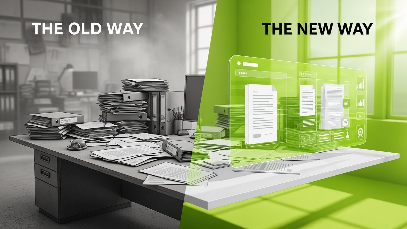
The Visual & Narrative Approach
A sharp Split Screen composition that contrasts "The Old Way" with "The New Way." The left side uses a desaturated Grey palette to depict a messy desk piled with chaotic paper stacks—a literal representation of administrative chaos. The right side uses Vivid Lime and White to depict a clean, 3D holographic interface organizing the same documents. The dividing line is sharp, acting as a portal between stagnation and innovation.
Psychological Impact & KPI Focus
This triggers a "Pain vs. Relief" response. It forces the viewer to identify with the messy desk (their current reality) and yearn for the clean hologram (the solution). It highlights Workflow Automation and Digitization, effectively communicating the value of modernizing the tech stack.
Strategic Implementation & Trade-offs
- Best Use Case: Facebook/Instagram Feed Ads (1:1). The side-by-side comparison is instantly understood without audio, making it perfect for mobile consumption.
- Duration: 10-15 Seconds.
- Trade-off: It simplifies the problem. Real-world "chaos" is often digital (messy inboxes), not paper stacks, but the visual metaphor works for clarity.
Transition: Once they choose the "New Way," they need to know that the interface is deep enough to solve complex problems.
Companies using similar video content -
ProcessMaker – ProcessMaker – Automates workflows, transforming chaos into order.
monday.com – Work OS – Streamlines work processes, improving team efficiency.
Bonita – Bonita Platform – Designs and automates business processes for efficiency.
8. Deep-Diving the Dashboard
MOFU | Driving Demo Requests
The Visual & Narrative Approach
Moving from the abstract to the specific, this 3D Parallax UI Presentation showcases the actual software interface. The UI screens are deconstructed into floating layers—background, widgets, text—creating a rich sense of depth. The camera drifts through these layers in a Deep Ocean Blue space, highlighting circular gauges and activity feeds. Neon Cyan rim lights accent the edges, suggesting precision.
Psychological Impact & KPI Focus
This style is critical for driving Demo Requests. It allows the viewer to "feel" the UI before they buy it. The layering technique implies that the software has "depth"—it allows for Granular Analysis and drill-down capabilities, addressing the fear that the dashboard is just a superficial "pretty picture."
Strategic Implementation & Trade-offs
- Best Use Case: Landing Page Header (16:9). It keeps the user engaged on the page while they process the feature set.
- Duration: 30-45 Seconds.
- Trade-off: It requires high-fidelity UI assets. If the product UI changes, this asset becomes obsolete quickly.
Transition: Deeper still, we must reassure the technical buyers that the underlying mechanism is robust and transparent.
Companies using similar video content -
Calabrio – Calabrio ONE – Offers deep insights into workforce engagement and analytics.
Talkdesk – Talkdesk – Provides AI-powered analytics and agent assist tools.
Apploye – Apploye – Delivers intelligent monitoring and workforce analytics dashboards.
9. Revealing the Engine of Compliance
MOFU | Building Trust

The Visual & Narrative Approach
This visualization uses a 3D X-Ray technique to reveal the internal mechanics of trust. We see a digital padlock with a shell of Translucent Blue glass. Inside, gears rendered in Solid Skeleton White turn smoothly. The camera zooms in to show the perfect meshing of these gears. The "X-Ray" view is a metaphor for Operational Transparency.
Psychological Impact & KPI Focus
Trust is built on transparency. By showing the "guts" of the machine working smoothly, you address the skeptic's fear of "black box" algorithms. It reinforces System Integrity and Auditability, assuring the client that the platform is robust and fair.
Strategic Implementation & Trade-offs
- Best Use Case: Security or Technology Architecture pages. It helps explain complex backend benefits (like API syncing or encryption) through a relatable mechanical metaphor.
- Duration: 15-20 Seconds.
- Trade-off: It is a strong metaphor, but it is only a metaphor. It must be accompanied by technical specs (SOC2, HIPAA) to fully satisfy the IT buyer.
Transition: Finally, we return to the most important element of all: the human being at the center of the technology.
Companies using similar video content -
Cisco Systems (Splunk) – Splunk Cloud Platform – Provides transparent security and observability mechanisms.
Evanios – Evanios – Unifies IT operations management with transparent machine learning.
AWS – Systems Manager – Manages and automates multi-cloud configurations transparently.
10. Humanizing the Digital Interface
MOFU | LinkedIn Video Ads

The Visual & Narrative Approach
This Generative AI Realistic Character video grounds the technology in the human experience. We see a professional woman in a modern office, holding a tablet that projects a soft, holographic light onto her face. Her expression is confident and relaxed. The background blurs with the movement of a thriving team. The lighting is "Cinematic Office Daylight," warm and flattering.
Psychological Impact & KPI Focus
This style fosters Emotional Connection. It combats the "robot overlord" narrative by placing a human face at the center. It links the software to Empowerment and Ease of Use, suggesting that the tool makes the agent's life better, not harder. It directly addresses Employee Satisfaction and retention.
Strategic Implementation & Trade-offs
- Best Use Case: LinkedIn Video Ads and Case Study intros. It works best when paired with a testimonial or a specific "day in the life" narrative.
- Duration: 15-30 Seconds.
- Trade-off: The "uncanny valley" risk is real. The execution must be flawless to ensure the character feels genuine and trustworthy.
Companies using similar video content -
Observe.AI – Observe.AI – Empowers agents with AI-powered quality management and coaching.
Playvox – Playvox – Enhances agent experience with quality, coaching, and learning tools.
Zendesk – Zendesk – Provides an intuitive platform for agent support and productivity.
11. Illuminating Time Allocation
MOFU | Feature Education
The Visual & Narrative Approach
This Clean UI Workflow (Light Mode) visualization strips away the cinematic drama to focus on the granular reality of agent time. The view is a pristine, flat-lay browser window in Pastel Blue and Soft Coral. Inside, a calendar doesn't just show "tasks"; it displays "heatmaps" of activity intensity. The soft coral gradients overlay specific time blocks, visually representing periods of high cognitive load versus downtime. The aesthetic is clinical yet gentle, using rounded corners and drop shadows to make the data feel accessible.
Psychological Impact & KPI Focus
By visualizing intensity rather than just "hours logged," this style reframes time tracking as Burnout Prevention rather than policing. It appeals to managers concerned with Resource Utilization and agent well-being. It visually demonstrates that the software identifies overworked agents just as effectively as underperforming ones, fostering a culture of balanced productivity.
Strategic Implementation & Trade-offs
- Best Use Case: Email Nurture Campaigns targeting team leads. It answers the specific "how do I manage my team's energy?" question.
- Duration: 30-45 Seconds.
- Trade-off: The light, pastel aesthetic is very soft. It works best for HR-focused messaging but may lack the aggressive "power" needed for hard-line sales pitches.
Transition: While managing time is crucial, systemizing the workflow itself ensures that time is spent effectively.
Companies using similar video content -
DeskTime – DeskTime – Monitors employee activity and visualizes work habits.
Time Doctor – Time Doctor – Tracks time and measures productivity with detailed analytics.
Workstatus – Workstatus – Provides real-time updates and productivity insights for teams.
12. Engineering the Perfect Process
MOFU | Feature Education
The Visual & Narrative Approach
To explain complex routing logic, we utilize an Isometric 3D Workflow rendered in a "Clay" style with soft matte finishes. The scene depicts a miniature, cutaway office floor plan in Mustard Yellow, Steel Grey, and White. Tiny, abstract cylindrical figures move along logical, yellow-painted paths, effortlessly avoiding obstacles. The lighting mimics a softbox, casting gentle shadows that define the depth of the walls. It creates a "god’s eye view" of the operation, making the intangible concept of Workflow Optimization physically visible.
Psychological Impact & KPI Focus
This style satisfies the manager’s desire for order and control. By reducing the office to a clean, functioning model, it reduces the Cognitive Load of understanding complex routing algorithms. It visually proves Process Efficiency, implying that the software creates a path of least resistance for every task, eliminating bottlenecks before they occur.
Strategic Implementation & Trade-offs
- Best Use Case: Product Pages or Feature Deep-Dives. It holds the viewer's attention long enough to explain "how it works."
- Duration: 45-60 Seconds.
- Trade-off: The "toy-like" aesthetic is charming but can feel less "enterprise-grade" if not paired with serious copy. It prioritizes clarity over authority.
Transition: Sometimes, the best way to show value is to contrast your clarity with the competitor's chaos.
Companies using similar video content -
Activiti – Activiti – Provides a flexible workflow engine for process automation.
Camunda – Camunda Platform – Automates and manages business processes with BPMN 2.0.
jBPM – jBPM – Offers a graphical editor for designing and executing business processes.
13. Untangling the Competitor's Chaos
MOFU | Competitive Displacement
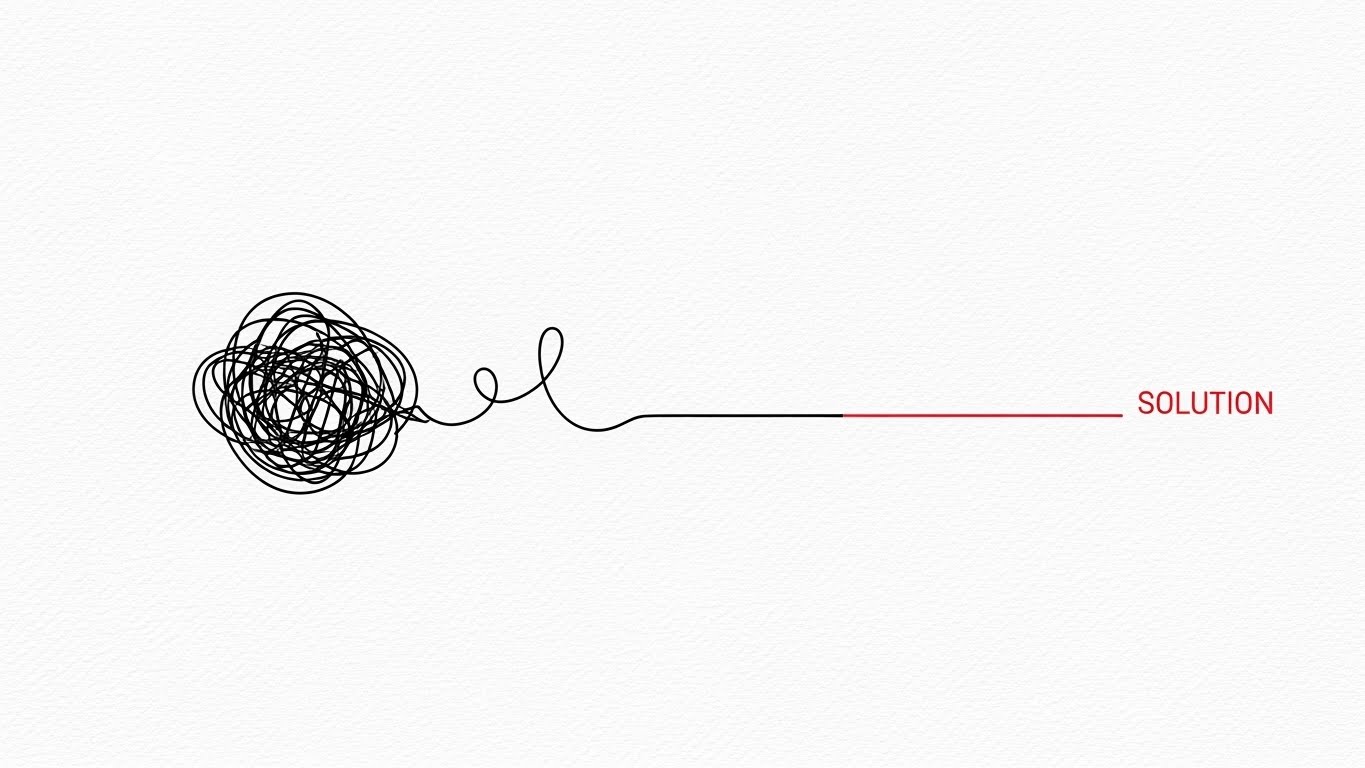
The Visual & Narrative Approach
Simplicity is the ultimate sophistication. This 2D Line Art Animation uses a stark Black and White palette with a single Red accent to tell a story of resolution. The camera pans to reveal a tangled, chaotic black scribble—representing the competitor’s complex, buggy interface. As the line progresses to the right, it untangles, smoothing out into a perfectly straight, efficient Red line labeled "SOLUTION." The background texture of faint canvas paper adds a touch of craftsmanship.
Psychological Impact & KPI Focus
This is a pure Cognitive Ease play. It visually validates the frustration users feel with clunky legacy systems ("The Scribble") and offers your platform as the immediate relief ("The Line"). It creates a subconscious association between your brand and Operational Clarity, positioning you as the antidote to complexity.
Strategic Implementation & Trade-offs
- Best Use Case: Competitor Comparison pages or Retargeting Ads. It’s a quick, punchy visual that respects the viewer's intelligence.
- Duration: 5-8 Seconds.
- Trade-off: It is minimalist. It sells the feeling of switching but doesn't show the features you get.
Transition: Solving chaos is a logical win, but emotional resistance regarding privacy remains a major hurdle.
Companies using similar video content -
Icaro Tech – Dash Analytics – Simplifies digital transformation and operational efficiency.
Axway – Decision Insight – Revitalizes IT infrastructures, reducing complexity.
HCLSoftware – HCL iControl – Streamlines AI and automation for digital operations.
14. The Privacy Peace of Mind
MOFU | Overcoming Objections

The Visual & Narrative Approach
To address the "Big Brother" objection, this 2D Character-Driven Story uses a warm, empathetic aesthetic. We see a young professional in a cozy home office, rendered in Soft Lavender, Mint Green, and Peach. He works comfortably at his laptop, a sleeping cat nearby. A thought bubble appears, not with work tasks, but with a clean Shield Icon. This explicitly visualizes that while he is working, he feels protected, not watched.
Psychological Impact & KPI Focus
This style directly targets Employee Sentiment and retention. By depicting the agent as relaxed and happy, it counters the narrative of invasive surveillance. It visualizes Privacy Compliance as a feeling of safety, assuring decision-makers that adopting this tool won't cause a mutiny.
Strategic Implementation & Trade-offs
- Best Use Case: Blog Headers for "Employee Privacy" articles or internal change management decks.
- Duration: N/A (Static Illustration) or short animation.
- Trade-off: It is soft and emotive. It addresses the human objection but not the technical implementation of privacy (masking, encryption).
Transition: With the team reassured, we can accelerate the pace and show the raw speed of the platform.
Companies using similar video content -
SmartOffice Payroll – SmartOffice – Offers employee monitoring with privacy-focused features.
We360.ai – We360.ai – Provides productivity monitoring with user privacy in mind.
Workmeter – EffiWork – Measures efficiency while respecting individual privacy.
15. The Velocity of Features
MOFU | The Functional Buyer
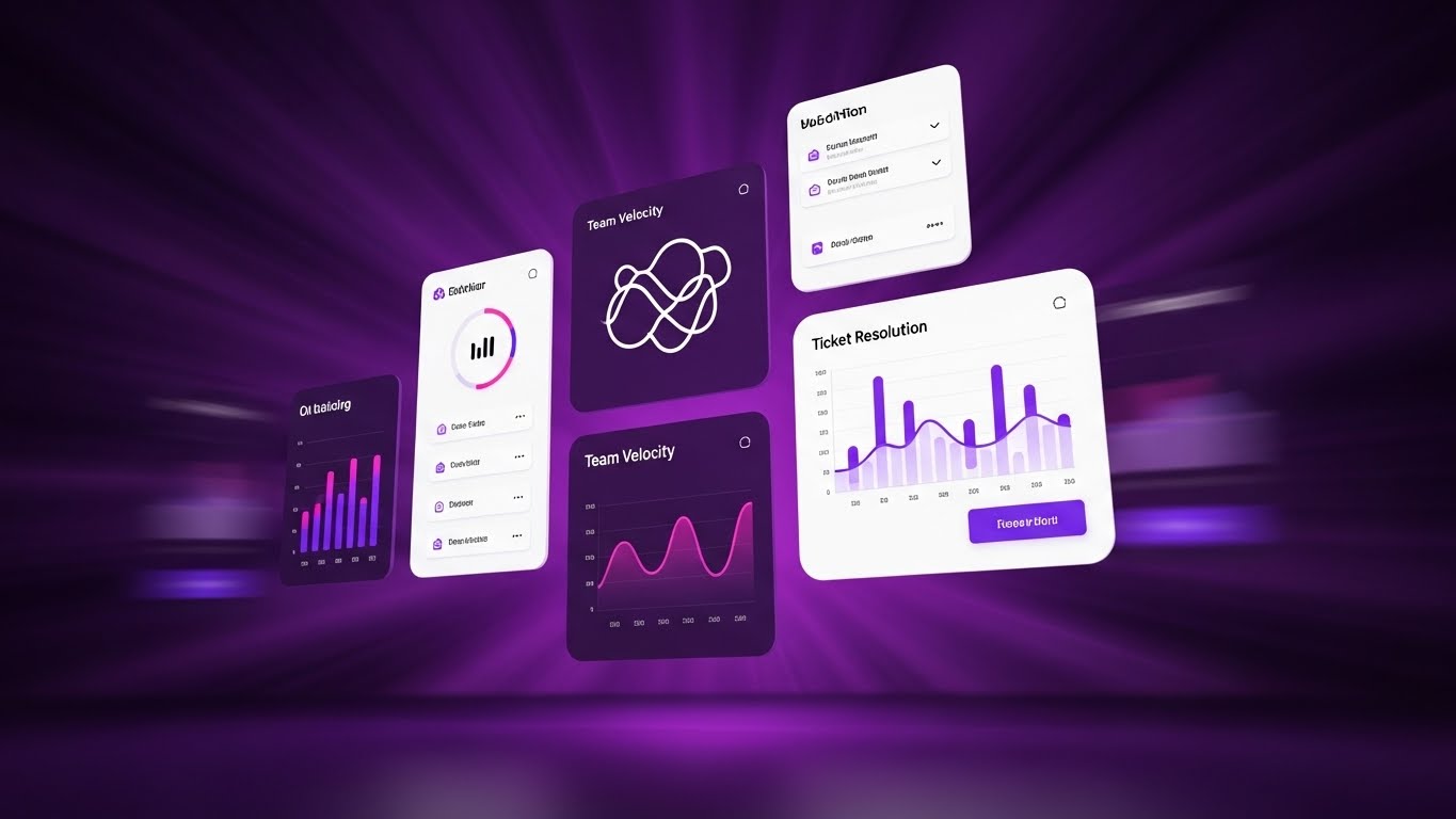
The Visual & Narrative Approach
Designed for the "Functional Buyer" who cares about speed, this Rapid UI Feature Montage is pure kinetic energy. Against a Radial Blur of Deep Purple, clusters of UI widgets—showing "Team Velocity" and "Ticket Resolution"—fly towards the viewer. The Electric Pink accents and high-contrast white text pop against the dark background. The motion implies that data is coming at you fast, but the widgets remain crisp and readable.
Psychological Impact & KPI Focus
This visualization triggers a sense of Momentum. It suggests that the software generates insights faster than the problems can occur. It appeals to managers focused on SLA Adherence and Ticket Velocity, visually promising that the platform will speed up their entire operation.
Strategic Implementation & Trade-offs
- Best Use Case: Sales Decks (Hype reel section) or high-tempo Social Ads.
- Duration: 10-15 Seconds.
- Trade-off: It is stylized. The "flying" motion prevents detailed reading of the data, so it functions more as a mood setter than a tutorial.
Transition: Speed is essential, but it must be guided. We need to show that the software acts as a coach, not just a speedometer.
Companies using similar video content -
Five9 – Five9 – Delivers intelligent automation and real-time analytics at speed.
Dialpad – Dialpad – Offers AI-powered agent flexibility and rapid outbound calling.
RingCentral – Contact Center – Provides omnichannel communication with rapid feature delivery.
16. From Surveillance to Guidance
MOFU | Objection Handling

The Visual & Narrative Approach
This inventive 2D Animation & UI Composition blends character art with interface elements to soften the concept of monitoring. A flat 2D office worker sits at a desk, while a friendly, semi-transparent "Ghost" character—constructed from UI lines and icons—floats gently beside them. The Ghost isn't haunting; it's pointing at the screen, guiding the worker's hand. The palette of Soft Blue and Grey keeps the mood professional and non-threatening.
Psychological Impact & KPI Focus
This metaphor reframes Real-Time Monitoring as Real-Time Coaching. It visually demonstrates that the AI is a "sidekick" that helps the agent succeed, rather than a manager looking over their shoulder. It supports the KPI of First Contact Resolution (FCR) by suggesting the tool provides the answers needed to win.
Strategic Implementation & Trade-offs
- Best Use Case: Retargeting Ads for users who visited "Features" pages but didn't convert. It addresses the "creepy" factor head-on with humor and warmth.
- Duration: 6-10 Seconds (Loop).
- Trade-off: The "Ghost" metaphor is playful. It works well for tech-forward companies but might be too whimsical for highly traditional, buttoned-up enterprises.
Transition: Now that we've secured the team's buy-in, we must present the undeniable numbers to the budget holder.
Companies using similar video content -
AmplifAI – AmplifAI – Converts data into measurable agent improvement and coaching.
Level AI – Level AI – Provides real-time agent assistance and generative coaching.
Cresta – Real-Time AI – Guides agents with AI-powered next-best actions.
17. Cultivating Organic ROI
BOFU | ROI Justification

*Description: An isometric 2D motion design piece. The palette is Forest Green, Light Green, and White. The scene shows a grid platform where abstract "vegetation" (representing productivity) is growing rapidly in the form of green bar charts and data trees. The camera view is a strict isometric angle. The background is a technical grid pattern in a very faint green.*
The Visual & Narrative Approach
Shifting to the Bottom of the Funnel (BOFU), this Isometric 2D Motion Design visualizes ROI as a natural ecosystem. On a technical Forest Green grid, we see abstract "vegetation" sprouting rapidly. However, the plants are actually green bar charts and data trees, growing taller and denser by the second. The clean vector style and Light Green/White palette convey a sense of healthy, sustainable financial growth.
Psychological Impact & KPI Focus
This style appeals to the desire for Sustainable Growth. Unlike the aggressive "Exploding ROI" styles, this organic growth suggests stability and long-term Profitability. It visually links agent productivity to the company's financial ecosystem, reinforcing that a healthy workforce yields a healthy bottom line.
Strategic Implementation & Trade-offs
- Best Use Case: LinkedIn Carousels or ROI Calculator landing pages.
- Duration: 10-12 Seconds.
- Trade-off: It is abstract. It requires accompanying copy (e.g., "$12k Savings per Agent") to ground the visual metaphor in hard numbers.
Transition: For the C-Suite, however, growth is just one part of the picture. They need total command of the data.
Companies using similar video content -
Lystloc – Lystloc – Optimizes workforce management for sustainable growth.
Befective – Befective – Manages people and productivity for organic business growth.
Flowace – Flowace – Enhances team productivity and effectiveness with AI analytics.
18. The Executive Command Center
BOFU | The Economic Buyer
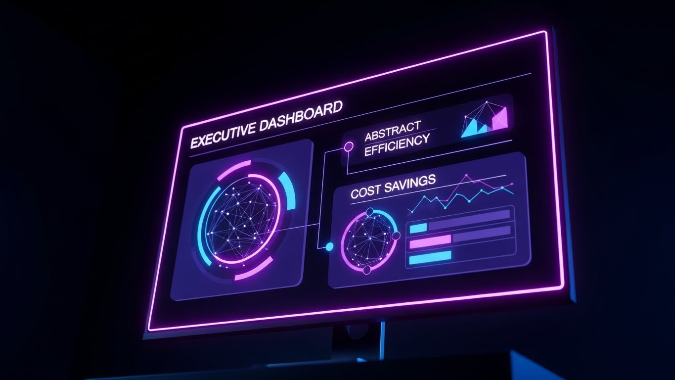
The Visual & Narrative Approach
This is the view from the top. The Dark Mode UI Showcase presents a high-level "Executive Dashboard" glowing in a pitch-black room. The palette employs Midnight Blue and Neon Purple to create a premium, elite atmosphere. The camera angle is slightly upward, making the monitor and its data—"Global Efficiency," "Cost Savings"—loom large and impressive. It feels like the control deck of a spaceship.
Psychological Impact & KPI Focus
This style targets the Economic Buyer (CFO/CEO). It validates their status and their need for High-Level Visibility. The dark mode aesthetic suggests that this is a serious tool for serious decision-makers, focusing on macro KPIs like OpEx Reduction and Global Headcount Efficiency rather than individual agent tasks.
Strategic Implementation & Trade-offs
- Best Use Case: Executive Reports, Pitch Decks, or "Enterprise" pricing pages.
- Duration: Static or Slow Pan (5-10 Seconds).
- Trade-off: It can feel intimidating to lower-level managers. This visual is strictly for the buyer, not the user.
Transition: The vision is compelling, but the buyer needs assurance that the transition from their current state to this future state is seamless.
Companies using similar video content -
Workday – Workday – Provides high-level workforce management for executive oversight.
Oracle – HCM Cloud – Offers comprehensive human capital management for strategic decisions.
UKG – UKG Pro – Delivers enterprise HCM for executive-level insights.
19. From Implementation to Value
BOFU | Competitive Comparison

The Visual & Narrative Approach
This Wireframe to Reality split-image technique visualizes the implementation journey. On the left, a Blueprint Blue wireframe depicts a complex office structure—representing the planning phase. As the eye moves right, the wireframe seamlessly transforms into a Solid Gold and White photorealistic render of the same structure, shining under a bright sky. This symbolizes the transition from "Plan" to "Value Realization."
Psychological Impact & KPI Focus
This addresses the fear of Implementation Risk. It visually promises that what is promised during the sales cycle (the blueprint) will become a tangible, valuable reality (the gold). It reinforces Time-to-Value, suggesting that the transition is smooth, structural, and ultimately profitable.
Strategic Implementation & Trade-offs
- Best Use Case: Case Studies and "Onboarding" process explainers.
- Duration: 5-10 Seconds (wipe transition).
- Trade-off: It is conceptual. It represents the outcome of implementation, not the actual steps (data migration, training) involved.
Transition: Finally, we must cement the decision by proving that this "Gold" structure is protected by an impregnable defense.
Companies using similar video content -
Bentley Systems – AssetWise Connect Edition – Manages infrastructure assets from design to operations.
ServiceNow – Integration Hub – Connects systems for seamless operational intelligence.
Smart Utility IoT – Smart Fleet and Workforce Management – Optimizes fleet and workforce with IoT.
20. Fortifying the Digital Infrastructure
BOFU | Risk Mitigation

The Visual & Narrative Approach
To conclude the buyer's journey, we use Low-Poly 3D Modeling to visualize stability. From a bird's-eye view, we see a fortress being constructed from individual Blue and Orange data blocks. These cubes snap together with satisfying precision, forming a solid, impenetrable wall. The lighting is bright and directional, casting sharp shadows that emphasize the solidity of the structure.
Psychological Impact & KPI Focus
This serves the goal of Risk Mitigation. It visually answers the IT Director's concerns about System Stability and Data Integrity. The "snapping" motion of the blocks implies that the software integrates perfectly into the existing stack, creating a stronger, more secure infrastructure than what existed before.
Strategic Implementation & Trade-offs
- Best Use Case: Whitepapers on Security or API Documentation headers.
- Duration: 10-15 Seconds.
- Trade-off: The "blocky" style is less "enterprise sleek" than the Dark Mode UI, but it communicates "building" and "structure" more effectively.
Companies using similar video content -
Disrupt-X – Personnel Tracking – Builds robust IoT solutions for personnel safety.
Overdrive IoT – Personnel Tracking Solution – Monitors workforce in real-time for safety and efficiency.
Ripples IoT – Ripples IoT – Provides Bluetooth RTLS for connected worker safety.
21. Augmenting the Onboarding Reality
Onboarding | Self-Serve Onboarding

The Visual & Narrative Approach
This 2D Graphics Over Live Action style bridges the physical and digital worlds to celebrate user activity. We see a high-quality POV shot of real hands typing confidently on a laptop. As the keys are pressed, glowing Cyan and White 2D icons—checkmarks, small rockets, and sparks—pop up from the keyboard, floating upwards before fading. The aesthetic combines realistic "gritty" work textures with the magical feedback of gamification.
Psychological Impact & KPI Focus
This serves Time-to-Value. By visualizing the immediate gratification of using the platform, it encourages "Self-Serve Onboarding." It validates the user's effort, creating a dopamine loop that associates data entry with progress rather than drudgery. It directly impacts Activation Rate by making the initial setup feel rewarding.
Strategic Implementation & Trade-offs
- Best Use Case: Welcome Emails or "First Login" splash screens.
- Duration: 5-10 Seconds.
- Trade-off: It is playful. While great for individual users (agents), it might feel too casual for a grim-faced compliance officer.
Transition: Once the user starts the journey, we must ensure the data integration feels effortless.
Companies using similar video content -
Jibble – Jibble – Gamifies time tracking with facial recognition and activity tracking.
Hubstaff – Hubstaff – Tracks time and activity, rewarding productive work.
WebWork Time Tracker – WebWork Time Tracker – Optimizes productivity with AI-powered time tracking.
22. The Frictionless Install
Onboarding | Reducing Implementation Friction

The Visual & Narrative Approach
To combat the fear of "clunky integration," this Abstract 2D Motion Graphics style uses fluid dynamics. A stream of Turquoise liquid shapes flows effortlessly from the left, merging smoothly into a larger, calm Soft Yellow river. The motion is rhythmic and unimpeded, set against a pristine white background. There are no hard edges, only curves and gradients that imply zero resistance.
Psychological Impact & KPI Focus
This visualizes Interoperability and ease of installation. It subconsciously reassures the IT Manager that your software won't "clog" their existing ecosystem. It lowers the Implementation Barrier, visually promising that the data ingestion process is natural, automatic, and stress-free.
Strategic Implementation & Trade-offs
- Best Use Case: Installation progress screens or API documentation headers.
- Duration: Loop (infinite).
- Trade-off: It is highly metaphorical. It calms the nerves but doesn't explain how the integration actually works technically.
Transition: Integration is smooth; now we need to lock in the user's habit with a moment of celebration.
Companies using similar video content -
AWS – IoT Events – Detects and responds to events from IoT sensors seamlessly.
Coralogix – Coralogix – Offers real-time streaming analytics with frictionless integration.
Axway – Amplify API Management Platform – Manages APIs for seamless integration.
24. Nudging Feature Adoption
Retention | Driving Deep Feature Adoption

The Visual & Narrative Approach
A Macro UI Micro-Interaction shot that fetishizes the interface. We see an extreme close-up of a single UI button labeled "Optimize," featuring a lightning bolt icon. The palette is Clean White with a Highlighted Blue accent. As a cursor hovers over it, the button physically lifts (z-axis movement) and casts a soft shadow, glowing slightly. It makes the digital button feel tactile and clickable.
Psychological Impact & KPI Focus
This style drives Deep Feature Adoption. By making the interface look "delicious" and responsive, it triggers curiosity. It suggests that the software is responsive and high-quality. It is particularly effective for highlighting new, underused features (like "AI Auto-Schedule") to existing customers, boosting Lifetime Value (LTV).
Strategic Implementation & Trade-offs
- Best Use Case: "New Feature" tooltips or email GIFs.
- Duration: 3-5 Seconds (Loop).
- Trade-off: It is hyper-specific. It promotes one button, not the whole platform.
Transition: Sometimes, the user just needs a quick answer to a problem.
Companies using similar video content -
Apploye – Apploye – Highlights features for intelligent monitoring and workforce analysis.
TimeClock Plus – TimeClock Plus – Promotes features for time and attendance management.
Mera Monitor – Mera Monitor – Showcases real-time screen monitoring for productivity.
25. Resolving the Knowledge Gap
Retention | Knowledge Base

*Description: A symmetrical, static composition. A simple Black line-art question mark sits in the center. As we watch, it smoothly morphs into a solid Sage Green checkmark. The background is a very pale grey. The lines are elegant and thin, conveying simplicity.*
The Visual & Narrative Approach
This Minimalist Flat 2D + Line Art Hybrid is designed for clarity and calm. In a symmetrical composition, a simple, elegant black line-art "Question Mark" sits in the center of a Sage Green circle. Seamlessly, the line morphs, untwisting itself to become a solid, bold "Checkmark." The background is a soothing pale grey. The animation is slow and deliberate, symbolizing the transition from confusion to understanding.
Psychological Impact & KPI Focus
Used in support contexts, this reduces Support Ticket Volume. It visually reinforces the idea that the Knowledge Base holds the answers. It projects a feeling of Resolution and competence, reassuring frustrated users that their problem has a simple, binary solution.
Strategic Implementation & Trade-offs
- Best Use Case: Help Center search bars or "No Results Found" pages (to guide them back to safety).
- Duration: 2-4 Seconds.
- Trade-off: It is generic. It communicates "help is here" but doesn't provide the actual help content.
Transition: Retention isn't just about fixing problems; it's about proving long-term value.
Companies using similar video content -
Freshdesk Contact Center – Freshdesk Contact Center – Offers robust knowledge base integration for support.
LiveAgent – LiveAgent – Provides a comprehensive help desk and knowledge base.
Sprinklr Service – Sprinklr Service – Unifies customer service with extensive knowledge management.
26. Visualizing the Success Curve
Retention | Reducing Churn

The Visual & Narrative Approach
To combat churn, we remind the client of the lifestyle benefits. This Lifestyle Stock with UI Overlay shows a relaxed professional in a sunlit cafe, sipping coffee while looking at a laptop. The lighting is warm and aspirational. Floating in the air over his shoulder is a semi-transparent Soft Blue UI panel showing a "Success Curve" trending smoothly upward. It links the act of using the software with a stress-free existence.
Psychological Impact & KPI Focus
This targets Sentiment and retention. It subconsciously argues that keeping the subscription leads to a balanced life. It reframes the software from a "tool for work" to a "generator of peace," making it harder for the client to cancel without fearing a return to chaos.
Strategic Implementation & Trade-offs
- Best Use Case: Quarterly Business Review (QBR) decks or "Anniversary" emails.
- Duration: Static or Micro-motion (clouds moving).
- Trade-off: It relies on stock photography. It must be carefully selected to avoid looking cheesy or inauthentic.
Transition: But what about the users who have slipped away? We need a visual to bring them back.
Companies using similar video content -
Workstatus – Workstatus – Visualizes productivity insights for team success and peace of mind.
Time Doctor – Time Doctor – Shows productivity trends for improved work-life balance.
Insightful – Insightful – Tracks and visualizes workforce productivity for better outcomes.
27. Re-engaging the Ghost
Retention | Visitor Re-engagement

The Visual & Narrative Approach
For re-targeting, we use high-contrast allure. This Futuristic Neon/Dark Mode visualization depicts a "Digital City" where buildings are constructed from stacks of data servers. Glowing streams of Cyberpunk Pink and Electric Blue light flow like traffic between the towers. The low-angle camera shot makes the data infrastructure look monumental and exciting.
Psychological Impact & KPI Focus
This is a "Wake Up" call for dormant users. It uses Novelty and Aesthetic Appeal to draw attention back to the platform. It suggests that the platform is a thriving, modern metropolis of activity, triggering FOMO (Fear Of Missing Out) in users who haven't logged in recently.
Strategic Implementation & Trade-offs
- Best Use Case: Display Retargeting Ads or "We Miss You" emails.
- Duration: 10-15 Seconds.
- Trade-off: It is abstract eye candy. It grabs attention but doesn't convey specific information.
Transition: Once they are back, we need to show them the path to expansion.
Companies using similar video content -
Metabase – Metabase – Re-engages users with dynamic, open-source business intelligence.
GoTo – GoTo Contact Center – Attracts users back with multichannel queuing and features.
8x8 – 8x8 Contact Center – Re-engages with team collaboration and contact center features.
28. The Enterprise Upsell
Expansion | Driving Upsell

The Visual & Narrative Approach
To sell the "Enterprise" tier, we visualize command. A realistic 3D render of a rich wood-grain boardroom table sits in dim ambient light. Projected above it is a Holographic UI in Electric Blue and Silver. The hologram displays a rotating 3D map of a city with data points connecting buildings, labeled "Enterprise-wide Visibility." It looks like a scene from a sci-fi command bunker.
Psychological Impact & KPI Focus
This appeals to Status and Strategic Control. It positions the "Enterprise Plan" not just as more features, but as a promotion to the "War Room." It validates the decision-maker's need for total oversight, directly supporting Account Expansion and upsell revenue.
Strategic Implementation & Trade-offs
- Best Use Case: "Upgrade to Enterprise" modals or pricing page headers.
- Duration: Loop.
- Trade-off: It feels expensive. It works for selling high-ticket tiers but might intimidate a small business user.
Transition: The most powerful growth engine, however, is a happy customer telling their friends.
Companies using similar video content -
Genesys – Genesys Cloud CX – Offers enterprise-grade customer experience and WFM.
NICE CXone – NICE CXone – Provides comprehensive contact center solutions for large enterprises.
Oracle – HCM Cloud – Drives upsell with advanced human capital management features.
29. The Social Proof Celebration
Expansion | Driving Referrals

The Visual & Narrative Approach
Referrals come from happy teams. This Aspirational Stock image captures a "Golden Hour" moment on a rooftop terrace. A diverse team of professionals is high-fiving, laughing, and pointing at a laptop screen (not visible). The palette is Warm Sunlight and Fresh Green. There is no UI, no data—only the raw, human emotion of a team that has just crushed their goals.
Psychological Impact & KPI Focus
This visualizes the result of productivity: Team Cohesion. It serves the Net Promoter Score (NPS) and referral goals. It suggests that recommending this software will make you a hero to your peers. It shifts the focus from "tracking agents" to "celebrating agents."
Strategic Implementation & Trade-offs
- Best Use Case: Referral Program landing pages or "Thank You" screens after a high NPS rating.
- Duration: Static.
- Trade-off: It lacks product specificity. It sells the "vibe" of success, relying entirely on the brand's established trust.
Transition: Finally, to keep this ecosystem thriving, we must assure them that the platform is constantly evolving.
Companies using similar video content -
Rippling – Rippling – Celebrates unified HR, IT, and finance for team success.
Zoho People – Zoho People – Fosters employee engagement and team collaboration.
BambooHR – BambooHR – Promotes positive employee experience and company culture.
30. Stability in Chaos
Expansion | Proactive Support
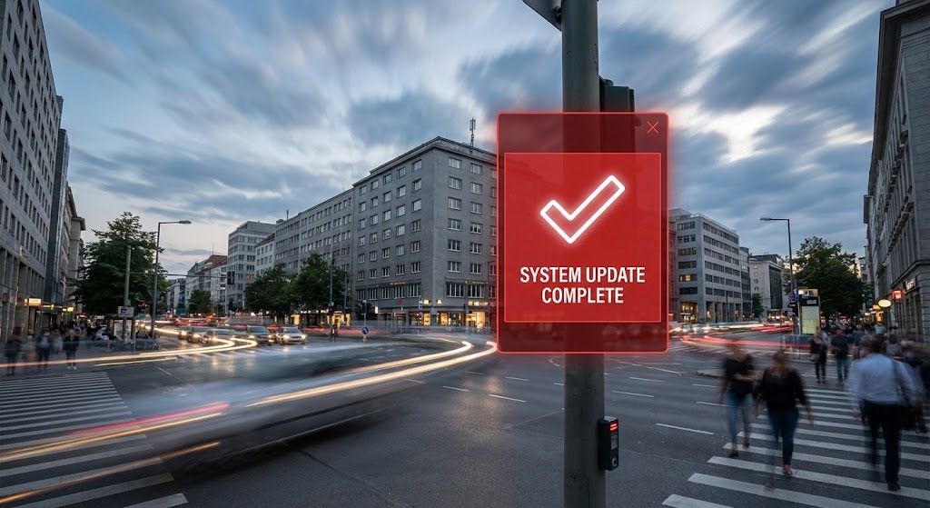
The Visual & Narrative Approach
To demonstrate proactive value, we contrast speed with stillness. A Hyper-lapse video shows a busy city intersection with cars and clouds blurring by in a grey-toned rush. In the foreground, a sharp, stationary Red and White UI panel floats anchored to a lamp post. It displays a bold "Checkmark" and "System Update Complete." The world spins, but the system is solid.
Psychological Impact & KPI Focus
This reinforces Reliability and Uptime. It tells the customer that while their business environment is chaotic and fast-paced, the platform is their anchor. It builds Long-term Trust, crucial for contract renewals. It says, "We are working in the background, keeping you safe."
Strategic Implementation & Trade-offs
- Best Use Case: "Product Update" video intros or System Status pages.
- Duration: 5-10 Seconds.
- Trade-off: It is a mood piece. It effectively communicates "stability" but requires text support to explain what was actually updated.
Strategic Knowledge Base: The Visual Operations Doctrine
Drawing from the 30 visual styles analyzed above, we can now synthesize a comprehensive strategic framework. This is not just about "making videos"; it is about constructing a Visual Operating System for your enterprise software that drives adoption, reduces friction, and proves value.
Strategic Alignment & Visual Architecture
The "Pre-Production" Phase: Defining the Visual Operating System
Before a single pixel is rendered, the visual strategy must be aligned with the cognitive reality of your users. In the Agent Productivity space, the primary challenge is the tension between "Monitoring" (perceived as negative) and "Empowerment" (the actual goal). Your visual architecture must bridge this gap.
-
The Cognitive Load Audit: Productivity software is often complex. Perform an audit of your current training materials. If a concept takes three paragraphs to explain (e.g., "Weighted utilization scoring"), it must be replaced by a visual (e.g., Style 11: Heatmap Calendar). Visuals are not decoration; they are compression algorithms for complex data.
-
Role-Based Visual Mapping: One size does not fit all.
-
For the Agent: Use "High-Touch" visuals like Style 16 (The UI Ghost) and Style 21 (Augmented Typing). These styles emphasize assistance, coaching, and personal progress. They should feel tactile and gamified.
-
For the Executive: Use "High-Altitude" visuals like Style 6 (NOC Room) and Style 18 (Neon Dashboard). These buyers do not care about buttons; they care about command, control, and global trends.
-
The "Glanceability" Standard: In a high-volume operations center, managers don't have time to study charts. Your product visuals (and your actual UI) must pass the "Glanceability Test." Can the status of the operation be understood in 2 seconds? Styles like Style 1 (Fluid Circle) and Style 30 (Update Shield) train users to recognize health/risk states instantly through shape and color, not text.
-
The Advids Strategic Audit: This is where a partner like Advids becomes essential. We don't just produce assets; we define this visual lexicon. We ensure that the "Green" used in your ROI calculator (Style 17) matches the "Green" in your Onboarding Success screen (Style 25), creating a subconscious thread of continuity that strengthens brand authority.
Operational Adoption & Implementation
The "Deployment" Phase: Embedding Visuals into the Workflow
The best software fails if users refuse to adopt it. In this domain, resistance often stems from fear of surveillance. Visual strategy is your primary tool for Change Management.
- Overcoming "Big Brother" Anxiety: You cannot text your way out of an emotional fear. You must visualize safety. Use Style 14 (Home Office Shield) and Style 9 (Glass Padlock) early in the sales and onboarding process. These visuals don't explain how encryption works; they explain how it feels to be protected. They shift the narrative from "Spying" to "Shielding."
- The Micro-Learning Shift: Agents are busy. They will not read a PDF manual. Deconstruct your training into 15-30 second visual bites (using Style 23: The Guided Tour). Embed these directly into the dashboard. When a user hovers over a metric, show them the video. This "Just-in-Time" learning reduces support tickets and frustration.
- Gamification of Training: Use Style 5 (Rising Bars) and Style 21 (Augmented Typing) to visualize performance metrics as "scores" rather than "reports." When agents see their productivity as a growing 3D structure or a series of unlocking achievements, they engage with the platform as a tool for personal mastery, increasing voluntary adoption.
- Leadership Communication: When an Ops Leader presents your platform to their board, they are often terrified of looking incompetent. Arm them with Style 19 (Blueprint to Gold) and Style 28 (Boardroom Vision). Give them the visual assets that make them look like visionary leaders. If your visuals help them win their internal budget battles, you have a customer for life.
Measuring Impact & Future-Proofing
The "ROI" Phase: Proving Value and Scaling Up
Finally, the visual strategy must be accountable. It must drive metrics that the CFO cares about, and it must be flexible enough to evolve with the product.
- The "Idle Time" Metric: Measure the impact of your visuals. Does watching the Style 12 (Isometric Workflow) video reduce the "Time to First Ticket Resolution" for a new agent? High-quality visualization should directly correlate with reduced software navigation time (Idle Time). If users are confused, your visual strategy (or your UI) is failing.
- Compliance Velocity: In regulated industries, speed of compliance is currency. How fast can your fleet of agents understand a new policy? Sending a text memo might take days to be absorbed. A 60-second Style 2 (Falling Blocks) video explaining the new data handling process can ensure compliance across the organization in hours.
- Scalability of Assets: Your product will change. If every video is a live-action shoot, you are dead in the water when the UI updates. This is why we lean heavily on Abstract 3D (Style 3), Vector Motion (Style 7), and UI Re-creations (Style 24). These assets are modular. When your interface updates, Advids can swap out the UI layer without re-shooting the entire scene, ensuring your visual library remains "Evergreen."
- The ROI of Safety: For agent wellness, visuals are a safety feature. Style 11 (Heatmap Calendar) isn't just a calendar; it's a burnout detector. By visualizing "Intensity," you help managers intervene before an agent quits. The ROI of retaining a trained agent is massive. Visuals that promote wellness (Style 26) directly protect this asset.
- Final Call to Innovation: The market is moving toward Generative AI and real-time guidance. Your visual strategy must anticipate this. Moving from static dashboards to Style 10 (Holographic Assistant) helps frame your roadmap. Treat video not as "marketing content," but as "visual infrastructure." It is the lens through which your value is perceived.
Conclusion
In the invisible world of digital workflows, visibility is value. By deploying these 30 visual styles strategically, you do more than just sell software; you clarify complexity, alleviate anxiety, and empower a dispersed workforce to perform at their best.
Companies using similar video content -
AWS – CloudWatch – Monitors resources and applications for operational stability.
Cisco Systems (Splunk) – Splunk Cloud Platform – Ensures digital security and operational resilience.
Telefónica Tech – IoT for Mobile Workforce Management – Provides stable IoT solutions for field staff.
Author & Editor Bio


