
Introduction: Visualizing the "Invisible" Clinical Partner
The healthcare industry is currently navigating a profound paradox. While digital tools were promised to liberate clinicians, they have inadvertently created a "digital wall"—the screen—between the physician and the patient. For Medical Directors, CMIOs, and HealthTech innovators, the marketing challenge is unique: how do you visualize a solution that is designed to disappear? Your technology listens, analyzes, and documents, allowing providers to return their focus to the patient. The goal of this style guide is to translate that "invisible partner" into tangible, high-impact visuals that resonate with overwhelmed healthcare professionals.
The operational reality is stark. Recent data from the American Medical Association reveals that for every eight hours scheduled with patients, office-based physicians spend more than five hours in the EHR. This imbalance is not just an operational bottleneck; it is a crisis of cognitive load. When your video content visually addresses this friction—showing the chaos of the status quo versus the serenity of AI-enabled documentation—you move beyond selling software to selling sanity and sustainability.
However, a shift is underway. Industry analysis predicts that by 2027, generative AI implementation will have reduced the time spent on clinical documentation tasks by 50%. Your visual strategy must bridge the gap between today's pressure and tomorrow's promise.
This guide outlines distinct visual styles, mapped to specific funnel stages, designed to dismantle skepticism. From empathetic 2D character narratives that validate user pain points to high-precision 3D renders that visualize data infrastructure, each style serves a strategic purpose in demonstrating how your AI assistant integrates directly into the complex, high-stakes environment of modern medicine.
1. Minimalist Flat 2D Vector: The Time-to-Care Morph
TOFU | Brand Awareness

The Visual & Narrative Approach
This style utilizes crisp, clean geometry to distill complex operational concepts into immediate visual metaphors. In this scenario for a LinkedIn brand awareness campaign, we visualize the core value proposition: recovering lost time. A stylized analog wall clock, representing the rigidity of scheduled appointments, fluidly morphs into a soft, organic heart shape. The aesthetic is strictly clinical yet approachable, utilizing "medical blue" and "sanitary white" against a pale slate gray background. The clock hands are subtly shaped like stylized medical syringes, reinforcing the medical context through crisp geometry without being visceral.
Psychological Impact & KPI Focus
- Niche Psychology: Clinicians are cognitively overloaded. They crave simplicity and order. This style reduces "visual noise," offering a soothing, orderly aesthetic that signals your software is a tool for simplification, not added complexity.
- Operational Impact: By abstracting the tool into a symbol of "balance," we bypass technical skepticism and appeal directly to the aspiration of the provider—to care for patients, not screens. The primary KPI here is Stop-Scroll Rate on professional networks.
Strategic Implementation & Trade-offs
- Best Use Case: 15-second LinkedIn or Twitter (X) organic posts where the message must be understood in zero-click environments.
- Trade-off: This abstract approach is excellent for emotional resonance but poor for explaining how the AI actually works. It establishes the "Why" but leaves the "How" for deeper funnel content.
Companies using similar video content -
Abridge – AI Platform – Transforms clinical conversations, enhancing patient care.
Suki AI – Voice Assistant – Frees clinicians from documentation, saving time.
DeepScribe – AI Scribe – Automates documentation, allowing focus on patients.
2. 2D Character-Driven Story: The Burnout Contrast
TOFU | Market Education
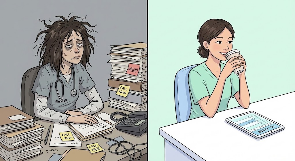
The Visual & Narrative Approach
This style leverages the power of "Optimized Reality" through a split-screen composition, directly contrasting the "Status Quo" with the "AI-Enabled Future." On the left, we see a medical receptionist or clinician drowning in paper-based workflows—messy hair, overflowing files, muted grey tones. On the right, the same character is composed, smiling, and sipping coffee at a pristine, empty desk with only a sleek tablet, rendered in pastel mint and bright white. The style uses relatable, non-cartoony character proportions with smooth linework to ensure the professional audience sees themselves in the protagonist.
Psychological Impact & KPI Focus
- Niche Psychology: Empathy is the currency of healthcare marketing. This style validates the user's daily struggle (burnout, administrative burden) before presenting the solution, creating a "They understand me" moment.
- Operational Impact: It visualizes the intangible benefit of "peace of mind." The contrast effectively communicates efficiency gains without needing to show complex code or backend processes.
Strategic Implementation & Trade-offs
- Best Use Case: 60-90 second YouTube explainer videos aimed at Market Education.
- Trade-off: Character animation requires careful tonal balance; if it’s too "cartoony," it risks trivializing the seriousness of medical work. It must remain professional and respectful of the persona's expertise.
Companies using similar video content -
Nuance Dragon Medical One – Ambient eXperience (DAX) – Reduces documentation time, combats burnout.
Rocket Doctor AI – AI Solutions – Alleviates burnout by automating administrative tasks.
3. Bold Kinetic Typography (Visual): The Semantic Collision
TOFU | Vertical Social Organic
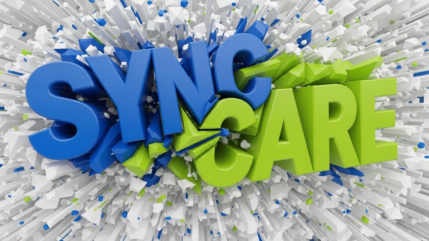
The Visual & Narrative Approach
Here, text becomes the protagonist. Massive, blocky 3D shapes representing core concepts like "SYNC" and "CARE" collide and fuse together in an electric, high-energy environment. This is a visual representation of data interoperability—the "collision" of disparate systems (EHR, billing, notes) into a unified, synchronized workflow. The shapes are rendered in electric blue and vivid lime green, and the background is a dynamic explosion of abstract geometric confetti in white and silver. The angle is diagonal and aggressive, conveying high energy and impact.
Psychological Impact & KPI Focus
- Niche Psychology: Attention spans are short, especially on mobile. This style uses aggression and speed to disrupt the passive scrolling behavior of tired professionals.
- Operational Impact: It positions the brand as a dynamic disruptor. It implies that the software is powerful, fast, and capable of handling massive data loads instantly.
Strategic Implementation & Trade-offs
- Best Use Case: 10-15 second TikTok or Instagram Reels aimed at Vertical Social Organic reach.
- Trade-off: This style creates high excitement but low comprehension. It is a "hype" builder that needs to be followed up with substantive educational content. It grabs attention but doesn't retain it for deep learning.
Companies using similar video content -
Workato – Automation Platform – Integrates thousands of healthcare applications securely.
Microsoft Power Automate – Workflow Automation – Streamlines healthcare workflows with compliance.
4. Hyper-lapse Stock Footage with Data: Visualizing Throughput
TOFU | Skippable Pre-Roll Ad
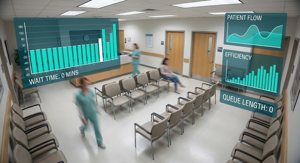
The Visual & Narrative Approach
This style grounds the abstract AI concept in the physical reality of a clinic. We use a hyper-lapse style static image showing a busy hospital waiting room with motion blur on the people moving through, indicating speed. Overlaid on the image are crisp, static data widgets in bright teal and white, representing "Wait Time: 0 mins" via abstract bars and graphs. The lighting is bright fluorescent office lighting, and the camera angle is a high CCTV-style vantage point looking down at the rows of empty chairs.
Psychological Impact & KPI Focus
- Niche Psychology: Practice managers obsess over patient throughput and bottlenecks. This visualization speaks their language (metrics, flow, time) and places the solution directly into their physical environment.
- Operational Impact: It bridges the "Digital/Physical Divide." It shows that digital efficiency (the AI) leads to physical efficiency (empty waiting rooms).
Strategic Implementation & Trade-offs
- Best Use Case: 6-second unskippable YouTube Pre-Roll Ads.
- Trade-off: Reliance on stock footage can sometimes feel generic. The quality of the motion tracking (anchoring the data widgets to the room) determines whether it looks premium or cheap.
Companies using similar video content -
Veradigm – Predictive Scheduler – Optimizes appointment management, improves efficiency.
Stellar – AI Solutions – Streamlines patient flow, optimizes resource allocation.
5. Abstract 2D Flat Vector Organic Motion: The Data Ecosystem
TOFU | Category Creation

The Visual & Narrative Approach
To visualize "Category Creation" and the fluidity of data, we use abstract, glossy motion graphics. Liquid-like bubbles in teal and silver merge and separate, containing abstract representations of medical data nodes connected by thin lines. The background is a clean, matte white. This style avoids the literal representation of documents or computers, focusing instead on the feeling of seamless integration and the "ecosystem" nature of modern AI platforms. The texture of the bubbles suggests high-end glassmorphism with soft specular highlights.
Psychological Impact & KPI Focus
- Niche Psychology: Sophisticated buyers look for "modernity" signals. Fluid motion implies a frictionless user experience, countering the expectation that medical software is clunky and rigid.
- Operational Impact: It helps visualize abstract concepts like "Cloud Integration" or "Neural Networks" without being intimidatingly technical. It invites curiosity rather than demanding cognitive effort.
Strategic Implementation & Trade-offs
- Best Use Case: LinkedIn Video backgrounds or loopable website headers.
- Trade-off: Highly abstract. If the voiceover or supporting text doesn't clearly anchor the visual to a specific business benefit, the viewer may enjoy the animation but miss the value proposition.
Companies using similar video content -
Hathr.AI – AI Platform – Provides secure healthcare workflows, encrypted data handling.
OpenAI for Healthcare – API Platform – Powers tools with latest models, embeds AI.
6. Isometric 2D Motion Design: The Optimization Blueprint
MOFU | Product/Solution Differentiation
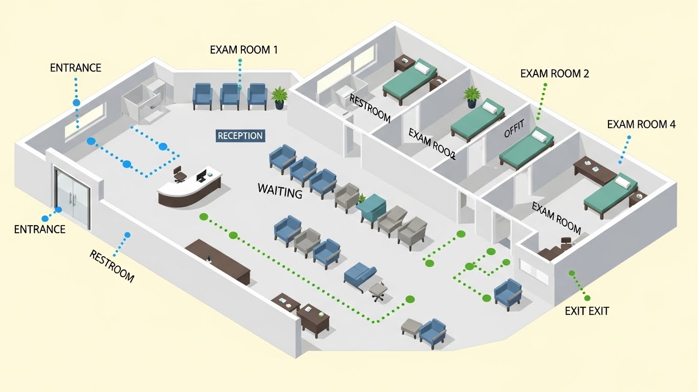
The Visual & Narrative Approach
This style offers a "God's eye view" of the clinical workflow. An isometric 2D illustration of a medical clinic floor plan reveals the entire patient journey. The layout shows a reception desk, a waiting area, and examination rooms. Small, abstract dots representing patients flow smoothly through the rooms along dotted lines in soft sky blue and grass green. There are no bottlenecks. The design is flat with no shadows, set against a pale cream background, emphasizing clarity and organization.
Psychological Impact & KPI Focus
- Niche Psychology: Administrators love optimization. This style appeals to their desire for systemic control and visibility. It transforms the clinic into a manageable, optimize-able system.
- Operational Impact: It effectively demonstrates Solution Differentiation by showing where the AI intervenes in the physical workflow, not just the digital one.
Strategic Implementation & Trade-offs
- Best Use Case: Website "How It Works" sections or Middle-of-Funnel (MOFU) explainer videos.
- Trade-off: It can feel detached or impersonal. It visualizes the process perfectly but removes the human element of care. It should be paired with human-centric messaging.
Companies using similar video content -
OneAdvanced Healthcare – AI Solutions – Streamlines operations, optimizes resource allocation.
IntuitionLabs – AI in Hospital Operations – Automates tasks, supports clinical staff.
7. Isometric 3D Workflow: The Infrastructure Model
MOFU | Feature Education

The Visual & Narrative Approach
Elevating the 2D floor plan into a 3D "clay render" aesthetic, this style adds weight and tactile reality to the software's ecosystem. We see a 3D isometric render of a miniature hospital environment with soft, global lighting. Detailed miniature elements include a tiny ambulance, patient beds, and an MRI machine. Glowing golden lines connect these elements to a central floating server block above the roof, symbolizing cloud integration. The palette is medical blue, pure white, and matte clay grey.
Psychological Impact & KPI Focus
- Niche Psychology: 3D renders imply substance and high capital investment. Using this style signals that your platform is a serious, enterprise-grade solution, not a fly-by-night app.
- Operational Impact: The "glowing lines" metaphor effectively communicates connectivity and interoperability—critical concerns for hospital IT directors who fear data silos.
Strategic Implementation & Trade-offs
- Best Use Case: Feature pages on the website or deep-dive product demos.
- Trade-off: Production time is higher. This style is less flexible for quick updates than 2D vector, so it should be used for evergreen "Core Infrastructure" content.
Companies using similar video content -
R1 RCM – R1 Acceleration Platform – AI for revenue cycle management.
AGS Health – AGS AI Platform – Automates, optimizes, and forecasts RCM workflows.
8. Photorealistic 3D Renders: The Executive Standard
MOFU | Establishing Thought Leadership

The Visual & Narrative Approach
For establishing Thought Leadership, we move to high-fidelity photorealism. We see a photorealistic 3D render of a high-end executive doctor's desk. The focus is on a sleek, metallic tablet stand displaying a blank but glowing screen with a subtle blue hue. Beside it lies a high-quality stethoscope with chrome detailing and a pair of rimless glasses. The lighting is natural sunlight streaming from a window on the left, casting realistic soft shadows on the mahogany desk surface.
Psychological Impact & KPI Focus
- Niche Psychology: Doctors and executives aspire to this level of calm and status. It utilizes the "halo effect," associating your software with high-end medical devices and a successful practice.
- Operational Impact: It builds brand prestige. This visual says, "This software is for the top 1% of practices."
Strategic Implementation & Trade-offs
- Best Use Case: LinkedIn Articles, Whitepaper covers, or High-Ticket sales decks.
- Trade-off: It is purely brand-building. It conveys zero information about features. It relies entirely on the surrounding text to carry the functional message.
Companies using similar video content -
Merative – Clinical Decision Support – AI-powered, evidence-based clinical insights.
Wipro – AI Predictive Analytics – Rationalizes resource allocations, monitors disease.
9. Rapid UI Feature Montage: The Value Stack
MOFU | Accelerating Time-to-Value
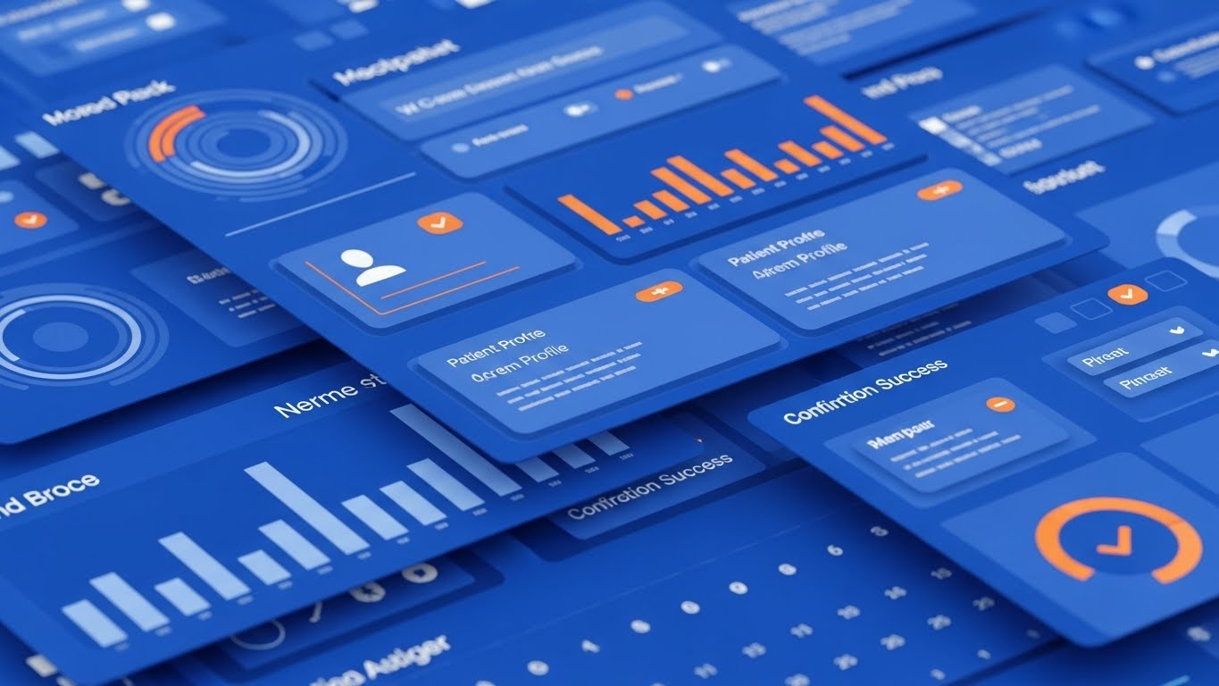
The Visual & Narrative Approach
When the goal is Accelerating Time-to-Value, we need to show the product. This style uses a composite image simulating a rapid montage of UI screens. Multiple layers of abstract software interfaces are stacked, featuring calendar grids, patient profile cards, and success checkmarks. The color palette utilizes bright orange accents against a dominant cobalt blue interface. The composition implies speed and distinct functional blocks fitting together like a puzzle, suggesting a frictionless, responsive user experience.
Psychological Impact & KPI Focus
- Niche Psychology: "Is this hard to learn?" is a primary barrier. This montage suggests the interface is intuitive, modular, and modern—similar to the consumer apps (like Spotify or Uber) that users already know.
- Operational Impact: It provides "Social Proof" of the product's existence and polish. It reassures the buyer that the tool is real and ready for deployment.
Strategic Implementation & Trade-offs
- Best Use Case: Instagram/Facebook Retargeting Ads or App Store preview videos.
- Trade-off: Rapid cutting can be overwhelming. It creates an impression of the UI rather than a tutorial. It sells "usability" rather than teaching "usage."
Companies using similar video content -
NextGen Healthcare EHR – EHR Software – Drives efficiencies, improves patient outcomes.
Athenahealth – athenaOne AI-native EHR – Supports clinical decision-making, streamlines tasks.
10. Split Screen: Optimized Reality and UI: The Ambient Partner
MOFU | Driving Demo Requests

The Visual & Narrative Approach
This style brings it all together for the bottom of the funnel. A split-screen composition pairs the human outcome with the digital enabler. The left half shows a high-quality photograph of a male doctor with deep skin tones, wearing a crisp white coat and smiling confidently at a patient (off-camera). The right half shows a clean, vector-based UI sidebar menu in white and light grey, listing abstract menu items like "Appointments" and "Records." The lighting on the doctor matches the clean brightness of the UI, visually fusing the two worlds.
Psychological Impact & KPI Focus
- Niche Psychology: The ultimate fear is that technology will disrupt the doctor-patient relationship. This visual proves the opposite: the UI (Right) runs in parallel to the Care (Left), enabling the doctor to be more present.
- Operational Impact: It is the perfect visual summary of the value proposition: "High Tech, High Touch." It serves as a visual guarantee of the product promise.
Strategic Implementation & Trade-offs
- Best Use Case: LinkedIn Conversion Ads or Landing Page Hero sections.
- Trade-off: Requires high-quality custom photography to match the UI. Stock photos often fail here because the doctor's eye line doesn't match the implied interaction, breaking the immersion.
Companies using similar video content -
Abridge – AI Platform – Enhances patient engagement by freeing clinicians.
Glass – AI Diagnosis & CDS – Captures conversations, provides real-time insights.
11. Low-Poly 3D Modeling: The Structural Architect
MOFU | Shaping Brand Perception

The Visual & Narrative Approach
To shift brand perception from "just another transcription tool" to an "architect of order," we utilize a Low-Poly 3D aesthetic. A stylized doctor figure, constructed from clean, faceted triangles in calming low-poly blue and grey, stands on a floating geometric island. The doctor is seen actively organizing floating geometric blocks—representing disparate patient data points—into a neat, vertical tower. The background is a soft, gradient violet to white. This animation is deliberate and satisfying, emphasizing the transformation of chaos into order.
Psychological Impact & KPI Focus
- Niche Psychology: Clinicians deal with unstructured chaos daily—patient narratives, symptoms, and history. This visual metaphorically validates the AI's core function: structuring the unstructured. It appeals to the physician's desire for cognitive organization and logic.
- Operational Impact: It visually represents Data Integrity. By simplifying the doctor and the data into polygons, we remove the "messiness" of real life and present a sanitized, optimized version of clinical documentation processes.
Strategic Implementation & Trade-offs
- Best Use Case: Blog headers for technical articles (e.g., "The Logic of NLP"), "How It Works" website sections, or deck slides explaining data processing.
- Trade-off: The stylized nature creates a slight distance from reality. It is excellent for conceptual branding but less effective for showing specific UI features or detailed clinical workflows.
Companies using similar video content -
MedTagger – Clinical NLP System – Extracts clinical information from unstructured text.
Apache cTAKES – Open-source NLP – Extracts clinical information from free-text.
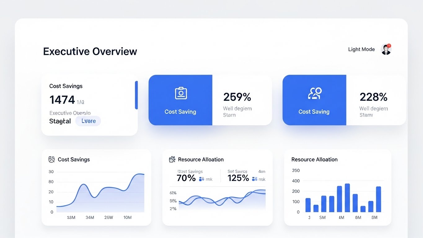
12. Dynamic Data Visualization: The Revenue Trajectory
BOFU | ROI Justification

The Visual & Narrative Approach
When speaking to the CFO or Hospital Administrator, abstract metaphors must give way to hard numbers. This style features 3D bar charts physically growing out of a sleek tablet surface, rendered in premium "Financial Gold" and "Trust Navy" glass. A neon green trajectory arrow winds dynamically upwards around the bars, emphasizing momentum. The dark, professional gradient background ensures the data pops, signaling precision and high-value analytics. The motion is smooth and accelerating, mimicking the compounding returns of efficiency.
Psychological Impact & KPI Focus
- Niche Psychology: Administrators are risk-averse; they need to see the "upside." This visual triggers the Gain Motivation center of the brain. It moves the conversation from "cost of software" to "revenue recovered" (e.g., through reduced claim denials or increased patient throughput).
- Operational Impact: It directly visualizes Revenue Cycle Management (RCM) improvements. It serves as visual proof that the AI is not just a clinical aid, but a financial asset that pays for itself.
Strategic Implementation & Trade-offs
- Best Use Case: Pitch Decks for investor relations, final-stage sales presentations to the C-Suite, or "ROI Calculator" results pages.
- Trade-off: Without accurate context or accompanying text, it can look like generic "business growth." It relies heavily on the narration or slide headers to define what the bars actually represent (e.g., "Billable Encounters").
Companies using similar video content -
Collectly – AI in RCM – Automates tasks, improves accuracy, increases efficiency.
Waystar – AI-powered Platform – Accelerates reimbursements, improves patient experience.
13. Wireframe to Reality Transition: The Modernization Shift
BOFU | Competitive Displacement
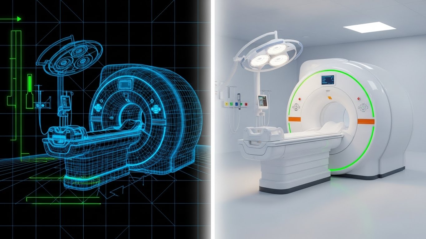
The Visual & Narrative Approach
To visualize Competitive Displacement—convincing a prospect to rip and replace their legacy system—we use a "Blueprint to Reality" transition. A split-screen composition shows a complex MRI machine. The left side is a technical blue grid wireframe, representing the concept or the "old way" of planning. A bright white vertical line sweeps across, revealing the right side: a stunning, photorealistic, glossy white machine in a modern hospital room. This implies that your software turns theoretical efficiency into tangible clinical reality.
Psychological Impact & KPI Focus
- Niche Psychology: Decision-makers fear that new software will be "vaporware" or half-finished. This visual creates a bridge between the architectural plan (the promise) and the finished product (the delivery), reducing the perceived risk of migration.
- Operational Impact: It communicates Implementation Maturity. It says, "We aren't just coding; we are deploying real infrastructure." It targets the buyer's fear of unfinished or beta-test software.
Strategic Implementation & Trade-offs
- Best Use Case: Remarketing Ads targeting users of competitor software or "Switching to Us" landing pages.
- Trade-off: It is a high-level conceptual visual. It doesn't show the user interface, so it sells the outcome of the switch rather than the process of the switch.
Companies using similar video content -
Bitstrapped – Generative AI – Automates medical documentation process, improves efficiency.
Vozo – Generative AI – Transforms medical documentation processes.
14. Dark Mode UI Showcase: The Compliance Vault
BOFU | Risk Mitigation

The Visual & Narrative Approach
Security in healthcare is not a feature; it is a binary requirement. To visualize Risk Mitigation (HIPAA/SOC2), we utilize a sleek Dark Mode UI aesthetic. The background is a deep charcoal gray, allowing neon green elements to glow with intensity. The focal point is a stylized "Shield" and "Padlock" icon, pulsating gently to suggest active monitoring. Abstract grey bars represent encrypted text. This visual language borrows from cybersecurity imagery to signal robust protection.
Psychological Impact & KPI Focus
- Niche Psychology: For the CMIO and IT Director, data breaches are a career-ending nightmare. This aesthetic creates a Safety Signal. The dark mode suggests a "back-end" or "root level" security that is always on, protecting the institution from the shadows.
- Operational Impact: It visualizes the invisible layer of Data Governance. It reassures stakeholders that patient privacy (PHI) is the foundation of the platform, not an afterthought.
Strategic Implementation & Trade-offs
- Best Use Case: Security Whitepapers, Trust Center pages on the website, or IT-specific sales collateral.
- Trade-off: Dark mode can feel "hacker-ish" if overdone. It must remain clean and corporate to avoid a dystopian cyber-punk look which might alienate non-technical stakeholders.
Companies using similar video content -
BastionGPT – Medical GPT – Secure, HIPAA-compliant AI for clinical notes.
Hathr.AI – AI Platform – Provides secure healthcare workflows, encrypted data handling.
15. Abstract 3D AI Visualization: The Medical Intelligence Core
BOFU | The Economic Buyer

The Visual & Narrative Approach
The Economic Buyer asks: "Why is this AI better than generic ChatGPT?" This style answers by visualizing a Specialized Neural Network. We see a web of glowing nodes in vibrant purple and cyan, floating in a digital void. Crucially, the nodes are not random spheres; they are shaped like medical crosses and pill capsules. Intricate filaments connect them, representing the association between symptoms, diagnoses, and treatments. The aesthetic is high-tech, expensive, and distinctly medical.
Psychological Impact & KPI Focus
- Niche Psychology: This addresses the "Generic AI" objection. It proves visual Domain Expertise. It shows that your model is trained specifically on medical data, not just general internet text.
- Operational Impact: It visualizes Clinical Context Awareness. It implies the system understands that "admin" means "administration of medication," not "administrative assistant," reducing error rates in documentation.
Strategic Implementation & Trade-offs
- Best Use Case: Website "Technology" or "AI Platform" pages; Background loops for keynote presentations.
- Trade-off: Highly abstract. It works best when paired with audio or text explaining how the specific training data benefits the hospital (e.g., "Trained on 10 million patient encounters").
Companies using similar video content -
Ekipa AI – AI Solutions – Delivers personalized insights, enhances diagnostic accuracy.
OpenAI for Healthcare – API Platform – Powers tools with latest models, GPT-5.2.
16. 3D X-Ray Visualization: The Infrastructure Audit
BOFU | The Technical Buyer

The Visual & Narrative Approach
For the Technical Buyer (CTO/CIO), beauty is transparency. We use a 3D X-Ray effect to look inside the machine. A computer server rack is rendered with a semi-transparent, ghostly white casing. Inside, the "organs" of the server—hard drives, data cables, cooling units—are visible in solid, opaque primary colors (Red, Blue, Yellow). This visual metaphor suggests that your company has nothing to hide; your infrastructure is organized, robust, and ready for inspection.
Psychological Impact & KPI Focus
- Niche Psychology: IT leaders deal with "black boxes" that break. This style offers Transparency and Control. It signals that your architecture is modular and accessible, alleviating fears of vendor lock-in or unfixable bugs.
- Operational Impact: It visualizes System Reliability and Uptime. The organized cables and glowing components suggest a well-oiled machine that can handle high patient loads without latency.
Strategic Implementation & Trade-offs
- Best Use Case: Technical Specifications pages, Implementation Guides, or during the "Architecture Review" phase of the sales cycle.
- Trade-off: It is visually "cold" and hardware-focused. It should not be used for clinicians, as it disconnects from the patient care aspect entirely.
Companies using similar video content -
Infinx – AI for RCM – Automates, optimizes, and forecasts RCM workflows.
AGS Health – AGS AI Platform – Combines AI and HITL for smarter revenue cycle.
17. Lifestyle Stock with UI Overlay: The Ambient Promise
BOFU | Building Trust & Credibility
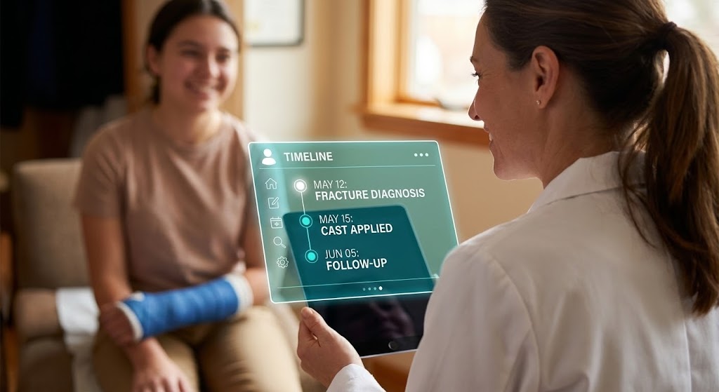
The Visual & Narrative Approach
This style brings the focus back to the human element to Build Trust. We use high-quality photography of a doctor interaction—warm lighting, genuine eye contact, empathy. The doctor is not looking at the screen. However, in the foreground, blurred slightly to show depth, is a tablet with a sharp, holographic UI overlay in bright teal. This "Augmented Reality" look visually demonstrates the concept of Ambient Computing—the tech is there, active and helpful, but it does not obstruct the human connection.
Psychological Impact & KPI Focus
- Niche Psychology: The "screen" is the enemy of the patient connection. This visual resolves that conflict by showing the screen as a passive support, not an active barrier. It validates the doctor's primary role as a caregiver.
- Operational Impact: It visualizes Workflow Integration. It shows the software capturing the "Fracture Diagnosis" and "Cast Applied" timeline automatically, requiring no manual data entry from the physician during the exam.
Strategic Implementation & Trade-offs
- Best Use Case: Case Studies, Testimonial Videos, and "Day in the Life" marketing assets.
- Trade-off: Requires exceptional photography. If the stock photo looks staged or the lighting doesn't match the UI overlay, the "trust" factor collapses, and it looks like a cheap composite.
Companies using similar video content -
Abridge – AI Platform – Enhances patient engagement by freeing clinicians.
DeepScribe – AI Scribe – Ambient nature doesn't intrude on patient visit.
18. 2D Line Art Animation: The Simplicity Loop
BOFU | Objection Handling

The Visual & Narrative Approach
To handle objections regarding complexity, we revert to the absolute simplest visual form: the single continuous line. On a textured white paper background, a black ink line draws a complex hospital building, then fluidly morphs into a simple, confident "Checkmark" inside a circle. The animation is smooth and elegant. This reductionist style visually argues that your software takes the complexity of a hospital (the building) and reduces it to a simple task (the checkmark).
Psychological Impact & KPI Focus
- Niche Psychology: Overwhelmed users crave closure. The checkmark is the universal symbol of "done." This style appeals to the desire to finish the day's charting and go home.
- Operational Impact: It visualizes Ease of Use and Task Completion. It suggests that complex approval workflows or billing codes are handled in the background, leaving the user with a simple "approve" action.
Strategic Implementation & Trade-offs
- Best Use Case: Email Footers, Loading Screens within the app, or subtle micro-interactions on the pricing page.
- Trade-off: It is purely symbolic. It cannot explain how the complexity is reduced, only that it is reduced. It works best as a visual punctuation mark.
Companies using similar video content -
QuickSlot Health – EMR-native Tools – Automates every step of workflow, precise billing.
Nudge AI – AI for Mental Health – Automates SOAP notes, making documentation faster.
19. Clean UI Workflow (Light Mode): The Welcome Mat
Onboarding | Self-Serve Onboarding
The Visual & Narrative Approach
The sale is won, but retention starts now. To facilitate Self-Serve Onboarding, we present a pristine, "High-Key" UI visualization. The background is pure white. The interface cards, featuring abstract profiles and data, float with soft drop shadows. A large, friendly, bright blue mouse cursor hovers invitingly over a "Get Started" button. The aesthetic is airy, open, and uncluttered, sharply contrasting with the dense, grey interfaces of traditional EHRs.
Psychological Impact & KPI Focus
- Niche Psychology: "New software" usually means "painful training seminar." This visual counters that by mimicking the friendly, intuitive design of consumer apps (like Airbnb or Dropbox). It signals Low Cognitive Load.
- Operational Impact: It visualizes Time-to-Productivity. It implies that a user can log in and start working immediately without reading a manual, directly impacting adoption rates.
Strategic Implementation & Trade-offs
- Best Use Case: Welcome Emails, First-Time Login screens, and "Getting Started" video tutorials.
- Trade-off: It represents the "Happy Path" only. It doesn't show how the UI handles complex errors or edge cases, so it is strictly for setting a positive initial expectation.
Companies using similar video content -
Dezy It – Practice Management – Automates patient call handling, intake, scheduling.
Pabau – Practice Management – Streamlines tasks, appointment scheduling, billing.
20. 2D Animation & UI Composition: The Interactive Partner
Onboarding | Reducing Implementation Friction

The Visual & Narrative Approach
To humanize the implementation process, we combine character animation with UI elements. A stylized, friendly female doctor character (cel-shaded, approachable) interacts with large, floating UI buttons that hang in the air around her. As she touches a "Gear" icon, it glows vibrant coral, indicating responsiveness. The background is a soft abstract teal gradient. This "Minority Report meets Disney" style makes the interaction feel magical yet controlled.
Psychological Impact & KPI Focus
- Niche Psychology: Users often feel subservient to medical software. This visual flips the dynamic: the doctor is the protagonist, and the software (the floating buttons) is a responsive tool that waits for her command.
- Operational Impact: It visualizes User Empowerment. It shows the software reacting to the human, not the human struggling to input data into the software.
Strategic Implementation & Trade-offs
- Best Use Case: In-app onboarding videos, "Walkthrough" tutorials, and Customer Success newsletters.
- Trade-off: The character design must be inclusive and professional. If it is too juvenile, it can feel condescending to highly trained medical professionals. It must tread the line between "friendly" and "competent."
Companies using similar video content -
Suki AI – Voice Assistant – Responds to voice commands for documentation.
Heidi Health – AI Medical Scribe – Provides interactive support for clinicians.
21. Minimalist Flat 2D Vector: The Knowledge Anchor
Onboarding | Knowledge Base & FAQ Videos

The Visual & Narrative Approach
When users are stuck, they do not want spectacle; they want answers. For the Onboarding phase, we return to the Minimalist Flat 2D Vector style to represent the "Knowledge Base." The visual features a perfectly symmetrical open book icon with pristine white pages, anchored by a flat, "medical blue" cross. The background is a distraction-free soft grey. This is not about motion or flash; it is about stability. It visualizes the software not just as a tool, but as a reliable repository of truth.
Psychological Impact & KPI Focus
- Niche Psychology: Frustration rises quickly when technology fails during a patient visit. This clean, iconographic style lowers the "blood pressure" of the moment. It signals that the answer is simple, accessible, and authoritative, reducing the anxiety of "not knowing."
- Operational Impact: It visually categorizes Self-Help Resources. By establishing a consistent visual language for "Help," you condition users to look for these simple icons when they need support, directly impacting Support Ticket Deflection.
Strategic Implementation & Trade-offs
- Best Use Case: Thumbnails for Help Center articles, iconography within the chatbot interface, or "Quick Tip" overlays.
- Trade-off: It is static and basic. It cannot communicate how to solve a complex problem, only where to find the solution. It is a signpost, not the destination.
Companies using similar video content -
Treatment.com AI Inc. – Global Library of Medicine – Source of reliable information for practitioners.
Glass – AI Diagnosis & CDS – Provides evidence-based clinical reference with citations.
22. Macro UI Micro-Interactions: The Tactile Toggle
Retention | Reducing Support Overhead

The Visual & Narrative Approach
To emphasize the simplicity of new feature adoption during Retention, we zoom in—extreme macro. This style features a photorealistic close-up of a single UI toggle switch. The focus is soft and cinematic, blurring the edges to draw the eye to the center: a toggle clicking into the "On" position and glowing with a vivid, "success-state" lime green. The texture of the dark grey surface appears matte and premium. This visualizes the tactile satisfaction of enabling a powerful feature (like "Auto-Correct") with a single click.
Psychological Impact & KPI Focus
- Niche Psychology: Clinicians fear that "updating settings" involves complex menus. This visual proves the opposite. It triggers a dopamine response associated with "activation" and "readiness," making the software feel responsive and tangible.
- Operational Impact: It promotes Feature Discovery. By isolating the specific interaction (the click), you remove the noise of the surrounding dashboard and focus the user's attention on the ease of upgrading their workflow.
Strategic Implementation & Trade-offs
- Best Use Case: Feature Update emails (GIF format), "What's New" tooltips, or social media teasers for platform updates.
- Trade-off: Lacks context. A toggle on its own doesn't explain what is being turned on. It requires strong accompanying copy to define the value of the feature.
Companies using similar video content -
DeepCura AI – AI Medical Scribe – Focuses on ease of use and activation.
Zirr AI Medical Scribe – AI Medical Scribe – Streamlines creation of medical charts.
23. Aspirational Stock Montage: The Team Harmony
Retention | Reducing Churn

The Visual & Narrative Approach
Retention is driven by feeling. This style shifts from the screen to the outcome of the software: a happy, cohesive care team. We use a cinematic, backlit shot of a diverse group of hospital staff walking down a sunlit corridor. They are talking and laughing, not rushing. The lighting is warm and golden (Golden Hour), contrasting with the sterile blue usually associated with hospitals. This is "The Day After Implementation"—a visual promise of the culture shift your software creates.
Psychological Impact & KPI Focus
- Niche Psychology: Burnout isolates; shared success unites. This visual reminds the buyer (Medical Director) of their ultimate goal: a sustainable, happy workplace. It validates the software purchase as a "Culture Investment," not just an IT expense.
- Operational Impact: It reinforces Brand Loyalty. By associating your brand with the positive emotions of teamwork and relief, you create an emotional moat against competitors who focus only on features.
Strategic Implementation & Trade-offs
- Best Use Case: Customer Newsletters, Quarterly Business Review (QBR) covers, or "Year in Review" videos.
- Trade-off: It can feel generic if overused. Without specific brand elements or UI overlays, it looks like a standard pharmaceutical ad. It serves as an emotional anchor, not an informational one.
Companies using similar video content -
Rocket Doctor AI – AI Solutions – Improves work-life balance, reduces stress.
Abridge – AI Platform – Measurably improving outcomes for clinicians, nurses.
24. Abstract 2D Motion Graphics: The Rhythm of Care
Retention | Website Visitor Re-engagement

The Visual & Narrative Approach
To maintain top-of-mind awareness without being intrusive, we use Abstract Motion. Fluid, organic shapes in soft lavender and cream loop continuously against a deep plum background. The motion mimics the rhythm of breathing or a calm heartbeat—never erratic, always smooth. The shapes intertwine, symbolizing the seamless weaving of AI into the clinical workflow. This "Screensaver Aesthetic" is designed to be soothing and hypnotic.
Psychological Impact & KPI Focus
- Niche Psychology: In a high-stress environment, "calm" is a premium asset. This visual style operates on the subconscious, signaling that your brand is a source of stability and non-intrusive support.
- Operational Impact: It drives Brand Recall. The unique color palette and fluid motion serve as a "visual scent," making your brand instantly recognizable on display networks without needing to scream a sales message.
Strategic Implementation & Trade-offs
- Best Use Case: Re-targeting Display Ads, Webinar waiting screens, or subtle website background elements.
- Trade-off: Zero informational value. It is purely aesthetic. It captures the eye but must be paired with a headline to capture the mind.
Companies using similar video content -
Arcadia – Predictive Analytics – Provides insights into patient care, resource management.
GoodData – Predictive Analytics – Forecasts future health outcomes, identifies patterns.
25. Futuristic Neon/Dark Mode: The AI Brain
Expansion | Driving Upsell/Cross-sell
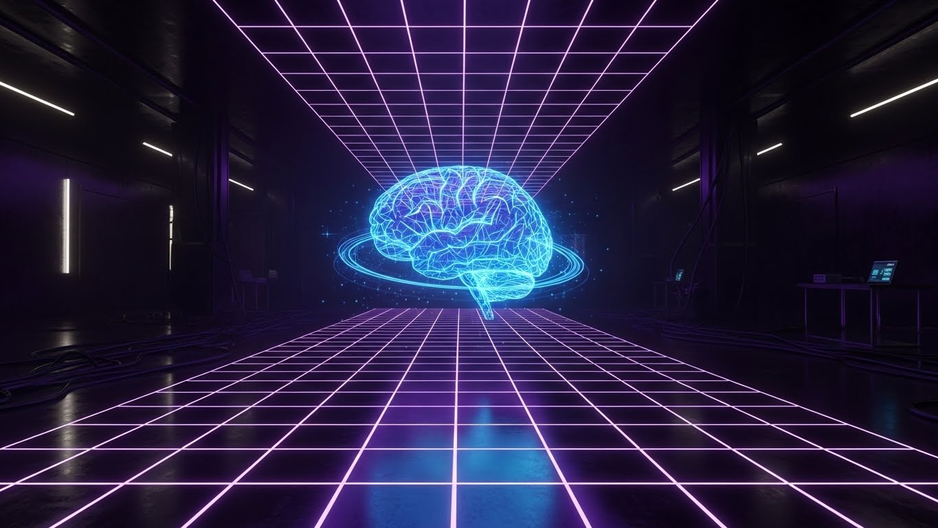
The Visual & Narrative Approach
When upselling "Premium Intelligence" or "Predictive Analytics," the visual language must shift to "Next-Gen." We utilize a Cyberpunk Medical aesthetic: a dark, server-room environment illuminated by a purple neon perspective grid. Floating in the center is a holographic, glowing blue brain, detailed with data nodes. This is not just documentation; this is thinking. The contrast between the deep blacks and the electric blue lines screams "Advanced Technology."
Psychological Impact & KPI Focus
- Niche Psychology: Innovation leaders want to feel they are on the cutting edge. This style appeals to the "Futurist" persona within the hospital leadership. It visually justifies a higher price point by signaling superior computational power.
- Operational Impact: It visualizes Predictive Capability. It moves the perception of the tool from "Passive Recorder" to "Active Intelligence," opening the door for conversations about add-on modules like Clinical Decision Support (CDS).
Strategic Implementation & Trade-offs
- Best Use Case: Product Launch videos for new modules, Keynote presentations, or "Enterprise Tier" landing pages.
- Trade-off: Can appear "Sci-Fi" and unrealistic. If the actual product UI is a simple white text box, this marketing visual might create a gap in expectations. Use carefully to represent the backend power, not the frontend interface.
Companies using similar video content -
Wipro – AI Predictive Analytics – Predicts disease progression, optimizes resource allocation.
Ekipa AI – AI Solutions – Predictive analytics for disease risk, drug interaction monitoring.
26. 3D Parallax UI Presentation: The Analytics Deep Dive
Expansion | Driving Deep Feature Adoption

The Visual & Narrative Approach
To encourage users to go deeper into the platform, we visualize the "Depth" of data. This style uses a 3D environment where multiple translucent glass UI screens float at different depth levels (parallax). The foreground screens show summary metrics, while background screens reveal complex analytics and patient population health trends. The camera drifts slowly sideways, revealing the layers. The aesthetic is "Glassmorphism"—clean, blue, and sophisticated.
Psychological Impact & KPI Focus
- Niche Psychology: Administrators often only see the surface. This visual metaphor shows them that "there is more beneath the surface." It invites exploration and suggests that the platform holds untapped value waiting to be discovered.
- Operational Impact: It visualizes Data Granularity. It demonstrates that your platform can handle both the high-level view (Admin) and the granular view (Clinician), supporting "Expansion" conversations across different departments.
Strategic Implementation & Trade-offs
- Best Use Case: Webinar backgrounds, "Advanced Reporting" feature pages, or loopable video headers for case studies.
- Trade-off: Text on the floating screens can be hard to read. This style is about the impression of data density, not the specific data points themselves.
Companies using similar video content -
Arcadia – Predictive Analytics – Leverages big data to provide insights.
GoodData – Predictive Analytics – Analyzes historical data to make informed predictions.
27. 2D Graphics Over Live Action: The In-App Magic
Expansion | In-App Upsell

The Visual & Narrative Approach
To visualize the "magic" of an upgrade within the app, we combine reality with delight. A medium shot (photo or video) shows a nurse or doctor at a station, looking at a monitor with a neutral expression. Suddenly, 2D animated elements—flat yellow "sparkles," "upward arrows," and "lightning bolts"—erupt from the screen. The user smiles. This "Mixed Reality" style visually represents the moment a new feature (like "Auto-Coding") is activated, transforming a boring task into a delightful one.
Psychological Impact & KPI Focus
- Niche Psychology: Routine work is dull. Visualizing the software as a source of "energy" or "magic" disrupts the monotony. It frames the Upsell not as "more money" but as "more ease" and "more power."
- Operational Impact: It visualizes Instant Gratification. It suggests that the benefits of the upgrade are immediate and tangible, encouraging click-through on in-app modals.
Strategic Implementation & Trade-offs
- Best Use Case: In-App Modals ("Try Pro features"), social media stories, or gamified training modules.
- Trade-off: Can look juvenile if the animations are too cartoony. The live-action footage must remain professional to anchor the whimsy of the graphics.
Companies using similar video content -
Mobius Conveyor – AI Medical Scribe – Enhances workflow with AI.
INVOX Medical – AI & Speech Recognition – Transforms clinical documentation.
28. AI Generated Mixed Media Video: The Texture of Medicine
Expansion | Driving Referrals & Advocacy

The Visual & Narrative Approach
To drive advocacy, we need to stand out creatively. This style uses a dynamic, stop-motion collage aesthetic. Ripped paper textures, 3D rendered pills, flat vector calendar pages, and realistic photos of stethoscopes collide and rearrange on a textured cardboard background. The lighting is harsh and artistic. This "Gritty/Real" aesthetic breaks the mold of clean, sterile medical marketing, signaling authenticity and a grassroots connection to the reality of medical practice.
Psychological Impact & KPI Focus
- Niche Psychology: Doctors trust other doctors, not "corporate suits." This "unpolished" (yet highly produced) artistic style signals that the brand is confident, creative, and "real." It builds the Cultural Capital needed for a user to recommend you to a peer.
- Operational Impact: It visualizes Complexity Management. The collage metaphor implies that your software takes the messy, disparate parts of medicine (pills, schedules, tools) and arranges them into art.
Strategic Implementation & Trade-offs
- Best Use Case: Social Media Campaigns (Instagram/TikTok), "Community" highlight reels, or Event openers.
- Trade-off: Polarization. Traditionalists may find it "messy" or unprofessional. It is a high-risk, high-reward style suited for social channels rather than the boardroom.
Companies using similar video content -
Harmony (by Fast Data Science) – NLP & Generative AI – Harmonizes mental health data.
Apache cTAKES – Open-source NLP – Information extraction from from clinical free-text.
29. Generative AI Cinematic Video: The Future Facility
Expansion | Demand Gen & Lead Capture

The Visual & Narrative Approach
To capture leads for enterprise-wide deployments, we sell the dream. This style uses high-end Generative AI to create a cinematic wide shot of a futuristic hospital lobby. Robots glide silently; smart glass walls display subtle data streams; the lighting is a dramatic teal and orange. It looks like a sci-fi movie. This is not the hospital of today; it is the "Smart Hospital" of tomorrow that your software helps build.
Psychological Impact & KPI Focus
- Niche Psychology: Hospital CEOs are competing to be the most advanced. This visual feeds their Aspiration. It positions your software as a foundational element of the "Hospital of the Future," not just a utility.
- Operational Impact: It visualizes Scale and Modernization. It implies that your solution is native to the next generation of healthcare facilities, creating a sense of urgency ("Don't be left behind").
Strategic Implementation & Trade-offs
- Best Use Case: YouTube Pre-roll Ads, Homepage Hero Video, or Booth backdrops at major conferences (HIMSS).
- Trade-off: It sets a very high bar. If the actual implementation is difficult or clunky, the disconnect between this "Sci-Fi" promise and the reality can lead to disappointment.
Companies using similar video content -
IntuitionLabs – AI in Hospital Operations – Transforming hospital operations, efficiency.
OneAdvanced Healthcare – AI in Hospitals – Revolutionizing patient care and operations.
30. Generative AI Realistic Character Video: The Human Face of Support
Expansion | Proactive Support/Announcements

The Visual & Narrative Approach
Finally, to scale support without losing the human touch, we use hyper-realistic AI avatars. A professional female customer success agent looks directly into the lens, smiling helpfuly. The background is a blurred, modern office. The lighting is perfect studio quality. This allows for the rapid creation of personalized "Update" or "Check-in" videos that feel personal but are generated at scale. It puts a face to the software.
Psychological Impact & KPI Focus
- Niche Psychology: Users ignore text emails. They respond to faces. This style leverages Social Connection triggers to increase engagement with support content and announcements. It says, "We are here for you."
- Operational Impact: It visualizes Accessibility. Even though it is AI-generated, the "human" presence reassures the user that they are supported, reducing the feeling of being "alone with the machine."
Strategic Implementation & Trade-offs
- Best Use Case: Personalized onboarding check-ins, "Patch Note" rundowns, or proactive support outreach emails.
- Trade-off: The "Uncanny Valley." If the lip-sync or eye movement is slightly off, it becomes creepy. Quality control on the generation is critical to maintaining trust.
STRATEGIC KNOWLEDGE BASE: The Visual Operations Doctrine
To transform these 30 visual styles from a "library of assets" into a cohesive business driver, we must apply a strategic framework. This section synthesizes the visual operational doctrine for AI Writing Assistant Software in healthcare.
STRATEGIC ALIGNMENT & VISUAL ARCHITECTURE
The "Pre-Production" Strategy. Why and Who.
- The Cognitive Load Audit: Before designing a single asset, audit the "Visual Noise" of your current training materials. If a clinician is spending 5 hours in the EHR, your training video cannot be clutter. It must be Style 1 (Minimalist) or Style 18 (Line Art)—reductionist by design.
- Role-Based Visual Mapping: Differentiate your visual strategy by persona. Use Mobile-First/Vertical styles (Style 3) for the Front-line Clinician who consumes content between rounds. Use Desktop/Data-Rich styles (Style 12, Style 26) for the CMIO/Administrator who needs to see the "Control Center" on a widescreen.
- The "Glanceability" Standard: In a clinical setting, attention is fragmented. Visual assets must pass the "Glance Test"—can the value be understood in 3 seconds? Use Style 4 (Hyper-lapse with Widgets) to anchor complex data in physical reality instantly.
- Brand Voice Consistency: Your AI tool likely integrates with various EHRs (Epic, Cerner). Your visual identity must be the "Red Thread" that connects these disparate screens. Use a consistent color palette (e.g., "Trust Navy" and "Signal Green") across all 30 styles to maintain brand sovereignty within third-party environments.
- The Advids Strategic Audit: Partnering with Advids allows for an external audit of your visual hierarchy. We help define this "Visual Operating System" before production begins, ensuring that every asset, from a 6-second bumper to a 3-minute case study, adheres to a unified strategic goal.
- Standardization vs. Customization: For core clinical workflows (Style 7), use standardized, evergreen 3D assets that don't age. For "News" and "Updates" (Style 30), use rapid-turnaround Generative AI styles. Balance high-value stock (Style 8) with bespoke explanation (Style 2) to manage budget without sacrificing authority.
- The Cross-Departmental Bridge: Visuals are the universal language. Use Style 6 (Isometric Floorplan) to align Sales (who sell the promise), Ops (who manage the flow), and Support (who fix the bugs) on the exact same workflow model.
- Legacy System Integration: You are selling innovation into legacy environments. Use Style 13 (Wireframe to Reality) to visually demonstrate the bridge between old on-premise hardware and your new cloud-based interface, reducing the fear of the "gap."
- Accessibility in Medicine: Your user base is diverse. Ensure all motion graphics (Style 5) and typography (Style 3) are legible and WCAG compliant. High contrast and clear hierarchy are not just aesthetic choices; they are patient safety requirements.
- The Mobile-First Mandate: Doctors live on their phones. Adapt all 30 styles for mobile consumption. A "Desktop-only" visual strategy ignores the reality of 50% of the clinician's day.
OPERATIONAL ADOPTION & IMPLEMENTATION
The "Deployment" Phase. How to embed visuals into the workflow.
- Overcoming "Big Brother" Anxiety: Clinicians fear AI is "watching" them to penalize performance. Use Style 10 (Split Screen) and Style 17 (Lifestyle with UI) to visually re-frame the AI as a "Silent Partner" that handles the grunt work, rather than a "Digital Overseer." Empathy in visualization is your best defense against rejection.
- The Micro-Learning Shift: No doctor reads the manual. Replace PDF guides with Style 9 (Rapid UI Montage) and Style 22 (Macro UI) clips. Deliver these 30-second "Micro-Doses" of training via email or in-app triggers, respecting the physician's time constraints.
- Just-in-Time Support: Embed Style 21 (Minimalist Vector) icons directly into the EHR interface. When a user hovers over a complex field, a 10-second explainer loop should trigger. Support should be ambient, not a destination.
- Gamification of Training: Use Style 27 (Graphics Over Live Action) to add a layer of "delight" to mandatory training. Visualizing progress bars, success sparkles, or "Level Up" graphics can increase completion rates for boring compliance modules.
- Reducing Support Ticket Volume: There is a direct correlation between the clarity of your visual guides and the volume of Level 1 support tickets. Investing in Style 2 (Explainer Stories) for common error states pays for itself by deflecting calls.
- Remote Onboarding: You cannot always send a trainer to the hospital. Leverage Style 7 (3D Workflow) and Style 30 (AI Avatars) to create a "Virtual Onboarding Seminar" that feels personal and high-touch, scaling your implementation team without travel costs.
- Standard Operating Procedures (SOPs): Text-based SOPs are dangerous because they are misinterpreted. Transform critical clinical SOPs into Style 6 (Isometric Motion) flows. Visual ambiguity is zero; text ambiguity is high.
- Feedback Loops: Use interactive video elements (Style 20) to gather feedback. If a user pauses a video repeatedly at the same second, your UI is likely confusing there. Use video analytics as a UX research tool.
- Scalable Localization: If you are deploying globally, use Style 5 (Abstract Motion) and Style 1 (Vector) which rely on universal symbols rather than translated text. This reduces the cost of localizing your training assets for different markets.
- Leadership Communication: When the CMIO needs to present progress to the Board, give them Style 12 (Dynamic Data Viz). Equip your champions with high-end visual assets that make them look good, and they will fight for your renewal.
MEASURING IMPACT & FUTURE-PROOFING
The "ROI" Phase. Measuring success and looking ahead.
- Beyond "Views": Vanity metrics (views) are useless in B2B. Measure Time-to-Competency (how fast a new user charts their first patient) and Feature Adoption Rate (how many users clicked the "Toggle" after seeing Style 22). Connect visuals to behavior.
- The "Idle Time" Metric: Correlate better visualization with reduced "Pajama Time" (charting at night). If your visual training is effective, physicians finish work earlier. This is the ultimate ROI metric for the buyer.
- Compliance Velocity: How fast can you get a hospital staff of 500 to understand a new HIPAA regulation? Use Style 14 (Dark Mode Security) to create urgent, clear compliance updates. Measure the speed of attestation before and after video implementation.
- Retention and Churn: High-quality UX visualization (Style 24) reduces the feeling of "clunkiness." Customers don't churn from software they love looking at. Track the correlation between consumption of "Pro Tip" videos and renewal rates.
- The AI Visual Frontier: Prepare for real-time generative video. In the future, the "Help" video will be generated instantly based on the specific patient chart the doctor is looking at. Start building the asset library (Style 11, Style 15) to feed these future models.
- Scalability of Assets: Build a "Visual Lego Kit." Don't make one-off videos. Create a library of reusable 3D assets (servers, pills, doctors - Style 7) that can be re-assembled into new narratives as your product evolves.
- The Advids Partnership: This is where Advids becomes your long-term infrastructure partner. We don't just create a video; we manage the lifecycle of your visual assets, ensuring they evolve with your version updates and scale with your user base, preventing "Asset Rot."
- Benchmarking Success: "Good enough" visuals are a competitive risk. If your competitor uses Style 8 (Photorealism) and you use generic 2D cartoons, you look like the riskier, cheaper option. Visual quality is a proxy for code quality in the buyer's mind.
- The ROI of Safety: In healthcare, an error is a lawsuit. Quantify the reduction in documentation errors (and subsequent claim denials) achieved through better visual training (Style 2). This is a hard-dollar ROI argument for the CFO.
- Final Call to Innovation: Treat video as Infrastructure, not marketing content. It is the interface through which your users learn, trust, and master your tool. Invest in it with the same rigor you apply to your code. The future of AI is invisible, but the path to adoption must be beautifully, strategically visible.
Companies using similar video content -
Dialzara – AI Virtual Phone Answering – Handles patient communication, scheduling.
OpenAI for Healthcare – ChatGPT for Healthcare – Secure, enterprise-grade foundation for AI.
Author & Editor Bio


