
The alcohol distribution industry is currently navigating a period of unprecedented fluidity. We are moving from an era defined by physical logistics—pallets, kegs, and paper invoices—into an age of digital precision. For the modern Distributor Principal and Operations Director, the challenge is no longer just moving liquid; it is moving data with the same speed and accuracy.
However, a significant disconnect remains. While the global wine, beer, and spirits software market is projected to reach $15.01 billion in 2025, signaling a massive appetite for digital solutions, the operational reality on the ground is often different. McKinsey reports that only 20 percent of warehouses have adopted advanced automation. This gap—the "Physical/Digital Divide"—is where efficiency bleeds out through shrinkage, breakage, and compliance errors.
For software platforms in this space, the goal is not just to sell features but to sell visibility. You must bridge the gap between the gritty, fast-paced reality of a warehouse and the clean, organized potential of your ERP. Video visualization is the bridge. By using the right visual language, you can reduce the cognitive load for busy Operations Directors, showing them exactly how your digital tool creates physical order.
This guide outlines 30 distinct visual styles designed to communicate value to the alcohol supply chain. From abstract representations of data flow to hyper-realistic augmented reality overlays, these styles are engineered to turn skepticism into adoption.
1. Abstract 2D flat vector organic
TOFU | Brand Awareness

Visual & Narrative Approach
This style masterfully utilizes the metaphor of "state change." It begins with fluid, organic shapes in vivid amber and bright white, representing the liquid nature of spirits. As the "liquid" flows across the screen, it encounters a digital threshold and morphs seamlessly into clean, geometric squares of cyan and white. The aesthetic is modern and glossy. The narrative is purely visual: transforming the chaos of liquid inventory into the order of digital data streams.
Psychological Impact & KPI Focus
Psychologically, this addresses the distributor's fear of disruption. The smooth, liquid transition implies that implementing your software will be frictionless. It bridges the gap between their product (alcohol) and your product (code). This style is designed for Ad Recall, using the high-contrast amber/cyan palette to stop the scroll on social feeds by promising a modernization of their core asset.
Strategic Implementation & Trade-offs
- Best Use: High-level brand awareness campaigns targeting decision-makers on Instagram or LinkedIn.
- Trade-off: It is purely conceptual. It builds a brand "vibe" but fails to explain how the software works (e.g., tax compliance or route accounting).
- Duration: 10-15 seconds.
Companies using similar video content -
Encompass Technologies – Fluid digitization for seamless supply chain integration.
Infor – CloudSuite Distribution – Abstract visualization of fluid SCM processes.
2. Isometric 2D Motion Design
TOFU | Category Creation
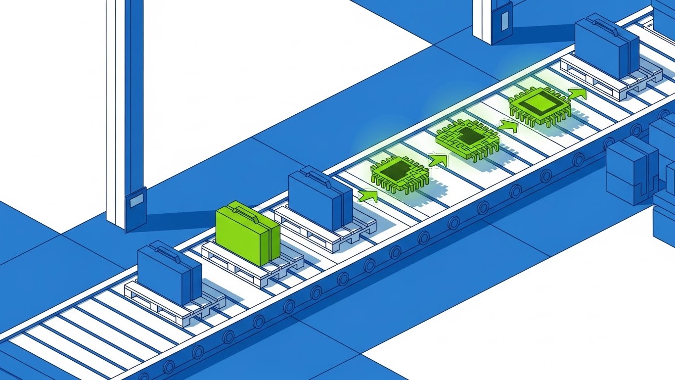
Visual & Narrative Approach
This style offers a "God’s-eye view" of the operation. Using an isometric perspective, we see a stylized warehouse conveyor belt. Wooden pallets holding abstract cases move along the line, but as they pass through a "scanner," they transform into glowing green circuit board chips. The palette is electric blue and lime green. The motion is rhythmic and clockwork-like, emphasizing precision, tracking, and the creation of a "digital twin" for every physical case.
Psychological Impact & KPI Focus
Isometric design appeals to the Operations Director's need for control and overview. It visually validates the promise of "Inventory Visibility." By turning cases into chips, you subconsciously signal that your software turns inert inventory into smart, trackable assets. This reduces the cognitive load of understanding complex WMS (Warehouse Management System) integrations.
Strategic Implementation & Trade-offs
- Best Use: Hero sections of landing pages or "How it Works" explainer videos to instantly communicate value.
- Trade-off: The "chip" metaphor might feel too tech-heavy for smaller, family-run distributors who value tradition over automation.
- Duration: 30-45 seconds.
Companies using similar video content -
VIP Global – Route Accounting System – Visualizing beverage logistics circuits.
Descartes Systems Group – Route Planner – Isometric view of optimized delivery routes.
3. Abstract 2D Motion Graphics
TOFU | Market Education
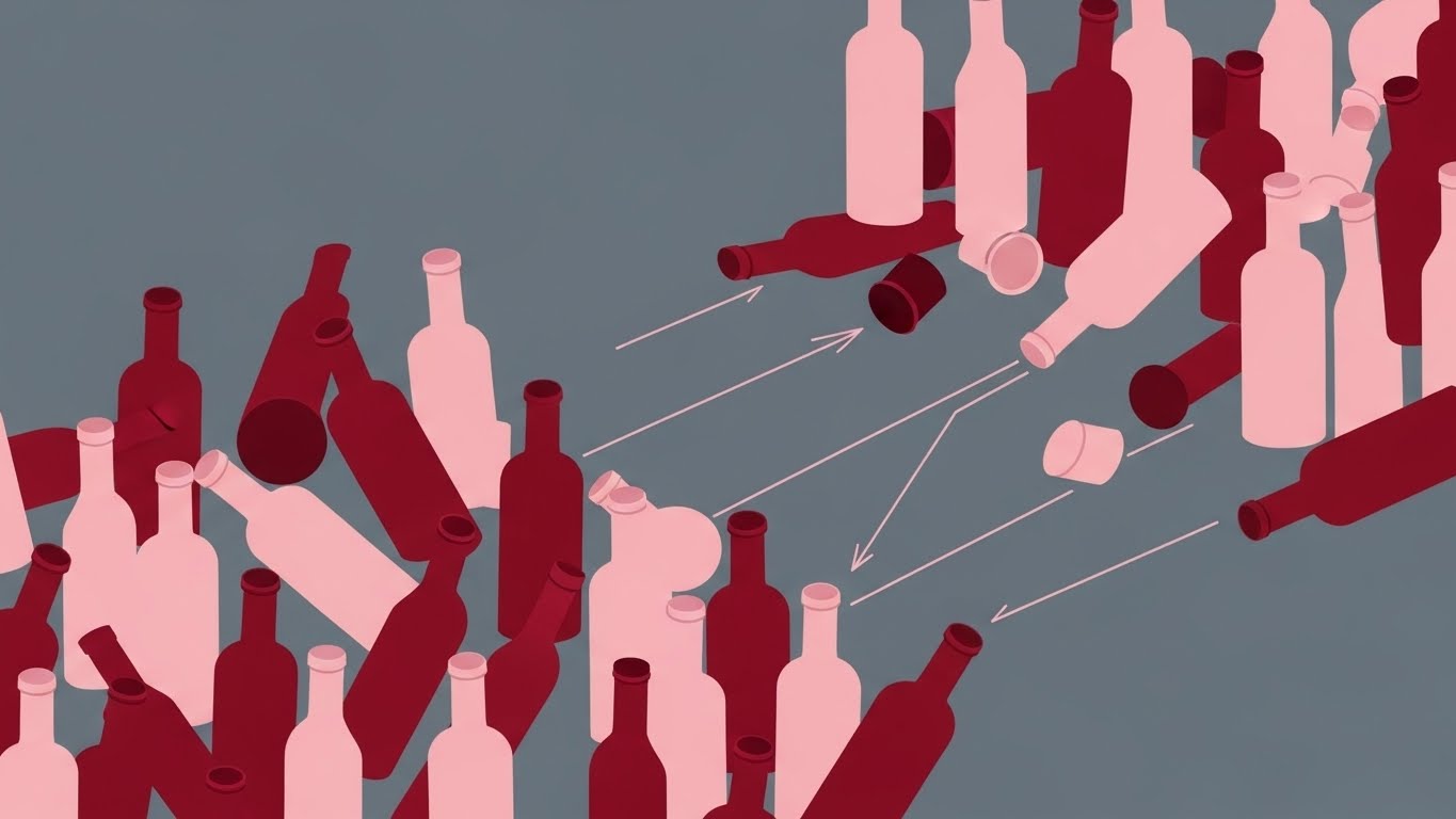
Visual & Narrative Approach
This style tackles the pain point of "Entropy." We see a chaotic scattering of abstract bottle silhouettes in deep Pinot Noir red and soft pink is being pulled into perfectly organized, symmetrical rows by invisible magnetic lines. The background is a clean slate grey. The motion is snappy and satisfying. It visualizes the core benefit of the software: imposing logic and order on a disorganized environment.
Psychological Impact & KPI Focus
This triggers a "satisfaction" response. For a manager dealing with messy warehouses and lost SKUs, seeing chaos snap into order offers a vicarious sense of relief. It effectively communicates SKU Rationalization and Automated Slotting without needing to show a complex spreadsheet or dashboard.
Strategic Implementation & Trade-offs
- Best Use: Educational content or "Problem/Solution" ads on YouTube intro segments.
- Trade-off: It is abstract. It sells the result (order) but not the process (scanning/barcoding), so it must be paired with voiceover explanation.
- Duration: 15-20 seconds.
Companies using similar video content -
Aptean – Food & Beverage ERP – Automating inventory chaos into organized order.
Logility – Digital Supply Chain Platform – Magnetic organization of supply chain data.
4. Bold Kinetic Typography (Visual)
TOFU | Shaping Brand Perception

Visual & Narrative Approach
This style eschews detail for power. Using Bauhaus-inspired geometry, large flat blocks of burnt orange, charcoal, and metallic gold crash together to form the abstract silhouette of a wine bottle. Radiating lines of energy extend outward, implying speed and influence. There is no text; the visual weight of the shapes communicates the message. The aesthetic is heavy, solid, and enterprise-grade.
Psychological Impact & KPI Focus
This style is designed to build Authority. In a sea of generic, blue-hued software branding, the bold geometry and "heavy" colors signal a robust, serious player. It appeals to the Executive Buyer (CEO/CFO) who looks for stability and market leadership. It implies that your platform is the "gold standard."
Strategic Implementation & Trade-offs
- Best Use: LinkedIn feed interruptions to announce milestones, partnerships, or new enterprise features.
- Trade-off: It conveys zero functional information. It must be paired with strong copy to provide context, as the visual alone is purely atmospheric.
- Duration: 4-5 seconds (Looping).
Companies using similar video content -
Magento – Adobe Commerce – Establishing market authority for B2B e-commerce.
SAP – S/4HANA – Geometric impact for enterprise resource planning.
5. AI generated mixed media video
TOFU | Vertical Social Organic

Visual & Narrative Approach
This style leverages the "satisfying video" trend. We see high-quality footage of a rich red wine being poured. As it lands, it doesn't splash—it morphs instantly into a rising 3D bar chart. The liquid texture transitions seamlessly into solid data columns (silver/black). This rapid visual metaphor connects the product (passion) with the result (profit/data).
Psychological Impact & KPI Focus
This style grabs attention through Novelty. It creates a "Wow" moment that drives engagement on mobile platforms. For younger logistics professionals or tech-forward sales reps, it signals that your brand understands modern media. It visually answers the question: "How does my inventory translate to business intelligence?"
Strategic Implementation & Trade-offs
- Best Use: TikTok, Reels, or Shorts to drive brand awareness among younger industry demographics.
- Trade-off: AI generation requires strict quality control. If the "morph" looks glitchy, it can damage the perception of data accuracy.
- Duration: 10-15 seconds.
Companies using similar video content -
LibDib – Wholesale Marketplace – Liquid analytics for dynamic data visualization.
o9 Solutions – Digital Brain – AI-driven insights for supply chain planning.
6. 2D Animation & UI Composition
TOFU | Skippable Pre-Roll Ad

Visual & Narrative Approach
This style humanizes the software. It features a professional female character in a flat "Corporate Memphis" style, holding a tablet. Floating around her are buoyant, semi-transparent UI bubbles containing icons of trucks, bottles, and checkmarks. The palette is teal, coral, and white—friendly and accessible. The animation shows her interacting effortlessly with the data, suggesting that the software is an enabler, not a burden.
Psychological Impact & KPI Focus
This style reduces Adoption Anxiety. Staff often fear that new software will be difficult to learn. The friendly aesthetic and "floating" UI elements suggest lightness and ease of use. It focuses on Sales Enablement, showing that the tool helps the rep do their job better and faster.
Strategic Implementation & Trade-offs
- Best Use: Pre-roll ads targeting users searching for "inventory management help."
- Trade-off: The art style is very common in SaaS. To stand out, the specific icons (kegs, bottles) must be clearly industry-specific, not generic boxes.
- Duration: 15-30 seconds.
Companies using similar video content -
GreatVines – CRM for Wine & Spirits – Intuitive UI empowering sales teams.
Salesforce – Sales Cloud – Animated UI for enhanced sales productivity.
7. Lifestyle Stock with UI Overlay
MOFU | Product/Solution Differentiation

Visual & Narrative Approach
This style grounds the solution in reality. An over-the-shoulder shot shows a sales rep in a dimly lit, upscale bar—the actual work environment. The focus is on the tablet screen in their hand, which displays a glowing, futuristic inventory interface in cool blue tones. The contrast between the warm bar lighting and the cool digital screen emphasizes clarity in chaos.
Psychological Impact & KPI Focus
This builds Trust. It validates that the software works in the real world, not just in a well-lit office. It addresses the specific pain point of mobile sales: access to data in low-light, offline environments. It helps the buyer visualize their team succeeding in the field, reinforcing Operational Fit.
Strategic Implementation & Trade-offs
- Best Use: Product pages and sales decks to demonstrate "Field Readiness."
- Trade-off: Requires high-quality composition. The UI overlay must look like it is physically on the screen (correct perspective and glow) to be believable.
- Duration: Static or 5-second cinemagraph.
Companies using similar video content -
DSDLink – Mobile Sales & Delivery – Contextual reality for field sales enablement.
Zebra Technologies – Mobility DNA – UI overlay on mobile devices for warehouse tasks.
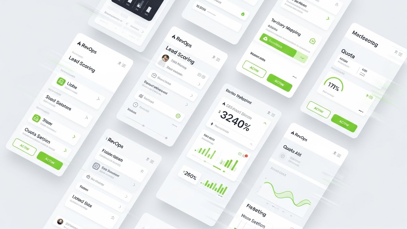
8. Rapid UI Feature Montage
MOFU | Feature Education & Demonstration
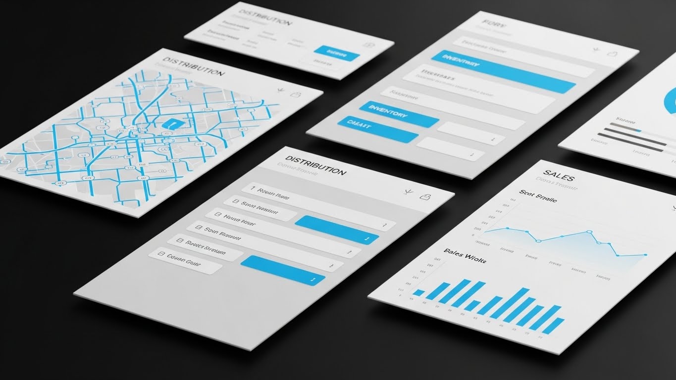
Visual & Narrative Approach
This style is about breadth. A clean, sharp montage of multiple UI screens (maps, lists, graphs) floats in a grid formation. The design is strictly 2D vector, using a palette of crisp white, sky blue, and light grey. It conveys the sheer volume of features available without being cluttered. It says: "We handle it all."
Psychological Impact & KPI Focus
This appeals to the Functional Buyer (IT/Ops) who needs to tick boxes. It visually demonstrates the completeness of the platform, reducing the fear that they will need to buy multiple tools. It communicates Efficiency and Organization.
Strategic Implementation & Trade-offs
- Best Use: Mid-funnel emails or webinar intros where you need to show feature depth quickly.
- Trade-off: Can be overwhelming if too fast. Best for audiences who already know they need a solution and are comparing feature sets.
- Duration: 15-20 seconds.
Companies using similar video content -
Manhattan Associates – Warehouse Management – Dashboard density for comprehensive platform control.
Microsoft Dynamics 365 – Supply Chain Management – Rapid UI showcasing integrated SCM features.
9. 2D Character-Driven Story
MOFU | Driving Demo Requests

Visual & Narrative Approach
This style focuses on the "Hero" of the warehouse. A vector illustration depicts a warehouse manager in a safety yellow vest, smiling confidently as he uses a handheld scanner. The soft blue scanning beam highlights the ease of the task. The background is simplified industrial grey. The narrative is about removing friction from the daily grind.
Psychological Impact & KPI Focus
This builds Empathy. It shows that the software improves the quality of life for the workforce. For decision-makers, this translates to Employee Retention and higher productivity. It positions the software as a tool that supports the team, rather than policing them.
Strategic Implementation & Trade-offs
- Best Use: Storytelling ads on LinkedIn targeting Operations Managers.
- Trade-off: Characters must look professional, not childish, to be taken seriously in a B2B context.
- Duration: 30-60 seconds.
Companies using similar video content -
Zebra Technologies – Workforce Connect – Worker success improving operational efficiency.
Honeywell Intelligrated – Momentum WES – Character-driven story of warehouse worker empowerment.
10. 2D Graphics Over Live Action
MOFU | The Functional Buyer
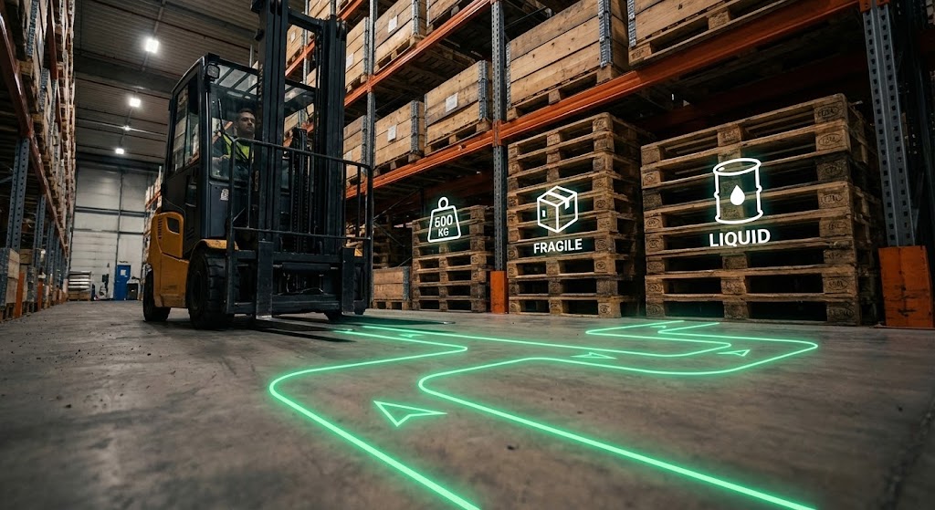
Visual & Narrative Approach
This style visualizes the "invisible hand" of the software. We see a real photo of a forklift in a warehouse, overlaid with a bright neon green vector path on the floor indicating the optimal route. Floating white icons show pallet data (weight, contents). It blends the gritty reality of the warehouse with the sleek precision of digital planning.
Psychological Impact & KPI Focus
This appeals to the desire for Optimization. It visually proves the ROI of the software by showing exactly how it guides physical actions to save time and money. It makes the concept of "Route Optimization" concrete and tangible.
Strategic Implementation & Trade-offs
- Best Use: Case studies and "Proof of Value" videos.
- Trade-off: Requires high-quality B-roll. The warehouse footage must look clean and professional for the graphics to have the desired "high-tech" effect.
- Duration: 30-45 seconds.
Companies using similar video content -
ORBCOMM – Fleet Management – Augmented logistics optimizing route paths.
Verizon Connect – Reveal – Graphics over live action for fleet tracking.
11. Split Screen: Optimized Reality and UI
MOFU | Competitive Displacement
Visual & Narrative Approach
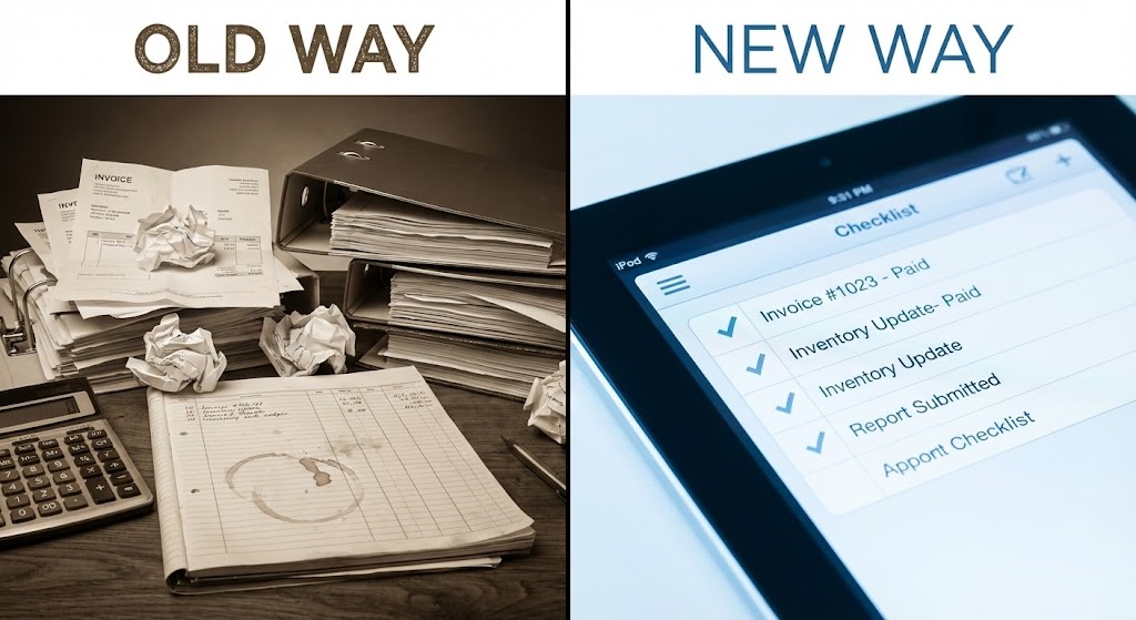
This style utilizes the Contrast Principle to force a choice. The screen is split vertically. The left side, labeled "OLD WAY," depicts a desaturated, sepia-toned desk cluttered with crumpled paper invoices and a calculator—a visceral reminder of manual friction. The right side, labeled "NEW WAY," features a crisp, high-definition close-up of a tablet displaying a clean digital checklist. The visual narrative is binary: it juxtaposes the stress of the past with the clarity of the future.
Psychological Impact & KPI Focus
This targets Cognitive Dissonance. By placing the pain (chaos) directly next to the cure (order), you amplify the perceived value of the solution. It appeals to the Operations Manager's desire for a "clean slate," visually linking your software to Process Efficiency and the elimination of the "paper chase" associated with lost invoices.
Strategic Implementation & Trade-offs
- Best Use: Remarketing ads for users who visited pricing pages but didn't convert. It reminds them of the operational pain they are trying to escape.
- Trade-off: It is a blunt instrument. It frames the prospect's current reality as "obsolete," so it must be balanced with empathetic copy.
- Duration: Static image or 6-second loop.
Companies using similar video content -
Provenance – Blockchain for Transparency – Binary contrast visualizing ethical supply chain.
EazyStock – Inventory Optimization – Split screen showing old vs. new inventory management.
12. 3D X-Ray Visualization
MOFU | Risk Mitigation

Visual & Narrative Approach
This style addresses the fear of "blind spots" in the supply chain. We see a delivery truck rendered in a semi-transparent, skeleton-white wireframe. Inside, the cargo is not just liquid; the stacked crates reveal glowing blue data cubes within them. The background is a clean, bright, clinical white laboratory setting. This visual metaphor implies that the software sees through the physical asset to track the data inside—batch numbers, vintage dates, and depletion rates.
Psychological Impact & KPI Focus
This appeals to the need for Accuracy and Loss Prevention. In high-value distribution, shrinkage (theft or loss) is a major anxiety. This visual assures the buyer that your platform provides "X-Ray vision" into their inventory, supporting KPIs related to Inventory Accuracy and Traceability.
Strategic Implementation & Trade-offs
- Best Use: Feature pages discussing "Track and Trace," compliance, or inventory management.
- Trade-off: The "clinical" aesthetic can feel sterile. It works best for emphasizing precision and security rather than brand warmth.
- Duration: 15-20 seconds.
Companies using similar video content -
VeChain – Thor Blockchain – Data transparency eliminating inventory blindspots.
Tecsys – WMS – X-ray vision for inventory accuracy and traceability.
13. Futuristic Neon/Dark Mode
BOFU | ROI Justification

Visual & Narrative Approach
This aesthetic visualizes the distribution network as a living digital organism. Set against a deep black background, glowing neon purple and cyber-blue lines connect nodes representing producers, warehouses, and retailers. The nodes pulsate with light, mimicking a heartbeat or data transmission. It portrays the supply chain not as a linear path, but as a complex, interconnected ecosystem powered by data.
Psychological Impact & KPI Focus
This targets the CFO or CTO by visualizing Scalability. The high-tech, "Dark Mode" aesthetic signals that the platform is enterprise-grade and capable of handling massive data throughput. It shifts the conversation from "keeping track of bottles" to "managing a high-frequency data network," validating the ROI of a premium solution.
Strategic Implementation & Trade-offs
- Best Use: Account-Based Marketing (ABM) display ads targeting enterprise-level distributors or multi-state operators.
- Trade-off: It is abstract. It demonstrates power and connectivity but does not show specific features or workflows.
- Duration: 10-15 seconds.
Companies using similar video content -
MercuryGate International – TMS – Network pulse visualizing real-time transportation scale.
Samsara – Connected Operations Cloud – Futuristic dark mode for fleet and asset tracking.
14. Isometric 3D Workflow
BOFU | Risk Mitigation
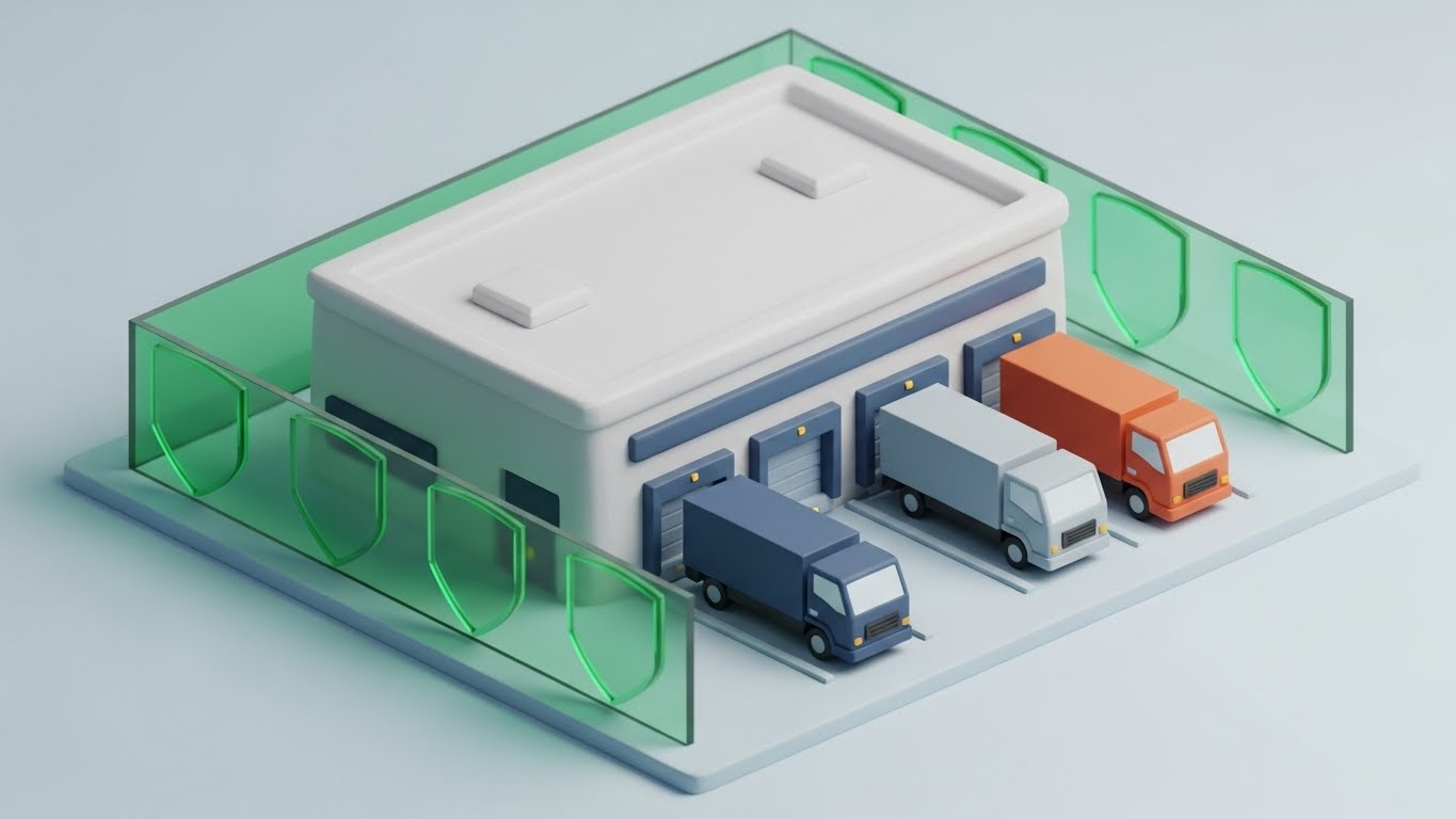
Visual & Narrative Approach
Using a "claymorphism" style—soft, rounded, tactile 3D shapes—this visual depicts a miniature distribution center. The scene is friendly yet secure, with translucent green "shields" hovering around the perimeter and loading docks. Tiny, detailed trucks dock with precision. The lighting is soft and diffuse. It visualizes the software as a protective layer around the physical operation, ensuring compliance and security.
Psychological Impact & KPI Focus
This style addresses Regulatory Compliance (e.g., Excise Tax, Bonded Warehousing). The "toy-like" but orderly nature of the visual reduces the anxiety associated with complex audits. It suggests that maintaining a secure, compliant facility is manageable and contained. It builds trust that the software acts as a guardian of the inventory.
Strategic Implementation & Trade-offs
- Best Use: Supporting visuals in whitepapers or case studies focused on security protocols and compliance reporting.
- Trade-off: The "cute" aesthetic must be balanced with serious technical copy to ensure it isn't perceived as "entry-level" software.
- Duration: Static or slow-moving cinemagraph.
Companies using similar video content -
IBM Food Trust – Blockchain Solution – Secure perimeter visualizing regulatory compliance.
Swisslog – SynQ WMS – Isometric workflow for automated warehouse operations.
15. Photorealistic 3D Renders
BOFU | Building Trust & Credibility
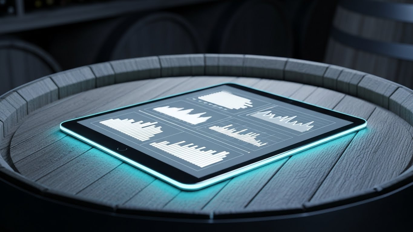
Visual & Narrative Approach
This style bridges the gap between the ancient craft of alcohol and modern technology. A sleek, glass tablet displaying sharp, high-resolution data charts rests on the rustic, weathered wood surface of an aged oak barrel. The background is a blurred (bokeh) wine cellar. The juxtaposition of the rough, organic wood and the pristine digital screen serves as a powerful metaphor: respecting tradition while employing cutting-edge tools.
Psychological Impact & KPI Focus
This builds Cultural Fit. Many distributors are multi-generational family businesses who fear losing their "soul" to automation. This visual reassures them that the technology fits naturally into their environment. It validates that you can have Data Precision without sacrificing the industry's heritage.
Strategic Implementation & Trade-offs
- Best Use: The "About Us" page or high-value landing pages where establishing brand trust is paramount.
- Trade-off: Expensive to produce. The textures (wood grain, glass reflections) must be perfect, or it risks looking fake.
- Duration: Static high-res imagery.
Companies using similar video content -
Orchestra Software – Brewery & Winery ERP – Heritage tech bridging tradition and innovation.
VinSUITE – DTC & Winery Management – Photorealistic renders for winery tech integration.
16. Dark Mode UI Showcase
BOFU | The Technical Buyer
Visual & Narrative Approach
This is an "under the hood" view for the technical stakeholder. The screen is a deep charcoal grey, populated by complex analytics, abstract lines of code in neon green, and symmetrical data structures. There is no "marketing fluff"—just raw data density and structural logic. It visualizes the backend stability, API connections, and the depth of the code base.
Psychological Impact & KPI Focus
This appeals to the IT Director. They are often the gatekeepers who can veto a purchase if they suspect the software is "vaporware" or hard to integrate. This style signals Reliability, Uptime, and Integration Readiness. It proves that the software is built for power users and can handle complex ERP integrations.
Strategic Implementation & Trade-offs
- Best Use: Technical documentation, API integration pages, or the "Technical Specs" section of a sales deck.
- Trade-off: Completely alienating to a non-technical CEO or Sales Manager. Use strictly for the IT persona.
- Duration: Static or subtle code-scrolling animation.
Companies using similar video content -
Sage X3 – ERP for Distribution – Code architecture validating technical robustness.
Oracle – Supply Chain Management Cloud – Dark mode UI for enterprise SCM.
17. Wireframe to Reality Transition
BOFU | Overcoming Objections
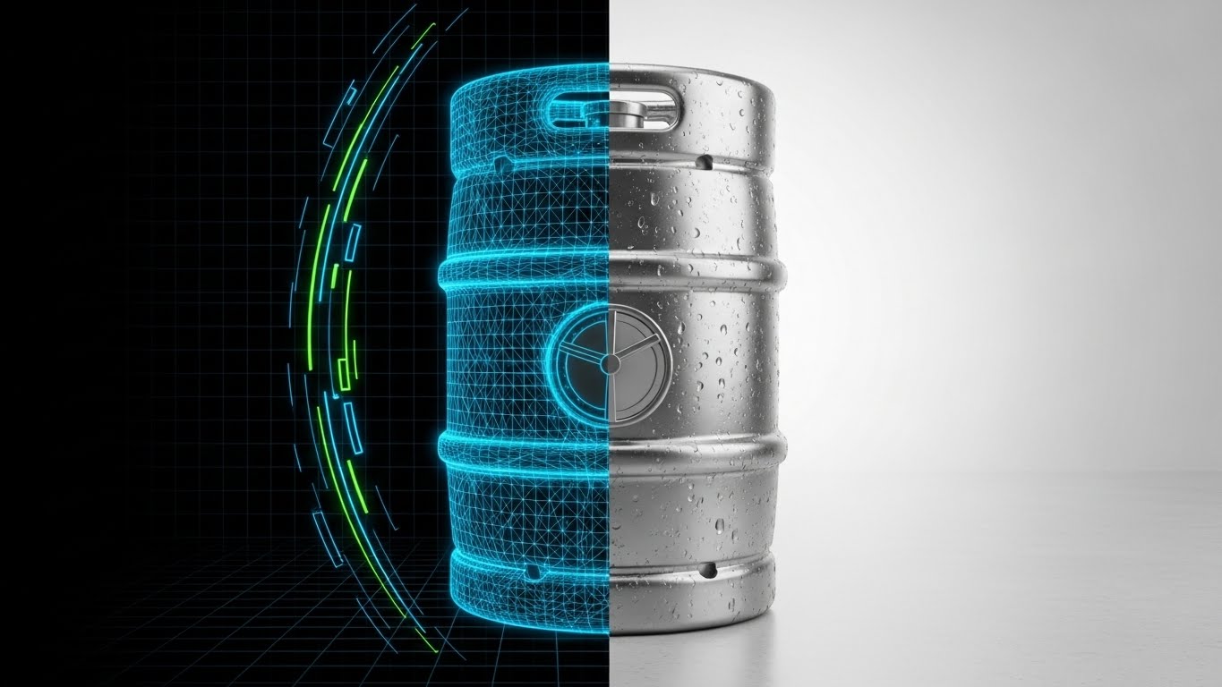
Visual & Narrative Approach
This transition style visualizes the concept of "Realization." We see a stainless steel beer keg. The left half is a glowing blue wireframe blueprint, revealing the structural lines and geometry. The right half is a photorealistic, shiny steel render with condensation droplets. The background fades from a grid paper design to a realistic warehouse floor. It tells the story of how your software's planning (wireframe) translates into physical assets (real keg).
Psychological Impact & KPI Focus
This validates Operational Execution. It answers the objection: "Does this actually work in the real world?" By showing the blueprint becoming the object, you subconsciously signal that your software's plans (routes, loads, orders) will materialize accurately in the physical world. It reinforces Asset Management capabilities, specifically for returnable assets like kegs.
Strategic Implementation & Trade-offs
- Best Use: Mid-presentation in a sales deck to visually explain the implementation process or "Go Live" phase.
- Trade-off: Requires precise alignment between the 3D model and the wireframe to look seamless.
- Duration: 5-10 second loop.
Companies using similar video content -
Epicor – Kinetic ERP – Structural precision realizing asset value.
SAP Business One – ERP Solution – Wireframe to reality for business process implementation.
18. Generative AI cinematic video
BOFU | The Economic Buyer

Visual & Narrative Approach
This style creates an aspirational "Hero Shot" for the decision-maker. It features a medium close-up of a confident CEO standing in a modern glass office, looking out at a city skyline. The window reflection subtly overlays complex supply chain data visualizations in corporate blue and gold. The lighting is warm and dramatic. The narrative is about foresight: the leader seeing the future of their business through the lens of your data.
Psychological Impact & KPI Focus
This targets the Ego and Ambition of the Principal/Owner. It positions the software not as a utility, but as a strategic asset that enables leadership. It reinforces the value of Business Intelligence (BI) and Forecasting, suggesting that using this tool equates to having a "visionary" perspective on the market.
Strategic Implementation & Trade-offs
- Best Use: High-ticket retargeting ads on LinkedIn for C-suite job titles.
- Trade-off: High production value is essential. If the AI generation looks unnatural, it undermines the "premium" feel.
- Duration: 15-30 seconds.
Companies using similar video content -
SYSPRO – ERP for Distribution – Visionary reflection for strategic market foresight.
Anaplan – Connected Planning – Cinematic AI for strategic business planning.
19. Dynamic Data Visualization
BOFU | Objection Handling

Visual & Narrative Approach
This style uses a powerful fluid simulation to visualize value. Thick, viscous red liquid (resembling a rich Cabernet) flows upwards against gravity. As it rises, it solidifies into standing 3D bar charts. The liquid texture transitions into a glossy, solid material. The background is pure white to maximize contrast. It literally visualizes the distributor's "Liquid Assets" transforming into "Solid Data" and profit.
Psychological Impact & KPI Focus
This creates a Tangible ROI connection. It addresses the fear that software is an abstract cost. By turning the wine into a chart, it visually argues that the inventory is the data, and better management of one leads to growth of the other. It is a satisfying, hypnotic visual that reinforces Revenue Recovery.
Strategic Implementation & Trade-offs
- Best Use: Remarketing ads to potential buyers who have stalled. It’s a visual reminder of the value left on the table.
- Trade-off: Requires high-end fluid simulation software. The physics must look realistic to be satisfying.
- Duration: 10-15 seconds.
Companies using similar video content -
Blue Yonder – Luminate Platform – Liquid intelligence for tangible ROI visualization.
Netstock – Inventory Optimization – Dynamic data visualizing inventory health and profit.
20. Clean UI Workflow (Light Mode)
Onboarding | Reducing Implementation Friction
Visual & Narrative Approach
This style is pure breathability and ease. It showcases a minimalist UI design in "Light Mode." The palette is mint green, pure white, and soft grey—colors associated with freshness. A central modal window floats on the screen, animating a large, satisfying "Success" checkmark. There is no clutter, no dense text—just the feeling of a task completed effortlessly.
Psychological Impact & KPI Focus
This targets Implementation Anxiety. The biggest barrier at the final stage is the fear that the team won't use the tool. This visual promises a Low Learning Curve. It triggers a dopamine response associated with task completion, reassuring the buyer that their team will find the software easy and rewarding to use.
Strategic Implementation & Trade-offs
- Best Use: "Welcome" emails or the final slide of a demo deck to leave a lasting impression of simplicity.
- Trade-off: It hides complexity. Ensure you have already validated the robust features (Style 16) before showing this, or it may look too simple.
- Duration: 5-10 second animation.
Companies using similar video content -
Acumatica – Cloud ERP – Success state reducing implementation friction.
Fishbowl Inventory – Inventory Management – Clean UI for simplified inventory workflows.
21. Minimalist Flat 2D Vector
Onboarding | Self-Serve Onboarding

Visual & Narrative Approach
This style embraces radical simplicity to counter "dashboard shock." It features a flat, vector illustration using a primary palette of "Safety Blue," yellow, and white. A stylized hand with clean, geometric lines is depicted pressing a single, large button on a simplified interface. There is no background noise, gradients, or clutter. The visual narrative creates a direct, unmistakable link between the user's intent and the system's action.
Psychological Impact & KPI Focus
This targets Cognitive Overload. New users are often intimidated by complex ERP dashboards. This visual style acts as a psychological "deep breath," reassuring the user that the next step is easy and binary. It supports Time-to-Value by visually guiding the user through the "First Run Experience" without distraction.
Strategic Implementation & Trade-offs
- Best Use: In-app tooltips, "Getting Started" wizards, or zero-state screens (e.g., "Create Your First Order").
- Trade-off: It is not suitable for explaining complex data relationships. It works best for single-action instructions.
- Duration: Static or 3-second micro-animation.
Companies using similar video content -
Provi – B2B Beverage Marketplace – Action trigger simplifying first steps.
3PL Central – Warehouse Management System – Minimalist vector for streamlined 3PL operations.
22. Macro UI Micro-Interactions
Onboarding | Accelerating Time-to-Value

Visual & Narrative Approach
This style brings the user closer to the interface than ever before. It utilizes a macro 3D render of a specific UI element: a toggle switch labeled "ACTIVATE." The camera focus is extremely shallow, blurring the background into a soft grey texture to force attention on the switch. As the switch flips to vibrant green, a subtle glow emits. It simulates the tactile feeling of turning on a machine.
Psychological Impact & KPI Focus
This triggers a Dopamine Response. By dramatizing the moment of activation, you make the software feel powerful and responsive. It addresses the user's need for Control, visually confirming that their settings have taken effect. This micro-interaction builds a subconscious habit loop, encouraging frequent platform usage.
Strategic Implementation & Trade-offs
- Best Use: Feature announcement emails or "Success" states after a user completes a setup task.
- Trade-off: It is stylistic, not informational. It creates a feeling of power but requires accompanying text to explain what was activated.
- Duration: 3-5 seconds.
Companies using similar video content -
Pepperi – B2B Sales App – Tactile activation validating user control.
Odoo – Open Source ERP – Macro UI interactions for engaging user experience.
23. 2D Line Art Animation
Onboarding | Trial/Freemium User Activation
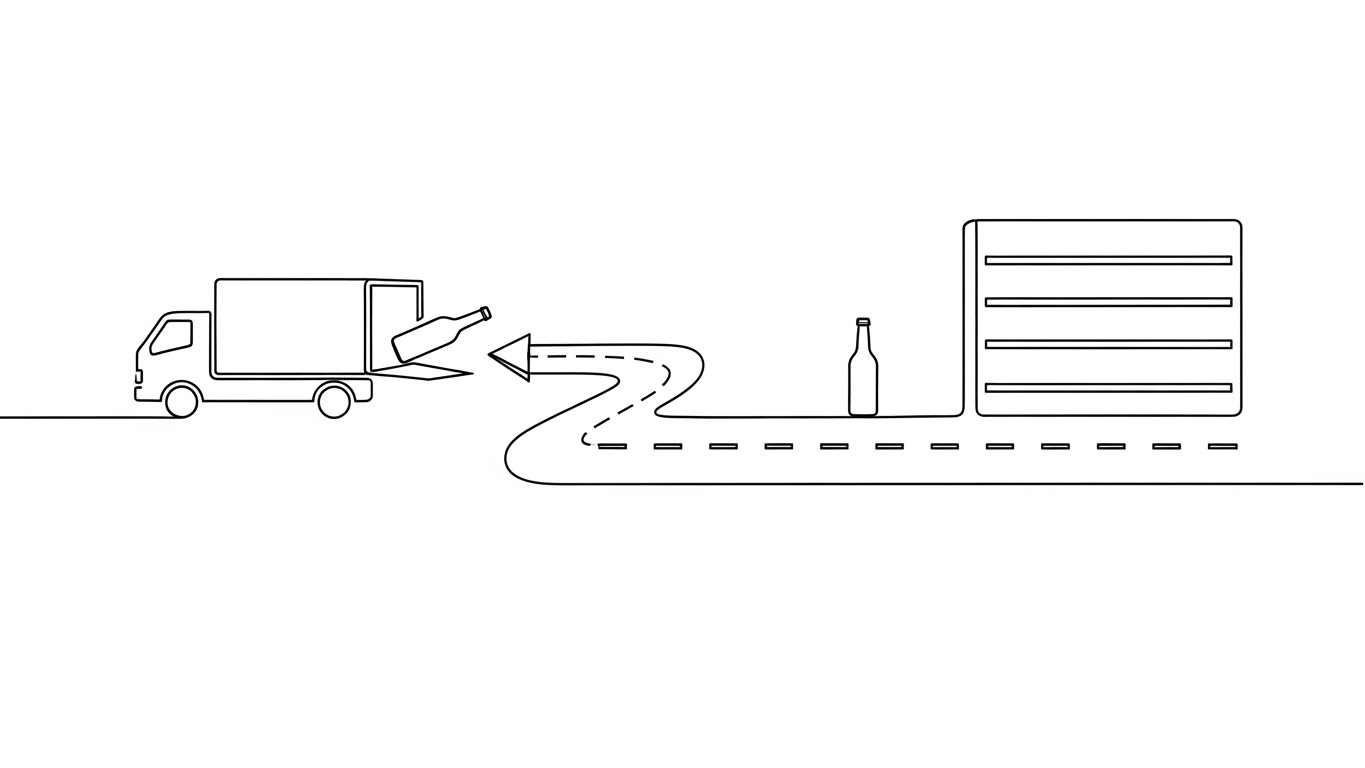
Visual & Narrative Approach
This style uses elegance to communicate flow. A single, continuous black ink line travels across a paper-white background. It morphs seamlessly to draw a truck, then a road, then a bottle, and finally a store shelf. The line never breaks; it flows. This visual metaphor represents the "Golden Path"—the ideal, uninterrupted workflow that your software enables from supplier to retailer.
Psychological Impact & KPI Focus
This reduces Implementation Anxiety. New users often fear that setting up logistics software will be a disjointed, jerky process. The continuous line subconsciously signals Integration and connectivity. It promotes the idea of a "seamless end-to-end solution," encouraging the user to complete their profile setup.
Strategic Implementation & Trade-offs
- Best Use: Welcome emails or "concept overview" videos during the trial phase.
- Trade-off: It is high-level. It sets the stage for the workflow but does not train the user on specific button clicks.
- Duration: 10-15 seconds.
Companies using similar video content -
Extensiv – 3PL Warehouse Manager – Continuous journey visualizing frictionless logistics.
Routific – Route Optimization – Line art animation for seamless delivery planning.
24. Low-Poly 3D Modeling
Retention | Reducing Support Overhead

Visual & Narrative Approach
This style gamifies the learning process. It utilizes a "Low-Poly" 3D aesthetic—blocky, colorful, and playful—to depict a bird's-eye view of a distribution map. We see simplified white trucks moving along grey roads past green geometric trees. It strips away the gritty details of the real world to focus purely on the logic of routing and territory management.
Psychological Impact & KPI Focus
This leverages Cognitive Ease. Complex routing concepts (like geofencing or territory optimization) can be hard to grasp in text. By presenting them as a "toy world," you lower the barrier to understanding. This style is highly effective for Self-Serve Support, allowing users to grasp concepts quickly without calling a support agent.
Strategic Implementation & Trade-offs
- Best Use: Knowledge base articles explaining algorithms, territory mapping, or fleet tracking logic.
- Trade-off: It may feel too "casual" for C-level reporting, but it is perfect for training dispatchers and route planners.
- Duration: 15-30 seconds.
Companies using similar video content -
Project44 – Movement by Project44 – Simplified topography clarifying route concepts.
Geotab – Telematics Platform – Low-poly modeling for fleet tracking visualization.
25. 3D Parallax UI Presentation
Retention | Knowledge Base & FAQ Videos

Visual & Narrative Approach
This style creates depth in data. We see translucent "Glassmorphism" UI cards floating in suspended layers. The background is a blurred modern office, grounding the tech in a business context. The camera moves gently, creating a parallax effect where the foreground cards (user profiles, key metrics) move faster than the background layers. It visualizes the software as a deep, multi-dimensional workspace.
Psychological Impact & KPI Focus
This targets Perceived Value. It signals that the software is not just a flat spreadsheet but a layered, sophisticated tool. It encourages Feature Discovery by visually suggesting that there is "more behind the surface." It makes the act of learning the software feel like exploring a high-tech environment.
Strategic Implementation & Trade-offs
- Best Use: "Deep Dive" tutorial videos or "What's New" updates that showcase improvements to the interface architecture.
- Trade-off: Requires careful animation to avoid motion sickness. The text on the floating cards must remain legible.
- Duration: 20-40 seconds.
Companies using similar video content -
HighJump (Körber Supply Chain) – WMS – Layered intelligence organizing complex information.
E2open – Supply Chain Platform – Parallax UI for multi-dimensional supply chain insights.
26. Generative AI Realistic Character video
Retention | Reducing Churn

Visual & Narrative Approach
This style reintroduces the human element into SaaS. It features a hyper-realistic, AI-generated video of a friendly customer support professional. She wears a headset, nods empathetically, and maintains eye contact. The lighting is warm, and the background is a soft-focus, busy support center. It simulates a 1-on-1 video call, even if the content is pre-recorded or dynamically generated.
Psychological Impact & KPI Focus
This builds Emotional Loyalty. Churn often happens when customers feel ignored. A "face" attached to the software reassures them that help is available. It directly impacts Net Promoter Score (NPS) by making the brand feel accessible and caring, rather than a faceless automated system.
Strategic Implementation & Trade-offs
- Best Use: Quarterly business review updates, apology videos during downtime, or personalized "Check-in" emails.
- Trade-off: The lip-sync and eye movement must be flawless. The "Uncanny Valley" effect can damage trust if the AI looks robotic.
- Duration: 30-60 seconds.
Companies using similar video content -
StayinFront – Retail Execution – Personal connection humanizing technical support.
Salesforce – Service Cloud – Generative AI character for personalized customer service.
27. Holographic UI over 3D Render
Expansion | Driving Upsell/Cross-sell

Visual & Narrative Approach
This style screams "Premium." A high-end glass spirit bottle sits in a white studio. Floating around the bottle neck is a holographic ring of data—rainbow-colored analytics, charts, and growth metrics that cast a real light reflection onto the glass. It visually marries the core product (the spirit) with the upsell product (advanced analytics).
Psychological Impact & KPI Focus
This targets Aspiration. It frames the "Enterprise Tier" or "Analytics Add-on" not as a cost, but as an evolution of the product they already love. It visualizes Data Enrichment, suggesting that the software wraps their physical product in a layer of intelligence that drives value.
Strategic Implementation & Trade-offs
- Best Use: In-app paywalls or upgrade prompts when a user tries to access a locked feature.
- Trade-off: It is abstract. It sells the concept of premium data, not the specific report layout.
- Duration: 5-10 second loop.
Companies using similar video content -
Körber Supply Chain – Automation Solutions – Premium analytics visualizing added value.
Dematic – Warehouse Automation – Holographic UI over 3D renders for advanced material handling.
28. Aspirational Stock Montage
Expansion | Driving Referrals & Advocacy

Visual & Narrative Approach
This style focuses on the result of a job well done. It uses bright, high-quality stock photography of business professionals shaking hands in a sun-drenched vineyard. In the foreground, hands are visible holding tablets displaying the software's "Growth Analytics" dashboard. The palette is gold and green. It shifts the focus from "logistics" to "business success" and "partnership."
Psychological Impact & KPI Focus
This leverages Social Proof and Belonging. It positions the software user as part of a successful, thriving community. It creates an emotional state conducive to Advocacy, making satisfied customers more likely to provide a testimonial or referral.
Strategic Implementation & Trade-offs
- Best Use: LinkedIn posts celebrating customer milestones, case study headers, or "Year in Review" videos.
- Trade-off: Stock imagery can feel generic. It is crucial to overlay specific UI screens to tie the "success feeling" back to your specific platform.
- Duration: Static or slideshow.
Companies using similar video content -
SevenFifty – Wholesale Marketplace – Partnership success celebrating shared growth.
FourKites – Real-Time Visibility Platform – Aspirational montage for supply chain collaboration.
29. Abstract 3D AI Visualization
Expansion | Driving Deep Feature Adoption

Visual & Narrative Approach
This style visualizes the "Brain" of the operation. It features white glowing spheres (nodes) connected by electric violet lines, forming a complex web that resembles both a neural network and a distributor's route map. The background is a clean silver gradient. It represents the AI and Machine Learning algorithms working in the background to optimize inventory and routing.
Psychological Impact & KPI Focus
This builds confidence in Automation. Users are often skeptical of "black box" algorithms. This visual gives form to the formless, suggesting that the system is interconnected, smart, and constantly learning. It supports the adoption of Predictive Analytics features.
Strategic Implementation & Trade-offs
- Best Use: Landing pages for AI-driven features (e.g., "Predictive Ordering" or "Smart Routing").
- Trade-off: It is highly abstract. It must be paired with concrete results (e.g., "Reduces stockouts by 15%") to be effective.
- Duration: 10-15 seconds.
Companies using similar video content -
Kinaxis – RapidResponse – Neural network visualizing backend intelligence.
E2open – AI-Powered Supply Chain – Abstract 3D AI for predictive analytics.
30. Hyper-lapse Stock Footage with Data
Expansion | Proactive Support/Announcements

Visual & Narrative Approach
This style conveys speed and stability. It uses a hyper-lapse (fast-motion) video of a busy warehouse floor. Workers and forklifts blur in motion, but overlaying them are sharp, static white data boxes tracking their movement. The data remains perfectly crisp and readable while the world moves fast. This visualizes the software's ability to maintain precision even in a high-velocity environment.
Psychological Impact & KPI Focus
This reassures the user of System Stability. In logistics, downtime is a disaster. This visual implies that no matter how fast the operation moves, the software (and its data tracking) stays rock solid. It supports Operational Uptime and reliability messaging.
Strategic Implementation & Trade-offs
- Best Use: "System Status" pages, performance update emails, or background video for a "Reliability" feature page.
- Trade-off: Requires high-quality footage. A shaky camera ruins the effect of "stability."
- Duration: 5-10 second loop.
Strategic Knowledge Base: The Visual Operations Doctrine
To close the gap between "buying software" and "achieving digital transformation," we must move beyond viewing video as marketing content. In the alcohol distribution supply chain, visual communication is an operational infrastructure. The following three strategic segments synthesize the 30 styles into a cohesive doctrine for implementation.
Strategic Alignment & Visual Architecture
Pre-Production & Planning – Defining the "Visual Operating System"
Before a single pixel is animated, the visual strategy must be aligned with the cognitive reality of the alcohol supply chain.
- The Cognitive Load Audit: Prior to creating training content, audit the complexity of your current text manuals. Map Styles 21 (Minimalist) and 24 (Low-Poly) to the most complex topics to artificially lower the barrier to entry.
- Role-Based Visual Mapping: Differentiate your visual language by persona. Use "High-Contrast/Mobile-First" styles (Style 10, 30) for drivers on the road who need glanceability, and "Density/Dark Mode" styles (Style 16, 25) for Ops Directors on desktop monitors.
- The "Glanceability" Standard: In a warehouse, attention is scarce. Enforce a 3-second rule for all operational visuals. If the key insight (e.g., "Load Truck A") isn't visible in Style 1 or 22 within 3 seconds, the design has failed.
- Brand Voice Consistency: Ensure that the "friendly" onboarding voice (Style 6) doesn't clash with the "serious" compliance voice (Style 14). Use a unified color palette across all 30 styles to maintain brand integrity.
- The Advids Strategic Audit: Partnering with a specialized agency like Advids allows for an external audit of your visual assets. We help define this "Visual Operating System," ensuring your library is scalable rather than a collection of disjointed videos.
- Standardization vs. Customization: Use standardized "Abstract" styles (Style 1, 3) for general concepts, but invest in "Photorealistic" styles (Style 7, 15) for high-stakes features where trust is paramount.
- The Cross-Departmental Bridge: Use these visuals to unify terminology. If Sales calls it "The Dashboard" and Ops calls it "The Grid," use Style 8 (Feature Montage) to visually anchor the correct terminology across the company.
- Legacy System Integration: Many distributors run on legacy hardware. Use Style 11 (Split Screen) to visually validate the transition, showing how your modern UI respects but replaces the "Green Screen" era.
- Accessibility in Trucking: Design motion graphics (Styles 2, 23) that rely on visual cues rather than voiceover, catering to a diverse workforce where English might be a second language.
- The Mobile-First Mandate: 60% of distribution users are non-desk workers. All styles, especially 5, 20, and 21, must be legible on a 5-inch smartphone screen in daylight.
Operational Adoption & Implementation
Deployment – Embedding Visuals into the Workflow
A video is only effective if it is seen at the moment of need. This segment focuses on distribution and "Just-in-Time" learning.
- Overcoming "Big Brother" Anxiety: When introducing driver tracking, use empathy-driven visuals (Style 9, 26) to frame the technology as "safety and support," not "surveillance."
- The Micro-Learning Shift: Replace 50-page PDF manuals with a library of 30-second clips (Style 22, 24). This "TikTok-ification" of training increases retention among younger warehouse staff.
- Just-in-Time Support: Embed specific visual styles directly into the software's error messages. If a scan fails, show a 5-second loop of Style 1 (Correct Scanning Motion) immediately.
- Gamification of Training: Use "Level Up" visuals (Style 27, 20) to reward drivers who complete safety modules. Visualizing progress increases engagement.
- Reducing Support Ticket Volume: There is a direct correlation between proactive visual guides and reduced call center load. Implementing Style 24 (Low-Poly 3D) for complex routing logic can deflect up to 40% of Tier 1 support tickets.
- Remote Onboarding: For distributed fleets, use Styles 2 and 26 to conduct "virtual ride-alongs," allowing you to train staff in remote depots without travel costs.
- Visual SOPs: Transform Standard Operating Procedures into visual process flows (Style 14). A visual of a "Secure Perimeter" is understood faster than a checklist of security protocols.
- Feedback Loops: Use interactive video elements (Style 21) to gather driver feedback. A simple "Thumbs Up/Down" visual interaction provides better data than a survey.
- Scalable Localization: When expanding globally, rely on "Text-Free" styles (Style 1, 10, 23). Visuals are a universal language that bypasses translation costs.
- Leadership Communication: Use high-end "Cinematic" styles (Style 18, 28) for Quarterly Business Reviews. Helping Ops Directors sell their success up the chain to the CEO is a powerful retention tool.
Measuring Impact & Future-Proofing
ROI & Evolution – Quantifying Success
Finally, we must measure the impact of this visual infrastructure. This segment aligns visual strategy with hard business metrics.
- Beyond "Views": Do not measure video success by "views." Measure it by Time-to-Competency. How much faster does a new packer reach 100% efficiency after watching Style 6 vs. reading a manual?
- The "Idle Time" Metric: Correlate better visualization (Style 2, 30) with reduced software navigation time. Saving a driver 2 minutes per stop adds up to massive fleet savings.
- Compliance Velocity: Measure how fast new regulations (e.g., ELD mandates) are adopted. Visual explanation (Style 14) typically drives faster compliance than textual memos.
- Retention and Churn: High-quality UX visualization (Style 25, 26) increases perceived product value. Track Customer Lifetime Value (LTV) relative to engagement with your video knowledge base.
- The AI Visual Frontier: Prepare for the future where Styles 5 and 18 are generated in real-time based on the user's specific data. Generative video is the next frontier of personalization.
- Scalability of Assets: Build a component library. If you change your UI color, you shouldn't have to re-shoot. Vector styles (Style 1, 23) allow for global color updates in minutes.
- The Advids Partnership: As your feature set grows, so must your library. Advids serves as the long-term partner to ensure your visual assets evolve in lockstep with your software updates, preventing "Visual Debt."
- Benchmarking Success: In a competitive market, "good enough" visuals are a competitive risk. If your competitor uses Style 15 (Photorealism) and you use generic screenshots, you lose the "Trust" battle before the demo starts.
- The ROI of Safety: Quantify the reduction in insurance costs or accident rates after implementing visual safety training (Style 10, 14). This is the "Hard ROI" that CFOs love.
- Final Call to Innovation: Treat video not as "marketing content" but as "software infrastructure." When you view visualization as a core feature of your platform, you unlock a level of efficiency and user delight that text can never achieve.
Companies using similar video content -
FourKites – Real-Time Visibility Platform – Real-time velocity monitoring operational speed.
Samsara – Dash Cams & Telematics – Hyper-lapse footage with data for fleet monitoring.
Author & Editor Bio


