
Introduction: The Art of Visualizing the Invisible
In the high-stakes world of B2B cybersecurity, success is often defined by what doesn't happen. A quiet network, a clean inbox, and uninterrupted uptime are the hallmarks of effective protection. However, for marketers and product leaders, this "invisibility" presents a unique paradox: How do you demonstrate the immense value of a product that, when working perfectly, looks like nothing at all?
The answer lies in strategic visualization. We are entering a golden age of cybersecurity narrative, where the abstract concepts of "zero trust" and "neural heuristics" are being translated into tangible, compelling visual assets. This shift is not just aesthetic; it is an operational necessity. With Gartner reporting that worldwide information security spending is projected to total $213 billion in 2025, the market is crowded, aggressive, and noisy. To stand out, your visual language must cut through the static.
Furthermore, the industry is facing a massive human capital challenge. The gap of 4.8 million professionals in the global cybersecurity workforce means that your tools are likely being evaluated and used by overextended teams. Your video content cannot add to their cognitive load. It must function as "cognitive relief," using intuitive visual metaphors to explain complex logic instantly, proving that your platform is an efficiency multiplier, not just another alert generator.
This guide provides 30 "Gold Standard" visual styles designed to bridge the physical/digital divide. These examples demonstrate how to make the invisible logic of your software visible, tangible, and undeniable. From the organic fluidity of adaptive defense to the crystalline clarity of AI visualization, these styles are your toolkit for building trust in an intangible product.
Let’s explore the first 10 styles that are redefining cybersecurity visualization.
1. The "Fluid Security" Aesthetic
TOFU | Brand Awareness
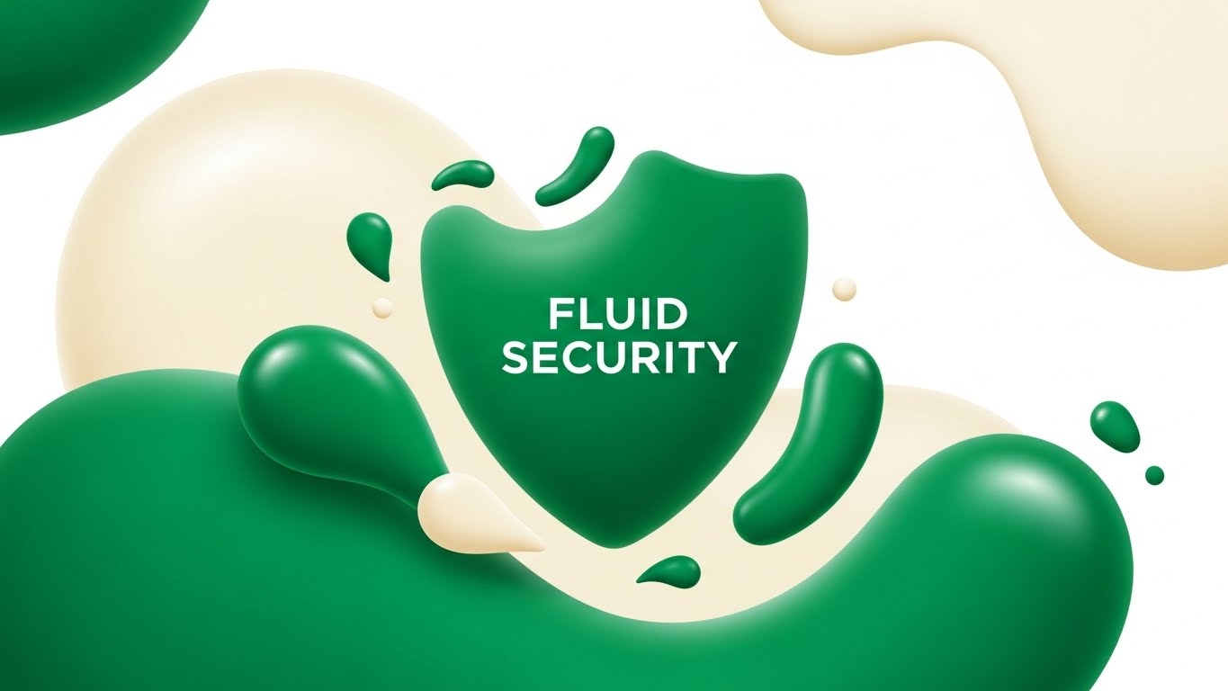
Visual & Narrative Approach
This style abandons the rigid, aggressive imagery often associated with "cyber warfare" in favor of something far more sophisticated: organic adaptation. The visual centers on a shield composed not of steel, but of merging liquid droplets in Vivid Emerald Green. This metaphor serves a specific narrative purpose: it communicates that your security is not a static wall, but a living, breathing system that adapts to the shape of the threat. The "glossy" finish on the vector shapes implies a premium, frictionless user experience.
Psychological Impact & KPI Focus
Psychologically, the use of fluid shapes reduces the "anxiety" often triggered by security marketing. It signals integration rather than restriction. For a Top-of-Funnel (TOFU) audience, this visual reduces cognitive friction. It suggests that installing this software won't break existing workflows; it will simply "flow" around them. The primary KPI here is Ad Recall, as the unique "liquid" aesthetic stands out against the sea of blue locks and shields.
Strategic Implementation & Trade-offs
- Best Use: Instagram and LinkedIn feed ads where you need to stop the scroll with satisfying motion.
- Duration: Short loops (6-10 seconds).
- Trade-off: This style is excellent for Brand Feel but poor for Technical Detail. Do not use this to explain specific features like "ransomware rollback"; use it to sell the concept of adaptive security.
Companies using similar video content -
Zscaler – Zero Trust Exchange – Adapts security seamlessly to user and device.
Netskope – Security Cloud – Fluidly protects data across cloud, web, apps.
2. The "Neural Crystalline" Network
TOFU | Category Creation

Visual & Narrative Approach
To claim leadership in AI-driven security, you must visualize the "brain" of your software. This style uses translucent glass nodes connected by glowing internal filaments to represent a Neural Network. The camera looks up at an infinite lattice, conveying immense scale and processing power. Crucially, the "glass" texture suggests transparency—a vital counter-narrative to the "black box" fears many CISOs have about AI. It shows that your AI is powerful, yet clear and structured.
Psychological Impact & KPI Focus
This visual leverages the Heuristic of Complexity: highly detailed, orderly structures are perceived as "intelligent" and "capable." The refraction of light through the nodes signals high-fidelity engineering. For the viewer, this translates to trust in the algorithm’s decision-making capabilities. It supports the KPI of Time on Site, as the mesmerizing, slow-moving network encourages the visitor to pause and absorb the "Category Creation" message.
Strategic Implementation & Trade-offs
- Best Use: The Hero section of your homepage or a product launch video background.
- Duration: Continuous slow-motion loop.
- Trade-off: High rendering costs. This style demands premium 3D execution; a low-quality version will look like a generic screensaver and damage brand credibility.
Companies using similar video content -
Darktrace – Self-Learning AI – Visualizes autonomous AI detecting novel threats.
Vectra AI – Attack Signal Intelligence – Transparently shows AI detecting and prioritizing threats.
3. Isometric Threat Rejection
TOFU | Market Education
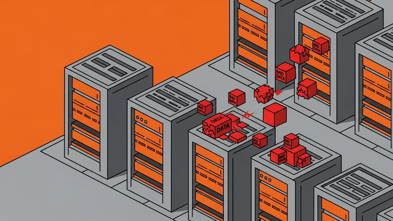
Visual & Narrative Approach
When educating the market on how a threat is blocked, clarity is king. This isometric style treats the digital environment like a physical factory floor. The server units are reinforced steel walls, and "bad data" is visualized as jagged red cubes. The narrative is instant and wordless: threats (red cubes) strike the defense (grey walls) and bounce off harmlessly. The cel-shaded, matte aesthetic removes visual noise, focusing the eye strictly on the action-reaction mechanics of the defense.
Psychological Impact & KPI Focus
This style utilizes Spatial Cognition. By turning abstract data flows into physical objects (cubes) interacting with physical barriers (walls), you make the concept of "firewall rejection" intuitively understood by non-technical stakeholders (e.g., CFOs). It lowers the barrier to entry for complex topics. The goal is Comprehension, making it perfect for explanatory blog posts or help center videos.
Strategic Implementation & Trade-offs
- Best Use: Explainer videos embedded in technical blogs or "How it Works" pages.
- Duration: 30-60 seconds.
- Trade-off: It can feel "too playful" for highly severe enterprise crisis communications. Keep the color palette disciplined (Steel Grey/Burnt Orange) to maintain a B2B tone.
Companies using similar video content -
Fortinet – FortiGate – Clearly demonstrates automated threat prevention at network edge.
Palo Alto Networks – Next-Generation Firewall – Visualizes precise threat blocking on a network grid.
4. Minimalist Stack Integration
TOFU | Demand Gen
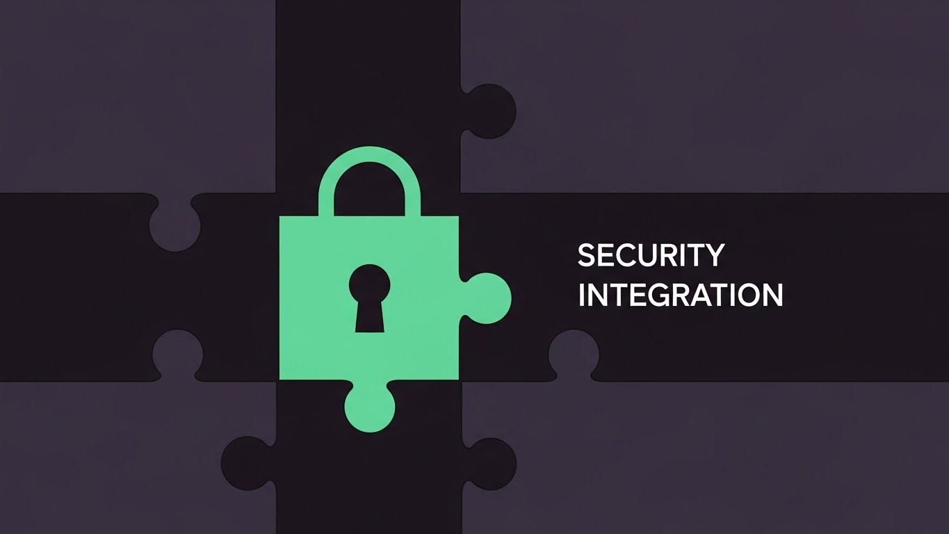
Visual & Narrative Approach
One of the biggest barriers to adoption is the fear that a new tool won't play nice with the existing tech stack. This minimalist vector style addresses that fear head-on. By shaping the "lock" icon exactly like a puzzle piece, the visual metaphor shifts from "security" to "compatibility." The satisfying "click" of the piece fitting into the charcoal void implies a perfect, frictionless installation. The Mint Green color signals "Go" / "Safe" / "Fresh."
Psychological Impact & KPI Focus
This appeals to the Law of Closure—the human desire for completed patterns. Seeing the piece fit perfectly provides a micro-dose of dopamine and satisfaction. For a Demand Gen campaign, this visual promise of "easy integration" attacks the objection of implementation effort. The primary KPI is Click-Through Rate (CTR) on ads targeting IT managers who dread complex deployments.
Strategic Implementation & Trade-offs
- Best Use: Middle-of-Funnel (MOFU) retargeting ads for users who visited the "Integrations" page.
- Duration: Static or very short animation (3-5 seconds).
- Trade-off: Extreme minimalism lacks emotional depth. It is purely functional. Use it to close the deal on utility, not to build emotional brand affinity.
Companies using similar video content -
Okta – Identity Cloud – Seamlessly integrates identity management into existing stacks.
SailPoint – Identity Security Cloud – Precision fit for integrating diverse identity systems.
5. The "Invisible Shield" Corporate Reality
TOFU | Building Trust
Visual & Narrative Approach
To build trust with Enterprise buyers, you must mirror their reality. This photorealistic style places the viewer in a high-end executive office. The "product" is visualized as a massive, seamless glass wall. It is invisible, yet it clearly separates the safe interior from the outside world. The caustic light effects on the glass prove its solidity. This metaphor perfectly captures the ideal state of enterprise security: unobtrusive, beautiful, and impenetrable.
Psychological Impact & KPI Focus
This style leverages Social Proofing through environmental cues. The high-fidelity, architectural visualization implies that this software belongs in the Fortune 500. It validates the buyer's status. The Ice Blue palette cools the temperature, conveying control and calm. The KPI here is Conversion Rate on high-ticket demo requests, as the visual quality aligns with a premium price point.
Strategic Implementation & Trade-offs
- Best Use: "Enterprise" solution pages or background visuals for C-level keynote presentations.
- Duration: Static or subtle camera pan.
- Trade-off: It is static. It conveys state (we are safe) rather than action (we are fighting). It effectively sets the mood but doesn't explain the mechanics.
Companies using similar video content -
CrowdStrike – Falcon Platform – Premium, invisible endpoint protection for enterprises.
Microsoft Security – Defender for Cloud – Unobtrusive, comprehensive cloud security for large organizations.
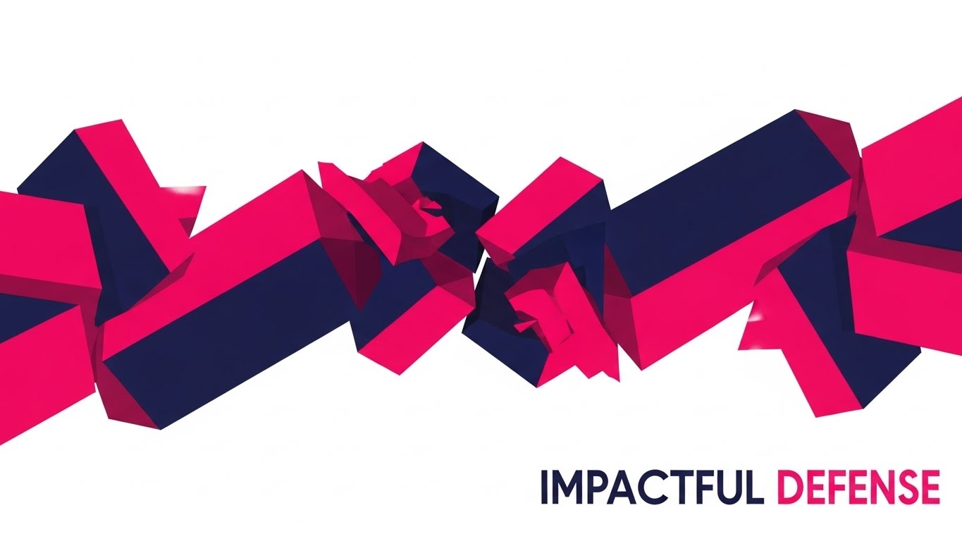
6. Kinetic Blockade
TOFU | ABM Awareness
Visual & Narrative Approach
Sometimes, you need to be loud. This style borrows the energy of Kinetic Typography but swaps letters for abstract blocky shapes. The Hot Pink and Deep Navy palette creates maximum vibration and contrast. The narrative is one of "collision" and "impact"—shapes slam together to form a diagonal barricade. It visualizes the active, aggressive nature of your threat blocking capabilities without using scary imagery. It screams "We stop them."
Psychological Impact & KPI Focus
This utilizes the Von Restorff Effect (the isolation effect)—the item that differs most from the rest is most likely to be remembered. In a feed full of corporate blue and white, Hot Pink blocks colliding at high speed demand attention. It conveys high energy and robust protection. The KPI is CPM efficiency (getting noticed quickly in crowded display networks).
Strategic Implementation & Trade-offs
- Best Use: Account-Based Marketing (ABM) display ads targeting specific high-value accounts.
- Duration: High-tempo loops (3-5 seconds).
- Trade-off: It can be fatiguing. It is a "shout," not a conversation. Use strictly for awareness, not for deep education.
Companies using similar video content -
SentinelOne – Singularity Platform – Boldly communicates active, autonomous threat blocking.
Cybereason – Defense Platform – Kinetic visualization of active threat disruption.
7. Speed-Line Analytics
TOFU | Skippable Pre-Roll

Visual & Narrative Approach
Speed is a critical differentiator in threat detection. This style strips away all detail to focus purely on velocity. Solar Yellow streaks across a grey background, using heavy motion blur to imply that the data analysis is happening faster than the human eye can track. It’s a visual shorthand for "Real-time." The horizontal panning motion creates a sense of forward momentum and progress.
Psychological Impact & KPI Focus
This appeals to the need for Immediacy. In a pre-roll context, you have 5 seconds to convey value. Motion blur is a universal cue for speed. It tells the viewer, "We don't waste time—yours or your network's." It positions the tool as a performance accelerator. The KPI is View-Through Rate (stopping the user from skipping) by creating an immediate sense of urgency and energy.
Strategic Implementation & Trade-offs
- Best Use: YouTube Pre-roll ads (first 5 seconds are critical).
- Duration: 15 seconds total.
- Trade-off: It is abstract. It communicates "fast," but not "what." It must be paired with a clear voiceover or text overlay to define what is moving so fast (e.g., "Analyze 1TB in milliseconds").
Companies using similar video content -
Splunk – Enterprise Security – Visualizes high-speed data ingestion and real-time analysis.
Rapid7 – Insight Platform – Rapidly analyzes vulnerabilities and security events.
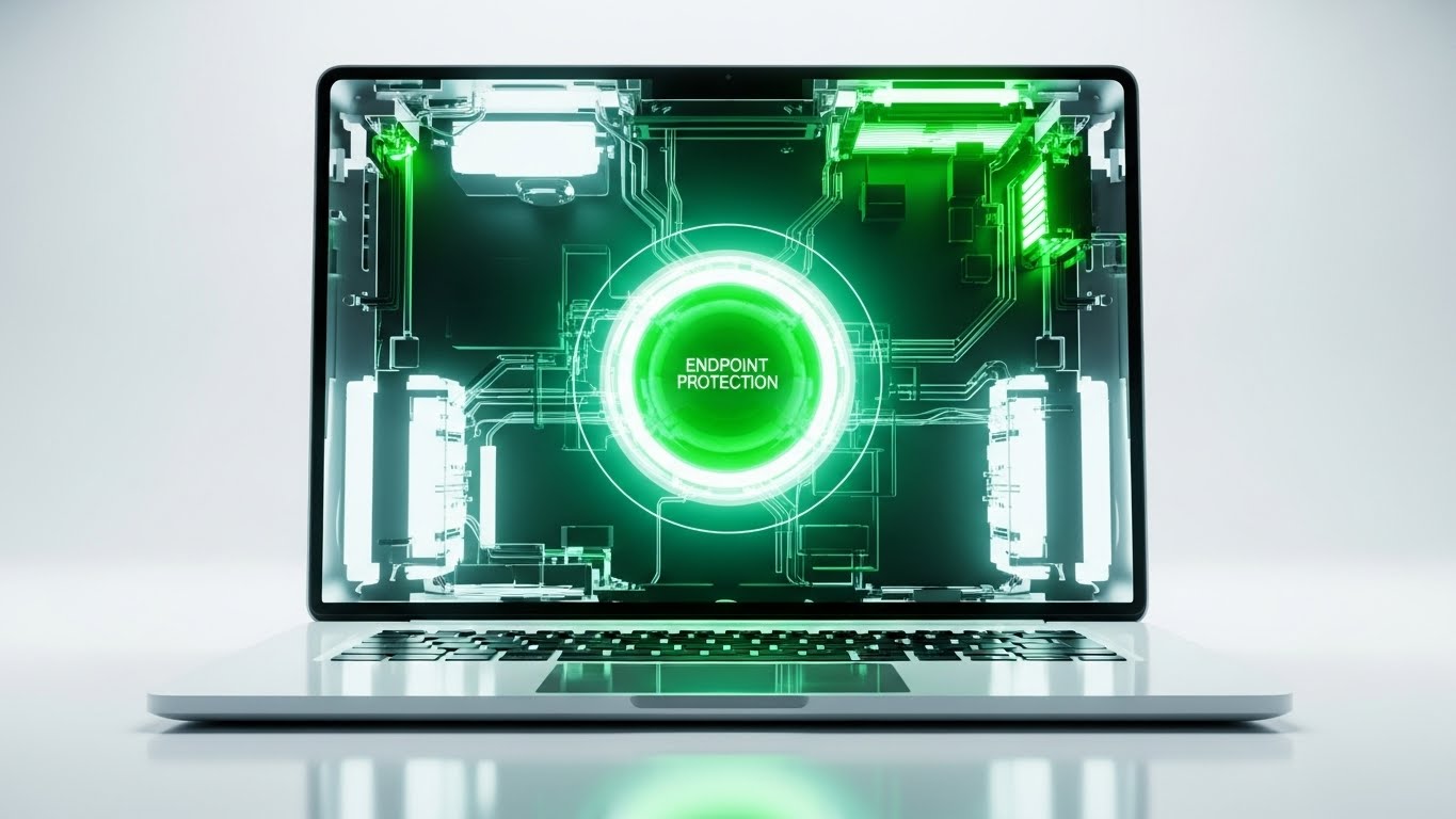
8. The X-Ray Core
TOFU | Risk Mitigation
Visual & Narrative Approach
For technical whitepapers, you need to show depth. This 3D X-Ray style peels back the surface of the hardware (a laptop) to reveal the "ghost in the machine"—a glowing Teal orb at the center. This symbolizes "Endpoint Protection" that sits at the kernel level, deeper than the OS. It visualizes the concept of intrinsic security that is baked into the device, rather than painted on top.
Psychological Impact & KPI Focus
This style triggers the Authority Bias. X-ray imagery is associated with medical precision and deep diagnosis. It suggests that your software has "surgical" visibility into the system. For a technical audience (risk managers), this visualizes thoroughness. It supports the goal of Download Rate for whitepapers, as the cover image promises deep, structural insights.
Strategic Implementation & Trade-offs
- Best Use: Whitepaper covers, PDF assets, or technical deep-dive webinars.
- Duration: Static or slow rotation.
- Trade-off: It can look clinical or cold. It lacks the "human element." It is strictly for proving technical depth to a technical audience.
Companies using similar video content -
VMware Carbon Black – Cloud Endpoint – Deep kernel-level endpoint protection.
Trend Micro – Apex One – X-ray view of deep endpoint threat detection.
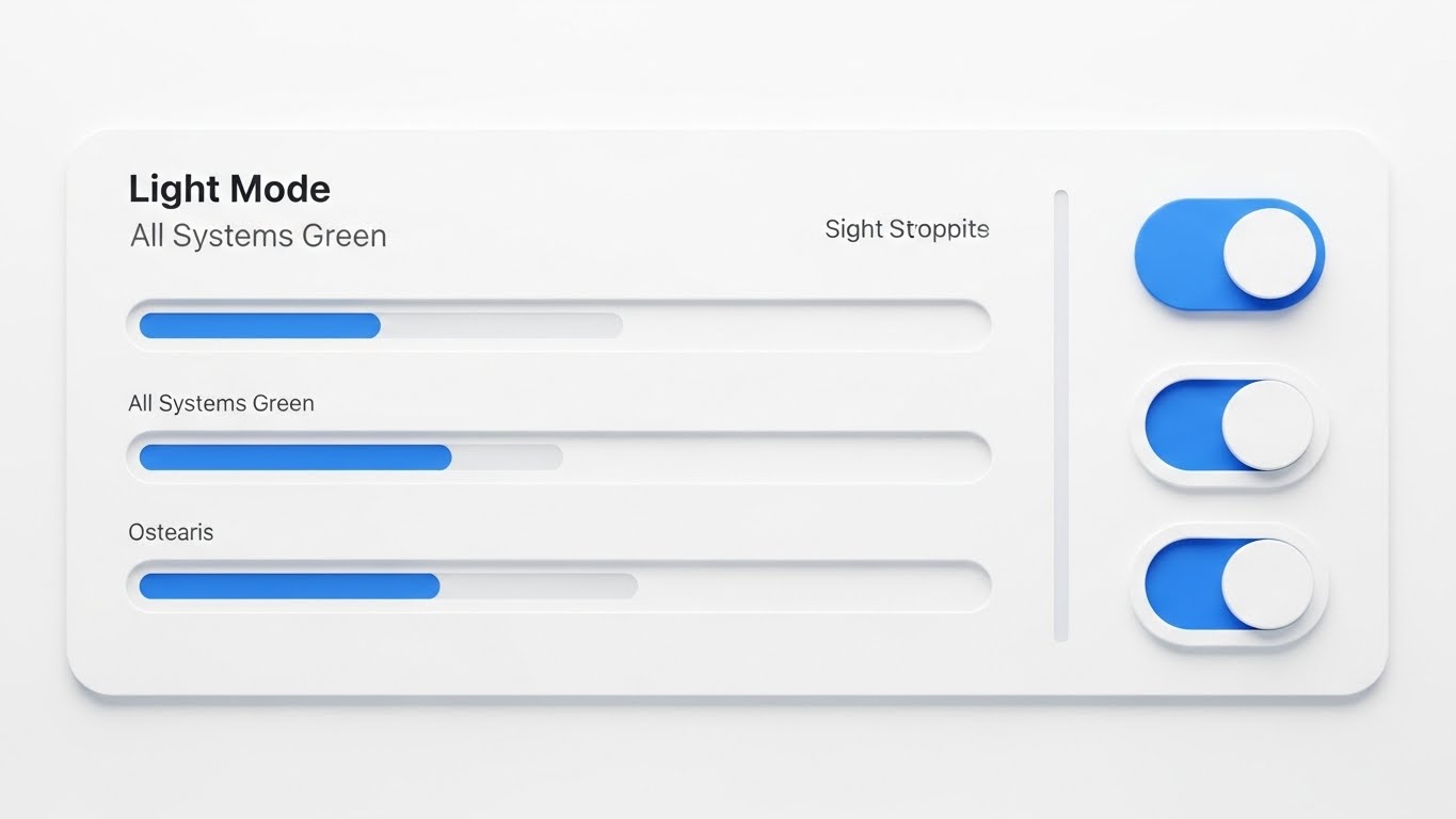
9. Neumorphic "All Green" Dashboard
MOFU | Demo Requests
Visual & Narrative Approach
Security tools are often stressful to look at—full of red alerts and black backgrounds. This style flips the script using Neumorphism (soft, extruded plastic visuals). The palette is Sky Blue and Paper White. The dashboard shows "All Systems Green" with smooth, rounded progress bars. It doesn't just show a UI; it sells a feeling of control and calmness. It promises the CISO that their day could look like this: clean, bright, and handled.
Psychological Impact & KPI Focus
This leverages Cognitive Ease. The soft shadows and lack of harsh borders reduce visual tension. It suggests that the tool is intuitive and easy to use, directly addressing the "workforce gap" anxiety (Stat: 4.8 million unfilled roles) by implying that anyone can manage this dashboard. The KPI is Demo Request Conversion, appealing to users who are tired of clunky, complex legacy tools.
Strategic Implementation & Trade-offs
- Best Use: The "Ease of Use" section of a product page.
- Duration: Static or subtle UI animations (toggles switching).
- Trade-off: It might look "too simple" for power users who want command-line interfaces. Position it as "Executive Visibility" rather than "Forensic Analysis."
Companies using similar video content -
Sophos – Central – Clean, low-stress dashboard for unified security management.
ESET – Protect – Intuitive, calm dashboard for endpoint security monitoring.
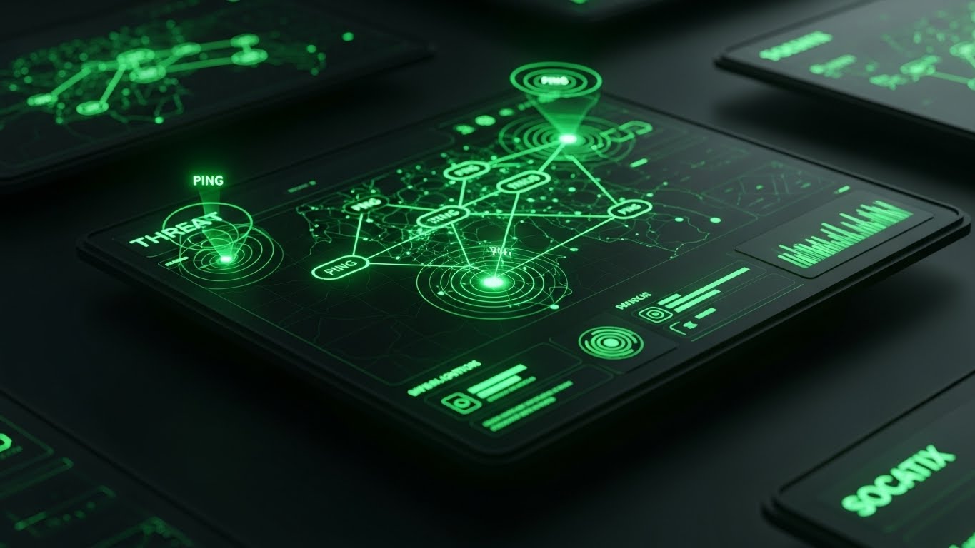
10. Dark Mode "Threat Map"
MOFU | LinkedIn Organic
Visual & Narrative Approach
In contrast to the Neumorphic style, this "Dark Mode" aesthetic is designed for the practitioners—the SOC analysts working the night shift. It uses a Matrix Green and Black palette, mimicking the high-contrast OLED screens found in Security Operations Centers. The "Ping" radar effects on the map visualize active hunting. It looks "cool," professional, and "cyber." It validates the analyst's identity as a defender in the dark.
Psychological Impact & KPI Focus
This appeals to Tribal Identity. It looks like the tools seen in movies, which (subconsciously) is what many analysts aspire to operate. It signals "Pro Grade." The perspective tilt adds depth, making the interface feel immersive. The goal is Engagement (Likes/Shares) on LinkedIn, as analysts share content that validates the sophistication of their work environment.
Strategic Implementation & Trade-offs
- Best Use: Organic social posts targeting the technical community (SysAdmins, Analysts).
- Duration: Static or pulsing radar loop.
- Trade-off: It can feel cliché if overused. Ensure the UI elements shown are actually functional/realistic, not just decorative "Hollywood OS" gibberish.
Companies using similar video content -
IBM Security – QRadar SIEM – High-visibility threat mapping for SOC analysts.
Elastic Security – SIEM – Dark mode UI for immersive threat hunting and analysis.
11. Wireframe to Reality
MOFU | Product Differentiation

Visual & Narrative Approach
To differentiate a product as "secure by design" rather than a bolt-on solution, this style uses a sophisticated split-screen technique. The left half of the screen reveals a skeletal, Cyan 3D wireframe of a workstation, symbolizing the architectural blueprint of the digital environment. As the eye moves across the vertical divider to the right, the wireframe seamlessly resolves into a photorealistic, modern office setting. This visual metaphor argues that your security is not an afterthought layer; it is woven into the very structural fabric of the endpoint.
Psychological Impact & KPI Focus
This appeals to the Essentialist Bias—the preference for things that are perceived as fundamental rather than additive. By showing the "bones" of the system, you communicate depth and stability. It reassures the viewer that the protection is intrinsic. The primary KPI is Time on Page, as the satisfying "wipe" transition invites the user to scrub the video back and forth to analyze the transformation.
Strategic Implementation & Trade-offs
- Best Use: The "Architecture" or "Technology" section of your product page.
- Duration: Loopable interaction or short clip (6-8 seconds).
- Trade-off: It is conceptual. It sells the philosophy of your engineering but does not show the actual dashboard. Use it to establish quality, not to train users.
Companies using similar video content -
Wiz – Cloud Security Platform – Visualizes security built into cloud architecture from wireframe.
Lacework – Polygraph Data Platform – Shows security integrated into cloud infrastructure design.
12. Isometric "Toy Block" Workflow
MOFU | Feature Education
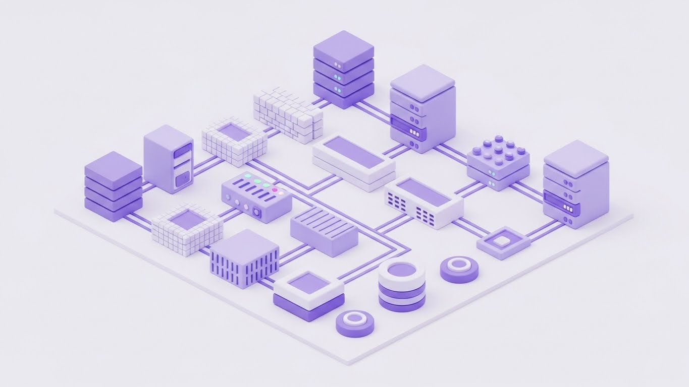
Visual & Narrative Approach
Complex infrastructure often alienates non-technical buyers. This style utilizes "Claymorphism"—soft, matte 3D shapes with rounded edges in a soothing Pastel Purple and White palette. The servers, firewalls, and endpoints are depicted almost like toy blocks on a seamless studio floor. This aesthetic choice de-threatens the environment. It transforms a terrifyingly complex network into a tidy, organized, and manageable model, visually promising that your software creates order out of chaos.
Psychological Impact & KPI Focus
This leverages Cognitive Ease. By removing sharp corners, metallic textures, and dark shadows, you lower the viewer's cortisol levels. It makes the subject matter feel accessible and "friendly," which is critical when selling to stakeholders who may feel overwhelmed by technical jargon. The goal is Retention Rate on longer explainer videos, as the pleasant visual style prevents viewer fatigue.
Strategic Implementation & Trade-offs
- Best Use: "How it Works" videos and educational content for non-technical stakeholders (e.g., CFOs).
- Duration: 60-90 seconds.
- Trade-off: It can appear "childish" if not balanced with sophisticated narration. It is not suitable for "Threat Hunting" scenarios where a serious, high-stakes tone is required.
Companies using similar video content -
Cisco Meraki – Cloud-Managed IT – Simplifies network management into organized, manageable blocks.
Juniper Networks – Mist AI – Organizes and simplifies AI-driven network operations.
13. Neon ROI Streams
MOFU | ROI Justification
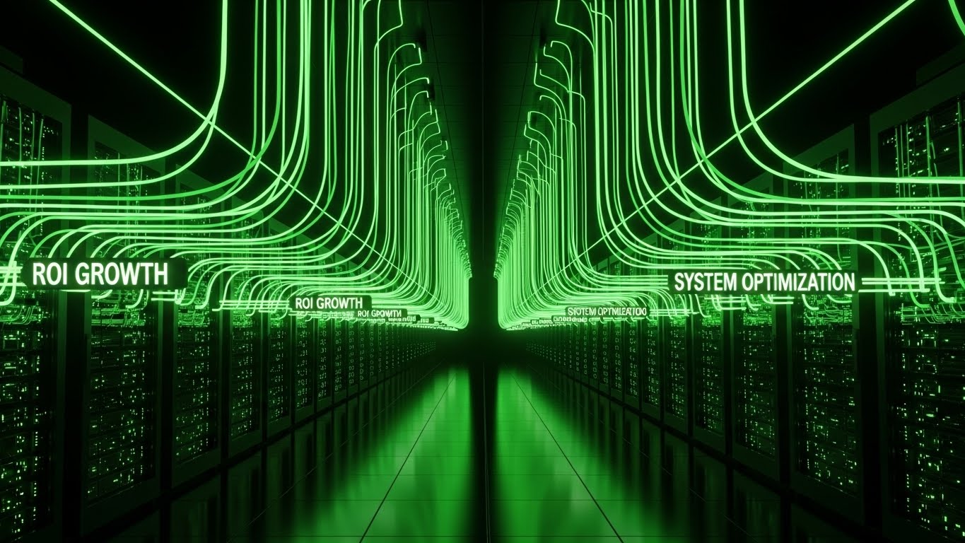
Visual & Narrative Approach
Justifying budget requires visualizing value. This style adopts a sleek "Dark Mode" aesthetic, placing the viewer in an infinite server corridor. The narrative focus is on the Laser Green neon data streams flowing upward from the racks, explicitly labeled with tags like "ROI GROWTH" and "SYSTEM OPTIMIZATION." Unlike threat-focused visuals, this style focuses on output. It visualizes the antivirus not as a cost center, but as a generator of efficiency and uptime.
Psychological Impact & KPI Focus
This visual triggers the Framing Effect. By visualizing security data as "Growth" (upward movement, green color) rather than "Defense" (shields, walls), you reframe the purchase decision from an insurance cost to a productivity investment. The KPI is Conversion Rate on case studies, as it provides the visual evidence needed for a buyer to justify the expenditure to their finance department.
Strategic Implementation & Trade-offs
- Best Use: Case study headers or ROI calculator results pages.
- Duration: 10-15 seconds.
- Trade-off: It is highly abstract. It shows result visuals, not process visuals. It must be paired with hard numbers (e.g., "300% ROI") to ground the neon aesthetics in reality.
Companies using similar video content -
Proofpoint – Email Security – Visualizes the value flow of protected email and data.
Forcepoint – DLP – Shows optimization and value from data loss prevention.
14. Comparative Efficiency Charts
MOFU | Competitive Displacement
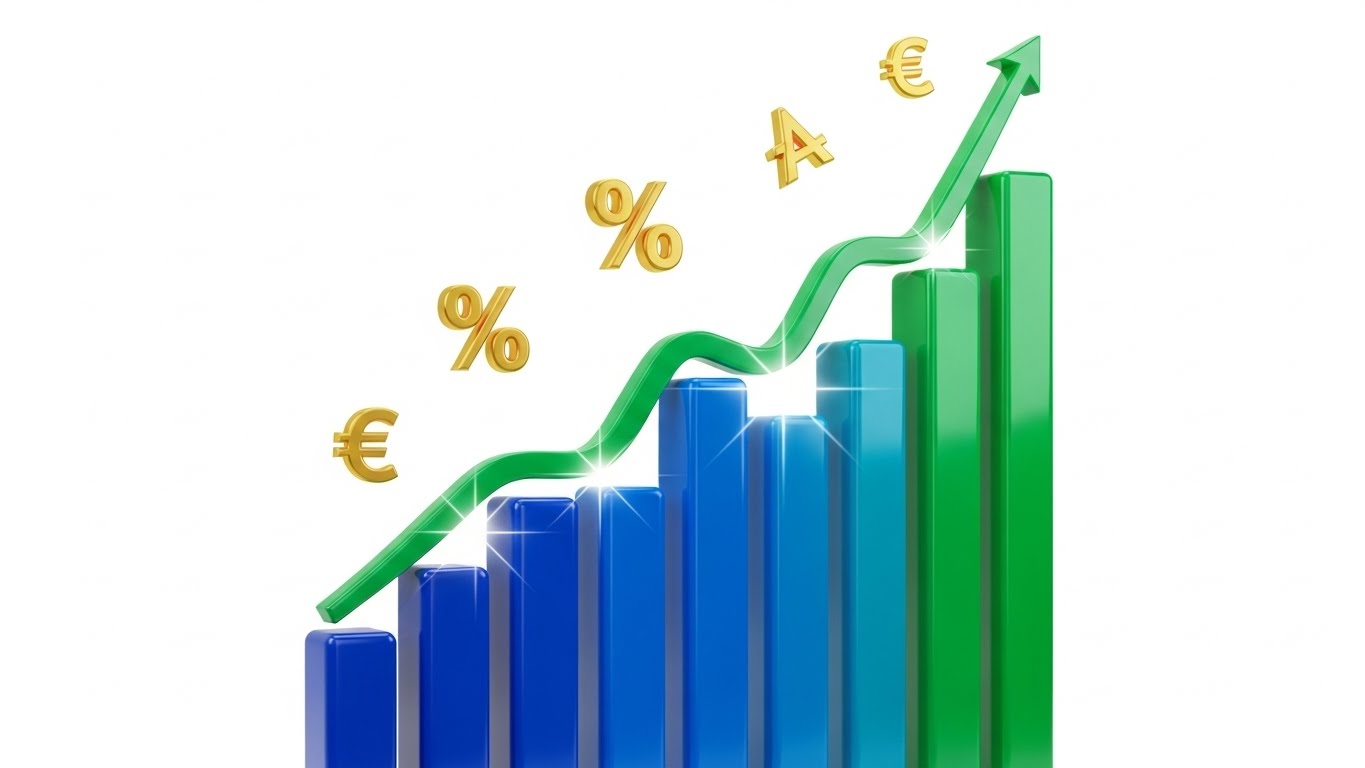
Visual & Narrative Approach
When displacement is the goal, you must prove your software is lighter and faster. This style abandons abstraction for direct comparison using 3D bar charts. The visuals are clean and glossy, utilizing a Blue and Green palette to represent positive metrics. The ascending Green arrow and the inclusion of currency symbols (€) and percentage signs directly links technical performance to business outcomes. The narrative is binary and indisputable: "We are the efficient choice."
Psychological Impact & KPI Focus
This utilizes Distinction Bias, where two options are evaluated side-by-side to highlight differences. By presenting a clear "tall bar vs. short bar" visual (or in this case, a soaring growth curve), you simplify the choice architecture. It validates the technical claim of "low resource footprint." The primary KPI is Bounce Rate Reduction on "Us vs. Them" comparison pages, as the image provides an instant summary of the text.
Strategic Implementation & Trade-offs
- Best Use: Competitor comparison landing pages or slide decks for sales teams.
- Duration: Static or simple "growth" animation.
- Trade-off: It is transactional. It lacks emotional resonance and brand storytelling. Use it strictly for logical, evidence-based persuasion at the MOFU stage.
Companies using similar video content -
Tenable – Vulnerability Management – Compares and highlights efficiency in vulnerability reduction.
Qualys – Cloud Platform – Visualizes performance advantage in security and compliance.
15. The Holographic Command Center
MOFU | Thought Leadership
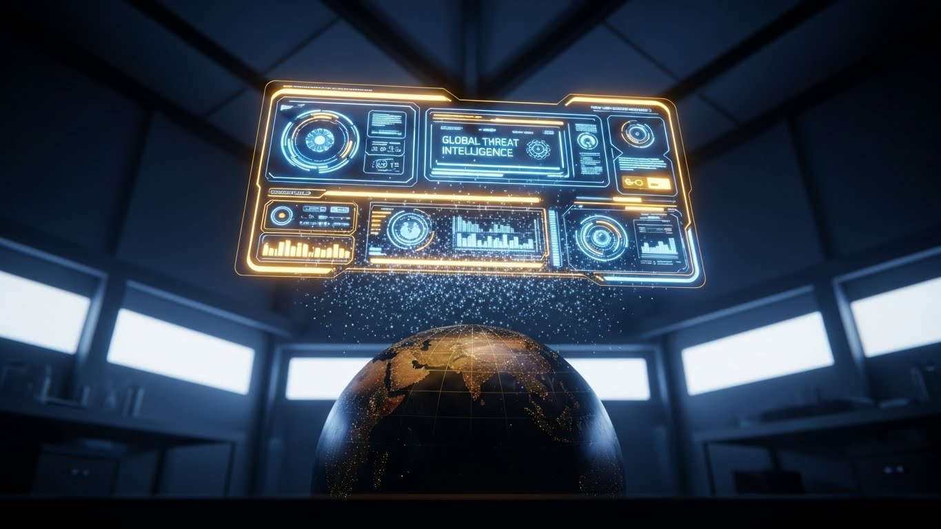
Visual & Narrative Approach
To sell "Threat Intelligence," you must sell the scope of your vision. This style uses a cinematic low-angle shot of a high-tech lab, featuring a realistic globe illuminated by a floating, volumetric Holographic UI. The Gold and Electric Blue interface displays "Global Threat Intelligence," implying that the software is constantly scanning the entire planet. It positions the user as a commander with omniscient oversight, capable of seeing threats before they cross borders.
Psychological Impact & KPI Focus
This appeals to the desire for Control and Mastery. The "God View" of the globe and the sophisticated HUD (Heads-Up Display) make the viewer feel powerful and informed. It elevates the brand from a software vendor to a global intelligence partner. The goal is Webinar Registrations, as the high-production value promises high-value insights.
Strategic Implementation & Trade-offs
- Best Use: Backgrounds for webinar invitations, whitepaper headers, or event keynotes.
- Duration: Slow rotation loop (10-20 seconds).
- Trade-off: It can feel "Sci-Fi." Ensure the UI elements (graphs, text) look plausible and grounded in actual cybersecurity terminology, or it risks looking like a video game.
Companies using similar video content -
Recorded Future – Intelligence Cloud – Holographic view of global threat intelligence.
Mandiant (Google Cloud) – Threat Intelligence – Omniscient view of global cyber threats.
16. The "Human Firewall" Overlay
MOFU | Functional Buyer

Visual & Narrative Approach
Cybersecurity is ultimately about people. This style bridges the gap between lifestyle photography and tech interface. It features a high-quality, over-the-shoulder shot of an IT Manager in a Navy Blue shirt, working in a modern, sunlit office. Overlayed on his tablet is a sharp, abstract UI graphic in Warm Skin tones and Green, showing a "Shield/Checkmark" status. The narrative is clear: this tool empowers the human operator to secure the organization from anywhere, effortlessly.
Psychological Impact & KPI Focus
This triggers Self-Referencing, allowing the target audience (IT Managers) to see themselves in the ad. Unlike the dark, isolated "hacker in a hoodie" trope, this visual normalizes security as a bright, professional, and integrated part of the workday. It reduces the stigma of stress associated with the role. The KPI is Click-Through Rate (CTR) on LinkedIn, driven by the relatability of the human element.
Strategic Implementation & Trade-offs
- Best Use: LinkedIn Feed Ads and "Careers" or "Culture" pages.
- Duration: Static image or subtle UI animation on the tablet screen.
- Trade-off: It is less "tech-heavy." Hardcore technical buyers might find it "fluff" if not accompanied by technical copy. It sells the lifestyle of the user, not the specs of the code.
Companies using similar video content -
Imprivata – Identity Governance – Empowers IT managers with augmented identity control.
CyberArk – Privileged Access Manager – Shows empowered administrators with augmented control.
17. Magenta Action Montage
BOFU | Overcoming Objections
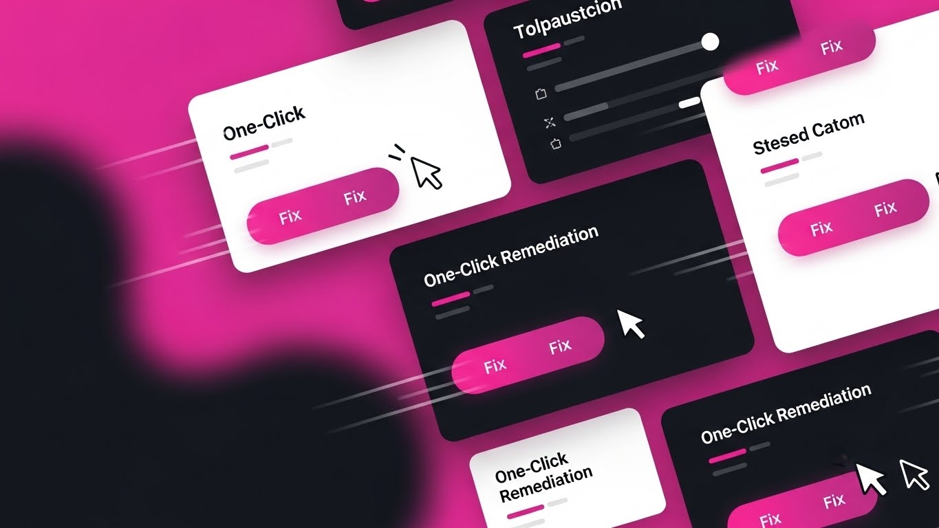
Visual & Narrative Approach
Speed of response is a critical selling point. This style uses a high-energy collage of UI snippets, dominated by a bold Magenta and Bright White palette. The composition is dynamic, featuring motion lines and overlapping panels that highlight "Fix" buttons and "One-Click" actions. The visual narrative is all about velocity—showing how multiple complex steps are collapsed into a single, decisive click. It visualizes the concept of "Remediation" as an instant, powerful action.
Psychological Impact & KPI Focus
This appeals to the desire for Instant Gratification and efficiency. The repeated visual cue of the cursor hitting the "Fix" button provides a sense of closure and resolution. It directly counters the objection that the tool is "hard to use" or "cumbersome." The goal is Product Video Completion Rate, as the fast-paced editing keeps the viewer engaged.
Strategic Implementation & Trade-offs
- Best Use: Feature highlight reels and "Quick Start" guide videos.
- Duration: Fast-paced cuts (2-3 seconds per scene).
- Trade-off: It can be overwhelming. The "Pink" palette is aggressive. Use it to inject energy into a demo, but not for the entire duration of a deep-dive tutorial.
Companies using similar video content -
CrowdStrike – Falcon Response – Rapid remediation and one-click actions for incident response.
Palo Alto Networks – Cortex XSOAR – Fast-paced visualization of automated security orchestration.
18. Augmented Reality Defense
BOFU | Accelerating TTV

Visual & Narrative Approach
To show that protection travels with the employee, this style blends real-world footage with 2D vector graphics. A professional woman types on a laptop in a busy co-working space, and as she works, flat Coral-colored shield icons animate around her device, "popping" into existence to deflect invisible threats. This "Augmented Reality" style visualizes the invisible layer of protection that surrounds remote workers, reinforcing the "Anywhere, Anytime" security promise.
Psychological Impact & KPI Focus
This utilizes the Symbolism of Proximity. By placing the graphic shields directly on the real-world footage, you visually compress the distance between the user and the software. It makes the protection feel tangible and present. It supports the KPI of Ad Recall, as the playful mix of reality and illustration stands out in social feeds dominated by static stock photos.
Strategic Implementation & Trade-offs
- Best Use: Instagram Reels and LinkedIn Ads targeting remote-first companies.
- Duration: Short loops (6-10 seconds).
- Trade-off: It leans towards "Consumer/Prosumer" aesthetics. Ensure the copy remains B2B focused (e.g., "Enterprise Grade," "SOC 2 Compliant") to avoid looking like a personal antivirus product.
Companies using similar video content -
Zimperium – Mobile Threat Defense – Real-time shielding for mobile devices in live action.
Lookout – Mobile Endpoint Security – Augmented reality defense for mobile workforces.
19. The "Seamless Plug" Metaphor
BOFU | Reducing Friction
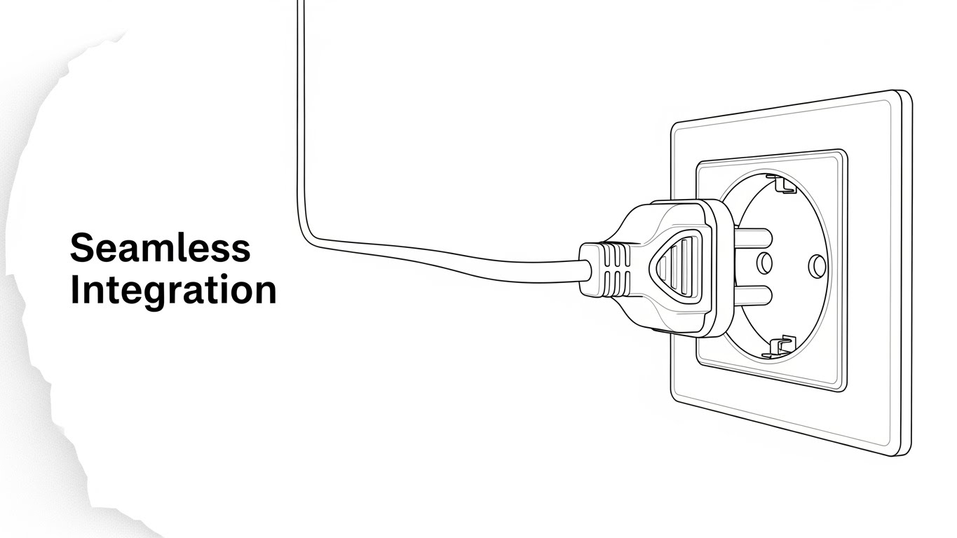
Visual & Narrative Approach
Sometimes, the most powerful visual is the simplest. This style uses elegant, continuous-line art in Black and White to depict a universal metaphor: a plug fitting perfectly into a socket. The text "Seamless Integration" anchors the meaning. There are no complex servers or code streams—just the pure, clean idea of connection. This validates the claim that the software plays nice with existing API ecosystems and requires no heavy lifting to deploy.
Psychological Impact & KPI Focus
This appeals to Processing Fluency. Simple, high-contrast images are processed faster by the brain and are perceived as more truthful. The minimalism implies that the process itself is minimal. It calms the anxiety of "Implementation Hell." The primary KPI is Click-Through Rate (CTR) on "Integration" documentation or partner pages.
Strategic Implementation & Trade-offs
- Best Use: Partner integration pages, technical documentation covers, or icon sets.
- Duration: Static or subtle "line draw" animation.
- Trade-off: It is symbolic, not literal. It doesn't show what is being integrated. It functions best as a supporting visual icon rather than a standalone hero image.
Companies using similar video content -
HashiCorp – Vault – Seamlessly plugs into various systems for secrets management.
Kong Inc. – API Gateway – Frictionless connection for API management and security.
20. Amber Parallax Depth
BOFU | Technical Buyer
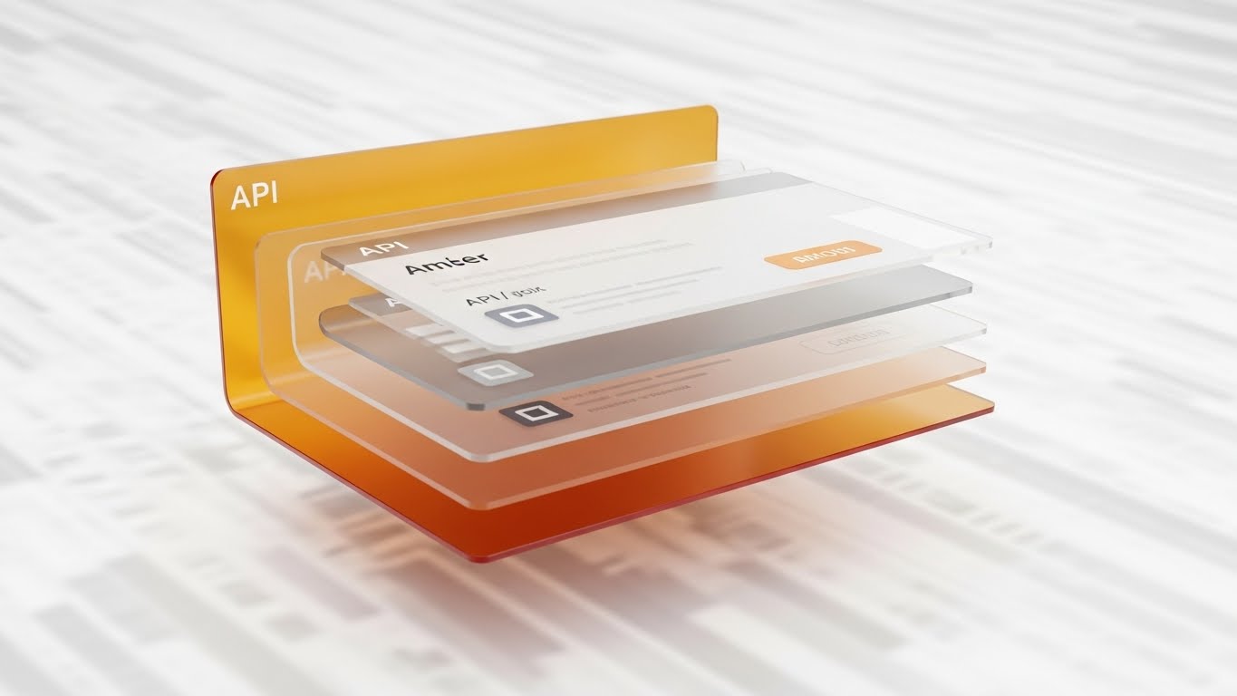
Visual & Narrative Approach
For the technical buyer (DevOps, Architects), depth equals substance. This style uses "Glassmorphism"—frosted, semi-transparent panels layered in 3D space. The Amber and Glass palette suggests a premium, hardened environment. The camera views the stack from the side, revealing floating API windows and data layers resting on top of one another. This "Parallax" effect visualizes the richness of the tech stack, implying that the software has deep, accessible layers for custom configuration.
Psychological Impact & KPI Focus
This leverages the Heuristic of Depth. Visual depth is often associated with intellectual depth and robustness. The transparency of the glass suggests "nothing to hide"—the code and APIs are open and accessible. It builds trust with technical gatekeepers. The goal is Time on Site for developer documentation pages, encouraging deep reading.
Strategic Implementation & Trade-offs
- Best Use: Developer portals, API documentation headers, and "Under the Hood" technical briefs.
- Duration: Slow, panning camera movement to accentuate the parallax effect.
- Trade-off: It is abstract. It represents the idea of an API, not the JSON code itself. It sets the mood for technical work but requires actual code snippets nearby to satisfy the developer audience.
Companies using similar video content -
Snyk – Developer Security Platform – Transparent API architecture for deep developer security.
GitLab – DevSecOps Platform – Visualizes deep stack security within the DevSecOps pipeline.
21. Split Screen: Optimized Reality
BOFU | Economic Buyer

Visual & Narrative Approach
When pitching to the Economic Buyer (CFO/CEO), you must visualize the "Before" and "After" instantaneously. This style employs a sharp vertical split-screen. The left side, bathed in stressful Red tones, depicts a cluttered desk with tangled wires and overflowing paper stacks—symbols of operational chaos and vulnerability. The right side, illuminated in calm Electric Blue and white, shows a pristine, minimalist workspace with wireless tech. The narrative is binary: "Chaos vs. Control." It frames the purchase not as software, but as organizational hygiene.
Psychological Impact & KPI Focus
This triggers the Contrast Principle—we perceive differences more starkly when presented adjacent to one another. It visually validates the cost of inaction (chaos) against the value of investment (calm). The primary KPI is Sales Cycle Acceleration, as it gives the internal champion a powerful visual tool to justify the budget to executive leadership.
Strategic Implementation & Trade-offs
- Best Use: The "Problem/Solution" slide in a pitch deck or a BOFU sales email.
- Duration: Static image or a slow "wipe" animation revealing the clean side.
- Trade-off: It is binary and lacks nuance. It simplifies complex security problems into "Messy vs. Clean," which works for executives but may feel reductive to engineers.
Companies using similar video content -
Rubrik – Data Security Platform – Contrasts data chaos with ordered, secure data management.
Veeam – Data Platform – Shows transition from data vulnerability to optimized reality.
22. Macro UI Micro-Interactions
BOFU | Driving Trials

Visual & Narrative Approach
To encourage a user to start a trial, you must make the action feel tangible and satisfying. This style uses a simulated "Macro Photography" aesthetic with an extremely shallow depth of field. The focus is locked on a single UI element: a toggle switch turning to the "ON" position, glowing Electric Blue against a dark grey matte surface. It turns a digital click into a physical event. The visual promises that security is just one switch away—simple, decisive, and powerful.
Psychological Impact & KPI Focus
This appeals to the Need for Control. The extreme close-up creates a sense of intimacy and power. Seeing the switch flip triggers a "completion" response in the brain, reducing the perceived effort of installation. The KPI is Free Trial Sign-ups, specifically targeting users who fear complex setup processes.
Strategic Implementation & Trade-offs
- Best Use: Retargeting ads for users who abandoned the sign-up page.
- Duration: Short, satisfying loops (3 seconds).
- Trade-off: Context blindness. By focusing so tightly on one button, you lose the broader context of the dashboard. Use it only when the call to action is simple (e.g., "Turn it on").
Companies using similar video content -
Duo Security (Cisco) – MFA – Tactile control for instant multi-factor authentication activation.
LastPass – Business – Instant activation and tactile control for password management.
23. 2D Character-Driven Story
BOFU | Competitive Switcher
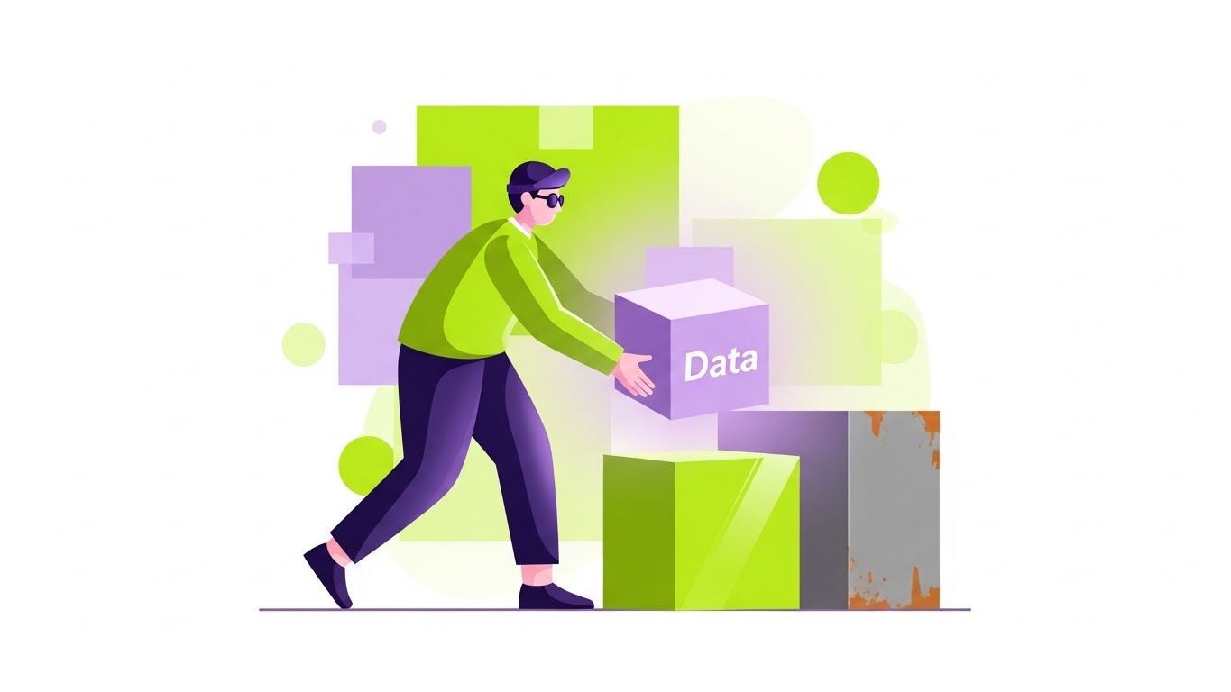
Visual & Narrative Approach
Convincing a client to switch antivirus providers is an emotional hurdle. This style uses friendly, geometric 2D characters in Lime Green and Lavender to soften the narrative. A stylized IT professional is shown effortlessly moving a glowing lavender cube (Data) from a rusty, grey box (Old Provider) to a shiny, lime green box (New Provider). The "Flat Vector" art style removes the grit of reality, framing the migration process as a simple, drag-and-drop story rather than a technical nightmare.
Psychological Impact & KPI Focus
This utilizes Narrative Transportation. By using a character, the viewer empathizes with the protagonist's success. The clean geometry suggests that the migration process is structured and predictable. The goal is Email Click-Through Rate, specifically for "Switcher" campaigns targeting customers of legacy competitors.
Strategic Implementation & Trade-offs
- Best Use: Email newsletters or "We Miss You" reactivation campaigns.
- Duration: Static illustration or simple GIF.
- Trade-off: It can look "entry-level." Ensure the geometric shapes remain sharp and the palette sophisticated (avoid primary colors) to maintain B2B credibility.
Companies using similar video content -
Bitdefender – GravityZone – Effortless migration story for switching endpoint protection.
Webroot (OpenText) – Business Endpoint Protection – Character-driven story of simple security migration.
24. 2D Animation & UI Composition
Onboarding | Self-Serve Onboarding
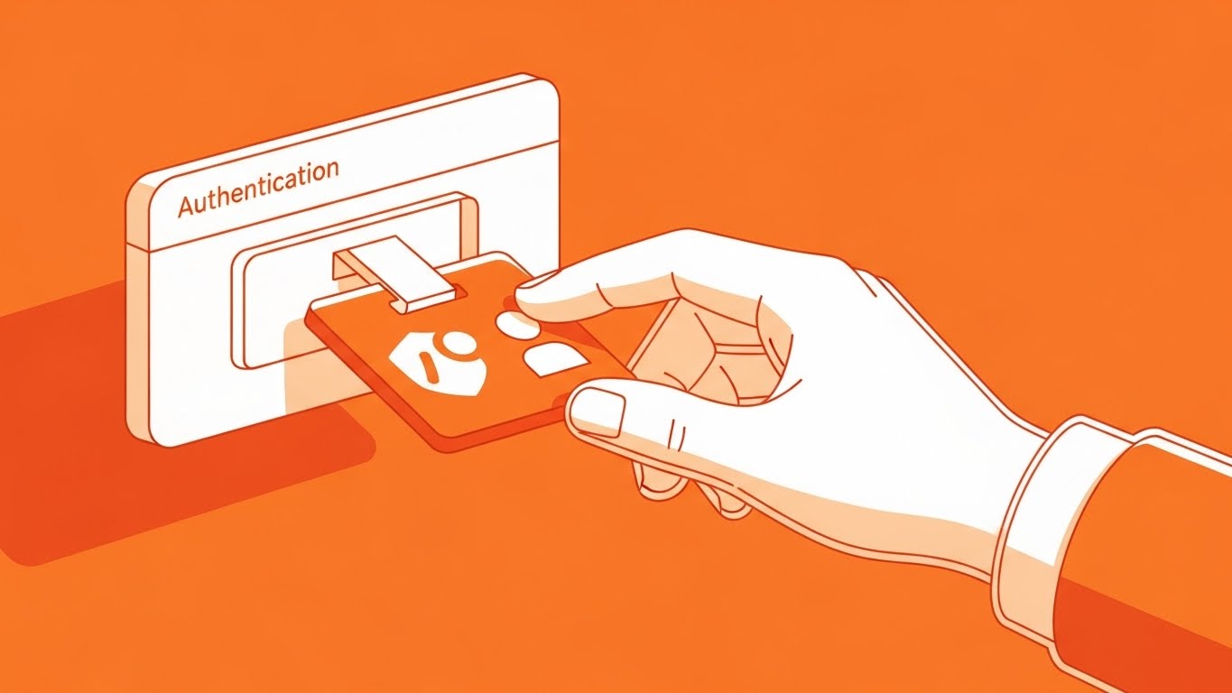
Visual & Narrative Approach
The first login is the most critical moment for retention. This style combines bold 2D animation with UI elements. A stylized hand, outlined in thick ink, places a security badge onto a floating UI window. The Tangerine and White palette is energetic and welcoming. This visual metaphor of "badging in" physically represents the concept of Authentication. It turns a boring login screen into a ritual of entry, welcoming the user into a secure space.
Psychological Impact & KPI Focus
This leverages Ritualization. By visualizing the login as a physical "badging" process, you add weight and significance to the action. The bright Tangerine color stimulates mental activity and enthusiasm. The KPI is Activation Rate (percentage of users who complete setup within 24 hours).
Strategic Implementation & Trade-offs
- Best Use: The header image of the "Welcome to the Platform" email or the first screen of the setup wizard.
- Duration: Short, welcoming loop.
- Trade-off: It is highly stylized. It does not show the actual software interface, so it must be followed immediately by the real UI to avoid confusion.
Companies using similar video content -
Auth0 (Okta) – Identity Platform – Animated first step for securing user identities.
Ping Identity – Intelligent Identity – Cel-shaded illustration for secure identity onboarding.
25. Low-Poly Knowledge Kingdom
Onboarding | Knowledge Base
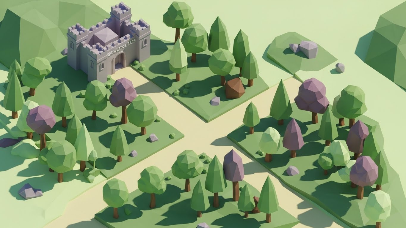
Visual & Narrative Approach
Self-service support reduces ticket volume. To encourage users to explore the docs, this style uses "Low-Poly" 3D art—a style reminiscent of indie video games. A stylized digital forest (confusion/wilds) leads to a structured, fortified castle (The Knowledge Base) in Forest Green and Brown. The distinct facets of the geometry catch the light, suggesting clarity and structure. It gamifies the support experience, making the search for answers feel like a quest rather than a chore.
Psychological Impact & KPI Focus
This appeals to Exploratory Drive. The "map-like" perspective encourages the user to navigate and find their own answers. It reframes support from "fixing a break" to "building knowledge." The KPI is Deflection Rate (users finding answers without emailing support).
Strategic Implementation & Trade-offs
- Best Use: Background headers for the Help Center or "Academy" landing pages.
- Duration: Static or slow cloud shadows moving across the landscape.
- Trade-off: It feels "indie." It works beautifully for a Knowledge Base but would be inappropriate for a serious "Data Breach Alert" notification.
Companies using similar video content -
KnowBe4 – Security Awareness Training – Gamified knowledge fortress for security education.
SANS Institute – Cybersecurity Training – Structured support and knowledge building for cyber professionals.
26. Aspirational Stock Montage
Retention | Objection Handling

Visual & Narrative Approach
Retention is about reminding the client why they pay you: so their people can work. This style uses high-quality, aspirational stock photography. The scene is a sunlit, open-plan office where a diverse team collaborates around a monitor. The lighting is "High Key" (bright, few shadows), symbolizing transparency and safety. There are no red alerts, no panicked IT staff. The narrative is: "We handle the threats; you handle the business."
Psychological Impact & KPI Focus
This leverages Social Proof and the Halo Effect. Seeing happy, productive people associates your software with a positive work environment. It reminds the decision-maker that the ultimate ROI is their team's productivity. The KPI is Net Promoter Score (NPS), as it reinforces the positive sentiment associated with the brand.
Strategic Implementation & Trade-offs
- Best Use: Quarterly business review (QBR) decks or customer appreciation newsletters.
- Duration: Static.
- Trade-off: It is generic. Without brand-specific overlays or UI inserts, it can look like any corporate stock photo. Always overlay a subtle UI element or logo to claim ownership.
Companies using similar video content -
Barracuda Networks – Total Email Protection – Aspirational view of business continuity through email security.
Mimecast – Email Security – High-key photography showing uninterrupted business operations.
27. Hyper-lapse Stock Footage
Retention | Reducing Churn

Visual & Narrative Approach
To prove the value of "Always-on" monitoring, you need to show the passage of time. This style uses Hyper-lapse footage of a city skyline transitioning from day to night. Long exposure light trails from traffic streak through the streets in Midnight Blue and Gold. Subtle digital grid lines are overlayed on the sky. The narrative is powerful: "While the city sleeps, we watch." It connects the relentless flow of traffic to the relentless flow of data and protection.
Psychological Impact & KPI Focus
This appeals to the need for Safety and Security. The steady, rhythmic motion of the city suggests stability and endurance. It reassures the client of the vendor's reliability. The KPI is Renewal Rate, as it visually summarizes a year’s worth of protection in a few seconds.
Strategic Implementation & Trade-offs
- Best Use: Background video for login screens or the opening slide of an Annual Security Report.
- Duration: 10-15 second loop.
- Trade-off: Large file size. Ensure it is optimized for web to prevent page load lag, which would ironically undermine the message of "speed."
Companies using similar video content -
Arctic Wolf – Managed Detection and Response – Hyper-lapse showing 24/7 vigilant monitoring.
Cyderes – Managed Security Services – Time-lapse cinematography for continuous security operations.
28. Papercraft "Compliance" Trail
Expansion | Upsell/Cross-sell

Visual & Narrative Approach
Regulatory compliance (GDPR, SOC2) is a messy reality of paper trails and logs. This style uses a "Papercraft" or stop-motion aesthetic to visualize this challenge. Disorganized scraps of paper (representing logs) fly into a neat, white digital folder, instantly stacking into a perfect, organized tower. The texture of the paper adds a tactile element to the boring concept of "audit logs," visualizing the software as the tool that brings order to administrative chaos.
Psychological Impact & KPI Focus
This appeals to the Need for Order. Compliance officers often feel overwhelmed by the volume of documentation required. Seeing the "mess" physically organize itself provides a strong sense of relief and solution. The goal is Webinar Sign-ups for compliance-focused topics, promising a solution to the headache of audits.
Strategic Implementation & Trade-offs
- Best Use: Social ads targeting Compliance Officers and CISOs.
- Duration: Short stop-motion animation (6-8 seconds).
- Trade-off: It is niche. It specifically targets the "Bureaucratic" side of security, not the "Combat" side. Use strictly for compliance-related messaging.
Companies using similar video content -
LogicManager – GRC Software – Papercraft visualization of organizing compliance chaos.
MetricStream – GRC Platform – Stop-motion organizing audit trails for compliance.
29. Generative AI Realistic Character
Expansion | Proactive Support

Visual & Narrative Approach
As AI evolves, so does the face of support. This style utilizes high-fidelity Generative AI to create a "Virtual CIO" character. The visual is a cinematic medium close-up of a confident professional in a high-tech conference room, lit with a cool rim light (Professional Blue and Grey palette). The character speaks directly to the camera, gesturing towards a holographic projection of a mobile device to explain "Mobile Defense." The realism establishes authority, while the AI generation allows for rapid localization and content updates.
Psychological Impact & KPI Focus
This appeals to the Authority Bias. We trust humans (or realistic human avatars) who look professional and speak confidently. This style scales the "human touch" of a dedicated account manager to every user. The goal is Feature Adoption, as the "expert" personally guides the user through complex new features like mobile fleet defense.
Strategic Implementation & Trade-offs
- Best Use: In-app feature walkthroughs or personalized support responses.
- Duration: Varies based on script (30-60 seconds).
- Trade-off: The "Uncanny Valley." If the lip-sync or eye movement is slightly off, it creates distrust. Quality control on the AI generation is paramount—it must be perfect or not used at all.
Companies using similar video content -
Cato Networks – SASE Cloud – Virtual expert guidance for SASE deployment and management.
Versa Networks – SASE – AI-generated character providing expert SASE guidance.
30. The Visionary Manifesto
Expansion | Referrals

Visual & Narrative Approach
The final style is the "Anthem." It blends the best of previous styles—real people, sleek UI, and abstract data flows—into a cohesive cinematic montage. The aspect ratio widens to 21:9 for a movie-like feel. The narrative is no longer about "blocking threats" but about "enabling the future." We see data streams turning into city lights, and code turning into commerce. It positions the antivirus not as a shield, but as a foundation for human progress.
Psychological Impact & KPI Focus
This appeals to Idealism and Belonging. It invites the customer to be part of a mission, not just a subscriber to a tool. It elevates the relationship from transactional to emotional. The primary KPI is Net Promoter Score (NPS) and brand advocacy, as it gives customers a story they are proud to be associated with.
Strategic Implementation & Trade-offs
- Best Use: Keynote openers at user conferences or the "About Us" page.
- Duration: 90-120 seconds.
- Trade-off: It is expensive and high-level. It sells the brand, not the product. It is the capstone of the visual strategy, not the foundation.
Strategic Knowledge Base: The Visual Operations Doctrine
To transform these 30 visual styles from "marketing assets" into a "business advantage," we must apply a strategic framework. This is not just about making things look good; it is about reducing the Cognitive Load of your users, accelerating Time-to-Value, and future-proofing your Brand Authority.
The following three segments outline how to operationalize this visual guide.
Strategic Alignment & Visual Architecture
Pre-Production & Planning – Defining the Visual Operating System.
- The Cognitive Load Audit: Before creating a single video, audit your current training materials. Are you asking SOC analysts to read dense PDFs during a crisis? Replace text-heavy "How-To" guides with Style 17 (Magenta Action) for immediate, low-latency comprehension.
- Role-Based Visual Mapping: Differentiate your visual language. Use Style 9 (Neumorphic) for C-suite dashboards (calm, high-level) and Style 10 (Dark Mode) for Analyst tools (high-contrast, data-dense). A "one-style-fits-all" approach fails both audiences.
- The "Glanceability" Standard: In cybersecurity, milliseconds matter. Design every alert and icon (using Style 19 Seamless Plug) to be understood in under 0.5 seconds. If a user has to "decode" your video, it has failed.
- Brand Voice Consistency: Your marketing visuals (social ads) and product visuals (dashboard icons) must speak the same language. Use Style 1 (Fluid Security) colors to accent your actual UI. This subliminal consistency builds trust; the product feels like it delivers on the marketing promise.
- The Advids Strategic Audit: Partner with Advids during this phase to define your "Visual Threat Language." We help map your complex technical features to intuitive visual metaphors before production begins, ensuring scalability.
- Standardization vs. Customization: Use standardized "Stock" styles (Style 27 Hyper-lapse) for general brand continuity, but invest in bespoke, high-end 3D (Style 2 Neural Crystalline) for your core differentiator (e.g., your proprietary AI engine). Spend budget where the differentiation is highest.
- The Cross-Departmental Bridge: Use these visuals to unify terminology. When Sales says "Heuristics," and Engineering says "Behavioral Analysis," show Style 25 (Knowledge Kingdom) to ensure both teams visualize the same concept.
- Legacy System Integration: Visualizing the connection between old on-prem hardware and new SaaS clouds is difficult. Use Style 11 (Wireframe to Reality) to visually demonstrate how your modern software wraps around and protects legacy infrastructure.
- Accessibility in Design: Cybersecurity is global. Ensure your Motion Graphics (Style 4 Kinetic Blockade) use high-contrast colors compliant with WCAG standards, ensuring accessibility for all analysts.
- The Mobile-First Mandate: Security is increasingly managed via mobile apps. Ensure all 30 styles, especially complex 3D ones like Style 8 (X-Ray Core), are legible when scaled down to a smartphone screen. If it doesn't work on mobile, it doesn't work for the modern CISO.
Operational Adoption & Implementation
Deployment – Embedding Visuals into the Workflow.
- Overcoming "Big Brother" Anxiety: Employee monitoring is a sensitive topic. Use Style 23 (Character Story) to use friendly, empathetic visuals that explain data protection, not user surveillance, building trust with the workforce.
- The Micro-Learning Shift: Modern analysts will not watch a 20-minute webinar. Break your training into 30-second "Micro-Drills" using Style 12 (Isometric Toy Block) to explain single concepts that can be consumed between tickets.
- Just-in-Time Support: Embed Style 30 (AI Proactive Support) directly into the error messages. When an alert triggers, pop up a 10-second video explaining exactly what it means and how to fix it.
- Gamification of Training: Use Style 25 (Low-Poly) to create "levels" of certification. Visualizing progress bars and "unlocking" new knowledge castles increases engagement with boring compliance training.
- Reducing Support Ticket Volume: There is a direct correlation between proactive visual guides and reduced call center load. If you visualize the "Integration" process clearly with Style 4 (Minimalist Stack), users won't need to call support to install the agent.
- Remote Onboarding: For distributed security teams, use Style 24 (Onboarding Badge) to create a sense of culture and welcome, even if the employee never visits HQ.
- Visual SOPs: Transform text-based Standard Operating Procedures (SOPs) into visual process flows using Style 28 (Compliance Trail). Visuals are processed 60,000x faster than text, which is critical during a live audit or incident.
- Feedback Loops: Use interactive video elements (e.g., clicking on a Style 22 Switch) in your training to gather feedback. If users click the wrong area, you know your UI is unintuitive. Use visuals as a listening tool.
- Scalable Localization: Cyber threats are global. By using abstract visual metaphors (Style 2, Style 11) rather than text-heavy screens, you reduce the cost of localizing your assets for different regions. The visual language of "Shield" and "Lock" is universal.
- Leadership Communication: When the CISO presents to the Board, they need Style 5 (Invisible Shield)—high-polish, photorealistic imagery that communicates safety and control without getting bogged down in technical jargon. Equip your champions with these assets.
Measuring Impact & Future-Proofing
ROI & Evolution – Validating the Investment.
- Beyond "Views": Do not measure success by "Video Views." Measure it by "Time-to-Competency." Did the new user configure the firewall faster after watching the Style 12 video? That is the only metric that matters.
- The "Idle Time" Metric: Correlate better visualization with reduced software navigation time. If users spend less time staring at the dashboard trying to interpret the data (thanks to Style 9), you have increased their productivity.
- Compliance Velocity: Measure how fast new regulations (e.g., DORA, NIS2) are understood and adopted across the org. Video explainers using Style 18 (Augmented Reality) can drastically shorten the "Compliance Gap."
- Retention and Churn: High-quality UX visualization (Style 26) reinforces the value of the subscription during the silent months when no attacks are happening. It reminds the client: "We are here, and we are working."
- The AI Visual Frontier: Prepare for the future where dashboards generate their own explanatory videos on the fly. Style 30 (Gen AI) is just the beginning of real-time, personalized video reporting.
- Scalability of Assets: Build a "Visual Library" of modular assets (icons, 3D models). This allows you to assemble new videos rapidly as features launch, rather than starting from scratch.
- The Advids Partnership: Scalability requires a partner, not just a vendor. Advids acts as the custodian of your visual assets, ensuring that as your product features evolve, your visual library grows in parallel without losing brand coherence. We turn "one-off videos" into a scalable content engine.
- Benchmarking Success: Innovative visuals are a competitive moat. If your competitor is still using stock photos of padlocks, and you are using Style 2 (Neural Crystalline), you win the "Perception of Innovation" battle instantly.
- The ROI of Safety: Quantify the unquantifiable. Use Style 13 (Neon ROI) to visually present data on "Cost Avoidance." Show the client how much money they didn't lose to ransomware, visualizing the savings as a growing green stack.
- Final Call to Innovation: Treat video as infrastructure. It is not marketing fluff; it is the interface through which the market understands your logic. By adopting these 30 styles, you are not just making your software look better; you are making it understood, trusted, and indispensable.
This concludes the "Video Style Guide for Antivirus Software."
Authored by the Advids Expert Team.
Companies using similar video content -
Palo Alto Networks – The Future of Cybersecurity – Cinematic mixed media for a visionary future.
Cisco – SecureX – Visionary manifesto for future-proof security operations.
Author & Editor Bio


