
Introduction: Visualizing the Invisible Nervous System
In the modern enterprise, the application stack is no longer just a collection of servers; it is the central nervous system of the business. From the microservices handling millions of API calls to the databases storing petabytes of customer information, this system is alive, complex, and dangerously invisible. For the CTOs, SREs, and DevOps leaders charged with keeping it running, the challenge is not just "monitoring"—it is observability. It is the ability to see the invisible and understand the "why" behind every latency spike.
The stakes for this visibility have never been higher. As the digital economy accelerates, the global application performance management market is projected to reach USD 15.14 billion by 2030. This growth is driven by a stark reality: opacity is expensive. Recent industry data reveals that 91% of organizations report that a single hour of downtime costs over $300,000. This is not just an IT problem; it is a board-level risk factor.
However, bridging the gap between raw telemetry data (the code) and strategic business value (the outcome) requires a new language. Video visualization is that language. It transforms abstract concepts like "distributed tracing" and "throughput" into tangible, visual metaphors that stakeholders can understand instantly. It reduces the cognitive load on exhausted teams and builds trust with non-technical buyers.
This guide presents 30 expert-curated video styles designed to solve the specific communication challenges of the APM sector. We analyze how each aesthetic—from the fluid organic streams of data to the structural precision of wireframes—can be deployed to articulate value, accelerate adoption, and position your platform as the visionary leader in a complex world.
1. Abstract Organic 2D
TOFU | Brand Awareness

The Visual & Narrative Approach
Scenario: A website hero video designed to reduce "alert fatigue." The screen displays a mesmerizing flow of vivid coral and soft white shapes against a pale grey background. These shapes do not represent specific servers, but rather the feeling of data moving unimpeded through a healthy system.
Tone: The narration is calm, sophisticated, and reassuring. It avoids technical jargon, focusing instead on words like "fluidity," "harmony," and "continuous." The glossy highlights on the curves catch the light as they move, symbolizing the frictionless speed of an optimized network.
Psychological Impact & KPI Focus
Niche Psychology: For a CTO, the ultimate aspiration is a system that "just flows." This style leverages the psychology of processing fluency—smooth, organic motion is easier for the brain to process than jagged, chaotic lines. It creates an immediate subconscious association between the software and operational stability.
Operational Impact: This style effectively bridges the physical/digital divide by abstracting complex infrastructure into a pure efficiency narrative. It is particularly effective for Brand Awareness (TOFU) by promising relief from the visual noise of traditional dashboards.
Strategic Implementation & Trade-offs
Duration: Best suited for 15-30 second intro loops or background visuals.
Trade-offs: While excellent for setting a mood of elegance, this style is suboptimal for technical deep dives. It lacks the precision to show specific features like distributed tracing. Use it to sell the vision of the product, not the mechanics.
Companies using similar video content -
Datadog – Unified Platform – Visualizing seamless data flow across services.
New Relic – Full-Stack Observability – Depicting fluid, integrated system health.
IBM Instana – Observability – Showing automated, frictionless microservices monitoring.
2. Abstract 3D AI
TOFU | Category Creation

The Visual & Narrative Approach
Scenario: Introducing a new AI-driven anomaly detection feature. The camera focuses on a central glass sphere glowing with electric cyan light. This "hub" pulses as it receives signals from a vast, blurred network of nodes in the deep navy background. The connections light up in rapid sequences, visualizing the AI "thinking" and correlating events in real-time.
Tone: The aesthetic is futuristic, high-tech, and precise. The depth of field creates a sense of immense scale, implying that the AI is monitoring a massive, distributed environment that would be impossible for a human to manage manually.
Psychological Impact & KPI Focus
Niche Psychology: This visualization targets the anxiety of "unknown unknowns" in microservices architectures. The central focus creates a sense of control—a "single pane of glass" amidst the chaos. It reassures the viewer that the AI is vigilant.
Operational Impact: By visually linking the central node (the platform) to the peripheral network (the infrastructure), it reinforces the value of Category Creation (1.2)—moving beyond simple monitoring to intelligent, automated observability.
Strategic Implementation & Trade-offs
Duration: Ideal for 30-60 second explainer segments.
Trade-offs: The high-end, cinematic look establishes authority but can feel cold if not paired with a warm voiceover. It creates a high expectation of "intelligence" that the actual product capabilities must match.
Companies using similar video content -
Dynatrace – Davis AI – Illuminating intelligent anomaly detection and correlation.
BigPanda – AIOps Platform – Visualizing AI-driven incident correlation and insights.
Resolve.ai – Intelligent Automation – Projecting AI-powered IT automation and remediation.
3. Abstract 2D Motion
TOFU | Market Education

The Visual & Narrative Approach
Scenario: An educational video explaining "how distributed tracing works." Simple geometric shapes—yellow circles and charcoal black triangles—move along a grid. As the voiceover explains a request traveling through services, a dotted line traces a path from a triangle (Service A) to a circle (Service B), transforming the shapes as they interact.
Tone: The style is Bauhaus-inspired: functional, clean, and democratic. It strips away all unnecessary decoration to focus purely on the logic of the process. The sunny yellow accents guide the eye, making complex architectural concepts feel approachable.
Psychological Impact & KPI Focus
Niche Psychology: DevOps engineers appreciate precision. This style respects their intelligence by presenting information without "marketing fluff." It reduces cognitive load, allowing the viewer to grasp the structural relationships between modules instantly.
Operational Impact: This style is a workhorse for Market Education (1.3). It translates the abstract logic of code into concrete spatial relationships, directly improving comprehension for new users.
Strategic Implementation & Trade-offs
Duration: Perfect for 60-90 second "How-To" or "Concept 101" videos.
Trade-offs: The flat, grid-based layout is excellent for logic but poor for emotion. It is unlikely to excite a C-level buyer looking for "innovation," but will build deep trust with practitioners.
Companies using similar video content -
SigNoz – OpenTelemetry APM – Simplifying distributed tracing logic and data paths.
Jaeger – Distributed Tracing – Explaining request flow through microservices with clear lines.
Elastic Observability – APM – Illustrating code execution and service interaction.
5. Minimalist Flat 2D
TOFU | YouTube SEO
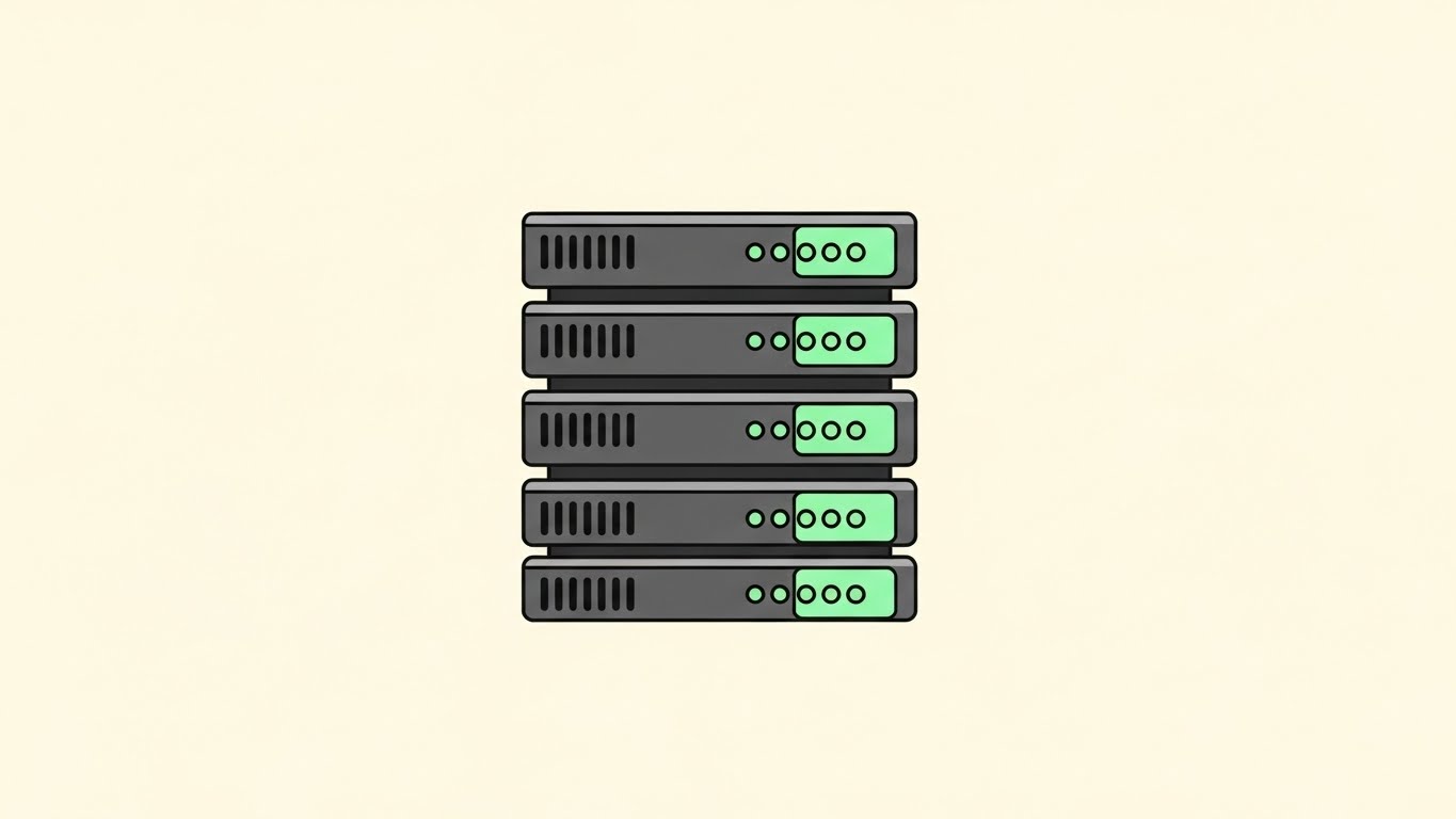
The Visual & Narrative Approach
Scenario: A YouTube pre-roll ad aiming to capture search traffic for "server health check." A symmetrical stack of rectangles, rendered in pastel mint green and charcoal gray, sits center frame. As the voiceover mentions "instant visibility," the small status lights on the stack blink from grey to a glowing green in perfect unison.
Tone: The vibe is clinical, orderly, and calming. The clean cream background eliminates all visual noise, focusing the viewer entirely on the state of the infrastructure. It communicates reliability and simplicity.
Psychological Impact & KPI Focus
Niche Psychology: For SREs dealing with dashboard clutter, a clean, minimalist visual is a relief. The symmetry and pastel palette signal order. It addresses the desire for a "clean slate" and the aspiration for 100% green/healthy status.
Operational Impact: Optimized for YouTube SEO (3.3). Its high contrast and simple shapes remain legible even on mobile screens. It visualizes the core KPI of Uptime in its simplest binary form: Red (Bad) vs. Green (Good).
Strategic Implementation & Trade-offs
Duration: Highly effective for 6-15 second bumper ads.
Trade-offs: The extreme simplicity limits narrative depth. You cannot show complex data flows here. It is a "signal" style, not a "story" style.
Companies using similar video content -
UptimeRobot – Website Monitoring – Confirming simple, binary system status health.
Zabbix – Open Source Monitoring – Displaying clean, orderly infrastructure health checks.
Better Stack – Monitoring & On-Call – Visualizing straightforward uptime and incident status.
6. Kinetic Typography
TOFU | LinkedIn Organic
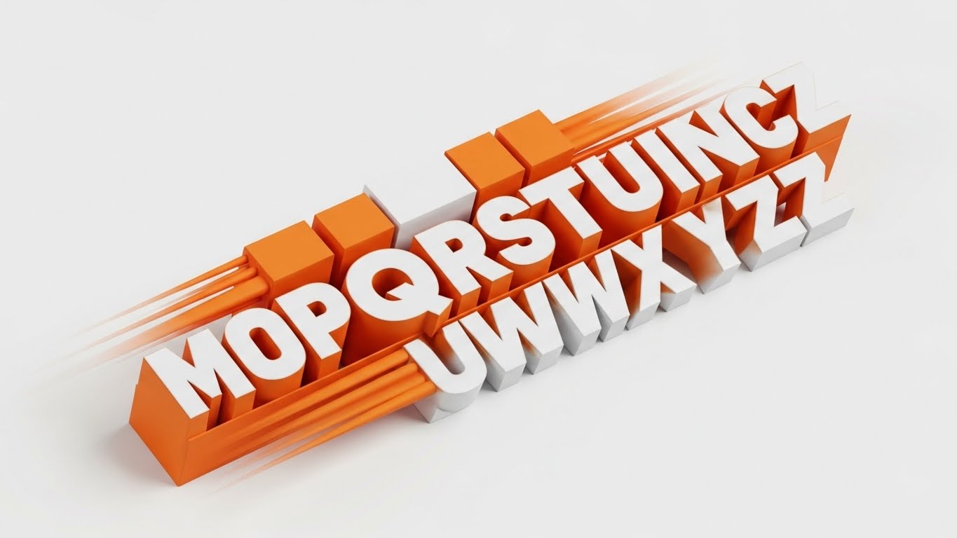
The Visual & Narrative Approach
Scenario: A LinkedIn feed stopper for a "Zero Latency" feature. Massive, blocky letters spelling "SPEED" and "SCALE" slam into the frame on a diagonal axis. The text is safety orange and stark white, with motion blur trailing off the edges to emphasize velocity.
Tone: The energy is aggressive, confident, and urgent. It mimics the high-frequency nature of modern trading or real-time data processing. The diagonal composition disrupts the standard vertical scroll, demanding attention.
Psychological Impact & KPI Focus
Niche Psychology: This appeals to the "need for speed" in high-performance computing. It triggers a physiological arousal response (alertness). It speaks to the anxiety of latency—positioning the brand as the antidote to slowness.
Operational Impact: Optimized for LinkedIn Organic (3.4), where sound is often off. The text is the visual. It effectively communicates benefits like "Real-Time Analytics" without requiring the user to parse charts.
Strategic Implementation & Trade-offs
Duration: Short and punchy: 10-20 seconds maximum.
Trade-offs: This style is purely emotive. It offers zero explanatory power regarding how the speed is achieved. It is a hype-generation tool that must be followed up with deep-dive content.
Companies using similar video content -
Honeycomb – Observability Platform – Emphasizing high-velocity data analysis and debugging.
Chronosphere – Cloud Native Observability – Highlighting speed and scale in metric processing.
Datadog – Real-Time Analytics – Stressing rapid data ingestion and actionable insights.
7. Dynamic Data Vis
TOFU | Pre-Roll Ad

The Visual & Narrative Approach
Scenario: A pre-roll ad demonstrating ROI. On a stark white background, bright neon green wireframe bars extrude upwards rapidly. Small orbs representing data points orbit the bars, and floating percentage symbols pop up to quantify the growth.
Tone: The aesthetic is "quantified success." The wireframe style suggests transparency—nothing to hide, just raw data. The side-angle view emphasizes the upward trajectory, visually reinforcing improvement.
Psychological Impact & KPI Focus
Niche Psychology: This speaks the language of the CFO: Growth. It visualizes the ROI of the APM tool. The clinical background suggests scientific rigor, implying that the results are measurable facts, not marketing claims.
Operational Impact: Critical for Pre-Roll Ads (4.1). It visually answers "What do I get?" immediately. It bridges the gap between technical metrics (latency reduction) and business outcomes (conversion increase).
Strategic Implementation & Trade-offs
Duration: 15-30 seconds.
Trade-offs: While it proves "success," it can feel generic if not branded carefully. The motion design must be exceptionally smooth to feel premium.
Companies using similar video content -
LogicMonitor – IT Infrastructure Monitoring – Demonstrating metric growth and operational ROI.
ManageEngine Applications Manager – APM – Quantifying performance improvements and business value.
SolarWinds AppOptics – APM – Visualizing application performance and infrastructure metrics.
8. Low-Poly 3D
TOFU | Social Ads

The Visual & Narrative Approach
Scenario: A social ad visualizing "Cloud Infrastructure Management." A camera pans over a miniature city where buildings are stylized servers made of sky-blue and paper-white facets. Small low-poly clouds cast soft shadows, creating a tangible sense of a managed ecosystem.
Tone: Playful yet organized. The paper-like texture makes the intimidating scale of cloud infrastructure feel manageable and "light." It replaces the heavy, industrial feel of server rooms with a friendly, modern aesthetic.
Psychological Impact & KPI Focus
Niche Psychology: This style leverages the "gamification" of work. It appeals to the builder/architect mindset. By turning infrastructure into a "city," it taps into the satisfaction of urban planning, making complex orchestration feel like a constructive game.
Operational Impact: Perfect for Social Ads (4.4). It provides a high-level metaphor for Scalability. It shows how different parts of the stack coexist without needing complex network diagrams.
Strategic Implementation & Trade-offs
Duration: 20-40 seconds.
Trade-offs: The "cute" aesthetic might be perceived as less "enterprise-grade" by traditional banking clients. It works best for SaaS and mid-market audiences.
Companies using similar video content -
AWS CloudWatch – Monitoring & Observability – Managing cloud infrastructure scale as a stylized city.
Google Cloud Trace – Distributed Tracing – Visualizing cloud service interactions in a friendly manner.
NetApp Cloud Insights – Hybrid Cloud Monitoring – Representing managed data center and cloud resources.
9. AI Cinematic
TOFU | CTV / OTT

The Visual & Narrative Approach
Scenario: A CTV commercial targeting enterprise decision-makers. The camera glides low along a reflective floor in a pristine, endless server aisle. The racks tower above, illuminated by cool silver and sapphire blue lights. Anamorphic lens flares streak horizontally.
Tone: Epic, serious, and awe-inspiring. This is the "Hollywood" version of IT. It conveys immense power, security, and institutional weight. It signals that the platform is ready for the Fortune 500.
Psychological Impact & KPI Focus
Niche Psychology: This targets the ego of the Enterprise CIO. It validates the importance of their domain. It transforms the server room into a cathedral of technology. It assures the buyer that this vendor understands the gravity of the infrastructure they protect.
Operational Impact: Drives Brand Prestige (4.6). It is less about features and more about trust. It reinforces the "premium" nature of the service.
Strategic Implementation & Trade-offs
Duration: 30-60 seconds.
Trade-offs: This is purely atmospheric. It provides zero technical information. It is a "trust marker" to be used top-of-funnel to establish credibility.
Companies using similar video content -
Splunk Observability Cloud – Full-Fidelity Observability – Establishing enterprise scale and authority in data centers.
Dynatrace – Software Intelligence Platform – Conveying immense power and security in IT environments.
IBM Instana – Observability – Projecting a premium, high-tech enterprise monitoring vision.
10. Holographic UI
MOFU | Thought Leadership
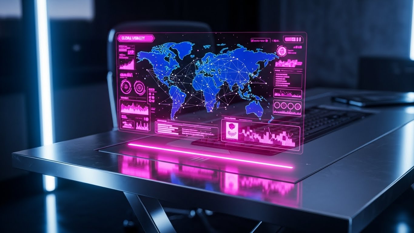
The Visual & Narrative Approach
Scenario: A Thought Leadership piece on LinkedIn. A close-up of a glass desk. Hovering above the surface is a translucent, holographic blue projection of a global network map. The hologram emits a soft glow, illuminating the desk surface. The background is a blurred, high-end office environment.
Tone: Visionary and commanding. This is the view from the "Captain's Chair." It visualizes Global Observability—the ability to see the entire footprint at a glance.
Psychological Impact & KPI Focus
Niche Psychology: Appeals to the "Mission Control" fantasy of IT leadership. It resolves the anxiety of fragmentation by bringing everything into a single, glowing hologram. It makes the observer feel powerful and omniscient.
Operational Impact: Excellent for Thought Leadership (1.4). It visualizes the outcome of using the software: total situational awareness.
Strategic Implementation & Trade-offs
Duration: 15-45 seconds.
Trade-offs: It can look "too sci-fi" if not grounded. The danger is promising a UI experience that the actual product cannot deliver. It should be framed as a "vision" of data visibility.
Companies using similar video content -
Kentik – Network Observability – Projecting global network visibility and command.
Splunk Observability Cloud – Unified Observability – Visualizing a comprehensive, interactive data landscape.
Dynatrace – Software Intelligence Platform – Displaying a visionary "single pane of glass" for IT.
11. 3D X-Ray**
MOFU | Differentiation
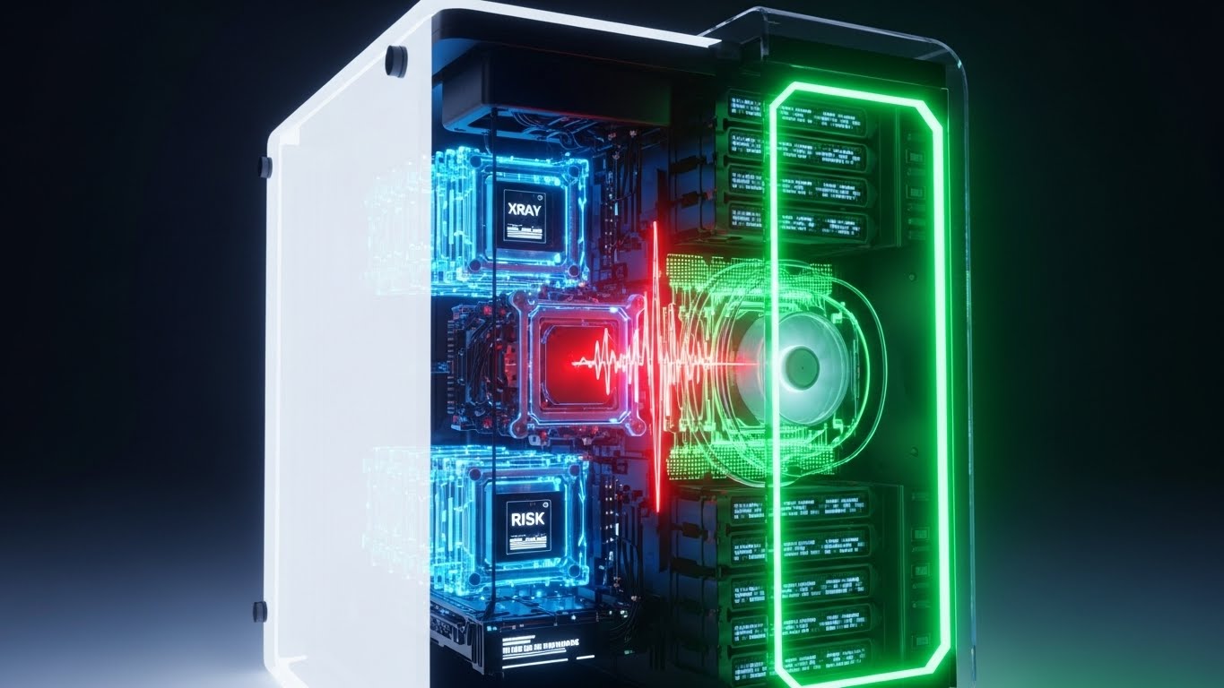
The Visual & Narrative Approach
Scenario: A "Deep Dive" product feature video. The camera slowly pushes toward a sleek, matte-white server unit. As we get closer, the outer shell dissolves into translucent white glass, revealing a pristine, complex internal architecture of glowing golden circuits. A single core pulses warmly, isolating a specific query or microservice.
Tone: Surgical, forensic, and deeply analytical. The aesthetic borrows from high-end medical imaging, implying that the software has the penetrating power to see through the "noise" of the infrastructure to find the "signal" deep within.
Psychological Impact & KPI Focus
Niche Psychology: This addresses the SRE’s greatest fear: the "Black Box." When a system fails, the inability to see inside proprietary code or third-party dependencies creates paralysis. This style visualizes Root Cause Analysis (RCA), satisfying the engineer's need for total transparency and depth.
Operational Impact: Highly effective for Differentiation (1.7). It visually argues that your platform provides Deep Code Profiling, not just surface-level metrics. It directly supports the KPI of reducing Mean Time to Resolution (MTTR).
Strategic Implementation & Trade-offs
Duration: 30-45 seconds.
Trade-offs: High production value is non-negotiable. If the internal "circuits" look generic or low-poly, the metaphor of "precision" collapses. It is best used for your most technical, proprietary differentiators.
Companies using similar video content -
AppDynamics – APM – Revealing deep root cause analysis within application code.
Sentry – Error Monitoring – Showing internal code structure to pinpoint errors.
Raygun – Error & Performance Monitoring – Visualizing deep diagnostics within software components.
12. Macro UI
MOFU | Feature Education

The Visual & Narrative Approach
Scenario: A feature highlight regarding "Automated Optimization." The frame is filled entirely by a brushed metal surface housing a single, tactile button glowing with electric cobalt blue light. The depth of field is razor-thin, blurring everything else. A finger presses the button—labeled with a "Play" icon—triggering a satisfying mechanical click and a ripple of light that signifies the immediate execution of a fix.
Tone: Tactile, premium, and decisive. It simplifies the complex reality of scripting and patching into a single, satisfying moment of resolution.
Psychological Impact & KPI Focus
Niche Psychology: DevOps teams are often overwhelmed by complexity and "Alert Fatigue." They crave agency and simplicity. This style triggers the dopamine response associated with "problem solved." It promises that the platform can condense hours of manual work into a single decision.
Operational Impact: Ideal for Feature Education (1.8). It is a powerful metaphor for Auto-Remediation and One-Click Rollbacks. It sells the concept of "Ease of Use" without getting bogged down in dashboard settings.
Strategic Implementation & Trade-offs
Duration: 5-10 second loops.
Trade-offs: Context is sacrificed for focus. The viewer sees the "action" but not the "data." This style works best as a punctuation mark in a longer sequence or as a GIF in an email.
Companies using similar video content -
PagerDuty – Incident Management – Focusing on automated remediation with a decisive button press.
Opsgenie – Incident Management – Highlighting one-click actions for incident resolution.
incident.io – Incident Management – Emphasizing simplified, automated incident workflows.
13. Wireframe to Reality
MOFU | Competitive
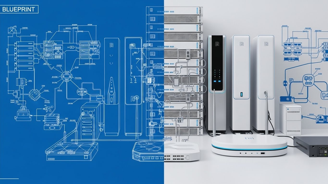
The Visual & Narrative Approach
Scenario: A competitive comparison video. The screen is split vertically. The left side displays a technical "Blueprint Blue" wireframe of a complex network architecture—the plan. The right side seamlessly transitions this same structure into a photorealistic, solid white and silver hardware implementation—the reality. A scanning line moves back and forth, proving that the deployed infrastructure matches the design perfectly.
Tone: Structural, constructive, and rigorous. It bridges the gap between the theoretical "Infrastructure as Code" and the physical "Production Environment."
Psychological Impact & KPI Focus
Niche Psychology: Targeted at the IT Architect and CTO. These stakeholders worry about "Drift"—where the reality of the system diverges from the documentation. This style reassures them that the platform maintains absolute fidelity between design and execution.
Operational Impact: Strong for Competitive Positioning (1.13). It positions the tool as a Lifecycle Management solution, not just a monitoring tool. It reinforces the value of Accuracy and Provisioning Verification.
Strategic Implementation & Trade-offs
Duration: 20-40 seconds.
Trade-offs: Requires a perfect match between the 2D and 3D assets. If the transition is clunky, it suggests a lack of polish in the product itself.
Companies using similar video content -
HashiCorp – Terraform – Validating architectural fidelity from code to deployed infrastructure.
Convox – Kubernetes Platform – Bridging blueprint designs with real-world application deployments.
Elastic Observability – Infrastructure Monitoring – Showing planned vs. actual system configurations.
14. Rapid UI Montage
MOFU | Demo Requests
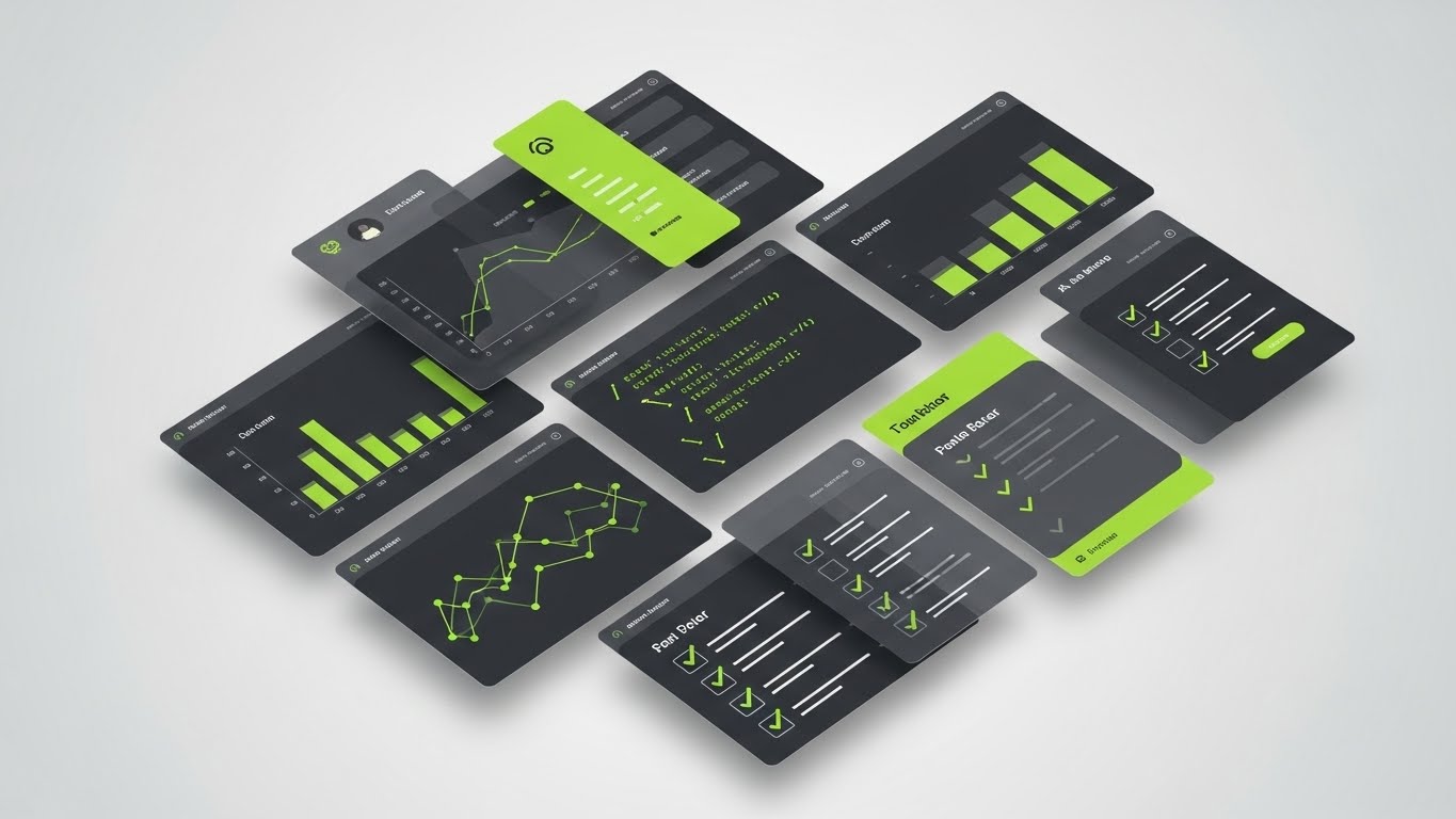
The Visual & Narrative Approach
Scenario: A retargeting ad driving demo requests. A dynamic array of UI panels—featuring graphs, code snippets, and checklists—floats in a dark void with vibrant lime green accents. The camera pans rapidly across them as they shuffle and reorganize, giving the viewer a visceral sense of the sheer breadth of tools available in the suite.
Tone: Fast-paced, comprehensive, and abundant. It creates a "Kid in a Candy Store" vibe for data professionals, showing off the variety of visualizations available.
Psychological Impact & KPI Focus
Niche Psychology: Buyers fear "Tool Sprawl"—the need to purchase five different point solutions. This style assuages that fear by showing a unified ecosystem. It triggers "FOMO" (Fear Of Missing Out) by flashing features the viewer may not currently have.
Operational Impact: Optimized for Demo Requests (2.1). It overwhelms the viewer (positively) with value, prompting them to click to explore the specific dashboards relevant to their role.
Strategic Implementation & Trade-offs
Duration: 15-20 seconds.
Trade-offs: Detail is sacrificed for speed. No single screen is readable. This is an impressionist style designed to prove Quantity and Integration, not specific functionality.
Companies using similar video content -
Datadog – Unified Platform – Showcasing feature density across numerous dashboards.
New Relic – Full-Stack Observability – Displaying a breadth of monitoring tools and visualizations.
Site24x7 – All-in-one Monitoring – Highlighting diverse monitoring capabilities in quick succession.
15. Split Screen
MOFU | Switcher

The Visual & Narrative Approach
Scenario: A "Problem/Solution" social ad. The screen is split. The left (black and white, grainy) shows a hand tightly clenching a stress ball—a universal symbol of "War Room" panic. The right (warm peach and soft steel blue) shows a hand relaxed on a sleek mouse, navigating the APM interface with ease.
Tone: Empathetic and transformative. It validates the pain of the user (burnout) without being overly negative, immediately offering the solution (control) as the alternative reality.
Psychological Impact & KPI Focus
Niche Psychology: DevOps burnout is a critical industry crisis. This style bypasses technical specs to address the human cost of bad software. It positions the APM tool as a quality-of-life improvement for the on-call engineer, appealing to their desire for peace of mind.
Operational Impact: Perfect for Switcher Campaigns (5.5)—convincing users to leave a clunky, legacy competitor. It visualizes the User Experience (UX) upgrade.
Strategic Implementation & Trade-offs
Duration: 15-30 seconds.
Trade-offs: It relies on emotional resonance rather than technical proof. It must be executed subtly to avoid feeling like a late-night infomercial.
Companies using similar video content -
Better Stack – Monitoring & On-Call – Contrasting incident chaos with streamlined control.
UptimeRobot – Website Monitoring – Visualizing stress of downtime versus ease of monitoring.
Coralogix – Observability Platform – Showing the difference between data noise and actionable insights.
16. 2D Line Art
MOFU | Proactive Support
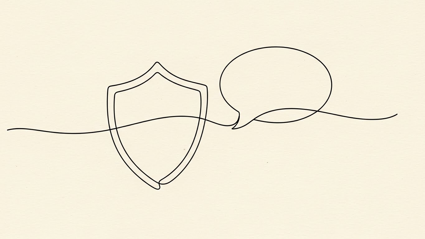
The Visual & Narrative Approach
Scenario: An email signature video or support page intro. A continuous, elegant black ink line draws itself on a cream paper-textured background. The line fluidly forms a shield (Security) which morphs into a speech bubble (Support). The motion is smooth and unbroken.
Tone: Gentle, accessible, and boutique. It steps away from the "Cyberpunk" aesthetic to present security as a fluid, ongoing conversation rather than a rigid barrier.
Psychological Impact & KPI Focus
Niche Psychology: Security features can feel restrictive, and support can feel distant. This style humanizes the vendor. It appeals to the buyer looking for a partner, not just a tool. It builds "Psychological Safety."
Operational Impact: Best for Proactive Support communication (9.2). It simplifies complex concepts like "Managed Security Services" into a friendly, easy-to-grasp visual metaphor.
Strategic Implementation & Trade-offs
Duration: 10-20 seconds.
Trade-offs: The "sketch" style lacks technical authority. It cannot show how encryption works, only that it exists. Use it for relationship-building and service guarantees.
Companies using similar video content -
Zenduty – Incident Management – Sketching proactive support and team collaboration.
Opsgenie – Incident Management – Illustrating continuous incident response and communication.
Atatus – Full Stack Observability – Depicting friendly, accessible support and security.
17. Lifestyle Stock + UI
BOFU | Demand Gen

The Visual & Narrative Approach
Scenario: A "Social Proof" ad on LinkedIn. A professional woman sits in a sunlit, modern workspace, smiling at her laptop. Hovering in the air around her are semi-transparent, holographic APM dashboards showing positive trend lines in warm beige and grey. She interacts with the air, suggesting the data is seamlessly integrated into her reality.
Tone: Aspirational, professional, and successful. Unlike the dark, windowless server rooms often depicted, this shows the "Success State": sunlight, smiles, and data that floats effortlessly.
Psychological Impact & KPI Focus
Niche Psychology: This validates the career aspirations of the user. It mirrors how they want to see themselves: competent, in control, and working in a modern environment. It connects the software to personal professional success.
Operational Impact: Strong for Demand Gen (1.6). It helps the buyer visualize their team using the software successfully, bridging the gap between the tool and the user.
Strategic Implementation & Trade-offs
Duration: 15-30 seconds.
Trade-offs: The holographic compositing must be high-quality. If the UI looks like generic stock graphics, it loses credibility. It must look like your specific interface.
Companies using similar video content -
Datadog – Unified Platform – Integrating data into a professional, aspirational workspace.
New Relic – Full-Stack Observability – Showing successful professionals interacting with data.
IBM Instana – Observability – Visualizing seamless data integration in modern offices.
18. Hyper-lapse
BOFU | Building Trust

The Visual & Narrative Approach
Scenario: A website hero background. A hyper-lapse of a busy, modern open-plan office. While the physical world moves fast (people blurring), superimposed streams of white binary code and data lines streak through the air, visualizing the invisible network traffic that powers the business.
Tone: Kinetic, energetic, and vital. It emphasizes that the software operates at the speed of the business. It bridges the physical activity of the company with the digital pulse that sustains it.
Psychological Impact & KPI Focus
Niche Psychology: Executives know their business moves fast. They worry their IT can't keep up. This visual reassures them that the observability platform is synchronized with the pulse of the organization.
Operational Impact: Excellent for Building Trust (1.9). It visually embeds the software into the fabric of the company, implying it is mission-critical infrastructure capable of handling enterprise Scale.
Strategic Implementation & Trade-offs
Duration: 10-20 second loops.
Trade-offs: Purely atmospheric. It doesn't explain features. It sets the stage for a conversation about scale and reliability.
Companies using similar video content -
Kentik – Network Observability – Visualizing high-velocity data streams in a busy office.
Riverbed APM – Application Performance – Depicting invisible network traffic powering business.
OpsRamp – IT Operations Management – Showing the kinetic energy of digital operations.
19. Photorealistic 3D
BOFU | ROI Justification
The Visual & Narrative Approach
Scenario: A closing argument video aimed at the CFO. On a clean white pedestal, a bar graph grows—but the bars are rendered as solid, heavy gold ingots. An emerald green arrow wraps around them, pointing aggressively upward. The lighting highlights the expensive sheen of the metal.
Tone: Premium, valuable, and undeniable. There is no abstraction here; the visual language is literal wealth. It communicates "Value" in the most universal currency possible.
Psychological Impact & KPI Focus
Niche Psychology: The CFO doesn't care about latency; they care about the bottom line. This style translates technical metrics (uptime) into financial metrics (gold). It addresses the anxiety of "Cost Center" vs. "Profit Center," reframing the purchase as an asset acquisition.
Operational Impact: Critical for ROI Justification (1.10). It provides the technical champion with the visual ammo to prove that the tool saves more money than it costs.
Strategic Implementation & Trade-offs
Duration: 10-15 seconds.
Trade-offs: Very blunt. It lacks nuance. It is a closing tool, not an opening tool. Use it when the conversation shifts to budget approval to signify "Value."
Companies using similar video content -
Oracle OCI APM – Cloud APM – Materializing financial ROI with solid gold graphs.
ManageEngine Applications Manager – APM – Justifying investment with tangible business value.
Reveille Software – ECM Monitoring – Visualizing the financial benefits of optimized content management.
20. 2D Character
BOFU | Objections

The Visual & Narrative Approach
Scenario: An objection-handling video on the FAQ page. A friendly, flat-illustration character (Blue skin, yellow shirt) stands confidently. A jagged red line (representing a bug or security threat) flies toward them. They simply hold up a hand, and the red line hits it, transforming instantly into a smooth, flowing green stream.
Tone: Reassuring, friendly, and capable. It simplifies the complex concept of "Intrusion Detection" or "Error Handling" into a simple narrative of protection.
Psychological Impact & KPI Focus
Niche Psychology: Buyers often have objections about "difficulty of use" or "implementation risks." This friendly "Corporate Memphis" style disarms these objections. It makes the software feel like a helpful assistant rather than a complex machine.
Operational Impact: Useful for Objection Handling (1.11). It visually answers "What happens if...?" questions with a clear, positive outcome: The system handles it effortlessly.
Strategic Implementation & Trade-offs
Duration: 30-60 seconds.
Trade-offs: This style is often associated with B2C or lower-cost SaaS. Be careful using it for high-ticket enterprise deals unless the script is very sharp. It risks looking "generic" if not paired with strong branding.
Companies using similar video content -
Sentry – Error Monitoring – Visualizing frictionless incident resolution with friendly characters.
Raygun – Error & Performance Monitoring – Depicting easy bug blocking and problem solving.
PagerDuty – Incident Management – Showing simplified, friendly incident handling.
21. Isometric 2D**
BOFU | Risk Mitigation

The Visual & Narrative Approach
Scenario: A "Security & Compliance" page explainer. The camera maintains a consistent, high-angle isometric view of a stylized "digital fortress." Thick, reassuring walls colored in ice blue and safety orange surround a central server cluster. A shield icon hovers protectively above. As external "threats" (small red triangles) approach, the perimeter pulses, neutralizing them instantly.
Tone: Robust, architectural, and impenetrable. The isometric perspective offers a "God’s eye view," reinforcing the feeling of total oversight and structural integrity.
Psychological Impact & KPI Focus
Niche Psychology: Security is the primary source of anxiety for enterprise buyers. They crave containment. This style addresses that fear with a visual metaphor of stability. It appeals to the Protector archetype within IT leadership, visualizing "Hardened Infrastructure" without needing complex encryption diagrams.
Operational Impact: Targeted at Risk Mitigation (1.12). It simplifies complex compliance standards (SOC2, GDPR) into a singular, understandable structure. It acts as a visual "Trust Seal" that validates the platform's reliability during the security review.
Strategic Implementation & Trade-offs
Duration: 20-40 seconds.
Trade-offs: The "toy-like" quality of isometric art can sometimes trivialize the severity of security. It must be rendered with sharp, high-tech textures to avoid looking like a mobile game.
Companies using similar video content -
Zabbix – Open Source Monitoring – Mitigating infrastructure security risks with a digital fortress.
Elastic Observability – Security Analytics – Visualizing robust security and compliance structures.
Turbo360 – Azure Observability – Depicting a secure, contained cloud environment.
22. 2D over Live Action
BOFU | Sales Cycle

The Visual & Narrative Approach
Scenario: A LinkedIn video celebrating a new enterprise partnership. We see high-quality, real footage of professionals shaking hands in a glass-walled meeting room. Superimposed over them are playful, hand-drawn white 2D animations—checkmarks popping, sparks of energy, and a "100%" uptime badge floating nearby.
Tone: Human, energetic, and collaborative. It bridges the gap between the cold software code and the warm human relationships that drive B2B sales.
Psychological Impact & KPI Focus
Niche Psychology: Enterprise software is bought by people, not algorithms. This style validates the social aspect of the deal. It creates a sense of shared victory and alignment between the vendor and the client, leveraging Social Proof with a creative twist.
Operational Impact: Best for Sales Cycle Acceleration (1.14). It visualizes the "Deal Closed" moment, subconsciously priming the prospect to sign. It humanizes the vendor as a true partner.
Strategic Implementation & Trade-offs
Duration: 10-15 seconds.
Trade-offs: Requires high-quality original footage. Generic stock footage often feels fake here. The "doodles" must be executed with restraint so they don't distract from the human faces.
Companies using similar video content -
Cisco AppDynamics – APM – Validating partnership success with human interaction and animated overlays.
IBM Instana – Observability – Celebrating client relationships with superimposed success metrics.
Splunk – Enterprise Security – Highlighting collaborative victories in B2B engagements.
23. AI Realistic Character
BOFU | ABM Awareness
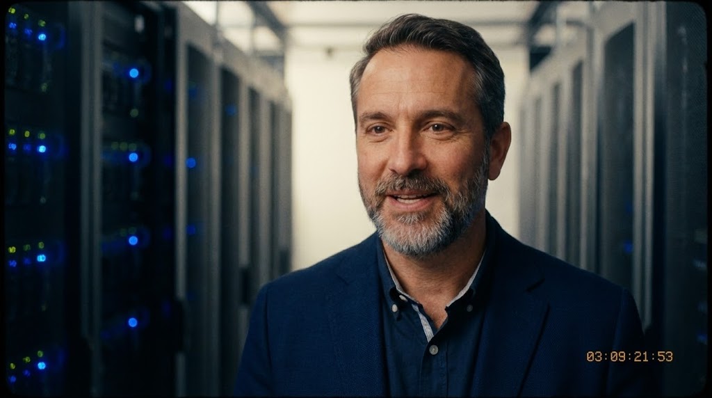
The Visual & Narrative Approach
Scenario: An Account-Based Marketing (ABM) ad targeting a specific vertical (e.g., Fintech). A hyper-realistic AI-generated character—a male in his 40s, wearing a navy blazer—speaks directly to the camera. The background is a soft-focus server room with blue bokeh. He articulates specific pain points relevant to financial CIOs with perfect lip-sync.
Tone: Experienced, empathetic, and credible. This is not a "salesperson"; it is a "peer." The lighting is cinematic, conveying high production value and gravity.
Psychological Impact & KPI Focus
Niche Psychology: Decision-makers trust their peers more than vendors. This style leverages the Mirror Effect. By presenting a persona that looks and sounds like the target buyer, it subconsciously establishes rapport and suggests, "I understand your world."
Operational Impact: Critical for ABM Awareness (2.2). It allows for the rapid scaling of personalized video content—creating 50 variations of the script for different industries without hiring 50 actors.
Strategic Implementation & Trade-offs
Duration: 30-60 seconds.
Trade-offs: The "Uncanny Valley" risk is real. The AI model must be top-tier to ensure the micro-expressions feel human. If it looks robotic, trust is lost immediately.
Companies using similar video content -
Dynatrace – Software Intelligence Platform – Building account trust with an AI-generated IT peer.
Splunk – Enterprise Security – Delivering personalized ABM messages with realistic personas.
BigPanda – AIOps Platform – Presenting empathetic, credible AI-driven insights.
24. Aspirational Stock
BOFU | Economic Buyer

The Visual & Narrative Approach
Scenario: A website banner video for the "Enterprise" pricing tier. A silhouette of a business executive stands in a corner office, looking out at a city skyline bathed in warm, golden sunset light. The scene is still and majestic. Subtle text fades in: "See Beyond the Horizon."
Tone: Visionary, calm, and triumphant. It shifts the conversation from "fixing bugs" to "leading the market." It sells the feeling of having conquered the technology puzzle.
Psychological Impact & KPI Focus
Niche Psychology: Targeted at the Economic Buyer (7.1)—the C-Suite. They are selling a vision of the future to their board. This imagery aligns your software with that high-level strategic success. It evokes the archetype of the Ruler or Visionary.
Operational Impact: Sets the anchor for high-ticket negotiations. It visually justifies a premium price point by associating the brand with executive success and "New Dawn" imagery.
Strategic Implementation & Trade-offs
Duration: 10-15 second loop.
Trade-offs: Highly generic. It creates a mood but conveys zero information. It must be used strictly for emotional priming at the top of a page, never for explanation.
Companies using similar video content -
Dynatrace – Software Intelligence Platform – Inspiring strategic vision for economic buyers.
Splunk – Enterprise Security – Evoking executive success and future-forward leadership.
New Relic – Full-Stack Observability – Aligning with C-suite aspirations for market dominance.
25. 2D Anim & UI
BOFU | Functional Buyer
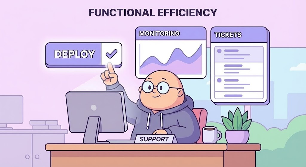
The Visual & Narrative Approach
Scenario: A video on the "Support" or "Features" page. A flat-shaded, friendly character sits at a desk. Floating above them are large, simplified UI widgets in soft lavender and white. The character taps a "Deploy" widget, and a "Success" checkmark instantly appears. The motion is bouncy and fluid.
Tone: Approachable, easy, and stress-free. The cel-shaded style removes the grittiness of reality, presenting a world where IT operations are smooth and delightful.
Psychological Impact & KPI Focus
Niche Psychology: Targeted at the Functional Buyer (7.2)—the manager who has to use the tool daily. They fear clunky, gray, enterprise interfaces. This style promises a "Consumer-Grade" UX—software that is as pleasant to use as their favorite phone app.
Operational Impact: Drives Usability Perception. It visually argues that the learning curve is low. It is excellent for reducing friction during the evaluation phase and deflecting simple support questions.
Strategic Implementation & Trade-offs
Duration: 30-60 seconds.
Trade-offs: Can feel "lightweight." Ensure the voiceover reinforces the power of the backend so the "cute" visual doesn't imply "weak" capability.
Companies using similar video content -
ManageEngine Applications Manager – APM – Simplifying functional workflows with friendly animation.
Site24x7 – All-in-one Monitoring – Presenting easy-to-use, consumer-grade UX for IT operations.
Scout APM – Application Monitoring – Illustrating stress-free development and monitoring tasks.
26. Clean UI Workflow
Onboarding | TTV
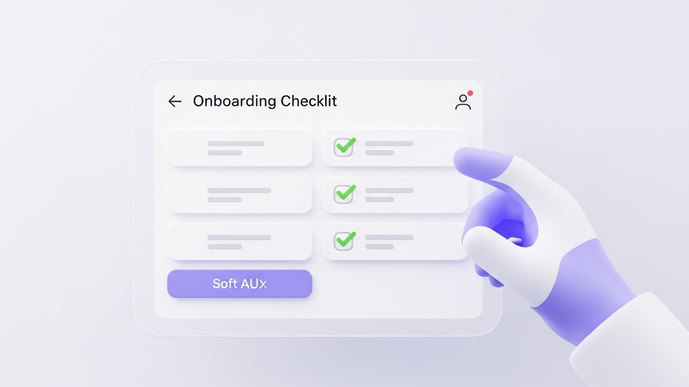
The Visual & Narrative Approach
Scenario: An in-app onboarding welcome video. A pristine, "Soft UI" screen displays a setup checklist. A 3D rendered hand (white glove or abstract shape) floats in, tapping the items. As each item is tapped, it turns green with a satisfying animation.
Tone: Helpful, clear, and instructive. The focus is entirely on the next step. The soft shadows and rounded corners make the interface feel modern and tactile.
Psychological Impact & KPI Focus
Niche Psychology: The "Blank Slate" is daunting for new users. This style provides a visual roadmap. It leverages the Zeigarnik Effect—the human desire to complete unfinished tasks.
Operational Impact: Directly targets Time-to-Value (TTV) (1.15). By showing how fast setup is, it reduces drop-off rates during the critical first hour of usage.
Strategic Implementation & Trade-offs
Duration: 30-45 seconds.
Trade-offs: Must match the actual UI closely enough to be recognizable, but simplified enough to be clear. If the real product is complex/cluttered, this idealized version might set false expectations.
Companies using similar video content -
SigNoz – OpenTelemetry APM – Accelerating time-to-value with a pristine checklist UI.
OpenObserve – Open Source Observability – Guiding users through quick setup and configuration.
Dash0 – Observability Platform – Streamlining onboarding with clear, instructive UI steps.
27. Isometric 3D
Onboarding | Implementation

The Visual & Narrative Approach
Scenario: An implementation guide video. The server environment is rendered as a high-end plastic toy set (resembling LEGO®). Small yellow and grey blocks click together to form server racks. Miniature workers (stylized) adjust the components. The tilt-shift effect makes the scene look like a miniature world.
Tone: Playful, constructive, and organized. It "gamifies" the work of sysadmins, turning the stress of provisioning into the joy of building.
Psychological Impact & KPI Focus
Niche Psychology: Appeals to the "Builder" instinct in engineers. It reframes complex integration tasks as simple assembly steps. It makes the technology feel modular and manageable.
Operational Impact: Strong for Implementation Training (1.16). It visualizes Modularity and Scalability without needing abstract diagrams. It’s excellent for showing how plugins or agents fit into the core platform.
Strategic Implementation & Trade-offs
Duration: 45-90 seconds.
Trade-offs: The "toy" aesthetic is risky for "Mission Critical" messaging. Use it for training and setup topics, not for crisis management or security topics.
Companies using similar video content -
Grafana – Observability Platform – Gamifying implementation logic with server blocks.
Prometheus – Monitoring System – Visualizing modular infrastructure assembly and scaling.
Groundcover – Kubernetes APM – Representing Kubernetes environments as manageable building blocks.
28. 3D Parallax UI
Onboarding | Self-Serve
The Visual & Narrative Approach
Scenario: A product tour video for self-serve users. Multiple layers of UI screens float in a white void. They are semi-transparent glass. The camera pushes through the layers, creating a parallax effect. The front-most screen snaps into sharp focus, highlighting a "Success" message in cyan, while previous screens blur into the background.
Tone: Sophisticated, deep, and multidimensional. It visually represents the "depth" of the platform—implying there are layers of functionality waiting to be discovered.
Psychological Impact & KPI Focus
Niche Psychology: Users want to feel they are using a rich tool. The parallax depth cues suggest a "Deep Dive." It keeps the viewer engaged by constantly revealing new information on the z-axis.
Operational Impact: Optimized for Self-Serve Activation (2.4). It keeps engagement high during automated product tours where no human sales rep is present to guide the user.
Strategic Implementation & Trade-offs
Duration: 30-60 seconds.
Trade-offs: Text readability can suffer on the "background" layers. Ensure the critical information is always on the focal plane.
Companies using similar video content -
Honeycomb – Observability Platform – Deepening self-serve discovery with floating UI layers.
Chronosphere – Cloud Native Observability – Highlighting multidimensional data exploration.
ServiceNow Cloud Observability – Lightstep – Guiding users through layers of platform functionality.
29. Futuristic Neon
Retention | Activation

The Visual & Narrative Approach
Scenario: An email re-engagement campaign announcing a powerful new "Enterprise" feature set. A towering skyscraper made of server racks rises into a dark, cyberpunk pink and neon purple sky. Neon rain (binary code) falls. The tower glows with internal energy, suggesting massive processing power.
Tone: Aggressive, cool, and elite. It borrows from "Blade Runner" and gaming aesthetics. It frames the software not just as a tool, but as a "weapon" of business dominance.
Psychological Impact & KPI Focus
Niche Psychology: Appeals to the "Power User." It taps into the cultural cool factor of coding and hacking. It makes the user feel like an elite operator in a high-stakes digital world.
Operational Impact: Best for Activation (5.3) of dormant users or upselling to a "Pro" tier. It signals a shift in capability—"You are now playing with power."
Strategic Implementation & Trade-offs
Duration: 15-30 seconds.
Trade-offs: Can look "dark" or "dystopian" if not balanced with positive energy. It may alienate conservative corporate buyers (banks, healthcare) who prefer clean white/blue aesthetics. Know your audience segment.
Companies using similar video content -
SignalFx – Real-Time Observability – Activating power users with a towering data skyscraper.
Elastic Observability – APM – Announcing powerful new features with a cyberpunk aesthetic.
Coralogix – Observability Platform – Framing advanced capabilities as a weapon of business dominance.
30. Dark Mode UI
Expansion | Upsell
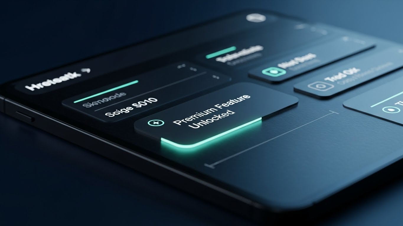
The Visual & Narrative Approach
Scenario: An in-app notification video or "What's New" featurette. The interface is shown in a sleek, midnight blue "Dark Mode." Teal accent text glows softly. The camera focuses on a notification badge: "Premium Feature Unlocked." The texture is grainy and premium, like high-end OLED screens.
Tone: Exclusive, professional, and easy on the eyes. Dark mode is often associated with "Pro" tools and developer environments. It signals that this is a serious workspace.
Psychological Impact & KPI Focus
Niche Psychology: Developers and SREs live in dark mode to reduce eye strain. Showing the UI in this native preference signals respect for their work environment. It also carries a connotation of "Premium" or "Night Operations."
Operational Impact: Targeted at Expansion/Upsell (1.20). It makes the upgrade look like a luxury product. It utilizes the Status Quo Bias—positioning the "Light Mode" as basic and "Dark Mode" as the pro standard.
Strategic Implementation & Trade-offs
Duration: 15-20 seconds.
Trade-offs: Lower contrast can be harder to read in bright viewing environments (e.g., a phone outdoors). Best used for desktop/developer-focused communications.
Strategic Knowledge Base: The Visual Operations Doctrine
To truly dominate the APM market, generating visual assets is not enough. You must architect a Visual Operating System that aligns with the cognitive needs of your users and the strategic goals of your business. This concluding section synthesizes the 30 styles into three actionable frameworks for adoption, efficiency, and ROI.
Strategic Alignment & Visual Architecture
The "Pre-Production" Strategy – Why and Who.
- The Cognitive Load Audit: Before commissioning a video, audit the "Cognitive Load" of the feature you are explaining. High-complexity topics (e.g., distributed tracing) require low-noise styles like Abstract 2D Motion (Style 3) or 3D X-Ray (Style 11). Low-complexity topics (e.g., uptime status) benefit from high-emotion styles like Kinetic Typography (Style 6).
- Role-Based Visual Mapping: Differentiate your visual language by persona.
- The SRE/Developer (The User): Craves precision, dark mode, and logic. Use Dark Mode UI (Style 30) and Wireframe to Reality (Style 13).
- The CTO/VP (The Buyer): Craves vision, scale, and control. Use Abstract 3D AI (Style 2) and Holographic UI (Style 10).
- The "Glanceability" Standard: In APM, speed is life. Design dashboard-focused visuals (like Minimalist Flat 2D - Style 5) to be understood in under 2 seconds. In an Incident Response ("War Room") scenario, if a stakeholder can't determine "Good vs. Bad" instantly, the visual has failed.
- Brand Voice Consistency: Your APM platform likely consists of disparate modules (Logs, Metrics, Traces). Use a unified visual element—such as the Fluid Coral Streams (Style 1) or a specific Neon Green (Style 7)—to create a "Visual Thread" that ties these isolated tools into a single platform narrative.
- The Advids Strategic Audit: Visual chaos erodes trust. Partner with Advids to define this "Visual Operating System" before production begins. We ensure that every asset, from a 6-second bumper to a 3-minute explainer, adheres to a strict cognitive and aesthetic code.
- Standardization vs. Customization: Use standardized "Stock" styles (Aspirational Stock - Style 24) for high-level emotional beats. Save your budget for bespoke, proprietary visualizations (3D X-Ray - Style 11) that explain your core IP.
- The Cross-Departmental Bridge: Use video to unify terminology. A "Latency Spike" might mean "Slow Code" to Devs but "Lost Revenue" to Sales. A video like Dynamic Data Vis (Style 7) bridges this by showing the technical metric and the business ROI side-by-side.
- Legacy System Integration: Visualizing the connection between legacy on-prem mainframes and modern cloud SaaS is critical. Use Wireframe to Reality (Style 13) to visually validate that your modern APM tool respects and integrates with legacy hardware logic.
- Accessibility in DevOps: Engineering teams are global and neurodiverse. Designing motion graphics (2D Line Art - Style 16) that rely on universal symbols (shields, locks, checkmarks) rather than heavy on-screen text ensures your training materials are inclusive and effective for a global workforce.
- The Mobile-First Mandate: On-call engineers often triage incidents via mobile. Ensure all 30 styles—especially "Alert" visuals like Macro UI (Style 12)—are legible on vertical mobile screens (9:16 aspect ratio), enabling effective "pocket observability."
Operational Adoption & Implementation
The "Deployment" Phase – How to embed visuals into the workflow.
- Overcoming "Big Brother" Anxiety: Developers often fear APM tools are for surveillance. Use empathy-driven visuals (Style 15) and "Privacy Shield" metaphors (Style 21) to position the tool as a guardian of code health, not a monitor of employee activity.
- The Micro-Learning Shift: Stop burying documentation in PDFs. Replace the "Getting Started" manual with a playlist of Clean UI Workflow (Style 26) videos. These 30-second clips should be embedded directly in the empty states of the dashboard.
- Just-in-Time Support: Integrate visual help into the IDE. When a developer encounters a specific error class, a relevant Abstract Motion (Style 3) or Code Structure video should be one click away, providing context without forcing them to leave their coding environment.
- Gamification of Training: Visualizing "Reliability Scores" or "Bug Bash" leaderboards using Isometric 3D (Style 27) assets can boost engagement. Make the act of improving system health feel like building a stable structure, rewarding teams for "Green" status.
- Reducing Support Ticket Volume: There is a direct correlation between proactive visual guides and reduced support costs. Deploying Feature Discovery (Style 28) videos prevents "How do I...?" tickets, allowing your support team to focus on complex Tier-3 issues.
- Remote Onboarding: For distributed engineering teams, physical seminars are impossible. Leverage AI Realistic Characters (Style 23) to deliver consistent, personalized onboarding messages to new hires in different time zones, ensuring a uniform cultural introduction to the platform.
- Standard Operating Procedures (SOPs): Transform text-based Incident Response plans into visual process flows. A Kinetic Typography (Style 6) video can outline the "Severity 1 Incident Protocol" faster and more memorably than a wiki page, ensuring protocol adherence during panic moments.
- Feedback Loops: Use interactive video elements. After a "New Feature" video plays (Style 29), present a simple "Thumbs Up/Down" overlay. This visual feedback loop gives product teams instant data on sentiment regarding new releases.
- Scalable Localization: For global SaaS, re-shooting video is costly. Use styles that rely on Abstract UI (Style 14) or Line Art (Style 16) where text overlays can be easily swapped for different languages without needing to re-animate the core visuals.
- Leadership Communication: CIOs need to sell the value of APM to the Board. Equip them with Aspirational Stock (Style 24) and Photorealistic 3D (Style 19) assets. These high-polish visuals act as "internal sales enablement," helping IT leaders secure budget renewals.
Measuring Impact & Future-Proofing
The "ROI" Phase – Measuring success and looking ahead.
- Beyond "Views" – Defining Actionable KPIs: Do not measure these videos by "Likes." Measure them by Feature Adoption Rate. If you release a video using Futuristic Neon (Style 29) about a new Premium Feature, track the spike in activation for that feature specifically.
- The "MTTU" Metric: Measure "Mean Time To Understand." Correlate better visualization with reduced software navigation time. If a Macro UI (Style 12) video effectively teaches a shortcut, you should see a measurable drop in the time users spend clicking through menus.
- Compliance Velocity: When new regulations (like GDPR or SOC2) emerge, use Isometric 2D (Style 21) to quickly educate the entire customer base. Measure how fast customers achieve compliance after the video campaign versus text-only emails.
- Retention and Churn (LTV): High-quality UX visualization (Style 30) reduces friction. Track the "Health Score" of accounts that consume your "Onboarding Academy" content versus those that don't. The former typically shows higher retention and Lifetime Value (LTV).
- The AI Visual Frontier: Prepare for Generative AI video. Soon, APM tools will generate custom "Incident Summary" videos on the fly based on real-time log data. Establishing a strong visual style guide now ensures these AI-generated assets remain on-brand.
- Scalability of Assets: Build a library, not a landfill. Organize your source files so that a UI update in the product doesn't require a total re-shoot. Use Abstract UI (Style 14) to extend the shelf-life of assets even as the interface evolves.
- The Advids Partnership: Scale requires a long-term partner. Advids acts as your "Visual SRE Team," maintaining the health and currency of your visual asset library. We ensure that as your product features expand, your visual language evolves without fracturing.
- Benchmarking Success: "Good enough" visuals are a competitive risk in a market valued at $15B. Benchmark your visual fidelity against the top 3 competitors. If their "Hero Video" uses AI Cinematic (Style 9) and yours uses screen recordings, you are losing the "Perceived Value" battle before the demo starts.
- The ROI of Safety: Ultimately, the goal is Uptime. Quantify the insurance cost reduction or SLA penalty avoidance achieved through better training. If better visuals lead to fewer manual errors, that is direct bottom-line ROI.
- Final Call to Innovation: Treat your video assets as Visual Infrastructure. Just as you refactor your code to be faster and cleaner, you must refactor your visuals to be sharper and more effective. In the invisible world of software, the company with the clearest vision wins.
Companies using similar video content -
SigNoz – OpenTelemetry APM – Triggering upsell desire with a sleek, professional dark mode.
Better Stack – Monitoring & On-Call – Showcasing premium features in a developer-friendly interface.
Sentry – Error Monitoring – Highlighting advanced debugging tools in a dark, focused workspace.
Author & Editor Bio


