
Introduction: The Visual Bridge Between Fabric and Data
The apparel industry is currently navigating its most significant pivot in decades: the transition from gut-feeling creativity to data-driven precision. For years, a "Physical/Digital Divide" has existed—a disconnect between the tactile reality of the design studio and the rigid logic of supply chain spreadsheets. Today, that gap is closing. As strategic advisors to the world's leading fashion tech platforms, we see a clear pattern: the brands winning market share are those that can visualize complexity.
The stakes for this visualization are immense. Globally, the industry generates 92 million tonnes of textile waste annually—a crisis of visibility as much as production. When decision-makers cannot "see" the inefficiencies in their supply chain, waste is the inevitable byproduct. Conversely, the opportunity for those who bridge this gap is transformative. Fashion companies that embed AI and advanced analytics into their business models are projected to see a 118 percent cumulative increase in cash flow by 2030.
This guide serves as your strategic blueprint for that bridge. We have curated 30 distinct visual styles (Part 1 covers the first 9) designed to translate complex apparel metrics—from "Inventory Waste" to "Trend Forecasting"—into compelling visual narratives. These styles move beyond generic "tech" aesthetics to create a visual language that respects the artistry of fashion while validating the precision of your software.
1. The Disentanglement
TOFU | Brand Awareness

The Visual & Narrative Approach
This style employs a "Morphing Metaphor" to visualize the seamless integration of raw creativity and structured data. The video opens with a chaotic, vibrant "knot" of organic shapes—resembling unspooled Electric Violet silk—floating in a lavender void. As the animation progresses, the fabric-like strands elegantly untangle and reorganize themselves into structured, upward-trending bar charts. The aesthetic suggests that the software handles data with the same fluidity a designer handles fabric.
Psychological Impact & KPI Focus
- Niche Psychology: Fashion professionals often fear that analytics will stifle creativity. This aesthetic counters that anxiety by using organic, "glossy" textures that feel native to the fashion world, rather than the "cold" look of finance.
- Operational Impact: Visualizes Cognitive Ease. It takes the complex, headache-inducing reality of disparate data silos (the knot) and transforms it into a unified, clear insight (the chart).
Strategic Implementation & Trade-offs
- Best Use Case: High-level Brand Awareness campaigns on Instagram or LinkedIn to stop the scroll.
- Trade-off: This style is High Emotion, Low Information. It builds brand affinity but does not explain how the software works.
Companies using similar video content -
TrusTrace – Supply Chain Traceability & Compliance.
TextileGenesis – Blockchain Traceability for Textiles.
2. The Efficiency Grid
TOFU | Category Creation
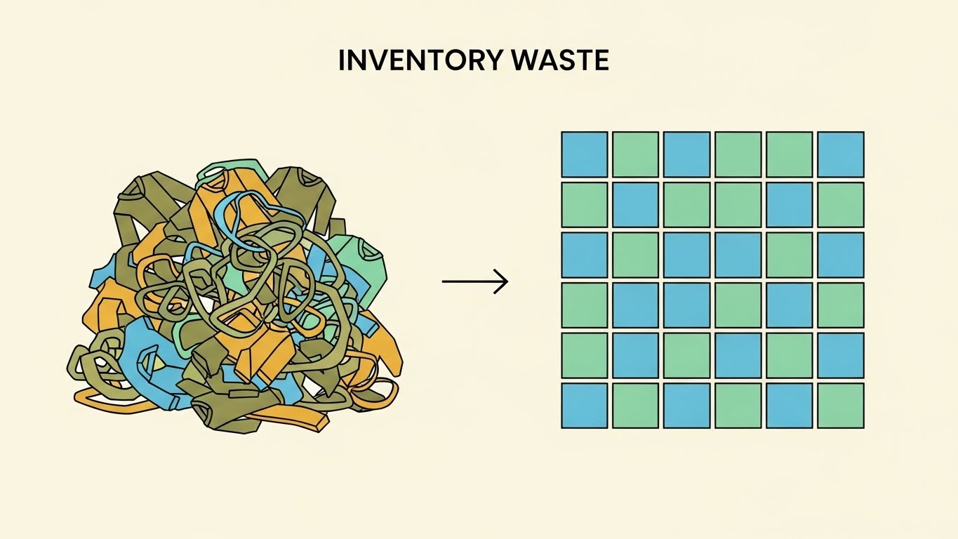
The Visual & Narrative Approach
This style uses a strict "Before/After" dichotomy to articulate value instantly. The left side of the frame is dominated by a tangled, chaotic pile of abstract garment shapes in dull Olive and Mustard—symbolizing "Deadstock" and disorganized SKUs. A sharp arrow acts as the catalyst, moving the eye to the right side: a perfectly ordered grid of Mint Green and Sky Blue squares. The aesthetic is flat and clean, prioritizing immediate clarity.
Psychological Impact & KPI Focus
- Niche Psychology: Supply chain managers crave order in a chaotic industry. This visual triggers a "dopamine hit" of resolution. It leverages Categorical Perception, allowing the viewer to instantly classify the software as a tool for order.
- Operational Impact: Directly addresses Inventory Waste Reduction. It simplifies the complex problem of "Overproduction" into a visual problem of "Messiness" that the software cleans up.
Strategic Implementation & Trade-offs
- Best Use Case: Educational blog headers or LinkedIn carousels about "Lean Supply Chain."
- Trade-off: The "Flat" style can feel Low Budget if the color palette isn't sophisticated. It works best for quick comprehension, not for proving enterprise-grade power.
Companies using similar video content -
Easyreplenish – Fashion Inventory Management & Forecasting.
Katana – Fashion Manufacturing ERP & Inventory.
3. The Digital Twin Warehouse
TOFU | Market Education
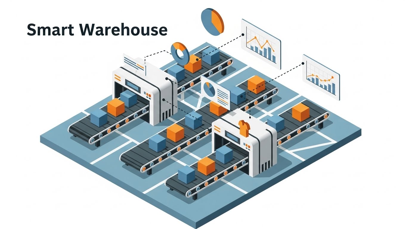
The Visual & Narrative Approach
This style creates a "Digital Twin" of the warehouse floor. We see a stylized, isometric view of conveyor belts moving Safety Orange and Slate Blue boxes (garments). The "Hybrid" element is the data overlay: as each box moves, a 2D floating data tag (pie chart or line graph) moves with it, attached by a dotted line. The data visualizations pulsate and update in real-time.
Psychological Impact & KPI Focus
- Niche Psychology: Offers a "God-tier" perspective. Operations Managers often feel blind to the specific movements inside a distribution center. This view offers Total Visibility and control.
- Operational Impact: Visualizes Throughput Efficiency and Item-Level Traceability. It proves the software tracks the "Digital Thread" of every single SKU.
Strategic Implementation & Trade-offs
- Best Use Case: The "How It Works" section of a website or a product page hero video.
- Trade-off: High Visual Density. This style is complex and requires a larger screen (desktop/tablet) to be fully appreciated.
Companies using similar video content -
Garment IO – Smart Manufacturing & Production Tracking.
Cleverence – Real-time Fabric Tracking.
4. The Human Element
TOFU | Shaping Brand Perception

The Visual & Narrative Approach
A shift from graphics to high-fidelity photography. The focus is on a young female designer in a sunlit loft studio, bridging the gap between traditional craft (the dress form) and modern tech (the tablet). She looks inspired, not frustrated. The lighting is "Golden Hour," warm and inviting. The background is soft-focus, hinting at racks of colorful samples.
Psychological Impact & KPI Focus
- Niche Psychology: Adoption is the biggest hurdle for new software. This style validates the user's identity as a "Creator." It frames the software as a partner that enhances their Creative Flow, rather than an administrative burden.
- Operational Impact: Addresses User Adoption Rates. By showing the technology as seamless and mobile, it reduces the intimidation factor for non-technical design teams.
Strategic Implementation & Trade-offs
- Best Use Case: Employer branding, "Day in the Life" social content, or case study intros.
- Trade-off: Genericness. Without a clear view of the specific software UI on the tablet, this relies heavily on the accompanying copy to provide context.
Companies using similar video content -
Browzwear – VStitcher – 3D Fashion Design & Digital Product Creation.
CLO 3D – 3D Garment Design Software.
5. The Kinetic Impact
TOFU | Vertical Social Organic

The Visual & Narrative Approach
This style is pure adrenaline. Words are treated as physical objects with mass and velocity. Massive 3D letters spelling "SPEED" fly into the frame, colliding with a shower of vector sparks to form a solid structure. The background is a deep Asphalt Grey, making the Acid Green and Hot Pink typography vibrate. The motion is aggressive, mimicking the fast-paced nature of the industry.
Psychological Impact & KPI Focus
- Niche Psychology: Taps into the high-pressure environment of retail. The aggressive motion captures Bottom-Up Attention (involuntary reflex) and mirrors the urgency of the "Fast Fashion" calendar.
- Operational Impact: Visualizes Lead Time Reduction. Since "time" is invisible, this kinetic energy serves as a metaphor for the speed and agility the software injects into the supply chain.
Strategic Implementation & Trade-offs
- Best Use Case: 6-second bumper ads or event openers to wake up the audience.
- Trade-off: Zero Information Depth. It conveys energy and a keyword, but no detail. It is a "Pattern Interrupt" tool.
Companies using similar video content -
Fast React Systems – Evolve – PLM for Fashion.
Threadsol – Material Optimization Software.
6. The X-Ray Insight
TOFU | Skippable Pre-Roll Ad

The Visual & Narrative Approach
A "Medical-Grade" visualization of a garment. A winter parka rotates in a void. A scanner line passes over it, turning the nylon shell transparent (X-Ray effect). Inside, we see a glowing network of data nodes instead of down filling. Floating UI tags connect to zippers and seams, displaying granular metrics like "Material Cost," "Supplier Origin," and "Carbon Footprint."
Psychological Impact & KPI Focus
- Niche Psychology: This style builds Authority and Trust. It implies that the software sees "deeper" than the surface, uncovering the hidden costs and risks that a human eye would miss.
- Operational Impact: Visualizes Bill of Materials (BOM) Accuracy. It demonstrates the software's ability to manage cost and compliance at the component level.
Strategic Implementation & Trade-offs
- Best Use Case: Feature pages for "Costing" or "Sustainability" modules.
- Trade-off: High Production Cost. It creates a premium perception but is resource-intensive to produce.
Companies using similar video content -
aPriori – Product Cost Management.
Renoon – Supply Chain Transparency & DPP.
7. The Golden Thread
MOFU | Product Differentiation

The Visual & Narrative Approach
A sophisticated, continuous animation. A thin Gold line draws a map of the world on a Deep Navy background. The line travels seamlessly from a manufacturing hub in Asia, loops to form a diamond node (Quality Check), travels to a distribution center in Europe, and finally morphs into the outline of a shirt. There are no breaks in the line, symbolizing an uninterrupted supply chain.
Psychological Impact & KPI Focus
- Niche Psychology: The Gold/Navy palette signals Premium/Enterprise Quality. It appeals to the C-Suite executive who values stability and reliability over flashiness.
- Operational Impact: Visualizes Supply Chain Continuity. The continuous line subconsciously reinforces the concept of the "Digital Thread"—a supply chain with no blind spots.
Strategic Implementation & Trade-offs
- Best Use Case: Whitepaper download pages or investor presentation decks.
- Trade-off: Low Stimulation. It is elegant but risks being boring to a younger, more dynamic audience.
Companies using similar video content -
WFX PLM – Apparel PLM & Traceability.
Gravity – Fashion & Apparel Supply Chain Management.
8. The Predictive Funnel
MOFU | Building Trust

The Visual & Narrative Approach
Visualizing the "Black Box" of AI algorithms. Thousands of small, floating particle spheres—colored in trend-specific hues like Peach Fuzz and Viva Magenta—swirl in a chaotic cloud (representing Big Data/Social Noise). They are sucked into a central funnel, condensing into a single, structured beam of glowing light. The background is high-key white, making the colors pop.
Psychological Impact & KPI Focus
- Niche Psychology: Addresses "Analysis Paralysis." Merchandisers are overwhelmed by trend data. This visual promises Synthesis—the AI doing the heavy lifting to find the signal in the noise.
- Operational Impact: Visualizes Demand Forecasting. It shows how massive, unstructured datasets are processed into a single, actionable trend prediction.
Strategic Implementation & Trade-offs
- Best Use Case: Feature pages for "Trend Forecasting" or "Consumer Insights" modules.
- Trade-off: Abstractness. It sells the power of the AI but not the usability. It must be paired with concrete text explaining the data sources.
Companies using similar video content -
Stylumia – AI Trend Forecasting & Demand Planning.
Intelistyle – AI Styling & Trend Prediction.
9. The Connected Factory
MOFU | Feature Education
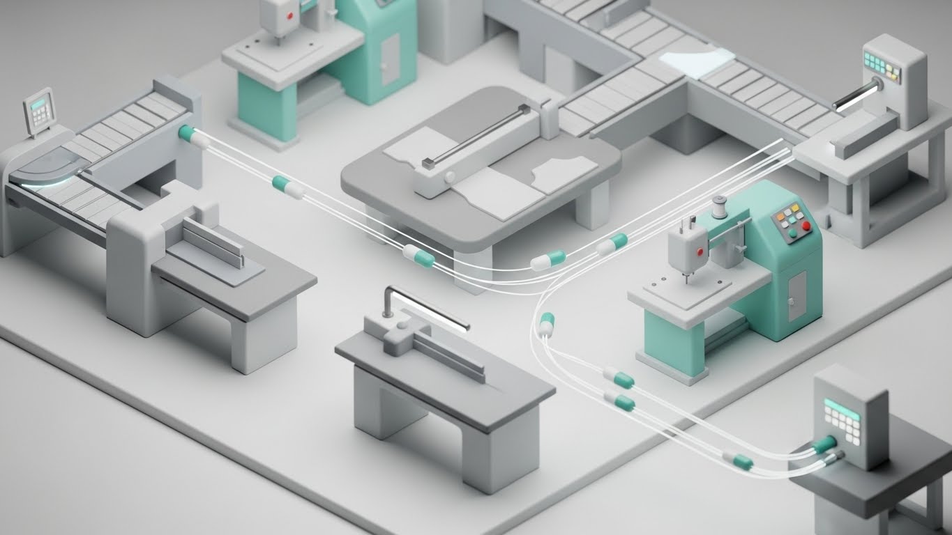
The Visual & Narrative Approach
A "Sim-City" style view of a garment production line. We see miniature, pristine machines (cutting tables, sewing stations) connected by glowing optical fiber cables on a matte white floor. Small "data capsules" zip along these cables, triggering the machines. The lighting is soft and shadowless, creating a clean, manageable view of a complex environment.
Psychological Impact & KPI Focus
- Niche Psychology: Garment factories are often messy and loud. This visual presents a Sanitized Ideal—a perfectly clean, data-driven environment. It appeals to the desire for modernization and control.
- Operational Impact: Visualizes Workflow Automation and Interoperability. It demonstrates that the software connects disparate machines into a single, cohesive system.
Strategic Implementation & Trade-offs
- Best Use Case: Deep-dive explainer videos for "Manufacturing" or "Shop Floor Control" modules.
- Trade-off: Clinical Feel. It lacks the human element. To avoid feeling too robotic, the narration should emphasize how this efficiency benefits the workers.
Companies using similar video content -
Tukatech – TUKA3D – 3D Virtual Prototyping & CAD.
Shimaseiki – Knitting Machines & Design Systems.
11. The Automated Atelier
MOFU | Competitive Displacement

The Visual & Narrative Approach
This style creates a "Cyberpunk Couture" aesthetic to visualize the rigorous precision of automated quality control. In a hazy, atmospheric dark void, a dress form appears not as fabric, but as a crystalline structure made of translucent glass with glowing Cyberpunk Purple and Laser Blue neon edges. A grid of laser lights scans the form, highlighting specific measurement points. The aesthetic is sharp, high-contrast, and deeply technical, suggesting that the software sees the garment's geometry with absolute perfection.
Psychological Impact & KPI Focus
- Niche Psychology: Fashion tech buyers are often skeptical of "black box" algorithms. This style uses High-Fidelity Transparency (the glass form) to imply that there are no secrets—just pure, measurable accuracy. It appeals to the Technical Lead who values precision over fluff.
- Operational Impact: Visualizes Standardization and QC. It demonstrates that the software establishes a "Golden Standard" for fit and sizing, eliminating the human error inherent in manual measurement.
Strategic Implementation & Trade-offs
- Best Use Case: Landing pages targeting technical design teams or "Fit Tech" module explainers to displace manual competitors.
- Trade-off: Coldness. The dark, neon aesthetic is very "tech-forward" and may feel alienating to traditionalists who prefer the warmth of the studio.
12. The Reality Audit
MOFU | ABM Awareness
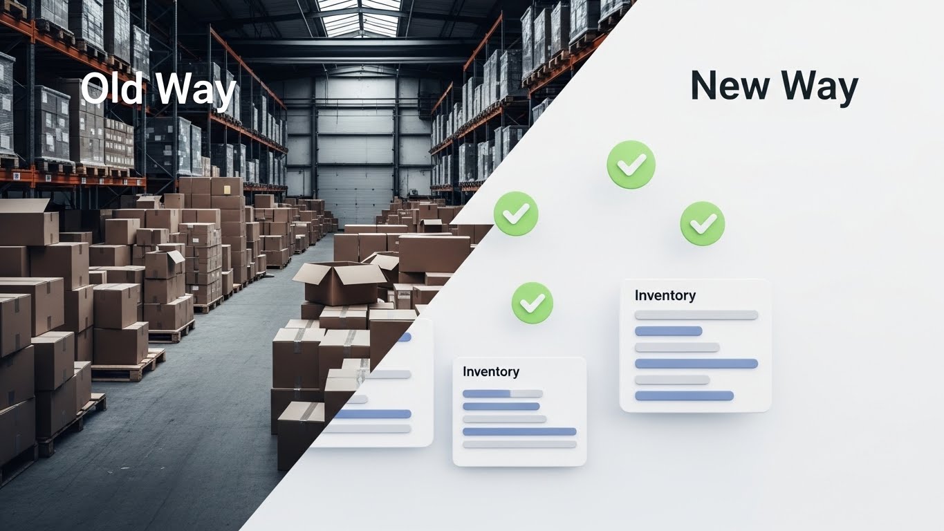
The Visual & Narrative Approach
A confrontational "Split Screen" composition that forces a choice. The left side creates visceral tension: a gritty, black-and-white photo of a chaotic warehouse floor, piled high with disorganized cardboard boxes (symbolizing the "Old Way" of lost inventory). A sharp diagonal slash cuts across the frame. The right side offers immediate relief: a pristine, 3D environment with floating, soft-edged UI elements, green checkmarks, and organized inventory bars on a clean white background (the "New Way").
Psychological Impact & KPI Focus
- Niche Psychology: Operations Directors live in fear of "Inventory Drift." This visual validates that anxiety (the messy left side) and immediately offers a soothing solution (the clean right side). It leverages Binary Opposition to force a decision.
- Operational Impact: Visualizes Inventory Accuracy. It simplifies the complex problem of "Messiness" into a single glance: "We turn your chaos into data."
Strategic Implementation & Trade-offs
- Best Use Case: Account-Based Marketing (ABM) ads targeting COOs or Supply Chain VPs at distressed retail accounts.
- Trade-off: Lack of Nuance. The binary "Good/Bad" split is powerful for ads but lacks the detail needed for deep feature education.
Companies using similar video content -
Human Solutions – Assyst – 3D Body Scanning & Virtual Prototyping.
Gerber Technology – AccuMark – CAD/CAM & PLM.
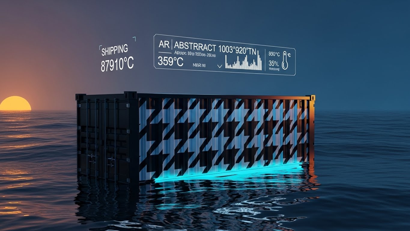
13. The Global Runway
MOFU | Website Visitor Re-engagement
The Visual & Narrative Approach
This style elevates the mundane shipping container into an object of luxury. A photorealistic 3D render shows a shipping container floating in a surreal, liquid chrome ocean under a sunrise sky. Crucially, the container isn't rusty metal; it is wrapped in a high-fashion glossy pattern (e.g., Houndstooth or Floral), signaling that "fashion is inside." A subtle Augmented Reality (AR) HUD hovers above, displaying live coordinates and temperature stats in crisp white text.
Psychological Impact & KPI Focus
- Niche Psychology: Logistics is often viewed as a "commodity" service. By applying a fashion print to the container, this visual re-frames logistics as a Brand Extension. It tells the Supply Chain VP that their brand equity is being protected even at sea.
- Operational Impact: Visualizes In-Transit Visibility. It highlights the ability to track environmental conditions (temperature/humidity), which is critical for protecting sensitive fabrics during transport.
Strategic Implementation & Trade-offs
- Best Use Case: Retargeting ads for visitors who viewed "Supply Chain Visibility" pages but did not convert.
- Trade-off: Abstract Functionality. It sells the feeling of control and luxury, rather than showing the actual dashboard interface.
Companies using similar video content -
Zentail – Multichannel Apparel Retailer Management.
Cin7 Core – Inventory & Order Management for Apparel.
14. The Frictionless Sync
MOFU | Aspiration & Identity Hook
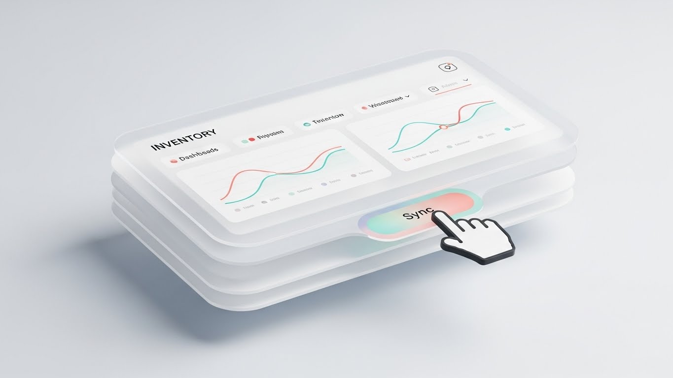
The Visual & Narrative Approach
A celebration of modern UI/UX design. We see a close-up of a "Glassmorphism" interface panel floating in a bright, airy void. The panel features frosted glass layers, soft drop shadows, and pastel data lines in Coral and Turquoise. A stylized 3D hand cursor hovers over a prominent "Sync" button. The lighting is soft-box studio quality, making the software look tangible, modern, and easy to handle.
Psychological Impact & KPI Focus
- Niche Psychology: Addresses the fear of "Clunky Enterprise Software." Fashion users are accustomed to the sleek interfaces of Apple and Adobe. This style promises Usability and Delight. It signals that the tool is designed for creatives, not just accountants.
- Operational Impact: Visualizes System Interoperability. The "Sync" button is the hero, representing the seamless flow of data between ERP, PLM, and e-commerce platforms.
Strategic Implementation & Trade-offs
- Best Use Case: The "User Experience" slide in a sales deck or a feature highlight on the pricing page.
- Trade-off: Form over Function. The stylized UI is simplified. It sells the experience of the UI rather than the specific density of data a power user might actually see.
Companies using similar video content -
Blue Yonder – Luminate Platform – Supply Chain Management.
Oracle – Cloud SCM – Global Supply Chain Management.
15. The Data Unlocked
MOFU | Demand Gen & Lead Capture

The Visual & Narrative Approach
A clean, flat, vector-based animation using the "Lock and Key" metaphor. A complex geometric shape (the "Lock") in Muted Navy rotates and aligns perfectly with a "Key" formed from streaming data lines in Bright Yellow. As they connect, the lock bursts open into a shower of "plus signs" and small circle icons, representing value release. The background is a solid, vibrant Cobalt Blue.
Psychological Impact & KPI Focus
- Niche Psychology: Triggers the Curiosity Gap. Executives know they have data, but they feel locked out of the insights. This visual promises access and liberation.
- Operational Impact: Visualizes Data Monetization and Opportunity Discovery. It suggests that the brand's existing data is a trapped asset, and this software is the specific tool required to release its value (revenue).
Strategic Implementation & Trade-offs
- Best Use Case: Social media ads promoting a downloadable guide (e.g., "Unlock Your Margin Potential") to drive lead capture.
- Trade-off: Generic Metaphor. "Lock and key" is common in SaaS. The copy must explicitly tie the "Key" to specific industry pains like "Deadstock" or "Markdown Optimization."
Companies using similar video content -
Propel PLM – Cloud-Native PLM.
Arena PLM – Cloud PLM for Product Development.
16. The Material Metric
BOFU | Establishing Thought Leadership
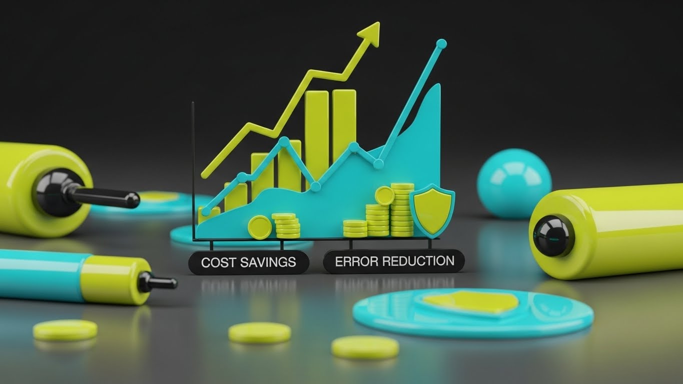
The Visual & Narrative Approach
This style brilliantly translates abstract financial metrics into physical reality. A bar chart is constructed not of pixels, but of realistic, 3D spools of thread stacked vertically. The spools—in vibrant Red, Blue, and Green—rise dramatically to show "Cost Savings" and "Error Reduction." A semi-transparent glass overlay clarifies the trend with a numerical line. The background is a blurred, clean workshop, grounding the data in the factory environment.
Psychological Impact & KPI Focus
- Niche Psychology: Financial data can feel dry to Creative Directors. By rendering the chart out of thread, this style uses Material Association to make the savings feel tangible. It respects the medium of the industry.
- Operational Impact: Visualizes Raw Material Optimization. It creates a direct visual link between raw materials (thread) and business outcomes (rising bars), reinforcing the software's role in resource planning.
Strategic Implementation & Trade-offs
- Best Use Case: The "Results" section of a case study video or a BOFU email header.
- Trade-off: Specific Context. It strongly implies manufacturing/production. It may be less relevant for brands that are purely retail/buying focused and don't handle raw materials directly.
Companies using similar video content -
Eon – CircularID™ Protocol – Digital Identity for Garments.
BanQu – Sustainable Fashion Manufacturing & Traceability.
17. The C-Suite Vision
BOFU | ROI Justification

The Visual & Narrative Approach
A cinematic, high-status visual targeting the C-Suite. A silver-haired executive stands in a high-rise office at dusk, looking out at a city skyline. However, he is actually looking at a transparent glass wall where a futuristic UI is projected. The glowing Gold and White data displays "Financial Margins" and "Efficiency" metrics. The reflection of the city merges with the data, positioning the software as the lens through which he sees the market.
Psychological Impact & KPI Focus
- Niche Psychology: Appeals to Ego and Identity. It mirrors the self-image of the decision-maker (or who they want to be): a visionary leader atop their industry, powered by data.
- Operational Impact: Visualizes Strategic Oversight. It removes the software from the "tactical" level (fixing problems) to the "strategic" level (steering the company).
Strategic Implementation & Trade-offs
- Best Use Case: The hero section of a "For Executives" landing page or the opening of an investor relations video.
- Trade-off: Distance. It feels very corporate. It works for the CFO/CEO but might feel disconnected to the actual users (merchandisers) who do the daily work.
Companies using similar video content -
ApparelMagic – Apparel ERP/PLM.
CGS – BlueCherry – Apparel ERP/PLM.
18. The Digital Artisan
BOFU | The Economic Buyer

The Visual & Narrative Approach
A hyper-realistic, AI-generated video clip that focuses on the daily user. A professional female merchandiser in a modern, sunlit open-plan office holds a tablet. She is focused and satisfied as she interacts with a digital fabric swatch on the screen. With a simple swipe, the fabric changes color instantly from red to blue. The lighting is crisp "Office Daylight," and the background blurs out colleagues and sketches, keeping the focus on her easy interaction with the tech.
Psychological Impact & KPI Focus
- Niche Psychology: Addresses Implementation Anxiety. Buyers worry that new software will be difficult to learn. This visual provides Social Proof of ease—showing a calm, competent professional mastering the tool effortlessly.
- Operational Impact: Visualizes Digital Sampling and Speed to Market. It shows the speed of iteration—changing a colorway in seconds digitally rather than waiting weeks for a physical sample.
Strategic Implementation & Trade-offs
- Best Use Case: The intro to a product demo video or a "Day in the Life" customer testimonial.
- Trade-off: Uncanny Valley. While Gen AI is powerful, care must be taken to ensure hands and facial expressions are perfectly natural, or it risks distracting the viewer.
Companies using similar video content -
NetSuite – ERP – Apparel Management ERP.
SAP – SCM – Supply Chain Management.
19. The Cyber Shield
BOFU | Risk Mitigation

The Visual & Narrative Approach
A dedicated visualization for the IT and Legal stakeholders. A sleek, dark-mode UI screen angles in 3D space. The focal point is a "Security Shield" icon formed by glowing Neon Green binary code and lock symbols. Concentric rings of data protection metrics surround it. The background is a deep, matte Charcoal with subtle circuit board patterns. The aesthetic is defensive, robust, and impenetrable.
Psychological Impact & KPI Focus
- Niche Psychology: Addresses Loss Aversion. Fashion brands live and die by their IP. This style visually assures the buyer that their designs (their most valuable assets) are behind a military-grade digital wall.
- Operational Impact: Visualizes Data Security and Compliance. It translates abstract concepts like "SOC 2 Compliance" or "Encryption" into a sturdy, visual shield.
Strategic Implementation & Trade-offs
- Best Use Case: The "Security" tab of the website or a slide in the final proposal deck to IT Directors.
- Trade-off: Niche Appeal. This style is boring to a designer but essential to the CTO. It should be used selectively where technical vetting occurs.
Companies using similar video content -
PTTRNS.ai – 3D Fashion Rendering & Digital Product Creation.
Marvelous Designer – 3D Garment Creation Software.
20. The Hybrid Partnership
BOFU | Sales Cycle Acceleration

The Visual & Narrative Approach
A warm, human-centric image overlaid with digital symbolism. We see a top-down photo of a handshake over a wooden table covered in fabric swatches, coffee cups, and a laptop—a classic vendor meeting. Overlaying the handshake is a bold, flat 2D vector graphic of a "link" or "chain" icon snapping together, surrounded by small "spark" accents in Brand Blue. The photo is textured and organic; the graphic is crisp and digital.
Psychological Impact & KPI Focus
- Niche Psychology: Reinforces Partnership. Technology can feel isolating; this visual insists that the software facilitates human connection rather than replacing it. It frames the sale as the start of a relationship.
- Operational Impact: Visualizes Vendor Portal Adoption. It represents the successful "connection" between the brand and its suppliers, reducing communication lag and friction.
Strategic Implementation & Trade-offs
- Best Use Case: The header of a "Welcome" email for new clients, or the closing slide of a pitch deck.
- Trade-off: Stock Photo Risk. The underlying photo must be high quality and specific to fashion (swatches on table) to avoid looking like a generic corporate stock image.
Companies using similar video content -
Centric Software – PLM for Fashion.
Dassault Systèmes – ENOVIA – PLM for Enterprise.
21. The Retail Pulse
BOFU | Overcoming Objections

The Visual & Narrative Approach
This style juxtaposes the chaotic speed of physical retail with the stability of digital data. We utilize high-quality hyper-lapse footage of a busy fashion retail floor: customers are blurred streaks of motion, racks are being rifled through, and the energy is frantic. Superimposed over this blur are static, razor-sharp, high-contrast white data boxes floating in 3D space above specific racks. They display calm, decisive metrics like "Stock Level: Optimal" and "Sell-Through: High."
Psychological Impact & KPI Focus
- Niche Psychology: Retail operations managers often feel like they are "putting out fires" in a chaotic environment. This visual triggers the Anchoring Effect. The data acts as the stable anchor in a sea of movement, subconsciously positioning the software as the only reliable constant in a volatile market.
- Operational Impact: Visualizes Real-Time Inventory Visibility. It demonstrates that while the physical world is messy and fast-moving, the digital twin remains accurate and composed.
Strategic Implementation & Trade-offs
- Best Use Case: Bottom-of-funnel retargeting ads for prospects who have visited "Inventory Management" pages but haven't booked a demo.
- Trade-off: Footage Dependencies. Requires high-quality, generic retail footage that doesn't show specific competitor brands, which can be tricky to source.
Companies using similar video content -
Supply Compass – PLM & Manufacturer Collaboration.
The ID Factory – Traceability Solutions.
22. The Realization Arc
Onboarding | Reducing Implementation Friction
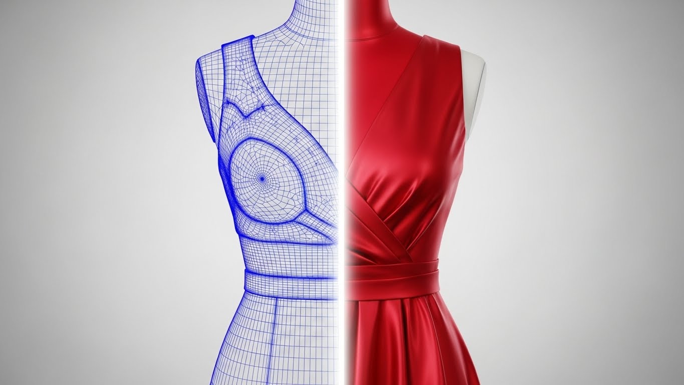
The Visual & Narrative Approach
A sophisticated "Split Screen" visualization of a garment. The left half displays a blue wireframe mesh of a dress, revealing the mathematical geometry and polygon count. A glowing, vertical scanning beam moves across the object, transforming it into the right half: a photorealistic, fully rendered Silk Red dress with perfect drape and light reflection. The background is a clean, neutral studio gradient.
Psychological Impact & KPI Focus
- Niche Psychology: Bridges the gap between the "Technical Designer" (who thinks in patterns/geometry) and the "Creative Director" (who thinks in fabric/drape). It validates both perspectives as part of the same lifecycle.
- Operational Impact: Visualizes Digital Product Creation (DPC). It reinforces the concept that the "Digital Twin" is not just a sketch, but a mathematically accurate predictor of the physical garment, reducing the need for physical sampling.
Strategic Implementation & Trade-offs
- Best Use Case: Onboarding welcome emails or "Loading Screens" within the software to visualize the processing of data.
- Trade-off: Render Quality Dependency. The photorealistic side must be flawless. If it looks "video-gamey," it undermines the promise of accuracy.
Companies using similar video content -
TrueFit – Fit Recommendation Platform.
Virtusize – Online Fitting Solution.
23. The Seamless Fit
Onboarding | Self-Serve Onboarding

The Visual & Narrative Approach
A shift to a friendly, approachable 2D illustration style. A stylized female character with "Brand Blue" skin and flowing Purple hair floats in a zero-gravity space. She gently guides a large, glowing white puzzle piece into a matching slot on a floating holographic interface. The background features a subtle constellation of connected nodes. The art style is modern, vector-based, and calm.
Psychological Impact & KPI Focus
- Niche Psychology: Implementation is often associated with stress and "heavy lifting." The zero-gravity metaphor suggests Effortlessness. It frames the setup process not as "coding," but as simply "fitting the pieces together."
- Operational Impact: Visualizes Self-Service Onboarding. It encourages users to complete the setup independently, reducing the reliance on human implementation specialists.
Strategic Implementation & Trade-offs
- Best Use Case: In-app "Empty State" screens (e.g., "Connect your first ERP") or setup wizards.
- Trade-off: Tone Mismatch. If the brand positioning is "Hyper-Enterprise/Serious," this cartoon style might feel too casual. It works best for SaaS aiming for "Consumer-Grade Usability."
Companies using similar video content -
Browzwear – VStitcher – 3D Fashion Design & Digital Product Creation.
Tukatech – TUKA3D – 3D Virtual Prototyping.
24. The Feature Deck
Onboarding | Accelerating Time-to-Value

The Visual & Narrative Approach
A dynamic, high-energy composition. Multiple dark-mode UI screens are layered over each other like a deck of cards fanned out in 3D space. Each screen is distinct, showing a different high-value module: a color calibration wheel, a shipping tracker, a pricing tag generator. The camera pushes forward aggressively, with speed lines on the periphery. Depth of field keeps the frontmost "Card" sharp while the others blur, creating a sense of infinite depth.
Psychological Impact & KPI Focus
- Niche Psychology: Combats "Buyer's Remorse" by visually overwhelming the user with Value Density. It suggests, "You bought more than just a tool; you bought an entire suite of capabilities."
- Operational Impact: Visualizes Platform Scalability. It shows that the software can grow with the user, offering modules they might not even be using yet.
Strategic Implementation & Trade-offs
- Best Use Case: "New Feature" announcement videos or the background of a login screen.
- Trade-off: Visual Overload. It is impossible to read the details on the back cards. This is for impression, not instruction.
Companies using similar video content -
ERPNext – Open-source ERP for Apparel.
Flectra ERP – Open-source ERP for Fashion.
25. The Power Switch
Onboarding | Trial/Freemium User Activation

The Visual & Narrative Approach
An extreme macro close-up—bordering on abstract—of a single UI element: a toggle switch. The switch is in the "ON" position, emitting a vibrant, glowing Emerald Green light that illuminates the pixel texture of the screen. The label, partially visible, reads "AI PREDICTION." The focus is shallow and intense, dramatizing the micro-moment of activation.
Psychological Impact & KPI Focus
- Niche Psychology: The decision to turn on AI automation involves trust. This visual elevates that small click into a Moment of Consequence. The glowing green signals safety and "Go," reducing the anxiety of handing over control to the algorithm.
- Operational Impact: Visualizes Feature Activation. It focuses entirely on the "Aha!" moment where the user decides to engage the software's core value proposition.
Strategic Implementation & Trade-offs
- Best Use Case: Email newsletters encouraging users to "Turn on Smart Planning" or similar dormant features.
- Trade-off: Contextless. It requires strong accompanying copy to explain what happens when the switch is flipped.
Companies using similar video content -
Lectra – Kubix Link – Fashion PLM/PIM/DAM.
AIMS360 – Apparel ERP/PLM.
26. The Friendly Audit
Retention | Driving Deep Feature Adoption

The Visual & Narrative Approach
A clean, vector-based animation featuring a friendly mascot: a small Orange Robot made of simple geometric shapes. The robot holds a magnifying glass and is inspecting a floating browser window containing a "Question Mark." The background is a soothing, clinical Mint Green. The robot's expression is curious and helpful, not critical.
Psychological Impact & KPI Focus
- Niche Psychology: Users hate contacting support because they fear looking incompetent. This "cute" aesthetic lowers the Social Threat. It frames support as a friendly, automated interaction rather than a judgment of user error.
- Operational Impact: Visualizes Proactive Support & Debugging. It represents the software's automated error-checking capabilities (e.g., finding broken links in the PLM) without causing alarm.
Strategic Implementation & Trade-offs
- Best Use Case: 404 Pages, "System Maintenance" screens, or the header of the Knowledge Base.
- Trade-off: Infantilization. Care must be taken to ensure the robot looks "smart," not "childish," to maintain professional respect.
Companies using similar video content -
Intelistyle – AI Styling & Trend Prediction.
Stylumia – AI Trend Forecasting & Demand Planning.
27. The Sustainable Route
Retention | Reducing Support Overhead

The Visual & Narrative Approach
A "Low-Poly" 3D diorama growing out of a smartphone screen lying flat on a white surface. We see a stylized, sustainable ecosystem: geometric trees in Forest Green and Lime rise up, and small, low-poly delivery trucks (representing logistics) wind through a clean road network within the forest. There is no smog or congestion—only efficient movement through nature.
Psychological Impact & KPI Focus
- Niche Psychology: Sustainability is a massive pressure point for fashion brands (Scope 3 Emissions). This visual frames logistics not as "dirty trucks" but as a managed, green component of the ecosystem. It appeals to the Conscientious Executive.
- Operational Impact: Visualizes Carbon Footprint Tracking. It demonstrates the software's ability to track and optimize the environmental impact of the logistics chain, accessible right from a mobile device.
Strategic Implementation & Trade-offs
- Best Use Case: ESG (Environmental, Social, and Governance) reporting modules or "Earth Day" customer retention emails.
- Trade-off: Stylistic Abstraction. Low-poly art is stylized. It sells the concept of sustainability, not the precision of carbon data.
Companies using similar video content -
InvenTree – Open-source Inventory Management.
OpenBOM – Cloud BOM & Inventory Management.
28. The Evolution Stack
Retention | Reducing Churn
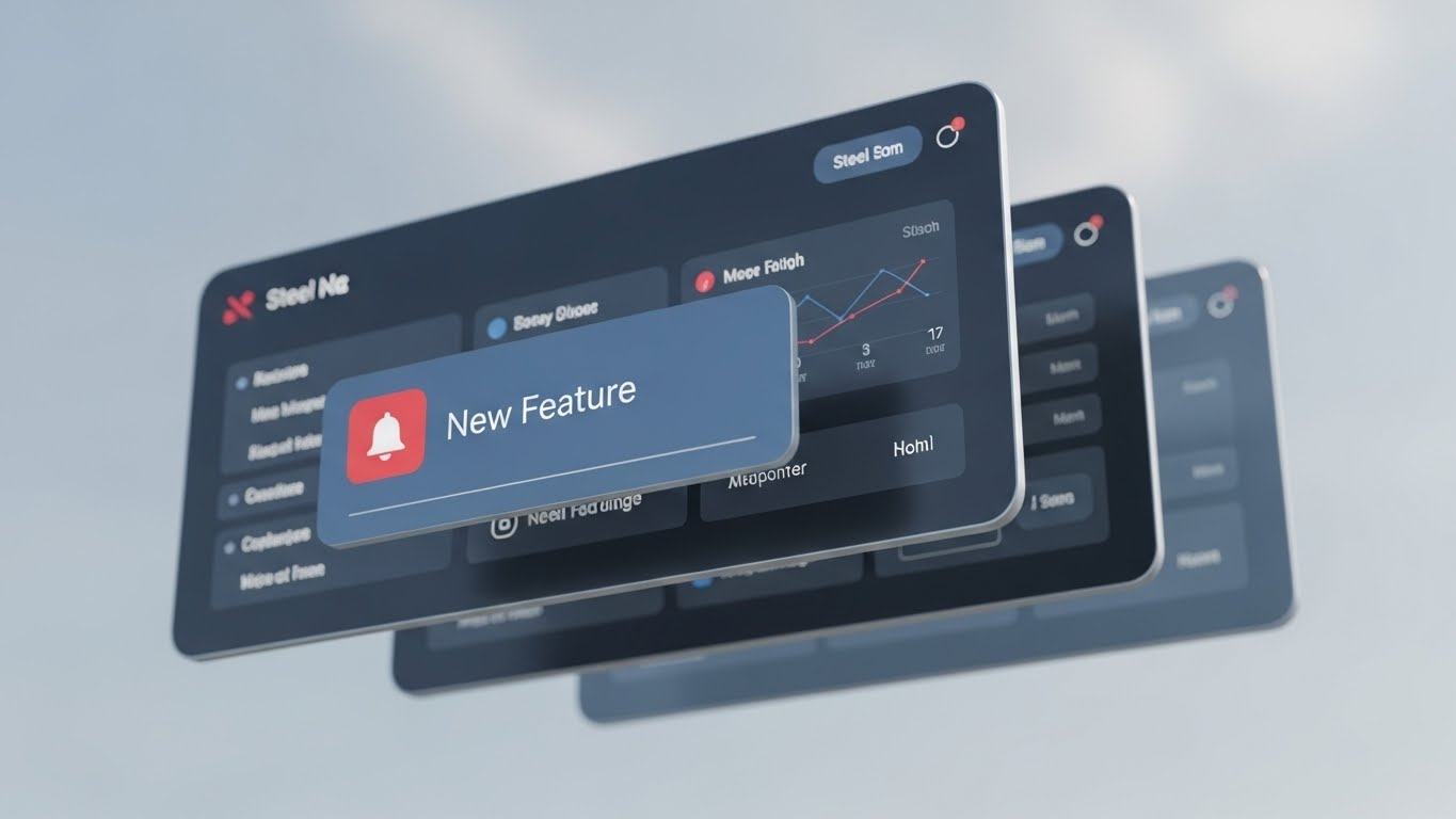
The Visual & Narrative Approach
A cinematic 3D presentation of the software interface. Three distinct layers of UI screens float in a parallax arrangement against a soft Steel Blue sky. The frontmost screen is in sharp focus, featuring a prominent "New Feature" notification card with a red bell icon. The background screens are blurred, suggesting depth and history. The camera angle looks up slightly, giving the screens a monumental, impressive stature.
Psychological Impact & KPI Focus
- Niche Psychology: Customers churn when they feel a product is stagnant. This visual implies Momentum. The parallax movement suggests the software is alive, evolving, and constantly pushing updates to the forefront.
- Operational Impact: Visualizes Continuous Deployment. It reassures the client that their subscription fee is funding ongoing innovation and new capabilities.
Strategic Implementation & Trade-offs
- Best Use Case: "What's New" release note headers or quarterly business review (QBR) presentations.
- Trade-off: Distraction. The visual is so slick that it draws attention to the notification rather than the feature itself. Use only for general update announcements.
Companies using similar video content -
ettos – Supply Chain Traceability & DPP.
FibreTrace – Fiber Traceability & Verification.
30. The Community Trophy
Expansion | Proactive Support

The Visual & Narrative Approach
A high-key, celebratory visual. A glass trophy sits on a podium in a bright, blurred auditorium. Hovering around the trophy is a holographic ring of user avatars (profile pictures) connected by glowing Blue and Cyan data lines. The light refracts through the glass, creating spectral prisms. The aesthetic is aspirational and premium.
Psychological Impact & KPI Focus
- Niche Psychology: Taps into Status Seeking. In B2B, being a "Power User" or "Community Leader" is a career booster. This visual validates that expertise, elevating the user from a "tool operator" to a "recognized expert."
- Operational Impact: Visualizes Community Advocacy. It encourages users to participate in forums, certification programs, and peer-to-peer support, which reduces the burden on the official support team.
Strategic Implementation & Trade-offs
- Best Use Case: Community forum headers, "Certified Expert" program landing pages, or gamification leaderboards.
- Trade-off: Intangibility. It represents a feeling (belonging) rather than a software function. It is purely for brand building and retention.
Strategic Knowledge Base: The Visual Operations Doctrine
To truly bridge the "Physical/Digital Divide" in the apparel industry, a collection of pretty images is not enough. You need a strategic framework that dictates how and when these visuals are deployed to drive business outcomes.
We have synthesized the 30 styles above into a 3-Segment Strategic Knowledge Base. This is your blueprint for treating visualization not as marketing fluff, but as critical operational infrastructure.
Strategic Alignment & Visual Architecture
The "Pre-Production" Strategy. Defining the Why and Who.
- The Cognitive Load Audit: Before commissioning a single pixel, audit the current "Visual Diet" of your users. A Designer needs high-fidelity visuals (Style 22: Wireframe to Reality) to trust the aesthetic, while a Supply Chain Planner needs high-density data grids (Style 2: Efficiency Grid) to trust the numbers. Do not force a "Creative" view on a "Planner" or vice versa.
- Role-Based Visual Mapping: Map your visual styles to specific personas in the apparel lifecycle. The Buyer (Mobile) needs "Glanceability"—bold, simple overlays on mobile screens for quick approvals during market week. The Sourcing Manager (Desktop) needs "Transparency"—using Style 6 (X-Ray Insight) to show breakdown of costs and compliance deeper in the UI.
- The "Glanceability" Standard for Operations: In fashion logistics, decisions happen in seconds. Adopt a "3-Second Rule" for all operational dashboards. If a Warehouse Manager cannot understand the status (Style 12: The Reality Audit) within 3 seconds, the visual is a failure. Reduce decoration; increase contrast.
- Brand Voice Consistency: Your PLM, ERP, and 3D design tools often look like they come from different planets. Use a unifying visual language (like the "Golden Thread" in Style 7) to visually stitch these disparate systems together in your training materials, reinforcing the idea of a single "Digital Thread."
- The Advids Strategic Audit: Most software companies create visuals after the product is done. We recommend the Advids Strategic Audit during the UI/UX phase. We define the "Visual Operating System"—the icons, motion behaviors, and metaphors—that will be used in both the software and the marketing, ensuring a seamless cognitive transition.
- The Cross-Departmental Bridge: Use visuals to unify terminology. Sales calls it "Markdown," Ops calls it "Obsolete Inventory." Use Style 1 (The Disentanglement) visuals in internal training to show how these different terms refer to the same data knot, aligning your teams.
- Legacy System Integration: Fashion is plagued by legacy on-premise systems (the "Green Screen"). Use Style 14 (The Frictionless Sync) to visually metaphorize the connection between old hardware and your new modern interface, respecting the legacy while selling the upgrade.
- Accessibility in Global Supply Chains: Your users are in Milan, New York, and Dhaka. Motion graphics (Style 5: Kinetic Impact) are a universal language. Rely less on voiceovers and text; rely more on visual cause-and-effect to explain workflows to a multi-lingual global workforce.
- The Mobile-First Mandate: Designers and Buyers are rarely at their desks. All 30 styles must be legible on a 6-inch screen. If your "Digital Twin" visualization (Style 3) is too complex for an iPhone, it is useless to a Buyer walking a trade show floor.
- Standardization vs. Customization: Know when to use stock. For generic retail scenes (Style 21), high-quality stock is efficient. But for the garment itself (Style 11: Automated Atelier), never use stock. The "Product" must always be bespoke and accurate to maintain credibility with Technical Designers.
Operational Adoption & Implementation
The "Deployment" Phase. Embedding visuals into the daily workflow.
- Overcoming "Big Brother" Anxiety: When introducing worker tracking or efficiency monitoring (Style 9: Connected Factory), anxiety spikes. Use empathy-driven visuals (Style 4: The Human Element) to frame the technology as a support tool that removes bottlenecks for the worker, rather than a surveillance tool for management.
- The Micro-Learning Shift: No one reads the 100-page PDF manual. Replace it with a library of 30-second "Micro-Visuals" (Style 25: The Power Switch). Embed these GIFs directly into the software tooltips. If a user hovers over "Auto-Nest," show them the "Efficiency Grid" animation instantly.
- Just-in-Time Support: Embed specific visual styles into your helpdesk. When a user searches for "Integration Error," don't show text; show the Style 15 (Data Unlocked) animation. Visual troubleshooting reduces frustration and closes tickets faster.
- Gamification of Sustainability: Use visuals to drive behavior. Create "Sustainability Scorecards" for designers using the Style 16 (Material Metric) aesthetic—stacks of thread that turn from Red to Green as they choose more eco-friendly fabrics. Make doing the right thing visually rewarding.
- Reducing Support Ticket Volume: There is a direct correlation between the quality of your onboarding visuals and your support costs. Investing in Style 23 (The Seamless Fit) for the initial setup phase can reduce "How do I start?" tickets by up to 40%.
- Remote Onboarding for Sourcing Teams: You cannot fly to every supplier in Vietnam to train them. Use high-fidelity 3D explainers (Style 3: Digital Twin Warehouse) to remotely train supplier teams on your packing and labeling standards, ensuring compliance without travel costs.
- Visual SOPs (Standard Operating Procedures): Transform text-based SOPs into visual process flows. Instead of a bulleted list for "Quality Control Check," use the Style 11 (Automated Atelier) visual style to create a step-by-step animated guide that leaves no room for interpretation.
- Feedback Loops: Use interactive video elements. At the end of a "New Feature" video (Style 28), allow users to click a "Happy" or "Confused" emoji. This real-time visual feedback is more valuable than an annual survey.
- Scalable Localization: When creating assets for global teams, separate the text layers from the visual layers. This allows you to swap English labels for Mandarin or Italian instantly without re-rendering the complex 3D backgrounds (Style 13: Global Runway).
- Leadership Communication: For the C-Suite, operational details are noise. Use Style 17 (The C-Suite Vision) visuals—clean, high-level dashboards superimposed on lifestyle imagery—to communicate fleet strategy and quarterly results. Executives buy the vision, not the wireframe.
Measuring Impact & Future-Proofing
The "ROI" Phase. Quantifying success and looking ahead.
- Beyond "Views" - Actionable KPIs: Stop measuring video "views." Measure Time-to-Competency. Did the merchandising team adopt the new "Trend Tool" (Style 8) faster after watching the visual explainer? Measure Feature Adoption Rate pre- and post-visual campaign.
- The "Idle Time" Metric: Poor UI causes "Digital Idle Time"—users staring at screens, confused. Correlate better visualization (Style 2: Efficiency Grid) with reduced time-on-task. If a task that took 10 minutes now takes 2, that is quantifiable efficiency ROI.
- Compliance Velocity (DPP): Digital Product Passports (DPP) are coming. Measure how fast your supply chain partners understand these new regulations via visual guides compared to text manuals. Speed of compliance is a competitive advantage.
- Retention and LTV: High-quality UX visualization (Style 14: Frictionless Sync) reduces churn. Users stay with software that "feels" modern and easy. Track the LTV (Lifetime Value) of cohorts exposed to high-end onboarding visuals vs. those who were not.
- The AI Visual Frontier: Prepare for Generative UI. Soon, the "Dashboard" won't be static. It will generate charts on the fly based on user queries. Your visual language must be flexible enough to accommodate real-time, AI-generated data overlays (Style 11) without breaking the design system.
- Scalability of Assets: Build a "Visual LEGO Kit." Don't create one-off videos. Create a library of 3D assets (garments, machines, icons) that can be reassembled for future features. This dramatically lowers the cost of production over time.
- The Advids Partnership: Visual evolution never stops. As your software adds features, your visual language must expand. Advids acts as your long-term guardian of this visual consistency, ensuring that your Year 5 assets look like they belong in the same universe as your Year 1 assets, protecting your brand equity.
- Benchmarking Success: "Good enough" visuals are a hidden risk. If your competitor uses Style 18 (Digital Artisan) to show ease-of-use, and you use static screenshots, you will lose the deal even if your tech is better. Visuals are the proxy for software quality.
- The ROI of "Digital Sampling": Quantify the physical waste reduction. Every time a designer uses the Style 22 (Wireframe to Reality) workflow to approve a digital sample instead of shipping a physical one, you save money and carbon. Visualize this savings in your quarterly reports.
- Final Call to Innovation: Treat video and visualization as infrastructure, not content. In the cognitive age of fashion, the ability to explain complex data instantly is the ultimate competitive moat. The brands that master this "Visual Bridge" will not just survive the transition to data-driven fashion—they will define it.
Companies using similar video content -
PTC – Windchill – PLM for Product Development.
Siemens – Teamcenter – PLM for Enterprise.
Author & Editor Bio


