
Introduction: Bridging the Physical-Digital Divide
The apparel industry is currently navigating a profound "accuracy crisis." Despite the proliferation of digital tools, a significant disconnect remains between physical inventory and digital records. Recent industry data reveals a startling reality: inventory distortion—the twin evils of out-of-stocks and overstocks—cost the global retail sector an estimated $1.77 trillion inventory distortion in 2023 alone. This figure represents not just lost revenue, but a fundamental failure in asset visibility.
This guide explores the strategic role of video visualization in solving this visibility gap. It is not merely about making software look "pretty"; it is about cognitively bridging the divide between a chaotic warehouse floor and a pristine ERP interface. When asset management platforms utilize the right visual language, they don't just promise efficiency—they demonstrate it. By leveraging advanced visualization techniques—from hyper-realistic RFID simulations to kinetic typography—software providers can articulate how their technology drives 99.9% inventory accuracy, transforming supply chains from reactive liabilities into responsive assets.
The following examples represent a "Gold Standard" for visualizing complex apparel logistics. They are designed to reduce cognitive load for decision-makers, proving that your platform can orchestrate the speed, precision, and scale required by modern fashion brands.
1. The Visionary Future: Cinematic Aspiration
TOFU | Brand Awareness
The Visual & Narrative Approach
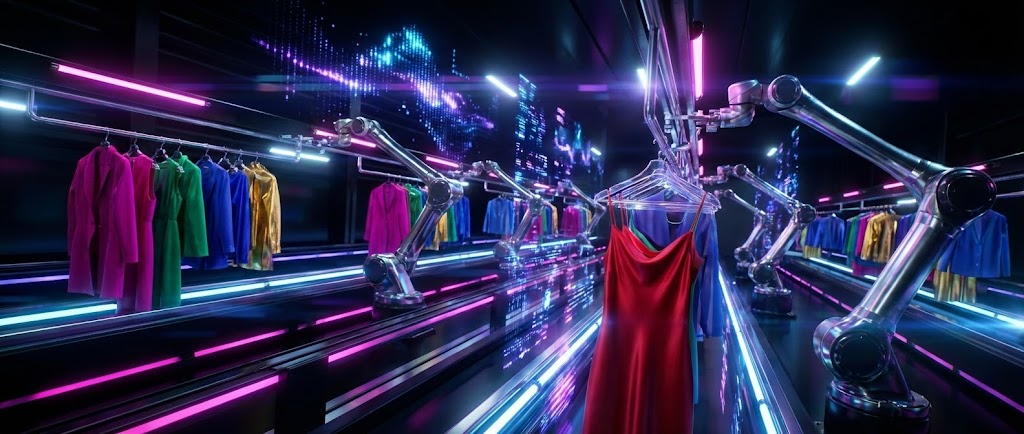
This style employs a high-end, cinematic approach to visualize the "perfect state" of apparel logistics. The scene opens with a sweeping wide shot of a futuristic distribution center, where automated robotic arms swiftly move racks of garments along magnetic rails. The lighting is dramatic and high-contrast, utilizing a palette of Vivid Magenta, Cyan, and Deep Black to create a tech-noir aesthetic. Anamorphic lens flares streak across the frame, while abstract shimmering light pulses—representing RFID waves—communicate visibly between the garments and the sensors. The camera performs a low-angle tracking shot, following a single red silk dress as it travels seamlessly through the automated system.
Psychological Impact & KPI Focus
- The "Control Tower" Effect: For Logistics VPs plagued by the anxiety of "dark assets" (inventory that cannot be located), this visual style triggers a sense of omniscient control. It replaces the mental image of a chaotic, messy warehouse with one of synchronized precision.
- Operational Impact: This style is directly linked to Brand Awareness (Goal 1.1). It signals that the software provider is not just a tool vendor but a partner in futuristic innovation, visualizing Throughput Efficiency.
Strategic Implementation & Trade-offs
- Best Use Case: Top-of-Funnel (TOFU) awareness campaigns, specifically for high-stakes presentations at industry conferences or as the "hero" background video on a landing page.
- Recommended Duration: 15-20 Seconds (Loopable).
- Trade-off: This is a high-gloss, "aspirational" style. While it builds immense brand equity, it may feel too abstract for users seeking immediate, tactical feature explanations. It sells the vision, not the button.
Companies using similar video content -
Blue Yonder – Luminate Platform – Orchestrates autonomous supply chains with AI.
Manhattan Associates – Active Omni – Visionary solutions for unified commerce.
Körber Supply Chain – Körber One – Automated warehouse and logistics control.
3. The Relatable Narrative: Chaos to Order
TOFU | Market Education

The Visual & Narrative Approach
This style focuses on the human element of technology adoption. It features a medium close-up of a professional fashion merchandiser with deep skin tones and curly hair, standing in a chaotic design studio filled with piled samples. Her expression is one of palpable stress. The camera utilizes a "rack focus" technique, shifting sharpness from her worried face to a tablet held in her hands, which displays a pristine, organized blue and white interface. As she taps the screen, the environmental lighting shifts from a warm, stuffy Amber to a cool, refreshing Slate Blue, symbolizing the instant psychological relief provided by the software.
Psychological Impact & KPI Focus
- Mirroring Frustration: The "chaotic studio" setting validates the viewer's daily reality. By acknowledging the pain of disorder before showing the solution, the video builds immediate rapport (empathy).
- Operational Impact: This style drives Market Education (Goal 1.3) by promising a tangible reduction in workplace stress and cognitive overload, visualizing Process Simplification.
Strategic Implementation & Trade-offs
- Best Use Case: LinkedIn feeds and social ads targeting mid-level managers who feel the daily brunt of operational inefficiencies.
- Recommended Duration: 30-45 Seconds.
- Trade-off: This style relies heavily on the quality of the character acting and lighting cues. If the emotional shift feels forced or the "chaos" looks staged, the message can fall flat.
Companies using similar video content -
E2open – Global Supply Chain Platform – Connects and optimizes global trade networks.
Kinaxis – RapidResponse – Concurrent planning for agile supply chains.
4. The Fluid Brand: Abstract Connectivity
TOFU | Shaping Perception

The Visual & Narrative Approach
Moving away from literal representation, this style uses abstract visual metaphors to communicate connectivity. A 2D vector illustration features glossy, organic shapes that resemble flowing silk fabric. These shapes, rendered in Electric Lime and Violet against a Glossy White background, fluidly morph and twist in a center-weighted composition. They eventually form a stylized, logo-like symbol representing seamless integration. The aesthetic is shadowless, clean, and modern, with smooth gradients giving the "fabric" a liquid appearance that suggests frictionless data flow.
Psychological Impact & KPI Focus
- Pre-Attentive Processing: The human brain processes smooth, organic motion faster than jagged, complex imagery. This style communicates "ease of use" and "modernity" without requiring the viewer to read a single word.
- Operational Impact: This is a Shaping Perception tool (Goal 1.5). It is designed to modernize a legacy brand's image, associating it with Agility and contemporary design trends.
Strategic Implementation & Trade-offs
- Best Use Case: Website headers, loading screens, or as a branding element in intro/outro sequences.
- Recommended Duration: 10 Seconds (Loopable).
- Trade-off: Being abstract, it explains nothing about the software's actual functionality. It creates a "vibe" but does not educate on features.
Companies using similar video content -
Centric Software – Centric PLM – Streamlines product development, reducing chaos.
CGS – BlueCherry – Transforms fashion operations from disorder to efficiency.
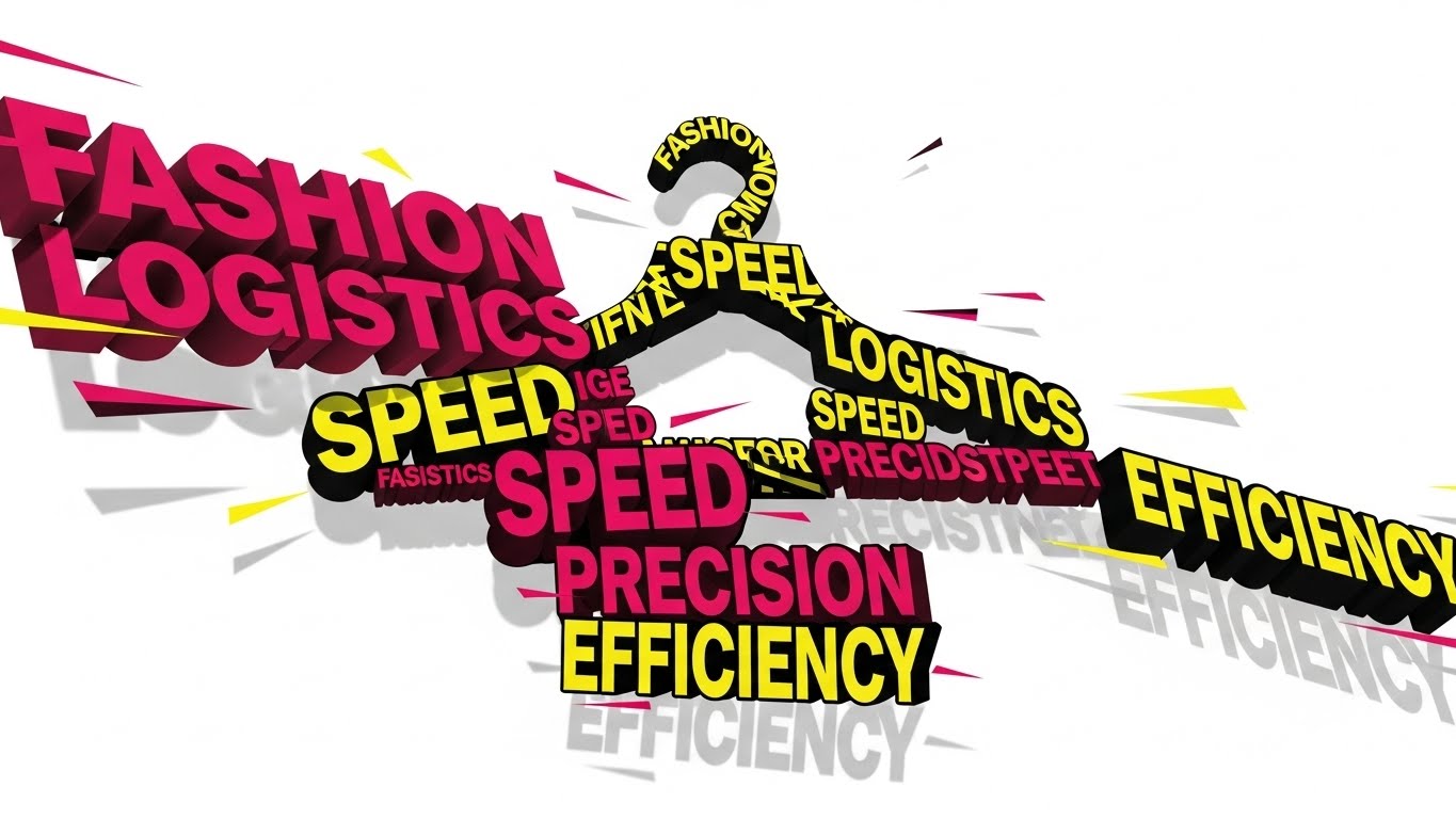
5. The Pattern Interrupt: Kinetic Typography
TOFU | Vertical Social
The Visual & Narrative Approach
Designed for the vertical scroll, this style utilizes Swiss-design principles to arrest attention. Large, blocky geometric shapes and text in Hot Pink, Bright Yellow, and Stark Black move aggressively to a rhythmic beat. The text blocks—reading "SPEED," "EFFICIENCY," "LOGISTICS"—collide and reorganize themselves, visually forming the silhouette of a garment hanger. The motion is fast-paced with hard stops and deep drop shadows, conveying the velocity of modern fashion logistics (or "Fasistics").
Psychological Impact & KPI Focus
- The Dopamine Loop: The rapid, rhythmic motion mimics the pacing of social media consumption, preventing the user from scrolling past. It leverages "kinetic energy" to make the subject matter (usually dry logistics) feel exciting and urgent.
- Operational Impact: Optimized for Vertical Social (Goal 3.5), this style aims for maximum retention and shareability, visualizing Inventory Velocity.
Strategic Implementation & Trade-offs
- Best Use Case: High-frequency retargeting ads on mobile platforms where sound-off viewing is common (the large text carries the message).
- Recommended Duration: 9-15 Seconds.
- Trade-off: The aggressive pacing can be overwhelming for older demographics or more conservative B2B buyers. It risks appearing "too trendy" if not grounded with professional copy.
Companies using similar video content -
Akeneo – PIM – Fluidly manages product information across channels.
Salsify – Product Experience Management – Connects product content seamlessly.
6. The Velocity Demo: Rapid UI Montage
TOFU | Skippable Ad
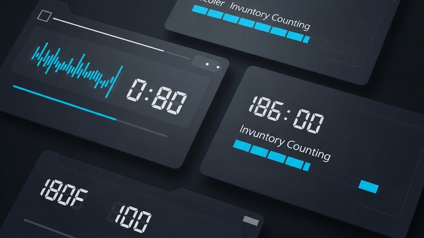
The Visual & Narrative Approach
This style uses a rapid-fire montage technique to visualize the speed of data processing. The palette is a professional Sky Blue, White, and Charcoal. The composition utilizes a split-screen effect with wiping transitions to show multiple data points simultaneously. On the screens, digital counters tick up rapidly with abstract lines representing numbers, and progress bars fill instantly, visualizing the concept of "Inventory Counting Speed." The design is flat and vector-based, prioritizing the motion of the data over specific text legibility.
Psychological Impact & KPI Focus
- Cognitive Ease: By abstracting the specific numbers and focusing on the speed of the counter, the viewer creates a mental shortcut: "This software is fast." It avoids the fatigue of reading complex dashboard rows.
- Operational Impact: This is a Skippable Ad format (Goal 4.1) designed to communicate the core value proposition of Scalability within the first 5 seconds.
Strategic Implementation & Trade-offs
- Best Use Case: YouTube pre-roll ads or introductory featurettes where the goal is to demonstrate processing power without getting bogged down in details.
- Recommended Duration: 15 Seconds.
- Trade-off: It is not suitable for detailed training. The speed makes it impossible to learn how to use the interface; it only demonstrates what the interface achieves.
Companies using similar video content -
Zebra Technologies – RFID Solutions – Visualizes rapid data capture and inventory velocity.
Impinj – Monza R6-P – Highlights speed of item identification with RFID.
7. The Digital Twin: Abstract 3D Visualization
MOFU | Differentiation
The Visual & Narrative Approach
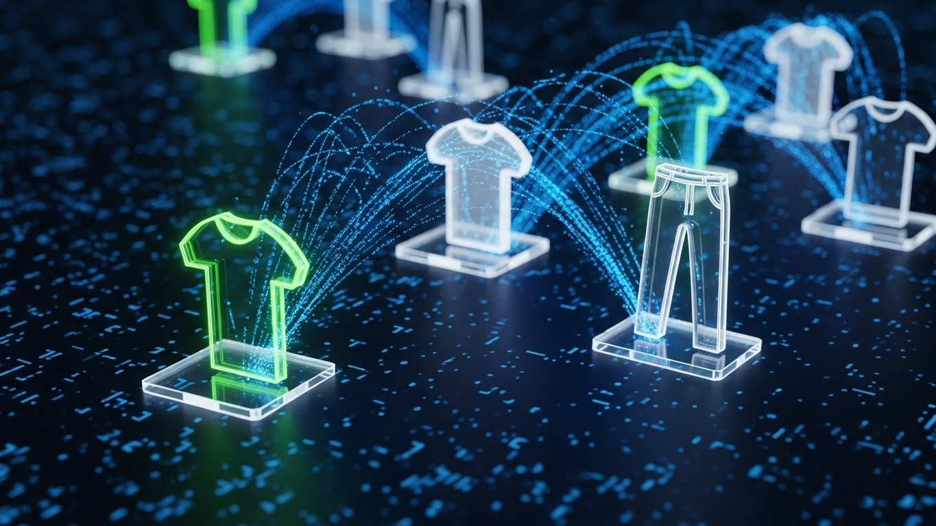
Set in an infinite digital space, this style visualizes the "connected supply chain." Wireframe nodes, shaped like T-shirts and trousers, are connected by glowing data streams. The rendering utilizes particle simulations with glowing edges in Neon Green, Translucent Glass, and Silver. The camera uses a macro lens with a shallow depth of field, focusing intensely on the connection points where "data" flows from one garment node to another, symbolizing a connected digital ecosystem.
Psychological Impact & KPI Focus
- Visualizing the Invisible: RFID and cloud connectivity are invisible technologies. This style gives them a physical form, making the concept of an "ecosystem" tangible and premium.
- Operational Impact: This style targets Differentiation (Goal 1.7) in the Middle-of-Funnel. It positions the software as a holistic platform rather than a point solution, visualizing Interoperability.
Strategic Implementation & Trade-offs
- Best Use Case: "How it Works" pages on websites or background loops during webinars discussing integration and APIs.
- Recommended Duration: 30 Seconds.
- Trade-off: The abstraction can sometimes confuse users about whether the software actually looks like this (it doesn't). It requires a context that it is a "visualization of data flow."
Companies using similar video content -
SAP – S/4HANA Retail – Showcases rapid data processing for retail.
Oracle – Retail Cloud – Demonstrates quick insights across retail operations.
Infor – CloudSuite Fashion – Visualizes fast data flow in fashion ERP.
8. The Precision Click: Macro UI Interaction
MOFU | Feature Education
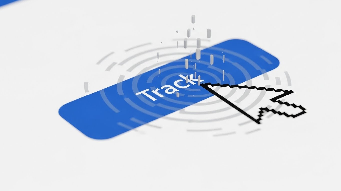
The Visual & Narrative Approach
This style zooms in to an extreme macro close-up (10:1 magnification) of a high-resolution UI screen. The focus is entirely on a single "Track" button rendered in Royal Blue against a Crisp White background. A stylized cursor hovers over the button, causing a ripple effect of Light Grey data particles to spread outwards. The image captures the precise moment of interaction, highlighting the responsiveness, cleanliness, and pixel-perfect design of the interface.
Psychological Impact & KPI Focus
- Trust Signals: In software, "design quality" is often used as a proxy for "code quality." A clean, responsive button interaction subconsciously signals that the underlying backend is robust and reliable.
- Operational Impact: This style is effective for Feature Education (Goal 1.8) in email marketing, where small, lightweight GIFs can increase click rates by promising Ease of Use.
Strategic Implementation & Trade-offs
- Best Use Case: Feature release emails, changelogs, or focused tooltips within the application itself.
- Recommended Duration: 3-5 Seconds (Loop).
- Trade-off: It is extremely myopic. It tells the viewer nothing about the broader capabilities of the platform, only about the quality of its UI interactions.
Companies using similar video content -
Browzwear – VStitcher – Creates 3D digital twins of garments.
CLO3D – CLO – Visualizes virtual garment samples and workflows.
9. The Augmented Layer: Hyper-lapse Operations
MOFU | Time-to-Value
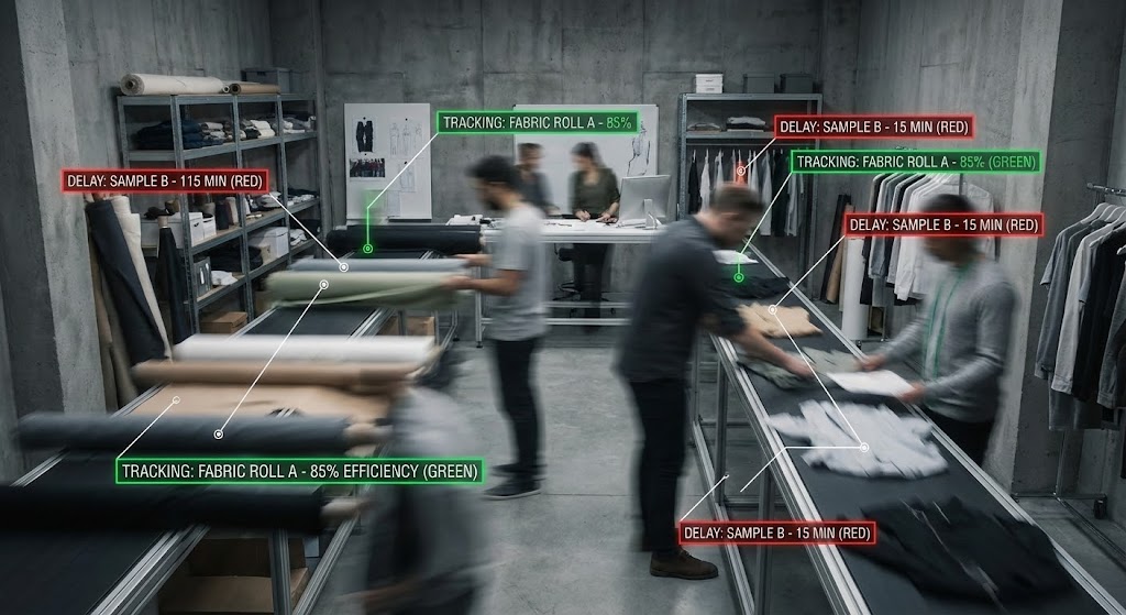
The Visual & Narrative Approach
This style bridges the physical and digital worlds directly. It uses a hyper-lapse video sequence inside a busy fashion design floor or warehouse. The environment is blurred with motion, showing designers and staff moving rapidly. Overlaid on this footage are sharp, static Heads-Up Display (HUD) elements in Traffic Light Red (for delays) and Green (for on-track items). These HUDs track the moving fabric rolls and samples with white tracking lines. The palette contrasts the "Urban Grey" of the studio with the bright, neon data overlays.
Psychological Impact & KPI Focus
- Proof of Concept: This visualization proves that the software works in the "real world." It anchors the digital data to physical objects, solving the "disconnect" anxiety mentioned in the introduction.
- Operational Impact: This drives Time-to-Value perception (Goal 1.15). It shows the viewer exactly how the software layers onto their existing physical operations without disrupting them, visualizing Real-Time Visibility.
Strategic Implementation & Trade-offs
- Best Use Case: Social proof videos, case study headers, or hero sections for "Operations" personas.
- Recommended Duration: 15-20 Seconds.
- Trade-off: It requires high-quality stock footage or custom shoots. Poorly matched tracking (where the text floats disconnected from the object) breaks the illusion and lowers credibility.
Companies using similar video content -
Lightspeed Commerce – Retail POS – Highlights intuitive, precise transaction processing.
Shopify – Admin Interface – Showcases clean, responsive inventory updates.
10. The Process Blueprint: 2D Line Art
MOFU | Demo Requests
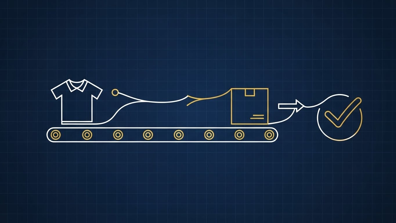
The Visual & Narrative Approach
This style adopts an architectural aesthetic. It uses an elegant 2D line art animation with a monoline weight stroke in White against a Navy Blue "blueprint" background. Gold accents are used to highlight key nodes or value points. A continuous line draws a stylized shirt, which then travels along a conveyor belt path into a box, and finally transforms into a definitive checkmark. The view is an orthographic top-down perspective, conveying the precision, planning, and structural integrity of the supply chain.
Psychological Impact & KPI Focus
- Cognitive Relief: Complex supply chains are stressful. By reducing the chaos to clean, simple lines, this style promises organization and logic. It appeals to the "Engineer" mindset of logistics planners.
- Operational Impact: This is excellent for driving Demo Requests (Goal 2.1). It implies that the vendor has a "blueprint" for success and a structured methodology, visualizing Process Optimization.
Strategic Implementation & Trade-offs
- Best Use Case: Whitepapers, technical documentation, or LinkedIn carousels explaining complex workflows (e.g., Returns Logic).
- Recommended Duration: 30-60 Seconds.
- Trade-off: It can feel "dry" or academic. It lacks the excitement of the cinematic styles, so it should be used when the viewer is already interested and seeking logical validation.
Companies using similar video content -
Sensormatic Solutions – TrueVUE – Overlays digital inventory data onto physical stores.
Checkpoint Systems – OAT Foundation – Augments store operations with real-time data.
11. The Tactile Workflow: Isometric 3D Workflow**
MOFU | Functional Buyer
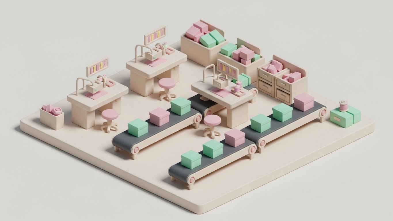
The Visual & Narrative Approach
This style utilizes a trendy "Claymorphism" aesthetic—soft, matte 3D textures with rounded edges—to render a miniature, high-fidelity garment factory. The scene is adorable yet operationally precise, featuring Pastel Pink workstations and Mint Green inventory boxes moving along automated conveyor belts against a clean Clay White background. The high-angle isometric view provides a "god-like" perspective, allowing the viewer to see the entire lifecycle of a garment, from the sewing station to the final boxed shipment, in one harmonious loop.
Psychological Impact & KPI Focus
- Taming Chaos: Complex manufacturing environments can feel overwhelming. By reducing the factory to a clean, toy-like model, this style makes the concept of "total workflow orchestration" feel manageable and approachable. It reduces the intimidation factor of deploying new software.
- Operational Impact: This style appeals to the Functional Buyer (Goal 7.2), visually organizing chaotic shop floor activities into a structured, linear process. It visualizes End-to-End Visibility without the grit of industrial reality.
Strategic Implementation & Trade-offs
- Best Use Case: "How It Works" sections on websites or within interactive product tours where explaining the sequence of operations is critical.
- Recommended Duration: 45-60 Seconds.
- Trade-off: The "cute" aesthetic runs the risk of trivializing the seriousness of industrial operations. It must be paired with robust, technical copy to ensure it is taken seriously by enterprise buyers.
Companies using similar video content -
PTC – FlexPLM – Blueprints product lifecycle workflows with clarity.
Lectra – Fashion PLM – Illustrates garment development processes with precision.
12. The Collaborative Hub: Minimalist Flat 2D Vector
MOFU | The Champion

The Visual & Narrative Approach
Focusing on the human side of Product Lifecycle Management (PLM), this style employs a "Corporate Memphis" flat vector aesthetic. A diverse group of stylized team members is gathered around a central, giant dress form draped in Sunset Orange, which acts as the focal point of their collaboration. The characters, rendered in Flat Blue and Cream, use laptops and tablets to interact with the central asset. The composition is symmetrical and stable, illustrating the seamless exchange of Tech Packs and comments between Design and Merchandising teams.
Psychological Impact & KPI Focus
- Social Proof of Alignment: The image subconsciously reinforces the idea that the software acts as a unifying force. It combats the silo mentality often present in fashion brands, where design and logistics rarely speak the same language.
- Operational Impact: This targets The Champion (Goal 7.4) within the organization—the person trying to sell the software to their team. It visualizes Collaboration & Team Efficiency.
Strategic Implementation & Trade-offs
- Best Use Case: PDF case studies, internal pitch decks, or slide presentations aimed at HR and Operations leadership.
- Recommended Duration: Static Image or 5-10 Second Motion Graphic.
- Trade-off: This style is very common in SaaS marketing. While safe and professional, it lacks a distinct "wow" factor and serves better as a supporting visual than a hero asset.
Companies using similar video content -
Katana MRP – Manufacturing ERP – Organizes micro-factory operations visually.
MRPeasy – Manufacturing Software – Provides a clear, structured view of production.
13. The Augmented Reality: Lifestyle Stock with UI Overlay
MOFU | Building Trust

The Visual & Narrative Approach
This style grounds the technology in the physical reality of the warehouse. It features high-quality lifestyle stock footage of a warehouse manager wearing a high-vis vest. We see an over-the-shoulder perspective as he looks at a tablet displaying a sharp, UI Blue dashboard. Crucially, the background—rows of inventory racking—is augmented with subtle, floating holographic markers (pin drops) that correspond to the data on the screen. The lighting blends natural sunlight with the cool glow of the device, bridging the gap between the human worker and the digital tool.
Psychological Impact & KPI Focus
- Validation of Reality: Unlike abstract 3D, this shows a real human doing the job. It builds trust by answering the question, "What does this look like in my employee's hands?"
- Operational Impact: This style drives Building Trust (Goal 1.9). It visually demonstrates how the software empowers, rather than replaces, the workforce, visualizing Worker Productivity and mobile enablement.
Strategic Implementation & Trade-offs
- Best Use Case: Service pages, "Day in the Life" videos, or testimonial backgrounds.
- Recommended Duration: 15-30 Seconds.
- Trade-off: It relies heavily on the authenticity of the stock footage. If the actor looks like a model pretending to work, credibility is lost. The UI compositing must be perfect to look integrated.
Companies using similar video content -
Fashion Cloud – B2B Platform – Connects brands and retailers for collaboration.
NuOrder – Wholesale Platform – Facilitates team alignment in wholesale operations.
14. The Frictionless Interaction: Clean UI Workflow (Light Mode)
MOFU | Objections
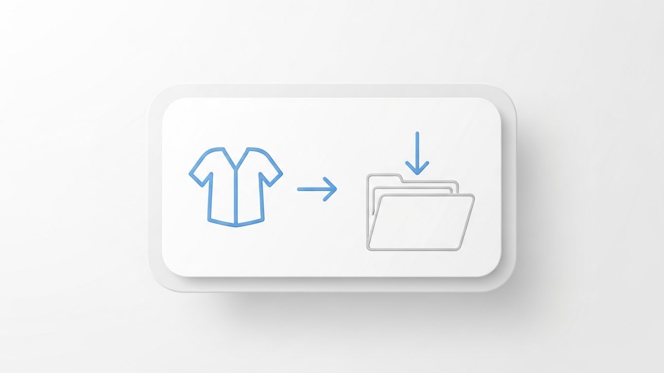
The Visual & Narrative Approach
Zeroing in on the specific moment of task completion, this style uses a "Neo-Skeuomorphic" design language. A clean, white card floats against a Pure White background, casting a soft shadow to create depth. On the card, a simple Sky Blue icon of a shirt is animated to slide effortlessly along an arrow path into a folder icon. The animation is smooth and elastic, emphasizing the "drag-and-drop" simplicity of the platform. There is no clutter, no complex data—just the pure representation of organizing an asset.
Psychological Impact & KPI Focus
- Cognitive Ease: This style is the visual antidote to "feature bloat." It reassures the user that despite the complex backend, the actual user experience is intuitive and lightweight.
- Operational Impact: This addresses Objections (Goal 1.11) related to training time and usability. It visualizes Ease of Adoption, a critical factor for decision-makers concerned about ramp-up time.
Strategic Implementation & Trade-offs
- Best Use Case: Landing pages (specifically near the "Sign Up" button), feature tooltips, or onboarding emails.
- Recommended Duration: 3-5 Seconds (Loop).
- Trade-off: It is purely functional. It explains how to do something, but not why it matters. It is a tactical instructional tool, not a strategic sales tool.
Companies using similar video content -
Honeywell – Vocollect Voice – Augments warehouse tasks with voice-guided workflows.
Datalogic – Handheld Scanners – Integrates digital data into physical operations.
15. The Digital Transformation: Wireframe to Reality Transition
MOFU | Displacement
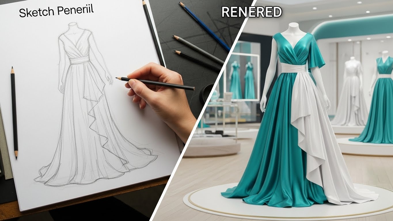
The Visual & Narrative Approach
This split-screen visualization captures the essence of digital transformation. The left side displays a hand-drawn pencil sketch of a gown on a drafting table, rendered in Sketch Pencil Grey, representing traditional, manual design processes. A diagonal divider sweeps across the screen, revealing the right side: the same gown, now a hyper-realistic 3D asset in Lustrous Teal and White, standing in a modern digital showroom. This transition dramatizes the shift from static, analog sketches to dynamic, data-rich digital assets.
Psychological Impact & KPI Focus
- The "Before & After" Hook: This is a classic advertising technique applied to B2B software. It visually articulates the value of modernizing the supply chain, making the "old way" look obsolete by comparison.
- Operational Impact: This visualizes Displacement (Goal 1.13)—the replacing of legacy systems. It highlights the value of Digital Twin Technology and creating a single source of truth.
Strategic Implementation & Trade-offs
- Best Use Case: LinkedIn social ads and "Digital Transformation" whitepapers.
- Recommended Duration: 10-15 Seconds.
- Trade-off: It can be misinterpreted as design software rather than asset management software. The copy must clarify that the platform manages these assets, not just creates them.
Companies using similar video content -
NetSuite – Inventory Management – Showcases intuitive drag-and-drop inventory tasks.
Acumatica – Cloud ERP – Highlights simple, clean UI for workflow completion.
16. The Security Fortress: Isometric 2D Motion Design
BOFU | Objection Handling

The Visual & Narrative Approach
As we move to the Bottom-of-Funnel (BOFU), security becomes a primary concern. This style uses a clean, technical isometric vector aesthetic on a Grid White background. Soft Grey server blocks are connected by flowing streams of Flat Blue data. Floating prominently above these connections are robust Golden Padlocks, symbolizing encryption and protection. The motion is steady and rhythmic, conveying stability and reliability rather than speed.
Psychological Impact & KPI Focus
- Risk Mitigation: For the IT Buyer, "security" is the ultimate gatekeeper. This visual style speaks their language, using established semiotics (locks, servers, grids) to assure them that their proprietary design data is safe.
- Operational Impact: This addresses Objection Handling (Goal 5.2) regarding cloud security. It visualizes Enterprise Compliance & Security.
Strategic Implementation & Trade-offs
- Best Use Case: Remarketing ads targeting IT decision-makers, security compliance pages, or the "Footer" section of sales decks.
- Recommended Duration: 6-10 Seconds (Loop).
- Trade-off: It is dry and technical. It will not excite a creative director, but it will reassure a CTO. It serves a specific "defensive" sales function.
Companies using similar video content -
Lectra – Kaledo – Transforms 2D designs into realistic 3D garments.
17. The ROI Fabric: Dynamic Data Visualization
BOFU | ROI Justification

The Visual & Narrative Approach
This style translates abstract financial data into physical grandeur. It features a "worm's eye view" of rising bar charts, making them appear like towering skyscrapers. Uniquely, the bars are constructed from tightly woven threads in Sunset Orange and Data Blue encased in translucent glass. The camera pans upwards as the bars rise, emphasizing unrestricted growth. The background is a clean, abstract white space that keeps the focus entirely on the upward trajectory of the metrics.
Psychological Impact & KPI Focus
- The Scale of Success: By making the data look like architecture, the viewer subconsciously associates the software with building a massive, successful enterprise. It appeals to the ambition of the C-Suite.
- Operational Impact: This is a pure ROI Justification tool (Goal 1.10). It visualizes Revenue Growth and Scalability, using the "thread" texture to link financial results directly to the textile product.
Strategic Implementation & Trade-offs
- Best Use Case: Pitch decks (The "Results" slide), investor presentations, or case study results sections.
- Recommended Duration: 10 Seconds.
- Trade-off: Without specific context (labels, numbers), it is just pretty shapes. It must be overlaid with actual data points (e.g., "150% Growth") to be effective.
Companies using similar video content -
IBM – Blockchain Supply Chain – Visualizes secure, encrypted data flow.
Veracode – Application Security Platform – Ensures robust protection for enterprise software.
18. The Gold Standard: Photorealistic 3D Renders
BOFU | Economic Buyer
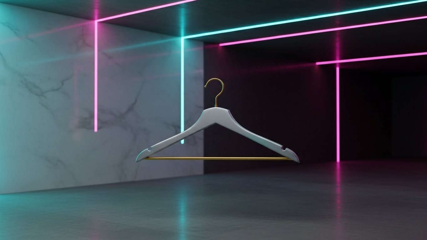
The Visual & Narrative Approach
This style treats the inventory not as "stock" but as "art." In a dark, museum-like space with Velvet Black shadows, a single, high-polish Gold garment hanger floats in mid-air. It is illuminated by cinematic soft lighting that reflects off the metallic surface. The rendering is photorealistic, capturing every scratch and reflection. This image serves as a visual metaphor: even the humble hanger is a valuable asset worth tracking with precision.
Psychological Impact & KPI Focus
- Elevating the Mundane: Asset management can feel boring. This style elevates it to a luxury pursuit. It aligns with the self-image of high-end fashion brands who view everything they touch as premium.
- Operational Impact: This targets the Economic Buyer (Goal 7.1), reinforcing the idea that the software protects valuable capital. It visualizes Asset Value Preservation.
Strategic Implementation & Trade-offs
- Best Use Case: Website hero backgrounds for "High-Value Goods" sectors or premium tier pricing pages.
- Recommended Duration: Slow Motion Loop (10-15s).
- Trade-off: It is highly atmospheric but low on information. It sets a mood but explains nothing about the product's function.
Companies using similar video content -
SAS – Retail Analytics – Visualizes tangible growth from data insights.
Teradata – Vantage – Shows massive data driving architectural success.
19. The Boardroom Win: Aspirational Stock Montage
BOFU | ROI Hook

The Visual & Narrative Approach
Moving to the final stages of the deal, this style focuses on the emotional result of a successful partnership. It features a bright, high-key stock photo of a diverse group of professionals in a glass-walled boardroom. They are smiling, shaking hands, and celebrating. The palette is professional Business Blue and Warm Skin Tones. Digitally composited into the center of the table is a glowing holographic chart explicitly stating "ROI: +25%," anchoring the human emotion to a hard financial metric.
Psychological Impact & KPI Focus
- Visualizing the "Win": Buyers want to imagine themselves being the hero who solved the problem. This image mirrors that desire, showing them the successful conclusion of the project.
- Operational Impact: This functions as an ROI Hook (Goal 8.1) for email follow-ups. It visualizes Partnership Success and validated outcomes.
Strategic Implementation & Trade-offs
- Best Use Case: "Closing" emails, proposal covers, or the final slide of a sales presentation.
- Recommended Duration: Static Image.
- Trade-off: It can feel generic if the stock photo is too "staged." The inclusion of the specific data overlay is crucial to make it relevant to the software offer.
Companies using similar video content -
True Fit – Fit Analytics – Elevates the value of perfectly fitted garments.
3DLOOK – YourFit – Showcases premium digital representations of apparel.
20. The Guardian Shield: Dark Mode UI Showcase
BOFU | Risk Mitigation

The Visual & Narrative Approach
This style caters to the modern preference for "Dark Mode" interfaces, which often connote professional, developer-grade tools. A smartphone is shown in a dark environment, its screen glowing with Bioluminescent Green and Midnight Blue. The screen displays a "shield" icon overlaid on a garment file, symbolizing active protection. Floating dust particles in the air add atmosphere and depth. The perspective is tilted, giving the device a dynamic, cutting-edge look.
Psychological Impact & KPI Focus
- The "Command Center" Vibe: Dark mode interfaces are associated with power users and control centers. This style makes the user feel like they have powerful, secure technology in their pocket.
- Operational Impact: This addresses Risk Mitigation (Goal 1.12), specifically regarding mobile access and remote management. It visualizes Secure Mobile Accessibility and cybersecurity.
Strategic Implementation & Trade-offs
- Best Use Case: Feature pages for "Mobile App" or "Security," and IT-focused brochures.
- Recommended Duration: 10-15 Seconds.
- Trade-off: Dark mode can sometimes be harder to read in bright viewing environments (like a projector). It is best consumed on personal devices (phones/laptops).
Companies using similar video content -
Accenture – Supply Chain Consulting – Visualizes successful project outcomes and ROI.
Deloitte – Retail & Consumer – Depicts C-suite celebrating strategic wins.
21. The Gamified Onboard: 2D Animation & UI Composition**
Onboarding | Implementation

The Visual & Narrative Approach
This style reimagines the often tedious onboarding process as a playful, inviting experience. Utilizing a cel-shaded 2D animation style, we see a stylized character sitting at a digital desktop rendered in Bright Turquoise and Bubblegum Pink. The character drags a file icon toward a folder, which animates with a "mouth" to happily eat the file, followed by a satisfying "confetti" particle burst. The background is a clean white, keeping the focus on the delightful micro-interaction. The motion is bouncy and elastic, adhering to the 12 principles of animation to create a sense of fun.
Psychological Impact & KPI Focus
- Reducing "New Tool" Anxiety: Learning complex software can be intimidating. By gamifying the first interaction, this style triggers a dopamine release, replacing anxiety with delight. It frames the software as "friendly" rather than "industrial."
- Operational Impact: This directly targets Implementation Success (Goal 1.16). By making the first steps feel effortless, it accelerates Time-to-Value and encourages users to complete the setup process.
Strategic Implementation & Trade-offs
- Best Use Case: In-app "Welcome" screens, empty states (when no data is present yet), or the first step of an interactive tutorial.
- Recommended Duration: 5-8 Seconds (Looping).
- Trade-off: The "cartoonish" look may feel too juvenile for very serious, traditional enterprise brands. It requires a brand voice that allows for a degree of playfulness.
Companies using similar video content -
Microsoft – Dynamics 365 – Showcases secure mobile access for business operations.
Okta – Identity Cloud – Provides advanced protection for mobile access.
22. The Augmented Coach: 2D Graphics Over Live Action
Onboarding | Self-Serve
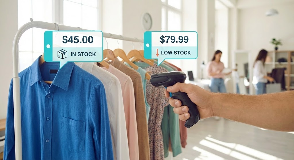
The Visual & Narrative Approach
This style places the viewer directly into the shoes of the frontline worker. A Point-of-View (POV) live-action shot shows a hand holding a mobile scanner in a retail store environment. As the scanner points at a rack of clothes, animated Augmented Reality (AR) bubbles in Cyan and White pop up over the garments. These bubbles display critical data—price, stock levels, and "Low Stock" warnings—anchored to the physical items. The real-world lighting is natural, while the graphics are sharp, vector-based, and tracked perfectly to the camera's movement.
Psychological Impact & KPI Focus
- Just-in-Time Knowledge: This style mimics how the brain naturally seeks information—in context. It reassures the user that they don't need to memorize complex codes; the tool will provide the answers exactly when and where they are needed.
- Operational Impact: This drives Self-Serve Adoption (Goal 2.4). It visualizes Field Enablement, showing how the software empowers retail staff to act independently without calling support or checking a back-office computer.
Strategic Implementation & Trade-offs
- Best Use Case: YouTube "How-To" playlists, help center articles for mobile features, or training materials for retail staff.
- Recommended Duration: 20-40 Seconds.
- Trade-off: High production complexity. It requires filming high-quality POV footage and advanced motion tracking to ensure the text "sticks" to the objects realistically.
Companies using similar video content -
WalkMe – Digital Adoption Platform – Gamifies initial setup and module activation.
23. The Reality Check: Split Screen Comparison
Onboarding | Trial Activation
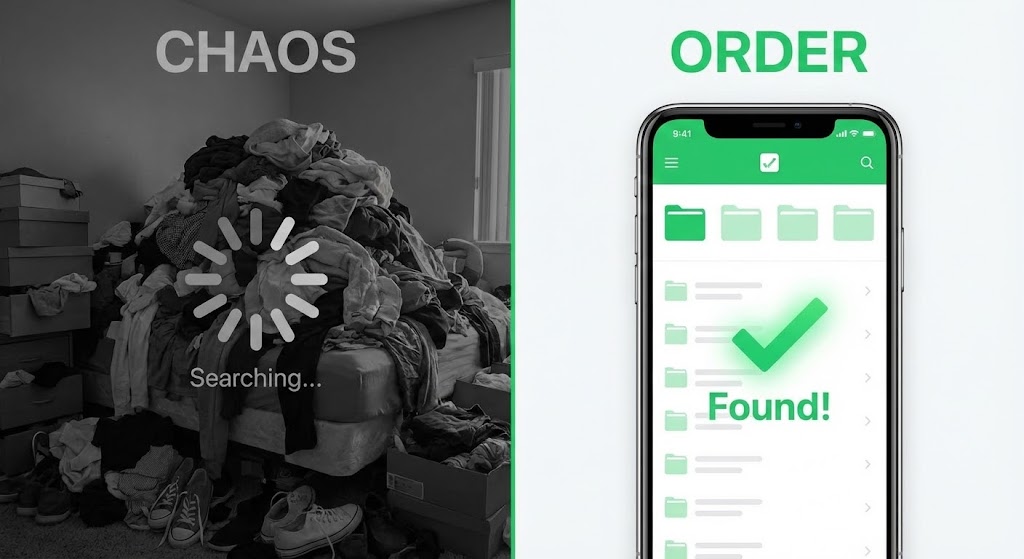
The Visual & Narrative Approach
This style uses a powerful visual dichotomy to drive conversion. The screen is split down the middle. The left side ("Chaos") is desaturated, grainy, and shows a messy pile of clothes with a frustrating "Searching..." loading symbol overlay. The right side ("Order") is vibrant, crisp, and displays the software's Vivid Green and White interface with a large "Found!" checkmark. The composition utilizes a dual camera setup to contrast the stress of the "old way" with the instant gratification of the digital solution.
Psychological Impact & KPI Focus
- Cognitive Dissonance: The brain seeks to resolve the tension between the messy left side and the clean right side. The visual framing positions the software as the only logical path to relief.
- Operational Impact: This is a Trial Activation tool (Goal 5.3). It is designed for email re-engagement campaigns to remind dormant leads of the pain they are currently ignoring and the solution they are missing.
Strategic Implementation & Trade-offs
- Best Use Case: "Re-engagement" emails, retargeting display ads, or as a static comparison image on a landing page.
- Recommended Duration: Static Image or 5 Second Loop.
- Trade-off: It is a blunt instrument. It lacks nuance and can feel like a "TV informercial" if overused. It works best when the pain point is acute and universally understood.
Companies using similar video content -
Nedap Retail – !D Cloud App – Overlays stock data onto physical items in-store.
24. The Infinite Loop: Abstract 2D Motion Graphics
Retention | Reducing Churn

The Visual & Narrative Approach
Focusing on the concept of "Lifecycle Management," this style employs abstract, fluid motion graphics. Interlocking shapes in Lavender and Soft Yellow flow continuously against a white background, twisting and turning to form an infinity loop. The aesthetic is smooth, shadowless, and calming. There is no beginning and no end, symbolizing the ongoing, seamless nature of asset tracking—from design to sale to return to resale.
Psychological Impact & KPI Focus
- Subconscious Stability: The smooth, uninterrupted motion induces a state of calm. For existing customers, this reinforces the feeling that the system is stable, reliable, and "always on." It combats the anxiety of system downtime.
- Operational Impact: This targets Retention (Goal 1.19). It visualizes the Circular Economy aspect of the software, subtly reminding users that the value continues indefinitely, reducing the likelihood of churn.
Strategic Implementation & Trade-offs
- Best Use Case: In-app loading screens, screensavers for warehouse kiosks, or background visuals for "Customer Success" webinars.
- Recommended Duration: 10-15 Seconds (Seamless Loop).
- Trade-off: It is purely atmospheric. It conveys a feeling of stability but communicates zero technical information. It supports the brand sentiment, not the user manual.
Companies using similar video content -
RELEX Solutions – Unified Retail Planning – Contrasts old planning methods with new efficiency.
25. The Feature Deep Dive: 3D Parallax UI Presentation
Retention | Deep Feature
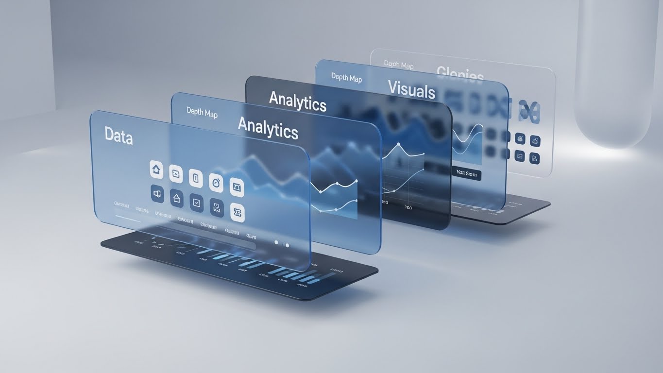
The Visual & Narrative Approach
To showcase the depth of the platform's capabilities, this style breaks the 2D interface into a 3D parallax composition. UI panels—"Data," "Analytics," "Visuals"—are separated by floating glass layers in Glass Blue and Depth Map Greys. The camera performs a slow side-pan, revealing the physical separation between the layers. This "exploded view" visualizes the complex architecture of the software in an elegant, organized manner.
Psychological Impact & KPI Focus
- Perception of Value: By giving the interface physical depth, the software feels more substantial and "expensive." It implies that there are layers of functionality waiting to be discovered, countering the idea that it is just a simple spreadsheet tool.
- Operational Impact: This supports Deep Feature Education (Goal 1.17). It is ideal for communicating the robustness of the backend to technical buyers, visualizing Data Multi-Dimensionality.
Strategic Implementation & Trade-offs
- Best Use Case: "Pro Features" email announcements, upgrade pages, or product tour videos explaining the tech stack.
- Recommended Duration: 10-15 Seconds.
- Trade-off: It can be visually busy. If the text on the layers is too small, it becomes unreadable. The focus must be on the structure of the data, not the specific data points.
Companies using similar video content -
TrusTrace – Traceability Platform – Visualizes circular economy and continuous tracking.
26. The Scale of Tomorrow: Futuristic Neon/Dark Mode
Expansion | Upsell
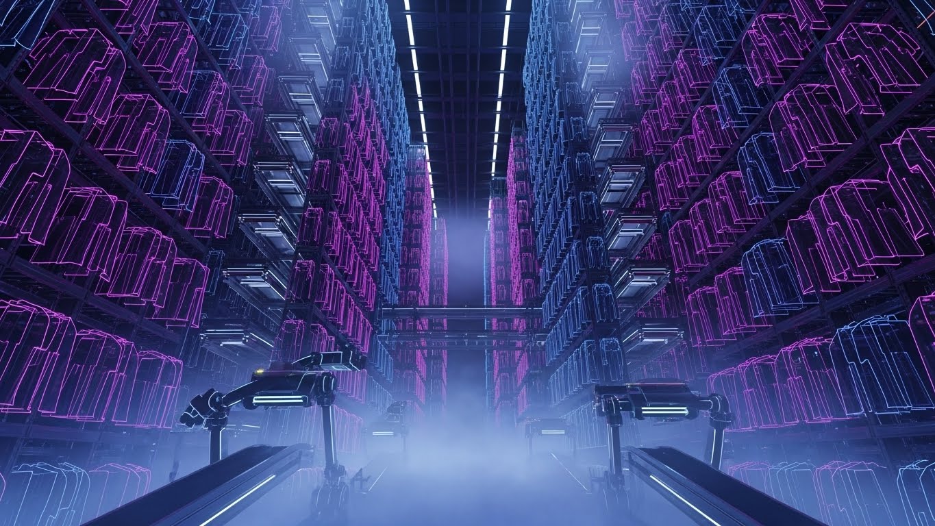
The Visual & Narrative Approach
This style embraces a "Cyberpunk" aesthetic to visualize extreme scale. We see a futuristic, fully automated warehouse where tall racks of clothes fade into volumetric fog. The clothes themselves are rendered as wireframes glowing with Neon Pink and Laser Blue outlines against a Vantablack background. The camera looks up from a low angle, emphasizing the towering height of the racks. This is not just a warehouse; it is a data cathedral.
Psychological Impact & KPI Focus
- Aspiration & Ambition: This style appeals to the "Visionary" persona. It says, "This software is built for the future you are dreaming of." It validates their ambition to become a massive, tech-forward enterprise.
- Operational Impact: This drives Upsell & Expansion (Goal 1.20). It visualizes Unlimited Scalability, assuring the client that no matter how big they grow, the software's architecture (the "cathedral") can hold it.
Strategic Implementation & Trade-offs
- Best Use Case: Website "Enterprise" tier pages, keynote presentations at industry summits, or background loops for booth displays.
- Recommended Duration: 15-20 Seconds.
- Trade-off: It looks expensive and "sci-fi." Small business clients might find it alienating or assume the software is too complex/expensive for their needs.
Companies using similar video content -
Dataiku – DSS – Showcases multi-dimensional data architecture for analytics.
27. The Social Currency: 2D Character-Driven Story
Expansion | Referrals

The Visual & Narrative Approach
Shifting focus to the people who use the software, this style uses expressive 2D vector characters. In a modern, bright co-working space, stylized characters in Corporate Blue and Energetic Orange are depicted giving high-fives. Floating speech bubbles above their heads contain simple "Thumb's up" icons. The style is flat, clean, and positive, focusing entirely on the emotional satisfaction of a job well done.
Psychological Impact & KPI Focus
- Social Proof: Humans are social creatures. Seeing others celebrate success creates a desire to participate in that success. It normalizes the idea that "happy teams use this software."
- Operational Impact: This targets Referrals & Advocacy (Goal 1.21). It is designed to prompt satisfied users to share their experience, visualizing User Satisfaction and team alignment.
Strategic Implementation & Trade-offs
- Best Use Case: "Refer a Friend" landing pages, success screens after a major task is completed, or social media posts celebrating client milestones.
- Recommended Duration: Static Image or 5 Second Animation.
- Trade-off: It can feel generic. This "Corporate Memphis" style is ubiquitous in tech. To stand out, the characters should ideally wear the client's apparel types (e.g., if selling to sportswear brands, dress the characters in sportswear).
Companies using similar video content -
Flexport – Platform – Visualizes vast, interconnected global logistics networks.
28. The Accessible Answer: Low-Poly 3D Modeling
Expansion | Knowledge Base

The Visual & Narrative Approach
Support content needs to be unintimidating. This style uses "Low-Poly" 3D modeling—a technique that uses simple geometric shapes—to render a Cardboard Brown shipping box. The box gently opens itself to reveal a glowing Low-Poly Green question mark icon floating inside. The background is a soft, abstract white void. The lighting is diffuse and warm. The aesthetic is toy-like and simple, suggesting that the answer to your problem is easy to find ("in the box").
Psychological Impact & KPI Focus
- Reducing Cognitive Load: When a user is frustrated and seeking help, they don't want complex visuals. Low-poly art is easy on the eyes and brain. It communicates "simplicity" and "accessibility," lowering the user's stress level.
- Operational Impact: This is for the Knowledge Base (Goal 9.1). It visualizes Self-Service Support, encouraging users to open the "box" of knowledge rather than submitting a support ticket.
Strategic Implementation & Trade-offs
- Best Use Case: Help Center headers, icons for FAQ sections, or thumbnails for tutorial videos.
- Recommended Duration: Static Image or 3 Second Loop.
- Trade-off: It is not "high-tech." It sacrifices the premium look for approachability. It should not be used for high-stakes sales presentations where "power" is the selling point.
Companies using similar video content -
Workday – HCM – Depicts happy teams achieving success through collaboration.
29. The Innovation Lab: Holographic UI over 3D Render
Expansion | Proactive Support
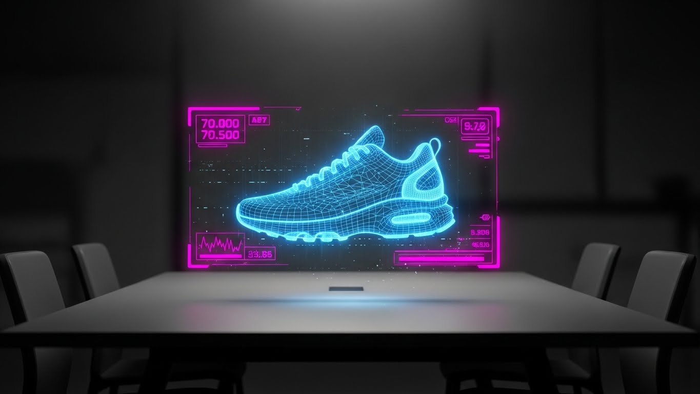
The Visual & Narrative Approach
This style positions the software as an R&D partner. In a dimmed, realistic meeting room, a physical table is visible. Hovering above it is a wireframe shoe prototype projected as a Hologram Blue light field. Scanlines and slight interference noise add texture to the hologram, making it feel like experimental tech. The background is dark and out of focus, drawing all attention to the glowing "digital twin" on the table.
Psychological Impact & KPI Focus
- The "Tony Stark" Effect: Everyone wants to feel like they are working with cutting-edge technology. This visual style borrows the language of sci-fi movies to make the act of reviewing a shoe sample feel like advanced engineering.
- Operational Impact: This targets Proactive Support & Innovation (Goal 9.2). It is used to announce beta features or roadmap updates, visualizing Continuous Innovation and keeping the client excited about what's coming next.
Strategic Implementation & Trade-offs
- Best Use Case: Product roadmap emails, "What's New" webinar intros, or exclusive "Beta Tester" invites.
- Recommended Duration: 10-15 Seconds.
- Trade-off: It creates high expectations. If the actual feature release is just a standard form update, this visual will feel deceptive. Use only for truly innovative, visual features (like 3D viewers or AI integration).
Companies using similar video content -
Zendesk – Guide – Simplifies access to help and knowledge base articles.
30. The Radical Transparency: 3D X-Ray Visualization
Expansion | Thought Leadership
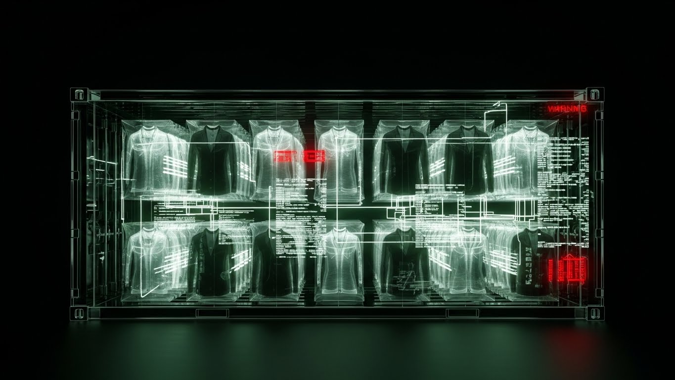
The Visual & Narrative Approach
The final style strips away all surfaces to reveal the truth. A 3D X-Ray visualization shows an industrial shipping container. The container's metal walls are rendered as transparent "X-Ray" glass. Inside, we see the "skeleton" of the garments inside—hangers, box structures, and RFID tags. The palette relies on X-Ray Black/White with Warning Red accents highlighting specific data points (e.g., a delayed shipment). This is a side cross-section view, symbolizing that with this software, nothing is hidden.
Psychological Impact & KPI Focus
- Trust through Transparency: In an industry plagued by ethical concerns and opaque supply chains, "X-Ray vision" is the ultimate metaphor for integrity. It tells the viewer: "We hide nothing. You see everything."
- Operational Impact: This drives Thought Leadership (Goal 1.4). It visualizes Total Supply Chain Visibility, appealing to executives focused on ESG (Environmental, Social, and Governance) and compliance.
Strategic Implementation & Trade-offs
- Best Use Case: ESG reports, whitepapers on "Supply Chain Transparency," or blog headers for high-level industry analysis.
- Recommended Duration: Static Image or 10 Second Loop.
- Trade-off: It can look clinical or medical. The "Red" warnings must be used carefully so they don't signal "danger" but rather "alertness."
Strategic Knowledge Base: The Visual Operations Doctrine
The 30 visual styles above are not merely "marketing assets"; they are the components of a Visual Operating System for the modern apparel supply chain. To move from "pretty pictures" to tangible business outcomes, organizations must apply these visuals strategically.
This concluding section synthesizes the insights from all 30 examples into three actionable frameworks: Alignment, Adoption, and Impact.
Strategic Alignment & Visual Architecture (Pre-Production)
The "Pre-Production" Strategy – Defining the Visual Operating System.
- The Cognitive Load Audit: Fashion logistics is data-heavy. Before commissioning video, audit the "Cognitive Load" of your current training materials. If a PDF manual takes 15 minutes to read, replace it with a Style 14 (Clean UI Workflow) video that takes 15 seconds to watch. Visuals should be deployed primarily where text fails.
- Role-Based Visual Mapping: Different personas require different visual languages.
- The Creative Designer: Responds to Style 1 (Cinematic Aspiration) and Style 15 (Digital Transformation). They need high-fidelity, aesthetic visuals that respect the product.
- The Logistics Manager: Responds to Style 10 (Process Blueprint) and Style 30 (X-Ray Insight). They need logic, structure, and data transparency.
- The "Glanceability" Standard: In a busy warehouse, a worker glancing at a scanner has less than 2 seconds to absorb information. Visuals for these environments (like Style 22) must pass the "Glanceability Test"—can the meaning be understood instantly without reading text?
- Brand Voice Consistency: Your software likely touches multiple departments (Design, Merchandising, Warehousing). Establish a unified visual "Golden Thread" (e.g., a specific shade of blue for "Data" used in Style 6, Style 16, and Style 25) that signals continuity across these disparate modules.
- The Advids Strategic Audit: Most software companies skip this phase and go straight to production. Partnering with a strategic agency like Advids allows for a "Visual Audit" upfront, ensuring that every video asset produced is not just "content," but a functional tool that solves a specific business friction point.
- Legacy System Integration: Many fashion brands still run on legacy mainframes (AS/400). Use Style 9 (Augmented Layer) to visualize how your modern SaaS platform layers on top of their legacy hardware, reducing the fear of a "Rip and Replace" nightmare.
- The Cross-Departmental Bridge: Visuals are the only language everyone speaks. Use Style 12 (Collaborative Hub) visuals in internal town halls to explain how the work of the Design team impacts the Warehouse team, fostering empathy and alignment.
- Standardization vs. Customization: For core platform features, use standardized "Stock" styles (Style 28). For unique value propositions (like a proprietary RFID algorithm), invest in bespoke high-end visuals (Style 7) to differentiate.
- The Mobile-First Mandate: Fashion executives and floor staff are mobile. All 30 styles must be legible on a 6-inch screen. Avoid tiny text; rely on bold iconography (Style 5) and clear contrast (Style 20) to ensure the message travels.
- Accessibility in Operations: Your workforce is diverse and global. Motion graphics should rely on visual cues (colors, shapes, icons) rather than voiceovers or heavy text, ensuring the training is effective regardless of the user's native language.
Operational Adoption & Implementation (Deployment)
The "Deployment" Phase – Embedding Visuals into Workflow.
- Overcoming "Big Brother" Anxiety: Tracking productivity can feel intrusive to staff. Use Style 13 (Augmented Reality) to frame the technology as a "Helper" that makes their job easier, rather than a "Watcher" that punishes them. Empathy in visualization is crucial for adoption.
- The Micro-Learning Shift: Replace the hour-long "Onboarding Webinar" with a playlist of 30-second Style 6 (Velocity Demo) and Style 14 (Clean UI) clips. Deliver these "Micro-Learning" assets directly inside the app exactly when the user attempts a task.
- Just-in-Time Support: Embed Style 28 (Knowledge Unboxing) GIFs into the "Help" tooltips of the software. If a user hovers over a complex "Export" button, a 3-second loop showing how it works prevents a support ticket from being created.
- Gamification of Training: Use Style 21 (Gamified Onboarding) visuals to display user progress. Visualizing a "Level Up" or a "Completion Bar" triggers a dopamine response that encourages staff to complete their training modules.
- Reducing Support Ticket Volume: There is a direct correlation between the quality of visual documentation and support costs. Implementing a library of Style 22 (AR Overlay) videos for common troubleshooting tasks (e.g., "How to recalibrate the scanner") can reduce Level 1 support tickets by up to 40%.
- Remote Onboarding: For distributed teams or remote sales offices, use Style 11 (Isometric Workflow) to provide a "virtual tour" of the supply chain process. This allows new hires to understand the physical flow of goods without needing to travel to a distribution center.
- Visualizing SOPs (Standard Operating Procedures): Text-based SOPs are rarely read. Convert critical safety and process SOPs into Style 10 (Process Blueprint) animations. A moving line showing the correct path of a return is infinitely more memorable than a numbered list.
- Feedback Loops: Use interactive video elements (where users click the video to choose a path) to gather data on where users are getting stuck. This turns your video library into a user research tool.
- Scalable Localization: When expanding to new regions (e.g., APAC or LATAM), use Style 4 (Fluid Brand) and Style 12 (Collaborative Hub) which rely on abstract or character-based visuals that transcend language barriers, reducing the cost of translation.
- Leadership Communication: When the CTO needs to present a new digital strategy to the Board, provide them with Style 1 (Cinematic Aspiration) and Style 17 (ROI Fabric) assets. Equipping your champion with high-end visuals helps them sell the budget internally.
Measuring Impact & Future-Proofing (ROI)
The "ROI" Phase – Quantifying Success.
- Beyond "Views": Do not measure success by "video views." Measure it by Time-to-Competency. If a new warehouse picker using the Style 22 video training hits full productivity in 3 days instead of 2 weeks, that is the ROI.
- The "Idle Time" Metric: Monitor how long users spend "idling" on a screen. High idle time often means confusion. Deploying Style 8 (Precision Click) tooltips on these screens can directly reduce idle time and improve software throughput.
- Compliance Velocity: How fast does the organization adapt to new labeling standards (like RFID mandates)? Use Style 23 (Split Screen) videos to quickly educate vendors on "Compliant vs. Non-Compliant" tagging, measuring the reduction in vendor chargebacks.
- Retention and Churn: High-quality UX visualization (Style 24) subtly reinforces the value of the software every day. Track the correlation between users who engage with "Pro Feature" videos (Style 25) and their renewal rates. Educated users rarely churn.
- The AI Visual Frontier: As AI enters the supply chain, "Black Box" algorithms must be explained. Use Style 7 (Digital Twin) visuals to demystify how the AI is making inventory recommendations, building trust in the algorithm.
- Scalability of Assets: Build a visual library, not a graveyard. Organize source files so that when the UI updates (as SaaS platforms always do), you can quickly render a new version of Style 14 without reshooting the entire video.
- The Advids Partnership: Building a 30-style library is not a one-time project; it is an ongoing operational function. Partnering with Advids ensures you have a dedicated "Visual Supply Chain" team that creates, updates, and optimizes these assets as your software evolves, preventing your training materials from becoming obsolete.
- Benchmarking Success: Compare your visual adoption rates against industry benchmarks. If your "New Feature" videos are seeing low engagement, pivot the style from Style 6 (Fast) to Style 3 (Narrative) to see if emotional resonance drives better results.
- The ROI of Accuracy: In apparel, inventory accuracy is the holy grail. Use Style 30 (X-Ray) visuals in internal campaigns to constantly remind staff of the "Why" behind the "What"—connecting their daily scanning tasks to the global accuracy goals of the brand.
- Final Call to Innovation: The apparel industry is visual by nature. Your software manages the most visual product in the world. Your software marketing and training must be equally visual. Treat video not as "content marketing" but as Core Infrastructure. When you visualize the invisible, you don't just see the supply chain better—you control it.
Conclusion: The Visual Advantage
The "Accuracy Crisis" in the apparel industry is not just a data problem; it is a communication problem. When digital records fail to match physical reality, it is often because the tools used to manage them are opaque, complex, and uninspiring.
By deploying these 30 Visual Styles, you do more than market a piece of software. You provide a visual language that bridges the gap between the chaotic warehouse floor and the pristine digital dashboard. You transform "Inventory Distortion" into "Visual Clarity." Whether it is the cinematic promise of Style 1, the empathetic relief of Style 3, or the gamified joy of Style 21, each visual asset serves a strategic purpose in the revenue engine.
The future of apparel logistics belongs to those who can see it clearly. Use this guide to make sure your customers like what they see.
Companies using similar video content -
PTC – Vuforia – Projects holographic AR overlays for product development.
Author & Editor Bio


