
Introduction: Stitching the Physical-Digital Divide
The global apparel industry stands on the precipice of a significant transformation. While fashion has always been about the tangible allure of fabric and cut, the operational backbone ensuring those garments reach the customer is increasingly digital. For apparel retailers and inventory managers, the challenge is no longer just predicting the next trend; it is mastering the complex web of data that underpins modern commerce. We are seeing a shift where the "invisible" logistics of billing, inventory synchronization, and omnichannel management are becoming as visible and vital as the storefront itself.
This shift presents a profound opportunity. However, the cost of adhering to the status quo is staggering. In 2024, inventory distortion—encompassing out-of-stocks and overstocks—was projected to cost the retail industry an estimated $1.77 trillion globally. This figure represents not just lost revenue, but a chaotic disconnect between physical stock and digital records. Yet, for those who successfully bridge this gap, the rewards are immense. Retailers who master omnichannel strategies see 494% higher order rates compared to single-channel campaigns.
The bridge between this costly chaos and profitable clarity is often a matter of perception. Complex software solutions can feel overwhelming to potential adopters. This is where strategic visualization becomes your most powerful Go-To-Market asset. By visualizing the seamless flow of data—from the factory floor to the Point of Sale (POS)—you reduce the cognitive load for decision-makers, replacing anxiety with confidence. This guide explores 30 distinct video styles designed to articulate the value of your apparel billing software, proving that your solution is the thread that ties the entire operation together.
1. Minimalist Flat 2D Vector
TOFU | Brand Awareness

The Visual & Narrative Approach
The video opens on a pristine white canvas. Abstract, glossy waves of Vivid Coral and Electric Blue liquid flow onto the screen, moving with the heavy, luxurious drape of silk fabric. As these organic shapes flow across the center, they seamlessly morph and crystallize into rigid digital network nodes and structured data points. The transition is smooth and continuous, visualizing the journey from raw textile material into organized business intelligence without a single cut. The tone is sophisticated, fluid, and precise.
Psychological Impact & KPI Focus
- Niche Psychology: This style directly addresses the "Order from Chaos" desire of the target persona. By visually converting the organic, unpredictable nature of fashion (liquid fabric) into the stable, predictable structure of data (nodes), it reassures the viewer that the software can tame their complex supply chain.
- Operational Impact: It visually bridges the physical/digital divide, reinforcing the concept of Digital Twin technology where every physical garment has an accurate digital counterpart.
Strategic Implementation & Trade-offs
- Best For: TOFU Brand Awareness (Instagram/Facebook Feed) where the goal is to stop the scroll with aesthetic beauty and a high-level concept.
- Trade-off: While visually arresting, this style is abstract. It establishes a feeling of sophistication but does not explain how the software works. It should be paired with more direct educational content later in the funnel.
Companies using similar video content -
Finale Inventory – Apparel Inventory Management – Cloud-based WMS for omnichannel brands, streamlining data.
Fulfil – AI-native ERP – Real-time visibility across inventory, orders, and finances.
WFX ERP – Cloud-based ERP – Fully connected system for apparel production lifecycle.
2. Bold Kinetic Typography (Visual)
TOFU | Market Education
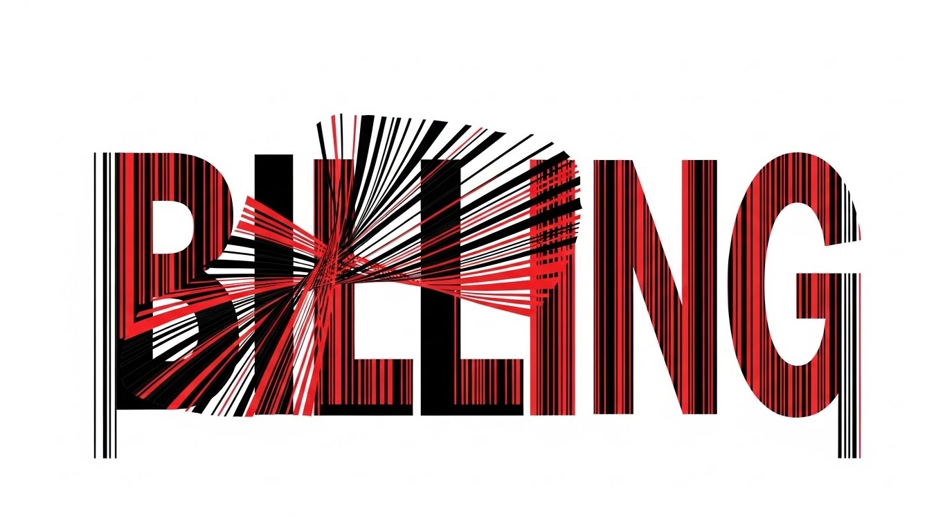
The Visual & Narrative Approach
The screen is dominated by massive, heavy block shapes in High-Contrast Black and Red. They initially form an abstract representation of the word "BILLING," but the structure is unstable. Rapidly, with aggressive energy, the blocks twist and shatter, reassembling themselves into precise vertical barcode lines. These lines then lock together like puzzle pieces, symbolizing the instant organization of chaotic retail data into a streamlined scanning process. The tone is energetic, urgent, and authoritative.
Psychological Impact & KPI Focus
- Niche Psychology: This style taps into the "Speed and Efficiency" motivation. The aggressive motion mirrors the high-paced environment of a retail checkout counter during a sale, promising that the software is robust enough to handle high volume without crashing.
- Operational Impact: It highlights the core function of the POS system—speed. By abstracting the barcode, it reinforces the technology's role in reducing Checkout Friction and queue times.
Strategic Implementation & Trade-offs
- Best For: Market Education on mobile devices (YouTube Shorts) where sound might be off; the visual intensity carries the message.
- Trade-off: The high-contrast, aggressive aesthetic might be too intense for boutique or luxury software positionings. It works best for high-volume, mass-market retail solutions.
Companies using similar video content -
Lightspeed Retail – POS and Payments – Cloud-based system for fast sales and inventory.
Loyverse – POS Software – Convenient sales, quick barcode scanning, real-time analytics.
Er4u Boutique Management Software – Streamlines invoicing and barcode scanning for faster operations.
3. Generative AI Cinematic Video
TOFU | Vertical Social Organic
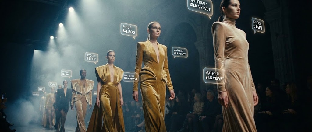
The Visual & Narrative Approach
A slow-motion, low-angle shot captures a high-fashion runway show. Models stride confidently in avant-garde Gold and Champagne velvet outfits. As they pass the camera, augmented reality (AR) price tags, fabric composition details, and live inventory bubbles pop up in the air around them. The lighting is dramatic, with spotlights cutting through atmospheric haze, highlighting both the rich texture of the velvet and the glowing sharpness of the digital data. The tone is aspirational, futuristic, and premium.
Psychological Impact & KPI Focus
- Niche Psychology: This appeals to the "Visionary" aspect of the persona—the desire to be at the cutting edge of Fashion Tech. It connects the glamour of the front-end product with the intelligence of back-end operations.
- Operational Impact: It visualizes the End-to-End Visibility promise, showing that data (price, stock, material) travels with the garment from the runway to the rack.
Strategic Implementation & Trade-offs
- Best For: Social Organic channels (TikTok/Reels). It positions the brand as a leader in AI and future retail trends, driving high engagement and shares.
- Trade-off: The production quality sets a high bar; if the actual software UI is dated, this creates a "expectation gap" that can lead to disappointment.
Companies using similar video content -
StyleMatrix – AI-powered Inventory Management – Leverages AI for real-time insights and predictive analytics.
Heuritech – Trend Forecasting Platform – Uses AI and computer vision for emerging fashion trends.
4. Abstract 2D Motion Graphics
TOFU | Skippable Pre-Roll Ad

The Visual & Narrative Approach
A rhythmic, Bauhaus-inspired geometric composition fills the screen. Squares (boxes) and circles (garments) in Teal, Lime Green, and Slate Grey move along a stylized conveyor belt line. The movement is perfectly synchronized to a beat. As they move, the shapes snap into a rigid grid formation, visualizing the concept of SKUs falling into place within a warehouse slotting system. The tone is orderly, rhythmic, and efficient.
Psychological Impact & KPI Focus
- Niche Psychology: This style soothes the anxiety of "Logistical Chaos." The satisfying "snap" of shapes into the grid triggers a sense of resolution and control, which is the primary emotional benefit of good inventory management software.
- Operational Impact: It metaphorically explains Automated Sorting and Slotting Optimization without needing complex footage of a real warehouse, making the concept accessible.
Strategic Implementation & Trade-offs
- Best For: Skippable Pre-Roll Ads (YouTube). The visual hook (the movement) starts instantly, communicating the value proposition (organization) without needing audio.
- Trade-off: It is abstract, so it requires a strong voiceover or text overlay to connect the "shapes" to actual "apparel inventory" for the viewer to fully grasp the relevance.
Companies using similar video content -
Prodsmart – Production Management – Automates reporting and streamlines shipping for apparel manufacturers.
Aptean Apparel ERP – Apparel ERP – Manages production, inventory, and supply chain operations.
5. Abstract 3D AI Visualization
TOFU | Shaping Brand Perception

The Visual & Narrative Approach
A wide-angle camera flies through a digital void illuminated by Deep Purple and Neon Pink data streams. Glowing nodes act as anchors, connecting floating racks of clothing in a complex, 3D web. These connections pulse with light, visualizing data packets traveling instantly from a "Warehouse Node" to a "Retail Store Node." The particle effects give the scene a high-tech, living quality. The tone is high-tech, expansive, and connected.
Psychological Impact & KPI Focus
- Niche Psychology: This targets the fear of "Data Silos." By showing a fully interconnected web where every node talks to the other, it promises a unified ecosystem, alleviating the stress of disjointed systems.
- Operational Impact: It perfectly illustrates Omnichannel Synchronization. The visual of light traveling between nodes represents real-time inventory updates, crucial for preventing stockouts.
Strategic Implementation & Trade-offs
- Best For: Account-Based Marketing (ABM) on LinkedIn targeting CTOs who need to see the "Architecture" of the solution. It signals enterprise-grade capability.
- Trade-off: Can appear too "Sci-Fi" for smaller boutique owners who prefer to see the actual simple dashboard they will use daily.
Companies using similar video content -
Logic ERP – Apparel ERP Software – Comprehensive modules including Omni-Channel Retail.
Gofrugal – Boutique Management Software – Go omnichannel, integrating POS with online platforms.
6. Low-Poly 3D Modeling
TOFU | ABM Awareness
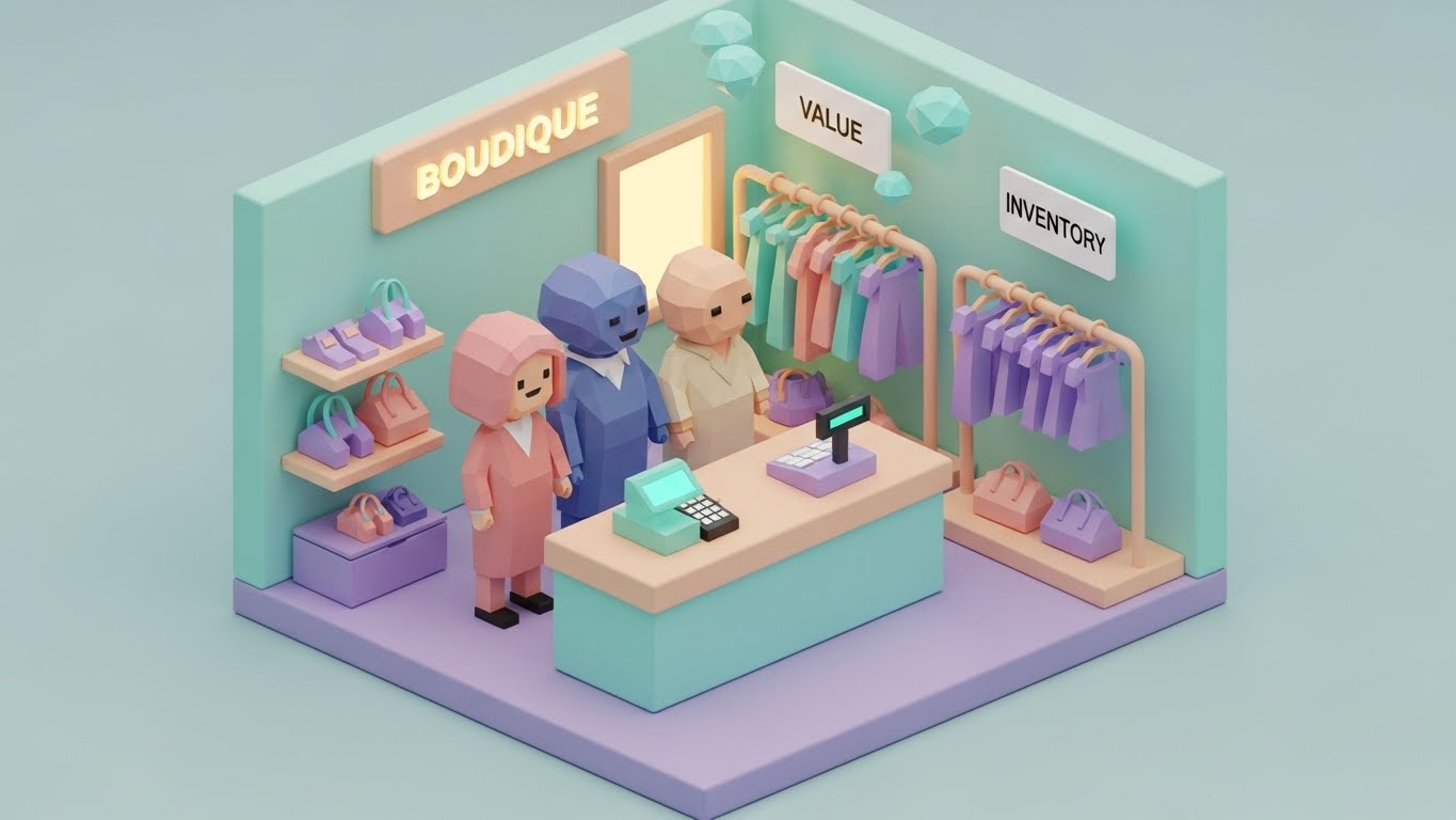
The Visual & Narrative Approach
The camera creates an isometric, miniature view of a charming boutique store. Rendered in soft Pastel Mint, Peach, and Lavender, the scene features faceted, geometric characters standing behind a counter. A tiny, blocky POS terminal glows warmly. Above the clothes racks, floating diamond icons appear, representing "Value" and "Inventory Levels." The lighting is soft and ambient, making the store look like a well-managed toy set. The tone is approachable, friendly, and manageable.
Psychological Impact & KPI Focus
- Niche Psychology: This style lowers the barrier to entry. Retail software can feel intimidating; the "toy-like" aesthetic makes business management look simple, fun, and "gamified," appealing to store owners who value ease of use.
- Operational Impact: It simplifies Store Operations. By stripping away realistic detail, it focuses the viewer on the key elements: the staff, the POS, and the stock, highlighting the relationship between them.
Strategic Implementation & Trade-offs
- Best For: Meta & General Social Ads targeting SMBs. The "cute" factor disrupts the feed of boring B2B ads, increasing click-through rates.
- Trade-off: May lack the "gravitas" required for pitching to a Fortune 500 retailer who expects a serious, corporate presentation.
Companies using similar video content -
Rain POS – Boutique POS System – Effortlessly tracks inventory, launches loyalty programs, automates reordering.
Comcash POS – Boutique Management Software – Intuitive features for managing sales and inventory.
7. Split Screen: Optimized Reality and UI
TOFU | Meta & General Social Ads

The Visual & Narrative Approach
The screen is divided by a vertical slider line. The left side displays a chaotic, realistic photograph of an unorganized pile of multi-colored vintage clothes in a thrift store—a visual representation of "inventory mess." The right side reveals a pristine, clean UI grid organized by color and size, rendered in Cool Blue and White. The slider moves slowly to the left, revealing more of the organized digital side, effectively "cleaning up" the mess. The tone is comparative, problem-solution, and satisfying.
Psychological Impact & KPI Focus
- Niche Psychology: This leverages the "Before and After" trope, which is incredibly effective for decision-making. It validates the user's pain (the mess) and immediately offers the cure (the UI), reducing cognitive load.
- Operational Impact: It directly visualizes Digitization of Stock. It shows exactly how physical clutter is translated into structured digital assets (SKUs), a core value of the software.
Strategic Implementation & Trade-offs
- Best For: Website Header or Hero Video as it instantly communicates the "What We Do" proposition without words. It is universally understood across languages/regions.
- Trade-off: Requires high-quality photography for the "messy" side; if the photo looks too staged or generic, it loses authenticity.
Companies using similar video content -
Finale Inventory – Apparel Inventory Management – Transforms manual processes into automated, organized inventory.
Vencru – Inventory Tracking Software – Streamlines clothing store inventory management with intuitive interface.
8. Clean UI Workflow (Light Mode)
TOFU | Category Creation
The Visual & Narrative Approach
A straight-on view of a minimalist tablet interface floating in a void of soft Sage Green and Clean White. The screen displays an inventory management dashboard featuring "glassmorphism"—frosted glass blur effects overlaying the background. Abstract icons representing "Shirts," "Pants," and "Accessories" are neatly arranged. Progress bars smoothly fill up to show stock levels, changing color from green to orange as they hit reorder points. The tone is professional, transparent, and serene.
Psychological Impact & KPI Focus
- Niche Psychology: This style appeals to the user's need for "Clarity and Focus." The clean, shadowless lighting and soft colors suggest that using the software is a stress-free experience, countering the typical stress of inventory management.
- Operational Impact: It highlights User Interface (UI) Design and Ease of Monitoring. The visual cues (color-changing bars) demonstrate how the software alerts users to Low Stock without cluttering the screen with numbers.
Strategic Implementation & Trade-offs
- Best For: Product/Solution Differentiation (MOFU) on Landing Pages. Potential buyers need to see the interface to judge usability. This stylized version makes it look modern and appealing.
- Trade-off: It is a "stylized" UI, not a screen recording. If the actual product doesn't look this polished, it can be misleading.
Companies using similar video content -
NetSuite – Inventory Management – Provides a single, real-time view of inventory across all locations.
Magestore – Magento POS – Centralized product data and synced inventory for sales.
9. Macro UI Micro-Interactions
MOFU | Product/Solution Differentiation

The Visual & Narrative Approach
An extreme close-up focuses on a high-resolution touchscreen. A realistic finger enters the frame to tap a glossy, Silver and Bright Blue button. The impact is palpable; the screen pixels are visible, and the button press triggers a satisfying ripple effect of light that spreads outwards. This micro-interaction symbolizes a "One-Click Checkout" or "Confirm Order" action, emphasizing the responsiveness of the system. The tone is tactile, responsive, and high-definition.
Psychological Impact & KPI Focus
- Niche Psychology: This taps into the "Sense of Control." The tangible feedback of the ripple effect assures the user that their action has been registered instantly, addressing fears of system lag or unresponsiveness at the POS.
- Operational Impact: It focuses on UX Friction Reduction. By highlighting the simplicity of a single tap, it argues that the software requires minimal training and reduces the time-per-transaction.
Strategic Implementation & Trade-offs
- Best For: Feature Education on Product Pages. It isolates a specific moment of delight (the click) and magnifies it, reinforcing the quality of the engineering.
- Trade-off: Being a macro shot, it lacks context. It shows how a button works, but not why the user is pressing it or what the broader workflow looks like.
Companies using similar video content -
Lightspeed Retail – POS and Payments – Simplifies in-store payments and streamlines inventory.
Loyverse – POS Software – Quick and smooth sales with one-click additions.
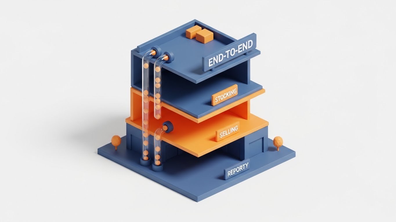
11. Isometric 2D Motion Design + Isometric 3D Workflow**
MOFU | Sales Cycle Acceleration
The Visual & Narrative Approach
The video utilizes a clean, matte "clay-render" aesthetic to present a cutaway view of a multi-story shopping mall. The color palette is a professional trio of Navy Blue, Soft Orange, and White. Each floor represents a distinct stage of the apparel retail lifecycle: the basement is "Stocking," the ground floor is "Selling," and the top floor is "Reporting." Tiny, satisfying spheres (representing data units) roll through transparent pneumatic tubes that physically connect the floors, visualizing the upward flow of information from the warehouse to the boardroom.
Psychological Impact & KPI Focus
- Niche Psychology: This style addresses the "Siloed Operations" anxiety common in mid-to-large retailers. By showing the floors physically connected by data tubes, it visually proves that the billing software eliminates communication gaps between departments.
- Operational Impact: It illustrates End-to-End Visibility. The viewer instantly grasps that a sale on the ground floor immediately triggers an inventory update in the basement and a revenue report on the top floor.
Strategic Implementation & Trade-offs
- Best For: Sales Decks and Deep-Dive Presentations. It allows sales teams to narrate the "full story" of the software’s ecosystem in a single, cohesive loop.
- Trade-off: The stylized, "miniature" look is excellent for explaining concepts but may not satisfy a technical buyer looking for specific UI screenshots or API documentation.
Companies using similar video content -
MyPOS Connect – Cloud-hybrid POS Software – Customizable interface for retail businesses.
ShopTill-e – POS and eCommerce Solution – Manages sales, inventory, and online orders effortlessly.
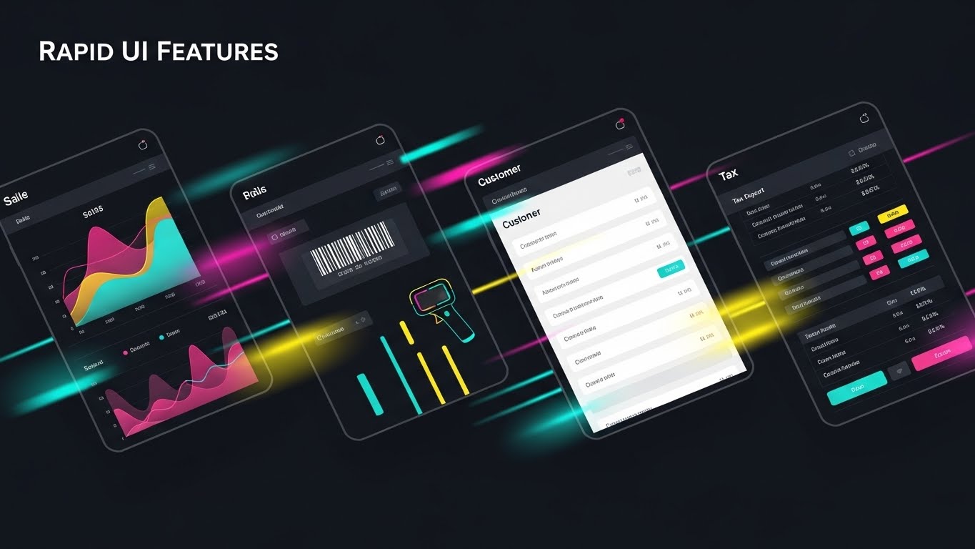
12. Rapid UI Feature Montage
MOFU | Demand Gen & Lead Capture
The Visual & Narrative Approach
This style creates a high-energy sense of momentum. A sequence of UI screens—Sales Graphs, Barcode Scanner Interfaces, Customer Profiles, and Tax Reports—flashes across the screen in a vibrant RGB spectrum. The screens are presented at dynamic, tilted angles with motion blur connecting the transitions, implying that the software moves as fast as the fashion industry itself. The pacing is rhythmic and accelerating, leaving an impression of comprehensive capability.
Psychological Impact & KPI Focus
- Niche Psychology: This taps into the "Fear of Missing Out" (FOMO) regarding feature sets. The sheer volume of screens shown in rapid succession suggests a robust, all-encompassing solution that can handle any scenario, from taxes to loyalty programs.
- Operational Impact: It visualizes Operational Agility. The speed of the cuts implies low latency and high system performance, crucial for high-volume retail environments where every second at the register counts.
Strategic Implementation & Trade-offs
- Best For: LinkedIn Video Ads (Demand Gen). The energy captures attention in a professional feed, signaling "Modern" and "Fast" without requiring the user to watch a long demo.
- Trade-off: It is impressionistic. Viewers cannot read the specific data on the screens, so it must be followed up with a detailed demo or high-resolution imagery.
Companies using similar video content -
ApparelMagic – Fashion ERP – Manages sales, inventory, costs, PLM, CRM.
Aims360 Fashion ERP – Apparel ERP – Single solution for all fashion business needs.
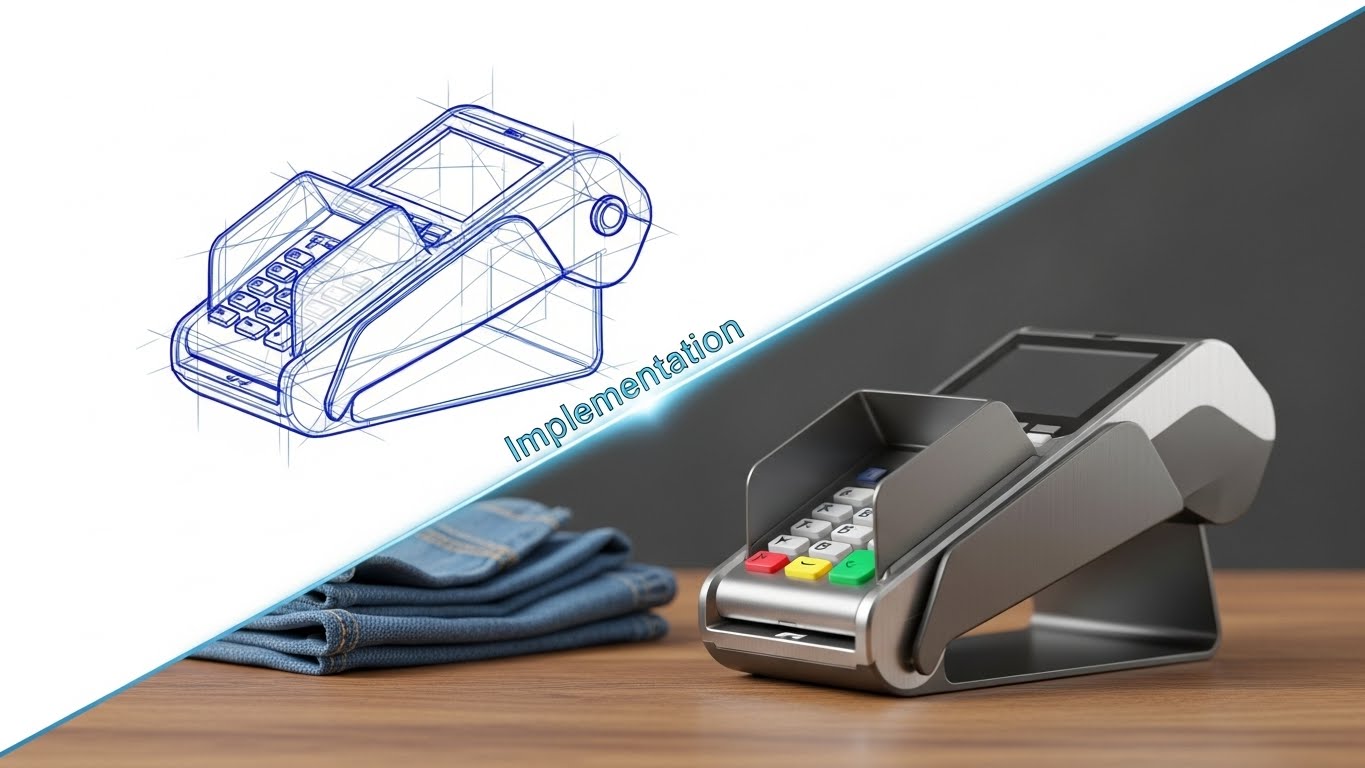
13. Wireframe to Reality Transition
MOFU | Driving Demo Requests
The Visual & Narrative Approach
The screen is split diagonally. The top-left segment displays a technical, blue-line wireframe sketch of a modern POS terminal, rotating slowly. As it crosses the diagonal divider to the bottom right, it transforms seamlessly into a photorealistic render of the hardware, finished in sleek brushed aluminum, sitting on a wooden counter next to realistic folded denim. The transition line glows, symbolizing the realization of a concept into a tangible business tool.
Psychological Impact & KPI Focus
- Niche Psychology: This style appeals to the "Builder" mindset of operational directors. It subtly communicates that the software is not just a digital wrapper but a well-engineered tool grounded in thoughtful design and structural integrity.
- Operational Impact: It highlights Implementation Readiness. The transition from "plan" (wireframe) to "product" (photo) serves as a metaphor for the ease of deploying the software—turning a business goal into a working reality.
Strategic Implementation & Trade-offs
- Best For: Email Campaigns driving demo requests. It suggests a journey from "Planning" to "Execution," prompting the recipient to take the next step in their procurement process.
- Trade-off: It is highly stylized. It works best for hardware-software bundled solutions; for pure SaaS, the "wireframe" metaphor might need to adapt to UI mockups.
Companies using similar video content -
Logic ERP – Apparel ERP Software – Comprehensive modules for procurement, order processing, warehouse.
Uphance – Apparel ERP – Comprehensive tools for inventory, production, sales, mobile app.
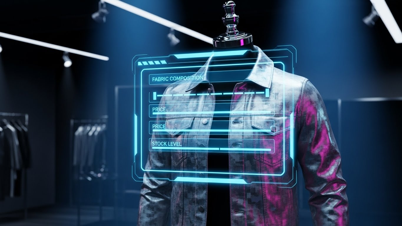
14. Holographic UI over 3D Render
MOFU | Website & Landing Pages
The Visual & Narrative Approach
A central subject—a high-fashion, realistic denim jacket—floats on a headless mannequin in a dark, moody retail showroom. Floating in front of the fabric is a transparent, glowing Blue and Silver holographic menu. This futuristic interface does not obscure the garment but enhances it, displaying live data blocks for "Fabric Composition," "Price," and "Stock Level." The visual suggests that the software adds a layer of intelligence to every physical item in the store.
Psychological Impact & KPI Focus
- Niche Psychology: This speaks to the "Value-Add" motivation. Retailers want to believe their software does more than just count stock; this visual implies it turns inventory into "Smart Assets," increasing the perceived value of their holdings.
- Operational Impact: It visualizes Rich Product Data Management. It shows that the system can handle complex attributes (size, material, cost) and make them instantly accessible, reducing lookup time for staff.
Strategic Implementation & Trade-offs
- Best For: Website Hero Sections. It instantly communicates the intersection of "Fashion" and "Technology," effectively positioning the brand as a premium tech partner for apparel.
- Trade-off: The futuristic "Iron Man" aesthetic might feel like overkill for discount retailers or basic thrift shops who just want simple billing.
Companies using similar video content -
iDPRT – RFID Apparel Solutions – Complete RFID tracking system including hardware and software.
kcode – RFID Apparel Inventory Management – Solutions for item-level visibility using RFID.
15. 3D Parallax UI Presentation
MOFU | The Functional Buyer
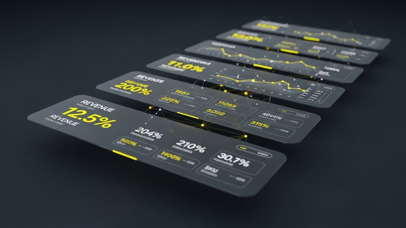
The Visual & Narrative Approach
Multiple semi-transparent UI dashboard layers float in a Deep Charcoal void, accented with Bright Yellow data highlights. The camera moves through these layers, utilizing a shallow depth of field to focus on specific metrics. The front layer displays high-level revenue figures ("Revenue 12.5%"), while the background layers reveal the granular SKU data supporting those numbers. This parallax effect creates a sense of depth and hierarchy, separating signal from noise.
Psychological Impact & KPI Focus
- Niche Psychology: This targets the "Analytical" buyer who fears data overload. By visually separating high-level KPIs from low-level data using depth, it promises a system that offers both big-picture clarity and granular drill-down capabilities.
- Operational Impact: It illustrates Data Granularity. It visually demonstrates that users can look through the top-line numbers to find the root causes in the inventory data, supporting better decision-making.
Strategic Implementation & Trade-offs
- Best For: LinkedIn Content targeting CFOs and Financial Controllers. The focus on revenue metrics and data structure aligns perfectly with their priorities.
- Trade-off: It is abstract. While it looks beautiful, it doesn't show the actual "button-clicking" workflow, so it serves better as a promise of insight rather than a tutorial.
Companies using similar video content -
LS Retail – LS Central – Unified retail management, customer data for personalization.
Stefanini – Digital Solutions for Luxury Fashion – Implements sophisticated inventory management.
16. Minimalist Flat 2D Vector
MOFU | Competitive Displacement

The Visual & Narrative Approach
A symmetrical, high-contrast composition in Matte Black and Paper White features a stylized weighing scale. On the left pan, which is weighed down heavily, sits a chaotic, scribbly pile of paper receipts and ledgers. On the right pan, which floats effortlessly high, is a clean, simple icon of a Cloud. The visual metaphor is stark and immediate: the "heavy" burden of legacy paper systems versus the "weightless" efficiency of the cloud solution.
Psychological Impact & KPI Focus
- Niche Psychology: This leverages "Loss Aversion" and the desire for relief. It validates the pain of the current manual process (the mess) and visually offers the cloud as the liberator, appealing to the desire to reduce administrative burden.
- Operational Impact: It serves as a direct metaphor for Competitive Displacement. It visually argues that the cloud solution is not just different, but superior in terms of operational "weight" and agility.
Strategic Implementation & Trade-offs
- Best For: "Us vs. Them" Comparison Pages. It simplifies the choice between sticking with the old way and adopting the new, making the decision feel obvious.
- Trade-off: It is a high-level concept. It does not explain how the cloud works, only that it is "lighter" and better.
Companies using similar video content -
Prediko – AI-powered Inventory Management – Combines fashion analytics for optimized stock.
Wairforretail – AI Demand Forecasting – Provides 360-degree inventory analytics and optimization.
17. Dynamic Data Visualization
BOFU | ROI Justification

The Visual & Narrative Approach
Set in a studio environment with rich Emerald Green and Gold lighting, the camera focuses on an open cash drawer. Instead of static cash, realistic gold coins and stacks of dollar bills begin to stack themselves rapidly, forming the shape of a rising bar graph. A glowing green trend line weaves through the stacks. The texture of the money is hyper-realistic, conveying tangible wealth. This is not just data; it is physical profit growing before the viewer's eyes.
Psychological Impact & KPI Focus
- Niche Psychology: This speaks directly to the "Economic Buyer" (Business Owner/Investor). It bypasses features to focus on the ultimate goal: Profit. It reassures the viewer that this software is an investment that pays returns, not a cost center.
- Operational Impact: It visualizes ROI (Return on Investment). By morphing the cash drawer (POS utility) into a chart (Business Intelligence), it shows that the software converts sales activity into growth data.
Strategic Implementation & Trade-offs
- Best For: Proposal PDFs and Pricing Pages (BOFU). When the prospect is hesitating on price, this visual reminds them of the financial upside.
- Trade-off: It can appear "salesy." If used too early in the funnel, it might feel like a "get rich quick" promise rather than a software solution.
Companies using similar video content -
Finale Inventory – Apparel Inventory Management – Cloud-based integrated WMS replacing manual processes.
StyleMatrix – Cloud Inventory Software – SaaS platforms replacing outdated server systems.
18. Photorealistic 3D Renders
BOFU | The Economic Buyer
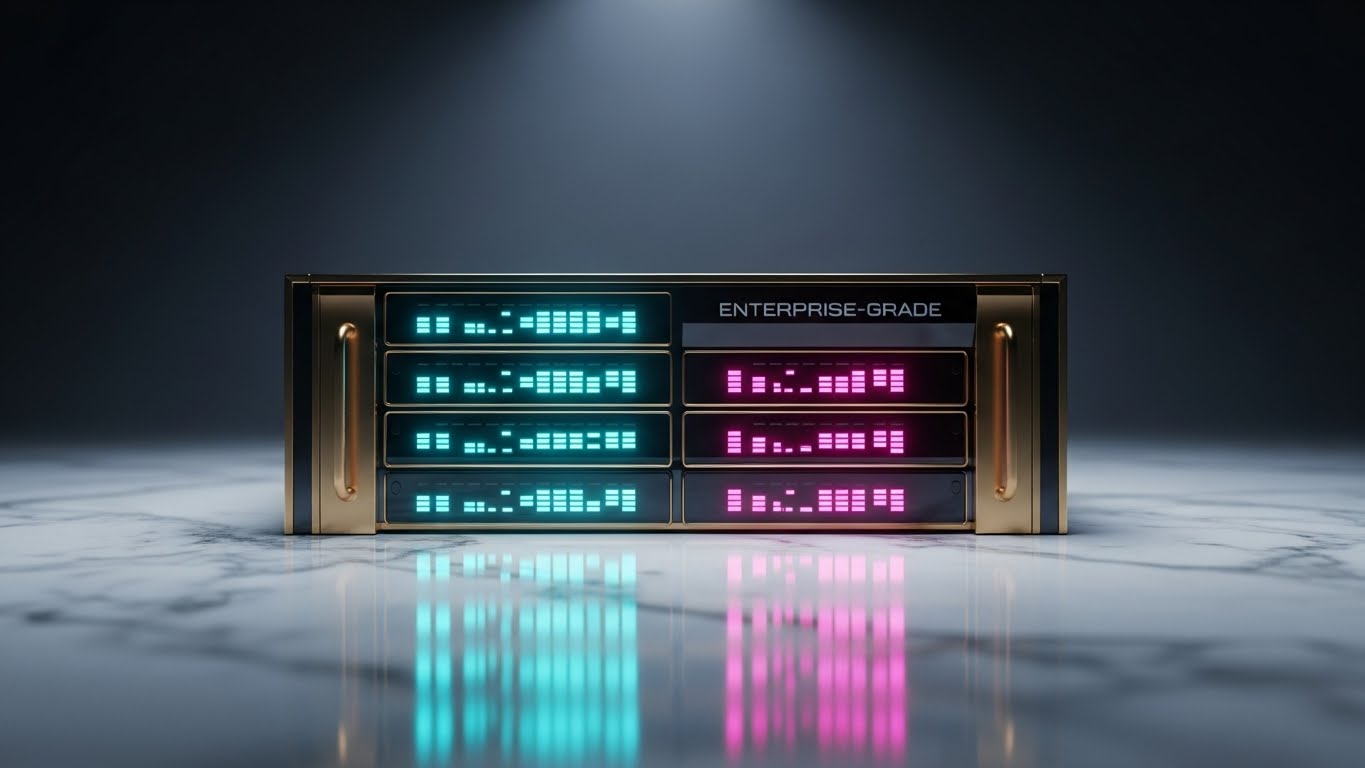
The Visual & Narrative Approach
The camera performs a slow, cinematic pan over a piece of hardware that looks like a piece of jewelry: a server rack unit finished in Matte Black with Gold trim, sitting on a luxury marble surface. The status lights don't just blink; they pulse with a steady, rhythmic "heartbeat" in cool blue. The lighting highlights the solidity and build quality of the infrastructure. There are no characters, just the machine. The tone is secure, stable, and expensive.
Psychological Impact & KPI Focus
- Niche Psychology: This targets the "Risk Averse" buyer (CTO/IT). For enterprise clients, "cool" features matter less than "uptime" and "security." This aesthetic signals that the platform is built on rock-solid, enterprise-grade foundations.
- Operational Impact: It visualizes Infrastructure Reliability and Uptime. It effectively communicates that the backend is robust enough to handle Black Friday traffic without crashing.
Strategic Implementation & Trade-offs
- Best For: Investor Decks and Security Whitepapers. It builds confidence in the technical asset value of the company.
- Trade-off: It is somewhat cold and impersonal. It creates distance rather than connection, so it's less effective for selling to small boutique owners who want a personal touch.
Companies using similar video content -
Fishbowl – Business Management Solution – Streamlines processes including accounting and sales for profitability.
Logic ERP – Apparel ERP Software – Helps manage accounts, GST returns, and insights for cost saving.
19. 2D Character-Driven Story
BOFU | Building Trust & Credibility

The Visual & Narrative Approach
A vector-illustrated scene features a friendly boutique owner with warm skin tones, wearing a stylish apron, standing confidently in her shop. The background uses Warm Earth Tones (Beige, Brown) and depicts neatly organized shelves. She holds a tablet and smiles with genuine relief. Floating around her are soft icons of "Hearts" and "Checkmarks," symbolizing positive customer feedback and completed tasks. The style is illustrative and human-centric, focusing on the emotional payoff of using the software.
Psychological Impact & KPI Focus
- Niche Psychology: This appeals to the "Human Connection." B2B buyers are still people who want to feel successful and less stressed. Seeing a mirror image of themselves—happy and organized—builds emotional trust and validates their identity as a successful business owner.
- Operational Impact: It visualizes Customer Satisfaction (CSAT) and Staff Empowerment. It shifts the focus from "what the software does" to "how the software makes you feel"—which is relieved and in control.
Strategic Implementation & Trade-offs
- Best For: Case Studies and Testimonial Videos. It puts a face to the success story, making the abstract benefits relatable and personal.
- Trade-off: The "cartoon" style can seem less serious than the photorealistic 3D styles. It is best used for building rapport, not for proving technical specs.
Companies using similar video content -
Dassault Systèmes – Supply Chain Digital Twins – Enterprise-level solutions for manufacturing and logistics.
Siemens – Supply Chain Digital Twins – Developing capabilities for complex supply chains.
20. Dark Mode UI Showcase
BOFU | Risk Mitigation Hook

The Visual & Narrative Approach
A sleek, Midnight Blue interface screen dominates the view, presenting a "Dark Mode" aesthetic. In the center, a glowing Neon Green padlock icon, constructed from intricate digital circuit lines, locks into place with a mechanical "thud." Surrounding the lock are shield emblems and "Encrypted" status bars that load to 100%. The lighting is high-contrast, rim-lighting the edges of the UI elements to make them pop against the dark background, evoking a sense of cyber-defense.
Psychological Impact & KPI Focus
- Niche Psychology: This addresses the "Security Anxiety" that comes with handling customer credit card data. The dark mode and neon aesthetics borrow from cybersecurity visual language, reassuring the viewer that their data is behind a military-grade shield.
- Operational Impact: It highlights Data Security, Encryption, and Compliance (like PCI-DSS). It visually demonstrates that the system is a fortress, protecting the retailer from the reputation-destroying nightmare of a data breach.
Strategic Implementation & Trade-offs
- Best For: Security/Compliance Pages and BOFU "Trust" sections. It is the final reassurance a technical buyer needs before signing the contract.
- Trade-off: It is a defensive visual. It doesn't sell "growth" or "sales," it sells "safety." It is a necessary checkbox, not a primary hook.
Companies using similar video content -
Gofrugal – Boutique Management Software – Focuses on increasing sales and profits with CRM.
Comcash POS – Boutique Management Software – Helps build customer relationships and keep businesses thriving.
21. Futuristic Neon/Dark Mode
BOFU | Risk Mitigation

The Visual & Narrative Approach
The video opens in a deep digital void. A wireframe mesh of a t-shirt renders in glowing Ultraviolet and Neon Blue lines. It is not static; it rotates slowly, revealing that its fabric is composed of streaming code. From the sleeve of the digital garment, a bright data cable extends, plugging firmly into a glowing "API" port floating in the background. The visual style mimics the "Tron" aesthetic—clean, dark, and electrically alive—representing the seamless connection between the garment and the technical backend infrastructure.
Psychological Impact & KPI Focus
- Niche Psychology: This addresses the "Technical Debt" anxiety of CTOs and IT Directors. They often fear that new software won't "talk" to their existing ERPs. This visual demonstrates a "Plug-and-Play" architecture, soothing fears of complex, broken integrations.
- Operational Impact: It visualizes API Connectivity. By showing the garment physically plugging into the system, it proves that product data flows without friction into the broader software ecosystem, ensuring data integrity.
Strategic Implementation & Trade-offs
- Best For: Technical Specification Sheets and Developer Documentation. It speaks the language of the IT team who will ultimately veto or approve the purchase.
- Trade-off: The "Cyberpunk" look is very niche. It appeals strongly to developers but may feel cold or overly technical to a creative fashion director.
Companies using similar video content -
Logic ERP – Apparel ERP Software – Helps manage accounts, TDS, TCS, GST returns securely.
Gofrugal – Boutique Management Software – Ensures robust data security with instant cloud backups.
22. 2D Line Art Animation
BOFU | Objection Handling & Friction Reduction
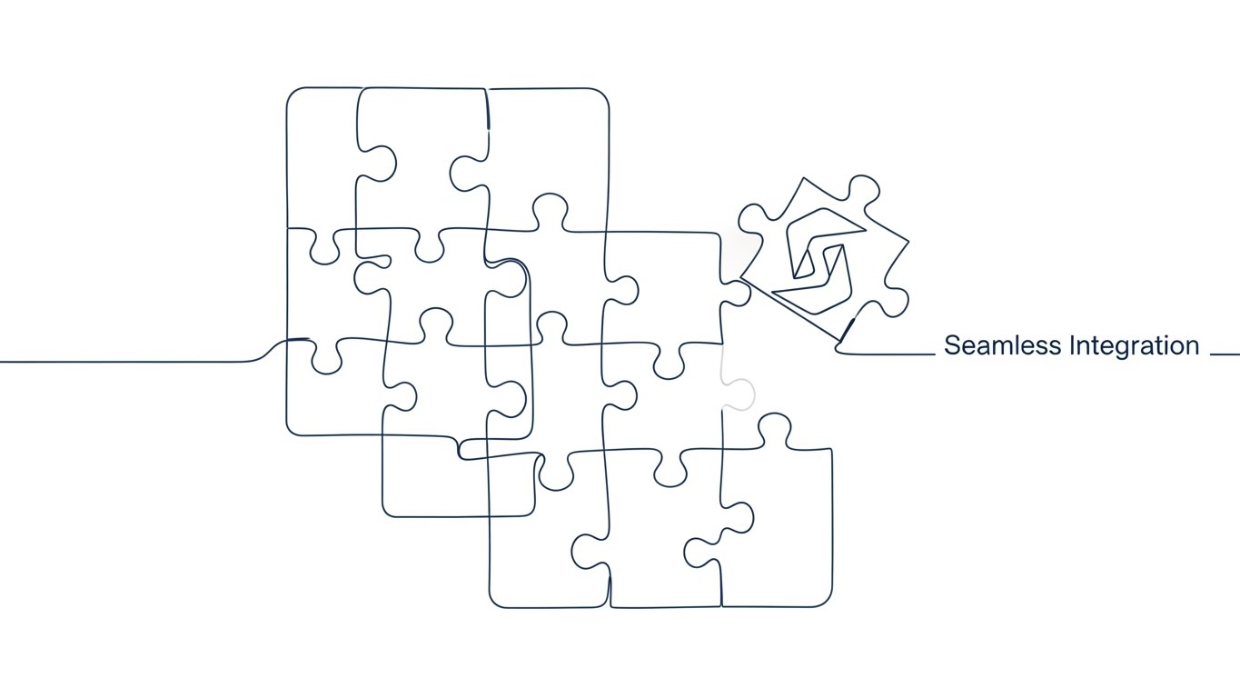
The Visual & Narrative Approach
A continuous, elegant single line in Monochromatic Blue moves across a white screen, drawing a complex, disjointed puzzle. As the line travels, it forms the final missing piece—shaped subtly like the software’s logo. The piece slides perfectly into the empty slot with a satisfying ease. The drawing never lifts from the page, symbolizing an uninterrupted workflow. The style is fluid, precise, and minimalist, focusing entirely on the concept of completion.
Psychological Impact & KPI Focus
- Niche Psychology: This taps into the desire for "Closure and Fit." In the BOFU stage, buyers worry about "gaps" in the solution. This visual metaphor subconsciously assures them that this software is the missing piece that completes their operational puzzle.
- Operational Impact: It illustrates Seamless Integration. It suggests that the software fits into the existing business logic without forcing a complete tear-down of current processes.
Strategic Implementation & Trade-offs
- Best For: FAQ Pages and "Objection Handling" email sequences. It provides a calm, logical visual answer to complex implementation questions.
- Trade-off: It is symbolic, not literal. It conveys a feeling of "fit" but doesn't show the actual UI, so it relies on the surrounding text to explain what is fitting together.
Companies using similar video content -
JOOR – B2B Wholesale Platform – Seamlessly connects with over 100 ERPs, PLMs, and POS systems.
Katana – Apparel Inventory Software – Offers seamless integrations with e-commerce platforms.
23. 2D Animation & UI Composition
Onboarding | Self-Serve Onboarding

The Visual & Narrative Approach
A stylized, cel-shaded character—representing a store associate—stands in a dynamic, energetic pose. They are high-fiving a floating, semi-transparent login window. The palette is explosive with Bright Primary Colors (Red, Blue, Yellow). Upon contact, sparkles and digital confetti burst from the screen. This is not just a login; it’s a "First Win." The energy is infectious, framing the software setup not as a chore, but as a celebratory launch.
Psychological Impact & KPI Focus
- Niche Psychology: This targets "Adoption Resistance." Staff often dread learning new systems. By gamifying the first interaction and making it look fun and rewarding, this style lowers the emotional barrier to entry and encourages a positive attitude toward the change.
- Operational Impact: It focuses on Self-Serve Onboarding. It visually reinforces that getting started is easy, instant, and positive, directly aiming to reduce the "Time-to-First-Value."
Strategic Implementation & Trade-offs
- Best For: Welcome Emails and the "First Login" screen. It sets a positive emotional tone for the user relationship right from day one.
- Trade-off: The "cartoon" aesthetic is very casual. It works wonders for end-users (staff) but might feel too juvenile for a board-level presentation.
Companies using similar video content -
Blue Link ERP – Garment Wholesaler Software – Automates and streamlines management, integrates accounting.
Prima Solutions – PrimaNet – Adaptable, simple, fast, and effective wholesale ordering process.
24. Hyper-lapse Stock Footage with Data
Onboarding | Accelerating Time-to-Value

The Visual & Narrative Approach
The background is a hyper-lapse video of a busy retail floor flooded with natural sunlight. Shoppers and staff move as colorful blurs, capturing the frantic pace of physical retail. Overlaid on this chaotic footage is a static, razor-sharp data layer: a "Sales Counter" ticking up rapidly and a steady inventory bar. The contrast is stark—the physical world is a blur of speed, but the digital metrics remain clear, stable, and perfectly readable.
Psychological Impact & KPI Focus
- Niche Psychology: This appeals to the need for "Stability in Chaos." Retail managers know the floor is unpredictable. This visual promises that no matter how fast the physical store moves, the software captures every transaction with absolute precision.
- Operational Impact: It highlights Real-Time Tracking. It visually proves that the system captures high-velocity sales data without lag, ensuring that the numbers on the screen always match reality.
Strategic Implementation & Trade-offs
- Best For: App Intro Videos and Digital Signage in HQs. It serves as a constant reminder of the software's ability to keep pace with business volume.
- Trade-off: Requires high-quality stock footage. If the background footage looks generic or low-res, it undermines the "premium" feel of the data overlay.
Companies using similar video content -
Loyverse – POS Software – Intuitive system for managing sales, inventory, and customer relationships.
Vencru – Inventory Tracking Software – Intuitive interface and extensive features for clothing stores.
25. 3D X-Ray Visualization
Onboarding | Reducing Implementation Friction
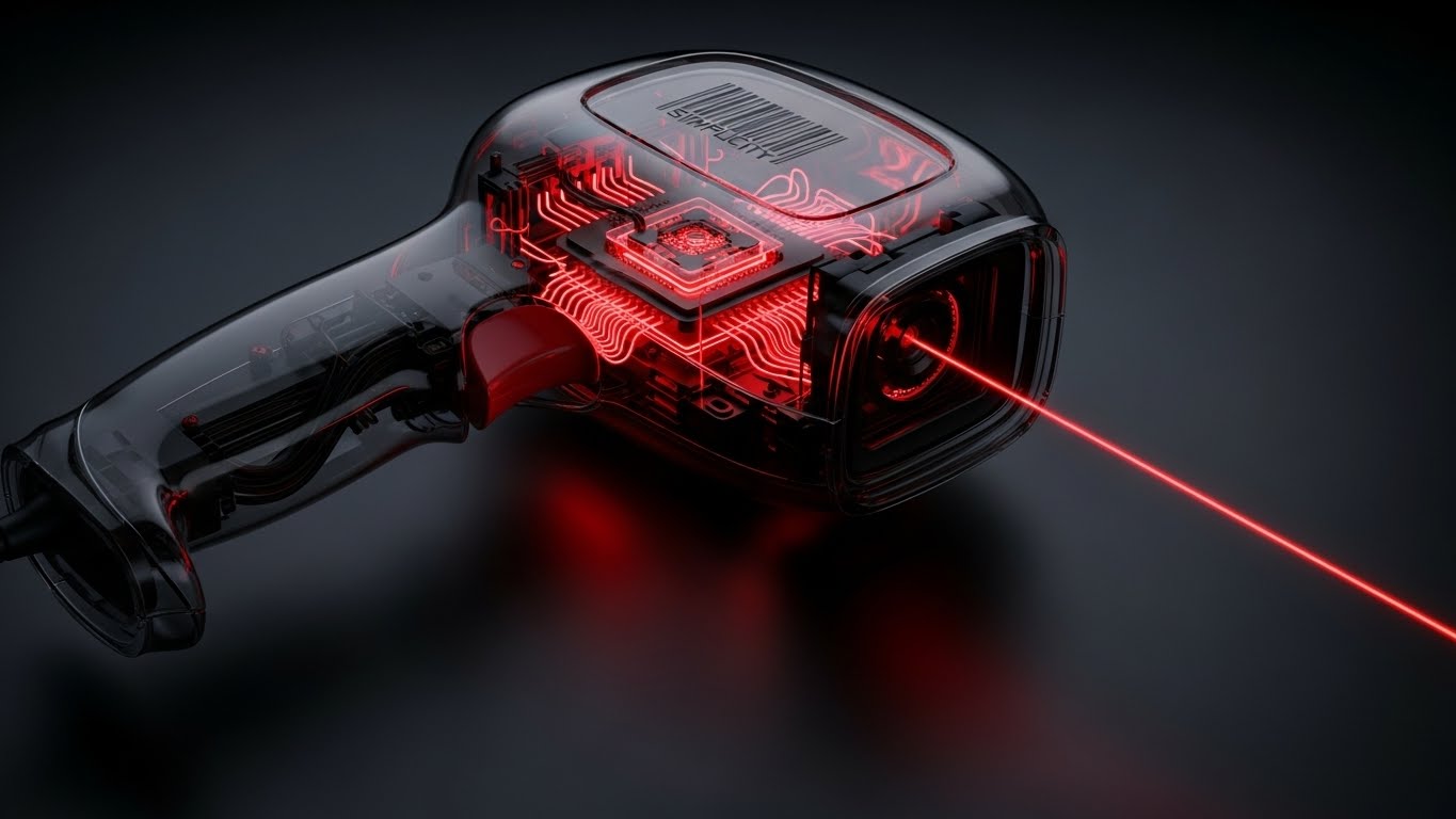
The Visual & Narrative Approach
A standard handheld barcode scanner is rendered with a transparent, Greyscale plastic casing. Through the "skin" of the device, we see the glowing Red internal core processor and intricate wiring. A laser beam shoots out from the scanner lens. The camera rotates around the object, revealing the "simple" elegance of the technology inside. It demystifies the hardware, showing it not as a magical black box, but as an understandable, engineered tool.
Psychological Impact & KPI Focus
- Niche Psychology: This targets "Hardware Intimidation." Non-technical staff can be afraid of breaking expensive equipment. By showing the internal workings in a clean, logical way, it makes the device feel accessible and robust, reducing anxiety.
- Operational Impact: It visualizes Hardware Compatibility and Simplicity. It suggests that while the tech is advanced (the glowing core), the mechanism is straightforward, implying durability and ease of maintenance.
Strategic Implementation & Trade-offs
- Best For: Training Videos and Hardware Setup Guides. It helps users understand the tool they are holding, fostering a sense of ownership and care.
- Trade-off: It is very hardware-centric. If your solution is purely software (SaaS) running on third-party devices, this might distract from your core value proposition.
Companies using similar video content -
RFIDTag™ – RFID Technology – Provides real-time tracking of each garment's movement and location.
iDPRT – RFID Apparel Solutions – Enables real-time inventory updates from factory to storefront.
26. Lifestyle Stock with UI Overlay
Retention | Reducing Churn
The Visual & Narrative Approach
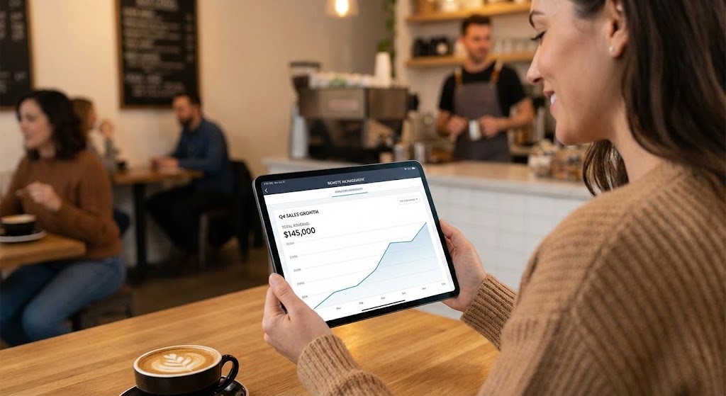
An over-the-shoulder shot captures a boutique owner sitting in a cozy cafe, bathed in Warm Coffee tones. She is relaxed, holding an iPad Pro. Superimposed on the tablet screen is a crisp, clean sales graph showing a steady upward trend. The background—the cafe patrons, the barista—is slightly blurred. The focus is on her posture: relaxed, unhurried, and in control. This is the ultimate promise of the software: the freedom to manage the business from anywhere.
Psychological Impact & KPI Focus
- Niche Psychology: This taps into the "Lifestyle" aspiration. Small business owners often feel chained to their store. This visual sells the dream of "freedom"—the ability to step away without losing visibility, directly countering the fear of burnout.
- Operational Impact: It visualizes Cloud Mobility. It demonstrates that the dashboard is fully functional on mobile devices, allowing for remote decision-making and monitoring.
Strategic Implementation & Trade-offs
- Best For: Retention Newsletters and "Feature Update" emails. It reminds existing customers of the lifestyle benefits they enjoy (or could enjoy) by fully utilizing the mobile app.
- Trade-off: It risks looking like a generic stock photo. The UI overlay must be distinct and branded to ensure the viewer connects the "freedom" specifically to your software.
Companies using similar video content -
iDPRT – RFID Apparel Solutions – Complete RFID system including printers, tags, handheld readers.
kcode – RFID Apparel Inventory Management – ktrac software reads RFID tags on clothes.
27. 2D Graphics Over Live Action
Retention | Driving Deep Feature Adoption
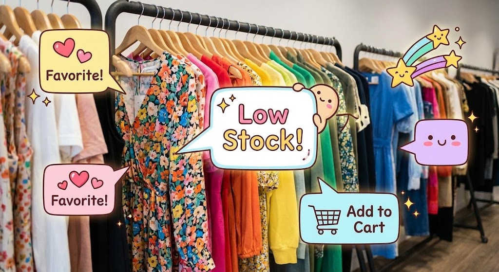
The Visual & Narrative Approach
A high-quality photo of a clothing rack in a well-lit store serves as the base. Superimposed over the clothes are cute, 2D cartoon "Tooltip" bubbles and sparkles in bright pastel colors. One bubble points to a floral dress saying "Low Stock!" Another points to a summer shirt with a "Favorite!" heart icon. This Augmented Reality style brings the static inventory to life, making the process of identifying stock needs feel fun, interactive, and helpful.
Psychological Impact & KPI Focus
- Niche Psychology: This targets the "Routine Fatigue" of inventory management. Counting stock is boring. By overlaying playful graphics, the software is presented as a helpful, cheerful assistant that makes the mundane task of stock-taking feel lighter and more engaging.
- Operational Impact: It visualizes Smart Alerts. It shows how the software proactively identifies issues (low stock) and opportunities (bestsellers) without the user having to dig through spreadsheets.
Strategic Implementation & Trade-offs
- Best For: In-App Pop-ups and "Did You Know?" feature highlights. It grabs attention quickly and educates the user on advanced features without feeling heavy.
- Trade-off: The "cute" factor is high. It works best for boutique and fashion-forward brands, but might feel out of place for industrial workwear or safety gear retailers.
Companies using similar video content -
StyleMatrix – Cloud Inventory Software – Dashboard accessible on any device, real-time data synchronization.
Lightspeed Retail – POS and Payments – Cloud-based system, access reports from anywhere.
28. Aspirational Stock Montage
Expansion | Driving Upsell/Cross-sell

The Visual & Narrative Approach
A wide, cinematic shot places the viewer behind a successful fashion CEO. He stands on a glass balcony overlooking a massive, automated high-tech warehouse that stretches to the horizon. The lighting is bathed in Luxury Gold and Platinum hues. Robots zip along the floor; shelves reach the ceiling. The scale is immense. This image is not about "managing a store"; it is about "commanding an empire." It visually validates the ambition to scale.
Psychological Impact & KPI Focus
- Niche Psychology: This speaks to the "Growth" motivation. Every retailer wants to believe they are the next big brand. This visual aligns the software with that ambition, subtly suggesting that this platform is the engine that will power their rise to the top.
- Operational Impact: It visualizes Scalability. It implies that the software can handle infinite volume, complex logistics, and multi-location operations, positioning the "Enterprise Plan" as the necessary vehicle for this growth.
Strategic Implementation & Trade-offs
- Best For: Promo Emails for Plan Upgrades and Expansion Campaigns. It sets the stage for a conversation about moving from a "Basic" to a "Pro" or "Enterprise" tier.
- Trade-off: It creates a "distance." It is aspirational, not relatable for the day-to-day. It inspires, but doesn't teach.
Companies using similar video content -
Rain POS – Boutique POS System – Automated reorder alerts, low-stock notifications.
Gofrugal – Boutique Management Software – Predicts demands and keeps optimum stock available.
29. Generative AI Realistic Character Video
Expansion | Driving Referrals & Advocacy

The Visual & Narrative Approach
A professional, photorealistic woman—generated by AI—dressed in a sharp Navy Blue blazer, speaks directly to the camera with the poise of a news anchor. Her expression is friendly and trustworthy. She gestures to her left, where a clean, graphical "Referral Link" box appears with a satisfying "ding." The background is a blurred, modern office. The lighting is professional studio quality. She acts as the human face of the referral program, inviting the user to share their success.
Psychological Impact & KPI Focus
- Niche Psychology: This taps into "Social Proof" and "Reciprocity." A human face (even a synthetic one) creates a stronger connection than text. Her professional demeanor suggests that recommending this software is a professional, credible action that reflects well on the referrer.
- Operational Impact: It visualizes Advocacy. It makes the referral process look simple, professional, and rewarding, directly encouraging users to become brand ambassadors.
Strategic Implementation & Trade-offs
- Best For: Social Media (LinkedIn/Instagram) and Referral Program Landing Pages. It personalizes the ask, making it harder to ignore than a static button.
- Trade-off: The "Uncanny Valley" risk. High-quality generation is essential; if the lip-sync or eye movement is off, it becomes creepy rather than trustworthy.
Companies using similar video content -
Aptean Apparel ERP – Apparel ERP – End-to-end visibility, supports managing supply chain demands.
PolyPM – ERP and PLM System – Manages entire production process from design to global distribution.
30. Photorealistic 3D Renders
Expansion | Establishing Thought Leadership

The Visual & Narrative Approach
The view is from space, looking down at a globe floating in deep space black. However, the continents are not land; they are textured with different textile patterns—denim for the Americas, silk for Asia, wool for Europe. Glowing Fiber Optic White lines arc across the planet, connecting these textile continents. These lines represent the invisible, digital supply chain that binds the global fashion industry together. The image is epic, detailed, and conveys absolute authority.
Psychological Impact & KPI Focus
- Niche Psychology: This targets the "Visionary" leader. It lifts the conversation above billing and inventory to "Global Economics." It positions the software vendor not just as a tool provider, but as a thought leader who understands the macro-trends of the industry.
- Operational Impact: It visualizes Global Connectivity. It represents multi-currency support, cross-border logistics, and international compliance, assuring the viewer that the software has no borders.
Strategic Implementation & Trade-offs
- Best For: Whitepaper Covers and Annual Reports. It signals "We define the industry standards," building immense brand equity and trust.
- Trade-off: It is purely brand building. It offers no functional insight into the software, so it serves better as a promise of insight rather than a tutorial.
The Visual Operations Doctrine: A Strategic Knowledge Base
Having explored 30 distinct visual styles, the question shifts from "What does it look like?" to "How do we use this?" This section synthesizes the visual examples into a cohesive strategic framework. This is your Visual Operations Doctrine—a guide to aligning these visuals with business goals to drive adoption, efficiency, and growth.
Strategic Alignment & Visual Architecture
The "Pre-Production" Strategy – Why and Who
Before a single pixel is rendered, the visual strategy must be aligned with the operational reality of the retail floor.
- The Cognitive Load Audit: Retail environments are high-stress. Before choosing a style, audit the complexity of the task. High-complexity tasks (e.g., reconciling tax discrepancies) require Style 8 (Clean UI) to reduce load, while low-complexity tasks (e.g., login) benefit from Style 23 (Gamification) to boost energy.
- Role-Based Visual Mapping: Different roles digest data differently. Store Associates (Mobile/Simple) need Style 9 (Micro-Interactions) to confirm tasks quickly. Regional Managers (Desktop/Data) need Style 15 (Parallax UI) to visualize data hierarchy and drill down into regional performance.
- The "Glanceability" Standard: In a busy store, staff cannot watch long videos. Design visuals for "glanceability"—information that can be understood in under 2 seconds. Style 2 (Kinetic Typography) is critical here for flashing key alerts or process changes on back-room screens.
- Brand Voice Consistency: Your billing software is an extension of the fashion brand. Ensure the visual language of the software training matches the brand's aesthetic. A luxury brand should use Style 18 (Luxury 3D) for internal comms, while a streetwear brand aligns better with Style 2 (Bold Typography).
- The Advids Strategic Audit: Defining this "Visual Operating System" requires a deep understanding of both creative and technical constraints. Advids specializes in this pre-production audit, helping you map your feature set to the most effective visual styles before you invest in production.
- Standardization vs. Customization: For core billing functions, use standardized, scalable styles like Style 6 (Low-Poly). For unique, brand-specific differentiators (like a proprietary loyalty algorithm), invest in bespoke Style 3 (Generative AI) to highlight the unique value.
- The Cross-Departmental Bridge: Use visuals to unify terminology. Sales calls it "Checkout," Ops calls it "Inventory Deduction." A visual like Style 11 (Isometric Workflow) creates a shared mental model, showing that "Checkout" is "Inventory Deduction," bridging the silo.
- Legacy System Integration: Transitioning from legacy hardware is scary. Use Style 16 (Scale Balance) to visually acknowledge the "weight" of the old system while introducing the "lightness" of the new, validating the user's history while guiding them forward.
- Accessibility in Retail: Your workforce is diverse. Motion graphics must be designed for accessibility. Style 1 (Minimalist Vector) with high contrast and clear iconography is essential for multi-lingual staff, ensuring training is effective regardless of language fluency.
- The Mobile-First Mandate: Retail happens on the floor, not the desk. All 30 styles must be adapted for vertical mobile consumption. Ensure that Style 12 (Rapid Feature Montage) reads just as clearly on a smartphone screen as it does on a boardroom monitor.
Operational Adoption & Implementation
The "Deployment" Phase – How to embed visuals into the workflow
Visuals are not just marketing assets; they are operational tools that drive software adoption.
- Overcoming "Big Brother" Anxiety: Staff may fear that POS monitoring is purely for surveillance. Use Style 19 (Character Story) to frame the software as a "Support Tool" that helps them hit targets and earn commissions, rather than a "Tracking Tool" that watches their mistakes.
- The Micro-Learning Shift: Replace the 50-page PDF manual with a library of 30-second clips. Style 25 (X-Ray) is perfect for explaining hardware maintenance (e.g., scanner cleaning) in a format that staff will actually watch.
- Just-in-Time Support: Embed specific visual styles directly into the POS help menu. When a transaction fails, a 5-second Style 22 (Line Art) loop showing the fix is infinitely more effective than a text error code.
- Gamification of Training: Use visuals to make training sticky. Visualize staff performance scores using Style 23 (UI Celebration) to turn "learning the software" into a competitive, rewarding team activity.
- Reducing Support Ticket Volume: There is a direct correlation between proactive visualization and support costs. Implementing Style 27 (Tooltip Overlay) for complex new features can preemptively answer "How do I...?" questions, drastically reducing calls to the IT helpdesk.
- Remote Onboarding: For retail chains expanding to new cities, physical training seminars are costly. Leverage Style 11 (Isometric Workflow) and Style 26 (Lifestyle Overlay) to conduct remote onboarding that feels comprehensive and personal, scaling your culture without travel costs.
- Standard Operating Procedures (SOPs): Transform text-based SOPs into visual process flows. A "Closing the Register" checklist becomes a Style 8 (Clean UI) animation, ensuring every step is followed precisely and consistently across all stores.
- Feedback Loops: Use interactive video elements. After a Style 4 (Motion Graphics) tutorial plays, prompt the user with a simple "Did this help?" micro-interaction. This data helps refine your training library over time.
- Scalable Localization: Global brands need global assets. Style 1 (Minimalist Vector) and Style 6 (Low-Poly) are culturally neutral and easy to localize—simply swap the text layer—making them ideal for international rollouts.
- Leadership Communication: When rolling out a major ERP update, store managers need to feel the vision. Use Style 30 (Global Fabric) in executive presentations to communicate the "Why" behind the change, inspiring leadership buy-in before the technical rollout begins.
Measuring Impact & Future-Proofing
The "ROI" Phase – Measuring success and looking ahead
The final phase is proving that your visual strategy is delivering a return on investment and preparing for the next wave of technology.
- Beyond "Views": Do not measure success by video views. Define actionable KPIs: Did the Style 23 onboarding video reduce "Time-to-First-Transaction"? Did the Style 27 tooltip reduce support tickets for that specific feature?
- The "Idle Time" Metric: In retail, time is money. Correlate better visualization with reduced software navigation time. If Style 9 (Micro-Interactions) teaches shortcuts effectively, you should see a measurable drop in "Average Transaction Time."
- Compliance Velocity: When tax laws change (e.g., VAT updates), speed is critical. Measure how fast the network achieves compliance after releasing a Style 2 (Kinetic Typography) alert versus a standard email memo.
- Retention and Churn: High-quality UX visualization builds trust. Track the LTV (Lifetime Value) of cohorts exposed to high-touch "Success" visuals like Style 29 (Advocacy) versus those who aren't. Visuals remind users of value, directly impacting retention.
- The AI Visual Frontier: Prepare for the future. As Generative AI matures, Style 3 (Cinematic AI) will become cheaper to produce. Start experimenting with these styles now to stay ahead of the "content velocity" curve.
- Scalability of Assets: Build a library, not a graveyard. Construct your visuals using modular assets (like the icons in Style 1 or the models in Style 6) so they can be reassembled for future updates without starting from scratch.
- The Advids Partnership: Scale brings complexity. As your library grows to hundreds of assets across global regions, you need a partner to manage continuity. Advids acts as the custodian of your visual language, ensuring that your 500th video remains as on-brand and strategic as your first.
- Benchmarking Success: "Good enough" visuals are a competitive risk. If your competitor uses Style 14 (Holographic UI) to sell their vision and you rely on static screenshots, you will lose the "Innovation" argument in the sales cycle.
- The ROI of Accuracy: For financial teams, accuracy is paramount. Quantify the reduction in billing disputes or inventory shrinkage after implementing clear, high-contrast Style 25 (Transparency) visuals in fraud prevention training modules.
- Final Call to Innovation: Treat video as infrastructure, not content. Just as you invest in servers and code, invest in the visual explanation of that code. In the digital age, if they can't see how it works, it doesn't work. The future belongs to the brands that make the complex clear, the invisible visible, and the difficult simple.
Companies using similar video content -
Stylumia – AI Fashion Solutions – Helps brands understand true demand from consumer behavior.
Nextail – Merchandise Execution Platform – Uses AI for smarter inventory management and demand predictions.
Author & Editor Bio


