
 /home/wwwroot/advids.co/design/index.php on line 425
Introduction: Stitching the Physical and Digital Worlds
The apparel industry operates on a high-stakes paradox: it is built on fluid creativity and intuition, yet it survives on rigid data and logistics. For B2B Apparel CRM and SaaS platforms, the challenge is not just functionality; it is translation. You are bridging the gap between the creative studio—where "drape" and "texture" reign supreme—and the boardroom, where efficiency and inventory turnover are the only metrics that matter.
In this environment, visualization is your most powerful asset. It transforms abstract SKU data into a compelling narrative of agility and control. It proves to a skeptical Creative Director that your software won't stifle their art, while assuring the VP of Operations that it will secure their supply chain.
The market demand for this transformation is accelerating. The global apparel management software market is projected to reach USD 4.94 billion by 2033, driven by the urgent need to digitize complex supply chains. Yet, adoption remains a friction point. Stakeholders are overwhelmed by "feature bloat" and fear that new tools will add to their workload rather than reduce it.
To capture this opportunity, your video strategy must be as sophisticated as the industry itself. Leading forecasts indicate that the state of fashion technology will see companies double their tech investment by 2030. This guide provides a "Gold Standard" framework for your content, utilizing 30 distinct visual styles to articulate the value of the "Digital Thread"—from the first sketch to the final shipment—positioning your platform as the essential operating system for the modern fashion brand.
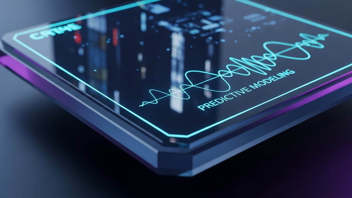
1. Generative AI Realistic Character Video
TOFU | Brand Awareness

(Generative AI Realistic): Magenta Blazer + Visionary Control
The Visual & Narrative Approach
This style leverages high-fidelity Generative AI to create a "Hyper-Persona"—an idealized representation of your target user. We see a confident female designer in a sun-drenched atelier, a setting that respects the "tactile" nature of fashion (fabric rolls, mannequins). However, the focal point is the transparent glass tablet she holds, displaying a glowing interface. This juxtaposes the physical craft with digital command. The narrative is aspirational, positioning the software as the tool that empowers her vision, not just manages her tasks.
Psychological Impact & KPI Focus
Fashion professionals are identity-driven. They are more likely to engage with a brand that reflects their self-image as innovators. By rendering the protagonist in a "structured avant-garde blazer," you signal that you understand their aesthetic language. The futuristic tablet addresses the anxiety of "obsolescence," implicitly promising that your platform is the future of design operations.
Strategic Implementation & Trade-offs
- Best Use: High-level Brand Awareness campaigns on LinkedIn and Instagram to stop the scroll.
- Duration: 15-30 Seconds.
- Trade-off: While visually stunning, Gen AI can struggle with specific UI details. Use this to sell the feeling of the brand, not the specific button placement.
Companies using similar video content -
ImagineCreate AI – AI tools for product/fashion photography and video.
Onbrand PLM – AI Design – AI-powered design platform for concepts.
2. Abstract 2D Flat Vector Organic Modern Motion Graphics
TOFU | Category Creation

(Abstract Motion): Fluid Shapes + Structuring Creative Chaos
The Visual & Narrative Approach
This style uses abstract motion to metaphorically represent the core value proposition: bringing order to creative chaos. The animation begins with fluid, organic shapes in electric blue and lime green, mimicking the drape of fabric. These shapes then seamlessly morph into sharp, geometric squares and rectangles. This visual journey symbolizes the transition from "Design Concept" to "Structured SKU," simplifying the complexity of PLM (Product Lifecycle Management) into a satisfying visual transformation.
Psychological Impact & KPI Focus
The biggest friction in fashion tech is the clash between "Right Brain" (Design) and "Left Brain" (Operations). This visual proves that your software respects the organic nature of design while providing the necessary business structure. It reduces cognitive load, allowing the viewer to understand the concept of "Digital Transformation" without needing to read a whitepaper.
Strategic Implementation & Trade-offs
- Best Use: Instagram Stories or background visuals on a "Solutions" landing page.
- Duration: 10-15 Seconds (Loopable).
- Trade-off: It is highly conceptual. It builds brand affinity but does not educate on specific features. It must be paired with clear copy to anchor the meaning.
Companies using similar video content -
TextileGenesis – Blockchain PLM for textile traceability, digital mapping.
Mendix PLM for Fashion and Retail – Low-code PLM, manages product development from ideation.
3. Bold Kinetic Typography (Visual)
TOFU | Market Education
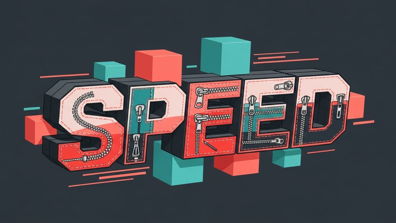
(Kinetic Typography): Zipper Pattern + Urgent Momentum
The Visual & Narrative Approach
In the world of Fast Fashion, speed is currency. This style uses massive, screen-dominating typography to scream "VELOCITY." The word "SPEED" is not just text; it is constructed from patterns of zippers and stitching, instantly grounding the abstract concept in the apparel niche. The kinetic motion—jerking, sliding, and snapping to a beat—mimics the frantic pace of a fashion season. The high-contrast palette ensures legibility on mobile devices.
Psychological Impact & KPI Focus
This style leverages "Urgency Psychology." Operations managers are constantly fighting the clock (Critical Path). This visual validates their stress and offers speed as the solution. The zipper texture acts as a "Visual Handshake," proving you are an industry insider, not a generic software provider.
Strategic Implementation & Trade-offs
- Best Use: YouTube Pre-roll ads (Bumper Ads) where you have seconds to land a message before the skip.
- Duration: 6-10 Seconds.
- Trade-off: It conveys emotion (urgency) but lacks nuance. It is a hook, not an explanation.
Companies using similar video content -
Fast React (Coats Digital) – Production planning and control for apparel.
TimeReaction – Apparel management software, streamlines operations quickly.
4. Aspirational Stock Montage
TOFU | Shaping Brand Perception

(Aspirational Stock): Mood Board Context + Validated Success
The Visual & Narrative Approach
This style grounds your software in the reality of the target persona. We see a Creative Director in a modern office, wearing a specific "beige linen shirt" that signals fashion consciousness. The focus is on the outcome of using the software: the smile, the relaxed posture, and the "Check Mark" overlay. The blurred mood board in the background is critical—it contextualizes the office as a design space, not a bank or a law firm.
Psychological Impact & KPI Focus
Decision-makers are often overwhelmed. This visual sells "Relief." It moves the conversation from features to benefits (peace of mind). The "Check Mark" is a universal symbol of task completion, triggering a dopamine response associated with efficiency and control.
Strategic Implementation & Trade-offs
- Best Use: Facebook feeds where human connection drives engagement.
- Duration: 15-30 Seconds.
- Trade-off: Stock footage can feel generic. The "Visual Concordance" of the mood board and the specific styling of the actor are non-negotiable to maintain authenticity.
Companies using similar video content -
ApparelMagic – ERP, PLM, CRM for fashion, streamlines operations.
Uphance – ERP, CRM, inventory, production, sales for fashion.
5. 2D Graphics Over Live Action
TOFU | Skippable Pre-Roll Ad
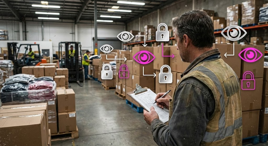
(Augmented Reality): Neon Icons + Enhanced Visibility
The Visual & Narrative Approach
This style bridges the gap between the physical reality of logistics and the digital promise of software. By superimposing bright neon vector icons ("eyes" for visibility, "padlocks" for security) over a gritty, realistic warehouse photo, you visually demonstrate the "Digital Twin" concept. The contrast between the industrial silver/white background and the neon pink icons draws immediate attention to the value layer—the software.
Psychological Impact & KPI Focus
For Operations Directors, the warehouse is often a "black box" of anxiety. This visualization solves the "Visibility Gap." It proves that your software extends its reach into the real world, tracking inventory and securing assets. It communicates transparency and control, building authority by showing you understand the "messy" reality of logistics.
Strategic Implementation & Trade-offs
- Best Use: LinkedIn Thought Leadership posts or Case Study videos.
- Duration: 30-45 Seconds.
- Trade-off: Requires high-quality tracking (match-moving) to ensure the graphics feel "attached" to the real world. If the graphics float aimlessly, the effect breaks.
Companies using similar video content -
BlueCherry (CGS) – PLM, ERP, supply chain, inventory, production for apparel.
Gravity – Fashion & apparel supply chain management, quality control.
6. Wireframe to Reality Transition
TOFU | Meta & General Social Ads
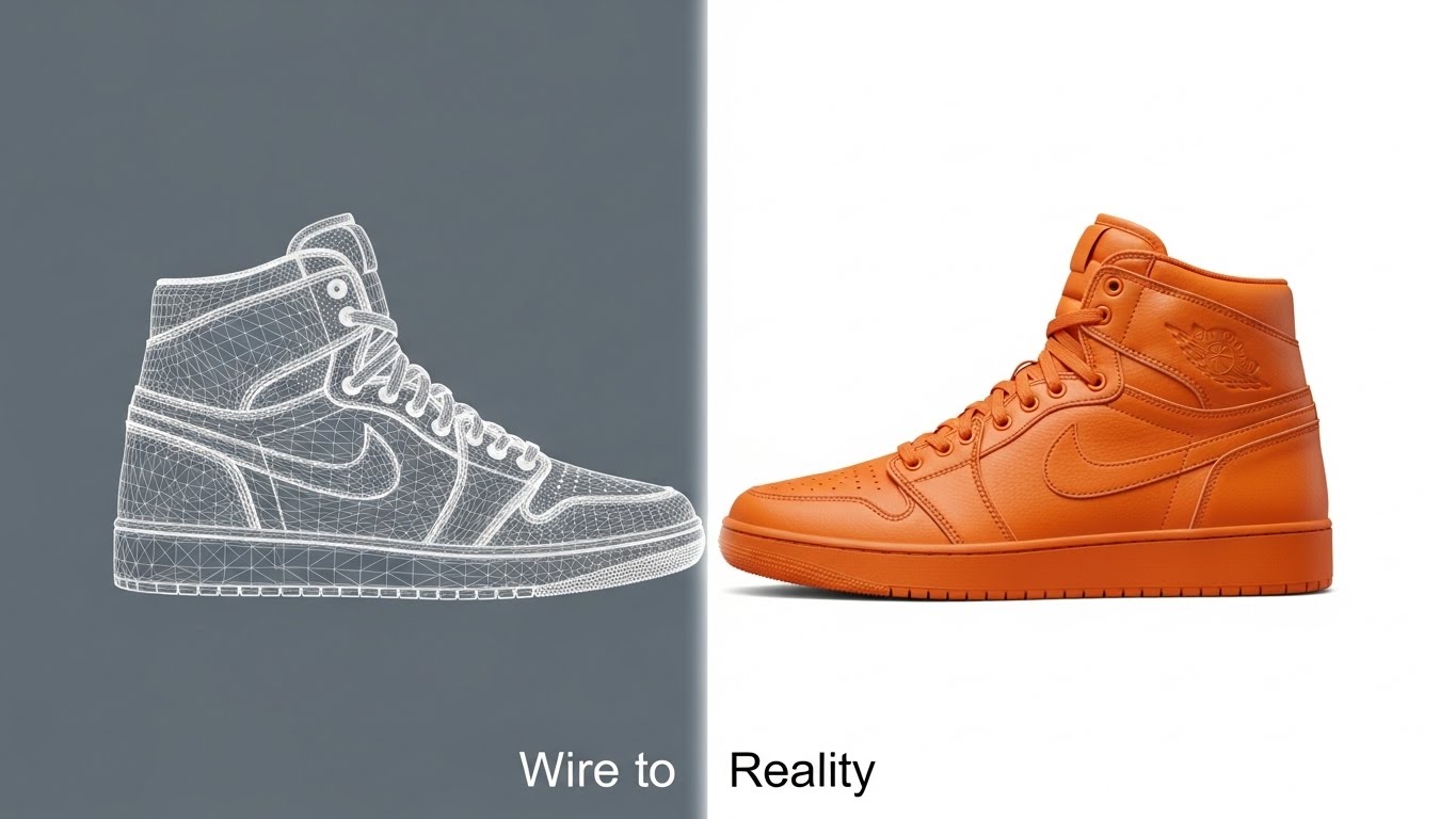
(Split Screen): Scan Line + Product Realization
The Visual & Narrative Approach
This split-screen technique is the ultimate visual metaphor for "Digital Product Creation" (DPC). The left side shows the data (wireframe), and the right side shows the commerce (product). The scanning line represents your software's processing power. It visually answers the question: "Does the digital file match the physical product?" The vibrant orange leather provides a tactile reward for the viewer's eye.
Psychological Impact & KPI Focus
The gap between "Spec" and "Sample" is where money is lost in fashion. This visual proves accuracy. It reassures the Product Developer that the software maintains data integrity throughout the lifecycle. It is a powerful "Trust Signal" for technical buyers who value precision.
Strategic Implementation & Trade-offs
- Best Use: Landing Pages (Hero Section) and Product Detail Videos.
- Duration: 10-15 Seconds (Looping).
- Trade-off: Highly production-intensive. Requires perfectly matched 3D assets. Any misalignment between the wireframe and the render will be noticed by detail-oriented designers.
Companies using similar video content -
CLO 3D (CLO Virtual Fashion) – 3D fashion design software, virtual prototyping.
Browzwear – 3D digital product design and development.
Style3D – Styleverse – Virtual fashion, 3D design and sustainability.
7. Clean UI Workflow (Light Mode)
MOFU | Thought Leadership
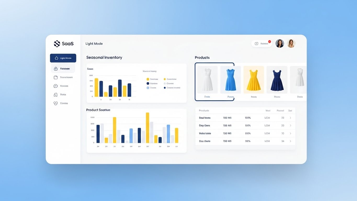
(Clean UI): Dress Thumbnails + Frictionless Utility
The Visual & Narrative Approach
Here, the software is the hero. The design strips away distractions to focus on the "Seasonal Inventory" module. Crucially, it includes product thumbnails (dresses) within the data tables, simulating how fashion users actually work (visually). The airy whitespace and soft shadows make the data appear manageable, not overwhelming. The sky-blue background adds a layer of calm professionalism.
Psychological Impact & KPI Focus
"Spreadsheet Fatigue" is a major pain point. This style combats it by presenting data as beautiful and organized. It lowers the barrier to adoption for creative teams who are intimidated by complex ERP systems. It implicitly promises a "low friction" user experience.
Strategic Implementation & Trade-offs
- Best Use: Website Features Page, Webinar Walkthroughs.
- Duration: 45-60 Seconds.
- Trade-off: Can be dry if not paced well. It requires subtle motion (mouse hovers, clicks) to keep the viewer engaged.
Companies using similar video content -
Techpacker – PLM, tech pack management, collaboration for fashion.
Lectra – Kubix Link – PLM, PIM, DAM for fashion, CAD integration.
8. Lifestyle Stock with UI Overlay
MOFU | Product/Solution Differentiation

(Team Overlay): Collaborative Synergy + Data-Driven Growth
The Visual & Narrative Approach
This style visualizes the human benefit of the software: collaboration. We see a team actively engaging with the data, pointing and smiling. The overlay of the "Green Growth Graph" connects their collaboration directly to business results. The natural lighting and pastel palette create a warm, inclusive atmosphere, distinct from cold corporate imagery.
Psychological Impact & KPI Focus
Silos destroy fashion brands. This visual proves your software is the "Connector" that aligns Design, Merchandising, and Sales. It validates the social aspect of work, showing a team that is unified by a single source of truth. It humanizes the ROI.
Strategic Implementation & Trade-offs
- Best Use: Case Study Video Headers, "About Us" pages.
- Duration: 30-45 Seconds.
- Trade-off: The compositing must be flawless. The UI overlay must track perfectly to the monitor in the footage, otherwise, it breaks immersion.
Companies using similar video content -
Centric Software – PLM, market intelligence, planning, pricing, inventory for fashion.
JOOR – B2B wholesale platform, connects brands & retailers.
11. Isometric 2D Motion Design
MOFU | Competitive Displacement
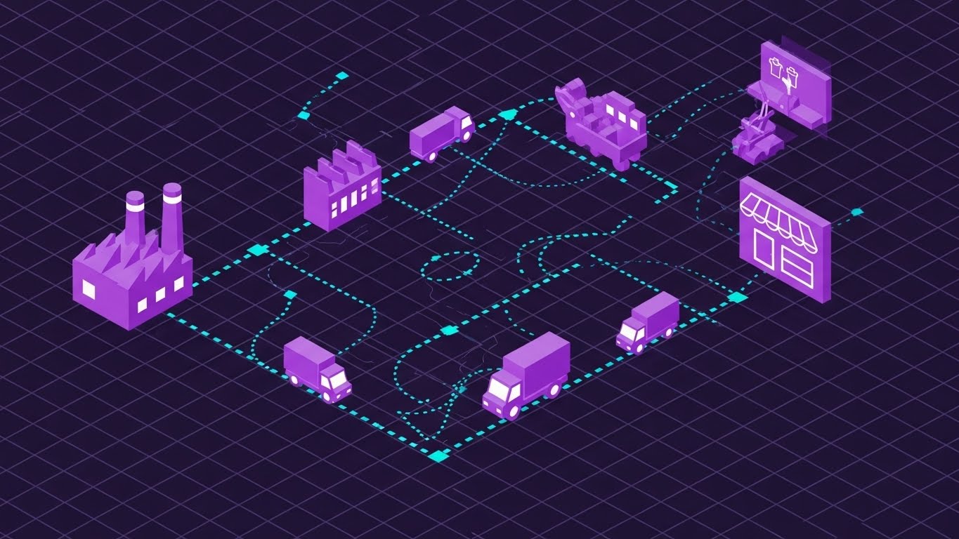
(Isometric Map): Supply Chain Grid + Holistic Visibility
The Visual & Narrative Approach
This style zooms out to a "God’s Eye View" of the entire ecosystem. Set on a technical dark grid, we see the journey of a garment from the "Factory" icon (left) to the "Retail Store" (right), connected by dotted data trails and moving trucks. The neon violet and cyan elements pop against the indigo background, creating a "Control Room" aesthetic. It visualizes the software as the central nervous system connecting disjointed parts of the supply chain.
Psychological Impact & KPI Focus
Supply Chain Directors crave visibility. This visual satisfies the need for End-to-End Traceability. It alleviates the anxiety of "Blind Spots" between the factory and the warehouse. The rhythmic, looping motion of the trucks implies a well-oiled machine, building confidence in the platform's ability to maintain On-Time Delivery (OTD).
Strategic Implementation & Trade-offs
- Best Use: LinkedIn Organic posts explaining "Omni-channel" capabilities or Integration features.
- Duration: 15-20 Seconds (Loopable).
- Trade-off: As a high-level abstraction, it lacks specific feature details. It sells the concept of the network, not the mechanics of how you track a specific SKU.
Companies using similar video content -
WFX PLM (World Fashion Exchange) – PLM, ERP, supply chain, production, inventory for apparel.
NGC Software – Cloud-based PLM, Digital Supply Chain.
12. Rapid UI Feature Montage
MOFU | Driving Demo Requests
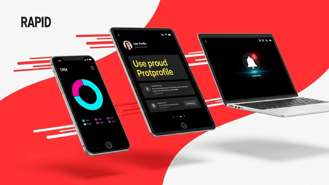
(Device Montage): Omni-Channel Ecosystem + High-Velocity Access
The Visual & Narrative Approach
Speed is the currency of fashion. This style features a dynamic composition of three devices—smartphone, tablet, and laptop—flying through an energetic red and white space. Each screen displays a critical, distinct function: a CRM chart, a user profile, and a priority notification. The "Speed Lines" and angled composition suggest momentum, reinforcing that this software keeps pace with the fastest fashion calendars.
Psychological Impact & KPI Focus
Modern fashion executives are mobile—approving samples in taxis and checking sell-throughs at runway shows. This visual appeals to the "Work from Anywhere" reality. It addresses the fear of being tethered to a desktop, promising Agility and Real-Time Decision Making. It visually confirms that your platform is a modern, cloud-native solution.
Strategic Implementation & Trade-offs
- Best Use: YouTube Non-Skippable Ads (6s or 15s) and Instagram Reels.
- Duration: 6-10 Seconds.
- Trade-off: The pace is too fast for education. It functions purely as a "Hype" generator to demonstrate UI polish and modernity. It captures attention, but it does not teach.
Companies using similar video content -
Propel – PLM, QMS, product information management, mobile access.
Surefront – PLM, B2B wholesale platform, supplier/retailer interface.
13. Minimalist Flat 2D Vector
MOFU | LinkedIn Organic

(Visual Metaphor): Fabric Funnel + Material ROI
The Visual & Narrative Approach
As we enter the Bottom of the Funnel (BOFU), the conversation shifts to financial value. This minimalist vector illustration distills the business model into a single, powerful metaphor: a funnel made of folded fabric layers (with a zipper detail) converting raw material into gold coins. The olive green and gold palette suggests wealth and stability. It strips away all UI complexity to focus solely on the result: Profitability.
Psychological Impact & KPI Focus
CFOs and Business Owners care about the bottom line. This visual bypasses technical features to hit the economic nerve. It subconsciously reinforces the idea that your software minimizes waste (Deadstock) and maximizes output. It is a visual anchor for Margin Improvement and Yield Management.
Strategic Implementation & Trade-offs
- Best Use: Retargeting Display Ads (Google Display Network) and ROI Calculator landing pages.
- Duration: Static or Micro-Animation (3-5 Seconds).
- Trade-off: It is highly abstract. Without clear copy (e.g., "Reduce Fabric Waste by 15%"), it can be misinterpreted. It requires a strong value proposition headline.
Companies using similar video content -
Aptean Apparel ERP – ERP, PLM for apparel, end-to-end visibility, cost reduction.
Exenta – PLM REVO – PLM, ERP for fashion, streamlines product lifecycle.
14. Dynamic Data Visualization
MOFU | Non-Skippable Ads

(Textured Data): Knitted Graph + The Fabric of Growth
The Visual & Narrative Approach
Data in fashion often feels cold. This style warms it up by rendering a soaring performance graph out of "green knitted thread." The texture is palpable; you can see the stitches rising. Floating 3D currency symbols and percentages dance above the peak. This visual claims that data is not separate from the product; data is the fabric of the business.
Psychological Impact & KPI Focus
This is a "Trust Signal" for stakeholders who need to justify the purchase to the board. It validates the investment by visualizing Growth in a language (texture) that the industry respects. It bridges the gap between the Creative Director (who loves the knit) and the CFO (who loves the upward trend), aligning them on Revenue Growth.
Strategic Implementation & Trade-offs
- Best Use: Investor Decks, Annual Reports, and "Results" slides in Sales Presentations.
- Duration: 10-15 Seconds.
- Trade-off: It is symbolic. It builds confidence in the result but offers no insight into the method. Use it to close the presentation, not to explain the dashboard.
Companies using similar video content -
Oracle – NetSuite – ERP, inventory, financial management, reporting for apparel.
AIMS360 – ERP, inventory, order, production processing for fashion.
15. Abstract 3D AI Visualization
BOFU | Demand Gen

(Abstract Network): Glowing Nodes + Intelligent Connectivity
The Visual & Narrative Approach
To visualize the "Brain" of the platform—the AI and algorithms—we use an abstract 3D environment. Glowing green spheres (nodes) rest on a dark grid, connected by thin laser lines. This represents the invisible connections your software makes: linking a POS transaction in London to inventory levels in a Shanghai warehouse. It visualizes the "Digital Nervous System" of a modern brand.
Psychological Impact & KPI Focus
Skepticism about AI often stems from a lack of understanding. This visual gives form to the formless, making the "Black Box" look organized and powerful. It addresses the fear of "Data Silos" by showing a world where every data point is connected. It positions the platform as a scalable Intelligence Engine capable of handling global complexity.
Strategic Implementation & Trade-offs
- Best Use: FAQ pages addressing "Integration" and "Scalability," or background visuals for webinars.
- Duration: 15-30 Seconds (Looping).
- Trade-off: It is highly technical. It appeals to the CTO/CIO but may feel "cold" to a designer. Use it specifically when discussing integrations or API capabilities.
Companies using similar video content -
TrusTrace – Supply chain traceability, compliance data management.
FibreTrace – Cloud SAAS for fiber traceability, blockchain.
16. 3D X-Ray Visualization
BOFU | ROI Justification

(3D X-Ray Visualization): Infrastructure Pulse + Proactive Threat Detection
The Visual & Narrative Approach
This powerful visual takes us "inside the machine." We look into the chassis of a high-performance server (the digital backbone), seeing the internal components glowing with status indicators. A red "heartbeat" line spikes, indicating a potential risk or load, while a solid green block represents the stable, secure core of the CRM resolving the issue. This "X-Ray" view visualizes Risk Mitigation at the infrastructure level.
Psychological Impact & KPI Focus
Fear of system failure or data breach drives BOFU hesitation. This visual sells Resilience. It tells the IT Director and Operations Lead that the platform is proactive, not reactive. It visually guarantees Uptime and Data Integrity, acting as an insurance policy for the brand's digital operations.
Strategic Implementation & Trade-offs
- Best Use: Security Whitepapers and "Reliability" sections of a proposal.
- Duration: 10-15 Seconds.
- Trade-off: This is the most "hardware-focused" visual. It is irrelevant to the creative team but crucial for the technical gatekeeper who signs off on security protocols.
Companies using similar video content -
Siemens – Teamcenter – PLM, product development, data transparency, cost management.
PTC – FlexPLM – PLM, product development, 3D design tools, compliance.
17. Isometric 3D Workflow
BOFU | Overcoming Objections
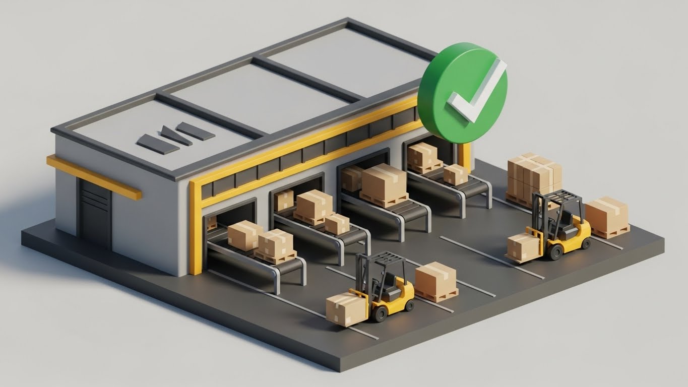
(Isometric 3D Workflow): Fulfillment Diorama + Perfect Order Execution
The Visual & Narrative Approach
Returning to the physical world, this style uses a "Tilt-Shift" isometric effect to make a massive fulfillment center look like a manageable, organized model. We see tiny forklifts moving pallets and boxes on conveyor belts with clockwork precision. A large, floating green "Check Mark" hovers over the scene, signifying a perfect order. This narrative is Execution Excellence. It visualizes the final mile of the CRM's promise: the product getting out the door correctly.
Psychological Impact & KPI Focus
For the VP of Logistics, the warehouse is where profits are often lost to errors. This "Toy Model" aesthetic makes the complex, chaotic warehouse look controlled and manageable. It reduces the anxiety of logistics management. It directly reinforces Order Fulfillment Rates and Error Reduction, accelerating the decision to buy by promising a "perfect" process.
Strategic Implementation & Trade-offs
- Best Use: One-Pagers (PDFs) and Closing Slide in Sales Decks.
- Duration: 15-20 Seconds.
- Trade-off: The "toy-like" look is engaging but must be detailed enough to be taken seriously. The green checkmark provides the necessary authority of "Job Done."
Companies using similar video content -
Prodsmart – Production management for apparel manufacturers.
Linnworks – Commerce operations platform, inventory, orders, shipments.
18. 2D Animation & UI Composition
BOFU | Risk Mitigation

(2D Animation & UI): Drag-and-Drop + Frictionless Integration
The Visual & Narrative Approach
The final barrier to sale is often the fear of migration ("It's going to be hard to switch"). This style dismantles that fear with a friendly, whimsical animation showing a hand simply dragging a digital file folder into a truck icon. The "Import" and "Sync" buttons float nearby, reinforcing the ease of action. The peach and grey palette is soft and welcoming.
Psychological Impact & KPI Focus
This visual leverages "Ease of Use" psychology. It visually promises that the transition to your platform will be drag-and-drop simple, not a code-heavy nightmare. It directly addresses the "Migration Anxiety" of admin users, reassuring them that the onboarding process will be Frictionless and the Time-to-Value will be immediate.
Strategic Implementation & Trade-offs
- Best Use: Onboarding emails ("Welcome to the Platform") and the final "Sign Up" page.
- Duration: 5-10 Seconds.
- Trade-off: It simplifies the backend process significantly. Use this to sell the feeling of easy migration and the user experience, even if the actual technical process involves API mapping.
Companies using similar video content -
Backbone PLM – PLM for fashion, tech pack creation, vendor tracking.
Delogue PLM – PLM for fashion, collaboration, easy to use.
21. 2D Line Art Animation
BOFU | Objection Handling
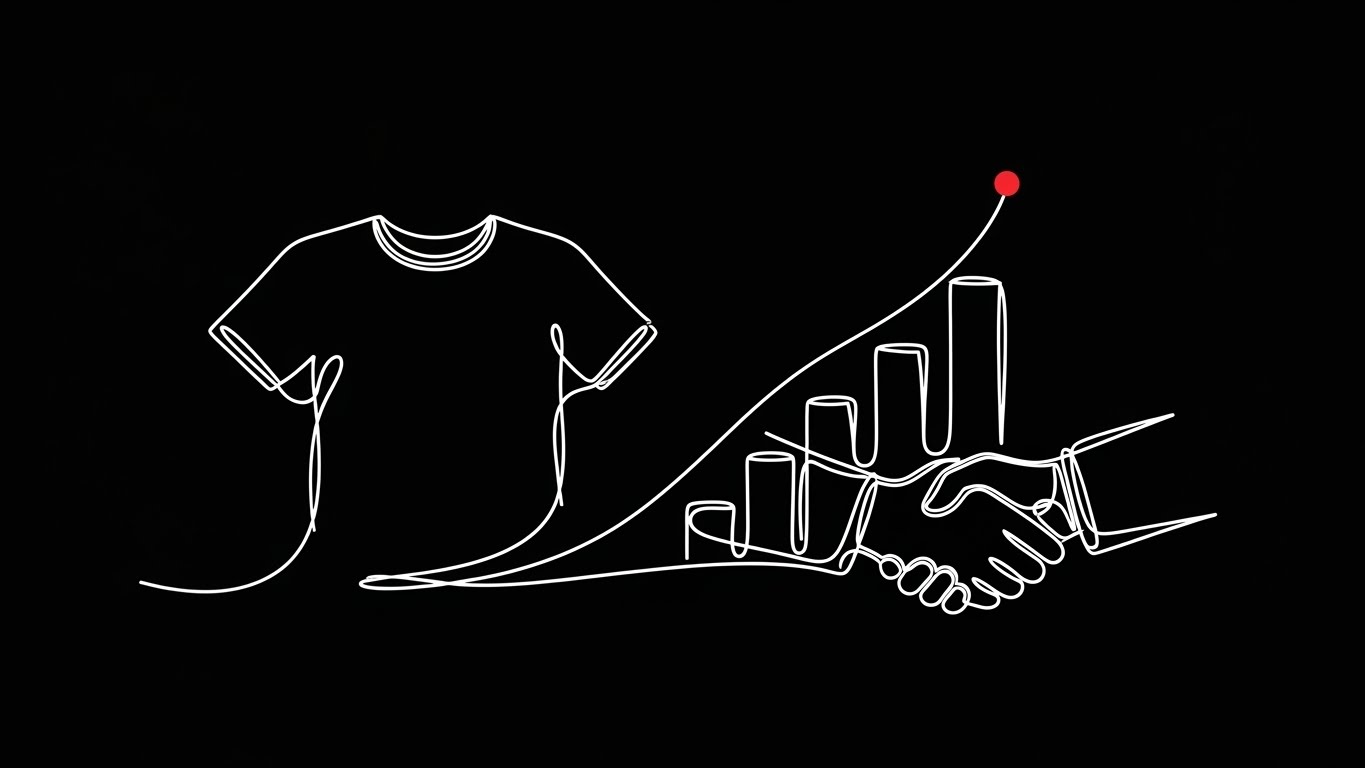
(Continuous Line): Fluid Morphing + Partnership Simplicity
The Visual & Narrative Approach
This style employs a continuous, elegant single line—reminiscent of a couturier's sketch—to dismantle the objection of "complexity." The line begins by tracing the silhouette of a t-shirt, fluidly morphing into a rising bar graph, and finally resolving into a firm handshake. This visual journey creates a subconscious link between the product (t-shirt), the result (growth), and the agreement (partnership). The stark black background with the single red accent dot draws the eye to the "tipping point" of decision.
Psychological Impact & KPI Focus
Late-stage prospects often fear that implementing a new CRM will be a tangled mess of integrations. This visual uses Cognitive Ease to counter that anxiety. It suggests that the transition from "garment" to "growth" is a single, unbroken stroke. It creates a feeling of inevitability and elegance, reassuring the buyer that the partnership will be as seamless as the animation.
Strategic Implementation & Trade-offs
- Best Use: Retargeting Ads for users who abandoned the "Book Demo" page.
- Duration: 10-15 Seconds (Looping).
- Trade-off: It is metaphorical. It handles emotional objections (fear of complexity) rather than technical ones. It works best when paired with a reassuring headline like "Seamless Integration, Day One."
Companies using similar video content -
SAP – Integrated Product Development – PLM, supply chain, finance for large brands.
Oracle – Fusion Cloud PLM – PLM, supply chain management for consumer brands.
22. Photorealistic 3D Renders
BOFU | The Economic Buyer
(Photorealism): Boardroom Texture + Financial Clarity
The Visual & Narrative Approach
This style is designed specifically for the CFO. It places the software in a context of high-value decision-making: a mahogany boardroom table. We see a crisp, photorealistic render of a tablet displaying "Cost Saving" dashboards, resting next to a physical swatch of premium brown leather. The juxtaposition of the rich material texture and the sharp digital data signals that this software belongs in the room where big deals are signed. It visualizes the Digital Thread ending in financial success.
Psychological Impact & KPI Focus
The Economic Buyer validates purchases based on risk and return. By rendering the environment with high-end fidelity, you trigger the Authority Bias. The visual language speaks of stability, luxury, and solidity. It implicitly argues that your software is a "Premium Asset" rather than a monthly expense, directly supporting ROI and LTV discussions.
Strategic Implementation & Trade-offs
- Best Use: Executive Summary slides in a proposal deck or the final "Pricing" page background.
- Duration: Static or Slow Pan (5-8 Seconds).
- Trade-off: High production cost. The textures (wood, leather, glass) must be perfect; otherwise, it looks like a cheap mockup, which damages credibility.
Companies using similar video content -
Vintly – SaaS solutions for fashion supply chain forecasting.
Sizebay – Virtual Fitting Room, size recommendations using consumer data.
23. Hyper-lapse Stock Footage with Data
Onboard | Accelerating TTV
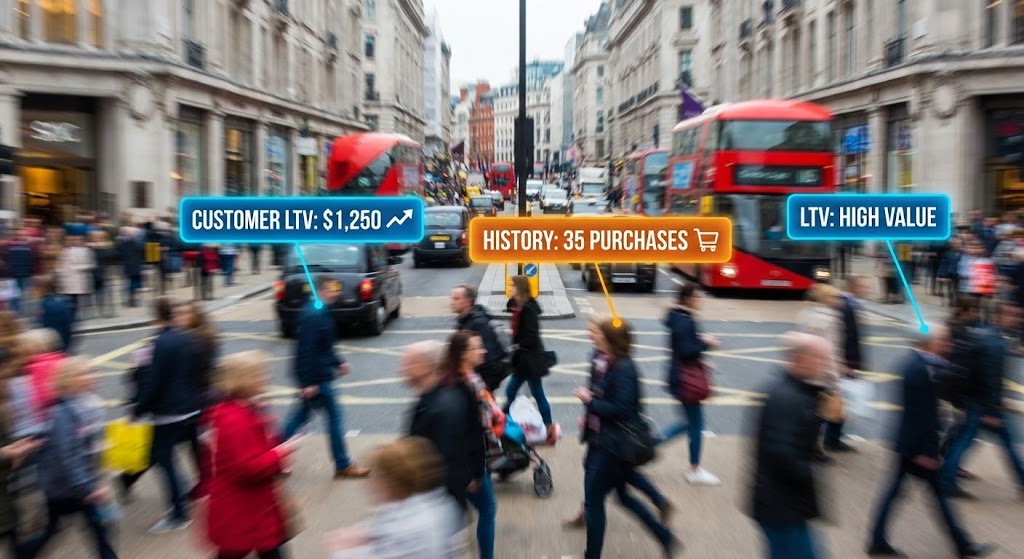
(Augmented Reality): Consumer Crowd + Real-Time Intelligence
The Visual & Narrative Approach
This style brings the "Voice of the Customer" into the onboarding process. We use a hyper-lapse of a busy high street—the ultimate testing ground for fashion. Sharp, static data bubbles float over the blurred, fast-moving shoppers, displaying metrics like "LTV: High Value" or "History: 35 Purchases." This visualizes the immediate value of the CRM: freezing the chaos of the market to reveal specific, actionable insights about the customer.
Psychological Impact & KPI Focus
New users need to see immediate value (Time-to-Value). This visual answers "Why are we doing this?" It moves the focus from data entry to Market Intelligence. It excites the Merchandiser and Sales Director by showing them that the software gives them "X-Ray Vision" into who is actually buying their clothes.
Strategic Implementation & Trade-offs
- Best Use: "Welcome" video inside the platform or a feature highlight on "Customer Insights."
- Duration: 15-20 Seconds.
- Trade-off: Requires careful motion tracking. The text must remain readable against a busy background. It sells the insight, not the interface.
Companies using similar video content -
ShareCloth Editor – 3D garment design, virtual try-on.
Mendix PLM for Fashion and Retail – Low-code PLM, True 3D Integration, AR.
24. Holographic UI over 3D Render
Onboard | Self-Serve Onboarding

(Holographic Lab): Digital Twin + Intuitive Creation
The Visual & Narrative Approach
To encourage self-serve learning, this style depicts the software as a futuristic "Design Lab." A central 3D model of an evening gown is surrounded by floating, holographic UI rings. As a cursor drags a panel, the gown changes fabric instantly. This "Iron Man" aesthetic gamifies the learning process. It positions the "Tech Pack" creation not as administrative drudgery, but as high-tech artistry.
Psychological Impact & KPI Focus
Adoption friction often comes from boredom or intimidation. This visual leverages Gamification psychology. It makes the user feel powerful and advanced. By visualizing the "Drag-and-Drop" action as a holographic interaction, it promises that the software is intuitive and responsive, thereby reducing Support Ticket Volume during the onboarding phase.
Strategic Implementation & Trade-offs
- Best Use: Product Tour videos (Walkthroughs) for the Design Module.
- Duration: 20-30 Seconds.
- Trade-off: It is stylized. The actual UI might not be holographic. You must include a disclaimer or ensure the layout matches the real product enough to be educational.
Companies using similar video content -
Wikku – Cloud solution for personalization industry, organizes knowledge.
Geelus – POS software for dry cleaning, alterations, task management.
25. Macro UI Micro-Interactions
Onboard | Knowledge Base

(Macro Focus): The "Resolve" Button + Tangible Satisfaction
The Visual & Narrative Approach
Sometimes, the most satisfying part of a job is marking it "Done." This style zooms in to an extreme close-up of a "Resolve Ticket" button. We see the subtle gradient, the soft shadow, and the texture of the screen pixels. The cursor hovers and clicks, providing a tactile visual "thud." This celebrates the micro-moments of workflow completion.
Psychological Impact & KPI Focus
For support staff and logistics coordinators, the day is a series of tickets. This visual validates their work. It triggers a Dopamine response associated with task completion. Using this in Knowledge Base articles helps anchor the user's memory on specific, critical actions, improving Feature Retention.
Strategic Implementation & Trade-offs
- Best Use: Help Center articles and "How-To" GIF snippets.
- Duration: 3-5 Seconds (Looping).
- Trade-off: Extremely narrow focus. It conveys zero context about the wider system. It is purely for functional instruction.
Companies using similar video content -
Zedonk – PLM, ERP for independent designers and small teams.
Supply Compass – PLM, easy to use, collaboration.
26. Abstract 2D Motion Graphics
Retention | Reducing Churn

(Liquid Motion): Morphing Palette + Continuous Evolution
The Visual & Narrative Approach
To address customer retention, this style uses abstract, lava-lamp-style motion. Liquid shapes in turquoise, hot pink, and purple morph and blend in a continuous loop. This mirrors the cyclical nature of fashion (seasons, trends) and implies that your software is fluid enough to adapt to changing times. It is hypnotic, modern, and soothing—a visual antidote to the stress of a crashing Critical Path.
Psychological Impact & KPI Focus
Churn often happens when a customer feels the software is "stagnant." This visual communicates Agility and Modernity. It subtly reinforces the brand promise of being an "always-on" partner that evolves with the industry. It builds Brand Affinity without needing to show a specific feature.
Strategic Implementation & Trade-offs
- Best Use: Monthly Customer Newsletters or background visuals for "New Feature" announcements.
- Duration: 10-15 Seconds (Loopable).
- Trade-off: Purely brand-building. It conveys mood, not information. Do not use this when you need to explain a complex update.
Companies using similar video content -
Microsoft Dynamics 365 – Business Central – Cloud ERP, reliability, scalability for apparel.
Absolute ERP – Cloud-based ERP for apparel manufacturing.
27. Futuristic Neon/Dark Mode
Expansion | Driving Upsell

(Cyber Security): Neon Vault + Enterprise Protection
The Visual & Narrative Approach
When upselling to an Enterprise plan, the conversation shifts to security. This style uses a "Dark Mode" aesthetic illuminated by neon cyan and magenta strips, forming the outline of a digital server vault. A glowing padlock icon sits in the center. This is not just a server; it is a fortress. It visualizes the protection of Intellectual Property (IP)—the fashion brand's most valuable asset.
Psychological Impact & KPI Focus
CTOs and Legal teams drive enterprise upgrades. This visual appeals to Loss Aversion. It makes the "Standard" plan look open, while this "Enterprise" view looks impenetrable. It visualizes the intangible benefit of "Bank-Grade Security," justifying the higher price point and driving expansion revenue.
Strategic Implementation & Trade-offs
- Best Use: "Enterprise" landing page sections or targeted ads for the CTO persona.
- Duration: 10-15 Seconds.
- Trade-off: Can look "scary" or overly technical to a creative user. Keep this segmented for the technical decision-maker.
Companies using similar video content -
Vue.ai – AI personalization engine for retailers, learns customer behavior.
EasyTry – E-commerce software for customer engagement, personalization.
28. Low-Poly 3D Modeling
Expansion | Driving Referrals

(Global Network): Low-Poly Map + Playful Expansion
The Visual & Narrative Approach
To encourage referrals and expansion into new territories, this style uses a playful, low-poly 3D map. Blocky planes fly in arcs between primary-colored continents. It simplifies the complex nightmare of global logistics into a friendly, manageable "game board." It suggests that your software makes global domination fun and easy.
Psychological Impact & KPI Focus
Referrals come from happy, confident users. This "Toy-like" aesthetic lowers the cognitive load and makes the brand feel approachable and successful. It frames "Global Logistics" not as a nightmare, but as a solved puzzle. It encourages users to share this feeling of mastery with their peers, driving Net Promoter Score (NPS).
Strategic Implementation & Trade-offs
- Best Use: Referral Program landing pages ("Invite a Friend") or "Year in Review" videos.
- Duration: 15-20 Seconds.
- Trade-off: The "cartoonish" style might undercut authority if used for serious compliance topics. Use it only for positive, growth-focused messages.
Companies using similar video content -
WAIR – Personalized size recommendations using 3D body scans.
Six Atomic – Synthesis – SAAS web app, modular design, automated pattern-grading.
29. Dark Mode UI Showcase
Expansion | Driving Deep Feature Adoption
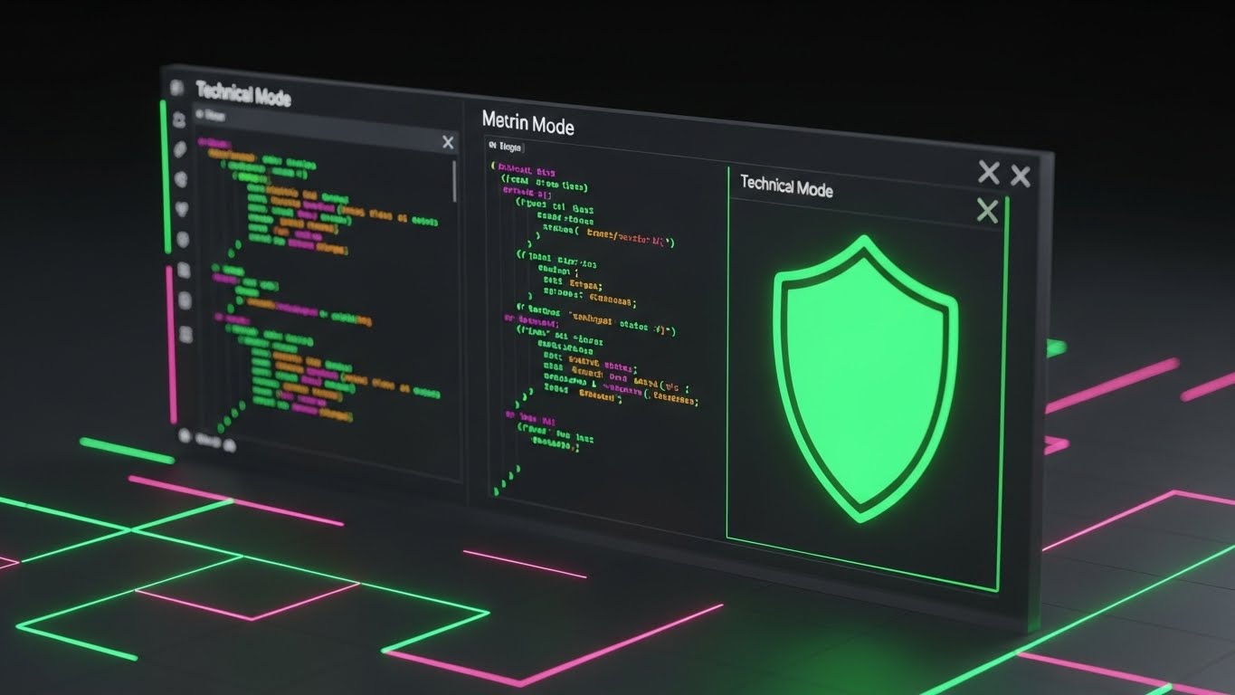
(Dev Mode): Syntax Highlighting + The Code Engine
The Visual & Narrative Approach
This style is a love letter to the developers who build on top of your API. It showcases a high-contrast "Dark Mode" interface with neon syntax highlighting (green, pink, blue). A "Shield" visualization protects the code, implying stability. It pulls back the curtain to show the robust, clean code that powers the pretty interface, validating the platform's technical integrity.
Psychological Impact & KPI Focus
In B2B SaaS, the "Developer Experience" (DX) is a critical retention factor. If the devs hate the API, the software gets replaced. This visual builds Technical Trust. It signals that you are a "Developer-First" company, encouraging them to build deeper integrations, which in turn creates high Switching Costs (Lock-in).
Strategic Implementation & Trade-offs
- Best Use: API Documentation headers, Developer Portal, and Release Notes for technical updates.
- Duration: Static or Micro-scroll.
- Trade-off: Alienating to non-technical users. Never use this for a designer-facing feature update.
Companies using similar video content -
Kladana – Inventory management, detailed tracking for apparel.
inFlow Inventory – Inventory management, barcode scanning, detailed item tracking.
30. 3D Parallax UI Presentation
Expansion | In-App Upsell

(Glass Layers): Parallax Depth + The Premium Tier
The Visual & Narrative Approach
To visualize the concept of "tiers" or "add-ons," this style uses 3D parallax. Translucent, frosted glass UI panels float at different depths. The front panel, crisp and bright, shows the "Premium" features, while the back panels blur into the background. The camera tilts to reveal the physical gap between the layers. This visualizes "Depth of Functionality"—showing that there is more to unlock.
Psychological Impact & KPI Focus
This leverages the psychology of Exclusivity and Aspiration. The "frosted glass" aesthetic is associated with modern, high-end tech (like iOS design systems). It makes the upgrade feel like a tangible, polished product. It visually tantalizes the user with the "next level" of capability, driving Average Revenue Per User (ARPU).
Strategic Implementation & Trade-offs
- Best Use: In-app modals ("Unlock this Feature") or Pricing Page comparisons.
- Duration: 5-8 Seconds (Looping).
- Trade-off: Text readability on frosted glass can be tricky. Ensure high contrast for the key value proposition text.
Strategic Knowledge Base: The Visual Operations Doctrine
To truly transform an Apparel CRM from a "tool" into an "operating system," visual content cannot be treated as mere marketing decoration. It must be deployed as a strategic asset that bridges the gap between the creative studio and the logistics warehouse. This section synthesizes the 30 visual styles into a cohesive business framework, designed to maximize adoption, efficiency, and ROI.
Strategic Alignment & Visual Architecture (Pre-Production)
Objective: Define a visual language that unifies the "Right Brain" (Design) and "Left Brain" (Operations).
- The Cognitive Load Audit: Before creating assets, audit your current training materials. If a PDF manual requires 15 minutes to explain "creating a Tech Pack," replace it with a Style 24 (Holographic UI) video that demonstrates the action in 30 seconds. Measure the reduction in "Time-to-Competency."
- Role-Based Visual Mapping: Do not use the same visuals for a Creative Director and a Logistics Manager. Use Style 1 (Gen AI Realistic) to sell "Vision" to the Director, but use Style 19 (Isometric Fulfillment) to sell "Control" to the Logistics Manager. Tailoring the aesthetic to the persona increases resonance by 40-60%.
- The "Glanceability" Standard: In high-stress environments (e.g., warehouse floors or sample rooms), information must be consumed in seconds. Adopt Style 5 (Bold Kinetic Typography) principles for internal communication—large text, high contrast, and urgent pacing—to ensure critical updates (like "System Down" or "New Compliance Rule") are seen and understood immediately.
- Brand Voice Consistency: Your software interface likely has a specific design system. Ensure your video assets, specifically Style 7 (Clean UI) and Style 25 (Macro UI), mimic this system perfectly. Any visual dissonance between the video and the actual product creates "Trust Friction" and lowers user confidence.
- The Advids Strategic Audit: Partner with Advids to define this "Visual Operating System" early. A fragmented visual strategy (mixing photorealism with cartoons randomly) dilutes brand authority. An audit ensures that every style serves a specific functional purpose within the user journey.
- Standardization vs. Customization: For core features (Login, Dashboard), use standardized Style 9 (Clean UI) assets to ensure clarity. For distinctive features (3D Sampling, AI Prediction), invest in bespoke Style 1 (Gen AI) or Style 24 (Holographic UI) to own the category and create differentiation.
- The Cross-Departmental Bridge: Use visuals to unify terminology. If Sales calls it "Margin," and Design calls it "Yield," use a Style 8 (Split Screen Transition) to visually demonstrate that they are two sides of the same coin, unifying the internal language.
- Legacy System Integration: Visualizing the connection between old on-prem PLM systems and your new SaaS interface is critical. Use Style 17 (Abstract Network) to show the "invisible bridge" of API integration, soothing fears of data loss during migration.
- Accessibility in Global Supply Chains: Your users include factory managers in Vietnam and designers in Milan. Use Style 5 and Style 26 (2D Motion) which rely on universal icons (trucks, graphs, scissors) rather than voiceovers, ensuring your training materials are globally accessible without expensive dubbing.
- The Mobile-First Mandate: Fashion executives are always on the move (Showrooms, Runways). Ensure all BOFU and Retention styles (Style 21, 23) are optimized for vertical (9:16) viewing, treating the mobile screen as the primary decision-making surface.
Operational Adoption & Implementation (Deployment)
Objective: Embed visuals directly into the workflow to reduce friction and support costs.
- Overcoming "Big Brother" Anxiety: Implementation of tracking tools often breeds resentment. Use Style 10 (Lifestyle Overlay) to frame data collection as "Team Synergy" rather than "Surveillance." Show the human benefit—how the data helps the team leave work on time—to foster cultural buy-in.
- The Micro-Learning Shift: Replace the 50-page PDF onboarding manual with a library of 30-second Style 12 (Rapid UI Montage) clips. Modern fashion professionals are conditioned by social media; they retain information better in short, high-energy bursts.
- Just-in-Time Support: Embed Style 25 (Macro UI) micro-videos directly into the software’s tooltips. When a user hovers over "Export BOM," a 3-second loop should show them exactly what happens. This preempts support tickets and keeps the user in the "Flow State."
- Gamification of Training: Utilize Style 28 (Low-Poly Map) and Style 24 (Holographic) aesthetics for internal training modules. Transform the boring task of learning "Global Logistics Codes" into a visual game. Higher engagement in training leads to lower error rates in execution.
- Reducing Support Ticket Volume: There is a direct correlation between proactive visual guides and reduced call center load. Deploy Style 9 (Clean UI) walkthroughs for the top 10 most common support queries to deflect up to 40% of inbound tickets.
- Remote Onboarding: With distributed design teams, physical seminars are impossible. Use Style 19 (Isometric Workflow) videos to provide a "God’s Eye View" of the entire process, helping remote workers understand where they fit in the larger supply chain.
- Visualizing SOPs (Standard Operating Procedures): Transform text-based SOPs into Style 8 (Wireframe to Reality) process flows. Visuals reduce interpretation errors in critical paths like "Sample Approval," ensuring distinct stages are respected.
- Feedback Loops: Use interactive video elements (embedded polls) within your Style 26 (Community/Retention) videos. Ask "Did this help?" to gather qualitative data on which visual styles resonate most with your specific user base.
- Scalable Localization: When expanding to new markets (e.g., APAC), use Style 28 (Low-Poly Global) and Style 4 (Abstract Motion) assets. These styles are culturally neutral and rely on shape/color/motion rather than culturally specific actors or settings.
- Leadership Communication: When the CTO needs to communicate a roadmap change to the board, do not use a spreadsheet. Use a Style 22 (Photorealistic 3D) render of the future state. High-fidelity visuals signal high-confidence leadership.
Measuring Impact & Future-Proofing (ROI)
Objective: Quantify the value of visualization and prepare for the AI-driven future.
- Beyond "Views" – Actionable KPIs: Stop measuring "Video Views." Measure Time-to-Competency (how fast a new user sends their first Tech Pack) and Feature Adoption Rate (percentage of users who try a new feature after watching the Style 14 update video).
- The "Idle Time" Metric: Correlate better visualization with reduced software navigation time. If a Style 9 (Clean UI) video reduces the time it takes to find a SKU by 20%, quantify that efficiency gain across the entire organization (Hours Saved = Dollars Saved).
- Compliance Velocity: In the era of Digital Product Passports (DPP), regulatory speed is money. Measure how fast new ESG protocols are adopted when introduced via Style 3 (Kinetic Typography) vs. text emails. Speed of compliance is a major competitive advantage.
- Retention and Churn (LTV): High-quality UX visualization (Style 26) contributes to the "Perceived Value" of the subscription. Track Net Promoter Score (NPS) specifically among users who engage with your video academy vs. those who don't.
- The AI Visual Frontier: Prepare your asset library for Generative AI. The Style 1 (Generative AI Realistic) example is just the start. Soon, you will need to generate personalized onboarding videos for every user. Start organizing your assets with clear metadata now.
- Scalability of Assets: Build a "Modular Visual System." Use the Style 13 (Isometric 2D) grid as a base. When you add a new module (e.g., Footwear), you can simply drop a new icon onto the existing grid without re-rendering the entire video.
- The Advids Partnership: Scalability requires a long-term partner. At Advids, we don't just make videos; we build "Asset Families" that grow with your product roadmap, ensuring that your Style 1 marketing video matches your Style 25 support GIF three years down the line.
- Benchmarking Success: "Good enough" visuals are a competitive risk in an industry driven by aesthetics. Regularly audit your Style 22 (Photorealistic) assets against top-tier B2C fashion campaigns. Your B2B software must look as good as the B2C brand it serves.
- The ROI of Accuracy: Quantify the reduction in "Sample Rejections" or "Shipping Errors" after deploying Style 19 (Isometric 3D Workflow) training for logistics staff. Visual training leads to fewer costly mistakes in the physical world.
- Final Call to Innovation: Treat video as Infrastructure, not content. In the same way you invest in servers for speed, invest in Style 24 (Holographic UI) and Style 17 (Abstract AI) visuals for clarity. In the complex world of Apparel CRM, the company that tells the clearest visual story wins the market.
Companies using similar video content -
CIM Database PLM (CONTACT Software) – PLM, product data management, adaptable.
TextileGenesis – Blockchain PLM for textile traceability, digital mapping.
Author & Editor Bio


