
Introduction: Stitching the Digital Thread
The apparel industry is undergoing its most significant metamorphosis in a century. We are moving from an era defined by intuition and sketches to one driven by data and digital twins. For the modern apparel executive, the challenge is no longer just "creating the next trend"—it is managing the immense complexity of a global supply chain with precision and speed.
The "Digital Thread"—the seamless flow of data from fiber to consumer—is the new gold standard. However, communicating the value of complex Product Lifecycle Management (PLM) and ERP platforms remains a hurdle. How do you visualize the invisible efficiency of a cloud-based tech pack? How do you make a Bill of Materials (BOM) feel as compelling as a runway show?
The opportunity for software providers is immense. Industry data indicates that brands leveraging 3D sampling and digital design workflows cut product development times by up to 50%, proving that the integration of advanced digital tools is directly correlated with market agility. Furthermore, with the global fashion apparel PLM software market projected to grow at a CAGR of around 12.08%, the status quo is quickly becoming a liability.
This guide presents a strategic visual framework for Apparel Management SaaS. We have curated 30 distinct video styles designed to bridge the gap between the tactile world of fabric and the logical world of data. These examples demonstrate how to reduce cognitive load, increase buyer confidence, and visualize the future of fashion technology.
1. The Digital Weaving Metaphor
TOFU | Brand Awareness

The Visual & Narrative Approach
This style masterfully bridges the physical and the digital. We observe rolls of satin-finished fabric in vivid magenta and deep indigo unspooling. However, instead of draping onto a table, the fabric seamlessly morphs into organized streams of digital data lines. These fluid, organic curves intertwined with rigid, geometric squares visualize the concept of "Digital Weaving." The tone is sophisticated yet tech-forward, utilizing a clean white background to emphasize the purity of the data.
Psychological Impact & KPI Focus
Fashion professionals are tactile learners; they trust what they can feel. By visually transforming a "roll of fabric" into a "stream of data," this style validates their craft while introducing the necessity of digitization. It reduces the anxiety of "losing the art" to software. The organic shapes reduce Cognitive Load, making the transition to a digital workflow feel natural rather than forced.
Strategic Implementation & Trade-offs
- Best Use Case: Top-of-Funnel (TOFU) Instagram or LinkedIn ads where you need to stop the scroll with color and movement.
- Duration: 15-20 Seconds.
- Trade-off: This style is metaphorical. It builds brand affinity but does not explain how the software works. It is a "hook," not a "tutorial."
Companies using similar video content -
WFX – Fashion PLM – Cloud-based PLM for fashion, centralizing data.
Lectra – Kubix Link – Open cloud platform for fashion PLM, PIM, DAM.
Propel – Propel PLM – Unifies PLM, QMS, PIM on a single platform.
2. The Global Ecosystem Network
TOFU | Category Creation

The Visual & Narrative Approach
A high-fidelity 3D visualization depicting the "brain" of the supply chain. A complex network of glowing cyan and teal nodes pulses against a medical-grade white background. The nodes are abstract representations of key industry stakeholders—textile mills, shipping containers, and retail storefronts—connected by luminous fiber-optic lines. The camera drifts slowly, conveying a sense of scale and control.
Psychological Impact & KPI Focus
The core anxiety of the Operations Director is "visibility"—the fear of not knowing where inventory is. This visual style directly addresses that fear by presenting the software as an omniscient, interconnected ecosystem. The cool cyan tones evoke trust, stability, and intelligence (common in SaaS color psychology), reassuring the viewer that the platform can handle Global Logistics without crashing.
Strategic Implementation & Trade-offs
- Best Use Case: The Hero section of your website. It instantly establishes the platform as an "Enterprise-Grade" solution.
- Duration: 30-60 Seconds (Looping).
- Trade-off: High production value requires significant rendering time. It is less effective for mobile screens where fine details (the fiber-optic lines) may get lost.
Companies using similar video content -
Zeus Command AI – Apparel SCM – AI-powered real-time visibility for global supply chains.
Infor – CloudSuite Fashion – ERP with AI for global fashion supply chain.
SAP – S/4HANA for Fashion – End-to-end ERP for global fashion operations.
4. The Kinetic SKU Explosion
TOFU | Brand Perception
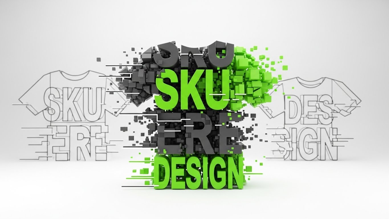
The Visual & Narrative Approach
This style utilizes aggressive, energetic motion to visualize the power of data management. Large, blocky geometric forms in electric lime green and charcoal gray aggregate to form the abstract silhouette of a t-shirt. Suddenly, the shape "explodes" into a cloud of precise digital pixel particles, revealing the text concepts of "SKU" and "DESIGN" within the debris. It is a visual metaphor for breaking down a finished product into its constituent data points.
Psychological Impact & KPI Focus
The energy here signals "Speed" and "Disruption." It appeals to the younger demographic of fashion buyers and designers who value agility. The "explosion" is cathartic—it suggests that the software can deconstruct complex problems instantly. The high contrast of lime on white captures attention immediately in a crowded social feed, signaling Innovation.
Strategic Implementation & Trade-offs
- Best Use Case: Hype reels for a new feature launch or a trade show booth background loop.
- Duration: 10-15 Seconds.
- Trade-off: It is purely impression-based. It conveys "Energy" but lacks "Information." Use it to generate excitement, then follow up with a slower explainer.
Companies using similar video content -
Centric Software – Centric PLM – Accelerates product development with agile data.
Backbone PLM – Backbone PLM – Lightweight PLM for fast product development.
5. The Cinematic Digital Runway
TOFU | Product Differentiation
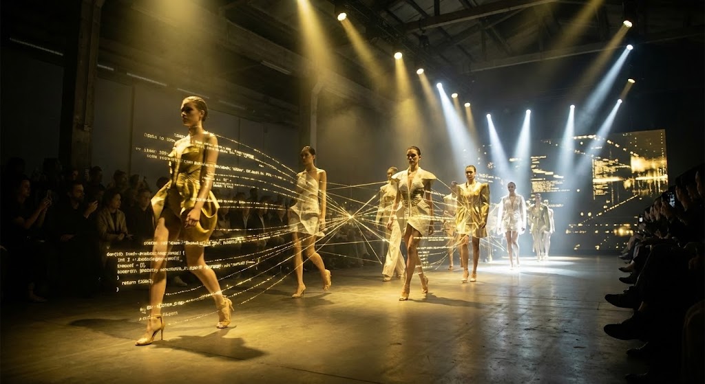
The Visual & Narrative Approach
We see a high-fashion runway scene that rivals Paris Fashion Week. Models walk confidently in avant-garde garments, bathed in dramatic spotlights of gold and stark white. The twist is the "Digital Thread": as they move, their garments leave behind trailing, glowing streams of data nodes and code lines. It visualizes the invisible data trail that every physical garment generates.
Psychological Impact & KPI Focus
This style bridges the gap between the "Dream" (Fashion) and the "Reality" (Data). It tells the Creative Director: "This software understands your world." It elevates the software from a boring utility tool to a luxury brand partner. The use of gold signifies value, premium quality, and high margins—subconsciously promising that the software will lead to better Profitability.
Strategic Implementation & Trade-offs
- Best Use Case: Brand manifesto videos and high-stakes investor presentations.
- Duration: 30-45 Seconds.
- Trade-off: This is the most expensive style to produce (even with Gen AI, achieving consistency is hard). It must be executed flawlessly; low-quality "uncanny valley" faces will destroy credibility.
Companies using similar video content -
Browzwear – VStitcher – 3D design and virtual prototyping for fashion.
CLO3D – CLO3D – 3D fashion design software for realistic garment simulation.
Tukatech – TUKA3D – 3D virtual prototyping and design for apparel.
6. The User Experience POV
TOFU | Vertical Social

The Visual & Narrative Approach
A relatable, human-centric approach. We see a vertical Point-of-View (POV) shot of a young fashion buyer in a stylish denim blue jacket. She stands in a modern, well-lit warehouse, surrounded by shelves of organized boxes. She holds a smartphone, and the screen casts a soft teal glow on her delighted face. The lighting is high-key and natural, emphasizing clarity and ease.
Psychological Impact & KPI Focus
Adoption is the #1 failure point for enterprise software. If the users (buyers, warehouse staff) hate it, it fails. This style visualizes "Joy of Use." It demonstrates that the software is mobile-friendly, accessible, and solves problems right on the factory floor, not just in the back office. It builds Empathy and shows the human benefit of the tech.
Strategic Implementation & Trade-offs
- Best Use Case: "Day in the Life" social content, recruiting videos, and user testimonials.
- Duration: 15-30 Seconds.
- Trade-off: It feels less "Enterprise" and more "Consumer." It is great for user adoption but may need to be paired with data-heavy visuals for the C-Suite decision-maker.
Companies using similar video content -
Uphance – Uphance ERP – Mobile-friendly ERP for apparel, managing operations.
AIMS360 – AIMS360 ERP – Fashion ERP with mobile access for inventory and orders.
7. The Digital Twin Transition
TOFU | Skippable Ad
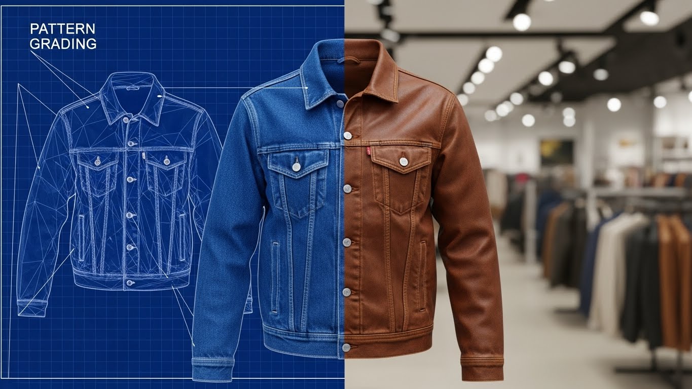
The Visual & Narrative Approach
A sharp, split-screen composition. The left half displays a technical blueprint blue wireframe of a denim jacket, highlighting "Pattern Grading" lines and nodes. The right half shows the photorealistic, high-texture render of the finished jacket in leather brown (or denim). The transition line is razor-sharp, proving that what was designed is exactly what was produced.
Psychological Impact & KPI Focus
This addresses the "Design-to-Production" gap. One of the biggest costs in fashion is sampling—making physical prototypes that don't fit. This visual proves the accuracy of the software's Digital Twin capabilities. It tells the technical designer: "You can trust this simulation." It screams accuracy, competence, and reliability.
Strategic Implementation & Trade-offs
- Best Use Case: Product feature demos focusing on sampling reduction and 3D design modules.
- Duration: 10-15 Seconds.
- Trade-off: It requires high-quality 3D assets. If the "Real" side looks fake, the promise of accuracy is broken.
Companies using similar video content -
Gerber Technology – YuniquePLM – PLM with CAD integration for accurate digital twins.
Optitex – Optitex 3D CAD/CAM – Virtual prototyping and 3D design for apparel.
8. The Material Quality Macro
TOFU | CTV Ad
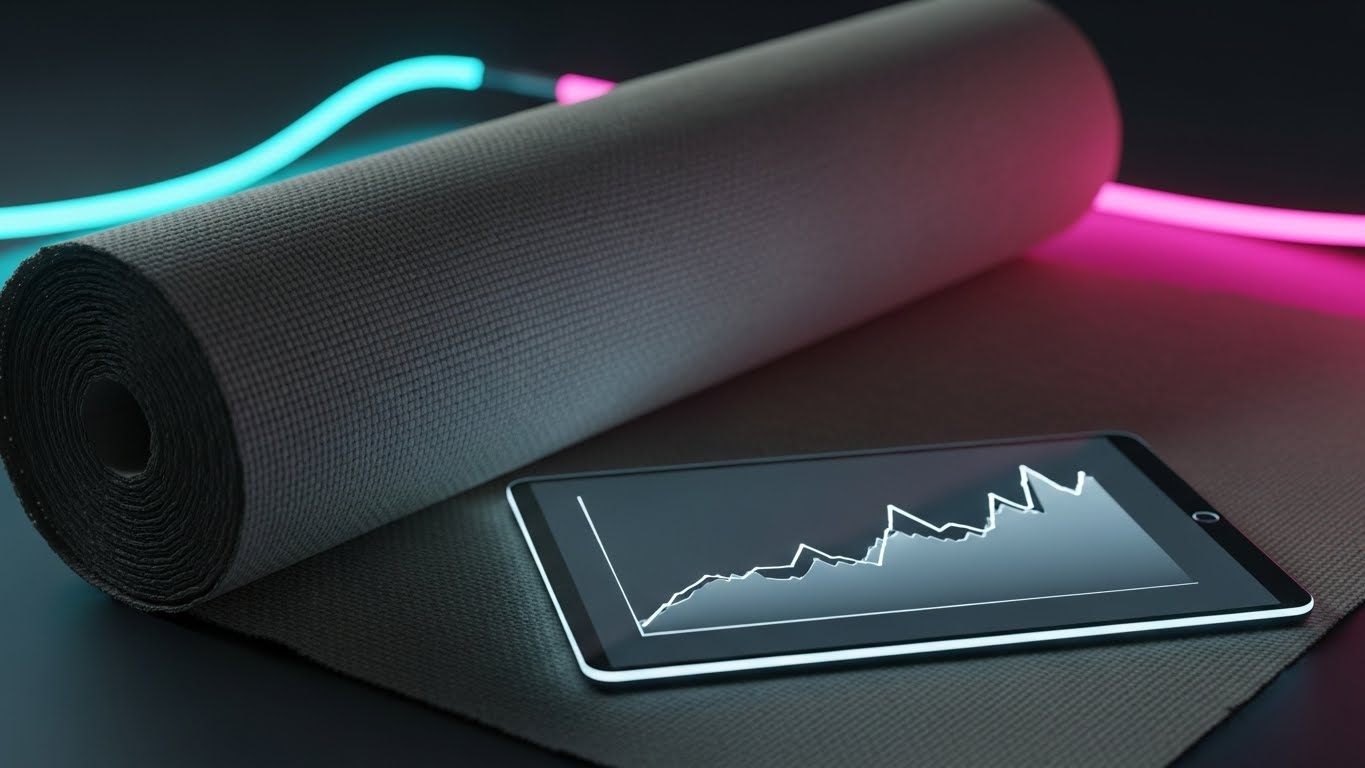
The Visual & Narrative Approach
A luxurious macro close-up using Octane-style rendering. We see a roll of raw beige canvas fabric, with every weave and fiber visible. Resting on this tactile surface is a sleek glass tablet displaying a glowing, rising graph line in slate grey. The lighting is warm and golden, highlighting the texture of the fabric against the smoothness of the technology.
Psychological Impact & KPI Focus
This style reinforces the concept of "Phygital" (Physical + Digital) integration. It elevates the perceived value of the materials being managed. It suggests that the software is precise enough to track the quality of the raw material, not just the quantity. The rising graph subtly implies that better Material Requirements Planning (MRP) leads to better margins.
Strategic Implementation & Trade-offs
- Best Use Case: Background visuals for webinars on sourcing, sustainability, and material management.
- Duration: 15-20 Seconds (Slow Pan).
- Trade-off: It is a static, slow-moving style. It sets a mood of "Quality" but is not effective for explaining complex workflows.
Companies using similar video content -
DeSL – DeSL PLM – Manages product development with focus on materials and sustainability.
Makersite – Makersite – Supply chain sustainability and material compliance.
9. The Fabric Data Visualization
MOFU | Demand Gen

The Visual & Narrative Approach
A dynamic visualization that creates a circular radial graph where the data segments are not mere colors, but actual fabric textures—wool, linen, and polyester in shades of olive green, burnt orange, and navy blue. Floating above this tactile chart are glossy 3D icons representing efficiency metrics. The background is a subtle isometric grid, keeping the focus on the data.
Psychological Impact & KPI Focus
Context is king in data retention. By visualizing data as the product (fabric), this style reduces Cognitive Load for industry professionals. It makes abstract numbers feel "real" and relevant. It transforms a boring "Inventory Report" into a "Material Asset Map," helping buyers understand their stock mix instantly.
Strategic Implementation & Trade-offs
- Best Use Case: Whitepapers, Annual Reports, and Bottom-of-Funnel (BOFU) case studies.
- Duration: 5-10 Seconds.
- Trade-off: Legibility can be a challenge. Ensure the fabric textures are distinct enough not to blur together when viewed on smaller screens.
Companies using similar video content -
Cin7 Core – Cin7 Core – Inventory and order management with BOM for fashion.
Zoho Inventory – Zoho Inventory – Tracks stock, suppliers, and orders for clothing stores.
10. The Isometric Production Loop
MOFU | Feature
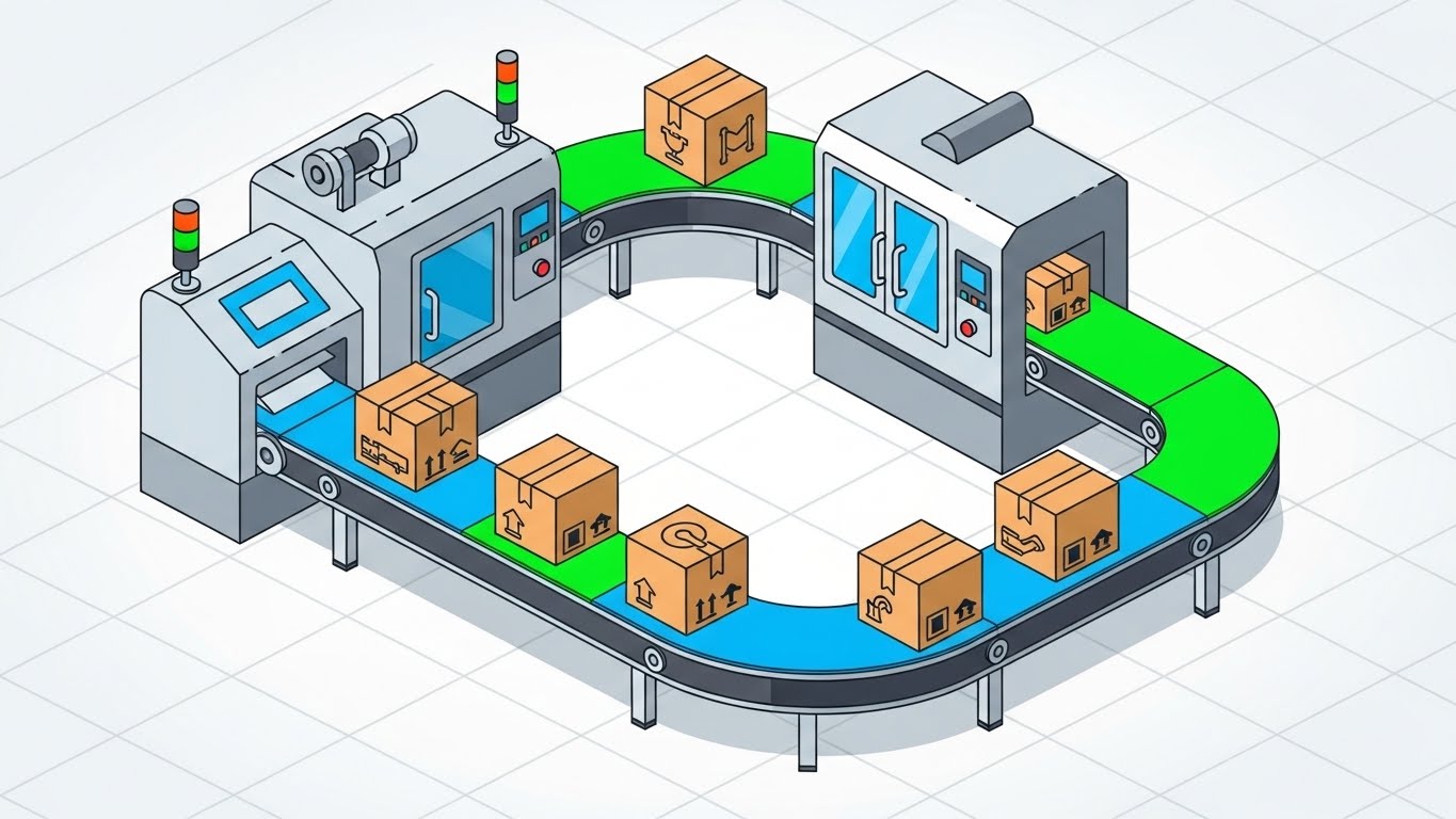
The Visual & Narrative Approach
A clean, isometric view of a garment factory floor. Conveyor belts carry cardboard boxes marked with safety orange abstract icons, moving through a stylized production line. The machinery is rendered in industrial grey with clean outlines. The composition creates a seamless loop of production flow from cutting tables to dispatch areas. The background is a soft, neutral white grid.
Psychological Impact & KPI Focus
This style appeals to the "Systemizer" mindset of the Operations Manager. It visualizes "Flow" and "Order." The isometric perspective offers a "God's Eye View" of the factory, reinforcing the feeling of control and Supply Chain Visibility. The satisfying loop implies that the software eliminates bottlenecks and ensures continuous, error-free production.
Strategic Implementation & Trade-offs
- Best Use Case: Explainer videos within email newsletters or onboarding documentation.
- Duration: 30-60 Seconds (Loop).
- Trade-off: It simplifies reality significantly. It works best for high-level workflow overviews rather than detailed training on specific user interface tasks.
Companies using similar video content -
Digit – Digit Apparel Manufacturing – Tracks production, inventory, and materials in one place.
Katana – Katana Cloud ERP – Visual ERP for fashion manufacturers, production overview.
11. The 3D X-Ray Visualization
MOFU | Feature

The Visual & Narrative Approach
This style penetrates the physical barriers of the supply chain to reveal the truth within. We are presented with a standard industrial shipping container rendered in a striking safety red. Suddenly, the metal walls dissolve into a translucent, glass-like material, revealing the contents inside: stacks of perfectly folded denim and organized inventory boxes glowing with a soft inner blue light. The camera pushes in, moving through the exterior shell to highlight the granular detail of the stock inside.
Psychological Impact & KPI Focus
Supply chain opacity is a major source of anxiety for Operations Directors. They fear the "black hole" between the factory and the warehouse—the period where inventory is often untrackable. This "X-Ray" visual metaphorically grants them superpowers: the ability to see through barriers. It builds immense trust by suggesting that the software offers absolute Work-in-Process (WIP) Visibility, ensuring that digital manifests match physical reality to reduce shrinkage.
Strategic Implementation & Trade-offs
- Best Use Case: Product pages dedicated to Inventory Management or Logistics tracking features.
- Duration: 10-15 Seconds.
- Trade-off: It is highly stylized. While it effectively communicates "visibility," it is important to clarify that the actual software interface uses data tables and dashboards, not literal x-ray vision.
Companies using similar video content -
Hardis Group – Reflex WMS – Warehouse management for fashion chains, inventory visibility.
SSI SCHAEFER – WAMAS – Logistics software for automated warehouses, transparency.
12. The Augmented Reality Overlay
MOFU | Building Trust

The Visual & Narrative Approach
A grounding "Phygital" (Physical + Digital) technique. We see high-quality live-action footage of a warehouse associate in a safety vest scanning a package. As he scans, crisp, floating 2D vector graphics in steel blue and yellow materialize in the air next to him. A "Checklist" icon ticks itself off, and a "Verified" shield appears. The digital elements track his movements perfectly, visualizing the real-time connection between his handheld device and the ERP system.
Psychological Impact & KPI Focus
This style humanizes the technology. It reassures the viewer that the software empowers their workforce rather than replacing them. By showing the "Success" state (the green checkmarks), it subliminally validates the accuracy of the system. It is particularly effective for Warehouse Managers concerned about Labor Efficiency and user adoption rates, proving the tool is a helper, not a hindrance to the pick-and-pack process.
Strategic Implementation & Trade-offs
- Best Use Case: Case study videos and "How it Works" sections for warehouse management modules.
- Duration: 20-30 Seconds.
- Trade-off: Requires original video footage or high-quality stock. If the underlying footage looks generic or staged, the "authenticity" factor is lost.
Companies using similar video content -
Jesta Vision Suite – Vision Suite – Unifies retail operations, potentially with AR for warehouse.
Aptean – BlueCherry ERP – End-to-end ERP for fashion, could integrate AR for shop floor.
13. The Split Screen: Optimized Reality
MOFU | Competitive Displacement
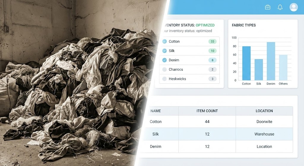
The Visual & Narrative Approach
A powerful "Before and After" comparison presented simultaneously. The left side of the screen is gritty and desaturated (sepia tones), showing a disorganized pile of raw fabric scraps and mixed clothing—a visual metaphor for "Spreadsheet Chaos." A bright white line sweeps across, revealing the right side: a pristine, sky blue and white UI dashboard where that same chaos is organized into neat data rows and charts.
Psychological Impact & KPI Focus
This appeals to the human desire for order. It visually quantifies the value of the software by juxtaposing the pain of the problem (disorganization) with the relief of the solution (structured data). It directly attacks the "Status Quo Bias" by making the current way of working look dirty and obsolete, while the software looks clean and efficient, driving home the benefit of Data Integrity.
Strategic Implementation & Trade-offs
- Best Use Case: Landing pages targeting competitors or users still relying on Excel/Email.
- Duration: 15 Seconds.
- Trade-off: It can be aggressive. Ensure the "Before" state is relatable but not insulting to the potential client's current reality.
Companies using similar video content -
ApparelMagic – ApparelMagic ERP – Consolidates products, inventory, sales from disparate systems.
PolyPM – PolyPM – Integrates ERP/PLM for SMB apparel, reducing manual processes.
14. The Critical Path Line Art
MOFU | ABM Awareness

The Visual & Narrative Approach
Simplicity is the ultimate sophistication. A single continuous black ink line draws itself across a textured cream background. On the left, the line creates a frantic, tangled knot, representing the complexity of sourcing and logistics. As it flows to the right, it gracefully untangles itself, smoothing out into a perfectly straight, efficient path that forms the outline of a finished garment.
Psychological Impact & KPI Focus
For C-Suite executives overwhelmed by complexity, this visual offers a moment of zen. It signals that the vendor understands the messiness of the industry but offers a solution of elegance and simplicity. It reduces Cognitive Load significantly, promising that the software will "straighten out" their twisted workflows and lead to a linear, predictable Time-to-Market.
Strategic Implementation & Trade-offs
- Best Use Case: High-level whitepapers, executive summaries, and Account-Based Marketing (ABM) campaigns.
- Duration: 10-15 Seconds.
- Trade-off: It is abstract. It conveys a feeling of "ease" but explains nothing about the actual features. It must be accompanied by strong copy.
Companies using similar video content -
Supply Compass – Supply Compass PLM – Streamlines collaboration and product development.
Delogue PLM – Delogue PLM – Single source of truth for product development, simplifying workflows.
15. The Rapid UI Feature Montage
MOFU | Re-engagement
The Visual & Narrative Approach
A high-energy showcase of platform breadth. We zoom rapidly through a 3D space filled with floating UI windows rendered in a modern, flat style with magenta and cyan accents. The camera flies through layers of interface elements—tech packs, costing sheets, and shipping logs—creating a tunnel effect. Speed lines and motion blur convey velocity, suggesting a robust, all-encompassing ecosystem.
Psychological Impact & KPI Focus
This triggers the "Fear of Missing Out" (FOMO) and establishes authority. It suggests that the platform is deep, feature-rich, and capable of handling high-volume operations. The speed implies Operational Velocity—that the software works as fast as the fashion industry itself. It reassures the buyer that they won't "outgrow" the system.
Strategic Implementation & Trade-offs
- Best Use Case: Retargeting ads for users who visited the pricing page but didn't convert.
- Duration: 6-10 Seconds.
- Trade-off: No single feature is legible. This is purely for impression and "scale," not for education.
Companies using similar video content -
WFX – WFX ERP – Comprehensive cloud-based ERP for apparel, showing breadth of features.
Centric Software – Centric Planning – AI-driven retail planning and assortment optimization.
16. The Isometric Global Map
BOFU | ROI Justification
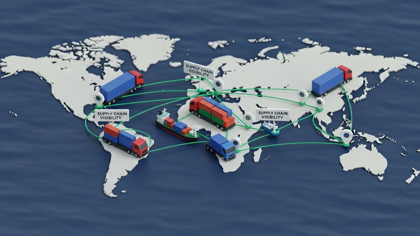
The Visual & Narrative Approach
A "God-Mode" view of the supply chain. We see a stylized, matte-finish world map. Toy-like 3D trucks and container ships travel along emerald green arcs connecting continents. White location markers pop up to indicate supply chain checkpoints. The aesthetic is clean and playful (claymorphism), turning the daunting task of global logistics into a manageable board game.
Psychological Impact & KPI Focus
This style gives the viewer a sense of total control. By shrinking the world into a manageable, viewable map, it alleviates the anxiety of global fragmentation. It visually reinforces the value proposition of End-to-End Visibility, making the argument that the software can optimize routes and reduce Landed Costs across the entire network.
Strategic Implementation & Trade-offs
- Best Use Case: The "Pricing" or "Enterprise" page of the website to justify the investment.
- Duration: 20-30 Seconds.
- Trade-off: It simplifies geography. Ensure it is clear that this represents data connection points, not just physical GPS tracking.
Companies using similar video content -
Gravity – Gravity SCM – Global supply chain management, sourcing, and delivery tracking.
ClickPost – ClickPost Logistics – AI-based logistics optimization for fashion brands.
17. The Cost-Shield Analogy
BOFU | Objections
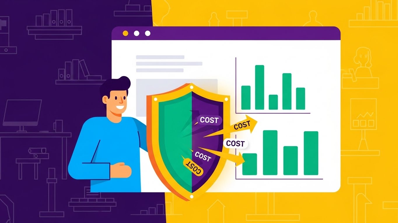
The Visual & Narrative Approach
A direct visual metaphor for cost control. A friendly 2D character in a sky blue shirt stands beside a large dashboard screen. They hold a stylized shield with an energetic orange rim, actively deflecting arrows labeled "COST" or "DELAY." The dashboard behind them displays green bar charts rising, indicating safe margins. The style is flat, approachable, and corporate-friendly.
Psychological Impact & KPI Focus
At the bottom of the funnel, the buyer is worried about risk and cost. This visual validates their role as the "guardian" of the company's budget. It positions the software not just as a tool, but as a defensive weapon against margin erosion. It directly addresses the KPI of Cost of Goods Sold (COGS) reduction and risk mitigation.
Strategic Implementation & Trade-offs
- Best Use Case: FAQ sections or "Why Us" pages addressing specific objections about price or implementation cost.
- Duration: 10-15 Seconds (Looping).
- Trade-off: Can feel "cartoony" if not executed with a modern, premium vector style. Avoid looking like a generic clip-art animation.
Companies using similar video content -
Easyreplenish – Easyreplenish – AI-powered inventory forecasting to reduce costs.
Absolute ERP – Absolute ERP – Affordable ERP for apparel manufacturers, cost reduction.
18. The Dark Mode Security
BOFU | Risk Mitigation
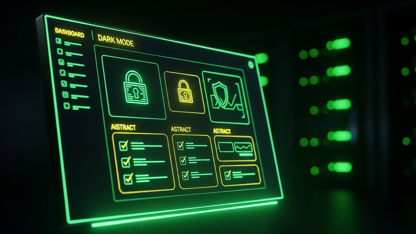
The Visual & Narrative Approach
A shift to a serious, "hacker-proof" aesthetic. We see a monitor displaying the software's dashboard in "Dark Mode," utilizing deep blacks and glowing matrix green accents. Padlock icons and security checklists animate onto the screen. The background is a blurred server room, hinting at robust infrastructure. The vibe is sleek, precise, and impenetrable.
Psychological Impact & KPI Focus
Security is a top priority for Enterprise IT Directors. This style speaks their language. It moves away from "fashion" and into "data security." It visually assures stakeholders that their proprietary designs and customer data are safe. It builds confidence in the platform's Compliance and Security standards, which is often the final hurdle in closing a deal.
Strategic Implementation & Trade-offs
- Best Use Case: The "Security" or "IT Compliance" page, and in sales decks for the CTO.
- Duration: 10-20 Seconds.
- Trade-off: It creates a "technical" mood that might feel cold to creative users. Use strictly for the technical decision-maker.
Companies using similar video content -
Oracle – Fusion Cloud PLM – Enterprise-grade PLM with robust security features.
Siemens Digital Industries Software – Teamcenter – Comprehensive PLM with strong data security.
19. The Clean UI Workflow
BOFU | Sales Acceleration
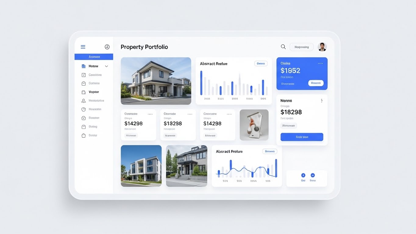
The Visual & Narrative Approach
A celebration of usability. We see a crystal-clear, high-resolution render of the interface in "Light Mode." The layout is spacious, utilizing royal blue headers and soft drop shadows against a clean white background. While the visual structure borrows from modern portfolio design, the data cards represent "Material Libraries" and "Fabric Yields." The cursor moves smoothly, clicking through tabs with zero lag, emphasizing the "soft" and fluid user experience.
Psychological Impact & KPI Focus
Complexity kills adoption. This style provides visual proof that the software is easy to look at and easy to use. It reduces the perceived Training Overhead. By showing a "clean" interface, it promises the buyer that their team will not struggle to learn the new system, thereby accelerating the Time-to-Value.
Strategic Implementation & Trade-offs
- Best Use Case: The primary sales deck and the "Request Demo" confirmation page.
- Duration: 30-45 Seconds.
- Trade-off: It must be an accurate representation of the actual UI. Over-polishing here can lead to disappointment during the actual demo if the real product is clunky.
Companies using similar video content -
Backbone PLM – Backbone PLM – Clean interface for tech pack creation and vendor tracking.
3 Clicks Cloud – 3 Clicks Cloud – User-friendly PLM for fashion apparel.
20. The Holographic Lab
BOFU | Demo Requests
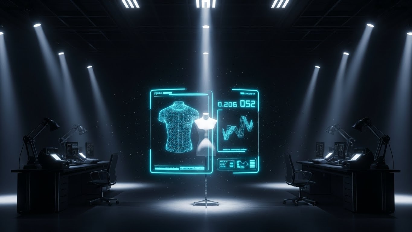
The Visual & Narrative Approach
The guide concludes with a vision of the near future. In a dimly lit, high-tech design lab, a spotlight hits a dress form. A neon cyan holographic projection materializes around it, displaying a wireframe garment with floating measurement data and "Digital Twin" metrics. Dust motes dance in the volumetric lighting, creating an atmosphere of breakthrough innovation.
Psychological Impact & KPI Focus
This appeals to the visionary leader who wants to be ahead of the curve. It positions the software provider as a partner in Innovation. It suggests that by buying this software, the brand is securing its future. It validates the investment in 3D and digital product creation (DPC), promising a reduction in physical sampling and a leap in Market Competitiveness.
Strategic Implementation & Trade-offs
- Best Use Case: The final slide of a keynote presentation or the background for a "Book a Demo" CTA.
- Duration: 15-20 Seconds.
- Trade-off: It is aspirational. It sells the "vision" more than the current reality. Ensure your sales team can articulate how today's features bridge the gap to this future.
Companies using similar video content -
Lectra – Kubix Link – Advanced PLM with PIM/DAM, enabling futuristic design.
Browzwear – VStitcher – 3D design for virtual prototyping, pushing innovation.
21. The Aspirational Stock Montage
BOFU | Economic Buyer

The Visual & Narrative Approach
This style speaks the language of the C-Suite. We utilize a cinematic, low-angle shot of a corporate executive in a sharp navy blue suit, standing in a high-rise office. The background is a blurred city skyline, suggesting global reach. He holds a tablet, and the screen’s glow illuminates his face with a look of confident satisfaction. We see abstract, high-level "ROI" charts and "Growth" metrics reflecting on the glass, symbolizing that the software delivers the bottom-line results he requires.
Psychological Impact & KPI Focus
The Economic Buyer (CEO/CFO) is less concerned with features and more concerned with outcomes. This visual validates their identity as a strategic leader. It connects the software purchase directly to their personal and professional success—profitability and control. It reinforces the KPI of Return on Investment (ROI) and market leadership, assuring them that this is a "Board-Level" solution.
Strategic Implementation & Trade-offs
- Best Use Case: LinkedIn Thought Leadership ads targeting C-Level job titles and ABM campaigns.
- Duration: 15-30 Seconds.
- Trade-off: It relies heavily on the quality of the stock footage. If the actor looks generic or the setting feels "staged," it loses its aspirational power.
Companies using similar video content -
SAP – S/4HANA for Fashion – ERP for large multi-brand companies, strategic growth.
Epicor – Epicor ERP – ERP for larger apparel businesses, driving strategic ROI.
22. The 3D Parallax UI Presentation
BOFU | Functional Buyer
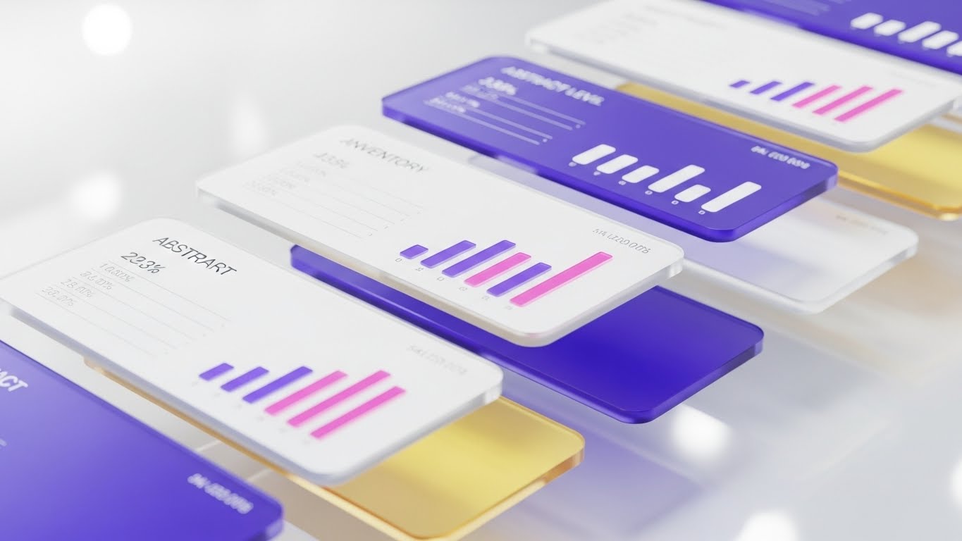
The Visual & Narrative Approach
A sophisticated visualization of depth and detail. We see a 3D composition of floating UI panels arranged in a parallax stack. The panels display abstract inventory levels, data grids, and bar charts in glassy pink and purple accents on pristine white cards. The camera tilts, revealing the physical separation between the layers. This depth signifies that the software is not superficial; it allows users to "drill down" into the data.
Psychological Impact & KPI Focus
The Functional Buyer (IT Director, Operations Lead) needs to know the system is robust. They fear "vaporware" that looks pretty but lacks substance. The parallax effect visually communicates Data Granularity and multidimensional reporting capabilities. It reassures them that they can peel back the layers of their supply chain to find the root cause of any issue.
Strategic Implementation & Trade-offs
- Best Use Case: The "Features" or "Platform Architecture" page of the website.
- Duration: 10-20 Seconds (Looping).
- Trade-off: It is abstract. While it looks high-tech, it doesn't show specific workflows. It sells the "concept" of depth rather than the "how-to."
Companies using similar video content -
NetSuite – NetSuite ERP – Comprehensive ERP with granular data and reporting.
Infor – CloudSuite Fashion – AI-powered ERP with deep data analytics for fashion.
23. The Hyper-lapse Stock Footage
Onboard | Time-to-Value

The Visual & Narrative Approach
A visualization of speed and stability. The background is a hyper-lapse video of a busy fashion district at night, with city lights streaking in city grey and amber bokeh. The world is moving fast and chaotic. Superimposed over this is a static, razor-sharp UI box displaying a green "Completed" checkmark. The contrast is stark: the industry is chaotic, but the software is the steady anchor that gets the job done instantly.
Psychological Impact & KPI Focus
New users are often overwhelmed by the pace of the apparel industry. This style calms that anxiety. It promises Operational Stability. It visually demonstrates that while the market moves at breakneck speed, the platform provides a grounding force, allowing users to complete tasks quickly. It reinforces Time-to-Value, showing that success (the checkmark) is just one click away.
Strategic Implementation & Trade-offs
- Best Use Case: Welcome emails and "Getting Started" loading screens.
- Duration: 5-10 Seconds.
- Trade-off: It is purely mood-setting. It creates a feeling of efficiency but does not instruct the user on specific actions.
Companies using similar video content -
Zentail – Zentail – Multichannel inventory sync for fast-paced online fashion.
Ordoro – Ordoro – Inventory management for online retailers, ensuring quick fulfillment.
24. The Low-Poly 3D Modeling
Onboard | Implementation

The Visual & Narrative Approach
A playful, inviting metaphor for implementation. We see a stylized factory being assembled from the sky down. Blocks of cardboard tan and pastel blue fall into place like Tetris pieces to build the structure. The style is "Low-Poly"—geometric and facet-heavy. It transforms the intimidating task of ERP implementation into a simple game of building blocks.
Psychological Impact & KPI Focus
Implementation is the most stressful phase of the buyer's journey. This style reduces the intimidation factor. It suggests that the software is Modular and easy to configure. It appeals to the user's desire for "Play" and simplicity, promising that setting up their digital supply chain will be a constructive, logical, and pain-free process (Reduced Implementation Time).
Strategic Implementation & Trade-offs
- Best Use Case: In-app setup wizards and "Configuration" guide videos.
- Duration: 15-30 Seconds.
- Trade-off: The "toy-like" aesthetic must be balanced. It works for setup (building) but might feel too juvenile for serious financial reporting modules.
Companies using similar video content -
Odoo – Odoo PLM – Modular ERP with PLM, simplified system setup.
MRPeasy – MRPeasy – Easy-to-use manufacturing ERP, modular production planning.
25. The Minimalist Flat 2D Vector
Onboard | Self-Serve
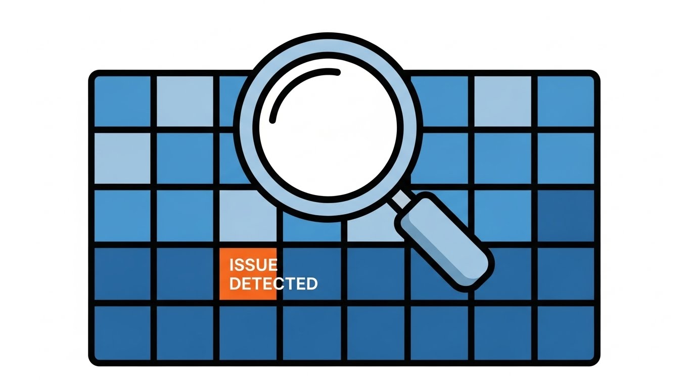
The Visual & Narrative Approach
Crystal clear clarity for problem-solving. We see a minimalist flat 2D vector scene against a soothing blue background. A large magnifying glass hovers over a grid of data blocks. It identifies a single orange block labeled "ISSUE DETECTED," isolating it from the healthy blue blocks. The style is "Corporate Memphis"—geometric, clean, and friendly—removing all visual noise to focus entirely on the diagnosis.
Psychological Impact & KPI Focus
When a user encounters an error, they are frustrated. They don't need cinematic drama; they need clarity. This style reduces Cognitive Load to zero. It is non-threatening and encourages Self-Serve Adoption. By visually isolating the issue, it suggests that problems are small, manageable, and easily fixed, motivating the user to resolve the alert without calling support.
Strategic Implementation & Trade-offs
- Best Use Case: Help Center articles, tooltips, and "Error State" screens.
- Duration: 30-60 Seconds.
- Trade-off: It is utilitarian. It lacks "wow factor" and is purely functional, intended to educate rather than impress.
Companies using similar video content -
Zoho Inventory – Zoho Inventory – Clear visual diagnostics for stock issues.
AIMS360 – AIMS360 ERP – Provides clear dashboards for operational insights.
26. The Macro UI Micro-Interactions
Retention | Feature Adoption

The Visual & Narrative Approach
A celebration of the details. An extreme macro close-up of the software interface on a high-resolution display. We see the individual pixels faintly. A toggle switch animates smoothly from a dormant grey to a bright, glowing emerald green. The background is pure white light. The focus is entirely on the satisfying "click" of the interaction, symbolizing activation and control.
Psychological Impact & KPI Focus
User retention often hinges on "Micro-Delights"—the small, satisfying moments in the UI. This visual emphasizes the polish and responsiveness of the platform. It tells the user that the system is precise and well-engineered. By highlighting a specific "Switch," it encourages Feature Adoption, inviting the user to turn on new modules or settings they may have ignored.
Strategic Implementation & Trade-offs
- Best Use Case: Feature release newsletters (GIFs) and "What's New" pop-ups.
- Duration: 3-5 Seconds (Loop).
- Trade-off: Extremely short format. It draws attention to a specific element but cannot explain complex logic or workflows.
Companies using similar video content -
Uphance – Uphance PLM – Highlights precise UI controls for product development.
WFX – WFX PLM – Emphasizes micro-interactions for efficient workflow.
27. The 2D Character-Driven Story
Retention | Reducing Churn

The Visual & Narrative Approach
A visual reinforcement of community. A flat 2D vector illustration shows a diverse team of characters (stylized, no facial features) sitting around a large conference table. In the center, a glowing isometric box represents a new "Feature Module." The characters lean in, interacting with it joyfully. The palette is vibrant: terracotta, navy, and white.
Psychological Impact & KPI Focus
Churn often happens when teams work in silos. This style visualizes Collaboration. It reminds the Account Administrator that the software is the "campfire" around which their team gathers to solve problems. It builds an emotional connection to the team's success, not just the software's function. It reinforces the value of Multi-Seat Licensing and team alignment, making it harder to rip and replace the system.
Strategic Implementation & Trade-offs
- Best Use Case: Quarterly Business Review (QBR) decks and "Year in Review" customer videos.
- Duration: 30-60 Seconds.
- Trade-off: Can feel generic if the characters look like stock art. Customizing the "uniforms" or setting to match the client's industry adds significant value.
Companies using similar video content -
ReChain – ReChain – Platform for design updates, supplier feedback, and approvals.
DeSL – DeSL PLM – Connects design, sourcing, and production for collaboration.
28. The Futuristic Neon/Dark Mode
Retention | Knowledge Base

The Visual & Narrative Approach
Transforming the mundane into the extraordinary. We enter a "Dark Mode" visualization of a warehouse. The environment is lit only by neon pink and cyberpunk blue strip lights attached to an automated garment rail system. The clothes hangers glow as they zip along the track. The aesthetic is sleek, high-contrast, and tech-heavy, resembling a high-end gaming PC setup.
Psychological Impact & KPI Focus
Technical support content is usually boring. This style flips the script, making "Maintenance" and "Logistics" feel cool and futuristic. It appeals to the warehouse tech managers who take pride in their advanced setup. It increases engagement with Knowledge Base content by treating technical diagrams as high-tech schematics, reducing the perceived drudgery of troubleshooting.
Strategic Implementation & Trade-offs
- Best Use Case: Advanced troubleshooting guides and technical certification videos.
- Duration: 45-90 Seconds.
- Trade-off: The dark aesthetic may not align with brands that prefer a "clean/clinical" look. It is best reserved for "Pro" features.
Companies using similar video content -
Just Fashion Software – Fashion Logistics – Warehouse control system with advanced features.
SSI SCHAEFER – WAMAS – Automated warehouse systems for fashion logistics.
29. The Abstract 2D Motion Graphics
Expansion | Upsell

The Visual & Narrative Approach
Visualizing the network effect. Abstract motion graphics feature a central node pulsating. From this center, new nodes sprout and connect via plexus lines, forming a rapidly expanding web. The nodes utilize a spectrum of rainbow colors against a clean white background, symbolizing the diversity of partners and integrations. It is energetic, fluid, and expansive.
Psychological Impact & KPI Focus
This style visualizes Scalability. It suggests to the customer that their current usage is just the beginning. The outward expansion implies growth, virality, and connection. It is the perfect visual metaphor for Referral Programs or "ecosystem" upsells (e.g., adding a Vendor Portal). It triggers the desire to be part of a larger, thriving network.
Strategic Implementation & Trade-offs
- Best Use Case: Dashboard banners promoting referral bonuses or API integration marketplaces.
- Duration: 5-10 Seconds.
- Trade-off: Highly abstract. It conveys "Growth" but requires text overlays to explain exactly what is growing (e.g., "Invite a Vendor").
Companies using similar video content -
TextileGenesis – TextileGenesis – Blockchain platform for digital mapping of textiles, network growth.
TrusTrace – TrusTrace – Traceability and compliance data management, expanding network.
30. The Lifestyle Stock with UI Overlay
Expansion | Referrals
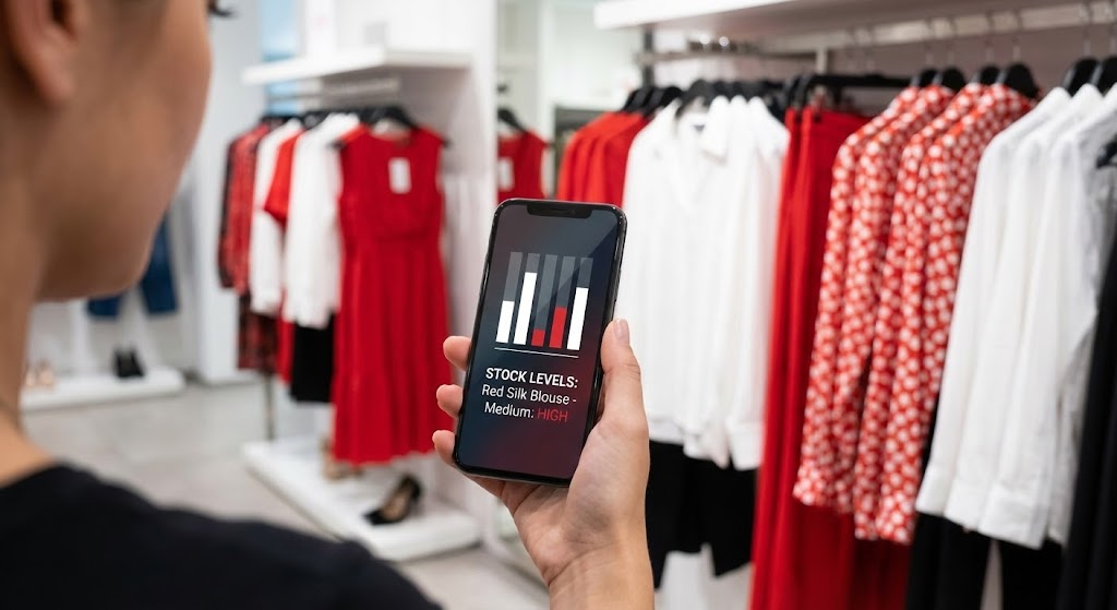
The Visual & Narrative Approach
The ultimate proof of value: real-world utility. An over-the-shoulder lifestyle shot of a store manager holding a smartphone. In the background, we see racks of clothes in retail white and brand red. The phone screen displays a sharp, high-contrast UI overlay showing "Stock Levels: High." The lighting is natural and candid.
Psychological Impact & KPI Focus
This bridges the gap between the software and the consumer. It shows the software "in the wild," solving problems at the point of sale. This creates Social Proof. When a user sees the tool working in a real store, they are more likely to become an Advocate. It visually validates the end-to-end promise of the software: from the factory floor (Style 1) to the retail store (Style 30).
Strategic Implementation & Trade-offs
- Best Use Case: Case study testimonials and "Refer a Friend" landing pages.
- Duration: 15-30 Seconds.
- Trade-off: The UI overlay must track perfectly with the phone's movement. If it "slips," the illusion is broken.
The Visual Operations Doctrine: A Strategic Knowledge Base
The 30 visual styles outlined in this guide are not merely "creative options." They represent a comprehensive Visual Operating System for the modern Apparel Management SaaS. To transition from "creating content" to "driving strategy," this Knowledge Base synthesizes these styles into three actionable executive frameworks.
Strategic Alignment & Visual Architecture
The "Pre-Production" Strategy – Defining the Why and Who.
- The Cognitive Load Audit: Fashion professionals are visually oriented but data-overloaded. A strategic audit must assess where text-heavy interfaces are causing friction. Use Style 1 (Digital Weaving) and Style 26 (Macro UI) to replace complex text instructions with visual cues, reducing the time it takes for a designer to comprehend a tech pack.
- Role-Based Visual Mapping: One size does not fit all. The Creative Director needs "Aspirational" visuals (Style 5, Style 21) that respect the aesthetics of the product. The Operations Director needs "Glanceable" data (Style 10, Style 16) that offers instant visibility into logistics. Map every video asset to a specific user role.
- The "Glanceability" Standard: In a busy warehouse or design studio, users do not have time to study complex charts. Visuals must be "glanceable." Use Style 23 (Hyper-lapse) and Style 25 (Minimalist Vector) to convey status updates (e.g., "Sample Approved") in under 2 seconds.
- Brand Voice Consistency: Your software likely spans multiple modules (PLM, ERP, SCM). A disjointed visual style suggests disjointed data. We recommend establishing a "Visual Unification Guide" where the Style 15 (Rapid UI Montage) ensures that the color palette and motion language remain consistent from the design studio to the shipping dock.
- The Advids Strategic Audit: Partner with Advids to conduct a "Visual Gap Analysis." We identify which stages of your customer journey (Onboarding, Retention, Expansion) are currently relying on text-heavy PDFs and systematically replace them with the appropriate video styles from this guide.
- Standardization vs. Customization: Know when to spend. Use standardized stock assets for common icons (Style 25), but invest in bespoke visualization for your core "Secret Sauce" features. For trucking and logistics, customize Style 16 (Global Map) to reflect the actual routes of your client to build immediate trust.
- The Cross-Departmental Bridge: Use visuals to unify terminology. A "BOM" might mean something different to Sales vs. Engineering. A shared visual dictionary utilizing Style 4 (Kinetic SKU) ensures everyone visualizes the same data structure, eliminating cross-departmental friction.
- Legacy System Integration: Most brands still rely on legacy systems. Use Style 13 (Split Screen) to visually demonstrate the bridge between old "green screen" data and your modern interface, respecting the past while selling the future.
- Accessibility in Global Teams: Fashion supply chains are global. Design motion graphics (Style 29) that rely on universal visual cues (arrows, colors, icons) rather than voiceovers. This allows the same asset to be used in Vietnam, Italy, and New York without expensive dubbing.
- The Mobile-First Mandate: Fashion buyers and sourcing managers are constantly traveling. All 30 styles, especially Style 6 (User POV) and Style 30 (Lifestyle Overlay), must be optimized for vertical mobile viewing (9:16) to align with the "office-anywhere" reality of the industry.
Operational Adoption & Implementation
The "Deployment" Phase – Embedding Visuals into the Workflow.
- Overcoming "Big Brother" Anxiety: Implementing tracking software in factories can cause labor unrest. Use empathy-driven visuals like Style 12 (Augmented Reality) to frame the technology as a "Helper" (giving them superpowers) rather than a "Policeman" monitoring efficiency.
- The Micro-Learning Shift: No one reads the manual. Break down complex PLM training into a library of 30-second "Micro-Learning" clips using Style 19 (Clean UI). Embed these directly into the software dashboard for "Just-in-Time" support.
- Just-in-Time Support: Embed specific "How-To" styles (Style 10 - Isometric Loop) directly into the error messages. If a user fails to upload a Tech Pack, show them the 10-second loop on "Correct File Formatting" immediately to resolve the issue without a support ticket.
- Gamification of Training: Use Style 24 (Low-Poly) and Style 29 (Abstract Motion) to visualize user progress. Award visual badges for completing training modules. This "gamified" approach increases engagement and speeds up the "Time-to-Competency" for new hires.
- Reducing Support Ticket Volume: There is a direct correlation between the quality of your visual help center and your support costs. Proactively deploying Style 25 (Self-Serve Vector) for common error messages empowers users to fix issues themselves, deflecting tickets away from your human support team.
- Remote Onboarding: With distributed design teams, physical seminars are obsolete. Use Style 20 (Holographic Lab) and Style 22 (Parallax UI) to create an immersive, virtual onboarding experience that builds excitement and brand immersion remotely.
- Standard Operating Procedures (SOPs) 2.0: Transform static factory SOPs into looping visual gifs (Style 14 - Critical Path). A visual loop of the correct workflow is universally understood, transcending language barriers in global supply chains (e.g., Vietnam, Bangladesh, Turkey).
- Feedback Loops: Use interactive video elements. After a "Feature Release" video (Style 15), include a one-click emoji poll to gather instant feedback on user sentiment. This data is invaluable for Product teams to iterate quickly.
- Scalable Localization: Global supply chains require global communication. By relying on visual metaphors (Style 2 - Global Network) rather than on-screen text, you reduce the cost and complexity of translating training materials for non-English speaking factory staff.
- Leadership Communication: Use high-end "Visionary" styles (Style 21 - Executive Vision) for quarterly town halls. When the CTO explains the roadmap, backing it with cinematic visuals builds confidence and internal buy-in, ensuring the strategy is understood by all stakeholders.
Measuring Impact & Future-Proofing
The "ROI" Phase – Measuring Success and Looking Ahead.
- Beyond "Views" - Actionable KPIs: Do not measure success by video views. Measure it by Feature Adoption Rate. If you release a video using Style 26 (Green Toggle) about a new costing feature, track how many users activated that feature within 48 hours.
- The "Idle Time" Metric: Good visualization reduces the time users spend "figuring it out." Correlate the deployment of Style 19 (Clean UI) tutorials with a reduction in "Idle Time" or "Time on Task," proving that better visuals lead to higher Operational Efficiency.
- Compliance Velocity: New regulations (like the Digital Product Passport) are complex. Measure how quickly your client base achieves compliance after watching explainer videos utilizing Style 14 (Critical Path). High velocity proves the educational value of your visual strategy.
- Retention and Churn: The impact of high-quality UX visualization on customer retention is measurable. Users who engage with "Team Story" visuals (Style 27) are often stickier because they understand the collaborative value of the platform, increasing Lifetime Value (LTV).
- The AI Visual Frontier: The industry is moving toward Generative AI. Prepare your visual strategy to integrate with real-time AI data. Style 5 (Cinematic Runway) and Style 20 (Holographic Lab) position your brand as "AI-Ready," safeguarding you against being perceived as a legacy tool.
- Scalability of Assets: Build a library that grows with the feature set. Do not render "flat" videos; render individual 3D assets (cloth rolls, UI cards) that can be remixed into new videos later. This ensures your visual library remains agile.
- The Advids Partnership: As your feature set grows, your visual library must grow. "One-off" video production is not scalable. Advids acts as your long-term infrastructure partner, maintaining the source files and assets for all 30 styles, allowing you to rapidly update or iterate on your visual documentation as the software evolves.
- Benchmarking Success: Why "good enough" visuals are a competitive risk. If your competitor uses Style 22 (Parallax UI) and you use static screenshots, you look outdated. Regularly benchmark your "Visual Density" against market leaders to ensure you maintain a premium position.
- The ROI of Safety: In logistics and factory management, safety is paramount. Quantify the reduction in accidents or insurance costs by implementing clear, visual safety training videos (Style 12 - AR Overlay). This is a direct ROI metric for your clients.
- Final Call to Innovation: Treat video as infrastructure, not content. In the cognitive economy of fashion, the ability to visualize complex data is not a "nice to have"—it is the primary interface through which your value is understood. Invest in it, refine it, and let it tell the story of your innovation.
Companies using similar video content -
tex.tracer – tex.tracer – Supply chain traceability via QR code scan for consumers.
FibreTrace – FibreTrace – Cloud platform for tracing and verifying fibers in supply chain.
Author & Editor Bio


