
 /home/wwwroot/advids.co/design/index.php on line 425
The recruitment technology landscape has shifted from simple digitization to complex, AI-driven ecosystems. For heads of Talent Acquisition and HR Tech buyers, the challenge is no longer just "finding tools" but orchestrating a seamless, intelligent infrastructure that connects passive talent with immediate business needs. We are witnessing a "Visualization Gap" in the industry: complex concepts like semantic search algorithms and automated candidate rediscovery are often buried in dense technical documentation.
This guide bridges that physical/digital divide. To win in 2026, your visual strategy must translate abstract algorithms into tangible, high-impact narratives. The stakes are operational and financial: recent industry data reveals that advanced AI-powered screening tools can reduce time-to-hire by up to 75%. This is a metric that fundamentally changes the baseline for recruitment teams. Furthermore, organizations that effectively deploy these intelligent systems are reporting 89.6% greater efficiency compared to traditional methods.
Your visual content must aggressively demonstrate this efficiency. This guide serves as your blueprint for communicating value through design, moving beyond generic "tech" imagery to specific, psychology-driven visual frameworks that resonate with the modern recruitment leader.
1. Abstract 3D AI Visualization
TOFU | Brand Awareness
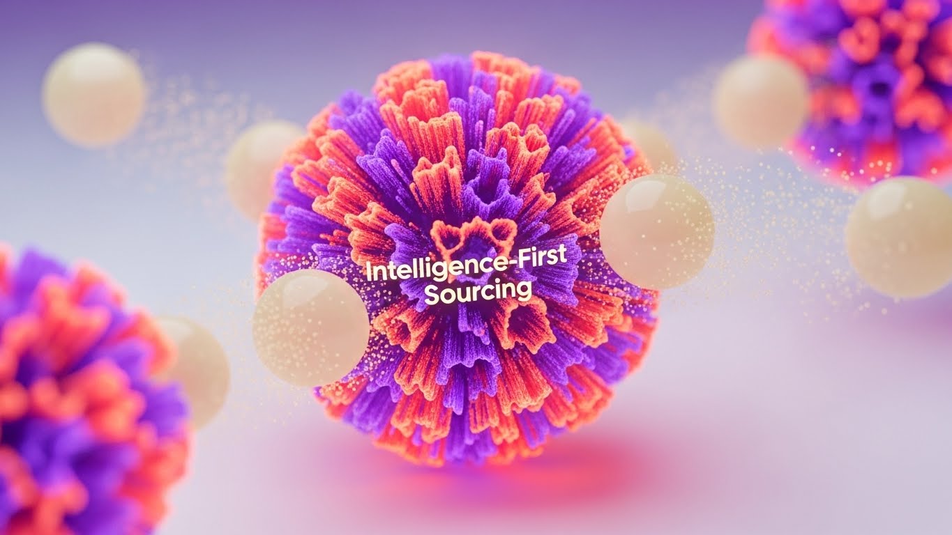
The Visual & Narrative Approach
This style utilizes high-end, abstract 3D rendering to visualize the intangible "brain" of your sourcing platform. The scene centers on a pulsating core of vibrant coral and electric purple textures, representing the central AI engine. Surrounding this core, soft cream-colored spheres—representing data nodes or candidate profiles—are magnetically drawn inward. The use of subsurface scattering gives these digital objects a wax-like, tangible quality, making the algorithm feel like a physical, touchable entity. The macro lens effect with a shallow depth of field focuses attention strictly on the "act" of intelligence gathering.
Psychological Impact & KPI Focus
- Cognitive Load: By simplifying complex data aggregation into a single, "magnetic" visual metaphor, this style reduces the cognitive load required to understand "centralized sourcing."
- Niche Psychology: Recruitment leaders often fear that AI is a "black box." This style counters that anxiety by visualizing the AI as an organic, organized, and attractive force that naturally attracts talent (the spheres) rather than aggressively hunting them.
- Operational Impact: Visually reinforces Category Creation (Framework 1.2), positioning your platform as the central nervous system for talent intelligence.
Strategic Implementation & Trade-offs
- Best Use Case: High-level brand films and LinkedIn organic posts where the goal is to establish market leadership.
- Duration: Short, looping assets (10-15 seconds).
- Trade-off: This style is highly conceptual. It builds brand equity but does not explain specific features.
Companies using similar video content -
Eightfold.ai – Talent Intelligence Platform – AI-powered talent matching and workforce planning.
Phenom People – Intelligent Talent Experience – AI-driven personalization for candidate journeys.
2. Abstract 2D Flat Vector Organic Modern Motion Graphics
TOFU | Category Creation
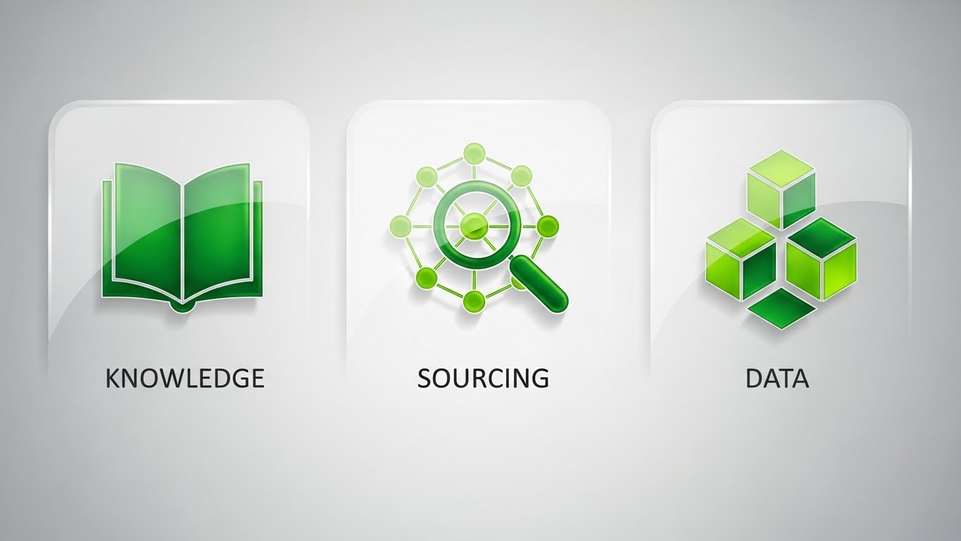
The Visual & Narrative Approach
This style brings order to chaos using a perfectly symmetrical flat-lay grid. The visual language adopts a "glassmorphism" finish—glossy emerald and lime green gradients with soft white highlights that simulate frosted glass. The icons representing "Knowledge," "Sourcing," and "Data" are constructed from simple geometric shapes but given depth through subtle drop shadows against a clean silver background. The lighting is even and shadowless, characteristic of high-end SaaS tech illustration.
Psychological Impact & KPI Focus
- Trust Building: The symmetry and "cleanliness" of the design trigger a psychological sense of reliability and precision—critical traits for a system handling sensitive candidate data.
- Comprehension: The flat vector style strips away distractions, forcing the viewer to focus on the semantic relationship between the three core pillars: Knowledge (Database), Sourcing (Action), and Data (Analytics).
- KPI Connection: Aligns with Market Education (Framework 1.3), helping prospects quickly categorize your solution within their mental tech stack.
Strategic Implementation & Trade-offs
- Best Use Case: Explainer videos on YouTube and "How It Works" website sections.
- Duration: 30-60 seconds for clear narration.
- Trade-off: While excellent for clarity, it can feel "safe" or generic if the icon design isn't bespoke.
Companies using similar video content -
SmartRecruiters – SmartOS Platform – Structured hiring with AI talent matching.
Lever – LeverTRM – Unified ATS + CRM with workflow automation.
3. Abstract 2D Motion Graphics
TOFU | Market Education
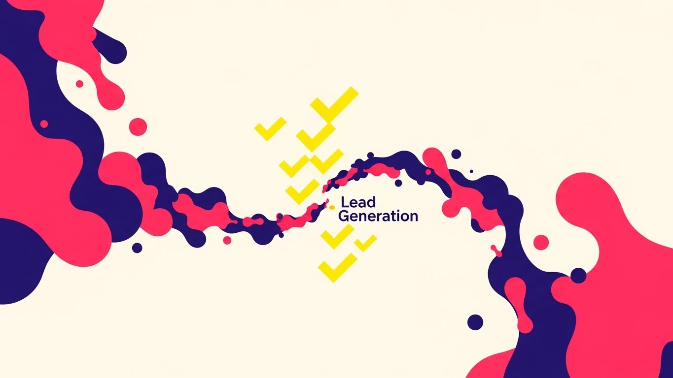
The Visual & Narrative Approach
Designed for speed and disruption, this style features a swirling vortex of fluid shapes in neon pink, deep indigo, and bright yellow against a stark white background. The narrative visualizes the process of "filtering" a chaotic market into qualified leads. The fluid shapes morph rapidly from disorganized chaos into sharp, organized geometric checkmark symbols in the center. The lines are razor-sharp with no gradients, relying on solid blocks of vibrant color to create maximum contrast.
Psychological Impact & KPI Focus
- Attention Capture: The high-contrast neon palette and rapid morphing motion are designed to stop the scroll on social feeds.
- Concept Association: The transition from "fluid chaos" to "geometric order" visually metaphors the core promise of sourcing software: turning a messy talent market into a clean list of candidates.
- Framework Alignment: Perfectly suited for Skippable Pre-Roll Ads (Framework 4.1), conveying the benefit of "Instant Organization" in under 5 seconds.
Strategic Implementation & Trade-offs
- Best Use Case: Top-of-funnel paid social ads (Instagram/LinkedIn) and pre-roll YouTube ads.
- Duration: 6-15 seconds maximum.
- Trade-off: This style is purely attention-grabbing and too abstract for deep product education.
Companies using similar video content -
hireEZ – Outbound Recruiting Platform – AI-driven sourcing and outreach automation.
Fetcher – AI Recruiting Software – Automates candidate sourcing and engagement.
4. Bold Kinetic Typography (Visual)
TOFU | Vertical Social Organic
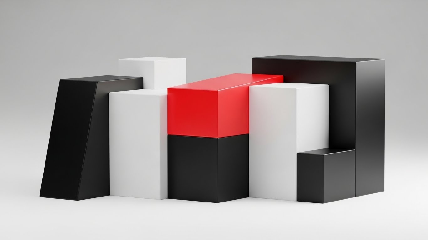
The Visual & Narrative Approach
Here, text and language are treated as physical architecture. The composition features abstract, blocky geometric forms that suggest the weight of heavy text without forming legible sentences. Rendered in jet black and white with a single, aggressive accent of laser red, the blocks cast long, hard diagonal shadows. The camera uses a frontal zoom, making the shapes feel imposing. This visualizes the "weight" and "authority" of search rankings and boolean strings.
Psychological Impact & KPI Focus
- Authority Bias: The heavy, monolithic structures and high-contrast palette trigger a sense of authority. It says, "This software is a powerhouse."
- Urgency: The "laser red" accent focuses the eye and creates a subconscious alert, driving the viewer to pay attention to the key message.
- SEO Relevance: Aligns with YouTube Organic Search (Framework 3.3) goals, where strong, readable thumbnails and intros improve click-through rates.
Strategic Implementation & Trade-offs
- Best Use Case: Intros for thought leadership videos, webinar openers, and bold social statements.
- Duration: 3-5 second "stings."
- Trade-off: Stylistically aggressive; best used as a "punctuation mark" within a broader content piece.
Companies using similar video content -
LinkedIn Talent Solutions – Recruiter – Advanced sourcing and AI-powered hiring.
Workday – Talent Acquisition – Enterprise HCM with integrated recruiting.
5. Isometric 2D Motion Design
TOFU | Skippable Pre-Roll Ad
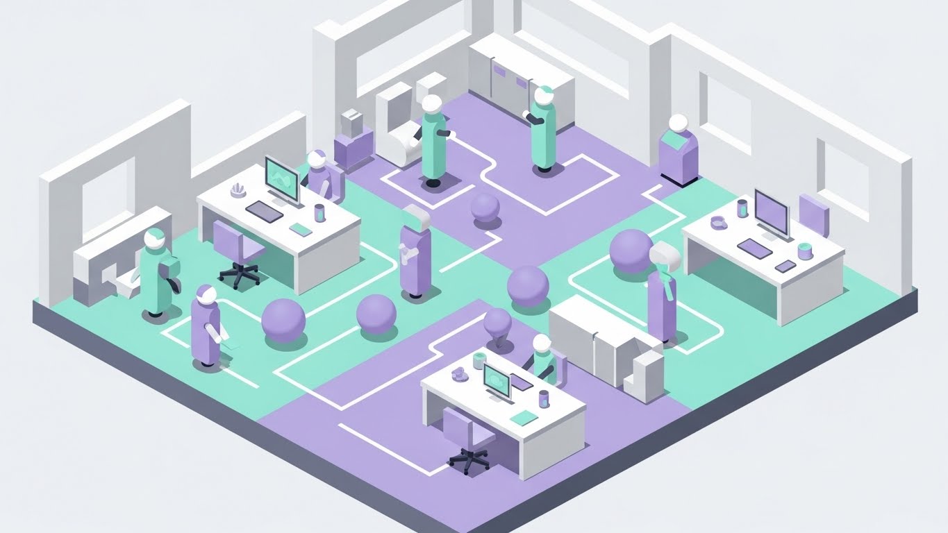
The Visual & Narrative Approach
This style softens the complexity of recruitment operations. It presents an isometric view of a stylized, futuristic office floor plan in pastel mint, lavender, and matte grey. Clean, stroke-less path lines connect different "stations" where abstract avatars (cylinders and spheres) move efficiently. The perfect 30-degree isometric grid creates a sense of engineering precision, while the soft global lighting makes the technology feel friendly and approachable.
Psychological Impact & KPI Focus
- Operational Ease: The smooth, uninterrupted movement of the avatars subliminally reassures the viewer that the software removes bottlenecks.
- Brand Affinity: The pastel palette counters the aggressive "corporate blue" typical of B2B, positioning the brand as innovative and user-centric (Framework 1.5).
- Empathy: Acknowledges the human element of recruiting—moving people, not just data.
Strategic Implementation & Trade-offs
- Best Use Case: Meta & General Social Ads, Homepage "Platform Overview" sections.
- Duration: 15-30 second loops.
- Trade-off: Can be perceived as "too cute" for enterprise-grade security discussions. Use for workflow visualization, not compliance.
Companies using similar video content -
Workable – All-in-one HR software – Intelligent tools for hiring and employee data.
Zoho Recruit – ATS & CRM – Budget-safe ATS with robust AI recruiting.
6. Wireframe to Reality Transition
TOFU | YouTube
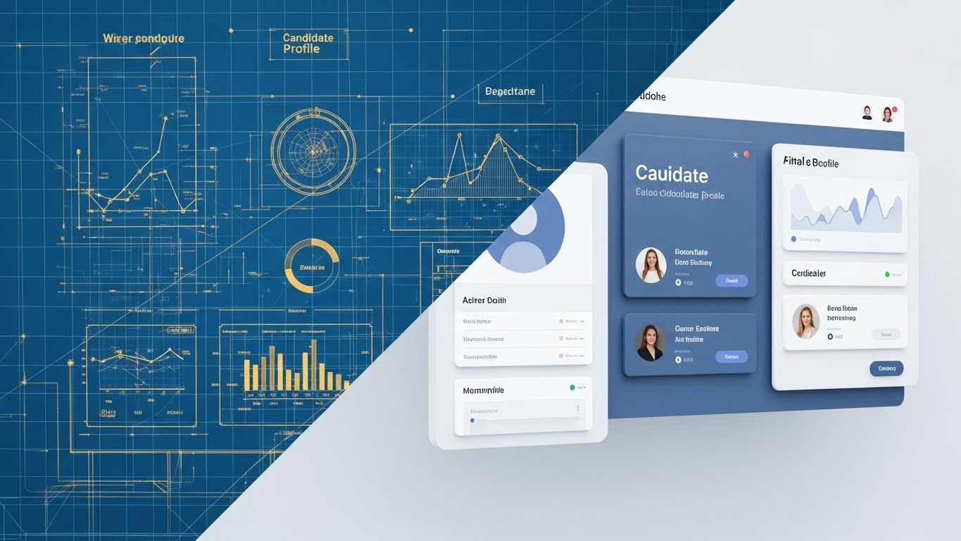
The Visual & Narrative Approach
This split-screen composition creates a direct link between engineering and experience. The left half displays a technical wireframe blueprint in metallic gold lines on a "blueprint blue" background, showing the underlying grid structure. The right half reveals the final, polished UI render in slate blue and white, complete with realistic drop shadows and textures. A sharp diagonal line acts as the transition point, visualizing the "Robust Architecture" behind the "Beautiful Interface."
Psychological Impact & KPI Focus
- Validation: Technical buyers (IT/Ops) need to know the system is well-architected. The wireframe satisfies this need for depth.
- Desirability: End-users need a clean UI. The right side promises a low-stress user experience.
- Differentiation: Aligns with Product Differentiation (Framework 1.7) by visually proving that the interface is backed by solid engineering.
Strategic Implementation & Trade-offs
- Best Use Case: Landing pages, Product Feature pages, and MOFU email nurtures.
- Duration: Static imagery or slow-sliding comparisons.
- Trade-off: Requires actual high-fidelity UI assets. If the UI is outdated, this style will highlight it.
Companies using similar video content -
iCIMS – Talent Cloud – Configurable enterprise ATS with recruitment marketing.
SAP SuccessFactors – Recruiting – Global ATS & CRM with skills-based matching.
7. Rapid UI Feature Montage
TOFU | Shaping Brand Perception
The Visual & Narrative Approach
A dynamic, high-energy composition that sells speed. Floating UI screens—specifically displaying "Filter" toggles and "Scorecard" graphs—are captured with a tilted Dutch angle to suggest forward momentum. The screens cascade toward the viewer in a tunnel of speed-blurred white light. The palette is vivid magenta, cyan, and deep navy. The glossy reflections on the screens emphasize that this is a premium, modern tool.
Psychological Impact & KPI Focus
- Perceived Velocity: The motion blur and camera tilt trick the brain into feeling the speed of the software, directly addressing the anxiety of "slow hiring processes."
- Feature Highlight: Isolating specific UI elements forces focus on differentiators without distraction.
- Education: Supports Feature Education (Framework 1.8) by making feature lists feel like an action sequence.
Strategic Implementation & Trade-offs
- Best Use Case: Email marketing GIFs, Product Launch trailers, Feature update announcements.
- Duration: Fast-paced cuts (2-3 seconds per screen).
- Trade-off: Can be overwhelming if used for detailed tutorials. It’s about feeling the speed, not learning the buttons.
Companies using similar video content -
Gem – AI-first Recruiting Platform – Automated outreach and candidate engagement.
Ashby – All-in-one Recruiting Platform – Integrated sourcing, scheduling, and analytics.
8. Isometric 3D Workflow
MOFU | Product/Solution Differentiation

The Visual & Narrative Approach
A distinct "Claymation" style 3D render that simplifies the competitive landscape. The scene depicts a maze in terra cotta and sand colors. One path (representing competitors) is blocked by a wall. The other path (our solution), colored in forest green, is wide open and straight. Miniature, faceless 3D people (rendered like matte plastic figurines) walk smoothly down the green path while others are stuck in the maze.
Psychological Impact & KPI Focus
- Comparison: The visual metaphor of "The Maze vs. The Straight Path" is instantly understood globally, requiring no text.
- Cognitive Ease: Reduces the complex argument of "efficiency" to a simple visual binary: Blocked vs. Open.
- Displacement: Aligns with Competitive Displacement (Framework 1.13), subtly framing the competitor's process as a "maze" of confusion.
Strategic Implementation & Trade-offs
- Best Use Case: LinkedIn Organic comparison posts and competitive landing pages ("Us vs. Them").
- Duration: Static images or slow, looping animations.
- Trade-off: It’s a metaphor, not a demo. Must be followed up with actual proof (UI screens).
Companies using similar video content -
Paradox – Conversational AI – Automates high-volume recruiting tasks via chat.
Humanly – Conversational AI – Automated candidate communication and engagement.
11. Dynamic Data Visualization
MOFU | Demand Gen & Lead Capture
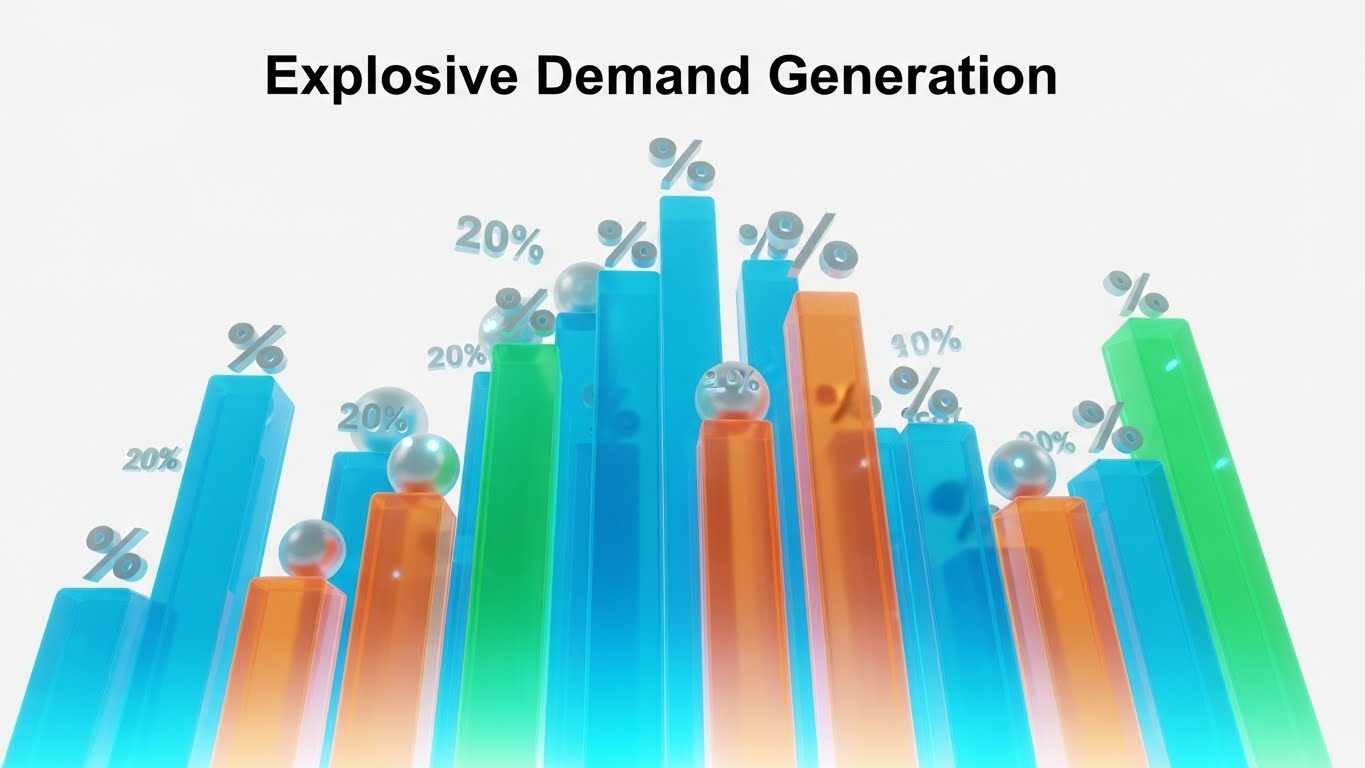
The Visual & Narrative Approach
This style moves beyond static reporting to visualize the "velocity" of a healthy talent pipeline. The composition features towering 3D bar graphs rendered in translucent teal and vibrant orange, glowing from the base up to represent organic growth. Unlike standard flat charts, these structures resemble a futuristic city skyline, suggesting that data is the infrastructure of modern recruiting. Floating spherical data points and percentage symbols hover energetically around the peaks, emphasizing that the numbers are alive and climbing. The low-angle camera shot makes the growth feel monumental and unstoppable.
Psychological Impact & KPI Focus
- Growth Mindset: The upward trajectory and "skyscraping" perspective trigger a psychological association with scaling success. It visualizes the promise of "more candidates, faster."
- Analytical Authority: The clean, crystalline texture of the bars appeals to data-driven Talent Operations leaders who value transparency and precision over fluff.
- KPI Alignment: Directly visualizes Pipeline Velocity and Source Quality, turning abstract metrics into a tangible "structure" of success.
Strategic Implementation & Trade-offs
- Best Use Case: Programmatic Display Ads and Account-Based Marketing (ABM) campaigns targeting Heads of Talent Ops.
- Duration: 6-10 seconds (Looping).
- Trade-off: This style celebrates the result of the data but does not explain how the data was gathered. It assumes the viewer already values metrics.
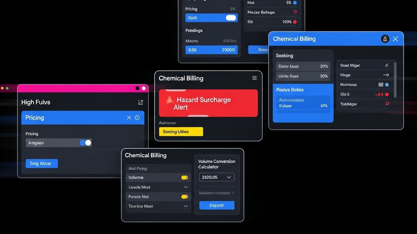
12. Dark Mode UI Showcase
MOFU | The Functional Buyer
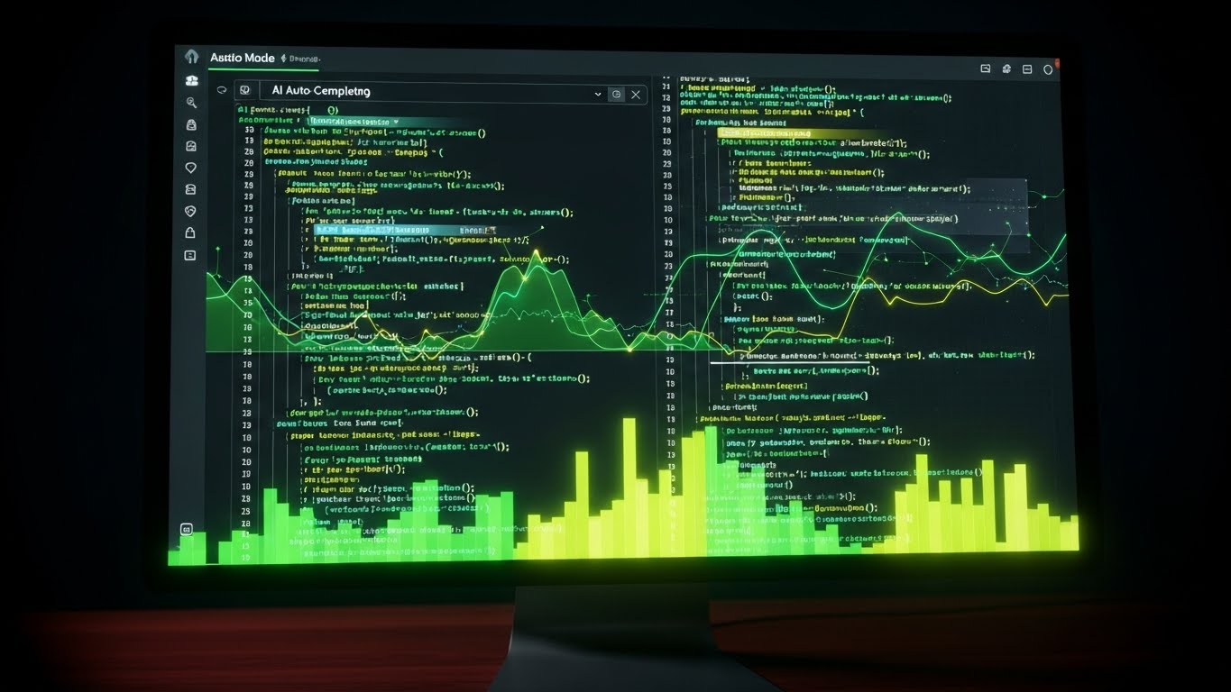
The Visual & Narrative Approach
This style is a love letter to the power user—the "Sourcing Ninja" who lives in Boolean strings and code. It features a photorealistic close-up of a monitor displaying your platform's "Dark Mode" interface. The palette is technical and sleek: charcoal backgrounds with neon green and electric yellow syntax highlighting that pops against the darkness. Complex code strings or search queries are shown being auto-completed by AI, visualizing the partnership between human expertise and machine speed. The faint reflection on the mahogany desk grounds the tech in a professional, executive environment.
Psychological Impact & KPI Focus
- Professional Validation: "Dark Mode" is culturally coded as a "Pro" feature in tech. It signals to technical recruiters that this tool was built for heavy, sustained usage, not just casual browsing.
- Cognitive Ease: The auto-complete visualization demonstrates the reduction of repetitive strain and mental fatigue associated with building complex search strings.
- Operational Impact: Validates Recruiter Efficiency and Search Precision, showing how the tool acts as a force multiplier for the sourcing team.
Strategic Implementation & Trade-offs
- Best Use Case: LinkedIn Video Ads targeting Senior Technical Recruiters and Sourcing Leads.
- Duration: 15-30 seconds.
- Trade-off: This aesthetic can feel intimidating to non-technical operational generalists. Use strictly for your "Power User" personas.
13. Split Screen: Optimized Reality and UI
MOFU | Website Visitor Re-engagement

The Visual & Narrative Approach
A vertical split-screen composition that forces a direct comparison between the "Old Way" and the "New Way." The left side features a desaturated, greyscale image of the traditional recruiting office—disorganized stacks of paper resumes and chaotic spreadsheets. The lighting is flat and uninspiring. In sharp contrast, the right side showcases a vibrant, high-fidelity digital tablet displaying a clean, organized candidate list. The lighting here is bright and directional. The visual narrative is the immediate migration from administrative chaos to digital clarity.
Psychological Impact & KPI Focus
- Pain Agitation: The greyscale "chaos" triggers the viewer’s memory of administrative frustration and lost candidates.
- Desire Creation: The vibrant "order" on the right offers an immediate visual solution, promising relief and control.
- KPI Alignment: Visually demonstrates Process Optimization and Reduced Admin Time, core metrics for Talent Acquisition managers drowning in manual work.
Strategic Implementation & Trade-offs
- Best Use Case: Meta (Facebook/Instagram) retargeting ads and "Why Switch" landing pages.
- Duration: Static imagery or simple sliding wipes.
- Trade-off: It is a binary simplification. It works for emotional impact but lacks the nuance needed for enterprise integration discussions.
Companies using similar video content -
Findem – Talent Intelligence Platform – Real-time analytics for candidate skills.
Metaview – AI Recruiting Platform – Interview intelligence and strategic sourcing reports.
14. Photorealistic 3D Renders
BOFU | Thought Leadership

The Visual & Narrative Approach
At the bottom of the funnel, you need to sell the value of the proprietary technology. This style uses a photorealistic 3D render of an abstract "Key" or "Node Connector," finished in polished chrome and silver. It rests on a pedestal in a cool, out-of-focus studio environment, implying it is a rare and valuable object. Ray-traced reflections dance across the metallic surface. This is not a literal key, but a metaphor for the "Secret Sauce" of your matching algorithm—the unique mechanism that unlocks access to passive talent.
Psychological Impact & KPI Focus
- Premium Authority: The high-fidelity rendering and "gallery" lighting position the software as a premium, high-value asset rather than a commodity utility.
- Intellectual Curiosity: The abstract nature of the object invites the viewer to ask, "What is the key?" creating an opening for a deeper technical conversation.
- Differentiation: Aligns with Thought Leadership goals (Framework 1.4), visually separating your brand from competitors who use generic stock photography.
Strategic Implementation & Trade-offs
- Best Use Case: LinkedIn Organic posts for C-Level audiences, Whitepaper covers, and Investor Decks.
- Duration: Static High-Res Imagery.
- Trade-off: It is purely metaphorical. It builds brand equity but explains zero functionality.
Companies using similar video content -
Turing – Intelligent Talent Cloud – AI-powered vetting for remote developers.
AmazingHiring – Tech Recruitment Platform – Aggregates profiles for niche tech skills.
15. Hyper-lapse Stock Footage with Data
BOFU | Building Trust & Credibility
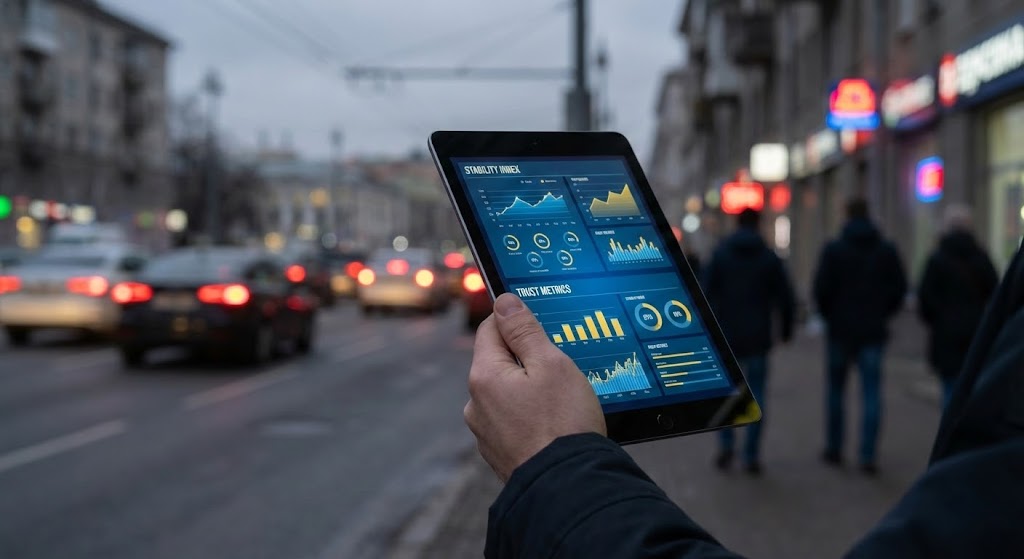
The Visual & Narrative Approach
The recruitment market is volatile, but your platform is the anchor. This style juxtaposes a chaotic background—a city street with heavy motion blur, representing the fast-moving, unpredictable talent market—against a stable foreground. A hand holds a tablet displaying a crisp, steady dashboard with "Stability Index" and "Trust Metrics" clearly visible in sunlight yellow and sky blue. The background is moving; the data is fixed. This visualizes the concept of "Command and Control" in a chaotic environment.
Psychological Impact & KPI Focus
- Safety & Control: Visualizes the anxiety of a turbulent market and immediately resolves it with the stability of the software interface.
- Contextual Relevance: Grounds the data in the "real world," reminding the buyer that this software operates in a busy, human environment.
- KPI Alignment: Supports Risk Mitigation and Predictable Hiring, showing that the platform provides a steady signal amidst the noise.
Strategic Implementation & Trade-offs
- Best Use Case: Website Hero sections and "About Us" brand videos.
- Duration: 10-20 seconds (Cinemagraph style).
- Trade-off: Requires high-quality stock matching (lighting must match the overlay). Poor compositing breaks trust immediately.
Companies using similar video content -
Bullhorn – Recruiting CRM – Automates recruiting lifecycle for agencies.
Recruiterflow – Recruiting CRM – AI-first end-to-end ecosystem for agencies.
16. 3D X-Ray Visualization
BOFU | ROI Justification

The Visual & Narrative Approach
When justifying ROI to a CFO, you must show the engine, not just the paint job. This style uses a "Medical-Grade" clean aesthetic to visualize the internal processing power of the platform. A translucent white glass casing reveals a glowing internal core of laser red and skeleton grey components, organized in a perfect grid. Glowing particles (candidate data) flow through this machinery without resistance. It visually proves that the system is engineered for throughput, showing the "inner value" that isn't visible on the standard UI.
Psychological Impact & KPI Focus
- Transparency: The X-Ray effect psychologically suggests you have "nothing to hide" and that the core technology is robust.
- Architectural Validation: Appeals to IT buyers and CIOs who need to verify the structural integrity and logic of the solution before approval.
- Operational Impact: Visualizes Processing Capacity and System Architecture, key components of the Total Cost of Ownership (TCO) discussion.
Strategic Implementation & Trade-offs
- Best Use Case: Technical solution briefs, Security/Compliance pages, and bottom-of-funnel retargeting.
- Duration: 15-30 second looped animations.
- Trade-off: Highly technical aesthetic. It can feel cold or clinical if not paired with human-centric messaging.
Companies using similar video content -
Beamery – Talent Lifecycle Management – AI-powered candidate experience.
Gloat – Talent Marketplace – Internal mobility and skills development.
17. Aspirational Stock Montage
BOFU | Overcoming Objections

The Visual & Narrative Approach
Recruiting is stressful; this visual sells the relief of success. It features a high-quality cinematic shot of a professional woman in a modern glass-walled office. She holds a coffee cup, looking out the window with a relaxed, confident smile, bathed in warm "Golden Hour" sunlight. There are no screens, no stress, and no clutter. This image doesn't show the work; it shows the result of the work: a role filled, a team complete, and a recruiter who has reclaimed her time.
Psychological Impact & KPI Focus
- Emotional Resonance: Directly addresses the burnout and stress pervasive in the recruitment industry. It sells "Peace of Mind" as a feature.
- Objection Handling: Counters the fear that "software adds more work" by visualizing a relaxed, successful end-state.
- Brand Affinity: Humanizes the B2B brand, connecting the software purchase to personal well-being and professional success.
Strategic Implementation & Trade-offs
- Best Use Case: Email marketing signatures, Case Study headers, and "Success Stories" pages.
- Duration: Static Imagery.
- Trade-off: Can be seen as generic "stock" if the photography isn't premium. Must be paired with hard data to be effective in B2B.
Companies using similar video content -
Rippling – HR Platform – Comprehensive HR with integrated sourcing.
Deel – HR Platform – Global recruitment and talent management.
18. Futuristic Neon/Dark Mode
BOFU | Risk Mitigation

The Visual & Narrative Approach
Data privacy is a top-tier anxiety for HR tech buyers. This style adopts a "Cybersecurity Aesthetic" to visualize protection. A glowing wireframe grid in electric violet leads to a vanishing point, suggesting infinite scale. In the center, a massive, holographic shield icon rendered in neon cyan and midnight blue floats protectively over the data stream. It uses the visual language of high-end security software to reassure the buyer that their candidate data is fortress-secure.
Psychological Impact & KPI Focus
- Security Assurance: The shield iconography is universally understood as a symbol of protection, instantly lowering anxiety regarding data breaches or GDPR compliance.
- Modernity: The neon/dark mode aesthetic signals that the security protocols are modern and cutting-edge, not legacy firewalls.
- KPI Alignment: Directly visualizes Compliance Standards and Data Integrity, crucial checkboxes for the Legal and IT procurement teams.
Strategic Implementation & Trade-offs
- Best Use Case: Security compliance pages, Trust Centers, and LinkedIn Ads targeting CIOs/CTOs.
- Duration: 10-15 seconds.
- Trade-off: This is a "Defensive" visual. It prevents a "No" vote but rarely drives the "Yes" vote on its own.
Companies using similar video content -
Skillate – Recruitment Automation – AI screening and process automation.
Pymetrics – AI Assessments – Bias-free talent matching and assessments.
HiredScore – Talent Orchestration – Ethical AI for hiring decisions.
19. Macro UI Micro-Interactions
BOFU | Driving Demo Requests

The Visual & Narrative Approach
Sometimes, the most powerful message is simplicity. This style uses an extreme macro close-up of a single UI element: the "Action" button. The button is crisp white with a "Focus Blue" border, sitting on a soft grey background. A mouse cursor hovers right over it, casting a tiny drop shadow to show elevation. The depth of field is razor-thin, blurring everything else. It focuses the viewer's entire world on the ease of taking the next step. It promises that the complex task of sourcing is reduced to a simple click.
Psychological Impact & KPI Focus
- Action priming: The visual of the cursor hovering over a button subconsciously primes the viewer to click the actual CTA on your landing page.
- Simplicity Bias: By isolating a single interaction, the software feels incredibly easy to use, overcoming the "Learning Curve" objection.
- Operational Impact: Visualizes User Adoption and Ease of Use, proving that the tool is intuitive enough for immediate deployment.
Strategic Implementation & Trade-offs
- Best Use Case: Bottom-of-funnel landing pages (near the "Book Demo" button) and retargeting display ads.
- Duration: 3-5 second loops (Hover -> Click -> Success State).
- Trade-off: It is tactical, not strategic. It works best when the user is already convinced of the value and just needs a nudge.
Companies using similar video content -
BambooHR – Hiring/ATS module – Consolidates HR and basic recruiting functions.
Teamtailor – Talent Acquisition Platform – Attracting and converting talent.
20. Lifestyle Stock with UI Overlay
BOFU | The Economic Buyer

The Visual & Narrative Approach
The final hurdle is often the CFO. This style speaks their language. It features an over-the-shoulder shot of a silver-haired executive in a mahogany-paneled boardroom. He is looking at a laptop screen, but instead of a generic spreadsheet, a high-fidelity dashboard overlay displays "Cost Reduction" graphs in serious steel grey and leather brown tones. The lighting is moody and cinematic. The focus is sharp on the data, visually connecting the human decision-maker directly with the financial metrics that matter: ROI and Savings.
Psychological Impact & KPI Focus
- Executive alignment: The visual cues (suit, boardroom, silver hair) signal that this software is "Boardroom Ready" and creates a safe choice for senior leadership.
- Financial Validation: By overlaying the UI on a business scene, it bridges the gap between "HR Tool" and "Business Asset."
- KPI Alignment: Laser-focused on Cost Per Hire (CPH) and Return on Investment (ROI), the only two metrics the Economic Buyer truly cares about.
Strategic Implementation & Trade-offs
- Best Use Case: Sales decks, proposal documents, and LinkedIn organic content targeting Finance leaders.
- Duration: Static High-Res Imagery.
- Trade-off: It creates distance from the actual end-user (the recruiter). Use this specifically to close the deal with the budget holder, not to attract the user.
Companies using similar video content -
SmartRecruiters – Winston Intelligence Platform – AI-powered security and compliance.
Oracle Recruiting – Fusion HCM – Enterprise security and campaign tools.
21. 2D Line Art Animation
Onboarding | Driving Freemium/Trials
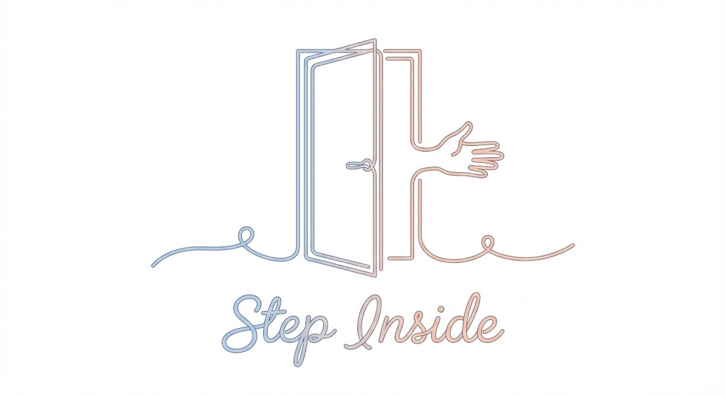
The Visual & Narrative Approach
The goal of the "Free Trial" CTA is to promise ease. This style utilizes an elegant, continuous line art illustration in soft pastel blue and peach on a white background. The single line fluidly draws a stylized open door that transitions into a welcoming hand gesture. The line varies in thickness to create weight and elegance, never breaking its continuity. There are no heavy fill colors—just the fluid, rhythmic movement. The aesthetic is minimalist and frictionless, visually encouraging users to "Step Inside" without barriers.
Psychological Impact & KPI Focus
- Cognitive Ease: The continuous line suggests an uninterrupted, smooth path. It subliminally signals that the sign-up process is a single, unbroken flow, lowering the mental barrier to entry.
- Perceived Simplicity: By using a minimalist aesthetic, you promise a lightweight, easy-to-use tool—crucial for users fatigued by "heavy" enterprise software.
- Conversion Focus: Aligns with Frictionless Entry (Framework 2.3), designed specifically to increase click-through rates on "Start Free Trial" buttons.
Strategic Implementation & Trade-offs
- Best Use Case: "Get Started" pages, exit-intent popups, and welcome emails.
- Duration: 3-6 second loops.
- Trade-off: This style is purely illustrative. It sets a mood of simplicity but does not explain specific features or interfaces.
Companies using similar video content -
Recooty – Cloud-based ATS – AI-powered candidate matching.
Freshteam – ATS Platform – Intuitive UI for small and growing businesses.
22. Minimalist Flat 2D Vector
Onboarding | Self-Serve Onboarding
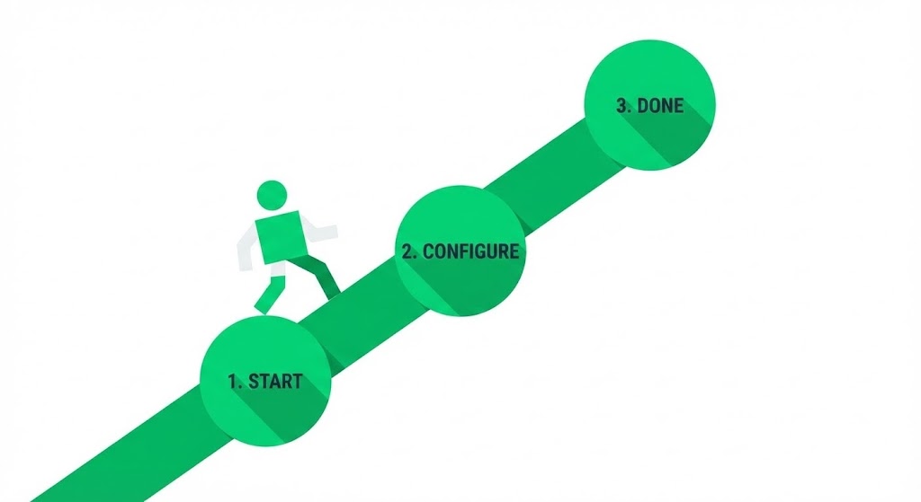
The Visual & Narrative Approach
Onboarding can feel overwhelming; this style makes it look like a walk in the park. It uses geometric primitives (circles, squares) in a clean white and vibrant green palette to create a "1-2-3" roadmap. A stylized figure walks confidently along a straight path from "Start" to "Done." The shadows are cast at hard 45-degree angles ("Long Shadow" style), adding depth without clutter. There are no gradients—just bold, solid blocks of color. It visually codifies the setup process into a finite, conquerable set of actions.
Psychological Impact & KPI Focus
- Goal Gradient Effect: By visualizing the progress (Step 1, Step 2, Step 3), the user feels a psychological pull to complete the sequence.
- Clarity: The flat design removes ambiguity. It says, "There are exactly three steps. No hidden complexity."
- Adoption: Supports Self-Serve Onboarding (Framework 2.4) by reducing the "setup anxiety" that often causes drop-off after signup.
Strategic Implementation & Trade-offs
- Best Use Case: Onboarding email sequences ("Step 1 is complete!") and Empty State screens in the dashboard.
- Duration: Static imagery or simple step-by-step GIFs.
- Trade-off: Can feel generic if the "character" design isn't aligned with your specific brand voice.
Companies using similar video content -
MokaHR – AI-Powered Enterprise Recruitment – Efficient, intelligent, and scalable hiring.
ClearCompany – ATS – Streamlines hiring from application to onboarding.
23. Clean UI Workflow (Light Mode)
Onboarding | Accelerating Time-to-Value
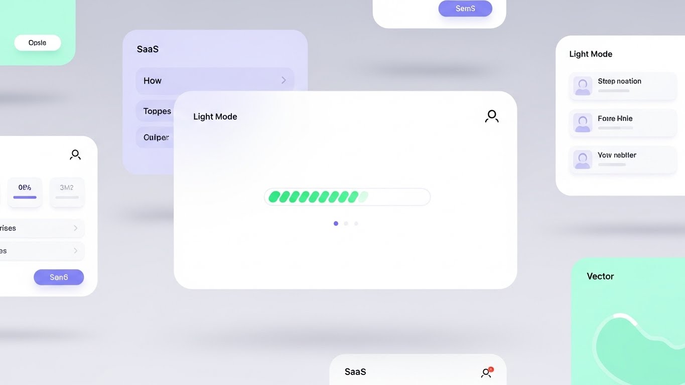
The Visual & Narrative Approach
This style celebrates the "Aha!" moment. It features a composition of floating UI screens in a bright, airy void, rendered in a "SaaS Light Mode" aesthetic—white backgrounds with soft mint and light lilac accents. The focus is a central progress bar filling up rapidly, emitting a soft green glow upon completion. Rounded corners and diffused drop shadows make the interface feel friendly and modern. It visualizes the speed and satisfaction of completing a core task, like parsing a resume or sending a campaign.
Psychological Impact & KPI Focus
- Positive Reinforcement: The glow and rapid movement of the progress bar trigger a dopamine hit, rewarding the user for their interaction.
- Modernity: The "airy" aesthetic positions the tool as current and cloud-native, distancing it from clunky legacy ATS interfaces.
- Activation: Aligns with Time-to-Value (Framework 1.15), showing new users that they can achieve results in seconds, not hours.
Strategic Implementation & Trade-offs
- Best Use Case: In-app product tours ("You just parsed 50 resumes!"), Feature announcement emails, and Help Center articles.
- Duration: 5-10 seconds.
- Trade-off: Requires a pristine UI. If your actual product is text-heavy or cluttered, this idealized version might set unrealistic expectations.
Companies using similar video content -
OpenCATS – Open Source ATS – Customizable platform for recruitment process.
Zoho Recruit – ATS & CRM – Free edition for basic recruiting needs.
24. Holographic UI over 3D Render
Onboarding | Reducing Implementation

The Visual & Narrative Approach
Integration is a major pain point. This style visualizes it as effortless "magic." A realistic 3D background (blurred office or server room) creates depth, while a sharp, semi-transparent holographic UI panel floats in the foreground. The UI, glowing in iridescent pearl and holographic blue, shows two "puzzle piece" modules (representing your software and the client's ATS) snapping together magnetically with a burst of light. It adopts an "Iron Man" HUD aesthetic to suggest advanced, frictionless engineering.
Psychological Impact & KPI Focus
- Technological Optimism: The futuristic aesthetic reframes "integration" from a headache-inducing task to a cutting-edge upgrade.
- Reassurance: The "magnetic snap" visual metaphor communicates compatibility and security—the pieces fit perfectly, implying no data loss or broken code.
- Implementation: Supports Reduced Implementation Time (Framework 1.16) by visually promising a "plug-and-play" experience.
Strategic Implementation & Trade-offs
- Best Use Case: Integration Marketplace pages, API documentation headers, and "Technical Setup" webinars.
- Duration: 10-15 seconds.
- Trade-off: Highly stylized. It represents the concept of connection, not the actual API configuration steps.
Companies using similar video content -
Folks HR – ATS – Automated job postings and sourcing.
Recruit CRM – Recruiting CRM – AI-powered platform for staffing agencies.
25. 2D Animation & UI Composition
Retention | Reducing Support Overhead

The Visual & Narrative Approach
When users are stuck, they need empathy. This style combines cel-shaded 2D character animation with stylized UI elements. A friendly, flat-design character (thick outlines, muted primary colors) is shown high-fiving a floating chat bubble containing a smiley face icon. The background is a simple abstract pattern of dots. The narrative is clear: help is friendly, available, and effective. It reframes the "Support Ticket" from a negative problem to a positive interaction.
Psychological Impact & KPI Focus
- Frustration Reduction: The playful, cartoon-like aesthetic lowers the blood pressure of a frustrated user. It signals, "We've got you, don't worry."
- Approachability: Makes the support system feel human and accessible, encouraging users to use self-service tools rather than churning in silence.
- Efficiency: Aligns with Reducing Support Overhead (Framework 1.18), promoting the idea that solutions are just a quick chat away.
Strategic Implementation & Trade-offs
- Best Use Case: Knowledge Base headers, "Contact Support" pages, and Chatbot idle screens.
- Duration: Loopable GIFs.
- Trade-off: Too informal for critical error messages (e.g., "Data Lost"). Use for guidance, not crisis management.
Companies using similar video content -
Manatal – AI Recruitment Software – Easy-to-use interface for hiring.
Workable – All-in-one HR software – Self-service platform with AI screening.
26. 2D Character-Driven Story
Retention | Proactive Support

The Visual & Narrative Approach
To retain users, you must constantly remind them of new value. This style uses a corporate vector art character in a warm grey and orange palette. The character holds a large, stylized megaphone. But instead of sound waves, the megaphone emits icons representing new features (stars, lightning bolts, gear cogs). The character has an expressive, happy face. The style is clean and energetic, focusing on the excitement of updates rather than the technical details.
Psychological Impact & KPI Focus
- Engagement: The "shout out" visual metaphor grabs attention in a crowded inbox, signaling that something important and positive has happened.
- Perceived Innovation: Constantly showing a character announcing new things reinforces the perception that the platform is evolving and improving (increasing LTV).
- Retention: Supports Proactive Support (Framework 9.2) by ensuring users are aware of tools that could solve their current problems.
Strategic Implementation & Trade-offs
- Best Use Case: Product Update emails (Changelogs), Newsletter headers, and In-app "What's New" modals.
- Duration: Static or simple 2-frame animation.
- Trade-off: Can become "banner blindness" if used too frequently. Save for significant feature drops.
Companies using similar video content -
iCIMS – Talent Cloud – Extensive partner marketplace for integrations.
Greenhouse – ATS – 500+ integrations for hiring workflows.
27. Low-Poly 3D Modeling
Retention | Reducing Churn

The Visual & Narrative Approach
Churn often happens when a user faces a gap in their process. This style visualizes your software as the bridge. Rendered in a low-poly 3D style with jewel tones (ruby red, sapphire blue), the scene depicts two cliffs separated by a deep chasm. A sturdy, crystalline bridge connects them, allowing tiny low-poly figures to cross safely. The lighting is sharp and faceted. This visual metaphor reinforces that the platform connects "Current State" to "Desired Outcome," preventing the user from falling into the void.
Psychological Impact & KPI Focus
- Stability: The structural integrity of the bridge (triangles are the strongest shape) psychologically reinforces the reliability of the platform.
- Safety: Visualizes the platform as the only safe passage through a difficult market or process.
- LTV Protection: Aligns with Reducing Churn (Framework 1.19), reminding the user that removing the software removes the bridge.
Strategic Implementation & Trade-offs
- Best Use Case: Renewal reminders, "We Miss You" re-engagement emails, and Account Review presentations.
- Duration: Static or slow panning video.
- Trade-off: Abstract. It reinforces value emotionally but doesn't remind them of specific features.
Companies using similar video content -
GoPerfect – AI Recruiting Platform – AI interviewer chat for candidate experience.
Paradox – Conversational AI – Olivia bot for automated candidate engagement.
28. Generative AI Realistic Character Video
Expansion | Driving Deep Feature Adoption

The Visual & Narrative Approach
This style leverages the cutting edge of Gen AI video to create a hyper-realistic "Virtual Success Manager." A professional woman with deep skin tones and a sharp navy blazer stands in a modern office. She looks directly into the lens, breaking the fourth wall, and points to a floating holographic node (a new feature) glowing in gold next to her. The fidelity is 8k—pores, eye reflections, and hair texture are perfect. It blurs the line between human support and AI guidance.
Psychological Impact & KPI Focus
- Personalization: The direct eye contact creates a sense of personal connection, even though the viewer knows it's AI-generated (or high-end stock).
- Authority: The professional styling and "presenter" mode command attention, making the feature explanation feel like a premium consultation.
- Adoption: Supports Deep Feature Adoption (Framework 1.17), using a human face to guide users into complex, high-value parts of the platform.
Strategic Implementation & Trade-offs
- Best Use Case: In-app video tutorials for "Enterprise" features, Upsell landing pages, and personalized onboarding videos.
- Duration: 30-60 seconds (Speaking).
- Trade-off: The "Uncanny Valley" is a risk. The lip-sync and movement must be flawless, or it becomes distracting.
Companies using similar video content -
Textio – Augmented Writing Platform – Inclusive job posting and language guidance.
Pesto Tech – AI Tools for Recruitment – AI-powered talent sourcing.
29. 3D Parallax UI Presentation
Expansion | Driving Upsell/Cross-sell
The Visual & Narrative Approach
Upselling requires showing "more." This style uses 3D parallax to physically stack value. Three UI screens are layered in deep space, viewed from a side profile. The back layers (Standard Plan) are tinted in "Depth Blue," while the front layer (Pro Plan) is vibrant "Parallax Purple." A "Premium" badge icon floats physically in front of the top screen, casting a shadow. The depth of field blurs the back layers, forcing focus on the premium front layer. It visually argues that the upgrade is a tangible step up in capability.
Psychological Impact & KPI Focus
- Perceived Depth: The layering effect visually represents "depth of functionality." The Pro plan literally stands out above the rest.
- Desirability: The focus and lighting on the front layer make the upgrade feel like the "hero" of the story.
- Revenue Expansion: Aligns with Driving Upsell (Framework 1.20), making the higher tier look more robust and essential.
Strategic Implementation & Trade-offs
- Best Use Case: Pricing pages, "Upgrade to Unlock" paywalls, and End-of-Trial email sequences.
- Duration: Slow, drifting parallax motion (loops).
- Trade-off: Works best for "Tiers" of service. Less effective for a-la-carte feature selling.
Companies using similar video content -
Reejig – Talent Intelligence Platform – Ethical AI for workforce redeployment.
Gloat – Talent Marketplace – Connects employees with internal opportunities.
30. 2D Graphics Over Live Action
Expansion | Driving Referrals & Advocacy

The Visual & Narrative Approach
Recruitment is ultimately human. This style grounds the tech in reality. It uses a candid, high-quality photo of a diverse team in a "Golden Hour" workspace—laughing, shaking hands. Subtly overlaying this organic scene are 2D vector "sparks" and a thin white network graph connecting the people. The graphics are minimal, just enough to show the digital connections underlying the human relationships. It conveys that your software powers these genuine moments of connection.
Psychological Impact & KPI Focus
- Social Proof: Seeing real people happy and connected triggers the desire to share that experience with peers.
- Authenticity: The "film grain" and candid nature of the photo cut through the polish of SaaS marketing, appealing to the user's emotions.
- Advocacy: Supports Driving Referrals (Framework 1.21), visually linking the software to the concept of a thriving professional network.
Strategic Implementation & Trade-offs
- Best Use Case: Referral program landing pages, LinkedIn "Customer Success" posts, and Case Study hero images.
- Duration: Static or Cinemagraph (sparks animating).
- Trade-off: Relies heavily on the quality of the base photo. Bad stock photos will kill the authenticity immediately.
The Visual Operations Doctrine: Strategic Knowledge Base
This section synthesizes the 30 visual styles into a cohesive business framework. It moves beyond "design" to address the operational and financial outcomes of a visual-first strategy in the Applicant Sourcing & HR Tech domain.
Strategic Alignment & Visual Architecture
The "Pre-Production" Strategy. Defining the Visual Operating System.
- The Cognitive Load Audit: Before commissioning assets, audit your current training materials. If a concept (e.g., Semantic Search) takes 3 paragraphs to explain, it requires a Style 1 (Abstract 3D) or Style 11 (Dynamic Data) visual. Goal: Reduce operational read-time by 50%.
- Role-Based Visual Mapping: Differentiate your visual language. Use Mobile/Simple styles (Style 21, 22) for Recruiters who need speed and "glanceability" on the go. Use Desktop/Data styles (Style 12, 16) for Talent Ops leaders who need depth and analytics.
- The "Glanceability" Standard: In a high-volume sourcing environment, a recruiter should understand a feature update in under 3 seconds. Design assets (like Style 7 Rapid UI) that communicate the "gist" instantly without audio.
- Brand Voice Consistency: Ensure your "AI" is visualized consistently. Is it a "Magic Wand" (Style 24) or a "Brain" (Style 1)? Advids recommends establishing a "Visual Metaphor Bible" to ensure disparate modules (Sourcing, CRM, Analytics) feel like one unified platform.
- The Advids Strategic Audit: Partner with Advids early to map your entire feature set against the "Funnel Stage" framework. Don't just make "cool videos"; create assets that specifically unblock the user at TOFU, MOFU, and BOFU stages.
- Standardization vs. Customization: Use standardized "SaaS" aesthetics (Style 23) for general workflow tutorials to save budget. Reserve bespoke, high-end 3D (Style 14) for "Category Design" narratives that differentiate you from competitors.
- The Cross-Departmental Bridge: Use visuals to unify terminology. If Sales calls it "AI Matching" but Product calls it "Semantic Scoring," use a single visual metaphor (Style 14 Key) to anchor the concept for both teams.
- Legacy System Integration: Visualizing the connection between old on-prem HRIS and your new cloud SaaS is critical. Use Style 6 (Wireframe to Reality) to visually prove that your modern UI respects the robust architecture of their legacy data.
- Accessibility in Recruitment: Ensure your motion graphics (Style 4 Kinetic Typography) are legible for all users. High contrast and clear typography are not just aesthetic choices; they are compliance and inclusivity mandates in HR.
- The Mobile-First Mandate: 40% of recruiter activity happens on mobile (LinkedIn/Email). Ensure all 30 styles, especially Style 19 (Macro UI), are legible on a vertical 9:16 screen.
Operational Adoption & Implementation
The "Deployment" Phase. Embedding visuals into the workflow.
- Overcoming "AI Anxiety": Recruiters fear AI will replace them. Use Style 12 (Dark Mode/Co-pilot) to visualize AI as a partner that completes the grunt work (auto-complete), not a replacement. Show the human controlling the AI.
- The Micro-Learning Shift: Replace 50-page PDF manuals with a library of 30-second clips (Style 7 and Style 17). Embed these directly into the ATS dashboard ("How do I filter?") to drive feature adoption at the point of friction.
- Just-in-Time Support: Embed Style 25 (2D Support) animations into your Help Center search results. When a user queries "Error," greet them with a calm, friendly visual that lowers frustration before they even read the solution.
- Gamification of Sourcing: Use Style 11 (Dynamic Data) to visualize recruiter scorecards. Showing "Sourcing Activity" as a climbing, vibrant bar chart encourages healthy competition and engagement with the platform.
- Reducing Support Ticket Volume: There is a direct correlation between proactive visual guides and reduced call center load. Deploying Style 22 (Step-by-Step) guides for common setup tasks can reduce "How-to" tickets by up to 30%.
- Remote Onboarding: With distributed recruiting teams, you cannot rely on in-person seminars. Use Style 28 (Gen AI Avatar) and Style 23 (Clean UI) to create a scalable, "always-on" onboarding academy that delivers consistent training globally.
- Standard Operating Procedures (SOPs): Transform text-based SOPs into visual process flows (Style 8 Isometric Workflow). "The Sourcing Maze" becomes a clear, green path, ensuring every recruiter follows the same compliance standards.
- Feedback Loops: Use interactive video elements (overlaying Style 19) to gather feedback. "Did this video help?" A simple click provides data on which visual assets are actually driving competency.
- Scalable Localization: Global SaaS platforms need global assets. Styles like Style 1 (Abstract 3D) and Style 2 (Vector Icons) are linguistically neutral. They communicate value without needing translation, saving massive localization costs.
- Leadership Communication: When pitching a renewal to a CHRO, do not use a spreadsheet. Use Style 20 (Lifestyle Overlay) and Style 15 (Hyper-lapse) to present a "State of the Union" that visualizes stability, control, and executive impact.
Measuring Impact & Future-Proofing
The "ROI" Phase. Quantifying success and evolving the strategy.
- Beyond "Views": Stop measuring video "views." Define actionable KPIs: Time-to-Competency (how fast a new recruiter places a hire) and Feature Adoption Rate (do they use the "Advanced Filter" after watching the Style 12 video?).
- The "Idle Time" Metric: Correlate better visualization with reduced software navigation time. If Style 17 (Macro UI) teaches a shortcut, measure the reduction in "seconds per sourcing session." This is your hard ROI.
- Compliance Velocity: How fast can you roll out a new OFCCP or GDPR update? Use Style 18 (Security Shield) to communicate changes instantly. Measure "Time to Compliance Attestation" before and after video deployment.
- Retention and Churn: High-quality UX visualization directly impacts LTV. Use Style 27 (Bridge) campaigns to target accounts showing "low usage" signals. Measure the "Save Rate" of these visual interventions.
- The AI Visual Frontier: Prepare for real-time video generation. Soon, your platform will generate Style 28 (Avatar) videos on the fly to answer specific user queries. Start building your "Visual Knowledge Graph" now.
- Scalability of Assets: Build a library, not a graveyard. Modular styles like Style 15 (Clean UI) allow you to swap out a single screen when the UI updates, without re-rendering the entire video.
- The Advids Partnership: Scale is the enemy of quality unless managed. Advids serves as your long-term repository and production partner, ensuring that as your feature set grows from 10 to 100 tools, your visual library scales in parallel without losing brand coherence.
- Benchmarking Success: "Good enough" visuals are a competitive risk in 2026. If your competitor uses Style 14 (High-End 3D) and you use generic screenshots, you lose the "Perceived Quality" battle before the demo starts.
- The ROI of Quality of Hire: Connect the dots. Better trained recruiters (via Style 10) find better candidates. Work with Talent Ops to trace "Quality of Hire" improvements back to the deployment of your "Sourcing Academy" assets.
- Final Call to Innovation: Treat video as infrastructure, not content. It is the UI of your knowledge base. Investing in a robust Visual Style Guide is investing in the operating speed and intelligence of your entire client base.
Companies using similar video content -
HireVue – Video Interviewing & Assessments – AI-powered video interviews.
Humanly – Conversational AI – Supports video interviews and post-interview analysis.
Author & Editor Bio


