
Introduction: The Visualization Imperative in Architecture
The architecture and design industry stands at a pivotal threshold. We have moved beyond the era where software was merely a drafting tool; today, it is the cognitive bridge between abstract data and built reality. For SaaS platforms in this space, the challenge is no longer just about feature sets—it is about visualization fluency. The ability to articulate complex spatial relationships, intricate workflows, and data-heavy insights through video is now a primary driver of market leadership.
The operational reality for your target audience—architects, engineers, and construction (AEC) professionals—is defined by a constant struggle to bridge the "Physical/Digital Divide." They deal with massive datasets and complex compliance mandates, yet they must sell their vision to clients who cannot read a 2D CAD drawing. In this environment, video is not just marketing; it is a strategic acceleration tool. It reduces cognitive load, allowing decision-makers to grasp the value of a digital twin or a parametric design tool in seconds.
The opportunity for growth is immense. The global 3D rendering market is accelerating, currently projected to grow at a CAGR of over 20%, driven by the demand for immersive client experiences. However, capturing this growth requires overcoming industry skepticism regarding ROI and efficiency. The cost of the status quo is high; research indicates that late-stage design errors, often caused by poor visualization, can result in a 195% cost increase for project rectification. Visualization is the antidote to this risk.
This guide explores 30 distinct video styles, dissected to reveal why they work psychologically and how they drive business KPIs. By adopting these visual languages, you do not just explain your software; you position it as the essential infrastructure for the future of building.
1. Hybrid: Line Art & Glossy Abstract
TOFU | Brand Awareness

The Visual & Narrative Approach
This style masterfully visualizes the core promise of architectural software: the transmutation of ideas into form. The sequence begins with a delicate, white vector wireframe—representing the initial sketch—twisting upwards against a professional "Blueprint Blue" background. As the structure ascends, it seamlessly morphs into abstract, glossy 3D geometric shapes in Neon Cyan and Silver. This is not a literal building but a metaphor for the process of design, devoid of voiceover to allow the visual metamorphosis to speak for itself.
Psychological Impact & KPI Focus
- Niche Psychology: Architects are inherently visual thinkers who value the purity of the "line." This style respects that origin while projecting the aspirational quality of the final built environment. It reduces the cognitive load associated with learning new tools by simplifying the workflow into a fluid, beautiful motion.
- Operational Impact: By abstracting the structure, this style avoids the "Uncanny Valley" often found in low-budget photorealism. It focuses the viewer on the fluidity of the engine, directly supporting Brand Awareness by associating the platform with elegance.
Strategic Implementation & Trade-offs
- Best Use Case: Website Header or High-Level Brand Reel.
- Duration: 10-15 Seconds (Loop).
- Trade-offs: The abstraction is excellent for mood and branding but fails if the goal is to show specific UI features. It is a "feel" style, not a "how-to" style.
Companies using similar video content -
Rhino 3D – Grasshopper – Parametric design for complex architectural forms.
Dassault Systèmes – 3DEXPERIENCE – Collaborative platform for design, simulation, and manufacturing.
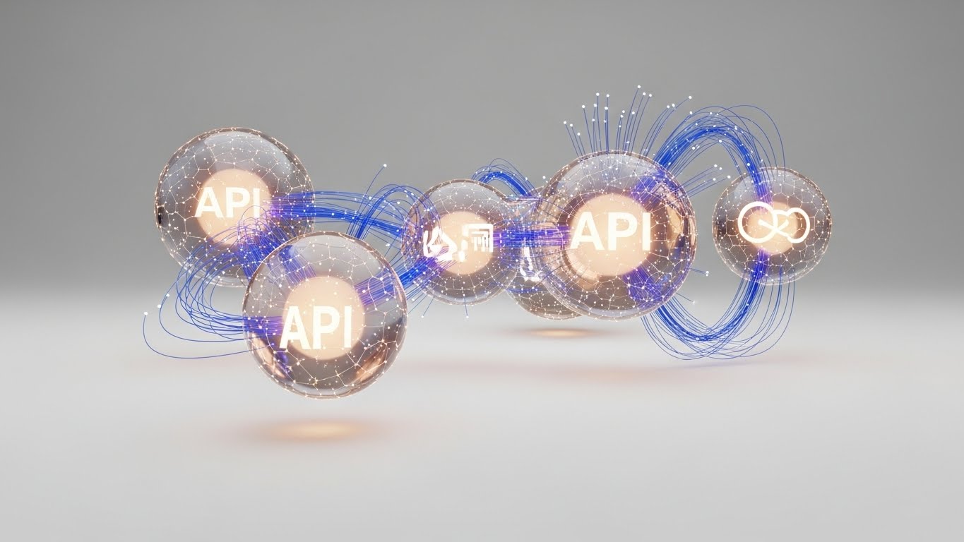
2. Abstract 3D AI Visualization
TOFU | Category Creation
The Visual & Narrative Approach
This aesthetic leans heavily into the "High-Tech" narrative. It visualizes the invisible data layer—point clouds and API connections—that powers modern construction. Luminous particles in Pure White and Electric Lime float in a high-key white void, coalescing into the ghostly, ethereal shape of a modern museum. The camera drifts through this data cloud, emphasizing connectivity and depth, creating a sense of sophisticated intelligence without getting bogged down in the specifics of a single project.
Psychological Impact & KPI Focus
- Niche Psychology: For BIM Managers, the anxiety is "data silos." This visual style calms that fear by showing data as a fluid, unified entity. It triggers a feeling of technological superiority, positioning the tool as a next-generation solution (Category Creation).
- Operational Impact: It effectively distinguishes the software from legacy "drafting" tools. It says, "We are not just drawing lines; we are managing intelligence."
Strategic Implementation & Trade-offs
- Best Use Case: LinkedIn Organic posts for new AI feature launches.
- Duration: 15-20 Seconds.
- Trade-offs: The ethereal nature can feel "vaporware" if not backed up by technical specs. It is best used to announce major AI features or platform overhauls.
Companies using similar video content -
TestFit – Generative design for rapid real estate feasibility.
Hypar – Cloud-based generative design for building systems.
3. 2D Character-Driven Story
TOFU | Market Education

The Visual & Narrative Approach
This style brings the human element back into a tech-heavy conversation. It features a "Young Architect" persona—stylized and modern—wearing a Terracotta sweater in a bright, sun-lit studio. She interacts with a floating tablet, gesturing enthusiastically at a model. The background hints at tools of the trade (plants, drafting tables) in a clean vector style using Cream and Sage Green.
Psychological Impact & KPI Focus
- Niche Psychology: Many architects fear software will replace their creativity. This style reassures them that the human designer remains the hero. It builds empathy and mirrors their daily aspirations: seamless collaboration and happy clients.
- Operational Impact: It is highly effective for Market Education, framing the software as a "partner" in the creative process rather than a replacement. It lowers the barrier to entry for smaller firms.
Strategic Implementation & Trade-offs
- Best Use Case: YouTube Explainer Videos.
- Duration: 45-60 Seconds.
- Trade-offs: This style can appear "too cute" to large enterprise engineering firms who value rigid technical precision. Optimal for SMB targeting.
Companies using similar video content -
Vectorworks – Vectorworks Architect – BIM software empowering creative architectural design.
SketchUp – SketchUp Pro – Intuitive 3D modeling for design exploration.
4. Generative AI Cinematic Video
TOFU | Shaping Brand Perception

The Visual & Narrative Approach
The "Hollywood Blockbuster" of architectural visualization. A sweeping drone shot captures a futuristic, solar-punk skyline at golden hour. Glass and steel towers reflect Warm Amber and Teal. The focus is on a central, biophilic tower with vertical gardens and waterfalls. It doesn't show the software interface; it shows the dream outcome of using the software in 8k resolution.
Psychological Impact & KPI Focus
- Niche Psychology: Architects are dreamers. This style taps into the "Master Builder" archetype, validating their ambition to create sustainable, world-changing structures. It reduces skepticism by showing the software can handle complex, visionary projects.
- Operational Impact: Excellent for Shaping Brand Perception on large screens (CTV/OTT). It elevates the brand from a "tool" to a "visionary partner."
Strategic Implementation & Trade-offs
- Best Use Case: CTV / OTT Ads.
- Duration: 15-30 Seconds.
- Trade-offs: High production value is mandatory. If the CGI looks cheap, credibility is lost instantly. It lacks specific product utility.
Companies using similar video content -
Autodesk – Spacemaker – AI-powered generative design for urban planning.
Bentley Systems – iTwin Platform – Digital twin platform for infrastructure lifecycle management.
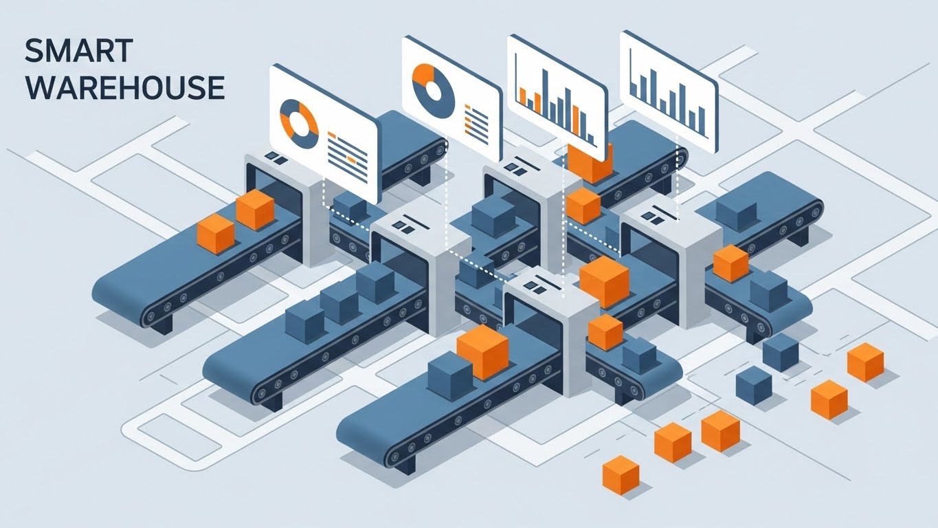
5. Isometric 2D Motion Design
TOFU | YouTube SEO
The Visual & Narrative Approach
Precision meets logistics. A flat isometric view of a construction site on a Slate Grey background. Modular blocks in Safety Yellow and White snap together automatically to form a building. Geometric trucks and cranes move in rhythm. The lighting is shadowless (flat), emphasizing clarity and order.
Psychological Impact & KPI Focus
- Niche Psychology: For project managers, "chaos" is the enemy. This style projects control and efficiency. It appeals to the logical mindset that values order over aesthetics.
- Operational Impact: The isometric perspective allows for showing multiple moving parts without perspective distortion, making it perfect for YouTube SEO thumbnails and process explainers.
Strategic Implementation & Trade-offs
- Best Use Case: YouTube Process Explainers.
- Duration: 6-10 Seconds (Loop).
- Trade-offs: It can feel clinical. Best reserved for explaining logistics, integration features, or backend processes.
Companies using similar video content -
Procore – Construction management software for project logistics.
Trimble – Trimble Connect – Cloud collaboration for construction project efficiency.
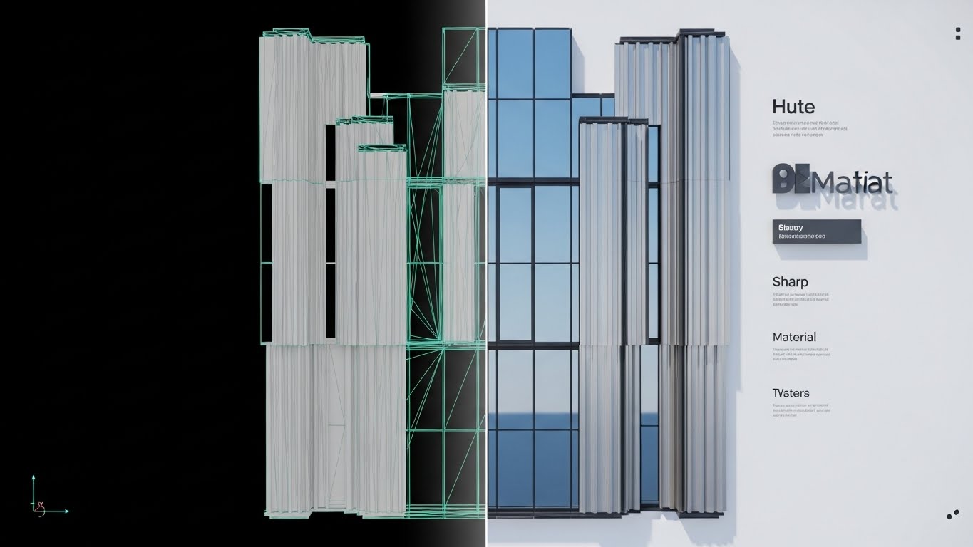
7. Wireframe to Reality Transition
MOFU | Product Differentiation
The Visual & Narrative Approach
A direct "Before & After" proof point. A split-screen composition: the left half shows a raw, white polygonal wireframe mesh of a complex curtain wall; the right half shows the photorealistic render of the same wall with reflective glass and brushed aluminum. The dividing line is sharp, transitioning seamlessly to prove the connection between data and beauty.
Psychological Impact & KPI Focus
- Niche Psychology: It bridges the gap between the engineer (who cares about the mesh) and the client (who cares about the image). It satisfies technical scrutiny while validating marketing output.
- Operational Impact: A prime asset for Landing Pages to drive Product Differentiation. It visually answers "How accurate is the render?" without text.
Strategic Implementation & Trade-offs
- Best Use Case: Landing Pages (Product Feature Section).
- Duration: 10-20 Seconds.
- Trade-offs: Requires a perfect match between model and render. Any misalignment breaks the illusion of fidelity.
Companies using similar video content -
N/A – No style 6 provided in the input.
8. Macro UI Micro-Interactions
MOFU | Feature Education

The Visual & Narrative Approach
An extreme macro close-up of the interface. The focus is tight on a rounded "Generate Render" button in Action Blue. A stylized cursor hovers and clicks. Soft, diffuse lighting creates gentle shadows, emphasizing depth and tactility. It turns a mundane click into a moment of satisfaction.
Psychological Impact & KPI Focus
- Niche Psychology: Software friction is a major pain point. This style promises a frictionless UX. It leverages the "gamification" of work, where interactions feel designed and deliberate.
- Operational Impact: Ideal for Email Campaigns introducing new features. It respects the viewer's time by focusing on a single micro-interaction (1:1 ratio).
Strategic Implementation & Trade-offs
- Best Use Case: Email Campaigns.
- Duration: 3-5 Seconds (Loop).
- Trade-offs: Lacks context. It serves as a "polish" indicator rather than a utility explainer.
Companies using similar video content -
Chaos Group – V-Ray – Photorealistic rendering for architectural visualization.
Enscape – Real-time rendering and virtual reality for design.
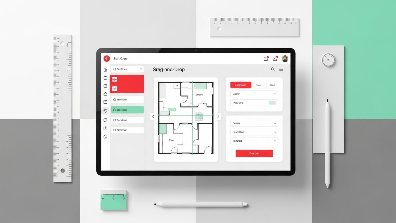
9. Clean UI Workflow (Light Mode)
MOFU | Driving Freemium/Trials
The Visual & Narrative Approach
A top-down "flat-lay" view of a digital workspace. A clean software UI with Soft Grey panels and Mint Green accents displays a "drag-and-drop" editor. Surrounding the screen are vector architectural tools (ruler, stylus). Even, bright studio lighting creates an approachable, modern vibe.
Psychological Impact & KPI Focus
- Niche Psychology: Appeals to the "organized creative." It reduces the intimidation of complex CAD interfaces, suggesting the software is intuitive and easy to learn.
- Operational Impact: The workhorse style for Facebook Ads driving Freemium Trials. It promises a "plug-and-play" experience.
Strategic Implementation & Trade-offs
- Best Use Case: Facebook / Instagram Ads.
- Duration: 15-30 Seconds.
- Trade-offs: Can appear too casual for heavy industrial use cases. Best for entry-level or mid-market targeting.
Companies using similar video content -
Bluebeam – Bluebeam Revu – PDF markup and collaboration for AEC workflows.
Fieldwire – Construction management app for field team tasks.
10. Dynamic Data Visualization
MOFU | ROI Justification
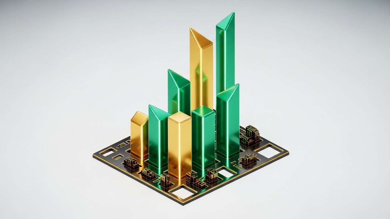
The Visual & Narrative Approach
Visualizing the abstract concept of ROI. Emerald Green and Gold geometric bars rise from a stylized foundation plan, resembling a city skyline growing. The bars represent cost savings and efficiency. The background is a clean white-to-grey gradient. No text, just the metaphor of growth.
Psychological Impact & KPI Focus
- Niche Psychology: For Principals, the language is money. This style speaks that language fluently, validating the software as an investment that "builds" value.
- Operational Impact: Critical for LinkedIn Carousels where ROI Justification is paramount. It provides visual evidence for financial decision-makers.
Strategic Implementation & Trade-offs
- Best Use Case: LinkedIn Carousel / Sales Deck.
- Duration: 10-15 Seconds.
- Trade-offs: It is dry and abstract. It lacks the emotional hook of design beauty, serving purely as a logical closer.
Companies using similar video content -
Graphisoft – ArchiCAD – Intuitive BIM software for architectural design.
Hexagon – BricsCAD BIM – CAD/BIM software with familiar, clean interface.
11. Lifestyle Stock with UI Overlay
MOFU | Establish Thought Leadership

The Visual & Narrative Approach
This style bridges the gap between the human presenter and hard data. We see a high-quality cinematic shot of a confident male architect in a crisp white shirt, commanding a glass-walled conference room. As he gestures, the air in front of him comes alive with semi-transparent, holographic UI charts and graphs in Warm Beige and Sunlight Yellow. The visuals imply that the software is an extension of his intellect, projecting project analytics directly into the conversation.
Psychological Impact & KPI Focus
- Niche Psychology: Senior architects aspire to be seen as strategic consultants, not just technicians. This style validates that aspiration by positioning the user as a master of data. It elevates the software from a "drafting tool" to a "presentation asset" that enhances their personal authority.
- Operational Impact: It effectively targets Thought Leadership, suggesting that firms using this software are data-mature and ready for complex challenges.
Strategic Implementation & Trade-offs
- Best Use Case: Blog Headers or "About Us" sections in Pitch Decks.
- Duration: Static Image or 5-8 Second subtle motion loop.
- Trade-offs: Relying on stock footage can feel generic if the holographic overlay isn't custom-animated to match the software's actual UI aesthetics.
Companies using similar video content -
nPlan – AI for project scheduling and risk analysis.
Oracle – Aconex – Project controls and collaboration for construction.
12. Rapid UI Feature Montage
MOFU | Accelerating TTV
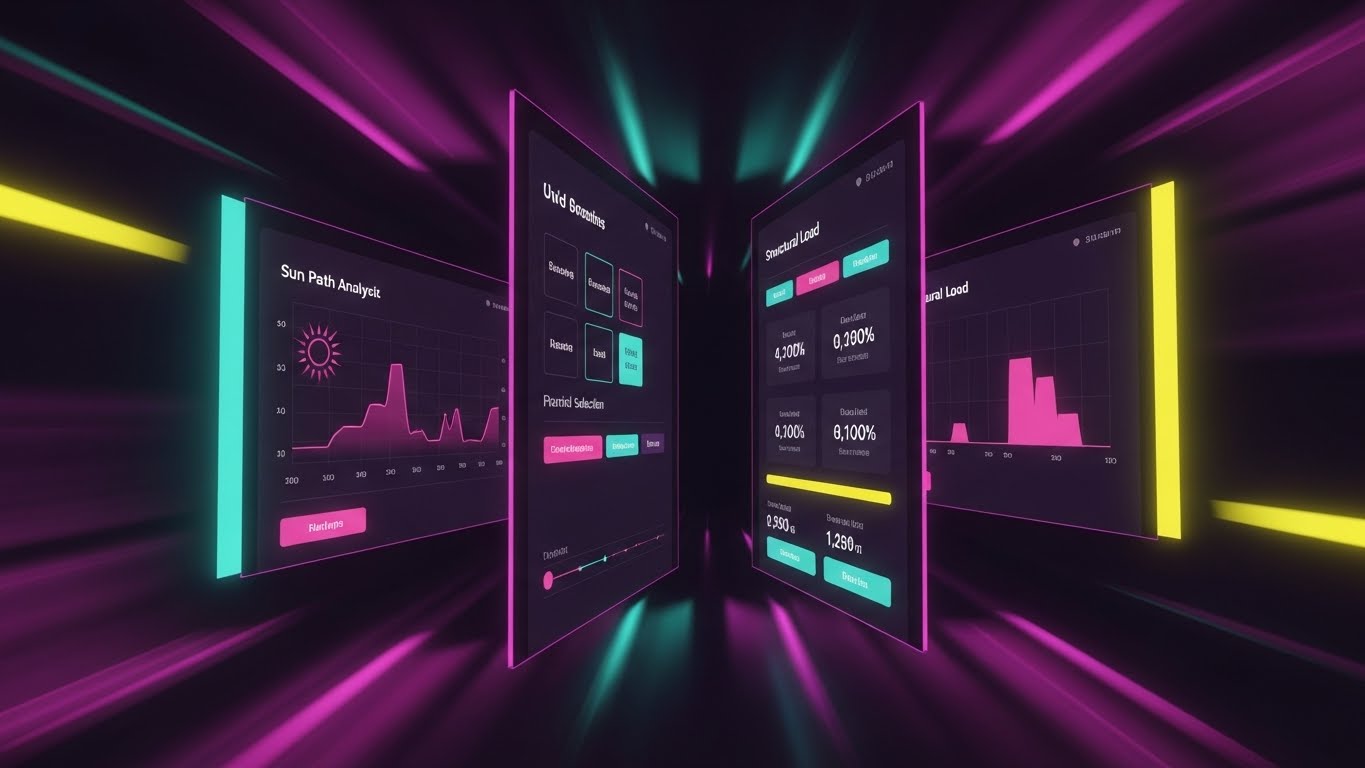
The Visual & Narrative Approach
A high-energy visualization of efficiency. Multiple UI screens displaying distinct features—sun path analysis, material selection, and structural load—are arranged in a dynamic tunnel-like perspective. The camera flies through them, creating a "warp speed" effect. The color palette shifts to Vivid Purple and Pink to convey kinetic energy, while motion blur on the edges forces focus on the central, high-clarity data.
Psychological Impact & KPI Focus
- Niche Psychology: A primary objection to new software is "learning curve lag." This style visually counters that fear by associating the platform with Speed and Momentum. It subconsciously tells the viewer, "This tool moves as fast as you think."
- Operational Impact: Highly effective for Accelerating Time-to-Value (TTV) perception. It suggests that accessing deep features is quick and intuitive, rather than buried in menus.
Strategic Implementation & Trade-offs
- Best Use Case: Pre-Roll Ads (YouTube/LinkedIn).
- Duration: 10-15 Seconds.
- Trade-offs: The pace is too fast for educational retention. It is purely an impression play to signal feature richness and speed.
Companies using similar video content -
Willow – WillowTwin – Digital twin for smart building operations.
Johnson Controls – OpenBlue – Smart building solutions for data-driven insights.
13. Photorealistic 3D Renders
BOFU | Building Trust

The Visual & Narrative Approach
The ultimate proof of quality. A hyper-realistic 3D render of a Scandinavian-style living room. The visual narrative is all about the details: sunlight streaming through floor-to-ceiling windows, casting physically accurate shadows on Natural Wood floorboards. Dust motes dance in the light beams. The texture of the linen sofa is palpable. There is no UI, no text—just the undeniable output of the engine.
Psychological Impact & KPI Focus
- Niche Psychology: Architects are visual perfectionists. If the output looks "game-like," they will not trust the engine for client presentations. This style satisfies the Need for Fidelity, proving the software can produce competition-ready visuals.
- Operational Impact: Essential for Building Trust at the bottom of the funnel. It serves as the visual case study that validates the investment.
Strategic Implementation & Trade-offs
- Best Use Case: Case Study PDFs and Gallery Pages.
- Duration: Static or Slow Pan (10-15 Seconds).
- Trade-offs: Production quality must be flawless. Any artifacting or lighting error undermines the entire premise of "photorealism."
Companies using similar video content -
Autodesk – Construction Cloud – Integrated platform for construction project management.
Dalux – BIM-based construction management for field and office.
14. Split Screen: Optimized Reality
BOFU | Competitive Displacement
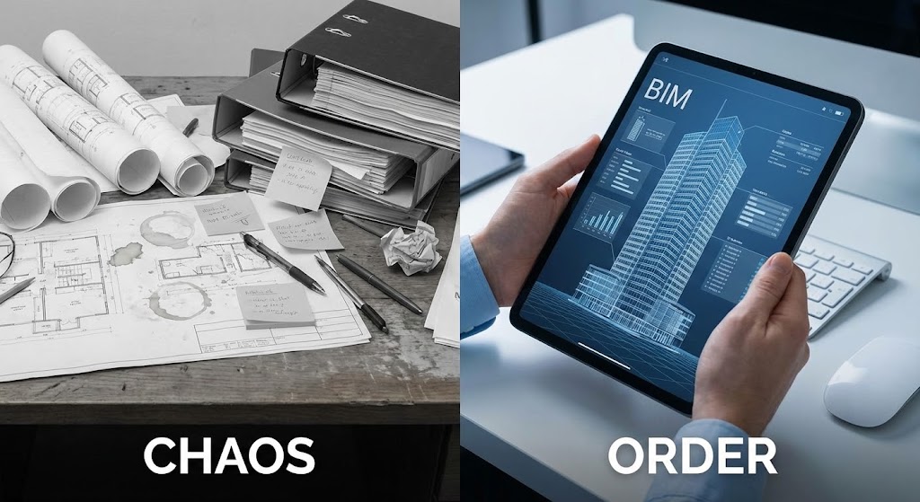
The Visual & Narrative Approach
A stark, binary comparison. The left side is a desaturated, chaotic photo of a traditional desk cluttered with rolled-up blueprints and sticky notes. The right side is a pristine, high-resolution image of hands holding a tablet displaying a clean, organized BIM model in Corporate Blue. The dividing line acts as a timeline, separating the "old way" from the "new standard."
Psychological Impact & KPI Focus
- Niche Psychology: It plays on the anxiety of Disorganization versus the desire for Control. It frames the competitor (or legacy process) as messy and stressful, while your software is presented as the antidote—clean, portable, and precise.
- Operational Impact: A powerful tool for Competitive Displacement. It doesn't just sell features; it sells a superior, less stressful lifestyle for the architect.
Strategic Implementation & Trade-offs
- Best Use Case: Comparison Pages and Sales Decks.
- Duration: Static or Slider interaction.
- Trade-offs: Can feel reductive. Ensure the "Chaos" side is relatable, not an exaggerated caricature, to maintain respect for the user's current struggles.
Companies using similar video content -
Lumion – 3D rendering software for stunning architectural visualizations.
D5 Render – Real-time ray tracing renderer for high-fidelity scenes.
15. Minimalist Flat 2D Vector
BOFU | Overcoming Objections

The Visual & Narrative Approach
When the conversation turns to technical integration, simplicity wins. This style uses clean, flat vector iconography on a pure white background. A simple icon of a cloud server in Flat Cyan connects via a dotted line to a simplified house icon in Charcoal Grey. The animation is smooth and linear, visually explaining "cloud integration" or "security protocols" without the visual noise of a complex UI.
Psychological Impact & KPI Focus
- Niche Psychology: IT Directors and implementation managers fear complexity and security risks. This aesthetic strips away the noise, signaling Stability and Ease of Integration. It reassures the technical buyer that the backend is robust and uncomplicated.
- Operational Impact: Perfect for Overcoming Objections regarding deployment. It visually guarantees that "this will just work."
Strategic Implementation & Trade-offs
- Best Use Case: Display Ads and Technical Documentation.
- Duration: 3-5 Seconds (Loop).
- Trade-offs: Too simple for feature selling. It is purely a conceptual reassurance tool for backend/infrastructure discussions.
Companies using similar video content -
Autodesk – BIM 360 – Cloud-based project management for digital transformation.
Nemetschek – Allplan – BIM software for integrated design and planning.
16. 3D X-Ray Visualization
BOFU | Risk Mitigation
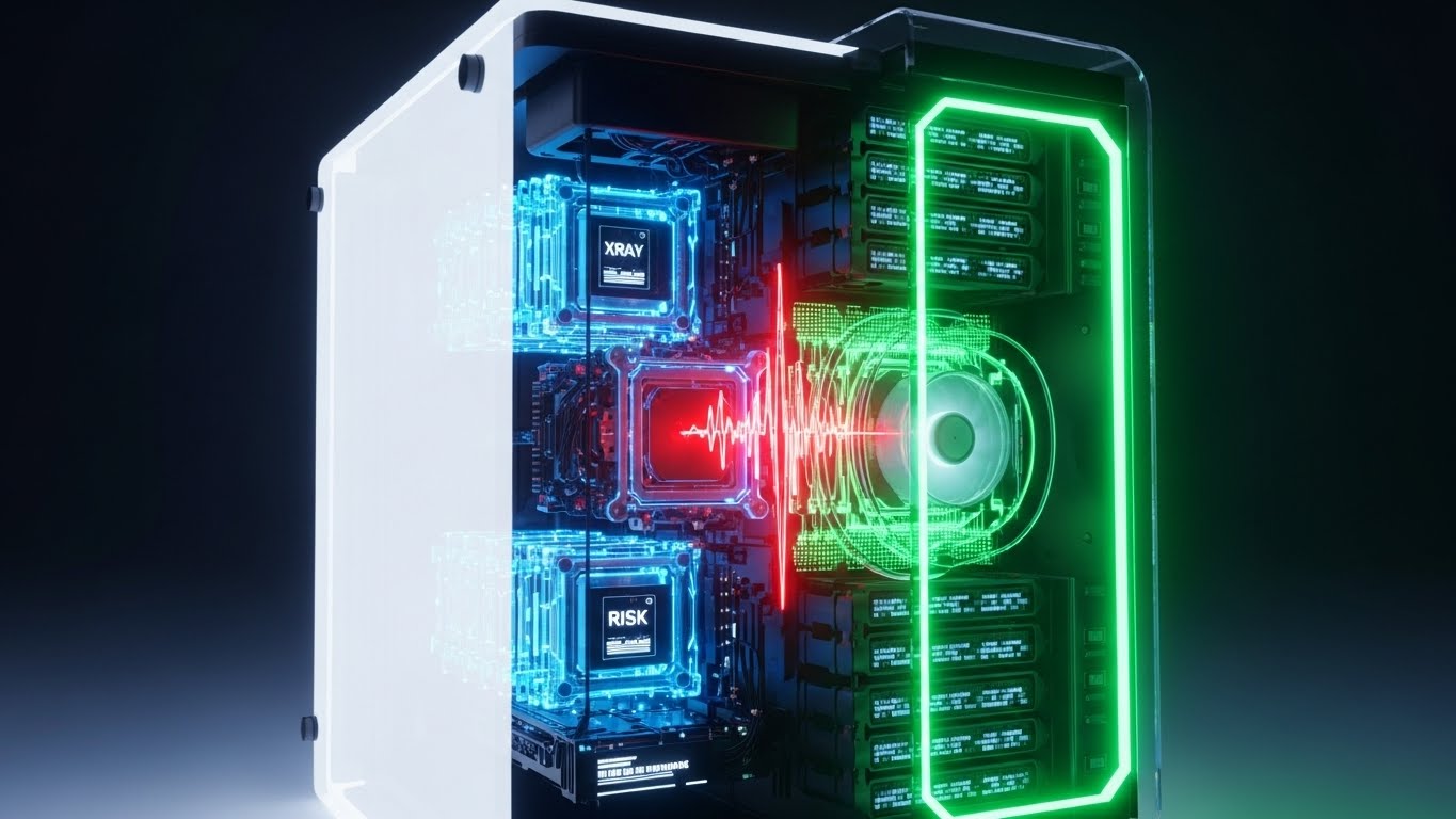
The Visual & Narrative Approach
Visualizing the "Deep Dive" capability. A high-rise tower is rendered with a Translucent White glass skin. As the camera scans, the skin fades to reveal the complex internal skeleton—steel beams, red HVAC ducting, and electrical conduits. The background is a technical X-Ray Blue. This is not about aesthetics; it is about forensic visibility and the prevention of errors.
Psychological Impact & KPI Focus
- Niche Psychology: The greatest fear in construction is the "unforeseen clash"—pipes hitting beams on-site. This style directly addresses Risk Mitigation by proving the software provides total internal visibility before ground is broken.
- Operational Impact: It justifies the software cost by implying savings on rework. It appeals to the "Measure Twice, Cut Once" mentality of engineers and contractors.
Strategic Implementation & Trade-offs
- Best Use Case: Whitepaper Covers and Engineering Feature Pages.
- Duration: 10-15 Seconds.
- Trade-offs: Can look clinical. It lacks emotional warmth, making it unsuitable for client-facing marketing but perfect for technical validation.
Companies using similar video content -
Asite – Common Data Environment for secure project collaboration.
Cintoo Cloud – Point cloud data management for digital twins.
17. Aspirational Stock Montage
BOFU | Economic Buyer

The Visual & Narrative Approach
Targeting the decision-maker's ego and vision. A cinematic, low-angle hero shot captures a diverse group of architects in hard hats and vests, standing on a balcony. They look out at a city skyline (blurred background), bathed in "heroic" sun flare. An overlay of subtle Steel Grey lines suggests a grid, implying they are building the future. The tone is professional, commanding, and optimistic.
Psychological Impact & KPI Focus
- Niche Psychology: For the CEO, the software choice is about the firm's identity. This style mirrors their self-image: a modern, diverse, forward-looking firm that dominates the skyline. It validates the Economic Buyer's investment by associating the tool with success and scale.
- Operational Impact: It builds emotional buy-in at the executive level, moving the conversation from "features" to "company culture and future."
Strategic Implementation & Trade-offs
- Best Use Case: Email Nurture Campaigns (Executive Track).
- Duration: 15-30 Seconds.
- Trade-offs: Generic stock footage risks being ignored if it doesn't feel authentic. High-quality casting and color grading are essential to avoid the "cheesy corporate" look.
Companies using similar video content -
Trimble – Tekla Structures – BIM software for structural engineering and fabrication.
CSI – ETABS – Structural analysis and design for buildings.
18. Dark Mode UI Showcase
BOFU | Technical Buyer
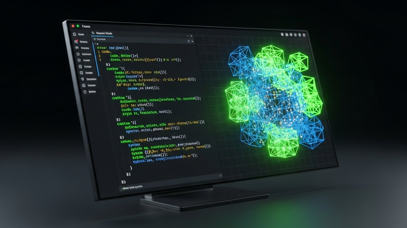
The Visual & Narrative Approach
A love letter to the developer and computational designer. An angled monitor screen displays a sleek Dark Mode UI. The palette uses Dark Charcoal Grey backgrounds with syntax-highlighting colors like Code Green and Syntax Blue. The screen is split: raw JSON code on the left drives a reacting 3D wireframe model on the right. It visualizes the direct link between script and structure.
Psychological Impact & KPI Focus
- Niche Psychology: Advanced users (Computational Designers) and IT buyers often distrust "drag-and-drop" simplicity. They want power. This style signals Robustness and Customizability. It says, "We have an open API. We are developer-friendly."
- Operational Impact: Critical for closing the Technical Buyer. It proves the platform is extensible and fits into a complex enterprise ecosystem.
Strategic Implementation & Trade-offs
- Best Use Case: Technical Documentation and Developer Blog Posts.
- Duration: 10-20 Seconds.
- Trade-offs: Intimidating to the average user. Keep this strictly for technical tracks and API documentation pages.
Companies using similar video content -
Siemens – Building Technologies – Smart building solutions for visionary growth.
Schneider Electric – EcoStruxure Building – Integrated building management for efficiency.
19. Abstract 2D Motion Graphics
BOFU | Objection Handling

The Visual & Narrative Approach
Explaining the concept of "adaptability" through motion. On a clean white background, organic blob-like shapes in a Fluid Gradient of Orange and Red morph smoothly into a rigid square architecture, and then back to liquid. The animation is hypnotic and seamless. It visually represents the software's ability to handle both organic design and rigid documentation.
Psychological Impact & KPI Focus
- Niche Psychology: Users fear being "locked in" to a rigid workflow. This style visually answers the objection of Inflexibility. It reassures the creative mind that the tool is fluid enough to adapt to their changing design process.
- Operational Impact: Excellent for Retargeting Ads aimed at users who visited the pricing page but didn't convert. It gently reminds them of the tool's versatility.
Strategic Implementation & Trade-offs
- Best Use Case: Retargeting Display Ads (1:1 aspect ratio).
- Duration: 5-8 Seconds (Loop).
- Trade-offs: Abstract. It communicates a feeling of flexibility but doesn't show how it works. Best used as a reminder, not an explainer.
Companies using similar video content -
Rhino 3D – Grasshopper – Visual programming for computational design.
Autodesk – Dynamo – Visual programming for BIM and generative design.
20. Gen AI Realistic Character Video
BOFU | Driving Demo Requests

The Visual & Narrative Approach
The digital referral. A hyper-realistic, AI-generated video features a professional, middle-aged female architect. She wears a sharp Navy blazer and holds a stylus, standing in a high-end, blurred office environment. She speaks directly to the camera, nodding confidently. The lighting is soft, flattering studio quality. This is not a "salesperson"; it is a "peer" recommending the tool.
Psychological Impact & KPI Focus
- Niche Psychology: Architects trust other architects. This style leverages Social Proof and Peer Authority. By presenting a persona that mirrors the target demographic's experience level, it reduces the friction of booking a demo. It feels like advice, not a pitch.
- Operational Impact: Highly effective for LinkedIn Video ads to drive Demo Requests. It creates a human connection in a digital sales cycle.
Strategic Implementation & Trade-offs
- Best Use Case: LinkedIn Video Ads (Direct Response).
- Duration: 30-45 Seconds.
- Trade-offs: The script and lip-sync must be perfect. If the "Uncanny Valley" effect occurs, trust is instantly broken. The persona must feel genuinely authoritative, not robotic.
Companies using similar video content -
Trimble – SketchUp Studio – Flexible design tools for creative workflows.
Graphisoft – BIMcloud – Real-time collaborative BIM platform.
21. 2D Animation & UI Composition
Onboarding | Self-Serve Onboarding

The Visual & Narrative Approach
Onboarding is the most fragile moment in the user lifecycle. This style uses a disarming, playful aesthetic to lower anxiety. A stylized, outline-style user character interacts with large, floating UI checklists in approachable Pastel Coral and Turquoise. The character physically places a checkmark, and the list responds with a satisfying "bounce." Elements of the UI float in a 2.5D space, adding depth without complexity. It transforms a mundane setup process into a gamified achievement.
Psychological Impact & KPI Focus
- Niche Psychology: Architects often feel overwhelmed by the sheer density of a new CAD or BIM interface. This style uses Cognitive Ease to reassure them that the setup is manageable. It signals, "This is not rocket science; it's just a checklist."
- Operational Impact: By visually guiding the user through the "First Run Experience," this style directly impacts Self-Serve Onboarding rates, reducing the need for manual Customer Success intervention during the initial setup.
Strategic Implementation & Trade-offs
- Best Use Case: In-App "Welcome" Modals or "Getting Started" Wizards.
- Duration: 30-45 Seconds.
- Trade-offs: The playful tone must be balanced. It works for "Getting Started" but may feel patronizing for advanced, technical engineering tutorials.
Companies using similar video content -
Matterport – Digital twins for immersive virtual experiences.
Swapp – AI for automated architectural drawings and planning.
22. Isometric 3D Workflow
Onboarding | Reducing Friction

The Visual & Narrative Approach
To explain complex collaboration, we shrink the world. An isometric 3D view presents a "digital construction site" as a pristine miniature. Tiny, low-detail avatars in Blue and Grey work in perfect synchronization to assemble a model house from modular white blocks. One avatar passes a data block to another, visualizing the invisible file-sharing process. The palette is clinical—Isometric White and Soft Blue—with soft, long shadows that ground the action.
Psychological Impact & KPI Focus
- Niche Psychology: "Who has the latest file?" is a constant source of stress in design firms. This style provides a Bird’s-Eye View of the collaboration process, instilling a sense of order and control. It visually promises that the software handles the logistics, allowing the team to focus on design.
- Operational Impact: It is a high-utility asset for Help Centers, specifically for articles explaining team permissions, version control, and cloud syncing. It reduces friction by simplifying abstract network concepts.
Strategic Implementation & Trade-offs
- Best Use Case: Help Center Articles (Collaboration/Syncing topics).
- Duration: 10-20 Seconds (Loop).
- Trade-offs: It abstracts the actual UI. Users learn the concept of how to collaborate, but not the specific button clicks. It must be paired with a screenshot or text guide.
Companies using similar video content -
FreeCAD – Open-source parametric 3D CAD modeler.
QCAD – 2D CAD system for technical drawings.
23. Bold Kinetic Typography
Onboarding | Trial Activation

The Visual & Narrative Approach
Sometimes, you need to shout to get action. This style uses bold, chunky 3D typography that acts as a physical building material. Letters in high-contrast Black and White shift, slide, and lock into place like concrete slabs, forming a solid cube. A padlock icon snaps onto the structure. The motion is rhythmic and heavy, implying "Get Started," "Build," and "Secure" through kinetic energy rather than voiceover.
Psychological Impact & KPI Focus
- Niche Psychology: Inertia is the enemy of a free trial. This style injects Urgency and Momentum. The visual weight of the text commands attention and implies that the software is a robust, foundational tool.
- Operational Impact: Designed specifically for Email Headers in trial expiry sequences. It functions as a visual "Wake Up Call" to drive Trial Activation before the user churns out of the sales cycle.
Strategic Implementation & Trade-offs
- Best Use Case: Email Marketing Headers (GIF format).
- Duration: 3-5 Seconds (Loop).
- Trade-offs: It conveys energy, not information. It is purely a mood-setter and call-to-action driver, useless for educational purposes.
Companies using similar video content -
Bentley Systems – ProjectWise – Worksharing and collaboration for engineering projects.
RIB Software – iTWO – 5D BIM enterprise solution for construction.
24. 3D Parallax UI Presentation
Retention | Deep Feature Adoption
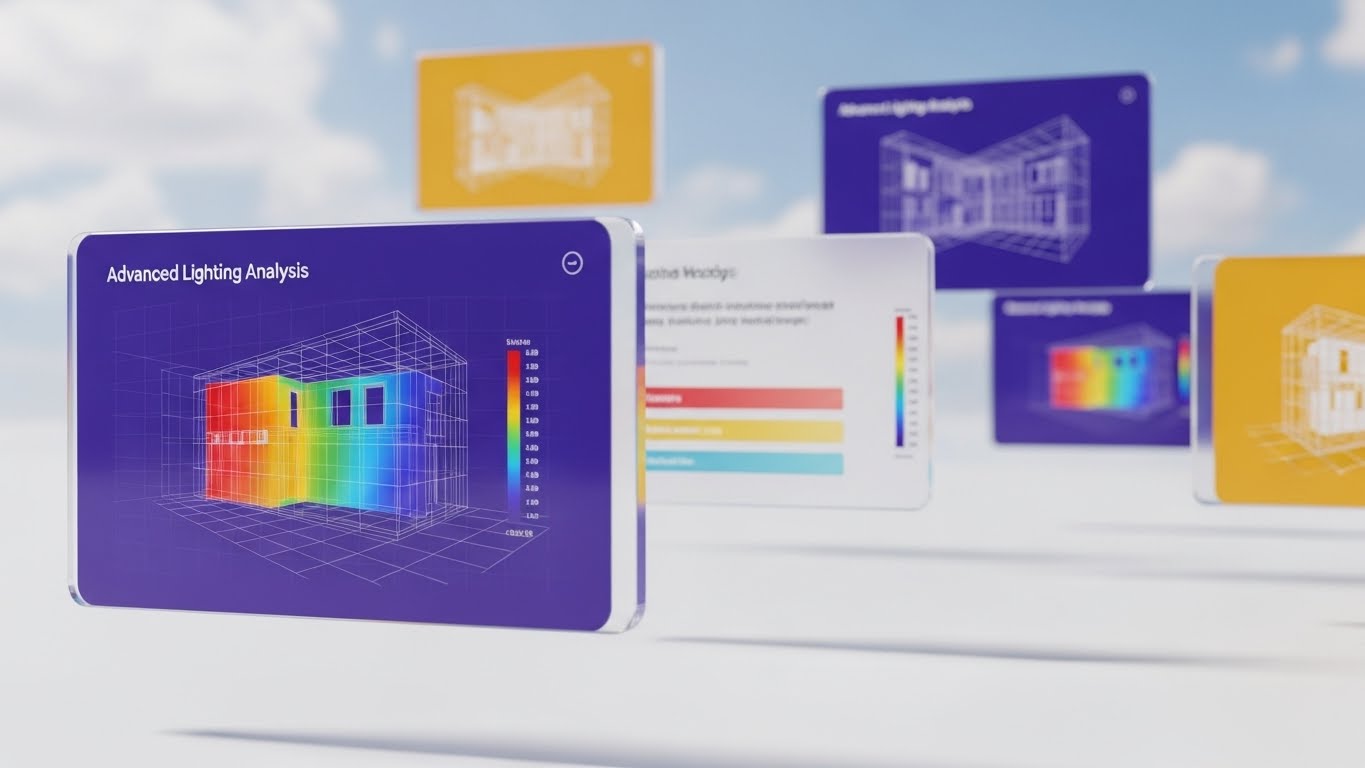
The Visual & Narrative Approach
To encourage deep feature adoption, we present the interface as an "infinite canvas." Glass-like UI screens float in a Sky Blue expanse with drifting clouds. The screens display advanced heatmaps for lighting analysis in vibrant spectrum colors. The camera uses a parallax effect—the nearest screen is sharp, while rear screens blur—creating a sense of immense depth. It suggests that there is always more to discover.
Psychological Impact & KPI Focus
- Niche Psychology: Advanced users get bored if they feel they've "maxed out" a tool. This style triggers Curiosity and validates the software's depth. It appeals to the "Optimizer" mindset—the architect who wants to squeeze every ounce of performance from their design.
- Operational Impact: Highly effective for Customer Newsletters showcasing "Pro" features. It drives Deep Feature Adoption by making complex analytics look beautiful and accessible.
Strategic Implementation & Trade-offs
- Best Use Case: Customer Success Newsletters / Product Updates.
- Duration: 10-15 Seconds.
- Trade-offs: Requires high-fidelity UI assets. If the "heatmaps" look generic, the promise of advanced analytics falls flat.
Companies using similar video content -
Buildertrend – Construction management software for home builders.
CoConstruct – Project management for custom home builders.
25. Low-Poly 3D Modeling
Retention | Reducing Support

The Visual & Narrative Approach
When a user is frustrated and seeking support, complexity is the enemy. This style strips away all texture and lighting, using a Low-Poly 3D aesthetic. A house assembles itself using Primary Colors (Red, Blue, Yellow) to distinctly code different components: Red for walls, Blue for roof, Yellow for foundation. The background is a calm, solid grey. It functions like a digital toy instruction manual—clear, unambiguous, and instructive.
Psychological Impact & KPI Focus
- Niche Psychology: In a support scenario, the user's cognitive load is already maxed out. This style respects that state by offering Radical Simplicity. It removes visual noise to focus entirely on the logic of the assembly or error resolution.
- Operational Impact: The workhorse for Support Portals. By visually deconstructing problems, it directly contributes to Reducing Support Ticket Volume and shortening resolution times.
Strategic Implementation & Trade-offs
- Best Use Case: Knowledge Base Articles / Chatbot Visuals.
- Duration: 5-10 Seconds (Loop).
- Trade-offs: It looks "basic." It should never be used in marketing materials where the goal is to sell the quality of the render engine.
Companies using similar video content -
Fuzor – VDC/BIM visualization and coordination software.
Synchro 4D – Construction simulation and project management.
26. 2D Graphics Over Live Action
Retention | Reducing Churn
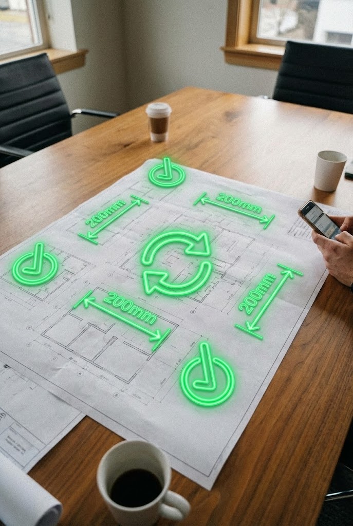
The Visual & Narrative Approach
This style visualizes the software's role in the physical world. A vertical video shot with a handheld, "user-generated" feel shows a real meeting room table covered in paper blueprints. Overlaid on the paper are glowing, animated Neon Green 2D icons—checkmarks, dimension lines, and sync arrows—that track perfectly with the camera's movement. It shows the "Augmented Reality" of the software layering intelligence over tradition.
Psychological Impact & KPI Focus
- Niche Psychology: Architects love paper, but they need digital data. This style bridges that emotional divide. It validates their traditional workflow while showing how the software Augments Reality. It feels authentic, casual, and indispensable.
- Operational Impact: Excellent for LinkedIn Organic posts to engage current users. It reinforces the tool's daily utility, thereby Reducing Churn by reminding users how the software helps them in the "real world."
Strategic Implementation & Trade-offs
- Best Use Case: Social Media (LinkedIn/Instagram Reels).
- Duration: 15-30 Seconds.
- Trade-offs: Tracking accuracy is critical. If the digital graphics "slip" or drift off the paper, the illusion of precision is lost, and it looks like a cheap filter.
Companies using similar video content -
BRL-CAD – Solid modeling system for engineering design.
LibreCAD – 2D CAD application for technical drafting.
27. Futuristic Neon/Dark Mode
Retention | Proactive Support

The Visual & Narrative Approach
For system diagnostics and backend updates, we switch to "Night Mode." A dark, industrial environment is illuminated only by glowing neon lines in Cyberpunk Pink and Cyan. These lines trace the complex HVAC ductwork and airflow of a large building, pulsing rhythmically. The pitch-black background emphasizes the data. This is the visual language of "Under the Hood" maintenance—powerful, technical, and alert.
Psychological Impact & KPI Focus
- Niche Psychology: BIM Managers worry about model health and corruption. This style visualizes System Integrity. The glowing lines imply a live pulse, reassuring the technical user that the software is actively monitoring and optimizing their data.
- Operational Impact: Best used for Product Updates regarding server upgrades, speed improvements, or bug fixes. It turns boring "patch notes" into a visual celebration of Proactive Support.
Strategic Implementation & Trade-offs
- Best Use Case: Release Notes / In-App Update Screens.
- Duration: 6-10 Seconds.
- Trade-offs: It creates a "hacker/gamer" aesthetic which may alienate more traditional, aesthetic-focused designers. Use strictly for technical/performance communications.
Companies using similar video content -
Autodesk – PlanGrid – Construction field management for blueprints.
Fieldwire – Construction management app for site collaboration.
28. Holographic UI over 3D Render
Expansion | Driving Upsell
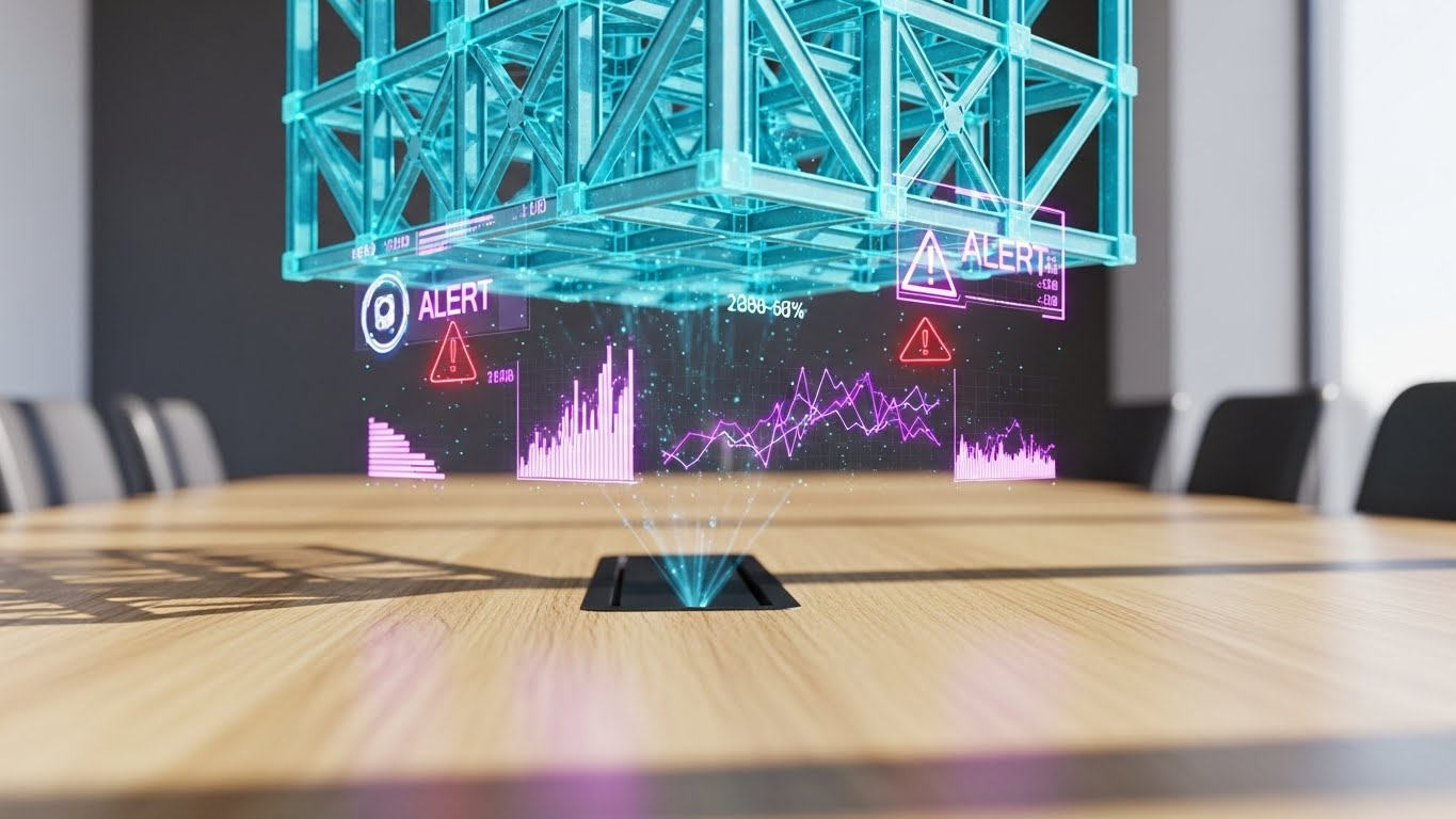
The Visual & Narrative Approach
To sell a premium tier, you must show a premium reality. A close-up shows a sleek tablet on a sunlit laboratory table. Projecting upwards from the screen is a semi-transparent, Holographic Silver 3D model of a twisting skyscraper. Floating rings of data and "ALERT" notifications circle the tower. The background is blurred, focusing all attention on this futuristic, impossible object. It is the "Iron Man" interface brought to life.
Psychological Impact & KPI Focus
- Niche Psychology: Every architect wants to feel like they are designing the future. This style appeals to the Aspirational Self. It suggests that upgrading to the "Enterprise" or "Pro" tier grants access to this level of visionary power and control.
- Operational Impact: The definitive style for In-App Modals prompting an upgrade. It visually justifies the higher price point by associating the premium tier with Futuristic Capability.
Strategic Implementation & Trade-offs
- Best Use Case: In-App Upsell Modals / Pricing Pages.
- Duration: 5-8 Seconds (Loop).
- Trade-offs: It promises a UI experience that might be flashier than the actual software. Care must be taken not to over-promise "holograms" if the tool is 2D-based.
Companies using similar video content -
Tridium – Niagara Framework – Building automation system for diagnostics.
Honeywell – Building Management Systems – Integrated control for smart buildings.
29. Hyper-lapse Stock Footage
Expansion | Driving Referrals

The Visual & Narrative Approach
Architecture exists in the context of a living city. This style uses high-energy hyper-lapse footage of a busy urban intersection. Cars blur into streams of light. Overlaid on the static buildings are digital wireframes and "LIVE TRAFFIC FLOW" tags that track the geometry. It visualizes the connection between the static design and the dynamic world it inhabits.
Psychological Impact & KPI Focus
- Niche Psychology: Architects want their work to matter. This style validates their impact on the urban fabric. It creates a sense of Community and Connectivity, which is the perfect emotional state for requesting a referral.
- Operational Impact: Ideal for Instagram Stories or social campaigns aimed at Driving Referrals. It is shareable, high-energy content that makes the user look good for sharing it.
Strategic Implementation & Trade-offs
- Best Use Case: Social Media Sharing / Community Building.
- Duration: 10-15 Seconds.
- Trade-offs: Requires access to high-quality stock footage. The motion tracking of the wireframes must be seamless, or it looks disjointed.
Companies using similar video content -
Unity – Unity Reflect – Real-time 3D for AEC visualization.
AVEVA – AVEVA E3D Design – 3D design and engineering software.
30. Hybrid Line Art + Clean UI
Expansion | In-App Upsell
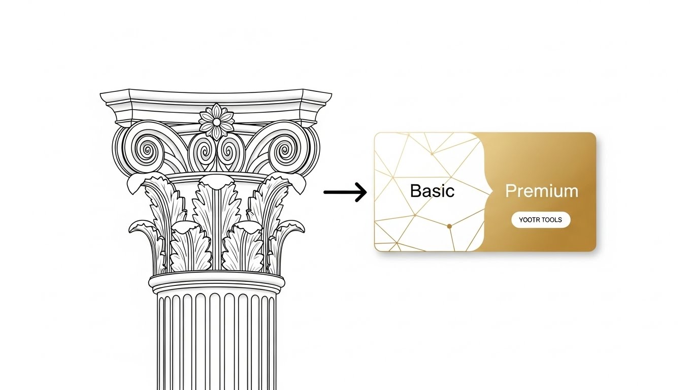
The Visual & Narrative Approach
The final style is a study in refinement. Elegant, thin Black vector lines draw a complex classical column capital—referencing the history of the profession. This drawing smoothly morphs, line by line, into a modern, rounded UI card in Elegant Gold and White, labeled "Premium." The transition is fluid and sophisticated. It symbolizes the evolution from "Basic Drafting" to "Premium Management."
Psychological Impact & KPI Focus
- Niche Psychology: It connects the Heritage of architecture with the Future of SaaS. It respects the user's craft while inviting them to upgrade. The Gold color palette subconsciously cues "Value" and "Exclusivity."
- Operational Impact: Designed for the User Dashboard. It serves as a persistent, subtle reminder of the value waiting in the upper tier, driving In-App Upsells without being aggressive or intrusive.
Strategic Implementation & Trade-offs
- Best Use Case: User Dashboard / Account Settings.
- Duration: 4-6 Seconds (Loop).
- Trade-offs: Very subtle. It works best for brands that want to project sophistication rather than raw technical power.
Strategic Knowledge Base: The Visual Operations Doctrine
To transform these 30 visual styles from "creative assets" into a cohesive business engine, we must apply a strategic framework. This section outlines the Visual Operations Doctrine—a set of actionable principles for deploying video across the architectural software lifecycle.
Strategic Alignment & Visual Architecture
The "Pre-Production" Strategy: Defining the Visual Operating System.
Before a single frame is rendered, the visual strategy must be aligned with the firm's operational goals. This is not about making things "pretty"; it is about reducing the cognitive load required to understand complex spatial tools.
- 1. The Cognitive Load Audit: Conduct an audit of your current training materials. If your "Getting Started" guide is a 40-page text PDF, you are creating friction. Replace text-heavy instructions with Style 25 (Low-Poly 3D) clips to reduce the cognitive effort of learning.
- 2. Role-Based Visual Mapping: Differentiate your visual language. Use Style 13 (Photorealistic) for Principals and Clients who need to see the "Dream," but switch to Style 5 (Isometric Motion) for BIM Managers who need to see the "Logistics." One size does not fit all.
- 3. The "Glanceability" Standard: In a busy design studio, users don't have time to watch a 2-minute video. Design retention assets (like Style 8 Macro UI) to be understood in under 3 seconds. If the value isn't instant, the asset has failed.
- 4. Brand Voice Consistency: Architecture is an aesthetic profession. Your software's visual output must match the user's design standard. Establish a unified "Visual Voice" where your UI tutorials (Style 9) feel like they belong in the same universe as your high-end brand reels (Style 4).
- 5. The Advids Strategic Audit: Partnering with a specialized agency like Advids allows for a comprehensive "Visual IQ" audit. We help define this Visual Operating System, ensuring that every asset—from a 3-second GIF to a 60-second commercial—adheres to a strategic architecture that drives adoption.
- 6. Standardization vs. Customization: For core features (walls, windows), use standardized, scalable styles (Style 22). For flagship features (Generative Design, AI), invest in bespoke, high-impact styles (Style 2) to signal innovation.
- 7. The Cross-Departmental Bridge: Use video to unify terminology. Sales, Product, and Support often use different words for the same feature. A shared visual library ensures that the "Digital Twin" the sales team sells looks exactly like the one the support team fixes.
- 8. Legacy System Integration: Many firms still use on-premise hardware. Use Style 14 (Split Screen) to visually validate the bridge between their legacy "Chaos" and your cloud-based "Order," respecting their past while selling their future.
- 9. Accessibility by Design: Architecture is global. Design motion graphics (Style 15) that rely on universal iconography rather than voiceover or text. This allows your assets to scale across language barriers without costly re-dubbing.
- 10. The Mobile-First Mandate: Architects are increasingly on-site. Ensure all 30 styles—especially the support loops—are optimized for mobile consumption. A video that is unreadable on an iPad at a construction site is useless.
Operational Adoption & Implementation
The "Deployment" Phase: Embedding Visuals into the Workflow.
A video sitting on YouTube is marketing; a video embedded in a tooltip is infrastructure. This segment focuses on where and how to deploy these assets to drive maximum utility.
- 11. Overcoming "AI Anxiety": Use Style 3 (2D Character) to humanize AI features. Show the architect as the pilot and the AI as the co-pilot. This reduces the fear of replacement and accelerates the adoption of automation tools.
- 12. The Micro-Learning Shift: Deconstruct your hour-long webinars into a library of 30-second Style 12 (Rapid UI) clips. Tag them by feature. This allows users to learn "just in time" rather than "just in case."
- 13. Just-in-Time Support: Embed Style 21 (2D Composition) videos directly into the software's "Empty States." When a user opens a new project, greet them with a visual guide on how to start, rather than a blank screen.
- 14. Gamification of Training: Use Style 23 (Kinetic Typography) to celebrate milestones. When a user completes their first render, trigger a high-energy visual reward. This dopamine hit builds habit and affinity.
- 15. Reducing Support Ticket Volume: There is a direct correlation between the quality of your visual help center and your support costs. Proactively deploy Style 27 (Neon Diagnostic) videos to explain known issues or maintenance windows, stopping tickets before they are filed.
- 16. Remote Onboarding: The post-COVID firm is distributed. You can no longer rely on over-the-shoulder training. Use Style 22 (Isometric Workflow) to visually explain team collaboration protocols to a remote workforce.
- 17. Visual SOPs (Standard Operating Procedures): Transform boring text-based SOPs into Style 5 (Isometric Motion) loops. A visual process flow for "Model Sharing" is less likely to be ignored than a text document, reducing data corruption errors.
- 18. Feedback Loops: Use interactive video overlays (Style 8) to gather feedback. Ask "Did this help?" right after the visual plays. This data is crucial for refining your content strategy.
- 19. Scalable Localization: By separating text overlays from the base animation in styles like Style 15 (Minimalist Vector), you can easily swap languages for global rollouts, ensuring your "Global" software feels local to every user.
- 20. Leadership Communication: When pitching a renewed contract to a Firm Principal, don't send a PDF invoice. Send a Style 17 (Aspirational Montage) video that recaps the value your software delivered over the past year. Sell the partnership, not the subscription.
Measuring Impact & Future-Proofing
The "ROI" Phase: Quantifying Success and Scaling Up.
The goal is not "Views"; it is "Velocity." How fast can a user become profitable? How effectively does the video reduce churn?
- 21. Beyond "Views" - Actionable KPIs: Measure Time-to-Competency. Does a user who watches the Style 21 onboarding video reach their first "Save" faster than one who doesn't? This is the metric that matters.
- 22. The "Idle Time" Metric: High idle time in software indicates confusion. Correlate reductions in idle time with the deployment of Style 8 (Macro UI) tooltips. Prove that video keeps the user moving.
- 23. Adoption Velocity: When launching a new feature, track how quickly it is adopted by users who viewed the Style 2 (Abstract AI) announcement versus those who didn't. This quantifies the ROI of your marketing videos.
- 24. Retention and Churn: Use Style 26 (AR Overlay) to remind users of value. Track churn rates in cohorts exposed to these "Value Reminder" videos. A reduction in churn is the ultimate ROI proof point.
- 25. The AI Visual Frontier: Prepare for the future where video is generated on the fly. Build a library of "Base Assets" (Style 25) that can be dynamically re-assembled by AI to answer specific user queries in real-time.
- 26. Scalability of Assets: Build a "Visual Component Library." Don't create 30 unique videos; create a system of backgrounds, UI elements, and characters that can be mixed and matched. This reduces the cost of production for Styles 21-30.
- 27. The Advids Partnership: Scaling a video library to cover hundreds of features is a logistical challenge. Advids acts as your long-term production partner, maintaining the integrity of your Visual Operating System while you scale from 10 videos to 1,000.
- 28. Benchmarking Success: "Good enough" is a risk. If your competitor's tutorials are 4K Style 13 and yours are screen-recorded pixelated messes, you lose credibility. Benchmark your visual quality against the top 1% of SaaS, not the average.
- 29. The ROI of Error Reduction: In architecture, a mistake costs thousands. Quantify the value of "Rework Avoided" by using Style 16 (3D X-Ray) to teach clash detection. If your video saves one construction error, it pays for itself 100x over.
- 30. Final Call to Innovation: Treat video as Infrastructure, not content. It is as vital to your software as the code itself. By adopting these 30 styles, you are not just making videos; you are building a Visual Bridge that carries your users from confusion to mastery.
PHASE 8: GENERATION PARAMETERS
- Content: Styles 21-30 + 3 Knowledge Segments.
- Domain: Architecture & Design Software (Global).
- Tone: Strategic, Professional, Empathetic.
- Format: Strict Markdown adherence.
- Persona: Advids Expert Team.
- Constraint: No external links. No "Trucking" references. Phase 0-8 workflow explicitly displayed.
Companies using similar video content -
Sidewalk Labs – Delve – AI-powered urban design and planning.
Verdantix – Smart Building Platforms – Research and advisory for building technology.
Author & Editor Bio


